Archive

Monthly Archives: June 2023

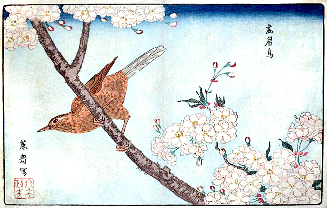
Kitao Shigemasa “Birds in Yellow Plum”

Recently I posted a piece about the history of naturalist illustration. It was a subject so huge — and with so many gorgeous images, that I could not begin to include some of my favorite things from the thousands of images I collected. 

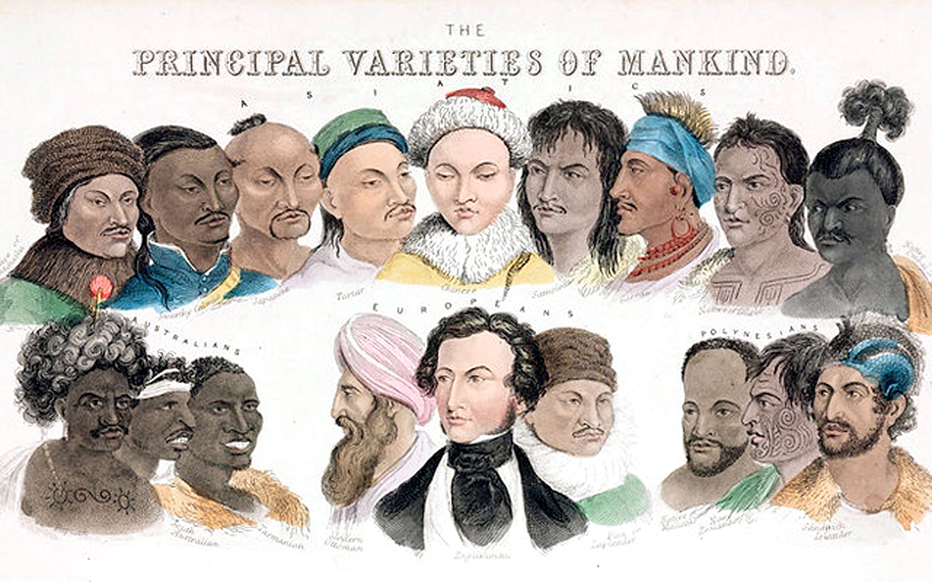
For instance, I had to rule out all of the non-Western art, and some of my favorite non-scientific animal art. And so, I felt I should write a follow-up piece for a few of the leftovers. 

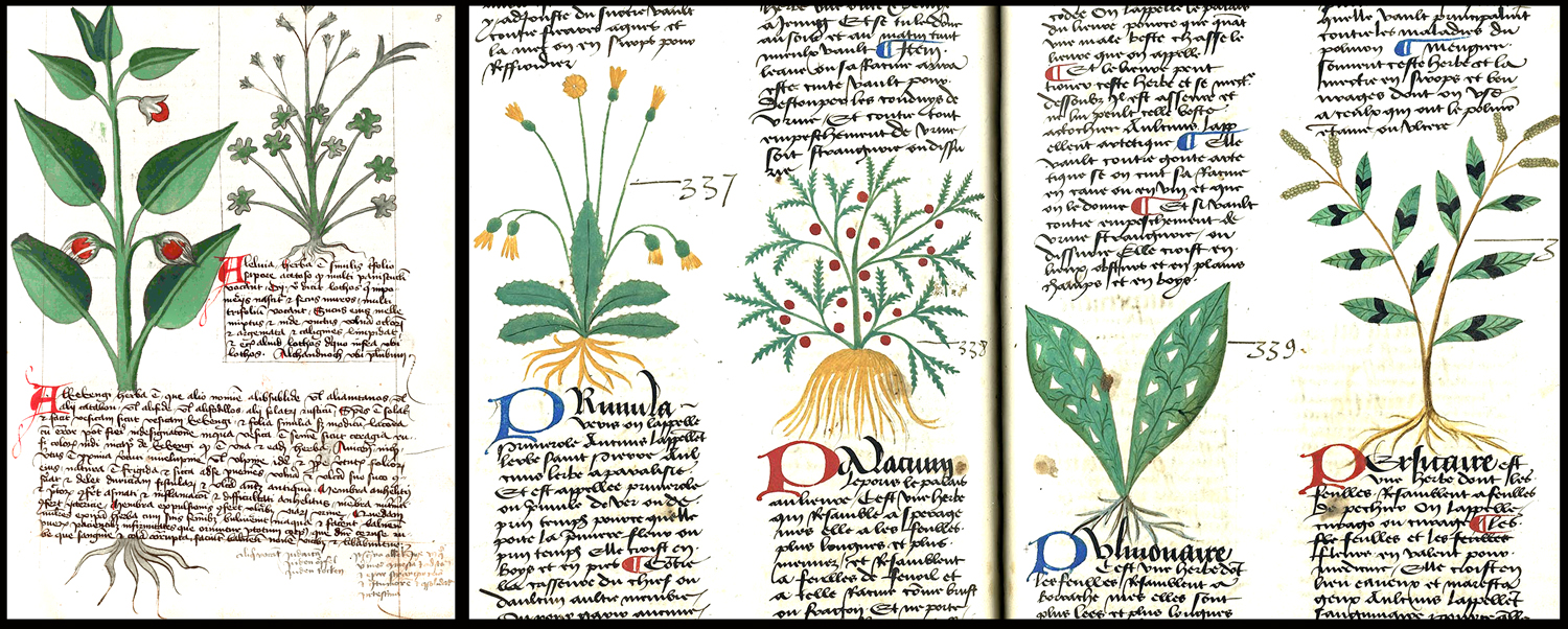
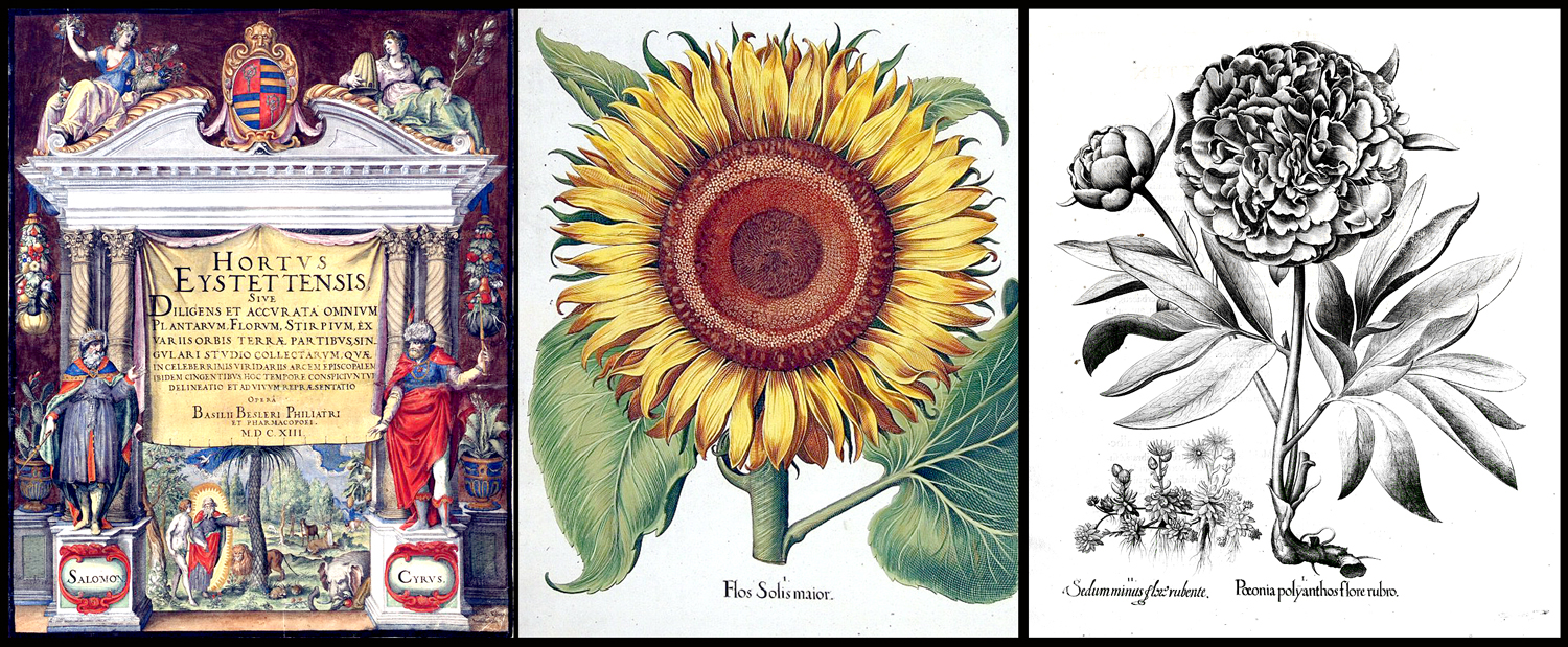
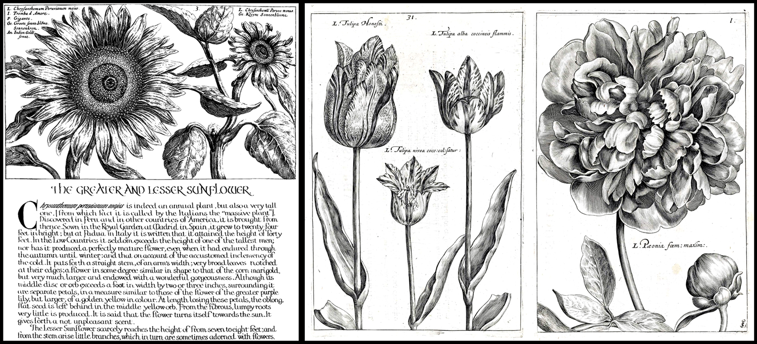
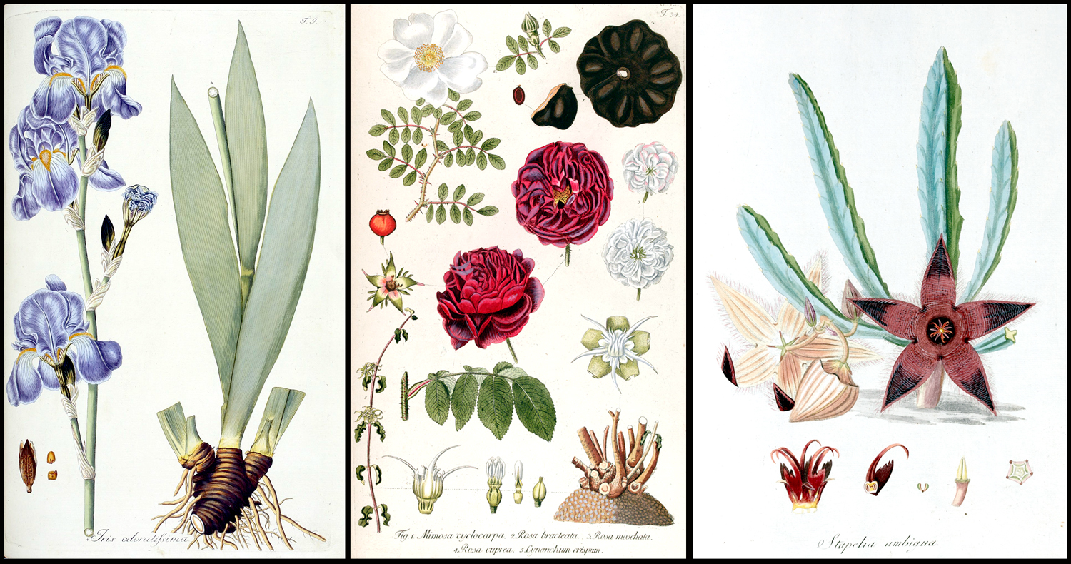
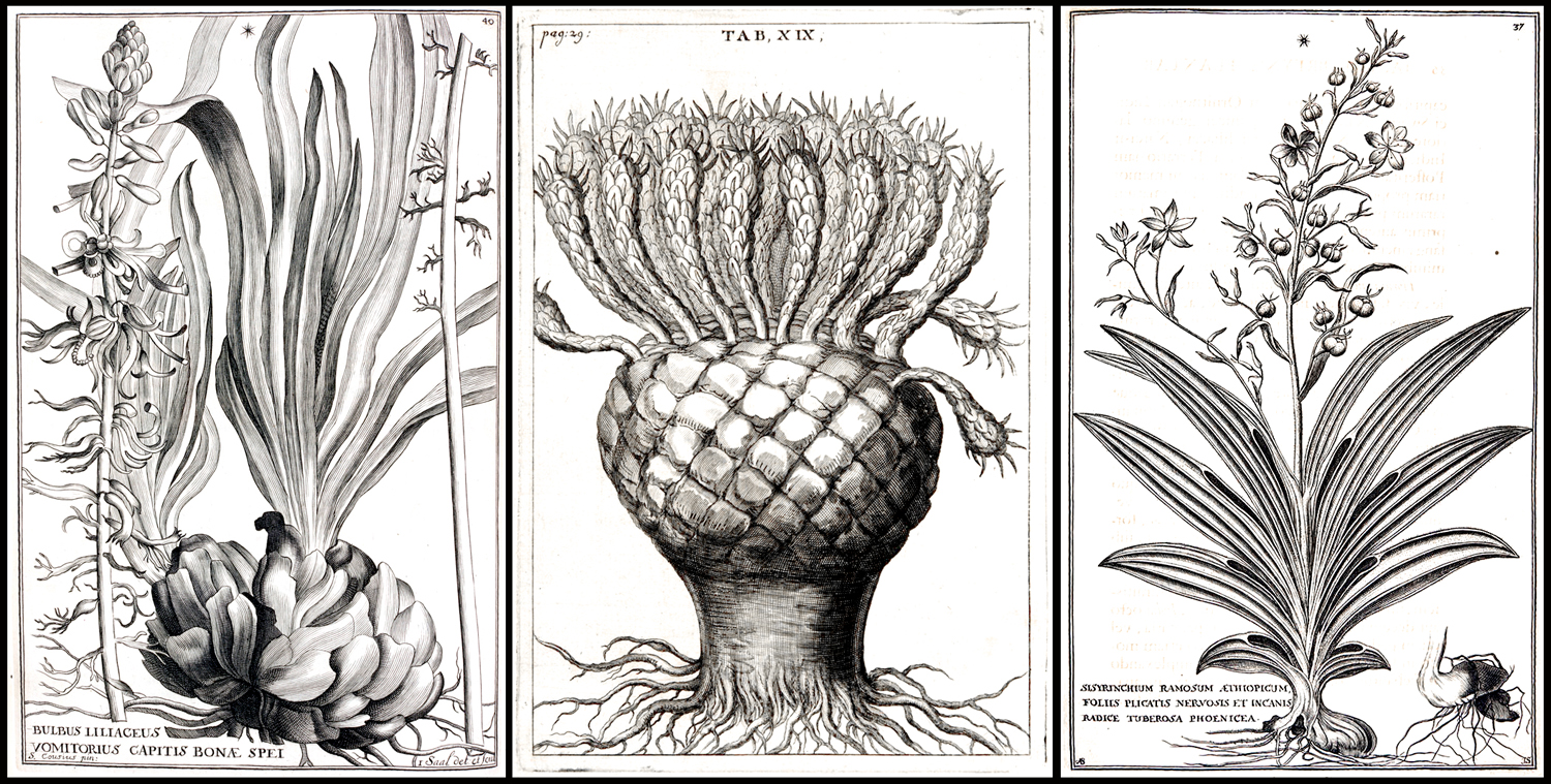
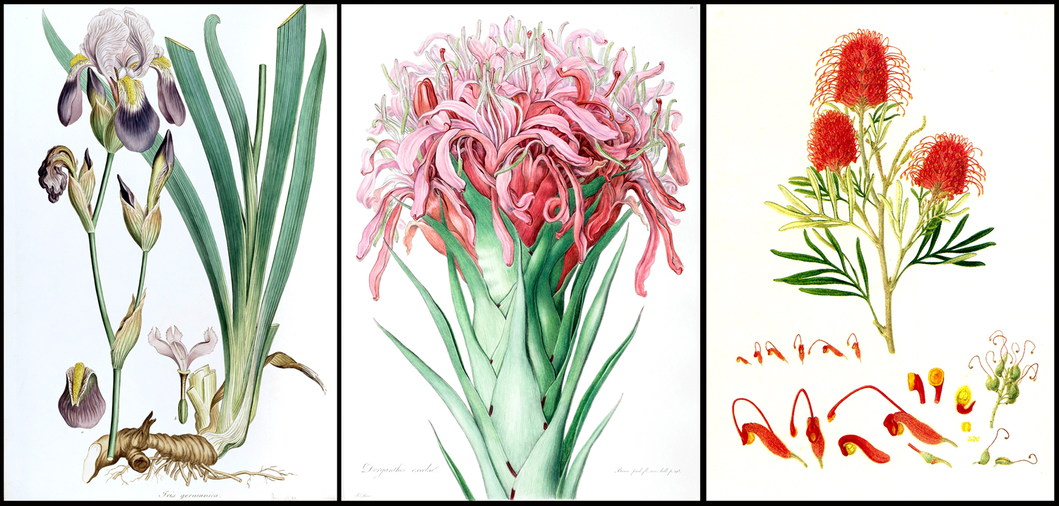
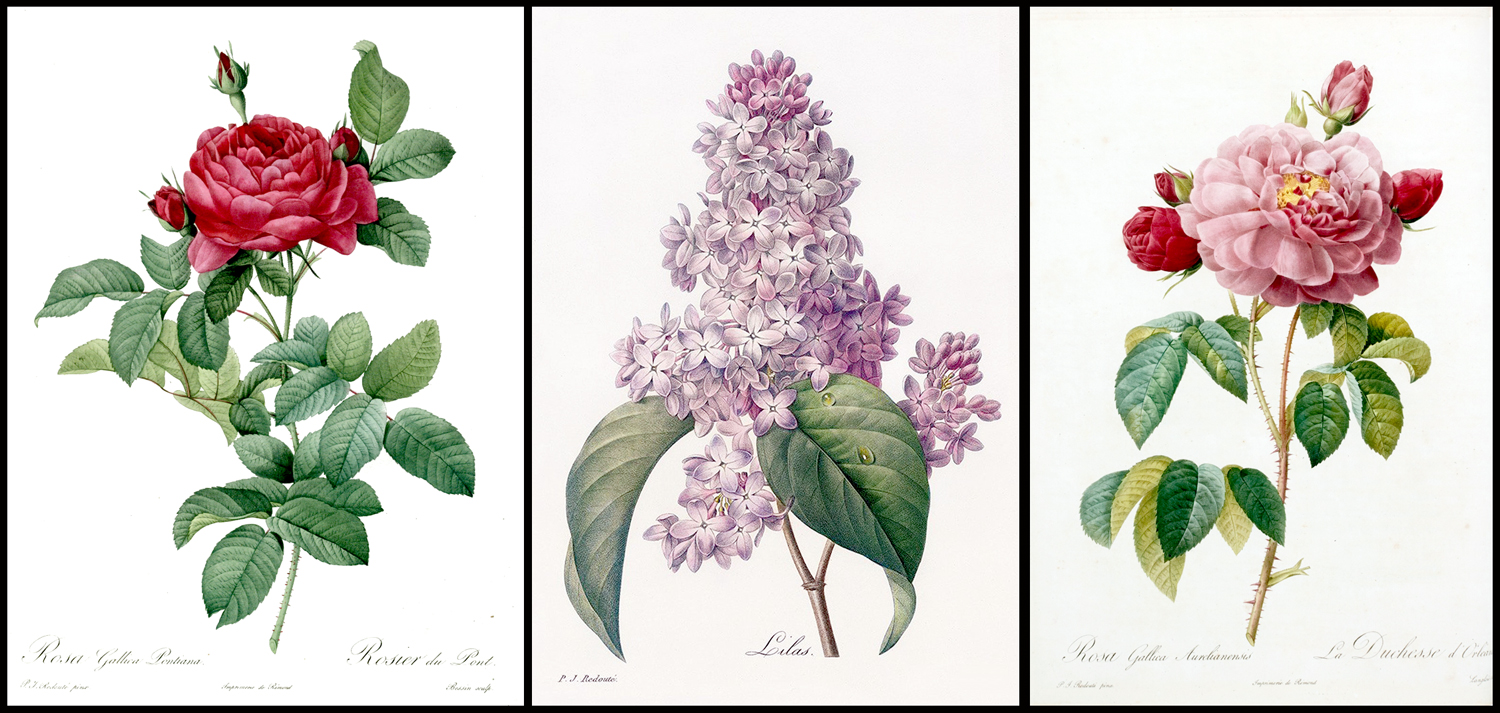
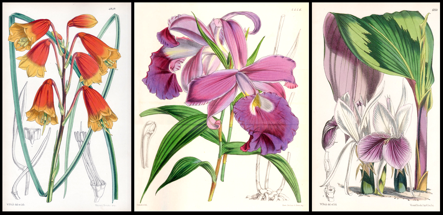
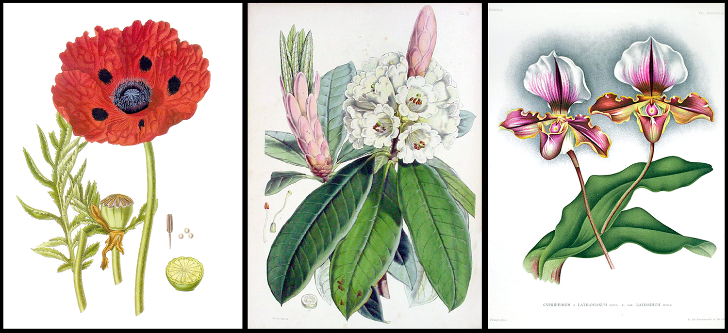
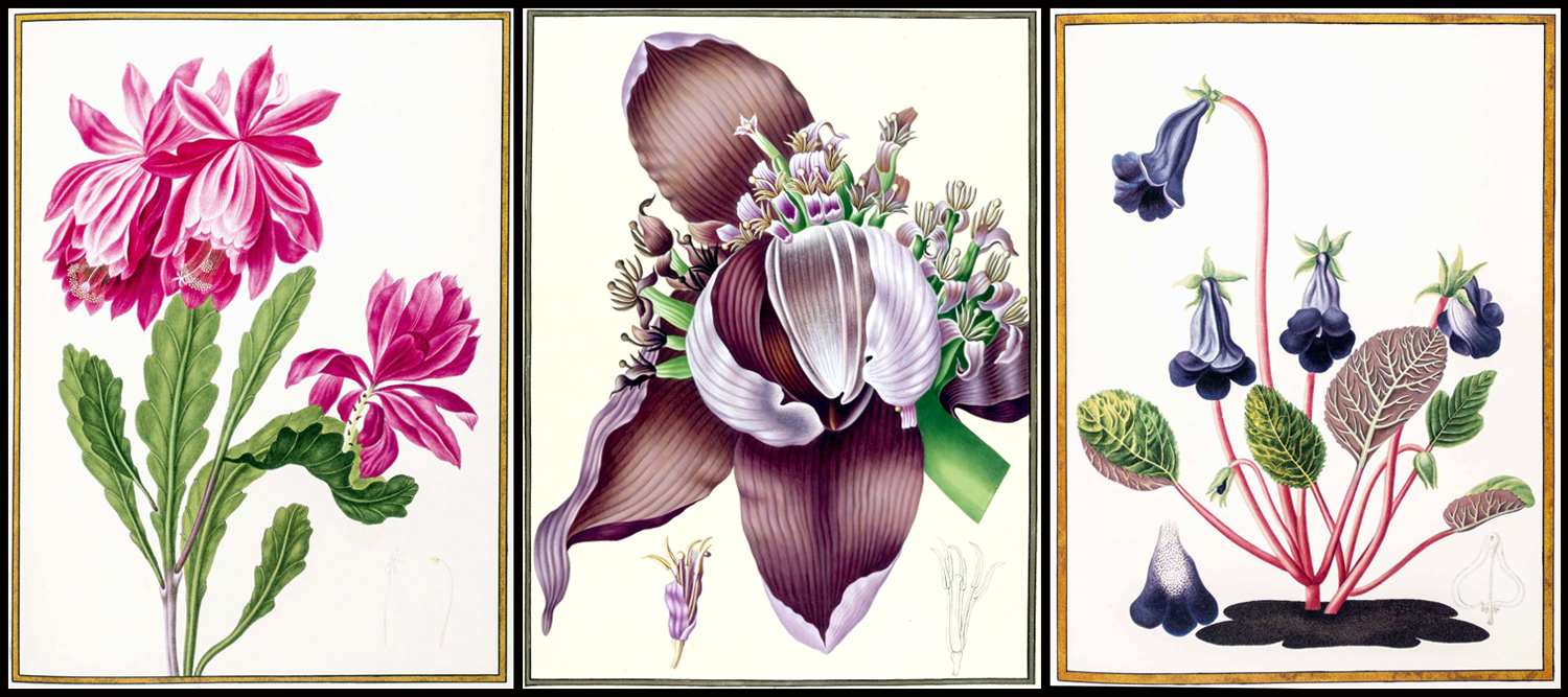
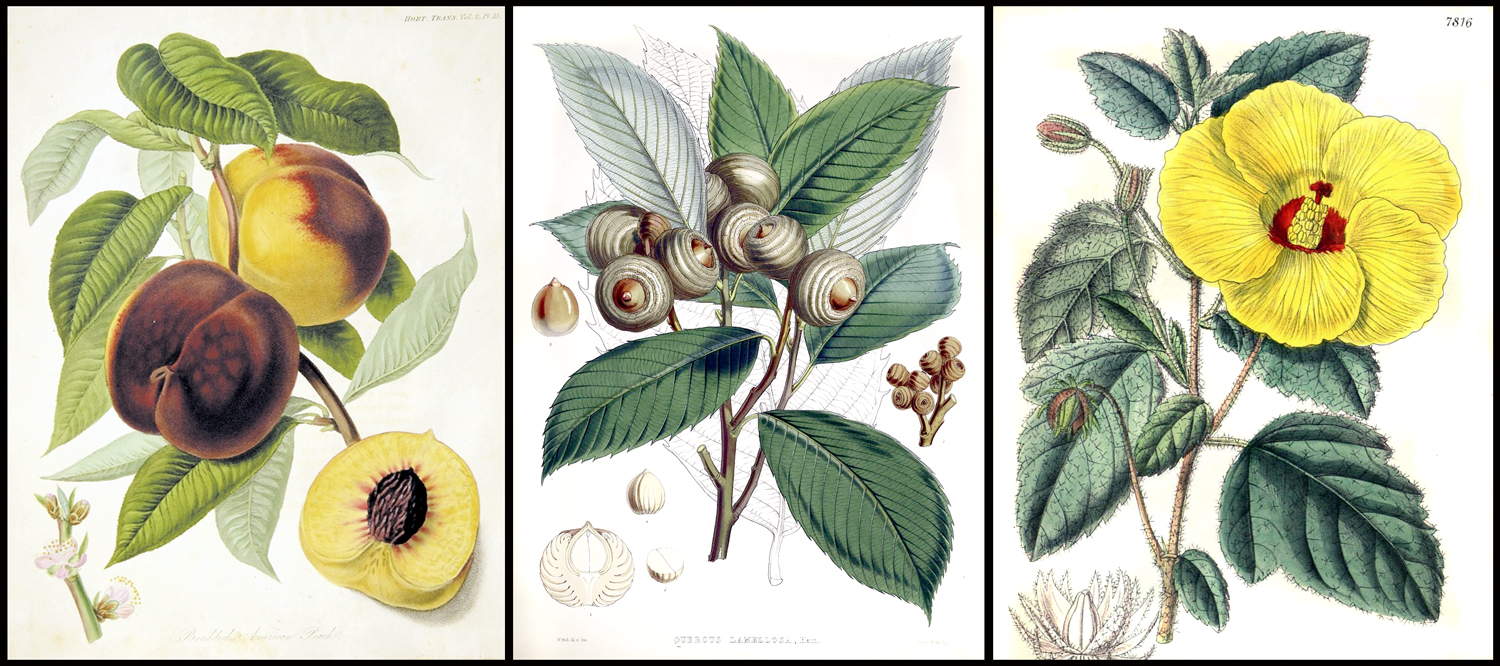
Most of the art I covered was meant to illustrate botanical collections in an era when new plants were constantly being added to the list of recognized species, and were meant to accompany scientific books written by specialists.


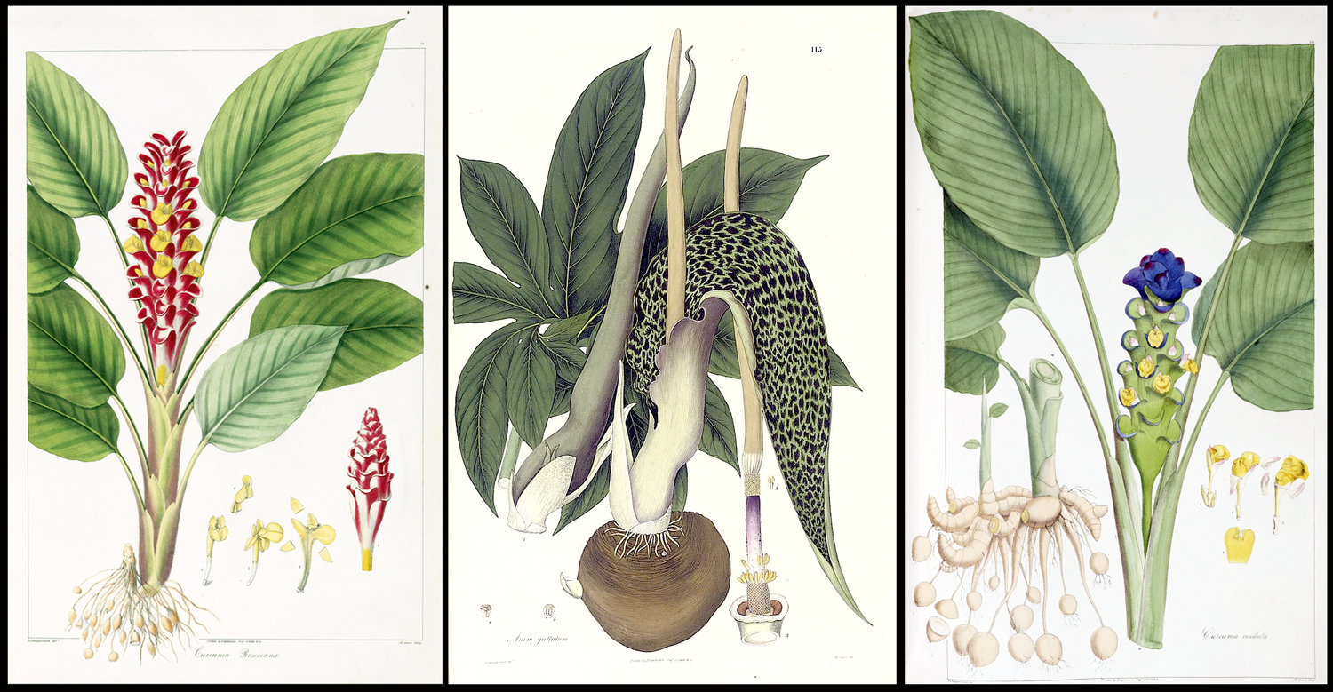
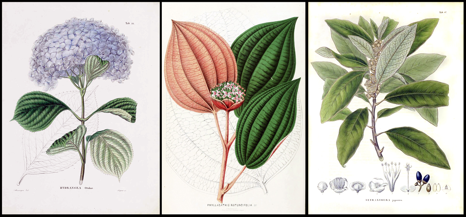
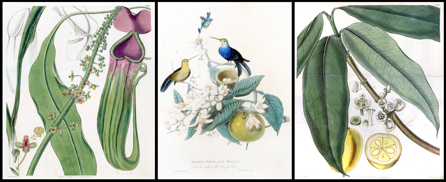
From “Plantae Asiaticae Rariores” of Nathaniel Wallich

For instance, there was Nathaniel Wallich, the Danish-born botanist who collected plants in India and published his Plantae Asiaticae Rariores in three volumes from 1830 to 1833, with illustrations by a half-dozen artists, both Indian and European. 

From “Treasury of Nature,” Albertus Seba

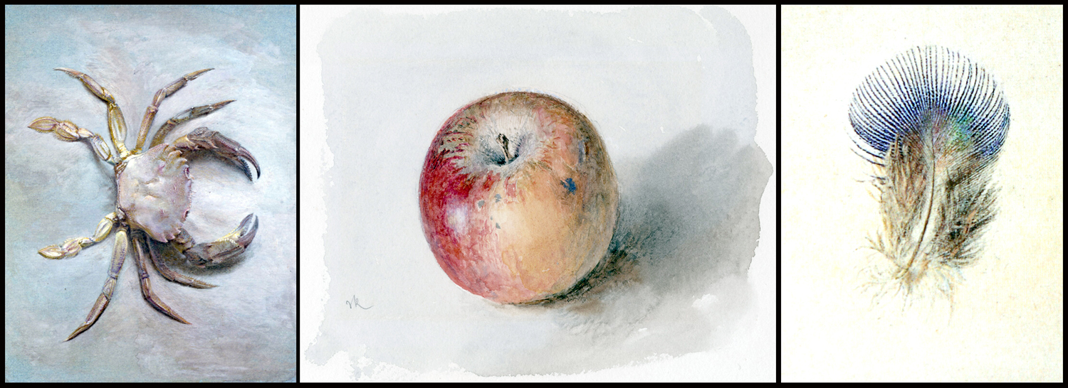
The collection I missed most in the earlier essay was Albertus Seba (1665-1736). His interest was less scientific and more one of abject curiosity. He collected tons of oddities from around the world in his “curiosity cabinet,” and in 1734 published his Locupletissimi Rerum Naturalium Thesauri Accurata Descriptio et Iconibus Artificiosissimus Expressio per Universam Physices Historiam (“A Careful Description and Exceedingly Artistic Expression in Pictures of the Exceedingly Rich Treasury of Nature Throughout the Entire History of Natural Science,” illustrated from beginning to end with engraved plates. 

Crab from Albertus Seba

The original 4-volume publication included 445 illustrations and Seba’s collecting helped Carl von Linne in his binomial classification system. 

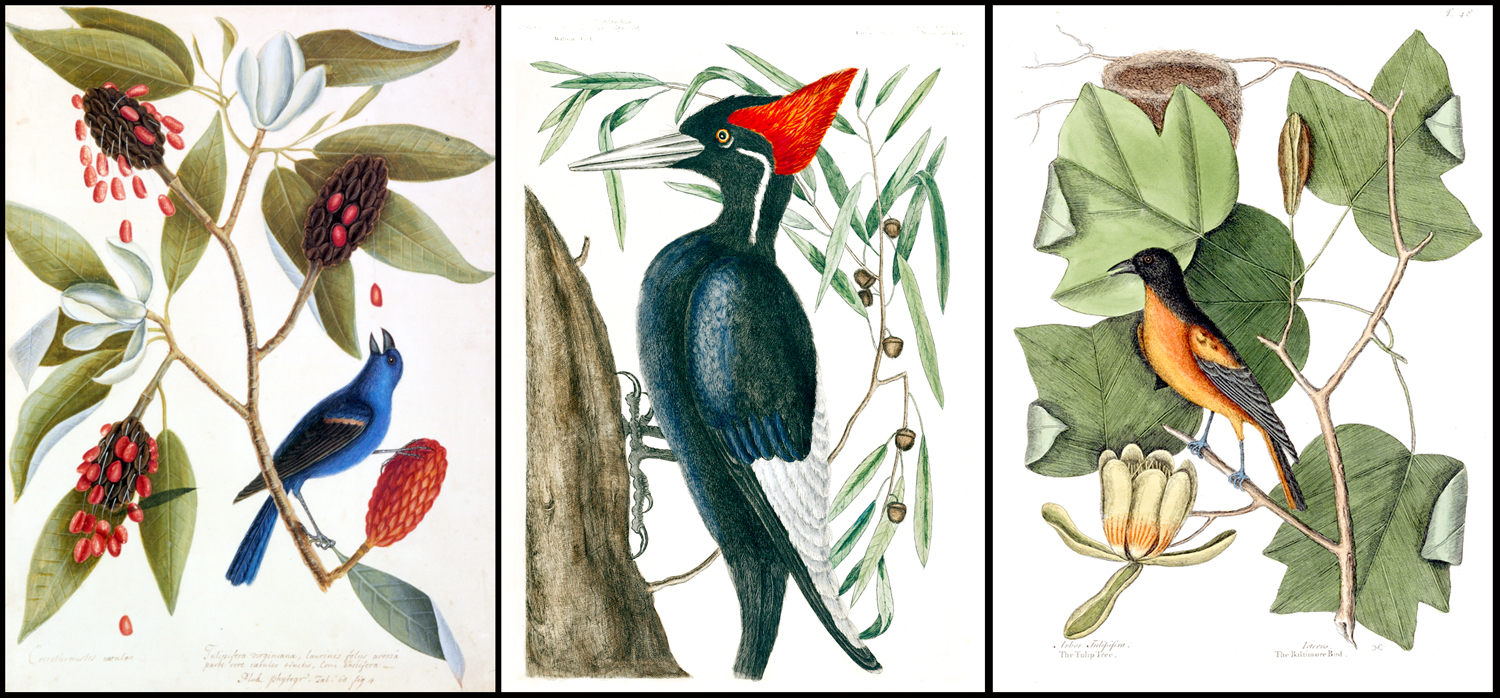
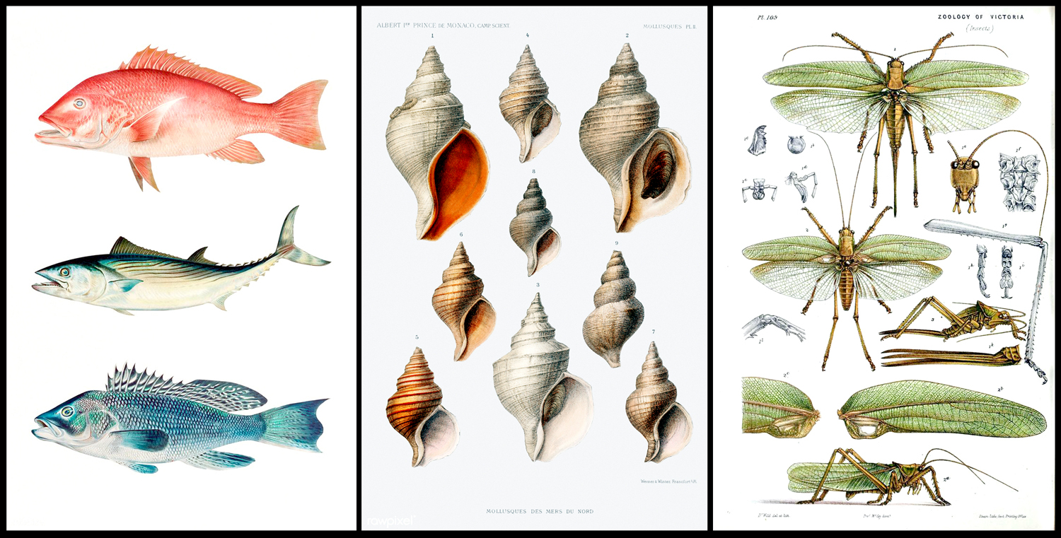
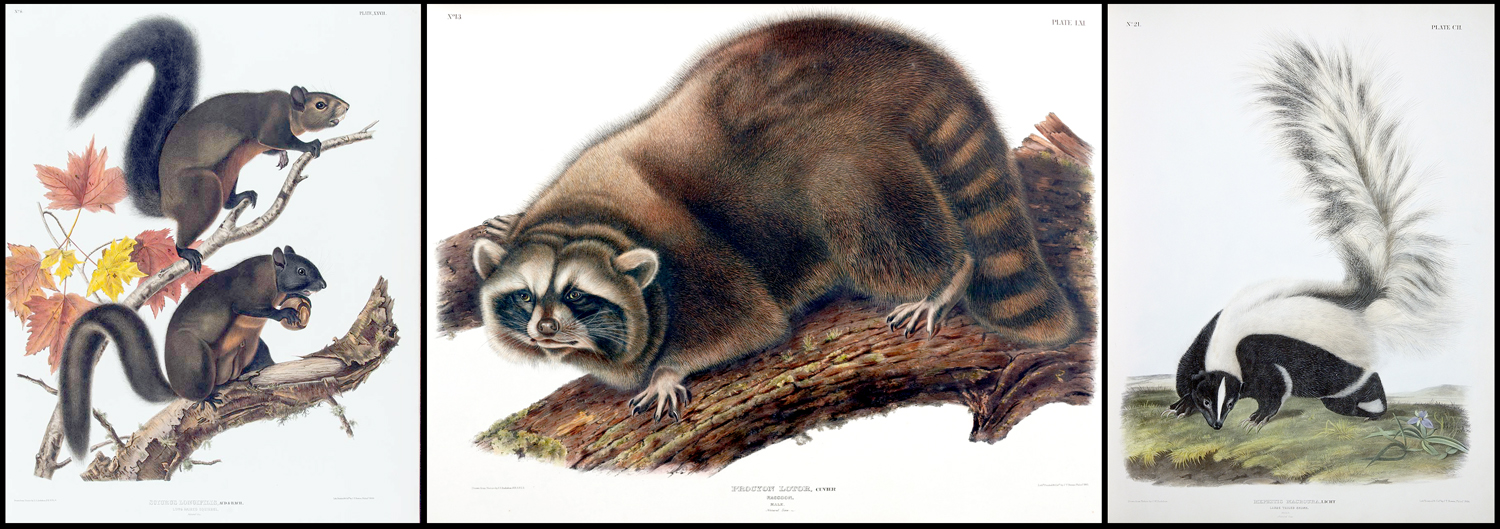
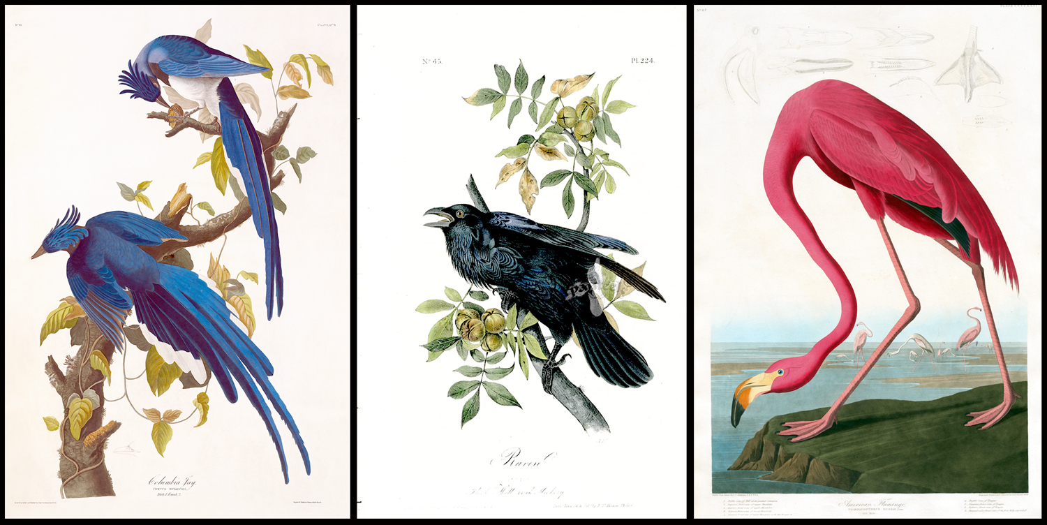
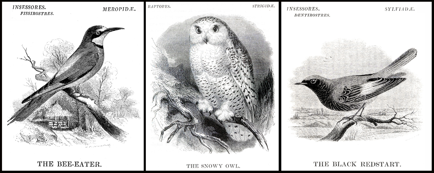
But, there are tons of bird, plant, and animal pictures meant for the general public, mostly throughout the 19th century. 

Wood engravings of plants

Unfortunately, most of those artists worked anonymously, pumping out pictures for books, magazines and posters. Animals, especially those of exotic locales, were always popular pictures with the public. And most of those were made in the process called wood engraving — a bit like woodcuts, but made with a burin on the end-grain of dense hardwoods and printed very like a copper plate engraving. 

Wood engravings of animals

The best-known wood engravings were probably the book illustrations of Gustave Doré. But the technique was nearly ubiquitous in the Victorian era. 

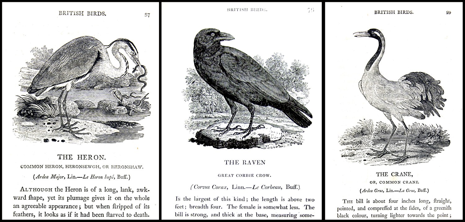
From “A History of British Birds” by William Yarrell

Wood engravings occasionally accompanied serious scientific work, also, such as those in A History of British Birds, published in 1843 by William Yarrell (1784-1856). Its wood-engraving illustrations were carried out by two artists, Alexander Fussell and John Thompson. 

Such art is meant primarily to identify plants and animals, but sometimes an artist’s intent is merely to look closely at and study his subject. And, as with the botanical illustration, to separate the subject from its context to better see it on its own. 

Drawings by Leonardo da Vinci

Artists have always done this, often in sketches, sometimes as studies for larger, more serious and integrated paintings, sometimes purely for its own sake. Leonardo drew lots of them. 

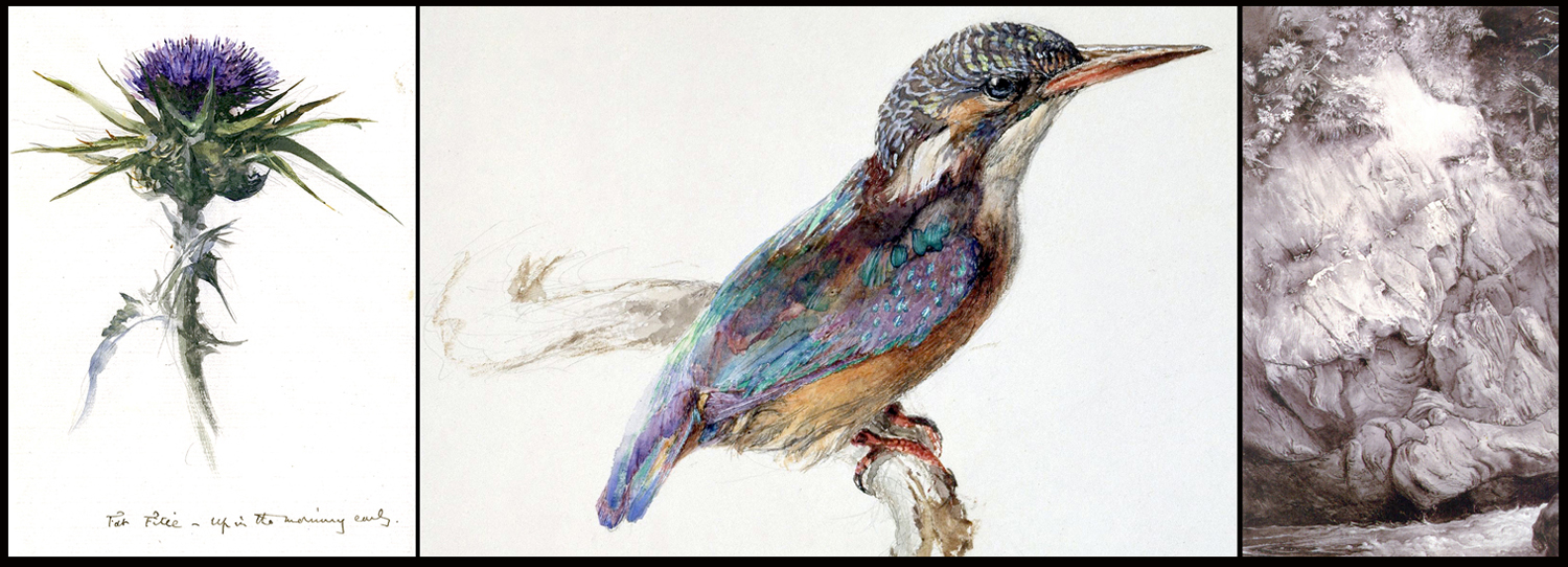
Drawings by John Ruskin

And it was the very point that critic John Ruskin made in Victorian times for the art of drawing: He felt that sketching forced close observation and that essence was found in detail. He aimed his eye at plants, birds, even rock formations, to come to know them better. 

Drawings by Ruskin

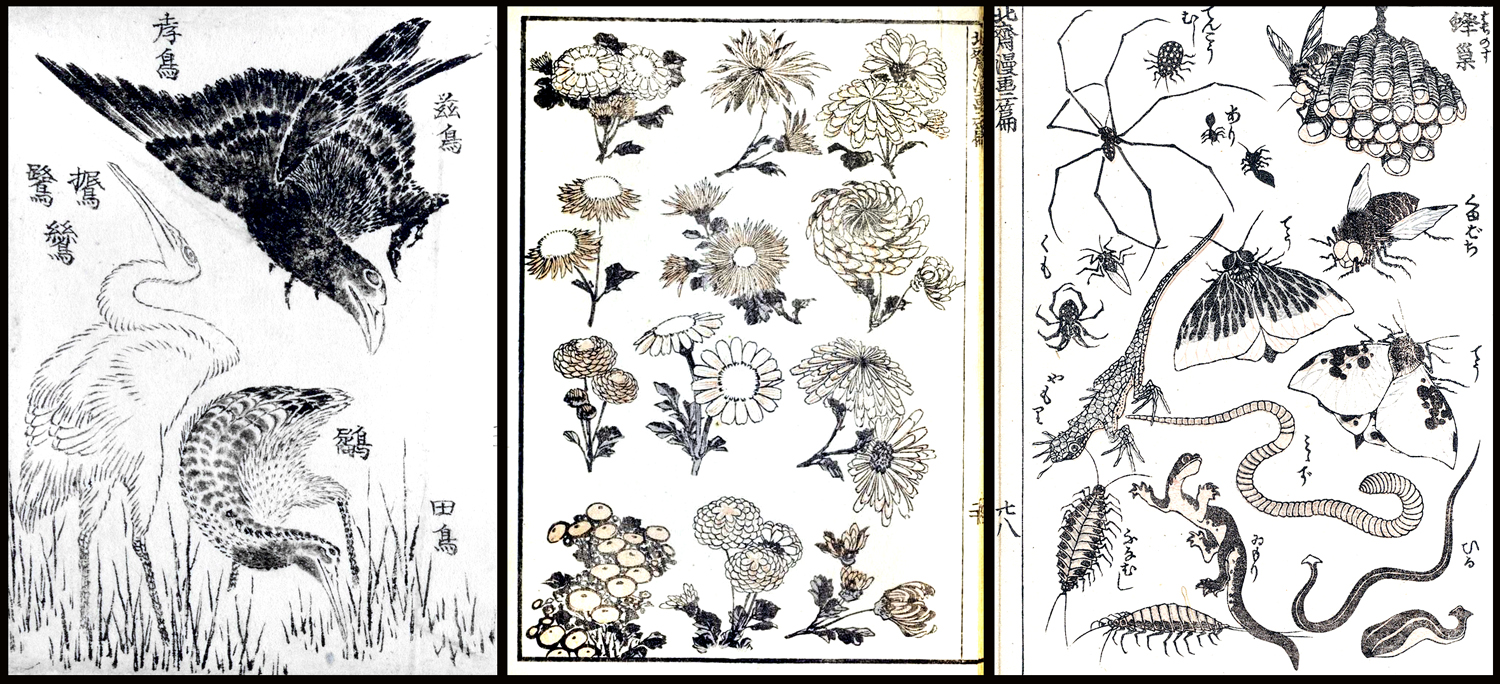
The most significant class of nature art left out of my original essay are the many kachō-e prints and paintings by Japanese artists, ranging from the 17th century to the 20th. I was sorry to leave them out. 

Masayoshi, “Gray Thrush” 

Kachō-e are so-called “bird and flower” pictures, although the subjects include fish and insects, too. Their ancestry runs back to huaniaochua (“bird and flower” paintings) popular in Chinese beginning in the Tang dynasty (AD 618-907). 

The work influenced much of art throughout Asia, and came to Japan, popularized by translations of the Chinese classic instruction book, Manual of the Mustard Seed Garden, published in parts from 1679 to 1701. The final chapters instruct how to best paint huaniaochua-style art. 

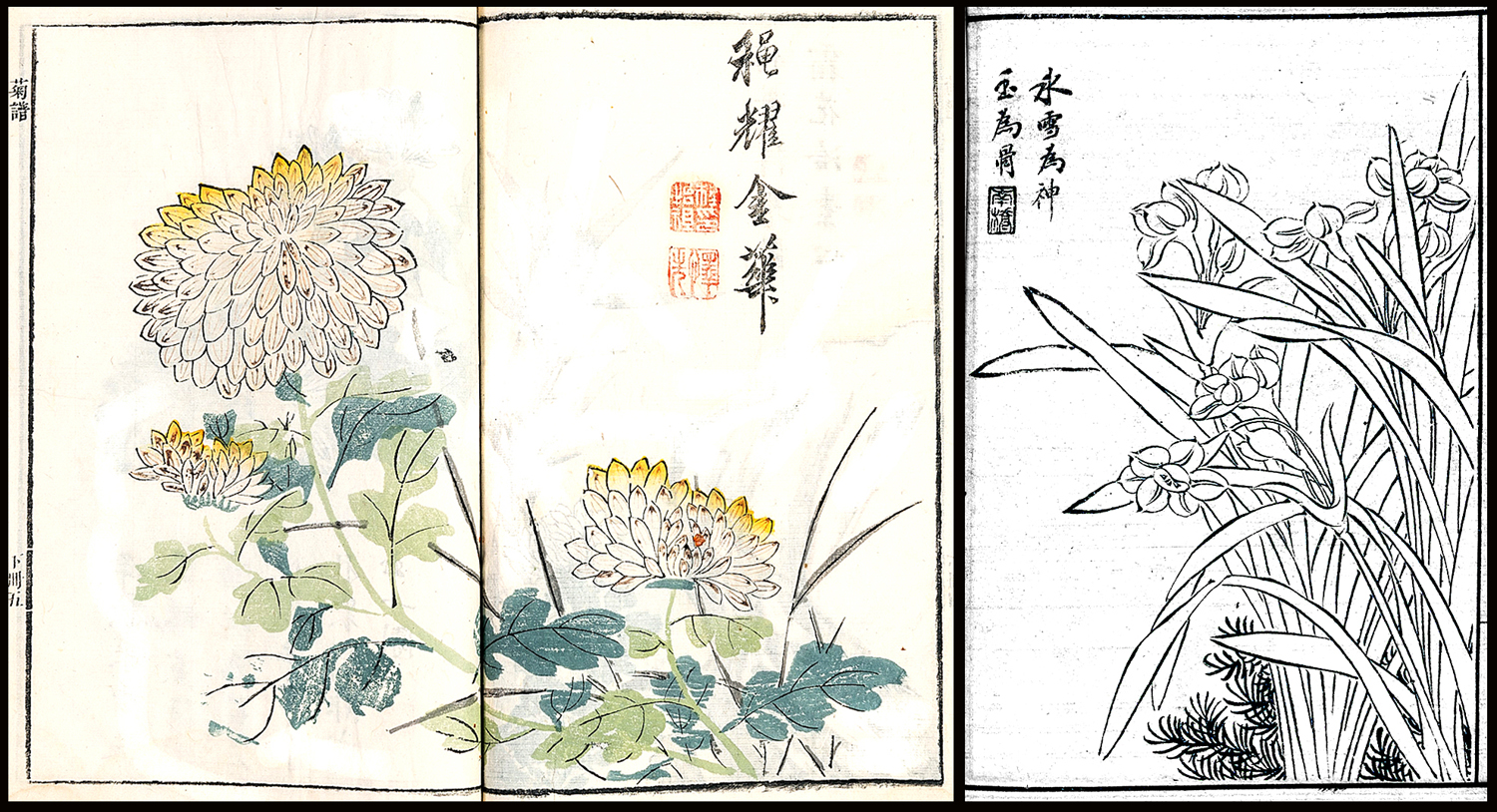
Pages from “Manual of the Mustard Seed Garden” 

The Chinese influence was felt all through the continent, not only in Japan and Korea, but as far west as Persia, where it inspired the golomorgh (“Bird and Tree”) paintings popular in the Safavid period (1501-1736).

Golomorgh art

 In Islamic art, the paintings take on an allegorical bent, with the birds (sometimes butterflies) standing in for the lover and the flower for the beloved.

But by far the biggest influence was in Japanese art, and the popular ukiyo-e style, mostly woodblock prints made from the 18th through the early 20th century. Ukiyo-e (“Pictures of the floating world”) were popular images of famous actors, courtesans, historical figures, landscapes, genre scenes — and nature. The nature genre was called kachō-e, or “bird and flower pictures.” 

One of the early masters of the form was Kitagawa Utamaro (1753-1806). He published a Book of Birds ca. 1790 (the dating is often uncertain, as records were not always kept, and popular books were published and republished, often with new plates, or new cuttings of old designs — precise dating can be guesswork). 

Each image was matched to poetry, written in elegant calligraphy on the empty parts of the image. For this one, named for the mejiro, or Japanese White-Eye (on the left) and the enaga or Long-Tailed Tit (on the right) has two poems. The first: “Pushed out of his honey-filled nest following a fight, the white-eyes bird seems not to mind at all,” while the other says “Come and let yourself be mine; For us the nights will be as long as the tit’s tail.”

Utamaro followed with a Picture Book of Selected Insects, about the same time, which showed dragonflies, beetles, bees, grasshoppers and other buggy life on beautifully drawn leaves and flowers. When Viking Press published a beautiful facsimile edition of the book in 1984, they must have worried about the title, so they renamed it Songs of the Garden. Much more attractive. 

In the west, the two most famous ukiyo-e artists are Hokusai and Hiroshige, near contemporaries. They both made kachō-e prints. 

 Katsushika Hokusai (1760-1849) called himself “Old Man Mad with Painting,” and worked in every conceivable genre. He was a one-man image factory. His curiosity spanned everything he could come in contact with. He even experimented with linear perspective after coming in contact with European art. 

Hokusai manga

In his sketchbook, or manga, he made pictures of everything he saw. The black-and-white drawings were made into woodblock prints. He tried just about everything. (Most famous, of course, for his “Great Wave off Kanagawa,” which has been reproduced endlessly.)

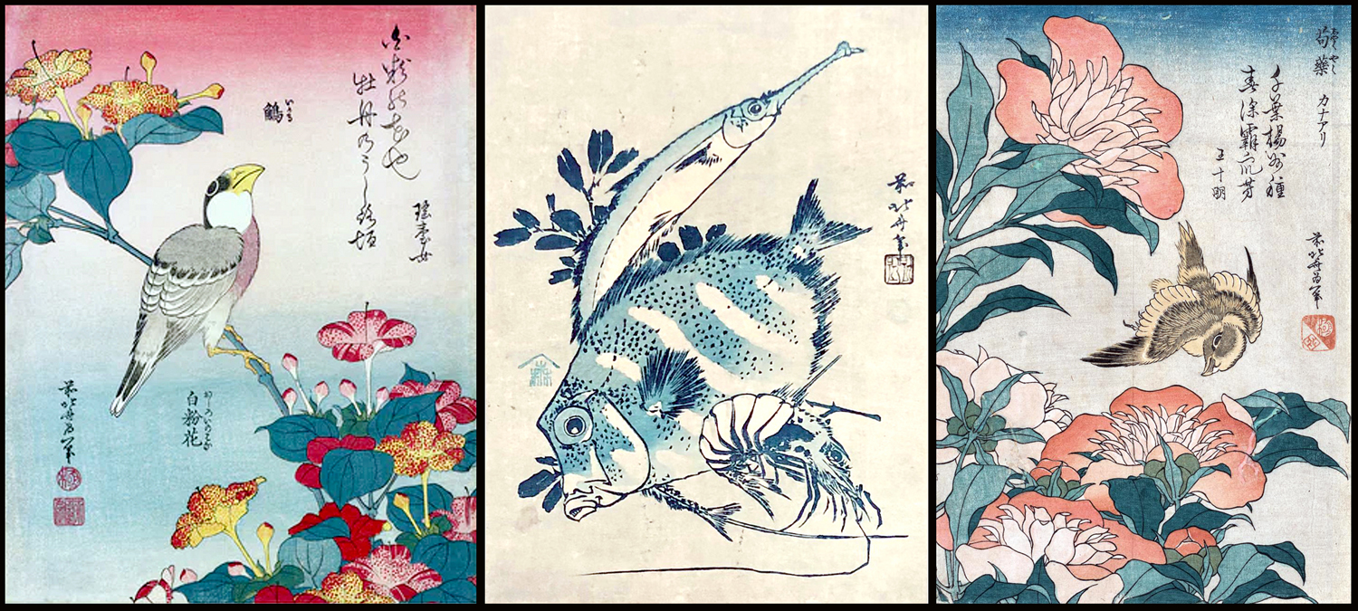
There is a proverbial saying in Japan: “Hokusai is the greater artist, but I love Hiroshige more.” It is hard not to be entranced by the atmospheric and almost Impressionistic work of Utagawa Hiroshige (1797-1858). Known for his landscape images, he also made a pile of bird-and-flower prints. Most often in the elongated vertical format known as hosoban

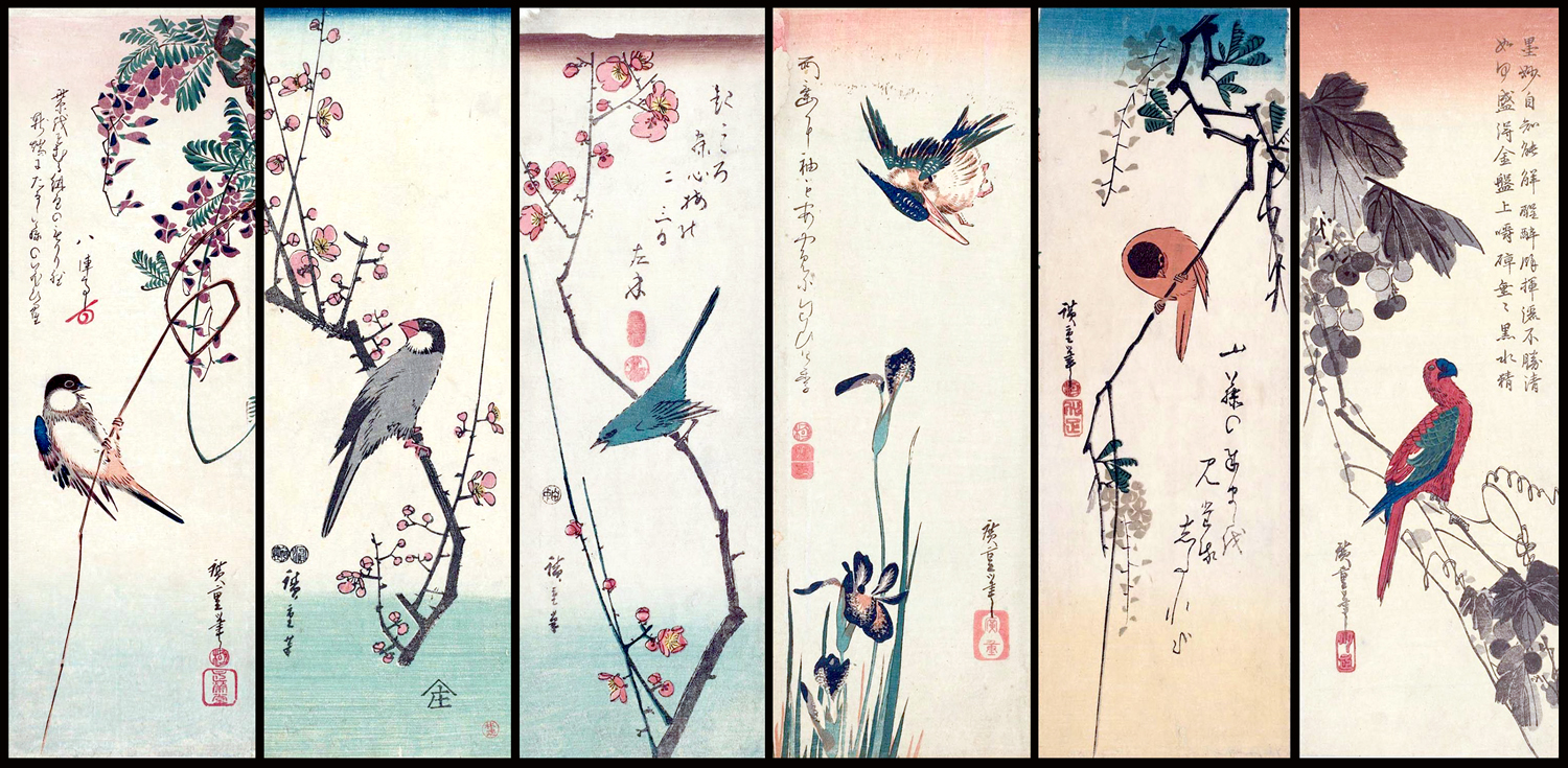
There are so many of them, it is hard to choose just a few examples. 

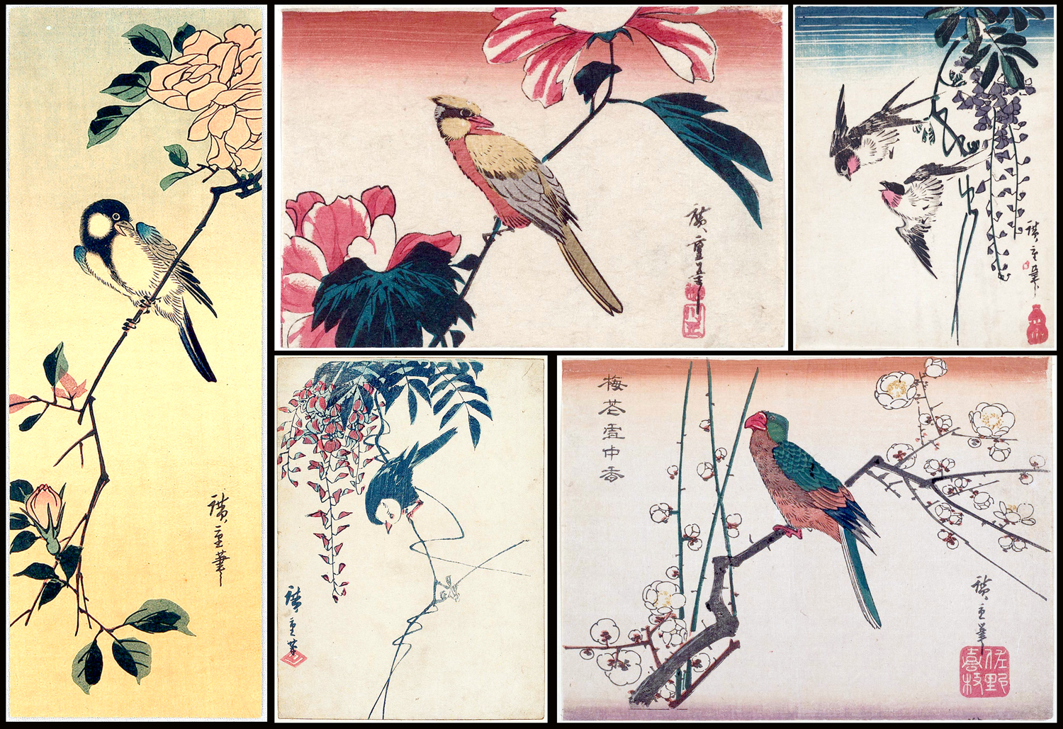
But he also published several books of fish and sea creatures, a “small” book of fish and a “large” book, each titled as such. I cannot help but post as many of Hiroshige’s images as I can. They are so seductive and beautiful.

It is usually said — by snooty connoisseurs — that ukiyo-e standards began to decline in the 19th century and the genre ended by the 20th. But instead, I believe it simply changed with the exposure of Japanese artists to the rest of the world with the Meiji Restoration (1868). Where once Japan’s culture was insulated from the outside, it now opened its arms to new influences. 

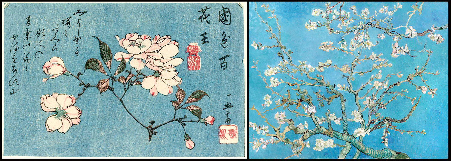
Hiroshige and Van Gogh

(The artistic fertilization went in both directions, as ukiyo-e art began arriving in Europe and artists such as Van Gogh were blown away by the freshness and style of the Japanese prints.) 

And kachō-e changed from a popular and demotic art form to one created by new designers who saw themselves less as craftsmen and more as western-style “artists.” The esthetic, called shinsaku-hanga,  became more refined, if less adventurous. It was a retrospective art, honoring the masters and styles of the past. 

Birds by Kono Bairei

And artists such as Kono Bairei (1844-1895) continued the birds-and-flowers tradition, but with a turn to more naturalistic drawing, albeit in a stylized setting.

Bairei fish

He also took on fish. 

The work of Imao Kainen (1845-1924) maintains that almost-western realism in highly decorative compositions.

By Imao Kainen

The most famous of the shinsaku-hanga artists was probably Ohara Koson (1877-1945). He was a teacher at the Tokyo School of Fine Arts, and met American scholar Ernest Fenollosa, who encouraged him to export his bird prints to America. His work now sits in most American art museum collections. 

By Ohara Koson

It wasn’t only Van Gogh who responded to the Japanese style. One of my favorite and largely unknown illustrators of natural history was Charles Philip Hexom (1884-1959). He was a teacher at Luther College in Dacorah, Iowa, and made many cover illustrations for Nature Magazine from the 1920s into the early ’50s. 

The use of flat outlining and spot-color were common to both ukiyo-e and Hexom’s covers. 

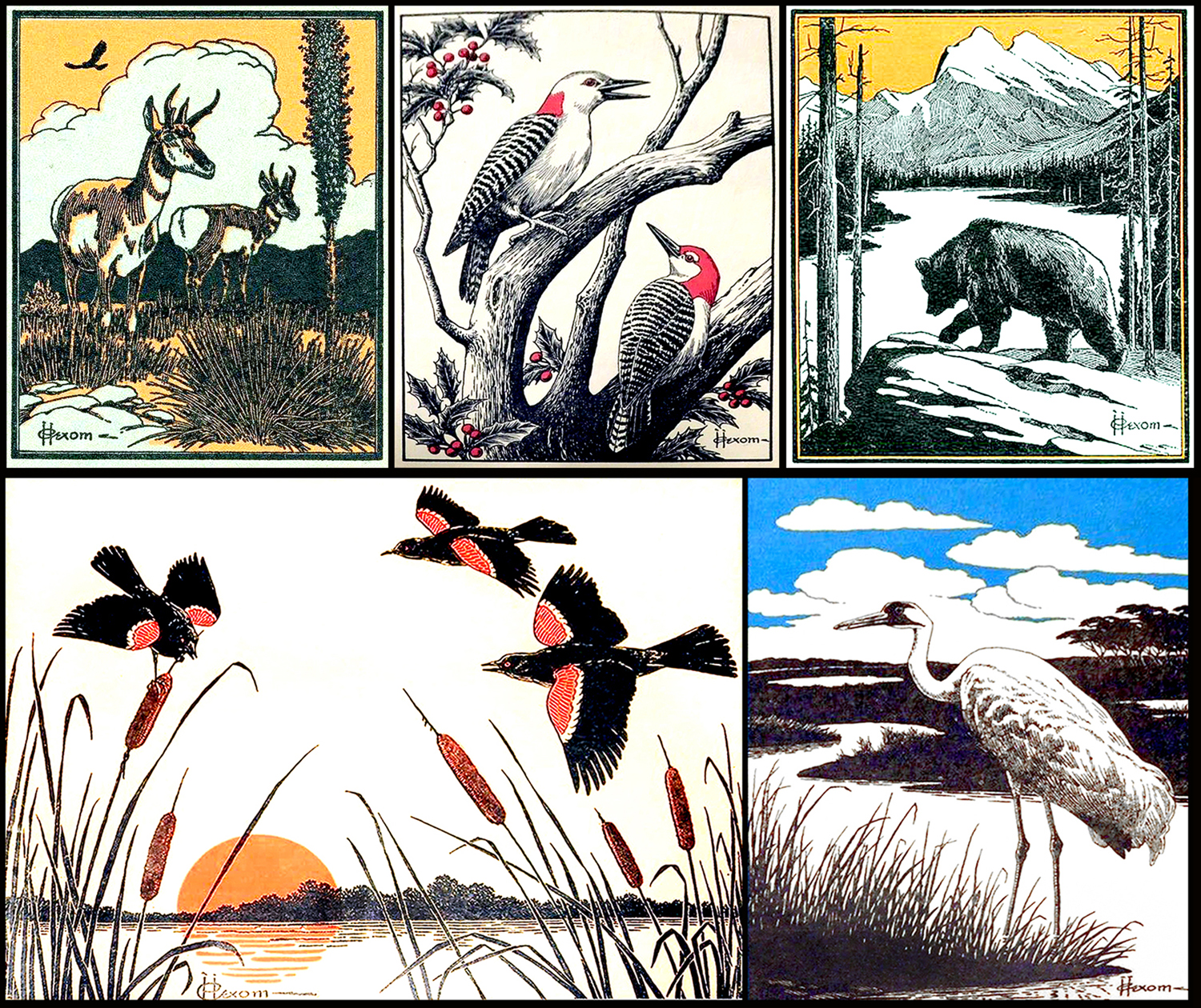
I don’t know why the work of Charles Hexom hasn’t been collected and published in a book. He seems to have been forgotten. He deserves to be remembered.

Beatrix Potter watercolors

Nature art may be a sub-genre in the world of fine art, but it is a fertile one. One finds captivating and beautiful illustration everywhere. Beatrix Potter (1866-1943) before she became a children’s author, used her drawing talent to study nature. She became an expert on mushrooms and fungi. One of her admirers was the Pre-Raphaelite artist Sir John Everett Millais, who told her: “Plenty of people can draw, but you have observation.”

Again, I have left out so much. So, just as a little P.S. to this tiny essay, I want to mention the early paintings of my brother-in-law Mel Steele, who could paint rings around anyone even as a boy and moved on to bigger things and a long career.

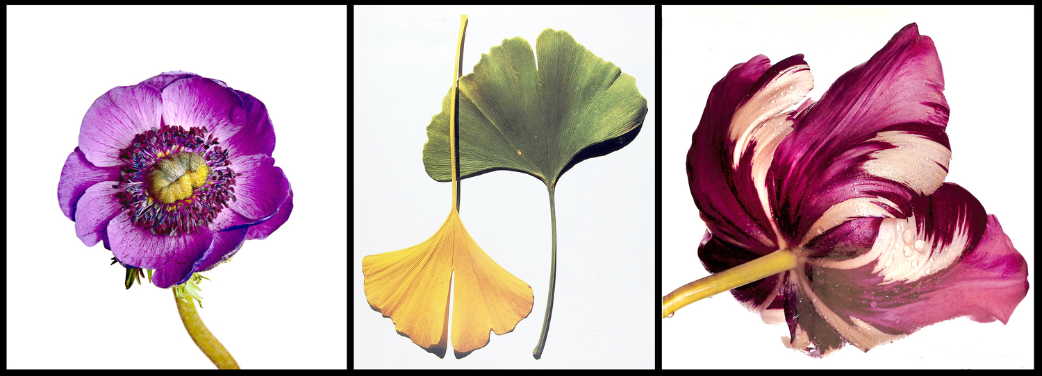
And my own minor essay into the field as a photographer. I found that I could put live flowers on my flatbed scanner and get beautiful prints that could be reproduced in fine detail at almost any size. 

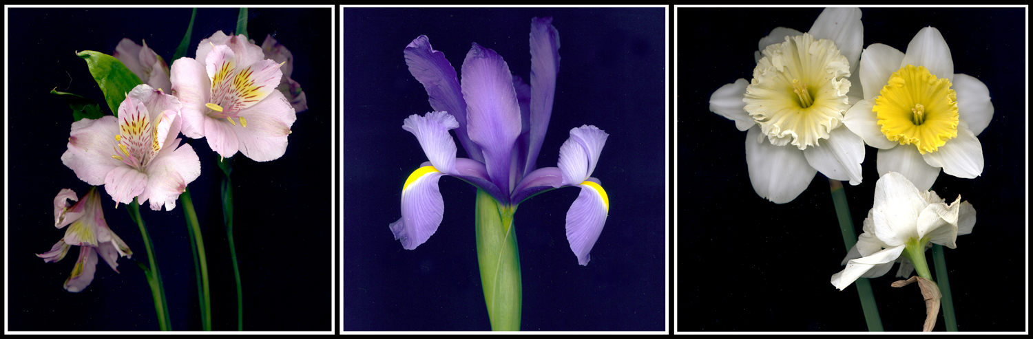
Friesia, iris and daffodils 

I have made many photographs of flowers, birds and insects, not so much to create art as to focus my attention on the world around me. Paying attention is, I believe, the prime directive for life.

Click on any image to enlarge

Nature is messy. I mean that in a good way. But it is all over the place, hugger-mugger, one thing on top of another and with the edges of one thing blending into that of the next. 

And humans have tried their best to regularize and organize all that mess since the beginning of time, naming plants and animals, setting up categories, deciding which bits might be edible, which poisonous, which to take when you have aches or fevers. 

One of the primary means of accomplishing this is visual. Certainly the main method is verbal: the naming and sorting. But a mere word description of a plant can be so convoluted as to be confusing on its own. Take this description of the black oak, from E. Lawrence Palmer’s Fieldbook of Natural History:

Quercus velutina: Tree to height of 125 ft; trunk diameter, 4.5 feet. Upper branches ascending, lower, horizontal. Bark dark, deep-fissured between thick ridges that are cross-fissured. Inner bark yellow, bitter. Twigs stout, angular with sharp-tipped angled buds with dirty-white to yellow fuzz. Leaves to 6 in. long and 4 in. wide, highly variable, thick.  Flowers staminate, in hairy catkins, to 6 in. long. Pistillate, on short, hairy stalks. Fruit and acorn maturing in second season.” Etc. And even that is written in simplified language for the lay person. The scientific literature is close to unreadable. And would this help you find a black oak in the woods? 

Wouldn’t it be easier, quicker, better, just to have a picture? Roger Tory Peterson thought so when he came up with the idea for his now-ubiquitous field guides. “There are at least 60 ways to say that a plant is not smooth, that it has fuzz, hair, prickles or roughness of some sorts,” he wrote in the introduction to his Field Guide to Wildflowers. And he lists them, including such arcane words as bullate, canescent, coriacious, echinate, flocculent, glanduliferous, hispidulous, lepidote, verrucose, and villosulous. It takes a lexicographer rather than a botanist to navigate such things. 

“That is why the best of keys often fail. … But, I am afraid, most of us belong to the picture-matching school.” Peterson began in 1934 with his A Field Guide to the Birds of Eastern and Central North America, which he updated with new editions — and new illustrations — until his death in 1996. The book has been immensely popular and remains so. Peterson branched out with a series of such field guides, covering wildflowers, trees, seashells, insects, fish, mammals — now more than 50 such guides, most written by specialists, while Peterson remained general editor until his death in 1996. 

Each book relies on drawings of the animals or plants in question. 

Of course, humans have been making pictures of the natural world since the beginning. The animals drawn the the caves of Lascaux date back something like 30,000 years. Egyptians painted notably realistic animals, such as the famous geese from the Chapel of Itet at Meidum from about 2590 B.C. Romans were fond of animal mosaic floors in the villas, and some are so accurate you can identify species. 

But the use of drawings for identifying plants or animals reached a new level of importance in the Middle Ages, when plants were used medicinally and books of drawings helped physicians identify the proper plant for the proper malady. 

Originally, these were manuscript books. But after Gutenberg, many were printed in quantity, offering advice on the best plants for the worst illnesses.  

Often these herbals or “medicinals” were at best diagrammatic. There purpose was simply to sort out which plants would be useful. But as the Renaissance flowered, and a more realistic style of image-making took over, many artists were attracted to the natural world, looking with ever sharper detail at the plants and animals around them. There are drawings and paintings by Leonardo, Raphael and others. But it would be hard to best the small naturalistic pictures by German artist Albrecht Dürer. 

But Dürer’s paintings are one-offs. As the 17th century progressed, a more systematic approach took hold, wherein artists as botanists attempted to catalog the plant life around them. 

One of the first such attempts was the Hortus Eystettensis, edited by Basilius Besler (1561-1629) beginning in 1613 and spread over several years. It was a collection of copper-plate engravings of the plants collected by the prince-bishop of Eichstätt in Bavaria for his palace garden, which contained examples of all the shrubs and flowering plants known at the time, from around the world. 

The book contained images of 1,084 species, divided into 357 plates. A cheaper black and white version was supplemented by a luxury edition in which the images where hand-colored. The book changed botanical illustration overnight. What had been crude and diagrammatic became works of art. 

Soon in its heals came Hortus Floridus, a collection of 160 engravings of flowering plants published in 1616, which became so popular its Latin text was soon translated into Dutch, French, and English editions. The book, in modern editions is still available today. It was created by Dutch engraver Crispijn van de Passe the Younger (1595-1670), a popular and prolific engraver of the Dutch Golden Age. 

Such books of engravings, colored or not, appeared throughout the century, with Louis XIV’s official painter, Nicolas Robert (1614-1685), producing illustrations in 1640, 1660, and entries in the giant compendium  Recueil des Plantes published in 1676. 

His drawings and paintings, as well as the engravings made, were of a new freshness and delicacy and presaged a surge in flower pictures made not simply for identification purposes, but as esthetic objects — as art. 

As the 18th century began, these two strains of botanical illustration developed. On one hand, there was a rise in scientific exploration, with botanists traveling the world collecting new species of plant and animal previously unknown to European science. On the other, there was a growing market for books and images of pretty flowers. The two traditions flourished side by side, but also cross-pollenated. 

That market for flower pictures was given a jump start by the Dutch tulip craze of the 1630s, when speculation in the market for rare tulips created a financial bubble that burst in 1637. But the Dutch economy was expansive and a growing middle class had money to spend on luxury items such as art. The actual tulip mania was confined to a small but important few speculators, the public at large wanted their part and so prompted the production of pictures of the fanciest tulips. If you couldn’t afford a tulip bulb that cost as much as a house, you could afford a colored engraving of the same flower. And so, pictures of flowers became a thing.

There had always been still-life paintings: pictures of flowers in vases; even kitchen scenes with food on the table and game hanging above. But what I am interested in here are those images of singular plants, birds, or animals, usually devoid of background context, meant to show off the specimen to best advantage. Where still life is meant to elicit warm feelings of comfort and beauty, the botanical illustration is meant to focus attention on a particular item, to see it for itself alone. 

The 17th and 18th centuries were the great era of cataloguing the world, and it led to a plethora of illustration of new and exotic species as scientists accompanied military explorers around the globe, gathering natural history data and both collecting specimens and illustrating them, usually in books. 

Dutch-born Nikolaus Joseph von Jacquin (1727-1817), for instance, travelled to the West Indies, Central and South America, publishing prolifically throughout the 18th century. 

Sometimes, they went on their own, like the Polish Jacob Breyne (1637-1697), who travelled to South Africa and catalogued plants. 

Austrian Franz Bauer (1760-1826) went to Australia, collecting and painting what he found.

Englishman Mark Catesby (1683-1749) sailed to the New World, publishing his Natural History of Carolina, Florida and the Bahama Islands in volumes between 1729 and 1747.

Henri-Lois Duhamel de Monceau (1700-1782) was a French  Encyclopedist, writing on many subjects, but catalogued the flora of his native France over his long lifetime, including his 1768 Treatise on Trees and Shrubs

Likewise, Englishman Thomas Bewick (1753-1828) stayed at home and made wood engravings of his native animals and birds. 

Grub Street writer Oliver Goldsmith neither drew nor painted, but his enormously popular Natural History of the Earth and Animated Nature, first published in 8 volumes in 1774, went through many subsequent editions, each time copiously illustrated by an army of anonymous engravers. 

As the 18th crossed over into the 19th century, two men characterized the two thrusts of botanical illustration. 

William Bartram (1739-1823) traveled through the New World exploring for flora and fauna. His book, Travels through North and South Carolina, Georgia, East and West Florida, the Cherokee Country (1791), is still in print, usually known just as “Bartram’s Travels,” and covers his travels through Georgia, Florida and western North Carolina and is a readable a travel book as it is important as a naturalist survey. 

The other impulse for botanical illustration is the creation of art for the beauty of it. And no one did more for that than Pierre-Joseph Redouté, whose images of roses and lilies are still popular in framed prints to hang in tasteful middle class homes. As Wikipedia puts it: “Reproductions of his prints are available from virtually all print and poster shops.”

Redoute’s life was fascinating. He was official illustrator to Queen Marie Antoinette, and somehow survived with his head after the French Revolution and the Terror, despite his aristocratic credentials, and lived to become official artist for Empress Joséphine de Beauharnais and then survived her divorce from Napoleon Bonaparte, only later to be made Chevalier de Legion d’Honeur, France’s highest honor, and his work bought by Charles X. 

His early work was watercolor, but later in life, much of his art was engraved and hand-colored or turned into chromolithographs. And now, there are boatloads of books featuring Redouté’s art. 

Two developments affected the publication of prints of the natural world as the 19th century overtook the 18th. One was the mainstreaming of colonialism, and the number of biologists and artists who traveled to the new lands to catalog the flora and fauna. 

In the 18th century, much of the exploration was just to find out what was out there, to discover new Pacific islands or what was going on in the polar regions. But in the next century, the drive was to exploit what the colonies offered, and to do that meant to catalog all the new things these colonial toyboxes had to offer. 

And so, scientists such as Philipp Frans van Siebold (1796-1855) went to Japan; Nathaniel Wallich (1786-1854) went to India; Johann Joseph Peyritsch (1835-1889) went to Sudan. They collected specimens and wrote books illustrated by a host of artists who made illustrations from the specimens they brought back. 

One of the artists employed by the botanists was Walter Hood Fitch (1813-1892). Fitch supplied many of the illustrations for John Dalton Hooker’s 1855 Flora Indica, a survey of plants of India and the Himalaya mountains. 

While botanical illustration comprised maybe 80 percent of all natural history artwork, much was done with animals, too, and even such things as seashells, rock types, and landforms. 

Colonialism brought in an infection called “scientific racism,” and natural history illustration looked not only at flora and fauna, but at human beings, typing them just as they did genus and species of orchid. 

There was almost a mania to classify and name everything. 

The second development was the invention of lithography, in 1796, which gave both scientists and artists a better means of mass producing images. 

The first botanical illustrations were either drawings or paintings, and the first reproductions were by woodcut. But copper-plate engraving supplanted the coarse woodcut and those engravings were often hand-colored, an expensive and time-consuming process for publication. 

For instance, when John James Audubon (1785-1851) published his original edition of Birds of America in England, in sets from 1827 to 1838, at least 50 colorists were employed and no more than about 200 full sets were printed. 

But lithography, and later chromolithography, allowed much larger editions of prints and mass production of images. The later work of Redouté was made with the new process. And when Audubon came to work on his later Viviparous Quadrupeds of North America (published in 1851, after his death) the images were lithographs. 

Of course, the most famous natural history art has to be Audubon’s Birds of America. He initially produced 435 large-scale plates, each with life-size images of the birds he drew and painted in his travels through America. The plates were engraved and etched and hand colored. The pages were called “double elephant” size — roughly 28 inches by 40 inches — and you can see he had to contort some of the larger birds, such as the flamingo, to fit those pages and still have them life size. 

Later editions came in smaller pages. 

The market for natural history imagery was immense during Victorian times and the number of artists working in the field from the late 18th- through the 19th-century was to great for me to cover them all. But I wanted to show off a few of them. 

Such as Matthias Schmutzer (1752-1824), who produced 1433 plates for Das Florilegium Kaiser Franz I, a compendium of plants from the garden of Emperor Francis I, the final emperor of the Holy Roman Empire and first of the Austrian Empire.

And I should mention the father-son pair of William Jackson Hooker (1785-1865), a botanist and illustrator and first director of Kew Garden in London. Hooker published more than 20 major botanical works over a period of 50 years. 

His son, Joseph Dalton Hooker (1817-1911), who succeeded his father as director of Kew, and was Charles Darwin’s friend. He joined expeditions to the Antarctic, Palestine, Morocco, the Himalayas, and the western United States, collecting specimens along the way, and publishing books on what he found, illustrated by many familiar botanical illustrators of the time, including Fitch. 

By the late 19th century, photography began to take over. The earliest I can find is an 1879 set of botanical photographs by Pietro Guidi. The black and white images still had to be hand-colored, just as the old engravings had to be. 

And by the fin-de-siecle, as art nouveau gathered steam, the link between nature and art became important. Nature motifs played out in furniture, architecture, book design and painting. Several artists and scientists became immersed in the subject.

Ernst Haeckel (1834-1919) was a biologist obsessed with Darwin and symmetry. His Kunstformen der Natur (“Art Forms in Nature”), published in 1904. It consists of 100 prints of various organisms, many of which were first described by Haeckel himself. Haeckel’s intricate drawings were transferred to print by lithographer Adolf Giltsch. 

In 1929, professor Karl Blossfeldt (1865-1932) used photography to express the relationship between nature and modern art in his Urformen der Kunst (“Original forms in Art” or “Art Forms in Nature”). His purpose was pedagogical, teaching his art students to seek for inspiration in natural forms.

This cataloguing and regularizing tendency in German art extended beyond botany and zoology. In the 1920s and ’30s, photographer August Sander attempted to photograph all the jobs and professions in Weimar Germany, and later, Bernd and Hilla Becher made multiple images of German water towers, mining tipples, cooling towers, grain elevators, coke ovens, and blast furnaces, among other things. Those images, made mostly from the 1960s through the 1990s were part of a movement dubbed the “New Objectivity.” 

But back to nature: It is hard to overemphasize the attractiveness and popularity of natural images, especially birds and flowers. 

Charles Philip Hexom (1884-1959) executed a series of covers for Nature Magazine in the 1930s and ’40s. I have collected several of these. They are simple but elegant. 

Irving Penn (1917-2009) published Flowers in 1980 and the perfection and simplicity of the photographs remind one of Redouté.

And finally, for our purposes, Robert Mapplethorpe photographed flowers over his whole career, with his book, Flowers, coming out posthumously in 1990. 

This has been a short, embarrassingly incomplete survey of botanical and natural history illustrations from the late Roman Empire until the Post-Modern age. Whole books have been written on the subject and more will likely be published in the future. 

I consulted about 20 books for this essay, among them are: The Art of Natural History by S. Peter Dance; The Painter as Naturalist: from Dürer to Redouté, by Madeleine Pinault; Un Jardin d’Eden by H. Walter Lack; and Flora: An Illustrated History of the Garden Flower, by Brent Elliott. 

Click on any image to enlarge

The most distinctive feature of Shamrock, Texas, in 1980 was the old Conoco gas station downtown. I don’t know if it is still there. But that is not what I remember best about the tiny town in the Texas Panhandle. 

My wife and I were driving across country for the first time. Neither of us had ever been west of the Appalachian Mountains and we had romantic ideas about the West. We dreamed of mesas and buttes, of cactus and coyotes, Navajos and the Pacific Ocean. And so we had set off in our old Chevy Citation during Carole’s summer school vacation planning to make the grand circuit. We were camping most of the way as our budget was economy size. 

It was perhaps the third night we were out, and we found a KOA campground in Shamrock. The sites each had a concrete picnic table under a tin awning. In the center of the camp was a low brick building with the office and camp store. 

As we were pitching our tent, a neighbor camper came over and told us that two days before a tornado had struck a few miles away. “No real damage,” he said. “There’s not much out there to hurt.” But he wanted to let us know, he said, because the weather forecast was iffy. 

We had driven that day through some rough weather already, with dark, louring clouds, a heavy rain — the kind the windshield wipers only made mad. At one point, we had to pull off the road and wait for the heavens to calm. 

But by the time we got to Shamrock, the skies were clear again. And we tucked in for the night in our sleeping bags, with the tent zipped tight and cozy. 

Then, about 1 a.m., we woke to find ourselves, tent and all, floating on several inches of water. It felt very like a waterbed, except that the rain made such a racket on the tent-sides. The wind luffed the fabric and lightning grew almost constant. We both began to worry. 

The only sane course of action was to leave the tent and head for the brick office. Carole went ahead of me, while I attempted to strike the tent against a howling wind. But the wind yanked it from my grip and I had to chase it until it caught on the picnic table. The tent had a tubular frame, which kept it in full shape. I grabbed the top crease and the wind took umbrage at my effrontery and tried to lift me airborne, with the tent as a kite and me as the kite tail. I fought it over my head, holding on for dear life. Finally the tent caught in the tin awning and held steady enough for me to de-tentpole the thing and collapse the kite into a smart bundle, soggy and dripping, which I put into the car before heading to the office and Carole. 

The office was not very big for the 30 or 40 people herded into it. There were crying babies, frightened grown-ups. One man explained that the weather service had confirmed a tornado in the vicinity. A husband and wife were yelling at each other, each blaming the storm on the other. The wind blew outside, hurling detritus past the door. It all finally calmed down after 20 minutes or so and the wind subsided and the rain gave up its anger and turned into a normal rainshower. 

But there was no way we could set the tent back up. Our campsite was a pond and the tent itself was a crumpled mess. We got into the car and thought perhaps we could make through the night sitting up.

I remembered, though, we had passed a motel in town. Maybe we should drive back into Shamrock and see if we could get a room. And so we did. 

When I entered the motel office — now it was well past 2 a.m. — the office was dark, but a woman came out and got us a room. 

I got back in the car and told Carole, “I’m not sure about this.” The office was choked with the aroma of curry — something I normally love, but this felt more like chemical warfare. We found our room at the back of the motel complex. It had that musty smell of old cigarettes, this time mixed with the vestige of curry. The window looked out into the tool shed.

But the prize was the carpet. It was a sickly blue-green shag rug and it ran up the walls like wainscotting, and around the bottom of the bed as a kind of dust ruffle. 

This would have been the worst motel experience we had, except that we had already spent a night in Forrest City, Ark., in a motel where we were bitten all night by fleas, and the toilet had a “sanitized for your protection paper band under which was a floating cigarette butt. 

Still, our Shamrock motel gave us a chance to sleep and calm our nerves from the storm. 

The next day, we set off west again, and finally reached Glen Rio, on the border between Texas and New Mexico, where the bottom dropped out of the flat Panhandle and we drove down into a new landscape filled with the mesas and buttes we had imagined. 

We had to laugh at ourselves years later, after living in Arizona for 25 years, at the naive glee we felt at seeing the tiny, unprepossessing hills we first passed in New Mexico, which would hardly merit the notice of anyone used to such things. But they were the first hintings of the sense that the American West was entirely alien to anything we had known in tidewater Virginia, where we were living back then. 

It was as if the Western movies I grew up with in New Jersey had come to life. We gawked at everything for the remainder of that first trip West, through Arizona, up California, through Oregon, Wyoming, Montana and all the states in between. We put 10,000 miles on the odometer that summer.