Archive

Tag Archives: art history

curtis and isabel
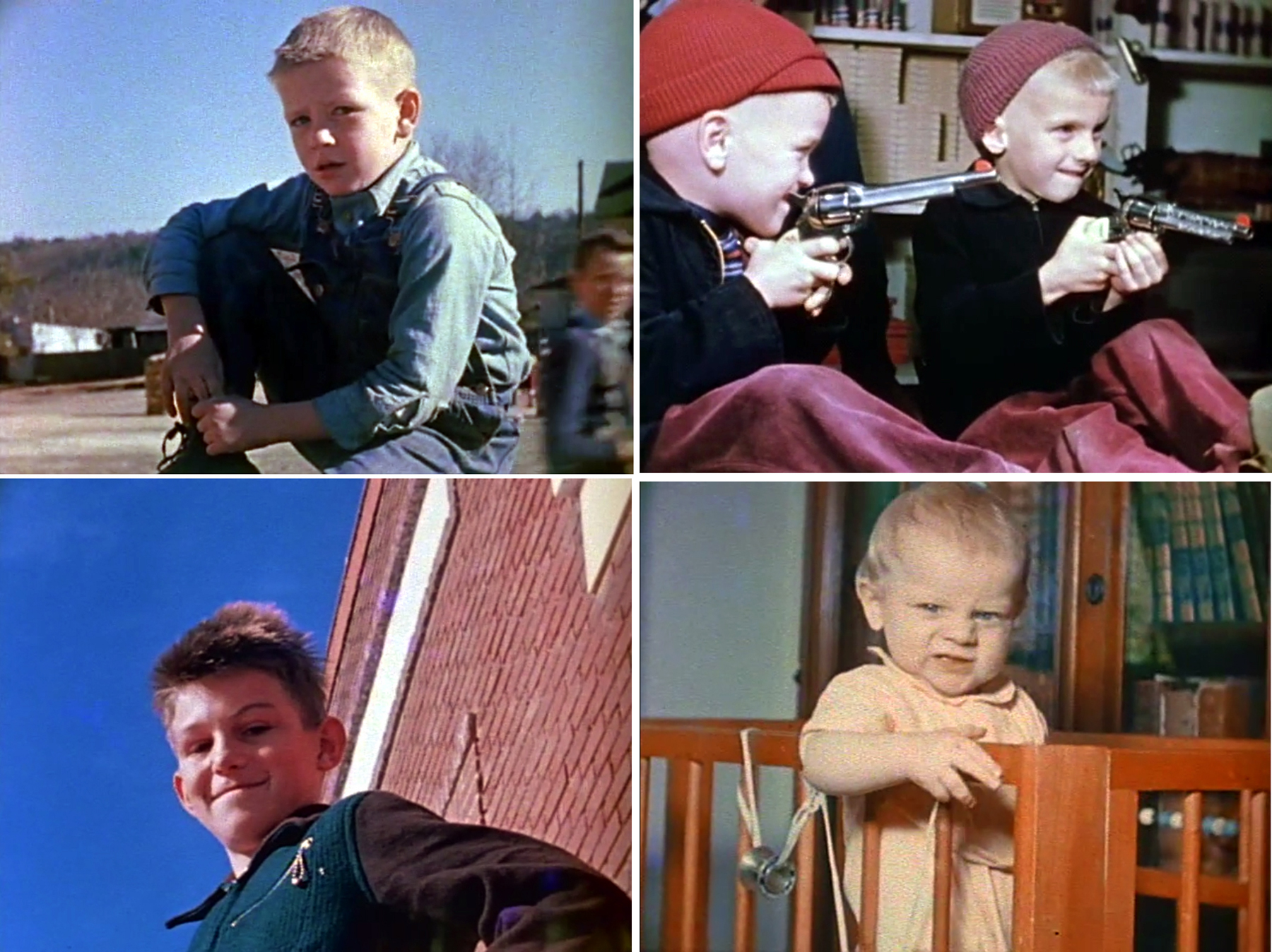
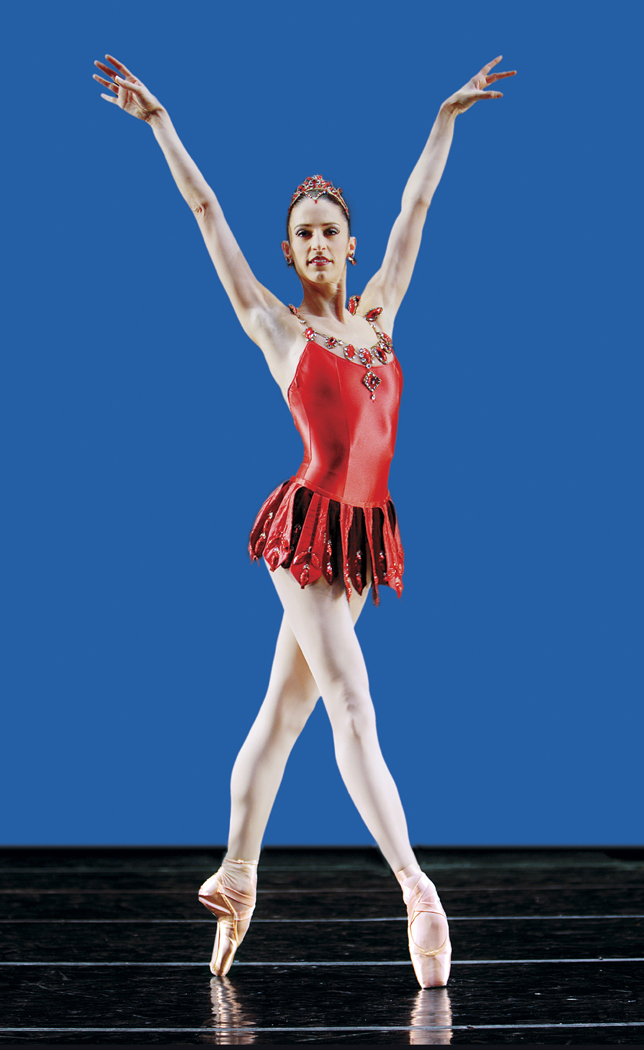
Portrait photographs come in basically two varieties: the formal and the candid. These days, with selfies monopolizing the social media, almost all portraits are informal. And when asked, most people say they prefer the candid picture, perhaps because the formal portrait has fossilized into the Olan Mills mall photo, in garish color against phony backgrounds. It would be hard to make an esthetic case for these assembly-line excrescences, with their banal smiles and enforced familial geniality.olan mills family

karsh sibelius
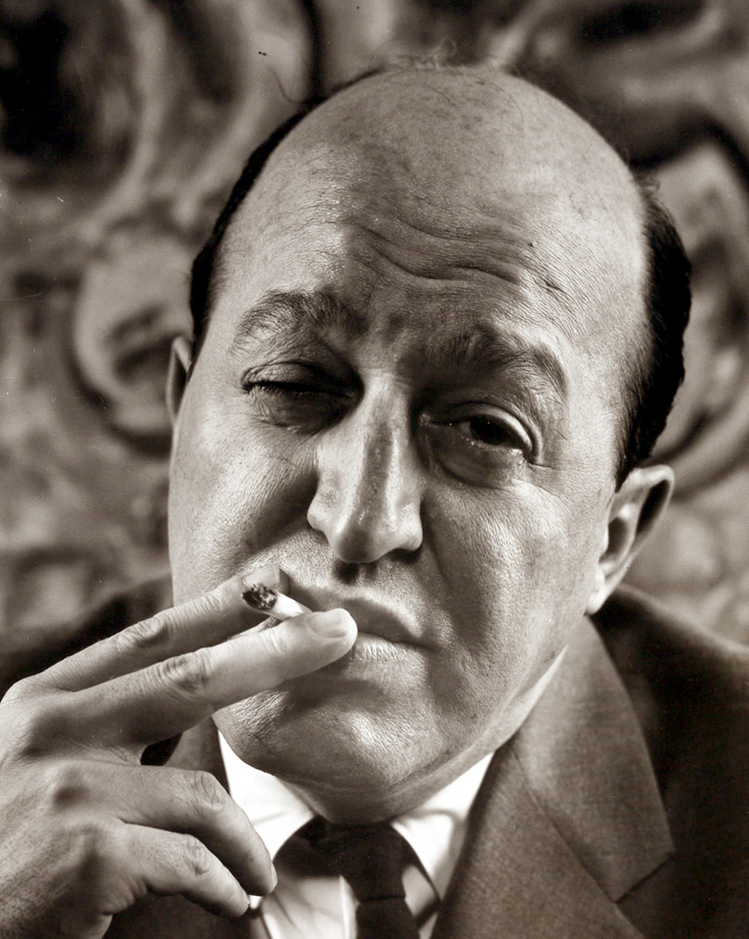
Then, there is a prejudice against artifice: Many people prefer the snapshots because they seem more natural, more spontaneous. If you look at one of those highly massaged portraits by Yousef Karsh, there would seem nothing less spontaneous. Every light, every specular reflection in an eye, seems calculated, even marmoreal, like his portrait of composer Jean Sibelius. If we’re a “rock and roll” nation, we are one that values the brash, the riff, the off-the-cuff: Indeed, we trust it to be more “truthful” than the rhetoric of the planned, controlled and considered. As Allen Ginsberg mendaciously preached: “First thought, best thought.” (Despite the fact that his best poems, such as Howl, were thoroughly revised and rewritten; we have the typescript for evidence, with all its emendations.)karsh churchill

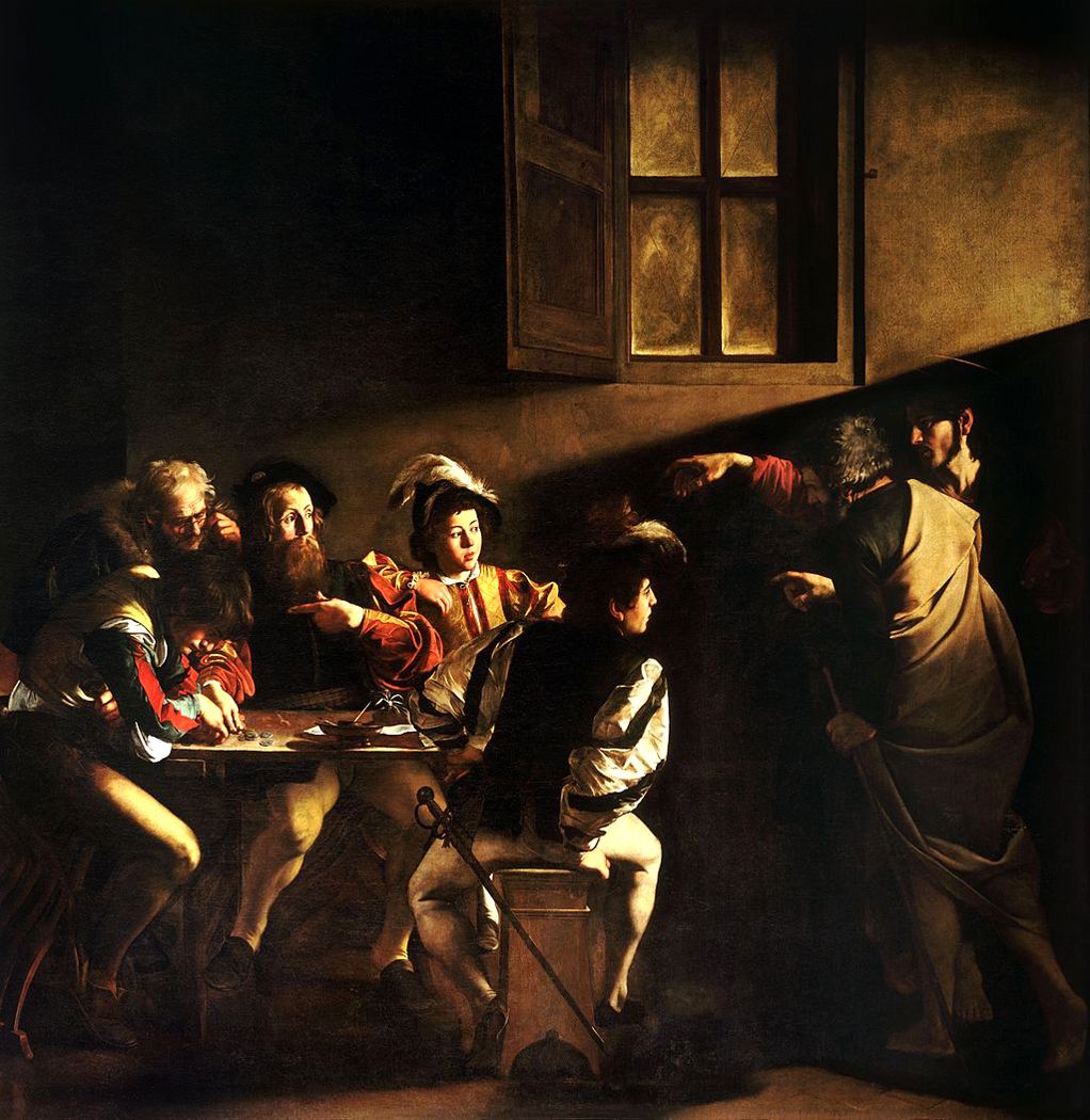
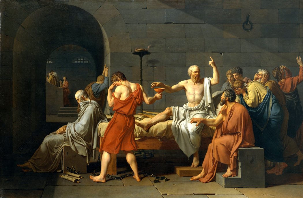
Yet, some of our most iconic images — the ones we remember, the ones that fix in our minds some large truth about their subjects, are exactly the careful, posed and arranged portraits, such as Karsh’s take on Winston Churchill — a photo that might have won the war all by itself.

The idea of the formal portrait survives, even in the gaudy, awful Olan Mills photos: The idea that the subject wants to be seen in his Sunday best, with his best teeth put forward for posterity: “This is how I want to be remembered.” Even though the actual life may be more squalid or confused, or complex– certainly infinitely richer. But “this version is the one with the barnacles scraped off.”

olan mills family portThe photographer Richard Avedon said, “What ends up in your scrapbook? The pictures where you look like a good guy and a good family man, and the children look adorable — and they’re screaming the next minute. I’ve never seen a family album of screaming people.”

But when done well, it isn’t the vanity of the subject that is portrayed, but the insight of the photographer. A good portrait should tell us something about the subject that the subject doesn’t want us to know, or is not aware of, or is somehow larger than the public face intended.

A photographic portrait also tells us something about the artist who makes it. This is something that Avedon always stressed.

“My portraits are always more about me than they are about the people I’ve photographed,” he said. You can spot an Avedon immediately: It’s style is uniquely his. The same can be said for Irving Penn, or for Arnold Newman, or Yousef Karsh — any of those who made a name as portraitists. An Avedon portrait — or a Penn — is a world view, consistent from image to image. avedon eisenhower

And it is in this sense that the portrait rises from vanity icon to art. The picture tells us not merely, what does this person look like, but rather the larger message: This is what being human is.

It is in the eyes, most often, that the humanity is tethered. You can see the light behind them. Nothing is worse than a picture of someone who is bored with the process of being photographed: The eyes turn into ball bearings, lifeless and extinct. A good portrait is a picture, instead, of being alive, of being in the moment, even if that moment is for posterity, or for eternity.

I bring all this up, because in the age before I became a writer, I thought I would be a photographer. It was in the days of chemicals and dim amber lights, and I became a proficient darkroom worker: My prints, I say with some pride, were as good as anyone’s. Crawford 1977 copy

And I took many portraits, working my way through the learning and development that any artist goes through: Imitation, innovation and finally, something personal that emerges.

Most of these portraits were friends or more. I went through cameras, always seeking the right one, never actually finding it: Nikons, Rolleis, Hasselblads. I went through lighting schemes, through backdrops.

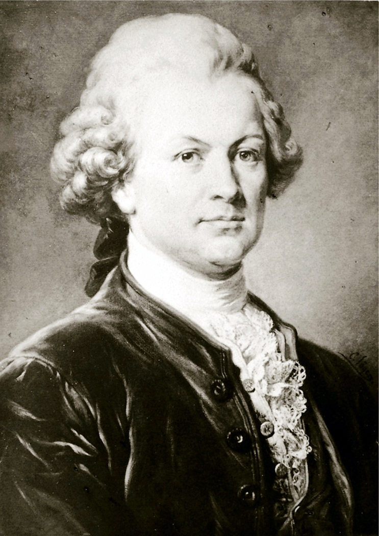
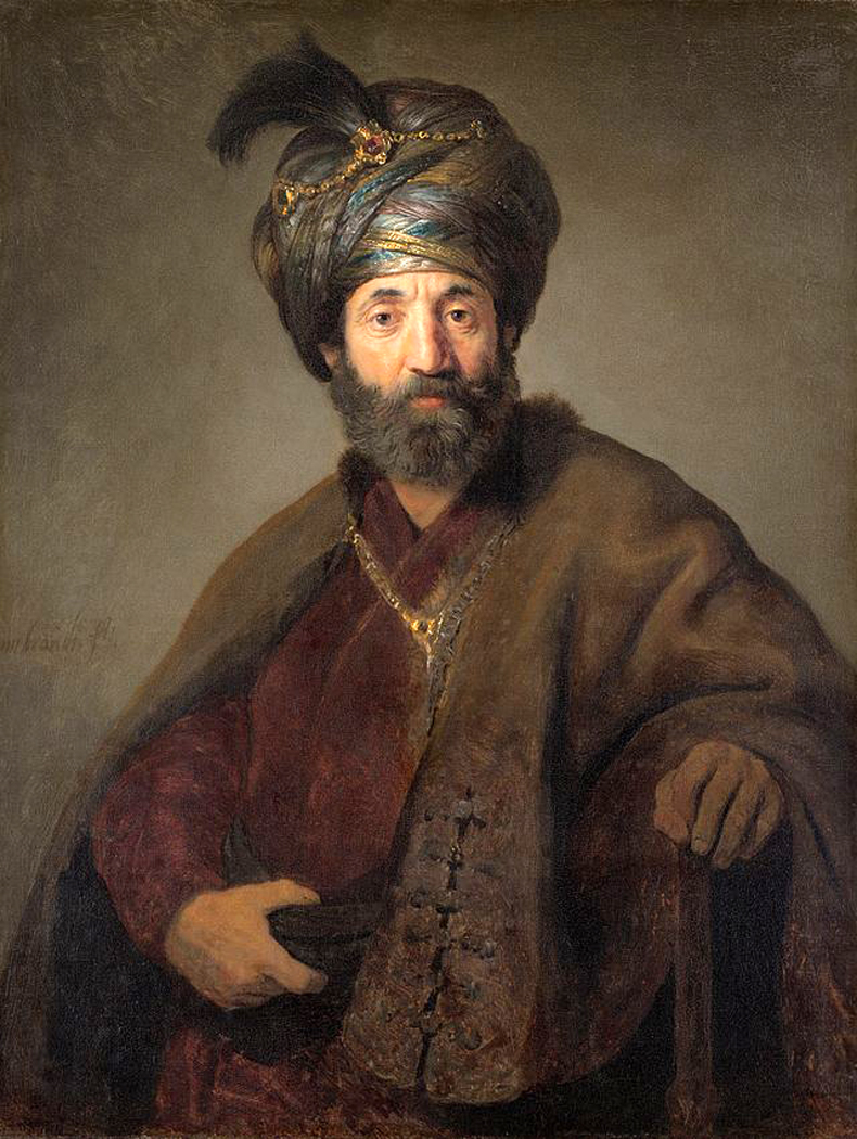
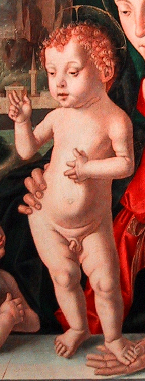
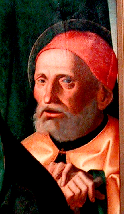
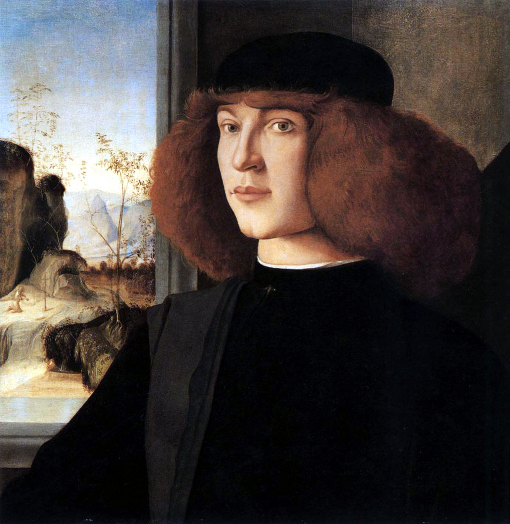
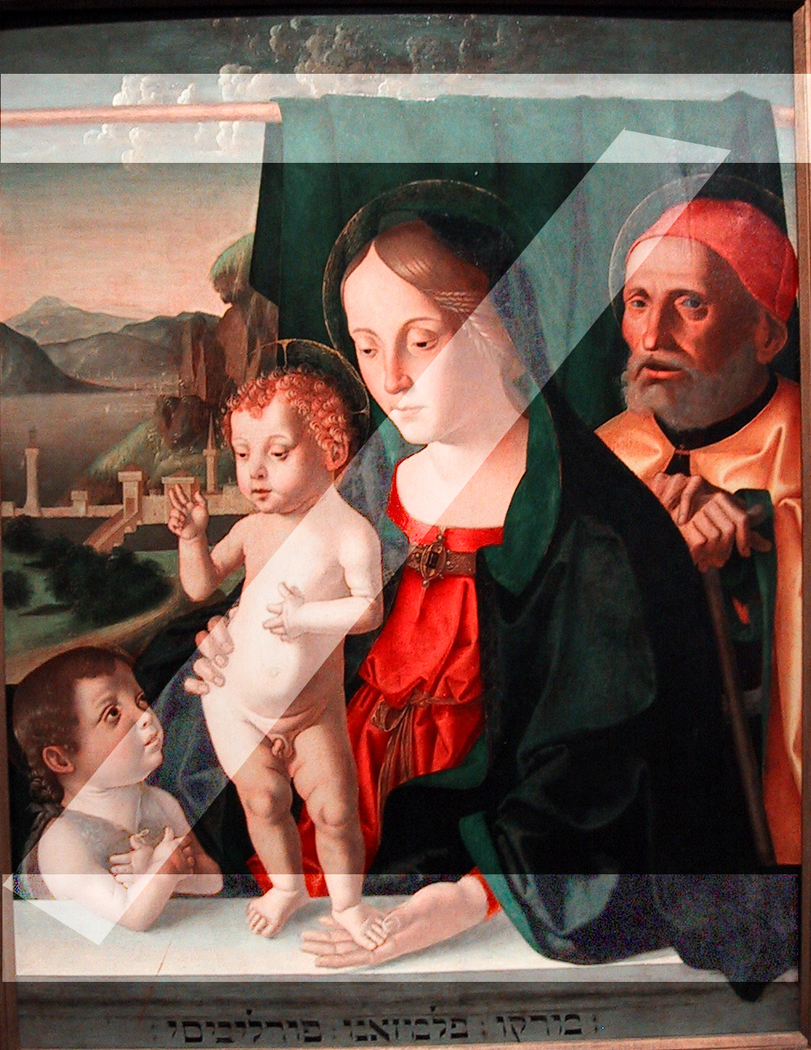
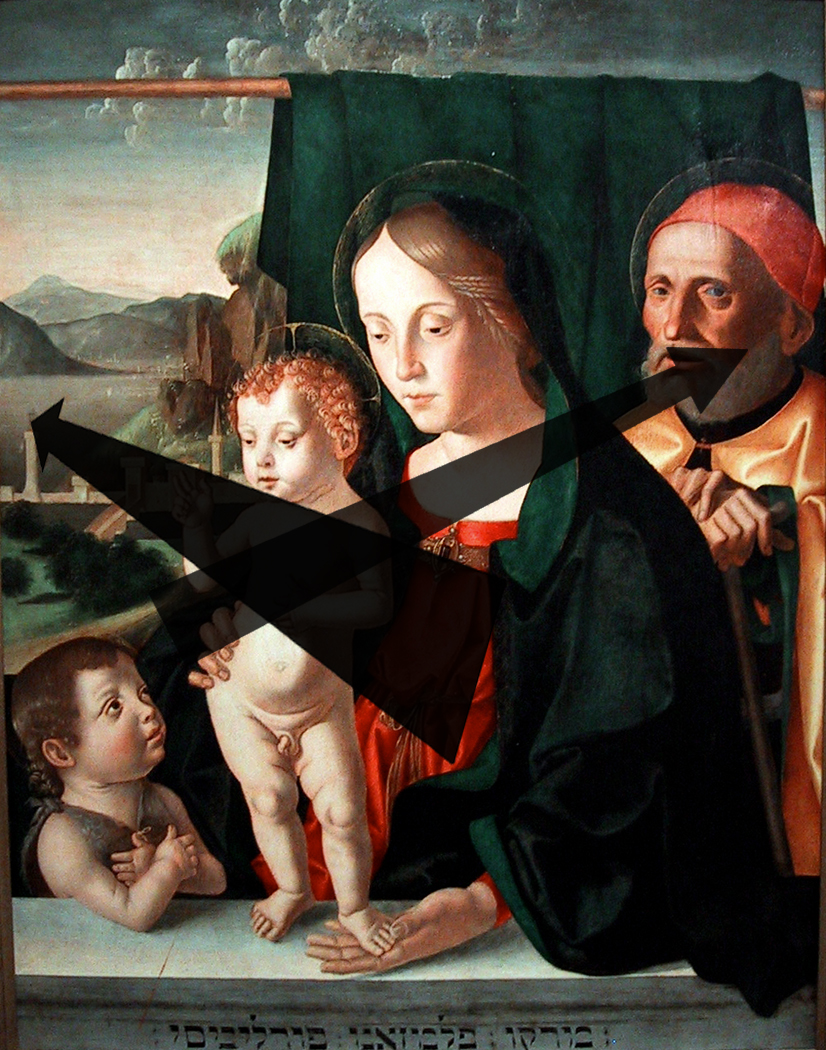
And I went through the history of portraiture, from Holbein to Raphael to Rembrandt to Gainsborough to Chuck Close. The model I felt closest to was the Renaissance portrait, such as Raphael’s portrait of Baldassare Castiglione. Here was a face to look at: Eyes that had seen a good deal of the best and worst of the world: It registers. raphael castiglione portThere is also a sense of moment; this is for posterity. The figure makes a pyramid in the frame, giving it foundation and security. The background is broken into interesting shapes — the so-called negative space, not ignored, but make essential to the impact of the image.

I saw something of the same in the photographs of Avedon: formality, interesting negative space, and the centrality of eyes.

There is one major difference between these great images and the Olan Mills smile-o-thons: So many of them have equivocal expressions on their faces. They aren’t genial and smiling; indeed, it’s hard to quite know what they are expressing. There is a neutrality to their faces; not slack, as if thoughtless, but rather as if thoughts were unresolved.Henry Parrish Lippincott Hackett

In other words, the faces were not billboards flashing their message, but rather something denser, meant to be read and fathomed. Not the momentary but the monumental.

This is a portrait of Henry Parrish Lippincott Hackett, I made it in about 1973. It is a model of what I was trying to get in those years.

Of course, they were also shapes in a frame, and the graphic quality of the images counted for a lot, such as the eye of Picasso in Penn’s version, or the indistinct edge of Eisenhower’s head in Avedon’s portrait.

I used the eye in a photo I made of Pam Henry, in the mid-1970s. double picasso pam

Other imitations, conscious or otherwise can be found in other portraits I made from 1970 to about 1986, when I gave up teaching photography and became a writer at The Arizona Republic.

 My Degas:double chrysanthemums

Not a conscious imitation, but clearly a resonance of Ingres in a portrait of artist Mel Steele.double ingres mel


This is Doug Nufer in 1978, when he was officially dubbed “The World’s Most Obscene Man,” against Avedon’s portrait of Willem de Kooning. Nufer has since gone on to become one of the avant-garde literary lights of Seattle. Made from work print, 9/25/06, 12:15 PM, 16C, 5364x6131 (1182+1975), 125%, Hennessey 0823,  1/15 s, R38.2, G21.9, B47.9

double MK Elks and VenusOr, Botticelli’s Venus in a picture of Kathy Elks.

But it wasn’t all imitation. It was an education, and a slow development of what I was trying to find in portraiture. I wanted it to be formal; I wanted it to be graphic; I wanted it to be more than a snapshot reminder of who my friends were. When I was teaching photography, I ran a course on portraiture and I was not so much concerned with the usual lighting schemes or lens choices, but with engaging with the sitter, finding something human there. And while book after book told us that we should use a long lens for more natural perspective, I found that a normal lens, or even a wide angle lens brought the photographer and the sitter closer together, making interaction unavoidable: The photographer could not be aloof from the sitter, as though the sitter were a mere object, and the sitter could not be indifferent to the photographer invading his private space. The interaction was forced. Always use a short lens, I taught. Get in their faces.

Here is artist and friend, Charles Williams, who returned the favor by making a drawing of my wife and me. Charles Williams

Second lesson: Always have the sitter look into the lens, so that in the photograph, he gazes out of the picture into the eyes of the person looking at the image. This makes the portrait not a neutral event, but it forces the viewer to have a relationship with the subject. In other words, the photographer confronts the sitter; the photograph confronts the viewer. This makes for a more active work of art.

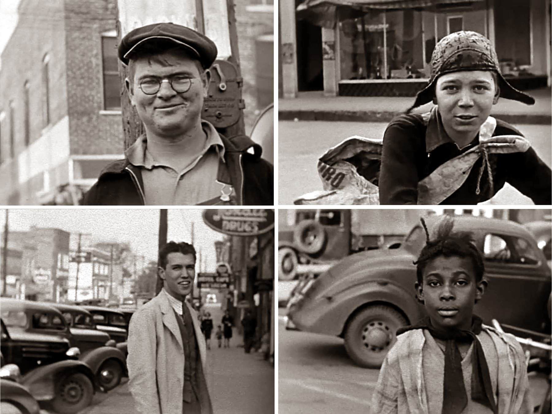
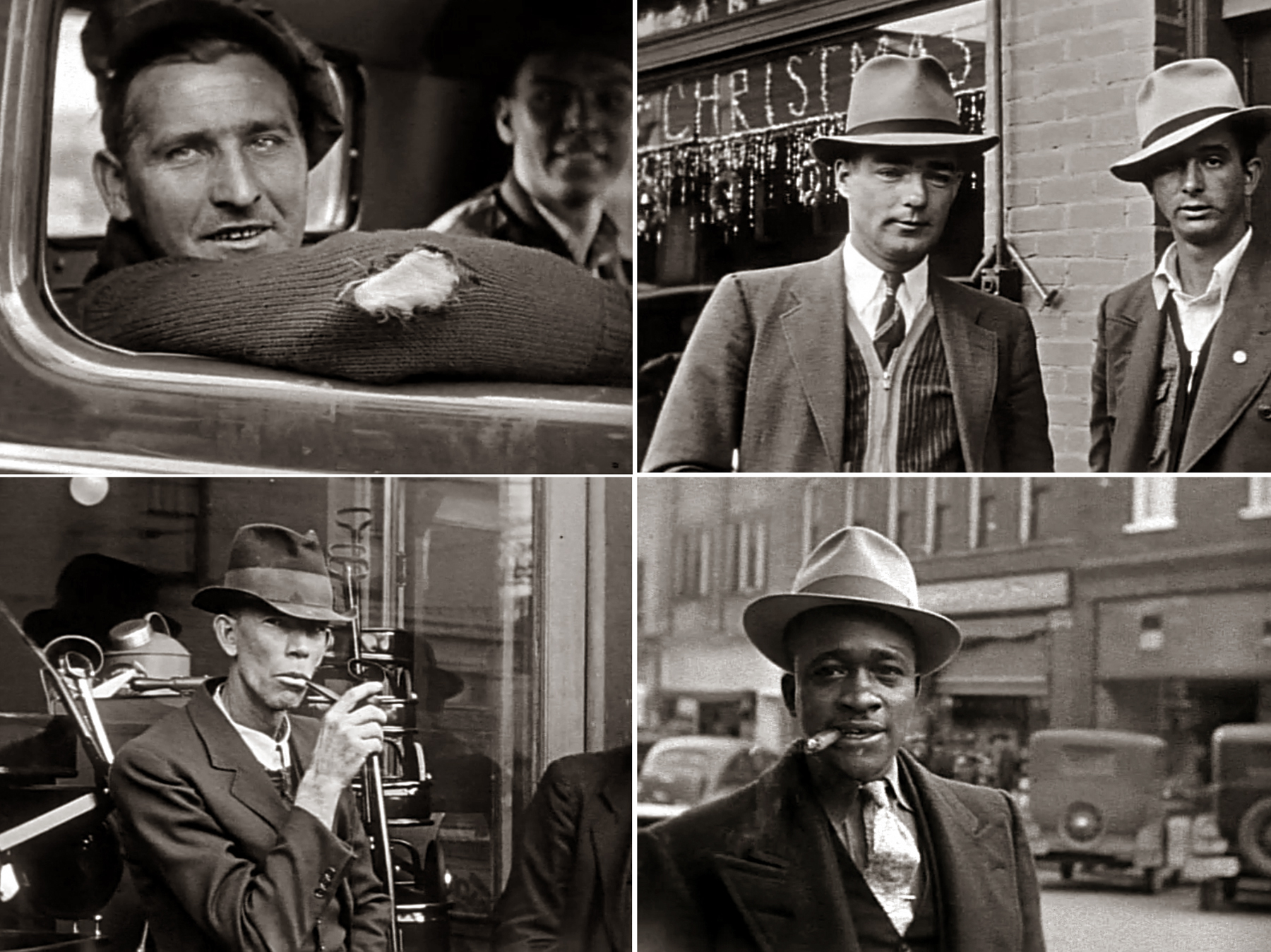
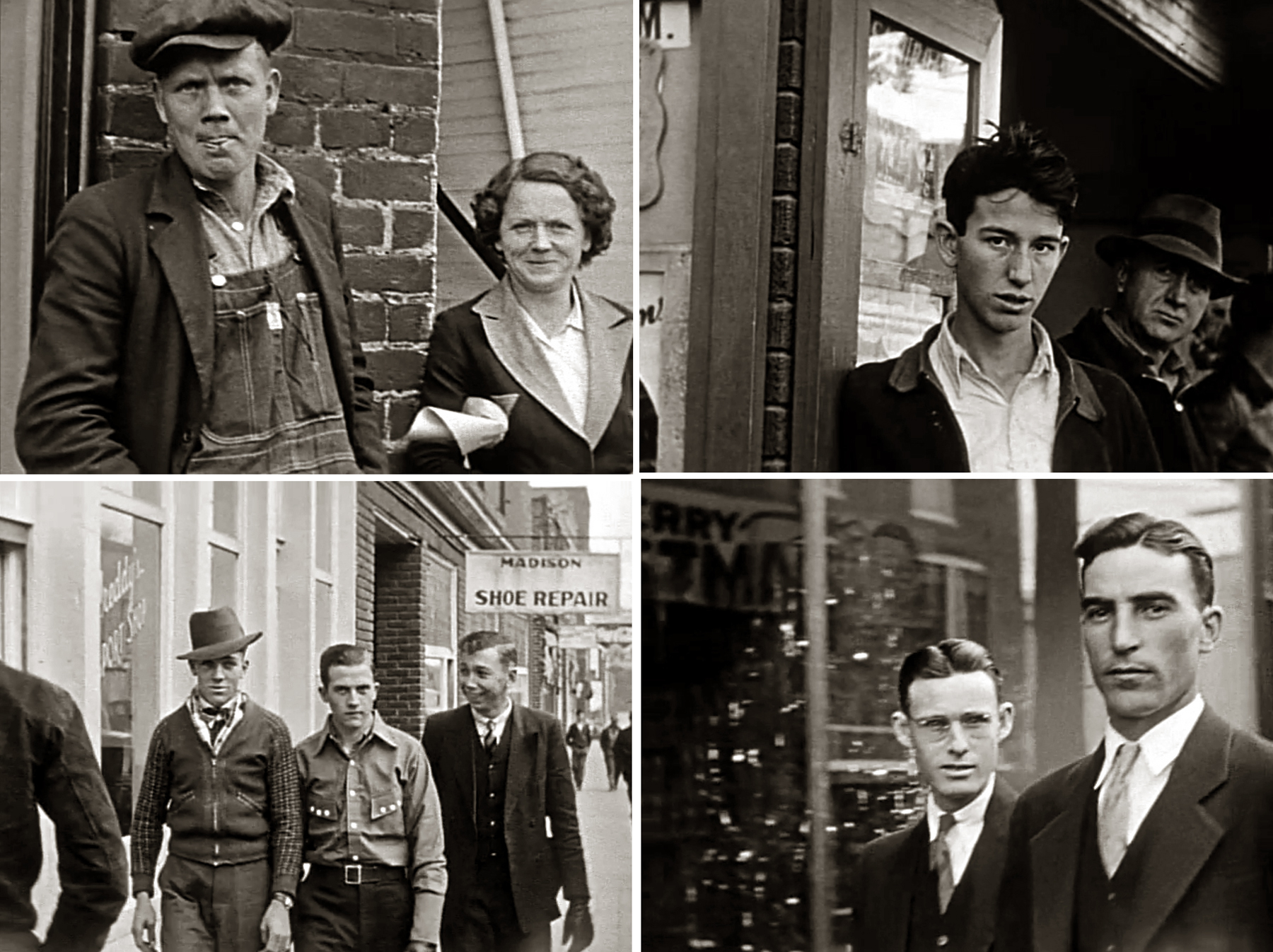
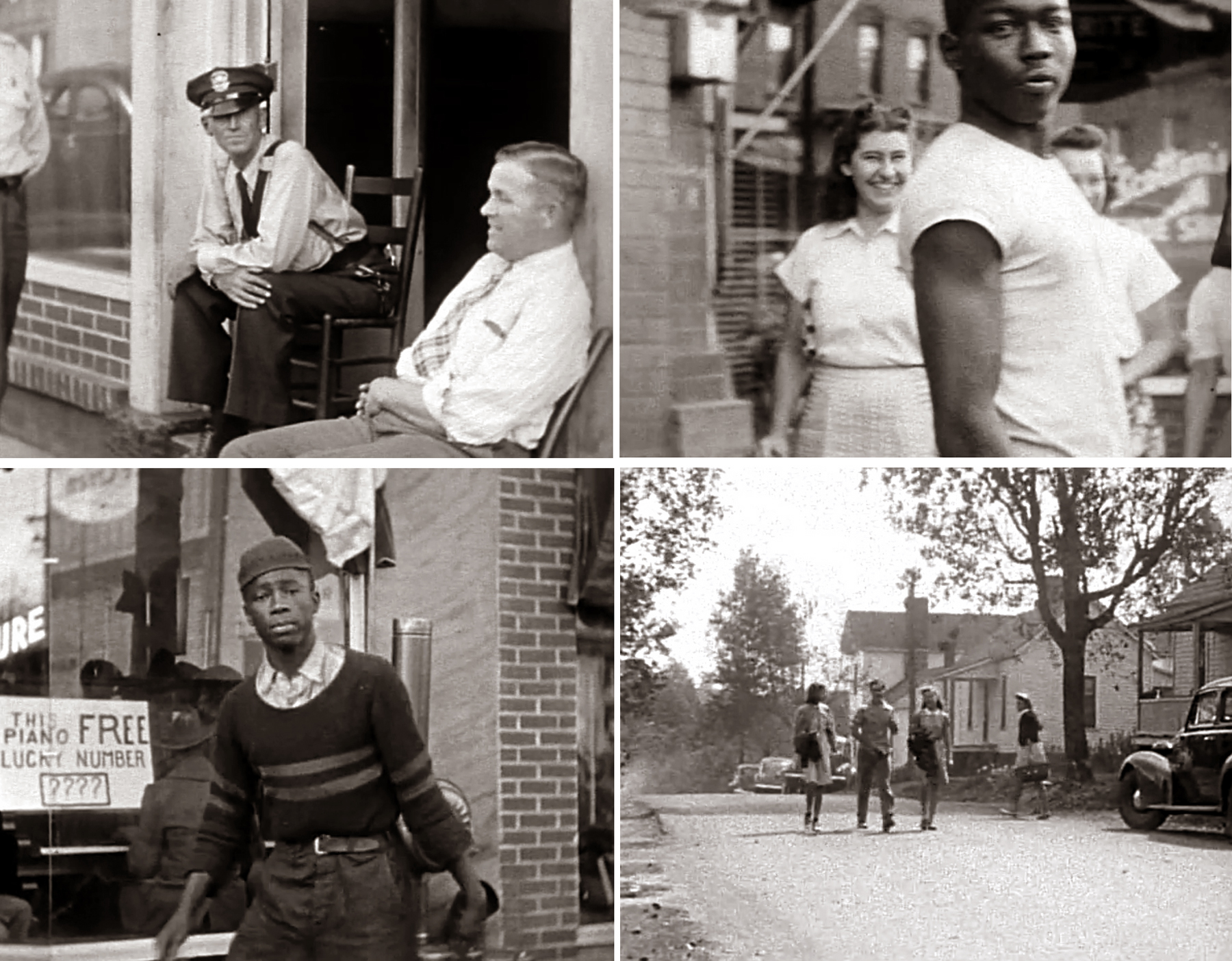
These are three photos I took for The Carolina Peacemaker, when I worked for that weekly black newspaper in Greensboro, N.C. I was looking for that directness, rather than the mere animation that most photo editors want.triple peacemaker ports

Third, no smiles. Unless they are genuine and are more than a tightened muscle at the mouth corner. There is a story about Greta Garbo, when an observer at a studio shoot said afterwards, “I couldn’t see her doing anything,” and the film director said, “But it will show up on film, just wait and see.” And of course, when the dailies were screened, every emotion ran riot across her face — primarily because she didn’t underline each one melodramatically. The film sees things you don’t. Let it do its job.double iott wolf

There were many other points in the course, but these three were most important, even if they ran counter to what is usually taught. After all, I told my students at the beginning of every class that I considered it my job as a teacher in the art department, not to train them for careers, but to make them unemployable. I wanted them to dig deeper than the stereotype. Many of them did. It was a great class.double robin reid linda olson

When I moved to Arizona and started work at the newspaper, I stopped taking as many photographs. I spent my time writing the two-and-a-half million words I pumped out in 25 years. There were photos meant to illustrate stories, but my emphasis had shifted.

Now, I still make the occasional photograph, and I still use the shorter lens, the in-your-face, and the attention to eyes.Mel BW

And I’ve gotten older, and so have my friends. You saw my Ingres-photo of brother-in-law Mel Steele. Here he is a couple of months ago, more informal — almost a snapshot, but with the lessons I learned from years of looking.


Rain_Steam_and_Speed_the_Great_Western_RailwayI grew up in an age when there was a distinct category called “Modern Art.” It was reviled by many and championed by the rest, and it was taken to be a complete break with the past — which is why it was both reviled and championed.

It may be hard to imagine now, but in the 1950s and ’60s, a large portion of the population actually believed “My kid could paint better than that.” In response, proselytizers mounted campaigns in support of Picasso and Kandinsky. When Life magazine ran a story on Jackson Pollock, it was an intentionally provocative act. “Is this the greatest living painter in the United States?” the story asked, daring its middle-class readers to argue back.pollock life magazine

Indeed, as late as the 1980s, a particularly condescending gallery owner in Scottsdale, Ariz., attempted to persuade me that abstract art was the wave of the future. He made the assumption that since I lived in Arizona, my tastes ran to cowboys. He wanted to “deprovincialize” me.

Modern Art was subsequently eclipsed by “Contemporary Art,” and after that the whole thing fell apart in a Postmodern disintegration. What we have now is “the trendy stuff at the gallery.”

But in my time, when I was a teenager whose personality was being forged, I had the immense privilege of living an easy trip to New York City and a subway ride away from the Museum of Modern Art, where my initial sense of taste was formed. I absorbed whole Picasso’s Guernica — which I always thought would be forever available to me — Jackson Pollock’s One: Number 31, and Van Gogh’s Starry Nightpollack 1

Turner catalogThe biggest single contribution to my growth, however, and the nudge that eased me into a life as an art critic, was the show in the spring of 1966 at MOMA of JMW Turner’s late paintings, called, “Turner: Imagination and Reality.” I was still a high school student and knew that there must certainly be a bigger, more impressive and powerful world out there than the one I knew in suburban New Jersey.

In that show, the English painter was dressed up as the precursor not only to Impressionism, but to such High Modernist painters as Mark Rothko. Turner’s watercolor washes were mere gestures with a loaded brush and implied an early morning sunrise barely seen through a frosty fog — hardly an edge or line in sight. turner rothko pair

Left: Turner “Pink Sky”               Right: Rothko detail

The show kicked off a resurgence in Turner’s reputation at the same time Vivaldi was getting a boost from the Baroque revival. It isn’t that either the Red Priest or the shaggy Brit were unknown or unappreciated, at least by those with their acquaintance, but that the wider world had largely — if not forgotten them, had relegated them to a “yes-them-too” sub-paragraph in the catalog. Turner emerged as not just a major artist, but a springboard for all the upcoming progress in art that resulted in — hooray — the glorious moment that is us.

That view seems quite laughable now, but we should instruct those X-ers and Millennials that came after us that the idea was that all of history was an inevitable march toward a single goal, and that in 1966, we had achieved it. The Age of Aquarius meant more than a bogarted doobie and a flower in the barrel of a National Guard rifle. We had reached some sort of checkered flag, some tape we had breasted.

Our history since then seems like a winded generation bent over with hands on knees, trying to catch a sweaty breath. It was Francis Fukuyama who was gasping.

Yet, if I can no longer see Modernism as some target bulls-eyed, I can still look back on that time, and that show, with a special fondness. It hit at just the right moment: my adolescence. I was ripe to be picked. turner cuyp pair

Left: Turner, “Calais Pier”               Right: Cuyp, “The Maas at Dordrecht 

Click to enlarge

For Joseph Mallord William Turner kept two plates spinning. On one hand, he does seem to prefigure the Impressionist fascination with light and color. But on the other hand, Turner was yet one more British huckster of the Sublime. He began as primarily a marine painter of ships, sea and clouds, patterned after so many earlier Dutch painters, like Aelbert Cuyp, but soon joined those painters of vast and menacing landscapes based on biblical or classical themes. Plagues of Egypt, destruction of Babylon, Noah’s flood, the Trojan War — they all show up.

Compare, for instance, Turner’s first entry into the Royal Academy, in 1800, with John Martin’s painting of the same subject: The Seventh Plague of Egypt (although, Turner, not a religious man and a desultory reader of the Bible at best, mislabled his plague as the Fifth). Turner Martin Seventh (fifth) plague

Turner, left; Martin, right

(Just for fun, let’s see Martin’s trilogy of paintings on the Flood: Eve of the Deluge, The Deluge, and The Assuaging of the Waters. The last was bought by Prince Albert for his Queen.)Martin Deluge trilogy copy

Click to enlarge

Martin’s grandiose paintings — clearly the inspiration for reels of Sword and Sandals epics by the likes of de Mille, Griffith and Giovanni Pastrone — are less competently painted and tend toward a darker palette of blues and blacks, while Turner’s paintbox veered increasingly to gamboge and flake white. Yet, his salability in the first half of the 19th century was based on his ability to provide the epic subject matter.

Consider the pair of paintings Turner made on The Deluge: Shadow and Darkness — The Evening of the Deluge, and Light and Colour — The Morning After the Deluge, from 1843.Shade and Darkness - the Evening of the Deluge exhibited 1843 by Joseph Mallord William Turner 1775-1851

 Click to enlarge

 So there I was, at the ripe, pimply age of 17, with all the world before me, and an ambition in my heart that transcended the possible, and there was Turner. I was being told he was the seed from which something important grew, but my primary and adolescent response was to the sublime — that sense that the world — nay, the universe — was grander, more intense and more alive than what I knew of Bergen County, New Jersey.

There were wind and waves, fire and brimstone, death and destruction, rocky precipices and roaring cataracts — Blow you hurricanoes, etc., etc. I was electrified at the idea that Turner had tied himself to a ship’s mast in a snowstorm to experience — like Odysseus — the siren call of destruction and death.snowstorm steamboat

Snow Storm: Steamboat off a Harbour’s Mouth, 1843

Author Lawrence Gowing, curator of the MOMA Turner show had written about the premonitory Impressionism in Turner, but in my saladgreen youth, that early seed was proof of Turner’s artistic heroism the same as his bodily courage he shows on the ship. Gowing was making an art-historical point; I was swept by the mythology. sharknado

Sharknado (2013)

It is the same impulse, I believe, that turns so many young men these days on to superheroes and supervillains and that whole genre of film where the planet is doomed by ice, fire, green monsters or evil multinational corporations. The FX movies that shake the separating walls of our cineplexes are the modern replacement for Byron’s Manfred and Shelley’s Prometheus.turner in studio movie still

I mention all this now because I have just seen Mike Leigh’s film, Mr. Turner, with Timothy Spall playing the painter, in a movie that advances with exactly the same pace and precision as paint drying. It is not a movie for the X-men crowd. Nothing blows up, no one turns the equator into an iceberg, and the earth doesn’t split into two.

Now as an adult, and with some 50 years under my belt since my exposure, I have a more sedate view of JMW Turner and his paintings. The film resonated with that: Turner had a living to make and catastrophe painting was his niche. Disaster was his shtick. That “vortex of obscurity,” those paint daubs. An avid public bought them up, and if some, such as John Ruskin, could see the work as the art of the future, most saw them as great, ecstatic expressions of the Romantic sensibility that was already passing into sedate and sententious Victorianism.  frosty morning

What MOMA chose to emphasize were the watercolors, primarily sketches for oil paintings. They were vague and washy and could more easily be seen as proto-Impressionism. The exhibit rather ignored the ships and sails of Turner’s more ordinary output. It also conveniently brushed aside that part of Impressionism that didn’t stoke the fires of Modernism: That Impressionism wasn’t just about paint and color, but about depicting the daily life of ordinary people rather than the grand mythology of the Academy painters. The present always chooses its past. At Petworth: Morning Light through the Windows 1827 by Joseph Mallord William Turner 1775-1851

And what one sees in Leigh’s film is not some spiritual visionary, but a Cockney artist, largely inarticulate, who has found a way to turn a little trick of paint daubs into a lucrative industry. Yet, I don’t mean to denigrate Turner: There was some level of genius in his ability to elevate the Mad-Martin extravaganza into something personal, idiosyncratic and, yes, forward looking. Turner was no revolutionary; he was bourgeois to the core, yet, that combination of conventional and ecstatic give his work that extra boost into the pages of art history textbooks. It’s what separates him from Martin, Samuel Palmer, Henry Fuseli and the rest of that forgotten ilk.

madison lede pix
The 1930s remain in our visual imagination with a vividness that hardly exists from other eras — at least eras we didn’t actually live through. And it is through the photography of the period that this happens: It is hard to recognize how many of the canonized photographers from that era gave us documentary and quasi-documentary images of the times. Elsewhen, artists — and the photographers — often sought something more universal, or general, or eternal, but the quota of work from the 1930s screams out the time of its birth. madison color quad

Think of them: Brassai, Bill Brandt, Walker Evans, Cartier-Bresson, the whole army of photographers working for the Works Project Administration under Roy Stryker — our image trove from the 1930s is a stuffed portfolio. Madison bw quad 1

Click to enlarge

If we tend to distinguish between photography as journalism and photography as art — art with its formal concerns — then the work of Life magazine photographers falls into the first camp and the more elevated work of photographers such as Edward Weston, Imogen Cunningham or Frederick Sommer would seem to be of another genus. But especially in the prewar decade, the photographers we honor as artists often were the ones who left us with a chronicle of their times. It is hard to picture America during the Depression without the black and white images of breadlines, dustbowl farms, iron workers and iron-willed matriarchs reigning over raw wood kitchen tables in unelectrified Appalachian cabins.madison bw quad 2

(I am not forgetting later movements of “street photography,” and certainly not forgetting Robert Frank, William Klein or Garry Winogrand, but their work on one hand also seems like a throwback to an earlier era, and on the other, is more consciously concerned with formal problems, like composition, lighting and contrast — and often with even more Postmodern concerns, such as how photography makes the world look. In the ’30s, the primary concern was sociological: These people we have been privileged to look at.)madison bw quad 3

I bring all this up because a friend sent me a link to an unusual archive at Duke University of old documents, photographs and films, primarily from North Carolina. In it, there is a set of three films, or rather three reels of randomly edited home movies, from Madison, N.C., taken between 1939 and 1941 and available for download. You can find them at:

http://library.duke.edu/digitalcollections/hleewaters/Spatial_Coverage/Madison%20%28N.C.%29

madison bw quad 4These films appear to have been taken by a single person, who filmed schoolkids, class by class, streaming out of the schoolhouse, workers leaving the factory and pedestrians walking down the streets of Madison and neighboring Mayodan. At times, he attempts trick photography, and they are not always in perfect focus. The first reel is in color, the remaining two reels are black and white. It is clear he (or she) favors framing with the subject in the right half of the picture, but it seems less like a formal concern and more like a idiosyncratic tic.

madison bw quad 5Madison particularly interests me because it is where my wife grew up. She was born in 1941 and so, the images in these movies pretty closely approximates the town she knew as a little girl. A few of the teachers shown in them are teachers she knew in school. madison bw quad 6

But I also found that if I excised individual frames from the motion, I could see them almost as a new source of FSA photos, or undiscovered images of Walker Evans. I have included a bunch of them with this blog post. madison bw quad 7

One has to forgive the lower quality of focus or color, taken as they are from what must be a 16mm original, but what strikes me most in them is the quality of individual human beings, the person behind the eyes that stares out at us from the pictures. It is the same face — or the same kind of face — that we see in Dorothea Lange’s California agriculture photos. There is joy, suspicion, hope, hopelessness, anger, privilege, satisfaction and shyness in these faces (sometimes as the film progresses, the same suspicious face turns friendly).

madison bw quad 8And I come to see them not so much as impersonal esthetic constructs, but as a doorway into each of them as people. Individuals, shining lights of the cosmos bound in skin. madison bw quad 9

And then, by way of looking back at the old, familiar pictures of Jack Delano, Russell Lee, Marion Post Wolcott, John Vachon, Ben Shahn and others, you come to the realization that what makes them special — what, indeed, makes them important — is not their photographic quality, not their compositional innovations or formal intent, but that through those rectangular frames burn the lives of actual beings. What brings them alive for us esthetically is exactly the quotient of compassion, of empathy, we bring to them. Do we see them as esthetic exercises? Certainly that aspect exists in them, but such aspect exists in abstract torn-paper collages, too. No, what gives them power is that connection they enable between us in our age, and those people in the pictures, in their age and we see they are us. madison color quad 2


arrow earth
“Beauty is truth, truth beauty,” wrote John Keats. He may have intended that ironically, although it has been taken literally by many. Truth is beauty — well, at least in this: that artists have always sought to express the truth, at least as they have known it.John Keats

Art is, in large part, an attempt to discover truth in the welter of the chaos and confusion that is our lives. We write a play and test whether the ideas our characters believe can hold up under scrutiny. We paint canvasses in an attempt to discover what the world looks like. We write music to explore our emotional coherence.

In short, science is the test we give to hard fact; art is the test we give to everything else.

If you look at the broad expanse of cultural history (including art, literature, music, architecture — even politics and religion), you find each generation attempting to ameliorate the fallacies, misconceptions and naivete of their parents’. It is an ongoing march.

(The 20th century was deluded into thinking that there was a directional arrow to this process, and that they were the conclusion of the historical process, the end result of all that dialectic. That was their naivete.)

But the process continues: Our children see right through us. Their children will see through them.

The real “truth” is that our experience is too multifarious, to contradictory, ever to be summarized by a single cultural moment. This does nothing to minimize the efforts of all those generations before us to attempt to understand their lives. Each attempt is heroic in its own way. And each is truthful in its own way.

This constant shifting can be seen in the back-and-forth of certain cultural constants, which I call the pendulums. They swing back and forth. In gross outline, they are the classic and romantic ideas, the Apollonian and Dionysian impulses. But the pendulums are more complex than that simplicity implies. There are dozens, scores, hundreds of competing and repeating ideas that jostle each other out of the way temporarily, only to reappear in their turn and push back.

In the previous blog post, I discussed one of these ideas — the primacy in their turns of the generalized, universalized image, versus the individualized and particularized.

But there are many more oppositions, many more pendulums, swinging back and forth over our shared history.

(My survey encompasses primarily Western art tradition, because it is the one I know best, the one I swim in, but other cultures share the dynamic, albeit with differing permutations. Just consider the Chinese art that swings from the formality of Chen Honshou to the spontaneity of Mu-Ch’i or Pa-ta-shan-jen).chen hongshou and bada sharen

Society or Cosmos

I wanted to look at just a few of these other oppositions in Western culture.

A second large group of oppositions concerns the subject matter, and whether the artist is concerned with man as a social being, an individual set in a welter of humanity — or whether he is concerned with the individual against the background of nature or the cosmos.

In the 18th Century, for instance, Alexander Pope wrote that “The proper study of mankind is man.”

The novel, which investigates human activity in its social setting, came from the same century. Fielding and Defoe come from that century.Prometheus

The succeeding century is concerned more with man in nature, or man in his loneliness, or fighting the gods and elements. One thinks of Shelley’s Prometheus Unbound or Byron’s Manfred.

Such poetry would have been considered utter nonsense 50 years earlier. One hundred years later, and they were taken for nonsense once again.

One only has to look at Pope and Wordsworth to see the difference.

I said these pendulums swing at different rates: After Romanticism in writing, we swing back to the social nature of Flaubert or Thackery or Dickens. The pendulum tends to remain social through the early part of this century. Eliot, despite his religious conversion, is eminently concerned with man and man, and sees religious conviction as a social good.

But when we hit the mid-century, the pent-up spirituality bursts out with the Beat writers, with the Abstract Expressionists, with Existential philosophy

The social-cosmic pendulum does not swing in synch with the general-particular pendulum.

Social — Cosmic

Limits — No limits

This world — The next world

Political — Apolitical

Regional — International

Active participation — Retreat from world

Rational — Magical

Emblem — Myth

Incarnation — Transcendence

Society — Nature

Nature as desert — Nature as cathedral

Dramatic — Lyric

Irony — Sincerity

Clarity and Ambiguity

The third large category is the fight between clarity and ambiguity. One age likes its art simple and direct; the next likes it textured, complex and busy.

The classic example, of course, is the shift from Renaissance classicism to Baroque emotionalism.

In a Renaissance painting, the artist made sure everything could be seen clearly. He lined everything up with the picture frame, lit it with a general illumination so that confusing shadows would be minimized.

Look at this Last Supper by Andrea del Castagno.

castagno

See how clear it all is. But the Baroque painter Tintoretto had a different vision of the same biblical event. It is writhing, twisting out into deep space, with deep shadows and obscure happenings.

tintoretto

The Renaissance liked stability and clarity, the Baroque, motion and confusion.

Like the David of Michelangelo and the Bernini statue of Apollo and Daphne.

david and apollo and daphne

Or the Birth of Venus of Botticelli

botticelli

and the Calling of St. Matthew by Caravaggio.

caravaggio

In buildings, you can see the shift from the Gothic, with its infinite variety and crenelated detail, obscuring the larger structural designs to the clarity of ornament and design in Christopher Wren’s  St. Paul’s Cathedral in London.st pauls milan cathedrals

You can hardly see the actual walls of the Gothic cathedral, so overwhelmed are they by buttresses and sculptures.

But St. Paul’s is a monument to line and form, clearly seen and designed.

Clarity — Ambiguity

Limits — Freedom

Simplicity — Complexity

Unity — Diversity

Drawing — Painting

Stasis — Energy

Regulation — Impulse

Overall — Detail

Formal — Organic

Codify — Explore

Stability — Change

Rules — Anything goes

Clarity — Obscurity

Old form — New form

Discrete disciplines — Mix and match

Relevant or Isolated

Another shift concerns whether art should serve some wider function, like moral instruction or a search for scientific truth, or whether art has no purpose but to stimulate our esthetic tastes. Art for art’s sake.

Should the art hang on the wall to be looked at, or should it decorate the handle of the shovel or spoon? Should it remain outside the mores of its time, or should it be used as propaganda for a righteous cause? Is it merely to look at, or should a Madonna teach you something about your religion?

This is a concern that has become important in the art of our time. A whole herd of artists arose in the 1960s who saw art as divorced from life. Color Field painters preached the gospel: “Art can make nothing happen.”

noland kruger pair

But Postmodernism is largely about inserting political thought into the paintings. Art for art’s sake is declared “elitist” and “irrelevant” and the new art must be judged on its political truth.


Art as Art — Art for Function

Entertainment — Edification

Style — Content

Apolitical — Political

Ignore past — Embrace past

Retreat from world — Active participation

Art on wall — Art on implement

Technical — Visionary

Vocation — Inspiration

Contemplation — Propaganda

Ideal — Practical

Tribal or Cosmopolitan

The history of art also pulsates with the shift from nationalistic to international styles, from that which is specific to an ethnic or identity group, and that which seeks to transcends those limitations. The Gothic style as an international style, but the Renaissance is either Italian or Northern. The Baroque breaks up further into French, Dutch, Italian, Flemish.

In music, Bach imitated the national styles in his English and French suites and his Italian Concerto.

But the Galant and Classical styles that replaced it vary little from country to country. Perhaps the Italian is a little lighter and the German a little more complex, but you can’t get simpler or more direct than Mozart.

Nationalism reasserted itself in the next century, so that you have whole schools of Czech music, French, Russian.

In the early 20th Century, internationalism took charge once more and for a while, everybody was writing like Stravinsky.

The main architectural style of the first half of this century is even called “The International Style.”

But ethnic identity is back, and art is once again seen as a key to identity.

Exclusionary — Syncretic

Limits — No limits

Theocratic — Humanistic

Reinforce ethos — Challenge ethos

Regional — International

Nationalism — Cosmopolitanism

Discrete disciplines — Mix media

Ajax Defending Greek Ships Against Trojans

All of us or just me

One of the big shifts is between what I call “ethos” and “ego.”

That is, art that is meant to embody the beliefs of an age, thoughts and emotions that everyone is believed to share — or art that is the personal expression of the individual making it.

We have so long taken it for granted that an artist is supposed to “express himself,” that we forget it has not always been so. Did Homer express his inner feelings in the Iliad? Or are those emotions described the emotions he expected everyone would understand and share? He tells of what Achilles is feeling, or Ajax or Hector or Priam — and they are deep and profound emotions — but they give no clue to what Homer was feeling.

In music, Haydn’s symphonies were written about as being powerfully emotional. Nowadays, we think of Haydn as a rather cerebral composer. If we want emotion, we go to Beethoven or Schubert. You cannot listen to Schubert’s string quintet and not believe it expresses the deepest emotions that its composer was suffering at the time. It is his emotion. We may share it, but it is his.

Ethos — Ego

General — Particular

Investigate world — Investigate self

Chorus — Individual

Rectitude — Bohemianism

Anonymous creator — Signed art

Vocation — Inspiration

Atelier — Single creator

Talent — Genius

Depiction of emotion — Expression of emotion

Head or Heart

baudelaireThen, there is the fight between wit and sentiment.

To some generations, art needs to take a cool, ironic view of the world. Cervantes in his Quixote, or Pope in his Rape of the Lock.

To other generations, art is about human emotion. The more a person feels, the better the art.

Wit was the hallmark of the 18th century. Sentiment of the 19th. It was a common issue of discussion. Everyone knew just what you meant when you used the terms.

Did you wish to write “what oft was thought, but ne’er so well expressed”? or did you want to release pent up emotions, creating something new, never felt before? That’s what Baudelaire did.

Wit — Sentiment

Irony — Sincerity

Universal — Particular

Intellect — Emotion

External — Internal

Reinforce ethos — Challenge ethos

Artifice — Naturalism

Social — Cosmic

Verbal — Sensuous

Society — Nature

Emblem or Myth

Penultimately, there is the swing from art which uses its symbols emblematically and that which uses it mythologically.

That is, if you use a symbol, does it stand “for” something else — as cupid stands easily for love in so much pastoral poetry — or does it partake of that which it expresses — that is, in photographer Minor White’s wonderful formulation: “what it is and what ELSE it is.”faerie queene

Cupid is an emblem. The Cross on the Knight’s shield in The Faerie Queene is an emblem. Moby Dick is a myth. One is easily translatable, the other is not and opens itself to investigating that which cannot be put in mere words or images.

A Classic age tends to be emblematic, a Baroque or Romantic age tends to be mythic. The one uses symbols as shorthand, the other as incredibly convoluted mental images that point at, but don’t touch, what it means. It is the opposite of shorthand.

Ovid is the acme of the emblematic. Homer of the mythic. Homer’s gods — for all their occasional silliness — are actual divinities. Ovid’s are puppets playacting for our amusement.

Emblem — Myth

Universal — Particular

Intellectual — Emotional0 R

Simplicity — Complexity

Unity — Diversity

Stasis — Energy

Regulation — Impulse

External — Internal

Secular — Religious

Style — Content

Synthetic — Organic

Miniature — Epic

Ironic — Sincere

Mimesis or Poiesis

And finally, there is the issue of whether art should imitate the appearance of nature, or should imitate the processes of nature. That is, whether art is mimetic or poetic. Should it copy or create from whole cloth?

We have seen in our century the change from abstract art to images. Abstraction once seemed unassailable. It was the serious art; anything else was trivial.

kandinsky mondrian pair

lichtenstein 2Well, we got over that. From the time of Pop Art, art has increasingly attempted to look, in some form or other, like the world.

It hasn’t done this in imitation of the look of paintings from earlier centuries. That look cannot come back, or cannot be used without irony.

But artists today paint images of people and things. They are identifiable. Some are almost like the old paintings.

Richard Diebenkorn was hailed as an abstract artist in the 60s.

When he began returning to the figure, he was at first castigated.

diebenkorn before and afterNow he is seen as a prophet.

Abstraction wasn’t only in painting. Waiting for Godot is an abstract play. Gertrude Stein wrote abstract prose. Carl Andre wrote abstract poetry.

Mimesis — Poiesis

Imitation — Abstraction

Particular — General

Individual — Universal

Observed –Stylized

Detail — Overall

Edification — Entertainment

Content — Style

Naturalism — Artifice

Investigate world — Investigate self

Scientific realism — Emotional realism

Stretching the frame

Before we leave the subject, we should point out that oppositions are entirely dependent on context. Baptists and Lutherans are opposites until we pair them as Protestants against Catholics, and we pair those against, say, Islam as the opposite of Christianity, or those paired as religions of the book against, let’s pick, Hinduism, but then we can pair those as religions against atheism, and pair them as belief systems against thoughtlessness, and pair them as philosophies against — well, whatever is the opposite of philosophy.

There are an uncounted number of oppositions; I have listed a few I have considered. I could elaborate blogs about each of pair them.

But you get the picture.


pit and pendulum poster
INTRODUCTION

Art keeps changing. What is popular in one century is laughed at in the next. Victorians hated the undisciplined libidos of the Romantics; the 20th Century has found the Victorians cloying, sentimental and insincere.

But what causes these changes in taste? It is too often believed that styles change merely out of boredom, as if we got tired of one look and were attracted to the glittering novelty of the next.

And while there is certainly something to the idea of the bright, shiny and new, there is also something deeper and more meaningful.

For art history is not just a history of shifting styles, but of changing sensibilities. The transformation of one age into the next — of the Renaissance into the Baroque, of Neo-Classicism into Romanticism, of Modernism into Postmodernism — is a transformation of ideas.

cones and bullets

Making a point (or two)


I say it isn’t merely fashion, but fashion isn’t either. Perhaps you get some idea of what I mean if we look at the Maidenform bra, for instance.
dreamed i was wanted

Here it is, as hard as cardboard and pointy as a dart. It molded the female form to a rigid contour. I remember when it used to be called the “nose cone” look.

But if you consider the time that gave  birth to the nose cone, you recognize it was the Eisenhower ’50s. It wasn’t merely the bra that was rigid. Men wore starched shirts then, too. Suits and ties were required attire at the office.

Wives wore highly structured dresses, with darts and sizing, and a mask-like make up, with red lipstick and black mascara. Their hair was held stiff, too.

And what was the political climate? It was also stiff. People were expected to conform. Those who didn’t were suspect. Investigated by the House Un-American Activities Committee. There was a conventional idea of what the ideal was. You can see it in the TV shows of the time.

Leave It to Beaver? The Donna Reed Show? Dragnet.soft and natural

Interestingly, the ’50 lasted through the ’60s. But at the end of that decade, something happened. The rigid bra went out. So did the structured clothes. So did the stiff ideas.

These things are all connected.

The ’60s, by the way, lasted into the middle of the ’70s, when the ’80s began. Our idea of decades in this century is a little cockeyed. Still, we call the ’60s the ’60s and everyone knows what we mean, even though what we mean is the years between 1968 and 1974. That was the ’60s. All over in a flash. I remember — the flashing, that is.

It was a retreat from what seemed like inauthentic artifice into what seemed at the time to be authentic naturalness. “Natural” became the adjective of the decade. I remember one shampoo that advertised “100 percent all natural natural ingredients,” which, of course, promised only that whatever natural ingredients made it into the bottle, were actually natural.nipple bra

Black America began wearing a hairstyle they called the “Natural.”

And we had the “braless” look. Even bras offered the braless look.

If the ’60s seemed like a reaction to the stuffy ’50s, it was. But it was a wide shift in sensibility. The art changed; the music changed; the politics changed; the philosophy changed.

Artifice vs. artlessness

Before there was stiff underwear, in the 1920s, when things were looser mentally, emotionally and morally, underwear was looser, too.1920s lingerie 2

And we can see the reassertion of the artificial, parodied by Madonna in the 80s.

Like the change that occurred at the time of the Reformation, more emphasis was placed on individual freedom of thought and less on the authority of power. Martin Luther wanted everyone to be able to read the Bible, and not have the book only interpreted by a priestly class. Abbie Hoffman (admittedly a lesser intellect, although I don’t think that insults Hoffman) wanted to make up his own mind about the Vietnam War instead of taking Lyndon Johnson’s interpretation of it.Abbie Hoffman 1

I can recall hearing over and over from our elders at the time that “Johnson has facts we don’t know; we have to trust him.” Well, it turned out he was as clueless as anyone. We of my generation thought we’d never make that mistake again.

Over the centuries, each definable age is a reaction to the one that went before. The Renaissance reacted to the Middle Ages. The Romantic Age to the Neo Classical age before it. Victorianism to the Romanticism and Modernism in the 20th Century to the Victorianism which it hated.

But what underlies these changes is a curious series of pendulums.

“Meta-pendulums”

yinyang colorYou know how you keep hearing that the pendulum only swings so far before reversing direction — so that the Sexual Revolution is replaced by the New Chastity — or so we’re told. The swing to the political left is slowed and eventually we swing back to the right. Hello Mitch McConnell.

These swings are, in fact, the very stuff of cultural change and we can see them through the art that embodies them.flaxman 1

When we see the change from Winckelmann’s exulted Classicism to Delacroix’s exotic Moorish women, we are seeing a change in ideas.Women of Algiers

What is curious is that these same pendulum swings keep recurring.

There are a bunch of them, and their “swing cycle” is irregular, so that the same ideas don’t occur at the same time: Some ideas have a longer cycle, some a quick turnaround. They never all line up quite the same way twice, which is why the various “romantic” periods in art — the Gothic, the Baroque, the Romantic — are not at all identical.

What I want to do is to take a look at a few of these swinging pendulums to get a feel for the changes they bring. And perhaps narrow them down to a few “metapendulums.” Those larger ideas that hold the smaller ones like melon balls in a hollowed out melon half.

An endless list

I made a list of some of these oppositions. My notebook went on for three pages. I stopped at 63 pairs of recurring ideas when I realized I could really go on for days adding to the list.

Here’s one example: How the middle of the 19th Century in France valued the historical (and religious and mythological) painting, like this David version of the death of Socrates. It was noble, formal, elevating. It taught the moral lessons that thoughtful people believed should be taught.death of socrates

But there was a reaction to it. That reaction gave us Impressionism, which gave up the past for the everyday present, like this barmaid in Manet’s painting.manet

I said these shifts recur. In the 1950s, for instance, the serious minded Abstract Expressionists, like Mark Rothko, expected their paintings to be morally and spiritually elevating.

What followed? The everyday present, like Warhol’s soup cans.rothko-warhol pair

The whole history of art keeps running back and forth through these issues, over and over, but never quite the same way — because other pendulums are also swinging back and forth at the same time, and their combined periods never quite in synch, so that the change from David to Manet is also a shift from a hard-edged style to a soft, fuzzy edged style, and between Rothko and Warhol comes the swing from abstract to realistic.

Among those 63 pairs of ideas — oppositions you might call them — are familiar ones. Here are a few of them:

Interest in the universal — Interest in the particular

Intellect primary — Emotion primary

Clarity — Complexity

Unity — Diversity

Religious — Secular

Edification — Entertainment

Reinforce ethos — Challenge ethos

Style — Content

Artificial — Natural

Social — Cosmic

Codification — Exploration

Stasis — Energy

Embrace past — Ignore Past

Internationalism — Nationalism

Emblematic (allegorical) — Mythic (symbolic)

Incarnation — Transcendence

Scientific realism — Emotional realism (“Truthiness”)

Nature as a desert — Nature as a cathedral

Vocation — Inspiration

Single creator — Atelier

Talent — Genius

Epic — Miniature

Dramatic — Lyric

Old form — New form

Irony — Sincerity

Discrete disciplines — Mix and match art forms

Depiction of emotion — Expression of emotion

There are many more. I’m sure you can come up with a bunch. But I don’t want to merely make a list.Dionysos pediment Parthenon

The general and the particular

 Because, as I was listing, I noticed that these ideas began to fall into larger patterns. They tend to group together, though some of the items in my list overlap, one category turning up as an item in another category.

But I want to look at the larger movements.sc000358.jpg

The first category is the rivalry between the universal and the particular. In some ages, we have wanted our art idealized. If we are going to paint a madonna, she should look like a woman, or better yet like all women, that is like Woman with a capital W. Especially if we harbor religious feelings about it, we don’t want our Madonna to look like Eleanor Roosevelt.

The 18th Century was one that believed in the importance of universalizing their art.

Samuel Johnson wrote in 1750 that “Poetry cannot dwell upon the minuter distinctions, by which one species differs from another, without departing from that simplicity of grandeur which fills the imagination.”

Or, in another place, “All the power of description is destroyed by a scrupulous enumeration; and the force of metaphors is lost, when the mind by the mention of particulars is turned more upon the original than the secondary sense, more upon that which the illustration is drawn than that to which it is applied.”

Nothing in real life is perfect, wrote painter Joshua Reynolds in his famous Discourses. The artist must never attempt to imitate real life too closely, he says, but rather, “he learns to design naturally by drawing his figures unlike to any one object. This idea of the perfect state of nature, which the artist calls the ideal beauty, is the great leading principle by which works of genius are conducted.”caravaggio madonna

Only 30 years later, English artist and poet William Blake wrote in the margins of his copy of Reynold’s Discourses

“To generalize is to be an idiot.”

He goes on to say: “To particularize is the alone distinction of merit. General knowledges are those knowledges that idiots possess.

“What is general nature? Is there such a thing? What is general knowledge? Is there such a thing? Strictly speaking, all knowledge is particular.

“Distinct general form cannot exist. Distinctness is particular, not general.”

Reynolds, if he painted a Madonna, would make sure she didn’t look like any live human being, but like the idea we have of the perfect form.

Blake, painting a Madonna, would certainly have made her look, if not like Eleanor Roosevelt, at least like some living, breathing woman he could see with his actual eyes.

And this is despite the fact that Reynolds is mainly a portraitist, making pictures of individuals — which he idealized in his paintings. And despite the fact that Blake makes mythological pictures of gods and spirits — which he meant to look like distinct personalities.

This issue between general and specific, universal and particular, recurs like all these ideas.laocoon

Hellenic and Hellenistic

It is the first major shift in Western art one sees, not counting the prehistoric art (which also follow most of these patterns). But beginning with the art of ancient Greece, we can see it reaching its height in the 4th Century, with such sculptures as the Elgin marbles and the frieze carvings of various temples.Belvedere Apollo

The Classical Greeks believed in idealized beauty, in the general and universal, as you can see in these lithe, stripped down figures.

But after the Macedonian invasion, under the reign of Alexander the Great, in the period we call Hellenistic, the main shift is in the naturalness of the art. The statues take on a movement and individuality unheard of in earlier Athens.

You can see the distinct face of the wrestler with his broken nose or the boy pulling a thorn from his foot. (You can also see the shift, mentioned above, from the morally elevating tone of the Classical period, to the everyday activities depicted in the Hellenistic).laocoon head

But just look at the faces, the Classical impassiveness and idealization,

and the Hellenistic warts and all portrait.

You can see the pendulum go back and forth, with early Roman art tending to imitate the Classic Greek, and Imperial Roman art again embracing the particular. Once you have seen a Roman portrait bust, there is not doubt you could pick its model out of a police lineup of a crowd at a bus station. They are so distinct.Roman portraits

In the Middle ages, first in the declining Roman period and the Romanesque, individuality is downplayed and figures, especially in the growing Christian church, tend to be generalized. But in the great Gothic period that flowered in the 11th and 12th centuries, the figures again become individualized. So much so, that the hundreds of figures carved into the side of, say, Chartres Cathedral, are as distinctive as movie stars’ faces.

During the Renaissance, figures are once more idealized. In the Baroque, they are individualized. In the Rococco, generalized, in the Romantic era, individualized. In the Academic painting that followed, they were again generalized. Impressionism put back their individual character. Modern art simplified the figures and generalized them — all of Modigliani’s figures seem interchangeable, for instance, or Brancusi’s idealized women. But particularity and distinct figures reappear with Pop and the following Postmodernism.

Back and forth the pendulum goes.

I have dwelt on this one pair of opposites rather a long time, just to get the feel of what I mean.

But, I also want to point out the subset of ideas that follow the fight between the universal and particular.

NEXT: Part 2 — More pendulums


house
The Seine  river loops northwest out of Paris into the rich, green French countryside of Normandy. The river is contained by low parallel ridges of hills on either side that form a kind of geologic sluice guiding the flow of the river toward Le Havre  and the ocean.

Some 50  miles from Paris, near the provincial town of Vernon,  the River Epte joins the Seine, although to call the Epte a river is to exaggerate.

It is hardly more than a creek.

Nothing would make one notice this tiny riverine junction, if it were not that Claude Monet chose this area to live, to paint, and to create one of the most celebrated gardens in the world.path

The great Impressionist painter moved to the hamlet of Giverny (Zhee-vair-nee) in 1883, and from then until his death in 1926,  he cultivated the kind of garden that made his home a modern Eden. Even now it is as much pilgrimage destination as tourist attraction.giverny village street

“Once settled, I hope to produce masterpieces,” Monet wrote his dealer when he first came to Giverny, “because I like the countryside very much.”

Monet settled on a two-acre parcel of land that sloped from the center of the village down toward the small branch of the Epte that runs parallel to the road. There he set up house with his second wife, Alice Hoschedé, and their combined brood. It was a bustling bourgeois home, full of bustles and lace, children and cakes.flower 1

The house still exists: an odd old farmhouse, it is only one room wide and long as a barn, made of pink stucco, with forest green shutters and doors.

Each room is painted in its special color – the kitchen is blue and the dining room is brilliant yellow. Monet had little use for beige.clos normande from window

Outside is the “clos Normand,”  or the Norman enclosure, where Monet immediately began planting his garden, “so that there would be flowers to paint on rainy days,” he wrote.

But the garden took over. By the time he set to work on the great waterlily paintings that he gave to the nation as a gift, he had six gardeners on his staff.flower 2

Thousands each year make the pilgrimage to Giverny. They want to see where Monet worked; they want to see the waterlilies that he made into icons of art. But the gardens still retain their independence: There are those who visit not because of the painter, but because of the flowers themselves.

Monet’s property has become one of the greatest gardens in the world.

In the summer, the place is crowded, but in the spring and fall, the tourists fade away and you can have the grounds to yourself, or nearly so.flowers against wall

One would think that in the middle of October, when the rains are already cold on your skin, the flowers would have died away, but it is not true.

Even then, the clos Normand is riot with the yellows of sunflowers, the reds of dahlias, the blues of asters and the pinks of cosmos. The garden paths are choked with flowers.clos normande

It was an effect that Monet sought: that weedy nature should take over the place, luxuriant in growth.

The formal French garden, as you find it in Versailles or the Tuileries, is orderly and tamed. Square and round plots, with a grid of garden path between. Every flower marches in rank and file, as if their gardeners were drill sergeants.clutter

In distinction, the English garden gives us a different vision of nature.

There, the meandering forest paths take us past informally planted shrubbery and flower beds, to provide the illusion that we are not in a garden at all, but rather walking through some especially lush bit of wildness.flower 3

Monet’s garden is a hybrid of these: The paths are rectilinear and formal, but the plants have taken over, spreading out over the footways, up into the air and intertwined with each other. There is a formal layout, but a rich chaos of growth defeating the formality. It creates the illusion of a patch of garden left untended so the flowers grow rampant.

The effect is still overpowering. Instead of looking down at patches of roses or dahlia, they instead grow up to nose-height, so they force their aroma into your nostrils. They rise to eye level as you walk the paths.

They hang overhead and dangle down at you.greenhouse

One cannot help but recall the stanza by Andrew Marvell:

“What wondrous life is this I lead!

Ripe apples drop about my head;

The luscious clusters of the vine

Upon my mouth do crush their wine;

The nectarine and curious peach

Into my hands themselves do reach;

Stumbling on melons as I pass,

Insnared  with flowers, I fall on grass.”flower 4

The present gardens are a miracle. After Monet’s death, his family dispersed and eventually left the old homestead to ruin. The gardens fell untended, the house sprung leaks.

As the great art critic John Rewald  wrote, “Rodents – as undernourished as the local inhabitants (at the end of World War II) – had gnawed away the roots of the plants in and around the pond. The waters had stopped flowing – it was a dried-out, devastated, heartbreaking site. Nothing was left but the memory of past glories and the paintings of Monet, of which quite a few were still in the house and others in the studios, where some of the skylights were broken.”house 2

The artist’s son, Michel,  hadn’t lived there for decades and showed little interest in keeping the place up. When he died, in 1966,  he bequeathed both estate and paintings to the French Academy of Fine Arts.  The grounds were slowly restored and the gardens replanted, taking as their guides the many paintings and photographs that had documented the place.flower 5

And in 1980,  the gardens were opened to the public, nearly 100 years after Monet first started planting bulbs.

Modern visitors find a large parking lot south of the gardens, within easy walking distance. The entrance to the garden takes them first through the large studio Monet had built to paint his large waterlilies in. It is now also the gift shop. Through that and into the clos Normand, you get your first view of the long shotgun house, covered in vines and flowers.red flowers

The clos is gridded with pathways, skied-in with trellises and arches and splattered with the petal-dots of color.bridge 2

As Monet himself wrote of them, “The overall effect is endlessly varied.

Not just from one season to the next, but from one minute to the next, for rather than making up the whole spectacle, the flowers are only the accompaniment to it.”waterlilies

In the water garden across the road, he noted, “the heart of everything is the reflecting mirror of the water, whose appearance fluctuates endlessly according as it catches the teeming life and movement of the every-changing sky. A passing cloud, a freshening breeze, a squall that looms then strikes, the gale that comes without warning, the light that fades then intensifies anew – all these things transform the color and texture.”Bingo

“How could such sweet and wholesome hours/Be reckoned but with herbs and flowers?”

Rheingold

Modern art is so ancient it’s practically a joke. It is older than my great grandmother, and I’m a geezer myself. cubist beethovenThe birth of Cubism, say, is actually closer in time to Beethoven’s Fifth Symphony than it is to us.

Modernism was a bender our culture went on; Postmodernism is the hangover we are just now getting over.

Of course, a lot of wonderful art was created in that century, but a lot of piffle was written, too, in support of the theories and ideologies that tried to argue the presumed supremacy of Modernism. Now, we look back at the wreckage and see it all as drunk-talk.

One of the arguments was over what was “appropriate” for any art form: the issue of “medium specificity,” as critic Clement Greenberg called it. Greenberg was one of the greatest pifflers at the bar, holding forth with a stein sloshing in his hand and willing to take on anyone in the bar, if they would just step outside. Here, hold my coat. clement greenburg

The idea was that each variety of art, whether painting, sculpture, theater or poetry, had its proper vocabulary and content. The lines between genres were defensive walls that should not be breached. Good walls make good neighbors, as it were.

All effects borrowed from any other medium should be proscribed, leaving the art form “pure.”  Purity becomes the sign of quality. All foreign effects must be exterminated. Esthetic cleansing, we might call it.

That means, painting must not tell a story; stories belong to literature. Sculpture must work in the round; sculpture that is meant to be seen from a single point of view is borrowing too much from painting and is therefore bad sculpture. Music that attempts to describe a scene is straying from the purity of musical expression and trying to be a picture. “Ut pictura poesis?: Not on my watch.

All this talk of purity makes us cringe now: If nothing else, the 20th century and its wars and pogroms have given the idea of purity some really bad karma.

It hadn’t always been that way: Purity didn’t used to be a shibboleth.

The issue of medium specificity is one of those generational pendulums that swings back and forth over time. nocturne in black and goldThe question is whether each art has a special message that can only be delivered in its language, or whether all the arts have the same message, only tell it in different languages.

The puritanism of the 20th century was a reaction to the promiscuous genre-mixing of the previous century, just as the pervasive tone of irony in the 20th century was an antidote to the cloying sincerity of Victorianism.

In the 19th century, it was clear that art — all art — had a single message, although there was not always agreement on what that message might be. Shelley wrote about this, Baudelaire wrote of the “perfume” of his poetry; Whistler painted “nocturnes,” as if he were Chopin on canvas; Franz Liszt gave concerts that were as much theater as music. (Nowadays, when we hear that a pianist has eliminated the hoopla and “found the music” in Liszt, we can be sure he has completely misunderstood Liszt.)bayreuth

And let’s not forget that it was the 19th century that brought us that greatest of artistic mash-ups, Richard Wagner’s Gesamtkunstwerk — the use of all the arts at a single blow in a grand design that ultimately included even architecture, in the Festspielhaus in Bayreuth. All set to a single purpose — albeit the purpose may have been the glorification of Wagner himself.

I said this was a pendulum. In the 18th century, a hundred years before Wagner, there was a sentiment, parallel to Greenberg’s, that the arts should not fraternize.

In his 1766 work, Laocoon: An Essay on the limits of poetry and painting, German critic Gotthold Lessing maintained, “that an artwork, in order to be successful, needs to adhere to the specific stylistic properties of its own medium.”Gotthold Ephraim Lessing

He was reacting to the classic line by the Roman poet, Horace, that “ut pictura poesis” — “as is painting, so is poetry” — arguing that these arts are inherently different, because while poetry unfolds in time, painting exists in space (forgetting that in a larger frame, both exist in the mind and imagination).

So, do we now use our scalpels and surgically separate music from poetry, painting from dance, and say unequivocally that what we get from Balanchine rubies balanchinebears no relation to what we get from Philip Roth? Or is there some quality they share that gives them value and worth?

As the pendulum swings back, we recognize that all art is about becoming more fully human, more aware of the world and our place in it. That awareness can be through compassion, through beauty, through politics, or through irony. It saves us from isolation, from ignorance, from emptiness. These are the big issues we face, in contrast, mutable public issues of politics or career are trivial: When we come to the end of our lives, what remains of the fustian of our existence has little to do with annual income or who got elected; it is how much we have loved and been loved, whether we have become larger in our hearts, or shrunken and dried up.

And it is art — in all its various plumage, each of its forms — that provides the imagery to do this. This is their common message.

And purity is a kind of puritanical and sanctimonious defense of the impotent notion of “good taste” that is anathema to the creation of vital art.

It is what Sir Kenneth Clark called the “fatal defect of purity.”

And as Pablo Neruda reminds us in his 1935 essay, Toward and Impure Poetry, “Those who shun the ‘bad taste’ of things will fall flat on the ice.”

pizza slice
People approach the arts generally in one of two ways: with taste and judgment or with curiosity.

critic

You can spot the first group by the arch of their eyebrow, the second group by the gleam in their eye.

The first group includes a good number of academics, critics and — worse — politicians. They all suck the life out of creation (with a lower-case “c”). I speak as a lifelong critic myself. In all three cases, they have criteria outside the issues of art by which they judge the art.
jacques derrida

The academic asks whether the art promotes his particular hobby horse, whether it is Marxism, Feminism or Post-structuralism. The politician looks to issues of biblical morality or economic theory or national pride. The critic, too, has his narrows and straits.

They all have ideals — or limitations — they ask the art to live up to and tend to filter out divergent opinions and make moral judgments, not merely aesthetic ones, against those who failed to live up to their standards.

They ran the gamut from the most enlightened connoisseurship to the most craven bigotry.

But each came to a final and immovable resting place, so to speak. They came to a certainty from a certainty. Not much of a voyage.Epimetheus opening Pandora's Box

Curiosity is the libido of art and it is always searching and always finding new pleasures, deeper enlightenment. It begins not with certainty and knowledge, but with openness and ignorance.

There is this one simple truth that we cannot escape: What you know prevents learning. It is only when we give up believing in our knowingness that we can grow. There is nothing so stunted as theory; it is the brain wearing a whalebone corset.

And curiosity is where all the greatest artists have begun. It is also where any art lover needs to start: Judgment is for the censorious; art aims for the unprogrammed curiosity.rembrandt

Obviously, I have stacked the deck in curiosity’s favor, but that is only as it should be.

The greatest artists have always been open to the world. Rembrandt had his Orientalism, Hokusai his Occidentalism. Leonardo had the most promiscuous curiosity in the history of our culture.

For me, these are the heroes of art.

And I think of them every time the issue of multiculturalism comes up. The concept seems simple and desirable to me, but it is a bugaboo for those who have wished to see culture ossified at a certain time and place, usually late 19th century and Europe.sesshu

I am not one to knock European art. I fall in rapture over Beethoven’s late quartets, Rembrandt’s self-portraits, Goethe’s Faust. But I also hunger to know as much as I can about the music of India, China, South America, Africa. I want to hear Ali Akhbar Khan on sarod, the clang of a Javanese gamelan. I want to see sumi paintings of Sesshu, the stonework of Macchu Picchu.

Shakespeare is a prodigy, but I also want to see Noh plays, Shakuntala and Chinese opera.

They all have something for me to experience and something to teach me.

picassoAnd they have something to teach the finest artists working today, a fact the finest artists are fully aware of. All the best artists borrow and steal from elsewhere, whether it’s Papa Haydn borrowing Alsatian folksongs or Pablo Picasso ripping off African masks.

But there are critics who decry Philip Glass for the Hindu in his minimalism or the Asiatic spectacle of Robert Wilson’s stagings.

But these are the people who are revivifying our high culture, just as Paul Simon and David Byrne, musical thieving magpies, are doing for our popular culture.

gauguinAnd artists have always been awake to these cultural borrowings, as Gauguin borrowed from the South Seas, Bartok borrowed from Hungarian folk music, as Shakespeare borrowed from anything he thought would be useful.

Everything, from top to bottom, is grist for fine art.

I know there is a politically correct aspect of multiculturalism that is ignorance incarnate: the enforced belief that anything from another culture is wonderful and we shouldn’t say anything bad about it. But that is a political consideration, not an aesthetic one.

I’m all for saying bad things about bad art, wherever it comes from, but let’s see and hear it first. Hold judgment in abeyance and just soak it all in.

There is not a culture anywhere on this planet that has nothing to teach us. We should never be so smug.

The critics and connoisseurs are concerned about being right. But much more important is maintaining a lively mind. What is correct and proper in any age is very likely to change over time. Such are not the “eternal verities” that their proponents like to think they are; they are mere fashion.

But a lively mind, whether it is in Third Century China, 18th Century France or 21st Century Brazil, will always be the medium of exchange for thinking, feeling people.

Remember when tomatoes were considered poison? If the reactionaries had had their way, we would not now have pizza. I rest my case.

apple cut

Have you ever been in love? Do you love chocolate?

Do you love your mother? Do you love heavy metal music? The smell of dew in newly cut grass? Perhaps you love irony.dinner knife

We toss the word ”love” around as if it meant only one thing, but love of Monday Night Football is significantly different from Tristan’s love for Isolde. We use the same word, but we mean different things.

It’s the same way with ”art.” The tiny trigram covers an enormous range, from late Beethoven quartets to the design on your dinner knife. And then we have trouble defining it, because we are looking for one single definition that will fit all cases. It should be no surprise that we can’t find it.

The problem with discussing art is that one person’s Rembrandt is the next person’s Hershey bar.elvis 2

So when I write that black-velvet Elvis paintings simply aren’t art, I’m guilty of hyperbole. Of course that is art. It just isn’t good art.

(There are some people who believe that ”bad art” is an oxymoron. Or as my late friend, the great Dimitri Drobatschewsky, used to say, “There’s no such thing as bad art; if it is bad, it isn’t art.”)

Working on the assumption that art requires ability, they make the analogy that bad art isn’t art the same way ”bad ability” isn’t ability.

Yet, there is a very wide range of abilities. Can we discount Henri Rousseau because he didn’t have the technique of Raphael? Surely it still deserves the name of art. And how about Jeff Koons’ basketballs floating in a fish tank? mbulu nguluHow much craftsmanship did that require? And yet, if it isn’t art, what the hell is it? Surely the definition of art is broad and deep.

If we attempt to be inclusive, if we attempt to find a definition that covers Rembrandt, Shakespeare, the prints that hang on a motel-room wall, the designs cut into a Western belt, the mbulu-ngulu figure of Africa and shakuhachi music from Japan, things get murky.

But that is only because we have set an impossible task: finding that illusive single definition for art.

APPLE SLICES

Yet, if we step back and attempt to see art as a whole rather than attempt to make a polemical case for our favorite corner of the art universe, we can begin to see at least the general outline of the subject. It also becomes clear that art must have a four-sided definition: The whole can be divided in half from side to side, or from front to back.

Sliced from side to side, there are two apple-halves of art.

First, there is the decorative side of art. Whether it is racing stripes on a car or a landscape over the sofa, art of this order attempts to make our lives more graceful. We use it to decorate our lives and the things of our lives.

On a more serious note, it is art that is a palliative against the abrasiveness of living. If we must suffer in love and business, we should be able to escape that in art. Hence, Broadway musicals.bass buckle

On the simplest level, it is the shape of your belt buckle, the color you choose for your Toyota, the typeface of your letterhead.

On a more refined level, it is Monet painting mural-size pictures of waterlilies for the Orangerie.

Overall, it is the sense that beauty is somehow the opposite of life and that art should embrace beauty and turn its back on pain and suffering, or at least idealize them and therefore freeze them into powerlessness.disasters of war

CONFRONTING TRUTH

But the other apple-half wants us to engage with life, complete with all its sufferings, frustrations and complexities. This view recognizes that art is a means we use to come to terms with life. All of life.

It says that art is the test we give to truth. As science confronts fact, art confronts truth. In this sense, art distinguishes between the genuine and counterfeit, the possible from the impossible, the passion from the sentimentality, the moral from the moralistic.

Art is in some sense a virtual reality, a model of the world that we can use, as an airplane designer uses his computer model or a climatologist uses his, to test our version of reality.

In another way of putting it, art isn’t the opposite of reality, but in fact, art creates reality.

It is one of the often overlooked verities that without art to picture what the world looks and feels like, we would not be able to see or feel the world at all.

The worlds of sensation and emotion are so infinitely complex, such a swirling mass of input, that we are forced to filter the information and organize it to make sense of it. Art is the means by which we do this.

THE CREATION OF ORDER

Egyptian figuresIt is the cumulative power of all our arts that defines our culture and its view of reality. The arts create civilization and not the other way around.

The style differences between cultures are not questions of fashion and taste but of how those cultures decide to see the world.

An ancient Egyptian wall painting, with its stylized poses and almond eyes, probably looked as real to the ancient Egyptians as a Renaissance painting looks to us.

Because we are not part of that culture, we can spot the artifice on the pharaoh’s tomb, but are harder pressed to see the distortion and artificiality of Renaissance perspective. But it is just as schematic, just as false as the Egyptian. Always, the image that falls on your retina is different from the image that forms in your mind. Art is how we learn to transform the one into the other.Waiting-for-Godot

From this view, art is the discovery or creation of meaning and order from the chaos of perception and experience.

And that is why some people prefer Waiting for Godot over The Odd Couple. Godot feels more true.

With the apple sliced this way, the argument is Vladimir and Estragon vs. Felix and Oscar.

A NOUN OR A VERB?

Ah, but if we slice the apple from front to back, we have a completely different argument on our hands.

This one asks, ”Is art a noun or a verb?”

If art is a noun, then it is an artifact. Seen this way, the art is the painting on the wall, the poem on the page. Art is what the artist creates, what is left when the artist walks away.

But if art is instead a verb, it is seen as the process that creates the painting. In this view, the finished canvas is only a byproduct of the art.

In this view, what counts is what the artist learns in the process of making the art. A residue of what he learns is evident in the resultant poem, painting or symphony, and an attentive audience, as they experience the art, must in essence re-create the journey the artist took.

This view requires rather more effort on the part of the audience. When the process becomes the point, the viewer cannot remain a couch potato.

It is what we mean when we say a certain play or piece of music is ”difficult.” It is art as hard work.

Art as noun leads to a scholar’s view of art, or a connoisseur’s. All one needs to possess it is a large enough bank account.

But with art as a verb, you cannot have it unless you earn it through your own emotional and intellectual effort.horse barn paint by number

A MOMENTARY DEFINITION

So let us reassemble the apple and see if all art can be encompassed in its sphere. Here is a provisional definition of art:

Art is something made by human hand or mind, or the making of something by hand or mind, that graces our lives or the things of our lives with beauty; or the same thing that explores experience and attempts to discover or create meaning. That meaning can be personal or communal, spiritual or perceptual, emotional or intellectual.

I have no doubt that there is a worm in this apple, and I encourage readers to search for it. If this definition is where I light for the moment, I am not unaware that the problem of coming to terms with art has remained difficult through the eons. But maybe this short explication sets the mark as high as I can stretch for the time.

It is as Sappho once wrote: ”Like an apple ripening on an upper branch, passed over by apple pickers — no, not passed over, but too high to reach.”

Memo:031a venus di milos


WHAT ART CAN DO

— Art can teach us to see

— Art can grace the ugliness

— Art can be used to express the mythology we believe in

— Art can be the note pad of the unconscious

— Art can be propaganda

— Art can be merchandise

— Art can be a value judgment

— Art can investigate the nature of reality

— Art can unify the senses and the intellect

— Art can be a means of causing meditation or contemplation

— Art can give names to things that have no names

— Art can illustrate a text, adding emotional resonance or clarity

— Art can give us roots

— Art can give us a past

— Art can be used to enforce a political agenda

— Art can be a means of recapturing what we think we have lost

— Art can establish class distinctions

— Art can be the satisfaction of form

— Art can be misunderstood and still be effective

— Art can be subversive, but not on a political level

— Art can be evidence of maturing taste

— Art may raise your IQ

— Art can be wealth

— Art can be instruction

— Art can be substitute language (including international symbols)

— Art can be fashion

— Art can be design

— Art can be secret communication

— Art can be an exploration of the non-verbal

— Art can be anything beyond the primary body needs

— Art can make a fetish from simple body needs: a certain way of eating

— Art can encompass everything mental, as opposed to physical

— Art can be packaging

— Art can be comic, lyric, epic or dramatic

— Art can lie to us profoundly

— Art can yank our chains

— Art can provide models for behavior

— Art can clarify something insufficiently clear in words

— Art can be the codification of values

— Art can unseat old values

— Art can be creation of order in a chaotic universe

— Art can be creation of chaos in an orderly society

— Art can unify a culture

— Art can separate elements of the culture

— Art can be as rigorous as physics

— Art can be as sloppy as mud wrestling

— Art can heal a wounded psyche

— Art can open wounds

— Art can be the object hanging on the wall

— Art can be the process that makes the object

— Art can be the means of defining the ego

— Art can be the means of defining the culture

— Art can be the communal experience of audience

— Art can be singular experience

— Art can provide an entree into the past

— Art can provide the key to understanding an alien culture

— Art can amuse us

— Art can bore us

— Art can be craftsmanship

— Art can make magicrousseau

Palmezzano from PAM

The Italian Renaissance is littered with unfamiliar names. Sure, there are the Leonardos, the Raphaels and the Michelangelos, but there are dozens of others from the Trecento through the early 16th century that we need an encyclopedia to look up.Forli map

Just take the small town of Forli in northern central Italy along the Montone River. It produced such painters as Livio Agresti, Ansuino da Forli, Guido Cagnacci, the two Baldassarre Carraris, father and son, Francesco Menzocchi and foremost among them, Melozzo da Forli and his student, Marco Palmezzano. All of them competent if conservative artists without which museums (and churches) around the world would be the poorer.

It is Palmezzano that drew my interest.

In an age of giants, Marco di Antonio Palmezzano (1458-1539) was merely human. He was a good but lesser painter in a Renaissance backwater. So little was his life noted that even his dates are approximate.

Born in the middle of the Quattrocento, 25 years before Raphael, he died in his 80s, about 20 years after his great countryman’s death. It was a life that spanned the most exciting years of the Renaissance.

He was born and died in Forli, a small town at the back of Italy’s knee, remaining there for his entire professional career. During his long life, he provided the necessary religious paintings for the churches and monasteries of the region.

His teacher was the better-known Melozzo di Forli (1438-1494), who had studied with Piero della Francesca (1416-1492), one of the great masters of the early Renaissance. Palmezzano’s youth was spent apprenticed to Melozzo, and his first signed paintings indicate his debt to his mentor: He called himself Marcus de Melotius, or ”Melozzo’s Marco.”

We know he visited Rome with Melozzo in 1489 and, after Melozzo’s death, he visited Venice, where the most advanced painters were to be found.

But the latest techniques and styles didn’t seem to interest Palmezzano, or maybe they didn’t interest his clients. At any rate, he remained an artistic conservative and his paintings look back rather than forward.

The exact date of Palmezzano’s death is disputed, but a self-portrait as an old man is dated 1536.

More than 90 of his works are still in existence, mostly in Forli, but his frescoes for the Feo Chapel in Forli were destroyed in World War II.

There is a Holy Family by Palmezzano at the Phoenix Art Museum, and it is a painting that I kept coming back to over the 25 years I lived and worked in that city.

A Right-Hand Man

One day, I noticed that Marco Palmezzano was right-handed.

It wouldn’t be any big deal, but Palmezzano has been dead for 400 years. And because I discovered it myself, this minor bit of information seems much more personal than the few cold facts in the painter’s biography. It brings him to life for me: Even the grave couldn’t hide this datum. It’s there in the painting.

Discovering things for yourself is what art is all about. Doing research is fine, but it is your personal interaction with a painting that is the real point.

The painting I’m talking about is the Holy Family with Infant St. John, which can be seen at the Phoenix Art Museum. It is a fairly standard oil-on-panel Madonna-with-her-entourage painted by a fairly standard middleweight Italian painter of the middle Renaissance.palmezzano madonna combo

These are a few of Palmezzano’s Holy Family paintings

Palmezzano himself painted dozens of similar works, fulfilling commissions for various churches and monasteries. You have to think of the painter as a small business owner, providing needed objects for the prevailing institutions of the day. Whatever was called for, he was contracted to provide — and his studio would have been not a simple artist’s studio, but a small factory with a variety of employees or apprentices helping out.palmezzano genre examples

Palmezzano produced most of the usual religious genre paintings, including this Virgin Enthroned, Annunciation and Crucifixion.

There are many things you could notice about this painting, or any painting you are willing to put the time and effort into.

”Noticing” is the operative word. Many museumgoers zip past the pictures on the wall, stopping a few seconds in front of one or another that catches a rushed eye. But artists who spend weeks or months on a painting have put more into their work than you can squeeze out in a moment.

It is a case of slowing down to see the roses.

So I want to take some time to dissect Palmezzano’s right-handiwork, and to walk you through the process of looking at a painting.

I’ll get back to Palmezzano’s right hand later.

Sensuous pleasure

First, why have I chosen this painting?

Primarily because I liked that intense, mineral green that makes up so much of Palmezzano’s Holy Family. It is a hue and an intensity that cannot be seen in reproduction. You can swim in this green.

There is nothing intellectual or difficult about the mindless sensuous pleasure that this green gives me, but it got me to slow down and decide to spend some hours with the painting.phx infantphx joseph

On second glance, the painting didn’t seem too promising. It is a very ordinary Madonna and child, with a rather awkwardly drawn child, with short, skinny arms and a set of hips that might have done Mae West proud.

But there was something that caught my eye and held it. After a few moments I realized what it was. The painting was staring back at me.

If you look around the museum gallery at the other paintings hanging there, the people in them look at each other or off into space. But in Palmezzano’s Holy Family, Joseph is looking at . . . me.

Noticing details

There are dozens of things to notice in this painting, from its complex structure of diagonals to the fact that the painter seems to have used no blue. Then, there is the peculiar Hebrew inscription at the bottom, the gold-leaf halos and an oddly gray landscape in the background. All these things are worth noticing, and all contribute to the final effect of the painting, but it is Joseph that gives this painting its particular emotional resonance.

In that gaze is the secret of the painting: There are two levels of reality being described here. Mary, Jesus and John are divine or semi-divine. Joseph, like you or me, is merely human. Mary or Jesus could not pay attention to us, it would break the spell, make them too human, too fallible. But Joseph can make the connection.

That distinction is enforced by the style in which Palmezzano paints them. Mary is idealized, a perfectly formed human with a look of unmoved serenity in her face. Jesus and John make stylized hand gestures that infants their age couldn’t understand, let alone perform.

The Madonna and children are iconic rather than real. We are meant to ”behold” them as symbols of religious faith.

But Joseph, all alone in the back of the painting, is not idealized, rather he is a portrait of someone real. We don’t know who, possibly the person who paid for the painting to be made. He is old (a convention for Josephs), and his hands rest arthritically on a walking stick.

Mary and the babies are involved with each other; Joseph looks at us. He is one of us.

Humanity speaking

Whatever the painting meant when it was new, it is Joseph’s humanity that speaks most clearly to us today.portrait of a man palmezzano

Portraiture was not an important art form during Palmezzano’s day; no one in Italy could make a living doing only portraits. That is too bad, because it is Palmezzano’s one notable talent. (Here is his Portrait of a Young Man). His Joseph is more real than most of the idealized figures we run into from the Renaissance, an age when what should be was more valued than what was.

What was required of Pamezzano were religious paintings. A Raphael or Michelangelo could bring life to their faith. Palmezzano could only imitate the patterns. His sense of color was average, his ability to create design was average, but his ability to draw a human face was above average. It is too bad that it was a talent that wasn’t particularly valued during his life.

In another time, in another place, Palmezzano might have been a more important artist.

Artistic conservative

Which brings us back to Marco’s right hand.

We know that Palmezzano was something of a conservative, artistically. His figures are a bit stiff, like those in Quattrocento paintings, despite the sinuous contrapposto he has given the Christ.

And although he is painting in oil, he continues to use techniques better suited to the earlier tempera painting.

In egg tempera, the paint dries almost immediately, so it is difficult to blend paint together on the panel. What an artist must do is lay down tiny brush strokes one next to the other, building up shades and tones. When you look closely, you can see those tiny lines, called ”hatching.”scribbles

Oil’s great advantage over tempera is that paints can be blended right on the panel or canvas and smooth gradations of tone are possible.

Palmezzano still uses hatching in this painting. It can be seen as the tiny lines in the shadows of the figures’ faces. Across the entire canvas, the hatching goes from upper right to lower left.

Take a pencil and scribble on a pad. If you are right-handed, the lines will run from upper right to lower left. If you are left handed, they will run the opposite. Try to draw them opposite and you will see how awkward it feels.

The hatching proves

Palmezzano was right-handed.

Ker-blue-ee

Perhaps the oddest thing about Marco Palmezzano’s Holy Family is that there is no blue in it. Because blue is one of the primary colors, its lack is unusual, though not unprecedented.

There are a few reasons we might expect to find blue. First, there is a sky, an ocean or lake and the receding mountains of the painting’s landscape, which we might expect to go bluish in the distance. But in this painting, they are iron gray.

Then there is the Virgin, who is garbed traditionally in a blue robe or hood. Blue was the color of the heavens, of which Mary was queen. Blue is so traditionally Mary’s color that probably 80 percent of the early Renaissance images of her conform to the blue scheme. In this painting, Mary’s robe is emerald green.

Blue was a special color in the Renaissance. Artists had no tubes of Grumbacher to squeeze back then. Their colors were prepared meticulously from the chemical or mineral pigment stock.

Color from stone

The best, most permanent blue was made by grinding rare and expensive lapis lazuli on a stone. When it was pulverized sufficiently — a long and arduous process — it was processed in chemicals. It was called ultramarine, and it was the most expensive color after gold and silver leaf.

During the Italian Renaissance, painters did not create canvases and then sell them to people who wanted them. Rather, a client or patron commissioned an artist to make a Madonna and child, or a Crucifixion or a Nativity, of such and such a dimension, with a certain number of figures (some artists were paid according to how many figures were in the painting) and with a certain quality of pigment and skill.

Ultramarine cherished

Of the hundreds of surviving contracts between painter and client from Italy during those years, about half mention ultramarine specifically, and what quality of ultramarine the artist is required to use. No other pigment is named regularly. Reds, greens, yellows can take care of themselves, but ultramarine would add significantly to the final cost of the painting, and so the client wished to protect himself contractually against inferior substitutes. It was a case of caveat emptor.Porta_schiavonia Forli

Well, Palmezzano, in a small town not so rich as neighboring Florence, Bologna or Venice, well may have been given a commission for an inexpensive Holy Family, with minimum gold leaf and no requirement for ultramarine.

This is pure speculation and should not be taken as gospel. But it well may be that Palmezzano, to keep the painting’s cost low, avoided blue altogether, or he may have used a cheap, impermanent blue that 400 years later has decomposed into the hueless gray of the sky and water.

Other things to notice

In writing this story, I spent about four hours with Palmezzano’s Holy Family, spread over several visits to the museum. It was time I enjoyed immensely.

While contemplating the painting, I began to notice things. These bits of information or insight came quite randomly and I noted them on a legal pad as they occurred. Some were thoughts on the iconography or the symbolic meaning of the images, some concerned the design or visual construction of the panel, and some were mistakes that Palmezzano made.

Here are a few of them:

— Joseph is leaning on a walking stick that in an apocryphal story once sprouted flowers and designated him worthy to marry the Queen of Heaven. The story was traditional in the Middle Ages and Renaissance. Nowadays, it is obscure to all but Catholic scholars and art-history students.

— All four characters in the painting look surprisingly like Renaissance Italians. They are wearing contemporary clothes and jewelry. Mary and the Christ child are blond. Joseph wears a familiar Italian hat.

The landscape behind them is certainly not Levantine, but more like that part of central Italy where Palmezzano lived.

Either Palmezzano had no sense of historical accuracy, or accuracy was not the point. I suspect the latter; the story is supposed to be eternally true.

Strange signature

— Then there is that strange Hebrew calligraphy at the bottom of the panel. If you parse them out, reading from right to left, they spell MRRQW PLMZZANN FWRLWVISI, roughly, given the lack of precise Hebrew equivalents to European languages. That is, ”Marco Palmezzano Forlovisi,” or Marco Palmezzano of Forli. Forli was his hometown.

Why he signed his name in a Hebrew transliteration of Italian is not known. Maybe he just liked the biblical look of it.

— The peculiar curtain rod that holds up the backdrop is not attached to anything; nothing holds it up. There is a chance that the painting used to be bigger than it is and that the rod had some visible means of support. But the edges of the panel, hidden behind the frame, are even and don’t suggest the panel ever was trimmed. (Sometimes paintings were trimmed by their owners to fit smaller frames or, as in the case of the Mona Lisa, to cut away a damaged portion.)

— But that rod does something else. It is artificially parallel to the picture plane, as is the balustrade at the bottom on which the Christ child stands. And midway up on the picture, so is the castle in the background. Those three horizontal lines divide the rectangle of the panel into smaller rectangles.Palmezzano zee

— As a counterpoint to that is the diagonal of heads and shoulders that cut the painting from upper right to lower left. Seen against the three horizontals they make a great big ”Z” out of the painting, with a line through its center, as is customary in Europe.palmezzano diagonals

— But there are other diagonals, too. The Christ child stands in front of Mary, who stands in front of Joseph. As we move from left to right, we recede at an angle into the painting. This is also a counterpoint to the strict parallel of the three horizontal lines.

— Even more radical is the depth we are asked to absorb from the figures in the front to the landscape in the back. This diagonal moves right to left into the distance, making the opposite diagonal.

— That same crossing diagonal is mirrored in the crossed arms of John. Design-wise, a great deal is going on in the painting.

Hands hold interest

— You also might notice that although the figures are overlapped, all eight hands are visible and all are expressive.

Joseph’s hands seem cramped and arthritic. Mary’s hands support her son. John’s hands are crossed in reverence, and Jesus raises one hand symbolically while touching his thorax with the other, as if to point to his mortality.

— It is Joseph’s eyes that first make us take notice of him, but his ear can’t be ignored. It is a peculiar ear, oddly orange. It is bent over by his cap and forms a shape that imitates his mouth.

That orange tint and odd shape are repeated in Christ’s ear, contradicting the idea that Joseph had nothing to do with the birth. This is family resemblance.

That may not be too odd, if we remember that Joseph, Jesus and Mary were understood then not only as themselves, but also as allegorical of the Father, Son and Holy Spirit. Joseph can be understood as a stand-in for God the Father.

— Yet, there are mistakes in the painting, several if you can find them.

Mary’s hands are out of proportion, much too big for her body and head.phx hand feet

And her left hand can be no thicker than paper for it to slide under Christ’s left foot on the balustrade. Palmezzano has poorly drawn that space, making something of an unconformity there.

— Other mistakes are more technical. The most glaring is the triangle of orange behind the Christ’s ear: The artist has painted Mary’s mantle first ocherish yellow, as an underpainting, and then green on top. This underpainting helps make the green seem all the more glowing; it is a standard artist’s device. But he misdrew the mantle with the ocher and forgot to cover it up with green in this small area.

Unusual coloring

— You can see more of this orange, on purpose, in the brocade borders of Mary’s mantle, as Palmezzano scratched into the green to expose the orange underneath, making a golden pattern.

— In another place, the back of Mary’s neck is artificially circular, from her ear to her shoulder. The shape is geometric rather than organic.

The perspective of his castle isn’t too well thought out, either.

— And if you crouch down in front of the painting to see the glare of the museum’s lights on the glazed surface of the painting, you will see the painting is pieced together from large, outlined sections, something like puzzle pieces, or, more accurately, like the giornata, or daily working sections that a fresco painter creates in wet plaster.

We know Palmezzano worked in fresco. Did he bring his fresco habits to oil paint?

There are many more things to notice, but I will leave them to you, hoping you will spend your own time with this painting or another — they all are worth close examination and contemplation.