Archive

Tag Archives: art history

stella flowers italy 1931 copy

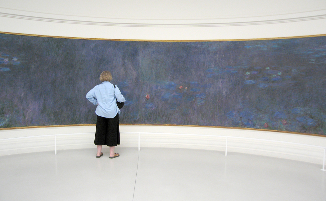
I spent 26 years of my life in Phoenix, Ariz., and came to know the collection at the Phoenix Art Museum intimately. There were paintings I loved and a very few that I disliked intensely. Most, of course, fell in the middle somewhere.

One painting I felt strong aversion to was Joseph Stella’s Flowers, Italy, which always seemed to me like a cheap piece of junk-surrealism. On the whole, I am not simpatico with even the best Surrealism.

There is only one thing to do when you don’t like a painting: spend a lot of time with it. So, I figured, if I stayed with the Stella for a while, I would either fully define why I did not, like it, or I would change my mind.

I finally wound up spending more than five hours with the painting, and, another hour or two afterward, reading about the artist and his work.

It was an enormous expense of time and energy, but it paid me back many times over. Now Stella’s Flowers is one of my anchors at the museum and, I cannot get enough of it.

Since the question I am asked most often and most imploringly is “How do you look at art?” it seemed like it might be helpful to describe what I found over those seven hours.

LOOKING AT A PICTURE

Most people like pictures of flowers. They come upon Joseph Stella’s Flowers, Italy at the Phoenix Art Museum, for instance, and they are likely to respond, ”I like flowers; they’re pretty; I like this painting,” and move on to the next.

But there is much more packed into any good painting, a world of meaning and experience that can only be squeezed out with time and effort.

So, mister wise-guy art critic, how do you look at a painting? It’s a question I have often heard. The answer has three large parts.

The first is looking.

And by looking, I mean spending a very long time noticing all the component parts of a painting, its colors, brush strokes, subject matter, design, size and proportions.

The second is thinking.

After you have noticed every square millimeter of the work, you are then obliged to figure out what it might mean. You dig into yourself — the well of your experience — and try to parse out what all those many bits might add up to.

And third, after you have some good idea what the painting might be communicating, there is the learning. You are interested enough that you want to find a book or person who might tell you more and help you fit this experience into the larger picture. But make sure to wait for this last: After you have experienced the painting, then you can worry about facts.

Too often, we want to start with facts, but if you place them first, they only blur your vision.

Once more, the three steps are: looking, thinking and learning.

Let’s take those same Stella flowers and try the method on them.

It is a large, square painting, about 6- by 6-feet, of dozens, maybe hundreds of flowers in a tangle that seems almost architectural, all against a deep, blue sky.

From a distance — and the way it hangs in the museum currently makes it difficult to view any other way — it seems finely painted and detailed. The paint seems smoothly brushed onto the canvas.

But try to get up close, and you will find that the surface is sloppy with thick gobs of rough paint. The flowers almost seem crude, as if drawn by a not-so-talented child.

Step back again. They regain their refinement.

This is only one of the many contradictions of the work.

Its overall impression and the first thing most people notice, after the flowers, is that the painting is rigidly symmetrical. Draw a line up and down through its middle and you find that the right and left sides mirror each other.

Yet, on closer inspection, nothing on one side exactly reproduces the other. What is a calla lily on one side is balanced by a hibiscus on the other. The painting only appears to be literally symmetrical.

There are two distinct axes to the design. Splitting the painting vertically is a line of plant stalks, pistils, racemes and petals. Each half of the painting is equal.

But cutting the bottom portion from the upper is a line of large white blooms. They sit lower than the halfway mark, settling as if gravity had pulled them down.flowers cross

That giant cross is the basic organizing principle of the work, like an airplane nose down, crashing into the bottom of the frame.

Another contradiction: Most of the blossoms are fairly realistic. You can tell the hibiscus from the aster, the lotus from the lily. Yet, the plant stems are greatly distorted. Many are rigidly straight, up and down. Others are not connected to anything recognizable. The upper portion of the picture, in fact, is divided into three panels by plant stalks that curve around at the top to make what look like Roman arches.

The background is blue sky; the closest part, on the bottom of the frame, is blue water, filled with waterlilies and fish. There are a host of white and red flowers, and a smattering of yellow. But considering this is a painting of foliage, there is surprisingly little green.

Notice that I haven’t yet mentioned what any of this might mean. Your first obligation is to discover what is there; only then can you worry what it might mean.monkey face

And what about the ”monkey” face?

Human beings are genetically programmed to recognize faces. It is why we so often find virgins in tortillas and aliens staring back from Martian mountains.

At the bottom of this painting, filling the middle third, is an animal face, with two rosy hibiscus for eyes, two birds for ears, and what looks like a red proteus for a nose ridge, crowned with a great white waterlily flower.

arcimboldoLike one of those crazy Arcimboldo faces from the Renaissance, made from fruit or vegetables, it is a visual pun, functioning on two levels at once: face and flower.

Stella is having it both ways once again.

Notice, too, that the bottom third of the painting acts like a very close, in-your-face wall, like a hedge that blocks the distant view behind. The painting then, maps out very clearly the near and the far.

Over and over, there are contradictions: things split into two — near-far, up-down, flower-face, greenless plants, realistic distortion.

There are dozens of other things you might notice. I’ve only listed a few; a complete list could fill an entire book.

But what does it all mean? The experience is all well and good, the looking slows us down and we discover scores of little details that we could not have noticed racing through the museum.

But it is the meaning we are after.

Well, the first thing you are likely to think about is the flowers. Any painting with this many maniacal flowers is likely to be about fecundity. This is one fertile painting.

And the details certainly substantiate that. Look at the top, with the day lily hanging upside down over the long, white tendrils that draw up the center line of the painting. It sits with its pollen-laden anthers just touching the tendril, which we must read as an abstracted pistil. The very moment of fertilization.

It is the climax of the painting, so to speak.

But the rest of the painting is no less orgasmic. Look at all the large flowers. Almost every one is a yonic horn with a large, phallic nub at its center. They are hibiscus and lotus, contradictory male and female at the same time. Near the very center of the painting is a jack-in-the-pulpit, with a lurid phallus sticking straight up from its bowl-like pulpit.

You would need an computer to keep track of the phalli and yoni in this picture.

Even that monkey face, looked at again turns into the female reproductive organs, with fallopian leaf fronds and ovarian hibiscus.

So, does this mean Stella had a dirty mind? Or was his subconscious playing Freudian games?

No. There is something else going on.Hubert_Robert Roman_Ruins

If we were to search the history of art for this painting’s ancestors, the most direct would be the 18th century picturesque landscapes of Hubert Robert and his like.

They usually showed a Roman or Greek ruin taken over by vines, with animals or people living and playing around them. Nature reconquers the works of man.

Stella has given us the ruin, in the form of the vegetal arches at the top of the painting. In his ”ruins” nature reconquers the world in a fit of fertility.

In the older paintings, we know that conventional iconography implies that the ruins symbolize death; the vines, the recurrence of life.

In Stella, the ruins are only suggested, and death — the arching plants that roof the painting — is itself seething with life.

The contradictions are all the more emphatic when we learn more about Stella and his art.

stella mugHe was born in Italy in 1877 and immigrated to the United States in 1894, where he died in 1946. He first achieved notice as an artist with a series of paintings of the Brooklyn Bridge and Coney Island, done before 1920.

In those, he brought the current Italian movement called Futurism to the U.S. Futurism glorified modernity, machines, speed and motion. Most of the noted Futurists were Italian; Stella was America’s only serious member.

But the contradictions in Stella’s personality kept him from continuing in this direction. Something in him mistrusted machines, even as he felt awestruck by the engineering of the Brooklyn Bridge.brooklyn bridge stella

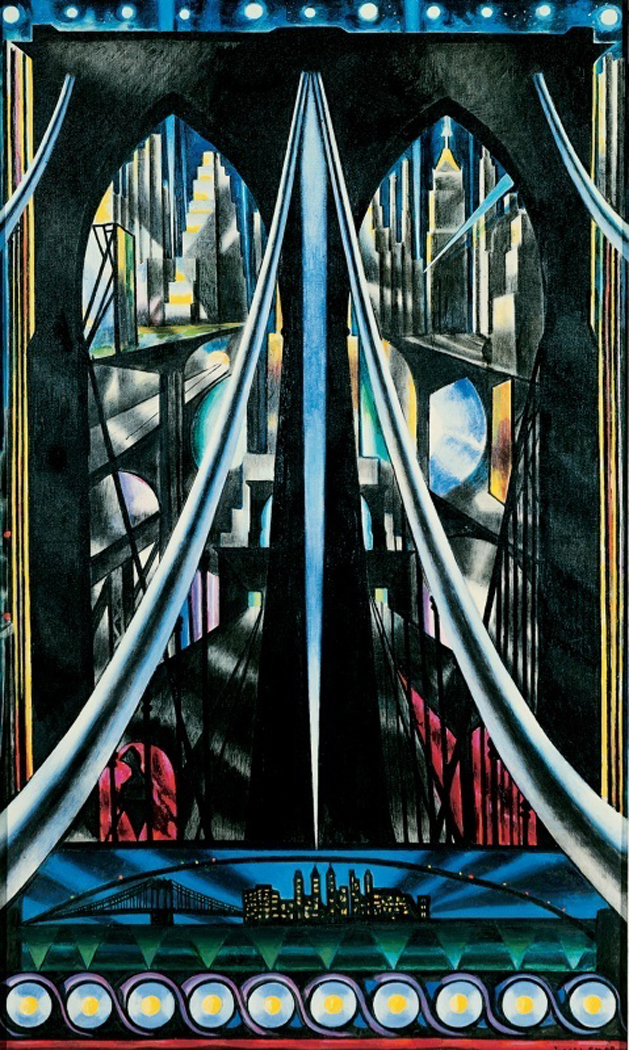
”Many nights I stood on the bridge — and in the middle alone — lost — a defenseless prey to the surrounding swarming darkness — crushed by the mountainous black impenetrability of the skyscrapers,” he wrote.

In another place, he called his home, New York City, ”Monstrous dream, chimeric reality, Oriental delight, Shakespearean nightmare . . . its enormous blocks of buildings barring one’s way . . . its dreadful closed windows barren of flowers.”

In his mind, Stella contrasted the steel, cold, northern city with the fertile, warm, sunny southern Italian town he had grown up in.

”Returning to my birthplace, I find all of nature smiling like a friend, greeting my arrival with festive salutes.”

And in another place, ”My drowsing energy, tortured by the cold of Northern countries, was awakened as if by magic, set aglow by the radiance of gold and purple light. All the ardor of my youth surged through me with the overflowing, stinging, demanding desire for new conquests in the virgin lands of art.”

Over and over in Stella’s letters, you find a man driven ecstatic by the abundance and plenitude of nature. Man’s works, so glorified in the Futurist paintings, became the fodder for ruins, which were ennobled by the fecundity of nature.stella purissima

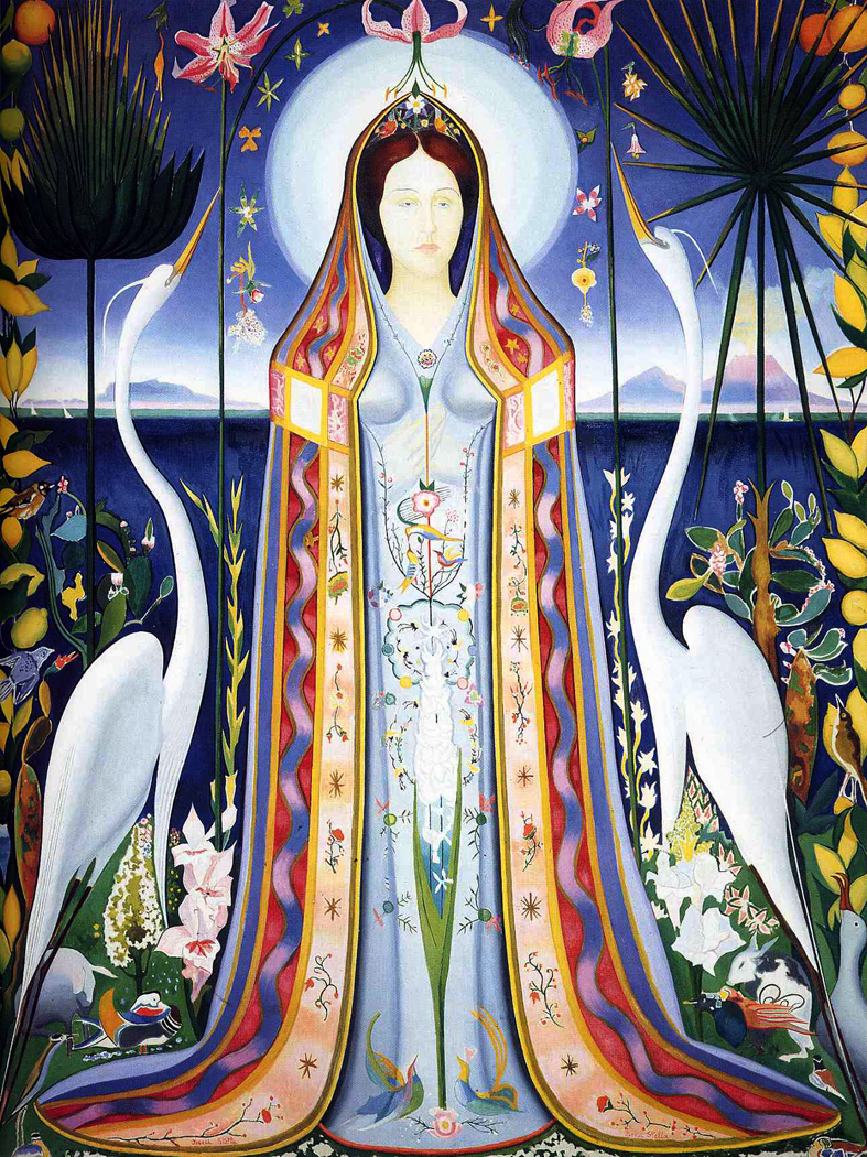
It is a theme that shows up in many of Stella’s better paintings (and it should be noted he was a very uneven painter). They have titles such as Joy of Living, Dance of Spring, Apotheosis of the Rose and Tree of My Life.

Stella had an almost Hindu sense of the ecstasy of nature, the sense that everything is burning with aliveness.

And in the end, even his famous paintings of the Brooklyn Bridge were not about human life and technology, but, as he wrote, ”I felt deeply moved, as if on the threshold of a new religion, or in the presence of a new Divinity.”

He was one of those painters, like Van Gogh, who yearned to express the exploding aliveness of the world, a man with a visionary sense of cosmic energy.

Finally, his Flowers, Italy is no more about mere sex than the cave paintings of Ajanta or the athletics of Henry Miller. It is a vision of perpetual life, renewing itself and burning, a non-Christian version of Dante’s Divine Rose, or the sacred Garden of Eden.

And it is at this level that, in Stella, as in the Vedic religion, all contradictions are transcended.

NEXT: Looking at an earlier painting, using the same techniques

Orangerie, up close, 2006

You wander through one of a city’s great art museums and watch the people. They spend an average of maybe 15 seconds in front of any painting that catches their attention before moving on.

Or more likely, they spend another 15 seconds reading the label on the wall. And if the label contains a legend explaining who the artist was or what the painting is about, they may very well spend more time with the label than with the art on the wall. It’s disheartening to watch.

One of the problems is that we are a verbal, not a visual culture. I know the common wisdom is currently that we are a visual people, but it simply isn’t true: Even those things we think of as symptomatic of being visual are things we “read” for information rather than see: like the stick figure man or woman that lets us know which restroom is appropriate.

But even more than that, it is that we are a problem-solving people. America’s national mythology describes us as doers and go-getters. We simply don’t believe in wasting our time. We’re too busy. Our heads are too crowded.

There are all those yapping voices, all those different aspects of our personalities, all clamoring for attention.

”Mmm, doughnuts!”

”Don’t forget the dentist appointment.”

”Do these socks go with this tie?”

”Is the ozone hole getting bigger?”

”Mmm, doughnuts!”

So, it’s hard to appreciate art these days.

And it’s no wonder that a management class steps forward to create some order.Orangerie, the critics, 2006

Each of us has it: The executive in our heads that tries to get through life quickly and efficiently, cutting through the baloney and making the decisions for everyone else in there.

It’s a necessity in an information top-heavy age with bumper-to-bumper traffic on the freeways.

Unfortunately, this tendency to empty the ”in box” and get on to the next problem runs completely counter to what art is about. To see art, or read poetry, or listen to chamber music, we have to kidnap, blindfold and gag the executive in our brains and give ourselves over to a different kind of experience.

And ”experience” is the operative word, for the primary function of art is to provide an aesthetic experience.

That executive in our cranium is used to dealing with information, not experience. There is life on one hand, and there are words and symbols about life on the other. Most of what life requires of us in the late 20th century deals with words and symbols: filling out forms, scanning in our Visa numbers, looking down the stock listings in the Business section of the newspaper. We are drowned in words.

But at least we are used to them. Experience is scary: sensuous, messy, confused.

So how do you deal with art? How do you prepare yourself to appreciate it, enjoy it, and grow from the experience of being exposed to it?

First of all, you have to slow down. Your interior life moves slowly, implacably. It is only your cerebral cortex that buzzes with frenetic energy. The deeper, more meaningful emotions, the underlying rhythm of life is more measured: a pedal note under the jangling fugue subject above.

Art requires that you work on this slower time scale. It doesn’t give itself up, like the punch line on a New Yorker cartoon; it slowly releases its value to those who can wait.

You have to spend time with a painting or statue. The Manager wants to look at a painting and say, ”Yes, I know that: It’s a Renoir. File it under ’19th Century, Impressionism, French.’ ” And then move on to the next: ”17th Century, Dutch, Genre: Rembrandt.”

It is as if knowing the name of the painting is the same thing as knowing the painting.Orangerie gawkers, 2006

But if you look at a single painting for, say, an hour, you will learn things about it. You will be forced to discover all the richness that the artist took the time to put there.

What colors has the artist used? What shapes? Is it dark or is it light? What is the subject? Can you make sense of it? If not, is the ambiguity important? Is the paint thickly applied, or flat and textureless? How does that help the painting convey what it has to give you?

You swish it around in your mouth like a good wine, looking for the complexities of taste and aftertaste.

How does the painting make you feel? Is it an emotion you’ve felt before? If not, is it related to one you’ve felt? If it’s completely new, how do you feel about that?

The art slowly unfurls, like a rose opening from a bud. The attention you pay will pay you back.

In the next installment, we’ll take a look at just one painting and see how this approach might pay off.

PCA-logo-text-date-FINAL

I hate “the arts.”

Don’t get me wrong: I love art. In whatever form. I could not live without music, dance, theater, architecture, literature, cinema, painting or sculpture.

But when grouped together and made plural, so that I have to bracket them in quotes as “the arts,” they become a value that is paid lip-service by politicians, administrators and businessmen and they become a category in the public agenda, much like potholes or redistricting. We hear over and over a justification of the arts that argues how much — how many dollars — “the arts” contribute to the economy. As if this were their raison d’etre.agee-famous-men

While it is certainly true the arts have some civic utility, frontlighting that is like saying that the invention of writing is important to civilization because newspapers are so useful to wrap fish in. It misses the point entirely.

When pluralized, the arts are neutralized: turned safe enough for school children and wives. They become a civic virtue, and ring as hollow as the platitudes of a politician running for office: not much more than a flag lapel pin.

And so, I hate “the arts.”

As James Agee once wrote in Let Us Now Praise Famous Men, “Official acceptance is the one unmistakable symptom that salvation is beaten again, and is the one surest sign of fatal misunderstanding.”allegory of the arts

Art — not “the arts” — is about that salvation. About becoming more fully human, more aware of the world and our place in it. It saves us from isolation, from ignorance, from emptiness. These are the big issues we face, in contrast, mutable public issues are trivial: When we come to the end of our lives, what remains of the fustian of our existence has little to do with annual income or who got elected; it is how much we have loved and been loved, whether we have become larger in our hearts, or shrunken and dried up.

Art engorges our hearts and makes our neck veins throb. We feel alive; we become more alive. Art teaches us to love and be loved. It gives us the images that train our hearts to the potentials. Without the images, without the metaphors, all there is are words, no more meaningful that an alphabet we cannot read.

Anyone fully listening to Isolde’s death song, or reading Wordsworth’s Intimations Ode, or paging carefully through Goya’s Disasters of War can be reduced to weeping — and the kind of profound weeping that makes the rest of the world disappear and our insides open up to become a sea as large as the planet.

There was a time when I was young that I thought art was merely “cool,” and that I wanted to be — or could be — in control of art instead of art being in control of me. I didn’t believe Emily Dickinson when she wrote, “If I read a book and it makes my whole body so cold no fire can warm me, I know that is poetry. If I feel physically as if the top of my head were taken off, I know that is poetry. These are the only ways I know it. Is there any other way?”

I write this listening to Strauss’s Four Last Songs (this is my own translation):

4. In the Red of Evening

Through good times and bad,

Anger and joy,

We have walked hand in hand;

And now we take a moment’s rest

With the world all before us.

All around us, the valleys dim away,

And the details gray out.

You can begin to see the lights below.

And overhead, two larks fly alone,

half-dreaming into the velveting air.

Come closer to me,

And let them fly over us;

Soon it is time for sleep.

And we must not let the darkness

Separate us from each other.

The peace is wide and still,

Deep in the redness of the western sky.

How tired we are of this need to keep moving.

Is that what death is?

DemiEightpack

In 1991, actress Demi Moore posed for a famous Vanity Fair cover photograph, taken by celebrity photographer Annie Leibovitz. It exploded as a “meme,” and was copied many more times.

Soon, it became impossible for an aspiring starlet not to be seen naked and gravid on the cover of one magazine or other.

Leibovitz herself seemed to feel “ripped off” and sued when an ad featuring Leslie Nielsen used the pose to sell the film, Naked Gun 33 ⅓: The Final Insult.

The courts didn’t agree with her, and anyway, we had moved on to other memes, including dancing cats on You Tube. The courts could hardly have decided otherwise, not only on the basis of fair use for parody, but because borrowing poses has been an essential tool in artists’ kit for millennia.

As Picasso didn’t actually say, “Good artists borrow; great artists steal.” Actually, that quote has been attributed not only to Picasso, but to T.S. Eliot and Igor Stravinsky, but goes back at least to 1897, when a variant version was used by critic W.H. Davenport Adams. Even quotes get borrowed or “stolen.”venus and eve

L-R: Venus de Milo; Eva Green in The Dreamers (2003).

The examples are legion. My interest came to me through the paintings of Manet, Titian and Giorgione.

First let’s look at a few examples.

One of the most familiar is the pose of the “Three Graces.” It shows up in many forms in antiquity.3 graces antiquity

L-R: mural from Pompeii; statue in the Louvre; mosaic from Anatolia.

It was used by many Old Master painters.3 Graces renaissance

L-R: Raphael; Rubens; Pontormo.

And even later.3 Graces recent

L-R: Edward Burne-Jones; Henri Regnault; Leonard Nimoy.

You could find dozens of others.

Adam and Eve became such a meme, too. One version has Adam with his arms around Eve. It became used for other things, too.Adam&Eve trio

L-R: Jan Gossaert, 1520; Gossaert, Neptune and Amphytrion, 1517; Two Virgins album, 1968.

Or take the famous Botticelli painting, Birth of Venus. The pose, with the goddesses hands vaguely protecting her modesty, and you find it all over Classical art and Renaissance painting, to say nothing about one of the oldest figures in Western art.Birth of venus archetype

Or even Playboy magazine, which — probably not on purpose — imitates some other, more famous images.buns foursome

Top: Playboy; Gauguin. Bottom: Boucher; Modigliani

But the main course:Edouard_Manet_-_Olympia_-_Google_Art_Project_3

Victorine_Louise_Meurent_(1844-1927)Edouard Manet created a scandal in the 1865 Paris salon when he exhibited his Olympia, a nude featuring the model Victorine Louise Meurent dressed up — or rather undressed — as a prostitute. She wasn’t, by the way, and later became a painter herself. Here is what she really looked like in 1865.

Her pose in the painting is an obvious quote of two famous paintings of the past, Titian’s Venus of Urbino from 1538,venus of urbino by titian

and Giorgione’s Sleeping Venus, from 1510 (and probably finished by Titian, after Giorgione’s death).Giorgione_-_Sleeping_Venus_-_Google_Art_Project_2

The salient points of the pose are the recumbent nude woman, with her calves crossed.

This is a pose that even Giorgione can take no credit for. It goes back to antiquity. Here she is from PompeiiAphrodite_Anadyomene_from_Pompeii_cropped

The full meme version is the Titian painting, with these other points that get “borrowed” over and over, including in the Manet version.venus of urbino with labels

olympia handNotice that the space of the painting is divided in half, near and far, and that there is a distinct vertical line that, in this case points downward directly to the model’s pudenda, which is caressed by the curling fingers of her left hand. This gesture is highly ambiguous: Is she really masturbating? Can a great master really have meant that to be our take-away?

In the Manet, the similar gesture is more assertive: Olympia uses her hand as a kind of gate to paradise for which she and she alone holds the key. You won’t get past that hand unless she gives permission.

There is also an animal in the picture, other subordinate people.

These elements are used over and over, not least of all by Titian himself, who used the pose, or variants in several paintings.jupiter&antiope titian 1535

Jupiter and Antiope from 1535.venus&cupid titian 1550

Venus and Cupid from 1550.Venus,venuscupid and organist titan 1548

Cupid and the Organist, from 1548.

venus, organist and little dog, titian 1550And then, more lasciviously, in the variant, Venus, Organist and Little Dog, from 1550, in which the so-called “male gaze” is fairly explicit, even comical.

But Titian is not the only artist obsessed with this pose. Lucas Cranach the Elder (1472-1553) painted nearly a dozen versions between 1515 and 1550, which he usually titled Nymph at the Fountain. Here are four of them.Cranach composite

She can’t quite figure out just what to do with that left hand.

Through so many of these paintings, note the presence of animals, the near-far background, the frequent strong vertical line bisecting the picture, and the frequent use of drapery behind the woman’s head.

Not all these paintings have all the components of the Ur-painting of Urbino, but each has some of the components.

Here’s a 1639 painting by Guido Reni, with the crossed legs, the drapery, the near-far and if there are no animals, well, Cupid at least has wings.reclining venus guido reni 1639

A 1540 painting by Paris Bordone, called Sleeping Venussleepingvenus bordone 1540

From 1523, a Sleeping Venus from Girolamo da Trevesisleepingvenus da treviso jr

From 1520 and Palma Vecchiovenus palma vecchio 1520

Even in the north, from Maarten von Heemskerk, in 1545Venus&cupid heemskerck 1545

And Jan Massys painted her as Flora in 1514023 Flora Jan Massys 1514  copy

While most of these come from the 16th century, the pose streches beyond, including this 1844 Nude Girl on Panther Skin by Felix Trutatnude girl on Panther Skin Felix Trutat 1844

Lord Frederic Leighton painted Cymon and Iphegenia in 1884, with the pose, but with Iphigenia modestly covered in draperyleighton iphigenia

He also did the nude version, Actaea Nymph on the Shore, in 1854.actaea-the-nymph-of-the-shore-1853 lord leighton.jpg!HD

And Paul Gauguin’s Noble Woman from 1896paul-gaugin-noble-woman-1896

There are many more. A pile of them are mirror images, with the nude on the right side of the painting.

Giulio Cesare Procaccini painted Venus and Cupids in 1625venus&cupids procaccini 1625

Palma Giovane in 1610 did Venus and Cupid at Vulcan’s Forgevenus&cupid at vulcan's forge giovane 1610

Lorenzo Lotto’s 1540 Venus and Cupid gets kinkyvenus&cupid lorenzo lotto 1540

Allesandro Allori’s Venus and Cupid from 1586venus&cupid Alles allori

Sebastiano Ricci’s Venus and Satyr from 1720venus and satyr sebastiano ricci 1720

I think you can even make a case for Piero di Cosimo’s Venus and Mars from 1490. Although, here it is Mars with the crossed legs. Still, animals.venus&mars piero di cosimo 1490

This is just a skim across the surface. I’m sure you can find many more examples of the reclining nude, legs crossed, with animals or cupids, with figures in the background and a wandering hand.

I’ll leave you with only three more:

Pablo Picasso’s parody, Olympia, from 19011901_pablo_picasso olympia

and Claes Oldenburg’s Pat, Lying as Olympia from 1959OldenPat,_Lying_as_Olympia 1959

And finally, E.J. Bellocq’s Storyville prostitute from New Orleans in ca. 1912bellocq13 copy

This meme gets around.

I hate style. When I hear an artist say she has finally found her ”style,” I get nauseous. Style is not what art is about.

Style should be the way something needs to be said. I see too much art wherein the artist has chosen a clever style, as if it were a shirt from a J.C. Penney catalog, and then tries to stuff it with something.

Artists who read art history and try to figure out where it is going next will always be shortsighted. Art is going where it will next because of some great imagination whose vision of reality cannot be expressed in the old vocabulary.

Younger artists tend to need style tricks more, just as older artists seem to strip down their style, like the final Kurasawa films or late Tolstoy.ran

As an example: The greatest writing survives translation well. Lesser, more refined artists often are untranslatable because their substance is the fugitive stuff of style. Tolstoy, Homer, Dostoevski and Dante are all powerful despite language problems. They each concerned themselves with powerful searching problems and explored the mazes of those problems with shocking honesty (in the terms of their times).

The search within

Artists and writers now need to search their innards for analogous problems. Our answers won’t be Dante’s answers, but art on the level of importance as the Paradiso is needed.terpning

Rembrandt; Picasso; Beethoven; Dostoevski; Dante; Michelangelo; Raphael; Hokusai; Bach; Homer; Shakespeare; Cervantes; Chaucer; Neruda; Matisse; Durer; Sophocles. . . . Does LeRoy Neiman, after all, belong on that list? Or Howard Terpning, or Frank Frazetta?

Four modes

There are four modes of producing art. I don’t mean discrete modes, but that they are four points on a spectrum. They are:guernica

–› The artist connects with something real in the world or the medium and, because his discovery cannot fit the molds cast by previous artists, he forges a new style. Picasso and Beethoven are representatives of this mode. Inner drive and a sense of the insufficiency of the old styles cause the creation of a new style.wyeth winter 1946

–› With some other artists, the interaction with authentic experience causes no feeling of the inadequacy of the existing styles. The connection with something real is still there, but accepted style merely becomes the mother tongue to discuss or develop the connections. Brahms, Andrew Wyeth and Rachmaninoff are possible examples.

The next two modes differ from the first in that the prime aim of the artist is not to express some genuine engagement with the world, but rather to manipulate style.

–› One is an imitation of the first mode, wherein the style is foremost and the artist attempts to create novelty rather than express something larger. Many students, too young to have anything real to say, are guilty of this mode.

–› The last is an imitation of the second, in that the conventional style is used with limited substance. Montovani, Cowboy artists or the truckloads of ”starving artist” oil paintings are prime examples. Neither message nor style is genuine, but only imitates the ”look” of art.

Like all those people who think they can paint like Jackson Pollock.amateur pollock

Style is seductive

louis armstrongStyle is a demon that seduces us. Audiences often choose by style and not by intrinsic worth: Jazz listeners listen to Kenny G pop jazz before listening to Mozart; Classical fans will listen to Zelenka or Ditters von Dittersdorf before listening to Louis Armstrong’s Struttin’ With Some Barbecue.

If we consider the actual function of art, the problems become clear. Art organizes, on a primary level, the undifferentiated chaos we find around ourselves. If the world does not seem chaotic to you now, thank the artists who have gone before you and struggled with the problems of perception.

To an artist, who is a person not entirely enculturated, the things we take for granted — the things that seem self-evident — are not to be trusted. Is perspective a realistic portrayal of how we see? That is suspect. Is nuclear war an entirely bad thing? Maybe, on a deeper level, it would be good for an overpopulated planet drowning in its own sewage. Maybe. Is the world of dreams all in the mind? Or is it as valid a reality as the one with digital watches and brothers-in-law? Maybe more valid. What are the true relationships between men and women? Why do otherwise reasonable people commit horrors and atrocities? Maybe it is a normal function of being a human. Maybe.

The artist won’t necessarily answer these questions, but he will consider them, or questions like them, and will engage with his explorations and exit the labyrinth with a canvas gripped tightly in his mitts, and with a wild look in his eye.

Style is a means of avoiding these tough issues, substituting a disengaged, shallow cleverness.autumn rhythm

To make new art, the artist should not attempt to find novel juxtapositions, but should go back to that primary undifferentiated chaos and attempt to find an order directly from it. Too much mediocre art comes from people trying to be new rather than trying to be real.

Selva Oscura

WHEN you are young, it is easy to be in love with art. You may love its artifice, you may love the colors or the rhymes or the great blaring sounds of the music you listen to. Art is vibrant; it seems so alive. But most of all, you are in love with the sense of importance iart brings: It seems to validate the belief we all have when we are young that our own lives matter, that we count in the larger scheme of things.

We are all Tristan, Achilles or Holden Caulfield.

Perhaps that is why the young make so much art. They are not yet unhappy with it, not yet dissatisfied at the lies that art creates, not yet disgusted with the prettiness of it all.

Most of all, the art we make when we are young imitates the art we have come to love: Art most often imitates art, not life. There is so much bad imitation T.S. Eliot written in college, so much abstract painting of no consequence, so much herd-instinct.

I have been as guilty as anyone. In my 50 years of photography, the bulk of my work has been imitation Ansel Adams or Edward Weston or Irving Penn. I was learning to make images that I could recognize as art, because it looked like the art I knew.Old photos

Big mistake.

Go to any art gallery and you see the same process unfolding. Imitation Monet here, imitation Duchamp there, imitation Robert Longo there. Whatever the current trend is in art, there are acolytes and epigones.

At some point, as you age and if you are lucky, you let all this shed off you, and you no longer care about art. What takes its place is caring about the world, caring about the experience of being alive. It isn’t going to last long, so you begin paying attention: close attention to soak in as much as you can before you die.

In a sense, when you are young, you test your life against the art you know and love, to see whether you measure up to it; when you are older, this turns around, and you test the art against your life, to see whether the art measures up.

And if you are inclined toward art, you give up caring whether you are making “great” art, or whether you are part of the great parade of art history, and you care only about what you see, hear, touch, smell and taste. The world becomes alive and art faces to pathetic simulacrum.

When you reach this point, then you can begin making art. And you make it for yourself, not for posterity. You make it to attempt to capture and hold the world you love, or to understand the world, or to transcend it, when it becomes too difficult to endure or accept.

Week's Bay Bog Alabama

2

The first garden I made was a vegetable garden in the front yard of the North Carolina house I was renting in the early 1970s. I grew the usual tomatoes and peppers, beans and spinach. I also ventured into eggplant, which turned into the most successful part of the garden, to my surprise.

But what I really learned from my garden is the difference between the neat, orderly photographs in the seed catalogs and the rampant, weedy, dirt-clod messiness of the real thing. Gardens, I discovered, were not military rows of uniform plants, but a vegetative chaos.

The stupid thing was that I should have known this going in. All around me, trees, vines, shrubs, roadside flowers and Bermuda grass were telling me one single thing, over and over: Profusion is the order of nature. Variety, profligacy, energy, expediency, growth.

Whether it is a kudzu shell over a stand of trees, or the tangle of saplings that close over an abandoned farm field, or the know of rhizomes that run under the turf, the rule of nature is clutter.Crab Apples Sullivan Maine

The walnut tree outside the front door was old, and its bark was stratified with moss, lichen, beds of sap, and a highway of ants running up and down. From a distance it was just a tree, but up close, it was a city.

When I was a boy, there was an abandoned farm beside our property. An old, unpainted barn and farmhouse stood in the center of a field of grass and weeds. When I was maybe 8 years old, those buildings burnt down one night in a glory of flame.

In the years that followed, the course of plant succession took over. I learned my lessons from Boy Scout merit badges I earned, but even there, the story of succession seemed much more orderly than what I saw out my window. Plant succession wasn’t a clear progression from annuals to perennials to shrubs and through a clearly delineated march of one kind of tree into another till we reached climax growth. It was instead a tangle of saplings through which it was nearly impossible to walk. There was not a “baby forest” that we saw, but an overpopulated struggle for sunlight, every plant elbowing its neighbor for survival. In a forest, the trees stand a certain distance apart, their crowns touching to make a roof. But this young version was more like a thick head of hair; there was no distance between the shoots.Buxton Sedge, Hatteras NC

Everything in nature told me the same thing: busy-ness, struggle and chaos. It was all exhilarating, and I loved the tangle of it all, the textures, the smells, loam and rot, the mud and dew.

And yet, that isn’t what I saw when I looked at art about nature, whether it was glossy calendar photos or Arizona Highways’ covers on the low end, or whether it was Raphael and Delacroix on the high end.

The nature I saw in most art was tame as a housecat. And the art wasn’t really about nature at all, but about order. I wasn’t made to see the world we saunter through, but to see how our minds organize and codify it.

Whether it was 18th-century paintings or Ansel Adams’ photographs, the art was all about order. In fact, you could say that the point of the art wasn’t to make us see nature, but to understand order.

I was unsatisfied with it, and with my own art. I wanted to make an art that would look at the natural world and make images that spoke to me about what I was really seeing and feeling.

3

NDP60I recognized something of what I wanted in the arts of the Gothic, Baroque and Romantic periods, eras in art that glorified the energy and visual confusion of the world. They are arts that responded to the profuse variety of the experience. They were also arts that were devalued by the mainstream art world of the 20th century. Eliot deprecated Milton; Stravinsky insulted Berlioz; Mies van der Rohe is the anti-Gothic architect.

Yet, I loved Shelley, Schumann, Chartres. And I wanted to find a way to make that over in our new century, in a new way, and reattach art to the world around me. It had been untethered too long; too long it had been its own reason for being. Art for art’s sake? Not any more.

It can be hard — it is probably impossible — to make art completely divorced from one’s time. The visual universe is too persuasive. We cannot even know how deeply we are affected by the stylistic twitches of our own age. And I am not saying my own work is sui generis. It certainly is not.friedlander montreal

The light that knocked me off my horse on my own way to Damascus was a single book of photographs — still a fairly obscure book — by Lee Friedlander, titled Flowers and Trees, from 1981. It was spiral bound, printed in a matte finish, and had virtually no text. Inside I found a mirror of the nature I knew and felt. Nothing was framed neatly, nothing was glorified by the light poured on it, nothing we reified into monumentality. Instead there was the profusion, confusion and organicism that I recognized from my own experience.

And I realized that I had been working in that same direction for years, but had buried the photographs among the more conventional mountainscapes and detail photographs. I had several series of images that were my own immediate response to nature and they were all photographs I had made in the gardens of friends. I gathered them together and looked. The conventional photographs seemed to have no value whatsoever and these others, almost random, usually confused, and always ad hoc, seemed to breathe the life I had been looking for.

Since that time, and with the advent of digital photography, I have been liberated. I take my camera with me, point it at something I want to feed it, and let it do the chewing. I never look through the viewfinder anymore, but instead look at the larger shapes, darks and lights, that showing the digital screen on the back of my camera. I see how I see and click the shutter.Back Bay, Virginia Beach, Va

Over the years, I have made many of these sets of photographs, usually 15 to 35 pictures in a group, and printed together to be seen as a “book,” that is, a print cabinet, where my audience can spend as much or as little time as they wish and shuffle to the next.book cover

And the unit of my work is the book, not the individual photo. When I visit a garden, I vacuum it all into my lens and after processing them, spread the images out in a series. You can see the results in a book preview for Gardens/Paradisi, a book I created on Blurb.com. The whole thing is there to see via “preview.” You can find it (and buy it, if you have that much excess money) at: http://www.blurb.com/b/607398-gardens-paradisi.

For the pictures in that book, selected from those loose leaves, I have had to edit them down to a manageable few. Most of these “books” have been turned into chapters of either 9 or 15 images. I hope they still give a flavor of what I have attempted. You can find more in the other books I have made and available at Blurb.com.Giverny 3

4

If I have succeeded, I have also failed.

For in the end, my attempt to wrestle with the world has turned into an art that is also about order, about how the mind engages with the things around it. I have wound up doing exactly what my predecessors have done.

It isn’t surprising. After all, when I turn on my elders and find their efforts insufficient, I am doing nothing different from what they did when they turned on their elders. It is how art grows. Wordsworth rebels against Pope, Eliot rebels against Wordsworth, Ginsburg rebels against Eliot. One generation finds its parents lacking and tries on its own to finally express the truth.

And I can only be happy when a generation after mine points its own finger backward and wiggles it in reproach at me.

It seems we never get closer to what we are all after. Value is all in the trying.Doug's Garden

egyptian geese 2

You enter the cave, walk through tight spots, crawl on hands and knees and come out, 100 yards later, into a dark room, a widening in the cavern walls, and see, if you point your lamp at them, some of the most beautiful animals ever drawn by human hand.chauvet

The very first art — some 30,000 years old — is some of the best, and what you have are pictures of animals. On the walls at Lascaux, Chauvet and Altamira in Europe, you find bison and elk, aurochs and rhinoceroses. When you find people drawn on the cave walls, they are hardly more than stick figures, but the animals are often so realistic you can identify them by genus and species.

You can see it in the Egyptian tomb paintings, too. Human figures are stiff, in the artificial “King Tut” poses so familiar from the hieroglyphs. The humans are stylized and symbolic rather than naturalistic. But the animals don’t share that fate: They are seen with a grace and directness at odds with all the machinery of symbolic hieroglyphs — a real duck, a real hippopotamus, a real ibis.knossos

You can see it too at the Palace of Minos in Knossos, where the mural is filled with graceful dolphins and mackerel.pompeii fish

Or in the mosaics at Pompeii, with its seafood menu of crustaceans, eels, octopuses and seabass. Animals have a special place in art.leonardo

They speak to us in a special language, even when they exist as a smaller part of another painting: the dog in Van Eyck’s Arnolfini Wedding, or the mink in Leonardo’s Lady With an Ermine.

It is an element that reflects us and we can’t seem to do without. But what is that element?

“They connect us to something larger or greater than ourselves, or with a past we’ve forgotten,” says painter Anne Coe, whose work is well known for its sometimes satiric use of animal imagery.

And, in fact, the animals in paintings almost always have an ulterior reason for being there. They are doors to something. “Something larger,” as Coe says.

But it’s a two-way door, and what the animals mean depends on your direction as you pass the portal.

Almost like choosing which end of the binoculars to look through, you get very different takes on what animals are and what they mean.

Going one way, the animals are symbols. They stand for all kinds of things: sometimes totemic, sometimes archetypal, sometimes they are as simple as elephants for Republicans and donkeys for Democrats. But they stand for something other than themselves. Perhaps the Democrats would be better symbolized by a platypus or the GOP by a warthog, but there you go: We are stuck with the symbols. Everyone understands them; they’re shorthand.medieval animals copy

Medieval and Renaissance art is filled with this kind of symbology. The dog stood for faithfulness, the goat for lust, the lion for nobility. Of course, for the medieval mind, everything was a symbol.egyyptian bee

We still have some of this emblematic symbolism with us: busy as a bee; crazy as a loon; the industrious ant vs. the lazy grasshopper. We tell Aesop fables to our children to warn them about bad behavior.

But going through the door in the other direction, the animals are steadfastly not symbolic, and force us to see them for themselves as separate entities in the universe. They force us to recognize them as “thou” in theologian Martin Buber’s formulation of “I-thou,” as distinguished from “I-it.”

You look at the eyes in a painting by animal portraitist May Cheney and you see the “there” there. There is no mistaking the cat or dog or goat for an insensible beast.

“An animal’s eyes have the power to speak a great language,” Buber himself said.may cheney dog

Cheney says, “The animal is present and looking back at you.”

And you are forced into the awareness that symbols are already several removes from reality, and that sometimes it is good to re-experience the world as it actually is.

When animals are symbolic, they are in some sense projections of ourselves. When they are not, they are reminders of all the rest of the universe. In either case, they kick-start us into the recognition of the larger connection we have with the world. And that is their function in art. After all, art itself is there to slap us into awareness, the way a doctor slaps a newborn into breath.

But whether the animals are symbolic or not, they also make us see them — as we come in the door or go out — either as kindred spirits, beings like us but in different form, or the opposite: beings that make us face the ineffable otherness of the world.

But there are more dichotomies, and more art to express them. Even if we see them as ourselves in fur or feathers, we have to ask: Are they similar to us because they are like us, or because we are like them? Are they people, too, or are we also animals?

“There is not an animal on the earth, nor a flying creature on two wings, but they are people like unto you,” it says in the Quran.

Western civilization has a long history of making a distinction between human and animal. The Bible gives us “dominion” over the beasts. We come up with all kinds of distinction to prove we are not animals. We have language, tools, laws, poetry. But looked at from the other side of the door, animals are no less distinct, no less deserving, no less intelligent than we are: Bees can make honey; humans don’t know how.

Mark Twain made fun of our presumed superiority to the animals: “I have been studying the traits and dispositions of the ‘lower animals’ (so called) and contrasting them with the traits and dispositions of man. I find the result humiliating to me.”hiroshige fish

You can see these choices played out in art, and not only in European art. It is there in the manga drawings of Hokusai and book illustrations of Hiroshige, the temple carvings in India, the Mayan glyphs and in the Chi Wara antelope headdresses of Africa.chi wara

Animals mean something to all cultures. You can see it most directly in the paintings of children.

When they are introduced to animals in the classroom by a teacher who brings a bunny or a turtle, the children respond intensely. You don’t have to teach them anything about art: They burn to make paintings of the animals. You can’t stop them.

And their paintings in the first or third grades parallel the adult art, although in childhood terms: Sometimes they see themselves as the animal, playing baseball or caring for the animal babies, and sometimes they see the animals as something foreign, exotic and emotionally powerful. Boys, especially, love to paint sharks or dinosaurs.kid shark

The untutored and spontaneous identification with the animals is so deep that you can’t prevent it from happening. This may or may not be animals’ primary virtue, but it is one too often overlooked when we consider their value as pet, draft animal or cutlet.

They are there in all our art: The animals are either mirrors or windows. We look into the animals’ face and see.

Ultimately, the animals are a connection with the world: They allow us to deflate our species’ solipsism and recognize that connection.pompeii fish 2

corot avray

Each of us has certain works of art that we return to over and over. We might call it a “favorite song” or poem, but it is more than mere favor that makes these works perennial comforts. There is a core in them we find identity with, a sense that the piece was created especially for or about oneself. It is art we take personally.

There is a slight Corot painting at the Phoenix Art Museum that I have returned to for 15 years. Most people probably pass by without noticing it: It is just a tiny landscape with a few gray-green trees, a river or lake, and a couple of unrelated people mixed with a few cows.

Called Memory of Ville d’Avray, it is typical of many paintings produced by Jean-Baptiste Camille Corot in the late 1860s and early 1870s.

Yet, there are many things that make this painting special.

Corot lived at a time of transition. Born in Paris in 1796, he lived through several revolutions, both political and aesthetic. Despite the tendency in many of his contemporaries, there is never a polemical word from Corot. He just did what he did — at some moments seeming conservative, at others radical. To him it was all the same. He was only interested in painting.

His art looks back to the great French painters of the Baroque, Claude and Poussin, yet at the same time, by painting outdoors and studying the ephemeral effects of weather and time, he became a precursor to the Impressionists. He seems perfectly comfortable, nestled in the cusp.

Before his time, a painting was a metaphorical window to look through at appropriate subject matter. After his time, the subject matter was not all that important, but its style was.

With the Impressionists and those who followed, style was meaning.

In Corot, and in this small painting, there is a perfect balance, with the perfect pitch, between its manner and its subject.

There are three central Corots: In his early landscapes, often of Italy, the sunlight is intense and the colors bright. The plein-air paintings inspired his Impressionist progeny. His portraits, mostly of young peasant women, foreshadow the heavy classicism of Picasso’s large-boned women, and in style imply the kind of planar vision that Cezanne made his own.

But in his later years, the third Corot appeared, more poetic, softer edged, with colors more subdued. The Memory of Ville d’Avray is one of these. In the 20th century, critics tend to praise Corot for the first two and ignore the third.

But Corot wasn’t wonderful because he pointed the way for Cezanne and Picasso, but because he was a great painter. In the Memory, he paints the landscape of his youth. He lived in Ville d’Avray, between Paris and Versailles. And the painting is full of the “emotions recollected in tranquillity” we know from Wordsworth. And it is full of Wordsworthian nature, too — a man waits in a skiff on the water and a woman kneels by a birch tree, presumably picking mushrooms.

But the painting itself is so smooth, so sensuous, in colors subtle and rich, in a light that is not the light of day, but of memory. You can almost hear the crickets, feel the humidity.

It is this nexus of outer and inner worlds that I find so satisfying. Corot isn’t making a point, either about the world or about the art of painting. But he is filtering his experience through his sensibility to the point the two can no longer be separated. The outer world seen literally is bland and naked. The mental world by itself is autobiography and trivial.

But the two alloyed make meaning.

crimestoppers

“The nation that controls gravity will control the universe,” wrote Dick Tracy creator Chester Gould.

moon maidThere was a period in the mid-’60s when Tracy got weird. Or weirder, I should say. Junior Tracy married Moon Maid and the first interplanetary child was born: Honey Moon. Tracy and the police force floated around the city in anti-gravity trash cans. There were the Stop-Action Laser Gun, the atomic light and Diet Smith’s Space Coupe. And the two-way wrist radio gave way to the two-way wrist TV. The quintessential cops-and-robbers comic strip was going sci-fi.

It was the age of Barbarella, and Dick Tracy signed on to go where no man had gone before.

A predilection for prophecy had always been a part of Tracy. Some predictions were conscious, such as Gould’s early enthusiasm for a kind of James Bond forensic science: He made the easy jump from fingerprints to voice prints.Crewy Lou

But others were unintentional: In the ’50s, Gould created the punk look with his villain Crewy Lou, who wore her hair in a crew cut on top and long down the back. She had a punk attitude, too.

Gould had Tracy on the moon five years before Neil Armstrong. And while there are no anti-gravity vehicles such as Gould predicted, the police do hover over the city in helicopters. The match isn’t perfect, but it is uncanny.

honey moon

But in that mid-’60s mania, Gould also predicted the future of newspaper comic strips. And the future he predicted was dismal.

That prediction came in the form of a comic strip within the comic strip.

A group of four characters in the Tracy strip began drawing a thing called “Sawdust.” “Sawdust” was always the same: four identical panels that showed a crudely drawn pile of sawdust — a pyramid of dots — above which ran a dialogue of heavy-handed puns and wheezy Joe Miller jokes. Gould’s sense of humor was as subtle as a cinder block.

Gould was ostensibly satirizing Peanuts, which seemed at the time to him to be an incompetently drawn strip. Gould wasn’t alone. There were many then who didn’t see Peanuts as revolutionary, but as badly drawn and childish.

Gould is lucky he didn’t live to see the funny pages of today. He would have found an entire page of “Sawdusts.”

The art portion of the comic strip has become expendable; the jokes read just the same without the drawings.

From a Wizard of Id:

A — “The safety engineer requests permission to put a warning label on the guillotine.”

B — “What does it say?”

A — “Avoid contact with skin.”

Didn’t need pictures for that, did you?

You could plug that gag into almost any comic strip, and have almost any characters speak the lines. Worse, they read like Bazooka Joe.

The problem is that the nation has become increasingly apathetic to visual things. Even images no longer function so much as pictures, but as icons, like the stick figures that serve to keep men out of the ladies’ room and vice versa.

From Foxtrot to Blondie to B.C., the strips have lost their visual punch. The joke is verbal, pictures are superfluous. The comics have become talking heads.

Dilbert can be a tremendously insightful comic about corporate inanity and office shenanigans, but a strip might well be panels of identical drawings of the character with words unfolding a punchline.

Dilbert strip

Compare that with an even middle-quality strip from the 1950s, like Brenda Starr and see the difference. There are establishing shots, like in the movies, there is the splendid perspective shot looking down the skyscraper. Many panels include two or three points of interest, causing your eye to move, say, from the telephone in the foreground to our heroine behind it and finally, her pal, Hank O’Hair, coming in the door in the back.

brenda starr

Space is three dimensional. There is variety, and there are visual rewards to following the strip.

Older strips — at least in the Sunday “Funny Papers” — spent time and space on purely decorative visual geegaws. There was a febrile joy in the very act of drawing. You will look long and hard to find anything like that in today’s newspapers.

katzenjammer kids

The Sunday comic section for most papers have shrunk both in page size and in page numbers. I miss those glorious Sundays waiting for my father to bring home the New York Journal-American and the New York Daily News. The primary reason for getting those papers was the comics. I’m not sure anyone actually read the news or looked at the ads, but we jumped on the funnies. There was Bringing Up Father, Katzenjammer Kids, Smokey Stover, Little Iodine, Terry and the Pirates, The Phantom, Prince Valiant, Moon Mullins, Gasoline Alley, and even that sappy, godawful soapy strip Dondi, which despite it’s mawkishness, was elaborately and cinematically drawn.

dondi

It’s all gone.

Or not quite gone. While it has left our daily newspapers, there is a fan base which latches on to the visual glories. They can be found poring over two related developments.

The first is called the “graphic novel,” and falls to the Frank Millers and the Art Spiegelmans.

miller 2

They especially play off the noirish aspects of the older comic books, with shadows and streetlamps, gun-barrel flashes and knuckle-crunching thuds.

The readership is limited rather than the mass audience of the old Sunday Funnies, and for all its stylishness, the graphic novel is more a playing out of well-worn tropes than an original visual language. It exaggerates the tropes; it is a Mannerist artform.

The second development comes to us from Japan, and the wild popularity of the manga. It, too, is Mannerist.

manga 1

Both these developments tend to feature adolescent fantasy stories and superheroes and their alter-ego arch-enemies. It’s a very narrow psychic space they fill, and, like heavy-metal music, tend to cultivate an audience much more in touch with the alternate world than the real one the rest of us inhabit.

At least, they are visual, with frame after frame stripped of unnecessary dialog. Like silent film, they tell their stories visually.

Unfortunately, that leaves us grown-ups without a common source of visually imaginative popular culture. We settle for talking diagrams.

burne hogarth tarzan


wordsworth

In the early 1800s, the population of England was roughly 8 million, and they produced Wordsworth, Coleridge, Blake, Byron, Keats and Shelley — not to mention Robert Southey, Leigh Hunt, Walter Savage Landor, Thomas Campbell, Thomas Moore, John Clare and Thomas Lovell Beddoes.

It is an astonishing flowering of poetry in a single era. Six major poets and a handful of others still read with pleasure by millions of people.

One might average them out very inaccurately as one great poet per 1 million in population.

Even in the 17th century, when the population of England was half that of the early 19th century, we have Thomas Carew, George Chapman, Richard Crashaw, John Donne, Michael Drayton, William Drummond, John Dryden, George Herbert, Robert Herrick, Ben Jonson, Richard Lovelace, Andrew Marvell, John Milton and John Wilmot (Earl of Rochester).

Of these, we can easily confer “major poet” status on Milton, Donne, Marvell and Dryden, making our ratio again 1-in-a-million.

By these numbers, we should easily expect, living in the United States at this moment, roughly 300 major poets. One scratches one’s head, because these numbers obviously are not true.

Just one state, North Carolina, is roughly equivalent in land area and in population to England in 1800. There should be at least six poets writing between Asheville and the Outer Banks of equivalent worth to Keats and Shelley, Wordsworth and Coleridge.

(Obviously, there are eras in which poetry features more importantly in a nation’s culture, and other times when the palm, the oak or bay goes to the novel or the stage, and times — and places — where emphasis is given to painting, sculpture, music or even philosophy. This equation is only meant in general terms — in any art, there should be more well-known and influential practitioners than one might generally count among the population at present).

I reckon that the problem should be understood much as a bicameral legislature. If we count a poetic house of representatives, there should, indeed, be 300 major poets writing at this moment. But instead, we have a senate, and we have a limited number of spots per nation reserved for “major” status. Perhaps we should never expect more than four at any given moment in any given nation.

That means we must look to the reading public (or art-going audience) as a conferring body that says there is only so much room in our culture model for the role of major poet, like only so many slots for general in an army.

It may be part of our cultural umwelt. We have a fixed and number-limited idea of what it means to rise to the top. Perhaps there really are 300 people writing poetry in American now that, if they had been published 200 years ago, would have been considered important, but now are merely the residue of a niche publishing market.

But I mean to present my case in much wider terms: the many arts as they manifest in the culture.

There is a top tier, and we treat these artists — currently the Damien Hirsts, the Jeff Koonses, the Richard Serras — as if they are the “major” artists, whose work is our answer to the Raphaels, Rembrandts and Monets of the past. Their work is deemed somehow more important than the work of thousands of other artists working away, often outside the beehives of New York and LA.

Of course, any critic with an ounce of humility will grant that these are only our “guesses.” That history has a way of choosing different names for the art history textbooks of the future. But as the art world is currently constituted, there is a great divide between art that is considered important and influential — art at the cutting edge of a presumed history — and all the lesser lights, the wannabes. And this doesn’t even make marginal room for all the weekend painters and watercolor society members and their pretty irises and tablecloths.

But who is art for? This is the crucial question. Is art made for the critic, curator, collector and gallery owner? Is the measure of its worth that it fulfill the expectations of narrow and self-specified interest group? If that were so, the rest of us might as well give up and turn on the TV.

This is not to disparage those critics (of which I am one), curators, collectors and gallery owners, many of whom I know and admire, and whose gifts are considerable. But it is like saying that a book is best judged by a librarian: There may be some insight there, but we choose our books by our own lights, our own interests and tastes. To the librarian, we entrust the Dewey Decimal System.

So, who is the art for? The poetry? The dance, the theater, the opera, the string quartet? They are all for all of us who love them.

The search for the “historically significant” artist is a question of history, not of art. We should all be free to enjoy whatever art speaks to us. And as artists, free to make the art that speaks for us.

The “big-boys” (and girls) of art are not disincluded: They really are making wonderful things. But so are the lesser lights, the regional artists, the undiscovered, the shy. The names you see over and over in the art magazines are there on their merit, for sure, but they are also there because of their naked ambition to climb the art-world hierarchy and because of luck. Some were just lucky enough to be spotted by some curator making the rounds for another museum biennial, or to work in a university program noted for graduating elite artists.

I worked in the fields for 25 years in Arizona, which is not usually thought of as a fertile ground for the world’s great art. And it does have its unfortunate share of blue coyote paintings and noble Indian chief portraits.

But I knew a dozen, maybe a score of artists whose work, given the proper exposure to the right people with open minds and open eyes, might stand equally before the impasto of Lucien Freud or the imposture of Jeff Koons.

kratzThe work was forceful, imaginative, idiosyncratic and intellectually rigorous. There should be no shame in being thought an “Arizona artist” if the state could produce a Marie Navarre, a Jim Waid, a Mayme Kratz, a Bailey Doogan, an Anne Coe, a Matthew Moore, an Annie Lopez. I could name a dozen more that you’ve likely never heard of, but that you could well have, if things had gone differently.

Each of these artists had given me great pleasure and spurred my intellectual growth and widened my world for me.

And every state in the union — indeed, every nation on the globe — can put forth its own slate of names of the artists, poets, dramatists, filmmakers, architects, authors, musicians and composers whose value is underrated or ignored, whose work has made a local difference, even if not a national ripple. Who’s to say they are not important? Who’s to say their work is not the equal of the headline artists at the Whitney Biennial?

If we include these excellent but unheralded artists and poets, we probably begin to match the ratio of poets to population of 17th- or 19th-century England.

But I don’t want to stop there, either. It isn’t merely regional art I am defending. I would make a case even for such maligned art as the academic art of university teachers, the irises and tablecloths of the watercolorists — even the paint-by-numbers amateurs and the selfie-posters of Instagram.

Every person who makes an image — and especially those rare and brave people who take up a pencil and attempt to draw something on paper — makes a contribution. They learn something about the world, and about art, even if they don’t have that name for it.

Art is not merely what hangs on gallery walls. Its primary purpose is an interaction with the world, and when anyone makes that connection, with pen, brush, camera, clay or word processor, filtering through their sensibility their ideas, feelings and reactions to the world around them, they have made art.

And ultimately, it is the making of art, not its consumption that has value. Everyone should try it, everyone would benefit from it.