Archive

Tag Archives: artist

Artist Robert Ryman (1930-2019) made a career with his white paintings. Over and over, he applied white paint to canvas, paper, or board, always with some degree of change in application or tint or texture or shape. 

Two years before his death, he donated 21 of his pieces to the Dia Art Foundation in New York. Before its closing in 2014, the Hallen für Neue Kunst in Schaffhausen, Switzerland, had a collection of 29 Ryman white paintings. So, there have been a lot of them. 

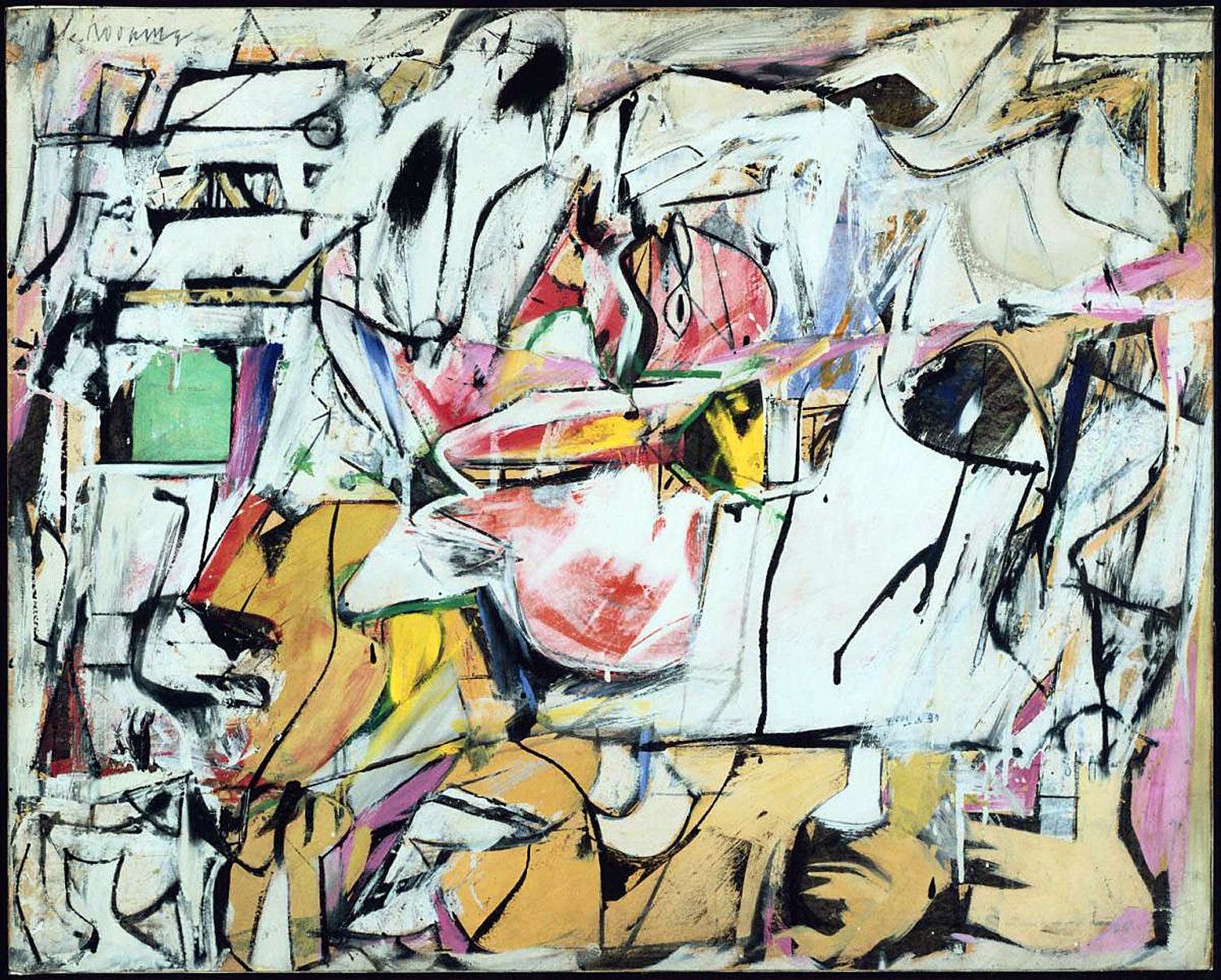
Three Rymans, L-R: from 1959; 1962; 2012

His work has been accepted into many museum collections, but there has been a backlash. 

“Aspects of Ryman’s work definitely stink of seeing what he could get away with,” wrote one critic. Another said, “Ryman is the undisputed master of showing precisely which part of the wall you are supposed to stare at.”

Robert Ryman

There seems to be a widely held belief in the general public that a good portion of art being made these days is a sneaky attempt by artists to put something over on them. That art — at least that art being sold for millions at auction — is a scam. And that artists are hucksters laughing at us all meanwhile getting rich as Scrooge McDuck through our collective gullibility. 

“A literal blank canvas? That could symbolize the artist’s emptiness.” And, of course, “If my 5-year-old could do that with his eyes closed, it’s not worth a fortune.” 

I am not going to try to defend the rarified world of the art market, nor of any particular trendy piece of celebrity art. One should never, ever confuse the art market with the art. The art market is not a function of the the art world, but of the financial world, where people with too much money buy and trade what is currently valued by the market, as investment or even to launder questionable dollars. Very few artists have anything to do with this crawling underbelly of financial worminess. And even less is fluctuating market value a measure of esthetic worth. 

The art and the market are parallel universes, and let’s face it, the overwhelming majority of working artists don’t become rich, and in fact, often have to work other jobs to pay for their need to make art, since their artwork cannot support them. A few solid and successful working artists make a living, but seldom making over a decent middle-class income. In other words, they are working stiffs. 

When they were young, probably at a university art program, they get caught up in various trendy ideas about art and get lost diving down this or that rabbit hole, thinking all the while that they are in the process of transforming the history of art. If they have any real talent, they outgrow these fantasies when out in the world attempting to make a living as commercial artists, product designers, advertising artists, or even fine artists, struggling to make ends meet. They are an indulgence of youth. 

But is will say that, as a working art critic for most of my adult life, who has known many artists and been friends with them, I have never ever come across one who thought he or she was pulling the wool over the public’s eyes. To a person, they were sincere, sometimes heartbreakingly so. 

I don’t mean to defend a lot of the goofy art that ventures out into the world. A lot of it is bad or at least mediocre. And a great deal of it is derivative: imitations of what earlier artists have done.

Artists can develop cockamamie ideas, have brainstorms of breathtaking stupidity, or at least monumental unoriginality or brilliant vapidity. But they are not trying to scam the public. They actually take these things seriously. 

I remember seeing a production where a local Arizona artist wore a coat made from pork chops. (And she assured us the meat was past its sell-by date, and would have been thrown out, so she was not wasting food). 

Another hung a 3-foot cube of ice from the ceiling by a wire and watched for two days as the weight of the melting ice pulled it through the cutting wire till it dropped to the floor. 

And if I never see another painting of nude lesbian vampires flying out of erupting volcanoes, it will be too soon. Who knew that was a trope? 

Every one of these artists was dead serious about their ideas. (And not one got rich from the work.) But please remember that over the whole course of human existence, most things that were done were either made badly or aspired to a level of mediocrity. The work in the art history books is skimmed from the top surface of what boils up from the bottom. 

Getting back to Ryman, he was not the first to make a white painting. In 1918, Russian Suprematist Kazimir Malevitch made White on White, with a tilted white square on a larger, whiter square. (A few years earlier, he had made a completely black painting, called Black.)

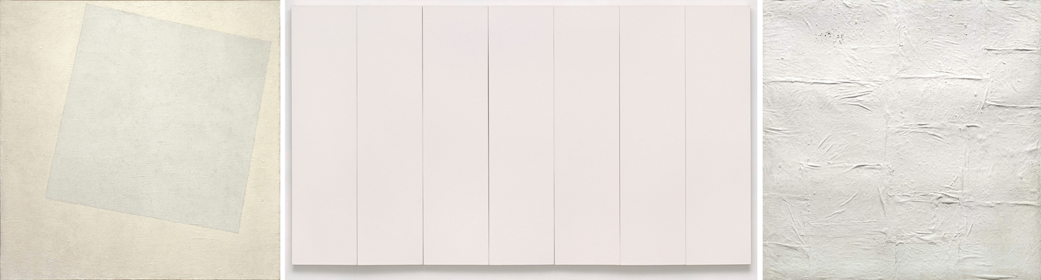
L-R: Malevich; Rauschenberg; Manzoni

In 1951, Robert Rauschenberg made a series of white paintings, using a paint roller to apply flat white wall paint to panels of canvas and joining several panels together to form larger works. For Rauschenberg, the idea was that the blank canvases would change appearance depending on the light hitting them, the shadows in the room, the number of people in front of them, and so they were meant to be visually active — at least to those who were willing to pay attention to them and the take them seriously. 

Another avant-garde artist, Piero Manzoni, offered up a canvas plastered over in kaolin clay — the white clay of porcelain — in another series of “Achrome” or “colorless” works of art, made from white wool, rabbit skin or phosphorescent paint. 

(Manzoni is probably most famous for allegedly canning his own feces (Merda d’artista, it said on the cans). In 2015, one can sold at Christie’s for the equivalent of about $240,000. As for artists getting rich off fraudulent art, Manzoni originally sold the cans for $37 each. It was the auction house that got rich, along with the owner who offered it up. All of which rather made the artist’s original point: He made the shitcans as an intended critique of consumerism and the waste it creates). 

And in many cases I have come across, the artist’s idea is genuinely worth exploring, even if the non-artist public may scratch their heads. Artists see the world differently from civilians. They worry about things that never occur to normal people. 

Like: If a piece of white paper sits with a shadow over a corner of it, is the whole page white? What is white? What do we mean by white? 

How may whites are there? Paint companies offer dozens of paint cans, each labeled in some form as white, and each different. Whites come in cool and warm varieties, as ivory, as snow, as off-white. 

White is not a single thing. If we take a piece of white paper and shine a high-power halogen lamp at it, it gets whiter. So, would a stronger light make it even whiter than that? Like temperature, whiteness is more a judgment than an actual quality. 

And so, Ryman seems to have wanted to investigate how white survives in various textures, matte or glossy surface, in contrast with other whites, compared with neighboring colors. All those different white paintings were not just repeats of the same blank canvas. 

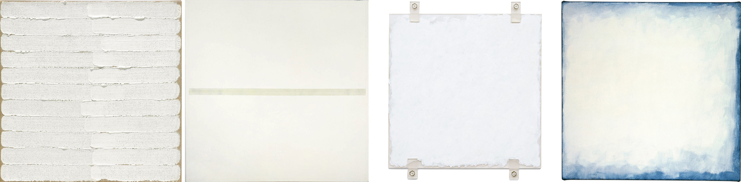
It may not be that Ryman’s art is world shaking. I’m not sure he himself thought of them as the last word in the evolution of art history. But he was quite serious about seeing what he could find out about the universe of white. 

Adrian Searle of The Guardian newspaper explained in his obituary of the artist, “Ryman worked with white, and the different kinds of whiteness different paints and pigments produced throughout his career. Lead, zinc, barium and titanium, chalky whites and hard industrial whites, silky whites and bone whites, kitchen whites and shroud whites, numinous whites and dead whites. Whites that seem to spread outward and emit light as we look and whites to fall into. The variety of their opacity, depth, brilliance and dullness all interested him. We apprehend them all differently, and differently again depending on the materials they are painted over and how they are applied, what their binders are and how much they are diluted all make a difference.”

Art, of course, isn’t a single thing. If you think painting is about making pictures of things, then white paintings don’t count. If you think they about expressing emotion, you may look in vain to find much of it in bland white; if you think art is primarily about beauty, you must acknowledge it in the eye of the beholder — remember that scene in the film American Beauty, when Ricky Fitts plays his camcorder video of a plastic bag blown about in the wind and says it is “the most beautiful thing” he has ever seen. When our attention is focused on the bag, we can suddenly see its beauty. It is the direction of focus that awakens our awareness. 

Many artists attempt to show us what we habitually ignore, to make us pay attention. Awareness — the sense of seeing the importance of the things of this world — is one of the goals of a certain branch of art. And attention must be paid, even to white. 

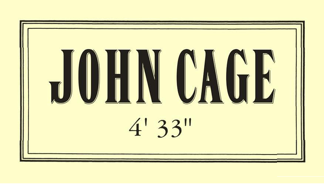
One of the most famous examples, that has been a whipping boy for the crowd that thinks art is frivolous, is the piece of music titled 4’33” by John Cage. For its performance, a pianist sits at his piano for the four-and-a-half minutes of the piece and does nothing. The aural equivalent of a blank canvas. 

For those without ears to hear, it is a lousy joke, or a scam pulled by the composer. But Cage’s point was that what filled the concert hall was never silence, but a cacophony of random sounds — programs rustling; people coughing; the air conditioning cycling; perhaps a police siren on the streets outside the hall; and even the sound of the blood pumping through the audiences’ ears. There was something to be paid attention to. 

I had scoffed at the idea of this music for years, until I heard it performed live and its meaning hit me like a ton of bricks. 

Admittedly, it is not a revelation that one can repeat. Once you get the message, you have it and don’t need to be jerked awake a second or third time — which makes the many imitations of Cage’s piece, such as the Two Minutes Silence track on the John Lennon-Yoko Ono album, Unfinished Music No. 2: Life With the Lions rather a pretentious knock-off rather than a meaningful experiment. 

It is easy to misunderstand art when it doesn’t play by the normal rules, or tries to get the viewing or listening public to experience the world in a new way, or understand an otherwise wordless idea. 

Perhaps the most famous (somewhat) recent example of this was the anger and outrage expressed in the late 1980s when Congressional Republicans attempted to defund the National Endowment for the Arts over the photograph called Piss Christ by Andres Serrano. The artist received death threats, the work was frequently vandalized when exhibited. 

It was described as a photograph of a crucifix in a jar of urine, but there was no jar to be seen: All it was was a crucifix in a glowing golden light and a few bubbles. It was quite beautiful, if you could forget the title. 

But what few of its critics recognized was that Serrano was a pious, believing Roman Catholic Christian who was looking at his faith in a way perhaps only an artist would, to emphasize the corporality of the incarnation: God becoming flesh. 

I say, “only an artist would,” but I could also say, “an artist or a child,” for I remember when I was a boy, various Catholic friends of mine, in the sixth grade, wondered whether Jesus ever had to defecate or urinate. Did the Christ sweat? Could he produce semen? These were questions that naturally occurred to boys just on the verge of discovering their own bodies. 

Serrano’s art often used bodily fluids, like milk or semen or urine, as reminders of the humanness of the god-become-man. I met with Serrano when I was an art critic in Phoenix, and there was no mistaking his sincerity. “Maybe if Piss Christ upsets people, it’s because it gives some sense of what the crucifixion actually was like, he said. “I was born and raised a Catholic and I’ve been a Christian all my life. The piece  was intended as a serious work of Christian art.”

If there was no doubting his sincerity, we may still question his naïveté over whether the public would easily understand. Most people have a rather lumpen and literal way of understanding figurative or symbolic imagery. A picture of a house should be a house, dammit. But artists, on the whole, are more interested in the things undefined. That could be color, line, shape, scale; it could be symbolism; it could be what the viewer brings to the experience. 

Ultimately, you will get the most from the art if you forget what you know and attempt to see what is actually happening before you. As Robert Irwin famously said, “Seeing is forgetting the name of the thing you are looking at.”

One final note: An awful lot of current art is awful, puerile, badly crafted, poorly thought out, and just plain ugly. Of course, it was the same a hundred years ago. I am not defending it as good or important art. And everyone has their own taste; you are free to like or hate any art you want. I am not making an argument that any of this art is genius that will last through the ages. Please, like what you like. 

But understand that the artist is very, very rarely just trying to trick you. They tend to be a very serious and thoughtful lot. They are artists because the see things and think things normal people don’t. And if you in turn take seriously what they have made, you may discover something that will enrich your life. 

Click on any image to enlarge

Take two of the most famous paintings in the Louvre. Most of us first experienced them in pictures in a book, perhaps Janson’s History of Art in an art history class. Or, projected onto a screen in the darkened classroom while the teacher pointed out details of the iconography. But these are images, not paintings. 

Often, today, we confuse the two, seeing pixels on a cellphone or iPad, and can easily believe we know the art because we can recognize the familiar shapes and colors. That is why so many people remark, on visiting the museum in Paris, about how “small” the Mona Lisa is. 

It’s not that small, of course. It’s a fairly normal size for a Renaissance portrait, but the fact is that separated out, as it is, for display, it takes up precious little wall space. Really, most people hadn’t given any thought to the actual size of the painting when seeing the reproduction in a book. It’s just an image, an icon, familiar not only in its regular shape, but also parodied to death in comic take-offs. 

You could look at the caption next to the printed image in your book, and see that there is a bunch of information in parenthesis beyond the identification of artist and title. It will often give you the date, in which museum collection it resides, and the size of the painting. In the case of the Mona Lisa, 21-by-30 inches. 

But then, perhaps you wander into the gallery with Théodore Géricault’s The Raft of the Medusa. You’ve seen it in your Janson and think you know it. You don’t. It is 16-by-23 feet — the size of a billboard. 

You see them as images, and they are adjusted to the size of the page and you can have no sense of their relative sizes.

But walk through the Louvre and it is quite different.

I remember when I was a teenager and going to the Museum of Modern Art in Manhattan and seeing Picasso’s Guernica, which stretched out across its own wall. You could see it from afar, stepping out of the elevator and looking to your right, several galleries away. Just under 12 feet high and 26 feet across, it was more than a painting and more than an image. It was a presence. 

And that was part of its meaning. It was made in outrage over the 1937 German bombing of the Basque down in Spain and if it had been made to display comfortably on a gallery wall, it would have been just another painting for sale. But at size, it forces you to consider the suffering and death. Its size means you cannot just look away. 

The world we live in is increasingly a virtual one. The TV screen, the computer screen, the cellphone screen, the tablet and even the wristwatch screen have become so normal to our daily lives it has become easy to mistake what we see there as real. It is not. 

You cannot have the personal experience of Guernica from a photographic reproduction or a pixel image. You can memorize its iconography and discuss its provenance and the biography of its creator, but you will not have the gut-level experience of it I had visiting it at MoMA. 

And it isn’t just the size. Seeing art in person means you can see the pigments used, the brushstrokes, the opacity or transparency of the paint, whether it is on panel or canvas — a whole range of physical properties not apparent in a reproduction, and all of it — in addition to its physical dimensions — are essential to its meaning. 

And by meaning, I don’t refer to its symbology. That is language. I mean the experience of it. Vermilion or ultramarine are experiences not conveyed in ink or pixel, and that experience is meaning. 

If you walk through the Louvre, another famous art history painting you find will be Veronese’s The Wedding at Cana. Another wallop in the gut. It is 22 feet high and 33 feet from side to side. 

If you think of it as a biblical subject, and believe you are “getting” the painting by naming the people pictured, you have missed the central experience of the work. 

Even more ordinary size paintings depend, in part, on their dimensions and how you relate to them. A life-size portrait can mimic meeting the person himself. In the Renaissance, one ideal was that a painting should be like a window through which you are looking, and so a window-size canvas was part of the experience. 

A giant head is another thing altogether, like the famous head of Emperor Constantine or one of the Olmec colossal stone heads from Mexico. Their size makes you take notice. The same shape, but the size of a cantaloupe, would hardly carry the power of these monuments. I remember the first time, as a boy, I saw the Olmec head at the American Museum of Natural History in New York; the memory of it stuck to my psyche for decades after. Still does. 

The same for the huge portrait heads of Chuck Close. 

The word often used to describe such larger-than-life art is “heroic.” They have an effect very like that of Achilles in the Iliad or Ahab in Moby Dick. It is a word often used to describe the large paintings of the Abstract Expressionists of the late 1940s and through the 1950s. These were painters of utter seriousness of intent. The last gasp of a non-ironic age, after which came the deluge of meta. 

There are artists who use mere size to impart meaning to their work, Anish Kapoor, for instance, in his huge shiny bean called Cloudgate, or the rusted steel curtains by Richard Serra that are best experienced by walking through. But notice that the giant bean is also ironic. It’s a bean, after all, raised to heroic proportions. 

But those cigarette-smoking, heavy-drinking and blue-collar wearing guys at mid-century were dead serious. Jackson Pollock painted his first large painting, called Mural, in the mid-’40s. It is 8 feet by 20 feet and meant to be installed in the apartment of Peggy Guggenheim. It led to the later drip paintings that made Pollock famous — in 1949, Life magazine asked “Is he the greatest living painter in the United States?” 

Pollock made paintings in various sizes, but it is his large canvases that hold the emotional power that still resonates today. I visited the huge Pollock retrospective at MoMA in 1998 and was blown away by the variety of the paintings, and got a chance, finally, to see Blue Poles, a large 1952 canvas sold to a gallery in Australia in 1973 and unavailable to American audiences since then. It was given pride of place in the exhibition and deserved it, in the center of the room, on a wall of its own. It was lit like a jewel, but a jewel 16 feet across. 

Most of the Abstract Expressionist gang trafficked in scale. Franz Kline, Mark Rothko, Robert Motherwell, Barnett Newman, Willem de Kooning, Clyfford Still — all found now in museums taking up whole walls by themselves. 

In the 1970s, I wandered through commercial galleries in New York and came across a back room storage of Newman paintings, being arranged for a show, and a group of them were almost two stories tall — monumental. These men (and they were almost all men) took their heroic calling seriously. 

After them, the deluge. Even Motherwell turned to irony; the self-importance of the first generation could not be sustained, or even taken seriously anymore. And although Robert Rauschenberg is sometimes classed among the Abstract Expressionists, his work always played with irony. 

All that was left after that was Andy Warhol and Jeff Koons. Art took a different turn.

When the Getty Center opened in Los Angeles in 1997, I was an art critic in Phoenix, Ariz., and given the assignment of covering the event. I met with Robert Irwin, who designed the landscaping for the Getty, and had a concurrent museum show at the Museum of Contemporary Art in LA. In a hallway, away from the main work in the exhibit, were a series of early paintings he made. Irwin was a thoughtful artist and his eyes glistened as he discussed those small, early canvases. 

“I was thinking about the heroic nature of those Abstract Expressionist paintings,” he said. “And I wondered if they could still work if they were small.” And so, he painted a line of tiny canvases, usually no more than a foot square, with similar abstract imagery on them. Did they work? Were they still heroic? Do you have to ask? 

Click on any image to enlarge

Artist Mel Steele turned 85 recently. I have known Mel for nearly five decades, through the motorcycle years, the goat-herding years, the gun collecting years, the opera years. He is my brother-in-law and a friend. And I love his recent paintings as much as I’ve loved any art I’ve seen in person. So, I thought I might write a little something about his work.  

I made my living as an art critic, and during my time as a journalist, I made it a practice never to write about the art of any of my friends, both because I feared insulting them through misunderstanding, but mostly because I wanted to avoid the charge of favoritism. (There were artists I wrote about who later became friends, but that was different.) 

But I have been retired now for a dozen years, and I would not write anything about Mel’s paintings that I have not said to him face-to-face. 

Mel Steele was born two years before America joined World War II, and was raised in Madison, N.C., about 30 miles north of Greensboro, and I doubt there was any question about what he would be when he grew up. From childhood, he had a brilliant talent for draftsmanship. I remember seeing a small painting of a rooster head he made when a schoolboy and it was as fully finished as any professional illustrator could have managed — almost photographic in its detail. 

He has always drawn and painted animals.

But what do you become when you are an enormously talented child? There is not a lot of expectation for a rural North Carolina boy to become a famous painter. He could have grown up to become a plumber, like his father, and perhaps doodled on his customer’s bills. 

 He wound up  going to the Richmond Professional Institute (now Virginia Commonwealth University) at age 20 and became a commercial artist, graduating from talented amateur to knowing professional. Commercial art seemed like the only meaningful way to use his gifts. Selling paintings in art galleries is an iffy prospect; a paid job is more dependable. As fashion-photographer great Richard Avedon once said about his own choice, “You can’t really make a living photographing trees.” 

Yet, at school, Mel was introduced to the larger world of contemporary art. It was 1959, and New York had become the world center for art, with the buzz of abstract painting at the center. 

Mel entered school wanting to paint like Norman Rockwell, but, as he says, “Most of the leading guys weren’t teaching just the standard way;  they were teaching what was going on right now.” And that meant Willem de Kooning, Jasper Johns, Robert Rauschenberg. Mel loved the new work. 

“Asheville” Willem de Kooning, 1948

But there was still that need to make a living, and when he graduated, he worked in advertising, employed initially for Belk department stores. Later, he opened up his own agency in Charlotte, N.C. He was good at what he was doing, enough so that he could pick and choose his clients. And move out of the city to a farmhouse in Rockingham County, N.C., where he and his wife, Deborah Ballington, took up raising goats and chickens. 

This is when I first came to know Mel and Deborah, when my wife —  Mel’s sister, Carole —and I would visit and get fed goat meat (absolutely fabulous) and perhaps do a bit of target shooting in the yard. (I was introduced to the .45 caliber Browning semi-automatic pistol, which had the kick of an angry horse and could knock a tree stump off its feet.) 

And by then, Mel had begun selling what are euphemistically called “limited edition prints” of rural scenes. These were essentially “posters” made from painted originals, printed up in volume and given evocative titles, like Down East or Wentworth Winter

Most regions of the U.S. have some populist art tradition that sells well commercially. In Maryland, it is pictures of skipjacks on Chesapeake Bay; in Maine, it is lobstering; in Arizona, it is cactus or Indians; in Texas, cowboys. In North Carolina, it was barns. Mel painted barns and farming scenes and became known statewide for his paintings and the prints made from them. 

He did well with these, enough he could buy some land in the woods outside of Reidsville, N.C., and design and build a new house and studio. And his prints were popular enough, he could begin selling not just the prints, but the original paintings. 

Mel would sometimes cynically denigrate the art he was making, thinking of it as hack work. But it put food on his table and motorcycles in his garage. In retrospect, these images were better than they needed to be. They often had some edge to them, such as the print of a fox skulking near a barn, titled Thief, and presumably looking for chickens to grab.

Thief

Or, more graphically, a dead rabbit, run over in the road.

Highway 704

I say these prints were made better than they needed to be, and compared with many of the regional prints from around the country, they were. The most famous in North Carolina is Bob Timberlake, who has turned his talent into a marketing juggernaut, selling prints and furniture from his gallery in Lexington, N.C. But compared with Mel’s paintings, Timberlake’s are simplified and verge on the cartoonish. And they traffic in a greeting-card sort of nostalgia. 

“Boyd’s Creek” Bob Timberlake

There is a long tradition of such sentimental fluff. People have always longed for a past they remember as better than it was. Victorian genre painting is full of such stuff. And artists, such as Paul Detlefsen, made a career out of sentimental Americana, painted for calendars and nowadays reproduced on jigsaw puzzles. Happy ragamuffin farmboys with fishin’ poles, covered bridges, horse-drawn wagons. 

By Paul Detlefsen

The point is, the artists who make these images never actually lived such lives — Detlefsen was born in Denmark. It is a fictional history they proffer, a mythologized lie. 

“Old School On the Hill” P. Buckley Moss

I don’t know if P. Buckley Moss had any real talent — she didn’t really need it for the kind of work she did, cartoonish prints of Mennonite farmers in northern Virginia — but Mel put some solid effort into his prints. 

Of course such prints all play on a kind of sentimental nostalgia, but the nostalgia in Mel’s prints is earned: He and his sister did live for a while in a log cabin growing up. They did know the houses and barns that show up in his prints. And rather than knock off simplified versions, he worked hard on detail and finish.

“The Thicket’s Edge” Mel Steele

Not that there wasn’t some tacky marketing involved. Mel knew his audience and often played to them. When he thought he could sell three prints instead of a single one, he tried making “trilogies,” such as the “Quilt Trilogy” — three prints featuring old-timey quilts in them. 

Or, discovering that he could charge more if his prints were “remarqued” — that is, a small detail from the image could be repainted in miniature on the border in actual paint — he began doing just that. You got a tiny bit of genuine painting along with your photomechanical print of the main picture. There should be no forgetting this was a commercial endeavor. 

Timberlake had published a coffee-table book to market his prints and Mel did the same, in a 1993 book called Weathered Wood & Rust. The text is godawful and smarmy — they hired a writer to come up with some cliché-filled pabulum — but the images were beautifully made. 

Marketing was an essential part of the limited-edition print business. But such things could get out of hand. I remember visiting the Moss studio in Virginia and seeing a framed print for sale with added “value” for having three signatures. First, on the original painting, which was then photographed and printed in large-number editions, with each prints given a second signature. And third, after the prints was framed, the glass was given an extra John Hancock, with gold ink. I don’t remember Mel ever going that far. 

I’ve spent a long time on this part of Mel’s career. I believe he often felt sheepish about courting popular fandom when what he was really interested in was more serious art. I have been telling him for years that he has nothing to be ashamed of for those populist prints. They really were often so much better than they needed to be. 

I’ve pointed out that his subjects, while they may have had an aura of nostalgia about them, were nevertheless genuine to his life and upbringing. I believe he felt genuine emotion toward them — even if he might have expressed a knowing disdain for what might have been taken as “cornball.” His professional training led him in one direction; his life experience informed another. 

I want to discuss two prints in particular. The first is Mitchell’s Mercantile, a gouache from 1980, that is just an old chair on a store’s front porch. 

Mitchell’s Mercantile

One of the things you notice in Bob Timberlake’s prints is their general lack of shadow. They are “cartoonish” in the sense that their subjects are simplified and usually portrayed in an overall wash of light. In Mel’s pictures, real objects tend to throw real shadows. Also, in the popular prints of other artists, objects — buildings, people, animals — are generalized, sketchy and not particular. But this chair on this porch is not just a chair, it is this chair. It is almost photographic; Mel has spent time and effort to look and to pay attention to the world. This is not some generalized metal chair. 

Paying attention is the unacknowledged secret of fine art. That is true of abstract art as well as naturalistic art. Nothing is glossed over or ignored. And so, the very exact angle that the chair’s seat leans back is paid attention to. The quotidian is afforded dignity. It is the idea behind the German expression “Ding an Sich.” The Thing in Itself. 

One does not need to get all academic over it. But look at the chair, the wood floor, the rusted Coke sign and the light that plays out over it all, from a distinct direction and shaping the images and recognize that Mel Steele has looked with care and internalized each millimeter of his picture. 

The other print is my favorite of all of them, and that is for entirely personal reasons. When Carole and I moved in together in the early 1980s, we lived in the Blue Ridge Mountains of North Carolina, along the New River in Ashe County and many of the hills were cleared for cattle, and other hills were natural “balds.” 

West Jefferson

Mel made a painting of this bare and unprepossessing landscape. It resonated strongly for me. I know this landscape and no one I know has better caught its sense of isolation and innigkeit — of being alone in an expansive space. I am convinced Mel made this picture because he felt something genuine in it. Surely it could never have been one of his more popular sellers. (In fact, Deborah tells me it was never made for sale, but as a Christmas gift for several valued regular collectors of his work.) 

So, there are two directions I sense Mel has always been pulled in. On one hand, as a professional and commercial artist, he knows his public and is able to aim his work at that market. But on the other hand, he truly wants to make something worth more than mere dollars, and so even making commercial work, puts an extra effort into it — and something personal — that lifts it above its mere purpose. 

I shouldn’t overstate my case here. Mel has made his share of purely pandering images, and often they are not as well crafted, and maybe a little more quickly tossed off. The buying public is looking for rural nostalgia and Mel could give it to them. But in his best prints, he has invested himself and his life experience. 

 His success in the print world meant that he could also sell original paintings in art galleries, and accept commissions. And he made quite a few paintings for himself. Landscapes, 

still lifes, 

portraits 

— even the motorcycles he loved and collected (he had been a big motocross fan as a young man

Which showed up in a series of motorcycle paintings

He experimented with a series of paintings made from little squares with letters, numbers of text in them, such as the red pepper. A detail shows how the picture is made up of tiny glyphs. 

He made another series of copies of famous paintings, usually in oil crayon, but always he made little “improvements” in them (as he called them), like this copy of Edward Hopper’s Chop Suey.

Mel could take on any style of art. His popular prints were photorealistic. But he could also do impressionistic

Or primitive

Or design work

Or even sculpture

Mel can tackle pretty much any style or genre. Yet, what he really wanted to do, since his early days at art school, was the abstract painting he discovered there. 

It sometimes needs to be pointed out that abstract painting isn’t necessarily easier or faster than detailed realism. In fact, quality in any variety of art depends on careful attention to color, line, design, mass, balance, and a sense of depth (or lack of, when that is the point). A successful photo-realist scene will only work as art if all its parts work in harmony. A good abstract painting is the same as a good realistic painting, except without a subject matter you can name — like a barn or owl.

Believe me, as an art critic (often asked to judge local art shows and give out blue ribbons), I saw a deplorable boatload of bad abstract painting, and almost always, the problem was that the artist really just threw some colors on the canvas in a haphazard fashion. Bad abstract art is a dime-a-dozen. 

Bad, indifferent, tossed haphazardly

It isn’t just the public, but too often the artists themselves, that think an abstract is made by energetically slathering paint on the canvas, and that the energy of its creation will be conveyed to the appreciative viewer. Das ist schlamperei. Sloppy; lazy; careless. 

Sometimes a painting can give the appearance of spontaneity, but such doesn’t happen through accident. One may look at an abstract painting by Mel’s hero, Willem de Kooning, and believe he tosses them off in a fit of athletic frenzy, but there is film of the artist painting and mostly he stands back from his easel by about 10 feet and looks at the canvas for two or three minutes and then approaches with his brush and adds a few strokes and steps back again to look. It is a slow accumulation of careful decisions made through a lot of just looking and thinking. 

I have watched paintings by Mel in the process of being “builded.” He likes to work alone, but I have snuck into his studio in off hours and seen paintings change slowly over days until he gets the final version he is happy with. Whole quarters of the canvas may be covered over and repainted; new details added or others scrubbed out. 

Subtle differences in three states of the same work

When the famous Japanese Ikiyo-e artist, Hokusai, turned 80 he said, “I have drawn things since I was six. All that I made before the age of 65 is not worth counting. At 73, I began to understand the true construction of animals, plants, trees, birds, fishes, and insects. At 90 I will enter into the secret of things. At 110, everything — every dot, every dash — will live.” 

Mediocre artists will find a “style” and stick with it. Better artists continue to grow their whole lives. You can follow the growing maturity of Mel’s abstract work from his early canvases to his most recent. 

His early abstracts suffer from the rigorous training he got at art school. His abstract paintings are notably careful, well-lined, almost as if he were making photorealist versions of abstract paintings. When architects attempt to make gallery art, they often make this sort of deracinated art — more design-y than resonant. It’s what I have always called “architect’s art.” 

Even in this early work, you can see some through-lines to the later. Unlike many abstract paintings, which may as well be wall-paper, Mel tends to situate shapes against a background. Often the background is a tiny sliver at the top of the canvas, sometimes the shapes occupy a spot at the center like a vase of flowers on a table. 

You see that in the early paintings and in more recent ones.

This gives Mel’s abstracts a solid sense of structure. Squiggles don’t just run off the edge of the frame. 

He also uses the size of shapes and their colors to create a sense of near-and-far, a sense of depth in the painting, so you can look at it as if you were gazing at a landscape. (I don’t want to get caught up here in an argument about Clement Greenberg, the influential mid-century critic who claimed that painting should be flat and that two-dimensionality was its essential fact and that to attempt the illusion of depth was somehow anti-art. That was always pure balderdash and if he had had eyes instead of theories, he would have seen that.) 

Some shapes cover up parts of other shapes. Cool colors and darker shades can recede while warmer colors and brighter ones can appear more forward. It isn’t all just a great bowl of oatmeal. There is visual structure available to those who take the time to immerse themselves in the art. Art takes time to look at and the longer you look, the more complex the painting, and the more intense the emotions that may be evoked. 

I mentioned that in his more commercial prints, at least in the best of them, Mel found ways to put his own life into them. Unlike some popular print artists, who present a nostalgic world that never actually existed, Mel’s barns and farm houses are part of the life he’s actually lived — at least in his childhood, and after a city life in Charlotte, once again in his life back in rural Rockingham County. 

When I have gone to visit Mel and Deborah in Reidsville, as I drive north from Winston-Salem on U.S. 158, I pass many tobacco barns like the ones in his prints. They are still there, and there is often a damaged barbed-wire fence around them. Nostalgia-mongers love white picket fences; there’s little quite so warm and fuzzy about barbed wire. Yet, it’s that detail that makes Mel’s print carry a weight greeting-card art never even attempts. 

Softer art likes flowers; Mel’s best paintings show weeds. 

And I think there is something similar in the abstract paintings. In most of them, there is a recurring detail of zebra stripes. A shape, either large or small, will be crossed with black-and-white stripes. I’ve asked Mel why and he doesn’t have a thought-out answer. “I just like it,” he says. But Mel grew up in a house in Madison, N.C., just across the street from a railroad grade crossing. I suspect that this detail has lodged in his consciousness and shows up as an emotional nexus in work that is otherwise non-figurative.

After all, the front door of his studio-home is striped also, and a spooky mask that sits on his wall. You can find these stripes all around his house, including on throw pillows on his sofa. 

 Like many creative people, Mel doesn’t seem to want to look too deeply into, or talk about the wellsprings of his work. Many artists I’ve talked to are afraid if they look too closely, their inspiration might dry up. 

One should always be wary of claiming to know what is going on in another person’s noggin. And I may have completely misunderstood Mel’s muse. If so, I’m sorry. It is only a guess, from watching from the outside. 

But over a very long work life, Mel has seemed to avoid talking about anything too deep in his art, while at the same time putting great effort into its making, even when less care would have been enough. 

For the past dozen years or so, Mel has painted landscapes on commission for certain collectors, mostly sold through his agent, and painted canvas after canvas working on his abstracts, using patches of color, on top or beneath each other, as if they were landscape paintings of imaginary shapes rather than trees and streams. 

You can see the layout of shapes running through the middle of these canvases, with a clear patch — almost a sky — above and another patch, almost like a meadow, below. The fact that the middle is made up of a bustle of shapes and colors might stand in for a forest — except that they don’t need to. It is sufficient that they are tangible shapes. 

It is the way some classical music has a “program” that tells you the story being depicted in the orchestra, but if you didn’t know the program, you would still be able to feel the movement of the music in a specific direction. 

It is in this sense that I say Mel’s abstracts can be seen as quasi landscapes. Not that they are meant to be literally so, but that they display a visual form that mimics the mental idea we have of a landscape. Take away anything in a scene that has a name and this is what is left. Color, shape, form, space, frame. 

I have included a passel of Mel’s artwork in the blog entry, but I have at least another 200 images I simply don’t have room for. Mel has been an extraordinarily prolific and various artist, using many styles and many media over the years — gouache, oil crayon, acrylic, pen-and-ink. There is almost no style, genre or medium he has not taken on over the past 60 years. 

He is better than he lets on. 

Click any image to enlarge