Nature is messy. I mean that in a good way. But it is all over the place, hugger-mugger, one thing on top of another and with the edges of one thing blending into that of the next.
And humans have tried their best to regularize and organize all that mess since the beginning of time, naming plants and animals, setting up categories, deciding which bits might be edible, which poisonous, which to take when you have aches or fevers.
One of the primary means of accomplishing this is visual. Certainly the main method is verbal: the naming and sorting. But a mere word description of a plant can be so convoluted as to be confusing on its own. Take this description of the black oak, from E. Lawrence Palmer’s Fieldbook of Natural History:
“Quercus velutina: Tree to height of 125 ft; trunk diameter, 4.5 feet. Upper branches ascending, lower, horizontal. Bark dark, deep-fissured between thick ridges that are cross-fissured. Inner bark yellow, bitter. Twigs stout, angular with sharp-tipped angled buds with dirty-white to yellow fuzz. Leaves to 6 in. long and 4 in. wide, highly variable, thick. Flowers staminate, in hairy catkins, to 6 in. long. Pistillate, on short, hairy stalks. Fruit and acorn maturing in second season.” Etc. And even that is written in simplified language for the lay person. The scientific literature is close to unreadable. And would this help you find a black oak in the woods?
Wouldn’t it be easier, quicker, better, just to have a picture? Roger Tory Peterson thought so when he came up with the idea for his now-ubiquitous field guides. “There are at least 60 ways to say that a plant is not smooth, that it has fuzz, hair, prickles or roughness of some sorts,” he wrote in the introduction to his Field Guide to Wildflowers. And he lists them, including such arcane words as bullate, canescent, coriacious, echinate, flocculent, glanduliferous, hispidulous, lepidote, verrucose, and villosulous. It takes a lexicographer rather than a botanist to navigate such things.
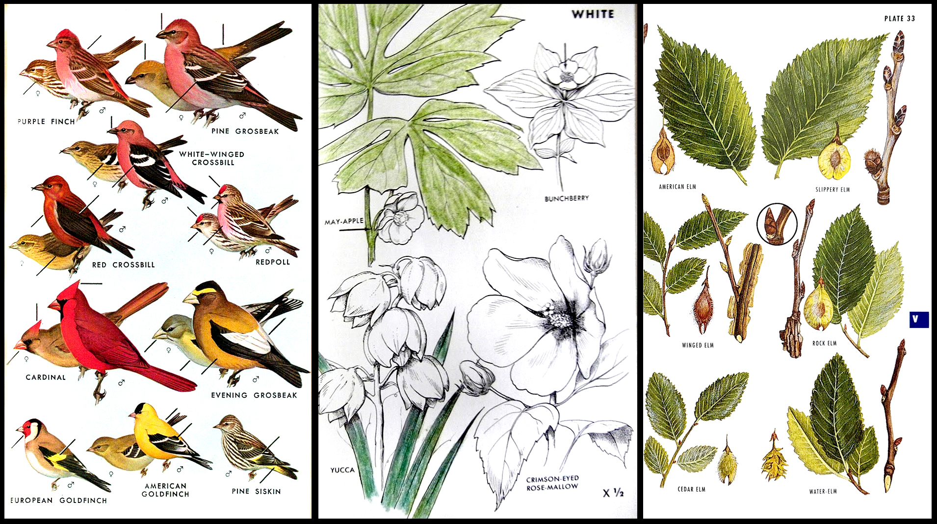
“That is why the best of keys often fail. … But, I am afraid, most of us belong to the picture-matching school.” Peterson began in 1934 with his A Field Guide to the Birds of Eastern and Central North America, which he updated with new editions — and new illustrations — until his death in 1996. The book has been immensely popular and remains so. Peterson branched out with a series of such field guides, covering wildflowers, trees, seashells, insects, fish, mammals — now more than 50 such guides, most written by specialists, while Peterson remained general editor until his death in 1996.
Each book relies on drawings of the animals or plants in question.
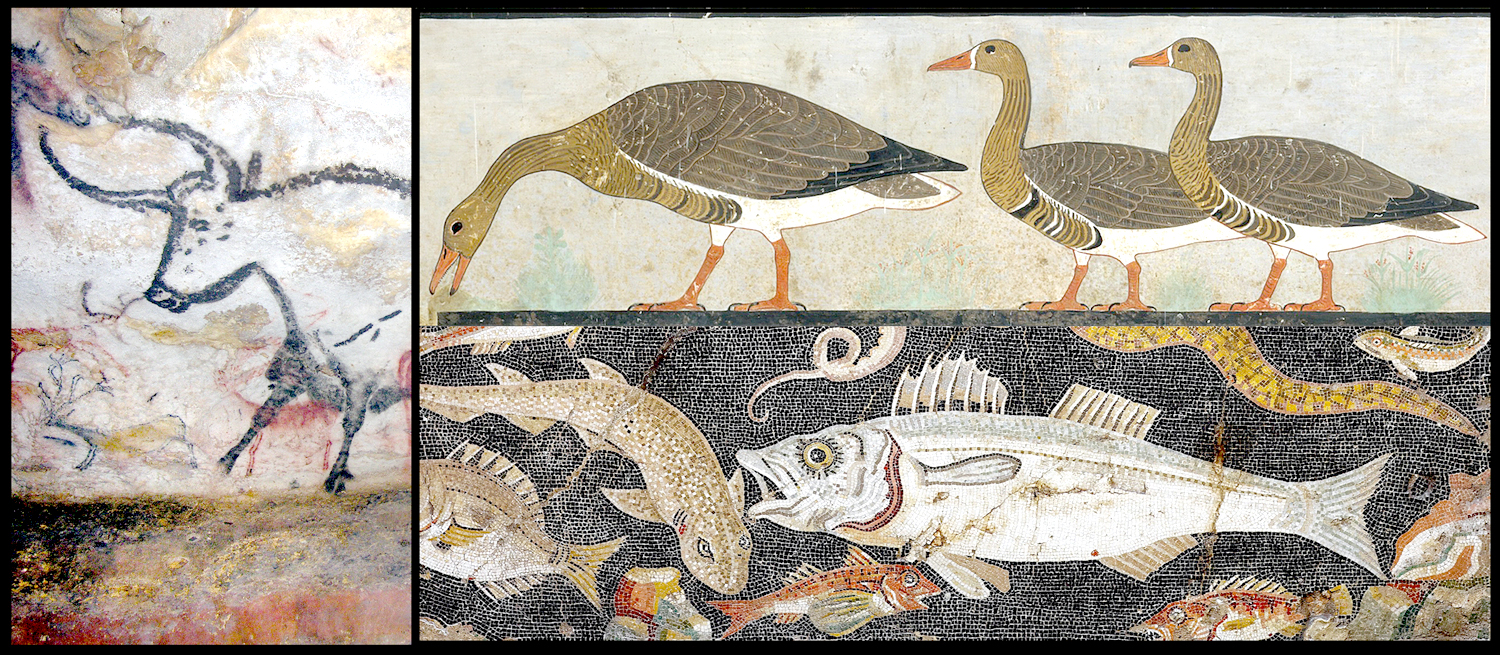
Of course, humans have been making pictures of the natural world since the beginning. The animals drawn the the caves of Lascaux date back something like 30,000 years. Egyptians painted notably realistic animals, such as the famous geese from the Chapel of Itet at Meidum from about 2590 B.C. Romans were fond of animal mosaic floors in the villas, and some are so accurate you can identify species.
But the use of drawings for identifying plants or animals reached a new level of importance in the Middle Ages, when plants were used medicinally and books of drawings helped physicians identify the proper plant for the proper malady.
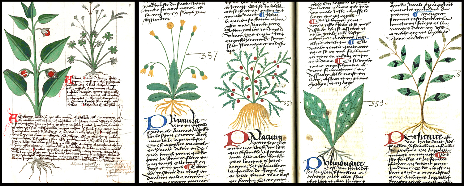
Originally, these were manuscript books. But after Gutenberg, many were printed in quantity, offering advice on the best plants for the worst illnesses.

Often these herbals or “medicinals” were at best diagrammatic. There purpose was simply to sort out which plants would be useful. But as the Renaissance flowered, and a more realistic style of image-making took over, many artists were attracted to the natural world, looking with ever sharper detail at the plants and animals around them. There are drawings and paintings by Leonardo, Raphael and others. But it would be hard to best the small naturalistic pictures by German artist Albrecht Dürer.

But Dürer’s paintings are one-offs. As the 17th century progressed, a more systematic approach took hold, wherein artists as botanists attempted to catalog the plant life around them.
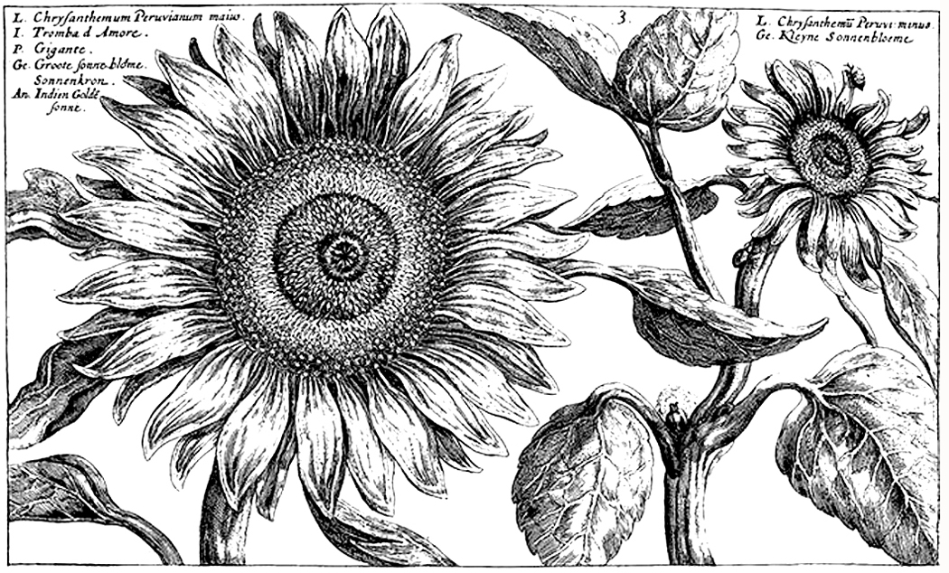
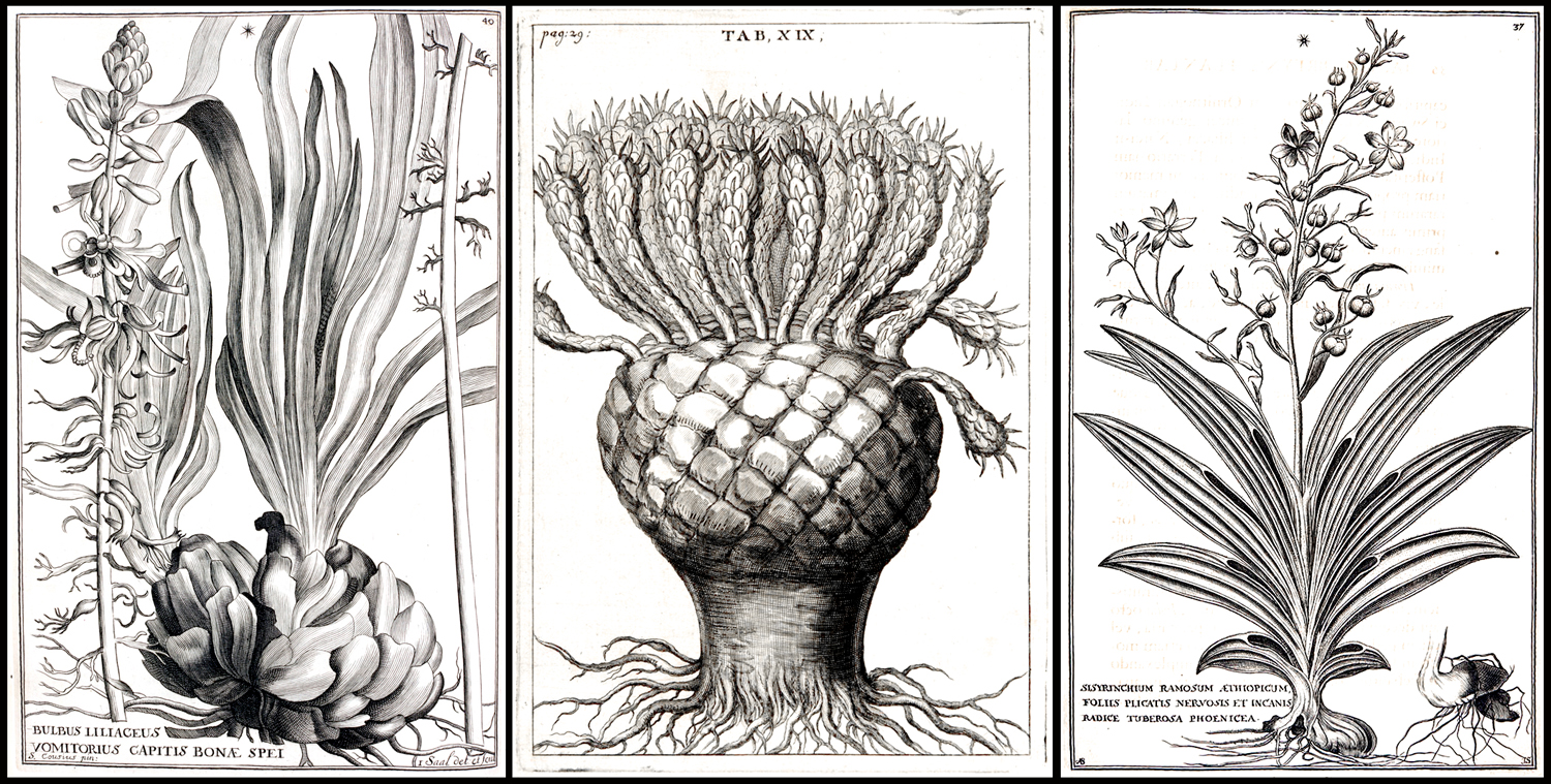
One of the first such attempts was the Hortus Eystettensis, edited by Basilius Besler (1561-1629) beginning in 1613 and spread over several years. It was a collection of copper-plate engravings of the plants collected by the prince-bishop of Eichstätt in Bavaria for his palace garden, which contained examples of all the shrubs and flowering plants known at the time, from around the world.
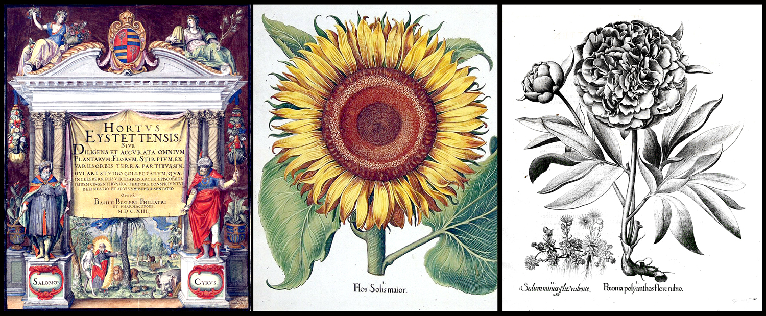
The book contained images of 1,084 species, divided into 357 plates. A cheaper black and white version was supplemented by a luxury edition in which the images where hand-colored. The book changed botanical illustration overnight. What had been crude and diagrammatic became works of art.
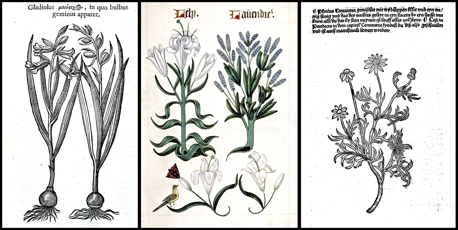
Soon in its heals came Hortus Floridus, a collection of 160 engravings of flowering plants published in 1616, which became so popular its Latin text was soon translated into Dutch, French, and English editions. The book, in modern editions is still available today. It was created by Dutch engraver Crispijn van de Passe the Younger (1595-1670), a popular and prolific engraver of the Dutch Golden Age.
Such books of engravings, colored or not, appeared throughout the century, with Louis XIV’s official painter, Nicolas Robert (1614-1685), producing illustrations in 1640, 1660, and entries in the giant compendium Recueil des Plantes published in 1676.

His drawings and paintings, as well as the engravings made, were of a new freshness and delicacy and presaged a surge in flower pictures made not simply for identification purposes, but as esthetic objects — as art.
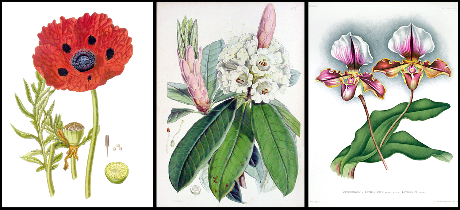
As the 18th century began, these two strains of botanical illustration developed. On one hand, there was a rise in scientific exploration, with botanists traveling the world collecting new species of plant and animal previously unknown to European science. On the other, there was a growing market for books and images of pretty flowers. The two traditions flourished side by side, but also cross-pollenated.

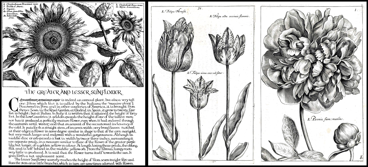
That market for flower pictures was given a jump start by the Dutch tulip craze of the 1630s, when speculation in the market for rare tulips created a financial bubble that burst in 1637. But the Dutch economy was expansive and a growing middle class had money to spend on luxury items such as art. The actual tulip mania was confined to a small but important few speculators, the public at large wanted their part and so prompted the production of pictures of the fanciest tulips. If you couldn’t afford a tulip bulb that cost as much as a house, you could afford a colored engraving of the same flower. And so, pictures of flowers became a thing.

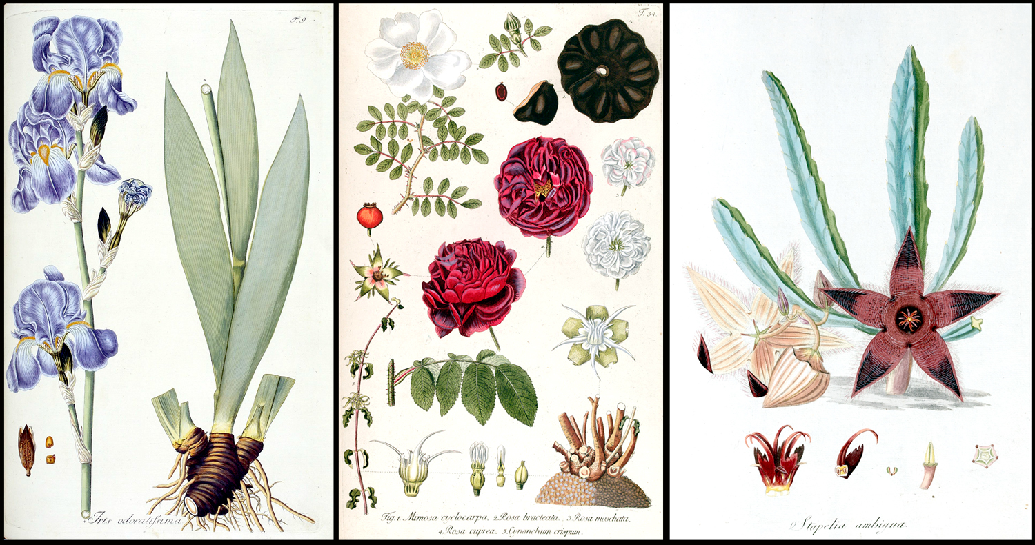
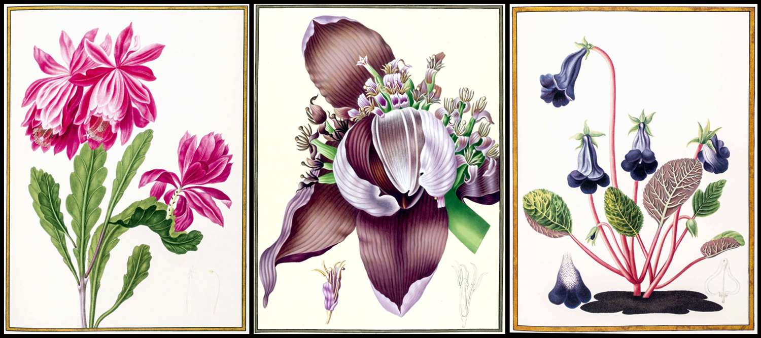
There had always been still-life paintings: pictures of flowers in vases; even kitchen scenes with food on the table and game hanging above. But what I am interested in here are those images of singular plants, birds, or animals, usually devoid of background context, meant to show off the specimen to best advantage. Where still life is meant to elicit warm feelings of comfort and beauty, the botanical illustration is meant to focus attention on a particular item, to see it for itself alone.
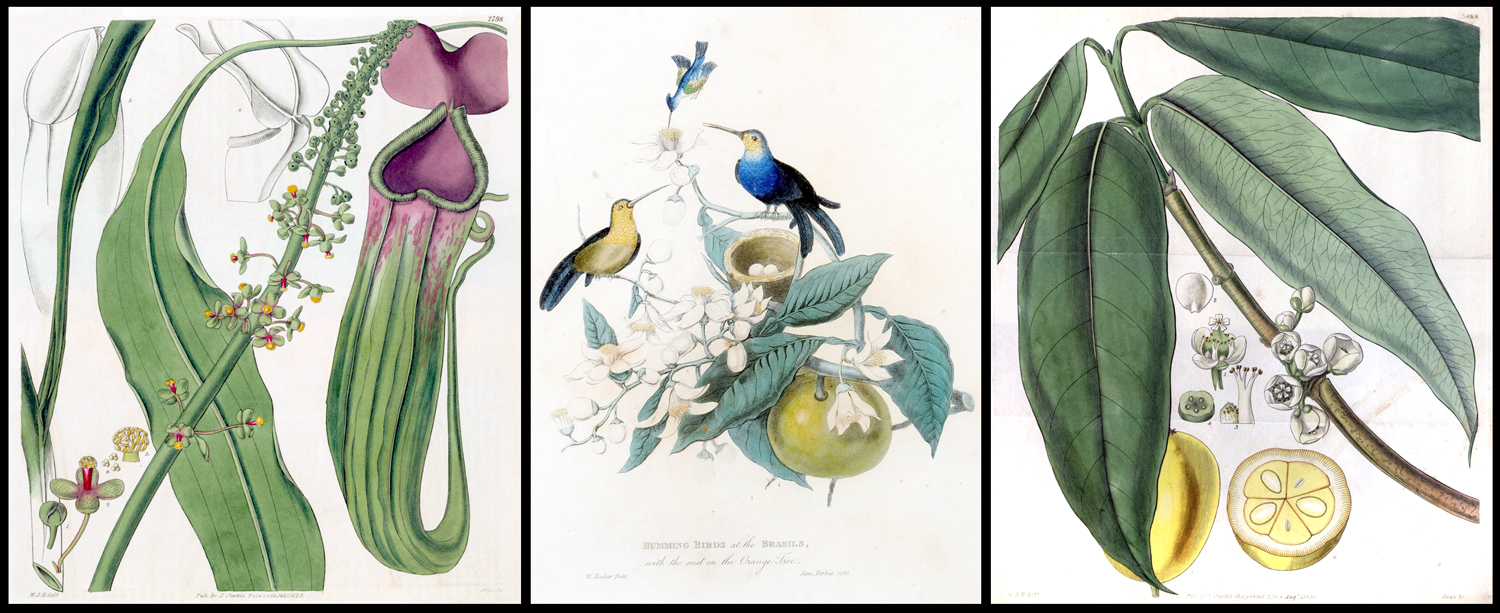
The 17th and 18th centuries were the great era of cataloguing the world, and it led to a plethora of illustration of new and exotic species as scientists accompanied military explorers around the globe, gathering natural history data and both collecting specimens and illustrating them, usually in books.
Dutch-born Nikolaus Joseph von Jacquin (1727-1817), for instance, travelled to the West Indies, Central and South America, publishing prolifically throughout the 18th century.
Sometimes, they went on their own, like the Polish Jacob Breyne (1637-1697), who travelled to South Africa and catalogued plants.
Austrian Franz Bauer (1760-1826) went to Australia, collecting and painting what he found.
Englishman Mark Catesby (1683-1749) sailed to the New World, publishing his Natural History of Carolina, Florida and the Bahama Islands in volumes between 1729 and 1747.

Henri-Lois Duhamel de Monceau (1700-1782) was a French Encyclopedist, writing on many subjects, but catalogued the flora of his native France over his long lifetime, including his 1768 Treatise on Trees and Shrubs.
Likewise, Englishman Thomas Bewick (1753-1828) stayed at home and made wood engravings of his native animals and birds.

Grub Street writer Oliver Goldsmith neither drew nor painted, but his enormously popular Natural History of the Earth and Animated Nature, first published in 8 volumes in 1774, went through many subsequent editions, each time copiously illustrated by an army of anonymous engravers.
As the 18th crossed over into the 19th century, two men characterized the two thrusts of botanical illustration.

William Bartram (1739-1823) traveled through the New World exploring for flora and fauna. His book, Travels through North and South Carolina, Georgia, East and West Florida, the Cherokee Country (1791), is still in print, usually known just as “Bartram’s Travels,” and covers his travels through Georgia, Florida and western North Carolina and is a readable a travel book as it is important as a naturalist survey.
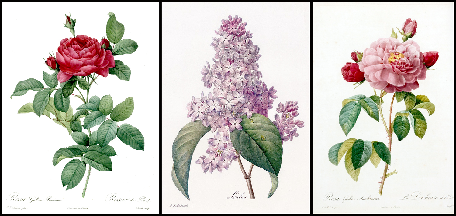
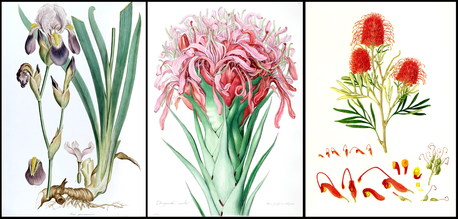
The other impulse for botanical illustration is the creation of art for the beauty of it. And no one did more for that than Pierre-Joseph Redouté, whose images of roses and lilies are still popular in framed prints to hang in tasteful middle class homes. As Wikipedia puts it: “Reproductions of his prints are available from virtually all print and poster shops.”
Redoute’s life was fascinating. He was official illustrator to Queen Marie Antoinette, and somehow survived with his head after the French Revolution and the Terror, despite his aristocratic credentials, and lived to become official artist for Empress Joséphine de Beauharnais and then survived her divorce from Napoleon Bonaparte, only later to be made Chevalier de Legion d’Honeur, France’s highest honor, and his work bought by Charles X.

His early work was watercolor, but later in life, much of his art was engraved and hand-colored or turned into chromolithographs. And now, there are boatloads of books featuring Redouté’s art.
Two developments affected the publication of prints of the natural world as the 19th century overtook the 18th. One was the mainstreaming of colonialism, and the number of biologists and artists who traveled to the new lands to catalog the flora and fauna.
In the 18th century, much of the exploration was just to find out what was out there, to discover new Pacific islands or what was going on in the polar regions. But in the next century, the drive was to exploit what the colonies offered, and to do that meant to catalog all the new things these colonial toyboxes had to offer.
And so, scientists such as Philipp Frans van Siebold (1796-1855) went to Japan; Nathaniel Wallich (1786-1854) went to India; Johann Joseph Peyritsch (1835-1889) went to Sudan. They collected specimens and wrote books illustrated by a host of artists who made illustrations from the specimens they brought back.
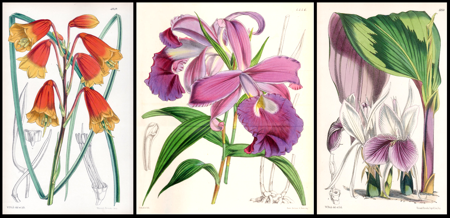
One of the artists employed by the botanists was Walter Hood Fitch (1813-1892). Fitch supplied many of the illustrations for John Dalton Hooker’s 1855 Flora Indica, a survey of plants of India and the Himalaya mountains.
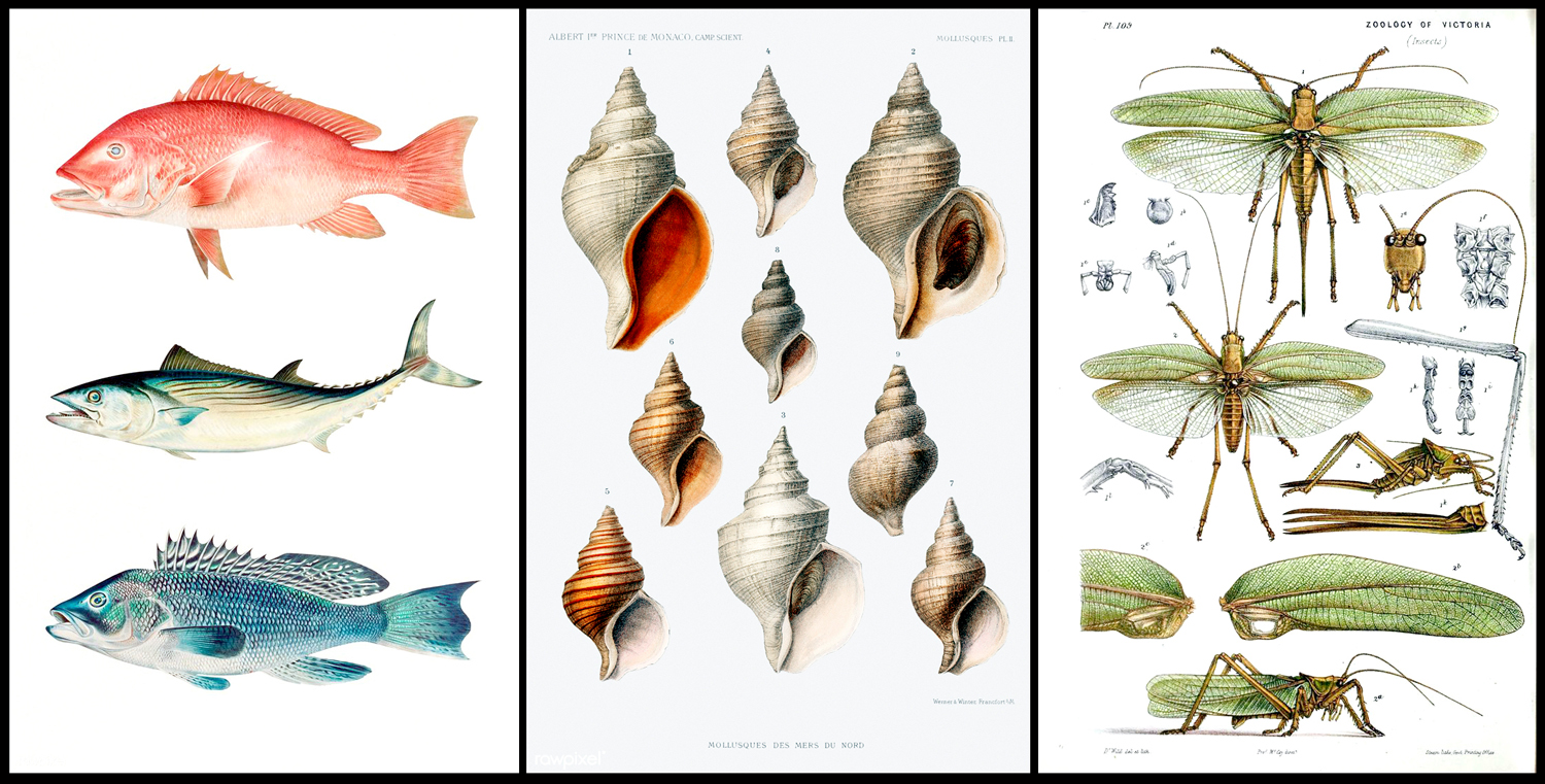
While botanical illustration comprised maybe 80 percent of all natural history artwork, much was done with animals, too, and even such things as seashells, rock types, and landforms.
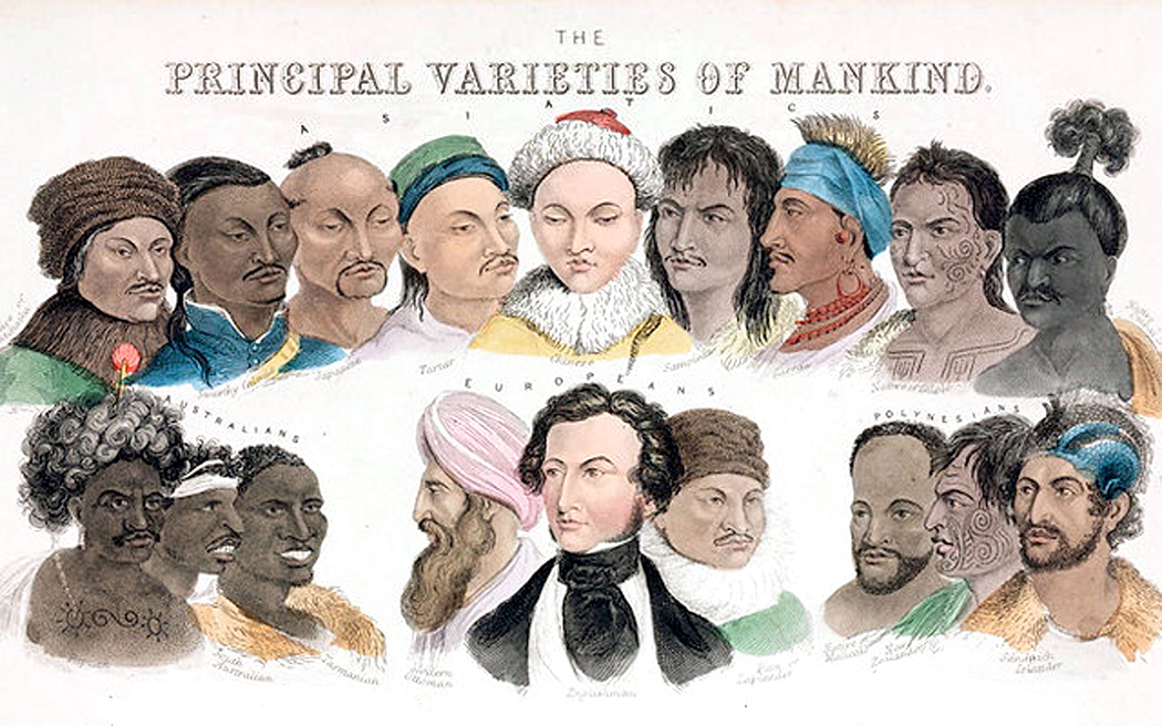
Colonialism brought in an infection called “scientific racism,” and natural history illustration looked not only at flora and fauna, but at human beings, typing them just as they did genus and species of orchid.
There was almost a mania to classify and name everything.
The second development was the invention of lithography, in 1796, which gave both scientists and artists a better means of mass producing images.

The first botanical illustrations were either drawings or paintings, and the first reproductions were by woodcut. But copper-plate engraving supplanted the coarse woodcut and those engravings were often hand-colored, an expensive and time-consuming process for publication.
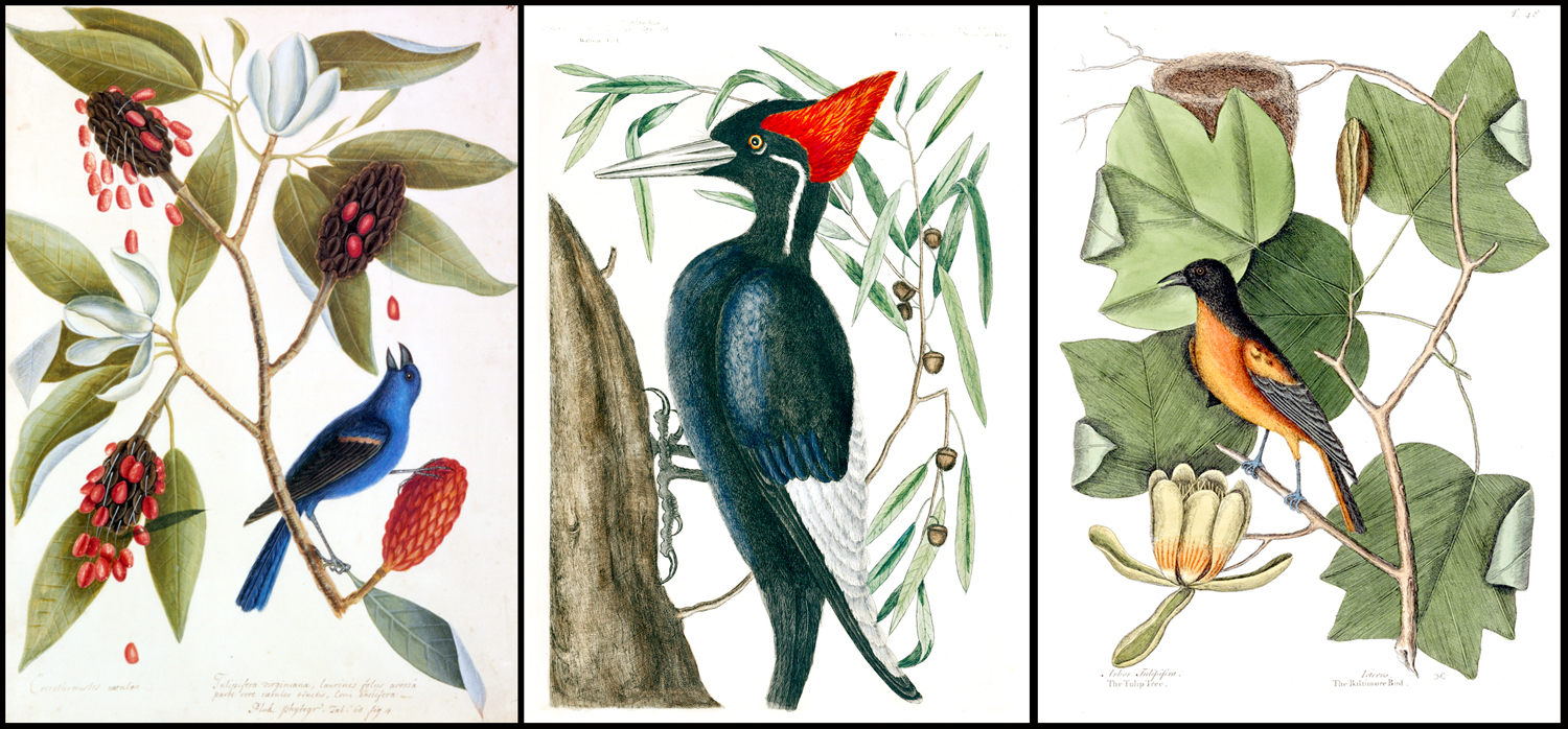
For instance, when John James Audubon (1785-1851) published his original edition of Birds of America in England, in sets from 1827 to 1838, at least 50 colorists were employed and no more than about 200 full sets were printed.
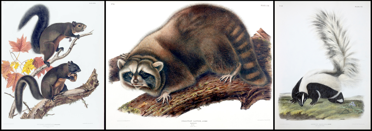
But lithography, and later chromolithography, allowed much larger editions of prints and mass production of images. The later work of Redouté was made with the new process. And when Audubon came to work on his later Viviparous Quadrupeds of North America (published in 1851, after his death) the images were lithographs.
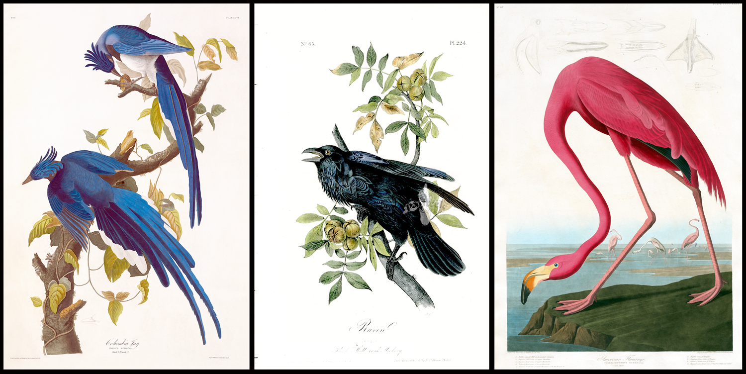
Of course, the most famous natural history art has to be Audubon’s Birds of America. He initially produced 435 large-scale plates, each with life-size images of the birds he drew and painted in his travels through America. The plates were engraved and etched and hand colored. The pages were called “double elephant” size — roughly 28 inches by 40 inches — and you can see he had to contort some of the larger birds, such as the flamingo, to fit those pages and still have them life size.
Later editions came in smaller pages.
The market for natural history imagery was immense during Victorian times and the number of artists working in the field from the late 18th- through the 19th-century was to great for me to cover them all. But I wanted to show off a few of them.
Such as Matthias Schmutzer (1752-1824), who produced 1433 plates for Das Florilegium Kaiser Franz I, a compendium of plants from the garden of Emperor Francis I, the final emperor of the Holy Roman Empire and first of the Austrian Empire.
And I should mention the father-son pair of William Jackson Hooker (1785-1865), a botanist and illustrator and first director of Kew Garden in London. Hooker published more than 20 major botanical works over a period of 50 years.
His son, Joseph Dalton Hooker (1817-1911), who succeeded his father as director of Kew, and was Charles Darwin’s friend. He joined expeditions to the Antarctic, Palestine, Morocco, the Himalayas, and the western United States, collecting specimens along the way, and publishing books on what he found, illustrated by many familiar botanical illustrators of the time, including Fitch.
By the late 19th century, photography began to take over. The earliest I can find is an 1879 set of botanical photographs by Pietro Guidi. The black and white images still had to be hand-colored, just as the old engravings had to be.
And by the fin-de-siecle, as art nouveau gathered steam, the link between nature and art became important. Nature motifs played out in furniture, architecture, book design and painting. Several artists and scientists became immersed in the subject.
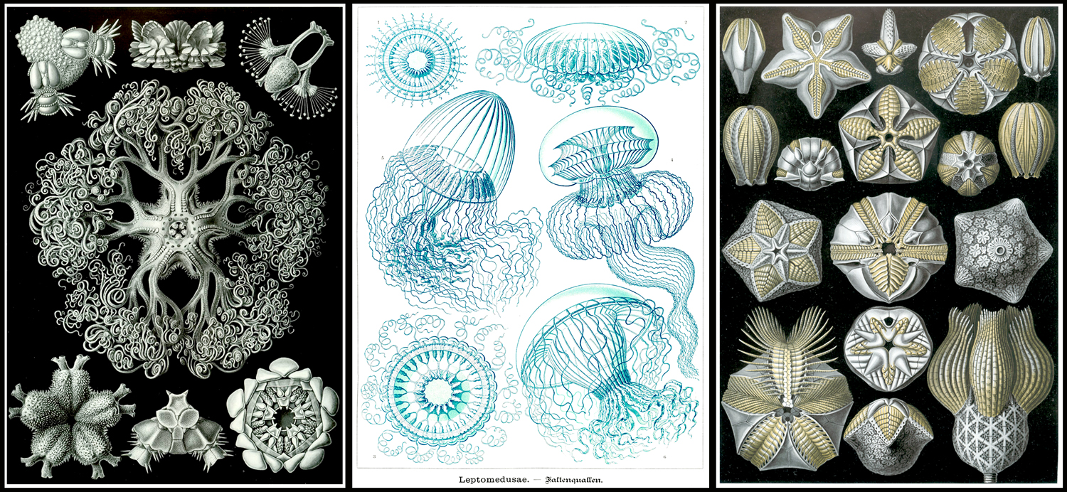
Ernst Haeckel (1834-1919) was a biologist obsessed with Darwin and symmetry. His Kunstformen der Natur (“Art Forms in Nature”), published in 1904. It consists of 100 prints of various organisms, many of which were first described by Haeckel himself. Haeckel’s intricate drawings were transferred to print by lithographer Adolf Giltsch.
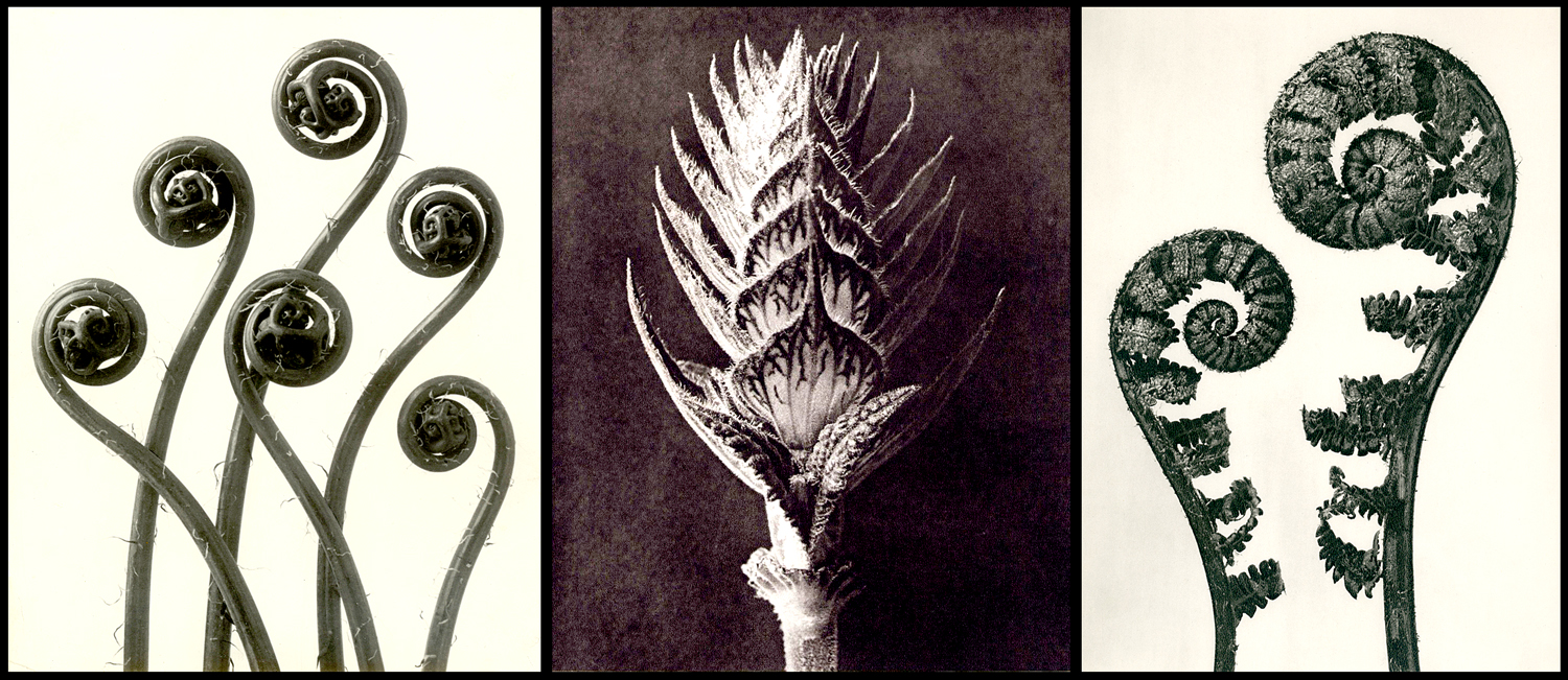
In 1929, professor Karl Blossfeldt (1865-1932) used photography to express the relationship between nature and modern art in his Urformen der Kunst (“Original forms in Art” or “Art Forms in Nature”). His purpose was pedagogical, teaching his art students to seek for inspiration in natural forms.

This cataloguing and regularizing tendency in German art extended beyond botany and zoology. In the 1920s and ’30s, photographer August Sander attempted to photograph all the jobs and professions in Weimar Germany, and later, Bernd and Hilla Becher made multiple images of German water towers, mining tipples, cooling towers, grain elevators, coke ovens, and blast furnaces, among other things. Those images, made mostly from the 1960s through the 1990s were part of a movement dubbed the “New Objectivity.”
But back to nature: It is hard to overemphasize the attractiveness and popularity of natural images, especially birds and flowers.

Charles Philip Hexom (1884-1959) executed a series of covers for Nature Magazine in the 1930s and ’40s. I have collected several of these. They are simple but elegant.
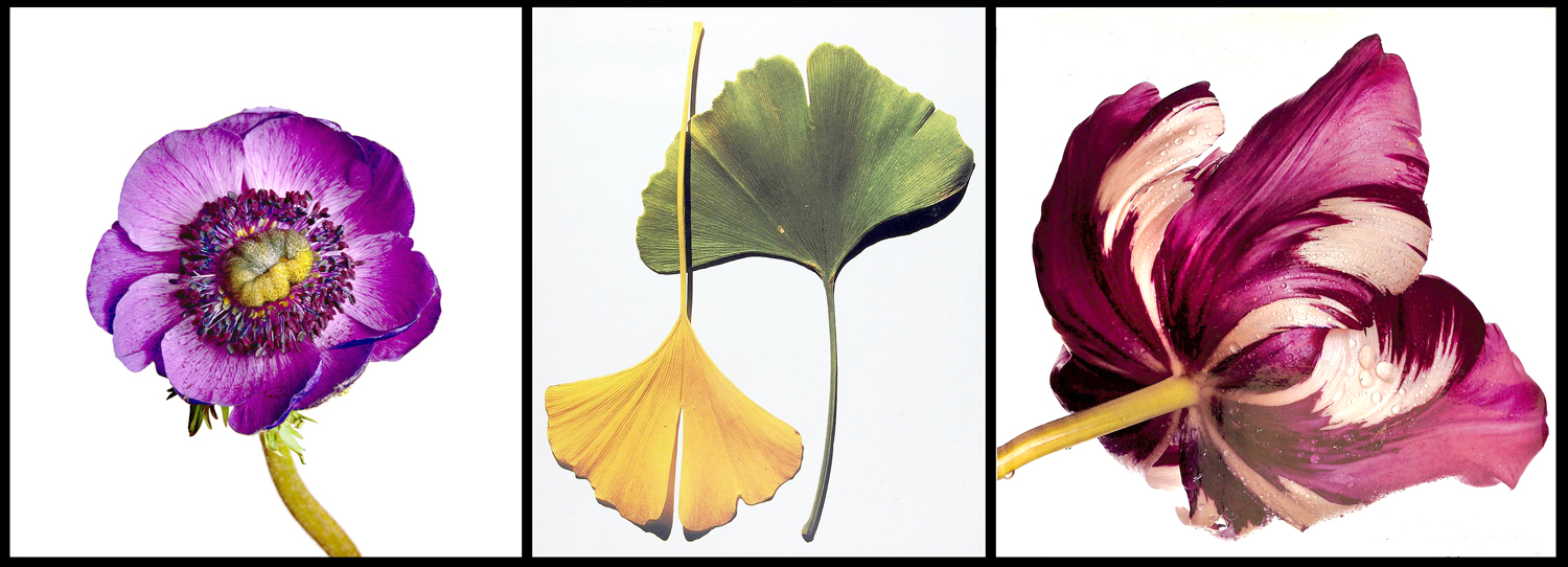
Irving Penn (1917-2009) published Flowers in 1980 and the perfection and simplicity of the photographs remind one of Redouté.

And finally, for our purposes, Robert Mapplethorpe photographed flowers over his whole career, with his book, Flowers, coming out posthumously in 1990.
This has been a short, embarrassingly incomplete survey of botanical and natural history illustrations from the late Roman Empire until the Post-Modern age. Whole books have been written on the subject and more will likely be published in the future.
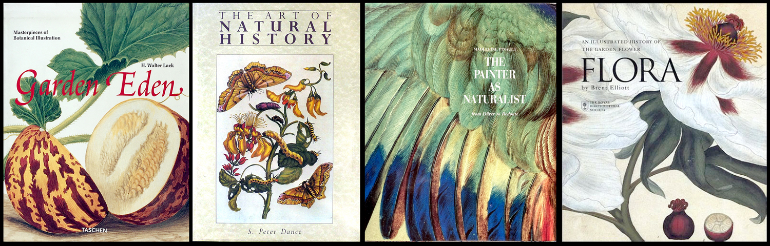
I consulted about 20 books for this essay, among them are: The Art of Natural History by S. Peter Dance; The Painter as Naturalist: from Dürer to Redouté, by Madeleine Pinault; Un Jardin d’Eden by H. Walter Lack; and Flora: An Illustrated History of the Garden Flower, by Brent Elliott.
Click on any image to enlarge


