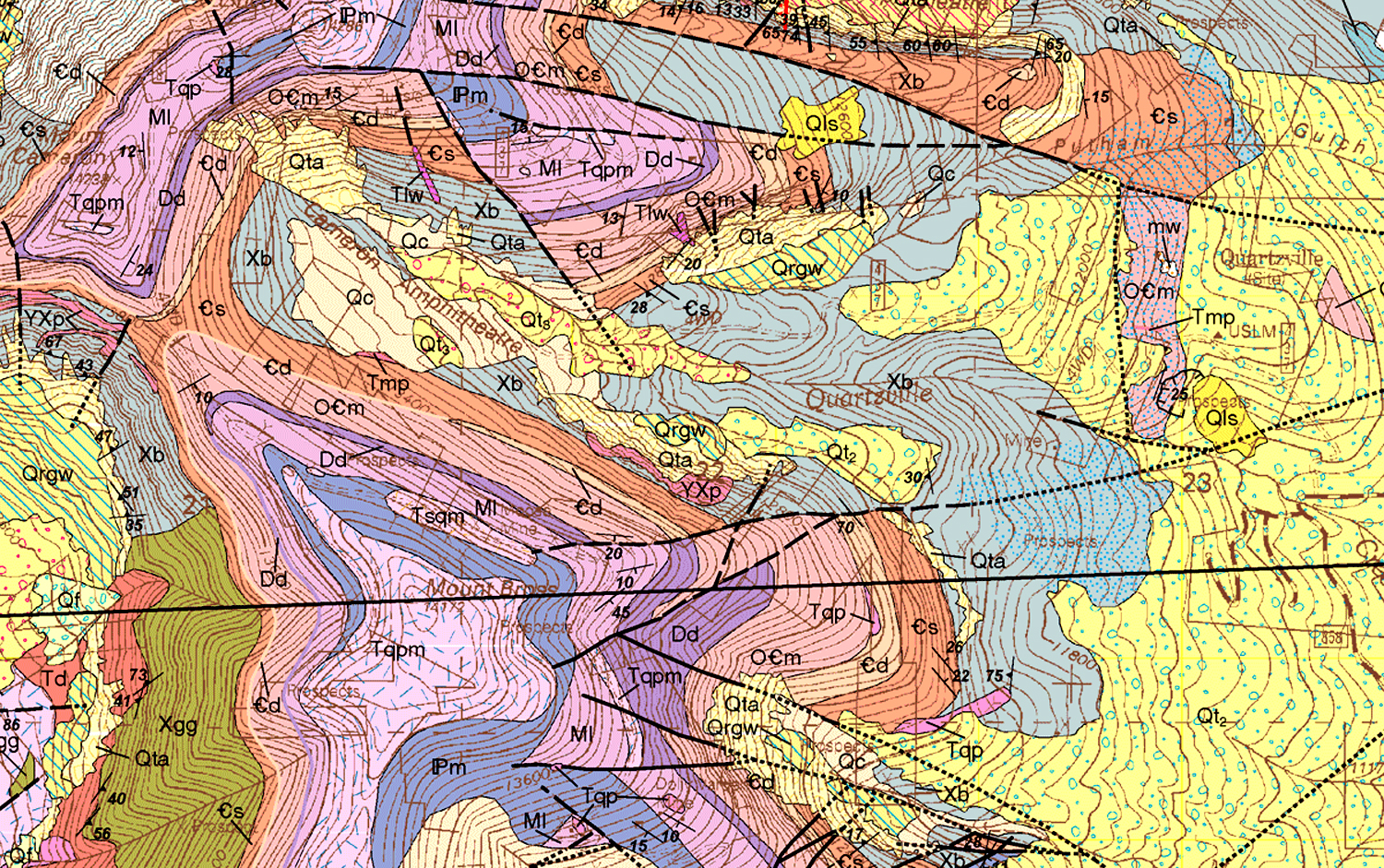
In the TV show, Big Bang Theory, physicist Sheldon Cooper claims that geology “isn’t a real science.” He’s quite a snob about it. But if you unfold any standard geological map — one that outlines the underlying bedrock of any state or county — you will see something so mindbogglingly complex and incomprehensible, that it couldn’t be anything but science.
A geologist is someone who can tell the difference between diorite and andesite, and can measure the schistosity of mica, and explain how seashell fossils came to be found on the top of Mt. Everest. Geologists find petroleum and metals under the earth, and tell us the Earth is 4.6 billion years old. And a good deal of what is written in the field is — much as with quantum physics — well beyond the ken and vocabulary of mere mortals.
They write things such as: “Mass transport deposits (MTDs) occur as intercalations within turbiditic sequences above the ophiolites. They represent syncontractional submarine slides that occurred on frontal accretionary prism slopes during the Late Cretaceous–Paleocene closure of the LPOB.” That, by the way is “Ligurian-Piedmont Ocean Basin,” in case you were confused.
Southern Utah
So, yes, they are scientists. And it’s fun to learn as much as you can, and collect interesting rocks and minerals. But geology is also for poets, artists and cooks. And it is the humanistic aspects of geology that have fascinated me since first studying geology in college.
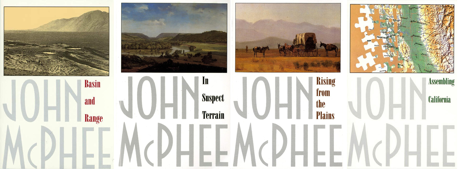
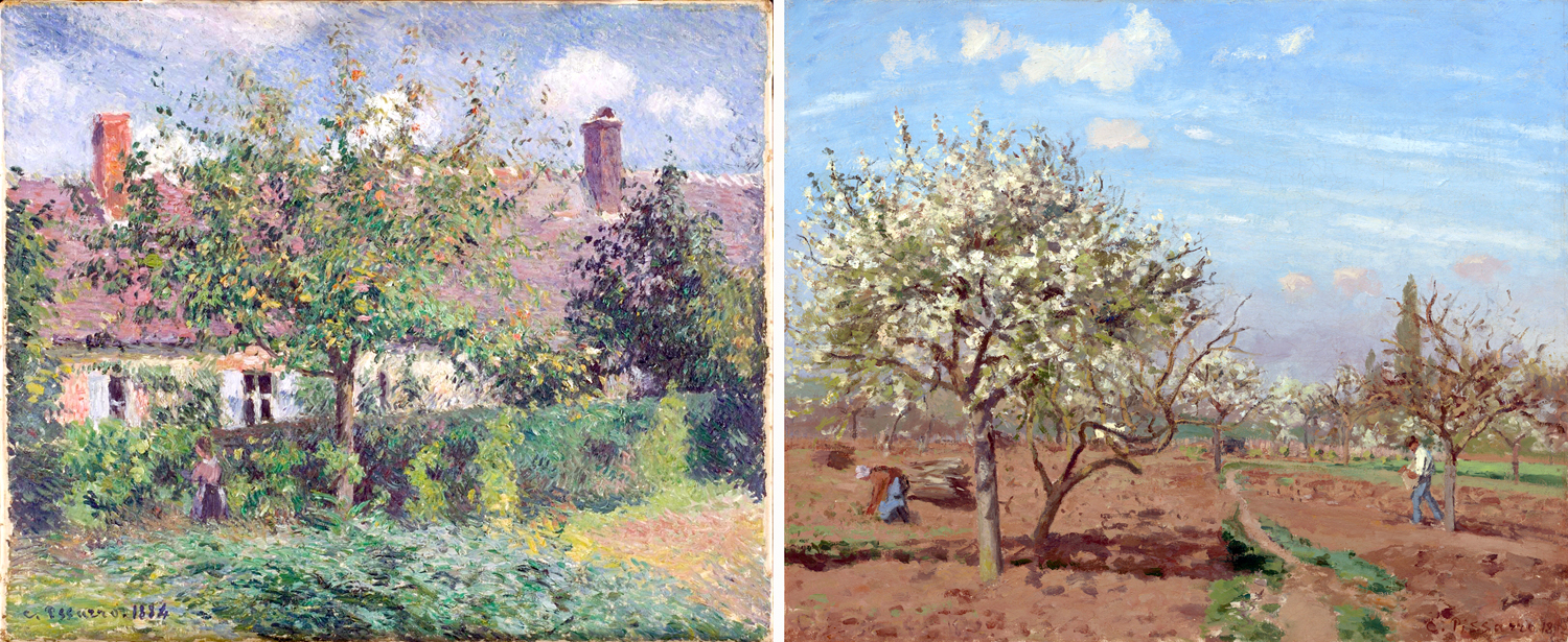
I read a good deal about geology, including the four books written by John McPhee in the 1980s — although they are about geologists as much as about the rocks they study. They are at the comprehensible boundary between general and specialist knowledge. And you’ll never drive through an interstate highway roadcut the same way again.
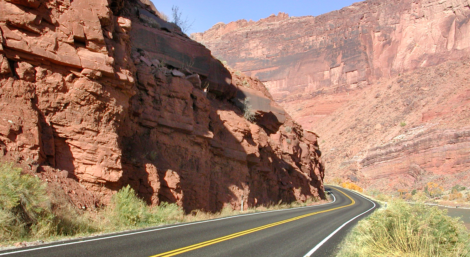
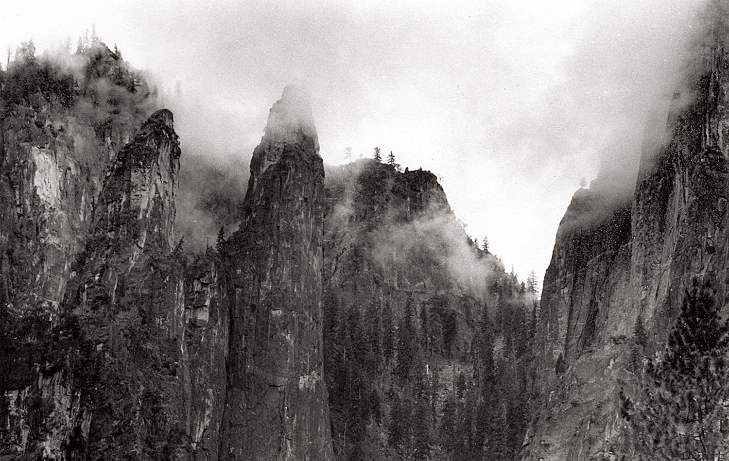
Along the Colorado River, Utah
Geology is just everywhere and affects all of our lives not only daily, but even hourly. Think of your car. Every bit of it, save only the rubber in its tires and the fabric or leather of its upholstery, came originally out of the ground. Whether it is the steel of its engine, the platinum in its catalytic converter, the glass in its windshield or the plastic of its dashboard — all dug out of the ground before being polished up and installed on your Hyundai.
And even your tires, these days, are only partially rubber. The rest of it was dug up, too.
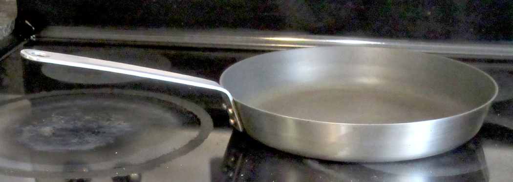
The skillet in your kitchen is just a rock that has been processed. The knives, too, and the potato peeler. All just carefully refined stones. In many ways, we still live in the Stone Age; we’re just more sophisticated about it than those guys banging rocks together in the Paleolithic caves.
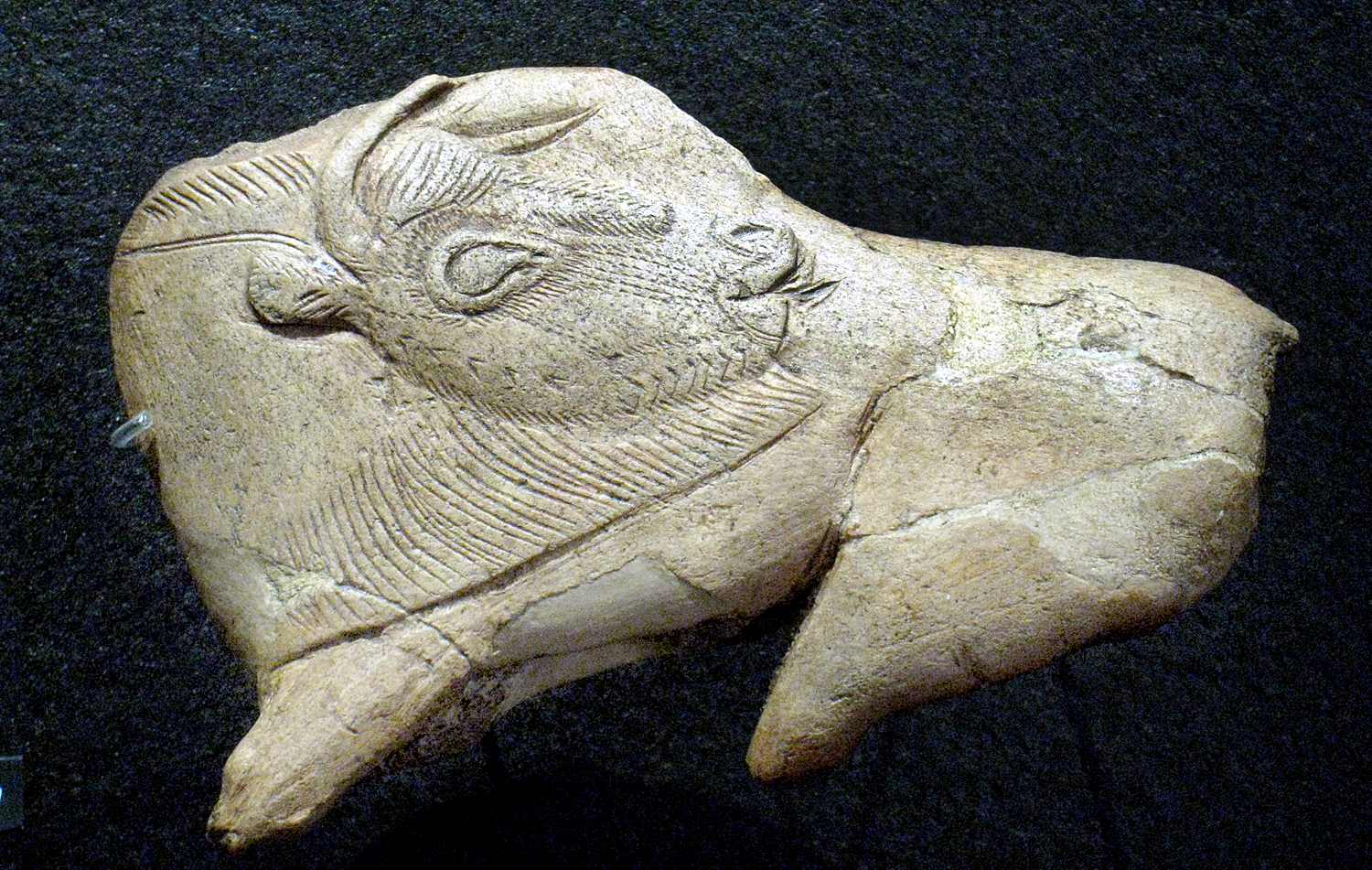
Paleolithic bison carving
Our human prehistory has been divided into the Paleolithic, Mesolithic and Neolithic. I suggest we now live in the Metalithic Age. (Everything now seems to be “meta.”) We do amazing things with the ore we dredge out of the ground and the petroleum we pump, but the foundation of our civilization is still geology.
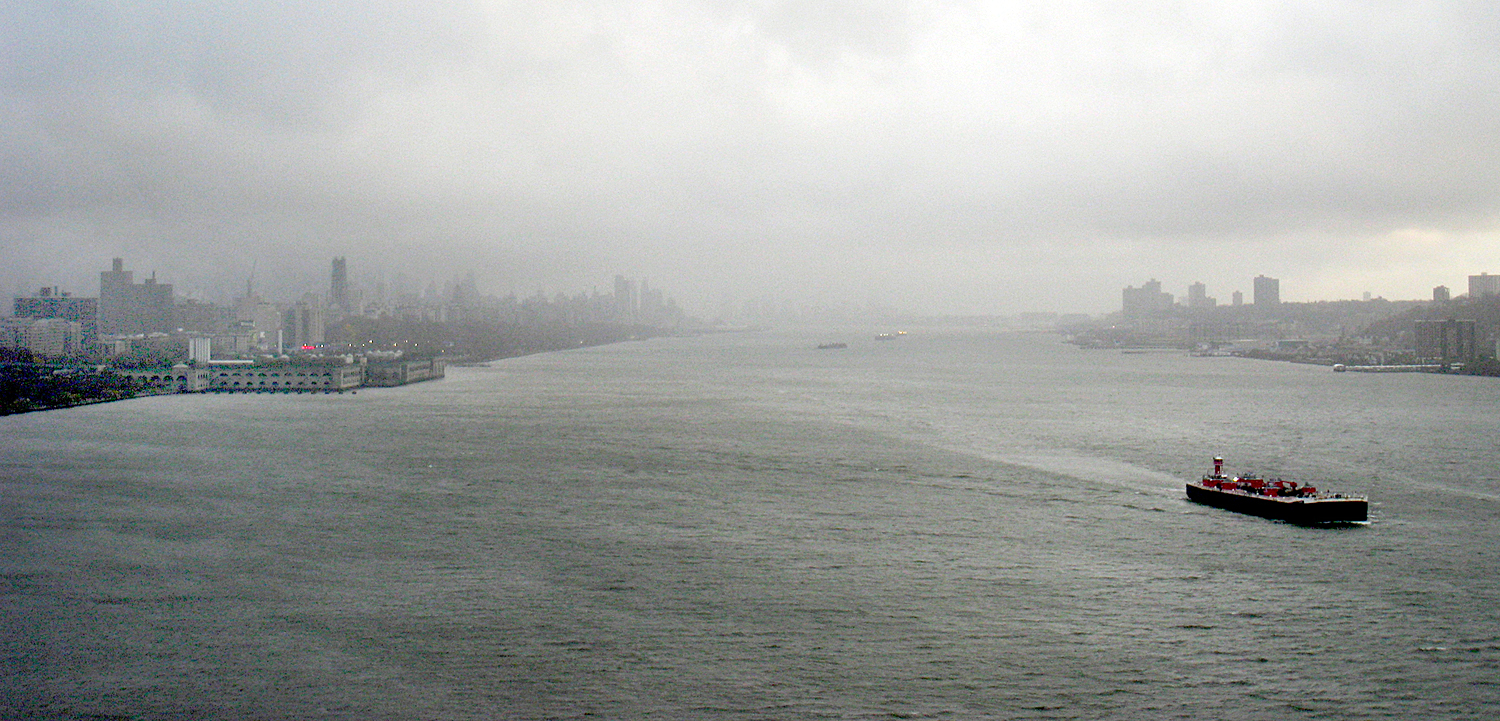
New York on the Hudson River
Cities are the index of civilization and most of the world’s great cities are built on harbors or rivers. The Indus, the Euphrates, the Nile, the Huang Ho. That’s geology. The cities are built with steel and concrete. Geology. Their streets are paved with either concrete or tar and gravel. More geology.
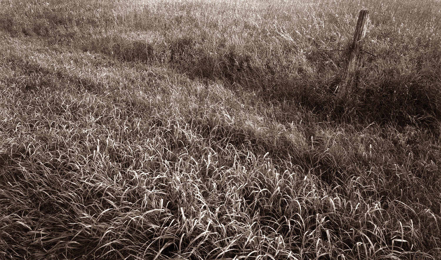
Our food grows in dirt, or grazes on the grasses that sprout from the soil — a soil derived from the bedrock underneath. What are vitamins and minerals but the residue of those same rocks?
Blue Hill, Maine
Geology drives history, too. For instance, because Norway and Greece are so rocky and ungenerous for agriculture, their peoples took to the sea and the Greeks colonized everywhere from Spain to the Black Sea, and the Vikings from Constantinople and Sicily to England and Iceland. Geology kept the Old World and the New from interacting significantly until 1492. It blocked the westward expansion of the British colonies in North America for a century. It is the reason that Afghanistan is the “graveyard of empires.” Plate tectonics — “continental drift” — and the formation of Eurasia as a single east-west landmass has been hypothesized as the cause for European and Asian historical dominance.
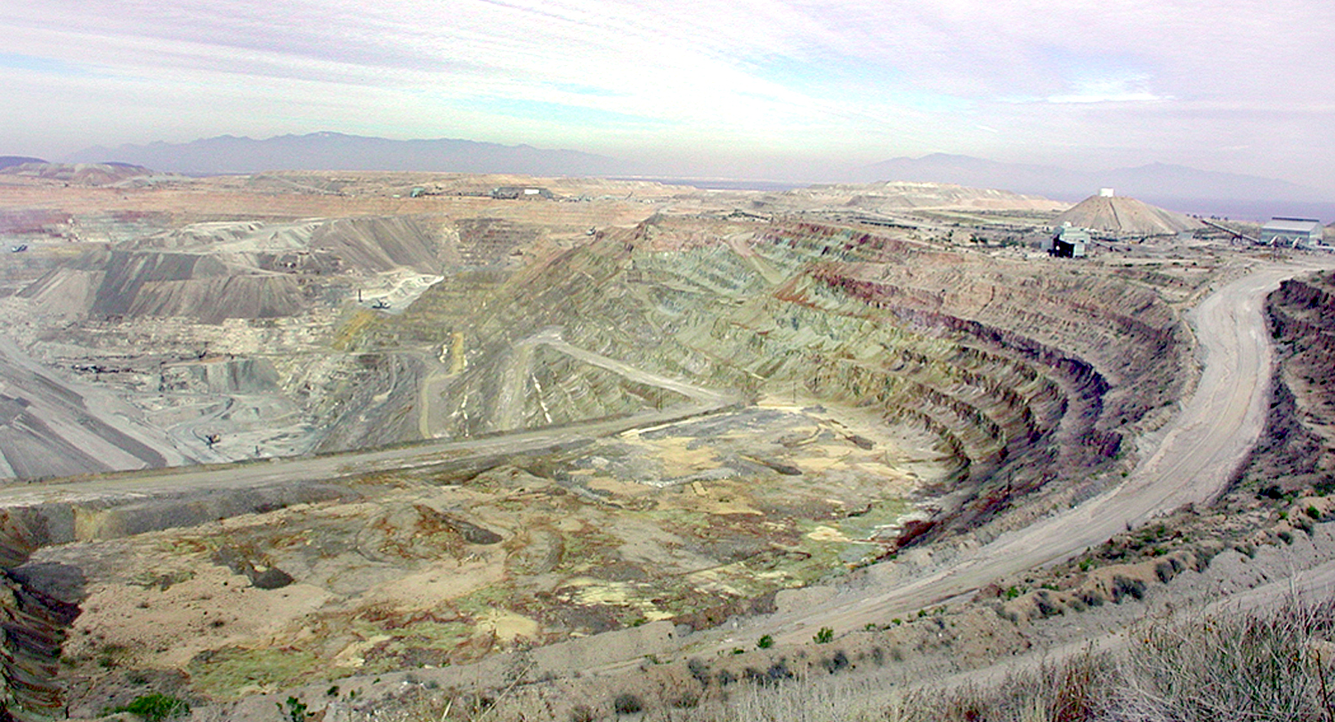
Asarco pit mine, Arizona
And geology, in the form of coal mining and petroleum extraction, is the cause of catastrophic climate change and global warming.
Geologist Donald Beaumont wrote, “Geology will, unfortunately, remain an under-recognized, ‘phantom,’ science in that its role in explaining the foundations for human society may never be fully appreciated.”
I’m not making the case that geology explains everything, nor that it is the only thing that made us what we are, but I am saying that it helps explain it, and that you can see the same forces acting out elsewhere in the world.
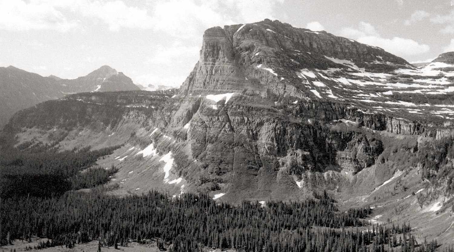
Olympic Mountains, Washington
It isn’t only physical, it is psychological also. Geology creates emotions. And so artists and poets have used geology to elicit in their audiences certain emotional states — rocky metaphors.
Pleasant Cove, Chuckanut, Wash.
It is to seek this power that great landscape artists — whether painters or photographers — make their pictures. It is not to make a postcard of a pretty piece of scenery, but to find in the land a metaphor for thought, emotion or state of mind — or even a political philosophy.
Canadian Rockies, Alberta
That mythic force is why we feel the rise in our throats when we sing of “amber waves of grain,” and “purple mountains majesty above the fruited plain.” Rocks and terrain serve as metaphors for internal states.
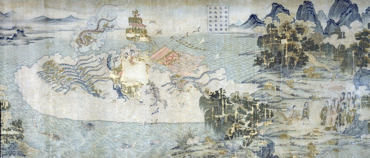
“The Nymphs of the Luo River,” by Gu Kaizhi
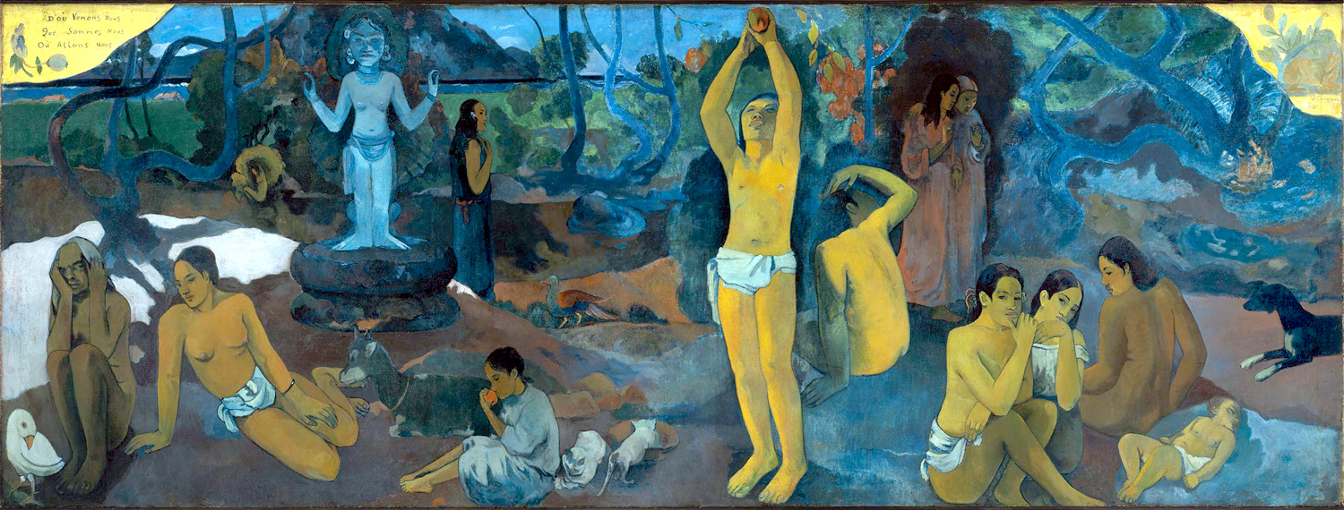
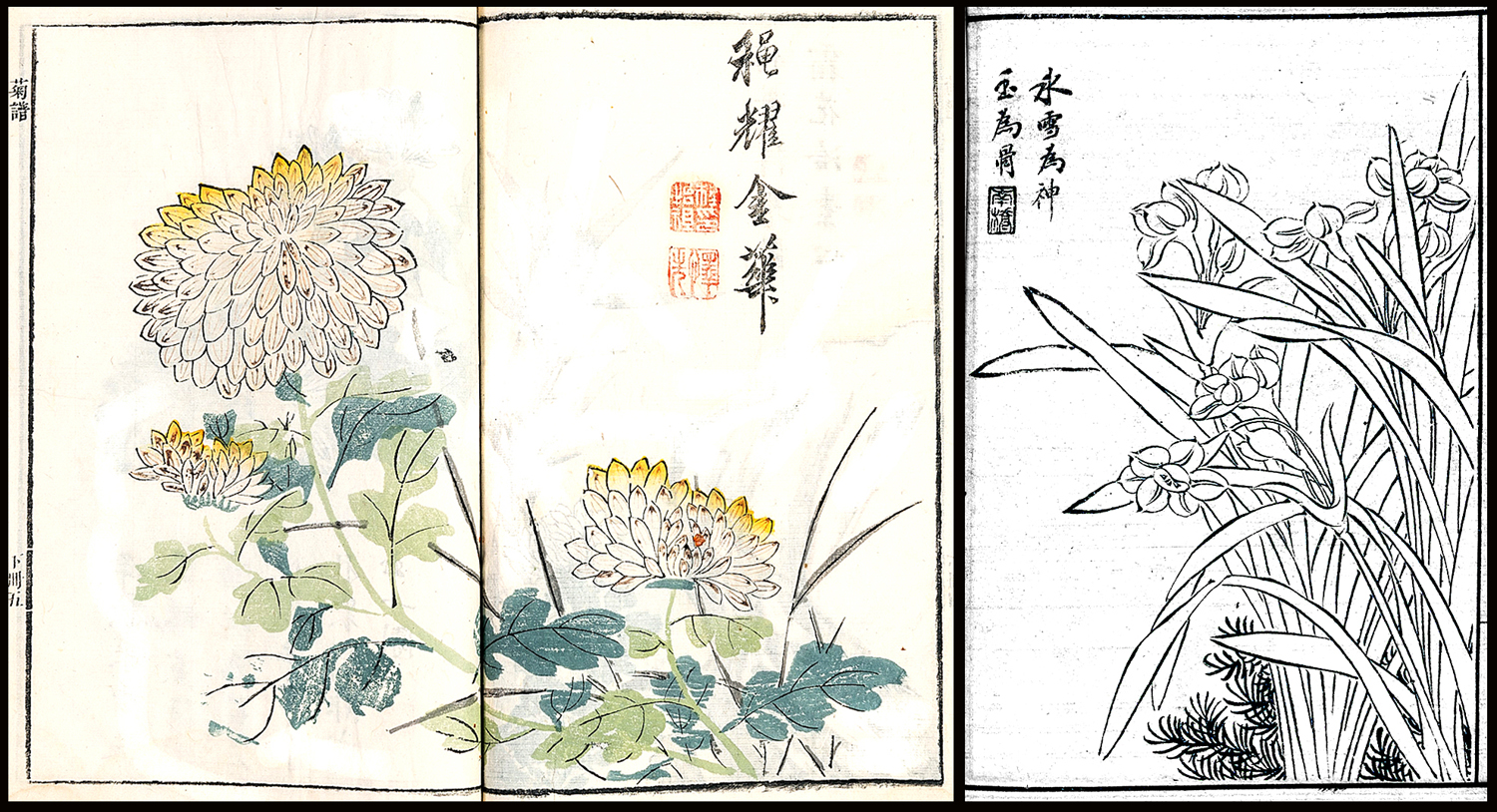
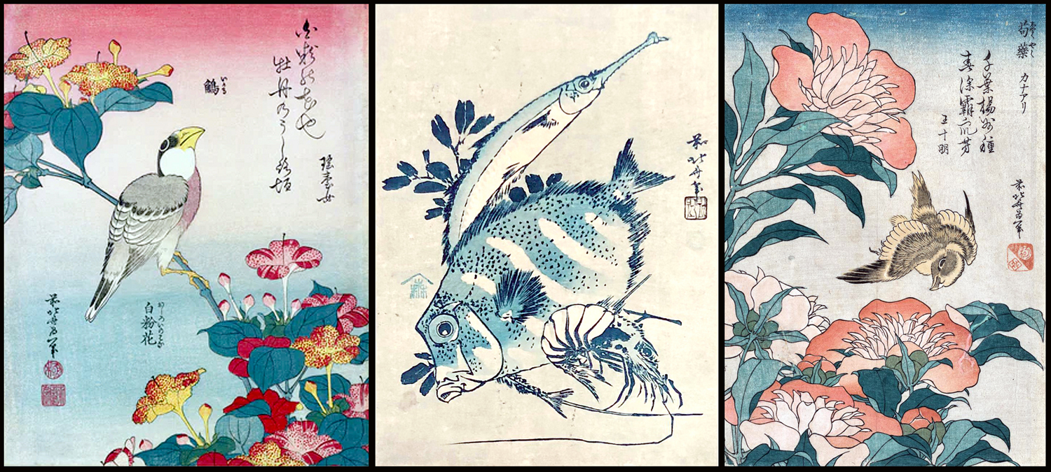
European artists have used that metaphor since the Middle Ages, Asian artists since the Jin Dynasty.
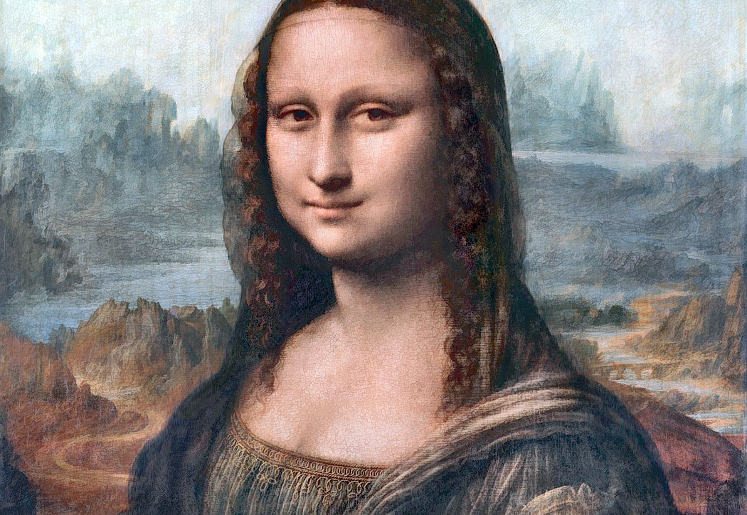
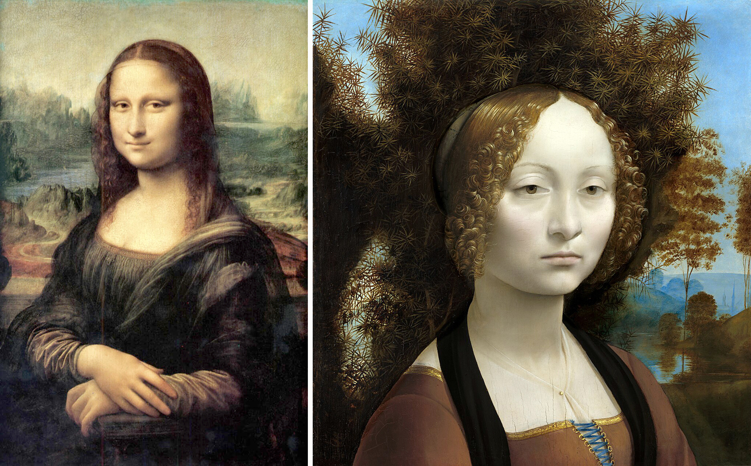
“La Gioconda” detail
Consider the Mona Lisa. Yes, it is a portrait, but behind the smiling lady is a rocky landscape. It is not like anything actually found in Italy, but rather it is a metaphorical landscape — a mountainous desert. Renaissance artists often used such stony views as a reminder that life on earth is a kind of spiritual desert (and the afterlife is where true fulfillment is to be found). As Geoffrey Chaucer wrote: “Here nis noon hoom, here is but wildernesse.”
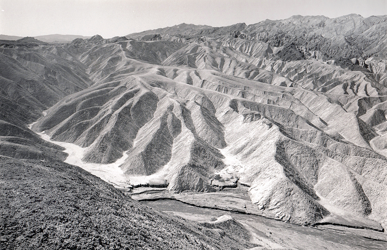
Zabriskie Point, Death Valley, Calif.
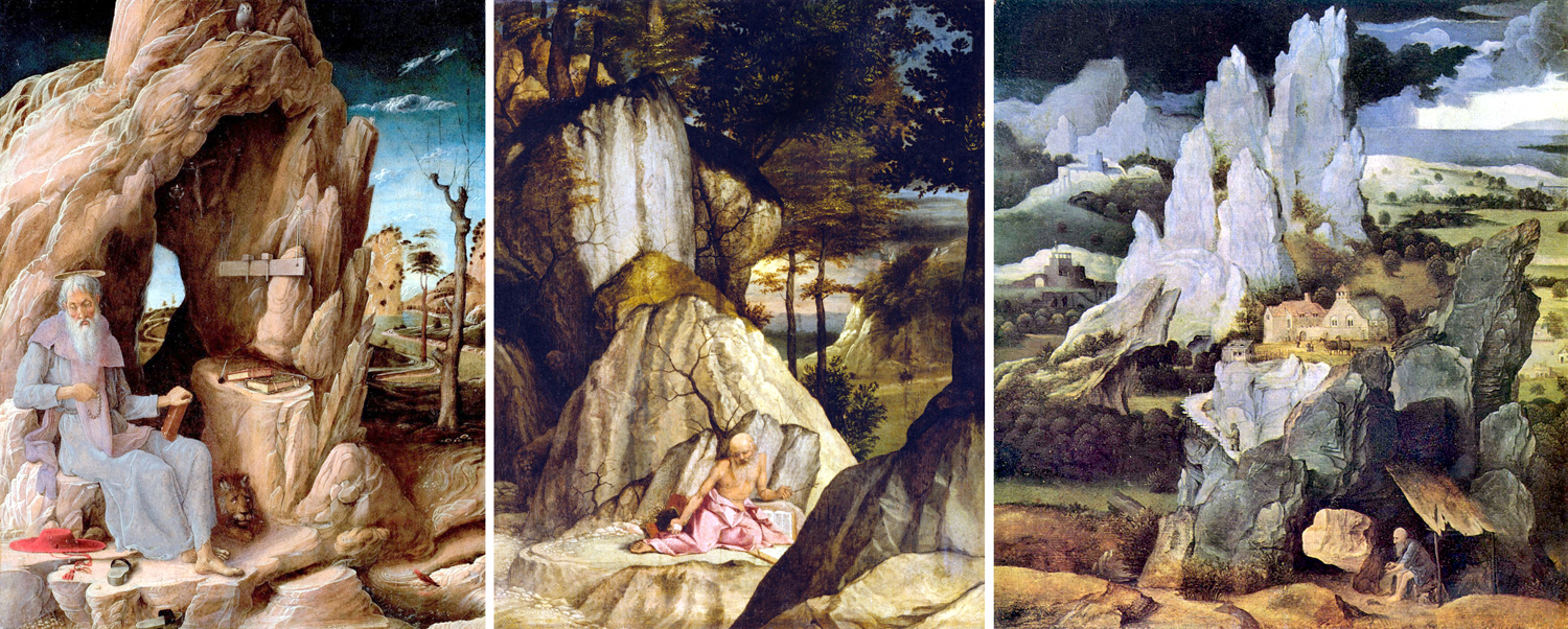
St. Jerome lived in a cave, and painters used the story to show the geology of spiritual isolation. Here are only three of many Renaissance paintings of the saint, by Andrea Mantegna, Lorenzo Lotto, and Joachim Patenier, all from the early 1500s.
Romantic painters in the 19th century used the vast Alps as a reminder that the cosmos is infinitely larger and more impersonal than we like to believe. Geology becomes an image of The Sublime.
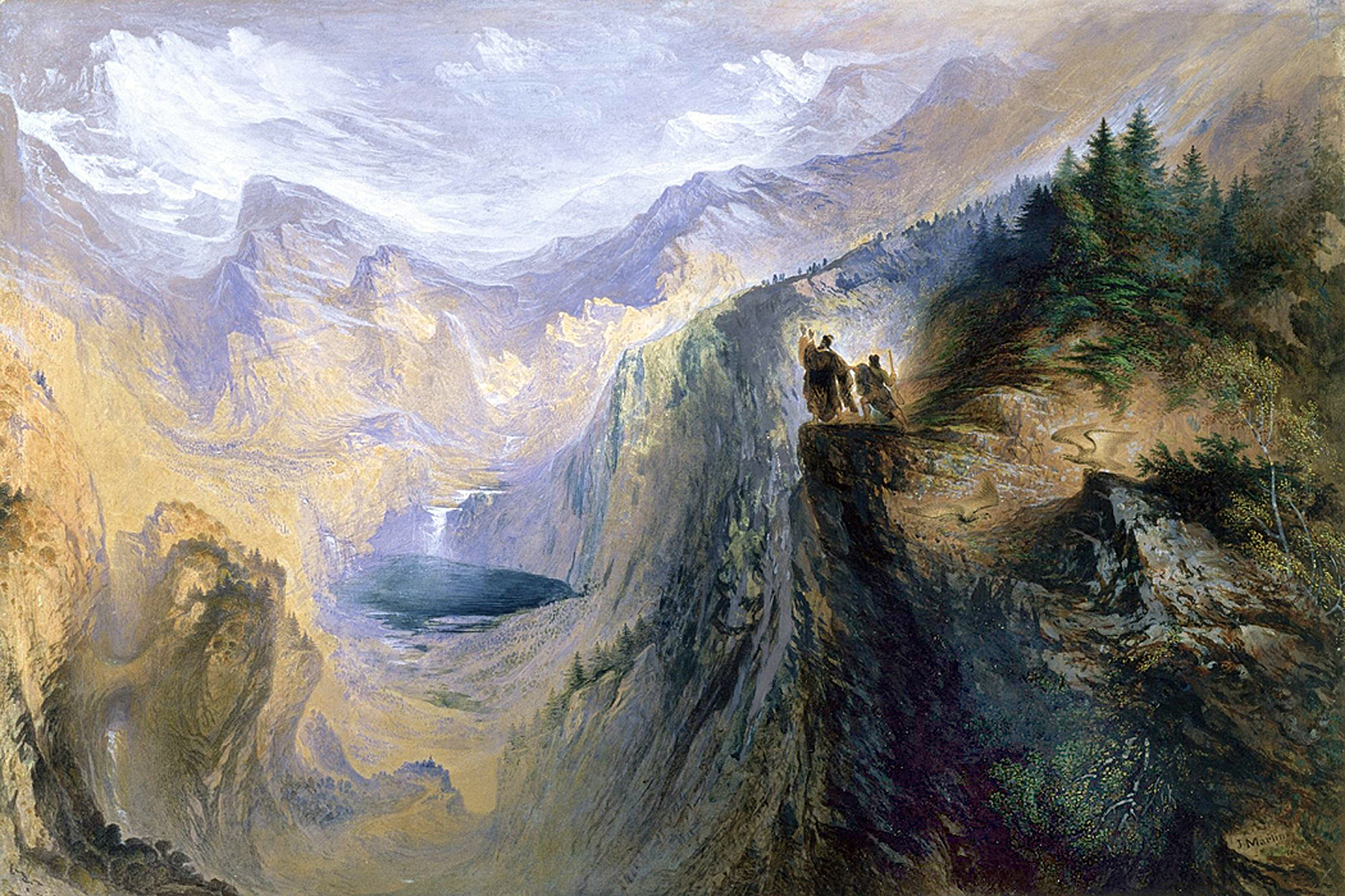
“Manfred on the Jungfrau” by John Martin
Chinese landscape painting features some amazing mountains. I used to believe these scenes were pure fantasy, but no, these mountains actually exist. On porcelain, by Huang Huanwu, a traditional painting — and a photograph, to prove they’re real.
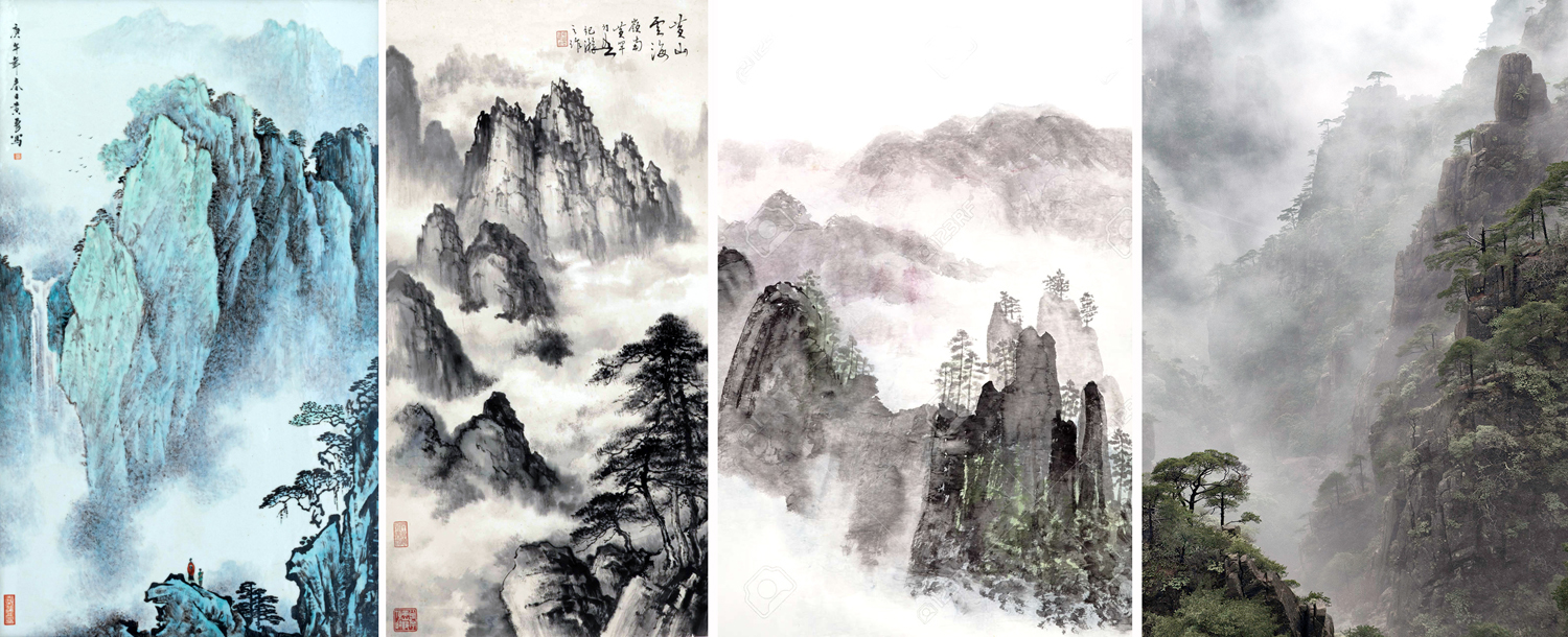
Three paintings and a photo
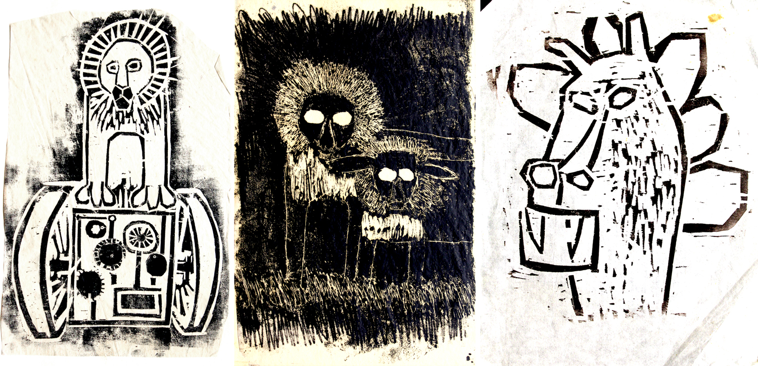
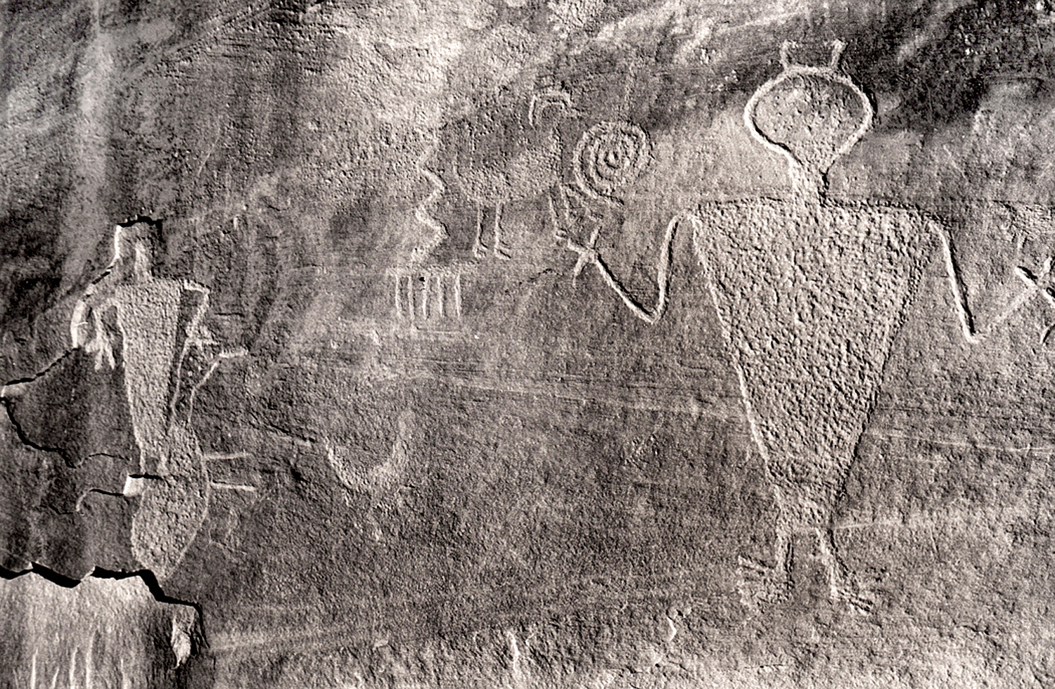
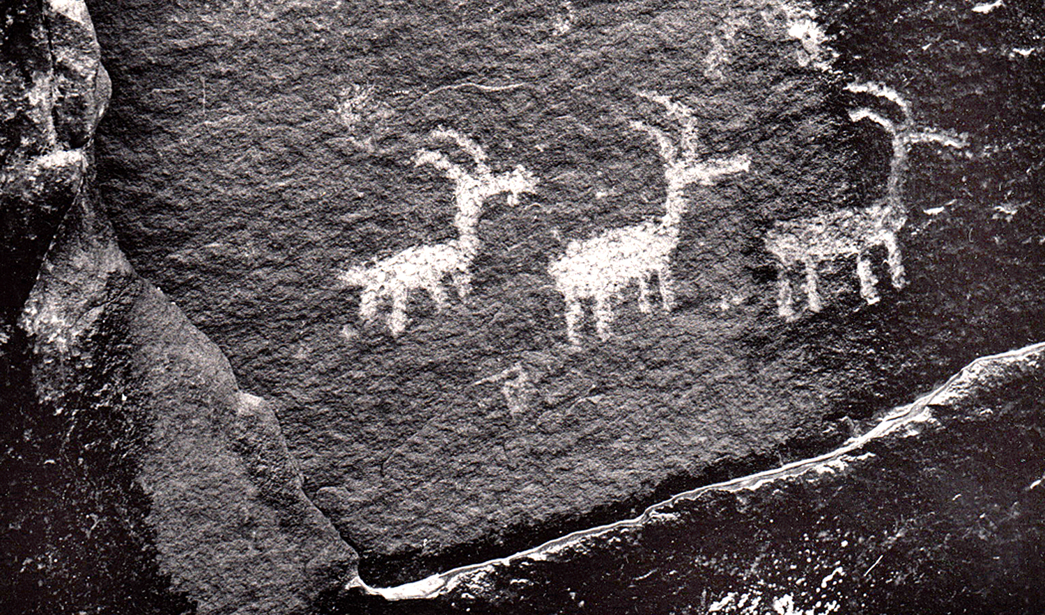
Prehistoric peoples used the rocks for their art, too.
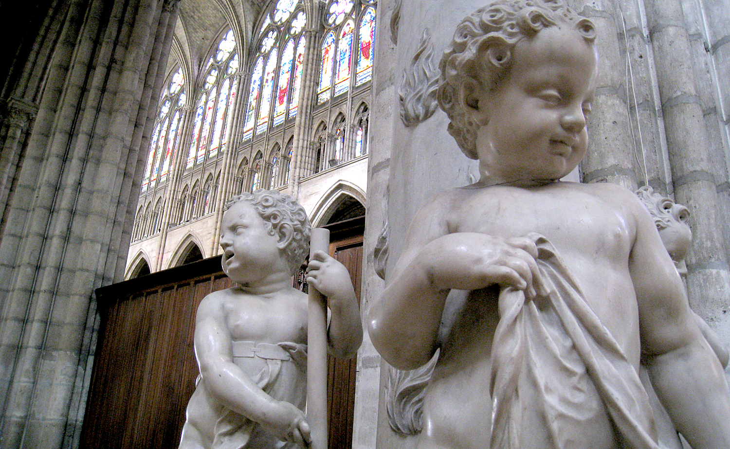
We use stone for permanence. Consider all the marble statuary and granite architecture.
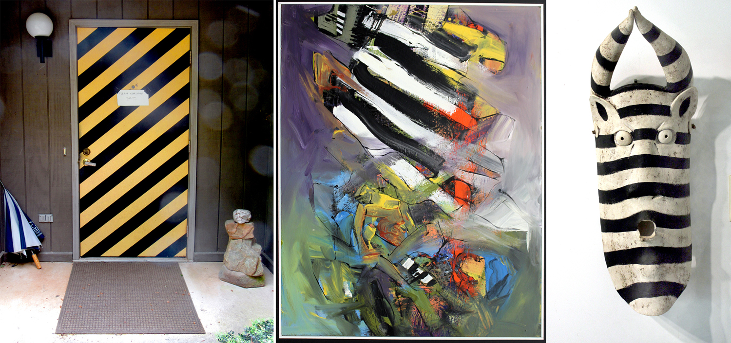
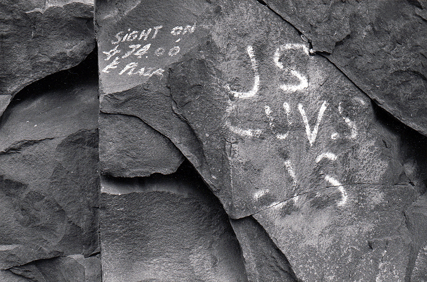
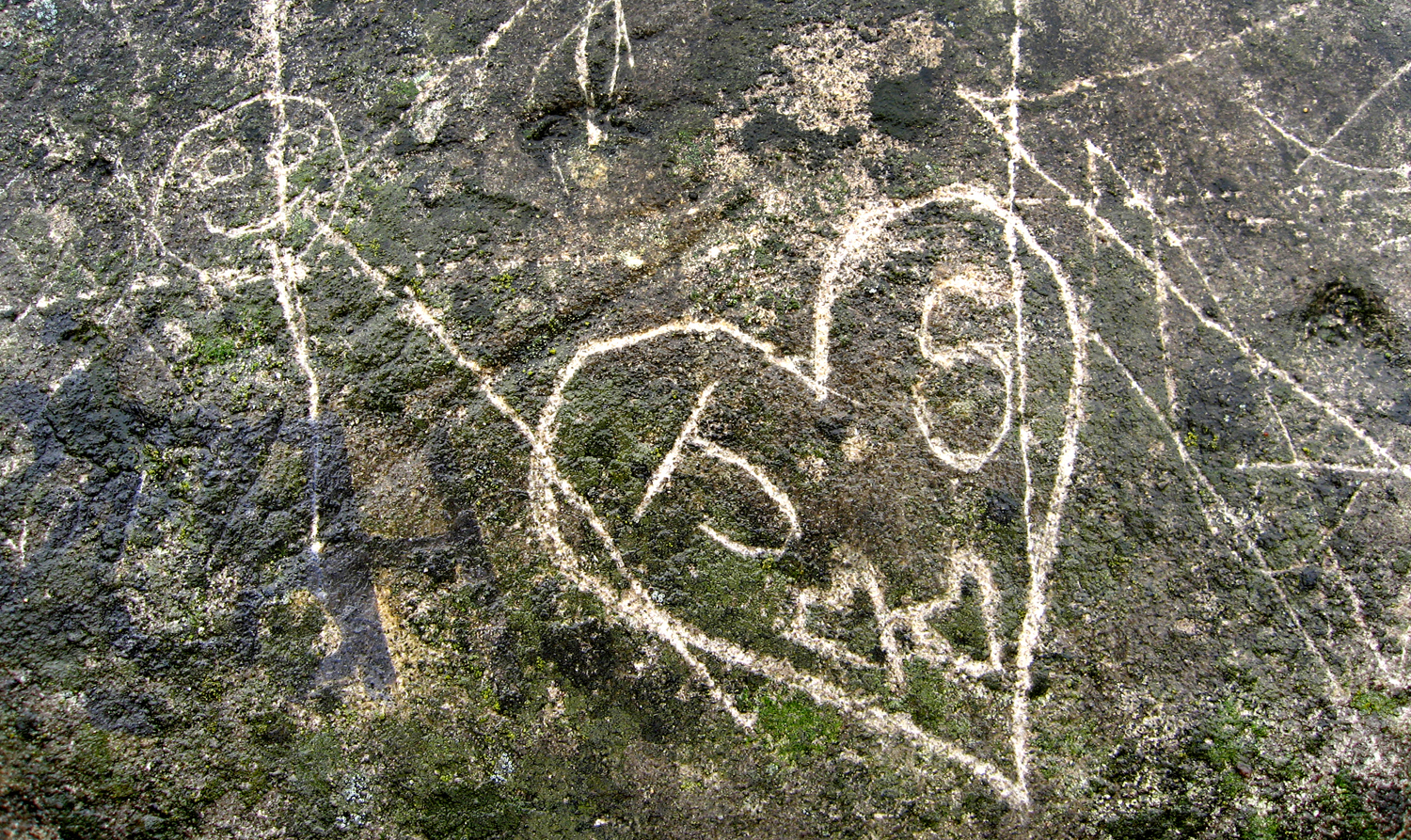
And the way we scrawl our names on rock faces. “K and A Forever.”
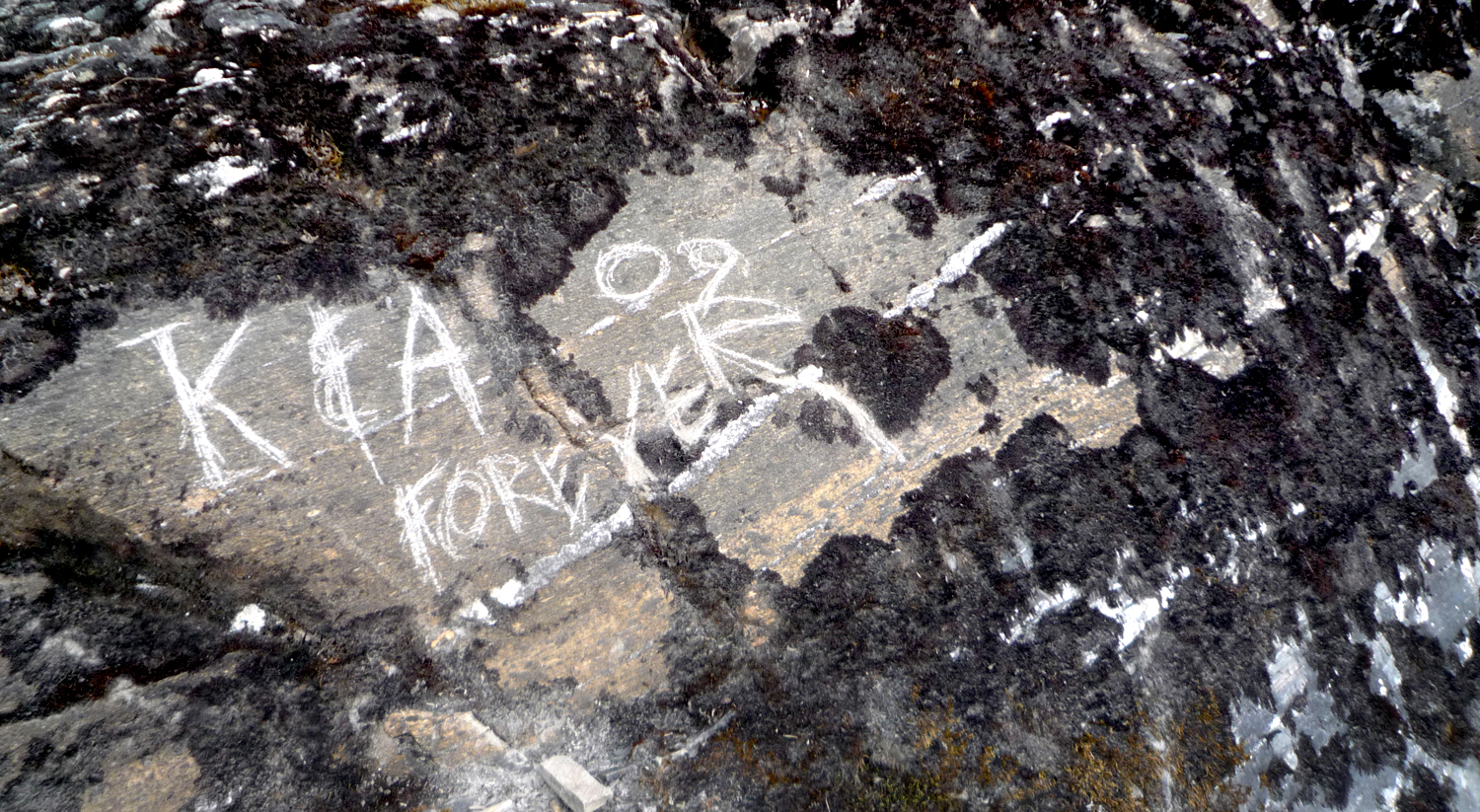
The stone is certainly more permanent than the relationship.
Hudson River Palisades, N.J.
Even the pigments that artists use comes from the ground. In the past, it was actually rocks that were ground up and processed. Now, there are pigments also made from petroleum.
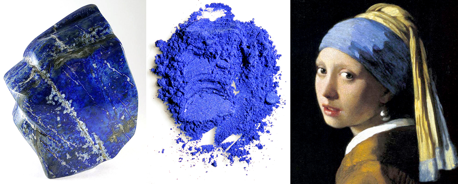
Lapis Lazuli
Different rocks, with their colors and textures, evoke different emotions. Think of a brilliant diamond or ruby; think of a cinder. Different emotions.
Mendenhall Glacier, Alaska
We use geology in our language, although often the words mutually exclusive import.
“You must have been stoned when you thought that up.” “No, I was stone cold sober.” “Well, the theory is either a bit rocky or it is rock-solid.” He answered with a stony silence.
Schoodic Point, Maine
The colors, textures and the grain all impart meaning.
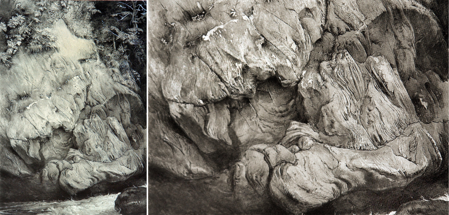
By John Ruskin
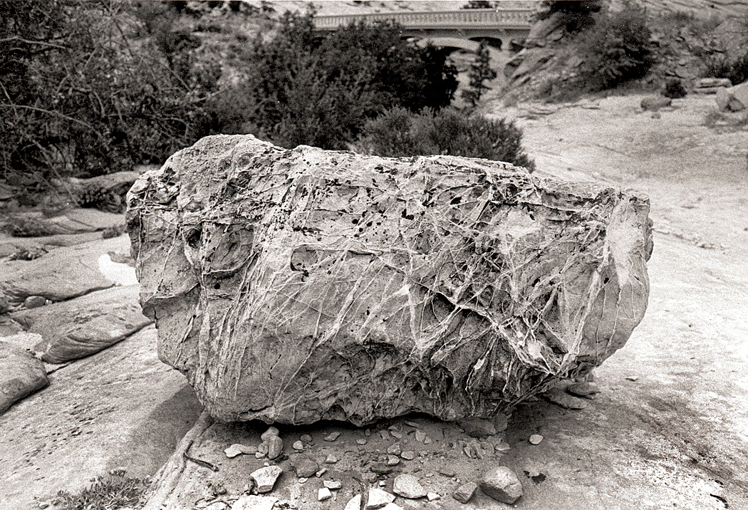
I began seriously considering the art elements of geology after seeing a splendid drawing of gneiss by English artist and critic John Ruskin. He made it over several days while visiting Scotland in 1853. The drawing had everything I respond to: texture, detail, close observation and an attention to the world as it is, that is as close to love as is possible to hold for the inanimate world. Ruskin was an astonishing draftsman.
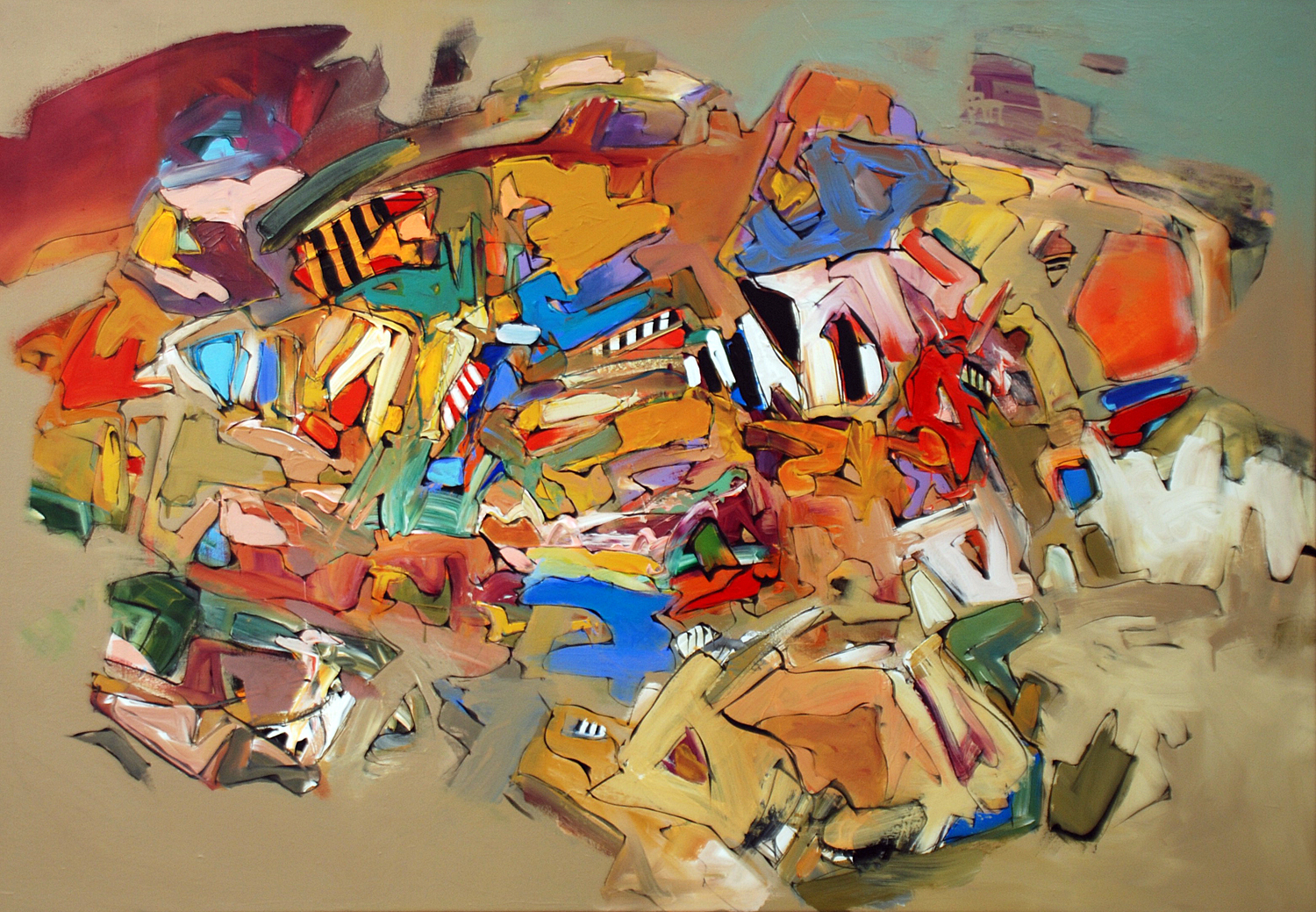
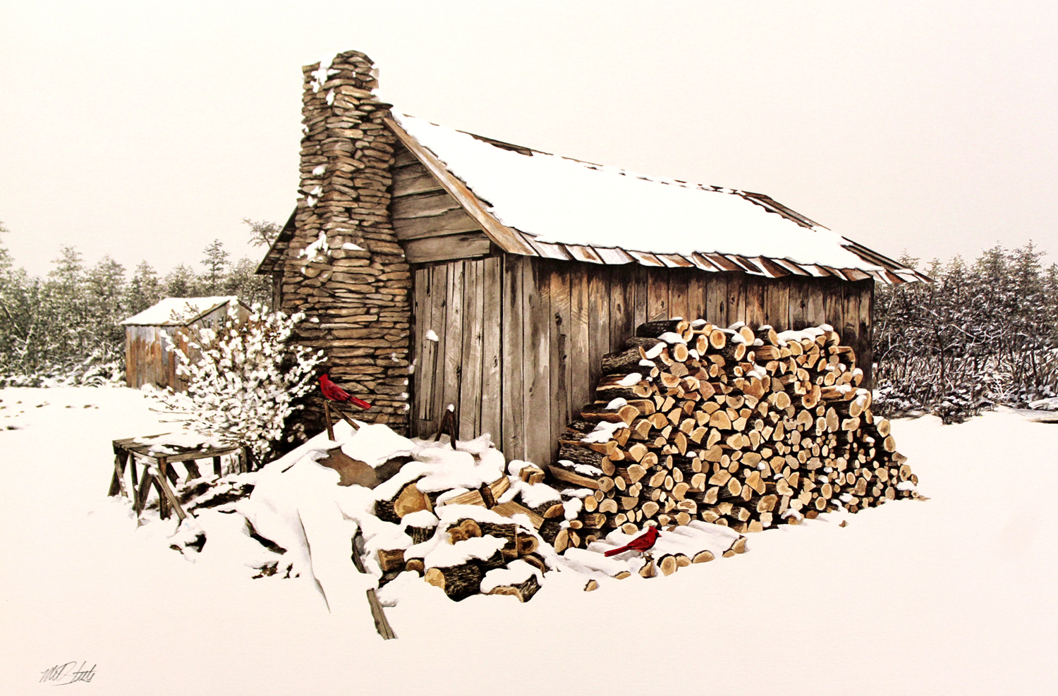
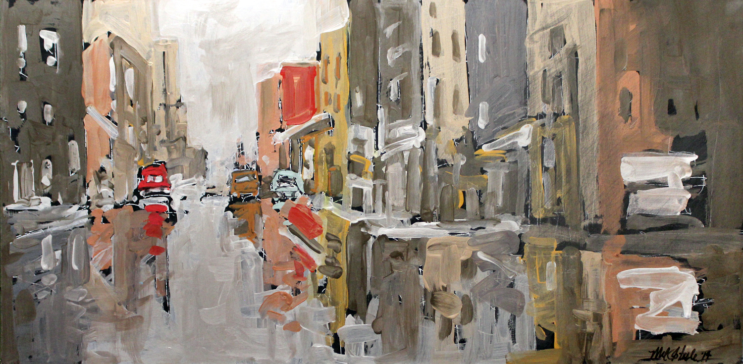
By Mel Steele
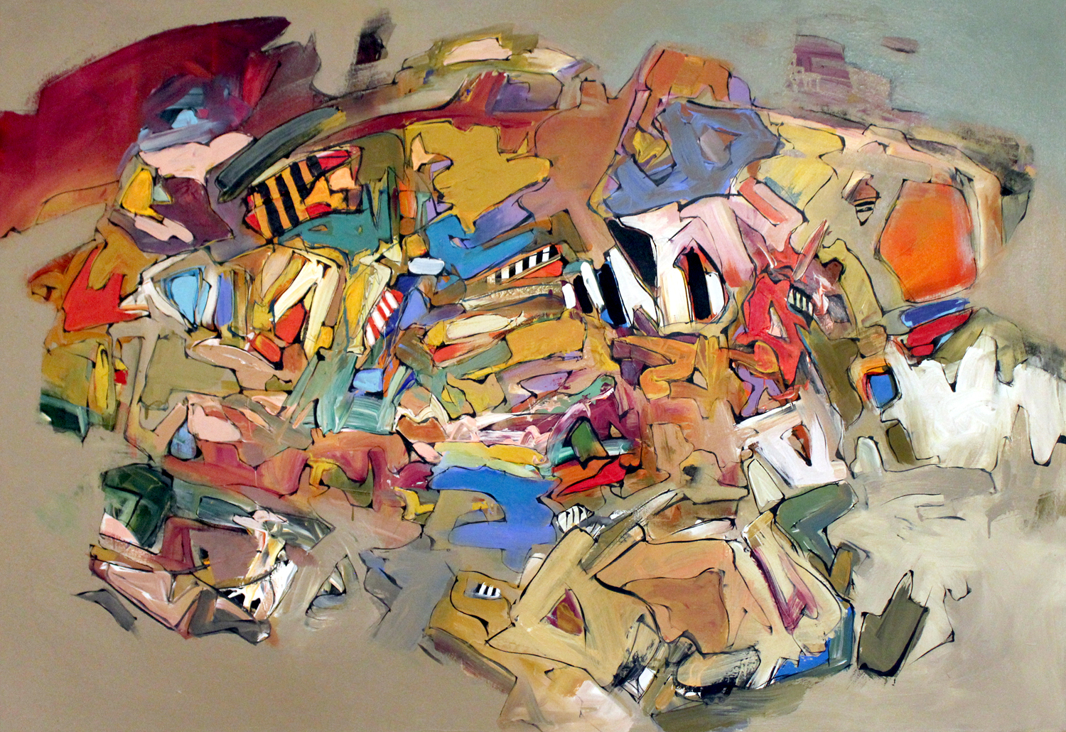
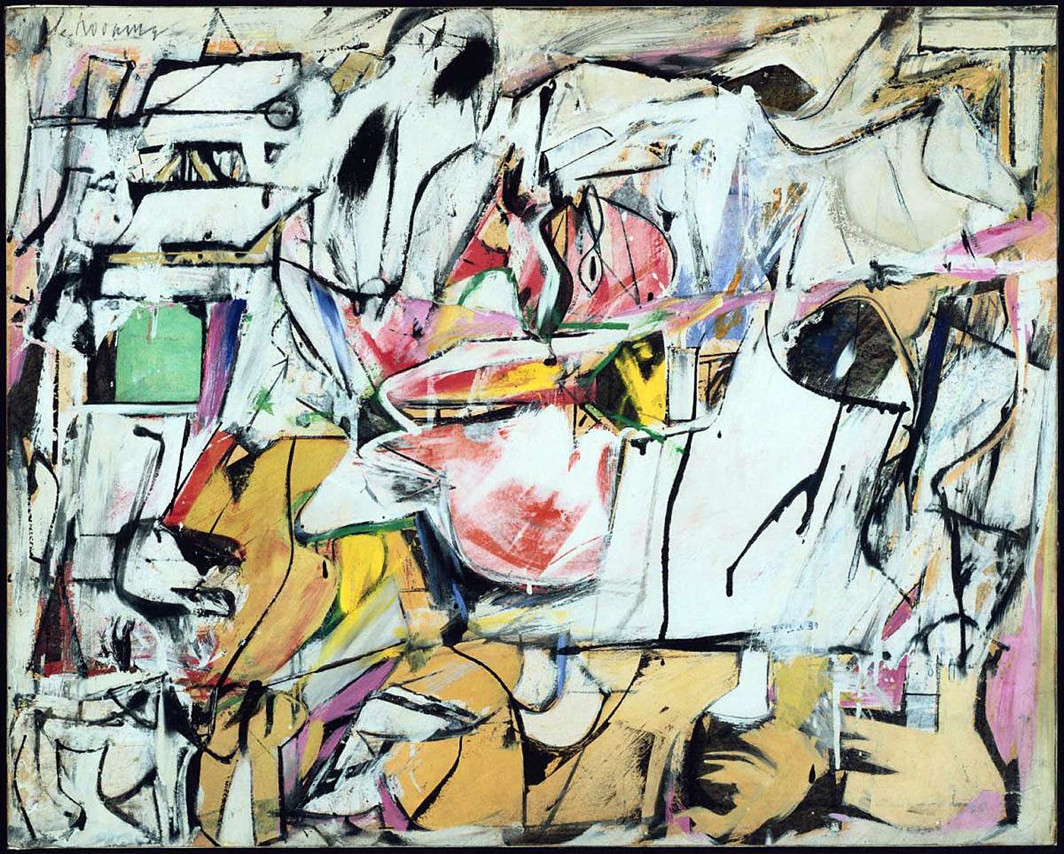
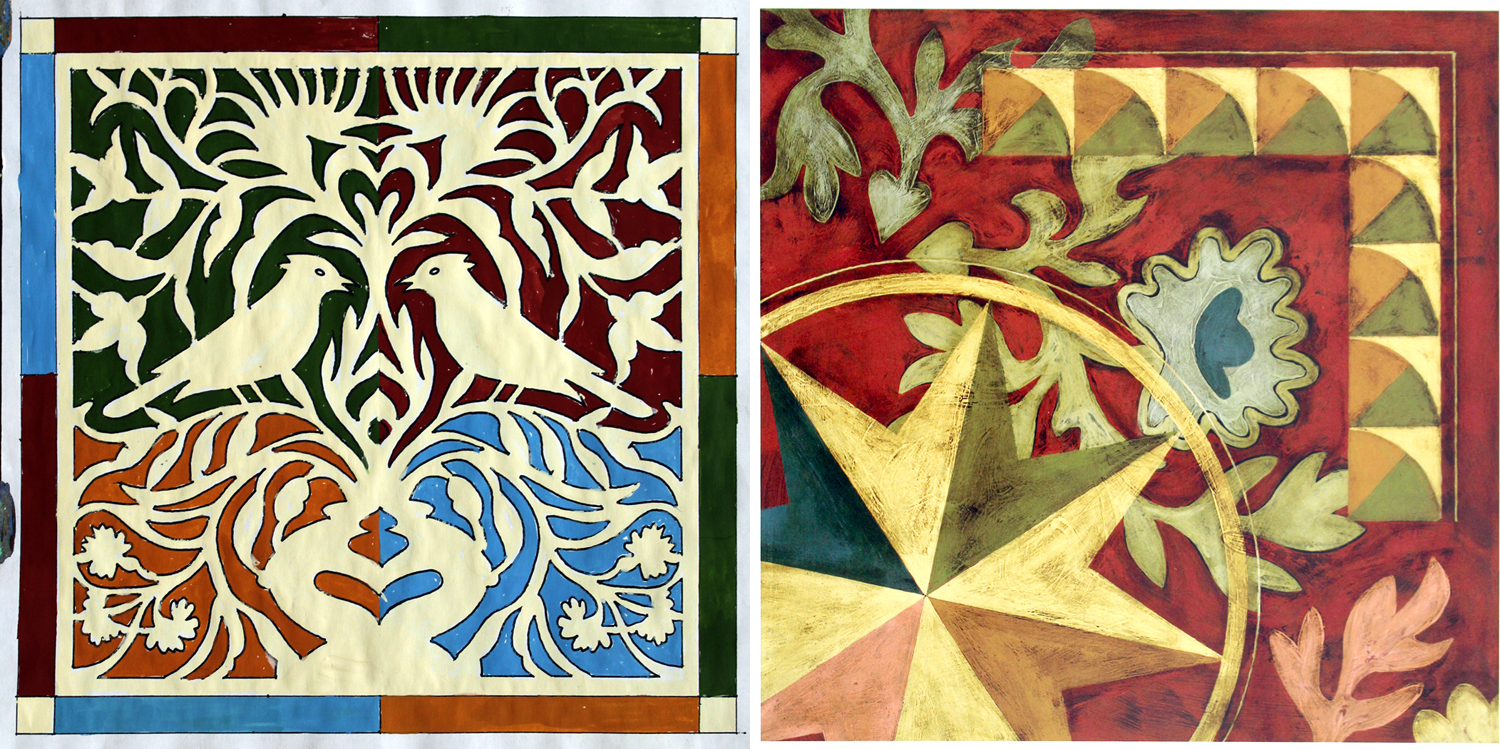
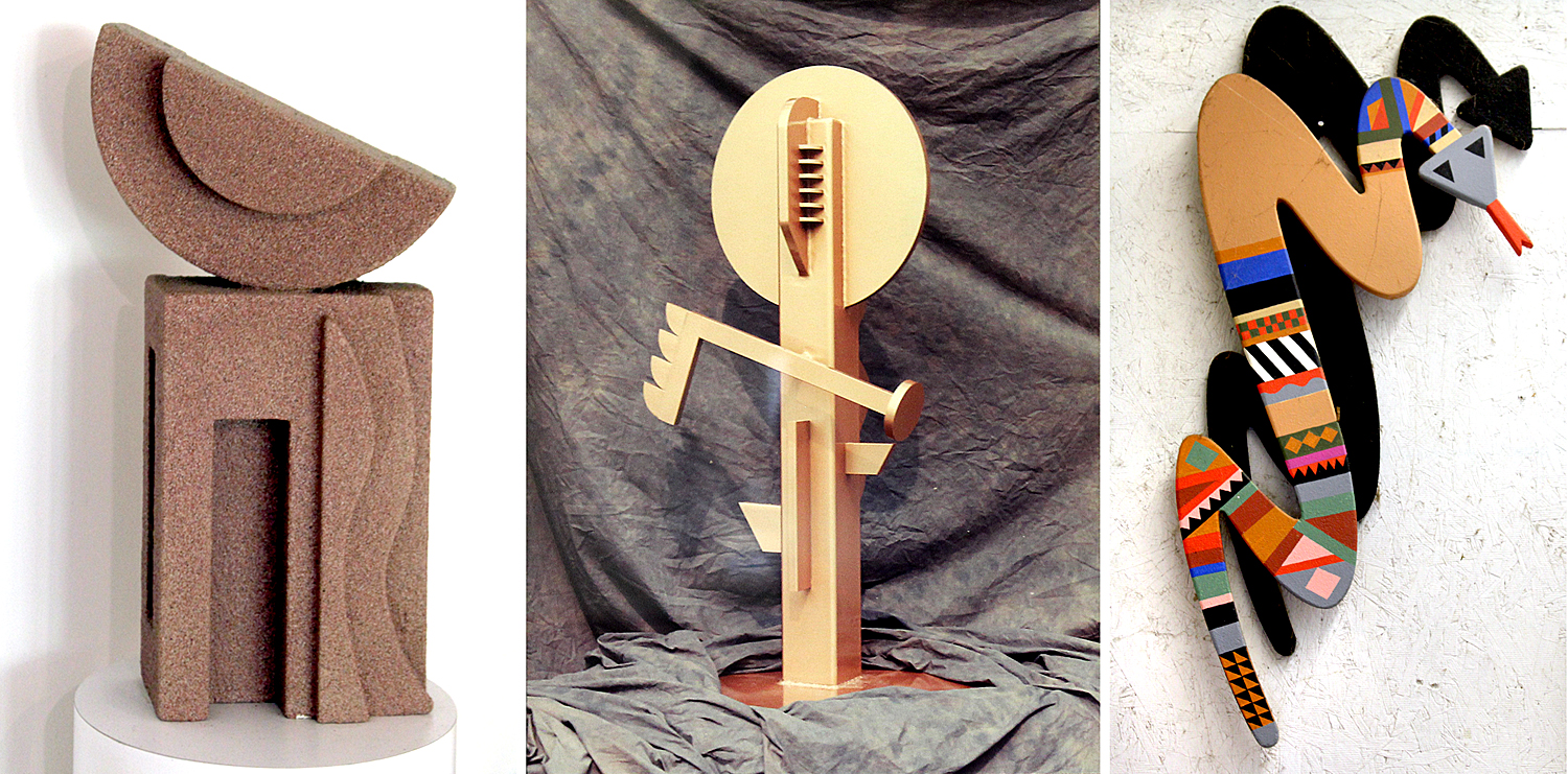
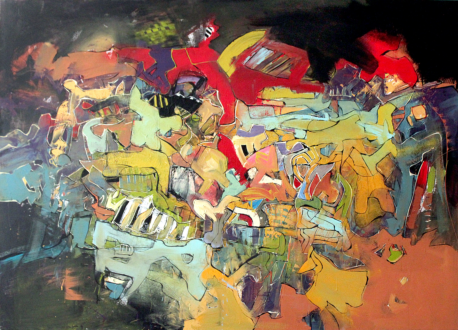
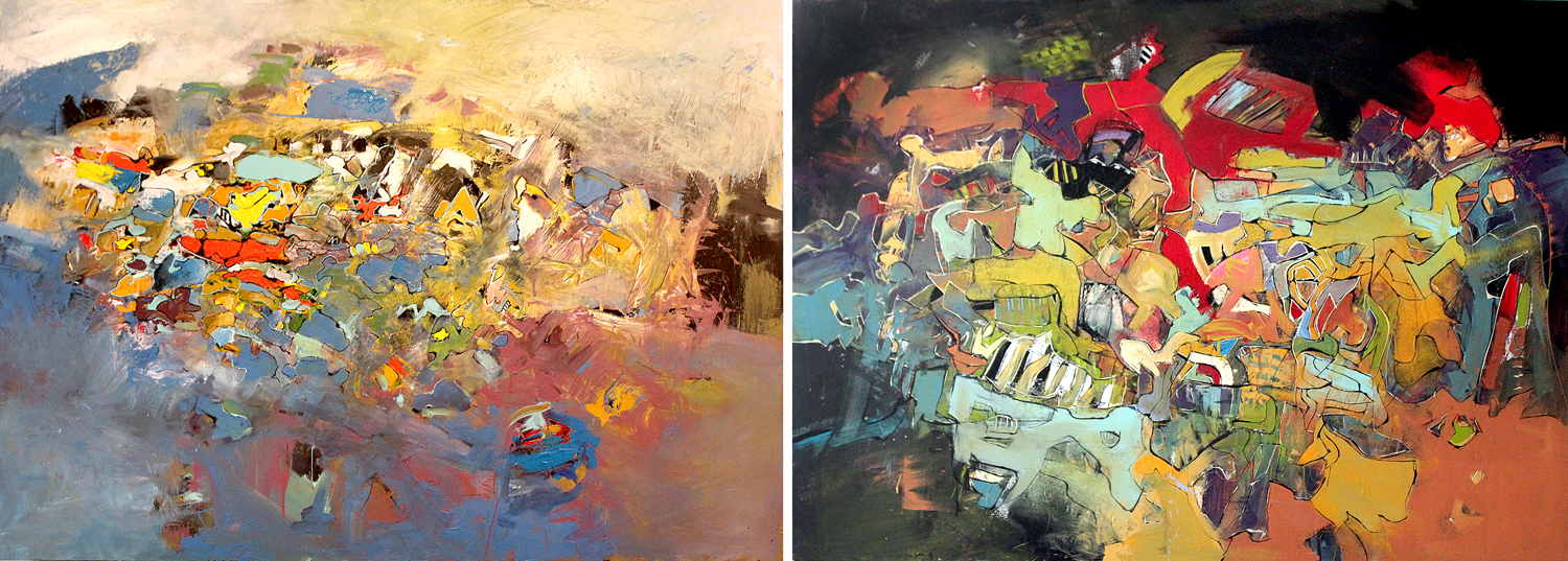
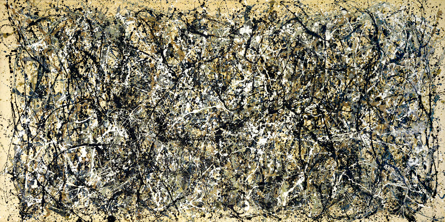
It has been one of the lessons of the 20th century and Modernism that meaning in art can transcend anecdote and be more than a story told in a still scene and can impart meaning purely through shape, color, texture, line and scale. Emotions can be evoked by all of them. We have had well more than a hundred years of abstract art.
Even realistic painting depends on the medium it is made from. It isn’t just the face or the scene, but the color and texture of that face and scene.
Craggy Gardens, N.C.
And a camera pointed at the shapes of geology can create meaning in the same manner as the abstract painting we lionize.
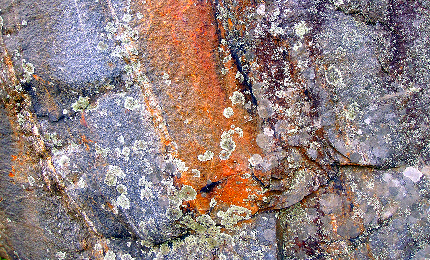
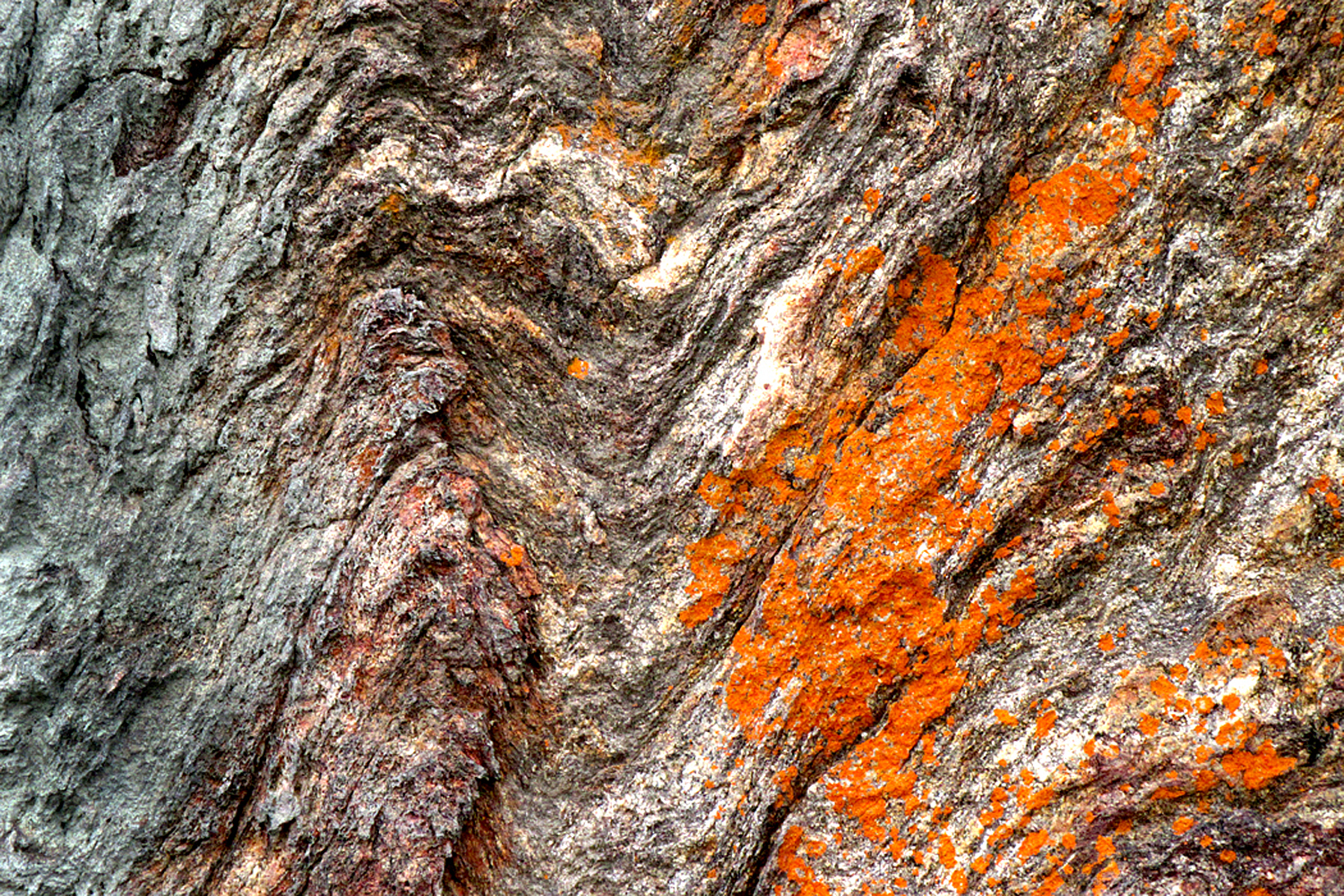
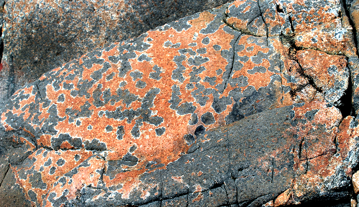
I have since found many rocks, with their esthetic pleasures. There is bright color
Blue Ridge Parkway, N.C.
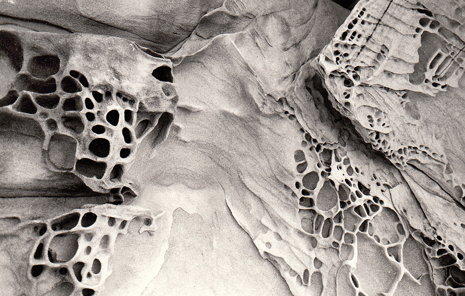
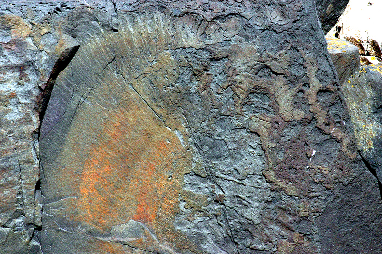
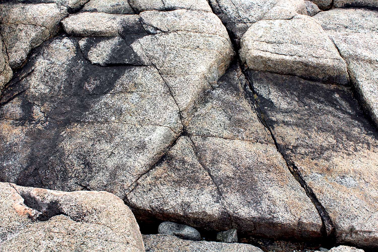
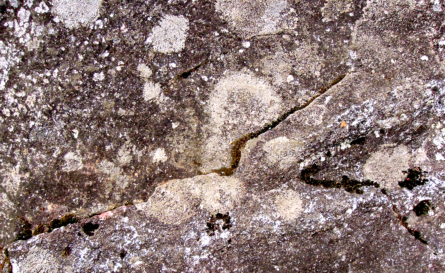
There is gnarly texture
Blue Ridge Parkway, N.C.
There are planes of surface
Schoodic Point, Maine
Repetition of shapes
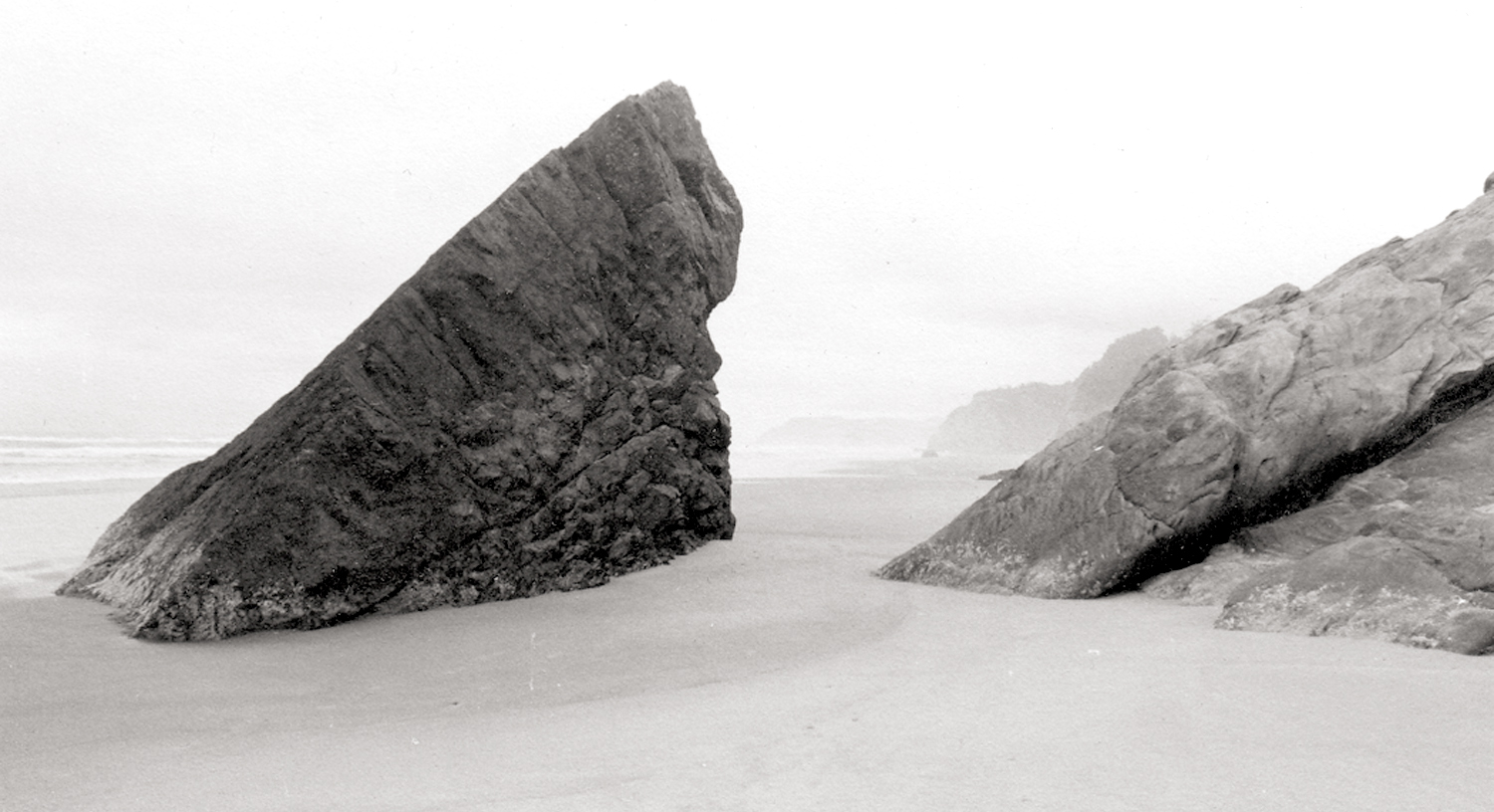
Hug Point, Arch Cape, Ore.
Complexity of image
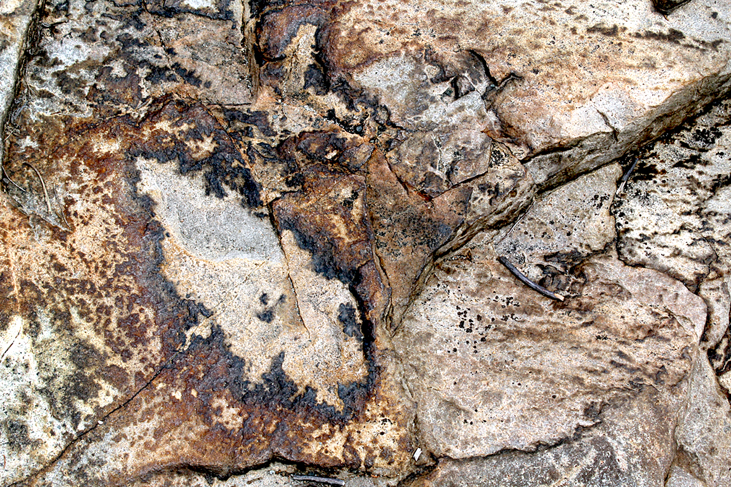
Schoodic Point, Maine
And a starry night
Pisgah National Forest, NC
Or flying over the continent and looking down at erosion
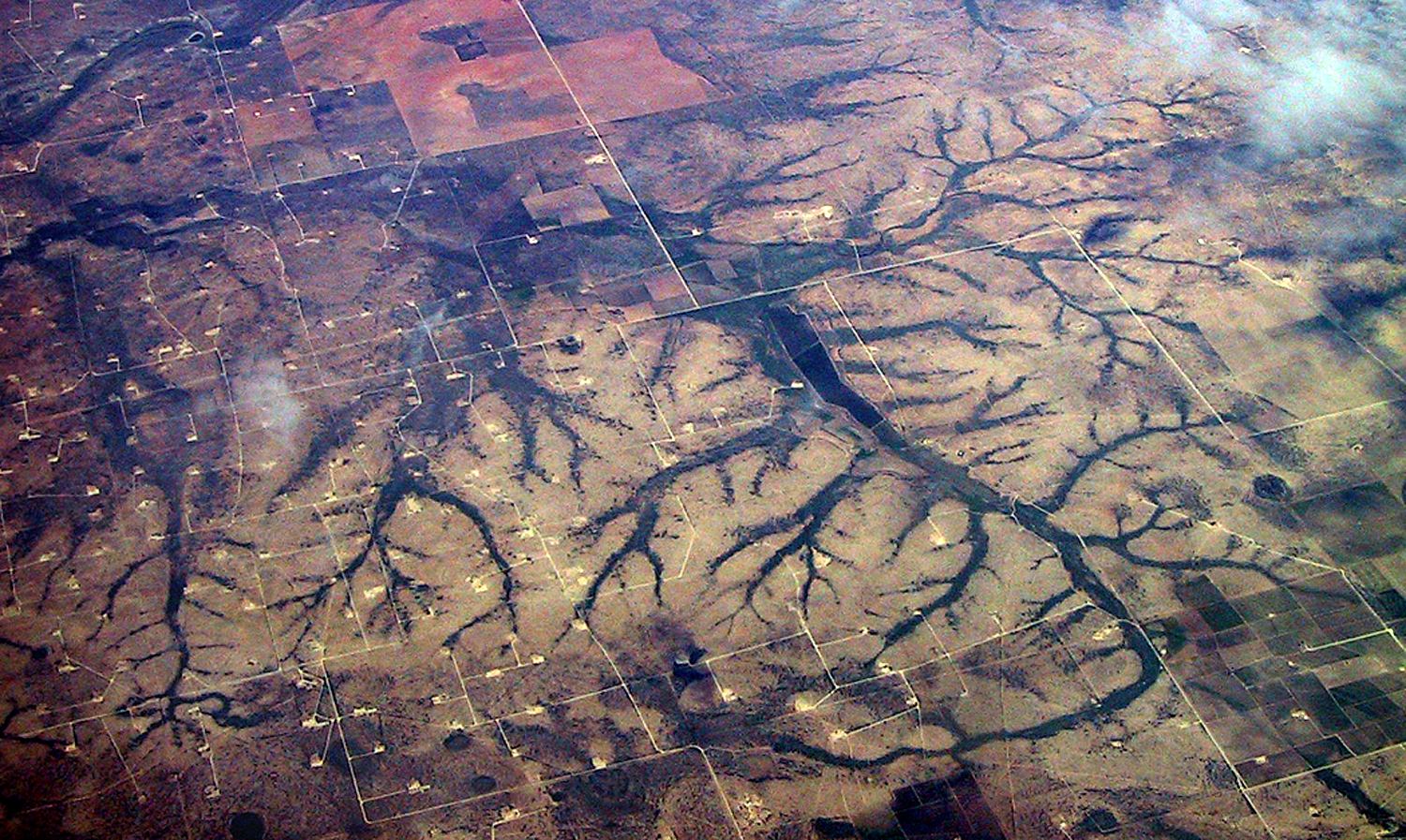
Over Colorado
One of the primary functions of art is to make us pay attention. It is an interaction with the world and a response to it.
Rio Puerco Ruins, N.M.
The most important lesson I was ever taught was by a college professor who would not accept glib work. Like many bright students, I was adept at giving a teacher what he or she wanted — basically repeating back what was said in class. But when I did that in my English Romantic Poetry class, he gave me a D for a paper that was otherwise correct in every aspect except one. “Don’t give me back what I’ve said,” he told me. “Engage with the material.” Real engagement cannot be faked.
What was real were the words written, not the words written about the words. Dive directly into the poetry. Don’t waste time learning “about” the poetry.
Try to take the material under study seriously and be real about it. If what you find contradicts what the teacher said, all the better. You’ve learned something.
Engage with the material — something you should do with friends, family, society, even the air and the rocks. Engage. Don’t gloss.
Click on any image to enlarge