Archive

Tag Archives: naturalism

two old men

Which of these portraits is more realistic?

One is a photograph and the other a Roman portrait bust. One might choose either one over the other, although I suppose most people would choose the photo. But in what sense are either of these “realistic?”

(For the purposes of this argument, you should imagine an actual photograph, on paper, held in your hand, not the digital image you see on your screen — for which there is a whole different set of problems. And the portrait bust, think of as the real stone sculpture, on a plinth in a museum.)

The photograph is in black and white; reality is in color. The photograph is flat; reality is rounded. If you walked around to the back of the photograph, you would not find the back of this man’s head; in reality, you would.

Further, the photograph is rectangular and framed by its edges; reality has no such frame. Looking at a photograph, we hardly notice the frame.

The sculpture is three-dimensional, which might give it a leg up on the photo, but the sculpture is also monochromatic. Worse, it has no pupils in the eyes, which makes it a little eerie. True, you can walk around to its back and see the rest of its tonsure, but that hair is stone, which is unlike real hair, except during the ’50s, when hairspray lacquered the head down into something brittle. Take its temperature, and it will not be 98.6, but room temperature.

Neither the photo nor the bust has a body attached, which would be  very uncomfortable in real life.

The fact is, that both forms of art are highly conventionalized. We take them as “realistic,” when, in fact, they are merely conventional. We tend to let our conventions fall invisible; we hardly notice them.

picasso self portraitThe photograph might be an 8X10 glossy, but the head in the photo would be miniature compared to the man’s real head. How is a tiny figure on a flat piece of paper said to be realistic? You can fit a whole city on an 8X10 glossy; try that with the real Philadelphia. The only way to do that is to accept the conventions and then let the disappear.

You can go on listing unrealities: The photo and bust are motionless. The men portrayed most certainly were not. They also made sounds — I’m sure they they each spoke to their portraitists while they were being immortalized. And they probably had characteristic smells about them. More, they each had thoughts that cannot be read in the images.

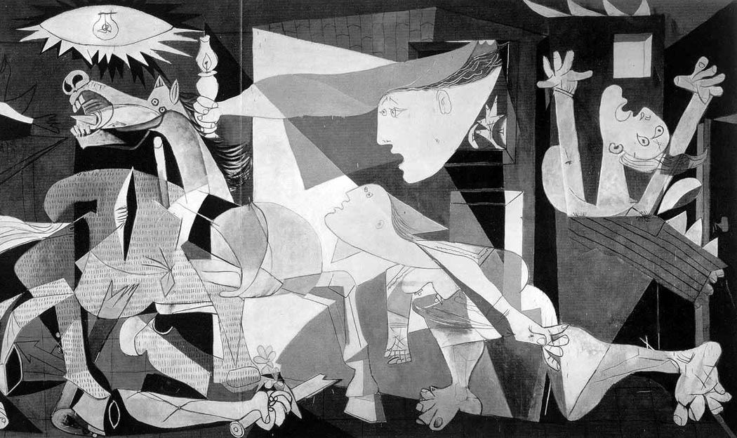
Yet, compared to a Picasso painting, we take these as realistic images. We ignore all the counter-indications and lock on to the few things we wish to accept.

duane hansonEven a Duane Hanson sculpture, which might fool us as we first enter the gallery, eventually gives itself away by never moving.

Every culture has these conventions. Consider the standard ancient Egyptian figure, turned into contortions so that we see both arms and both feet, yet the head turns profile because we need to know the nose sticks out from the face. Somehow, though, the eye is drawn as if head-on. The convention insists on things we know — like two arms and two legs — rather than things we see — like foreshortening and overlapping. To an Egyptian in the Middle Kingdom, a foreshortened figure would simply be “not true,” since it would obscure facts we know — like two arms and two legs.

ukiyo e mie pose actor pictureOr consider a cultural convention that seems to Western eyes truly bizarre — or at least comic. In the Japanese woodblock print, images of popular actors were often portrayed in the Mie Pose, which means giving them crossed eyes. To us, crossed eyes are silly, but in the Ukiyo-e tradition, they express extreme emotion. Those images were hugely popular in the 18th and 19th centuries — the equivalent of the Farrah poster from the 1970s, with its own conventional gesture and hairdo.

There are the conventions of Precolumbian cultures and the wonderful circle-and-dot conventions of Northwest Coast Native American cultures.

Each is a way of transposing the living, breathing world into a two- or three-dimensional image that can be understood to embody some version of that world. For us to accept the black-and-white photograph as a realistic depiction of our world, we have to accept and then forget the many conventions behind it.

clock 1But it is not merely art that conventionalizes our sense of the world. Many of the things we take for granted are not rooted in reality or necessity, but are purely conventional. Twenty-four hours in a day? Seven days in a week? There is no good reason, other than convention, that the clock and calendar could not be decimalized, like so many other measurements we now know. A 10-hour day just requires a clock notched out in a new way. Give those extended hours 100 minutes each. Fine. There is nothing about time that requires the division of the day and night into 24. Or a 10-day week, leaving us with a year of 36-and-a-half weeks.

Nor is there reason to add days into weeks, or weeks into months. We could subdivide them entirely differently, say into sub-weeks, or bi-weeks and cut the 36-week year into 9-week divisions, subdivided into 3-week “months.”

There is a lunar and sidereal cycle, but our current conventions don’t actually match up to them, so convention trumps astronomy on the calendar.

I am not suggesting we change our clocks and calendars; convention works just fine. But I am saying we should recognize them merely as conventions. If Ramadan moves around our Julian calendar like a slipped clutch, that’s fine: It’s merely another convention.

We are used to seeing North at the top of a map. How disorienting it can be to see a Medieval map which puts South at the top.

Suits and ties? Convention. Lipstick? Convention. Men in pants, women in skirts? Convention. Just picture Amelia Earhart in jodhpurs standing next to Sean Connery in a kilt. Where are the bloomers and bustles of yesteryear? Conventions change.

Our version of marriage? Convention. There are other ways of organizing families. History is full of them. Patriarchy? Convention. There are perfectly successful matriarchies in the world.

The names of colors are conventional. We could divide and subdivide the spectrum in other ways. Different cultures, in fact, do divide them differently. The same way we think of pink and red as different colors, Russians think of dark and light blue, and have different names for them: Siniy and Goluboy. We could easily make a distinction between “sea green” and “leaf green” and give them distinct names.

colors

chopsticksThe musical scale is now more conventional than ever, as it has been squeezed into the well-tempered system. We now split an octave into 12 semitones; others find five tones in an octave plenty. Indian ragas may need up to 40. All conventions, taken inside their generating cultures as simply “the way things are.”

Why do we eat off round places with knives and forks? Other cultures favor square plates or chopsticks. Three meals a day? Not nutritionally determined. Four does for some; two for others. Compare the French croissant and coffee in the morning with the full English breakfast.

Zuni PuebloOur houses have front and back doors. Ancient Puebloan people did without doors altogether and clambered into their homes from their roofs down ladders.

Poems used to rhyme. Works great in Italian, with all those vowels, a bit harder in English, unknown in most cultures, which may value metrical rules over rhyme, or alliteration instead.

Driving on the right in the U.S.? On the left in the U.K.? Switching from one to the other in Sweden?

We each of us has in our mind a pattern of how we think the world is organized and constructed. Sometimes called the “Umwelt,” it is partly constructed from the ineluctable constraints of reality, such as gravity, light, day, night, hunger, thirst, the horizon and the wetness of the sea — and the rest is made up of convention. We seldom make a distinction between the two, and take the weekend for as natural a thing as we take ripening fruit.

This model of the universe does not feel learned, the way laws have to be learned, but are taken as the natural state of the world. The problem lies when we make prescriptive demands on others based on our private Umwelt. It is what feeds racism, for instance. When you have an internal model of the world that sees one race as superior or inferior, you then create laws requiring others to act according you your inner light (or lack of light). Yet, as we have seen, a good deal of this inner model is nothing but convention. It might be good to examine everything we believe with some skepticism.

cun 18th century

What does the midday sun look like?

That may sound like a simple question, but it’s not. You can’t really look at the sun: If you try, the result is sensory overload, like the distortion of loud music on cheap speakers. You can even go blind, rather quickly.

Yet, everyone thinks he knows what the sun looks like. It’s everywhere in art, beginning with the tempera paintings kids make in elementary school: They so often put a wedge of sun in the corner of the painting, with rays spread out below like sea urchin spines.

kid turtle

But the sun doesn’t look like that: The child’s version of the sun is a symbolic representation of the solar disk.

But then, so are all adult representations.

So we also recognize the gilt centrifugal rays of Louis XIV’s Sun King symbol and the terra cotta sun face of Mexico and the red ball and rays of the World War II Japanese “Rising Sun” naval ensign.

sunmosaic

The sun is the paradigm of art problems, because it can never be portrayed accurately as it looks. Paint cannot be so bright.

But that doesn’t stop artists from attempting it. Van Gogh painted the solar disk over and over in his landscapes. Usually, the sun is a yellow circle surrounded by concentric brushstrokes in a darker ocher. The only way he could make the sun seem bright was by making the sky unnaturally dark.

vangoghsun1


Ansel Adams had a photograph he called The Black Sun, in which a long exposure caused the image of the sun to solarize, making it a dark dot in the picture, surrounded by a halo of rays. It looks almost like an eclipse photo.


Ansel Adams' "Black Sun"

Ansel Adams’ “Black Sun”

In Picasso’s Guernica, the sun is an edgy elliptical disk with spiked rays, in the middle of which is a light bulb.

guernica detail

Each of these is an attempt to portray something that cannot be portrayed.

On a piece of paper or a canvas, the brightest white is no more than 40 times brighter than the deepest black. In the Arizona summer, the sun is thousands of times brighter than the shadow under a mesquite. A canvas just cannot accommodate that brightness range. We compress that range and accept it.

But the emotional effect of the sun’s brightness is just as hard to portray. When artists attempt it, they have to leave the realm of naturalism and create a fiction, a symbol for the sun instead of its snapshot.

So, what does the world look like? The sun is only one minor example of the complexity of this question. It is a question that has been at the core of art for 30,000 years and has still not been answered in any finality.

The problem in formulating an answer is that human perception is both so complex — scientists keep finding more astonishing whirligigs in the brain’s apparatus — and at the same time, so universally believed simple. We all have eyes; and seeing, after all, is believing.

We see with our eyes, most people think. The world looks the way a photograph makes it look.

But of course, we don’t see with our eyes, but with our brains – and even more difficult, with our minds, which means we see through the haze of emotions, culture and individual life experience. We so thoroughly process the data that our eyes collect that the final result barely matches the patterns on the tickled retina.

Seeing doesn’t just happen; it is a complex mental process. And it is a learned process, as any of hundreds of studies have confirmed. One of the ways it is learned is through art — or, to use the more modern term, through media.

Which is why, until the Modernist revolution in this century, artists concerned themselves with attempting to accurately depict the world around them.

It was to this end that such men as Leon Battista Alberti and Filippo Brunelleschi attempted in the 15th century to devise a mathematical formula for creating the illusion of three-dimensional reality on a two-dimensional canvas. The linear perspective they created became the mother tongue of European painting for four centuries.

But perspective wasn’t the only question: We’ve all seen the obsessive drawings of Leonardo da Vinci, attempting to get down on paper the swirl of water in motion.

leonardowater

Or Michelangelo’s attempts to show every anatomical muscle under the marble skin of his statuary.

The Italian Renaissance was so thorough in its quest for realism, and so successful, in contrast to the Romanesque and Gothic art that came before it, that we have on some level considered the question answered ever since: This is what the world looks like.

Yet, it isn’t so. There are gross distortions built into perspective: Its grid of parallel lines is pure fiction. Leonardo’s water looks more like masonry than fluid, and Michelangelo’s muscles are a little too manic to be visually true.

Yet, the schematic system of image-making they came up with was so persuasive that we still accept the look of it.

Photographs, for instance, which are often taken for the ultimate in realism, are actually made through lenses carefully designed to mimic Renaissance perspective. Rectilinear imagery doesn’t happen naturally.

No art is ultimately realistic. What we tend to call realistic art, whether it is 200 years old and hanging on a museum wall, or hanging in the “starving artist” corner of your shopping mall, is more properly called ”conventional” art. It partakes of the conventions of art that we have, for the moment, accepted.

But those conventions are just as stylized – just as unrealistic – as the ”King Tut” angular figures on an Egyptian frieze, or the misty landscapes on Chinese scrolls.

Take any so-called realistic piece of art and ask just how like life it might be.

When a British cleric, Dr. Thomas Church, visited Rome in 1816, he sat to have his portrait drawn by Jean Auguste Dominique Ingres, one of the leading French artists of the time. The 6- by 8-inch pencil drawing Ingres made is now owned by the Los Angeles County Museum of Art. It is a drawing almost everyone would call a realistic likeness. Certainly, if you knew the drawing, you could have picked out Church from a police lineup.

Ingres' Dr. Thomas Church

Ingres’ Dr. Thomas Church

Yet, the drawing is realistic in only a conventional sense; we are so used to those conventions, we don’t even think about them. We are fish, the conventions are water. It almost seems silly if I point them out. But it isn’t silly; it is profoundly important for us to think about them.

First of all, I doubt the good reverend was only 15 inches tall, as he is in the drawing, or would be if he stood up and his legs hadn’t been cut off by the edge of the paper. We have no trouble believing that a small likeness is realistic, any more than we have trouble with Georgia O’Keeffe’s larger-than-life flowers.

Second, Church probably had a little more color in his cheeks than in this monochrome drawing. We accept black and white as realistic.

We even accept his high-collared coat as black because we know such coats, even though in the drawing, it is the same blank-paper color as his nose and cheek.

Third, the real doctor was three-dimensional; the drawing is not. We could walk around the real person and see his back; the verso of the drawing is just blank paper.

Then, too, the real person moved and the drawing is frozen still.

The real person moved through time, too. It should also be noted that the drawing still exists; the same cannot be said for the good cleric. Ars longa, vita brevis.

The real person made noise — I cannot imagine such a cleric not talking constantly, even prattling. The only noise the drawing can make is a crinkling sound if you were to crush it in your hands — a sound to draw the immediate attention of the museum guard, no doubt, but not exactly conversation.

The drawing also has no odor of humanity about it. Then, too, the drawing is made up of pencil lines. Examine as you will the world around you, you will not discover lines in it that outline the borders of objects. The use of line in drawing is one of the most persistent, and least realistic conventions.

And the last thing I’ll mention: There is a frame, an edge of the picture that cuts off the bottom half of the good reverend. Real experience does not come with a frame line.

All these things we look right past and accept the drawing as an accurate rendering of reality. I’m sure you can come up with a dozen other hidden conventions I have passed over. But that is the power of convention. And it is all the more reason we should be concerned with the question: What does the world look like?

A century of Modernism has taught us not to ask such a question, and we have largely bought into the propaganda. Instead of asking the question, “What does the world look like, from the time of Cezanne on, art has primarily asked, ”What does art look like?” When a visitor looked at one of Jackson Pollock’s swirls of paint drippings, he asked, wondering what the picture’s subject might be, ”What is it?” Pollock answered, ”A painting.” He wasn’t just being cute. All of art critical theory at the time asked us to consider the effects of colors against other colors, forms against form, line against line.

But as great as some of the century’s art is, the overall effect is of a mirror held up to a mirror. It is intentionally mute: ”Music can express nothing,” said the arch-Modernist composer Igor Stravinsky. He was wrong, but he summed up this century’s own unacknowledged provincialism.

Art must regain its connection with the life we live. There is no better way to do this than attempt to answer the basic question about the appearance of the world.

For seeing is active, not passive. It is something we do, not something that happens to us. Each generation must keep up this dialogue with the world.

It is still a noble goal of art: to discover the difference between the schematic and the mimetic, between convention and experience — between what is and what has to be.

To parse it all out.

What is called Postmodernism doesn’t effectively do this. If Modernism is a mirror looking at a mirror, what has followed is a TV set looking at a TV set.

nam june paik1

A generation of media-savvy savants has created an art that is self-referential, and its main reference is The Brady Bunch.

I am certainly not calling for artists to imitate the look of Norman Rockwell. I hope I have made clear that Rockwell is not realistic.

I am calling for artists to take a really close look at the world around them — actually, I am calling for them to love the world, to caress the things of the world with their eyes.

The most effective way of doing that is to draw. Not until you have drawn something have you really seen it, felt its texture in your mind, tasted its color on front and back of tongue, known its shape and the shape of the air around it.

You can see this in Ingres’ drawing again. The coat, the pose, the chair arm — they are all merely conventional. But look at the eyes. They fairly swell with life, there is a softness to the bags underneath, a bristliness to the eyebrows and a live intensity to their gaze. The eyes are the animated center of the drawing, a jewel in a supportive setting.

In the coat, one sees the artist’s training; in the eyes, his connection with the world. There is no doubt which is more important.

So I ask the question of artists, what does the world look like?

Take take just one of those issues: motion, for instance. In the early Renaissance, it was not unusual to repeat a figure several times in a painting, depicting action as it is shown in the frames of a comic strip – showing the same figure in different parts of the frame at different moments in the action.

salome

One depicts Salome dancing in one part of the picture and John the Baptist in his cell in another. Another corner of the picture shows John bent over the block with an executioner’s ax raised over his head and a final portion has Salome watching John’s head on a platter.

Even God appears twice, from front and back, in Michelangelo’s Sistine Chapel Creation.

An entire century of art grappled with this problem as Baroque artists painted violent action at its most unstable point in time, suggesting the motion even when the figures are still as statuary.

Marcel Duchamp’s Nude Descending a Staircase is an attempt to portray the motion itself.

nudedescendingstair

Jackson Pollock’s action paintings are visually active with the result of the painter’s own motion.

Jean Tinguely created kinetic sculpture that actually did move.

Which of these is most “realistic”?

The depiction of visual reality is only one of the purposes of art, but it is a great and noble purpose that has been in eclipse as artists have been seduced by the cleverness of conceptual art.

As though the problem of mimesis in art had somehow been solved, freeing us for other endeavors.

But every time an artist picks up a pencil and tries to get the proportions of a figure right, every time an artist mixes a rose madder with an alizarin crimson to match the color of a landscape, she is tackling the biggest and most intractable question of art.

Looking is hard work, worthy work for an artist.

The sun streams in through the window, I go to it, look out at the world beyond and wonder what it looks like.

Astonish us.