Archive

Tag Archives: pictures

I’ve been to the Louvre in Paris a number of times, but no matter how long I spend there, I never feel as if I’ve seen more than two percent of it. It is vast. It is the largest museum in the world, with 782,910 square feet of floor space (topping the No. 2 museum, St. Petersburg’s Hermitage, by more than 60,000 sq. feet) and a collection of more than 600,000 pieces. 

It’s where you go to find the Mona Lisa, the Winged Victory of Samothrace and the Venus de Milo.

It’s one of the oldest museums around, but never seems quite finished. It began as a royal palace in the 12th century, and has been added on to, parts burned down, parts replaced, and even a glass pyramid added to the top. 

When Louis XIV moved the court from the Louvre to Versailles in 1682, the building became a warehouse for kingly treasures and much of his art collection. in 1699, the first “open house,” or salon was held, and for a century, the royal academy of art was located there. 

The French Revolution ended the monarchy, and all the art once owned by the king became public property, and in 1793, the new government decreed that the Louvre should be open to the citizens as a free art museum. 

But soon after, the collection expanded exponentially, as Napoleon Bonaparte conquered half of the continent, and sent back to Paris a good deal of the art from conquered lands. He even had the museum renamed Musée Napoléon. That didn’t last, but neither did Napoleon. 

Over the 19th century, the museum collection grew, from bequests, purchases and colonial expropriations. For a while, it included a whole section of Pre-Columbian art from the New World, but that spun out into its own museum, leaving the Louvre for the Musée d’Ethnographie du Trocadéro in 1887; in 1945, the Louvre’s extensive collections of Asian art were moved to the Guimet Museum; and by 1986, all the museum’s art made after 1848, including Impressionist and Modernist work, was transferred to the Musée d’Orsay, a refurbished railways station. It seemed the Louvre kept bursting its seams. 

Then came François Mitterrand. Serving as French president from 1981-1995, Mitterrand conjured up the Grand Project to transform the cultural profile of Paris, with additional monuments, buildings, museums, and refurbishment of existing locations. Taxes were raised to accomplish this project, said to be on a scale that only Louis XIV had attempted. 

Part of this plan was the Grand Louvre, to remodel and expand the museum, and to regularize (as much as possible) the maze and warren of galleries in the old accretion of palace rooms. The most visible of the changes was the addition of the glass pyramid in the center courtyard of the palace. It was designed by architect I.M. Pei and although it has long become part of the landscape of the museum, it still angers many of the country’s more conservative grouches. In 2017, The American Institute of Architects noted that the pyramid “now rivals the Eiffel Tower as one of France’s most recognizable architectural icons.” 

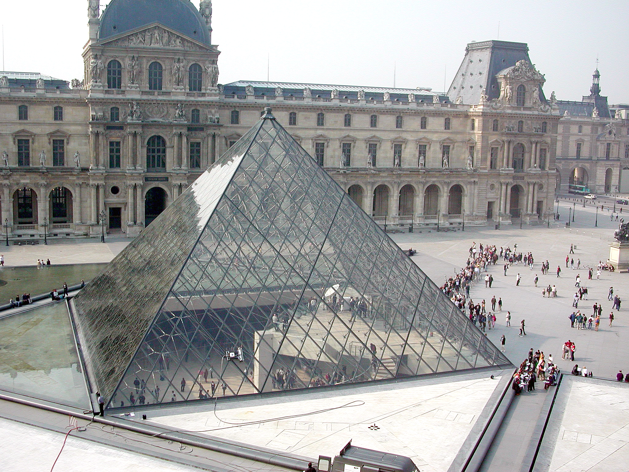
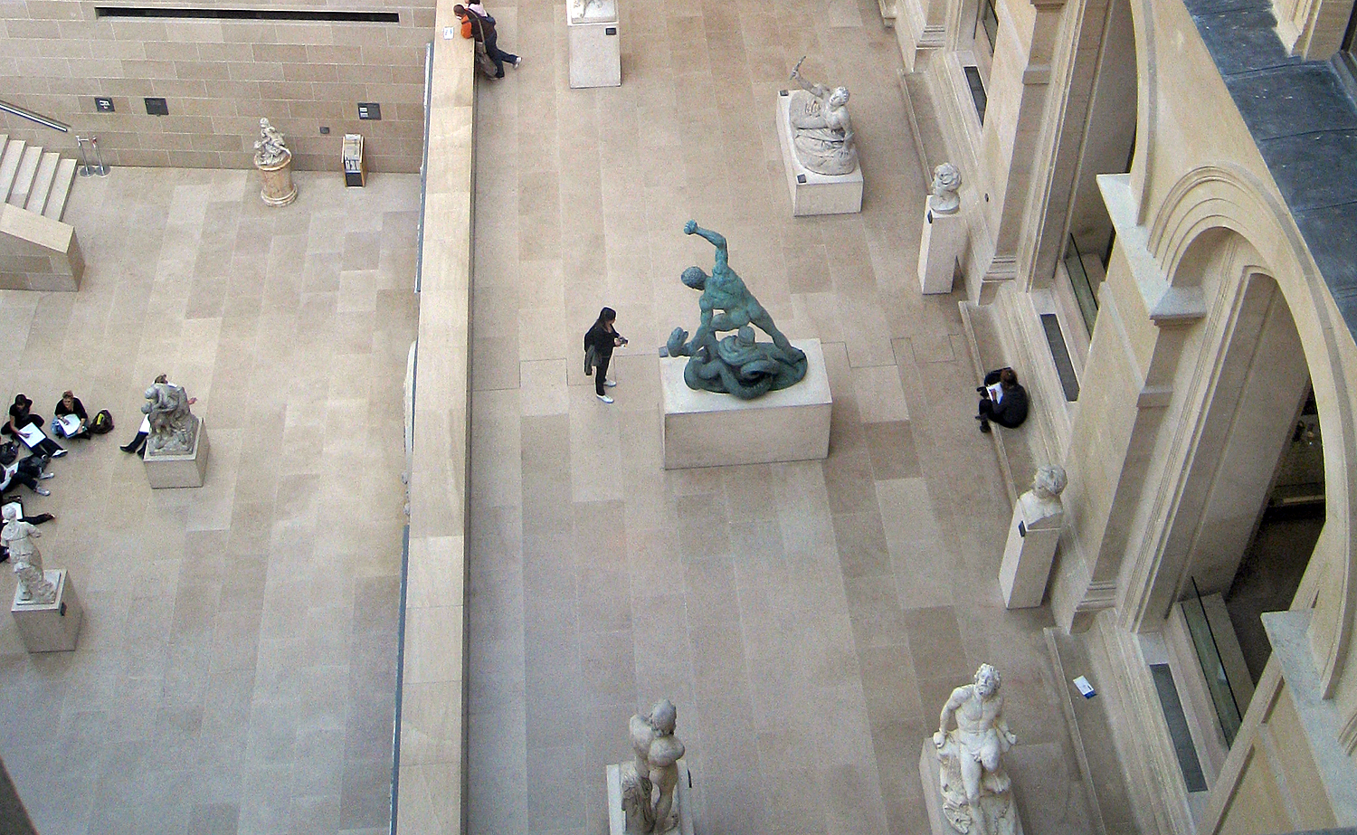
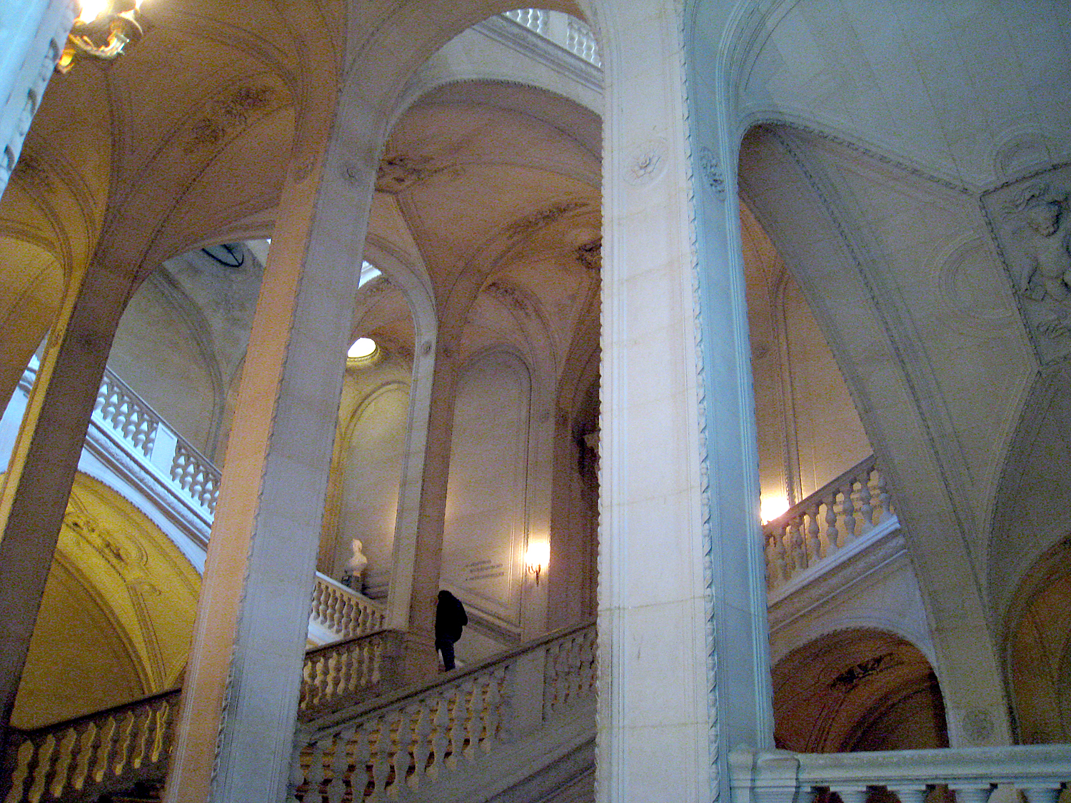
The entire central underground of the courtyard was remodeled to create a new entrance, and to attempt to make sense of the confusion of corridors, rooms, staircases and doorways. It was completed in 1989. 

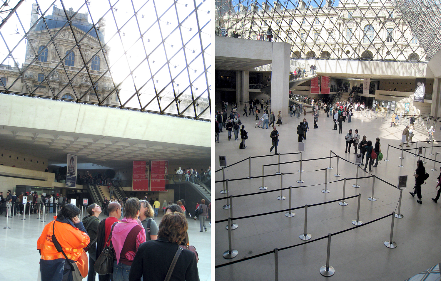
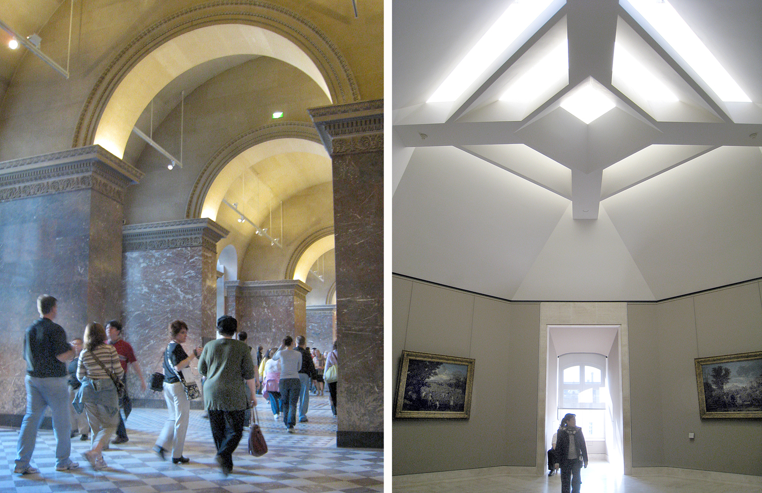
Now, one cannot think of the Louvre without its pyramid, but speaking as a visitor, while the Hall Napoléon (the underground foyer) has made some sense of the confusion, I cannot honestly claim the chaos has been tamed. The museum remains a labyrinth and you can be easily lost. 

And, unless you have budgeted a month or more to spelunk the entire museum, you will need to prioritize what you want to see in a visit — or two, or three. 

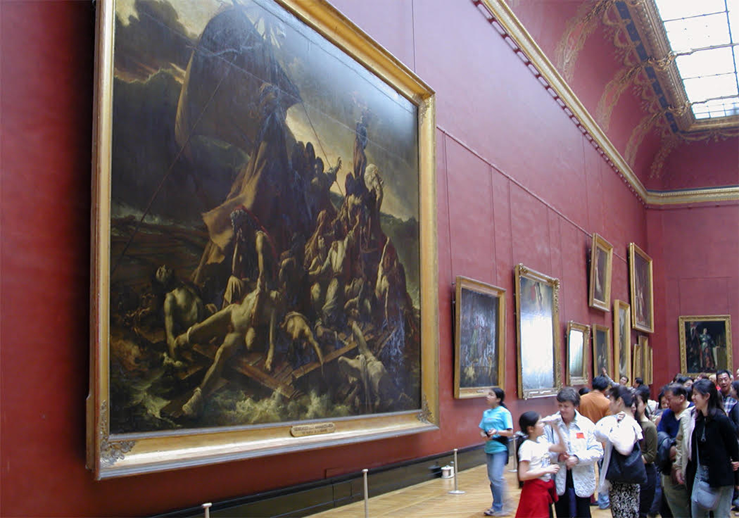
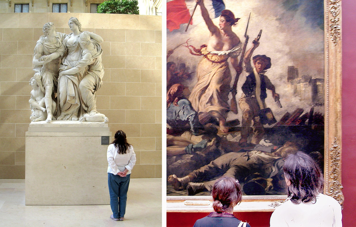
Quick word: Forget the Mona Lisa. It’s a tiny little painting of little artistic note, buried under a Times Square-size crowd of tourists all wanting to see the “most famous painting in the world.” It is what good PR will get you. It may be a historically noteworthy piece as one of the very few paintings Leonardo completed, but there is much better to be seen in the museum. Don’t exhaust yourself in the mêlée

Seek out the unusual, like Jan Provost’s Sacred Allegory, from about 1490, which I like to call “God’s Bowling Ball;” or The Ascension, by Hans Memling, from the same time, which shows Christ rising into heaven, but shows only his feet dangling from the clouds. There’s some quirky stuff on the walls of the Louvre. 

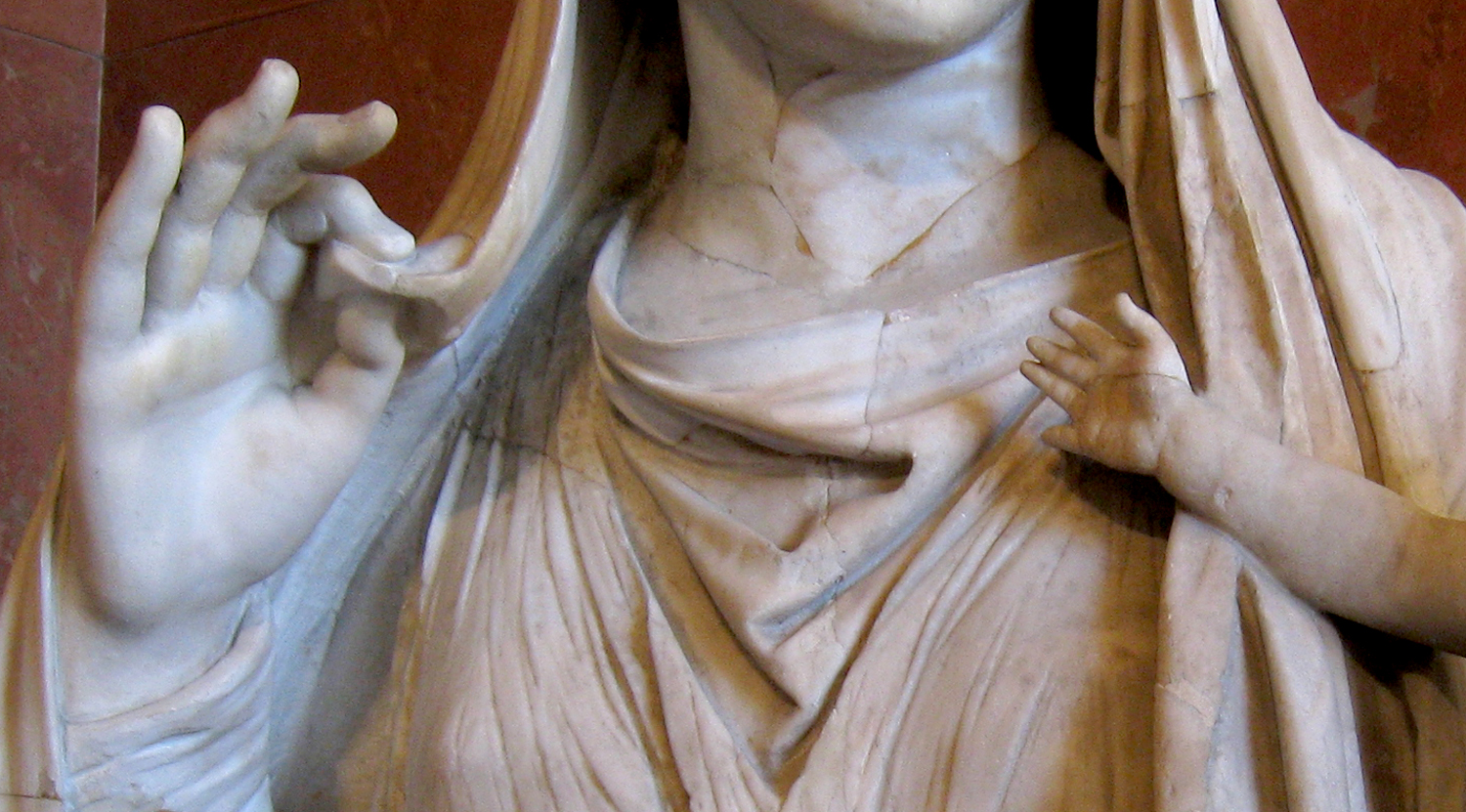
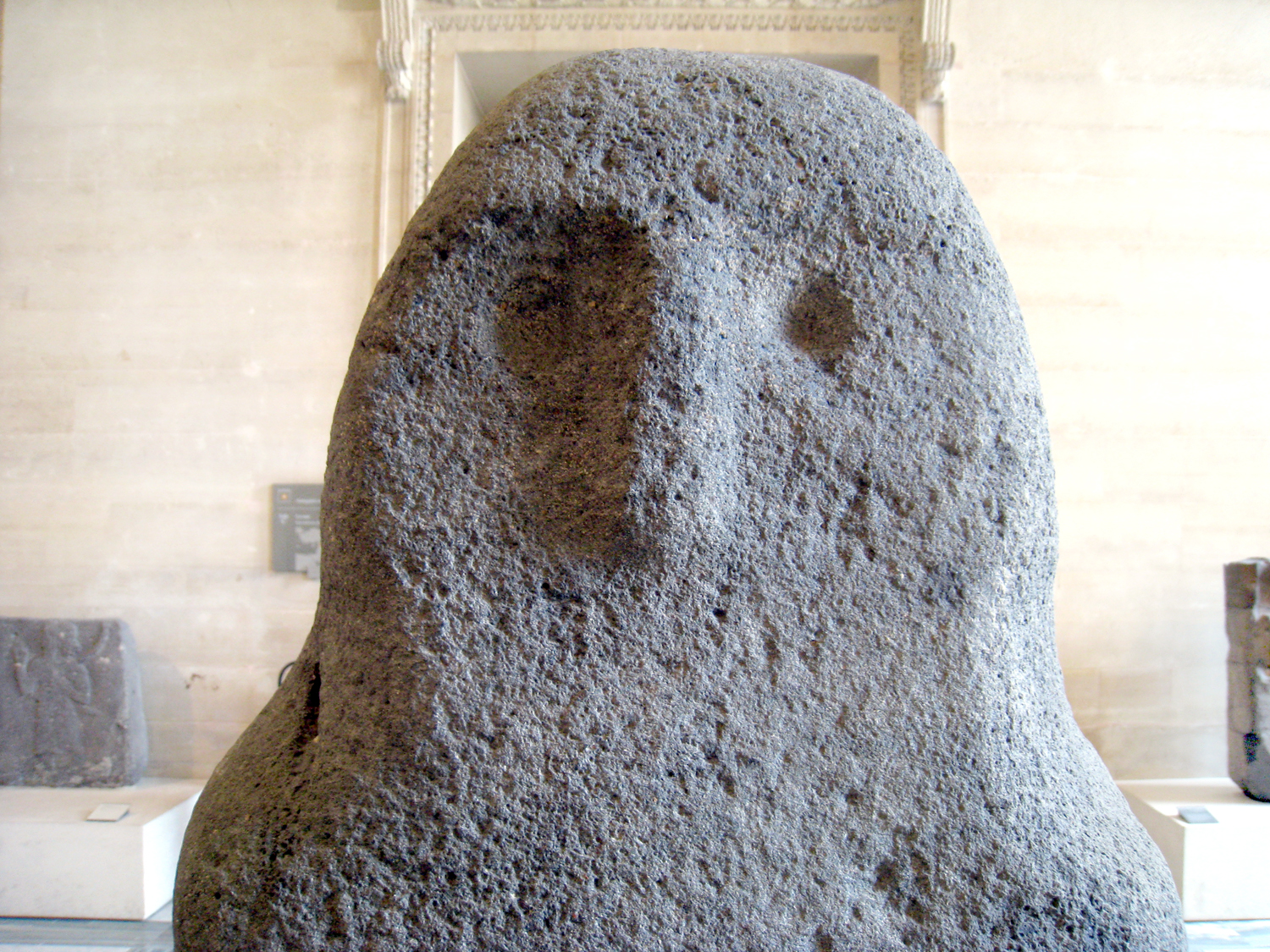
One of the goals of the museum is to collect, preserve, and display the cultural history of the Western world. This is our art, the stuff we have made for more than 3,000 years, from Ancient Sumer and Egypt, through classical Greece and Rome, wizzing past the Middle Ages and brightening with the Renaissance and the centuries that followed. You get the whole panoply and see what tropes have persisted, the ideas that have evolved, the stuff of our psychic landscape. 

(See how the fallen soldier in Jacques-Louis David’s Intervention of the Sabine Women echoes in Picasso’s Guernica. One way of looking at all cultural history is as an extended conversation between the present and the past. The reverberations are loud and clear.)

You can look at the paintings on the wall and see them for the beauty of their colors and brushwork, or the familiar (or not-so-familiar) stories they depict; or you can see them as the physical embodiment of the collective unconscious. 

I have always been a museum-goer. From my earliest times as a boy going to the American Museum of Natural History in New York, through my days as an art critic, rambling through the art museums of the U.S. and abroad. There is little I get more pleasure from. 

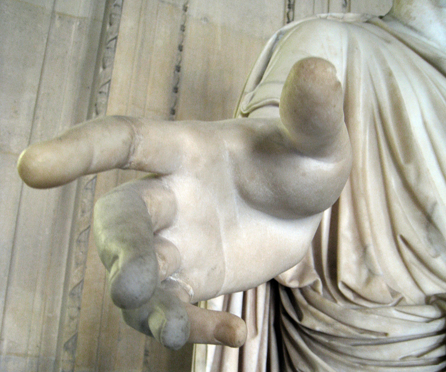
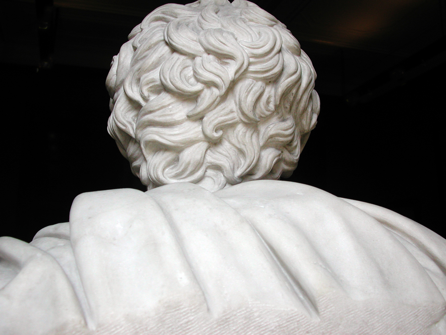
One soaks up the visual patterns, makes connections, recognizes the habits of humankind. Recognizes the shared humanity. The differences between me and Gilgamesh are merely surface tics. When I see the hand of the Roman emperor, it is my hand. I feel kinship with all those whose works and images appear in the galleries. 

And so, if it is two percent of the Louvre I have managed to absorb, I know the rest is there, and that it is me, also. 

Click on any image to enlarge

Many years ago, I attended a photo staff meeting at my newspaper and the photo editor was complaining about a picture that a very talented staffer had made. For him, it was too arty.

“This is a newspaper,” he said. “Our photographs must be clear. We cannot have any ambiguity in them. If it is a picture of a house, I want it in the center of the frame, and I want the whole house. Like a real estate photo. We are not making images for a gallery; we are showing readers what the story is about.”

I remember cringing, but I said nothing. I was not on the staff, but just a travel writer who made my own photographs for my stories. I was in the meeting by default. 

The idea that a photograph was merely an illustration to back up words bothered me then, and it bothers me now. Instead of a supplement, I thought of them as amplification. 

Some things can be said better visually than verbally. The photo might very well be able to stand on its own. 

But, in a culture of verbal people — as a newspaper tends to be — a picture is a stand-in for words. You should be able to point to something in the photograph and name it: “House.” The name then, takes over, and any visual information is immediately rendered moot. Very like when you head to a rest room at a McDonald’s and the pictures on the doors tells which one to open. The image becomes a pictogram. 

This is the way many people regard photographs. They look and they name. “Aunt Julia.” “The house I used to live in.” “Niagara Falls.” Then they turn the page in the album. “Here is me at my prom.” 

Much of the visual information in the picture is passed over, not registering. Was that a blue tux at the prom? Did those horn-rim glasses make you look dorky? Were the shoes cropped out of the picture? Can you remember, then, what shoes you wore? 

Details matter. When you name the image rather than see it, you miss the majority of what is pictured; you miss all the pleasures you could enjoy — the colors, shapes, textures — and all the information that is there to mine. I am reminded of those impatient people I have seen in art museums running from painting to painting and reading the tags next to them. “This is a Renoir. Oh, this one is a Picasso.” 

Naming things often gets in the way of seeing them. Naming is a very low form of intellectual activity, but one it is too easy to become proud of. It does not actually indicate your intelligence if you can name ever painting in the gallery, or the make and model of every car you spot on the highway. It just means you can memorize. 

When, before I was a writer, I was a teacher, I would sometimes draw two shapes on the blackboard and ask, “Which of these shapes can you draw more accurately?” Most students would pick the square. It had a name and they could see the square, translate what they saw to a word, and then retranslate that word onto the paper with their pen. In the process, details of the original are obliterated.

Notice that the square here is not a perfect square. It has some sketchy lines and it is not completely closed up, and, in fact, it isn’t even a square, but a low-aspect-ratio rectangle. All of that visual information is expunged when you replace it with the name, “square.” The amorphous shape, on the other hand, would require you to look at it and attempt to follow its contours with your pen, forcing you to pay attention visually. 


Your blob would be drawn more accurately than your square. 

In his groundbreaking book, Principles of Art History (1915), Heinrich Wölfflin described the differences between Renaissance and Baroque art with a series of oppositions. Among these is the contrast between art which emphasizes the unity of the whole, which may suppress detail to the benefit of the overall design; and art which revels in a multiplicity of detail, even if it confuses the overall design. 

It isn’t that the classic art doesn’t pay attention to detail. In fact, it often takes pains to make everything equally easy to recognize, well lit, well placed in the frame. But the whole is more important than the parts. 

Balancing that is art that may even obscure some detail to make others more prominent. 

This dichotomy occurs repeatedly in art history — from Classic Greek art to Hellenistic Art, from Renaissance to Baroque, from Neoclassic to Romantic, from Modernism to Postmodernism. In Nietzschean terms, classic and romantic, Apollonian and Dionysian. 

The 20th Century, which we are most recently heir to, unity was valued as supreme. Artists, writer and poets who filled their work with profusion of detail were denigrated. The most concise poets were held superior. Painters who reduced their subject to basic forms were extolled. Musicians who subdued florid detail in order to render the overall form of the music more clear were applauded. They had a “grasp of the structure.” 

The complaint lodged against pianist Vladimir Horowitz, for instance, was that he never fully expressed the form of longer pieces of music, such as sonatas, getting lost in multifarious musical volutes and whorls. Of course, when you listen to the ancient recordings of the great pianists of the early 20th century — an era of romantic piano playing — all of the pianists focused on details. It is where the fun was to be found, the flavor of the ingredients rather than the melange of the whole.  

Romanticism in general relishes the detail, and can often get lost in it. That’s what makes it Romanticism. (Well, one of the things). Detail is where we find the pith, the essential oils, the meat. 

Classic painter Joshua Reynolds taut the “grand style,” and recommended choosing the general over the particular: a stylized tree over the quirky oak in the back yard. Romantic artist William Blake read Reynold’s book and wrote in the margin: “To generalize is to be an idiot. To particularize is the alone distinction of merit.” You can also imagine him chasing kids off his lawn. 

But his point is that the world is made up of details, and meaning is found in them. The collection of details fills out the impression we get from the quick overview. It is the detail that we know the whole. 

Through this essay, I have sprinkled photographs of the details of a house in Maine. It is one I know and love very well. 

If you look closely at them and absorb all the tasty detail, you can have a much fuller understanding, not only of the house, but of the style of Down East Maine, its economy, its culture, the nature that grows green in profusion everywhere. 

Crumbs to make a cake.