I have infinite respect for school teachers. My late wife was one. I was one myself, for six years earlier in my career. Teachers work harder and for less pay that pretty much anyone else I can think of. And more than anyone else, the best teachers I had made me what I became in life.
But.
There was something about the teachers I had in public schools — grade school and high school — that mystifies me to this day. It was “required reading.” Nothing against the idea of having students read, but the problem was the books they had us read.
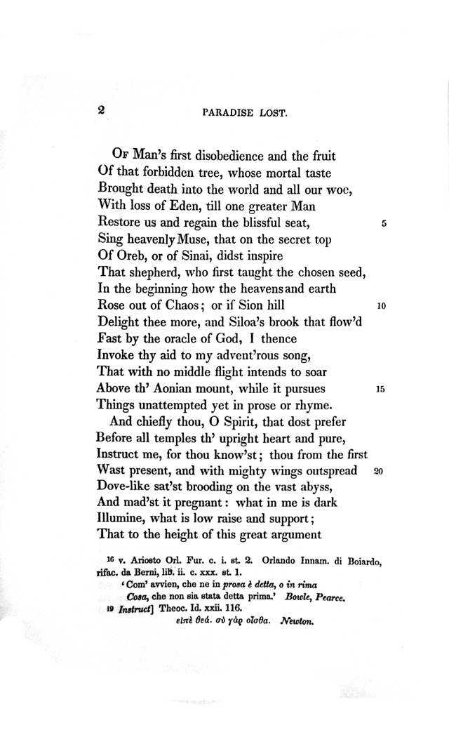
They were “great books,” unquestionably, and among the best of literature in the English language. But what, I ask, what can a 13 year old possibly make out of The Scarlet Letter? It is written in a rather formal early 19th century style, about a culture long faded in America, and involving minute shades of thought and feeling, with, like an iceberg, more beneath the surface than above. I was required to read it in eighth grade and was bored silly by it, mostly because I could not possibly understand it.

I remember one of the test questions on the book. “What is the significance of Hester naming her daughter ‘Pearl?’” Uh — I dunno. I was 13 years old and I had a hard time telling the difference between Arthur Dimmesdale and Roger Chillingworth. Perhaps I wasn’t paying close enough attention. Most likely the book was way over my head. Way over the head of any 13 year old. Which is my point. Why was it assigned?
My teachers wanted to expose me to the best in literature, I’m sure. And Scarlet Letter is certainly a great novel. I’ve read it as an adult and was amazed at how different it was from the same book I read in eighth grade. Deep and true, and subtle. All of which was lost on a boy with not enough life experience to be able to absorb what I was reading.
For most kids at that age, a novel was its plot. If I could keep the story clear in my head, that was what I took from the book. So, there were a few assigned books that I read and enjoyed. Oddly, one of them was Ben-Hur: A Tale of the Christ, by Lew Wallace. It was assigned in seventh grade, and it was, at the time, the longest book I had ever read.

It was no doubt assigned because of the 1959 movie, but I had not yet seen the film, and so I never had to compare the book with Charlton Heston. It was fresh to my eyes.
But it was a story told without excessive subtlety. If I followed the plot, I got out of the book pretty much all that was put into it by its author. I was 12 and at the time, fascinated by history. Lots of that in Ben-Hur.
It should be pointed out that I had nothing against reading books. I read them all the time. I was an avid reader, but pretty much every book I picked up was non-fiction. (I once complained about novels, “Why would I want to read anything that wasn’t true?” Little did I understand.) I read tons of books about World War II. I was obsessed with the war my father had fought in.
And so, Ben-Hur was right up my alley. A story clearly told and with little hidden between the lines.

Another great choice for a young person was To Kill a Mockingbird. As a pubescent teen, I was deeply moved by the injustice and the countering righteousness of Atticus Finch. I read it at a time of the Civil Rights Movement in the U.S., and it seemed instantly relevant to my life. The fact that it was told through the eyes of 8-year-old Scout, and the moral issues seemed so clear only made it easier to digest at my tender age.
The novel is still taught in many schools, and is perhaps the perfect book for required reading, although at the age I was asked to read it, I had no clue as to the the fact that its author also addresses issues of class, courage, compassion, and gender roles in the Deep South.
All the subtleties and complexities in the book were irrelevant to my reading it at the perfect age to encounter it. But then, as Flannery O’Connor said, “It’s interesting that all the folks that are buying it don’t know they’re reading a child’s book. Somebody ought to say what it is.”

In contrast, we also were assigned The Great Gatsby. On the surface, it is not difficult to understand. The language, unlike that in Scarlet Letter, was reasonably modern. But the book relies almost entirely on what is between the lines, which is exactly the part that a 14-year-old cannot perceive. When I first read it, in eighth grade, I thought it was a story about Nick Carroway. After all, he narrates it. This Gatsby guy seemed entirely peripheral and I couldn’t understand why the book had his name on it. And what the heck were those giant eyeglasses about? And that green light? No clue.
Oh, I followed the plot well enough, I thought. But boy, I had not the first inkling of what the book was actually about.
And how could I have. One has to have a decent fill of life’s vicissitudes, disappointments, misunderstandings, loves, longings, sex, ulterior motives — to say nothing of complex, multiple motives — before one can take in all that is going on in Fitzgerald’s book.

Or any book written for grown-ups. We were assigned The Grapes of Wrath, and I enjoyed most of it, but on the test, we were asked why Chapter Three talks about a turtle crossing a highway. A chapter that fits what Steinbeck calls “hooptedoodle.” In Sweet Thursday, a character says, “Sometimes I want a book to break loose with a bunch of hooptedoodle. … Spin up some pretty words maybe or sing a little song with language. That’s nice. But I wish it was set aside so I don’t have to read it. I don’t want hooptedoodle to get mixed up with the story.”
And so, Chapter Three seems to have nothing to do with the story. Or does it? At an age before hair began growing in unfamiliar places, I had no clue.
Worse, the end of the book just seemed like a vaguely smutty joke to make a teen laugh like Beavis and Butthead. Now, as an adult, it makes me weep.

There were other books assigned that my yet-vacant mind could not get around: Emma, The Return of the Native, Oliver Twist. Why were such books put into the hands of a boy who had not yet outgrown Cocoa Puffs?
I could barely make it through Emma, and couldn’t for the life of me understand why such a self-involved cupcake should be worthy of my attention (I said to my utterly self-involved teen self). At that age, irony is an unfathomable concept. No one my age at the time should be forced to read Jane Austen. Way above my pay grade at the time.
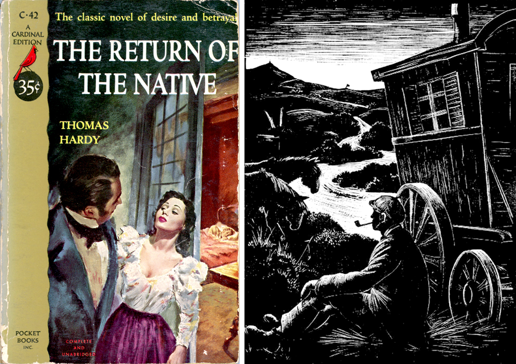
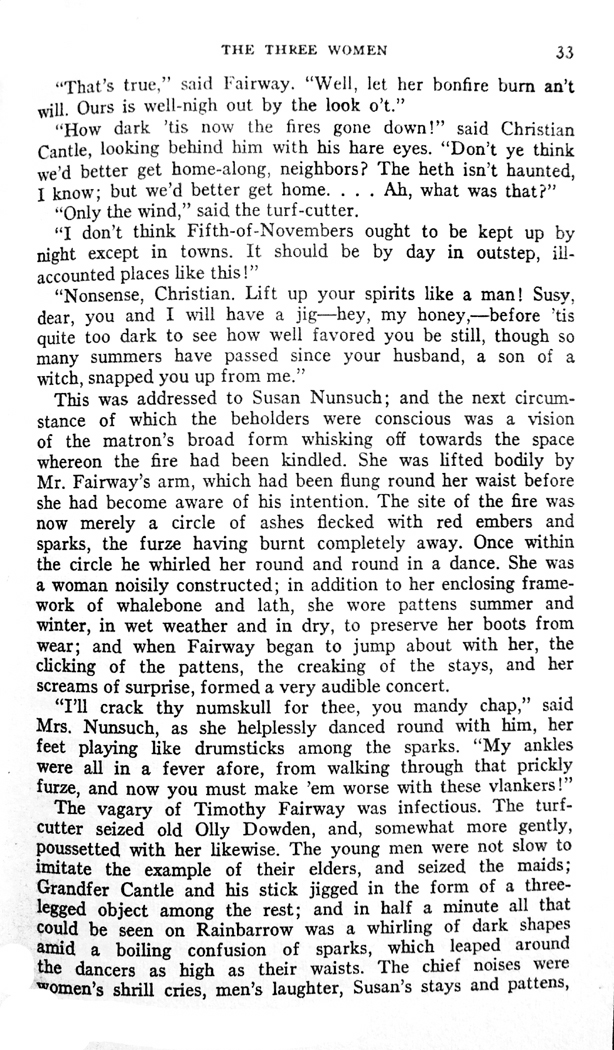
And worse, Thomas Hardy. I had no notion of what a reddleman might be, nor furze, nor a heath. Reading the prose was like chewing dry straw. Why, why, O why was this book handed to a pre-teen American boy, who never cut a wisp of furze in his life?
Last year, I found a used copy of the paperback book I was given back then, so many decades ago, and I began reading it to see if it was as bad as I remembered it, and surprise: I found some of the most resonant, deeply felt writing I’ve ever read. As twilight settles, on the first page of the book: “Looking upwards, a furze-cutter would have been inclined to continue work; looking down, he would have decided to finish his faggot and go home.” That image rings so instantly true. I’ve been there. When I was a kid, not so much.
There were other books assigned that memory has happily wiped from my mind.
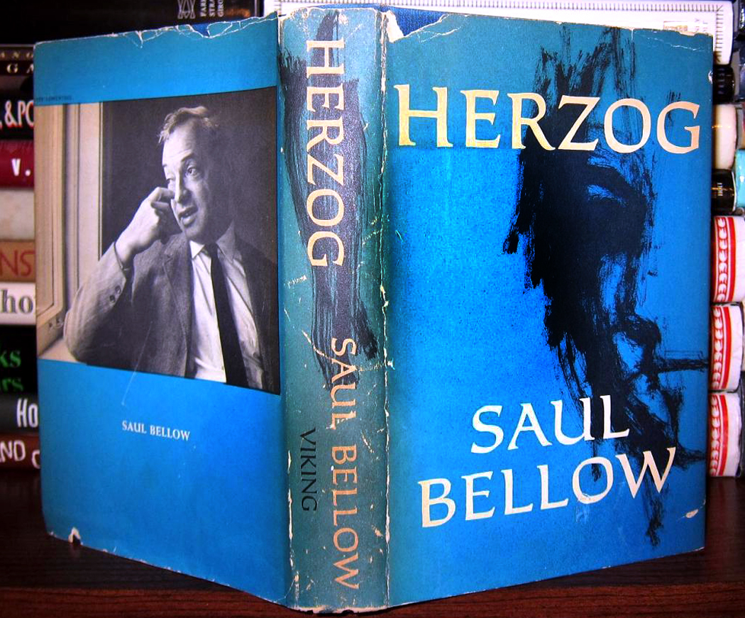
But worst of all, and for this I hold Miss Irene Scheider completely guilty, was my lifelong inability to read Charles Dickens. She was otherwise a fine teacher of my eighth grade class, but she decided she would assign each student his own book, chosen by her as the perfect match for his taste and personality. And for me, she chose Oliver Twist.

I cannot tell you how much I hated, hated, hated that book. I found it turgid, boring, endlessly prolix, and completely unrelatable. I trudged through it dutifully, But I found it the absolute opposite of anything my taste and personality would have fancied. “Please sir, I want less.”
No blame should be ascribed to Dickens for this failure. I believe the enthusiasm so many intelligent readers feel for his books. But my experience with Oliver Twist in the eighth grade has ruined Dickens for me for the rest of my life. I cannot even pick up another of his books. My muscles twitch and my eye develops a tick. “Oh keep the Dog far hence, that’s friend to men, Or with his nails he’ll dig it up again!”
I understand the impulse of grade school teachers to introduce great lit-rich-your to young minds. But forcing a teenager to read works they are not equipped to comprehend can only deter them from ever wanting to read books they haven’t been assigned.
I was lucky. I loved reading too much to be thrown off by boring books. I had my own direction. Before high school, most of what I read was non-fiction. I always had a book or two going. Some I read so avidly, I finished them in a day. You could not have stopped me from reading. But I only came to fiction and an appreciation for what it had to afford, after my brain had become fully formed, in my twenties. Then, I attacked all those classics I had dreaded when I was younger. Ulysses, yay! “Madame’s Ovaries,” whoopee! “Lady Loverly’s Chatter,” sign me up!
I am pretty sure that if you want to instill a love of reading into young minds, you have to let them read what they choose for themselves. Don’t worry if it’s not great literature. Don’t worry even if it’s trash. Or even if it’s comic books. If they enjoy it, they will keep reading. And if they keep reading, they will grow out of the junk and seek the real deal.
There are books that speak directly to eager minds. The Catcher in the Rye is only possible to read when you are young. Believe me, I tried to re-read it a few years ago and nearly upchucked. It’s not for adults. And there is a huge market for YAF (an acronym that makes me hiccup: Young Adult Fiction) that is surprisingly well written and tackles subject meaningful to their audience. Encourage that. Don’t, my god, hand them Brothers Karamazov.
So, let them soak up Harry Potter if they want. It’s OK. Better than never being able to read Charles Dickens again.