Archive

Tag Archives: seeing

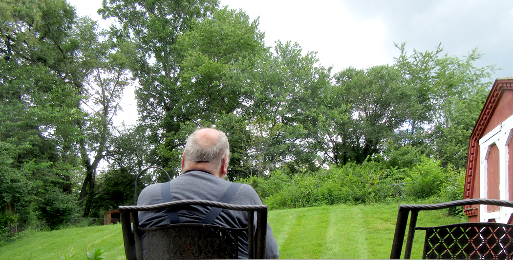
I was sitting on the backyard patio this morning, soaking up sunlight, when a squirrel skittered across the lawn, back and forth like a pinball. Eventually, he came to within 10 feet of me. I sat stock still, and he stared, twitching his nose, standing on hind legs like a deacon. After about a minute — which can feel like quite a long time — I must have blinked, because he jumped, startled, and took off running away. 

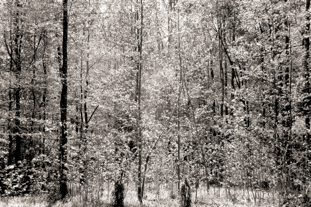
I often sit in the back yard, to hear the birds and watch the clouds. It feels like an unmediated soak in existence. I sit trying to notice everything, the birds singing, the clouds moving, the wind making the trees wiggle in random motion, and until recently, the incessant noise of the cicadas, sounding like the A Train rushing through the 81st Street subway station. I felt the breeze in my hair, saw the bluish greens of the iris plants and the yellower green of the grass, I enjoyed the warm concrete on the soles of my bare feet and the incipient sunburn on the backs of my hands.

Bill Moyers once asked Joseph Campbell about the search for meaning, but Campbell switched focus: “People say that what we’re all seeking is a meaning for life. I don’t think that’s what we’re really seeking. I think that what we’re seeking is an experience of being alive, so that our life experiences on the purely physical plane will have resonances with our own innermost being and reality, so that we actually feel the rapture of being alive.”

And so, I sit watching my back yard, the trees that line it and the sky above it. I can feel myself breathing, wiggling my toes and being alive, and what is more, recognizing the world being alive around me. For a moment, there is no boundary between my existence and the sea of being in which I swim. 

A wren flits down and sits on the steps to the shed and moves from one position to another with no apparent intervening motion, as if it were a jump-cut in a movie. A really bossy mockingbird runs through his repertoire of bird calls, claiming this patch as his own. A cardinal flies from my left to land on a bush to the right. A white butterfly bounces on the air waves to disappear behind the bushes. 

I’ve seen so much life in this tiny patch of ground, it sometimes astounds me. I cannot count the birds. Crows, even a raven. Way up in the sky, I’ve seen up to a dozen buzzards at a time circle as they catch the updraft coming from the river and up the bluff to this house. 

There have been cottontails and many squirrels. Two years ago, coming home from a trip to Maine, as I pulled into the driveway, two bear cubs were climbing up a tree at the back of the property. We watched them having their fun, and then mama bear climbed up behind them to encourage them to come back down. A dog barked aggressively from somewhere down the neighborhood and the bears all dropped to the ground and ran off. I’ve seen bears waddling through the streets here, and long ago learned not to put the trash out until garbage delivery day. 

A groundhog has crossed the back yard so often, he has left a permanent trace in the lawn. I have seen him multiple times harrumphing his way along. If he spots me sitting, he will take a moment to stare and consider his next move, but then run faster than you think he can move, back where he came from. 

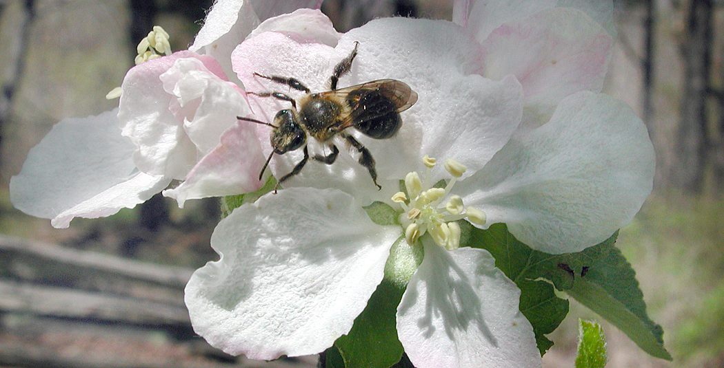
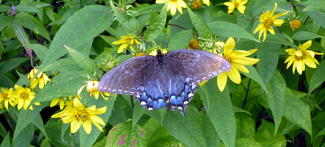
Then, there are the bumble bees, the honey bees, the wasps and the ant lions — their little sandy funnels in the dirt of the front garden. Big black butterflies, and their yellow and orange doubles light on the hedges and weeds. Ants build their nests in the cracks of the driveway, leaving tiny ridges of dirt where they have dug down. 

Yesterday, as I was headed out the back door to have my daily sit-down on the patio, before opening the door, I saw the groundhog plopped down right by my chair, butt-flat on the concrete and motionless as a garden gnome, while an angry mockingbird jumped in a half-circle around him aiming “Cht-Cht — Cht Cht” at him. They continued this performance for a good two minutes until I must have made a noise and the great, heaving woodchuck became disturbed, turned its head my way and waddled off to hide under the shed and the bird, having had its way, flew up to a tree and quieted down. 

When I was little and visited the Bronx Zoo, I was impatient to see the animals, who sometimes hid in the shade at the back of their enclosure, or sat behind some rocks, and if I did not have my interest piqued in the first five seconds, I moved on to the next animal. But my father told me to wait. Just watch. Eventually something would happen. I didn’t understand that then; I do now. I find myself in my yard patiently waiting for the next miracle. 

(Many years later, I worked at the Woodland Park Zoo in Seattle, and saw crowds of impatient kids moving from exhibit to exhibit. And it is only worse now, in an era of cell phones and digital immediacy.) 

Writing in the Fourth Century, the Christian poet Prudentius identified in his Psychomachia (“Battle of the Souls”) his version of the Seven Deadly Sins, and the corresponding Seven Virtues, at war with those sins, and among the virtues was Patience. 

I don’t know if I learned it from my father, or inherited it from his DNA, but, like him, I have become rather patient. Or maybe I’m just sluggish. But, I believe it served both of us well. The old man was slow to judge, slow to anger, and would never think to get outraged at traffic. Being raised that way, I, too, am willing to wait, when waiting seems either inevitable or purposeful. In fact, I can sit quietly in a chair neither talking or thinking for ages at a time. When I’m being philosophical about it, I call it meditation.

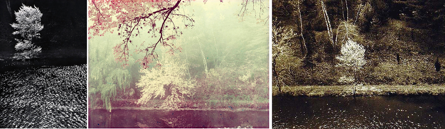
In the 1950s, the aging photographer Edward Steichen rarely left his home in West Redding, Connecticut, and began photographing a serviceberry tree (he called it a shadblow tree) through his window. He watched the seasons shift across the face of the pond and the tree and pictured them in all seasons and hours of the day, under varied weather, and made a case you could spend an infinite amount of time in a single place with a single subject and discover everything. As Yogi Berra once famously said, “You can observe a lot by just watching.” 

And it is the little things, carefully watched, that won’t happen again. The flow of the world is that it won’t happen again, all in constant forward motion and I sit to watch it move past me, and take me with it. 

 I just want to sit and soak, to sense the universe around me without thinking. We tend to glorify rationality, and the power of our brains to think meaningful thoughts, and we diminish the value of pure sensation, the sensuous awareness of colors, shapes, earthforms, clouds, birds, song, rhythm, touch, smells, and tastes. But these things are primal and exist before thought. Sensation is primary; making sense is an afterthought. 

And so I sit, trying to lose myself in the larger pattern.  

But, damn it, I can’t help being a writer and so I need to belittle what I enjoy, turning it all into words, into capsules of meaning that when read by others will be turned into ideas about sensations. Words not experience. And so, I can’t stop myself from writing this, hoping you share some of that delight when you step outdoors on the right day, with the right breeze, and the right mockingbird and crow squawking, and can see the trees dancing and the sun moving slowly across the sky blotted with whatever variety of cloud you have that moment.

This is a toaster. Something so banal that in our ordinary lives, we hardly notice or look at it. Actually this is a picture of a toaster, which is a remove from the real thing. But then, so is the word “toaster,” which is also not the real thing, but a remove from the reality. 

For most of us, most of the time, seeing something — like the toaster — means being able to name it and move on to something more interesting or more immediately useful. The image in the picture functions as a pictogram, or a different “spelling” of the word. We read the image as if it were the word. 

Pictogram to “read” as teapot; teapot image as “seen”

It is how we respond to most images that bombard our daily lives. We name the item seen. It has been categorized, filed and forgotten. Our lives are too busy to spend any time remarking that the toaster is yellow, or made of plastic, or has rounded corners. These details are of no particular use when fixing our morning bagel, and so, they might as well be invisible. 

Of course, being able to recognize things quickly is a survival skill, and humans have survived these hundreds of thousands of years precisely because they could point quickly and yell, “Tiger!” So, I’m not pooh-poohing that ability categorically. 

But life is about more than just survival. The things of this world are bursting with sense data that gets ignored by reading rather than seeing the visible world. The toaster was designed to have an esthetic impact; the yellow was chosen to be pleasing to the eye; the curves were worked in to make the shape more inviting than it would be if it were all pointy edges. 

We are embedded in a universe of things — a material world — and all of those things have physical and sensuous properties. They have shape, color, heft, texture, volume, solidity or softness, shine or roughness. And all of these properties make up the elements of art, and one of the jobs art does  is to remind us of these delights we normally pay no attention to. Art reminds us we are alive. 

Any life can be enriched simply by paying attention. To notice the yellow, the curve, the size and shape. In fact, to those awake to the world, it is all art — and the emotional richness that the awareness brings. 

It is one of the things artists were doing at the beginning of the last century when they began making abstract art: art about the color, shape, texture, without a nameable subject. 

Of course, artists have always paid attention to these visual qualities. Just because a painting is of a still life, and we can name the objects, doesn’t mean that the artist wasn’t obsessed with the sensuous truth. 

And so, it is a worthwhile exercise to occasionally attempt to forget what you know and see the things of your life freshly, as if you didn’t know the names, but saw only the qualities. 

Humanity is varied in its ability to see beyond the names. It takes an imagination — a way of turning off your rational mind to see only the vital facts and not their meaning or use. Some people have the hardest time: I remember one woman who was asked to close her eyes and describe what she could see in her mind’s eye, and her answer was “With my eyes closed, I see only black.” 

But attempting to see past the names of things is deeply rewarding. The pleasure of colors, shapes, designs, apprehended primally enriches our lives immeasurably. 

Certainly the natural world invites us with color and beauty. But it isn’t just the flowers and trees, the birds and the clouds. Everyday items can be appreciated for their roundness, plumpness, hardness, color, shape, even the feel under your fingertips. 

Many eons ago, when I was teaching photography at a two-year college, one of the assignments I gave my students was to photograph something in such a way I could not tell what it was. I made sure they understood that I didn’t mean just out-of-focus, or so badly lit it was murk. But to see something from a different angle, or to find a meaningful detail and separate it out. 

The purpose was to help them see without depending on what they already knew things looked like. To see directly. 

For example, here’s something most people see almost every day. 

Did you spot what it is? It is a view of your driver’s side rear view mirror as you approach the door to open it. A great big globular shape. 

One of my favorite images is one taken by Voyager II in 1983 as it passed the (then) planet Pluto and snapped this image of its moon, Charon. And compare with the more recent, and clearer image taken by NASA’s New Horizons space probe on its flyby in 2015. 

Actually, that’s a lie. The image on the left is a doorknob. 

And so, here’s a little quiz. These photographs were taken to illustrate the shapes, colors and textures of ordinary objects, but seen in fresh ways. But they are still recognizable, if you can spot them. Can you tell what they are? The answers are at the end of the column. 

1

2

3

4

5

6

7

8


10

Even when you are not trying to be tricky, it is good to pay attention to the physical properties of the things of the world. Those shapes make images more memorable. And there are shapes all around.

A doorway turned into a check-mark

A paper tissue half out of a box

A kitchen strainer

We are alive on this planet for such a short time, and there is so much to take in. With our five senses we are privy to such delight and can never exhaust the riches around us. But we must be open to them, aware of them, awake to them. 

Learning to see is a part of art education. To see a picture of a giraffe and point, like a first-grader, and say, “Giraffe,” is not seeing. But take up a pencil and attempt to capture what you see on paper will teach you what things really look like. Paying attention is the great secret of life. 

Quiz answers: 1. Paper plates; 2. Work glove; 3. Windshield wiper; 4. Measuring spoons and ceramic duck head towel hook; 5. Old Oxford cloth shirt; 6. Toilet paper; 7. Plastic mixing bowls; 8. Pop-open gas-cap cover for Buick; 9. Ceiling fan lamp fixture; 10. Assorted shopping bags. 

Click on any image to enlarge

I’m tired of hearing that we live in a visual culture. The fact is, we are generally very bad at seeing. I am constantly reminded of this by bad signage, bad book design, bad photographs, and bad TV. To say nothing of the horror that is TikTok. 

It may be true that we like to use images instead of text whenever we can, but we also tend to treat the images as if they were text: That is, we turn them into the equivalent of hieroglyphs or rebuses. Hence the popularity of emojis. 

But seeing a picture of a house and thinking “house,” is really just turning a picture into a word. Yes, no alphabetic letters need be used, but the information conveyed is basically the same. That is not seeing; it is translating. 

I am reminded of this because of a frequent problem I find on some back-channel TV stations when they broadcast a program in the wrong aspect ratio. It is a visual goof that bothers me no end, and yet, so many people, when I point it out, simply don’t notice it. Faces can be squeezed thin or stretched fat and the visual-verbal translation isn’t affected, and therefore, not noticed. 


Believe me, I’ve been laughed at for fussing over aspect ratio. But how can people not SEE? The visual information is distorted even if the verbal information is left unbothered. 

Aspect ratio is simply the ratio of the width of an image compared with its height. A square is the same in both measurements, and hence, its ratio — its aspect ratio — is one-to-one — 1:1. 

If a rectangle is twice as wide as it is tall, its aspect ratio is 2:1. 

When photographs are made, or films or TV is shot, they are created in a particular aspect ratio. For instance, for decades, the standard aspect ratio for Hollywood films was 1.375:1, which was adopted in 1932 for the entire industry. Before that, silent films were mostly shot in a 1.33:1 ratio, which can also be stated as a 4:3 ratio, which corresponded to four sprocket-holes on standard 35mm film. But when sound was added as an extra track alongside the image on the film, the picture had to be made a wee bit smaller to accommodate, and hence, the 1.375:1 ratio. 

That all sounds very technical and who cares? Well, what happens, then, when you display an old film on a new TV, which are now standardize at an aspect ratio of 16:9, a “widescreen” ratio? When done right, you get a “letterboxed” image, with black bars on either side of the picture. When done wrong, the squarer image is stretched out to fill the wider screen and you get a lot of fat people. 

This used to be a big problem in the early days of digital television, when many stations heard complaints about those letterboxed images. The response was to crop the movies down to fit the screen, losing a good bit of visual information in the process (a process dubbed “pan and scan”), or — too often — just stretch it all out to fit. To anyone sensitive to visuals, this was a nightmare. But again, many people — especially at the TV stations mutilating the images — just didn’t seem to think it important. 

The reverse also happens when a real widescreen movie (some films are made in aspect ratios wider than 16:9, such as the 2.4:1 of the most widely used widescreen movies. Then, shown on a standard TV screen, you get everything squished down. 

Many of these widescreen movies were shot with anamorphic lenses, which allowed for a wider image to fit onto a narrower piece of film. In essence, they squeezed the picture thin on purpose, and then when it was projected in a theater, a reverse anamorphic projection lens would spread the image back out to its natural dimensions. Tons of films were made (and are made) this way. 

The problem shows up with DVDs, too. Some are produced in a natural aspect ratio, usually 16:9, but others, mostly older ones, were created anamorphically, and so you may need to use your remote to find the proper aspect ratio (or “screen size”) for the disc. If not, you watch squeezed people. 

I remember when my college film series showed a version of Bad Day at Black Rock but didn’t correct the anamorphic images. We watched the whole movie distorted into a squished frame. It was nauseating, at least to me. The projectionist, when this was pointed out, said he didn’t see what I was talking about. (The same projectionist showed Birth of a Nation with the music track turned off because “it’s a silent film.” There is no accounting for how these people get in charge of things.) 

Most all of us have something like this, which bothers us no end. For some it is bad spelling or incorrect grammar. For others, it is making too much noise when eating soup. Others still cannot bear canned laughter on sitcoms, or the superfluous chyrons streaming across the bottoms of cable newscasts, telling us exactly what the speaker is saying. We can hear them, you know. You don’t need to spell it out. 

Anyway, one of those irritations that just drives me nuts is the inability of so many to actually notice when the picture has gone bad on their TV. The wider the original, the squishier the mistake. I remember seeing an early broadcast of The Good, The Bad and The Ugly scrunched into an old cathode-ray TV screen, like a closed accordion, and I thought, “How can poor Clint Eastwood even breathe?”

The aspect ratio problem, though, is really just a symptom of a wider issue: that too many of us are just bad at seeing, of not paying attention to what our eyes are telling us. It is the translation problem: We don’t see to see, we see to extract only so much information as we feel we need. If we can follow the plot with skinny people, then good enough. 

But seeing isn’t just about keeping track of the story. It is about being alive in the world, of noticing everything around you, of taking in what existence gifts you with. The green of a tree, the roundness of a tire, the texture of denim. To notice is to be alive; failure to notice is deadening. 

Art, and I include even popular art, is there to remind us of, and to interpret, the world we live in and the lives we lead. The best art slaps us awake, the way the slap of the doctor makes the newborn take its first breath. We can see what we had taken for granted, we can reinterpret what had become habitual. Failure to use your eyes is to refuse a gift being offered by existence. 

Click any image to enlarge

The world is not black and white, but until fairly recently, photography was. For most of its history, the art was an art of silver on paper, spread from inky blacks through velvety grays into pristine whites. 

There had been attempts to add color, either by painting on top of the monochrome image, or by various experimental techniques to capture the color directly. But even after the commercially successful introduction of Kodachrome in 1935, photography as a museum-approved art continued to be primarily in black and white. 

(In cinema, Technicolor predated Kodachrome by about a decade, but that process was essentially three different black and white negatives overlapped through color filters to create the effect. It was an expensive and difficult process and relatively few films, percentage-wise, were made with the process until after the commercial success of Gone With The Wind and The Wizard of Oz in 1939.)

I have been a photographer for at least 50 years. I have had shows and my work has been published. But for most of that time, I worked in monochrome. I “saw” in black and white. My photographic heroes worked in B&W, the techniques I mastered were silver techniques. I became an excellent printer. But I seldom used color film. It seemed an unnecessary noise to bring to the purity of the medium. 

I was hardly alone in this. When I was younger, even museums shied away from color photography. It was seen as not “permanent.” It’s images faded over time (I’m sure you all have old family snapshots turned rather magenta with age). The real artist-photographers used silver or platinum and made glorious images. 

Back then, art in general was seen with more precious eyes. We thought of “archival processing,” and even paintings were carefully preserved and curators looked down on some artists — such as Jackson Pollock or Mark Rothko — who used non-archival pigments or unprepared canvases and whose works, therefore, had begun to deteriorate. 

In current times, few artists or galleries worry much about such things. Art can be made on newsprint, or can even purposely self-destruct. Concern for the permanence of an artwork is seen as elitist. After all, no matter how careful you are, the art is going to be gone eventually, even if it lasts till the sun explodes. 

And besides, color is now no more or less permanent than black and white: Now they are both nothing but ones and zeros. Silver is dead; long live digital. 

Yet there is still a difference between color photography and black and white. It is a difference not simply of technique, but of thought. Thinking in color is different from thinking in black and white. 

The part of vision that deals in color is processed in a different area of the brain than the part that concerns itself with darks and lights. (Vision is ridiculously more complicated neurologically than you might think — the information on the retina is broken down into many separate components, processed by differing regions of the brain and then re-coordinated as a gestalt.)

And so, some people pay closer attention to the hue, others to the forms they see. 

The fact is, black-and-white photography and color photography are two different art forms. To be successful in both requires a kind of bilingualism. Most of us have brains that function best either in seeing forms and shades, or in seeing hues. The two photographies emphasize those different talents.

One has only to consider the work of Stephen Shore or William Eggleston. Most of their meaning comes through the color. Take one of Eggleston’s best-known images and suck the color out. What have you got?

He made this photo of a ceiling and light bulb. The red is overwhelming. But imagine it as a black and white image.

He also made a similar image of a brothel ceiling painted blue. Also overwhelming. The two are nearly the same image, but with very different emotional and sensuous meanings.

But if we make them both black and white, they very nearly merge into the same thing. 

Color can by itself separate forms. Here are four squares in four colors; as distinct as can be. But the exact image, unaltered except for the draining of all color from it, leaves a confused mess, barely a separation between grays. 

Black and white photography requires the separation of parts not by hue, but by contrast: Lights agains darks. It’s what makes great silver prints sing. Where color photographs separate forms primarily by hue, black and white shapes form with contrast.

I am not saying a color photograph has to be garish. Far from it. But the color will carry a good deal of the meaning and emotional resonance of the image. Even in a color photo that has hardly any color in it.

Many years ago, I tried an experiment. Like so many others, I loved the waterlily paintings of Claude Monet. But I wondered if they would make as much sense in black and white. Is there a structure holding the pictures together, a design or composition, that didn’t depend solely on the rich color. 

So, I began making photographs in black and white of water lilies. 

The most successful of them clearly relied on bright highlights and strong shadows. The shapes made the picture.

If I tried an overall design, like Monet’s the picture lost its strength. 

I did the same experiment with one of Monet’s paintings, rephotographing it in black and white. 

Did it hold up? It is certainly a very different beast. 

Then I went back to one of my own color photographs of his waterlilies in Giverny, a photograph that imitated Monet’s paintings, with color, sky, reflection, shadow and lily. In color and side-by-side, in black and white. 

What I discovered shouldn’t be a surprise: Monet was much more effective in color. But I also noticed that because my photos were well-focused rather than impressionistically fuzzy, they translated better into black and white: Black and white is meant to clarify shapes. Color identifies “areas” rather than discrete textures. 

And so, while I have spent the majority of my photographic career making monochrome images, along with many others now working in digital media, I switch back and forth between color and B&W. They do, however, require different vocabularies. They are different languages. 

While I have always made visual art, I made my career in writing about art. 

As an art critic, I had the unusual need to be bilingual in an odd sort of way. As a journalist, I needed to be good with words, but in writing about art, especially visual art, I needed to know how to use my eyes.

I discovered very early on how these two talents were seldom granted to the same person. All around me were reporters who knew a gerund from a copulative, but who often seemed almost infantile when discussing pictures. They could name the subject of the image, but not go much further than that. 


A photo editor of my acquaintance once explained photojournalism this way: “I need to know it’s a house; don’t trick it up with ‘art.’” This was image as ID photo. 

But on the other side, so many artists I knew couldn’t explain themselves out of a paper bag. They effused in vague buzzwords, words that changed currency every year or so. I once taught a graduate course in writing about art for art students who needed to prepare so-called “artist statements” for their exhibits. Most of what they wrote before the course was utter blather, obscure and important-sounding without actually meaning anything. 

Words and images: Worlds seldom interpenetrable. I call the talent for riding both sides a form of bilingualism. 

I do not know if the ability to deal in multiple “languages” is something you are born with, or that you learn early on the way you acquire language before the ability to do so closes off in adolescence. But somehow, I managed to do it, at least well enough to write about it without embarrassing myself.

The mental juice necessary to process each seems walled off from the other, except in rare cases. One either runs a literary program, based on sentence and paragraph structure, linear words building a whole out of alphabetic parts; or one comprehends shapes, lines, color, size, texture, and frame as carrying the information required to convey meaning. 

This doesn’t mean that visual people are illiterate, nor that literary people can’t enjoy an art gallery, but that their primary modes of understanding vary. The squishiness of an artist’s gallery talk can drive a writer bonkers; the flatness of a word-person’s understanding of a painting can leave an artsy type scratching her head: “Can’t you see?” 

Nor does it mean that either side can’t learn, although it will remain a second language, without native understanding of idiom and customary usage. A word person can be trained to see shape and form, but it will always remain as I learned Spanish. No one will ever confuse me with a native speaker.

This split between word and image, though is only one of the bisections. Musicians can think in tone the way painters can think in pigment. Yes, there is a language that can describe the music, but for non-musicians, that language is usually impressionistic and often visual — what the music “makes you think of,” or the “pictures in your mind.” 

For the musically trained, there is also language, but it is completely opaque to the civilian: Dominant-seventh, voice-leading, timbre, reed trimming, tenor clef, Dorian mode, ritornello, de capo, circle of fifths. But even these are merely words to describe the non-verbal reality of the music itself, which can convey meaning through sound alone. The words are not the music. 

The ability to think in the terms of each mode is essential to create well in that form, and a mighty help in understanding it for the audience. If you are not in love with words, the rich cream of Gibbons or the organ tones of Milton can leave you cold. If you have no eyes for color, the nuance of Turner or the pears of Cezanne can zip past without notice. If you think of pop tunes as music, the shifting tonal centers of Schubert are inaudible, the orchestration of Mahler merely noise. 

We each have a frequency our sensibilities are tuned to, and can receive it loud and clear; we may think we understand the rest, but too often we are only fooling ourselves. Do you really inhale the contrapuntal movement of a Balanchine chorus? Do you notice the rhythm of editing in a Spielberg film? Each is a language that its practitioners and connoisseurs understand profoundly, but zip past the mass of those sitting in the cheap seats. 

It’s a different language

Click on any image to enlarge