Archive

Author Archives: Richard Nilsen

Orangerie, up close, 2006

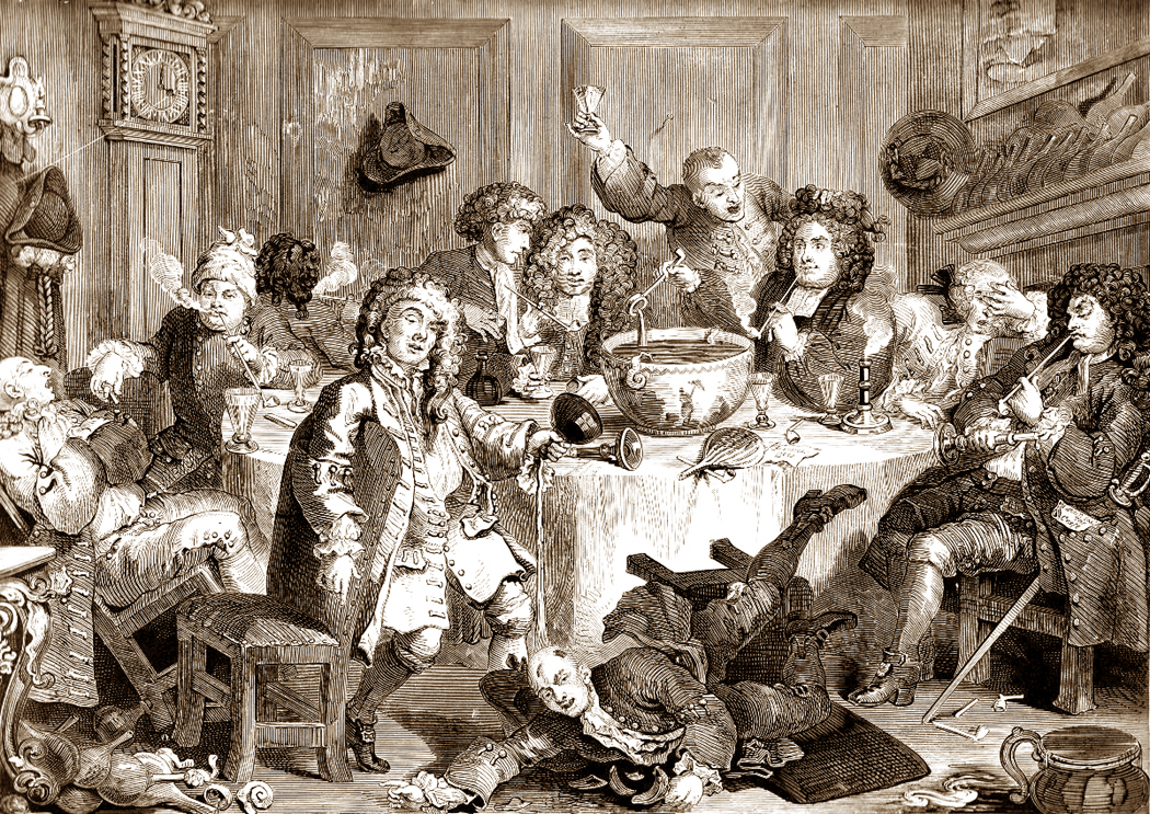
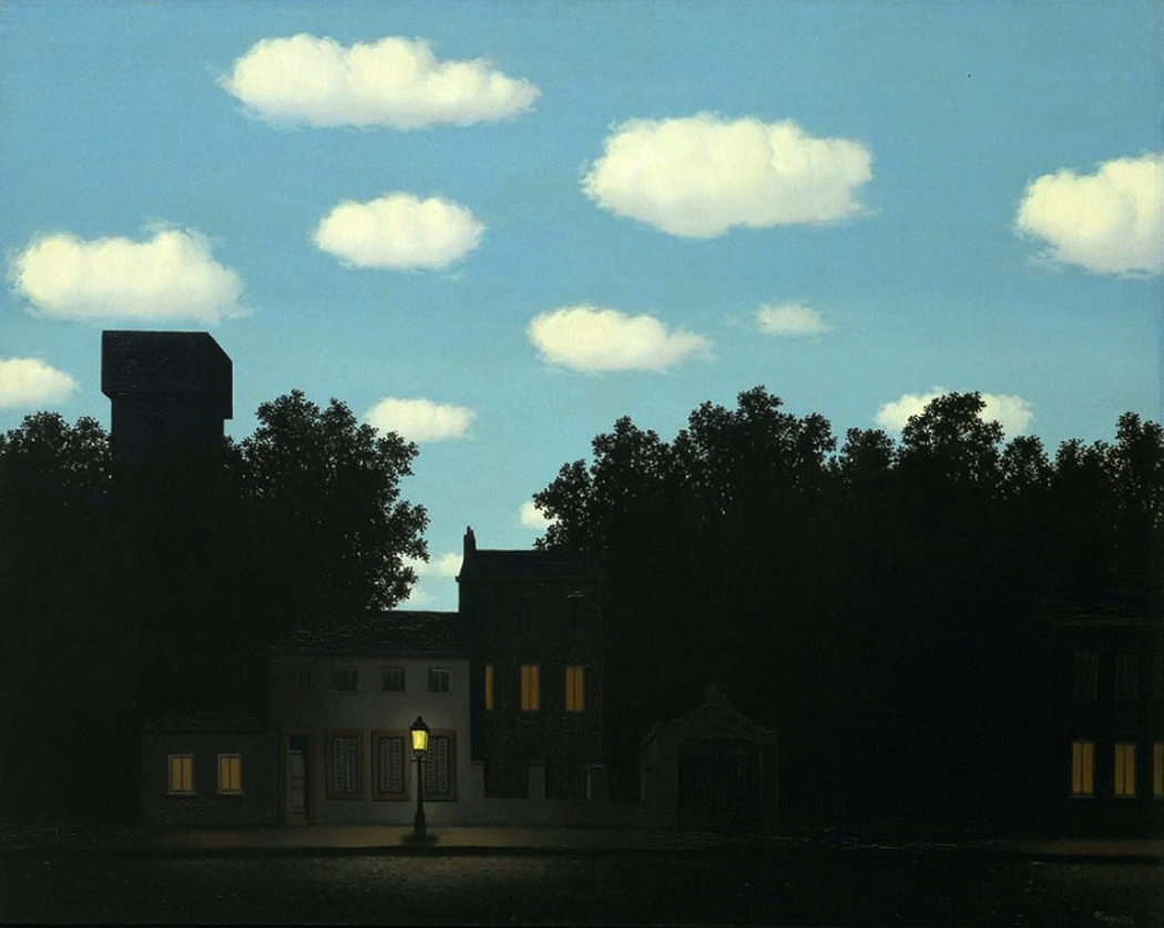
You wander through one of a city’s great art museums and watch the people. They spend an average of maybe 15 seconds in front of any painting that catches their attention before moving on.

Or more likely, they spend another 15 seconds reading the label on the wall. And if the label contains a legend explaining who the artist was or what the painting is about, they may very well spend more time with the label than with the art on the wall. It’s disheartening to watch.

One of the problems is that we are a verbal, not a visual culture. I know the common wisdom is currently that we are a visual people, but it simply isn’t true: Even those things we think of as symptomatic of being visual are things we “read” for information rather than see: like the stick figure man or woman that lets us know which restroom is appropriate.

But even more than that, it is that we are a problem-solving people. America’s national mythology describes us as doers and go-getters. We simply don’t believe in wasting our time. We’re too busy. Our heads are too crowded.

There are all those yapping voices, all those different aspects of our personalities, all clamoring for attention.

”Mmm, doughnuts!”

”Don’t forget the dentist appointment.”

”Do these socks go with this tie?”

”Is the ozone hole getting bigger?”

”Mmm, doughnuts!”

So, it’s hard to appreciate art these days.

And it’s no wonder that a management class steps forward to create some order.Orangerie, the critics, 2006

Each of us has it: The executive in our heads that tries to get through life quickly and efficiently, cutting through the baloney and making the decisions for everyone else in there.

It’s a necessity in an information top-heavy age with bumper-to-bumper traffic on the freeways.

Unfortunately, this tendency to empty the ”in box” and get on to the next problem runs completely counter to what art is about. To see art, or read poetry, or listen to chamber music, we have to kidnap, blindfold and gag the executive in our brains and give ourselves over to a different kind of experience.

And ”experience” is the operative word, for the primary function of art is to provide an aesthetic experience.

That executive in our cranium is used to dealing with information, not experience. There is life on one hand, and there are words and symbols about life on the other. Most of what life requires of us in the late 20th century deals with words and symbols: filling out forms, scanning in our Visa numbers, looking down the stock listings in the Business section of the newspaper. We are drowned in words.

But at least we are used to them. Experience is scary: sensuous, messy, confused.

So how do you deal with art? How do you prepare yourself to appreciate it, enjoy it, and grow from the experience of being exposed to it?

First of all, you have to slow down. Your interior life moves slowly, implacably. It is only your cerebral cortex that buzzes with frenetic energy. The deeper, more meaningful emotions, the underlying rhythm of life is more measured: a pedal note under the jangling fugue subject above.

Art requires that you work on this slower time scale. It doesn’t give itself up, like the punch line on a New Yorker cartoon; it slowly releases its value to those who can wait.

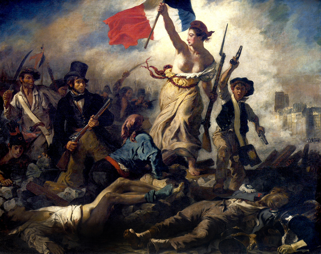
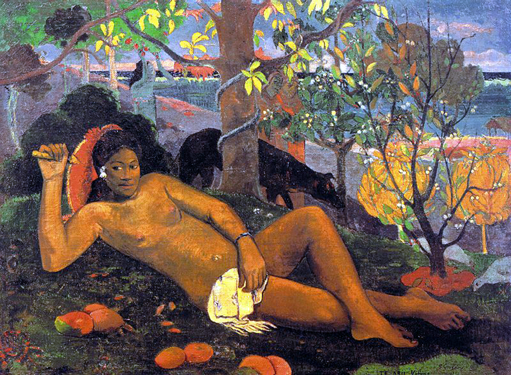
You have to spend time with a painting or statue. The Manager wants to look at a painting and say, ”Yes, I know that: It’s a Renoir. File it under ’19th Century, Impressionism, French.’ ” And then move on to the next: ”17th Century, Dutch, Genre: Rembrandt.”

It is as if knowing the name of the painting is the same thing as knowing the painting.Orangerie gawkers, 2006

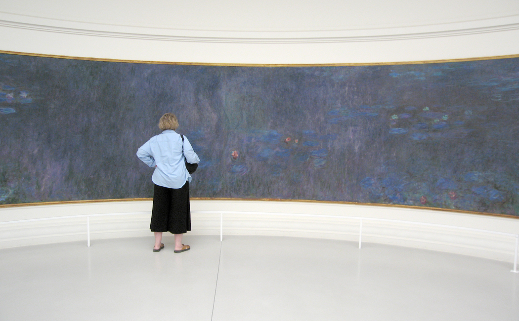
But if you look at a single painting for, say, an hour, you will learn things about it. You will be forced to discover all the richness that the artist took the time to put there.

What colors has the artist used? What shapes? Is it dark or is it light? What is the subject? Can you make sense of it? If not, is the ambiguity important? Is the paint thickly applied, or flat and textureless? How does that help the painting convey what it has to give you?

You swish it around in your mouth like a good wine, looking for the complexities of taste and aftertaste.

How does the painting make you feel? Is it an emotion you’ve felt before? If not, is it related to one you’ve felt? If it’s completely new, how do you feel about that?

The art slowly unfurls, like a rose opening from a bud. The attention you pay will pay you back.

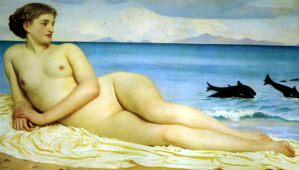
In the next installment, we’ll take a look at just one painting and see how this approach might pay off.

hogarth

The Star Spangled Banner didn’t begin with bombs bursting in air, it began with veins bursting in noses.

No, I don’t mean the stirring martial lyrics written by Francis Scott Key during the War of 1812, but the melody he borrowed.smith and key

The tune Key set his words to was an old English drinking song, To Anacreon in Heaven, written in 1780 by John Stafford Smith. It was the official song of the Anacreontic Society of London and was sung at the beginning of club meetings by all club members.anacreon gerome

Anacreon was a Greek poet of wine, women and song who died in 478 B.C. at the age of 86, from choking on a grape seed.

The club celebrated the grape, also.anacreontic society

Although, rather than wine, women and song, the Anacreontic Society seems more like booze, floozies and caterwauling. Imagine everyone at your local tavern or strip club getting up and singing a theme song before opening for business.

The society met every other week at the Crown and Anchor Tavern in the Strand, London, for a concert, dinner and a night of carousing. Each concert was formally opened by this song, performed by the president and joined by the company on refrain lines.

The curious Duchess of Devonshire, barred from the society by its all-male membership rules (barmaids were allowed, since they weren’t members), sometimes hid in a secret room under the stage in the tavern to hear the goings-on, enjoying the bawdy songs that were sung. Unfortunately, the duchess was a dampening influence on the society. Because the men were mortified that a woman of rank would hear them being so obscene, they disbanded in 1786 rather than continue, never knowing when the duchess would be in obscure attendance.fortmchenry_attack

Twenty-eight years later, Key penned the more familiar words during the siege of Fort McHenry outside Baltimore, on Sept. 13 and 14, 1814. The song was formally adopted as our national anthem by Congress in 1931.

For those who are curious about such things, these are the original words, or the first and last stanza, anyway, written by society president Ralph Tomlinson to Smith’s tune. Try singing it at the next baseball game.

To Anacreon in Heaven

To Anacreon in Heav’n, where he sat in full glee,

A few sons of harmony sent a petition

That he their inspirer and patron would be;

When this answer arrived from the jolly old Grecian —

(Refrain) “Voice, fiddle and flute, no longer be mute,

I’ll lend you my name and inspire you to boot;

And besides, I’ll instruct you like me to entwine

The myrtle of Venus with Bacchus’ vine.

And besides, I’ll instruct you like me to entwine

The myrtle of Venus with Bacchus’ vine.”

Ye sons of Anacreon, then, join hand in hand:

Preserve unanimity, friendship and love;

’Tis yours to support what’s so happily planned:

You’ve the sanction of gods and the fiat of Jove,

(Refrain) While thus we agree, our toast let it be

May our club flourish happy, united and free!

And long may the sons of Anacreon entwine

The myrtle of Venus with Bacchus’ vine.

And long may the sons of Anacreon entwine

The myrtle of Venus with Bacchus’ vine.

Signing_of_Declaration_of_Independence_by_Armand-Dumaresq,_c1873

Perhaps the most peculiar thing about the Declaration of Independence is that the portion of it that seemed commonplace when it was written now seems revolutionary, and the part that seemed to its framers as most central, to us seems trivial, even whiny.

As a piece of rhetoric, it begins in generalities, narrows to specifics, and ends in a course of action. It couldn’t be more concisely structured. The committee charged with drafting it in the summer of 1776 chose wisely when it asked Thomas Jefferson to write the first version. Jefferson’s prose is a model of late 18th-century style: precise, lucid and syllogistic.

But the only part of the Declaration that most people can recall, outside the opening, “When in the course of human events,” is the second paragraph. That second stanza contains the seed of every revolution that followed, from the bloody French to the bloody Russian. It is a statement of belief that is the foundation of American society, and almost every government created since 1776.

US-original-Declaration-topIt states baldly and without argument or support, that all men are born equal, have certain rights by virtue solely of being born, and that when a government fails egregiously to effect the safety and happiness of the people, it is their right to replace it.

But Jefferson didn’t invent its ideas whole cloth. In fact, as Jefferson wrote years later, the purpose of his stirring words was “not to find out new principles, or new arguments, never before thought of, but to place before mankind the common sense of the subject, in terms so plain and firm as to command their assent, and to justify ourselves in the independent stand we are compelled to take.”

Much of the remainder of the Declaration is given over to a litany of complaints the colonies had about British governance. Some of these complaints still seem legitimate; many seem trivial, even trumped up. “The King did this” and “The King did that.” ”

He has plundered our seas, ravaged our coasts, burnt our towns and destroyed the lives of our people,” it says. Pure hyperbole.

These complaints were the part of the Declaration that was “news” in 1776. They constituted what made the document inflammatory.

Few can read through the whole of the Declaration of Independence now without a sense of fatigue: Those complaints were the issues of 1776, not of today.

It is the second paragraph that seems told to all people at all times, and remains news to us in the 21st century.

Bridge between ages

But to follow those ideas from the century before the Declaration into the ink on its page shows just how important its year of birth was. It was born in the cusp between two great ages, two overriding sensibilities, and partakes of both.

The period from about 1750 to about 1825 is one of the richest in humankind’s history, fertile, even febrile. It is in many ways, the hinge between the past and the modern, between the classically minded 18th century and the Romantic 19th. From an age of Reason to one of Sentiment — as it was called at the time. In Europe, it was the age of Goethe and Rousseau.

And no figure in the American experiment better demonstrates that shift of sensibilities than Jefferson.

On one hand, he epitomized the faith in science and logic of the Enlightenment; on the other, he shared with the revolutionary Rousseau the belief in the nobility of humanity and its drive to social improvement.

You can hardly fail to notice this point when you visit Jefferson’s home in Virginia.

Monticello is a mirror of its maker. Jefferson built a model of Palladian proportion and filled it with moose antlers. The outside lines of the house are clean and mathematically rational. The inside is a warren of peculiar and unnerving spaces.

Jefferson never fully reconciled these two aspects of his personality. He was a slave owner who sings of the dignity of the free man. How much more conflicted than that can you be?

The Declaration of Independence speaks to us now, in large part, because of this clash of sensibilities in Jefferson.

On the one hand, you have the ideas of the Enlightenment, that brilliant flame of philosophy and science that sprang up in Europe in the 17th and 18th centuries.

On the other hand, you have the growth of the individual as a thinking and feeling person.

The Enlightenment preached rationality and temperance, tolerance and universal principals. One of its most influential writers was John Locke, who, in his Second Treatise on Civil Government, from 1690, wrote that all human beings have natural rights and that these included “life, liberty and the pursuit of property.”

It was an idea that took hold and flourished.

By the time of the American Revolution, the idea was commonplace. It shows up in George Mason’s Virginia Declaration of Rights in June 1776, in slightly altered form:

“That all men are by nature equally free and independent and have certain inherent rights, of which, when they enter into a state of society, they cannot by any compact, deprive or divest their posterity; namely, the enjoyment of life and liberty, with the means of acquiring and possessing property, and pursuing and obtaining happiness and safety.”

When you compare that with what Jefferson first wrote, you can see how much better a writer Jefferson was. He only needed 31 words to say what Mason required 57 for, and say it more forcefully and memorably.

An economy of words

Writing_the_Declaration_of_Independence_1776_Jefferson’s first take on this was considerably more sonorous, but still not quite there:

“We hold these truths to be sacred, that all men are endowed by their Creator with certain unalienable rights, and that among these are life, liberty and the pursuit of property.”

It was a committee of five, delegated by the Second Continental Congress, that were given the responsibility to draw up the Declaration. Jefferson wrote that first draft, but Benjamin Franklin, also on the committee, struck out “sacred” and replaced it with “self-evident.”

By 18th-century reasoning, self-evidence was universal, while sacredness could be construed as sectarian. Franklin wanted to emphasize the universal truth of the proposition.

And Jefferson himself changed “property” to “happiness,” and with that stroke made the Declaration jump from the past into the future.

The past was Thomas Hobbes, with his sense of the nastiness, brutishness and shortness of life, and a belief that the natural order of mankind was greed, rapine and thievery. Only strong central government, he wrote, could possibly control the natural impulses of humankind.

The future was Rousseau’s perfectibility of man, his belief in the nobility of those uncorrupted by society and government, the “natural man.”

The middle was Jefferson, perfectly if perilously balanced between.

The right of life remained pretty much the same looking forward and back, but the other two rights changed meaning over the cusp of 1800.

Locke believed that all humans coveted was property; Jefferson realized that there were many routes besides ownership to humanity’s true goal, individual happiness. Hence, the change in language.

Liberty is the word that has changed the most. In the 18th century, it meant being left alone, basically. Your government let you be: Taxes shouldn’t be too onerous and armies shouldn’t be quartered in your home at the whim of the commandant.La_liberté_guidant_le_peuple

But by the 19th century, liberty took on a more revolutionary turn: Romantic writers saw liberty as the antidote to repressive regimes around the world and one read poems to Count Egmont, the Prisoner of Chillon and Nat Turner. It fueled popular movements all across Europe and led to a crisis year in 1848. Liberty meant revolt — a very different thing from what John Locke had in mind.

(And it makes almost comic the confusion of the two versions of liberty conflated by contemporary anti-tax factions and the paranoid fringe looking for the black helicopters that we can get all belligerent and militant about “tyranny” in Washington, when compared to what is happening in Sudan, Russia or North Korea, we remain among the most liberty-ridden people on earth. Admittedly, the Declaration of Independence itself is full of the same sort of inflated rhetoric.)

“Life, liberty and the pursuit of happiness.”

This meant that the Declaration could speak, Janus-like, forward and backward. The fulcrum of modern history. The Enlightenment is emerging from its chrysalis into the age of Romanticism.

01 Rainbow, DelmarvaIn the early 1980s, my wife and I were both teachers and had our summers free to travel. Beginning in 1981 and for many years after, we drove all across the U.S. and Canada. I was a photography teacher at a 2-year college and carted around quite a freightload of photographic equipment, including a hefty 4X5 field camera.

Now, when we travel, I use a digital point-and-shoot that fits into my trouser pocket and weighs less than the lens shade for my old Super Angulon view camera lens. And the photos I get are just as good. (No matter how fancy the equipment, a photographer cannot get photos any better than his talent allows; cameras hardly matter). And goodbye hypo stains.

I have previously posted a passel of images from our trips out West. But we also visited the East. We have been to every state in the Union multiple times and have visited every Canadian province except Prince Edward Island, and I don’t know how we missed that.

We put thousands of miles on our old Chevy Citation every summer. It was a workhorse of a car; that’s it above, on the Delmarva Peninsula, under one of the greatest rainbows ever.

These are a few of the images I made on those trips.

02 central park03 Gorilla, Am Mus Nat Hist0404 Chicago skyline05 Union Station, Washington06 Greensboro Alley 107 Palisades, N.J08 Petroglyph09 Tidepool maine10 Carlsbad Caverns11 Beaver skull12 I-64, Virginia13 East Lake Hunt Club14 Bayou thicket15 Brookgreen Gardens, S.C16 Buxton Sedge grass17 Maine tide wash18 Schoodic rocks 2 copy19 lincolnville maine20 Ruins of Windsor21 Sunflower 122 Gettysburg23 Blue Ridge winter24 Cows, Crawley W.V25 Va Kendall SP Ohio 126 Va Kendall SP Ohio 227 Va Kendall SP Ohio 3

PCA-logo-text-date-FINAL

I hate “the arts.”

Don’t get me wrong: I love art. In whatever form. I could not live without music, dance, theater, architecture, literature, cinema, painting or sculpture.

But when grouped together and made plural, so that I have to bracket them in quotes as “the arts,” they become a value that is paid lip-service by politicians, administrators and businessmen and they become a category in the public agenda, much like potholes or redistricting. We hear over and over a justification of the arts that argues how much — how many dollars — “the arts” contribute to the economy. As if this were their raison d’etre.agee-famous-men

While it is certainly true the arts have some civic utility, frontlighting that is like saying that the invention of writing is important to civilization because newspapers are so useful to wrap fish in. It misses the point entirely.

When pluralized, the arts are neutralized: turned safe enough for school children and wives. They become a civic virtue, and ring as hollow as the platitudes of a politician running for office: not much more than a flag lapel pin.

And so, I hate “the arts.”

As James Agee once wrote in Let Us Now Praise Famous Men, “Official acceptance is the one unmistakable symptom that salvation is beaten again, and is the one surest sign of fatal misunderstanding.”allegory of the arts

Art — not “the arts” — is about that salvation. About becoming more fully human, more aware of the world and our place in it. It saves us from isolation, from ignorance, from emptiness. These are the big issues we face, in contrast, mutable public issues are trivial: When we come to the end of our lives, what remains of the fustian of our existence has little to do with annual income or who got elected; it is how much we have loved and been loved, whether we have become larger in our hearts, or shrunken and dried up.

Art engorges our hearts and makes our neck veins throb. We feel alive; we become more alive. Art teaches us to love and be loved. It gives us the images that train our hearts to the potentials. Without the images, without the metaphors, all there is are words, no more meaningful that an alphabet we cannot read.

Anyone fully listening to Isolde’s death song, or reading Wordsworth’s Intimations Ode, or paging carefully through Goya’s Disasters of War can be reduced to weeping — and the kind of profound weeping that makes the rest of the world disappear and our insides open up to become a sea as large as the planet.

There was a time when I was young that I thought art was merely “cool,” and that I wanted to be — or could be — in control of art instead of art being in control of me. I didn’t believe Emily Dickinson when she wrote, “If I read a book and it makes my whole body so cold no fire can warm me, I know that is poetry. If I feel physically as if the top of my head were taken off, I know that is poetry. These are the only ways I know it. Is there any other way?”

I write this listening to Strauss’s Four Last Songs (this is my own translation):

4. In the Red of Evening

Through good times and bad,

Anger and joy,

We have walked hand in hand;

And now we take a moment’s rest

With the world all before us.

All around us, the valleys dim away,

And the details gray out.

You can begin to see the lights below.

And overhead, two larks fly alone,

half-dreaming into the velveting air.

Come closer to me,

And let them fly over us;

Soon it is time for sleep.

And we must not let the darkness

Separate us from each other.

The peace is wide and still,

Deep in the redness of the western sky.

How tired we are of this need to keep moving.

Is that what death is?

Olympic coast


There were a few photos left over from my blog about seeing the West for the first time. These were taken, mostly, on trips across the country in 1981, 1982 and 1983, leaving from Virginia and driving west across the Mississippi River and into the landscape that has the mythological cast to become not merely a piece of land, but a segment of psychology.

Olympic stumpScorched redwoodMendocino County, CalifKiva, Mesa Verde, ColoNisqually GlacierHydro OklaSonoma Valley fenceHaystacks, Joes, ColoSunflowers ND 01Desert scene copyTexasDante's View Death ValleyTorrey, UtahCrumbacher LakeTsegi CanyonChuckanutVermilion CliffsAspens, ColoArch Cape, Ore

DemiEightpack

In 1991, actress Demi Moore posed for a famous Vanity Fair cover photograph, taken by celebrity photographer Annie Leibovitz. It exploded as a “meme,” and was copied many more times.

Soon, it became impossible for an aspiring starlet not to be seen naked and gravid on the cover of one magazine or other.

Leibovitz herself seemed to feel “ripped off” and sued when an ad featuring Leslie Nielsen used the pose to sell the film, Naked Gun 33 ⅓: The Final Insult.

The courts didn’t agree with her, and anyway, we had moved on to other memes, including dancing cats on You Tube. The courts could hardly have decided otherwise, not only on the basis of fair use for parody, but because borrowing poses has been an essential tool in artists’ kit for millennia.

As Picasso didn’t actually say, “Good artists borrow; great artists steal.” Actually, that quote has been attributed not only to Picasso, but to T.S. Eliot and Igor Stravinsky, but goes back at least to 1897, when a variant version was used by critic W.H. Davenport Adams. Even quotes get borrowed or “stolen.”venus and eve

L-R: Venus de Milo; Eva Green in The Dreamers (2003).

The examples are legion. My interest came to me through the paintings of Manet, Titian and Giorgione.

First let’s look at a few examples.

One of the most familiar is the pose of the “Three Graces.” It shows up in many forms in antiquity.3 graces antiquity

L-R: mural from Pompeii; statue in the Louvre; mosaic from Anatolia.

It was used by many Old Master painters.3 Graces renaissance

L-R: Raphael; Rubens; Pontormo.

And even later.3 Graces recent

L-R: Edward Burne-Jones; Henri Regnault; Leonard Nimoy.

You could find dozens of others.

Adam and Eve became such a meme, too. One version has Adam with his arms around Eve. It became used for other things, too.Adam&Eve trio

L-R: Jan Gossaert, 1520; Gossaert, Neptune and Amphytrion, 1517; Two Virgins album, 1968.

Or take the famous Botticelli painting, Birth of Venus. The pose, with the goddesses hands vaguely protecting her modesty, and you find it all over Classical art and Renaissance painting, to say nothing about one of the oldest figures in Western art.Birth of venus archetype

Or even Playboy magazine, which — probably not on purpose — imitates some other, more famous images.buns foursome

Top: Playboy; Gauguin. Bottom: Boucher; Modigliani

But the main course:Edouard_Manet_-_Olympia_-_Google_Art_Project_3

Victorine_Louise_Meurent_(1844-1927)Edouard Manet created a scandal in the 1865 Paris salon when he exhibited his Olympia, a nude featuring the model Victorine Louise Meurent dressed up — or rather undressed — as a prostitute. She wasn’t, by the way, and later became a painter herself. Here is what she really looked like in 1865.

Her pose in the painting is an obvious quote of two famous paintings of the past, Titian’s Venus of Urbino from 1538,venus of urbino by titian

and Giorgione’s Sleeping Venus, from 1510 (and probably finished by Titian, after Giorgione’s death).Giorgione_-_Sleeping_Venus_-_Google_Art_Project_2

The salient points of the pose are the recumbent nude woman, with her calves crossed.

This is a pose that even Giorgione can take no credit for. It goes back to antiquity. Here she is from PompeiiAphrodite_Anadyomene_from_Pompeii_cropped

The full meme version is the Titian painting, with these other points that get “borrowed” over and over, including in the Manet version.venus of urbino with labels

olympia handNotice that the space of the painting is divided in half, near and far, and that there is a distinct vertical line that, in this case points downward directly to the model’s pudenda, which is caressed by the curling fingers of her left hand. This gesture is highly ambiguous: Is she really masturbating? Can a great master really have meant that to be our take-away?

In the Manet, the similar gesture is more assertive: Olympia uses her hand as a kind of gate to paradise for which she and she alone holds the key. You won’t get past that hand unless she gives permission.

There is also an animal in the picture, other subordinate people.

These elements are used over and over, not least of all by Titian himself, who used the pose, or variants in several paintings.jupiter&antiope titian 1535

Jupiter and Antiope from 1535.venus&cupid titian 1550

Venus and Cupid from 1550.Venus,venuscupid and organist titan 1548

Cupid and the Organist, from 1548.

venus, organist and little dog, titian 1550And then, more lasciviously, in the variant, Venus, Organist and Little Dog, from 1550, in which the so-called “male gaze” is fairly explicit, even comical.

But Titian is not the only artist obsessed with this pose. Lucas Cranach the Elder (1472-1553) painted nearly a dozen versions between 1515 and 1550, which he usually titled Nymph at the Fountain. Here are four of them.Cranach composite

She can’t quite figure out just what to do with that left hand.

Through so many of these paintings, note the presence of animals, the near-far background, the frequent strong vertical line bisecting the picture, and the frequent use of drapery behind the woman’s head.

Not all these paintings have all the components of the Ur-painting of Urbino, but each has some of the components.

Here’s a 1639 painting by Guido Reni, with the crossed legs, the drapery, the near-far and if there are no animals, well, Cupid at least has wings.reclining venus guido reni 1639

A 1540 painting by Paris Bordone, called Sleeping Venussleepingvenus bordone 1540

From 1523, a Sleeping Venus from Girolamo da Trevesisleepingvenus da treviso jr

From 1520 and Palma Vecchiovenus palma vecchio 1520

Even in the north, from Maarten von Heemskerk, in 1545Venus&cupid heemskerck 1545

And Jan Massys painted her as Flora in 1514023 Flora Jan Massys 1514  copy

While most of these come from the 16th century, the pose streches beyond, including this 1844 Nude Girl on Panther Skin by Felix Trutatnude girl on Panther Skin Felix Trutat 1844

Lord Frederic Leighton painted Cymon and Iphegenia in 1884, with the pose, but with Iphigenia modestly covered in draperyleighton iphigenia

He also did the nude version, Actaea Nymph on the Shore, in 1854.actaea-the-nymph-of-the-shore-1853 lord leighton.jpg!HD

And Paul Gauguin’s Noble Woman from 1896paul-gaugin-noble-woman-1896

There are many more. A pile of them are mirror images, with the nude on the right side of the painting.

Giulio Cesare Procaccini painted Venus and Cupids in 1625venus&cupids procaccini 1625

Palma Giovane in 1610 did Venus and Cupid at Vulcan’s Forgevenus&cupid at vulcan's forge giovane 1610

Lorenzo Lotto’s 1540 Venus and Cupid gets kinkyvenus&cupid lorenzo lotto 1540

Allesandro Allori’s Venus and Cupid from 1586venus&cupid Alles allori

Sebastiano Ricci’s Venus and Satyr from 1720venus and satyr sebastiano ricci 1720

I think you can even make a case for Piero di Cosimo’s Venus and Mars from 1490. Although, here it is Mars with the crossed legs. Still, animals.venus&mars piero di cosimo 1490

This is just a skim across the surface. I’m sure you can find many more examples of the reclining nude, legs crossed, with animals or cupids, with figures in the background and a wandering hand.

I’ll leave you with only three more:

Pablo Picasso’s parody, Olympia, from 19011901_pablo_picasso olympia

and Claes Oldenburg’s Pat, Lying as Olympia from 1959OldenPat,_Lying_as_Olympia 1959

And finally, E.J. Bellocq’s Storyville prostitute from New Orleans in ca. 1912bellocq13 copy

This meme gets around.

Glen Rio, Tex (N.M

It is hard to describe to anyone not born and raised in the eastern portion of this country what a shock it is to see the American West for the first time. One gets used to the thick forests and twisting roads and the dense population of the East.

I had managed not to see the West until I was nearly 35. I was unprepared for what I found. There were mesas, buttes, mountains, geysers, chasms, canyons and prairies. There were deserts, high plains, cactus and arroyos. My eyes were pie plates. It was all new. We’re not in New Jersey anymore.Dawn, Grand Canyon

The air was crisp and dry. You could see 50 or 100 miles through it. Every day, there was something I had never seen before and had never even imagined.

This was in 1982, and in one single summer trip my wife and I put 10,000 miles on our car while driving in a huge loop around the Western half of the continent, and we saw everything from the Grand Canyon to Mount Rainier. We felt like mere babes, dumbstruck by a world we only knew through paintings by Thomas Moran, movies by John Ford and photographs by Ansel Adams. We hadn’t really believed what we had been shown: Nothing is really that gobsmacking.Goosenecks of the San Juan

We had some incredible luck. By accident, we came to Canyon de Chelly in northeastern Arizona by the back roads and found a place along the edge of it that was not crowded with tourists. We sat alone on the rim looking down into the abyss for hours, listening to the breeze and the birds, before another car even drove by.White House Ruins

We were lucky enough to drive through California’s Death Valley in June. It was empty also. Few people are crazy enough to go there when it is 115 degrees. But it meant we saw Death Valley at its most characteristic. It is well named.Zabriskie Point

We were lucky to pass through Depuyer, Mont., when the cottonwood trees were shedding their ”fluffy-duffies” and coated the whole town like a blizzard.

”I love this time of year,” the woman behind the store counter told us. ”When I was a little girl, I would collect as much fluff as I could and make little doll quilts from it and use it to stuff doll pillows.”

There was a mile-long climb up the Lake Angeles trail in the Olympic Mountains of Washington, and at the top we came to a fog-skimmed lake with the rocky precipice of Mount Angeles on the other side, looking like a living, breathing Thomas Moran painting.Hurricane Ridge

There were the steaming clouds of limestone piled up in Yellowstone National Park, at Mammoth Hot Springs, glistening with trickled water.Mammoth Hot Springs

And driving east from Yellowstone, down the Shoshone River Canyon, dropping off the eastern face of the Absaroka Mountains, we passed rock formations and river rapids.shoshone canyon

About 20 miles west of Cody, Wyo., we passed a road sign that read ”Weather Info Tune to 1610 AM.” We had seen such signs before, but this time we thought we’d try it out. Just as we did, the land opened up in front of us and we saw the sweeping plains that spread out towards the Buffalo Bill Reservoir, about 10 miles in front of us. The scene was perfect: Purple mountains trailed off into the distance, broad plains and a lake intensely blue spread like a feast before us, a sky higher than any we had seen, filled with four or five different kinds of clouds and interspersed with an ultramarine, rippled out to a visual infinity. I clicked on the radio, and instead of weather, we heard the Mormon Tabernacle Choir singing the Star-Spangled Banner with the richest kitschiest accompaniment the Philadelphia Orchestra could muster.Wheatfield, Pendleton, Ore

I’m not much given to patriotic sentiment, but I could not hold back a tear. I felt as much an American as George M. Cohan ever did. I felt the shores of Tripoli, the amber waves of grain, home of the free. The choir sang all the verses and at the very end, in a vocal trick now commonplace but brand-new then, the choir jumped an octave on ”free-eeeeeeeeee” as it ended, and I swear it sounded like Beethoven’s Ninth.

SaguarosOf course, when we later moved to Arizona, some of the glory wore off. We lived in Phoenix, which is pretty much Cleveland in the desert, and after 25 years working there — it isn’t that we didn’t still love the beauty of the landscape, but that it became familiar; it no longer astonished us. The human psyche can get used to almost anything.

“Whither is fled the visionary gleam?

“Where is it now, the glory and the dream?”

Now that we have moved back to the Blue Ridge Mountains — an entirely more comfortable, less spiky, less prickly landscape, softened with humidity and afternoon showers, green of the forest replacing the tawn of the desert — now that we have moved back, the night splashes full with dreams of distant impossibly white clouds with charcoal bottoms floating over red buttes and vast bajadas.

zulu basket

In the land of the Zulus, everything seems backward. January is the hottest month of the year. You have to drive on the left side of the road. orion upsidedownEven Orion stands on his head in the night sky; his sword becomes a celestial erection.

And, of course, white people are in the minority.

And though in America the name of a place is indicated by suffix – PIttsBURGH or FayetteVILLE — in the Nguni languages of southern Africa, it is a prefix. So Zululand is kwaZulu.

And what is more, because in that part of the South African province of Natal, where the Zulu people have traditionally lived, kwaZulu means the ”place of heaven,” heaven is underfoot. You can tell it is heaven just by looking at it.kwaZulu

The road inland from the Indian Ocean roller-coasters up and down grassy hills that have grown electric green in the nurturing humidity. In the valleys, you find a darker green of trees and the euphorbias that mimic cactuses. It is a land closed in by its own fertility, with few of the vast panoramas familiar from the desert.tugela river

January is the rainy season; the Tugela River is swollen and has washed away the bridge on Provincial Route N2, so the bus I’m riding has to detour several miles upstream and cross the churning brown water on an old railroad bridge.Eshowe

My goal is a Zulu kraal north of Eshowe in the community of kwaBhekithunga.

A kraal is an old-fashioned Zulu family settlement. The standard kraal consists of a number of beehive straw huts encircled by a palisade of wooden stakes.zulu kraal

In the center of the kraal is a corral holding the village animals, which are its wealth. Some of the huts are large enough to serve as dormitories, but most are about the size of a Navajo hogan. And as with the hogans, most people no longer live in them regularly but keep them maintained for cultural or religious reasons.

Zululand has gone through terrible cultural upheaval since it was first brought together politically in the 1820s under Shaka, the George Washington of Zululand. Nowadays, 82 percent of the population of kwaZulu is female. The men have gone to the cities to find work, mainly in the mines of the Transvaal. Those males remaining in Natal are mostly old men or children.

ZuluBut in the time of Shaka — who was born two years before Washington became president of the United States — things were different. Under the charismatic military leader, a disciplined army of 20,000 men conquered most of Natal, increasing the area of kwaZulu by a factor of more than 100 and incorporating the many small Nguni-speaking tribes into a larger political unit called Zulu.

Shaka’s kraal at kwaBulawayo was the size of a city, and he successfully negotiated treaties with the new ”sparrows,” or white men, who had recently colonized the area of Natal south of kwaZulu.

When Shaka was assassinated in 1828 by his own brothers, the kingdom began its long political decline and finally lost its sovereignty at the end of the century to the white South Africans. Zululand was annexed to Natal in 1897.

At kwaBhekithunga, there is none of the grandiosity that marked the reign of Shaka. The footpaths are muddy, the huts are dusty and several of them are under much-needed renovation.

The village’s headman is Bancusa Fakude — the ”c” is really one of those characteristic South African ”click” sounds — and he and his family spend the evening with the kraal visitors teaching us about Zulu culture and performing music and dance.Zulu dance

He explains that the hut floors are made of an adobe-like cement made of animal dung and that the door of each hut is protected by a line of animal urine drawn in the dust. ”It keeps the snakes away,” he says. ”Never had one here, so I guess it works.” We drink a cloudy liquid from a pitch-lined basket. It is the Zulu sweet-sour home-brew beer. And we eat such dishes as phutu, or cornbread crumbs, and istampu, a corn and butter bean succotash. When the village fire burns down, we head to our huts in the dark to sleep in the unsettling silence of Africa under an upside-down sky.

And when I want to point home to North America, I have to point down to the ground.

???????????????????????????????

I began seriously reading in high school, mostly contemporary fiction. I don’t remember what I could possible have made of Saul Bellow’s Herzog at the age of 16, but there it was. I followed that with Seize the Day and The Dangling Man. I read James Purdy, James Drought, Jules Fieffer, Hubert Selby Jr., Thomas Pynchon, Terry Southern, Albert Camus, and, ahem, P.G. Wodehouse.The Secret cover

Jack Kerouac, Brendan Behan, William Golding, Kingsley Amis, Eugene Ionesco, and of course, J.D. Salinger. I was a teenager, after all.

Quite a load of words for a high school student. I doubt I understood a tenth of what I read, but I couldn’t get enough.

There were a few “classics” thrown in, some required reading for school, but it was primarily new fiction I read — almost all of it over my head.

And almost all of it in paperback. There was a rack of paperbacks in the local drug store, and I would pore over them after school, looking for the latest Bellow or Updike.

return of the native airmontAnd then, there was Thomas Hardy’s Return of the Native, which was required reading in 8th grade — why, I don’t know. But I had the hardest time plowing through it. It seemed dense and impenetrable. I got bored. I couldn’t finish it.

Over the years, there were other books I had a hard time reading. The sense was always the same: They were uninviting; they were dense; they were difficult to read. I lost interest in them and didn’t finish them.return of native page

It was only years later that I realized the problem was not with the writing, it was with the printing: The cheap paperback edition of Return of the Native was really horribly designed: grey type, insufficient leading, narrow margins, bad, under-inked offset printing on grey or yellowed paper.

The problem was not with Hardy, the problem was not with me, the problem was with Airmont Classics, the paperback publisher. They had skimped on book design and created a brick.

Last week, wandering through the shelves of our local used book store, I found a copy of that noxious tome. As I began reading, I realized what a magical writer Hardy really could be. Now that I’m more mature — actually a geezer — I had a bit more patience than I had as a teenager, and I could manage to cut the furze, as it were, of the wretched typography. It is still a dank and uninviting book to look at, but I nearly cried at the opening paragraphs, as Hardy describes that particular and exact time of day and time of year when you can look down at dusk and the ground has lost any visual contrast; it dulls into the gray of evening — but if you look up, the sky is still bright. It is like that Magritte painting, only not meant to be surreal, only beautiful.magritte

“A Saturday afternoon in November was approaching the time of twilight, and the vast tract of unenclosed wild known as Egdon Heath embrowned itself moment by moment,” the book begins.

“Overhead the hollow stretch of whitish cloud shutting out the sky was as a tent which had the whole heath for its floor.

“The heaven being spread with this pallid screen and the earth with the darkest vegetation, their meeting-line at the horizon was clearly marked. In such contrast the heath wore the appearance of an installment of night which had taken up its place before its astronomical hour was come: Darkness had to a great extent arrived hereon, while day stood distinct in the sky. Looking upwards, a furze-cutter would have been inclined to continue work; looking down, he would have decided to finish his faggot and go home. The distant rims of the world and of the firmament seemed to be a division in time no less than a division in matter. The face of the heath by its mere complexion added half an hour to evening; it could in like manner retard the dawn, sadden noon, anticipate the frowning of storms scarcely generated, and intensify the opacity of a moonless midnight to a cause of shaking and dread.”

What had I missed over the years by thinking that certain books were dull, when it was only the visual aspect of their presentation that had discouraged me?aeneid

I remember trying my damnedest to shoulder my way through C. Day Lewis’ translation of The Aeneid. Whoever designed that paperback managed to use a page too small to hold the average length of a line in the font size he chose, meaning that almost every other line wrapped to the next line, flush right, giving the text a kind of visual hiccups, making a very ugly page that was nearly unnavigable. It put me off Vergil for decades.

By-and-large, it is paperbacks which are the greatest offenders. Designed to be cheap — which we appreciate — they are also designed to fit as much type onto a page as possible so as not to waste space or paper. Type is small; leading is squished; margins are narrow. To say nothing of the quality of paper used and the ink rolled on.

It isn’t merely a question of type size. Some large-type books are hard to read, and some with tiny text are easy. The issue seems to be the length of the line: Small type on a small page is fine, but spread that line out over a wide page and the eye tires before turning down to the next.

walden 1One of the prettiest books I own is a copy of Walden from the Heritage Club, published in 1939, with wood engravings by Thomas W. Nason. It was proud enough of its look to credit its designer, Carl Purington Rollins. I believe every book should credit its designer: A good design makes a book better; a bad design deserves blame.

Although it is printed in 8-point type, the page is compact, and the margin wide enough that the print-line is never too wearying.

One of the things that makes this Walden so attractive is that it was printed with lead type, not run off an offset press roller.

There are so few who still get pleasure from the look and feel of ink on paper — especially the tender and slight embossment of lead type dug into the fiber, and the ink laid there in the troughs. The soy ink now used flat on offset printing seems so one-dimensional. I have a two-volume Milton printed in 1843 that is as beautiful to look at as to read, as beautiful as a Piranesi engraving or a stained-glass window.milton 1

The question is not one merely of what typeface is chosen; some books are overly “artistic,” with fancy fonts and eccentric spacings — all of which make the book harder to read. What makes it all work is a typeface that is neutral enough not to call attention to itself, but not so dull as to be banal. No one want a whole book wearing Times New Roman like fishscales — you want to take the back of a knife to it and scrape it clean.

No, the question goes beyond type: It is a question of air between lines and around the text. It is a question of the darkness of the type — the heaviness of line in the drawing of the letters. It concerns the break of chapter and the intent of the paragraph: Neither too much nor too little.

And yes, this is a matter of taste, not of metrics: What is too much or not enough? The answer requires not a rule, but an awareness: awareness of the physical properties of the page and its contents. Most of us are unaware that books even get designed, unaware that there was a choice made in type, margin, leading, initial capitals, weight and brightness of paper stock, the deckling or smooth cut of the page edge.

Americans are often chided (and most often by themselves) for being too materialistic. But this simply isn’t true: Americans are not materialistic enough — they have little sense of the material world. The acquisitiveness that infects our nation has more to do with the non-material quality of status than with any love of the sensuous world we inhabit. One might say it is a “spiritual” value, not a material one. Certainly a tedious and unworthy spiritual value, but not in any way truly materialistic.kindle

So, it is hardly surprising that we now do so much of our reading on electronic gadgets. One might say one has become one’s own book designer, since one can choose certain visual parameters on your iPad or Kindle. But aside from enlarging the type for easier reading as we venture into the world of presbyopia, few take the chance to actually “design” the presentation on their e-reader.

And as a writer of a blog, I am frustrated by the fact that no matter how I try to make my text look on the computer screen, when it reaches your screen, it is your default choices that govern its looks as you read it. We have cut out the middle man — cut out the book designer, who can make my writing fun to read or a trial to machete through.