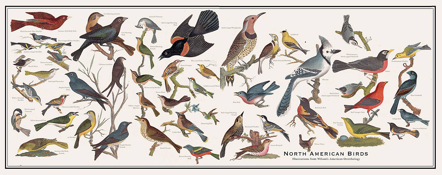
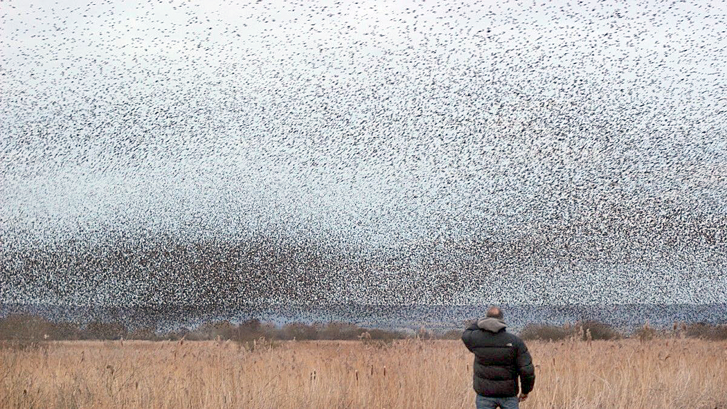
There was a time, many years ago, when I was an active birder and kept a life list. On one trip to the beach in South Carolina, I added 27 new species to my list. I was pretty chuffed about it. I don’t remember how many my list totaled by the time my interest shifted to something else, but it was in the hundreds. The checklist published in BirdLife magazine’s Handbook of Birds of the World catalogs 11,524 species of bird in the world, so my list is hardly detectible in the murmuration of life lists by serious bird watchers.
I had done the same for wildflowers before that. Many of them, I even had learned the scientific name for, which drove my wife nuts to the point she teased me about calling them all, “Know-atia dudiflorum.” Naming and cataloguing have been among the main preoccupations of humankind at least since Adam.
Mine has been a lifetime of learning — trying to learn everything. A quixotic quest at best.
In third grade, I learned — or seemed to learn — the names of all the popular dinosaurs. In fourth grade, I did all the whales. There seemed to be an endless supply of things to learn about. And that is the problem.
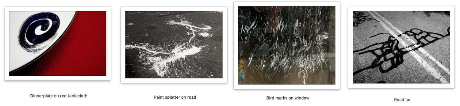
There is too much of everything. No one can grasp it all. Not even all of a limited subgroup, or sub-subgroup. Pigeons of Southeast Asia or sharks of the South Atlantic. You can find books about most of such things.
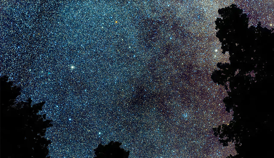
By most standard rankings, I am a reasonably well-read man. But I have looked up at the night sky in the desert wilderness, 50 miles from the nearest paved road, and seen millions of stars and the Milky Way, and thought, “That’s how many books I have not read.”
It may once have been possible to read almost everything ever published. After getting his Masters degree from Cambridge University in 1635, poet John Milton took six years off, reputedly to read everything available in English, Latin, Greek, Hebrew, French, German, Spanish, Italian, Old English and Dutch. As impressive as that is, he did not read Chinese, Japanese, Sanskrit, Arabic, Aramaic, Turkish, or any other written Asian tongue. That is a lot left out of his erudition.
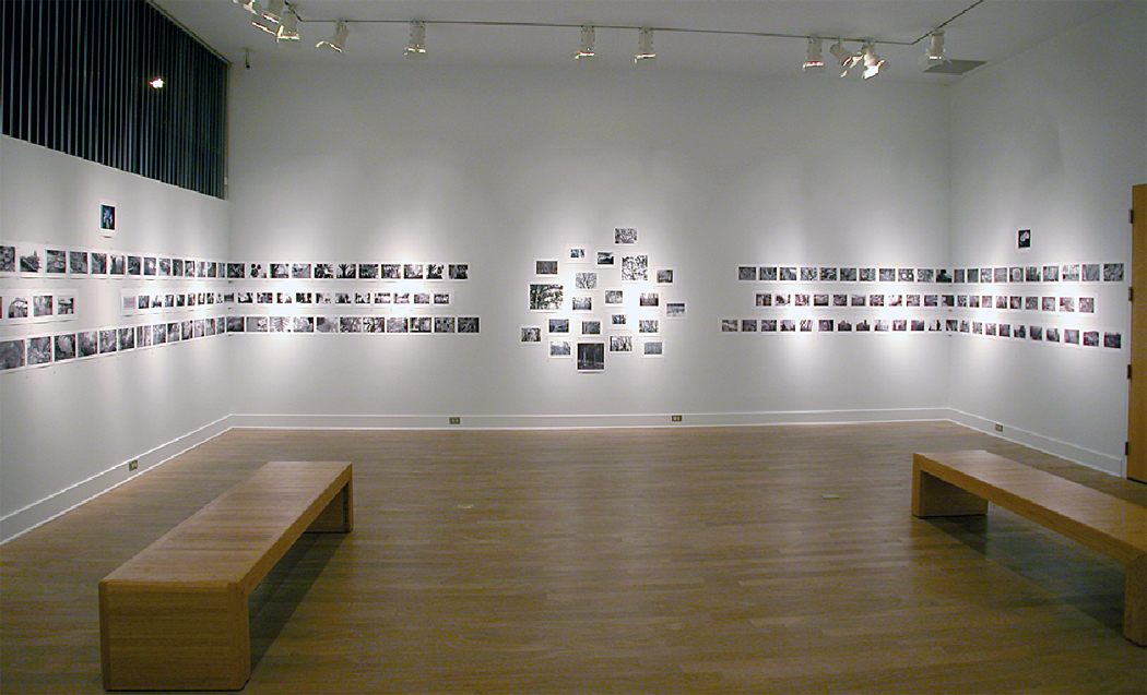
Over the years, I have collected thousands of books, and know that, like the birds or beasts, there are so many more out there that I have not even known existed. The sum total of human publication I doubt anyone has ever fully tallied. It would not be possible, even for a single language.

It is that way with almost anything. Too much. Even a post-doctoral scientist, who may know more than any other person about the subject at hand, will not have been able to read everything in that field. There is too much. Even the experts are mere dabblers, given the immensity of the task.
Take movies. I have seen more than most people. I spent part of my career for my newspaper as a back-up and later, temporary film critic (until a new full-time critic could be hired after the previous one left). My experience is with film from all over the world, not just Hollywood. But it is estimated that American film studios have produced more than 25,000 movies since they were invented. In 1940 alone, 1,973 films are listed. And that is just the U.S. Overall, the count is nearer 500,000 films worldwide. In fact, more films are listed as lost than I have seen — by far. It is estimated that half the films made before 1950 have been lost. Early Hollywood never carefully archived what it produced.

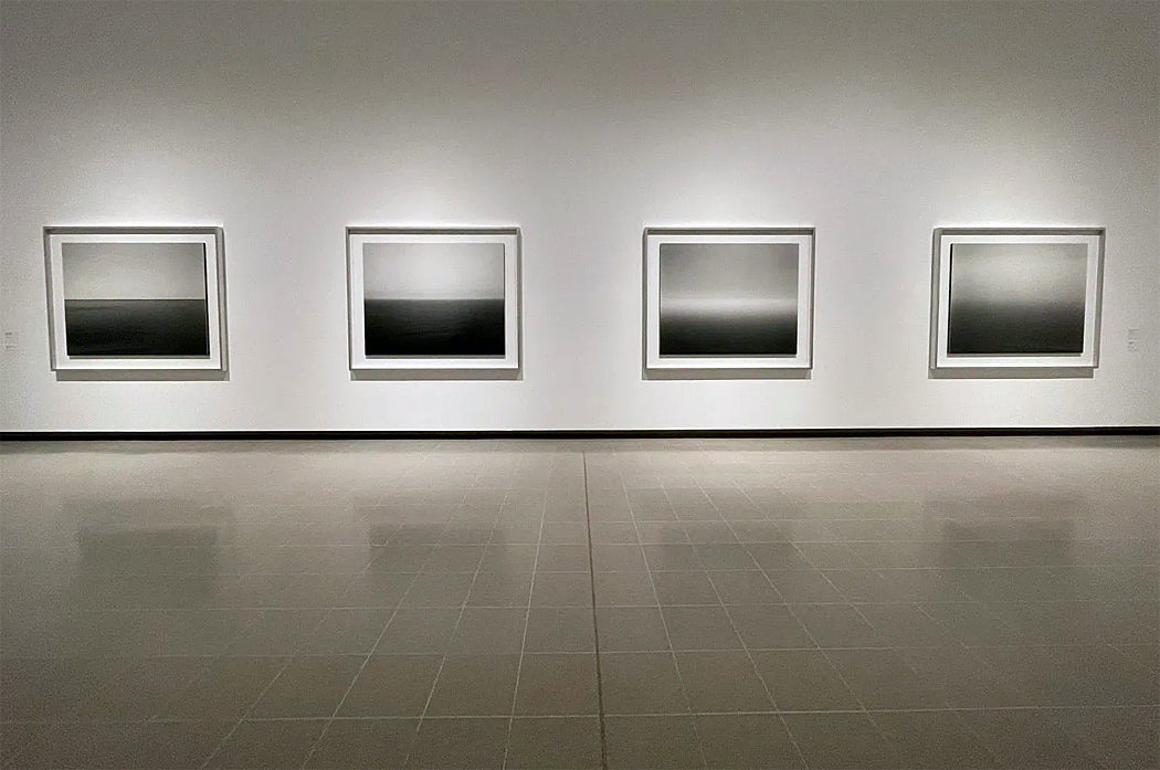
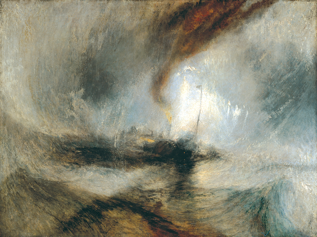
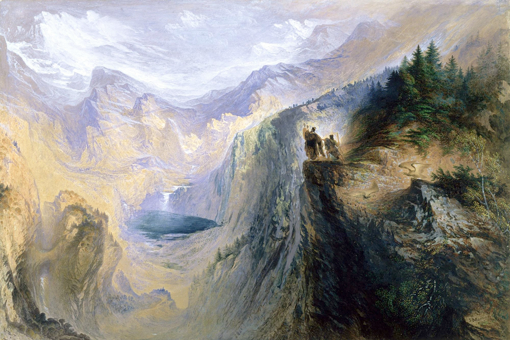
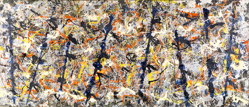
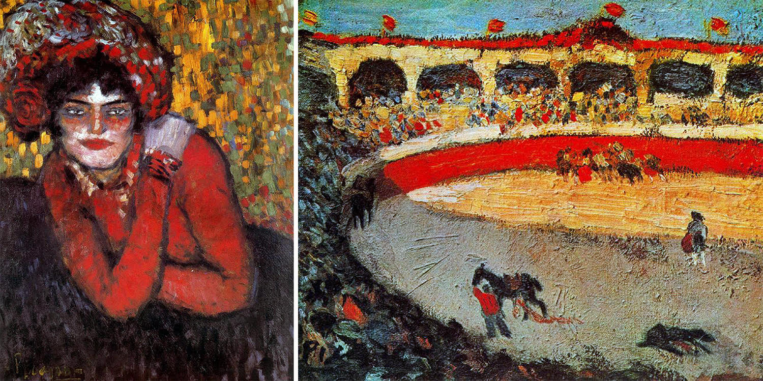
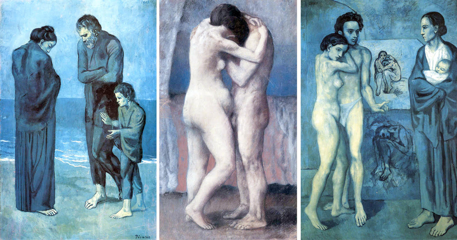
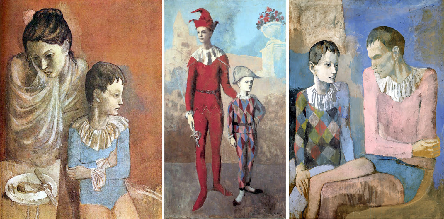
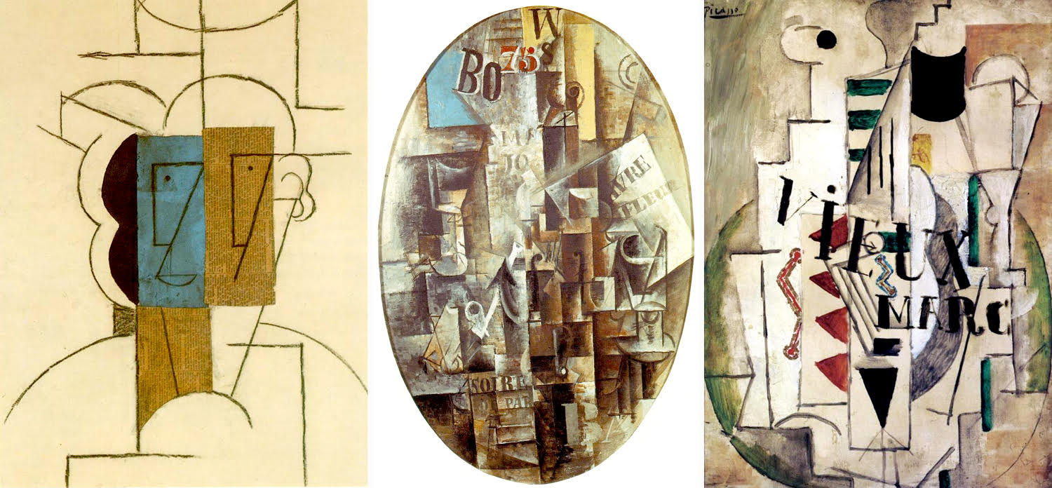
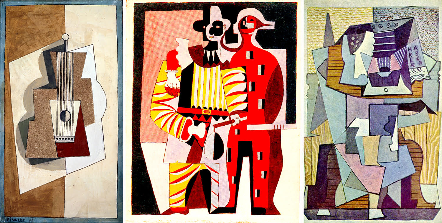
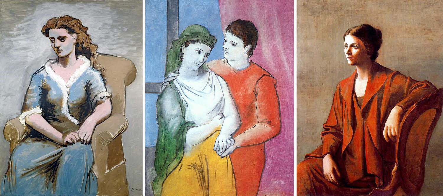
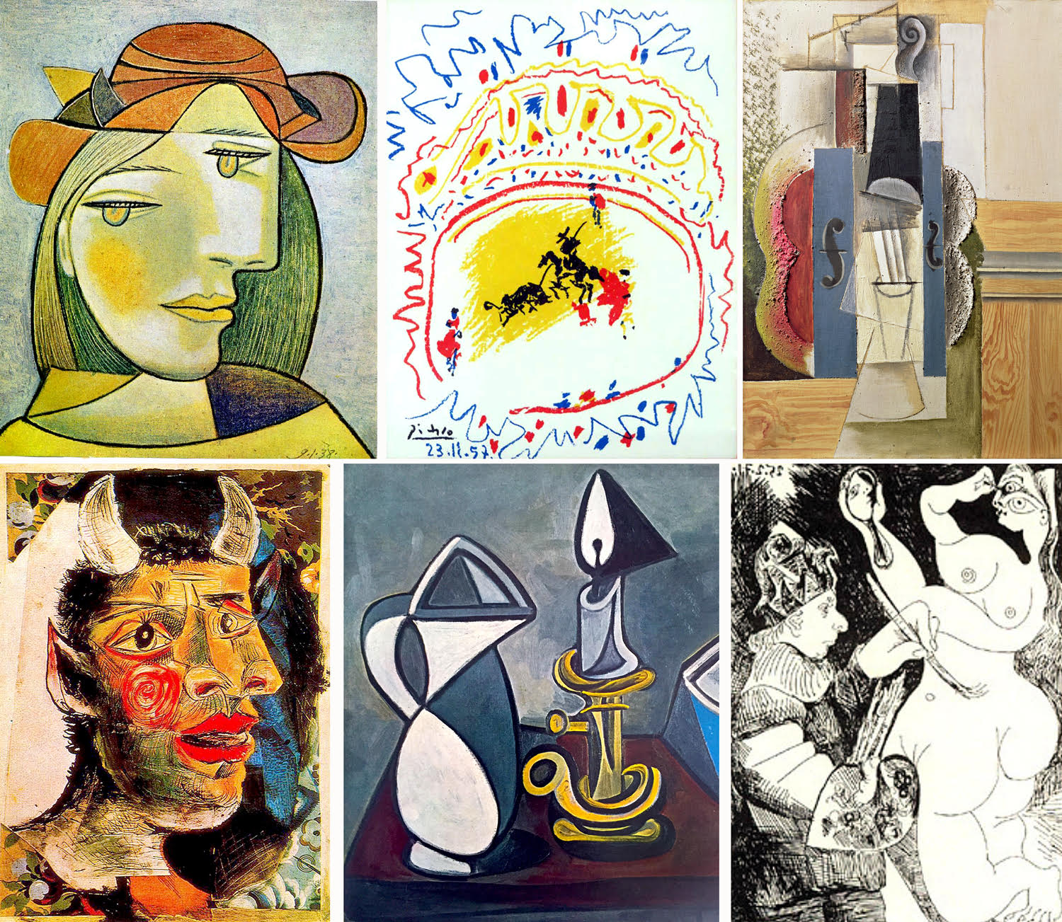
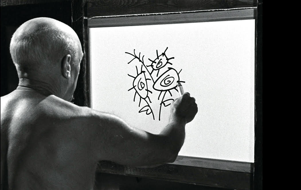
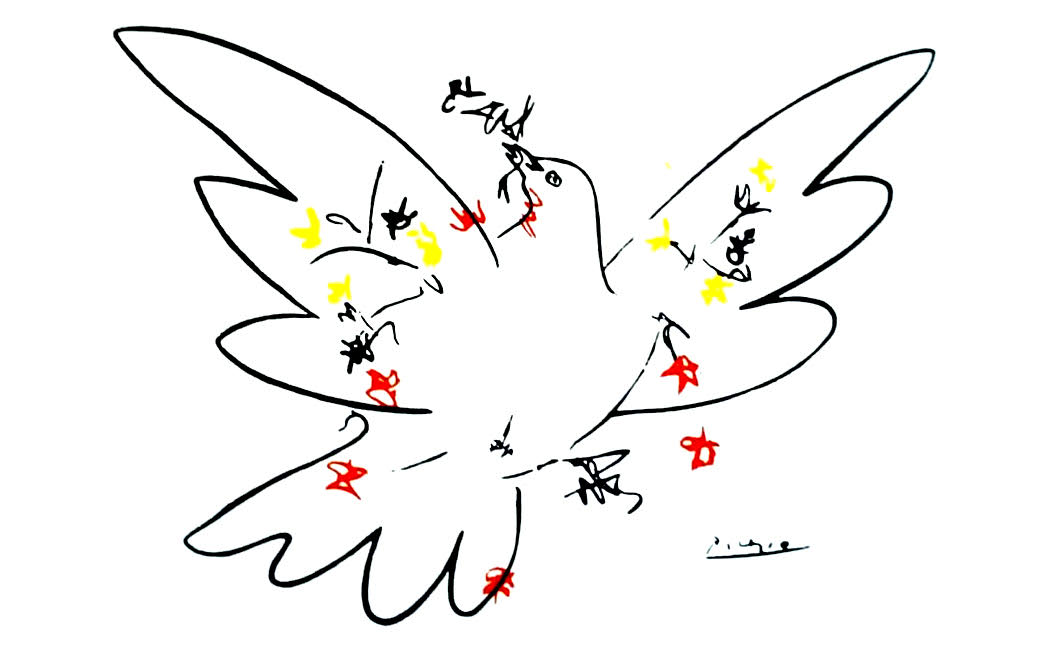
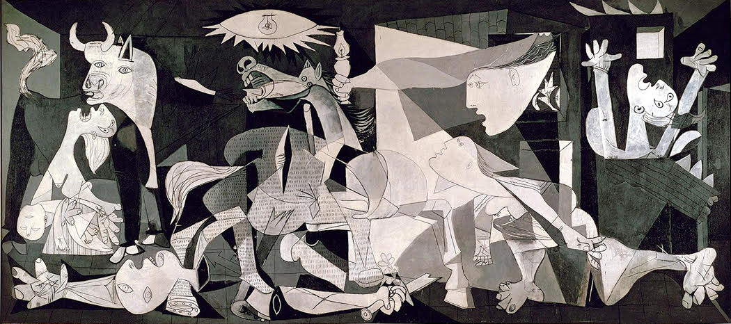
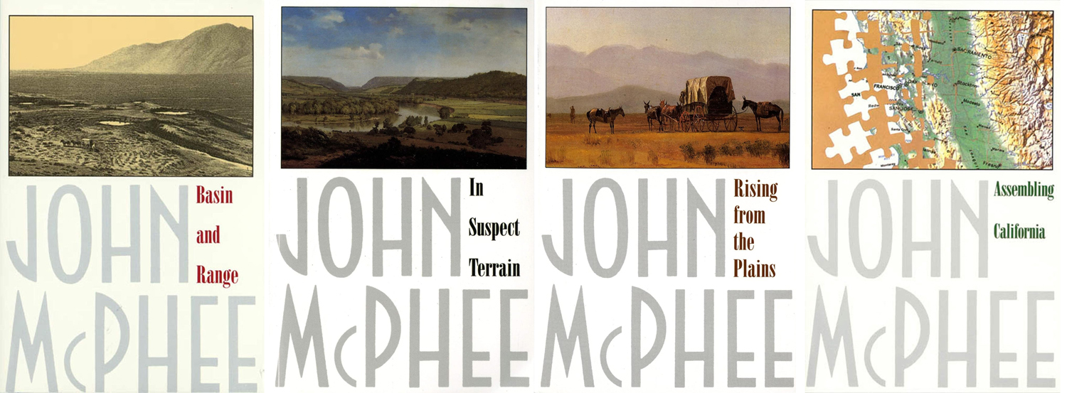
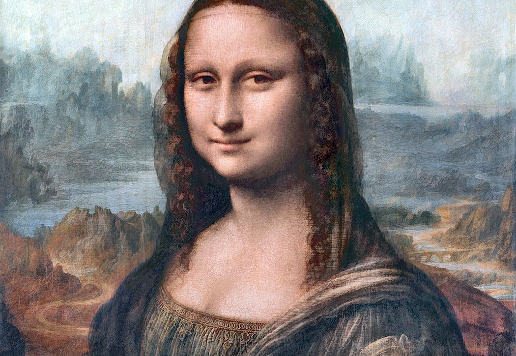
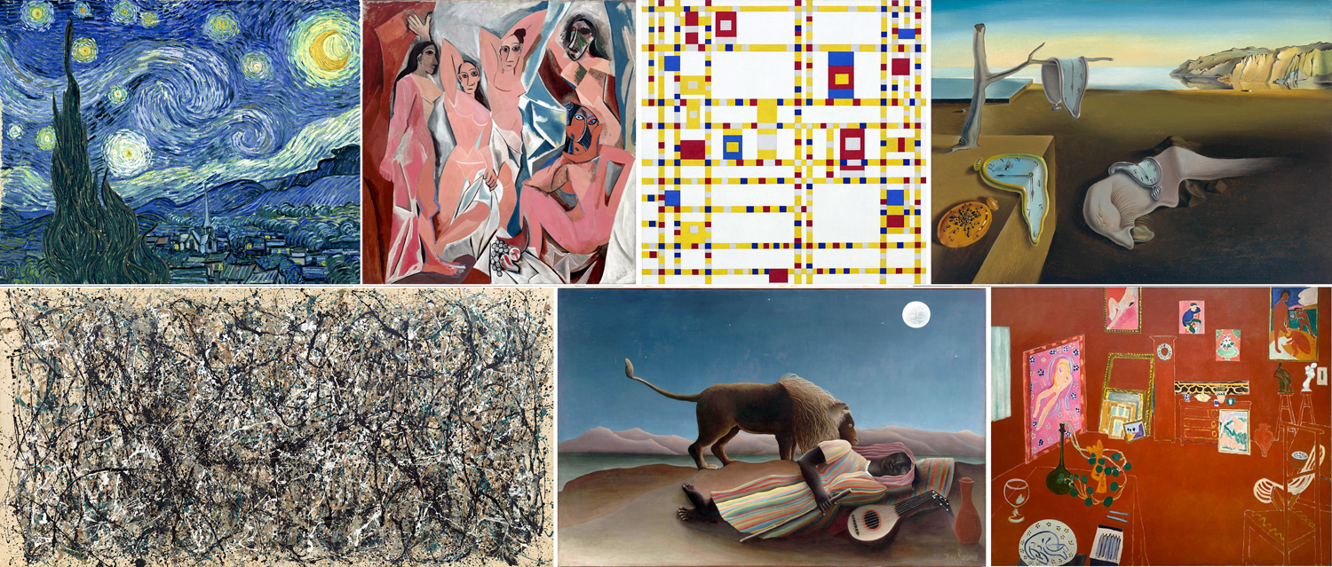
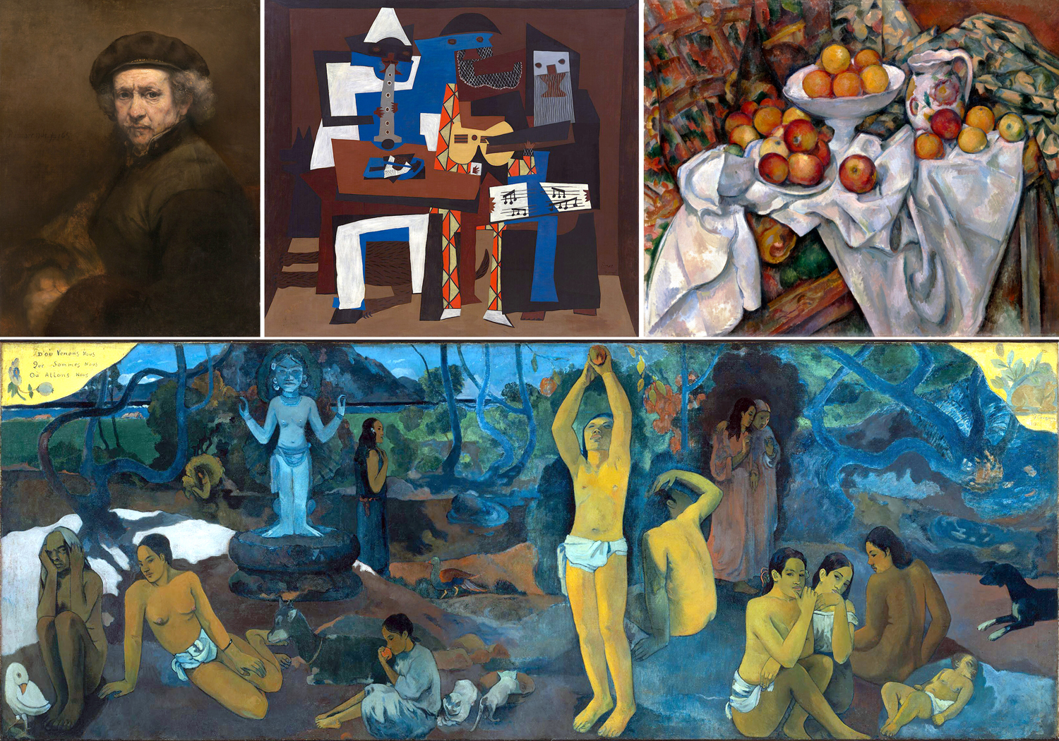
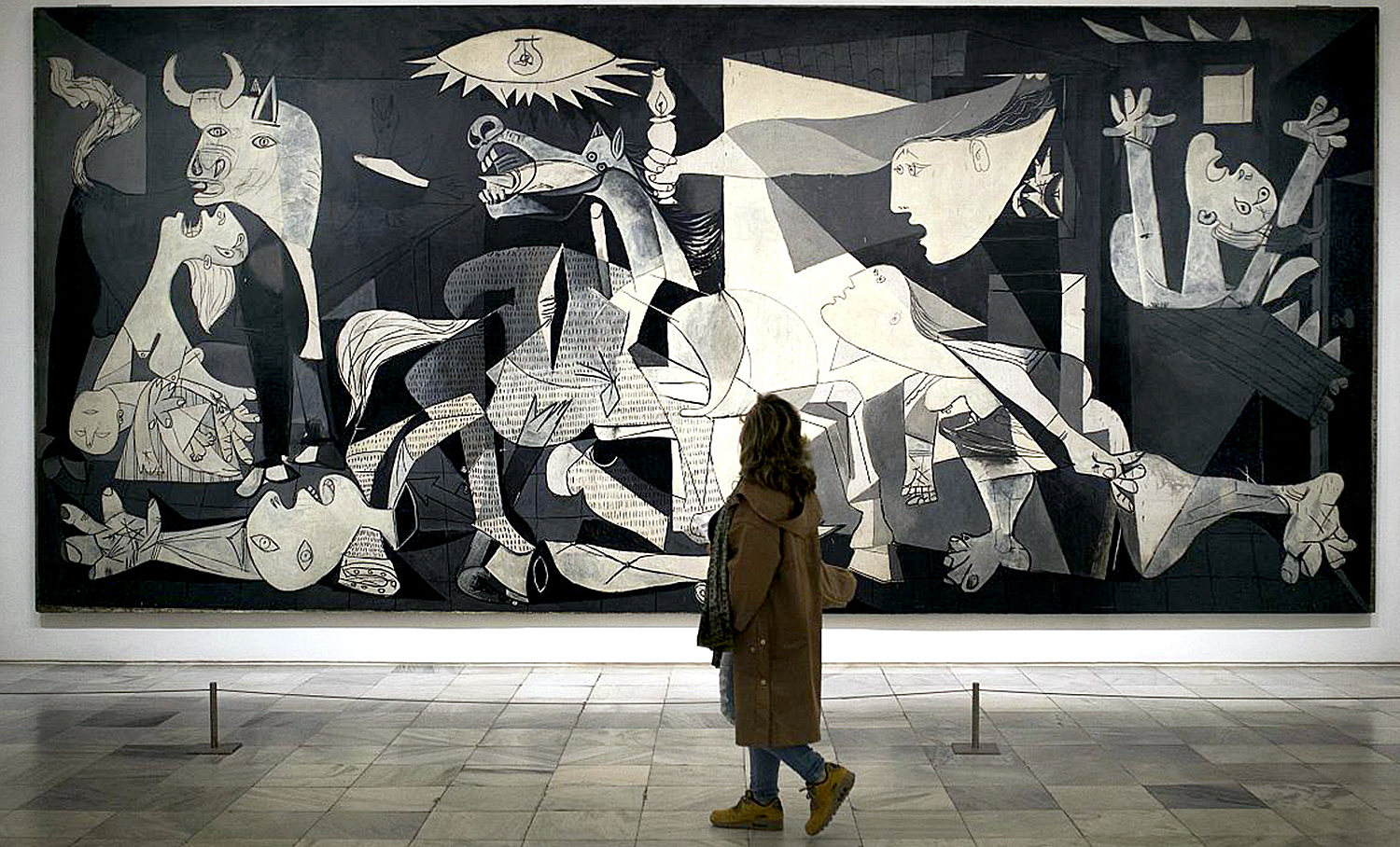
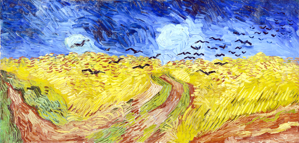
What about painting? Pablo Picasso produced more than 13,000 paintings over his 78 year life, to say nothing of the estimated 100,000 prints, 34,000 illustrations, 1,200 sculptures and thousands of ceramics. Admittedly, he was preposterously prolific, but he was just one artist. Consider all the paintings in all the galleries, museums, and private collections around the world. How many has any one person seen? What minuscule percentage? How can anyone claim to be an expert based on knowing such a small sample?
I have been going to concerts since I was 16. I can’t count them. I have a huge collection of recordings — thousands of them — but I know that I cannot ever reach the end of classical music. Yes, there’s Mozart and Stravinsky, and all the familiar gang, but what about Joseph Martin Krauss (the “Swedish Mozart”), Mieczysław Karłowicz (who was killed in an avalanche), or Johann Georg Pisendel (friend of Vivaldi). To say nothing about all those Italian Baroque composers: Corelli, Tortelli, Tartini, Martini, Spumoni (well, maybe not that last one). Wikipedia lists 406 Italian Baroque composers. Not even Naxos has recorded music by more than a fraction of them.
There are even more German Baroque composers, most with three names, beyond Johann Sebastian Bach. There were Johann Philipp Krieger, Johann Jeremias du Grain, Johan Gottfried Walther, Johann Heinrich Buttstett, Johan Paul von Westhoff, Johann Jacob Löwe, Johann Gottlieb Janitsch… And that’s not even leaving the “Johann” list.
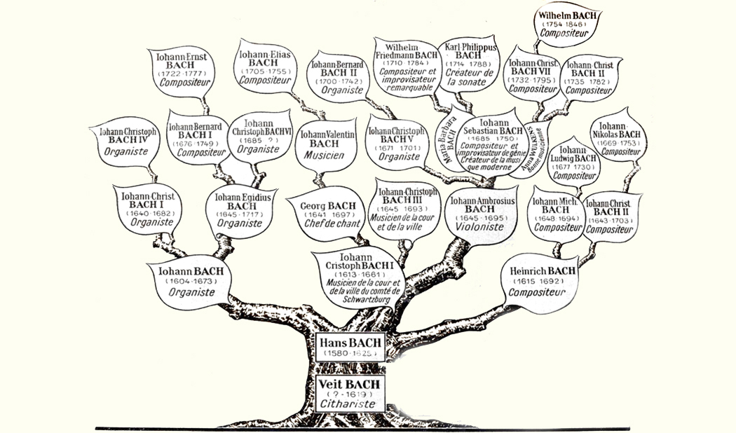
Bach alone counted among his ancestors and descendants more than 50 musicians and composers (one list counts 77), beginning with Veit Bach, born about 1555. In parts of central Germany at the time, the name “Bach” was a synonym for “musician.”
And all that is merely a subset of European composers. I am humbled.
Even if we look at popular music, it’s the same thing. Irving Berlin, alone, wrote an estimated 1,250 songs (even he had no accurate count). Yes, everyone knows God Bless America, and probably Blue Skies and Alexander’s Ragtime Band, but what about Alexander and his Clarinet, The Blue Devils of France, or Everything in America is Ragtime?
No one can count the number of songwriters who wrote for the publishers on Tin Pan Alley: Harold Arlen; Irving Berlin; George M. Cohan; George Gershwin; Dorothy Fields; Scott Joplin; Fats Waller. And uncounted more. The 19th century gave us Stephen Foster, Philip Bliss, Joseph Skelly, Eva Carter Buckner … There really is no need to list them all, even if I could. And these are just Americans. Songs were being written everywhere, and continue to be.

Shirley Gunter and the Queens
Try to tally up all the rock and pop bands, beginning in the 1950s and ’60s. For every Bill Haley and the Comets, there are a hundred Bill Black Combos and Shirley Gunter and the Queens (Oop Shoop). For every Beatles or Stones, there are a thousand Jive Fives and Dyke & The Blazers. A few pop up infrequently on Golden Oldie radio stations, but most are buried under the avalanche of whatever followed, only for those to be buried in their turn.
There are more than 7,000 languages in the world, not counting languages long extinct. I’m proud of being able to manage the simple vocabulary of a French newspaper. Milton could read 10 languages. Pikers, all of us. There is so much more.
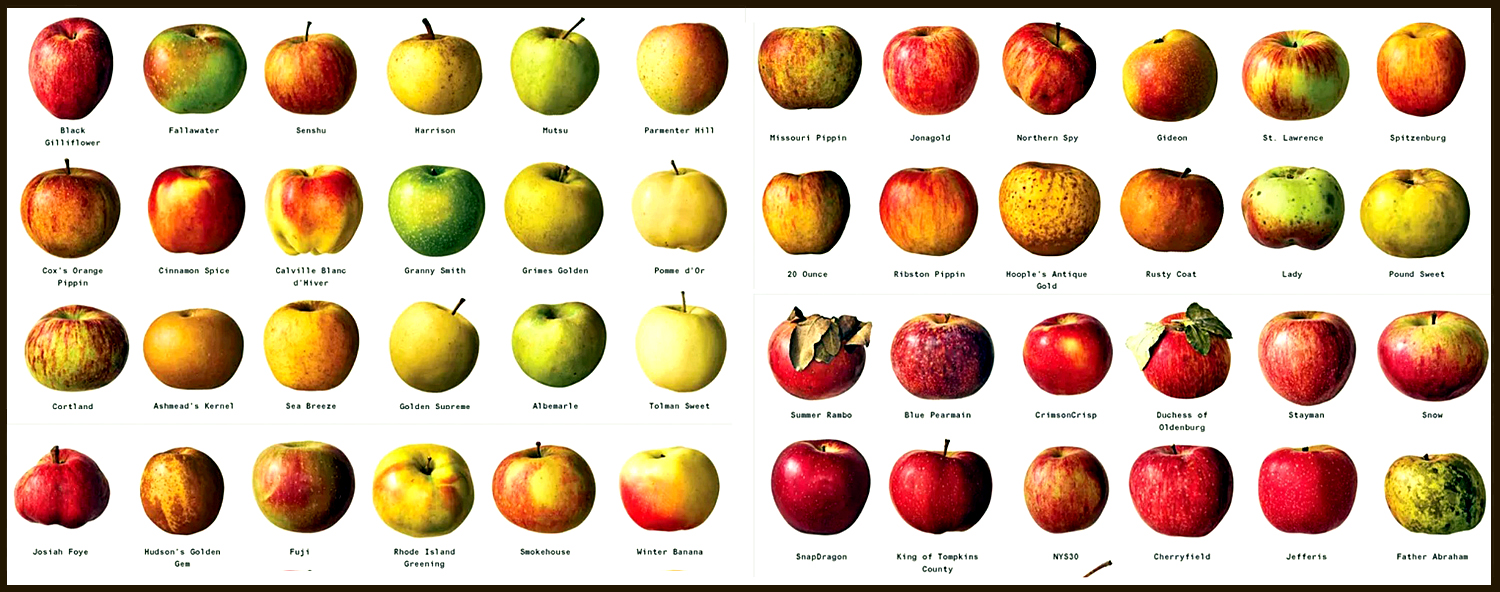
How many types of apples are there? How many breeds of pig? There are 7,500 cultivars of apple in the world, 2,500 grown in the U.S. No one knows how many wild strains have not been catalogued. As for hogs, according to a study by Chinese universities, around 600 breeds of pig have been created by farmers around the world, mainly in Europe and Asia.
The same could be asked of sheep, goats, kine, cats, dogs, and, I’m sure, even for fleas.
A million insect species have been formally described, but scientists estimate the true total is closer to 5.5 million. There are approximately 17,500 to 20,000 known species of butterflies worldwide. They are found on every continent except Antarctica, with roughly 750 species found in the United States and Canada.
There are eight billion people in the world. How many of them do you know? That’s a million of them eight thousand times over. If they were a parade and it moved past you at one soul per second, it would take 250 years to reach the end, but by then, the first billions would have died of old age, and billions more born to join the queue — so you would never reach the end.

This is all not to disparage expertise. We need people willing to learn as much as possible about as many things as possible. Ignorance is never a helpful contribution. But it is meant to foster a healthy humility about what we do know and what we even can know. Each of us is limited; the world is too vast, varied, and ever changing for any of us to claim much. There are as many recipes for cassoulet as there are families who prepare the dish.
I always remember what my wife told me. She was a primary school teacher and one day a third grader complained about how much they were expected to memorize.
“My mama told me the human brain can only hold so much or it will explode,” he said. He was serious.