Archive

Tag Archives: art

apple cut

Have you ever been in love? Do you love chocolate?

Do you love your mother? Do you love heavy metal music? The smell of dew in newly cut grass? Perhaps you love irony.dinner knife

We toss the word ”love” around as if it meant only one thing, but love of Monday Night Football is significantly different from Tristan’s love for Isolde. We use the same word, but we mean different things.

It’s the same way with ”art.” The tiny trigram covers an enormous range, from late Beethoven quartets to the design on your dinner knife. And then we have trouble defining it, because we are looking for one single definition that will fit all cases. It should be no surprise that we can’t find it.

The problem with discussing art is that one person’s Rembrandt is the next person’s Hershey bar.elvis 2

So when I write that black-velvet Elvis paintings simply aren’t art, I’m guilty of hyperbole. Of course that is art. It just isn’t good art.

(There are some people who believe that ”bad art” is an oxymoron. Or as my late friend, the great Dimitri Drobatschewsky, used to say, “There’s no such thing as bad art; if it is bad, it isn’t art.”)

Working on the assumption that art requires ability, they make the analogy that bad art isn’t art the same way ”bad ability” isn’t ability.

Yet, there is a very wide range of abilities. Can we discount Henri Rousseau because he didn’t have the technique of Raphael? Surely it still deserves the name of art. And how about Jeff Koons’ basketballs floating in a fish tank? mbulu nguluHow much craftsmanship did that require? And yet, if it isn’t art, what the hell is it? Surely the definition of art is broad and deep.

If we attempt to be inclusive, if we attempt to find a definition that covers Rembrandt, Shakespeare, the prints that hang on a motel-room wall, the designs cut into a Western belt, the mbulu-ngulu figure of Africa and shakuhachi music from Japan, things get murky.

But that is only because we have set an impossible task: finding that illusive single definition for art.

APPLE SLICES

Yet, if we step back and attempt to see art as a whole rather than attempt to make a polemical case for our favorite corner of the art universe, we can begin to see at least the general outline of the subject. It also becomes clear that art must have a four-sided definition: The whole can be divided in half from side to side, or from front to back.

Sliced from side to side, there are two apple-halves of art.

First, there is the decorative side of art. Whether it is racing stripes on a car or a landscape over the sofa, art of this order attempts to make our lives more graceful. We use it to decorate our lives and the things of our lives.

On a more serious note, it is art that is a palliative against the abrasiveness of living. If we must suffer in love and business, we should be able to escape that in art. Hence, Broadway musicals.bass buckle

On the simplest level, it is the shape of your belt buckle, the color you choose for your Toyota, the typeface of your letterhead.

On a more refined level, it is Monet painting mural-size pictures of waterlilies for the Orangerie.

Overall, it is the sense that beauty is somehow the opposite of life and that art should embrace beauty and turn its back on pain and suffering, or at least idealize them and therefore freeze them into powerlessness.disasters of war

CONFRONTING TRUTH

But the other apple-half wants us to engage with life, complete with all its sufferings, frustrations and complexities. This view recognizes that art is a means we use to come to terms with life. All of life.

It says that art is the test we give to truth. As science confronts fact, art confronts truth. In this sense, art distinguishes between the genuine and counterfeit, the possible from the impossible, the passion from the sentimentality, the moral from the moralistic.

Art is in some sense a virtual reality, a model of the world that we can use, as an airplane designer uses his computer model or a climatologist uses his, to test our version of reality.

In another way of putting it, art isn’t the opposite of reality, but in fact, art creates reality.

It is one of the often overlooked verities that without art to picture what the world looks and feels like, we would not be able to see or feel the world at all.

The worlds of sensation and emotion are so infinitely complex, such a swirling mass of input, that we are forced to filter the information and organize it to make sense of it. Art is the means by which we do this.

THE CREATION OF ORDER

Egyptian figuresIt is the cumulative power of all our arts that defines our culture and its view of reality. The arts create civilization and not the other way around.

The style differences between cultures are not questions of fashion and taste but of how those cultures decide to see the world.

An ancient Egyptian wall painting, with its stylized poses and almond eyes, probably looked as real to the ancient Egyptians as a Renaissance painting looks to us.

Because we are not part of that culture, we can spot the artifice on the pharaoh’s tomb, but are harder pressed to see the distortion and artificiality of Renaissance perspective. But it is just as schematic, just as false as the Egyptian. Always, the image that falls on your retina is different from the image that forms in your mind. Art is how we learn to transform the one into the other.Waiting-for-Godot

From this view, art is the discovery or creation of meaning and order from the chaos of perception and experience.

And that is why some people prefer Waiting for Godot over The Odd Couple. Godot feels more true.

With the apple sliced this way, the argument is Vladimir and Estragon vs. Felix and Oscar.

A NOUN OR A VERB?

Ah, but if we slice the apple from front to back, we have a completely different argument on our hands.

This one asks, ”Is art a noun or a verb?”

If art is a noun, then it is an artifact. Seen this way, the art is the painting on the wall, the poem on the page. Art is what the artist creates, what is left when the artist walks away.

But if art is instead a verb, it is seen as the process that creates the painting. In this view, the finished canvas is only a byproduct of the art.

In this view, what counts is what the artist learns in the process of making the art. A residue of what he learns is evident in the resultant poem, painting or symphony, and an attentive audience, as they experience the art, must in essence re-create the journey the artist took.

This view requires rather more effort on the part of the audience. When the process becomes the point, the viewer cannot remain a couch potato.

It is what we mean when we say a certain play or piece of music is ”difficult.” It is art as hard work.

Art as noun leads to a scholar’s view of art, or a connoisseur’s. All one needs to possess it is a large enough bank account.

But with art as a verb, you cannot have it unless you earn it through your own emotional and intellectual effort.horse barn paint by number

A MOMENTARY DEFINITION

So let us reassemble the apple and see if all art can be encompassed in its sphere. Here is a provisional definition of art:

Art is something made by human hand or mind, or the making of something by hand or mind, that graces our lives or the things of our lives with beauty; or the same thing that explores experience and attempts to discover or create meaning. That meaning can be personal or communal, spiritual or perceptual, emotional or intellectual.

I have no doubt that there is a worm in this apple, and I encourage readers to search for it. If this definition is where I light for the moment, I am not unaware that the problem of coming to terms with art has remained difficult through the eons. But maybe this short explication sets the mark as high as I can stretch for the time.

It is as Sappho once wrote: ”Like an apple ripening on an upper branch, passed over by apple pickers — no, not passed over, but too high to reach.”

Memo:031a venus di milos


WHAT ART CAN DO

— Art can teach us to see

— Art can grace the ugliness

— Art can be used to express the mythology we believe in

— Art can be the note pad of the unconscious

— Art can be propaganda

— Art can be merchandise

— Art can be a value judgment

— Art can investigate the nature of reality

— Art can unify the senses and the intellect

— Art can be a means of causing meditation or contemplation

— Art can give names to things that have no names

— Art can illustrate a text, adding emotional resonance or clarity

— Art can give us roots

— Art can give us a past

— Art can be used to enforce a political agenda

— Art can be a means of recapturing what we think we have lost

— Art can establish class distinctions

— Art can be the satisfaction of form

— Art can be misunderstood and still be effective

— Art can be subversive, but not on a political level

— Art can be evidence of maturing taste

— Art may raise your IQ

— Art can be wealth

— Art can be instruction

— Art can be substitute language (including international symbols)

— Art can be fashion

— Art can be design

— Art can be secret communication

— Art can be an exploration of the non-verbal

— Art can be anything beyond the primary body needs

— Art can make a fetish from simple body needs: a certain way of eating

— Art can encompass everything mental, as opposed to physical

— Art can be packaging

— Art can be comic, lyric, epic or dramatic

— Art can lie to us profoundly

— Art can yank our chains

— Art can provide models for behavior

— Art can clarify something insufficiently clear in words

— Art can be the codification of values

— Art can unseat old values

— Art can be creation of order in a chaotic universe

— Art can be creation of chaos in an orderly society

— Art can unify a culture

— Art can separate elements of the culture

— Art can be as rigorous as physics

— Art can be as sloppy as mud wrestling

— Art can heal a wounded psyche

— Art can open wounds

— Art can be the object hanging on the wall

— Art can be the process that makes the object

— Art can be the means of defining the ego

— Art can be the means of defining the culture

— Art can be the communal experience of audience

— Art can be singular experience

— Art can provide an entree into the past

— Art can provide the key to understanding an alien culture

— Art can amuse us

— Art can bore us

— Art can be craftsmanship

— Art can make magicrousseau

Palmezzano from PAM

The Italian Renaissance is littered with unfamiliar names. Sure, there are the Leonardos, the Raphaels and the Michelangelos, but there are dozens of others from the Trecento through the early 16th century that we need an encyclopedia to look up.Forli map

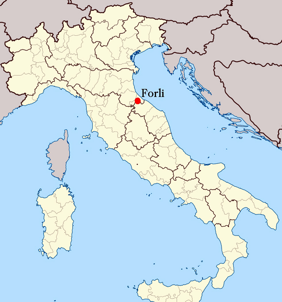
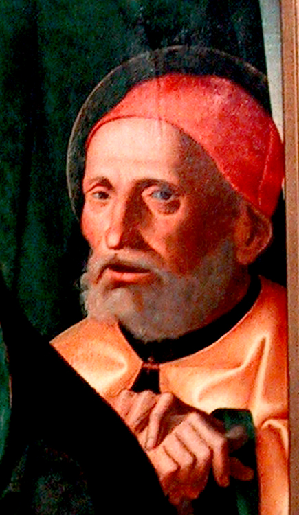
Just take the small town of Forli in northern central Italy along the Montone River. It produced such painters as Livio Agresti, Ansuino da Forli, Guido Cagnacci, the two Baldassarre Carraris, father and son, Francesco Menzocchi and foremost among them, Melozzo da Forli and his student, Marco Palmezzano. All of them competent if conservative artists without which museums (and churches) around the world would be the poorer.

It is Palmezzano that drew my interest.

In an age of giants, Marco di Antonio Palmezzano (1458-1539) was merely human. He was a good but lesser painter in a Renaissance backwater. So little was his life noted that even his dates are approximate.

Born in the middle of the Quattrocento, 25 years before Raphael, he died in his 80s, about 20 years after his great countryman’s death. It was a life that spanned the most exciting years of the Renaissance.

He was born and died in Forli, a small town at the back of Italy’s knee, remaining there for his entire professional career. During his long life, he provided the necessary religious paintings for the churches and monasteries of the region.

His teacher was the better-known Melozzo di Forli (1438-1494), who had studied with Piero della Francesca (1416-1492), one of the great masters of the early Renaissance. Palmezzano’s youth was spent apprenticed to Melozzo, and his first signed paintings indicate his debt to his mentor: He called himself Marcus de Melotius, or ”Melozzo’s Marco.”

We know he visited Rome with Melozzo in 1489 and, after Melozzo’s death, he visited Venice, where the most advanced painters were to be found.

But the latest techniques and styles didn’t seem to interest Palmezzano, or maybe they didn’t interest his clients. At any rate, he remained an artistic conservative and his paintings look back rather than forward.

The exact date of Palmezzano’s death is disputed, but a self-portrait as an old man is dated 1536.

More than 90 of his works are still in existence, mostly in Forli, but his frescoes for the Feo Chapel in Forli were destroyed in World War II.

There is a Holy Family by Palmezzano at the Phoenix Art Museum, and it is a painting that I kept coming back to over the 25 years I lived and worked in that city.

A Right-Hand Man

One day, I noticed that Marco Palmezzano was right-handed.

It wouldn’t be any big deal, but Palmezzano has been dead for 400 years. And because I discovered it myself, this minor bit of information seems much more personal than the few cold facts in the painter’s biography. It brings him to life for me: Even the grave couldn’t hide this datum. It’s there in the painting.

Discovering things for yourself is what art is all about. Doing research is fine, but it is your personal interaction with a painting that is the real point.

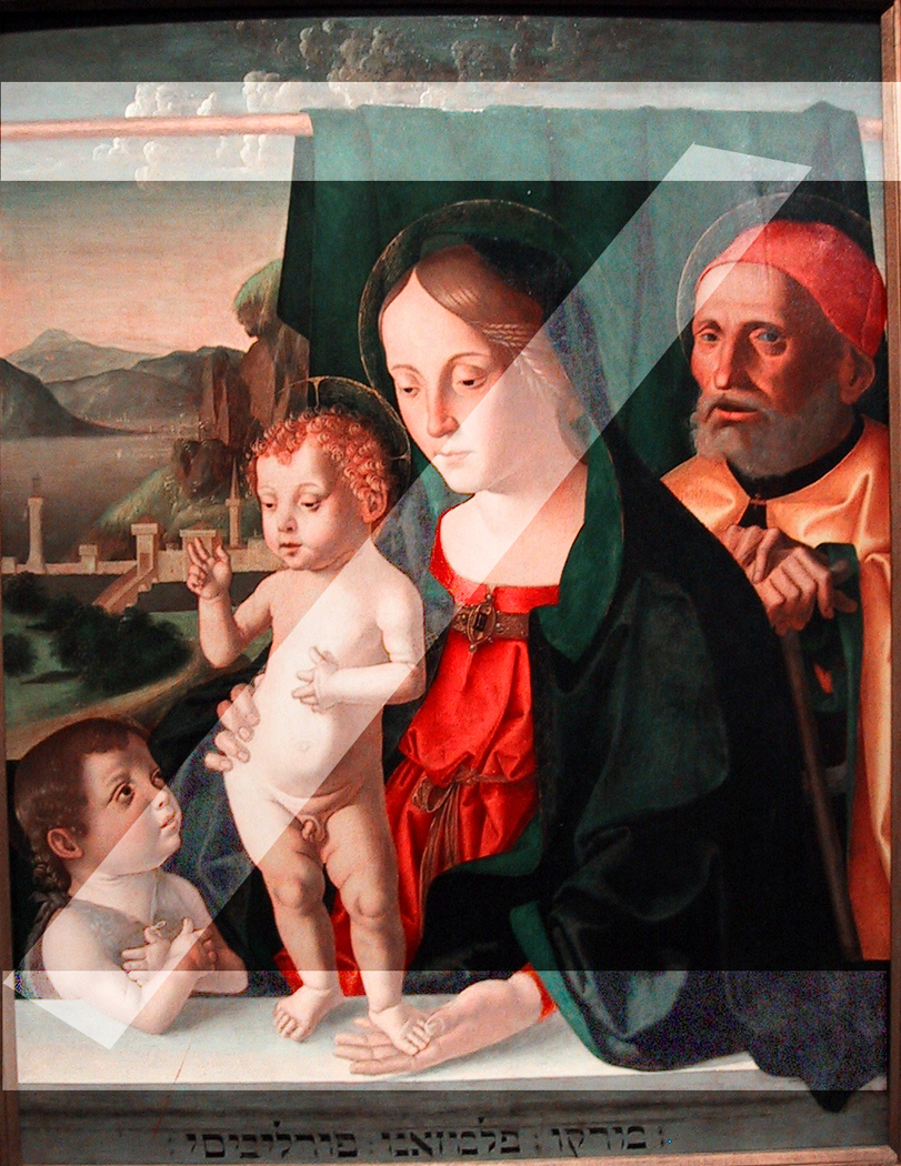
The painting I’m talking about is the Holy Family with Infant St. John, which can be seen at the Phoenix Art Museum. It is a fairly standard oil-on-panel Madonna-with-her-entourage painted by a fairly standard middleweight Italian painter of the middle Renaissance.palmezzano madonna combo

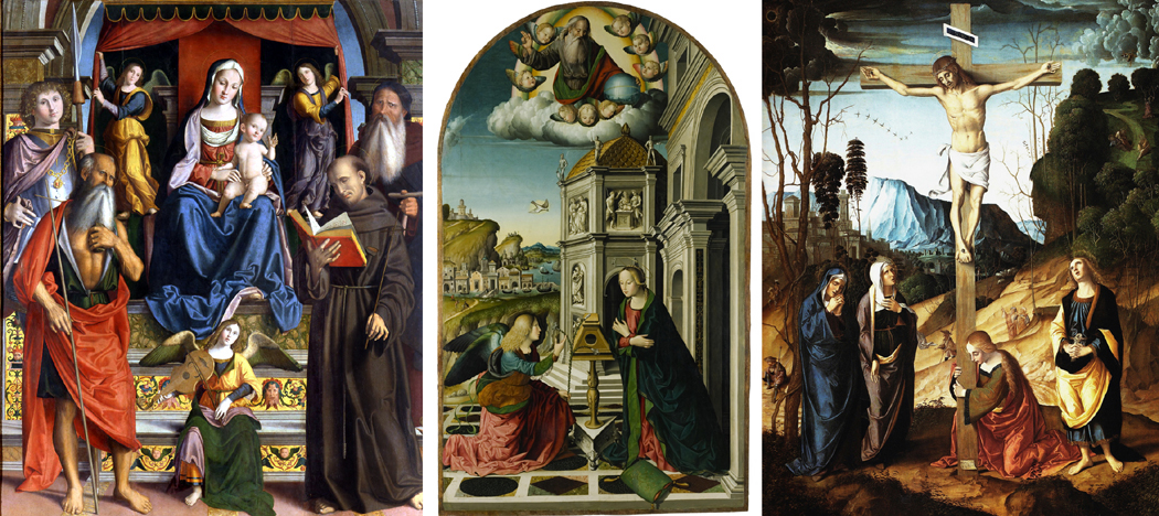
These are a few of Palmezzano’s Holy Family paintings

Palmezzano himself painted dozens of similar works, fulfilling commissions for various churches and monasteries. You have to think of the painter as a small business owner, providing needed objects for the prevailing institutions of the day. Whatever was called for, he was contracted to provide — and his studio would have been not a simple artist’s studio, but a small factory with a variety of employees or apprentices helping out.palmezzano genre examples

Palmezzano produced most of the usual religious genre paintings, including this Virgin Enthroned, Annunciation and Crucifixion.

There are many things you could notice about this painting, or any painting you are willing to put the time and effort into.

”Noticing” is the operative word. Many museumgoers zip past the pictures on the wall, stopping a few seconds in front of one or another that catches a rushed eye. But artists who spend weeks or months on a painting have put more into their work than you can squeeze out in a moment.

It is a case of slowing down to see the roses.

So I want to take some time to dissect Palmezzano’s right-handiwork, and to walk you through the process of looking at a painting.

I’ll get back to Palmezzano’s right hand later.

Sensuous pleasure

First, why have I chosen this painting?

Primarily because I liked that intense, mineral green that makes up so much of Palmezzano’s Holy Family. It is a hue and an intensity that cannot be seen in reproduction. You can swim in this green.

There is nothing intellectual or difficult about the mindless sensuous pleasure that this green gives me, but it got me to slow down and decide to spend some hours with the painting.phx infantphx joseph

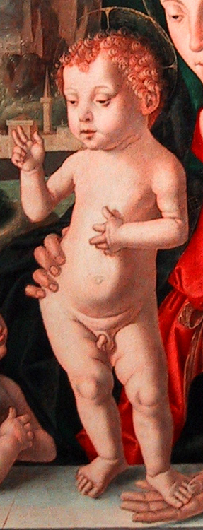
On second glance, the painting didn’t seem too promising. It is a very ordinary Madonna and child, with a rather awkwardly drawn child, with short, skinny arms and a set of hips that might have done Mae West proud.

But there was something that caught my eye and held it. After a few moments I realized what it was. The painting was staring back at me.

If you look around the museum gallery at the other paintings hanging there, the people in them look at each other or off into space. But in Palmezzano’s Holy Family, Joseph is looking at . . . me.

Noticing details

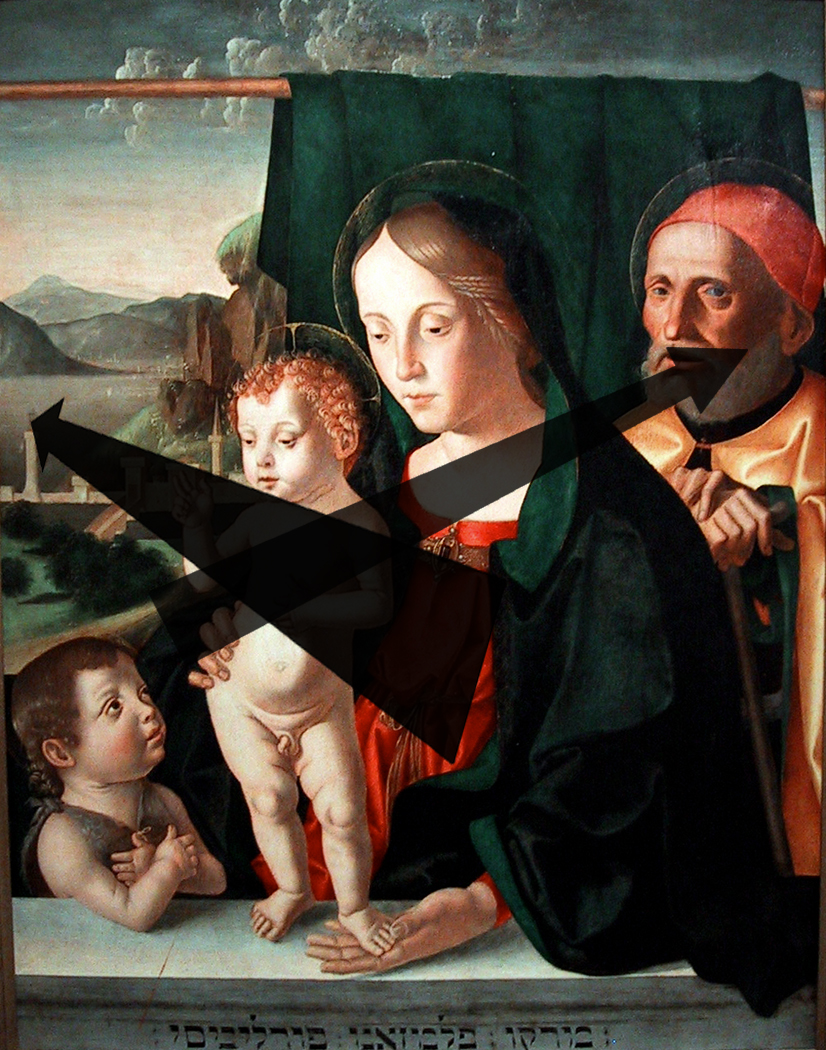
There are dozens of things to notice in this painting, from its complex structure of diagonals to the fact that the painter seems to have used no blue. Then, there is the peculiar Hebrew inscription at the bottom, the gold-leaf halos and an oddly gray landscape in the background. All these things are worth noticing, and all contribute to the final effect of the painting, but it is Joseph that gives this painting its particular emotional resonance.

In that gaze is the secret of the painting: There are two levels of reality being described here. Mary, Jesus and John are divine or semi-divine. Joseph, like you or me, is merely human. Mary or Jesus could not pay attention to us, it would break the spell, make them too human, too fallible. But Joseph can make the connection.

That distinction is enforced by the style in which Palmezzano paints them. Mary is idealized, a perfectly formed human with a look of unmoved serenity in her face. Jesus and John make stylized hand gestures that infants their age couldn’t understand, let alone perform.

The Madonna and children are iconic rather than real. We are meant to ”behold” them as symbols of religious faith.

But Joseph, all alone in the back of the painting, is not idealized, rather he is a portrait of someone real. We don’t know who, possibly the person who paid for the painting to be made. He is old (a convention for Josephs), and his hands rest arthritically on a walking stick.

Mary and the babies are involved with each other; Joseph looks at us. He is one of us.

Humanity speaking

Whatever the painting meant when it was new, it is Joseph’s humanity that speaks most clearly to us today.portrait of a man palmezzano

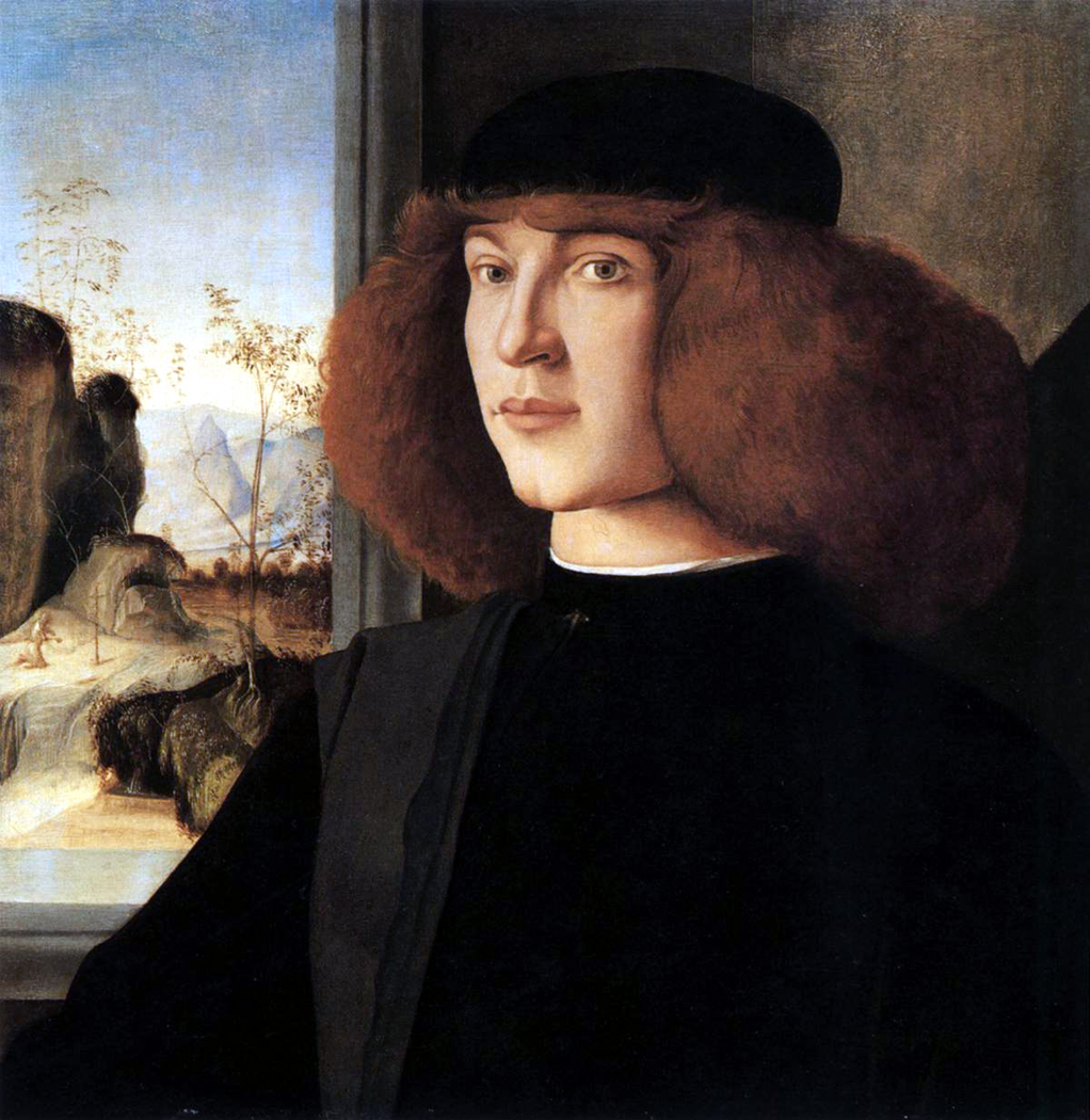
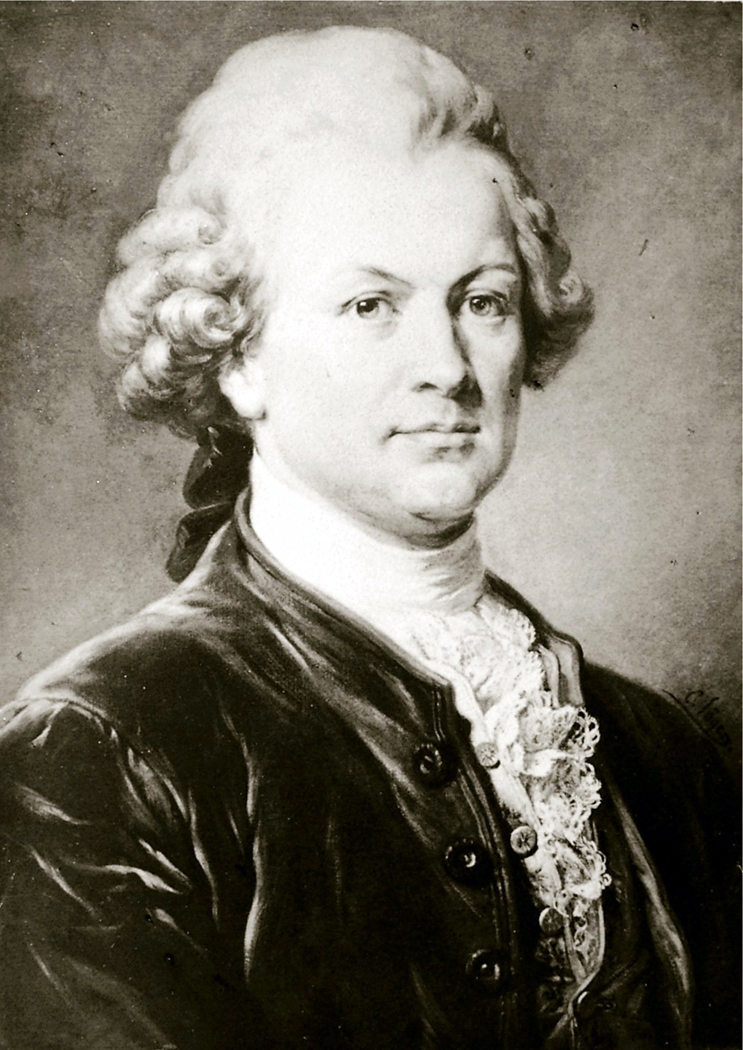
Portraiture was not an important art form during Palmezzano’s day; no one in Italy could make a living doing only portraits. That is too bad, because it is Palmezzano’s one notable talent. (Here is his Portrait of a Young Man). His Joseph is more real than most of the idealized figures we run into from the Renaissance, an age when what should be was more valued than what was.

What was required of Pamezzano were religious paintings. A Raphael or Michelangelo could bring life to their faith. Palmezzano could only imitate the patterns. His sense of color was average, his ability to create design was average, but his ability to draw a human face was above average. It is too bad that it was a talent that wasn’t particularly valued during his life.

In another time, in another place, Palmezzano might have been a more important artist.

Artistic conservative

Which brings us back to Marco’s right hand.

We know that Palmezzano was something of a conservative, artistically. His figures are a bit stiff, like those in Quattrocento paintings, despite the sinuous contrapposto he has given the Christ.

And although he is painting in oil, he continues to use techniques better suited to the earlier tempera painting.

In egg tempera, the paint dries almost immediately, so it is difficult to blend paint together on the panel. What an artist must do is lay down tiny brush strokes one next to the other, building up shades and tones. When you look closely, you can see those tiny lines, called ”hatching.”scribbles

Oil’s great advantage over tempera is that paints can be blended right on the panel or canvas and smooth gradations of tone are possible.

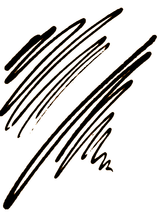
Palmezzano still uses hatching in this painting. It can be seen as the tiny lines in the shadows of the figures’ faces. Across the entire canvas, the hatching goes from upper right to lower left.

Take a pencil and scribble on a pad. If you are right-handed, the lines will run from upper right to lower left. If you are left handed, they will run the opposite. Try to draw them opposite and you will see how awkward it feels.

The hatching proves

Palmezzano was right-handed.

Ker-blue-ee

Perhaps the oddest thing about Marco Palmezzano’s Holy Family is that there is no blue in it. Because blue is one of the primary colors, its lack is unusual, though not unprecedented.

There are a few reasons we might expect to find blue. First, there is a sky, an ocean or lake and the receding mountains of the painting’s landscape, which we might expect to go bluish in the distance. But in this painting, they are iron gray.

Then there is the Virgin, who is garbed traditionally in a blue robe or hood. Blue was the color of the heavens, of which Mary was queen. Blue is so traditionally Mary’s color that probably 80 percent of the early Renaissance images of her conform to the blue scheme. In this painting, Mary’s robe is emerald green.

Blue was a special color in the Renaissance. Artists had no tubes of Grumbacher to squeeze back then. Their colors were prepared meticulously from the chemical or mineral pigment stock.

Color from stone

The best, most permanent blue was made by grinding rare and expensive lapis lazuli on a stone. When it was pulverized sufficiently — a long and arduous process — it was processed in chemicals. It was called ultramarine, and it was the most expensive color after gold and silver leaf.

During the Italian Renaissance, painters did not create canvases and then sell them to people who wanted them. Rather, a client or patron commissioned an artist to make a Madonna and child, or a Crucifixion or a Nativity, of such and such a dimension, with a certain number of figures (some artists were paid according to how many figures were in the painting) and with a certain quality of pigment and skill.

Ultramarine cherished

Of the hundreds of surviving contracts between painter and client from Italy during those years, about half mention ultramarine specifically, and what quality of ultramarine the artist is required to use. No other pigment is named regularly. Reds, greens, yellows can take care of themselves, but ultramarine would add significantly to the final cost of the painting, and so the client wished to protect himself contractually against inferior substitutes. It was a case of caveat emptor.Porta_schiavonia Forli

Well, Palmezzano, in a small town not so rich as neighboring Florence, Bologna or Venice, well may have been given a commission for an inexpensive Holy Family, with minimum gold leaf and no requirement for ultramarine.

This is pure speculation and should not be taken as gospel. But it well may be that Palmezzano, to keep the painting’s cost low, avoided blue altogether, or he may have used a cheap, impermanent blue that 400 years later has decomposed into the hueless gray of the sky and water.

Other things to notice

In writing this story, I spent about four hours with Palmezzano’s Holy Family, spread over several visits to the museum. It was time I enjoyed immensely.

While contemplating the painting, I began to notice things. These bits of information or insight came quite randomly and I noted them on a legal pad as they occurred. Some were thoughts on the iconography or the symbolic meaning of the images, some concerned the design or visual construction of the panel, and some were mistakes that Palmezzano made.

Here are a few of them:

— Joseph is leaning on a walking stick that in an apocryphal story once sprouted flowers and designated him worthy to marry the Queen of Heaven. The story was traditional in the Middle Ages and Renaissance. Nowadays, it is obscure to all but Catholic scholars and art-history students.

— All four characters in the painting look surprisingly like Renaissance Italians. They are wearing contemporary clothes and jewelry. Mary and the Christ child are blond. Joseph wears a familiar Italian hat.

The landscape behind them is certainly not Levantine, but more like that part of central Italy where Palmezzano lived.

Either Palmezzano had no sense of historical accuracy, or accuracy was not the point. I suspect the latter; the story is supposed to be eternally true.

Strange signature

— Then there is that strange Hebrew calligraphy at the bottom of the panel. If you parse them out, reading from right to left, they spell MRRQW PLMZZANN FWRLWVISI, roughly, given the lack of precise Hebrew equivalents to European languages. That is, ”Marco Palmezzano Forlovisi,” or Marco Palmezzano of Forli. Forli was his hometown.

Why he signed his name in a Hebrew transliteration of Italian is not known. Maybe he just liked the biblical look of it.

— The peculiar curtain rod that holds up the backdrop is not attached to anything; nothing holds it up. There is a chance that the painting used to be bigger than it is and that the rod had some visible means of support. But the edges of the panel, hidden behind the frame, are even and don’t suggest the panel ever was trimmed. (Sometimes paintings were trimmed by their owners to fit smaller frames or, as in the case of the Mona Lisa, to cut away a damaged portion.)

— But that rod does something else. It is artificially parallel to the picture plane, as is the balustrade at the bottom on which the Christ child stands. And midway up on the picture, so is the castle in the background. Those three horizontal lines divide the rectangle of the panel into smaller rectangles.Palmezzano zee

— As a counterpoint to that is the diagonal of heads and shoulders that cut the painting from upper right to lower left. Seen against the three horizontals they make a great big ”Z” out of the painting, with a line through its center, as is customary in Europe.palmezzano diagonals

— But there are other diagonals, too. The Christ child stands in front of Mary, who stands in front of Joseph. As we move from left to right, we recede at an angle into the painting. This is also a counterpoint to the strict parallel of the three horizontal lines.

— Even more radical is the depth we are asked to absorb from the figures in the front to the landscape in the back. This diagonal moves right to left into the distance, making the opposite diagonal.

— That same crossing diagonal is mirrored in the crossed arms of John. Design-wise, a great deal is going on in the painting.

Hands hold interest

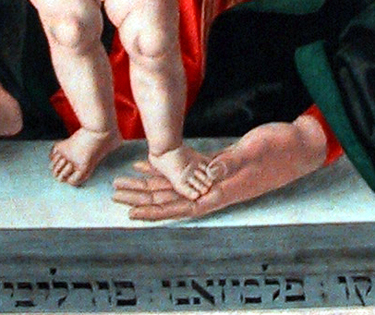
— You also might notice that although the figures are overlapped, all eight hands are visible and all are expressive.

Joseph’s hands seem cramped and arthritic. Mary’s hands support her son. John’s hands are crossed in reverence, and Jesus raises one hand symbolically while touching his thorax with the other, as if to point to his mortality.

— It is Joseph’s eyes that first make us take notice of him, but his ear can’t be ignored. It is a peculiar ear, oddly orange. It is bent over by his cap and forms a shape that imitates his mouth.

That orange tint and odd shape are repeated in Christ’s ear, contradicting the idea that Joseph had nothing to do with the birth. This is family resemblance.

That may not be too odd, if we remember that Joseph, Jesus and Mary were understood then not only as themselves, but also as allegorical of the Father, Son and Holy Spirit. Joseph can be understood as a stand-in for God the Father.

— Yet, there are mistakes in the painting, several if you can find them.

Mary’s hands are out of proportion, much too big for her body and head.phx hand feet

And her left hand can be no thicker than paper for it to slide under Christ’s left foot on the balustrade. Palmezzano has poorly drawn that space, making something of an unconformity there.

— Other mistakes are more technical. The most glaring is the triangle of orange behind the Christ’s ear: The artist has painted Mary’s mantle first ocherish yellow, as an underpainting, and then green on top. This underpainting helps make the green seem all the more glowing; it is a standard artist’s device. But he misdrew the mantle with the ocher and forgot to cover it up with green in this small area.

Unusual coloring

— You can see more of this orange, on purpose, in the brocade borders of Mary’s mantle, as Palmezzano scratched into the green to expose the orange underneath, making a golden pattern.

— In another place, the back of Mary’s neck is artificially circular, from her ear to her shoulder. The shape is geometric rather than organic.

The perspective of his castle isn’t too well thought out, either.

— And if you crouch down in front of the painting to see the glare of the museum’s lights on the glazed surface of the painting, you will see the painting is pieced together from large, outlined sections, something like puzzle pieces, or, more accurately, like the giornata, or daily working sections that a fresco painter creates in wet plaster.

We know Palmezzano worked in fresco. Did he bring his fresco habits to oil paint?

There are many more things to notice, but I will leave them to you, hoping you will spend your own time with this painting or another — they all are worth close examination and contemplation.

stella flowers italy 1931 copy

I spent 26 years of my life in Phoenix, Ariz., and came to know the collection at the Phoenix Art Museum intimately. There were paintings I loved and a very few that I disliked intensely. Most, of course, fell in the middle somewhere.

One painting I felt strong aversion to was Joseph Stella’s Flowers, Italy, which always seemed to me like a cheap piece of junk-surrealism. On the whole, I am not simpatico with even the best Surrealism.

There is only one thing to do when you don’t like a painting: spend a lot of time with it. So, I figured, if I stayed with the Stella for a while, I would either fully define why I did not, like it, or I would change my mind.

I finally wound up spending more than five hours with the painting, and, another hour or two afterward, reading about the artist and his work.

It was an enormous expense of time and energy, but it paid me back many times over. Now Stella’s Flowers is one of my anchors at the museum and, I cannot get enough of it.

Since the question I am asked most often and most imploringly is “How do you look at art?” it seemed like it might be helpful to describe what I found over those seven hours.

LOOKING AT A PICTURE

Most people like pictures of flowers. They come upon Joseph Stella’s Flowers, Italy at the Phoenix Art Museum, for instance, and they are likely to respond, ”I like flowers; they’re pretty; I like this painting,” and move on to the next.

But there is much more packed into any good painting, a world of meaning and experience that can only be squeezed out with time and effort.

So, mister wise-guy art critic, how do you look at a painting? It’s a question I have often heard. The answer has three large parts.

The first is looking.

And by looking, I mean spending a very long time noticing all the component parts of a painting, its colors, brush strokes, subject matter, design, size and proportions.

The second is thinking.

After you have noticed every square millimeter of the work, you are then obliged to figure out what it might mean. You dig into yourself — the well of your experience — and try to parse out what all those many bits might add up to.

And third, after you have some good idea what the painting might be communicating, there is the learning. You are interested enough that you want to find a book or person who might tell you more and help you fit this experience into the larger picture. But make sure to wait for this last: After you have experienced the painting, then you can worry about facts.

Too often, we want to start with facts, but if you place them first, they only blur your vision.

Once more, the three steps are: looking, thinking and learning.

Let’s take those same Stella flowers and try the method on them.

It is a large, square painting, about 6- by 6-feet, of dozens, maybe hundreds of flowers in a tangle that seems almost architectural, all against a deep, blue sky.

From a distance — and the way it hangs in the museum currently makes it difficult to view any other way — it seems finely painted and detailed. The paint seems smoothly brushed onto the canvas.

But try to get up close, and you will find that the surface is sloppy with thick gobs of rough paint. The flowers almost seem crude, as if drawn by a not-so-talented child.

Step back again. They regain their refinement.

This is only one of the many contradictions of the work.

Its overall impression and the first thing most people notice, after the flowers, is that the painting is rigidly symmetrical. Draw a line up and down through its middle and you find that the right and left sides mirror each other.

Yet, on closer inspection, nothing on one side exactly reproduces the other. What is a calla lily on one side is balanced by a hibiscus on the other. The painting only appears to be literally symmetrical.

There are two distinct axes to the design. Splitting the painting vertically is a line of plant stalks, pistils, racemes and petals. Each half of the painting is equal.

But cutting the bottom portion from the upper is a line of large white blooms. They sit lower than the halfway mark, settling as if gravity had pulled them down.flowers cross

That giant cross is the basic organizing principle of the work, like an airplane nose down, crashing into the bottom of the frame.

Another contradiction: Most of the blossoms are fairly realistic. You can tell the hibiscus from the aster, the lotus from the lily. Yet, the plant stems are greatly distorted. Many are rigidly straight, up and down. Others are not connected to anything recognizable. The upper portion of the picture, in fact, is divided into three panels by plant stalks that curve around at the top to make what look like Roman arches.

The background is blue sky; the closest part, on the bottom of the frame, is blue water, filled with waterlilies and fish. There are a host of white and red flowers, and a smattering of yellow. But considering this is a painting of foliage, there is surprisingly little green.

Notice that I haven’t yet mentioned what any of this might mean. Your first obligation is to discover what is there; only then can you worry what it might mean.monkey face

And what about the ”monkey” face?

Human beings are genetically programmed to recognize faces. It is why we so often find virgins in tortillas and aliens staring back from Martian mountains.

At the bottom of this painting, filling the middle third, is an animal face, with two rosy hibiscus for eyes, two birds for ears, and what looks like a red proteus for a nose ridge, crowned with a great white waterlily flower.

arcimboldoLike one of those crazy Arcimboldo faces from the Renaissance, made from fruit or vegetables, it is a visual pun, functioning on two levels at once: face and flower.

Stella is having it both ways once again.

Notice, too, that the bottom third of the painting acts like a very close, in-your-face wall, like a hedge that blocks the distant view behind. The painting then, maps out very clearly the near and the far.

Over and over, there are contradictions: things split into two — near-far, up-down, flower-face, greenless plants, realistic distortion.

There are dozens of other things you might notice. I’ve only listed a few; a complete list could fill an entire book.

But what does it all mean? The experience is all well and good, the looking slows us down and we discover scores of little details that we could not have noticed racing through the museum.

But it is the meaning we are after.

Well, the first thing you are likely to think about is the flowers. Any painting with this many maniacal flowers is likely to be about fecundity. This is one fertile painting.

And the details certainly substantiate that. Look at the top, with the day lily hanging upside down over the long, white tendrils that draw up the center line of the painting. It sits with its pollen-laden anthers just touching the tendril, which we must read as an abstracted pistil. The very moment of fertilization.

It is the climax of the painting, so to speak.

But the rest of the painting is no less orgasmic. Look at all the large flowers. Almost every one is a yonic horn with a large, phallic nub at its center. They are hibiscus and lotus, contradictory male and female at the same time. Near the very center of the painting is a jack-in-the-pulpit, with a lurid phallus sticking straight up from its bowl-like pulpit.

You would need an computer to keep track of the phalli and yoni in this picture.

Even that monkey face, looked at again turns into the female reproductive organs, with fallopian leaf fronds and ovarian hibiscus.

So, does this mean Stella had a dirty mind? Or was his subconscious playing Freudian games?

No. There is something else going on.Hubert_Robert Roman_Ruins

If we were to search the history of art for this painting’s ancestors, the most direct would be the 18th century picturesque landscapes of Hubert Robert and his like.

They usually showed a Roman or Greek ruin taken over by vines, with animals or people living and playing around them. Nature reconquers the works of man.

Stella has given us the ruin, in the form of the vegetal arches at the top of the painting. In his ”ruins” nature reconquers the world in a fit of fertility.

In the older paintings, we know that conventional iconography implies that the ruins symbolize death; the vines, the recurrence of life.

In Stella, the ruins are only suggested, and death — the arching plants that roof the painting — is itself seething with life.

The contradictions are all the more emphatic when we learn more about Stella and his art.

stella mugHe was born in Italy in 1877 and immigrated to the United States in 1894, where he died in 1946. He first achieved notice as an artist with a series of paintings of the Brooklyn Bridge and Coney Island, done before 1920.

In those, he brought the current Italian movement called Futurism to the U.S. Futurism glorified modernity, machines, speed and motion. Most of the noted Futurists were Italian; Stella was America’s only serious member.

But the contradictions in Stella’s personality kept him from continuing in this direction. Something in him mistrusted machines, even as he felt awestruck by the engineering of the Brooklyn Bridge.brooklyn bridge stella

”Many nights I stood on the bridge — and in the middle alone — lost — a defenseless prey to the surrounding swarming darkness — crushed by the mountainous black impenetrability of the skyscrapers,” he wrote.

In another place, he called his home, New York City, ”Monstrous dream, chimeric reality, Oriental delight, Shakespearean nightmare . . . its enormous blocks of buildings barring one’s way . . . its dreadful closed windows barren of flowers.”

In his mind, Stella contrasted the steel, cold, northern city with the fertile, warm, sunny southern Italian town he had grown up in.

”Returning to my birthplace, I find all of nature smiling like a friend, greeting my arrival with festive salutes.”

And in another place, ”My drowsing energy, tortured by the cold of Northern countries, was awakened as if by magic, set aglow by the radiance of gold and purple light. All the ardor of my youth surged through me with the overflowing, stinging, demanding desire for new conquests in the virgin lands of art.”

Over and over in Stella’s letters, you find a man driven ecstatic by the abundance and plenitude of nature. Man’s works, so glorified in the Futurist paintings, became the fodder for ruins, which were ennobled by the fecundity of nature.stella purissima

It is a theme that shows up in many of Stella’s better paintings (and it should be noted he was a very uneven painter). They have titles such as Joy of Living, Dance of Spring, Apotheosis of the Rose and Tree of My Life.

Stella had an almost Hindu sense of the ecstasy of nature, the sense that everything is burning with aliveness.

And in the end, even his famous paintings of the Brooklyn Bridge were not about human life and technology, but, as he wrote, ”I felt deeply moved, as if on the threshold of a new religion, or in the presence of a new Divinity.”

He was one of those painters, like Van Gogh, who yearned to express the exploding aliveness of the world, a man with a visionary sense of cosmic energy.

Finally, his Flowers, Italy is no more about mere sex than the cave paintings of Ajanta or the athletics of Henry Miller. It is a vision of perpetual life, renewing itself and burning, a non-Christian version of Dante’s Divine Rose, or the sacred Garden of Eden.

And it is at this level that, in Stella, as in the Vedic religion, all contradictions are transcended.

NEXT: Looking at an earlier painting, using the same techniques

Orangerie, up close, 2006

You wander through one of a city’s great art museums and watch the people. They spend an average of maybe 15 seconds in front of any painting that catches their attention before moving on.

Or more likely, they spend another 15 seconds reading the label on the wall. And if the label contains a legend explaining who the artist was or what the painting is about, they may very well spend more time with the label than with the art on the wall. It’s disheartening to watch.

One of the problems is that we are a verbal, not a visual culture. I know the common wisdom is currently that we are a visual people, but it simply isn’t true: Even those things we think of as symptomatic of being visual are things we “read” for information rather than see: like the stick figure man or woman that lets us know which restroom is appropriate.

But even more than that, it is that we are a problem-solving people. America’s national mythology describes us as doers and go-getters. We simply don’t believe in wasting our time. We’re too busy. Our heads are too crowded.

There are all those yapping voices, all those different aspects of our personalities, all clamoring for attention.

”Mmm, doughnuts!”

”Don’t forget the dentist appointment.”

”Do these socks go with this tie?”

”Is the ozone hole getting bigger?”

”Mmm, doughnuts!”

So, it’s hard to appreciate art these days.

And it’s no wonder that a management class steps forward to create some order.Orangerie, the critics, 2006

Each of us has it: The executive in our heads that tries to get through life quickly and efficiently, cutting through the baloney and making the decisions for everyone else in there.

It’s a necessity in an information top-heavy age with bumper-to-bumper traffic on the freeways.

Unfortunately, this tendency to empty the ”in box” and get on to the next problem runs completely counter to what art is about. To see art, or read poetry, or listen to chamber music, we have to kidnap, blindfold and gag the executive in our brains and give ourselves over to a different kind of experience.

And ”experience” is the operative word, for the primary function of art is to provide an aesthetic experience.

That executive in our cranium is used to dealing with information, not experience. There is life on one hand, and there are words and symbols about life on the other. Most of what life requires of us in the late 20th century deals with words and symbols: filling out forms, scanning in our Visa numbers, looking down the stock listings in the Business section of the newspaper. We are drowned in words.

But at least we are used to them. Experience is scary: sensuous, messy, confused.

So how do you deal with art? How do you prepare yourself to appreciate it, enjoy it, and grow from the experience of being exposed to it?

First of all, you have to slow down. Your interior life moves slowly, implacably. It is only your cerebral cortex that buzzes with frenetic energy. The deeper, more meaningful emotions, the underlying rhythm of life is more measured: a pedal note under the jangling fugue subject above.

Art requires that you work on this slower time scale. It doesn’t give itself up, like the punch line on a New Yorker cartoon; it slowly releases its value to those who can wait.

You have to spend time with a painting or statue. The Manager wants to look at a painting and say, ”Yes, I know that: It’s a Renoir. File it under ’19th Century, Impressionism, French.’ ” And then move on to the next: ”17th Century, Dutch, Genre: Rembrandt.”

It is as if knowing the name of the painting is the same thing as knowing the painting.Orangerie gawkers, 2006

But if you look at a single painting for, say, an hour, you will learn things about it. You will be forced to discover all the richness that the artist took the time to put there.

What colors has the artist used? What shapes? Is it dark or is it light? What is the subject? Can you make sense of it? If not, is the ambiguity important? Is the paint thickly applied, or flat and textureless? How does that help the painting convey what it has to give you?

You swish it around in your mouth like a good wine, looking for the complexities of taste and aftertaste.

How does the painting make you feel? Is it an emotion you’ve felt before? If not, is it related to one you’ve felt? If it’s completely new, how do you feel about that?

The art slowly unfurls, like a rose opening from a bud. The attention you pay will pay you back.

In the next installment, we’ll take a look at just one painting and see how this approach might pay off.

PCA-logo-text-date-FINAL

I hate “the arts.”

Don’t get me wrong: I love art. In whatever form. I could not live without music, dance, theater, architecture, literature, cinema, painting or sculpture.

But when grouped together and made plural, so that I have to bracket them in quotes as “the arts,” they become a value that is paid lip-service by politicians, administrators and businessmen and they become a category in the public agenda, much like potholes or redistricting. We hear over and over a justification of the arts that argues how much — how many dollars — “the arts” contribute to the economy. As if this were their raison d’etre.agee-famous-men

While it is certainly true the arts have some civic utility, frontlighting that is like saying that the invention of writing is important to civilization because newspapers are so useful to wrap fish in. It misses the point entirely.

When pluralized, the arts are neutralized: turned safe enough for school children and wives. They become a civic virtue, and ring as hollow as the platitudes of a politician running for office: not much more than a flag lapel pin.

And so, I hate “the arts.”

As James Agee once wrote in Let Us Now Praise Famous Men, “Official acceptance is the one unmistakable symptom that salvation is beaten again, and is the one surest sign of fatal misunderstanding.”allegory of the arts

Art — not “the arts” — is about that salvation. About becoming more fully human, more aware of the world and our place in it. It saves us from isolation, from ignorance, from emptiness. These are the big issues we face, in contrast, mutable public issues are trivial: When we come to the end of our lives, what remains of the fustian of our existence has little to do with annual income or who got elected; it is how much we have loved and been loved, whether we have become larger in our hearts, or shrunken and dried up.

Art engorges our hearts and makes our neck veins throb. We feel alive; we become more alive. Art teaches us to love and be loved. It gives us the images that train our hearts to the potentials. Without the images, without the metaphors, all there is are words, no more meaningful that an alphabet we cannot read.

Anyone fully listening to Isolde’s death song, or reading Wordsworth’s Intimations Ode, or paging carefully through Goya’s Disasters of War can be reduced to weeping — and the kind of profound weeping that makes the rest of the world disappear and our insides open up to become a sea as large as the planet.

There was a time when I was young that I thought art was merely “cool,” and that I wanted to be — or could be — in control of art instead of art being in control of me. I didn’t believe Emily Dickinson when she wrote, “If I read a book and it makes my whole body so cold no fire can warm me, I know that is poetry. If I feel physically as if the top of my head were taken off, I know that is poetry. These are the only ways I know it. Is there any other way?”

I write this listening to Strauss’s Four Last Songs (this is my own translation):

4. In the Red of Evening

Through good times and bad,

Anger and joy,

We have walked hand in hand;

And now we take a moment’s rest

With the world all before us.

All around us, the valleys dim away,

And the details gray out.

You can begin to see the lights below.

And overhead, two larks fly alone,

half-dreaming into the velveting air.

Come closer to me,

And let them fly over us;

Soon it is time for sleep.

And we must not let the darkness

Separate us from each other.

The peace is wide and still,

Deep in the redness of the western sky.

How tired we are of this need to keep moving.

Is that what death is?

DemiEightpack

In 1991, actress Demi Moore posed for a famous Vanity Fair cover photograph, taken by celebrity photographer Annie Leibovitz. It exploded as a “meme,” and was copied many more times.

Soon, it became impossible for an aspiring starlet not to be seen naked and gravid on the cover of one magazine or other.

Leibovitz herself seemed to feel “ripped off” and sued when an ad featuring Leslie Nielsen used the pose to sell the film, Naked Gun 33 ⅓: The Final Insult.

The courts didn’t agree with her, and anyway, we had moved on to other memes, including dancing cats on You Tube. The courts could hardly have decided otherwise, not only on the basis of fair use for parody, but because borrowing poses has been an essential tool in artists’ kit for millennia.

As Picasso didn’t actually say, “Good artists borrow; great artists steal.” Actually, that quote has been attributed not only to Picasso, but to T.S. Eliot and Igor Stravinsky, but goes back at least to 1897, when a variant version was used by critic W.H. Davenport Adams. Even quotes get borrowed or “stolen.”venus and eve

L-R: Venus de Milo; Eva Green in The Dreamers (2003).

The examples are legion. My interest came to me through the paintings of Manet, Titian and Giorgione.

First let’s look at a few examples.

One of the most familiar is the pose of the “Three Graces.” It shows up in many forms in antiquity.3 graces antiquity

L-R: mural from Pompeii; statue in the Louvre; mosaic from Anatolia.

It was used by many Old Master painters.3 Graces renaissance

L-R: Raphael; Rubens; Pontormo.

And even later.3 Graces recent

L-R: Edward Burne-Jones; Henri Regnault; Leonard Nimoy.

You could find dozens of others.

Adam and Eve became such a meme, too. One version has Adam with his arms around Eve. It became used for other things, too.Adam&Eve trio

L-R: Jan Gossaert, 1520; Gossaert, Neptune and Amphytrion, 1517; Two Virgins album, 1968.

Or take the famous Botticelli painting, Birth of Venus. The pose, with the goddesses hands vaguely protecting her modesty, and you find it all over Classical art and Renaissance painting, to say nothing about one of the oldest figures in Western art.Birth of venus archetype

Or even Playboy magazine, which — probably not on purpose — imitates some other, more famous images.buns foursome

Top: Playboy; Gauguin. Bottom: Boucher; Modigliani

But the main course:Edouard_Manet_-_Olympia_-_Google_Art_Project_3

Victorine_Louise_Meurent_(1844-1927)Edouard Manet created a scandal in the 1865 Paris salon when he exhibited his Olympia, a nude featuring the model Victorine Louise Meurent dressed up — or rather undressed — as a prostitute. She wasn’t, by the way, and later became a painter herself. Here is what she really looked like in 1865.

Her pose in the painting is an obvious quote of two famous paintings of the past, Titian’s Venus of Urbino from 1538,venus of urbino by titian

and Giorgione’s Sleeping Venus, from 1510 (and probably finished by Titian, after Giorgione’s death).Giorgione_-_Sleeping_Venus_-_Google_Art_Project_2

The salient points of the pose are the recumbent nude woman, with her calves crossed.

This is a pose that even Giorgione can take no credit for. It goes back to antiquity. Here she is from PompeiiAphrodite_Anadyomene_from_Pompeii_cropped

The full meme version is the Titian painting, with these other points that get “borrowed” over and over, including in the Manet version.venus of urbino with labels

olympia handNotice that the space of the painting is divided in half, near and far, and that there is a distinct vertical line that, in this case points downward directly to the model’s pudenda, which is caressed by the curling fingers of her left hand. This gesture is highly ambiguous: Is she really masturbating? Can a great master really have meant that to be our take-away?

In the Manet, the similar gesture is more assertive: Olympia uses her hand as a kind of gate to paradise for which she and she alone holds the key. You won’t get past that hand unless she gives permission.

There is also an animal in the picture, other subordinate people.

These elements are used over and over, not least of all by Titian himself, who used the pose, or variants in several paintings.jupiter&antiope titian 1535

Jupiter and Antiope from 1535.venus&cupid titian 1550

Venus and Cupid from 1550.Venus,venuscupid and organist titan 1548

Cupid and the Organist, from 1548.

venus, organist and little dog, titian 1550And then, more lasciviously, in the variant, Venus, Organist and Little Dog, from 1550, in which the so-called “male gaze” is fairly explicit, even comical.

But Titian is not the only artist obsessed with this pose. Lucas Cranach the Elder (1472-1553) painted nearly a dozen versions between 1515 and 1550, which he usually titled Nymph at the Fountain. Here are four of them.Cranach composite

She can’t quite figure out just what to do with that left hand.

Through so many of these paintings, note the presence of animals, the near-far background, the frequent strong vertical line bisecting the picture, and the frequent use of drapery behind the woman’s head.

Not all these paintings have all the components of the Ur-painting of Urbino, but each has some of the components.

Here’s a 1639 painting by Guido Reni, with the crossed legs, the drapery, the near-far and if there are no animals, well, Cupid at least has wings.reclining venus guido reni 1639

A 1540 painting by Paris Bordone, called Sleeping Venussleepingvenus bordone 1540

From 1523, a Sleeping Venus from Girolamo da Trevesisleepingvenus da treviso jr

From 1520 and Palma Vecchiovenus palma vecchio 1520

Even in the north, from Maarten von Heemskerk, in 1545Venus&cupid heemskerck 1545

And Jan Massys painted her as Flora in 1514023 Flora Jan Massys 1514  copy

While most of these come from the 16th century, the pose streches beyond, including this 1844 Nude Girl on Panther Skin by Felix Trutatnude girl on Panther Skin Felix Trutat 1844

Lord Frederic Leighton painted Cymon and Iphegenia in 1884, with the pose, but with Iphigenia modestly covered in draperyleighton iphigenia

He also did the nude version, Actaea Nymph on the Shore, in 1854.actaea-the-nymph-of-the-shore-1853 lord leighton.jpg!HD

And Paul Gauguin’s Noble Woman from 1896paul-gaugin-noble-woman-1896

There are many more. A pile of them are mirror images, with the nude on the right side of the painting.

Giulio Cesare Procaccini painted Venus and Cupids in 1625venus&cupids procaccini 1625

Palma Giovane in 1610 did Venus and Cupid at Vulcan’s Forgevenus&cupid at vulcan's forge giovane 1610

Lorenzo Lotto’s 1540 Venus and Cupid gets kinkyvenus&cupid lorenzo lotto 1540

Allesandro Allori’s Venus and Cupid from 1586venus&cupid Alles allori

Sebastiano Ricci’s Venus and Satyr from 1720venus and satyr sebastiano ricci 1720

I think you can even make a case for Piero di Cosimo’s Venus and Mars from 1490. Although, here it is Mars with the crossed legs. Still, animals.venus&mars piero di cosimo 1490

This is just a skim across the surface. I’m sure you can find many more examples of the reclining nude, legs crossed, with animals or cupids, with figures in the background and a wandering hand.

I’ll leave you with only three more:

Pablo Picasso’s parody, Olympia, from 19011901_pablo_picasso olympia

and Claes Oldenburg’s Pat, Lying as Olympia from 1959OldenPat,_Lying_as_Olympia 1959

And finally, E.J. Bellocq’s Storyville prostitute from New Orleans in ca. 1912bellocq13 copy

This meme gets around.

???????????????????????????????

I began seriously reading in high school, mostly contemporary fiction. I don’t remember what I could possible have made of Saul Bellow’s Herzog at the age of 16, but there it was. I followed that with Seize the Day and The Dangling Man. I read James Purdy, James Drought, Jules Fieffer, Hubert Selby Jr., Thomas Pynchon, Terry Southern, Albert Camus, and, ahem, P.G. Wodehouse.The Secret cover

Jack Kerouac, Brendan Behan, William Golding, Kingsley Amis, Eugene Ionesco, and of course, J.D. Salinger. I was a teenager, after all.

Quite a load of words for a high school student. I doubt I understood a tenth of what I read, but I couldn’t get enough.

There were a few “classics” thrown in, some required reading for school, but it was primarily new fiction I read — almost all of it over my head.

And almost all of it in paperback. There was a rack of paperbacks in the local drug store, and I would pore over them after school, looking for the latest Bellow or Updike.

return of the native airmontAnd then, there was Thomas Hardy’s Return of the Native, which was required reading in 8th grade — why, I don’t know. But I had the hardest time plowing through it. It seemed dense and impenetrable. I got bored. I couldn’t finish it.

Over the years, there were other books I had a hard time reading. The sense was always the same: They were uninviting; they were dense; they were difficult to read. I lost interest in them and didn’t finish them.return of native page

It was only years later that I realized the problem was not with the writing, it was with the printing: The cheap paperback edition of Return of the Native was really horribly designed: grey type, insufficient leading, narrow margins, bad, under-inked offset printing on grey or yellowed paper.

The problem was not with Hardy, the problem was not with me, the problem was with Airmont Classics, the paperback publisher. They had skimped on book design and created a brick.

Last week, wandering through the shelves of our local used book store, I found a copy of that noxious tome. As I began reading, I realized what a magical writer Hardy really could be. Now that I’m more mature — actually a geezer — I had a bit more patience than I had as a teenager, and I could manage to cut the furze, as it were, of the wretched typography. It is still a dank and uninviting book to look at, but I nearly cried at the opening paragraphs, as Hardy describes that particular and exact time of day and time of year when you can look down at dusk and the ground has lost any visual contrast; it dulls into the gray of evening — but if you look up, the sky is still bright. It is like that Magritte painting, only not meant to be surreal, only beautiful.magritte

“A Saturday afternoon in November was approaching the time of twilight, and the vast tract of unenclosed wild known as Egdon Heath embrowned itself moment by moment,” the book begins.

“Overhead the hollow stretch of whitish cloud shutting out the sky was as a tent which had the whole heath for its floor.

“The heaven being spread with this pallid screen and the earth with the darkest vegetation, their meeting-line at the horizon was clearly marked. In such contrast the heath wore the appearance of an installment of night which had taken up its place before its astronomical hour was come: Darkness had to a great extent arrived hereon, while day stood distinct in the sky. Looking upwards, a furze-cutter would have been inclined to continue work; looking down, he would have decided to finish his faggot and go home. The distant rims of the world and of the firmament seemed to be a division in time no less than a division in matter. The face of the heath by its mere complexion added half an hour to evening; it could in like manner retard the dawn, sadden noon, anticipate the frowning of storms scarcely generated, and intensify the opacity of a moonless midnight to a cause of shaking and dread.”

What had I missed over the years by thinking that certain books were dull, when it was only the visual aspect of their presentation that had discouraged me?aeneid

I remember trying my damnedest to shoulder my way through C. Day Lewis’ translation of The Aeneid. Whoever designed that paperback managed to use a page too small to hold the average length of a line in the font size he chose, meaning that almost every other line wrapped to the next line, flush right, giving the text a kind of visual hiccups, making a very ugly page that was nearly unnavigable. It put me off Vergil for decades.

By-and-large, it is paperbacks which are the greatest offenders. Designed to be cheap — which we appreciate — they are also designed to fit as much type onto a page as possible so as not to waste space or paper. Type is small; leading is squished; margins are narrow. To say nothing of the quality of paper used and the ink rolled on.

It isn’t merely a question of type size. Some large-type books are hard to read, and some with tiny text are easy. The issue seems to be the length of the line: Small type on a small page is fine, but spread that line out over a wide page and the eye tires before turning down to the next.

walden 1One of the prettiest books I own is a copy of Walden from the Heritage Club, published in 1939, with wood engravings by Thomas W. Nason. It was proud enough of its look to credit its designer, Carl Purington Rollins. I believe every book should credit its designer: A good design makes a book better; a bad design deserves blame.

Although it is printed in 8-point type, the page is compact, and the margin wide enough that the print-line is never too wearying.

One of the things that makes this Walden so attractive is that it was printed with lead type, not run off an offset press roller.

There are so few who still get pleasure from the look and feel of ink on paper — especially the tender and slight embossment of lead type dug into the fiber, and the ink laid there in the troughs. The soy ink now used flat on offset printing seems so one-dimensional. I have a two-volume Milton printed in 1843 that is as beautiful to look at as to read, as beautiful as a Piranesi engraving or a stained-glass window.milton 1

The question is not one merely of what typeface is chosen; some books are overly “artistic,” with fancy fonts and eccentric spacings — all of which make the book harder to read. What makes it all work is a typeface that is neutral enough not to call attention to itself, but not so dull as to be banal. No one want a whole book wearing Times New Roman like fishscales — you want to take the back of a knife to it and scrape it clean.

No, the question goes beyond type: It is a question of air between lines and around the text. It is a question of the darkness of the type — the heaviness of line in the drawing of the letters. It concerns the break of chapter and the intent of the paragraph: Neither too much nor too little.

And yes, this is a matter of taste, not of metrics: What is too much or not enough? The answer requires not a rule, but an awareness: awareness of the physical properties of the page and its contents. Most of us are unaware that books even get designed, unaware that there was a choice made in type, margin, leading, initial capitals, weight and brightness of paper stock, the deckling or smooth cut of the page edge.

Americans are often chided (and most often by themselves) for being too materialistic. But this simply isn’t true: Americans are not materialistic enough — they have little sense of the material world. The acquisitiveness that infects our nation has more to do with the non-material quality of status than with any love of the sensuous world we inhabit. One might say it is a “spiritual” value, not a material one. Certainly a tedious and unworthy spiritual value, but not in any way truly materialistic.kindle

So, it is hardly surprising that we now do so much of our reading on electronic gadgets. One might say one has become one’s own book designer, since one can choose certain visual parameters on your iPad or Kindle. But aside from enlarging the type for easier reading as we venture into the world of presbyopia, few take the chance to actually “design” the presentation on their e-reader.

And as a writer of a blog, I am frustrated by the fact that no matter how I try to make my text look on the computer screen, when it reaches your screen, it is your default choices that govern its looks as you read it. We have cut out the middle man — cut out the book designer, who can make my writing fun to read or a trial to machete through.

I hate style. When I hear an artist say she has finally found her ”style,” I get nauseous. Style is not what art is about.

Style should be the way something needs to be said. I see too much art wherein the artist has chosen a clever style, as if it were a shirt from a J.C. Penney catalog, and then tries to stuff it with something.

Artists who read art history and try to figure out where it is going next will always be shortsighted. Art is going where it will next because of some great imagination whose vision of reality cannot be expressed in the old vocabulary.

Younger artists tend to need style tricks more, just as older artists seem to strip down their style, like the final Kurasawa films or late Tolstoy.ran

As an example: The greatest writing survives translation well. Lesser, more refined artists often are untranslatable because their substance is the fugitive stuff of style. Tolstoy, Homer, Dostoevski and Dante are all powerful despite language problems. They each concerned themselves with powerful searching problems and explored the mazes of those problems with shocking honesty (in the terms of their times).

The search within

Artists and writers now need to search their innards for analogous problems. Our answers won’t be Dante’s answers, but art on the level of importance as the Paradiso is needed.terpning

Rembrandt; Picasso; Beethoven; Dostoevski; Dante; Michelangelo; Raphael; Hokusai; Bach; Homer; Shakespeare; Cervantes; Chaucer; Neruda; Matisse; Durer; Sophocles. . . . Does LeRoy Neiman, after all, belong on that list? Or Howard Terpning, or Frank Frazetta?

Four modes

There are four modes of producing art. I don’t mean discrete modes, but that they are four points on a spectrum. They are:guernica

–› The artist connects with something real in the world or the medium and, because his discovery cannot fit the molds cast by previous artists, he forges a new style. Picasso and Beethoven are representatives of this mode. Inner drive and a sense of the insufficiency of the old styles cause the creation of a new style.wyeth winter 1946

–› With some other artists, the interaction with authentic experience causes no feeling of the inadequacy of the existing styles. The connection with something real is still there, but accepted style merely becomes the mother tongue to discuss or develop the connections. Brahms, Andrew Wyeth and Rachmaninoff are possible examples.

The next two modes differ from the first in that the prime aim of the artist is not to express some genuine engagement with the world, but rather to manipulate style.

–› One is an imitation of the first mode, wherein the style is foremost and the artist attempts to create novelty rather than express something larger. Many students, too young to have anything real to say, are guilty of this mode.

–› The last is an imitation of the second, in that the conventional style is used with limited substance. Montovani, Cowboy artists or the truckloads of ”starving artist” oil paintings are prime examples. Neither message nor style is genuine, but only imitates the ”look” of art.

Like all those people who think they can paint like Jackson Pollock.amateur pollock

Style is seductive

louis armstrongStyle is a demon that seduces us. Audiences often choose by style and not by intrinsic worth: Jazz listeners listen to Kenny G pop jazz before listening to Mozart; Classical fans will listen to Zelenka or Ditters von Dittersdorf before listening to Louis Armstrong’s Struttin’ With Some Barbecue.

If we consider the actual function of art, the problems become clear. Art organizes, on a primary level, the undifferentiated chaos we find around ourselves. If the world does not seem chaotic to you now, thank the artists who have gone before you and struggled with the problems of perception.

To an artist, who is a person not entirely enculturated, the things we take for granted — the things that seem self-evident — are not to be trusted. Is perspective a realistic portrayal of how we see? That is suspect. Is nuclear war an entirely bad thing? Maybe, on a deeper level, it would be good for an overpopulated planet drowning in its own sewage. Maybe. Is the world of dreams all in the mind? Or is it as valid a reality as the one with digital watches and brothers-in-law? Maybe more valid. What are the true relationships between men and women? Why do otherwise reasonable people commit horrors and atrocities? Maybe it is a normal function of being a human. Maybe.

The artist won’t necessarily answer these questions, but he will consider them, or questions like them, and will engage with his explorations and exit the labyrinth with a canvas gripped tightly in his mitts, and with a wild look in his eye.

Style is a means of avoiding these tough issues, substituting a disengaged, shallow cleverness.autumn rhythm

To make new art, the artist should not attempt to find novel juxtapositions, but should go back to that primary undifferentiated chaos and attempt to find an order directly from it. Too much mediocre art comes from people trying to be new rather than trying to be real.

kids art 11

As a professional art critic for more than 25 years, I saw a lot of art — everything from cowboys in leather to nude men dressing themselves in raw meat. But none gives me such consistent pleasure as children’s art.

Mostly, I’m thinking of art made by first-, second-, and third-graders using humble tempera paint and large skeins of paper on which to flow their ideas.

You only have to watch a first-grader in the process of painting to know how deeply committed an artist he is. Every muscle is involved — his very toes are poised in relation to how the tip of his brush moves. He is not distracted by questions of style, of whether the painting will be marketable, of whether his is better or worse than those around him. There is only the fundamental necessity of getting down on paper whatever it is that needs expression.kids art 15

Curiosity and joy are inseparable. Which is more than you can say for many adults out there trying to make a living.

I used to be one of those people who condescended to children’s art. Charming, I thought, but not really art. I have learned better. A child artist is in no respects any different from an adult one; he does the same things, goes through the same processes and creates something as worthy.kids art 08

Some artists and critics with open minds have recognized just such. Alfred Stieglitz hung children’s art in his New York art gallery in the 1920s. The Chrysler Museum in Norfolk, Va., has also done so, without any belittling labels. When the art is properly framed and presented, no one could suspect that the works were not by a respected artist with a New York name.

Picasso has said, ”Every child is an artist. The problem is how to remain an artist once he grows up.”kids art 19

A direct link

Children pursue the creation of art with a purity of heart, and a courage that fails many as they grow older. It is a rare artist who recognizes that his duty to art is the duty that the child accepts without question.

I am not talking here about that god-awful ”project art” that some kids are forced into making — like tracing your hand and making a turkey out of it, or building a golden macaroni Parthenon. When all the children in a class are forced to make the same art, or are shown the accepted method of solving an art problem, all the joy — all the genuine art — is sucked out of it.kids art 02

I am talking about that direct link between experience and expression that comes when a child is given a bunny to hold and then given a paintbrush. The child cannot but attempt to express the experience in the most truthful and direct way. He does not need to be taught about design, theory, or worse, art history, to paint the rabbit. He finds his own “adequate means of expression.”

Consider what happens when the teacher takes a turtle to class, lets the children handle it and play with it, give it a name and study its anatomy and its habits. Here are some of the results. Notice how varied their approaches, and how beautiful the designs and the color harmonies.turtles 01

kids art 04 -- turtleBad children’s art — just like bad adult art — is most often made using formulas; good art is made when artists discover their own solutions. No good tree was ever painted using a sponge; all good art is reinventing the wheel.kids art 24

Creating a well to draw from

Using art to understand experience is what it is all about. It is how art comes to enrich, inform and deepen the child’s inner life. And that inner life is important because it is a sanctuary and a source for the rest of his life — a place he can draw strength and resources from.kids art 12

Formulaic art informs that inner life no more than television — it is busy work.

Solving the art problems, learning to see and to express experience, are all a part of the process of growing. Art is no different from reading or arithmetic in this. Children do it enthusiastically. We should take a lesson from them.

After all, we are not supposed to stop growing simply because we’ve reached adulthood.

The bottom line is that children are the heroes of their own lives. So should we all be.

Selva Oscura

WHEN you are young, it is easy to be in love with art. You may love its artifice, you may love the colors or the rhymes or the great blaring sounds of the music you listen to. Art is vibrant; it seems so alive. But most of all, you are in love with the sense of importance iart brings: It seems to validate the belief we all have when we are young that our own lives matter, that we count in the larger scheme of things.

We are all Tristan, Achilles or Holden Caulfield.

Perhaps that is why the young make so much art. They are not yet unhappy with it, not yet dissatisfied at the lies that art creates, not yet disgusted with the prettiness of it all.

Most of all, the art we make when we are young imitates the art we have come to love: Art most often imitates art, not life. There is so much bad imitation T.S. Eliot written in college, so much abstract painting of no consequence, so much herd-instinct.

I have been as guilty as anyone. In my 50 years of photography, the bulk of my work has been imitation Ansel Adams or Edward Weston or Irving Penn. I was learning to make images that I could recognize as art, because it looked like the art I knew.Old photos

Big mistake.

Go to any art gallery and you see the same process unfolding. Imitation Monet here, imitation Duchamp there, imitation Robert Longo there. Whatever the current trend is in art, there are acolytes and epigones.

At some point, as you age and if you are lucky, you let all this shed off you, and you no longer care about art. What takes its place is caring about the world, caring about the experience of being alive. It isn’t going to last long, so you begin paying attention: close attention to soak in as much as you can before you die.

In a sense, when you are young, you test your life against the art you know and love, to see whether you measure up to it; when you are older, this turns around, and you test the art against your life, to see whether the art measures up.

And if you are inclined toward art, you give up caring whether you are making “great” art, or whether you are part of the great parade of art history, and you care only about what you see, hear, touch, smell and taste. The world becomes alive and art faces to pathetic simulacrum.

When you reach this point, then you can begin making art. And you make it for yourself, not for posterity. You make it to attempt to capture and hold the world you love, or to understand the world, or to transcend it, when it becomes too difficult to endure or accept.

Week's Bay Bog Alabama

2

The first garden I made was a vegetable garden in the front yard of the North Carolina house I was renting in the early 1970s. I grew the usual tomatoes and peppers, beans and spinach. I also ventured into eggplant, which turned into the most successful part of the garden, to my surprise.

But what I really learned from my garden is the difference between the neat, orderly photographs in the seed catalogs and the rampant, weedy, dirt-clod messiness of the real thing. Gardens, I discovered, were not military rows of uniform plants, but a vegetative chaos.

The stupid thing was that I should have known this going in. All around me, trees, vines, shrubs, roadside flowers and Bermuda grass were telling me one single thing, over and over: Profusion is the order of nature. Variety, profligacy, energy, expediency, growth.

Whether it is a kudzu shell over a stand of trees, or the tangle of saplings that close over an abandoned farm field, or the know of rhizomes that run under the turf, the rule of nature is clutter.Crab Apples Sullivan Maine

The walnut tree outside the front door was old, and its bark was stratified with moss, lichen, beds of sap, and a highway of ants running up and down. From a distance it was just a tree, but up close, it was a city.

When I was a boy, there was an abandoned farm beside our property. An old, unpainted barn and farmhouse stood in the center of a field of grass and weeds. When I was maybe 8 years old, those buildings burnt down one night in a glory of flame.

In the years that followed, the course of plant succession took over. I learned my lessons from Boy Scout merit badges I earned, but even there, the story of succession seemed much more orderly than what I saw out my window. Plant succession wasn’t a clear progression from annuals to perennials to shrubs and through a clearly delineated march of one kind of tree into another till we reached climax growth. It was instead a tangle of saplings through which it was nearly impossible to walk. There was not a “baby forest” that we saw, but an overpopulated struggle for sunlight, every plant elbowing its neighbor for survival. In a forest, the trees stand a certain distance apart, their crowns touching to make a roof. But this young version was more like a thick head of hair; there was no distance between the shoots.Buxton Sedge, Hatteras NC

Everything in nature told me the same thing: busy-ness, struggle and chaos. It was all exhilarating, and I loved the tangle of it all, the textures, the smells, loam and rot, the mud and dew.

And yet, that isn’t what I saw when I looked at art about nature, whether it was glossy calendar photos or Arizona Highways’ covers on the low end, or whether it was Raphael and Delacroix on the high end.

The nature I saw in most art was tame as a housecat. And the art wasn’t really about nature at all, but about order. I wasn’t made to see the world we saunter through, but to see how our minds organize and codify it.

Whether it was 18th-century paintings or Ansel Adams’ photographs, the art was all about order. In fact, you could say that the point of the art wasn’t to make us see nature, but to understand order.

I was unsatisfied with it, and with my own art. I wanted to make an art that would look at the natural world and make images that spoke to me about what I was really seeing and feeling.

3

NDP60I recognized something of what I wanted in the arts of the Gothic, Baroque and Romantic periods, eras in art that glorified the energy and visual confusion of the world. They are arts that responded to the profuse variety of the experience. They were also arts that were devalued by the mainstream art world of the 20th century. Eliot deprecated Milton; Stravinsky insulted Berlioz; Mies van der Rohe is the anti-Gothic architect.

Yet, I loved Shelley, Schumann, Chartres. And I wanted to find a way to make that over in our new century, in a new way, and reattach art to the world around me. It had been untethered too long; too long it had been its own reason for being. Art for art’s sake? Not any more.

It can be hard — it is probably impossible — to make art completely divorced from one’s time. The visual universe is too persuasive. We cannot even know how deeply we are affected by the stylistic twitches of our own age. And I am not saying my own work is sui generis. It certainly is not.friedlander montreal

The light that knocked me off my horse on my own way to Damascus was a single book of photographs — still a fairly obscure book — by Lee Friedlander, titled Flowers and Trees, from 1981. It was spiral bound, printed in a matte finish, and had virtually no text. Inside I found a mirror of the nature I knew and felt. Nothing was framed neatly, nothing was glorified by the light poured on it, nothing we reified into monumentality. Instead there was the profusion, confusion and organicism that I recognized from my own experience.

And I realized that I had been working in that same direction for years, but had buried the photographs among the more conventional mountainscapes and detail photographs. I had several series of images that were my own immediate response to nature and they were all photographs I had made in the gardens of friends. I gathered them together and looked. The conventional photographs seemed to have no value whatsoever and these others, almost random, usually confused, and always ad hoc, seemed to breathe the life I had been looking for.

Since that time, and with the advent of digital photography, I have been liberated. I take my camera with me, point it at something I want to feed it, and let it do the chewing. I never look through the viewfinder anymore, but instead look at the larger shapes, darks and lights, that showing the digital screen on the back of my camera. I see how I see and click the shutter.Back Bay, Virginia Beach, Va

Over the years, I have made many of these sets of photographs, usually 15 to 35 pictures in a group, and printed together to be seen as a “book,” that is, a print cabinet, where my audience can spend as much or as little time as they wish and shuffle to the next.book cover

And the unit of my work is the book, not the individual photo. When I visit a garden, I vacuum it all into my lens and after processing them, spread the images out in a series. You can see the results in a book preview for Gardens/Paradisi, a book I created on Blurb.com. The whole thing is there to see via “preview.” You can find it (and buy it, if you have that much excess money) at: http://www.blurb.com/b/607398-gardens-paradisi.

For the pictures in that book, selected from those loose leaves, I have had to edit them down to a manageable few. Most of these “books” have been turned into chapters of either 9 or 15 images. I hope they still give a flavor of what I have attempted. You can find more in the other books I have made and available at Blurb.com.Giverny 3

4

If I have succeeded, I have also failed.

For in the end, my attempt to wrestle with the world has turned into an art that is also about order, about how the mind engages with the things around it. I have wound up doing exactly what my predecessors have done.

It isn’t surprising. After all, when I turn on my elders and find their efforts insufficient, I am doing nothing different from what they did when they turned on their elders. It is how art grows. Wordsworth rebels against Pope, Eliot rebels against Wordsworth, Ginsburg rebels against Eliot. One generation finds its parents lacking and tries on its own to finally express the truth.

And I can only be happy when a generation after mine points its own finger backward and wiggles it in reproach at me.

It seems we never get closer to what we are all after. Value is all in the trying.Doug's Garden