Archive

Tag Archives: art

Some years ago, there was an unusual installation at the Scottsdale Museum of Contemporary Art. It was a 34-minute video by Mungo Thompson titled The American Desert (for Chuck Jones) and consisted of altered clips from old Warner Brothers Roadrunner cartoons, with the protagonists filtered out, leaving a series of edited backdrops of the American Southwest, with mesas, buttes, canyons and cliffs. 

Screen grabs of Mungo Thompson’s “The American Desert (for Chuck Jones)

The video loop (it played continuously) showed me the landscape I knew so well, but translated into cartoon visuals, with all the shapes, colors and weirdness I loved from the Colorado Plateau — Monument Valley, Canyonlands National Park, Capitol Reef NP and Arches NP, the Navajo and Hopi reservations — simplified and turned into theatrical backdrops. 

That region has served its term many times over more than a century, as backdrop for drama, from early silent Westerns (The Vanishing American, 1925), through classic John Ford films (beginning with Stagecoach, 1939), and most recently in the Coen Brothers’ Ballad of Buster Scruggs. The Southwest is photogenic, if nothing else. 

But the Warner Bros.-Chuck Jones animation presented a stripped-down, diagrammatic version of the landscape that gave us the essentials only — the rocks, cactus, roads and precipices. 

Warner Brothers, already famous for its Bugs Bunny and Daffy Duck cartoons, tried something new in 1949, with the first of its series of Roadrunner cartoons, Fast and Furry-ous, with characters created by writer  Michael Maltese and drawn by Chuck Jones. 

Michael Maltese (l.), Chuck Jones (r.) and their star (c.) 

The seven-minute short was a series of attempts by a hungry coyote (originally named “Don Coyote” after Don Quixote) to capture and dine on a roadrunner (given spurious scientific names in the cartoons, such as “Disappearialis Quickius,” although in the natural world, Geococcyx Californianus). The Coyote comes up with an endless series of Rube Goldberg contraptions to catch the bird, who perpetually escapes usually leaving the coyote blown up by dynamite or falling to a sodden crash at the bottom of a canyon. 

For 49 animated cartoons, the formula never really changed, each film just a catalog of gags with the same outcome. And after Warner Brothers closed down their animation studio in 1963, Jones took his Roadrunner into various newer permutations, both in theaters and on TV, never varying the formula, but later adding a sheepdog, or Bugs Bunny into the works — even a baby roadrunner and coyote. 

The formula never changed, but the desert did. Several background designers worked on the films. The earlier ones, by Robert Gribbroek, were more realistic, but as time went on the landscape, designed by Maurice Noble, became both more abstract and more surreal. 

Roadrunner landscape, early (l.) and late (r.)

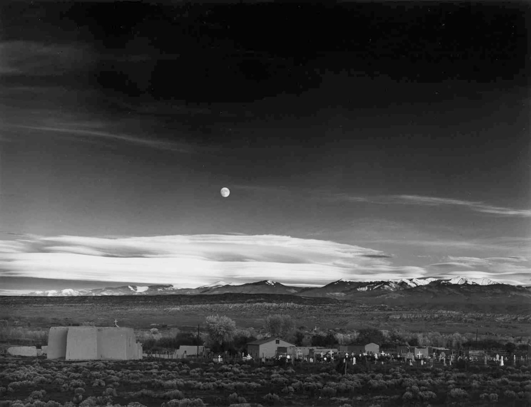
But, to be honest, how can you really make such a landscape more abstract or more surreal than the actual thing. The Southwest, and particularly the Colorado Plateau of northern Arizona and southern and central Utah, is a wonderland of geoforms, with buttes rising up and canyons dropping down. And in the popular mind, they have become a generic version of the American West, the place setting for countless cavalry-and-Indians movies, and endless TV series. 

The idea of a cartoonish Southwest landscape goes back before the Roadrunner. Beginning in 1913 and continuing until his death in 1944, cartoonist George Herriman filled Hearst newspapers with Krazy Kat comic strips, set in a bizarro world Coconino County, the original of which sits in northern Arizona. 

Although now famous, the Krazy Kat cartoon strips were not terribly popular when they first ran. They were too weird for popular tastes. Only because the big boss, Hearst himself, loved them, they continued until Herriman’s death. But since then, Krazy has become a cult favorite. 

Of course, just like the Roadrunner cartoons, they never changed. Gender-fluid Krazy is in love with Ignatz the mouse, who hurls bricks at the cat and is punished or admonished by Offissa Pup, the doggy policeman of Coconino County. A thousand changes are rung on the formula. 

And behind them, the surreal landscape that was a stylized version of the Four Corners region, a landscape Herriman himself came to love through many visits to the Kayenta area just south of Monument Valley.

But, it should be noted that Herriman wasn’t the first cartoonist to fall in love with the Western landscape. It is often stated that the first cartoon strip ever created was The Yellow Kid, by Richard Outcault, which ran in the Pulitzer and later Hearst papers at the end of the 19th century. But the prize for being first has an equal claimant in Jimmy Swinnerton (1875-1974), who began producing the Little Bears strip for the San Francisco Examiner a few years earlier than The Yellow Kid

Panel from Swinnerton comic strip, with Hopi kachinas

Like Herriman, the California-born Swinnerton loved the American West. When diagnosed with tuberculosis, he moved to Arizona. In 1922, he began a cartoon strip for Good Housekeeping magazine, titled Canyon Kiddies, about Navajo children and life in the Four Corners region. Each was a series of pictures with rhyming verse underneath. 

In one, he almost predicts the Roadrunner cartoons, as a coyote eyes a rabbit (instead of a roadrunner) but asks, “It’s simply terrible to have a meal/ That can run much faster than yourself.” 

Swinnerton was also a serious painter, and from the 1920s on, made many landscapes of the West. They were more realistic than his comic-strip landscapes, but were still a kind of stripped-down style that borrowed from the popular Art Deco esthetic of the times. 

That style has proved durable over the decades. There are artists who prefer a more detailed, more photographic style, but many others seem to have realized that a smoothed-out, simplified version of the landscape was perhaps more expressive. They emphasized tones and colors above detail. 

Maynard Dixon

Among the first serious artists who adopted the style was Maynard Dixon (1875-1946). Born in California, he later lived, and died, in Arizona. 

Dixon began as an illustrator and painter of a kind of generic California Impressionism, but his career hit its stride with the landscape of the West, and a more Modernist approach. 

What was a distinct style with Dixon later became a common vision for painters of the West. Simplified mesas and buttes, huge clouds above a low horizon, and dusty pastel colors. 

Maynard Dixon 

With Georgia O’Keeffe, geology turns almost to biology, as her many paintings of New Mexico seem almost like bulging muscles and twisting torsos. 

Of all the artists working in this style, no one did more to make the style personal. You can spot an O’Keeffe from the other side of the room. Who knew that the most stubbornly cussed Modernist painter of the Southwest could share so much with Roadrunner cartoons? 

What all these artists have in common is the reduction of sharp detail and an emphasis on color and general form. The desert Southwest surely demands such.

As the turn-of-the-20th-century art critic John C. Van Dyke wrote in his book, The Desert (1902): “Painters for years have been trying to put it upon canvas — this landscape of color, light, and air, with form almost obliterated, merely suggested, given only as a hint of the mysterious. Men like Corot and Monet have told us, again and again, that in painting, clearly delineated forms of mountains, valleys, trees, and rivers, kill the fine color-sentiment of the picture.”

Van Dyke continues: “The great struggle of the modern landscapist is to get on with the least possible form and to suggest everything by tones of color, shades of light, drifts of air. Why? Because these are the most sensuous qualities in nature and in art. The landscape that is the simplest in form and the finest in color is by all odds the most beautiful.”

Dixon (l.) and O’Keeffe (r.)

 In my years as an art critic in Arizona, I knew many artists who found the color more important than the texture. The Art Deco style of Dixon or (more idiosyncratically) O’Keeffe proved to be infinitely malleable for their work. 

Many more recent artists have adopted and adapted this style for their landscapes of the Southwest. 

Dennis Ziemienski (l.), Martin Sabransky (c.), and David Jonason (r.)

There is a thriving market for Western paintings. (I had to deal with quite a bit of it during my stretch as art critic in Arizona, where a kitschy version, called “Cowboy Art,” was popular in toney art galleries. These artworks, filled with bronco busters and noble Indians, were often painted with considerable technical skill, but very little originality — they were really more merchandise than art). 

But among the kitsch are quite a number of landscape artists, including Brett Allen Johnson … 

G. Russell Case … 

Gary Ernest Smith, who usually paints more Midwestern scenes, but occasionally gives a go at the Southwest … 

And Doug West, whose work is often done in silkscreen, or mimics the silkscreen style, which is the simplified color-and-shape taken to extremes. 

If you think we have wandered too far from the Roadrunner cartoons, they consider at least this one painting by Carol Bold:

Roadrunner cartoon (l.) and Carol Bold (r.)

But there are two artists I want to mention in particular, both of whom I knew back when I kept track of all the art being made in Arizona. 

The first is Ed Mell, who began his career painting fancy cars as a commercial illustrator. Not finding personal satisfaction as a New York advertising artist, he took a job teaching on the Hopi Indian Reservation and rediscovered the landscape of the Colorado Plateau. 

His early works tended to be influenced by Maynard Dixon, but as his career progressed, his painting tended to combine the Art Deco with a kind of Cubism, to what one might call “Cubist Deco.” More like the stylized landscape of the cartoons.

That Cubist Deco has made it to other artists, as well, including the above-mentioned David Jonason …

The other artist I want to bring up is Bill Schenck, who has also given us work in the Deco style …

But has also branched out into what can only be called a “paint-by-numbers” esthetic. It gives a hard edge to the otherwise more Impressionistic styles of his contemporaries. 

The style has also been mixed with the techniques of Bob Ross, to make a kind of “furniture store” art. One example shows up as a background to MSNBC security analyst Frank Figliuzzi. It is a painting by gallery-owner and artist Diana Madaras. 

And I couldn’t end this study without mentioning the Roadrunner esthetic of Wes Anderson’s Asteroid City

He even has a few appearances of a roadrunner, just to let you know, wink-wink.

I collected more than 200 images for this essay, and I had to leave out so many that I wanted to include. But there is only so much space, and so much attention willing to be subjected to this rabbit hole. 

But I did want to end with one final road runner, set in the landscape we’ve been discussing. 

Click on any image to enlarge

Kitao Shigemasa “Birds in Yellow Plum”

Recently I posted a piece about the history of naturalist illustration. It was a subject so huge — and with so many gorgeous images, that I could not begin to include some of my favorite things from the thousands of images I collected. 

For instance, I had to rule out all of the non-Western art, and some of my favorite non-scientific animal art. And so, I felt I should write a follow-up piece for a few of the leftovers. 

Most of the art I covered was meant to illustrate botanical collections in an era when new plants were constantly being added to the list of recognized species, and were meant to accompany scientific books written by specialists.


From “Plantae Asiaticae Rariores” of Nathaniel Wallich

For instance, there was Nathaniel Wallich, the Danish-born botanist who collected plants in India and published his Plantae Asiaticae Rariores in three volumes from 1830 to 1833, with illustrations by a half-dozen artists, both Indian and European. 

From “Treasury of Nature,” Albertus Seba

The collection I missed most in the earlier essay was Albertus Seba (1665-1736). His interest was less scientific and more one of abject curiosity. He collected tons of oddities from around the world in his “curiosity cabinet,” and in 1734 published his Locupletissimi Rerum Naturalium Thesauri Accurata Descriptio et Iconibus Artificiosissimus Expressio per Universam Physices Historiam (“A Careful Description and Exceedingly Artistic Expression in Pictures of the Exceedingly Rich Treasury of Nature Throughout the Entire History of Natural Science,” illustrated from beginning to end with engraved plates. 

Crab from Albertus Seba

The original 4-volume publication included 445 illustrations and Seba’s collecting helped Carl von Linne in his binomial classification system. 

But, there are tons of bird, plant, and animal pictures meant for the general public, mostly throughout the 19th century. 

Wood engravings of plants

Unfortunately, most of those artists worked anonymously, pumping out pictures for books, magazines and posters. Animals, especially those of exotic locales, were always popular pictures with the public. And most of those were made in the process called wood engraving — a bit like woodcuts, but made with a burin on the end-grain of dense hardwoods and printed very like a copper plate engraving. 

Wood engravings of animals

The best-known wood engravings were probably the book illustrations of Gustave Doré. But the technique was nearly ubiquitous in the Victorian era. 

From “A History of British Birds” by William Yarrell

Wood engravings occasionally accompanied serious scientific work, also, such as those in A History of British Birds, published in 1843 by William Yarrell (1784-1856). Its wood-engraving illustrations were carried out by two artists, Alexander Fussell and John Thompson. 

Such art is meant primarily to identify plants and animals, but sometimes an artist’s intent is merely to look closely at and study his subject. And, as with the botanical illustration, to separate the subject from its context to better see it on its own. 

Drawings by Leonardo da Vinci

Artists have always done this, often in sketches, sometimes as studies for larger, more serious and integrated paintings, sometimes purely for its own sake. Leonardo drew lots of them. 

Drawings by John Ruskin

And it was the very point that critic John Ruskin made in Victorian times for the art of drawing: He felt that sketching forced close observation and that essence was found in detail. He aimed his eye at plants, birds, even rock formations, to come to know them better. 

Drawings by Ruskin

The most significant class of nature art left out of my original essay are the many kachō-e prints and paintings by Japanese artists, ranging from the 17th century to the 20th. I was sorry to leave them out. 

Masayoshi, “Gray Thrush” 

Kachō-e are so-called “bird and flower” pictures, although the subjects include fish and insects, too. Their ancestry runs back to huaniaochua (“bird and flower” paintings) popular in Chinese beginning in the Tang dynasty (AD 618-907). 

The work influenced much of art throughout Asia, and came to Japan, popularized by translations of the Chinese classic instruction book, Manual of the Mustard Seed Garden, published in parts from 1679 to 1701. The final chapters instruct how to best paint huaniaochua-style art. 

Pages from “Manual of the Mustard Seed Garden” 

The Chinese influence was felt all through the continent, not only in Japan and Korea, but as far west as Persia, where it inspired the golomorgh (“Bird and Tree”) paintings popular in the Safavid period (1501-1736).

Golomorgh art

 In Islamic art, the paintings take on an allegorical bent, with the birds (sometimes butterflies) standing in for the lover and the flower for the beloved.

But by far the biggest influence was in Japanese art, and the popular ukiyo-e style, mostly woodblock prints made from the 18th through the early 20th century. Ukiyo-e (“Pictures of the floating world”) were popular images of famous actors, courtesans, historical figures, landscapes, genre scenes — and nature. The nature genre was called kachō-e, or “bird and flower pictures.” 

One of the early masters of the form was Kitagawa Utamaro (1753-1806). He published a Book of Birds ca. 1790 (the dating is often uncertain, as records were not always kept, and popular books were published and republished, often with new plates, or new cuttings of old designs — precise dating can be guesswork). 

Each image was matched to poetry, written in elegant calligraphy on the empty parts of the image. For this one, named for the mejiro, or Japanese White-Eye (on the left) and the enaga or Long-Tailed Tit (on the right) has two poems. The first: “Pushed out of his honey-filled nest following a fight, the white-eyes bird seems not to mind at all,” while the other says “Come and let yourself be mine; For us the nights will be as long as the tit’s tail.”

Utamaro followed with a Picture Book of Selected Insects, about the same time, which showed dragonflies, beetles, bees, grasshoppers and other buggy life on beautifully drawn leaves and flowers. When Viking Press published a beautiful facsimile edition of the book in 1984, they must have worried about the title, so they renamed it Songs of the Garden. Much more attractive. 

In the west, the two most famous ukiyo-e artists are Hokusai and Hiroshige, near contemporaries. They both made kachō-e prints. 

 Katsushika Hokusai (1760-1849) called himself “Old Man Mad with Painting,” and worked in every conceivable genre. He was a one-man image factory. His curiosity spanned everything he could come in contact with. He even experimented with linear perspective after coming in contact with European art. 

Hokusai manga

In his sketchbook, or manga, he made pictures of everything he saw. The black-and-white drawings were made into woodblock prints. He tried just about everything. (Most famous, of course, for his “Great Wave off Kanagawa,” which has been reproduced endlessly.)

There is a proverbial saying in Japan: “Hokusai is the greater artist, but I love Hiroshige more.” It is hard not to be entranced by the atmospheric and almost Impressionistic work of Utagawa Hiroshige (1797-1858). Known for his landscape images, he also made a pile of bird-and-flower prints. Most often in the elongated vertical format known as hosoban

There are so many of them, it is hard to choose just a few examples. 

But he also published several books of fish and sea creatures, a “small” book of fish and a “large” book, each titled as such. I cannot help but post as many of Hiroshige’s images as I can. They are so seductive and beautiful.

It is usually said — by snooty connoisseurs — that ukiyo-e standards began to decline in the 19th century and the genre ended by the 20th. But instead, I believe it simply changed with the exposure of Japanese artists to the rest of the world with the Meiji Restoration (1868). Where once Japan’s culture was insulated from the outside, it now opened its arms to new influences. 

Hiroshige and Van Gogh

(The artistic fertilization went in both directions, as ukiyo-e art began arriving in Europe and artists such as Van Gogh were blown away by the freshness and style of the Japanese prints.) 

And kachō-e changed from a popular and demotic art form to one created by new designers who saw themselves less as craftsmen and more as western-style “artists.” The esthetic, called shinsaku-hanga,  became more refined, if less adventurous. It was a retrospective art, honoring the masters and styles of the past. 

Birds by Kono Bairei

And artists such as Kono Bairei (1844-1895) continued the birds-and-flowers tradition, but with a turn to more naturalistic drawing, albeit in a stylized setting.

Bairei fish

He also took on fish. 

The work of Imao Kainen (1845-1924) maintains that almost-western realism in highly decorative compositions.

By Imao Kainen

The most famous of the shinsaku-hanga artists was probably Ohara Koson (1877-1945). He was a teacher at the Tokyo School of Fine Arts, and met American scholar Ernest Fenollosa, who encouraged him to export his bird prints to America. His work now sits in most American art museum collections. 

By Ohara Koson

It wasn’t only Van Gogh who responded to the Japanese style. One of my favorite and largely unknown illustrators of natural history was Charles Philip Hexom (1884-1959). He was a teacher at Luther College in Dacorah, Iowa, and made many cover illustrations for Nature Magazine from the 1920s into the early ’50s. 

The use of flat outlining and spot-color were common to both ukiyo-e and Hexom’s covers. 

I don’t know why the work of Charles Hexom hasn’t been collected and published in a book. He seems to have been forgotten. He deserves to be remembered.

Beatrix Potter watercolors

Nature art may be a sub-genre in the world of fine art, but it is a fertile one. One finds captivating and beautiful illustration everywhere. Beatrix Potter (1866-1943) before she became a children’s author, used her drawing talent to study nature. She became an expert on mushrooms and fungi. One of her admirers was the Pre-Raphaelite artist Sir John Everett Millais, who told her: “Plenty of people can draw, but you have observation.”

Again, I have left out so much. So, just as a little P.S. to this tiny essay, I want to mention the early paintings of my brother-in-law Mel Steele, who could paint rings around anyone even as a boy and moved on to bigger things and a long career.

And my own minor essay into the field as a photographer. I found that I could put live flowers on my flatbed scanner and get beautiful prints that could be reproduced in fine detail at almost any size. 

Friesia, iris and daffodils 

I have made many photographs of flowers, birds and insects, not so much to create art as to focus my attention on the world around me. Paying attention is, I believe, the prime directive for life.

Click on any image to enlarge

Nature is messy. I mean that in a good way. But it is all over the place, hugger-mugger, one thing on top of another and with the edges of one thing blending into that of the next. 

And humans have tried their best to regularize and organize all that mess since the beginning of time, naming plants and animals, setting up categories, deciding which bits might be edible, which poisonous, which to take when you have aches or fevers. 

One of the primary means of accomplishing this is visual. Certainly the main method is verbal: the naming and sorting. But a mere word description of a plant can be so convoluted as to be confusing on its own. Take this description of the black oak, from E. Lawrence Palmer’s Fieldbook of Natural History:

Quercus velutina: Tree to height of 125 ft; trunk diameter, 4.5 feet. Upper branches ascending, lower, horizontal. Bark dark, deep-fissured between thick ridges that are cross-fissured. Inner bark yellow, bitter. Twigs stout, angular with sharp-tipped angled buds with dirty-white to yellow fuzz. Leaves to 6 in. long and 4 in. wide, highly variable, thick.  Flowers staminate, in hairy catkins, to 6 in. long. Pistillate, on short, hairy stalks. Fruit and acorn maturing in second season.” Etc. And even that is written in simplified language for the lay person. The scientific literature is close to unreadable. And would this help you find a black oak in the woods? 

Wouldn’t it be easier, quicker, better, just to have a picture? Roger Tory Peterson thought so when he came up with the idea for his now-ubiquitous field guides. “There are at least 60 ways to say that a plant is not smooth, that it has fuzz, hair, prickles or roughness of some sorts,” he wrote in the introduction to his Field Guide to Wildflowers. And he lists them, including such arcane words as bullate, canescent, coriacious, echinate, flocculent, glanduliferous, hispidulous, lepidote, verrucose, and villosulous. It takes a lexicographer rather than a botanist to navigate such things. 

“That is why the best of keys often fail. … But, I am afraid, most of us belong to the picture-matching school.” Peterson began in 1934 with his A Field Guide to the Birds of Eastern and Central North America, which he updated with new editions — and new illustrations — until his death in 1996. The book has been immensely popular and remains so. Peterson branched out with a series of such field guides, covering wildflowers, trees, seashells, insects, fish, mammals — now more than 50 such guides, most written by specialists, while Peterson remained general editor until his death in 1996. 

Each book relies on drawings of the animals or plants in question. 

Of course, humans have been making pictures of the natural world since the beginning. The animals drawn the the caves of Lascaux date back something like 30,000 years. Egyptians painted notably realistic animals, such as the famous geese from the Chapel of Itet at Meidum from about 2590 B.C. Romans were fond of animal mosaic floors in the villas, and some are so accurate you can identify species. 

But the use of drawings for identifying plants or animals reached a new level of importance in the Middle Ages, when plants were used medicinally and books of drawings helped physicians identify the proper plant for the proper malady. 

Originally, these were manuscript books. But after Gutenberg, many were printed in quantity, offering advice on the best plants for the worst illnesses.  

Often these herbals or “medicinals” were at best diagrammatic. There purpose was simply to sort out which plants would be useful. But as the Renaissance flowered, and a more realistic style of image-making took over, many artists were attracted to the natural world, looking with ever sharper detail at the plants and animals around them. There are drawings and paintings by Leonardo, Raphael and others. But it would be hard to best the small naturalistic pictures by German artist Albrecht Dürer. 

But Dürer’s paintings are one-offs. As the 17th century progressed, a more systematic approach took hold, wherein artists as botanists attempted to catalog the plant life around them. 

One of the first such attempts was the Hortus Eystettensis, edited by Basilius Besler (1561-1629) beginning in 1613 and spread over several years. It was a collection of copper-plate engravings of the plants collected by the prince-bishop of Eichstätt in Bavaria for his palace garden, which contained examples of all the shrubs and flowering plants known at the time, from around the world. 

The book contained images of 1,084 species, divided into 357 plates. A cheaper black and white version was supplemented by a luxury edition in which the images where hand-colored. The book changed botanical illustration overnight. What had been crude and diagrammatic became works of art. 

Soon in its heals came Hortus Floridus, a collection of 160 engravings of flowering plants published in 1616, which became so popular its Latin text was soon translated into Dutch, French, and English editions. The book, in modern editions is still available today. It was created by Dutch engraver Crispijn van de Passe the Younger (1595-1670), a popular and prolific engraver of the Dutch Golden Age. 

Such books of engravings, colored or not, appeared throughout the century, with Louis XIV’s official painter, Nicolas Robert (1614-1685), producing illustrations in 1640, 1660, and entries in the giant compendium  Recueil des Plantes published in 1676. 

His drawings and paintings, as well as the engravings made, were of a new freshness and delicacy and presaged a surge in flower pictures made not simply for identification purposes, but as esthetic objects — as art. 

As the 18th century began, these two strains of botanical illustration developed. On one hand, there was a rise in scientific exploration, with botanists traveling the world collecting new species of plant and animal previously unknown to European science. On the other, there was a growing market for books and images of pretty flowers. The two traditions flourished side by side, but also cross-pollenated. 

That market for flower pictures was given a jump start by the Dutch tulip craze of the 1630s, when speculation in the market for rare tulips created a financial bubble that burst in 1637. But the Dutch economy was expansive and a growing middle class had money to spend on luxury items such as art. The actual tulip mania was confined to a small but important few speculators, the public at large wanted their part and so prompted the production of pictures of the fanciest tulips. If you couldn’t afford a tulip bulb that cost as much as a house, you could afford a colored engraving of the same flower. And so, pictures of flowers became a thing.

There had always been still-life paintings: pictures of flowers in vases; even kitchen scenes with food on the table and game hanging above. But what I am interested in here are those images of singular plants, birds, or animals, usually devoid of background context, meant to show off the specimen to best advantage. Where still life is meant to elicit warm feelings of comfort and beauty, the botanical illustration is meant to focus attention on a particular item, to see it for itself alone. 

The 17th and 18th centuries were the great era of cataloguing the world, and it led to a plethora of illustration of new and exotic species as scientists accompanied military explorers around the globe, gathering natural history data and both collecting specimens and illustrating them, usually in books. 

Dutch-born Nikolaus Joseph von Jacquin (1727-1817), for instance, travelled to the West Indies, Central and South America, publishing prolifically throughout the 18th century. 

Sometimes, they went on their own, like the Polish Jacob Breyne (1637-1697), who travelled to South Africa and catalogued plants. 

Austrian Franz Bauer (1760-1826) went to Australia, collecting and painting what he found.

Englishman Mark Catesby (1683-1749) sailed to the New World, publishing his Natural History of Carolina, Florida and the Bahama Islands in volumes between 1729 and 1747.

Henri-Lois Duhamel de Monceau (1700-1782) was a French  Encyclopedist, writing on many subjects, but catalogued the flora of his native France over his long lifetime, including his 1768 Treatise on Trees and Shrubs

Likewise, Englishman Thomas Bewick (1753-1828) stayed at home and made wood engravings of his native animals and birds. 

Grub Street writer Oliver Goldsmith neither drew nor painted, but his enormously popular Natural History of the Earth and Animated Nature, first published in 8 volumes in 1774, went through many subsequent editions, each time copiously illustrated by an army of anonymous engravers. 

As the 18th crossed over into the 19th century, two men characterized the two thrusts of botanical illustration. 

William Bartram (1739-1823) traveled through the New World exploring for flora and fauna. His book, Travels through North and South Carolina, Georgia, East and West Florida, the Cherokee Country (1791), is still in print, usually known just as “Bartram’s Travels,” and covers his travels through Georgia, Florida and western North Carolina and is a readable a travel book as it is important as a naturalist survey. 

The other impulse for botanical illustration is the creation of art for the beauty of it. And no one did more for that than Pierre-Joseph Redouté, whose images of roses and lilies are still popular in framed prints to hang in tasteful middle class homes. As Wikipedia puts it: “Reproductions of his prints are available from virtually all print and poster shops.”

Redoute’s life was fascinating. He was official illustrator to Queen Marie Antoinette, and somehow survived with his head after the French Revolution and the Terror, despite his aristocratic credentials, and lived to become official artist for Empress Joséphine de Beauharnais and then survived her divorce from Napoleon Bonaparte, only later to be made Chevalier de Legion d’Honeur, France’s highest honor, and his work bought by Charles X. 

His early work was watercolor, but later in life, much of his art was engraved and hand-colored or turned into chromolithographs. And now, there are boatloads of books featuring Redouté’s art. 

Two developments affected the publication of prints of the natural world as the 19th century overtook the 18th. One was the mainstreaming of colonialism, and the number of biologists and artists who traveled to the new lands to catalog the flora and fauna. 

In the 18th century, much of the exploration was just to find out what was out there, to discover new Pacific islands or what was going on in the polar regions. But in the next century, the drive was to exploit what the colonies offered, and to do that meant to catalog all the new things these colonial toyboxes had to offer. 

And so, scientists such as Philipp Frans van Siebold (1796-1855) went to Japan; Nathaniel Wallich (1786-1854) went to India; Johann Joseph Peyritsch (1835-1889) went to Sudan. They collected specimens and wrote books illustrated by a host of artists who made illustrations from the specimens they brought back. 

One of the artists employed by the botanists was Walter Hood Fitch (1813-1892). Fitch supplied many of the illustrations for John Dalton Hooker’s 1855 Flora Indica, a survey of plants of India and the Himalaya mountains. 

While botanical illustration comprised maybe 80 percent of all natural history artwork, much was done with animals, too, and even such things as seashells, rock types, and landforms. 

Colonialism brought in an infection called “scientific racism,” and natural history illustration looked not only at flora and fauna, but at human beings, typing them just as they did genus and species of orchid. 

There was almost a mania to classify and name everything. 

The second development was the invention of lithography, in 1796, which gave both scientists and artists a better means of mass producing images. 

The first botanical illustrations were either drawings or paintings, and the first reproductions were by woodcut. But copper-plate engraving supplanted the coarse woodcut and those engravings were often hand-colored, an expensive and time-consuming process for publication. 

For instance, when John James Audubon (1785-1851) published his original edition of Birds of America in England, in sets from 1827 to 1838, at least 50 colorists were employed and no more than about 200 full sets were printed. 

But lithography, and later chromolithography, allowed much larger editions of prints and mass production of images. The later work of Redouté was made with the new process. And when Audubon came to work on his later Viviparous Quadrupeds of North America (published in 1851, after his death) the images were lithographs. 

Of course, the most famous natural history art has to be Audubon’s Birds of America. He initially produced 435 large-scale plates, each with life-size images of the birds he drew and painted in his travels through America. The plates were engraved and etched and hand colored. The pages were called “double elephant” size — roughly 28 inches by 40 inches — and you can see he had to contort some of the larger birds, such as the flamingo, to fit those pages and still have them life size. 

Later editions came in smaller pages. 

The market for natural history imagery was immense during Victorian times and the number of artists working in the field from the late 18th- through the 19th-century was to great for me to cover them all. But I wanted to show off a few of them. 

Such as Matthias Schmutzer (1752-1824), who produced 1433 plates for Das Florilegium Kaiser Franz I, a compendium of plants from the garden of Emperor Francis I, the final emperor of the Holy Roman Empire and first of the Austrian Empire.

And I should mention the father-son pair of William Jackson Hooker (1785-1865), a botanist and illustrator and first director of Kew Garden in London. Hooker published more than 20 major botanical works over a period of 50 years. 

His son, Joseph Dalton Hooker (1817-1911), who succeeded his father as director of Kew, and was Charles Darwin’s friend. He joined expeditions to the Antarctic, Palestine, Morocco, the Himalayas, and the western United States, collecting specimens along the way, and publishing books on what he found, illustrated by many familiar botanical illustrators of the time, including Fitch. 

By the late 19th century, photography began to take over. The earliest I can find is an 1879 set of botanical photographs by Pietro Guidi. The black and white images still had to be hand-colored, just as the old engravings had to be. 

And by the fin-de-siecle, as art nouveau gathered steam, the link between nature and art became important. Nature motifs played out in furniture, architecture, book design and painting. Several artists and scientists became immersed in the subject.

Ernst Haeckel (1834-1919) was a biologist obsessed with Darwin and symmetry. His Kunstformen der Natur (“Art Forms in Nature”), published in 1904. It consists of 100 prints of various organisms, many of which were first described by Haeckel himself. Haeckel’s intricate drawings were transferred to print by lithographer Adolf Giltsch. 

In 1929, professor Karl Blossfeldt (1865-1932) used photography to express the relationship between nature and modern art in his Urformen der Kunst (“Original forms in Art” or “Art Forms in Nature”). His purpose was pedagogical, teaching his art students to seek for inspiration in natural forms.

This cataloguing and regularizing tendency in German art extended beyond botany and zoology. In the 1920s and ’30s, photographer August Sander attempted to photograph all the jobs and professions in Weimar Germany, and later, Bernd and Hilla Becher made multiple images of German water towers, mining tipples, cooling towers, grain elevators, coke ovens, and blast furnaces, among other things. Those images, made mostly from the 1960s through the 1990s were part of a movement dubbed the “New Objectivity.” 

But back to nature: It is hard to overemphasize the attractiveness and popularity of natural images, especially birds and flowers. 

Charles Philip Hexom (1884-1959) executed a series of covers for Nature Magazine in the 1930s and ’40s. I have collected several of these. They are simple but elegant. 

Irving Penn (1917-2009) published Flowers in 1980 and the perfection and simplicity of the photographs remind one of Redouté.

And finally, for our purposes, Robert Mapplethorpe photographed flowers over his whole career, with his book, Flowers, coming out posthumously in 1990. 

This has been a short, embarrassingly incomplete survey of botanical and natural history illustrations from the late Roman Empire until the Post-Modern age. Whole books have been written on the subject and more will likely be published in the future. 

I consulted about 20 books for this essay, among them are: The Art of Natural History by S. Peter Dance; The Painter as Naturalist: from Dürer to Redouté, by Madeleine Pinault; Un Jardin d’Eden by H. Walter Lack; and Flora: An Illustrated History of the Garden Flower, by Brent Elliott. 

Click on any image to enlarge

This is a toaster. Something so banal that in our ordinary lives, we hardly notice or look at it. Actually this is a picture of a toaster, which is a remove from the real thing. But then, so is the word “toaster,” which is also not the real thing, but a remove from the reality. 

For most of us, most of the time, seeing something — like the toaster — means being able to name it and move on to something more interesting or more immediately useful. The image in the picture functions as a pictogram, or a different “spelling” of the word. We read the image as if it were the word. 

Pictogram to “read” as teapot; teapot image as “seen”

It is how we respond to most images that bombard our daily lives. We name the item seen. It has been categorized, filed and forgotten. Our lives are too busy to spend any time remarking that the toaster is yellow, or made of plastic, or has rounded corners. These details are of no particular use when fixing our morning bagel, and so, they might as well be invisible. 

Of course, being able to recognize things quickly is a survival skill, and humans have survived these hundreds of thousands of years precisely because they could point quickly and yell, “Tiger!” So, I’m not pooh-poohing that ability categorically. 

But life is about more than just survival. The things of this world are bursting with sense data that gets ignored by reading rather than seeing the visible world. The toaster was designed to have an esthetic impact; the yellow was chosen to be pleasing to the eye; the curves were worked in to make the shape more inviting than it would be if it were all pointy edges. 

We are embedded in a universe of things — a material world — and all of those things have physical and sensuous properties. They have shape, color, heft, texture, volume, solidity or softness, shine or roughness. And all of these properties make up the elements of art, and one of the jobs art does  is to remind us of these delights we normally pay no attention to. Art reminds us we are alive. 

Any life can be enriched simply by paying attention. To notice the yellow, the curve, the size and shape. In fact, to those awake to the world, it is all art — and the emotional richness that the awareness brings. 

It is one of the things artists were doing at the beginning of the last century when they began making abstract art: art about the color, shape, texture, without a nameable subject. 

Of course, artists have always paid attention to these visual qualities. Just because a painting is of a still life, and we can name the objects, doesn’t mean that the artist wasn’t obsessed with the sensuous truth. 

And so, it is a worthwhile exercise to occasionally attempt to forget what you know and see the things of your life freshly, as if you didn’t know the names, but saw only the qualities. 

Humanity is varied in its ability to see beyond the names. It takes an imagination — a way of turning off your rational mind to see only the vital facts and not their meaning or use. Some people have the hardest time: I remember one woman who was asked to close her eyes and describe what she could see in her mind’s eye, and her answer was “With my eyes closed, I see only black.” 

But attempting to see past the names of things is deeply rewarding. The pleasure of colors, shapes, designs, apprehended primally enriches our lives immeasurably. 

Certainly the natural world invites us with color and beauty. But it isn’t just the flowers and trees, the birds and the clouds. Everyday items can be appreciated for their roundness, plumpness, hardness, color, shape, even the feel under your fingertips. 

Many eons ago, when I was teaching photography at a two-year college, one of the assignments I gave my students was to photograph something in such a way I could not tell what it was. I made sure they understood that I didn’t mean just out-of-focus, or so badly lit it was murk. But to see something from a different angle, or to find a meaningful detail and separate it out. 

The purpose was to help them see without depending on what they already knew things looked like. To see directly. 

For example, here’s something most people see almost every day. 

Did you spot what it is? It is a view of your driver’s side rear view mirror as you approach the door to open it. A great big globular shape. 

One of my favorite images is one taken by Voyager II in 1983 as it passed the (then) planet Pluto and snapped this image of its moon, Charon. And compare with the more recent, and clearer image taken by NASA’s New Horizons space probe on its flyby in 2015. 

Actually, that’s a lie. The image on the left is a doorknob. 

And so, here’s a little quiz. These photographs were taken to illustrate the shapes, colors and textures of ordinary objects, but seen in fresh ways. But they are still recognizable, if you can spot them. Can you tell what they are? The answers are at the end of the column. 

1

2

3

4

5

6

7

8


10

Even when you are not trying to be tricky, it is good to pay attention to the physical properties of the things of the world. Those shapes make images more memorable. And there are shapes all around.

A doorway turned into a check-mark

A paper tissue half out of a box

A kitchen strainer

We are alive on this planet for such a short time, and there is so much to take in. With our five senses we are privy to such delight and can never exhaust the riches around us. But we must be open to them, aware of them, awake to them. 

Learning to see is a part of art education. To see a picture of a giraffe and point, like a first-grader, and say, “Giraffe,” is not seeing. But take up a pencil and attempt to capture what you see on paper will teach you what things really look like. Paying attention is the great secret of life. 

Quiz answers: 1. Paper plates; 2. Work glove; 3. Windshield wiper; 4. Measuring spoons and ceramic duck head towel hook; 5. Old Oxford cloth shirt; 6. Toilet paper; 7. Plastic mixing bowls; 8. Pop-open gas-cap cover for Buick; 9. Ceiling fan lamp fixture; 10. Assorted shopping bags. 

Click on any image to enlarge

I’m tired of hearing that we live in a visual culture. The fact is, we are generally very bad at seeing. I am constantly reminded of this by bad signage, bad book design, bad photographs, and bad TV. To say nothing of the horror that is TikTok. 

It may be true that we like to use images instead of text whenever we can, but we also tend to treat the images as if they were text: That is, we turn them into the equivalent of hieroglyphs or rebuses. Hence the popularity of emojis. 

But seeing a picture of a house and thinking “house,” is really just turning a picture into a word. Yes, no alphabetic letters need be used, but the information conveyed is basically the same. That is not seeing; it is translating. 

I am reminded of this because of a frequent problem I find on some back-channel TV stations when they broadcast a program in the wrong aspect ratio. It is a visual goof that bothers me no end, and yet, so many people, when I point it out, simply don’t notice it. Faces can be squeezed thin or stretched fat and the visual-verbal translation isn’t affected, and therefore, not noticed. 


Believe me, I’ve been laughed at for fussing over aspect ratio. But how can people not SEE? The visual information is distorted even if the verbal information is left unbothered. 

Aspect ratio is simply the ratio of the width of an image compared with its height. A square is the same in both measurements, and hence, its ratio — its aspect ratio — is one-to-one — 1:1. 

If a rectangle is twice as wide as it is tall, its aspect ratio is 2:1. 

When photographs are made, or films or TV is shot, they are created in a particular aspect ratio. For instance, for decades, the standard aspect ratio for Hollywood films was 1.375:1, which was adopted in 1932 for the entire industry. Before that, silent films were mostly shot in a 1.33:1 ratio, which can also be stated as a 4:3 ratio, which corresponded to four sprocket-holes on standard 35mm film. But when sound was added as an extra track alongside the image on the film, the picture had to be made a wee bit smaller to accommodate, and hence, the 1.375:1 ratio. 

That all sounds very technical and who cares? Well, what happens, then, when you display an old film on a new TV, which are now standardize at an aspect ratio of 16:9, a “widescreen” ratio? When done right, you get a “letterboxed” image, with black bars on either side of the picture. When done wrong, the squarer image is stretched out to fill the wider screen and you get a lot of fat people. 

This used to be a big problem in the early days of digital television, when many stations heard complaints about those letterboxed images. The response was to crop the movies down to fit the screen, losing a good bit of visual information in the process (a process dubbed “pan and scan”), or — too often — just stretch it all out to fit. To anyone sensitive to visuals, this was a nightmare. But again, many people — especially at the TV stations mutilating the images — just didn’t seem to think it important. 

The reverse also happens when a real widescreen movie (some films are made in aspect ratios wider than 16:9, such as the 2.4:1 of the most widely used widescreen movies. Then, shown on a standard TV screen, you get everything squished down. 

Many of these widescreen movies were shot with anamorphic lenses, which allowed for a wider image to fit onto a narrower piece of film. In essence, they squeezed the picture thin on purpose, and then when it was projected in a theater, a reverse anamorphic projection lens would spread the image back out to its natural dimensions. Tons of films were made (and are made) this way. 

The problem shows up with DVDs, too. Some are produced in a natural aspect ratio, usually 16:9, but others, mostly older ones, were created anamorphically, and so you may need to use your remote to find the proper aspect ratio (or “screen size”) for the disc. If not, you watch squeezed people. 

I remember when my college film series showed a version of Bad Day at Black Rock but didn’t correct the anamorphic images. We watched the whole movie distorted into a squished frame. It was nauseating, at least to me. The projectionist, when this was pointed out, said he didn’t see what I was talking about. (The same projectionist showed Birth of a Nation with the music track turned off because “it’s a silent film.” There is no accounting for how these people get in charge of things.) 

Most all of us have something like this, which bothers us no end. For some it is bad spelling or incorrect grammar. For others, it is making too much noise when eating soup. Others still cannot bear canned laughter on sitcoms, or the superfluous chyrons streaming across the bottoms of cable newscasts, telling us exactly what the speaker is saying. We can hear them, you know. You don’t need to spell it out. 

Anyway, one of those irritations that just drives me nuts is the inability of so many to actually notice when the picture has gone bad on their TV. The wider the original, the squishier the mistake. I remember seeing an early broadcast of The Good, The Bad and The Ugly scrunched into an old cathode-ray TV screen, like a closed accordion, and I thought, “How can poor Clint Eastwood even breathe?”

The aspect ratio problem, though, is really just a symptom of a wider issue: that too many of us are just bad at seeing, of not paying attention to what our eyes are telling us. It is the translation problem: We don’t see to see, we see to extract only so much information as we feel we need. If we can follow the plot with skinny people, then good enough. 

But seeing isn’t just about keeping track of the story. It is about being alive in the world, of noticing everything around you, of taking in what existence gifts you with. The green of a tree, the roundness of a tire, the texture of denim. To notice is to be alive; failure to notice is deadening. 

Art, and I include even popular art, is there to remind us of, and to interpret, the world we live in and the lives we lead. The best art slaps us awake, the way the slap of the doctor makes the newborn take its first breath. We can see what we had taken for granted, we can reinterpret what had become habitual. Failure to use your eyes is to refuse a gift being offered by existence. 

Click any image to enlarge

Many years ago, my late wife bought me a copy of A Book of Clouds, published in 1925 by author William A. Quayle. It is a hefty clothbound volume, primarily of old black-and-white photographs of clouds, layered with Quayle’s particular garish encomia and reminiscence about the glories of skywatching. 

Clouds seem to bring out the gooey and poeticizing cliches in a writer. “I was kinsman of the clouds,” Quayle writes. “And as I grew, the clouds still sailed their crafts of  snowy sail across the blue sea of my heart. Clouds, so to say, were indigenous to my soul. I did not begin to notice them: I always noticed them. I did not learn to love them: I always loved them.” 

The book is fervid with such expostulations: “When clouds give reports of portentous skies, of prepending tempests, when they are black as pools of midnight water, their eminences wrinkled as if zigzag lightnings had been the shears which cut their patterns, then as the sun lurches behind their darkness, the fine fire that rims them and seizes all their peaks gives a touch of delirium to the soul.”  

I love this book, for all its gushy writing, because Carole gave it to me, and because, in an era of irony and unbelief, there is something utterly sincere under the purple prose. 

A few years later, she gave me another book, The Cloud Collector’s Handbook by Gavin Pretor-Pinney, a small volume and kind of a field guide to cloud identification — almost a Peterson guide. In it, Pretor-Pinney gives genus and species names of various formations, implying that a taxonomy of anything as gaseous and impermanent as a cloud might be spoken of almost as if it were a wildflower or a bunting. 

And so, there are is a list of Latinate names, not just the familiar “cumulus” and “cirrus,” but also “lenticularis,” “castellanus,” “radiatus,” and “undulatus.” Carl von Linné would have been proud. Each page is devoted to another cloud form, or cloud-related or -adjacent subjects: “pileus,” “virga,” “nacreous,” “noctilucent,” etc. It’s lots of fun. 

Pretor-Pinney, it turns out, is a veritable cheerleader for cloud watching. His full name is Gavin Edmund Pretor-Pinney, son of Anthony Robert Edmund Pretor-Pinney and Laura Uppercu, daughter of George Winthrop Haight — in other words, he’s British and has the “twitcher’s” enthusiasm, but for clouds rather than finches. And in 2004, he founded the Cloud Appreciation Society and two years later, wrote both The Cloud Collector’s Handbook and The Cloudspotter’s Guide. In 2019, he wrote A Cloud A Day, which features 365 cloud images accompanied with a short piece of cloud science, an inspiring sky quotation or a detail of the sky depicted in a classic painting. 

The Society has its website (link here) and features galleries of cloud art by painter-members, collections of cloud poetry, and many, many photographs. The paintings are especially entertaining, and hugely varied in approach.

Artists L-R — Top: Peter Nisbet; Carol McCumber; Elizabeth Busey. Bottom: Judy Friesem; Jethro Buck; Barbara Miller. 

And there is a Cloud Appreciation Manifesto (of course, there is): 

“We believe that clouds are unjustly maligned and that life would be immeasurably poorer without them. We think that clouds are Nature’s poetry, and the most egalitarian of her displays, since everyone can have a fantastic view of them.

“We pledge to fight ‘blue-sky thinking’ wherever we find it. Life would be dull if we had to look up at cloudless monotony day after day. We seek to remind people that clouds are expressions of the atmosphere’s moods, and can be read like those of a person’s countenance. We believe that clouds are for dreamers and their contemplation benefits the soul. Indeed, all who consider the shapes they see in them will save money on psychoanalysis bills.

“And so we say to all who’ll listen: Look up, marvel at the ephemeral beauty, and always remember to live life with your head in the clouds!”

Of course, Pretor-Pinney isn’t alone. 

There are loads of books, including a raft of children’s books, all about clouds. 


The sky is a slate upon which we can project our sense of beauty, our sense of meaning, the expanse of creation, and the progress of time. We look up and always, it is new. Always it is moving. To rephrase Heraclitus, you can never look at the same sky twice. 

And the sky has been there in painting for centuries, but usually as a background for more important goings-on in the foreground. Then, in the late 18th- and early 19th-centuries several artists began studying the clouds and the sky for its own sake.

Most famously, a series of cloud studies by John Constable and sketches by Alexander Cozens. 

Cozens:

Constable:

“Clouds, for Constable, were a source of feeling and perception, an ‘Organ of sentiment’ (heart or lungs) as much as meteorological phenomena,” writes author Mary Jacobus in the book Romantic Things: A Tree, a Rock, a Cloud. “If painting is another name for feeling, and the sky an organ of sentiment, then his cloud sketches are less a notation of changing weather effects than a series of Romantic lyrics: exhalations and exclamations, meditations and reflections, attached to a specific location and moment in time.”

In other words, the clouds, either painted or merely watched, become a subject for contemplation, even meditation. Beginning in the 20th century, paintings became increasingly abstract and the point being not subject matter but the substance of paint — color, shape, line, form, design. To look at a Jackson Pollock painting, or one by Mark Rothko, you are asked not to name a subject matter, but to relate the canvas to human affect, i.e., what does the painting make you feel?

A number of artists and photographers have turned to clouds to make images that are both abstract and descriptive. The clouds themselves provide the abstraction. 

At the beginning of the 20th century, Modernist photographer Alfred Stieglitz made a tremendous series of images of clouds, which he titled, “Equivalents,” meaning that the visual was an equivalent of the emotion. 

He made more than 200 such images, with the intent that they could express emotions, much as music can, purely by abstraction. They are images of actual clouds, but they are also shapes on a piece of photographic paper. You can see them as photographs of the sky, or as pure abstractions. Either way, for Stieglitz, the important part was that an emotion be evoked. 


Another photographer, Edward Weston made pictures of clouds through his lifetime, less consciously manipulated than Stieglitz’s, but cloud abstractions nonetheless. 

The German painter Gerhard Richter made a series of cloud paintings in the 1970s. A Sotheby’s catalog said, “the clouds are caught in a moment of confrontation between the painterly and the photographic, the representative and the abstract, the natural and the supernatural.” Much of Richter’s art is political or otherwise Postmodern tricks about the nature of art itself. As for the clouds, Richter himself said, “I felt like painting something beautiful.”

He kept a notebook of images, which he called “Atlas,” in which he kept many sketches, photos and paintings of everyday items, and a whole section on nothing but clouds. 

I have made countless photographs of clouds. I step out of the house pretty much every day, just to look up and watch clouds. They keep my eyes fresh and my mind invigorated. I have two books I have made: one of images of landforms and clouds seen from my airplane window; and a second of clouds pictures made all on a single afternoon in Arizona during the rising and waning of a monsoon storm. They can be viewed online here and here

When we spend as much time indoors as most people have these past two pandemic years, it is a relief to refocus our eyes outward (and upward) to a distance beyond the four walls. The clouds are far enough that our stereoscopic vision interprets the distance as indistinguishable from infinity. That refocus is necessary to keep us in touch with the greater things. Too often our eyes are focused on electronic screens held less than arms distant. Stretch your eyes back out. Look up. Keep watching the skies. 

Click on any image to enlarge

It’s completely meaningless to rate art. Is Picasso greater than Rembrandt? Beethoven than Mozart? Is Beethoven’s Fifth better than Beethoven’s Eroica? Pointless.

But there is a different question: faves. It’s possible to have favorites without making claims to supremacy. We all have them. Yes, they shift over the years: The older me appreciates different art and appreciates it in different ways than the young me did. But even day-to-day the favorites may change. Often my favorite symphony is the one I’m listening to at the moment. 

Still, Top Ten lists will be made. Or Top Five, or Top 100. There’s no hope for it. It’s instinctive, built into our DNA. And so, I’ve put together my list of my Top Dozen  favorite works of art — a baker’s dozen. Your mileage may vary. (For the ultimate list of lists, link here). 

And so, here are my favorites, listed by genre. I’ve tried to narrow my choices to art I have experienced in person — paintings I have actually seen, dances I have attended, books I have read. Book reproductions or sound recordings don’t count. I have a lifetime of art-going and concert-attending, and so I may have access to more than the average bear. But I am well aware that there’s a whole lot more that I haven’t seen. 

And by favorite, I don’t just mean something I like, but rather, something that has wormed into my very being and become a part of who I am, so that encountering it can explain to others a bit of who I am. It has been grafted into my personality. 

This list is entirely personal, flexible and apologetically incomplete. Ask me again tomorrow and this could be a very different list. 

Painting: None of these choices changes more often than painting. today’s favorite fades with tomorrow’s. I’ve simply come to love too many paintings to have a single choice. But today, I will go with Jackson Pollock’s Blue Poles. It was a painting I had wanted to see for years, and then got my chance when the Museum of Modern Art held a Pollock retrospective in 1998 and the elusive work was borrowed back from Australia, where it had sat for decades, out of the reach of us Northern Hemisphere shut-ins. Its appeal came from its elusiveness, for sure, but also for its unique place in Pollock’s catalog — more than just paint squiggles, it had the structure of the bars across its surface. I loved it in reproduction, but it bowled me over in person. 

Alternate takes: Picasso’s Guernica; John Singleton Copley’s Watson and the Shark

Sculpture: I grew up visiting the American Museum of Natural History in New York City as often as I could. I loved the place — and I mean loved. And deep in its bowels resided the giant Olmec head, chiseled from basalt (actually, the one in New York is a plaster copy, but I didn’t know that when I was 10 years old and rapt in wonder). In the darkened hall of the museum, the head seemed immense and the original weighs 20 tons. It impressed me no end and to this day, it is my favorite sculpture. No doubt there is other, more important sculpture elsewhere, but I have not been to Rome or Egypt to see them. I have spent considerable time in the Louvre in Paris and have several faves there, such as the Three Graces or the Winged Victory, but none has stuck in my psyche with quite the force of the Olmec head. 

Alternate takes: Rodin’s Burghers of Calais; Louvre’s Three Graces

Architecture: As architecture critic for The Arizona Republic, I got to visit a lot of buildings, including most of the Frank Lloyd Wright sites in the U.S. (Wright was a longtime resident of Scottsdale, Ariz.) I was blown away by Taliesin in Wisconsin and his studio in Oak Park, Ill. But the building that struck me as most beautiful was Falling Water in Pennsylvania. Everything you have ever heard about it is true — about its siting in the woods over the waterfall; about how its interior is micromanaged by Wright’s designs; and (I’m one of the few who have been given access to this) the pathetic orphan of a bathroom hidden in the basement. Wright really didn’t like having to deal with kitchens or bathrooms. 

Alternate takes: Chartres cathedral; George Washington Bridge

Orchestral music: this is the hardest category for me because I have so much music bottled up in the ol’ storage batteries, and faves change not only day to day, but hour to hour. But I studied Mozart’s Symphony in G-minor, K. 550, score in hand, for most of an entire semester in college and it is drilled into my memory so that I can hear the whole thing in my head, from beginning to end, even without the score. If ever a piece of music felt like home to me, it is Mozart’s 40th Symphony. Dissecting it has given me an approach to all other classical music. 

Alternate takes: Mahler’s Symphony No. 3; Stravinsky’s Rite of Spring

Choral music: I’m not a religious man, and neither was Johannes Brahms, so his German Requiem can console my most grief-stricken moments in a way more devout music cannot. More than any other music, I go to the Deutsches Requiem for consolation and peace. Each year, on the anniversary of the death of my wife, I drive up the Blue Ridge Parkway, find a quiet forest road and park and listen to my Brahms and weep for my loss and for the loss all humankind must suffer. 

Alternate takes: Haydn’s Creation; Rachmaninoff All-Night Vigil

Chamber music: I want so much to claim Schubert’s C-major String Quintet, for it is the deepest, most emotionally moving piece of chamber music in the repertoire. Yet, I cannot, as long as there is Schubert’s competing “Trout” Quintet, which must be the most ebullient, life-affirming piece of music ever written. One cannot come away from it not feeling — despite all the sorrows of the world — that life is pure joy. It is no end of astonishment for me that Schubert wrote both. 

Alternate takes: Brahms Clarinet Quintet; Shostakovich Piano Trio No. 2 

Opera: Mozart’s most subversive opera wasn’t The Marriage of Figaro, which was often banned for making fun of the aristocracy, but rather Don Giovanni, with its lusty chorus of “Viva la libertad” and its turning topsy-turvy the villain-hero model. The Don is the life force embodied, for good and bad, and when he is threatened with hell, he laughs and refuses to recant, choosing damnation over hypocrisy. Its first act is the most completely flawless in all of opera history and despite the phony ending usually tacked-on to the second act, a model of moral complexity. 

Alternate takes: Alban Berg’s Wozzeck; Richard Strauss’s Der Rosenkavalier 

Dance: Of all the artforms, dance moves me the most. And I was extremely lucky, because when I became dance critic, Ballet Arizona was taken over by Ib Andersen, former star dancer for George Balanchine and brilliant choreographer himself. He staged many Balanchine ballets and I was hooked. I have now seen Balanchine’s Apollo four times, once by the New York City Ballet in Paris, and I cannot watch it now without welling up with emotion. I love dance and Apollo stands in for all of it. 

Alternate takes: Ib Andersen’s choreography for Prokofiev’s Romeo and Juliet; Frances Smith Cohen’s choreography for Center Dance Ensemble’s Rite of Spring

Theater: Bad theater, or worse, mediocre theater can give the impression that live drama is hopelessly, well, theatrical. You know: dinner theater. But when it is done well, there is nothing that can match it, a lesson I learned by seeing the original Broadway production of Tony Kushner’s Angels in America. I’ve now seen it — both parts together — four times and it destroys me every time. In great theater, you soon forget all the artifice and everything becomes immediate and real. Movies are great, but they can’t match the breathing now-ness of live theater. 

Alternate takes: Eugene O’Neill’s Long Day’s Journey into Night; Peter Shaffer’s Amadeus

Film: There are films that are exciting, films that are visually beautiful, that are clever, that are cultural barometers, and there are films that are wise. Jean Renoir’s La Règle du Jeu has informed my own life more than any other film I’ve seen. How can you beat Octave’s observation: “The terrible thing about life is that everybody has their reasons.” I will watch Rules of the Game over and over for the rest of my life. It is cinematic comfort food. 

Alternative takes: Andrei Tarkovsky’s Andrei Rublev; Ingmar Bergman’s Seventh Seal

Novel: Most books, you read once. If it’s a mystery, you have the killer caught; if it’s a Victorian saga, you get the heroine married. But some books you can read over and over and get intense pleasure from the language used and the perspective offered. For me, that book is Herman Melville’s Moby Dick. I don’t always read the whole thing from beginning to end, but I bet I’ve read the first chapter, at least, a hundred times. Melville’s language has seeped into my own writing more than any other (for good or ill). 

Alternative takes: James Joyce’s Ulysses; Laurence Sterne’s Tristram Shandy

Poetry: I read a lot of poetry, mostly modern and contemporary, but the poem I go back to over and over, read out loud for the sound the words make in my mouth, proselytize to others and keep in my heart is Geoffrey Chaucer’s Trouthe. The antique language isn’t so hard, once you get used to it — sort of like listening to a working class Mancunian accent, or a Yorkshireman gabble — and once you’ve caught the knack of it, it’s like any other English. God, I love that poem. “The wrastling for the worlde axeth a fal.” 

Alternative takes: Eliot’s Four Quartets; Pablo Neruda’s Odas Elementales

And the Number One, hors compétition and sans genre, is: 

The north rose window, Chartres cathedral. As I have written many times, the north rose window is the single most beautiful human-made object I have ever seen. I am in awe of it. Reproduction cannot give you a sense of its glowing color and implied motion — it virtually spins (and I mean virtually literally). I can sit in its presence for an hour at a time. 

Again, I am not making the claim that these are all the greatest works, although they may be, but that they, more than their compeers, have buried their way into my innermost being, where they reside as a permanent part of my unconscious. They are who I am. 

No photographer has had a higher profile in mass culture than Ansel Adams. He was the popular idea of the photographer as artist, and, I’m sure, the only one to have his images printed on beer cans with his name attached. 

His pictures graced not only Coors beer, but books, posters, calendars, aprons, hats and coffee mugs. He was the subject of a Playboy interview, and had his face on the cover of Time magazine.

 He had a mountain was named for him in California’s Sierra Nevada. That honor came to him less for his photographs and more for his constant advocacy for nature and the environment. 

His earliest photographs were made when Adams was still a teenager with a love for back-country hiking in Yosemite National Park, made with a snapshot camera and drugstore prints. Even those early images show a flair for the dramatic and the careful placement of darks and lights to make a balanced photograph.

Ansel Easton Adams was born in 1902 to a well-off family from San Francisco. As a child, he broke his nose when the 1906 San Francisco earthquake threw him against a garden wall. That bent nose became a trademark of sorts: It leaned left, and the man did, too. He joined the Sierra Club at 17 and was a board member from 1934 on. In later life, he railed against the environmental policies of Ronald Reagan.

His family vacationed in Yosemite Valley; he met his wife there and they ran a visitor center and gift shop, now called the Ansel Adams Gallery.

Early in life, he had planned to be a concert pianist, but eventually gave up keyboard for lens. But his ambition was still artistic: He wanted to be more than a recorder of vacation memories. This at a moment in art history when a number of like-minded photographers were arguing for photography as art when museums, galleries and collectors believed photography was a merely mechanical reproduction system. 

You can see that aesthetic vision in Adams’ early art prints, in platinum or other early processes, slightly fuzzy, with the popular Impressionistic love of sunlight and shadow. 

But in the 1930s, he converted to a Modernist vision of photography, with sharply focused images printed on glossy paper. His friends included other leading photographers, including Alfred Stieglitz and Edward Weston, all of whom were proving that a photographic print had earned a place on the gallery wall.

But while these other artists worked in many genres, in the 1940s, Adams turned ever more to the kind of Great American Landscape we know him for: the images of national parks and American wilderness. Publishing books of his photographs has become an industry.

When he ventured beyond his strength, sometimes the results were stiff and uncomfortable, like his portraits, which made their subjects as granitic as the cliffs of Yosemite. The lighting is perfect, the focus is sharp, the detail is precise, and yet, they are completely lifeless. His presidential portrait of Jimmy Carter may be the worst presidential portrait ever. 

On the other hand, when his purpose was to document the injustice to interned Japanese citizens at the Manzanar camp, his people could be warm and human. 

And so, it is the landscapes we remember, and they have become iconic. 

His 1942 image, Moonrise over Hernandez, N.M., sold at Sotheby’s in 2006 for $685,500. 

____________________________________

“You don’t take a photograph, you make it.”

– Ansel Adams

____________________________________

For its first century and a half, photography meant loading light-sensitive film into your camera, calculating focus, f/stop and shutter speed, making an exposure, processing the film in a series of chemical baths to make a negative and then re-exposing that negative onto light-sensitive paper and running it through a series of chemical baths to create a positive image of the subject. It was an intensely physical process, as anyone who remembers the smell of sodium thiosulphate on their fingers will know. 

Now, it means holding up your smart phone and clicking an image and then swiping left or right to go through the results, and maybe sending it out via Instagram or Twitter so others can share it. And the image exists only in virtual form on a screen of pixels, never becoming anything physical — or requiring any specialist knowledge. 

Not that there’s anything wrong with that. But it does mean that the subject of a photo has been separated from the object of the photo itself. For most people, looking at their family snapshots, it has never been otherwise, but for professional photographers and those making photos ostensibly as art, the physicality of photographs and their making is central. 

Before digital, a photograph was two things: The image and the substrate on which the image appears. Most of us, looking at the snapshots of our families, see the people in the image, but pay little attention to the paper or the layer of silver that makes up the image. But in photography looked at as art, a good deal of attention is paid to the process and technique. In fact, often so much care is paid to the technique that the subject can become ancillary. Who cares if it’s a still life or a portrait, if the gum bichromate print is gorgeous. The subject was just an excuse for the virtuosity of the technique. 

I remember, in the 1970s, long before digital photography, when the technique was actually fetishized: If you didn’t process archivally and make your mattes of acid-free board, you couldn’t be taken seriously as a photographer. It gave rise to a certain preciosity. 

That was for black-and-white. Color photography hardly counted. It wasn’t accepted, for the most part, because of the impermanence of the image (you’ve all seen old snapshots turned funny colors with age). The only color permitted was the dye-transfer print — an expensive and cumbersome process. In the 1920s, museums were unwilling to collect any photography because, they reasoned, it wasn’t really art; it was mechanical. Before the 1970s, few museums collected color photography. Black and white was for the serious artist. All this has changed. 

The middle years of the 20th century — roughly from World War I till the advent of Pop Art in the 1970s, give or take — were ruled by Modernism, which proclaimed that the medium was the message, that the paint mattered more than the image. Abstract paintings — with no subject matter at all — was king. When someone was confused by the jumble of scribble in one of Jackson Pollock’s works, he naively asked the artist what it was he was supposed to see on the canvass. Pollock answered curtly: “A painting.” 

From the Renaissance to the middle of the 19th century, art was expected to picture reality. Looking at a picture frame mimicked looking through a window. Yes, there might be unreal things seen there: saints and angels. But portraits and landscapes were conventionally realistic, at least until the Impressionist revolution in the 1860s — and the invention and popularization of photography. 

When French painter Paul Delaroche saw his first daguerreotype, he famously proclaimed, “From today, painting is dead!” Of course painting didn’t roll over and expire; it went on to do other, newer things, and gave up the obligation to render visual reality the way a camera can. Because, although it wasn’t historically seen as such — at least by the masses — painting already was something different from simply an image of the world; it was a thing — an object, an artifact, a physical presence made of pigment and canvas. 

With the Impressionists, and later and more thoroughly with abstract painting, the thingness was the point. And when a few amateur photographers thought to elevate their camera imagery to the level of “art,” they at first imitated paintings, and especially Impressionist paintings. A whole movement of artist-photographers geared up with something they called Pictorialism — fuzzy imitations of fuzzy paintings. 

Then, in the 1920s, roughly, a group of exceptional photographers decided that photographs should not imitate paintings, but should look like photographs, and that photography had its own qualities and virtues. When American photographer Edward Weston was about to publish his first book of images, his publisher wanted to title it “Edward Weston: Artist,” but Weston objected and changed it to Edward Weston: Photographer. He was proud of his status as just that. 

In Europe, Modernist photography tended to be more political, but in the U.S., it became more interested in examining the physicality of the the visual world, which meant above all, landscape. The American tradition in painting had long featured landscape, and now, photographers thought they could make landscapes photographic rather than painterly. (They also produced a great number of exceptional portraits, and still lifes, but it is landscape that I’m concerned with here). And the landscapes they chose tended to be either industrial and urban, or the natural unpopulated sections of the American West. 

But while Edward Weston, Alfred Stieglitz, Paul Strand, Charles Scheeler, Edward Steichen — and Ansel Adams — were well aware of their prints being art objects, framed and hanging on gallery walls, the wider public, with their brownie cameras had a less sophisticated understanding of the medium: For them, the camera captured their reality, preserved their memories and became souvenirs of the past. For them, the photograph froze reality for them and held it still. 

Even today, there are many people who believe photographs pin down the visual truth of their world, not being aware of how a lens can distort things, what different types of film — or now, different microchips — can alter the final image. Lighting, focal length, depth-of-field, contrast, color temperature and a hundred different technical aspects of photography can govern the final image. For a professional photographer, all of these things are brought to bear on the final created image. For ordinary people a camera simply registers what they saw, or at least the part of what they saw that was important to them (not seeing, for instance, the tree in the background visually growing out of someone’s head). 

The person who most attempted to regularize the variables of photography was Ansel Adams. He wrote a series of five books (later recast as three) teaching the finer points of making photographs — how the lighting, focal length, depth of field, contrast, etc. affected the final picture. 

He perfected what he called the “Zone System” of exposure and processing to control the contrast and dynamic range of the final photographic print. Simplified, the problem faced was that black ink on white paper has a limited range: The white, under normal lighting conditions, is usually no more than 30 or, at best, 40 times brighter than the black. But when you look at the sunlit scene you want to photograph, the brightest part may be a thousand times brighter than the shadow. How do you squeeze all that into your 30:1 ratio? 

Most photographers and snapshooters just pick what they want to show up best and let the shadows go to solid black, or the highlights to bleach out in detailless white. Adams, instead, attempted to divide a scene into 10 (or 11, depending how you count) “zones” of brightness, from solid black to solid white, and then control your camera negative’s exposure to match your previsualized zones, knowing that you can alter the contrast in the developing process, to increase or decrease contrast to fit, Procrustes-style, the whole into the available printing surface. 

(A simplified version of this is the old photographers’ dictum: “Expose for the shadows, develop for the highlights.” Adams’ version is more precise.)

For the ordinary amateur, you point a camera and click the shutter to capture the image and you satisfy yourself with what you get. Adams and his fellow artists are hyper-aware of the end product. Adams preached what he called “previsualization,” in which you attempted to imagine what the final print should look like before you ever pressed the shutter button. The scene being photographed is just raw material for the final presentation.

 “In my mind’s eye, I visualize how a particular … sight and feeling will appear on a print. If it excites me, there is a good chance it will make a good photograph. It is an intuitive sense, an ability that comes from a lot of practice,” Adams said.

The result is a photographic negative, used to make the final print. 

“The negative is comparable to the composer’s score and the print to its performance. Each performance differs in subtle ways.” Anyone who has followed Adams’ career knows that an earlier print may differ considerably from a later one, just as a young pianist’s performance may mellow and change as the pianist ages. In other words, there is not a “single” true print, but, like a musical performance, a range of them. 

The belief in the veracity of photographs is persistent, even in the face of computer-generated imagery, digital manipulation and fakery. Indeed, that faith has often caused trouble for, say, photojournalists, when a literal-minded editor insists that a photo be printed “unmanipulated.” I have known a photostaff that was forbidden even to alter the contrast of a digital photo in the credulous belief that the image first recorded in the camera is more “truthful” than the finished one. (That dictum didn’t last; it couldn’t). The digital file created in a digital camera is like the negative in silver-image photography and is only a first step in the process. To disallow the photographer to finish the process in some mistaken belief that the unmanipulated version is “truer,” is hooey. 

Certainly a photographer in bad faith can use the editing process to distort the end result, but this was true in silver-image photography as well. Digital may make it easier, but no more possible. You depend on the integrity of the photojournalist not to lie, at least not on purpose. 

As for art photography, since the final product is what is sought rather than a record of something else, there can be no lying, just as there is no lying in fiction. You want a journalist to be truthful, but a novelist is allowed to make it all up. 

In the end, you wind up with an artifact, a thing in itself — a photographic print, a range of black and white, or of colors, making a flat version of a three-dimensional world. The unconsidered understanding of a photograph is that it “captures reality,” but a more sophisticated view is that there are conventional distortions we choose to ignore (a photograph doesn’t move, reality does; a photograph is flat, reality is rounded; a photograph doesn’t make sound, reality won’t keep quiet; a person in a photograph is two inches tall, in reality is six feet — and so on, all mere conventions). 

And so, the artist accepts what he has made as a physical object on its own, with its own expectations and reality. Adams may make images of the Tetons or Yosemite, but, in his best work, it is the print itself that engenders awe. 

Click on any image to enlarge 

I was in bed, having trouble getting to sleep, and so making mental lists instead of counting sheep. I made a list of the CDs I would keep, if allowed only one per composer, then if allowed 1 boxed set for each of the dozen major composers, then… well, it went on and I still couldn’t fall asleep. I had made probably half a dozen lists when I began a list of the most beautiful human-made things, one visual, one musical, one verbal, etc. 

Filling in the list was surprisingly easy, considering how many nominees should be considered, but I had no trouble finding single primary answers, which surprised me. 

I’ve written numerous times that the single most beautiful thing I’ve seen, visually, is the north rose window at Chartres Cathedral. I’ve been there four times (five if you count multiple visits to the cathedral over a two-day visit to the town), and I never fail to fall spellbound by that tumbling wheel of light. Its beauty is not found in how pretty the colors are, but in something transcendent — the intent of the Gothic idea of architecture, that if God is light, then a building that celebrates light celebrates God. Even as a non-believer, I can appreciate that glimpse of eternity. The north window is singular in its design, with its set of 12 diamonds turning over and over as they circle the center, giving an illusion of motion — as of angels dancing around divinity. 

I love all the rose windows I’ve seen, but the north rose of Chartres is the dance of the cosmos. 

And if I had only one piece of music to listen to, it would be Der Abschied, the final half-hour song that finishes Gustav Mahler’s Das Lied von der Erde. Every time I listen to it, I dissolve into a puddle of helpless emotion, filled to the brim with the sense of eternity and the world. I have heard countless versions of Der Abschied — I own more than a dozen recordings — and I have my favorites, but even the least of them leaves me wrung dry. 

Das Lied von der Erde is a set of six songs, supposedly translated from Chinese into German and published, among other poems, in 1907 in a book titled Die chinesische Flöte (“The Chinese Flute”), by Hans Bethge. Mahler set his selection of six to orchestral music so rich as to be fattening. The final song, as long as the first five together, tells of the departure of a friend. The poet confronts the beauty of nature around him as he waits for the friend so they may make their farewells. Each stanza is alternated with long orchestral interludes of refined delicacy. 

The music ends — if it can be said to end at all — with lines Mahler wrote himself, perhaps sensing his own imminent death: “Die liebe Erde allüberall/ Blüht auf im Lenz und grünt aufs neu!/ Allüberall und ewig blauen licht die Fernen!” And then, repeated and repeated, ever more quietly and hesitantly, “Ewig … Ewig … … Ewig” — “Forever … Forever … … Forever” — until at last you can barely hear the word, and the music dies.

“The dear earth everywhere/ blooms in spring and grows green anew!/ Everywhere and forever blue lightens the horizon!” and “Ewig … Ewig…” 

These choices came to me almost instantly, without having to think. There are other obvious choices that could be made. Other works of art that are profoundly beautiful, other music nearly as affecting. I have stood rapt in front of the Mary Queen of Heaven at the National Gallery in Washington DC, and been knocked silent by the pears and apples of Cezanne. And nearly as gut-slamming as Der Abschied is Richard Strauss’ Im Abendrot, the final of his Four Last Songs. Or a dozen other paintings and musics. 

As I lay there in the dark, unable to sleep, I rifled through my brain trying to remember a poem that moves me the same way, or any piece of literature: words that leave me drained each time. I went through all the major English poets — and there is plenty of poetry that moves me deeply — and even poems in translation. But the one poem that came back and slapped me upside the head isn’t by Yeats or Wordsworth, but by Carole Steele, my late wife. It is the first poem in her book, 42 Poems.

Carole was the genuine article. And that poem brings me to tears every time. Certainly part of my response comes from the 35 years we spent together, and the overwhelming sense of loss at her death five years ago. But I had the same response when she was alive: This is a poem that makes the connection between the inner and outer worlds; it responds to the physicality of the world in words that startle in their aptness, and combines the directness of childhood with a slant acknowledgement of death, and the awareness that others share in the knowledge of beauty. It isn’t the particular example that counts, but the shared awareness of its existence. 

We may all have different ideas of beauty, and you can each make your own list, but what must be common in all of them is the engagement. Beauty does not work as some passive prettiness outside the psyche. Pretty is not Beauty. Pretty is what is conventional. Beauty is the result of engagement and the creation of meaning. It is an awareness between you and the cosmos, each of the other. It is the recognition, sometimes startling in its suddenness, of the wholeness of it all, of its permanence and its evanescence. 

I have thought for more than 70 years about this. The world is many things, and it offers a share of misery, pain and loss, there is war and death, but it also affords moments of epiphany, the breakthrough of beauty, like the red glow in the black ashy cracks of a dying fire. 

This can easily devolve into “Raindrops on roses and whiskers on kittens,” but I mean something more difficult. Yes, I resonate to warm spring rain and the crisp, dry, cold and sunny October afternoon. These things are beautiful and they can fill up our emotions to bursting, but only if we actually pay attention. Just a plain rainy day spent polishing the silverware, or spending a fall Sunday watching football on TV don’t elicit the response. Paying attention does. 

And when the beauty hits, it is not something external or “out there,” and neither is it something merely subjective or “internal,” but rather it is the identification of them together as a single entity. My awareness of the spring rain brings the rain into my psyche, and my awareness also give the rain its actuality. It makes it real. Yes, the tree falling in the forest makes a sound, but it doesn’t have meaning unless it is heard. The spring rain may fall whether or not anyone notices, but its existence has meaning only when my awareness and its existence become a single thing. 

It has been said that human consciousness is the universe’s means of self-awareness, that our senses are the mirror for the cosmos. It is what Andrew Marvell meant in his poem, The Garden: “The mind, that ocean where each kind/ Does straight its own resemblance find,/ Yet it creates, transcending these,/ Far other worlds, and other seas…”

Beauty is the amour de soi of the cosmos. Our sense of beauty, in the physical world or in art, its mask and mimic, is our sense of identity with the cosmos. “I am he as you are he as you are me/ And we are all together.” This sense is lost when we act like crabs in a bucket, each out for himself and not recognizing our shared humanity, but also when we fail to recognize ourselves as the conscious portion of the universe. Beauty is the breakthrough. 

What we consider pretty is merely a matter of taste, but beauty is a breaking up of our singularity and an identification, however brief, with totality. 

Surely the most famous piece of Japanese art is The Great Wave off Kanagawa, by Katsushira Hokusai. It has become iconic enough that, like Van Gogh’s Starry Night or Michelangelo’s Creation of Adam, it can be recognized by even those who know nothing about art and can be fodder for countless parodies. 

The Great Wave is part of a book, published in Japan in 1830 called 36 Views of Mount Fuji, one of the most famous books of the Ukiyo-e woodblock print style of popular art in Japan from the 17th century until World War I. They were cheap: A single Ukiyo-e image could be bought for roughly the price of a bowl of noodles.

Hokusai (1760-1849) was about 70 years old when he published 36 Views and had been working as an artist since the age of 14. In his 88-year lifetime, he drew, painted and carved something like 30,000 works. Three years after publishing 36 Views, he began signing his work as “Old Man Mad With Painting.” 

As early as 1805, he had begun making pictures with the theme of fishermen in a boat fighting great waves.

And even after the Great Wave, he kept working the theme, including in his black-and-white sketchbook 100 Views of Mount Fuji.

He seems to have begun making the images for 36 Views somewhere about 1826. And it was in the years after that a new European pigment, Prussian blue, made its way to Japan. And so, some of the 36 Views are in the old style and some with the new blue pigment, which Hokusai seemed to enjoy experimenting with. The Great Wave would not have been possible without Prussian blue. An advertisement for the book emphasized the new color. 

But it is important to pay attention to the other images in the series. It is called 36 Views, but Hokusai couldn’t stop and later added an additional 10 images, bringing the total up to 46. They were published and republished multiple times during Hokusai’s life, and each new printing differs slightly from the first, sometimes with different colors, sometimes with new details carved into the woodblock. 

There is no set order for the images, but the ones below are in one of the published sequences. I wanted to post them all for two reasons. First because they give context to the Great Wave, but also because the whole set is great and should be known to anyone who loves art. I have loved them since I first encountered them more than 50 years ago. 

1. Nihonbashi Bridge in Edo

2. The Mitsui Store in Suruga District

3. Suruga Hill, Sundai, in Edo

4. The Hongan-ji Temple in Asakusa

5. The Timber Yard at Honjo

6. Under Mannen Bridge in Fukagawa

7. The Sazai Hall of the Temple of the Five Hundred Arhats

8. The Round-Cushion Pine in Aoyama

9. The Waterwheel at Onden

10. Lower Meguro

11. Snowy Morning in Koishikawa

12. Sunset View of Ryogoku Bridge from Oumaya

13. The Village of Sekiya on the Sumida River

14. Senju in the Musashino Province

15. Distant  View of Fuji from the Gay Quarters in Senju

16. Tsukuda Island in Musashino Province

17. The Kazusa Sea Route

18. The Bay at Nobuto

19. Ushibori in Hitachi Province

20. Fuji from Goten-yama in Shinagawa on the Tokaido

21. Great Wave off the Coast of Kanagawa

22. The Tama River in Musashino Province

23. Hodogaya on the Tokaido

24. The Beach of Seven-League in Sagami Province

25. Enoshima in Sagami Province

26. Nakahara in Sagami Province

27. To the Left of Umezawa in Sagami Province

28. The Lake at Hakone in Sagami Province

29. Mishima Pass in Kai Province

30. Fuji from a Tea Field in Katakura, Surugama Province

31. Ono Shindon in the Suraga Province

32. Fuji in a Storm

33. The Red Fuji (Fine Wind, Clear Morning)

34. People Climbing the Mountain

35. Ejiri in Suruga Province

36. The Coast of Tago Bay near Ejiri on the Tokaido

37. Fuji from Kanaya on the Tokaido

38. In the Mountains of Totomi Province

39. Yoshida on the Tokaido

40. Fujimigahara in Owari Province

41. Inume Pass in Kai Province

42. Fuji Reflected on Lake Kawaguchi at Misaka in Kai Province

43. Dawn at Isawa in Kai Province

44. Lake Suwa in Shinano Province

45. Kajikazawa in Kai Province

46. The Back of Fuji from Minobu River

Click on any image to enlarge