“It was six degrees last night,” I said. I was on the phone with Stuart. “A huge mass of cold has dropped down from the north. Tonight, it’s predicted to hit 5 degrees.”
“Sounds nasty,” Stuart said, although I know he was being diplomatic — He and Genevieve live in Portland, Maine. I’m pretty sure he’s seen his share of six-degree days.
“But,” he went on, “I’m not sure cold actually exists.” I settled in for a Stuart session. He has these bouts of brain flurries.
“It’s something I’ve been thinking about recently,” he said. “Cold is a judgment, not a thing. I mean, there’s no such entity as cold; it’s really just the absence of heat. Heat is real — the commotion of molecules. Cold is our perception of the lack of heat.”
I don’t think he was being deliberately sophistical; it’s just that sometimes the gears in his brain spin rather fast.
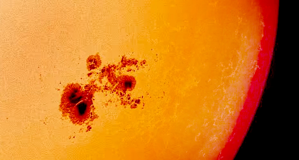
“We think of things being hot or cold,” he said. “But they are a single thing, which is an amount of heat. Sunspots, for instance, are ‘cold spots’ on the sun’s surface, even though they can measure 7000 degrees Fahrenheit, and frozen nitrogen can melt when heated above 346 degrees below zero.”
He knows this is a hobby-horse of my own: the gap between language and reality. I’ve written many times about how what we call opposites are usually just points on a single scale. A thermometer measures heat and we express it with words like “hot” and “cold.” We usually take words as reality, when they are merely a separate, parallel thing, with its own rules and forms.
“There are things that we take for granted that only make sense in the language we use to describe them, but don’t really exist in any real way,” he said. “Real life isn’t so black-and-white.”
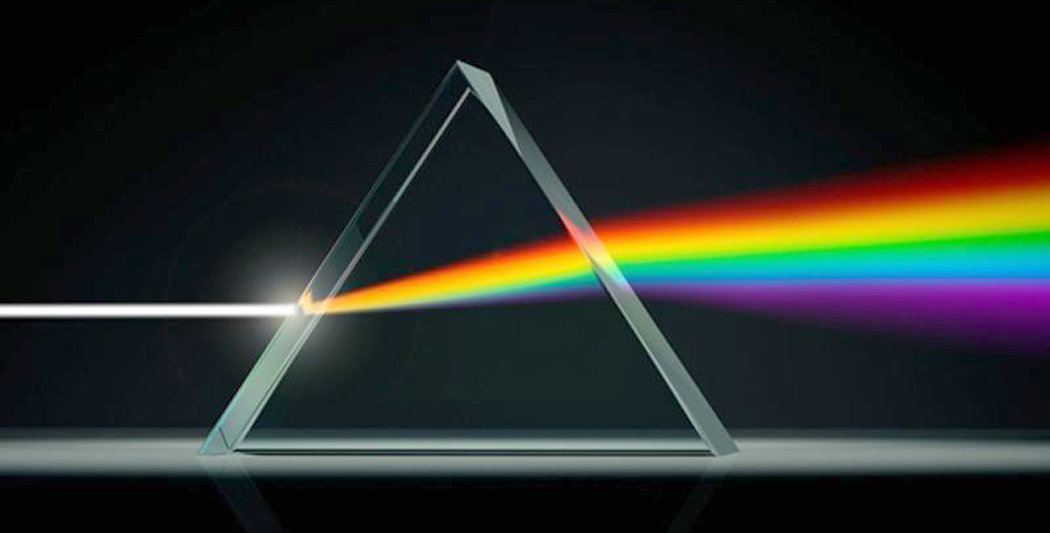
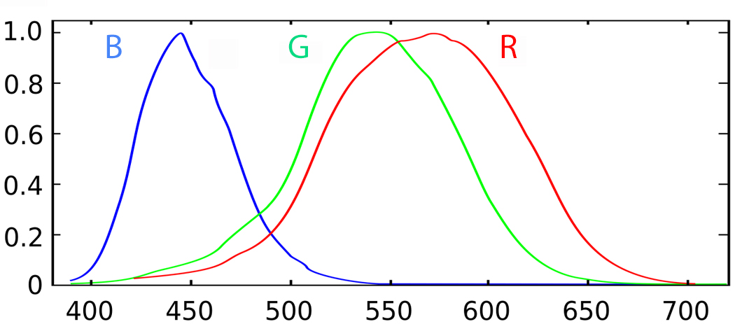
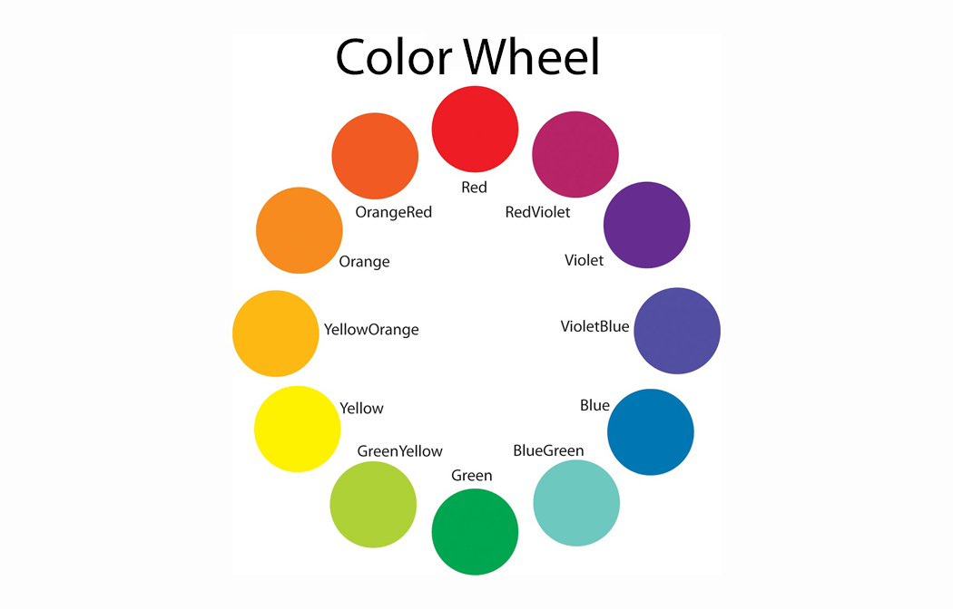
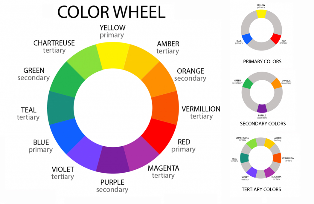
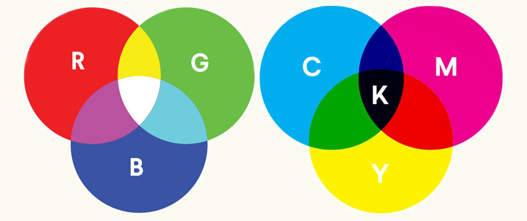
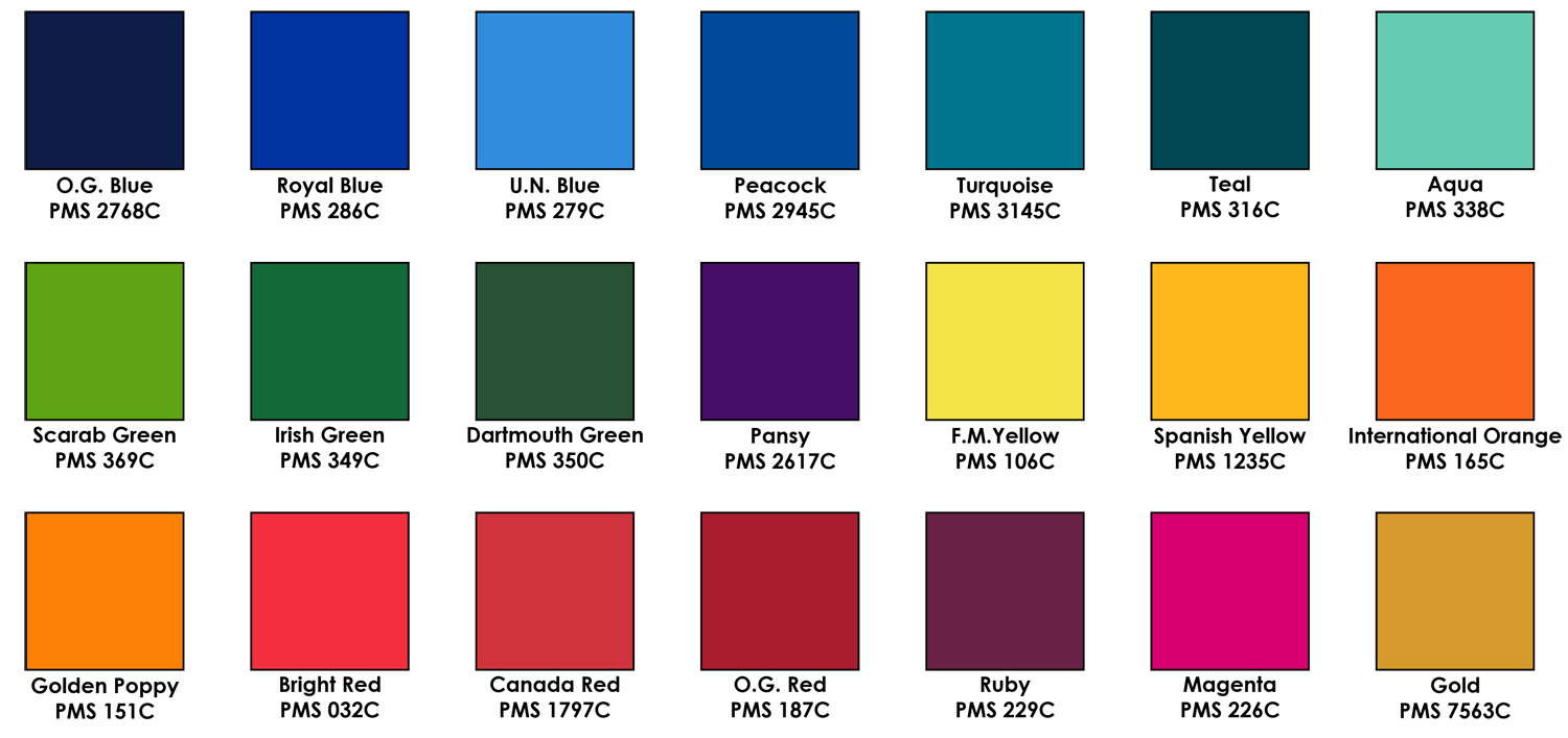
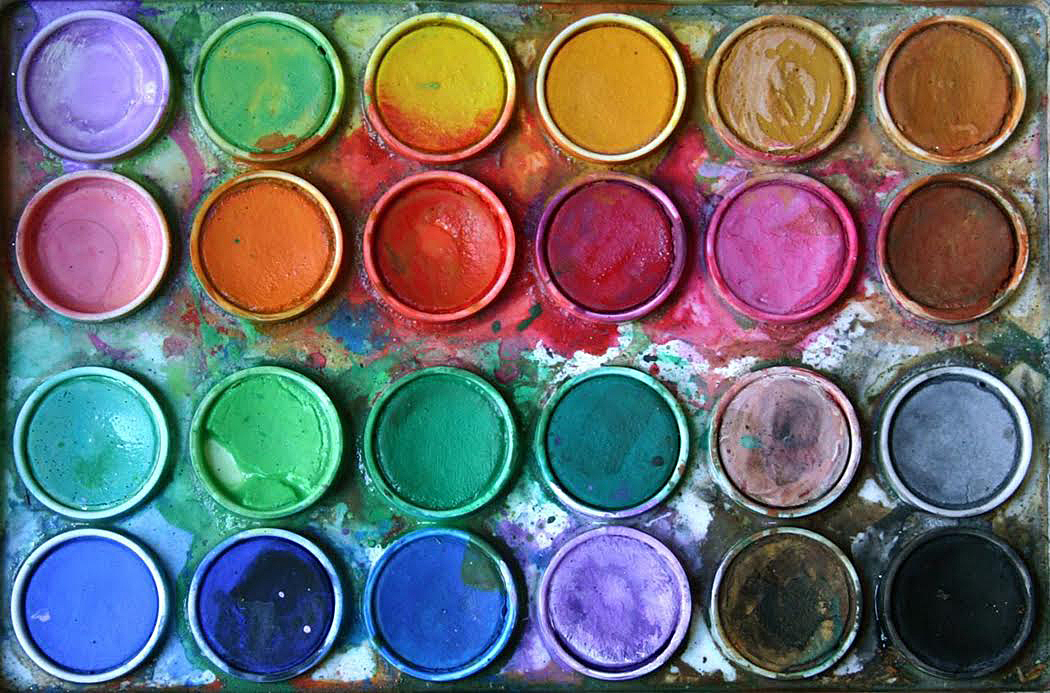
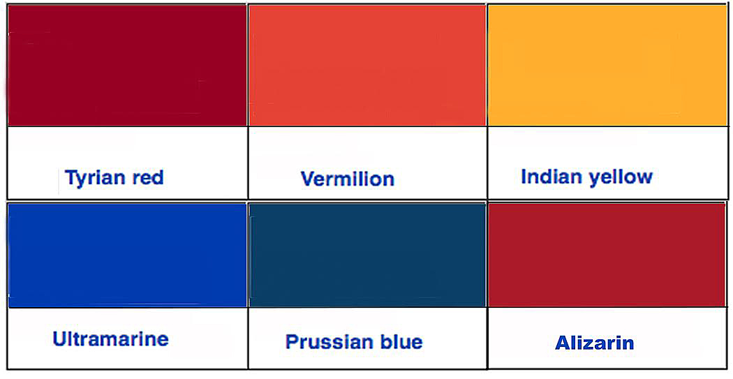
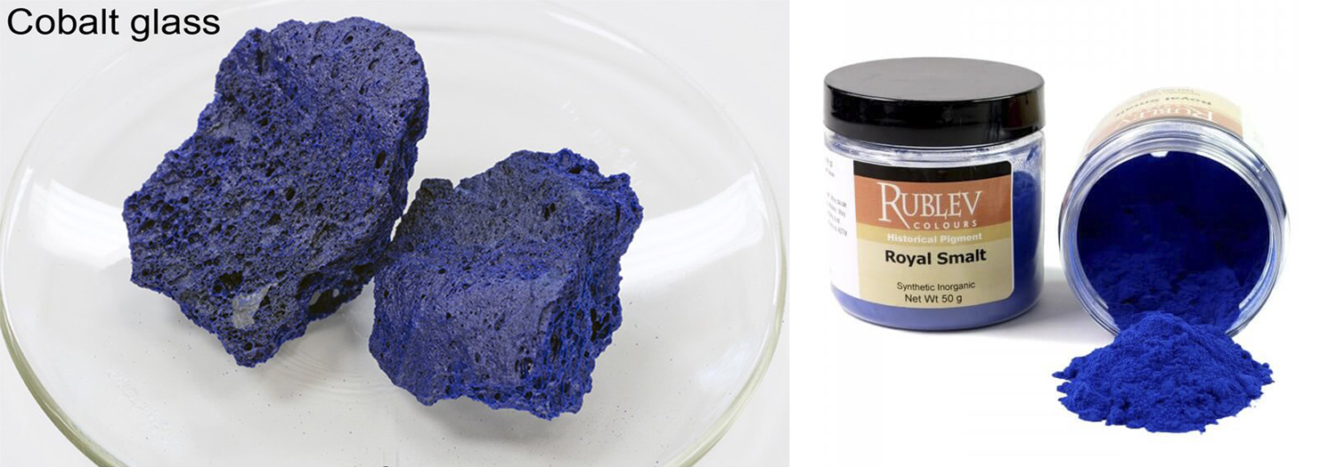
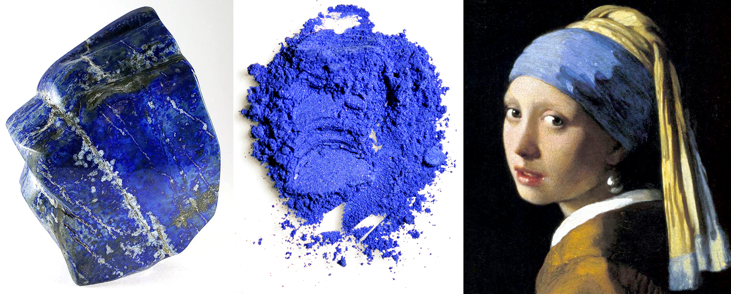
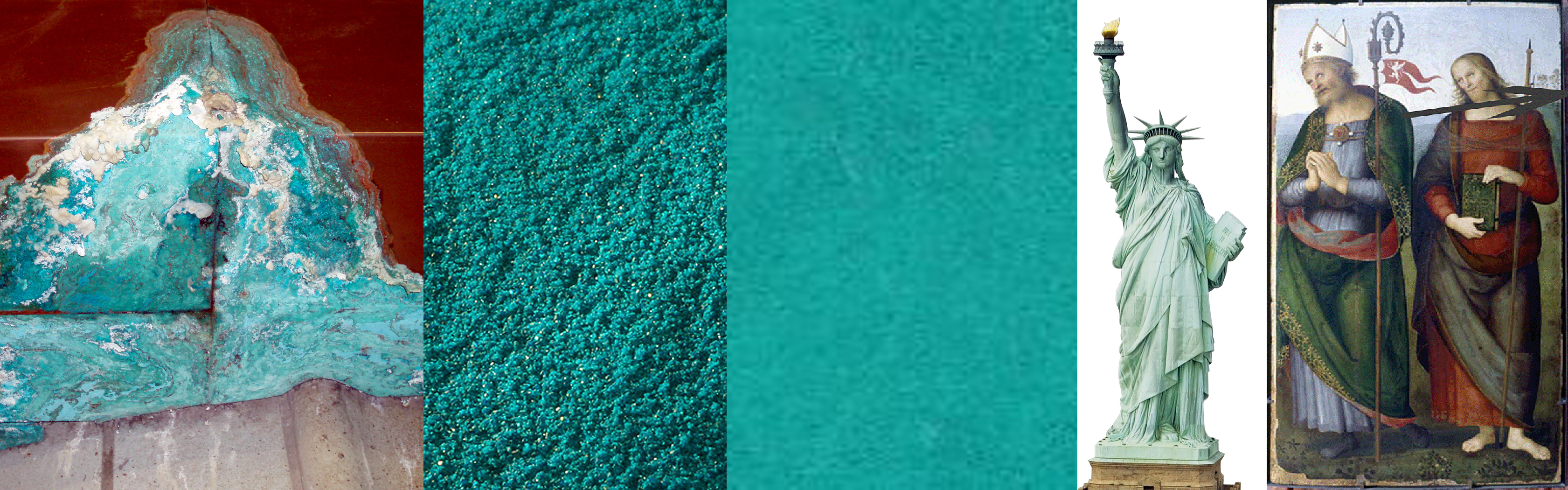
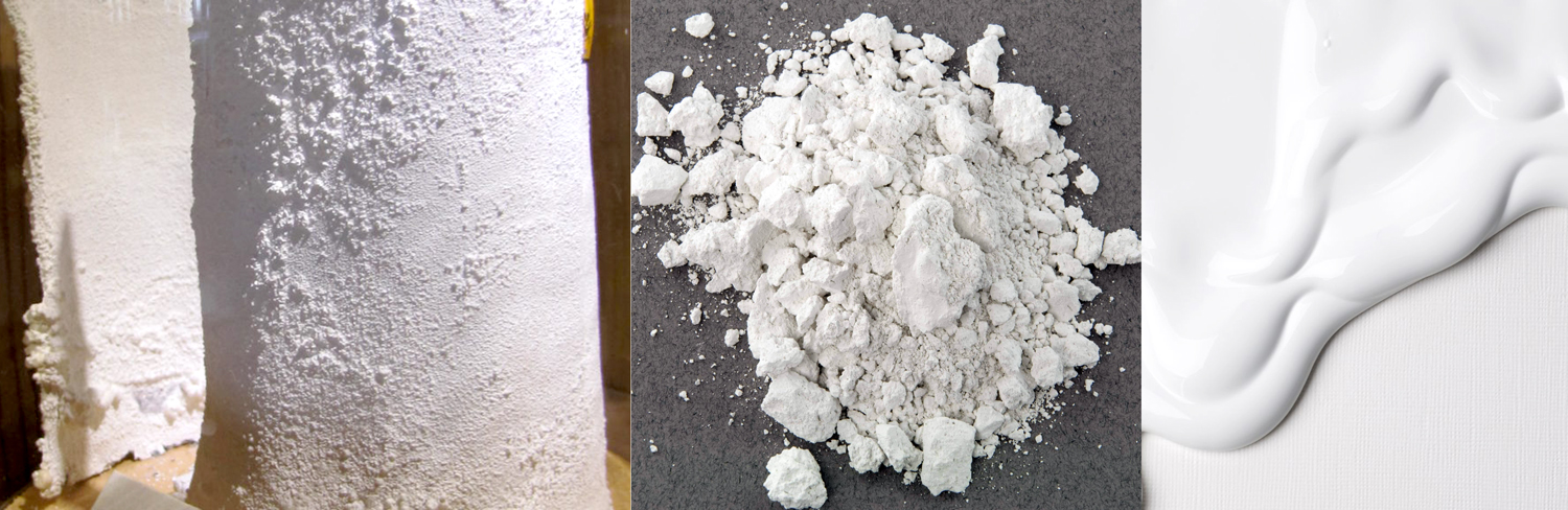
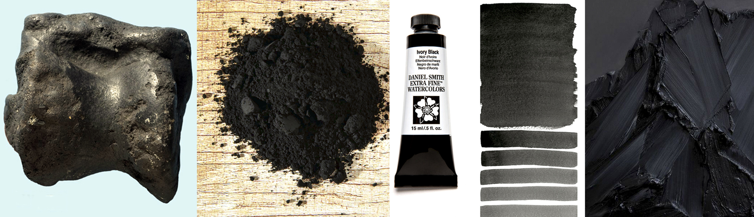
Stuart went on: “Take black and white, for instance. You’ve heard it said that white is the combination of all the colors added together, cancelling each other out. That was what Newton demonstrated with his prism. But that’s if you are talking about light. If you are painting, the combination of all the colors is black. So which is it really? Well, we aren’t talking about color so much as about hue. There are millions of colors and we give them names, like ‘teal’ or ‘pink.’ They are the combination of hue, shade and tint. Hue is a specific spot on the spectrum, a basic ingredient, like an atom. From them we build molecules — specific colors. A blue can be light or dark and still be the same hue, although the colors are sky blue or ultramarine.

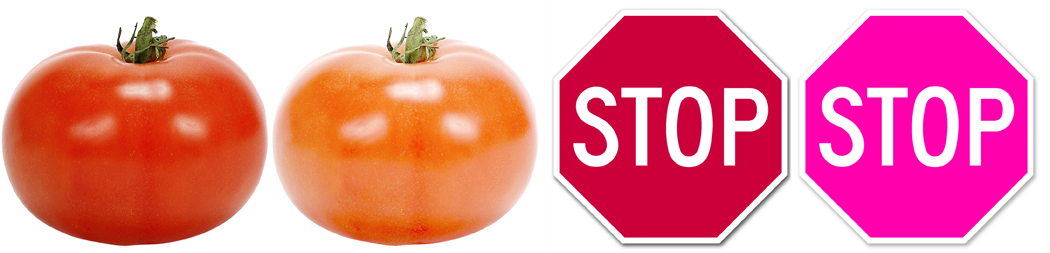
“So, realistically, both black and white are the absence not of color, but of hue. In reality black and white are the same thing, just different shades of it, with all the grays in between. If you realize that black and white are simply variations of the same thing, then you realize that darkness, like cold, doesn’t exist: It is merely the absence of light.”
OK, I thought. But does that really shed much light on our day-to-day lives?
“We take these confusions of language as something real, when they are not,” he said. “When I hear terms like ‘left wing’ and ‘right wing,’ or ‘conservative’ and ‘liberal’ bandied about, as if they actually mean something, I develop a kind of psychic acid reflux. Beliefs shift with time and what was once considered conservative, is suddenly dangerously leftie. And vice versa. Is it conservative to believe in a strong central government or in a small government? Is it conservative to try to minimize change and keep things in place that have been there for ages? Or to radically transform government and shake things up? It changes over time, making the terms we use basically useless. Republicans call themselves conservative, but have complained for decades about an ‘imperial president,’ and yet have happily elected just that.”
It seems to me, this has immediate relevance to our lives today. Language matters.
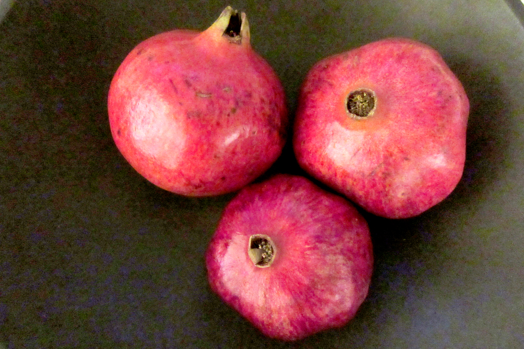
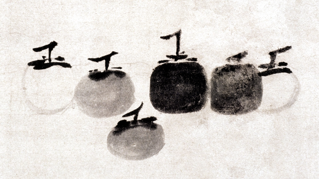
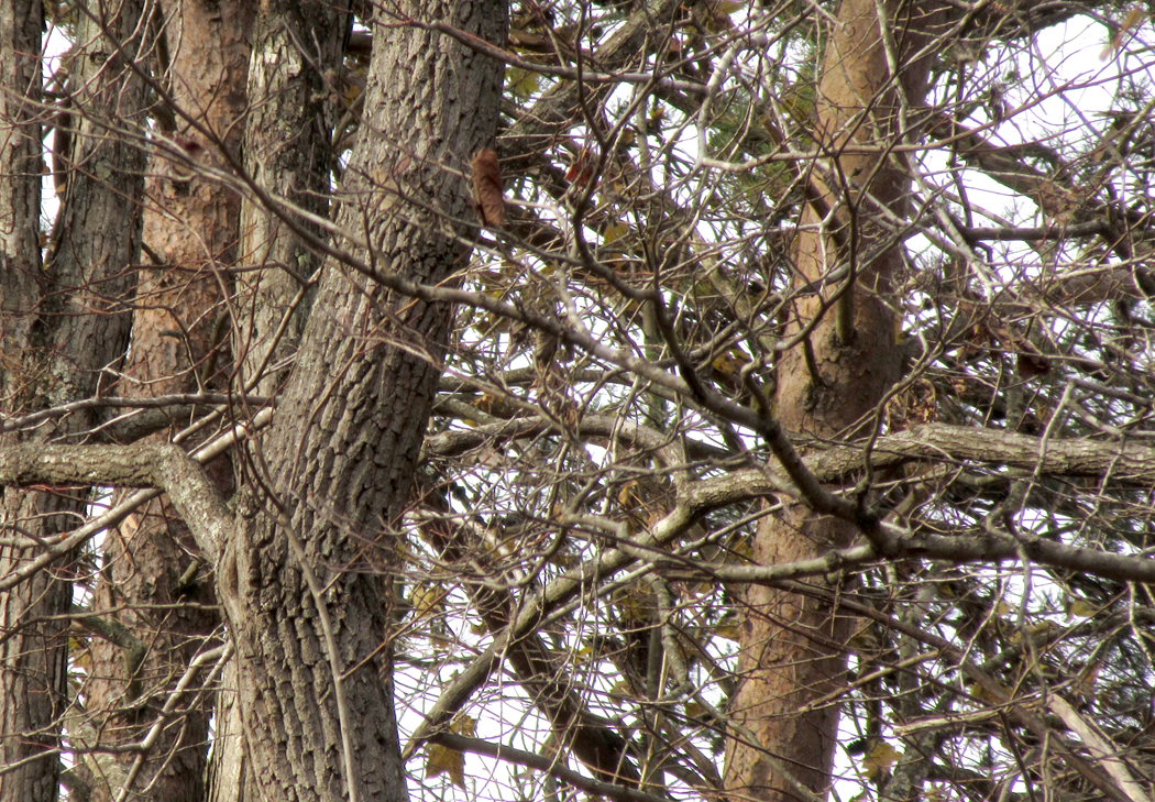
“You know, scientists have decided fish don’t exist,” I said. “Turns out a salmon is more closely related to a camel than it is to a hagfish. Just because it looks like a duck and quacks like a duck doesn’t mean it’s a duck. Just because something has fins and gills and swims in the water, doesn’t mean it’s in a common group called ‘fish.’ In the 17th century, a whale was a fish, too. And in earlier times, squids and mussels were also counted as fish. Jonah, after all, was swallowed by ‘a great fish,’ which tradition has it, was a whale.”
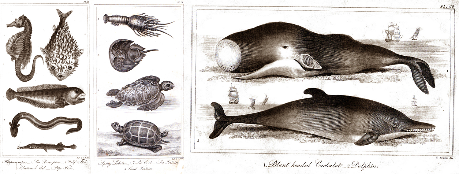
Once, these were all fish
“I have been thinking that language is really myth,” he said. “I don’t mean it doesn’t exist — that’s not the kind of myth I mean.
“The world is itself. It was before there were humans to perceive it. We see it, however, through language. Take a car. We all know what a car is. That car is in a terrible crash and smashed up. Is it still a car? It gets taken to a junk yard and disassembled for parts. Are the parts still a car? Grind them up into bits of metal and ask the same question. Melt down the metal into a molten form. The same atoms every time, but at what point did it stop being a car? The thing was the thing; the word was just the word.”
“The ship of Theseus,” I said, “that Plutarch wrote about, that had each of its parts replaced as they rotted, leaving the identical ship but completely new. Is it the same ship?”
“Our brains are hard-wired to see the world as things and those things have names,” Stuart said. “And we take the names seriously. It’s quite silly to worry if it’s the same ship: The question is entirely linguistic. All that piffle that Plato went on about, it’s all really just about language.
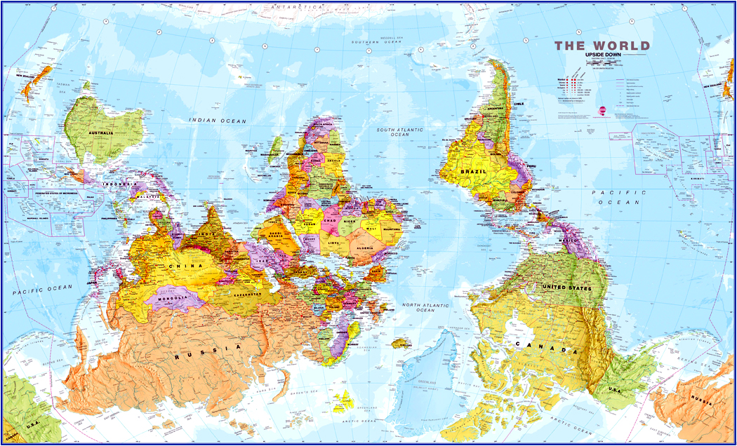
“It is our Umwelt,” he continued. “Which, as I’m using it, is a model of the world built into our psyches not only by experience, but by evolution, and through which we tend to filter our perception of the world, narrowing it down to what seem to be comprehensible limits. A pattern we impose on experience. In our Umwelt, the sky is up, the ground is down. Without thinking, we assume that north is up and south is down, although in a round world in a chaotic cosmos, up and down are meaningless terms. If we hang our world map on the world with Antarctica at the top, it looks wrong. Just wrong. It shouldn’t.
“It’s why quantum physics is so hard to accept. Our Umwelt is built from human-size experience and the quantum theory makes no sense. In a world of things, we understand atoms as tiny pellets. How could they be vibrating strings? We attribute human emotions to animals, we assume other beasts see the same colors we see, we take anything larger than ourselves as big and anything smaller as little — but why should human size be the standard?
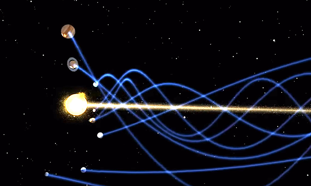
“Weeks.” Stuart was on a roll. “We take weeks for granted, but they don’t exist except as a custom. We’d be rather upset if we didn’t have weekends punctuating our worktime. The metric system the world uses and believes is derived from nature, is all nowadays built on a measured second, which is an utterly arbitrary duration — no natural fraction of experience, but one counted by an arbitrary number of cesium vibrations. We think of the earth as flat, although we know it isn’t. I mean, we know the earth is a globe, but if I separate out North Carolina in my mind, spread out, it is as flat as a map. It’s how it feels. That we orbit around the sun, when in fact sun, earth, all the planets and moons spiral around in complex motions as the whole shebang skitters through space.
“If we don’t simplify and schematize the world, we could never navigate it. That is what I mean when I claim that language is myth. It explains what cannot be explained. It actually functions as myth, explaining the world to us. And so, we can personify nameless things by naming them.”
“We think of myth as being, like Zeus and Theseus, but if Ancient Greeks thought of Zeus as a deity, he becomes a folk story when no one worships him anymore. But myths are also ways of explaining the world when science has no good answer — or rather, when the reality exceeds our tiny brain’s ability to grasp it all. Like when we were children and when we were scared of thunder, our parents might tell us not to worry, the noise was just angels bowling in the sky. It was a story that made sense to our infantile brains.
“Language is angel bowling for grown-ups. We use words to box up ideas, tidying them so our feeble brains can swallow them. We cannot begin to understand where the cosmos came from, so we use Genesis to explain it, or, nowadays, we use the Big Bang. Existence is something so far more complex and chaotic than our tiny minds can begin to understand. So, we make language, a 2-D version of a 3-D world.”
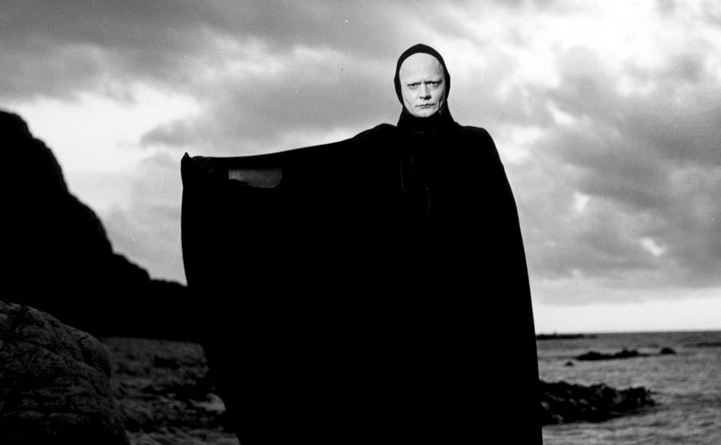
“Like death,” I said. “Death is a skeleton with a scythe in myth, or on a pale horse, or death hovers bedside over the terminally ill. But death doesn’t exist. Dying exists, but death is a myth. Death doesn’t take over our bodies, but the metabolism of our bodies ceases manufacturing life. The machine breaks down.”
“Yes,” Stuart said. “I remember someone pointing out that ‘life’ is not the opposite of ‘death,’ but that ‘birth’ is the opposite. They are verbs, not nouns.”
“I saw this with gut-tightening immediacy when Carole died,” I said. We watched her last inhalations, and then they stopped. She ceased being Carole. There were no 21 grams floating away, she just ceased manufacturing her own life. The light bulb burned out. Light didn’t go anywhere, it just stopped being generated. Almost instantly, her flesh began feeling like clay, cooling off. I’m sure it might soften the loss for those who believe in religion that her soul went somewhere else, but I just saw a factory close down, leaving an empty building.”

“Nice metaphor,” Stuart said. “All language is ultimately metaphor, and metaphor and myth are essentially the same thing. A way of talking about the unsayable.”
This was the moment I heard the faint voice of Stuart’s partner, Genevieve, somewhere in the other room say, simply, “Sophomore dorm room!” and we moved on. And I remembered that women know the real world a lot more than men.