A green thought in a green shade
The best gift a writer can get is proof that his words are being read, and not just read, but understood. (When I was writing for the newspaper, too often I heard from readers who complained about what they thought I wrote and not what I actually wrote. Every writer has had this experience.)

The other day, I received such a gift, a small one, not meant to be anything important, but it was completely meaningful to me. This gift was from an old and dear friend who I only see once or twice a year, and to our lunchdate, she brought a 3-by-5 notecard on which she had scribbled with every color green she could extract from her colored pencil set. I doubt she knew how much that meant to me.

It was a gloss on my most recent blog essay, in which I had mentioned how many greens I saw in the foliage in the woods and garden I was visiting, and also how many greens Paul Cezanne had managed to generate in his paintings. The card she plopped down on the table was meant to be a casual joke, but to me, it was very much more than that. We don’t always know the significance of what we do.
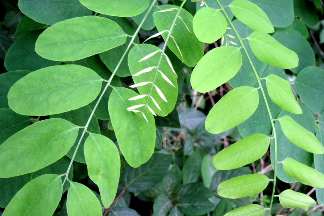
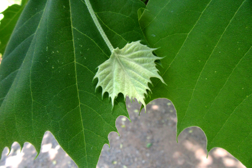
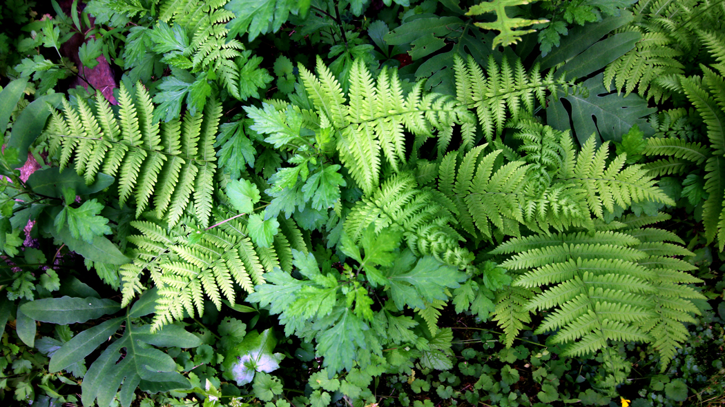
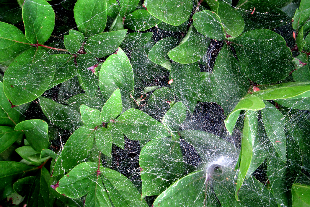
But it set me to thinking about those greens — blue-green, yellow-green, sea-green, leaf-green (not enough words for the varieties of hue) — and made me take my camera out to the garden again to gather my own set of greens. Nature gushes with them.

There are three qualities that make an image: shape, color and texture. (Leaving aside the question of what you name the subject of a picture: “That’s a house;” “That’s a car;” “That’s my Aunt Philomela at the beach house in Boca.”) Shape can be defined by outline. Color and texture fill those outlines in and what is more, if you are making an image in black and white, texture (stippling, crosshatching, scribbling) can substitute for color. Each of these elements can be as much a delight to the eye as harmony is to the ear or flavor to the palate.
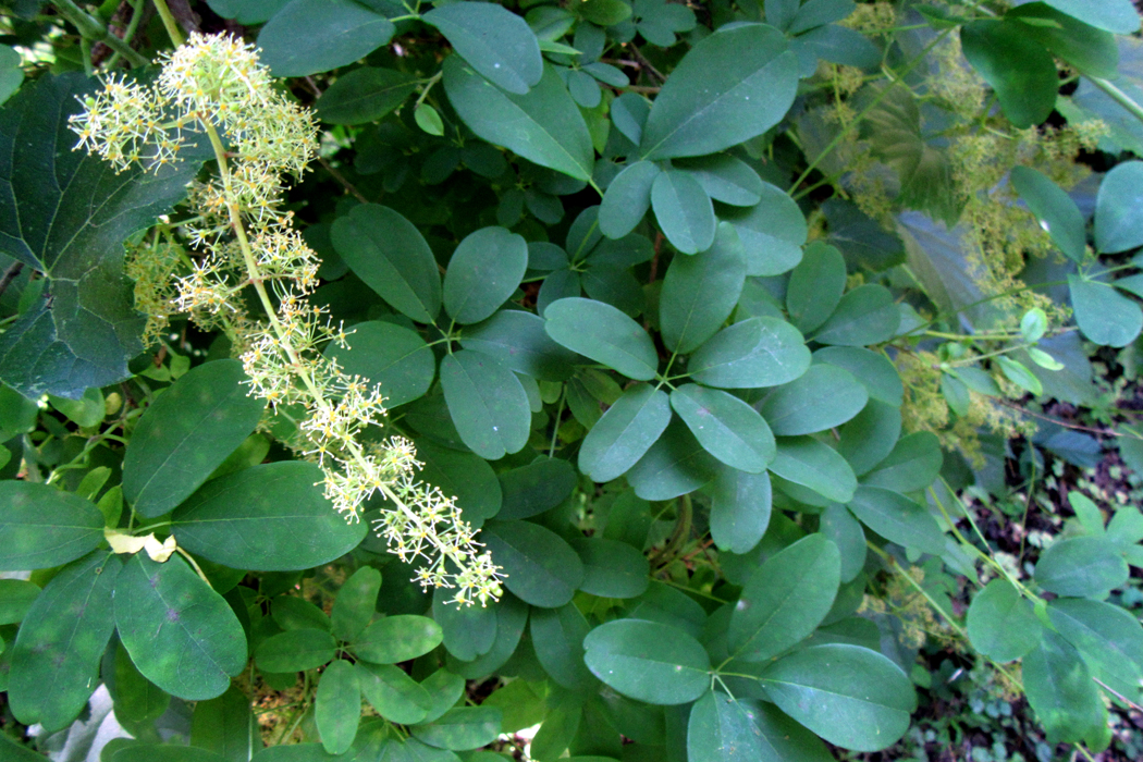
And so, I walked through the yard drinking in the greens and pointing my camera to arrange the patterns of shape, color and texture to try to make a kind of visual mixed salad for the eye.

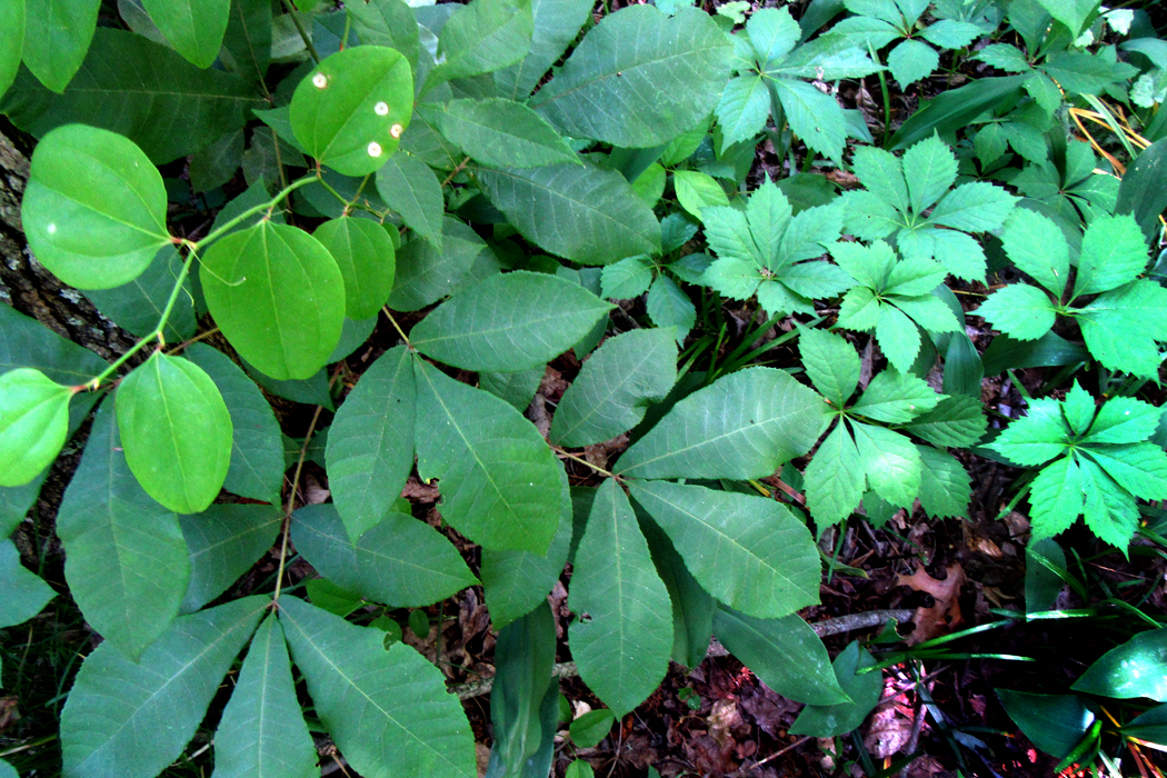
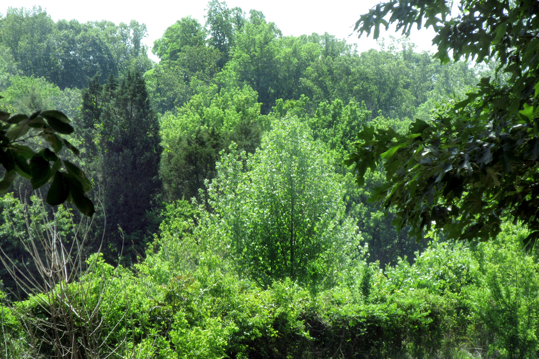
In the afternoon, I drove out into the countryside and stopped near the Mayo River — barely a river — that I had once canoed down maybe 50-plus years ago, hitting white water on the way (if the canoe had capsized, I doubt the water would have gotten higher than my knees). Along the banks were further salad greens. I gathered them all in my lens.

The pleasure later that evening was editing the photographs, collating those shapes and textures and those luscious greens. “No white nor red was ever seen/ So am’rous as this lovely green.”
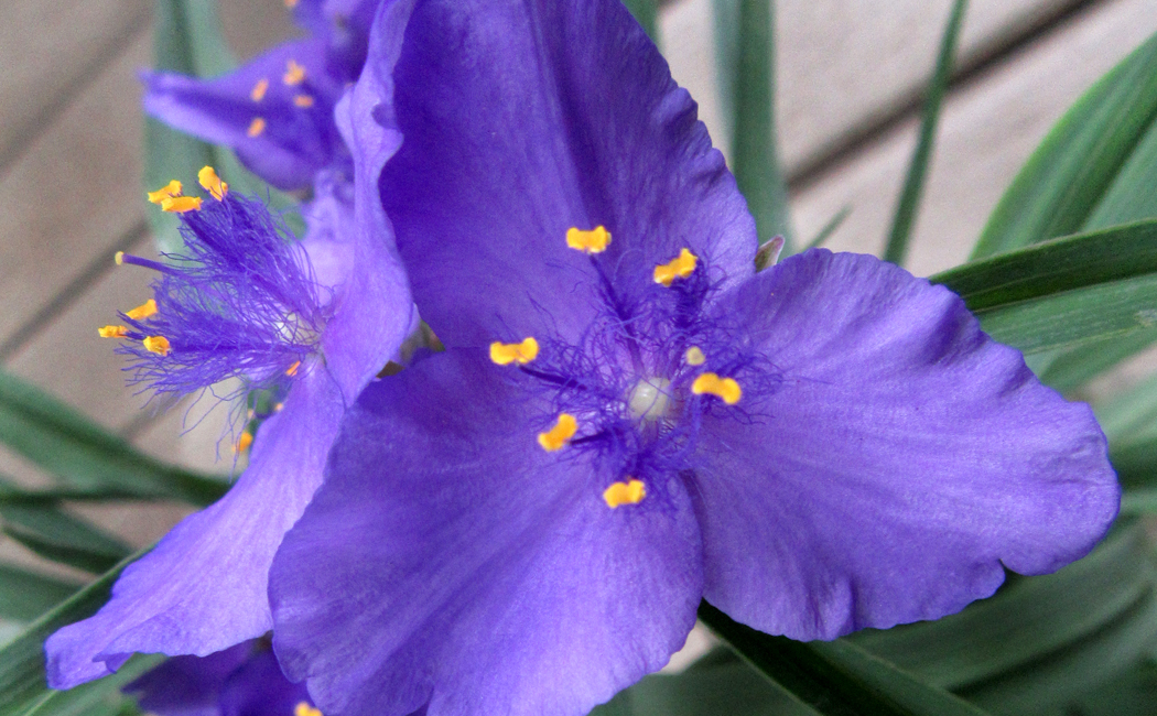
Many years ago, the professor I studied under commented offhandedly that nature never made a bad color combination. Any two colors found in nature, he said, could be placed side by side for a satisfying esthetic treat. Salmon red and pea green. The blue and yellow of a spiderwort flower. The orange and black of a monarch butterfly.

Humans are quite capable of jarring our eyes with garish mismatches — gaze down any “Miracle Mile” for its signage — but nature, he said, is always right. Of course, our pleasure in the color-matches of nature should probably be laid at the feet of natural selection: We have evolved to love those colors and perhaps we shouldn’t be too glib about assuming that nature had us in mind when she plopped the buttercups next to the violets along the highways.

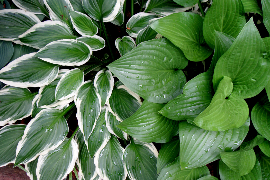
The riot of greens I saw and photographed played off against each other, making color combinations as rich in greens as the roadside flowers made of whites and yellows.
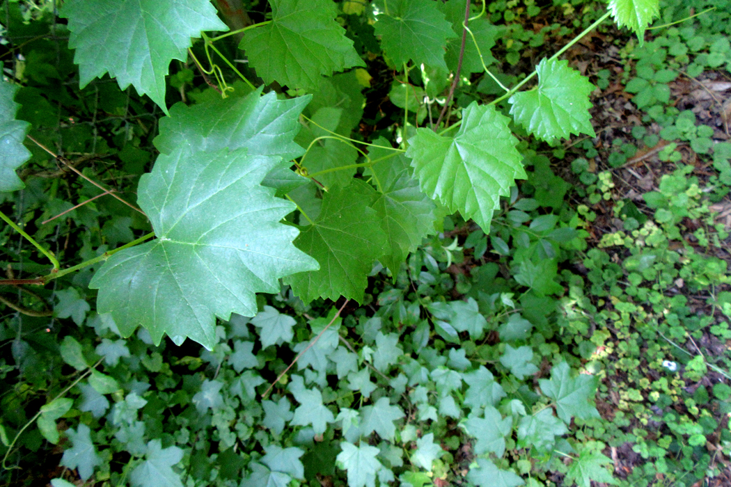
And the various textures of leaf surface made their own contrasts.
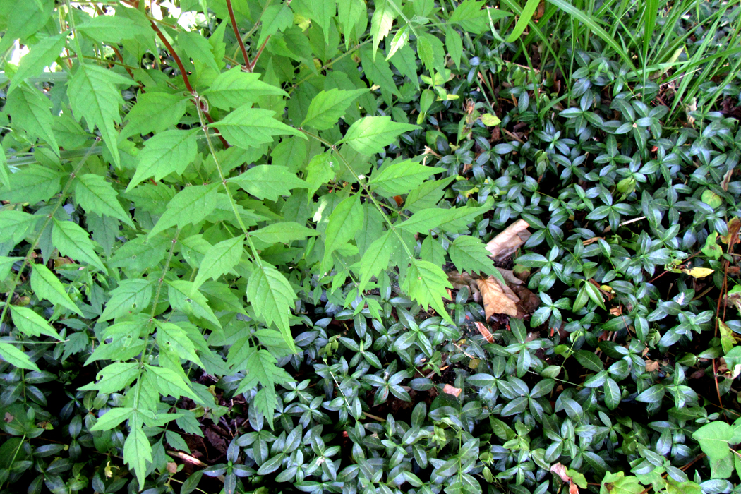
And the lights and darks, as shadow and light hit the foliage, gave them visual depth.

Deep in one image, the bright green leaves nearer the surface hid the shadowed poison ivy, almost hidden in a cavern of green.
Leaves come in varieties of all of them. And when you layer one next to another, the contrast can keep the eye interested.
In the process, I found myself drinking in not just the colors, but the varied shapes, creating patterns and textures that delighted my eye.

Shape against shape, color against color, texture against texture: the analog of variety in the world, a variety that means we can never grasp it all — there is too much.
One gets to know the plants in the woods near where you live, perhaps even name them: Duchesnia, Tradescantia, Helianthus, Ranunculus. They are part of what makes your home territory comfortable and familiar. Clovers, mosses, ferns, plantains, dandelions.
And there is excitement when you enter a new biome and come across new greens, like the gray-green greasewood of the Sonoran Desert or the euphorbias of South Africa, each with its idiosyncratic shades and tints.

Before the photographs from space showed us the dominant blue of our world, the Earth was traditionally called a “green planet.” It is green that makes life possible. Without it, the planet would be bare rock surrounded by the blue sea.
Each time I visit this part of the state, I can’t help but set myself a task — a kind of art project, to try to organize a different way of seeing. A few days ago, my task was to look straight down at the ground to see what it looked like. I made more than a hundred photographs I could use. After I wrote that blog entry, and after my friend gave me her gift, I began a second project, to see how many greens I could find, how many leaf shapes and contrasts I could photograph.

These that I’m presenting here are just a small sample. But I hope they are worth looking at, at least as a tasting menu of delicious green.

Click any image to enlarge
