Archive

Tag Archives: digital photography

No photographer has had a higher profile in mass culture than Ansel Adams. He was the popular idea of the photographer as artist, and, I’m sure, the only one to have his images printed on beer cans with his name attached. 

His pictures graced not only Coors beer, but books, posters, calendars, aprons, hats and coffee mugs. He was the subject of a Playboy interview, and had his face on the cover of Time magazine.

 He had a mountain was named for him in California’s Sierra Nevada. That honor came to him less for his photographs and more for his constant advocacy for nature and the environment. 

His earliest photographs were made when Adams was still a teenager with a love for back-country hiking in Yosemite National Park, made with a snapshot camera and drugstore prints. Even those early images show a flair for the dramatic and the careful placement of darks and lights to make a balanced photograph.

Ansel Easton Adams was born in 1902 to a well-off family from San Francisco. As a child, he broke his nose when the 1906 San Francisco earthquake threw him against a garden wall. That bent nose became a trademark of sorts: It leaned left, and the man did, too. He joined the Sierra Club at 17 and was a board member from 1934 on. In later life, he railed against the environmental policies of Ronald Reagan.

His family vacationed in Yosemite Valley; he met his wife there and they ran a visitor center and gift shop, now called the Ansel Adams Gallery.

Early in life, he had planned to be a concert pianist, but eventually gave up keyboard for lens. But his ambition was still artistic: He wanted to be more than a recorder of vacation memories. This at a moment in art history when a number of like-minded photographers were arguing for photography as art when museums, galleries and collectors believed photography was a merely mechanical reproduction system. 

You can see that aesthetic vision in Adams’ early art prints, in platinum or other early processes, slightly fuzzy, with the popular Impressionistic love of sunlight and shadow. 

But in the 1930s, he converted to a Modernist vision of photography, with sharply focused images printed on glossy paper. His friends included other leading photographers, including Alfred Stieglitz and Edward Weston, all of whom were proving that a photographic print had earned a place on the gallery wall.

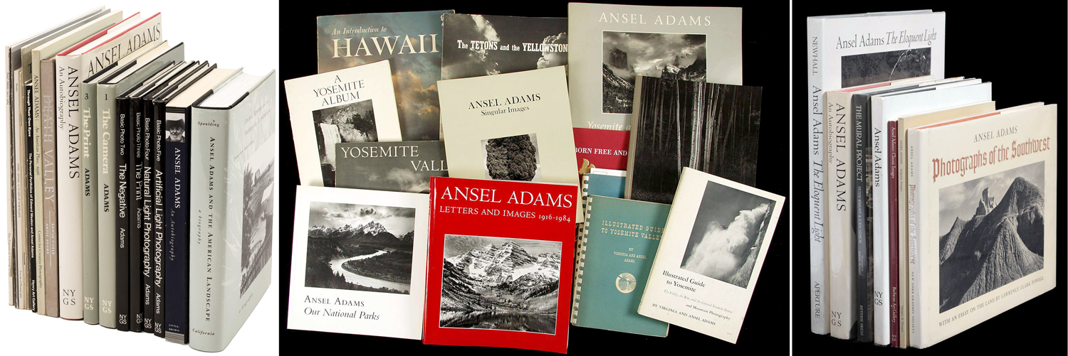
But while these other artists worked in many genres, in the 1940s, Adams turned ever more to the kind of Great American Landscape we know him for: the images of national parks and American wilderness. Publishing books of his photographs has become an industry.

When he ventured beyond his strength, sometimes the results were stiff and uncomfortable, like his portraits, which made their subjects as granitic as the cliffs of Yosemite. The lighting is perfect, the focus is sharp, the detail is precise, and yet, they are completely lifeless. His presidential portrait of Jimmy Carter may be the worst presidential portrait ever. 

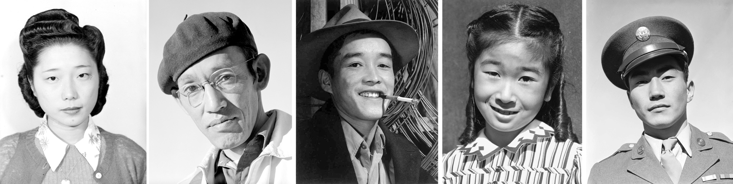
On the other hand, when his purpose was to document the injustice to interned Japanese citizens at the Manzanar camp, his people could be warm and human. 

And so, it is the landscapes we remember, and they have become iconic. 

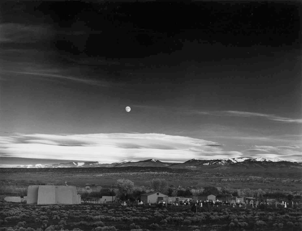
His 1942 image, Moonrise over Hernandez, N.M., sold at Sotheby’s in 2006 for $685,500. 

____________________________________

“You don’t take a photograph, you make it.”

– Ansel Adams

____________________________________

For its first century and a half, photography meant loading light-sensitive film into your camera, calculating focus, f/stop and shutter speed, making an exposure, processing the film in a series of chemical baths to make a negative and then re-exposing that negative onto light-sensitive paper and running it through a series of chemical baths to create a positive image of the subject. It was an intensely physical process, as anyone who remembers the smell of sodium thiosulphate on their fingers will know. 

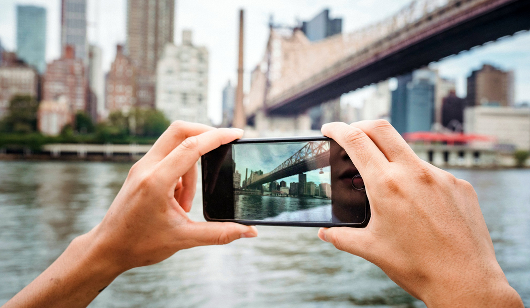
Now, it means holding up your smart phone and clicking an image and then swiping left or right to go through the results, and maybe sending it out via Instagram or Twitter so others can share it. And the image exists only in virtual form on a screen of pixels, never becoming anything physical — or requiring any specialist knowledge. 

Not that there’s anything wrong with that. But it does mean that the subject of a photo has been separated from the object of the photo itself. For most people, looking at their family snapshots, it has never been otherwise, but for professional photographers and those making photos ostensibly as art, the physicality of photographs and their making is central. 

Before digital, a photograph was two things: The image and the substrate on which the image appears. Most of us, looking at the snapshots of our families, see the people in the image, but pay little attention to the paper or the layer of silver that makes up the image. But in photography looked at as art, a good deal of attention is paid to the process and technique. In fact, often so much care is paid to the technique that the subject can become ancillary. Who cares if it’s a still life or a portrait, if the gum bichromate print is gorgeous. The subject was just an excuse for the virtuosity of the technique. 

I remember, in the 1970s, long before digital photography, when the technique was actually fetishized: If you didn’t process archivally and make your mattes of acid-free board, you couldn’t be taken seriously as a photographer. It gave rise to a certain preciosity. 

That was for black-and-white. Color photography hardly counted. It wasn’t accepted, for the most part, because of the impermanence of the image (you’ve all seen old snapshots turned funny colors with age). The only color permitted was the dye-transfer print — an expensive and cumbersome process. In the 1920s, museums were unwilling to collect any photography because, they reasoned, it wasn’t really art; it was mechanical. Before the 1970s, few museums collected color photography. Black and white was for the serious artist. All this has changed. 

The middle years of the 20th century — roughly from World War I till the advent of Pop Art in the 1970s, give or take — were ruled by Modernism, which proclaimed that the medium was the message, that the paint mattered more than the image. Abstract paintings — with no subject matter at all — was king. When someone was confused by the jumble of scribble in one of Jackson Pollock’s works, he naively asked the artist what it was he was supposed to see on the canvass. Pollock answered curtly: “A painting.” 

From the Renaissance to the middle of the 19th century, art was expected to picture reality. Looking at a picture frame mimicked looking through a window. Yes, there might be unreal things seen there: saints and angels. But portraits and landscapes were conventionally realistic, at least until the Impressionist revolution in the 1860s — and the invention and popularization of photography. 

When French painter Paul Delaroche saw his first daguerreotype, he famously proclaimed, “From today, painting is dead!” Of course painting didn’t roll over and expire; it went on to do other, newer things, and gave up the obligation to render visual reality the way a camera can. Because, although it wasn’t historically seen as such — at least by the masses — painting already was something different from simply an image of the world; it was a thing — an object, an artifact, a physical presence made of pigment and canvas. 

With the Impressionists, and later and more thoroughly with abstract painting, the thingness was the point. And when a few amateur photographers thought to elevate their camera imagery to the level of “art,” they at first imitated paintings, and especially Impressionist paintings. A whole movement of artist-photographers geared up with something they called Pictorialism — fuzzy imitations of fuzzy paintings. 

Then, in the 1920s, roughly, a group of exceptional photographers decided that photographs should not imitate paintings, but should look like photographs, and that photography had its own qualities and virtues. When American photographer Edward Weston was about to publish his first book of images, his publisher wanted to title it “Edward Weston: Artist,” but Weston objected and changed it to Edward Weston: Photographer. He was proud of his status as just that. 

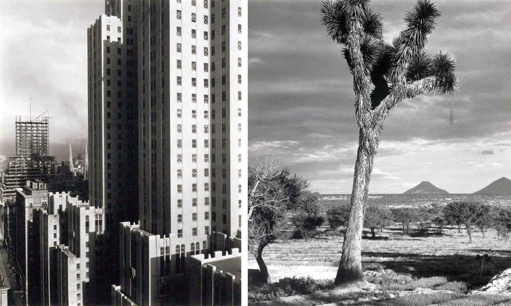
In Europe, Modernist photography tended to be more political, but in the U.S., it became more interested in examining the physicality of the the visual world, which meant above all, landscape. The American tradition in painting had long featured landscape, and now, photographers thought they could make landscapes photographic rather than painterly. (They also produced a great number of exceptional portraits, and still lifes, but it is landscape that I’m concerned with here). And the landscapes they chose tended to be either industrial and urban, or the natural unpopulated sections of the American West. 

But while Edward Weston, Alfred Stieglitz, Paul Strand, Charles Scheeler, Edward Steichen — and Ansel Adams — were well aware of their prints being art objects, framed and hanging on gallery walls, the wider public, with their brownie cameras had a less sophisticated understanding of the medium: For them, the camera captured their reality, preserved their memories and became souvenirs of the past. For them, the photograph froze reality for them and held it still. 

Even today, there are many people who believe photographs pin down the visual truth of their world, not being aware of how a lens can distort things, what different types of film — or now, different microchips — can alter the final image. Lighting, focal length, depth-of-field, contrast, color temperature and a hundred different technical aspects of photography can govern the final image. For a professional photographer, all of these things are brought to bear on the final created image. For ordinary people a camera simply registers what they saw, or at least the part of what they saw that was important to them (not seeing, for instance, the tree in the background visually growing out of someone’s head). 

The person who most attempted to regularize the variables of photography was Ansel Adams. He wrote a series of five books (later recast as three) teaching the finer points of making photographs — how the lighting, focal length, depth of field, contrast, etc. affected the final picture. 

He perfected what he called the “Zone System” of exposure and processing to control the contrast and dynamic range of the final photographic print. Simplified, the problem faced was that black ink on white paper has a limited range: The white, under normal lighting conditions, is usually no more than 30 or, at best, 40 times brighter than the black. But when you look at the sunlit scene you want to photograph, the brightest part may be a thousand times brighter than the shadow. How do you squeeze all that into your 30:1 ratio? 

Most photographers and snapshooters just pick what they want to show up best and let the shadows go to solid black, or the highlights to bleach out in detailless white. Adams, instead, attempted to divide a scene into 10 (or 11, depending how you count) “zones” of brightness, from solid black to solid white, and then control your camera negative’s exposure to match your previsualized zones, knowing that you can alter the contrast in the developing process, to increase or decrease contrast to fit, Procrustes-style, the whole into the available printing surface. 

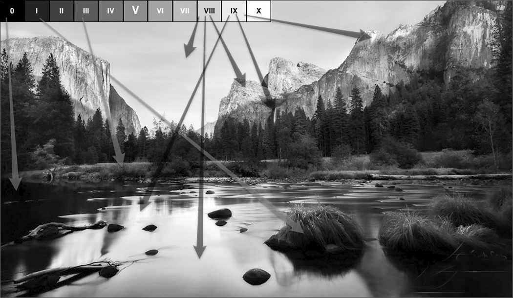
(A simplified version of this is the old photographers’ dictum: “Expose for the shadows, develop for the highlights.” Adams’ version is more precise.)

For the ordinary amateur, you point a camera and click the shutter to capture the image and you satisfy yourself with what you get. Adams and his fellow artists are hyper-aware of the end product. Adams preached what he called “previsualization,” in which you attempted to imagine what the final print should look like before you ever pressed the shutter button. The scene being photographed is just raw material for the final presentation.

 “In my mind’s eye, I visualize how a particular … sight and feeling will appear on a print. If it excites me, there is a good chance it will make a good photograph. It is an intuitive sense, an ability that comes from a lot of practice,” Adams said.

The result is a photographic negative, used to make the final print. 

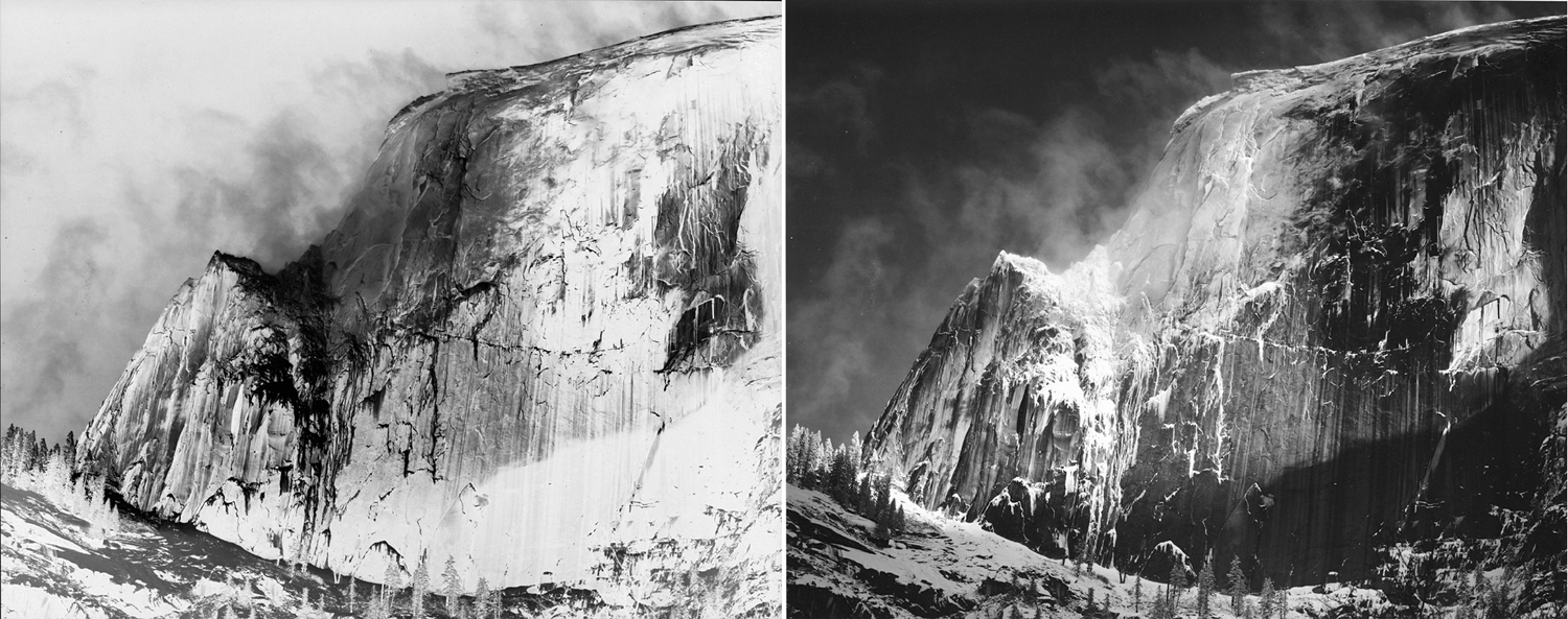
“The negative is comparable to the composer’s score and the print to its performance. Each performance differs in subtle ways.” Anyone who has followed Adams’ career knows that an earlier print may differ considerably from a later one, just as a young pianist’s performance may mellow and change as the pianist ages. In other words, there is not a “single” true print, but, like a musical performance, a range of them. 

The belief in the veracity of photographs is persistent, even in the face of computer-generated imagery, digital manipulation and fakery. Indeed, that faith has often caused trouble for, say, photojournalists, when a literal-minded editor insists that a photo be printed “unmanipulated.” I have known a photostaff that was forbidden even to alter the contrast of a digital photo in the credulous belief that the image first recorded in the camera is more “truthful” than the finished one. (That dictum didn’t last; it couldn’t). The digital file created in a digital camera is like the negative in silver-image photography and is only a first step in the process. To disallow the photographer to finish the process in some mistaken belief that the unmanipulated version is “truer,” is hooey. 

Certainly a photographer in bad faith can use the editing process to distort the end result, but this was true in silver-image photography as well. Digital may make it easier, but no more possible. You depend on the integrity of the photojournalist not to lie, at least not on purpose. 

As for art photography, since the final product is what is sought rather than a record of something else, there can be no lying, just as there is no lying in fiction. You want a journalist to be truthful, but a novelist is allowed to make it all up. 

In the end, you wind up with an artifact, a thing in itself — a photographic print, a range of black and white, or of colors, making a flat version of a three-dimensional world. The unconsidered understanding of a photograph is that it “captures reality,” but a more sophisticated view is that there are conventional distortions we choose to ignore (a photograph doesn’t move, reality does; a photograph is flat, reality is rounded; a photograph doesn’t make sound, reality won’t keep quiet; a person in a photograph is two inches tall, in reality is six feet — and so on, all mere conventions). 

And so, the artist accepts what he has made as a physical object on its own, with its own expectations and reality. Adams may make images of the Tetons or Yosemite, but, in his best work, it is the print itself that engenders awe. 

Click on any image to enlarge 

I first became interested in Monet’s water lilies when I was teaching black-and-white photography in Virginia, over 40 years ago. Of course, I had always loved the paintings; I grew up with his long panel at the Museum of Modern Art, which was a kind of second home as a teenager. 

But while I loved them, I hadn’t really thought about them. 

Because the photo lab where I taught back then was set up entirely for black-and-white, I thought in black-and-white. Seeing that way is different from seeing in color. A bright red might grab your eye in a scene you look at, but in the monochrome print you make, it is the same gray as a green or a blue. So, you learn to see in lights and darks, highlights and shadows. The world becomes translated to patches of charcoal and blasts of ivory. 

Such seeing — and thinking — leads to seeing your frame as a kind of jigsaw puzzle of those highlights and shadows, and you use them to make designs. Patterns. It is what is taught as “composition.” Rule of thirds; foreground-background. The frame edge becomes a kind of corral fence inside of which you deploy the monochrome elements of your design. 

But, looking at Monet’s nymphéas, I realized there was very little careful design, the way I was taught to see. Especially in the long ribbon-like murals of water lilies. I wondered if there were a way to make a successful black-and-white version of them. 

Back then, there was no digital photography; it was all Tri-X, Dektol and Kodabromide. I couldn’t easily drain an image of a Monet painting of its color to see what it looked like in black-and-white. But there were old art books that had black-and-white illustrations, and I found a few of those books and attempted to study them. There didn’t seem to be any good reason to look at such a painting; without the color, the image was vague, inchoate and pointless. 

At first, I put it all down to poor reproduction. Perhaps if I made my own photographs. So I dragged out my 4-by-5-inch field camera and tripod and drove down to Mackay Island National Wildlife Refuge on Back Bay, at the north end of the Outer Banks, where there was a rich crop of Nymphaeaceae (the scientific name of the water lily family, a name richer in vowels than the plant is in chlorophyll). 

Now, I had photographed water lilies before. I made some images I was happy with at Brookgreen Gardens in South Carolina. But there, I was photographing individual water lilies, or small pairs or trios, which allow for easy disposition into designs. Or I could use a single blossom as a point of focus.

What I was now interested in was the mass of lily pads floating on a larger body of water, a deracinated version of Monet’s luscious color images. Was there something of value that could be extracted from the subject? 

It isn’t as though Monet has not had imitators. Since his first water lilies in the 1860s, there have been knock-offs. The 20th century is especially full of epigones. Most all have managed to attempt some variation not on water lilies, per se, but variations on Monet’s take on water lilies. 

They’ve been done in water colors

In thick impasto

in pen and ink

colored pencil

in silk screen or other print forms

and my favorite: wallpaper

Even Pop Artist Roy Lichtenstein has had his go at the subject

The impact of Monet’s flurry of flowers has been enormous. I got on the queue and tried my luck. 

I carried my bulky view camera out to the wildlife refuge and set it up looking down on a clutch of lily pads and tried to find a way to frame them that made sense. 

The initial problem was how to make a black-and-white design with so chaotic a subject matter. Should I angle the camera out to exaggerate the near-far relationship? Should I attempt the “overall” design and find them roughly equal size in the frame?

Should I use massed pads as individual subjects and pair groups rather than individual pads?

Or use clear sections of water as negative space?

Should I get close and single out an individual? I could put bits of others agains the frame edge to irregularize the rectangle.

I tried many different approaches. 

The results look best shown as 20”-24” prints, large for photographs — almost the size of paintings. (The physicality of prints, the rich black of the silver image, and the impact of the size is impossible to show on a digital screen. You have to imagine.)

After all this, what was my conclusion? Well, I never really came to one. My photographs were interesting enough, but I’m not sure they told me that much about Monet’s sense of design. 

That had to wait until I managed to visit Monet’s gardens at Giverny, some 30 miles northwest of Paris. I have now been there four times, and each time attempting to make images. The first visit, I attempted to make black and white images, primarily. The second, I gave in completely to color and by the third visit, I had found my own way into making images of this famous garden. 

But the water lilies were still an issue. They really don’t make that interesting a photograph. They are largely a dull green against a greenish, brownish water. 

A few years before, I had made a photograph of water lilies in a pond in Mississippi that I later noticed looked very like vintage photographs made at Monet’s water garden, where the water and its plants was just one element in an otherwise traditional landscape design. 

Monet, however, was not making traditional landscapes. He was interested in something completely other. On a flat canvas, he was seeing into layers of distances: the water surface, the water underneath the surface and the reflection in the water of the sky, the clouds, and the trees surrounding the pond. 

This, then, became my intent as I came back to Giverny and photographed once again the lily pond that Monet had created. 

I found I could recreate a passable Monet imitation, but I’m not happy with doing that. 

There were images that looked under the surface to find the tangle of roots underneath and bits of tree reflection and sky on the mirror interface of the water.

I made wider and wider images, like the cinemascope panels made by the painter.

And I found ways to mix the water lilies with the weeping willows.

But this was all pastiche. I enjoyed them, but they weren’t me. They were apprentice lessons. Do it his way first and then wander off on your own.

My own inclination is to find other ways of “complexifying” an image. I like a good tangle, I enjoy looking through one tangle at another. 

So, I sought to mix the water lilies of Giverny with the plants, reflections and trees to show, not the mere patterns of lily pads

which would never approximate Monet’s luxurious colors, but rather to see what I could find for myself in the garden. Nature is prolific and extravagant, it seeks to fill the world in a green horror vacui.   

I love seeing vegetable growth, the vines, the twigs, leaves, panicles, stalks and roots. And the gardens at Giverny overflow with sprouting, stretching and swelling. 

In my several visits to Giverny, I have amassed a couple of thousand photographs. Many are duplicates or in poor focus, but there must be at least 1500 images that are printable and showable. Most are of the upper garden and the flowers there, not the lower garden with the water lilies. 

But walking through Monet’s vision in the fall is a kind a paradise. I think of Milton’s Eve or Marvell’s “Garden,” or Wordsworth’s daffodils. A world alive; a world happy and bright; a world we can sometimes enter. 


Click on any image to enlarge

Part 1: The Thing

Abstract art has several jobs, but one of the most important is to take the bits of the visual world around us, separate them from their context, and allow us to see them freshly. By removing color, texture, and pattern from their received meaning allows us to pay attention to the building blocks of vision. As if we could take the music of speech and remove the words from them, so only the sensuous vestige remains.

In most of the visual world we live in, we have given meanings to what we see, like seeing the diagrammatic picture of a man or woman on the restroom door. And in “reading” the visual world this way, as a sort of language, we too easily fail to actually see what we are looking at: We simplify and name: That is “green,” rather than “that is the green of kelp,” or “the green of grass.” Two very different greens. And there are thousands of greens. If we abstract the color from its worldly signature, we can place two greens next to each other and force ourselves to notice.

The same is true for texture, reflectivity, surface (whether matte or glossy), size or scale, the opacity or translucency of pigment — a thousand different qualities of sight, and of the visual world we inhabit, but where habit has dulled our perception — and our delight.

Still, no matter how abstracted from the quotidian an image may be, there remains some remnant of its source. We tend to recognize a certain green by the chords it sounds in our memory, our sense memory. We respond to this green or that in part — and idiosyncratically — by the way it calls to mind the emotions and pleasures we attach to it in a rather Proustian way.

Thus, although we may think of abstract art as a kind of rationalized set of color and pattern, line and texture, we can never entirely divorce our response to it from the experience of our own lives.

So, we are left with complicated response to art that on the surface seems to have no meaning.

(It’s no use making the argument that such response is too subjective, too personal. Our response to any art, no matter how abstract or how realistic, is always personal. Abstraction, again, reminds us of what we don’t normally think about.)

Painters have the advantage that they can invent shapes and lines from nothing but cobalt blue and vermilion. But a photographer is left with a more direct connection to the world outside his head. The camera must be pointed at something.

So, to make the same sort of visual argument as an abstract painter, the photographer has to use the real world and re-see it in some way as to make it unrecognizable. The two most immediate ways to do that are to get so close that all context is stripped away, or to step so far back that the perspective is one that no ordinary human can recognize it.

It is why I always book a seat by a window when I fly. I can look out the window and see the colors, textures and patterns of the planet below me, and make designs with them with my camera.

I self-published a book of such abstractions using the website, blurb.com. You can find the book here, and open it up in preview mode: http://www.blurb.com/b/1376943-windowseat

The skin of the continent becomes a canvas painted in swirls and pools, like some de Kooning or Pollock, Rothko or Diebenkorn. If you look, you can see again.

Part 2: The Metaphor

We live on a planetary canvas; colors and shapes are spread across the stretched linen of the Earth’s surface, although we have to step back to see it with any clarity.

The best way to do that is to climb up into the air. Up a tree and the neighborhood looks different; up a mountain and the valleys change; up in a jet plane and whole quarters of the continent are transformed.

That is the gift of the window seat. The view out and down paints a completely different picture of the world: clouds below us; shadows stretch out for dozens of miles late in the day, or as the sun rises; seas catch the sunlight in a scatter of sparks; the sky overhead is so dark a blue as to mimic midnight at midday.

I love flying. There is nothing quite so exciting as seeing a whole state underneath you opened up like a life-size map.

From 30,000 feet, you get a sense of the world as a tiny globe and can see whole ranges of many mountains as single features, like wrinkles on a face.

Few of us will ever see the Earth from the moon, or even from orbit, but anyone with a boarding pass can have his sensibility slapped silly with the incredible beauty of the planet.

So I always book a window seat for the show. And no matter how long the flight, I’m glued, stiff-necked, to the view.

You can spot the Rio Grande and its terrace, the Mississippi and its wiggle. You can tell Chicago from Detroit, Oklahoma from Arkansas.

Several times on cross-country flights, sitting on the north side of the plane, away from the glare of the direct sun, I looked out the window and down below the jet would be a floating pool of light, moving with the plane at some 500 mph. It is called a “glory” and it is certainly well-named. It is a visual effect much like a rainbow, and no two people see it in just the same place.

It can be seen at a point 180 degrees opposite the sun, speeding across the map-landscape below, crossing interstates and rivers, past the pegged dots of new housing developments, looking like mitochondria in an electron microscope, or the great circles of irrigated crops — great green coins spaced across Texas.

But it isn’t just the landforms that excite me. Even bad weather keeps my attention. Think of all the thousands of generations of humans who were never able to see the tops of clouds, which form their own fantastic landscapes, with mountains and valleys of crenellated whiteness.

The pilot curves the jet route in wide circles around a towering thunderhead, bleach-white at top and sooty at bottom, with its cauliflower protuberances catching new light. The distance is crowded with them, sprouting like mushrooms to the horizon. Dozens of fresh, new thunderstorms rising sunward like children reaching up for their mothers.

Over California once, after a rainstorm, with a low mist of water evaporating up into the atmosphere, the millions of puddles aggregated their mirror effect into a single flash, moving at the speed of the plane and making Fourth of July lightning bolts that flashed just beneath the surface of the mist, the way you can sometimes see the blood pulsing under the skin of a newborn. It gave me a feeling of intimacy with the planet.

Or a night flight, with the ground black underneath you as you fly over the empty expanses of the Southwest, with the small embers of tiny desert communities coming periodically into view, glowing like the last bit of a dying campfire. As you approach Phoenix, those embers gather into a vast pattern of incandescence, like some great lava field, with the glowing magma breaking through the cracks of the cooling stone above it. Almost nothing is as radiant as a city at night seen from the air. You want to hold your palms out toward it, to warm your hands in its heat.


Earthbound, we have a very bland, utilitarian sense of the celestial body we ride around on. It is all streets and signage, houses and mini malls. It is the place we go to work every day, the place where we watch television in the evening.

It is true, to those who have the eyes to see it, the planetary nature of our home is there to be seen: Daybreak shows us the sun breeching the horizon and moving across the heavens; the stars are there to see at night; there are rainy days and lightning storms to remind us of the larger forces. But they have all become ordinary through habit and usage. How many of us take the time to look up and admire a mackerel sky or a fair-weather cumulus cloud floating puffy on the slightly denser air beneath it?

But take an elevator to 30,000 feet and you get the god’s-eye view, moving across the curved surface of the world, where the people aren’t even ants and where the Earth is one small aggie in a great colliding pile of cosmic marbles.

Click any image to enlarge