Archive

Tag Archives: drawing

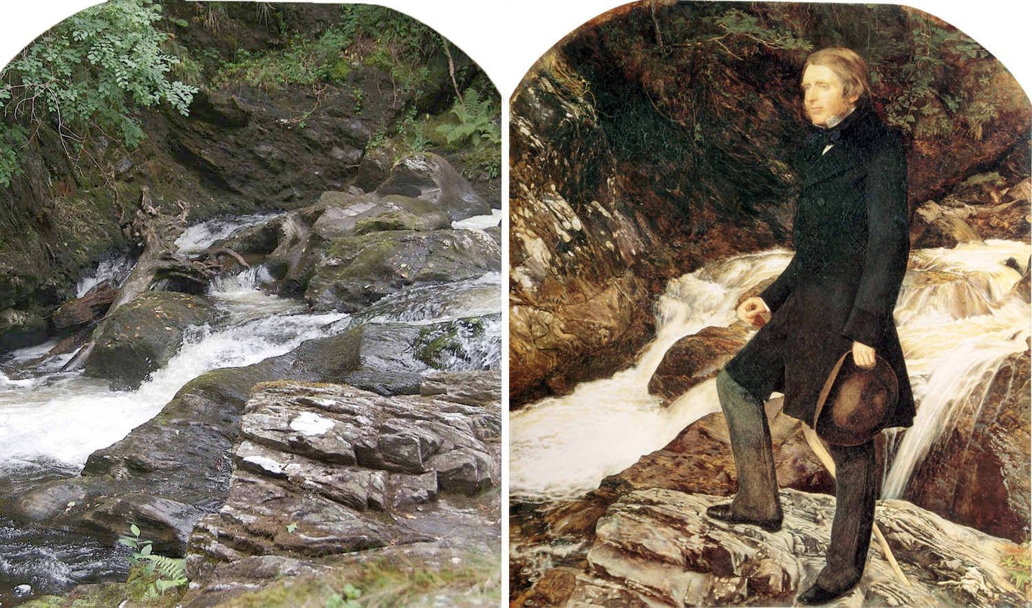
In the summer of 1853, painter John Everett Millais and writer John Ruskin traveled to Brig o’Turk, a tiny village in the Scottish Highlands, with their friend Sir Henry Acland and Ruskin’s wife, Effie. The purpose was for Millais to make a portrait of the writer in the rugged landscape. 

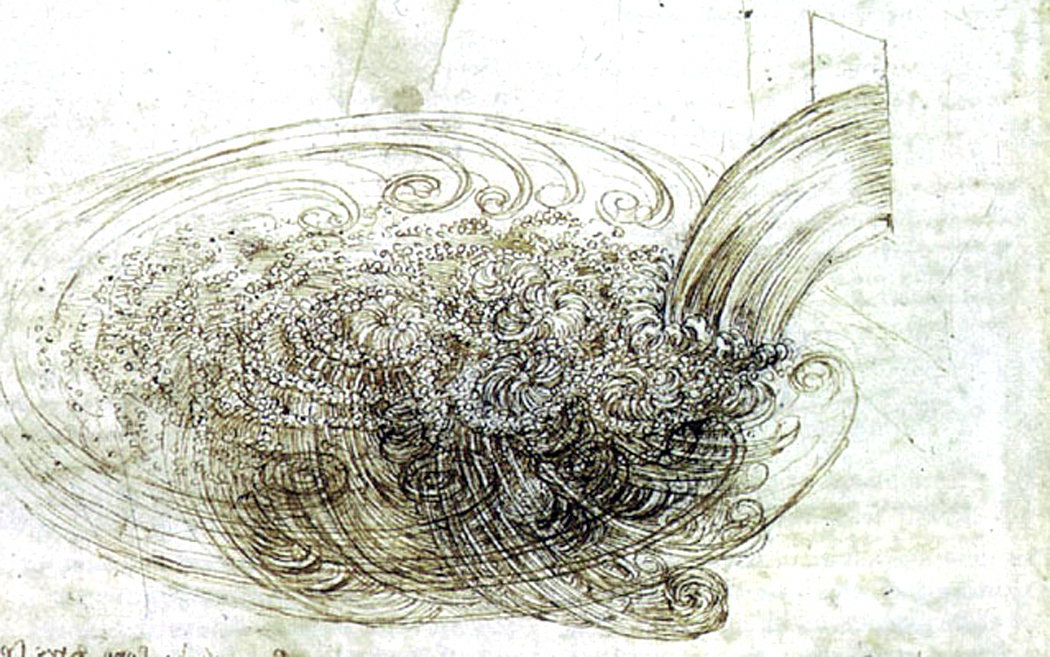
While Acland held the canvas steady on the rocks and swatted away midges, and Millais painted al fresco, Ruskin himself took to drawing rock formations along the freshet where the painter worked. The large drawing of Gneiss, With its Weeds was the poster art for a 1993 Phoenix Art Museum exhibit, “The Art of Seeing: John Ruskin and the Victorian Eye.” I fell in love with the drawing on sight. 

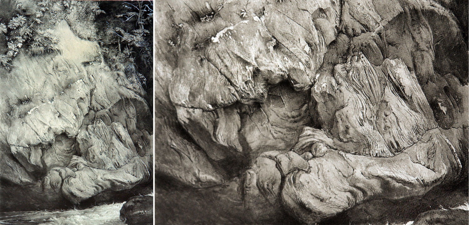
It had everything I respond to: texture, detail, close observation and an attention to the world as it is that is as close to love as is possible to hold for the inanimate world. Ruskin was an astonishing draftsman and many of his drawings and watercolors are part of the collection of the Ashmolean Museum in Oxford University. I much prefer his visual art to his writing. Ruskin was probably the most important and influential art critic of the 19th Century, and I find his writing truly insightful, but I would rather crack gravel in my teeth than have to read his prose, which is the heaviest most tedious sort of Victorian fustian possible. Sentence by sentence, lightning flashes; paragraph by paragraph, he is soporific; chapter by chapter, he makes you want to point a pistol at your uvula. 

Here is a chapter opening from his Stones of Venice:

You better rehydrate after reading a paragraph like that. Best to take Ruskin in wee small doses and think him a genius. His shorter sentences can be memorable — in a good way. 

“Remember that the most beautiful things in the world are the most useless: peacocks and lilies, for instance.” 

And rocks. Stone carved and molded, left striated and torn by time and weather. Many of Ruskin’s drawings are of stone, or rocky outcrops.

“It is not possible to find a landscape, which if painted precisely as it is, will not make an impressive picture,” he wrote in Modern Painters. “No one knows, till he has tried, what strange beauty and subtle composition is prepared for his hand by Nature.” 

Ruskin believed that close attention paid to the things of this world reaped benefits intellectual and spiritual. That a minute inspection of a piece of turf, such as Durer painted, contained all the seeds of a spreading universe. Indeed that questing after spiritual rewards through oneiromancy, divination, crystal ball or thumps under the table, would lead away from the genuine sense of transcendence available from simply paying close attention to the here and now. 

He wrote in Modern Painters: ”The greatest thing a human soul ever does in this world is to see something, and tell what it saw in a plain way. Hundreds of people can talk for one who can think, but thousands can think for one who can see. To see clearly is poetry, prophecy and religion, — all in one.” 

Hence his willingness to spend weeks on a simple drawing of an outcropping of gneiss in a watercourse clumped with weeds. 

(And weeks not paying attention to Effie, who received her attention from Millais, who also made numerous sketches of her. He painted her sitting beside a waterfall, or quietly sewing, with foxgloves tucked into her hair. He also helped Effie with her own drawings, took long walks with her in the evenings and sheltered with her under a shawl, waiting for the rain to stop. In turn, she read Dante to him. She eventually left Ruskin and, after an embarrassing annulment, married Millais. Embarrassing in that it turned out Ruskin had never consummated his marriage and was actually panicked, on his wedding night to discover that his bride had hair “down there.” His beloved Grecian marble goddesses did not. Ah, but they were stone. As for Effie and Millais: They had eight children.)

But back to that 24-by-28-inch drawing. It has stuck with me for all these years. There is something about that smooth-weathered gneiss that ticks a sympathetic spot in my psyche, purely sensuous. I can feel its surface in my imagination, its hardness and texture. The roundnesses of its protuberances. The very temperature of the stone under my fingers. 

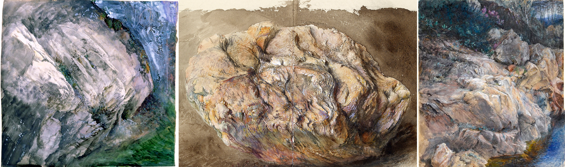
And in my own work, I have often attempted to mimic its sense of texture and quiddity. I have photographed many a stone face. 

Actually, I have been photographing rocks for long before I saw the Ruskin drawing. Some of my earliest remaining images are of rocky landscapes, and the first show I had, almost 40 years ago, was titled, “Rock Water Green.” 

At first, when I was young and ignorant, I wanted to make stunning landscape photographs. Inspired by the work of Edward Weston, Ansel Adams and Paul Caponigro, I wanted to capture the sublime in black and white. 

But over time, I became much more interested in using the camera to focus, not the lens, but my attention, and more often, on details rather than grand compositions. That aspect had always been there, but now, it became predominant. 

But, because I was working in silver and chemicals, almost all of it was in black and white. The advent of digital gave me an opening to a different way of seeing — in color. Color and black-and-white are completely different things; monochrome emphasizes form and texture while color almost makes you forget the form. Shadows are the jewel of black-and-white and the bane of color — they can leave shapes impenetrably confused. It took a while to become comfortable with the added dimension and new way of seeing. (I haven’t given up black-and-white, but now use them for different purposes. I still love the range of grays from glare to inky black.)

And the new dimension changed my approach to photographing stone. At first, I sought out the garish, like these rocks along the Blue Ridge Parkway, stained with iron rust.

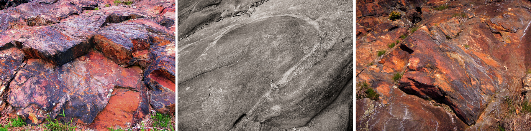
And I had the 20th-Century prejudice towards lining things up parallel with my picture plane. I thought of the rock faces as if they were abstract paintings. 

These are from Schoodic Point in Maine. I have always been attracted to the textures of the rocks, even when thinking of them as if they were paint on a canvas. 

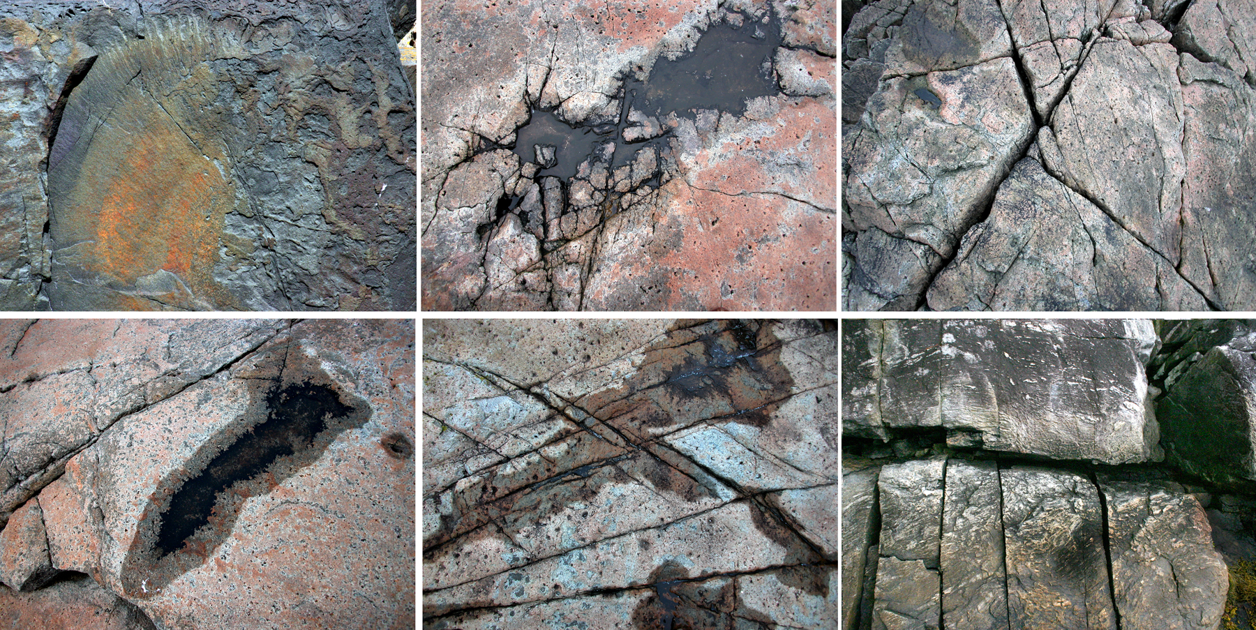
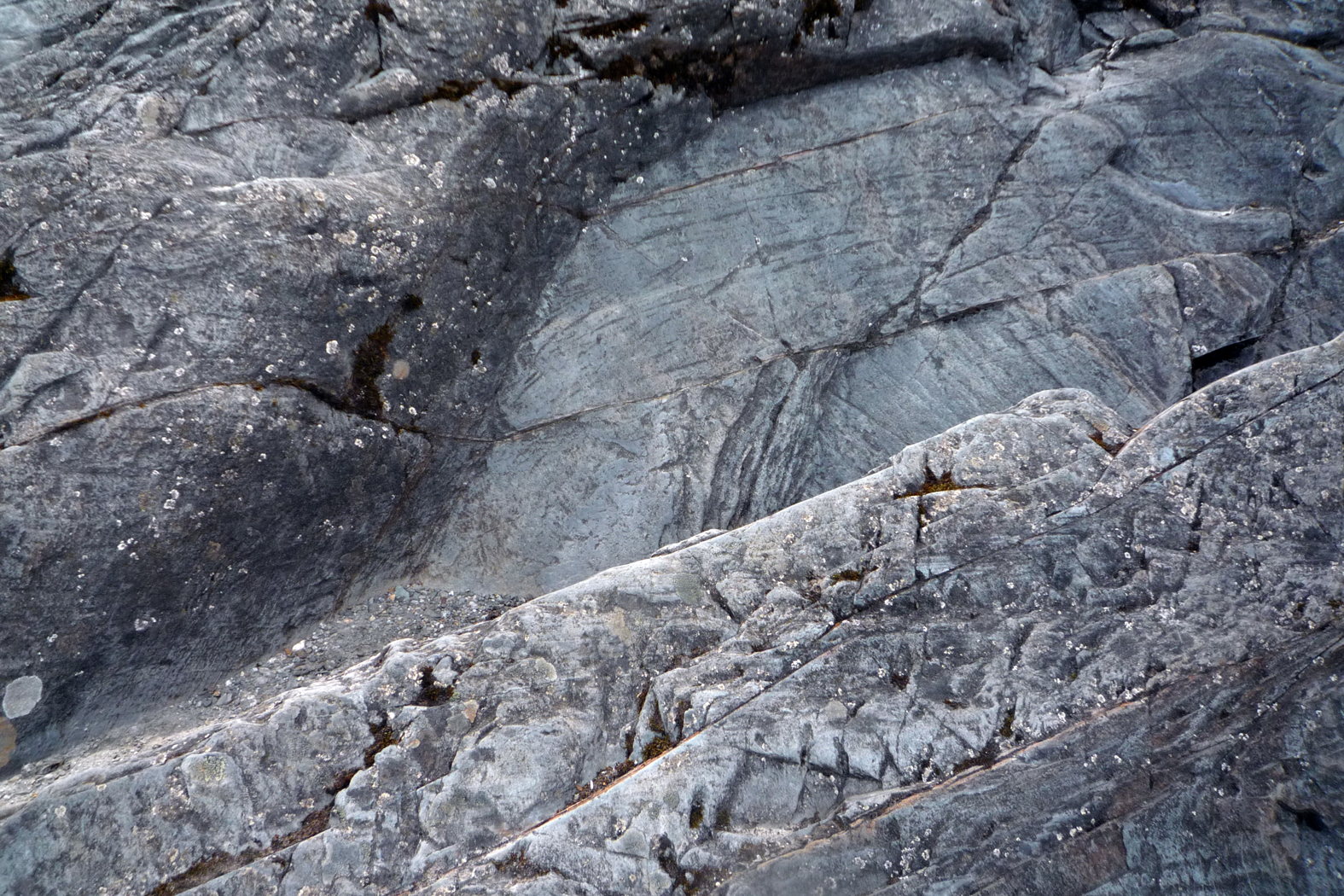
But visiting the Mendenhall Glacier north of Juneau, Alaska, I found the rocks to be, not paintings, but sculptures. The shapes advanced and receded, jutted and sunk, rounded and jagged. And I found myself spending the better part of a morning making a series of images emphasizing their three-dimensionality. 

And, instead of the garish color of the rust, I delighted in the subtle blues and grays of the stones, cooler and warmer shades of the stone. 

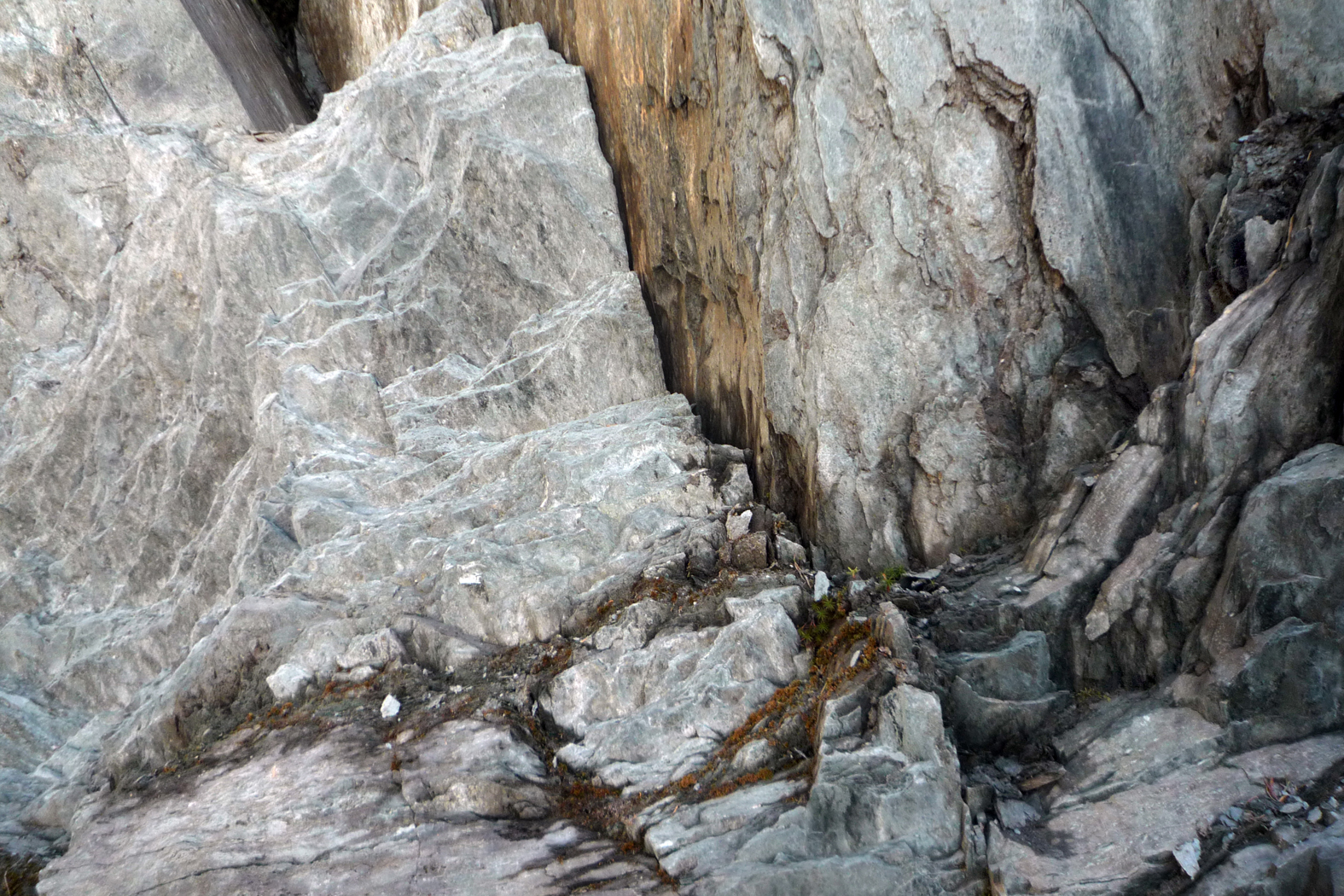
And the texture, wrinkled or scratchy, matte or glossy, is something I don’t only see, but feel, as if on the tips of my fingers. Shelley wrote: “The great secret of morals is a going out of ourselves,” and art, even so minor a one as my gleanings on the surfaces of stone, is a form of sympathy. When I watch dance, I feel in my muscles the twisting of the dancer’s legs. When I hear the swelling of strings in Brahms, I feel it in my chest. When I see the colors in a Monet waterlily, I recognize the world I inhabit. It is not enough to see or hear the art as something separate from oneself; one must not merely recognize oneself in the art, but rather one must feel the unity.  

This rock I photograph is me. I don’t mean that in any vague New-Age way, but in the real sense that the shapes and colors we share are the stuff of my own realization of myself as part of the cosmos. 

“The greatest thing a human soul ever does in this world is to see.”

Click on any image to enlarge

cun 18th century

What does the midday sun look like?

That may sound like a simple question, but it’s not. You can’t really look at the sun: If you try, the result is sensory overload, like the distortion of loud music on cheap speakers. You can even go blind, rather quickly.

Yet, everyone thinks he knows what the sun looks like. It’s everywhere in art, beginning with the tempera paintings kids make in elementary school: They so often put a wedge of sun in the corner of the painting, with rays spread out below like sea urchin spines.

kid turtle

But the sun doesn’t look like that: The child’s version of the sun is a symbolic representation of the solar disk.

But then, so are all adult representations.

So we also recognize the gilt centrifugal rays of Louis XIV’s Sun King symbol and the terra cotta sun face of Mexico and the red ball and rays of the World War II Japanese “Rising Sun” naval ensign.

sunmosaic

The sun is the paradigm of art problems, because it can never be portrayed accurately as it looks. Paint cannot be so bright.

But that doesn’t stop artists from attempting it. Van Gogh painted the solar disk over and over in his landscapes. Usually, the sun is a yellow circle surrounded by concentric brushstrokes in a darker ocher. The only way he could make the sun seem bright was by making the sky unnaturally dark.

vangoghsun1


Ansel Adams had a photograph he called The Black Sun, in which a long exposure caused the image of the sun to solarize, making it a dark dot in the picture, surrounded by a halo of rays. It looks almost like an eclipse photo.


Ansel Adams' "Black Sun"

Ansel Adams’ “Black Sun”

In Picasso’s Guernica, the sun is an edgy elliptical disk with spiked rays, in the middle of which is a light bulb.

guernica detail

Each of these is an attempt to portray something that cannot be portrayed.

On a piece of paper or a canvas, the brightest white is no more than 40 times brighter than the deepest black. In the Arizona summer, the sun is thousands of times brighter than the shadow under a mesquite. A canvas just cannot accommodate that brightness range. We compress that range and accept it.

But the emotional effect of the sun’s brightness is just as hard to portray. When artists attempt it, they have to leave the realm of naturalism and create a fiction, a symbol for the sun instead of its snapshot.

So, what does the world look like? The sun is only one minor example of the complexity of this question. It is a question that has been at the core of art for 30,000 years and has still not been answered in any finality.

The problem in formulating an answer is that human perception is both so complex — scientists keep finding more astonishing whirligigs in the brain’s apparatus — and at the same time, so universally believed simple. We all have eyes; and seeing, after all, is believing.

We see with our eyes, most people think. The world looks the way a photograph makes it look.

But of course, we don’t see with our eyes, but with our brains – and even more difficult, with our minds, which means we see through the haze of emotions, culture and individual life experience. We so thoroughly process the data that our eyes collect that the final result barely matches the patterns on the tickled retina.

Seeing doesn’t just happen; it is a complex mental process. And it is a learned process, as any of hundreds of studies have confirmed. One of the ways it is learned is through art — or, to use the more modern term, through media.

Which is why, until the Modernist revolution in this century, artists concerned themselves with attempting to accurately depict the world around them.

It was to this end that such men as Leon Battista Alberti and Filippo Brunelleschi attempted in the 15th century to devise a mathematical formula for creating the illusion of three-dimensional reality on a two-dimensional canvas. The linear perspective they created became the mother tongue of European painting for four centuries.

But perspective wasn’t the only question: We’ve all seen the obsessive drawings of Leonardo da Vinci, attempting to get down on paper the swirl of water in motion.

leonardowater

Or Michelangelo’s attempts to show every anatomical muscle under the marble skin of his statuary.

The Italian Renaissance was so thorough in its quest for realism, and so successful, in contrast to the Romanesque and Gothic art that came before it, that we have on some level considered the question answered ever since: This is what the world looks like.

Yet, it isn’t so. There are gross distortions built into perspective: Its grid of parallel lines is pure fiction. Leonardo’s water looks more like masonry than fluid, and Michelangelo’s muscles are a little too manic to be visually true.

Yet, the schematic system of image-making they came up with was so persuasive that we still accept the look of it.

Photographs, for instance, which are often taken for the ultimate in realism, are actually made through lenses carefully designed to mimic Renaissance perspective. Rectilinear imagery doesn’t happen naturally.

No art is ultimately realistic. What we tend to call realistic art, whether it is 200 years old and hanging on a museum wall, or hanging in the “starving artist” corner of your shopping mall, is more properly called ”conventional” art. It partakes of the conventions of art that we have, for the moment, accepted.

But those conventions are just as stylized – just as unrealistic – as the ”King Tut” angular figures on an Egyptian frieze, or the misty landscapes on Chinese scrolls.

Take any so-called realistic piece of art and ask just how like life it might be.

When a British cleric, Dr. Thomas Church, visited Rome in 1816, he sat to have his portrait drawn by Jean Auguste Dominique Ingres, one of the leading French artists of the time. The 6- by 8-inch pencil drawing Ingres made is now owned by the Los Angeles County Museum of Art. It is a drawing almost everyone would call a realistic likeness. Certainly, if you knew the drawing, you could have picked out Church from a police lineup.

Ingres' Dr. Thomas Church

Ingres’ Dr. Thomas Church

Yet, the drawing is realistic in only a conventional sense; we are so used to those conventions, we don’t even think about them. We are fish, the conventions are water. It almost seems silly if I point them out. But it isn’t silly; it is profoundly important for us to think about them.

First of all, I doubt the good reverend was only 15 inches tall, as he is in the drawing, or would be if he stood up and his legs hadn’t been cut off by the edge of the paper. We have no trouble believing that a small likeness is realistic, any more than we have trouble with Georgia O’Keeffe’s larger-than-life flowers.

Second, Church probably had a little more color in his cheeks than in this monochrome drawing. We accept black and white as realistic.

We even accept his high-collared coat as black because we know such coats, even though in the drawing, it is the same blank-paper color as his nose and cheek.

Third, the real doctor was three-dimensional; the drawing is not. We could walk around the real person and see his back; the verso of the drawing is just blank paper.

Then, too, the real person moved and the drawing is frozen still.

The real person moved through time, too. It should also be noted that the drawing still exists; the same cannot be said for the good cleric. Ars longa, vita brevis.

The real person made noise — I cannot imagine such a cleric not talking constantly, even prattling. The only noise the drawing can make is a crinkling sound if you were to crush it in your hands — a sound to draw the immediate attention of the museum guard, no doubt, but not exactly conversation.

The drawing also has no odor of humanity about it. Then, too, the drawing is made up of pencil lines. Examine as you will the world around you, you will not discover lines in it that outline the borders of objects. The use of line in drawing is one of the most persistent, and least realistic conventions.

And the last thing I’ll mention: There is a frame, an edge of the picture that cuts off the bottom half of the good reverend. Real experience does not come with a frame line.

All these things we look right past and accept the drawing as an accurate rendering of reality. I’m sure you can come up with a dozen other hidden conventions I have passed over. But that is the power of convention. And it is all the more reason we should be concerned with the question: What does the world look like?

A century of Modernism has taught us not to ask such a question, and we have largely bought into the propaganda. Instead of asking the question, “What does the world look like, from the time of Cezanne on, art has primarily asked, ”What does art look like?” When a visitor looked at one of Jackson Pollock’s swirls of paint drippings, he asked, wondering what the picture’s subject might be, ”What is it?” Pollock answered, ”A painting.” He wasn’t just being cute. All of art critical theory at the time asked us to consider the effects of colors against other colors, forms against form, line against line.

But as great as some of the century’s art is, the overall effect is of a mirror held up to a mirror. It is intentionally mute: ”Music can express nothing,” said the arch-Modernist composer Igor Stravinsky. He was wrong, but he summed up this century’s own unacknowledged provincialism.

Art must regain its connection with the life we live. There is no better way to do this than attempt to answer the basic question about the appearance of the world.

For seeing is active, not passive. It is something we do, not something that happens to us. Each generation must keep up this dialogue with the world.

It is still a noble goal of art: to discover the difference between the schematic and the mimetic, between convention and experience — between what is and what has to be.

To parse it all out.

What is called Postmodernism doesn’t effectively do this. If Modernism is a mirror looking at a mirror, what has followed is a TV set looking at a TV set.

nam june paik1

A generation of media-savvy savants has created an art that is self-referential, and its main reference is The Brady Bunch.

I am certainly not calling for artists to imitate the look of Norman Rockwell. I hope I have made clear that Rockwell is not realistic.

I am calling for artists to take a really close look at the world around them — actually, I am calling for them to love the world, to caress the things of the world with their eyes.

The most effective way of doing that is to draw. Not until you have drawn something have you really seen it, felt its texture in your mind, tasted its color on front and back of tongue, known its shape and the shape of the air around it.

You can see this in Ingres’ drawing again. The coat, the pose, the chair arm — they are all merely conventional. But look at the eyes. They fairly swell with life, there is a softness to the bags underneath, a bristliness to the eyebrows and a live intensity to their gaze. The eyes are the animated center of the drawing, a jewel in a supportive setting.

In the coat, one sees the artist’s training; in the eyes, his connection with the world. There is no doubt which is more important.

So I ask the question of artists, what does the world look like?

Take take just one of those issues: motion, for instance. In the early Renaissance, it was not unusual to repeat a figure several times in a painting, depicting action as it is shown in the frames of a comic strip – showing the same figure in different parts of the frame at different moments in the action.

salome

One depicts Salome dancing in one part of the picture and John the Baptist in his cell in another. Another corner of the picture shows John bent over the block with an executioner’s ax raised over his head and a final portion has Salome watching John’s head on a platter.

Even God appears twice, from front and back, in Michelangelo’s Sistine Chapel Creation.

An entire century of art grappled with this problem as Baroque artists painted violent action at its most unstable point in time, suggesting the motion even when the figures are still as statuary.

Marcel Duchamp’s Nude Descending a Staircase is an attempt to portray the motion itself.

nudedescendingstair

Jackson Pollock’s action paintings are visually active with the result of the painter’s own motion.

Jean Tinguely created kinetic sculpture that actually did move.

Which of these is most “realistic”?

The depiction of visual reality is only one of the purposes of art, but it is a great and noble purpose that has been in eclipse as artists have been seduced by the cleverness of conceptual art.

As though the problem of mimesis in art had somehow been solved, freeing us for other endeavors.

But every time an artist picks up a pencil and tries to get the proportions of a figure right, every time an artist mixes a rose madder with an alizarin crimson to match the color of a landscape, she is tackling the biggest and most intractable question of art.

Looking is hard work, worthy work for an artist.

The sun streams in through the window, I go to it, look out at the world beyond and wonder what it looks like.

Astonish us.