Archive

Tag Archives: esthetics

According to European-Western tradition, there are four cardinal directions: north, south, east and west; and we mark them on a map by making the sign of a cross: north, south, east and west. Dominus Vobiscum. But Western culture tends to value a map rather more than the ground under your feet. If we take a larger view of it all, we should acknowledge two more cardinal directions: up and down. We live in three dimensions, not two. A map is only a diagram. Et cum spiritu tuo.

And when we make images — photographs, drawings, paintings — we tend to look along the flat plane of our cardinal directions, which means also, the plane of our standing vision. And if we photograph flowers, we tend to make our images like the identification photos in a nature guidebook. We look at them as if they were as tall as us, or we as ground-hugging as them. 

The bias is to ignore the sky above, the mud below. I spent some hours yesterday attempting to break my own tendencies and see if a shift in perspective might give me a fresher look at the garden. And so, I made a series of photographs pointing the camera straight down at the flowers from the top. 

The first image I made, when I put it up on my screen, reminded me of something. It took a moment, but then I had it: the Pleiades — the Seven Sisters in the night sky in the constellation Taurus. Here are the flowers:

Here are the Pleiades:

Looking down in the day was a mirror of looking up at night. Bunches of flowers, especially roadside wildflowers, often remind us of stars in the night sky. It’s why we name them cosmos, stellas and asters. 

Certainly the flower that has meant the most to me, emotionally, through my life is the aster, named for the stars. I remember a day, some 40 years ago, driving with my then-soulmate (is there a sadder hyphenated word in the language?) near Port Jervis, N.Y., and coming across an abandoned field, maybe a couple of football fields in extent, that was crammed with asters, thistles and ironweed, so thick on the ground there was barely any green showing through. It was hysterical with blue, and I thought it was the most beautiful sight I had ever seen. Since then, I have sought any semblance of that abundance. I’m not sure a single life affords more than one of those moments. 

And so, I am walking through my sister-in-law’s garden in North Carolina and holding my camera flat parallel to the ground to see what these flower-stars look like from an angle we don’t normally see — or at least, think of them. 

Over and over the star analogy shown through. Constellations of yellow or white against a sky of green. 

Even the leaves themselves can be stars:

Patterns made: line-ups, triangles, squares, quincunx, spatters and grids. 

There is a Medieval trope that everything in Heaven finds its analog in the sublunary world (much like the Renaissance idea that everything in the world is mirrored internally in the mind). And I certainly felt that correspondence strongly while finding my floral models to photograph. 

It was the looking down that made the connection, the opposite of the looking upwards at the night sky. But looking down — straight down, if I could avoid my own clumsy feet — gave me more than that. I found that I was photographing more than calyx and petal, but discovering just how many distinct greens nature blares forth. 

Historically, painters had a limited number of pigments to use when painting leaves and trees. They could modulate those hues with the admixture of others, but there was a limit. The trees of Claude or Titian are mostly monophonic rather than stereo. The artist who freed green from those confines was Paul Cezanne, whose paintings contain more greens and more blues than any artist before or since. His eye for tint and shade was phenomenal. I remember when I first came to appreciate the work of Cezanne. I had seen his paintings only in reproduction and always thought of them as rather dull, even muddy. But visiting the National Gallery in Washington, D.C., I found a wall of the still lifes and was knocked out by the glowing depth of color: color I had never experienced except under the influence of herbs. But those chemical-induced colors were vaporous compared with the earthiness of Cezanne’s greens, blues and yellows. 

And so, there I was, camera in hand, looking earthward and seeing the exuberance of May in Piedmont, North Carolina, and the blistering variety of green that sprouts from the ground.

I walked around the property, head held downward, and finding such a joyous variety under my feet, that I wound up, in the space of under an hour, taking at least 100 usable photographs — images I would be proud or eager to share with the enthusiasm of a convert. The greens made patterns; the blossoms made patterns; the leaves were shapes to pleasure in; the colors were delicious. 

The esthetic sense, however, awakens an awareness of yet a seventh cardinal direction, which we might call “center.” It is the inward direction that is privy to the other six and gives them meaning and purpose. North, south, east, west, up, down, and in. Each in some way a reflection of all the others.

I have traveled much in each of the cardinal directions, north to the Canadian arctic, south to the Cape of Good Hope, eastward to Europe and finally, the Pacific coast. I have gone up in aeroplanes  and cathedral bell towers, and down in chthonic mine shafts and vast caverns, but most of all, I have gone inside of myself. The experience of nature — but also the making and partaking of art — expand the inner world, adding continents to the mental globe, possibilities of understanding, and depths of compassion. 

Looking down at the humble soil and its profuse variety keeps one from becoming tired of life. Paying attention is, in some ways, coequal with life itself.

Next — perhaps in tomorrow’s rain — I will extend my interior travels by looking straight up to see what is there.

Click on any image to enlarge

The world is not black and white, but until fairly recently, photography was. For most of its history, the art was an art of silver on paper, spread from inky blacks through velvety grays into pristine whites. 

There had been attempts to add color, either by painting on top of the monochrome image, or by various experimental techniques to capture the color directly. But even after the commercially successful introduction of Kodachrome in 1935, photography as a museum-approved art continued to be primarily in black and white. 

(In cinema, Technicolor predated Kodachrome by about a decade, but that process was essentially three different black and white negatives overlapped through color filters to create the effect. It was an expensive and difficult process and relatively few films, percentage-wise, were made with the process until after the commercial success of Gone With The Wind and The Wizard of Oz in 1939.)

I have been a photographer for at least 50 years. I have had shows and my work has been published. But for most of that time, I worked in monochrome. I “saw” in black and white. My photographic heroes worked in B&W, the techniques I mastered were silver techniques. I became an excellent printer. But I seldom used color film. It seemed an unnecessary noise to bring to the purity of the medium. 

I was hardly alone in this. When I was younger, even museums shied away from color photography. It was seen as not “permanent.” It’s images faded over time (I’m sure you all have old family snapshots turned rather magenta with age). The real artist-photographers used silver or platinum and made glorious images. 

Back then, art in general was seen with more precious eyes. We thought of “archival processing,” and even paintings were carefully preserved and curators looked down on some artists — such as Jackson Pollock or Mark Rothko — who used non-archival pigments or unprepared canvases and whose works, therefore, had begun to deteriorate. 

In current times, few artists or galleries worry much about such things. Art can be made on newsprint, or can even purposely self-destruct. Concern for the permanence of an artwork is seen as elitist. After all, no matter how careful you are, the art is going to be gone eventually, even if it lasts till the sun explodes. 

And besides, color is now no more or less permanent than black and white: Now they are both nothing but ones and zeros. Silver is dead; long live digital. 

Yet there is still a difference between color photography and black and white. It is a difference not simply of technique, but of thought. Thinking in color is different from thinking in black and white. 

The part of vision that deals in color is processed in a different area of the brain than the part that concerns itself with darks and lights. (Vision is ridiculously more complicated neurologically than you might think — the information on the retina is broken down into many separate components, processed by differing regions of the brain and then re-coordinated as a gestalt.)

And so, some people pay closer attention to the hue, others to the forms they see. 

The fact is, black-and-white photography and color photography are two different art forms. To be successful in both requires a kind of bilingualism. Most of us have brains that function best either in seeing forms and shades, or in seeing hues. The two photographies emphasize those different talents.

One has only to consider the work of Stephen Shore or William Eggleston. Most of their meaning comes through the color. Take one of Eggleston’s best-known images and suck the color out. What have you got?

He made this photo of a ceiling and light bulb. The red is overwhelming. But imagine it as a black and white image.

He also made a similar image of a brothel ceiling painted blue. Also overwhelming. The two are nearly the same image, but with very different emotional and sensuous meanings.

But if we make them both black and white, they very nearly merge into the same thing. 

Color can by itself separate forms. Here are four squares in four colors; as distinct as can be. But the exact image, unaltered except for the draining of all color from it, leaves a confused mess, barely a separation between grays. 

Black and white photography requires the separation of parts not by hue, but by contrast: Lights agains darks. It’s what makes great silver prints sing. Where color photographs separate forms primarily by hue, black and white shapes form with contrast.

I am not saying a color photograph has to be garish. Far from it. But the color will carry a good deal of the meaning and emotional resonance of the image. Even in a color photo that has hardly any color in it.

Many years ago, I tried an experiment. Like so many others, I loved the waterlily paintings of Claude Monet. But I wondered if they would make as much sense in black and white. Is there a structure holding the pictures together, a design or composition, that didn’t depend solely on the rich color. 

So, I began making photographs in black and white of water lilies. 

The most successful of them clearly relied on bright highlights and strong shadows. The shapes made the picture.

If I tried an overall design, like Monet’s the picture lost its strength. 

I did the same experiment with one of Monet’s paintings, rephotographing it in black and white. 

Did it hold up? It is certainly a very different beast. 

Then I went back to one of my own color photographs of his waterlilies in Giverny, a photograph that imitated Monet’s paintings, with color, sky, reflection, shadow and lily. In color and side-by-side, in black and white. 

What I discovered shouldn’t be a surprise: Monet was much more effective in color. But I also noticed that because my photos were well-focused rather than impressionistically fuzzy, they translated better into black and white: Black and white is meant to clarify shapes. Color identifies “areas” rather than discrete textures. 

And so, while I have spent the majority of my photographic career making monochrome images, along with many others now working in digital media, I switch back and forth between color and B&W. They do, however, require different vocabularies. They are different languages. 

While I have always made visual art, I made my career in writing about art. 

As an art critic, I had the unusual need to be bilingual in an odd sort of way. As a journalist, I needed to be good with words, but in writing about art, especially visual art, I needed to know how to use my eyes.

I discovered very early on how these two talents were seldom granted to the same person. All around me were reporters who knew a gerund from a copulative, but who often seemed almost infantile when discussing pictures. They could name the subject of the image, but not go much further than that. 


A photo editor of my acquaintance once explained photojournalism this way: “I need to know it’s a house; don’t trick it up with ‘art.’” This was image as ID photo. 

But on the other side, so many artists I knew couldn’t explain themselves out of a paper bag. They effused in vague buzzwords, words that changed currency every year or so. I once taught a graduate course in writing about art for art students who needed to prepare so-called “artist statements” for their exhibits. Most of what they wrote before the course was utter blather, obscure and important-sounding without actually meaning anything. 

Words and images: Worlds seldom interpenetrable. I call the talent for riding both sides a form of bilingualism. 

I do not know if the ability to deal in multiple “languages” is something you are born with, or that you learn early on the way you acquire language before the ability to do so closes off in adolescence. But somehow, I managed to do it, at least well enough to write about it without embarrassing myself.

The mental juice necessary to process each seems walled off from the other, except in rare cases. One either runs a literary program, based on sentence and paragraph structure, linear words building a whole out of alphabetic parts; or one comprehends shapes, lines, color, size, texture, and frame as carrying the information required to convey meaning. 

This doesn’t mean that visual people are illiterate, nor that literary people can’t enjoy an art gallery, but that their primary modes of understanding vary. The squishiness of an artist’s gallery talk can drive a writer bonkers; the flatness of a word-person’s understanding of a painting can leave an artsy type scratching her head: “Can’t you see?” 

Nor does it mean that either side can’t learn, although it will remain a second language, without native understanding of idiom and customary usage. A word person can be trained to see shape and form, but it will always remain as I learned Spanish. No one will ever confuse me with a native speaker.

This split between word and image, though is only one of the bisections. Musicians can think in tone the way painters can think in pigment. Yes, there is a language that can describe the music, but for non-musicians, that language is usually impressionistic and often visual — what the music “makes you think of,” or the “pictures in your mind.” 

For the musically trained, there is also language, but it is completely opaque to the civilian: Dominant-seventh, voice-leading, timbre, reed trimming, tenor clef, Dorian mode, ritornello, de capo, circle of fifths. But even these are merely words to describe the non-verbal reality of the music itself, which can convey meaning through sound alone. The words are not the music. 

The ability to think in the terms of each mode is essential to create well in that form, and a mighty help in understanding it for the audience. If you are not in love with words, the rich cream of Gibbons or the organ tones of Milton can leave you cold. If you have no eyes for color, the nuance of Turner or the pears of Cezanne can zip past without notice. If you think of pop tunes as music, the shifting tonal centers of Schubert are inaudible, the orchestration of Mahler merely noise. 

We each have a frequency our sensibilities are tuned to, and can receive it loud and clear; we may think we understand the rest, but too often we are only fooling ourselves. Do you really inhale the contrapuntal movement of a Balanchine chorus? Do you notice the rhythm of editing in a Spielberg film? Each is a language that its practitioners and connoisseurs understand profoundly, but zip past the mass of those sitting in the cheap seats. 

It’s a different language

Click on any image to enlarge

Pablo Picasso painting Guernica in his studio, Paris, 1937; photograph by Dora Maar

When Pablo Picasso painted Guernica, he knew he was making a monument. When Milton wrote Paradise Lost, he knew he was writing for the ages. When Bergman filmed Seventh Seal, he knew he was saying something important and not merely entertaining us with a cool story.

Art is often made with large purpose. Artists may work a whole lifetime to be able to sum things up in a major piece, or group of pieces, like  the Isenheim Altarpiece of Grünewald, or Proust’s À la recherche du temps perdu.

In these cases, the art becomes an entity in itself, a thing produced. It takes on a life beyond its maker’s; it is a milepost in cultural history. We look to it not only for beauty, but for wisdom, for inspiration, for a sense that there is something large which we all share as humans.

On the other end of the spectrum are the snapshots we take of our families, on birthdays, on vacations, on weddings. As such, the photographs are seldom seen as esthetic objects, but rather encapsulated memories — something to hold fast a fleeting moment of importance to our singular lives. They may capture something intensely human, but that is not their primary purpose.

(It is always fun to scavenge anonymous snapshots to find glimmers of the idiosyncratic or the universal, that is, to see them as if they were intended as art. But that is a piece of active curation on our parts, as if we were the artists ourselves, editing the random into a coherent message. The family photos were never meant to hang in art galleries.)

Even if a painter isn’t making a Sistine Chapel, if he is a professional, he is creating a commodity — an object that can be sold. And even if it’s not bought, the thing exists as a thing. There it is, framed and hanging on a wall, with track lighting making it glow jewel-like in the gallery.

But there is something between these two poles — between commodity and snapshot. It is the artist’s working sketch, never meant to be sold, never meant even to be seen. It is either the artist trying out ideas for a painting, or — and this is even more important — just keeping his hand in.

There is something of the throwaway in such noodling, but there is also something of value we shouldn’t underestimate.

We often forget that there is an intimate connection between art and the experience of living. It has been made easier to forget because in the last half century or so, a good deal of art has been made simply about art, about its materials, its limits, its meaning, its history. But through most of that history, art was about the world. Whether it was landscape or still life, whether portrait or history painting, it was meant to reflect something of our common experience of life.

Even when art has been about art, it has been about the experience, in life, of thinking about art. There is an unbreakable connection between experience and its image.Which takes me back to those sketches. Whether it is Picasso doodling on a napkin or Turner washing light watercolor pigment over rag paper, it is — aside from any commercial intention — an effort by the artist to make the connection with the world. To see, and see clearly.

Andreas Gursky

Photography, as much as painting, has its monuments, whether it is an Edward Weston pepper or Ansel Adams’ Moonrise Over Hernandez, or more recently, the giant photomurals of Thomas Struth or Andreas Gursky. They are the opposite of family photos.

But there is a middle ground in photography, also. It is the equivalent of an artist sketching. Photographer Lee Friedlander calls it “pecking.” It is the quick, improvisatory snapping of bits of the world, to see what is there.

With is 35mm rangefinder Leica camera, Friedlander says, “you don’t believe you’re in the masterpiece business. It’s enough to be able to peck at the world.”

Only afterwards, going through his accumulation, does he edit and pick a few that stand on their own to be published or to be exhibited. But the interesting part, to Friedlander, is the engagement with the world.

“I take more to the subject than to my ideas about it. I am not interested in any idea I have had, the subject is so demanding and so important,” he says. “Sometimes just the facts of the matter make it interesting.”

Friedlander is amazing in that his peckings are often so visually rich and complicated that they are nearly as Baroque as a painting by Rubens. Action seems to be in every corner of the frame.

But you don’t have to be an artist as good as Friedlander to engage with the things of this world. Making photographs is a way of seeing, similar to sketching. It is about paying attention. We can focus on the details.

For many Americans — maybe most humans anywhere — only use their eyes for useful things. They see the road they drive on, the could that tells them it will rain, the house, the car, the coat closet. When they make a snapshot for the family album, it is enough to be able to name the items in the picture — that is Uncle Vern, that is the house we used to live in, that is my first car — and beyond the naming of the subject, we don’t really pay attention to what is there. Most probably, we have framed the image so the house or the uncle stands dead center in the frame.

Frielander talks about the potency of the photograph describing what is either his experience when he was a boy with his first camera, or perhaps anyone’s similar experience: “I only wanted Uncle Vern standing by his new car (a Hudson) on a clear day. I got him and the car. I also got a bit of Aunt Mary’s laundry and Beau Jack, the dog, peeing on a fence, and a row of potted tuberous begonias on the porch and seventy-eight trees and a million pebbles in the driveway and more. It’s a generous medium, photography.”

For Friedlander, his life work became making all these disparate bits harmonious in the frame. Again, like a Rubens.

For most of us, these pecked pictures are mostly details. They are not the grand view or the concatenated whole, but the tiny bits out of which the larger scene is built. Most of us pay attention only to the whole, when we pay attention at all; for most Americans — maybe most humans anywhere — only use their eyes for useful things. They see the road they drive on, the cloud that tells them it will rain, the house, the car, closet. But every house has a door, and every door a door-handle; every car has tires and every tire a tread and each tread is made up of an intricate series of rubber squiggles and dents. Attention must be paid.

Paying attention to the details means being able to see the whole more acutely, more vividly. The generalized view is the unconsidered view. When you see a house, you are seeing an “it.” When you notice the details, they provide the character of the house and it warms, has personality and becomes a Buberesque “thou.” The “thou” is a different way of addressing the world and one that makes not only the world more alive, but the seer also.

(It doesn’t hurt that isolating detail makes it more necessary to create a design. You can make a photo of a house and just plop it in the middle of the frame and we can all say, “Yes, that’s a house,” and let the naming of it be the end-all. But if you find the tiny bits, they have to organize them in the frame to make something interesting enough to warrant looking at.)

Sectioning out a detail not only makes you look more closely, but forces your viewer to look more closely, too. Puzzling out what he sees without the plethora of context makes him hone in on its shape, color, and texture. It is a forced look, not a casual one.

This is a rich world, profound in detail, millions of species, visual patterns in every rock and cloud. Each bit of rust on a grate is intense, when noticed. And noticing is what “pecking” is all about. With my own peckings, I am not making any argument for them as art; they will not be hanging in a gallery. I make them for myself, to force me to pay attention to the minutiae that are the bricks of the visual world they inhabit. And paying attention is a form of reverence.

Click to enlarge any image

fellini-3I was watching Fellini’s 8½ the other night and found myself weeping uncontrollably at the end. The last 20 minutes of the film make little or no literal sense, and works on purely emotional level — I wanted to say symbolic, but it isn’t really symbol that works here; rather it is a dreamlike series of images that cannot be rationally explicated. They simply add up. One can see the final dance as a riposte to the end of Ingmar Bergman’s Seventh Seal, where there is a line of dancers following death silhouetted on the hillside; in Fellini, it is rather a circus dance of life, to the rhythm of Nino Rota’s music, which somehow manages to mix sadness with ebullience. In Bergman, the queue is linear and headed to oblivion; in Fellini, it is circular and continuous.

fellini-5

But what was important wasn’t meaning but effect. There I was with hot wet cheeks and full heart, profoundly moved, although I could not explain exactly why. In some ways, the finale of the movie is silly, even childish. Somehow, though, it hit some resonant note. I was a wet rag, drained and filled at the same time.

I bring it up because so often our response to art is too little; we are trained — especially if we are professional critics, as I was — to make notes, consider intellectual points, compare and contrast, bring context and place the experience in a historical moment. Yet, if I were to say truly, none of that really matters; what matters is whether I am moved. Art, whether literature, movie, music, architecture or painting, needs to do more than divert us, to entertain or tickle our pleasure centers. It should change our lives. This is not easy; this is rare.

emily-dickinson-daguerreotypeI remember reading a quote by Emily Dickinson, in a letter she wrote to her patron Thomas Wentworth Higginson: “If I read a book and it makes my whole body so cold no fire can warm me, I know that is poetry. If I feel physically as if the top of my head were taken off, I know that is poetry. These are the only ways I know it. Is there any other way?”

When I was younger, this struck me as schoolgirl hyperbole. Now I am an old man, and I am poorly satisfied with anything that doesn’t take the top of my head off. Through a lifetime of concerts, theater and galleries, I must report that very little displayed therein reaches that bar. Most of the time, art gives us pleasure enough — we enjoy the tunes or the colors — but it does not rip us up, tear us apart and reassemble us in new ways. To justify art in terms of its prettiness diminishes the importance it plays in life and in culture. We must consider it in terms of how it changes us, leaves us weeping and hollowed out.

I have attended hundreds, perhaps thousands of concerts in my life. I have enjoyed most of them, and even in those that have been disastrous, there is almost always some moment of pleasure. (I remember a concert of amateurs attempting to play some Dvorak; they were godawful, out of tune, out of rhythm, unbalanced, a horrendous squawk — but they played with such obvious gusto and enthusiasm, and were enjoying themselves so much, I found I considered myself truly lucky to have heard them). But I can also count a few score times in seven decades, the number of times I was actually transported by a performance. Yet, those few times bring me back over and over in hopes of once again entering that heaven to hear those angels.

I heard the Philadelphia Orchestra under Wolfgang Sawallisch blow the hell out of Richard Strauss’ Don Juan, with a chorus of eight horns sounding the great heroic horn call. There was a physicality to that blast that cannot be captured in a recording. I felt the music through the seat of my pants as much as through my ears. It made me believe.

Early in my career, in 1964, I heard Emil Gilels at the Brooklyn Academy of Music play the Liszt B-minor sonata. I can still remember it, even to the seat where I was sitting and the angle I viewed the pianist from.

Twice, I have heard Yo-Yo Ma play the Bach Unaccompanied Suites for cello, and twice I have visited Elysium. He has recorded those suites three times in the course of his career, and none of them captures the lightning of the live performance. Not even close.

apollo-1It isn’t just music, though. I can read and reread Wordsworth’s Intimations Ode and every time, I break down and weep. I have stood beneath the north rose window at Chartres and each time I have done so, I have been transfixed, even transfigured. It is the most beautiful manmade thing I have ever seen — a lens to focus a vision of paradise directly into my hypothalamus. I had a similar reaction the first time (and each time) I saw George Balanchine’s Apollo. It is pure sorcery, magic, unalloyed beauty. Not beauty so much as reason-to-live.

I could go on, making a list. But that would be futile, and also misleading. Because the fact I was transported to some ring of heaven beyond the seventh by the Cezannes at the National Gallery in Washington DC, that does nothing to guarantee you will have the same experience. Making a list of the “great works of art” is pointless, because what matters is not the “objective” quality of a piece of art, but rather its resonance in the psyche and like any physical object, we resonate at different frequencies. What opens the floodgates in one set of eyes can leave the next pair unmoved. Chaucer’s short poem, Trouthe, has been a touchstone for me. For others, it may be a jumble of archaic vocabulary. You may melt to a puddle at Musetta’s waltz from La Boheme, and I might think it a catchy tune. De gustibus.

king-learWhat matters, however, is that we find in whatever art that moves us, some special shattering of the veil of everydayness, a bursting out into the glory, the recognition that the night sky is infinite, that there is some web, some complex knot of emotional string that ties us together as human beings. It may be Michelangelo’s Pieta, Picasso’s Guernica, Brahms’ German Requiem, that moment at the end of King Lear when he carries the dead Cordelia back on stage and we realize his splintered ignorance and madness is our own —  it gives lie to all the feel-good rah-rah about “the arts,” and the chamber-of-commerce support for cultural institutions. It isn’t that the arts are some charming little ornament to our civic lives, but that when that spark ignites in the rare cases it happens, our entire beings are set on fire. There is nothing “nice” about it. It is disruptive, challenging, destructive in the way destruction can lead to new birth. I never want to be subjected to pleasant art. I want to be battered by it (pace John Donne).

What makes it all more frustrating, however, is that it can never be just the piece of art. If I was profoundly moved by Balanchine’s Prodigal Son the first time I saw it, that is no guarantee that I will have the same experience the next time, and not because of a variability in performance, but because the art can seep in and work its power on us only when we are receptive. I may have had a overcooked pork chop before heading to the concert hall, or a disturbing letter in the mail, and cannot receive the gift of the performance. I may just not be in the mood for Sam Beckett that night; or the memory of one conductor’s Beethoven may deafen me to the new one being offered. A thousand distractions block the missive from the gods.

There is also our age: What moves us at 20 may not at 65. We find new depths in things we were once blind to, and outgrow early enthusiasms. This is natural and if it didn’t happen, something would be wrong.

So, we should be all the more grateful when we can open our chests to the lash of what is being gifted us.

pit and pendulum poster
INTRODUCTION

Art keeps changing. What is popular in one century is laughed at in the next. Victorians hated the undisciplined libidos of the Romantics; the 20th Century has found the Victorians cloying, sentimental and insincere.

But what causes these changes in taste? It is too often believed that styles change merely out of boredom, as if we got tired of one look and were attracted to the glittering novelty of the next.

And while there is certainly something to the idea of the bright, shiny and new, there is also something deeper and more meaningful.

For art history is not just a history of shifting styles, but of changing sensibilities. The transformation of one age into the next — of the Renaissance into the Baroque, of Neo-Classicism into Romanticism, of Modernism into Postmodernism — is a transformation of ideas.

cones and bullets

Making a point (or two)


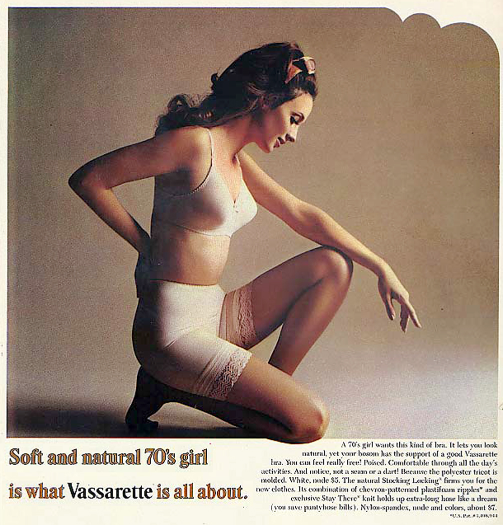
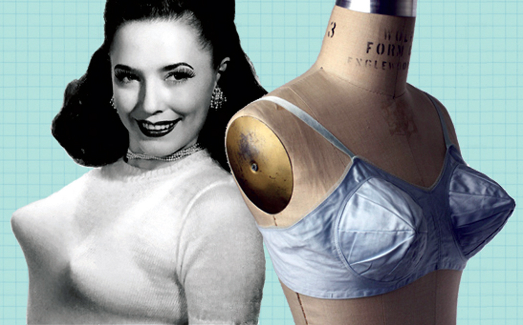
I say it isn’t merely fashion, but fashion isn’t either. Perhaps you get some idea of what I mean if we look at the Maidenform bra, for instance.
dreamed i was wanted

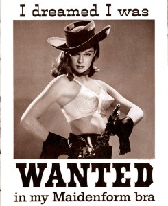
Here it is, as hard as cardboard and pointy as a dart. It molded the female form to a rigid contour. I remember when it used to be called the “nose cone” look.

But if you consider the time that gave  birth to the nose cone, you recognize it was the Eisenhower ’50s. It wasn’t merely the bra that was rigid. Men wore starched shirts then, too. Suits and ties were required attire at the office.

Wives wore highly structured dresses, with darts and sizing, and a mask-like make up, with red lipstick and black mascara. Their hair was held stiff, too.

And what was the political climate? It was also stiff. People were expected to conform. Those who didn’t were suspect. Investigated by the House Un-American Activities Committee. There was a conventional idea of what the ideal was. You can see it in the TV shows of the time.

Leave It to Beaver? The Donna Reed Show? Dragnet.soft and natural

Interestingly, the ’50 lasted through the ’60s. But at the end of that decade, something happened. The rigid bra went out. So did the structured clothes. So did the stiff ideas.

These things are all connected.

The ’60s, by the way, lasted into the middle of the ’70s, when the ’80s began. Our idea of decades in this century is a little cockeyed. Still, we call the ’60s the ’60s and everyone knows what we mean, even though what we mean is the years between 1968 and 1974. That was the ’60s. All over in a flash. I remember — the flashing, that is.

It was a retreat from what seemed like inauthentic artifice into what seemed at the time to be authentic naturalness. “Natural” became the adjective of the decade. I remember one shampoo that advertised “100 percent all natural natural ingredients,” which, of course, promised only that whatever natural ingredients made it into the bottle, were actually natural.nipple bra

Black America began wearing a hairstyle they called the “Natural.”

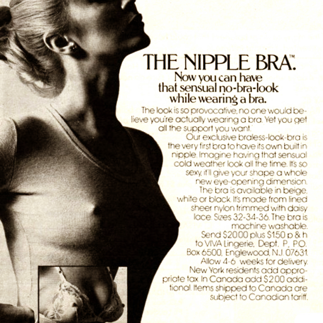
And we had the “braless” look. Even bras offered the braless look.

If the ’60s seemed like a reaction to the stuffy ’50s, it was. But it was a wide shift in sensibility. The art changed; the music changed; the politics changed; the philosophy changed.

Artifice vs. artlessness

Before there was stiff underwear, in the 1920s, when things were looser mentally, emotionally and morally, underwear was looser, too.1920s lingerie 2

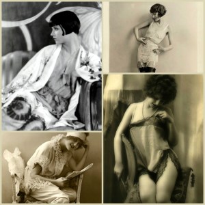
And we can see the reassertion of the artificial, parodied by Madonna in the 80s.

Like the change that occurred at the time of the Reformation, more emphasis was placed on individual freedom of thought and less on the authority of power. Martin Luther wanted everyone to be able to read the Bible, and not have the book only interpreted by a priestly class. Abbie Hoffman (admittedly a lesser intellect, although I don’t think that insults Hoffman) wanted to make up his own mind about the Vietnam War instead of taking Lyndon Johnson’s interpretation of it.Abbie Hoffman 1

I can recall hearing over and over from our elders at the time that “Johnson has facts we don’t know; we have to trust him.” Well, it turned out he was as clueless as anyone. We of my generation thought we’d never make that mistake again.

Over the centuries, each definable age is a reaction to the one that went before. The Renaissance reacted to the Middle Ages. The Romantic Age to the Neo Classical age before it. Victorianism to the Romanticism and Modernism in the 20th Century to the Victorianism which it hated.

But what underlies these changes is a curious series of pendulums.

“Meta-pendulums”

yinyang colorYou know how you keep hearing that the pendulum only swings so far before reversing direction — so that the Sexual Revolution is replaced by the New Chastity — or so we’re told. The swing to the political left is slowed and eventually we swing back to the right. Hello Mitch McConnell.

These swings are, in fact, the very stuff of cultural change and we can see them through the art that embodies them.flaxman 1

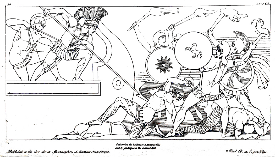
When we see the change from Winckelmann’s exulted Classicism to Delacroix’s exotic Moorish women, we are seeing a change in ideas.Women of Algiers

What is curious is that these same pendulum swings keep recurring.

There are a bunch of them, and their “swing cycle” is irregular, so that the same ideas don’t occur at the same time: Some ideas have a longer cycle, some a quick turnaround. They never all line up quite the same way twice, which is why the various “romantic” periods in art — the Gothic, the Baroque, the Romantic — are not at all identical.

What I want to do is to take a look at a few of these swinging pendulums to get a feel for the changes they bring. And perhaps narrow them down to a few “metapendulums.” Those larger ideas that hold the smaller ones like melon balls in a hollowed out melon half.

An endless list

I made a list of some of these oppositions. My notebook went on for three pages. I stopped at 63 pairs of recurring ideas when I realized I could really go on for days adding to the list.

Here’s one example: How the middle of the 19th Century in France valued the historical (and religious and mythological) painting, like this David version of the death of Socrates. It was noble, formal, elevating. It taught the moral lessons that thoughtful people believed should be taught.death of socrates

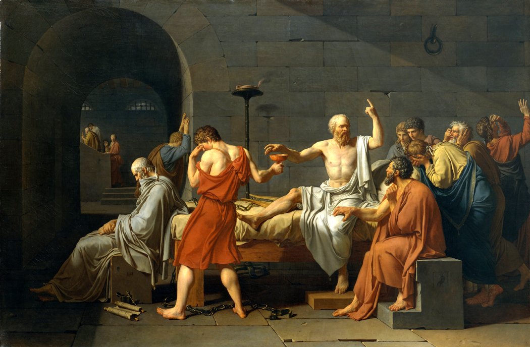
But there was a reaction to it. That reaction gave us Impressionism, which gave up the past for the everyday present, like this barmaid in Manet’s painting.manet

I said these shifts recur. In the 1950s, for instance, the serious minded Abstract Expressionists, like Mark Rothko, expected their paintings to be morally and spiritually elevating.

What followed? The everyday present, like Warhol’s soup cans.rothko-warhol pair

The whole history of art keeps running back and forth through these issues, over and over, but never quite the same way — because other pendulums are also swinging back and forth at the same time, and their combined periods never quite in synch, so that the change from David to Manet is also a shift from a hard-edged style to a soft, fuzzy edged style, and between Rothko and Warhol comes the swing from abstract to realistic.

Among those 63 pairs of ideas — oppositions you might call them — are familiar ones. Here are a few of them:

Interest in the universal — Interest in the particular

Intellect primary — Emotion primary

Clarity — Complexity

Unity — Diversity

Religious — Secular

Edification — Entertainment

Reinforce ethos — Challenge ethos

Style — Content

Artificial — Natural

Social — Cosmic

Codification — Exploration

Stasis — Energy

Embrace past — Ignore Past

Internationalism — Nationalism

Emblematic (allegorical) — Mythic (symbolic)

Incarnation — Transcendence

Scientific realism — Emotional realism (“Truthiness”)

Nature as a desert — Nature as a cathedral

Vocation — Inspiration

Single creator — Atelier

Talent — Genius

Epic — Miniature

Dramatic — Lyric

Old form — New form

Irony — Sincerity

Discrete disciplines — Mix and match art forms

Depiction of emotion — Expression of emotion

There are many more. I’m sure you can come up with a bunch. But I don’t want to merely make a list.Dionysos pediment Parthenon

The general and the particular

 Because, as I was listing, I noticed that these ideas began to fall into larger patterns. They tend to group together, though some of the items in my list overlap, one category turning up as an item in another category.

But I want to look at the larger movements.sc000358.jpg

The first category is the rivalry between the universal and the particular. In some ages, we have wanted our art idealized. If we are going to paint a madonna, she should look like a woman, or better yet like all women, that is like Woman with a capital W. Especially if we harbor religious feelings about it, we don’t want our Madonna to look like Eleanor Roosevelt.

The 18th Century was one that believed in the importance of universalizing their art.

Samuel Johnson wrote in 1750 that “Poetry cannot dwell upon the minuter distinctions, by which one species differs from another, without departing from that simplicity of grandeur which fills the imagination.”

Or, in another place, “All the power of description is destroyed by a scrupulous enumeration; and the force of metaphors is lost, when the mind by the mention of particulars is turned more upon the original than the secondary sense, more upon that which the illustration is drawn than that to which it is applied.”

Nothing in real life is perfect, wrote painter Joshua Reynolds in his famous Discourses. The artist must never attempt to imitate real life too closely, he says, but rather, “he learns to design naturally by drawing his figures unlike to any one object. This idea of the perfect state of nature, which the artist calls the ideal beauty, is the great leading principle by which works of genius are conducted.”caravaggio madonna

Only 30 years later, English artist and poet William Blake wrote in the margins of his copy of Reynold’s Discourses

“To generalize is to be an idiot.”

He goes on to say: “To particularize is the alone distinction of merit. General knowledges are those knowledges that idiots possess.

“What is general nature? Is there such a thing? What is general knowledge? Is there such a thing? Strictly speaking, all knowledge is particular.

“Distinct general form cannot exist. Distinctness is particular, not general.”

Reynolds, if he painted a Madonna, would make sure she didn’t look like any live human being, but like the idea we have of the perfect form.

Blake, painting a Madonna, would certainly have made her look, if not like Eleanor Roosevelt, at least like some living, breathing woman he could see with his actual eyes.

And this is despite the fact that Reynolds is mainly a portraitist, making pictures of individuals — which he idealized in his paintings. And despite the fact that Blake makes mythological pictures of gods and spirits — which he meant to look like distinct personalities.

This issue between general and specific, universal and particular, recurs like all these ideas.laocoon

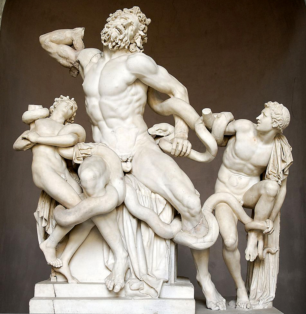
Hellenic and Hellenistic

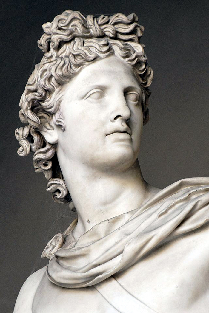
It is the first major shift in Western art one sees, not counting the prehistoric art (which also follow most of these patterns). But beginning with the art of ancient Greece, we can see it reaching its height in the 4th Century, with such sculptures as the Elgin marbles and the frieze carvings of various temples.Belvedere Apollo

The Classical Greeks believed in idealized beauty, in the general and universal, as you can see in these lithe, stripped down figures.

But after the Macedonian invasion, under the reign of Alexander the Great, in the period we call Hellenistic, the main shift is in the naturalness of the art. The statues take on a movement and individuality unheard of in earlier Athens.

You can see the distinct face of the wrestler with his broken nose or the boy pulling a thorn from his foot. (You can also see the shift, mentioned above, from the morally elevating tone of the Classical period, to the everyday activities depicted in the Hellenistic).laocoon head

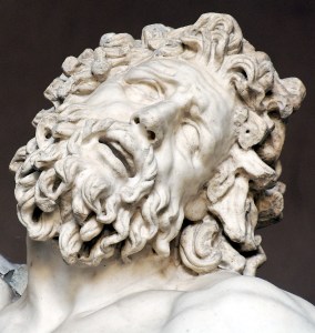
But just look at the faces, the Classical impassiveness and idealization,

and the Hellenistic warts and all portrait.

You can see the pendulum go back and forth, with early Roman art tending to imitate the Classic Greek, and Imperial Roman art again embracing the particular. Once you have seen a Roman portrait bust, there is not doubt you could pick its model out of a police lineup of a crowd at a bus station. They are so distinct.Roman portraits

In the Middle ages, first in the declining Roman period and the Romanesque, individuality is downplayed and figures, especially in the growing Christian church, tend to be generalized. But in the great Gothic period that flowered in the 11th and 12th centuries, the figures again become individualized. So much so, that the hundreds of figures carved into the side of, say, Chartres Cathedral, are as distinctive as movie stars’ faces.

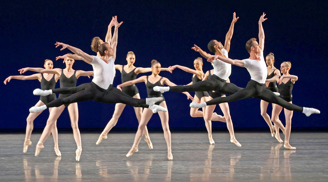
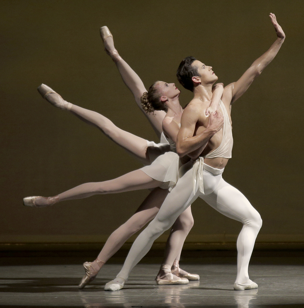
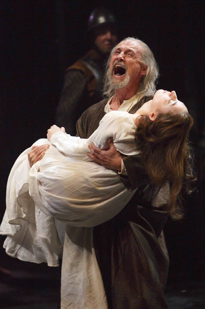
During the Renaissance, figures are once more idealized. In the Baroque, they are individualized. In the Rococco, generalized, in the Romantic era, individualized. In the Academic painting that followed, they were again generalized. Impressionism put back their individual character. Modern art simplified the figures and generalized them — all of Modigliani’s figures seem interchangeable, for instance, or Brancusi’s idealized women. But particularity and distinct figures reappear with Pop and the following Postmodernism.

Back and forth the pendulum goes.

I have dwelt on this one pair of opposites rather a long time, just to get the feel of what I mean.

But, I also want to point out the subset of ideas that follow the fight between the universal and particular.

NEXT: Part 2 — More pendulums


stella flowers italy 1931 copy

I spent 26 years of my life in Phoenix, Ariz., and came to know the collection at the Phoenix Art Museum intimately. There were paintings I loved and a very few that I disliked intensely. Most, of course, fell in the middle somewhere.

One painting I felt strong aversion to was Joseph Stella’s Flowers, Italy, which always seemed to me like a cheap piece of junk-surrealism. On the whole, I am not simpatico with even the best Surrealism.

There is only one thing to do when you don’t like a painting: spend a lot of time with it. So, I figured, if I stayed with the Stella for a while, I would either fully define why I did not, like it, or I would change my mind.

I finally wound up spending more than five hours with the painting, and, another hour or two afterward, reading about the artist and his work.

It was an enormous expense of time and energy, but it paid me back many times over. Now Stella’s Flowers is one of my anchors at the museum and, I cannot get enough of it.

Since the question I am asked most often and most imploringly is “How do you look at art?” it seemed like it might be helpful to describe what I found over those seven hours.

LOOKING AT A PICTURE

Most people like pictures of flowers. They come upon Joseph Stella’s Flowers, Italy at the Phoenix Art Museum, for instance, and they are likely to respond, ”I like flowers; they’re pretty; I like this painting,” and move on to the next.

But there is much more packed into any good painting, a world of meaning and experience that can only be squeezed out with time and effort.

So, mister wise-guy art critic, how do you look at a painting? It’s a question I have often heard. The answer has three large parts.

The first is looking.

And by looking, I mean spending a very long time noticing all the component parts of a painting, its colors, brush strokes, subject matter, design, size and proportions.

The second is thinking.

After you have noticed every square millimeter of the work, you are then obliged to figure out what it might mean. You dig into yourself — the well of your experience — and try to parse out what all those many bits might add up to.

And third, after you have some good idea what the painting might be communicating, there is the learning. You are interested enough that you want to find a book or person who might tell you more and help you fit this experience into the larger picture. But make sure to wait for this last: After you have experienced the painting, then you can worry about facts.

Too often, we want to start with facts, but if you place them first, they only blur your vision.

Once more, the three steps are: looking, thinking and learning.

Let’s take those same Stella flowers and try the method on them.

It is a large, square painting, about 6- by 6-feet, of dozens, maybe hundreds of flowers in a tangle that seems almost architectural, all against a deep, blue sky.

From a distance — and the way it hangs in the museum currently makes it difficult to view any other way — it seems finely painted and detailed. The paint seems smoothly brushed onto the canvas.

But try to get up close, and you will find that the surface is sloppy with thick gobs of rough paint. The flowers almost seem crude, as if drawn by a not-so-talented child.

Step back again. They regain their refinement.

This is only one of the many contradictions of the work.

Its overall impression and the first thing most people notice, after the flowers, is that the painting is rigidly symmetrical. Draw a line up and down through its middle and you find that the right and left sides mirror each other.

Yet, on closer inspection, nothing on one side exactly reproduces the other. What is a calla lily on one side is balanced by a hibiscus on the other. The painting only appears to be literally symmetrical.

There are two distinct axes to the design. Splitting the painting vertically is a line of plant stalks, pistils, racemes and petals. Each half of the painting is equal.

But cutting the bottom portion from the upper is a line of large white blooms. They sit lower than the halfway mark, settling as if gravity had pulled them down.flowers cross

That giant cross is the basic organizing principle of the work, like an airplane nose down, crashing into the bottom of the frame.

Another contradiction: Most of the blossoms are fairly realistic. You can tell the hibiscus from the aster, the lotus from the lily. Yet, the plant stems are greatly distorted. Many are rigidly straight, up and down. Others are not connected to anything recognizable. The upper portion of the picture, in fact, is divided into three panels by plant stalks that curve around at the top to make what look like Roman arches.

The background is blue sky; the closest part, on the bottom of the frame, is blue water, filled with waterlilies and fish. There are a host of white and red flowers, and a smattering of yellow. But considering this is a painting of foliage, there is surprisingly little green.

Notice that I haven’t yet mentioned what any of this might mean. Your first obligation is to discover what is there; only then can you worry what it might mean.monkey face

And what about the ”monkey” face?

Human beings are genetically programmed to recognize faces. It is why we so often find virgins in tortillas and aliens staring back from Martian mountains.

At the bottom of this painting, filling the middle third, is an animal face, with two rosy hibiscus for eyes, two birds for ears, and what looks like a red proteus for a nose ridge, crowned with a great white waterlily flower.

arcimboldoLike one of those crazy Arcimboldo faces from the Renaissance, made from fruit or vegetables, it is a visual pun, functioning on two levels at once: face and flower.

Stella is having it both ways once again.

Notice, too, that the bottom third of the painting acts like a very close, in-your-face wall, like a hedge that blocks the distant view behind. The painting then, maps out very clearly the near and the far.

Over and over, there are contradictions: things split into two — near-far, up-down, flower-face, greenless plants, realistic distortion.

There are dozens of other things you might notice. I’ve only listed a few; a complete list could fill an entire book.

But what does it all mean? The experience is all well and good, the looking slows us down and we discover scores of little details that we could not have noticed racing through the museum.

But it is the meaning we are after.

Well, the first thing you are likely to think about is the flowers. Any painting with this many maniacal flowers is likely to be about fecundity. This is one fertile painting.

And the details certainly substantiate that. Look at the top, with the day lily hanging upside down over the long, white tendrils that draw up the center line of the painting. It sits with its pollen-laden anthers just touching the tendril, which we must read as an abstracted pistil. The very moment of fertilization.

It is the climax of the painting, so to speak.

But the rest of the painting is no less orgasmic. Look at all the large flowers. Almost every one is a yonic horn with a large, phallic nub at its center. They are hibiscus and lotus, contradictory male and female at the same time. Near the very center of the painting is a jack-in-the-pulpit, with a lurid phallus sticking straight up from its bowl-like pulpit.

You would need an computer to keep track of the phalli and yoni in this picture.

Even that monkey face, looked at again turns into the female reproductive organs, with fallopian leaf fronds and ovarian hibiscus.

So, does this mean Stella had a dirty mind? Or was his subconscious playing Freudian games?

No. There is something else going on.Hubert_Robert Roman_Ruins

If we were to search the history of art for this painting’s ancestors, the most direct would be the 18th century picturesque landscapes of Hubert Robert and his like.

They usually showed a Roman or Greek ruin taken over by vines, with animals or people living and playing around them. Nature reconquers the works of man.

Stella has given us the ruin, in the form of the vegetal arches at the top of the painting. In his ”ruins” nature reconquers the world in a fit of fertility.

In the older paintings, we know that conventional iconography implies that the ruins symbolize death; the vines, the recurrence of life.

In Stella, the ruins are only suggested, and death — the arching plants that roof the painting — is itself seething with life.

The contradictions are all the more emphatic when we learn more about Stella and his art.

stella mugHe was born in Italy in 1877 and immigrated to the United States in 1894, where he died in 1946. He first achieved notice as an artist with a series of paintings of the Brooklyn Bridge and Coney Island, done before 1920.

In those, he brought the current Italian movement called Futurism to the U.S. Futurism glorified modernity, machines, speed and motion. Most of the noted Futurists were Italian; Stella was America’s only serious member.

But the contradictions in Stella’s personality kept him from continuing in this direction. Something in him mistrusted machines, even as he felt awestruck by the engineering of the Brooklyn Bridge.brooklyn bridge stella

”Many nights I stood on the bridge — and in the middle alone — lost — a defenseless prey to the surrounding swarming darkness — crushed by the mountainous black impenetrability of the skyscrapers,” he wrote.

In another place, he called his home, New York City, ”Monstrous dream, chimeric reality, Oriental delight, Shakespearean nightmare . . . its enormous blocks of buildings barring one’s way . . . its dreadful closed windows barren of flowers.”

In his mind, Stella contrasted the steel, cold, northern city with the fertile, warm, sunny southern Italian town he had grown up in.

”Returning to my birthplace, I find all of nature smiling like a friend, greeting my arrival with festive salutes.”

And in another place, ”My drowsing energy, tortured by the cold of Northern countries, was awakened as if by magic, set aglow by the radiance of gold and purple light. All the ardor of my youth surged through me with the overflowing, stinging, demanding desire for new conquests in the virgin lands of art.”

Over and over in Stella’s letters, you find a man driven ecstatic by the abundance and plenitude of nature. Man’s works, so glorified in the Futurist paintings, became the fodder for ruins, which were ennobled by the fecundity of nature.stella purissima

It is a theme that shows up in many of Stella’s better paintings (and it should be noted he was a very uneven painter). They have titles such as Joy of Living, Dance of Spring, Apotheosis of the Rose and Tree of My Life.

Stella had an almost Hindu sense of the ecstasy of nature, the sense that everything is burning with aliveness.

And in the end, even his famous paintings of the Brooklyn Bridge were not about human life and technology, but, as he wrote, ”I felt deeply moved, as if on the threshold of a new religion, or in the presence of a new Divinity.”

He was one of those painters, like Van Gogh, who yearned to express the exploding aliveness of the world, a man with a visionary sense of cosmic energy.

Finally, his Flowers, Italy is no more about mere sex than the cave paintings of Ajanta or the athletics of Henry Miller. It is a vision of perpetual life, renewing itself and burning, a non-Christian version of Dante’s Divine Rose, or the sacred Garden of Eden.

And it is at this level that, in Stella, as in the Vedic religion, all contradictions are transcended.

NEXT: Looking at an earlier painting, using the same techniques

Orangerie, up close, 2006

You wander through one of a city’s great art museums and watch the people. They spend an average of maybe 15 seconds in front of any painting that catches their attention before moving on.

Or more likely, they spend another 15 seconds reading the label on the wall. And if the label contains a legend explaining who the artist was or what the painting is about, they may very well spend more time with the label than with the art on the wall. It’s disheartening to watch.

One of the problems is that we are a verbal, not a visual culture. I know the common wisdom is currently that we are a visual people, but it simply isn’t true: Even those things we think of as symptomatic of being visual are things we “read” for information rather than see: like the stick figure man or woman that lets us know which restroom is appropriate.

But even more than that, it is that we are a problem-solving people. America’s national mythology describes us as doers and go-getters. We simply don’t believe in wasting our time. We’re too busy. Our heads are too crowded.

There are all those yapping voices, all those different aspects of our personalities, all clamoring for attention.

”Mmm, doughnuts!”

”Don’t forget the dentist appointment.”

”Do these socks go with this tie?”

”Is the ozone hole getting bigger?”

”Mmm, doughnuts!”

So, it’s hard to appreciate art these days.

And it’s no wonder that a management class steps forward to create some order.Orangerie, the critics, 2006

Each of us has it: The executive in our heads that tries to get through life quickly and efficiently, cutting through the baloney and making the decisions for everyone else in there.

It’s a necessity in an information top-heavy age with bumper-to-bumper traffic on the freeways.

Unfortunately, this tendency to empty the ”in box” and get on to the next problem runs completely counter to what art is about. To see art, or read poetry, or listen to chamber music, we have to kidnap, blindfold and gag the executive in our brains and give ourselves over to a different kind of experience.

And ”experience” is the operative word, for the primary function of art is to provide an aesthetic experience.

That executive in our cranium is used to dealing with information, not experience. There is life on one hand, and there are words and symbols about life on the other. Most of what life requires of us in the late 20th century deals with words and symbols: filling out forms, scanning in our Visa numbers, looking down the stock listings in the Business section of the newspaper. We are drowned in words.

But at least we are used to them. Experience is scary: sensuous, messy, confused.

So how do you deal with art? How do you prepare yourself to appreciate it, enjoy it, and grow from the experience of being exposed to it?

First of all, you have to slow down. Your interior life moves slowly, implacably. It is only your cerebral cortex that buzzes with frenetic energy. The deeper, more meaningful emotions, the underlying rhythm of life is more measured: a pedal note under the jangling fugue subject above.

Art requires that you work on this slower time scale. It doesn’t give itself up, like the punch line on a New Yorker cartoon; it slowly releases its value to those who can wait.

You have to spend time with a painting or statue. The Manager wants to look at a painting and say, ”Yes, I know that: It’s a Renoir. File it under ’19th Century, Impressionism, French.’ ” And then move on to the next: ”17th Century, Dutch, Genre: Rembrandt.”

It is as if knowing the name of the painting is the same thing as knowing the painting.Orangerie gawkers, 2006

But if you look at a single painting for, say, an hour, you will learn things about it. You will be forced to discover all the richness that the artist took the time to put there.

What colors has the artist used? What shapes? Is it dark or is it light? What is the subject? Can you make sense of it? If not, is the ambiguity important? Is the paint thickly applied, or flat and textureless? How does that help the painting convey what it has to give you?

You swish it around in your mouth like a good wine, looking for the complexities of taste and aftertaste.

How does the painting make you feel? Is it an emotion you’ve felt before? If not, is it related to one you’ve felt? If it’s completely new, how do you feel about that?

The art slowly unfurls, like a rose opening from a bud. The attention you pay will pay you back.

In the next installment, we’ll take a look at just one painting and see how this approach might pay off.

Chihuly 2

I am of two minds about Dale Chihuly, and I cannot imagine any thoughtful person being otherwise.

The stunning array of gorgeous glass is certainly the most interesting work in the medium done in a long time. The Chihuly name on a piece of glass is blue-chip all the way.

Yet, one cannot get past the sense that the name on the glass is less a signature than a brand name.

There are those who call the Seattle artist the “Liberace of glass.” He is a huge crowd pleaser — perhaps his work is too pretty. Chihuly 6

In addition, he’s everywhere, doing scores of museum and gallery shows each year. His studio produces so much work that critics consider it an industrial production line rather than an artist’s studio.

And, detractors point out, he hasn’t made much of anything himself since 1979. Since then, almost everything that has been sold with his name on it has been created by his hundreds of staffers. Worse, Chihuly is a tireless self-promoter. His genius is as much in marketing as it is in aesthetics.

Several Web sites are dedicated to dissing Chihuly, including one that avers it’s “OK to hate Dale Chihuly.”

It isn’t just that his studio produces so much in his name; it’s a veritable factory. It isn’t just that the glass sometimes is too pretty.

Take a look at it as it is displayed at any museum. The installations makes them look more like a showroom than a gallery. All that dramatic lighting and black background sets off one’s instinct to look for price tags and bar codes. Chihuly 11

So, looking at a Seaform, it might come from the show window at Tiffany, with all that glistening light and black background. I look for a salesman sizing me — and my bank account — up.

It isn’t that the work isn’t stunning in its effect, but that the effect is a little too slick.

Although Chihuly calls the show “Installations,” these are not installations as the art world usually means the term. These are rather settings for jewels, meant to show them off.chihuly installation

In most art-world installations, the individual pieces are subordinated to the meaning of the larger assembly. In Chihuly’s installations, the individual pieces are glorified by the presentation. They are set off heroically, like a protagonist in Italian opera hogging the spotlight.

But for all that, the problem with dismissing Chihuly because of his marketing and production strategies is that the argument ignores the art itself, which is hard to dismiss.

Even if you’re skeptical, the work itself is dazzling, really dazzling. Chihuly 10

Eminent art writer Barbara Rose puts it directly: “Chihuly has literally changed the definition of glass.”

Chihuly was born in 1941 in Tacoma, Wash., and began working with glass 20 years later. After school at the University of Washington, he did graduate work at the Rhode Island School of Design and won a Fulbright Fellowship to study glass in Venice.

In 1976, he lost his left eye in an automobile accident in England — his eye patch is his trademark — and the following year, he became head of the sculpture department at the Rhode Island school. Chihuly portrait

With his shock of wild hair and his eye patch over a face that looks like a caricature, he could be the Quasimodo of art glass.

All along, he continued to win awards and place work in major museums. Today, there is hardly a museum, major or minor, that doesn’t own Chihuly’s work.

In 1983, Chihuly moved to Seattle, where his studio grew to the point that it is a major industry, nearly as well known as Boeing or Microsoft.

On the way, he raised glass from a craft to a fine art. Chihuly certainly has pretensions of fine art. This glass is not meant to be seen as merely craft.

The difference between fine art and craft is metaphor. Fine art functions because of its metaphor; craft survives happily without it. Chihuly has consciously developed the metaphorical side of the glass.

There are organic shapes, there are womblike baskets with “baby” baskets inside, there are anemones and jellyfish, all in bright colors with brilliant accents. Chihuly 8

At their best, the metaphor resonates, as with the odd squid tentacles and octopus arms of his chandeliers, or the beautiful crimson grass stalks of Red Reeds.chihuly painting

The least effective works are his paintings, which strike one as nothing more than abstract LeRoy Neimans in glitter paint.

Like I said, I’m of two minds about Chihuly, and I cannot imagine any thoughtful person being otherwise.

spilled glue

When you’ve heard a piece of late 18th century music on the radio and you don’t know who wrote it, how do you tell whether it was by Haydn or by Mozart?

A former teacher of mine had a simple answer: “If you can remember the tunes when it’s over, it’s by Mozart.”

They were both great composers, but Mozart — in his best music — had a quality that Haydn lacked: He could write “sticky” tunes.

I’ve lately been thinking about this quality, because while we instantly recognize “stickiness” (that recognition itself is practically the definition of “sticky”), it’s difficult to know why one tune is sticky and another isn’t.sticky bun

And it is important to recognize that stickiness is only one quality of good music. Some composers, like Haydn, still wrote great music without it. Heck, the composer most people name as the greatest ever — Beethoven — hardly ever wrote a memorable tune. I mean memorable in the way that even a Rodgers and Hammerstein tune can be memorable. Let’s face it, “Da-Da-Da-Dum” is not really even a tune: It’s a pattern repeated so many times in that damn symphony it is pile-driven into our memories. Anything we rehearse over and over can be memorized. Like multiplication tables.

In contrast, the first thing you hear in, say, the Mendelssohn violin concerto is so sticky, if heard once, it is instantly becomes part of your life.

It should be acknowledged that stickiness is not the be-all and end-all of music. Marvin Hamlisch had it and Stephen Sondheim lacks it, but who is generally held to be the better composer? Sometimes, a catchy tune just means a shallow tune. library paste

There are those composers we instantly recognize for the warmth and catchiness of their melody writing: Mozart, Rossini, Schubert, Dvorak, Tchaikovsky, Verdi, Mendelssohn, Schumann. And there are those whose music finds its strength in other qualities, such as Beethoven, Brahms, Stravinsky.

That stickiness is a distinct quality of music can be seen in the descending careers of both Mendelssohn and Schumann. After Schumann’s breakdown, his music lost its stickiness. It maintained all its craft, but none of its memorability. Mendelssohn wrote the Octet and the Overture to Midsummer Night’s Dream when he was a teenager, but by the time he became the pious paragon of English Victorian culture, he was pumping out some very dull music, indeed. The two composers simply lost their adhesiveness. rolling stones sticky fingers

In contrast, two later composers took the other route: Early music by Cesar Franck and by Leos Janacek chuff-chuffs by on sheer force of will, while when their hair turned gray, they were both touched by the sticky muse and gave us music we can’t get out of our heads.

One thing that seems to be true about sticky melodies is that they feel somehow complete in themselves. The secret of most great symphonic music is that it is built on patterns of notes that can be altered and developed, the tune can be taken apart and rearranged, turned upside down, slowed down or sped up, without losing its fly paperidentity — like Beethoven’s “Da-Da-Da-Dum.” But a sticky tune, like the Mendelssohn concerto, is so complete in itself that it doesn’t easily bear symphonic development: Change a note or rhythm and it loses its identity. This is the downfall of so much music from the Romantic era, where a tune is so good to start with, the composer has nowhere to go with it, so he just repeats it with different instruments or at a different register. It can make for monotony in a 40-minute symphony, a monotony that Haydn never courts, because he is always doing something fresh and new with his themes.

But stickiness isn’t just for music. Some paintings are sticky, even after they’ve dried. Some poetry is sticky, some architecture is sticky.

Just compare, say, Alexander Pope with John Dryden. Pope, sticky, Dryden, dry. All the craft is there in Dryden, and some very lovely turns of phrase, but nothing as memorable as “The proper study of mankind is man.” Pope ranks third as most quoted poet in Bartlett’s.

Keats: sticky. Shelley: not so much.

Wordsworth, like Schumann, lost his youthful stickiness.jam face

Again, stickiness is not the sole measure of worth. Joyce Kilmer’s “Trees” is as sticky as a caramel apple, but not exactly on a level with John Milton.

Claude Lorrain, sticky; Nicolas Poussin, not so sticky. Henri Toulouse-Lautrec is one of the stickiest artists ever. You can come up with your own list of sticky paintings, sculpture and photographs. The subject of stickiness is wide and deserves deeper critical attention.

Stickiness is what every “hook” is in a pop tune, it is the sine-qua-non of a magazine ad or a TV commercial. It may have something to do with simplicity and clarity, but even a complex tune can be sticky.

I would welcome some scientific study of stickiness.

Image

Vulgarity is everywhere these days, from T-shirts to dinner conversation. This is a vulgar society we live in, one that supports a Howard Stern and a Rush Limbaugh: vulgar brothers under the skin, although the one has more skin than the other.

But conversely, vulgarity is also undervalued.

I recognized that at a concert recently, listening to the wonderful Ying String Quartet, which played Mozart, Bartok and Debussy with taste and refinement. But I knew that, as good as they were, they lacked that last touch of vulgarity that all really great art has access to.

I have heard the Guarneri and the Budapest quartets and they were both capable of making vulgar sounds — the buzzing tone of playing by the bridge, the taffy-pull of tempo, sudden shift from aggressive to sweet. It gave life to the music.

There are those who hold that the fine arts are supposed to be a safe haven from the vulgarity of daily life, that they should offer only the highest, finest and most elevated thoughts and emotions. To them, it is a way of insulating us from the barbarians we see on television each night.

But I’m afraid that is the very definition of snobbery, and misunderstands the nature of art.

Yes, fine art is more elevated than Two and a Half Men, yet it also embraces the possibility of such slapstick: Art is large, it contains multitudes.

First, what is vulgarity?

It is the awareness of the animal side of humanity — the body processes and appetites; and it is the trivial in an otherwise important context. It is the introduction of the quotidian into the ceremonial; it is farting in church.

It is also the reaquaintance of mind with body and it is vitality giving breath to the spirit.

It is found in all the greatest, most profound and elevated works of art.

Think of Botticelli’s Birth of Venus, for instance. What could be less vulgar? Yet, there is that cherub with his cheeks pooched out, like Dizzy Gillespie, blowing the sea wind that animates Venus’ hair. His expression is close to grotesque.

And, more subtly, although her nudity is certainly not vulgar, the goddess’ attempts to cover that nudity is. It is bourgeois propriety.

Or, at the height of Beethoven’s Ninth Symphony, a hymn to universal love and brotherhood, the music stops for the belch of a double bassoon and a Hogan’s Heroes march.

Don’t misunderstand me: I am not saying that vulgarity is fine art, but that the greatest art of our culture does not ignore vulgarity, but includes it in the mix.

It is the bumptious Minuet in the Classical symphony, the seemingly-naive tone-painting in a Schubert song accompaniment, the exaggerated muscles in a Michelangelo nude.

It is the Miller’s Tale in Chaucer, the porter’s scene in Macbeth, it is the cacophany of marching bands in Charles Ives and the Jewish wedding in Mahler.

Even Josquin, that most angelic of Renaissance voices, whose music for the Catholic Mass defined for centuries what religious music should be — at other times, he can also have his singers chirp like crickets.

Sometimes vulgarity is expressed by choice, sometimes by miscalculation, as when Keats writes, “She heaved her precious dainties meant to still an infant’s cry.” But no first-rank artist has any fear of the vulgar.

It is Ray Nanton’s growling trombone in Duke Ellington’s impressionism.

It is Pablo Neruda calling for the impure in poetry.

It is the ornament reaquainted with architecture in Postmodernism, a reaction to the dull inhuman “purity” of the International style.

And when you think of the greatest musicians, you recognize Horowitz, Kreisler, Casals, each capable of the most obvious vulgarity — the gauche portamento, the foot-stomping downbeat. Compare Leonard Rose with Mstislav Rostropovich and you will understand why the Russian is considered the greater cellist: He is unafraid of the peasant in him.

Art is not about being bloodless and noble, but about being human.

Hence the Hungarian peasant dances in Bartok’s Modernism, the Austrian folksongs and dancing bears in Haydn.

“Nothing that is human is alien to me,” said Cicero.

And being human begins — although it doesn’t end — with the body.

That is why Ezra Pound said that poetry atrophies the further it gets from music, and that music atrophies removed from dance. Dance is the body in motion, the foot — bunions and all — hitting the floor. (Someone once defined a ballerina as “a beautiful woman with ugly feet”).

There is a separation in Western culture between body and spirit. Art can reconnect them. And the pinch of vulgarity thrown into the mix act as an anchor, firmly keeping the more ethereal impulses in art from floating away on the ether of their own enthusiasms.

That art is greatest, not that hits the greatest heights alone, but that has the greatest reach: Homer, Michelangelo, Cervantes.

They reacquaint me with my own life and make it possible to aspire, not by setting the stars beyond human grasp, but by teaching me my connection with them: The dirt I stand on and the constellations over my head are of a piece.