Archive

Tag Archives: irony

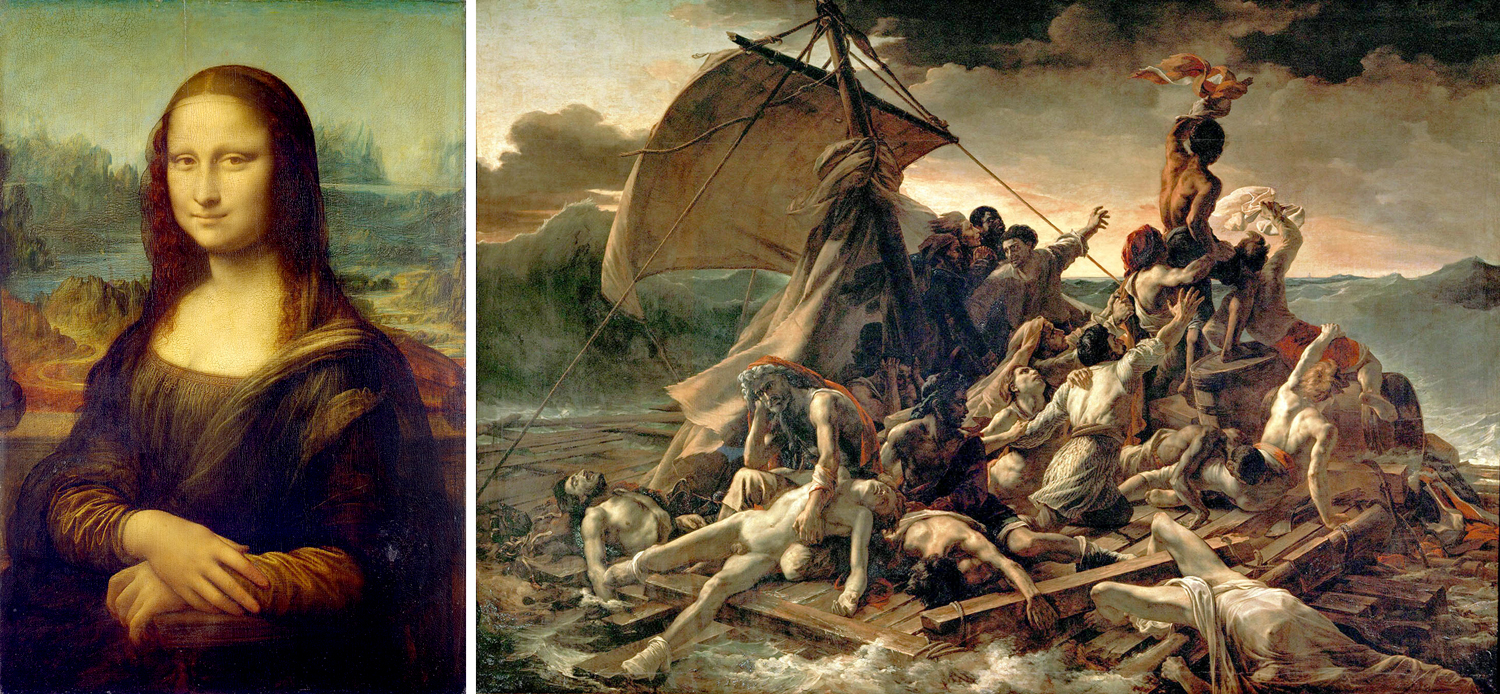
Take two of the most famous paintings in the Louvre. Most of us first experienced them in pictures in a book, perhaps Janson’s History of Art in an art history class. Or, projected onto a screen in the darkened classroom while the teacher pointed out details of the iconography. But these are images, not paintings. 

Often, today, we confuse the two, seeing pixels on a cellphone or iPad, and can easily believe we know the art because we can recognize the familiar shapes and colors. That is why so many people remark, on visiting the museum in Paris, about how “small” the Mona Lisa is. 

It’s not that small, of course. It’s a fairly normal size for a Renaissance portrait, but the fact is that separated out, as it is, for display, it takes up precious little wall space. Really, most people hadn’t given any thought to the actual size of the painting when seeing the reproduction in a book. It’s just an image, an icon, familiar not only in its regular shape, but also parodied to death in comic take-offs. 

You could look at the caption next to the printed image in your book, and see that there is a bunch of information in parenthesis beyond the identification of artist and title. It will often give you the date, in which museum collection it resides, and the size of the painting. In the case of the Mona Lisa, 21-by-30 inches. 

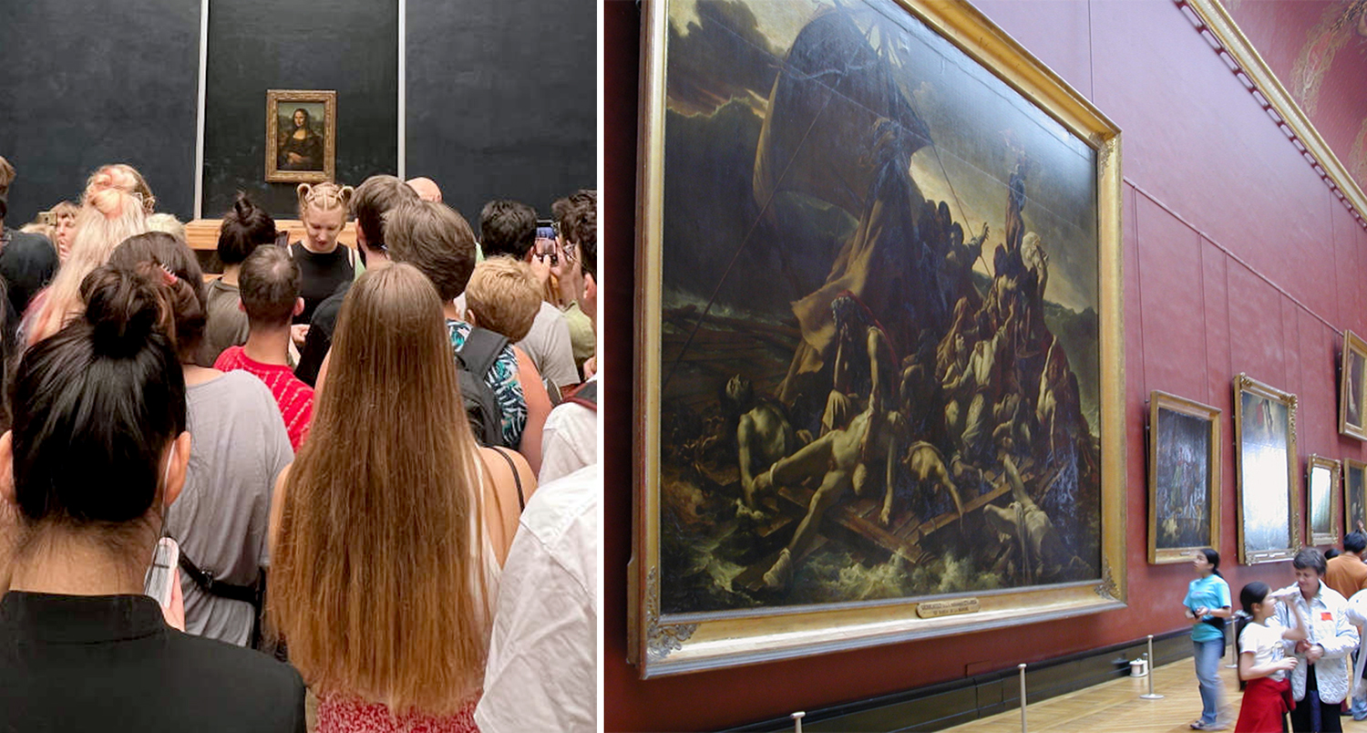
But then, perhaps you wander into the gallery with Théodore Géricault’s The Raft of the Medusa. You’ve seen it in your Janson and think you know it. You don’t. It is 16-by-23 feet — the size of a billboard. 

You see them as images, and they are adjusted to the size of the page and you can have no sense of their relative sizes.

But walk through the Louvre and it is quite different.

I remember when I was a teenager and going to the Museum of Modern Art in Manhattan and seeing Picasso’s Guernica, which stretched out across its own wall. You could see it from afar, stepping out of the elevator and looking to your right, several galleries away. Just under 12 feet high and 26 feet across, it was more than a painting and more than an image. It was a presence. 

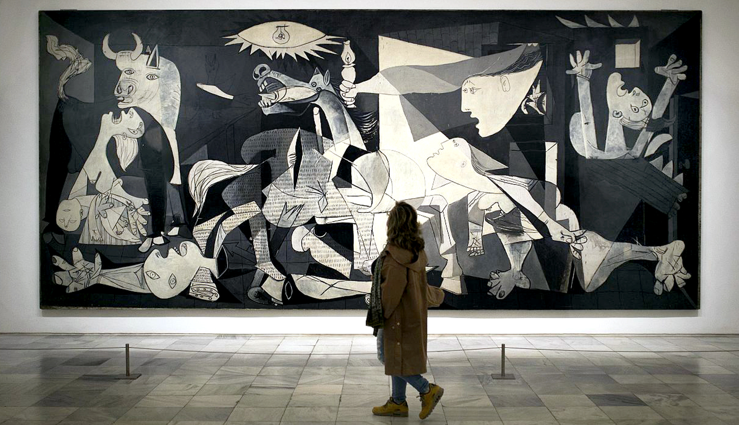
And that was part of its meaning. It was made in outrage over the 1937 German bombing of the Basque down in Spain and if it had been made to display comfortably on a gallery wall, it would have been just another painting for sale. But at size, it forces you to consider the suffering and death. Its size means you cannot just look away. 

The world we live in is increasingly a virtual one. The TV screen, the computer screen, the cellphone screen, the tablet and even the wristwatch screen have become so normal to our daily lives it has become easy to mistake what we see there as real. It is not. 

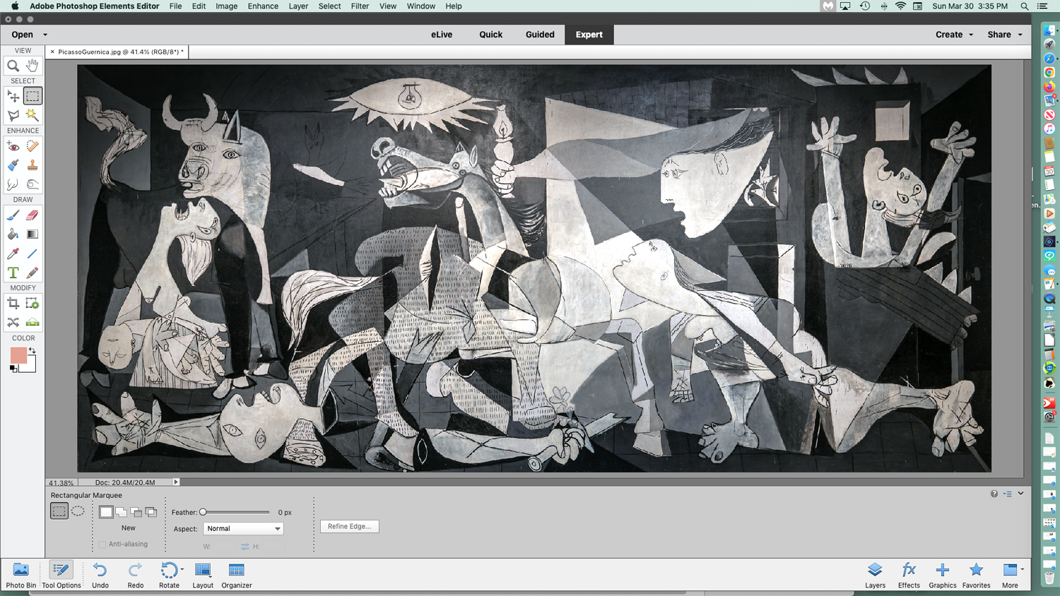
You cannot have the personal experience of Guernica from a photographic reproduction or a pixel image. You can memorize its iconography and discuss its provenance and the biography of its creator, but you will not have the gut-level experience of it I had visiting it at MoMA. 

And it isn’t just the size. Seeing art in person means you can see the pigments used, the brushstrokes, the opacity or transparency of the paint, whether it is on panel or canvas — a whole range of physical properties not apparent in a reproduction, and all of it — in addition to its physical dimensions — are essential to its meaning. 

And by meaning, I don’t refer to its symbology. That is language. I mean the experience of it. Vermilion or ultramarine are experiences not conveyed in ink or pixel, and that experience is meaning. 

If you walk through the Louvre, another famous art history painting you find will be Veronese’s The Wedding at Cana. Another wallop in the gut. It is 22 feet high and 33 feet from side to side. 

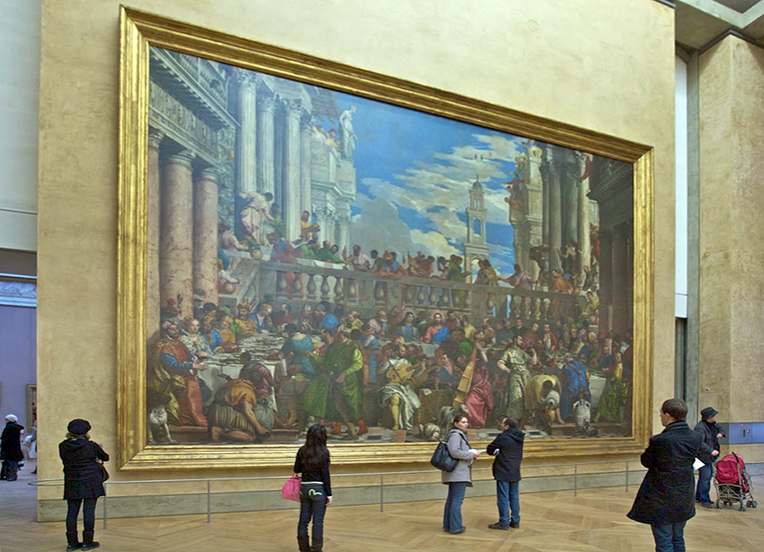
If you think of it as a biblical subject, and believe you are “getting” the painting by naming the people pictured, you have missed the central experience of the work. 

Even more ordinary size paintings depend, in part, on their dimensions and how you relate to them. A life-size portrait can mimic meeting the person himself. In the Renaissance, one ideal was that a painting should be like a window through which you are looking, and so a window-size canvas was part of the experience. 

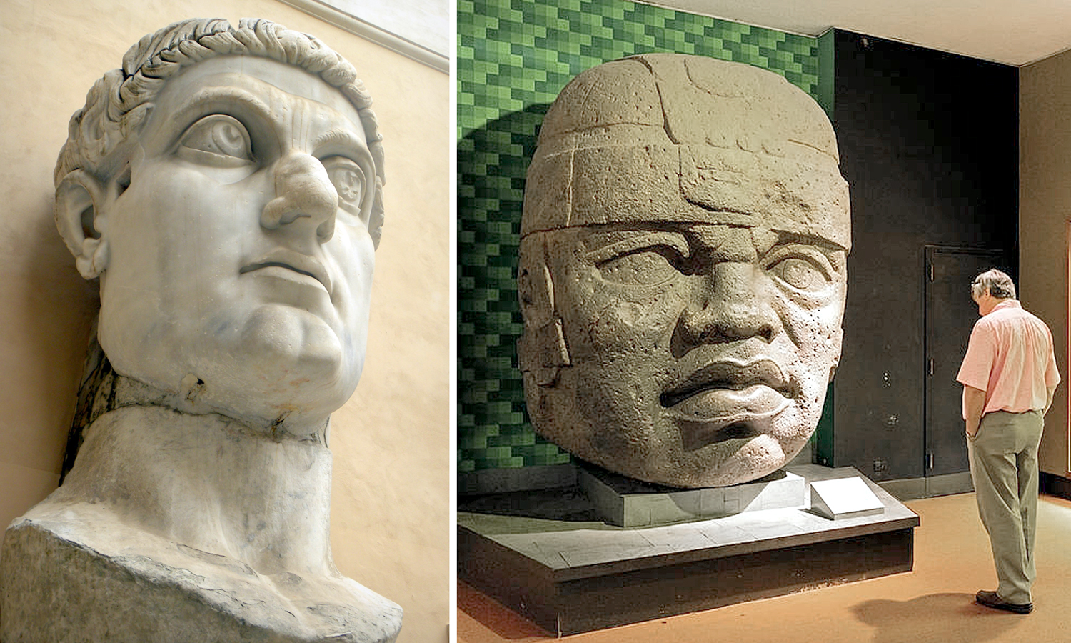
A giant head is another thing altogether, like the famous head of Emperor Constantine or one of the Olmec colossal stone heads from Mexico. Their size makes you take notice. The same shape, but the size of a cantaloupe, would hardly carry the power of these monuments. I remember the first time, as a boy, I saw the Olmec head at the American Museum of Natural History in New York; the memory of it stuck to my psyche for decades after. Still does. 

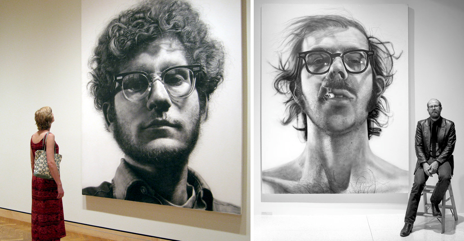
The same for the huge portrait heads of Chuck Close. 

The word often used to describe such larger-than-life art is “heroic.” They have an effect very like that of Achilles in the Iliad or Ahab in Moby Dick. It is a word often used to describe the large paintings of the Abstract Expressionists of the late 1940s and through the 1950s. These were painters of utter seriousness of intent. The last gasp of a non-ironic age, after which came the deluge of meta. 

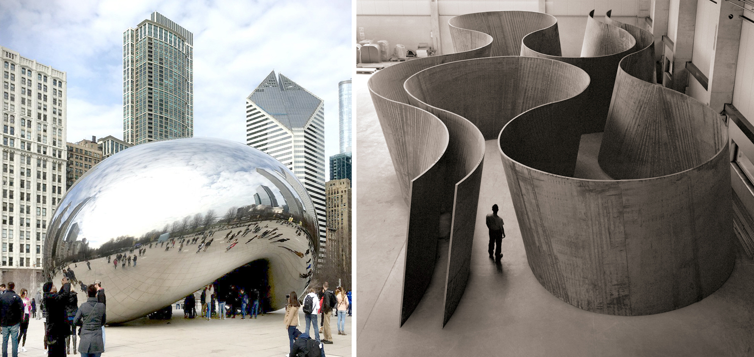
There are artists who use mere size to impart meaning to their work, Anish Kapoor, for instance, in his huge shiny bean called Cloudgate, or the rusted steel curtains by Richard Serra that are best experienced by walking through. But notice that the giant bean is also ironic. It’s a bean, after all, raised to heroic proportions. 

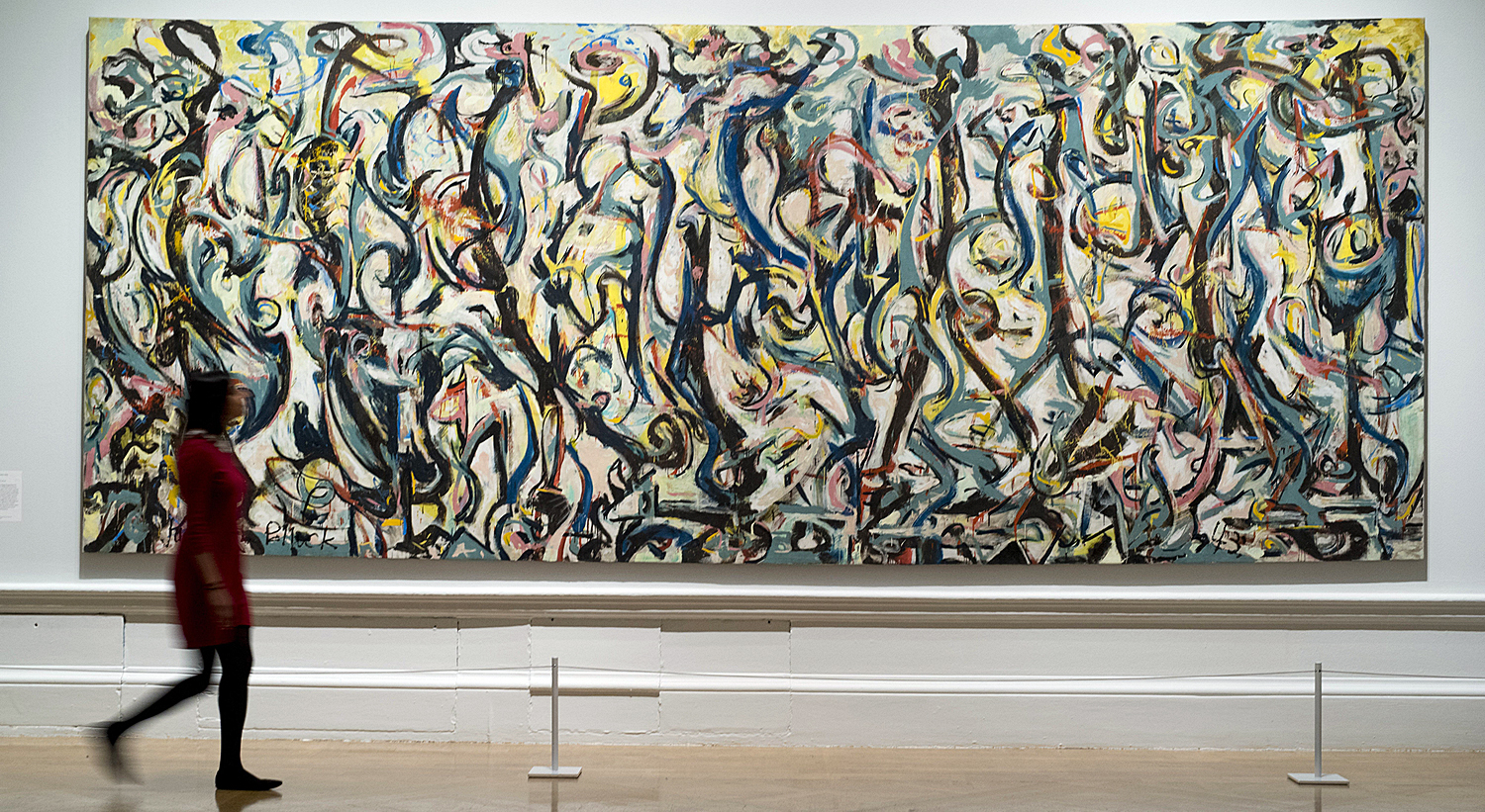
But those cigarette-smoking, heavy-drinking and blue-collar wearing guys at mid-century were dead serious. Jackson Pollock painted his first large painting, called Mural, in the mid-’40s. It is 8 feet by 20 feet and meant to be installed in the apartment of Peggy Guggenheim. It led to the later drip paintings that made Pollock famous — in 1949, Life magazine asked “Is he the greatest living painter in the United States?” 

Pollock made paintings in various sizes, but it is his large canvases that hold the emotional power that still resonates today. I visited the huge Pollock retrospective at MoMA in 1998 and was blown away by the variety of the paintings, and got a chance, finally, to see Blue Poles, a large 1952 canvas sold to a gallery in Australia in 1973 and unavailable to American audiences since then. It was given pride of place in the exhibition and deserved it, in the center of the room, on a wall of its own. It was lit like a jewel, but a jewel 16 feet across. 

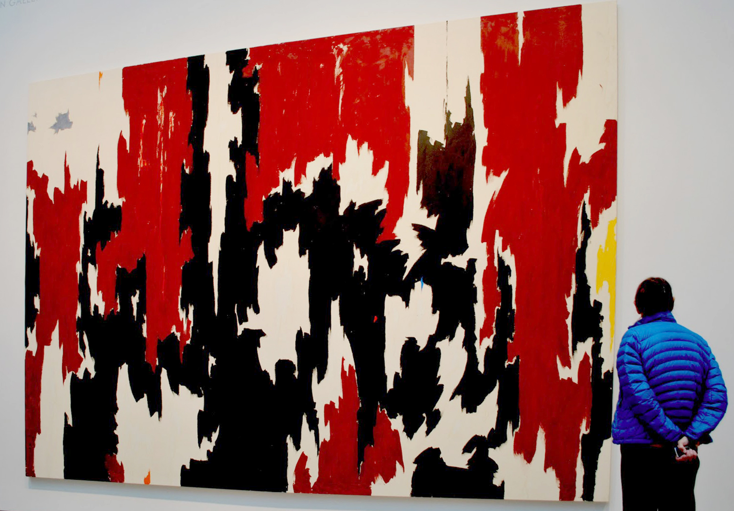
Most of the Abstract Expressionist gang trafficked in scale. Franz Kline, Mark Rothko, Robert Motherwell, Barnett Newman, Willem de Kooning, Clyfford Still — all found now in museums taking up whole walls by themselves. 

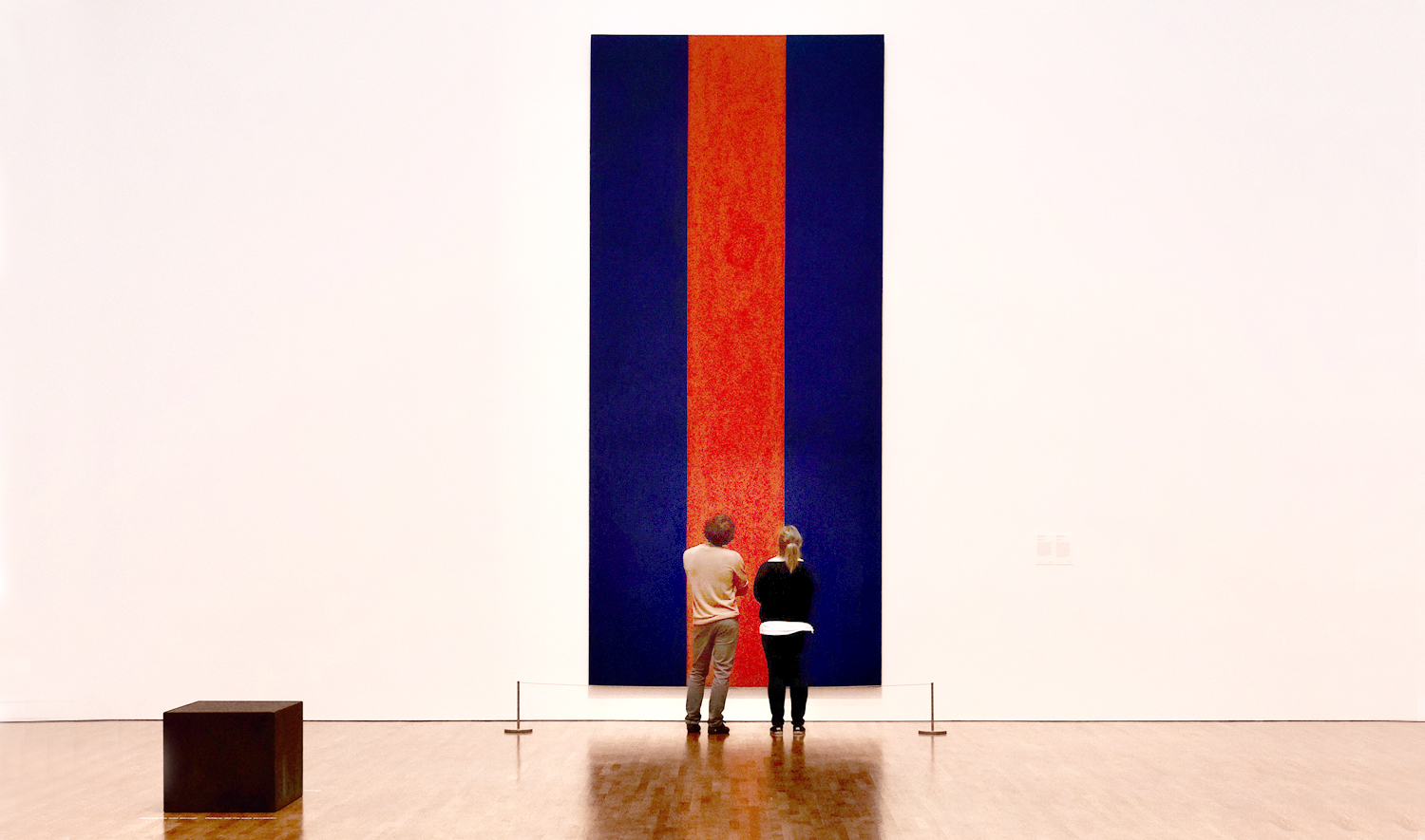
In the 1970s, I wandered through commercial galleries in New York and came across a back room storage of Newman paintings, being arranged for a show, and a group of them were almost two stories tall — monumental. These men (and they were almost all men) took their heroic calling seriously. 

After them, the deluge. Even Motherwell turned to irony; the self-importance of the first generation could not be sustained, or even taken seriously anymore. And although Robert Rauschenberg is sometimes classed among the Abstract Expressionists, his work always played with irony. 

All that was left after that was Andy Warhol and Jeff Koons. Art took a different turn.

When the Getty Center opened in Los Angeles in 1997, I was an art critic in Phoenix, Ariz., and given the assignment of covering the event. I met with Robert Irwin, who designed the landscaping for the Getty, and had a concurrent museum show at the Museum of Contemporary Art in LA. In a hallway, away from the main work in the exhibit, were a series of early paintings he made. Irwin was a thoughtful artist and his eyes glistened as he discussed those small, early canvases. 

“I was thinking about the heroic nature of those Abstract Expressionist paintings,” he said. “And I wondered if they could still work if they were small.” And so, he painted a line of tiny canvases, usually no more than a foot square, with similar abstract imagery on them. Did they work? Were they still heroic? Do you have to ask? 

Click on any image to enlarge

I did many things during my 25 years with The Arizona Republic. Primarily, I was a critic, but I also wrote travel articles and the occasional humor pieces. And for a while, my brief included driving around town in Phoenix, Ariz., looking for odd and ironic signage. I would photograph such things and they would run, say, at the bottom of a page with a short caption. 

Things such as a leprechaun who said “Se habla Español,” or a 20-foot high cutout of a baby on I-10 just west of the city. There is irony everywhere, if you are looking for it. The social landscape is brimming with whimsy. 

For me, it all began when my wife and I drove around the U.S. in the early 1980s, and we saw oddness all around. Carole kept notebooks, for each trip, and wrote down many of the things that struck us, such as the Elmer Hurlbutt Bridge in northern California. Or Fiery Gizzard in Tennessee. 

Or the sign along I-90 in South Dakota that read “Welcome to Kadoka, S.D. Kadoka needs another doctor.” Or in Maine: “Welcome to Kennebunk, the only village so named.” 

It became a theme of our travels. The Little Hope Baptist Church. A fast-food stand in Pennsylvania offered “arsonburgers.” A missing neon “Y” in Rising Star, Texas, made its bean-ery the “Old Colon Restaurant.”

 In Wolf Point, Mont., we crossed a tiny bridge over a stony dry wash with a sign posted saying, “No diving off bridge.” This is a common sign across the West. 

A billboard in El Paso, Texas, tells us a certain car dealership is “three miles west of Lee Trevino.” 

And while we were climbing up the Cascade Mountains in Washington, we found a roadsign that said “Flying Rocks 35 mph,” as if it were a speed limit for impatient boulders. It pictured a black blob with little hites trailing behind, on a yellow background. (“Hites” are those speed-lines drawn by cartoonists, as defined by Mort Walker in his Lexicon of Comicana.)

Perhaps my interest in oddness and irony was first touched off when I was a teenager visiting the Hayden Planetarium in New York City, where there was an illuminated sign pointing downstairs to “Solar System & Rest Rooms.” 

At any rate, there are many fellow travelers who collect these little roadside giblets. They show up on FaceBook and Twitter (I know, “X”), or in videos on YouTube. There is no shortage of misspellings, unnoticed juxtapositions, contradictory instructions, and bad word spacings. 

As a former copy editor and headline writer, I am more sensitive than non-journalists to the bad line break. That is when an adjective and noun are split into two lines and leave a misreading likely. Little Hope Baptist Church is one of these. Presumably, there is a Hope Baptist Church nearby, and this is the Little version of it. But that’s not how it reads. 

When you are alerted to the issue, bad line breaks are everywhere. It is behind all those signs warning of “Slow Children.” 

Then there is just plain irony, as in all those roads to cemeteries that feature “Dead End” signs. 

Sometimes, you are meant to read across, sometimes down, and sometimes the sign maker hasn’t seemed to notice. 

Some signs seem utterly unnecessary. 

Cows are a common theme. 

Some signs are self-referential. Without the sign, you wouldn’t need the sign to tell you what’s on the sign. 

Surely some street sign makers weren’t paying attention when they put together these. 

Some are unintentionally risque.

Aren’t secret sites supposed to be secret? 

Some are just head-scratchers.

And what are you supposed to do with these? 

Or these?

Or these “water signs?”

Everywhere you go, you find them. Sometimes the world seems like constant entertainment.

Eating children, fighting children, teddy bears shooting them. 

A traffic signs announces that there are “No Traffic Signs”

So, don’t say no one gave you directions.

Click any image to enlarge

apostle 1When I was leaving the theater after seeing Robert Duvall’s The Apostle, way back in 1997, a loud woman in the back of the crowd screamed out, somewhat redundantly, ”That’s the worst movie I have ever seen … in my entire life.”

At first, I couldn’t understand her reaction. It was a very good film, a quiet, intense character study of a Southern preacher. Perhaps, I thought, there were not enough car crashes in it, not enough glowing, cherry-red petro-explosions.

Certainly the film had not fulfilled her expectations.

And that was the sticking point. I have thought about it long and hard. Was The Apostle an outlier or a harbinger? There have been many articles written about the death of irony, yet, irony refuses quite to go away. The attacks of Sept. 11, 2001, led to a brief hiccup in our otherwise comforting embrace of the snarky, but it soon returned. If we briefly took a breath and said to ourselves, some things are too real, too important to sniff at, well, then it didn’t stop Stephen Colbert, it didn’t put an end to The Onion.

But there was still something in Duvall’s film. The singular quality of the film is its lack of irony. Everything is presented utterly straight, with no snide comments under the breath, no revelation of hypocrisy, no hidden agenda. Duvall neither makes fun of the Apostle’s deeply held religion, nor does he proselytize for it: It is not a “Christian” film, but a sober look at the complexities of a Christian life, fully rounded, and not a summation of a generic Christian life, but rather only this one person. Irony depends on stereotypes, on “classes” of people, not on individuals.

This straightforwardness is rare in Hollywood, perhaps unique, where we expect a cushion of irony to protect us from messy experience. hangover 1

Irony, narrowly defined, is saying one thing but meaning another. As when we see a friend green-skinned and hung over in the morning and say to him, ”You look bright and chipper today.”

In that, we are both in on the joke. Often, though, an audience is split between those who get it and those who don’t. Irony is thus used frequently as a kind of shibboleth for a clique. Those who ”get it” are in, those who don’t move to a retirement community in Florida.

Irony is also a literary trope, which means, its expectations are linguistic and not experiential. Most Hollywood movies set up a form and audiences know where the story is going. A gun flashed in an early scene will by expectation be used in a later scene. The surprise we wait for is the when.

But The Apostle never quite does this. Each time we spot an obvious plot development, the movie goes elsewhere, and where it goes is closer to what might happen in real life than what we would normally expect in a movie.

All setups are frustrated.

Unlike almost any mainstream Hollywood film, there was no ”in joke” to be in on.

Instead, the story of the Apostle E.F. is given to us as an esthetic construct, something to apprehend and appreciate, to hold in our mind, whole, as we might hold in our hands a glass orb, rotating it and seeing it from all angles.

In its lack of irony, The Apostle is an odd fit for our cultural moment. The 20th Century was a century of irony; irony has been our lingua franca. But, there are some indications that as we descend into the 21st, irony has begun to wear out its welcome. It is still pervasive, but oftentimes, it seems to come by rote, as in so many sitcom pilots, seemingly written from some formula. Irony is tired; it wants to put up its feet and rest. We expect the irony, but we don’t really believe in it anymore. It’s just the norm, which we also are too tired to give up.

This shift away from irony has happened before: It is clearest in the change from the 18th to 19th centuries, from the irony of Alexander Pope to the sincerity of William Wordsworth.

daffodilsOne has only to compare the mock epic tone of The Rape of the Lock with the straightforwardness, almost blandness of “I wandered lonely as a cloud/ That floats on high o’er vales and hills,/ When all at once I saw a crowd,/ A host, of golden daffodils.”

A younger generation back then, tired of the artificiality of the older and sought to substitute an authenticity for the artifice.

There were things that were important to be said, the younger generation thought, and to be said clearly and meaningfully. The century that followed Wordsworth was a century without irony — and almost, at times, it seemed without a sense of humor.

Eventually, the century gagged on its own sincerity, so that when the new one began, the page flipped back. Poets such as T.S. Eliot and Ezra Pound stoked their verses heavily with irony, never saying quite what they meant, always approaching their subject obliquely.

We no longer trusted the Great Truth spelled out in large, direct letters, and for good reason. Too many Great Truths turned out to be miserable lies. Colonialism, Imperialism, racism, purity, idealism. There have been many deaths. picasso violin

This wasn’t true only in literature. Music turned from Tchaikovsky’s grand passions to Stravinsky’s tweaked noses, art from grand historical paintings to pasted bits of daily newspapers and deconstructed violins.

One has only to compare the historical straggler, such as D.W. Griffith’s sentimental Way Down East with Ernst Lubitsch’s brassy Ninotchka. It is the same change. You can see the pendulum swing, saeculorum decursum, over and over.

Between the irony and the directness there is constant battle, for neither is sufficient. Each mode has both its strengths and weaknesses. Direct sentiment soon devolves into Victorian sentimentality, so that we laugh now at the mawkishness of much of it. But irony declines into mere cleverness, so that we admire an author’s wit, without much regard for his sense.

This has certainly been the case in Hollywood. It is rare to find a film in which actors behave the way any real people behave or feel the feelings of real people. Instead, they speak in catch phrases that ring with bell-like cleverness. The plots are artificial; their resolutions preposterous.

”Hasta la vista, baby!”

”Go ahead, punk, make my day!”

”Show me the money.”

“I have had it with these motherfucking snakes on this motherfucking plane!”

On television, it is even thicker. Seinfeld was a wonderfully clever sitcom, but it was, by its own admission, about ”nothing.” All style, no substance.

Most sitcoms are the same, and most hourlong dramas are numbingly formulaic. Forrest gump

Yet, there is a hunger for substance. It shows up in such mainstream places as movies like Forrest Gump, where the sincerity and lack of irony of its main character seems like a breath of life. The movie itself was mildly ironic, but the character was guileless. And what is more, his earnestness — that is, his ”pure heart” — won him all his prizes. (I am not defending the film as a whole, but only making a point about its underlying proposal of directness and sincerity — many people despise the film for this very reason).

In that, the tone of the movie was completely at odds with its predecessor, Being There, where we were all in on the great in-joke, as the idiot gardener, Chance, fools all the supposedly smart stuffed shirts into finding profundity in his inanities. Chauncey Gardner

And just as a clever century distrusts an earnest one, the pendulum swings back and we are beginning to be unsatisfied by the cleverness. The deeper Quentin Tarantino dives into genre film pastiche, the more irrelevant he becomes. His first films were about something — the deaths in Pulp Fiction, however clever in terms of plot, were real deaths with consequences; in Kill Bill, the deaths are just tin ducks in a shooting gallery. They carry no punch.

This great cultural sea change may be due, but it hasn’t become pervasive yet. Still, there are warning signs: Sincerity has also brought us political correctness; it has brought New Age philosophy; it has brought us any part of a Tyler Perry movie that isn’t Madea.

For, while irony requires a modicum of intelligence, sincerity is democratic: Everyone is invited — no brain too small. It runs the gamut from genius to imbecility. Not every 19th century poet was Wordsworth; heck, even Wordsworth was only Wordsworth on a good day.

The watchword for irony is skepticism; for sincerity, credulity. Blind faith in alternative medicines, UFOs and astrology is only possible in a time when our irony is eroding.

Yet, irony doesn’t get off the hook so easily, either. There are reasons some people feel compelled to give it up as the new century reaches its teen years.

The first is that irony is words, not life. It is essentially linguistic. That is, its rules and habits are linguistic rules, not experiential rules.

With irony, as with a joke, you have to have the setup and punch line come in the right order, followed by the rim shot. Out of sequence, they fall flat and meaningless.

Real life has other demands, but with irony, we translate the experience of life into the language. Language is a kind of parallel universe, divorced from reality, but somehow accepted as its mirror: When we are laughing at a joke on a sitcom, we are laughing not at life, but at language.

It is at the core of what is called Modern Art, that the process becomes the subject: The painter paints paintings about paint, the playwright constructs dialogue about speech, the sculptor shows us the raw surface of stone. Modernism has been about the tools it uses.

And that is why, at the end of the Modern century, the armor of irony that has protected our egos from the embarrassment of our sentiment has begun to fall off. We demand real experience.

When that woman yelled out her frustration at The Apostle, she was complaining that her linguistic expectations — the language of film we have all become accustomed to — were violated. Robert Duvall was doing something different.

But our culture now requires of all of us that we rise above our comfortable irony and attempt to see what is actually out there, floating in reality.

And deal with it.


art critic cap copy

I first recognized that the common baseball cap had taken over the world the second time I drove through eastern Washington, through the vast green and blowing wheat fields of the Palouse. The first time, in the early 1980s, all the farmers and ranchers wore curl-brimmed Western hats, either straw or felt. There was a distinctly cowboy feel to the agricultural workers.

But a few years later, these same wizened, leather-skinned and toothpick-thin men wore the duck-billed “gimme cap” of their local John Deere dealer or seed company.

johndeerecap

The artificial romance of the cowboy was gone for good. The gimme cap became standard.

If we think of Abraham Lincoln in his stovepipe top hat, or Harry Truman in a gray fedora, we are more likely to think of Bill Clinton in a ballcap. Fashions change.

You can still find the gimme cap in rural America, where it gives its wearer an honest day’s labor, but it is in the city that the cap has grown up. A John Deere cap on a farmer means one thing, but the same hat on an advertising company’s art director means quite another.

He is showing off his sense of hipness.

In fact, it is precisely this sense of irony that gives the ballcap — on MTV or on a city lawyer’s weekend head — its cache. We wear the caps to say something other than what the caps seem to say.

I know. I have had a ballcap collection going for something like 20 years, always looking for the corporate logo or bumper-sticker slogan that can be read ambiguously.

My collection is nothing like it used to be: As we get older, our need to express ourselves to strangers weakens and seems less important. Yet, I still have some of my favorites:

There is a DeKalb Seed Company hat with its logo of a flying corn-on-the-cob. I have always taken this as something of a personal totem. Anyone who has read much of my writing will recognize this immediately and have a good laugh.

Dekalblogo

Then there is the red cap with the giant “X” across it. Such hats were the rage when Spike Lee’s film, Malcolm X, came out. But most of its wearers were Black. I wore the hat nonetheless, and when asked about it, I always said it wasn’t about the Black Muslim leader, but was rather a tribute to my favorite chromosome.

O also love the suede gray, elegant cap with the winged “A”  on its front that was sold to advertise the Tony Kushner plays, Angels in America. It is a very butch hat for so subtle a play. It implies a great deal, but its message is only readable to a very few.

My favorite cap recently has been the gray and black Nixon hat. When I wear it to the ballpark, I tell people it honors Otis Nixon, my favorite of all former Atlanta Braves centerfielders — a very large and distinguished group of alumni. Nixon is also a charter member  of my personally selected “All-Ugly” squad. Lord, I enjoyed watching him play.

otis nixon

The perfect gimme cap, though, has the logo of the Shakespeare fishing gear company on it, written in an elegant script as though it were the signature of the Elizabethan playwright. When I wore it, my highbrow friends assumed it was in honor of the author of Hamlet; my more sports-minded friends took it as an endorsement of a rod-and-reel. It was perfectly ambiguous.

I wore that hat out and its replacement is a little less perfect, for added to the signature is the slogan “Since 1897,” which flattens some of the irony.

shakespeare logo

Many gimme caps are promotional items, meant to hawk a new movie or rock band. The most misaimed of these has to be the A&E network cap, with the logo on the backside, so it can be worn bill-back in home-boy style. What used to be the Arts and Entertainment network has given up completely on art, and given over to rednecks making duck calls, or chasing wild pigs across Texas. Artless.

Of course there are people who wear their caps with no sense of irony at all. They don’t mind advertising the Nike swoosh or their favorite baseball team or their brand of cola. They are left hopelessly behind. We read their lives like a book. The irony is meant, instead to hide, while revealing to the initiated.

The non-ironic ballcap is the equivalent of one of those oh-so-earnest bumper stickers that the politically committed paste on their cars. Yes, we care about whirled peas, and our gunless hands will be cold and dead. We should not be so one-dimensional.

But giving out a more complex message, the wealthy Hollywood actor, Tom Selleck can wear the blue-collar Detroit Tigers hat and pretend to be one of the proletariat.

Brooklyn cap

Which is why I choose the Brooklyn Dodgers cap, or the sky blue of the “Oral & Facial Surgical Center of Corinth, Mississippi,” or the plaid Bear Surf Boards cap.

It makes you think twice.