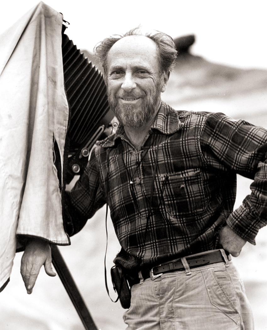
Photographer Edward Weston is most famous for bell peppers that look like nudes and nudes that look like granite. He is one of a handful of American photographers that took the art from gauzy Edwardian Pictorialism to hard-edged industrial Modernism. Along with the patriarch Alfred Stieglitz and the radical Paul Strand, they put the wooden stake into the heart of the merely pretty.
 In Europe, Modernism took a different tack, with photo-collage, political engagement and a series of “isms,” from Dada and Surrealism to Abstraction and street photography. But in America, the art went in the direction of monumentalism and the celebration of the “Ding an sich” — the thing as itself — a way of transmuting the object in the world into secular icon.
As Weston himself put it: “to photograph a rock, have it look like a rock, but be more than a rock.” And “To present the significance of facts, so that they are transformed from things seen to things known.”
Unlike the soft-focus Pictorialism that sought to imitate the look of Impressionist paintings, Weston and the other American pioneers attempted a hard edge, sharp vision that took advantage of what the camera and lens could see.
“The camera sees more than the eye,” he wrote, “so why not make use of it?”
In fact, where he once called himself “Edward Weston, artist,” he began using the expression, “Edward Weston, photographer.” He was proud of being what he was. Not that that makes him any less an artist.
He was born in Illinois in 1886, son of a doctor, who got him his first box camera when Edward was 16 years old. He dickered around with it and a larger 5X7 camera, and won several awards for the “artistic” images he made. In 1910, he moved to Tropico, Calif. (now Glendale) and opened a studio. He married, eventually had four sons and in 1913, met the bohemian bisexual Margrethe Mather, who joined him in his studio and introduced him to a more Modernist vision of art.

From 1923 to 1927, he spent a good deal of his time living in Mexico with his new love, Tina Modotti, where he came into contact with many artists of the Mexican renaissance, including Diego Rivera and Jose Clemente Orozco.

While there, he began photographing subjects less overtly artistic, and more mundane, transforming them into Modernist form — such as his multiple “excusados,” or toilets.

“Here was every sensuous curve of the ‘human form divine’ but minus imperfections,” he wrote.
When he finally returned to California, he was a full-fledged avant-garde artist, making his living with his camera. In short time, he became nationally known and joined such photographers as Stieglitz, Strand, Ansel Adams, Imogen Cunningham and several others, who all proposed a new esthetic of crispness and clarity.

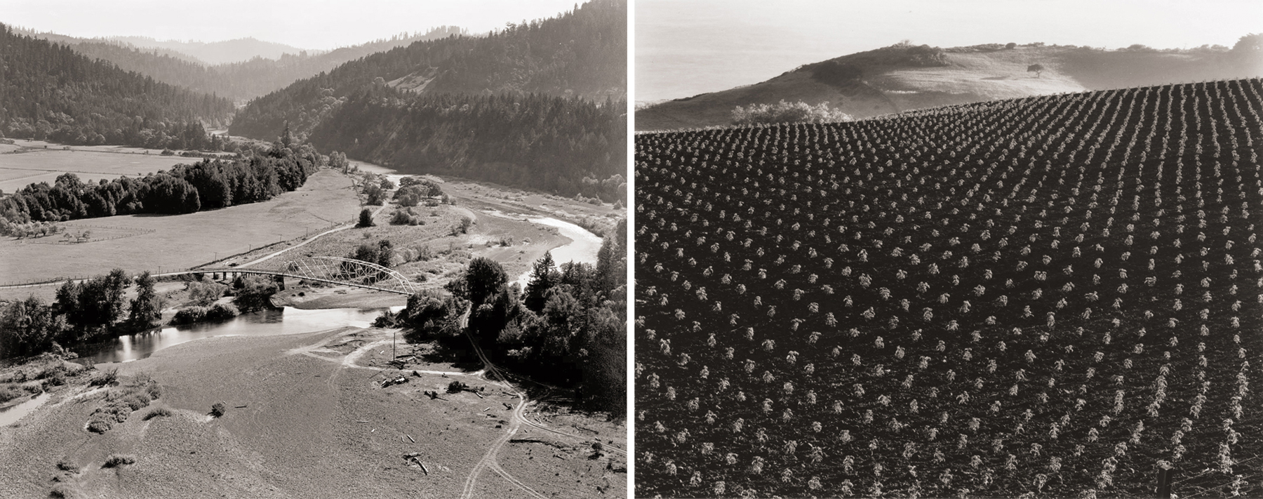
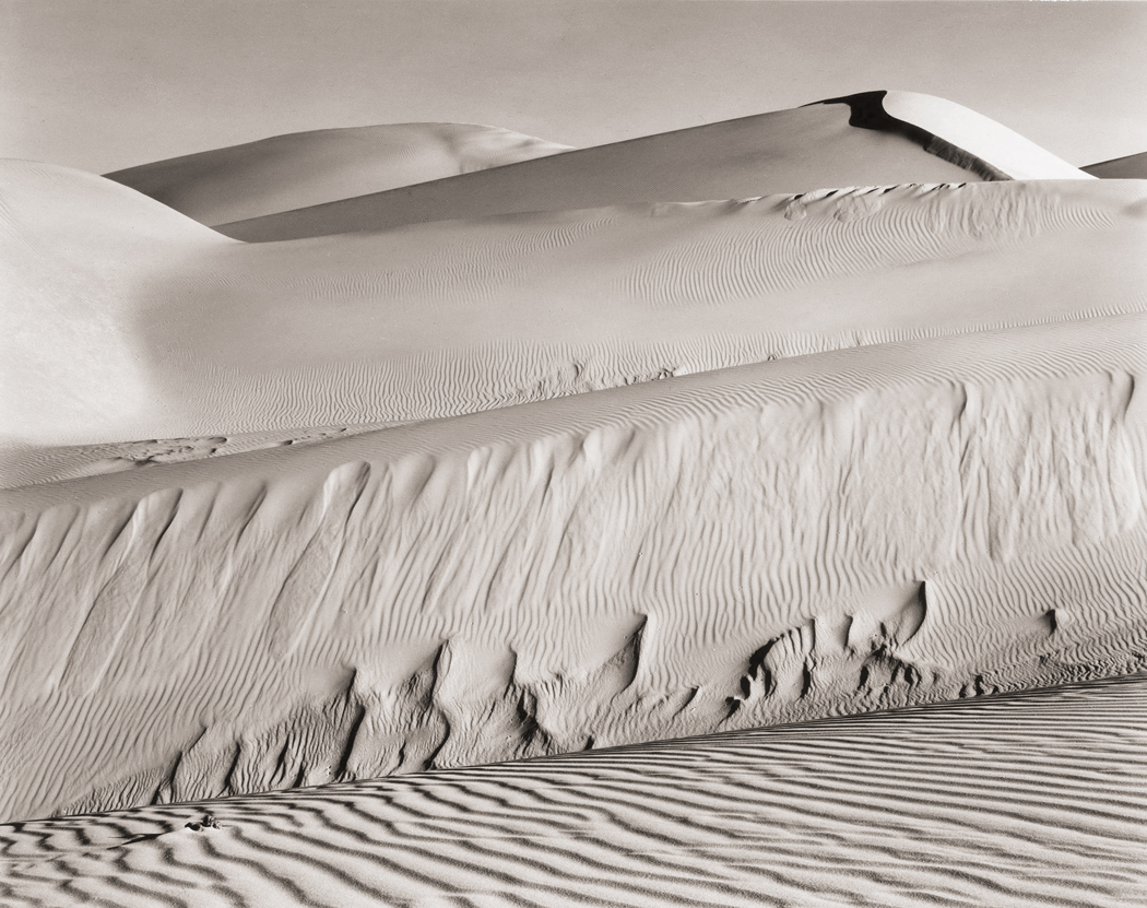
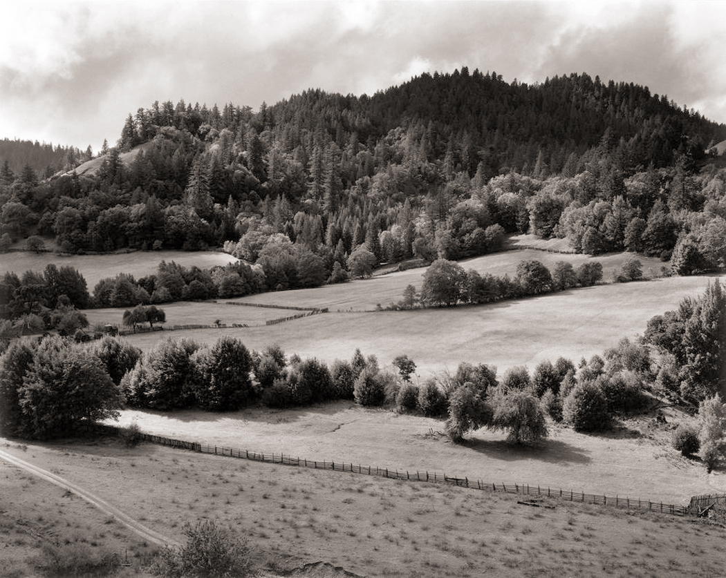
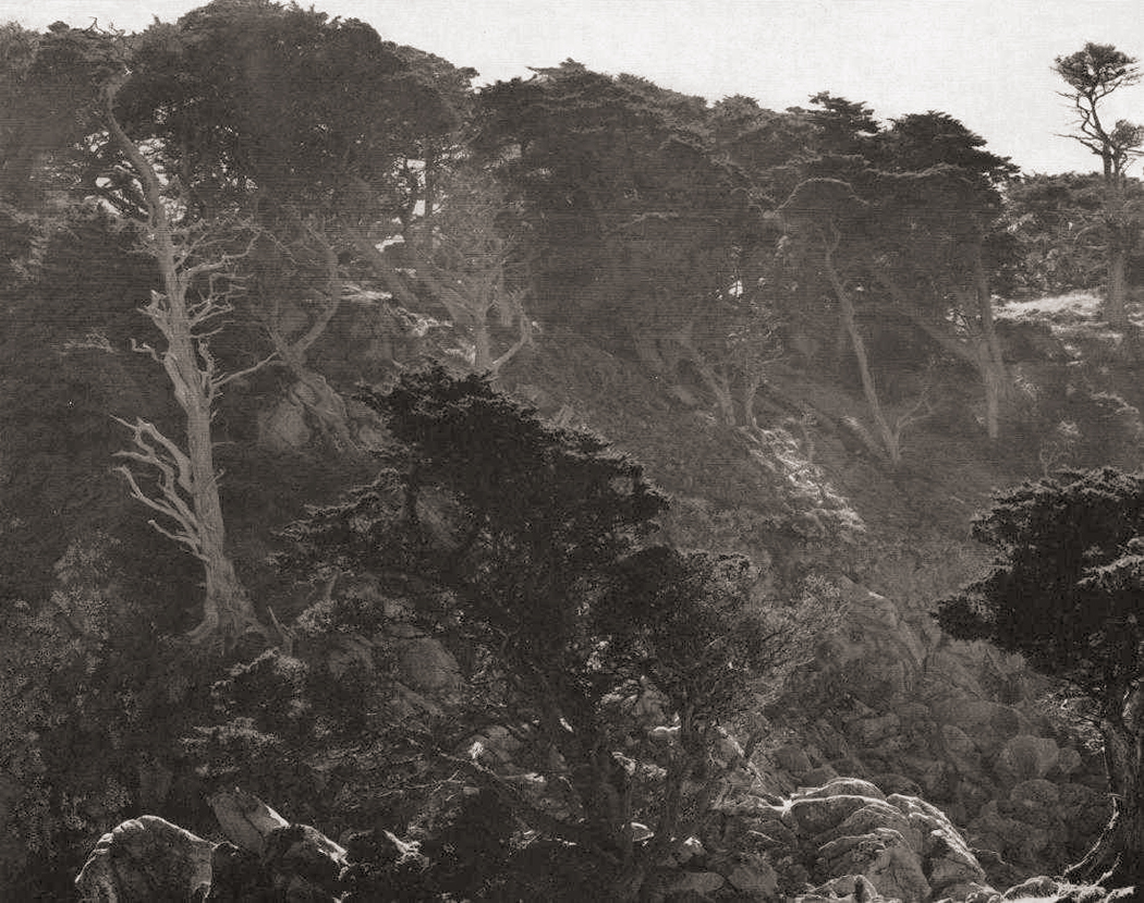
By 1937, he was awarded a $2,000 Guggenheim grant — the first ever given to a photographer — and traveled around the American West with his new squeeze, Charis Wilson, making in all some 1,200 images, mostly of landscape. The following year, he received a follow-up grant, that allowed him to process and print those negatives. Eventually, he married Wilson (she was 25; he was 53).

Charis
After the war, they divorced and Weston was hit with Parkinson’s Disease, forcing him to give up making new photographs. He died on New Year’s Day in 1958.
2.
We know the work of so many by their specialty. Ansel Adams has his pristine landscapes; Robert Frank has his street photos; Richard Avedon his pitiless portraits. But Weston encircled so much, so many subjects.
He also tried so many different things in his career that he seems to prefigure most current movements in art photography. No matter what it was, Weston did it first:
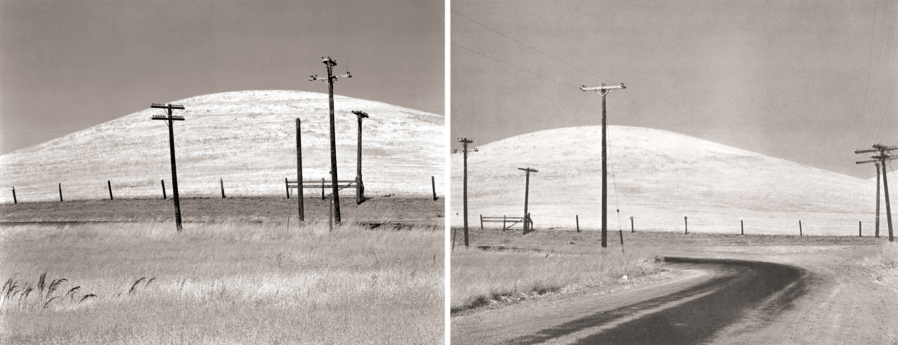
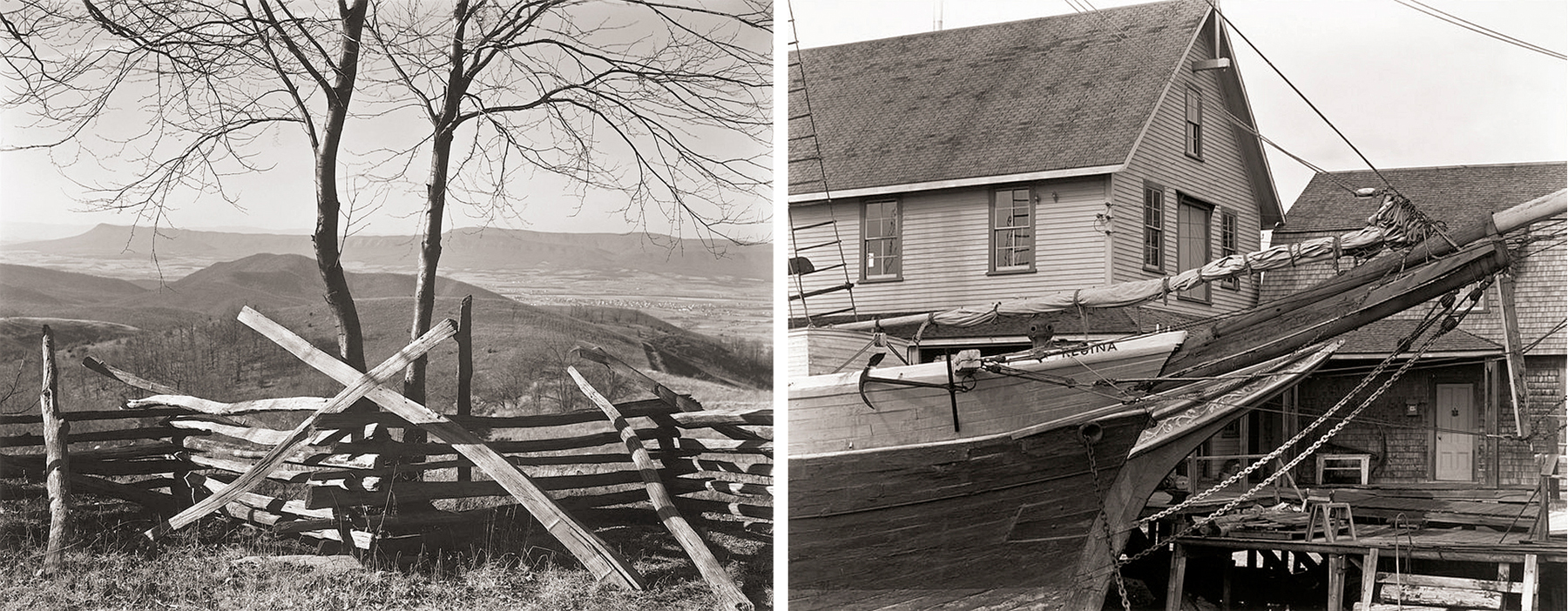
—He included man-made objects in his Western landscapes before Robert Adams.
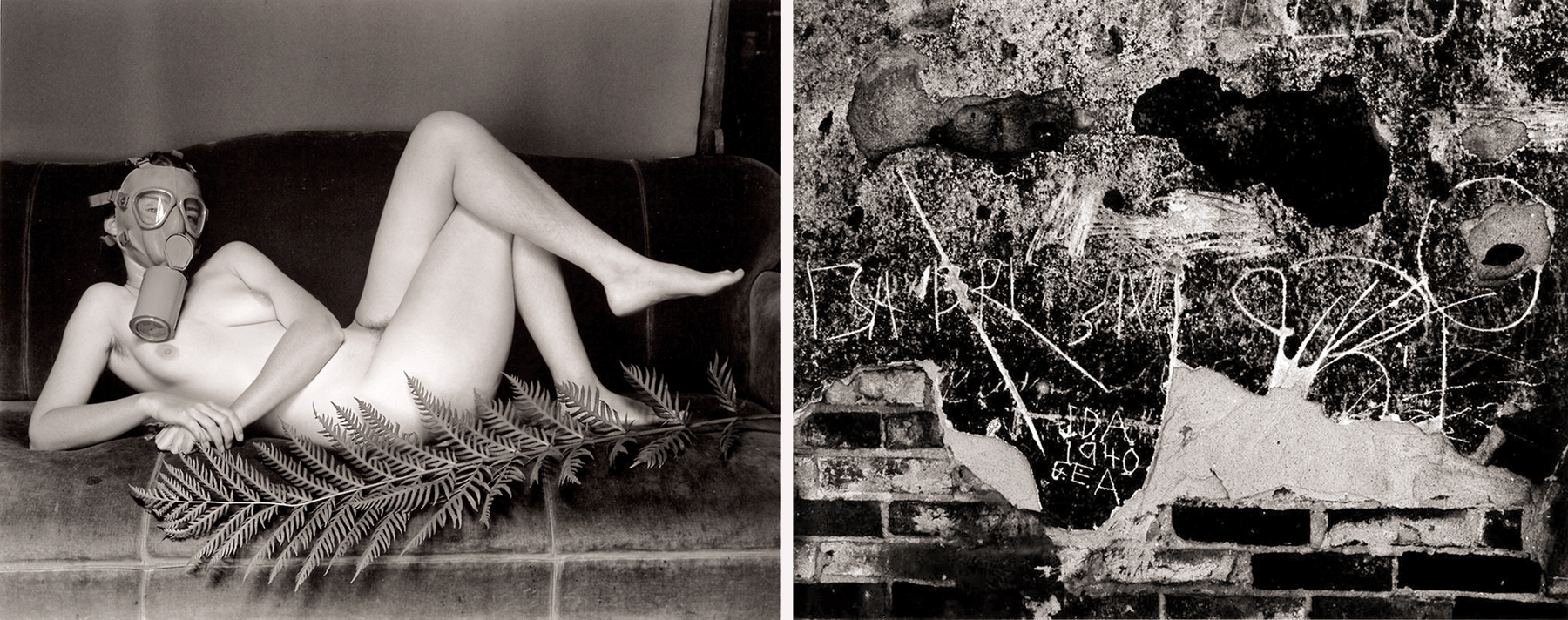
—He made surreal satires — a nude woman in a gas mask — before Les Krims.
— He chronicled his family before Nicholas Nixon or Emmet Gowin did theirs.
—He used foreground to obscure background, preceding Lee Friedlander.
—He prefigured the “New Color” of William Eggleston and Stephen Shore when he made his first Kodachrome pictures.
—He photographed graffiti before Aaron Siskind.
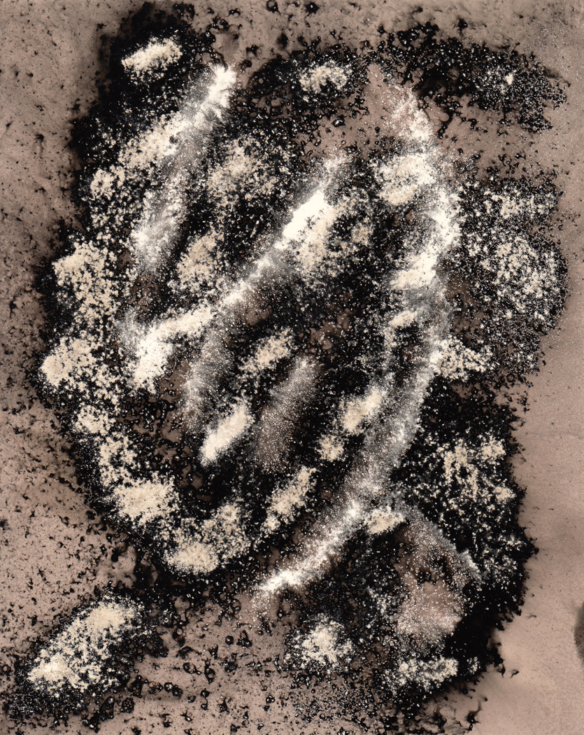
—He photographed ice crystals as abstractions before Minor White.
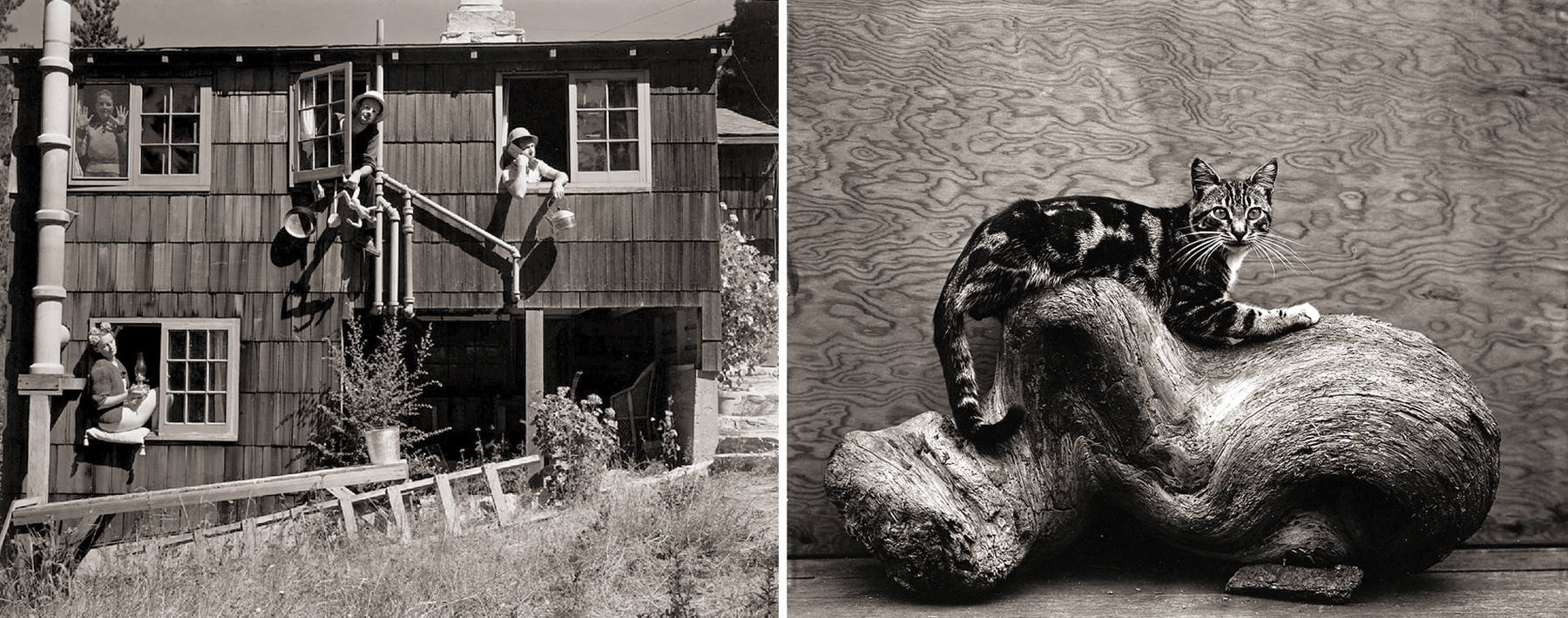
—He prefigured what has been dubbed “photography in the directorial mode” when he posed his friends in oddball satires such as Exposition of Dynamic Symmetry.
—He posed cats before William Wegman posed dogs.
—He even began the “grantsmanship” syndrome, being the first photographer to win a Guggenheim Fellowship, in 1937.
—In fact, it is hard to find a genre of art photography that Weston did not essay before anyone else. He is ancestor to Frank Gohlke, John Pfahl, Lewis Baltz, Len Jenshel, Olivia Parker, Ralph Gibson, Linda Connor, Stephen Shore, William Eggleston, Sandy Skoglund and really every other working photographer/artist, including those who show his influence by their rebellion against it.
You would be hard-pressed to find another artist in any medium so crucially seminal.
His presence has been so overwhelming that one critic, A.D. Coleman, has called Weston a “vast boulder blocking the path of photography.” It is nearly impossible to make a photograph for at least the remainder of the century without either imitating Weston or reacting in opposition.
It was the same complaint that T.S. Eliot made of John Milton: Being so good, a century of followers couldn’t think of any better way of doing it and so wound up as epigones. It sometimes seems that Weston, like Plato, was the original, and everyone else is a footnote.
That is, of course, an exaggeration, yet his achievement is monumental. Like Rembrandt, Hokusai or Beethoven, his imagination is vast and inclusive. Like them, he combined a brilliant formal sense with the realization that form alone isn’t enough. An art work must have meaning, also. His images are richly sensual, dark, at times brooding, always emotionally and psychologically fascinating.
Weston, more than any other single figure, has defined the directions photography has taken in the second half of this century. His is an influence that is only now being transcended.
3.
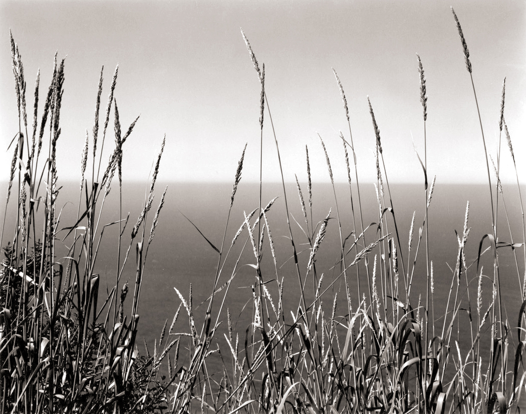
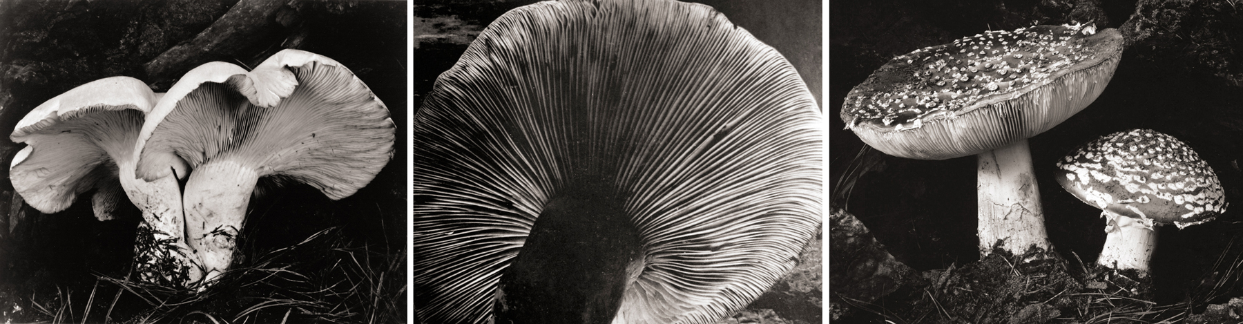
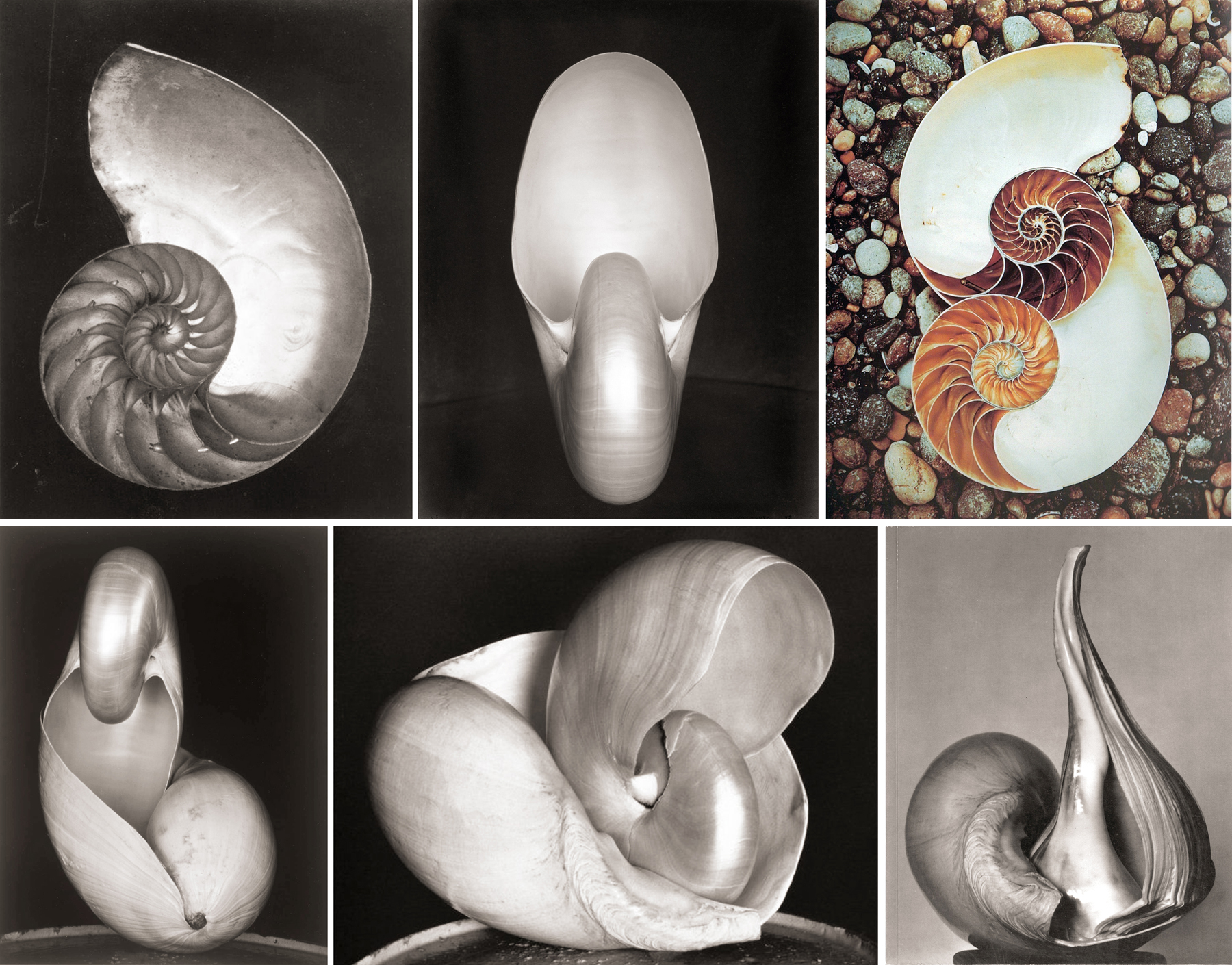
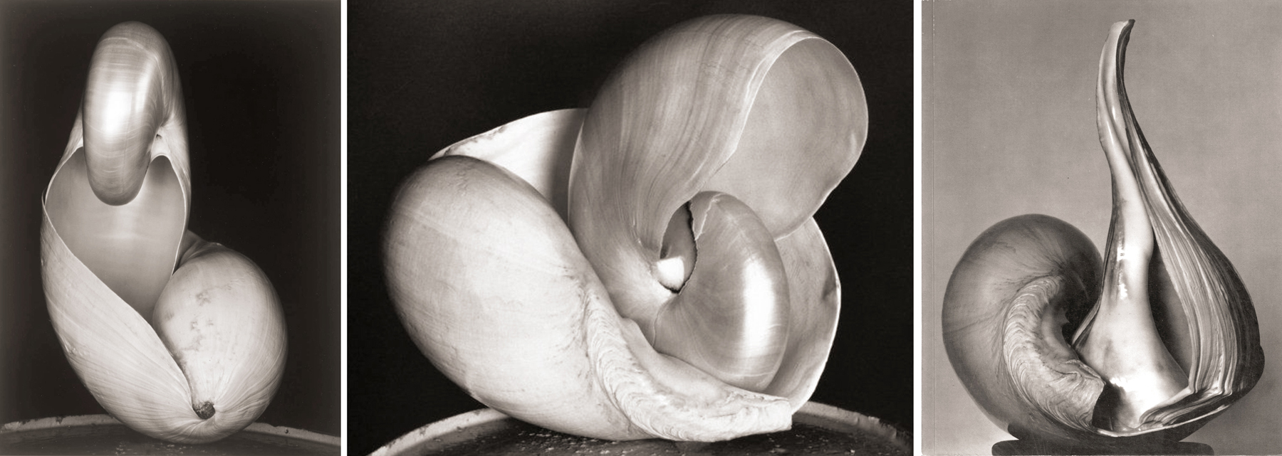
What we think of as the ur-Weston photograph is sharply focused, tightly cropped, so immaculately composed each element in the picture fits with the others like Lego blocks. Light defines shapes, moving across their curves like a masseur’s hands. And everything, whether the skin of a woman or the porcelain of a toilet, became abstract form.
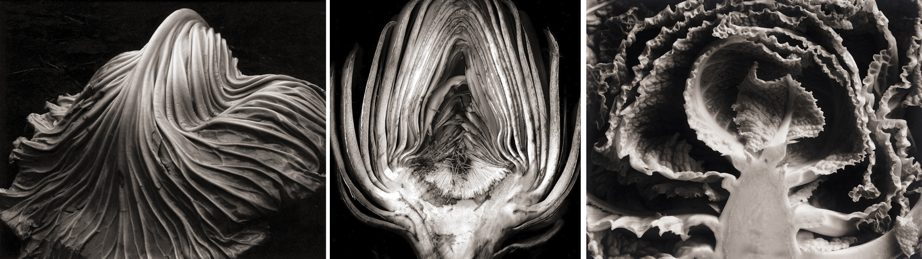
When he returned to Los Angeles in 1926, he began the series of photographs he is best known for: his close-ups of vegetables. Of his famous Pepper No. 30 (1930), he said, “It is classic, completely satisfying — a pepper — but more than a pepper; abstract, in that it is completely outside subject matter. … This pepper takes one beyond the world we know in the conscious mind.”
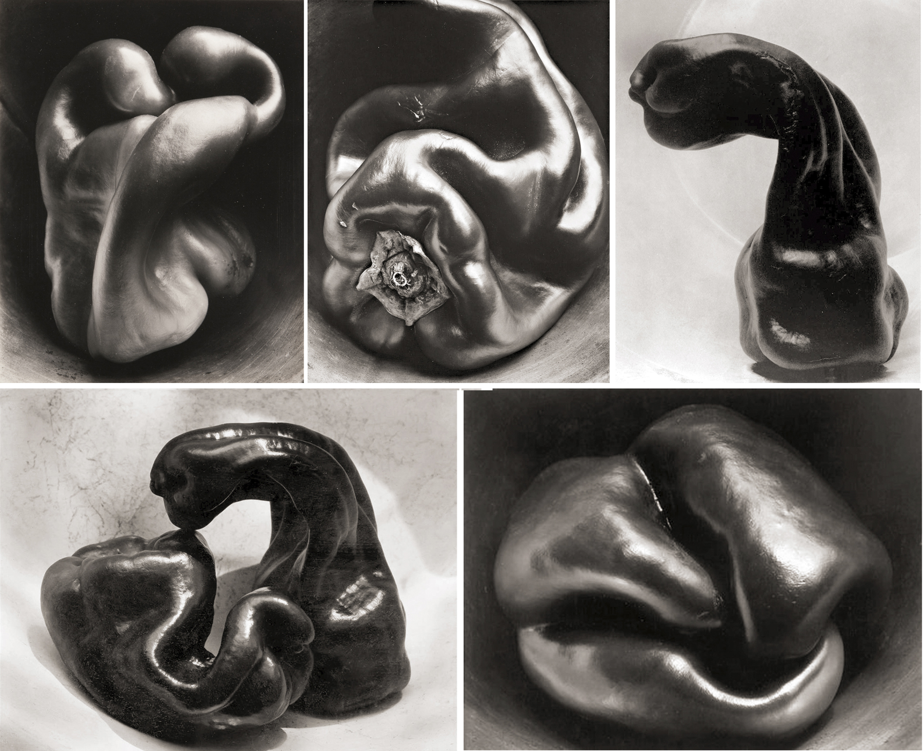
Weston called what he did “a revealment” and said, “This is the ‘significant presentation’ that I mean, the presentation through one’s intuitive self, seeing ‘through one’s eyes, not with them,’ the visionary.”
He said he wanted to make a picture of a pepper, for instance, ”that was more than a pepper.” He wanted it so sharp, our attention focused on it so intensely, that it verged on the psychedelic. Of course, that word didn’t exist at the time, and Weston certainly would have resisted any label, but it is hard to avoid recognizing the visionary quality of his best work.
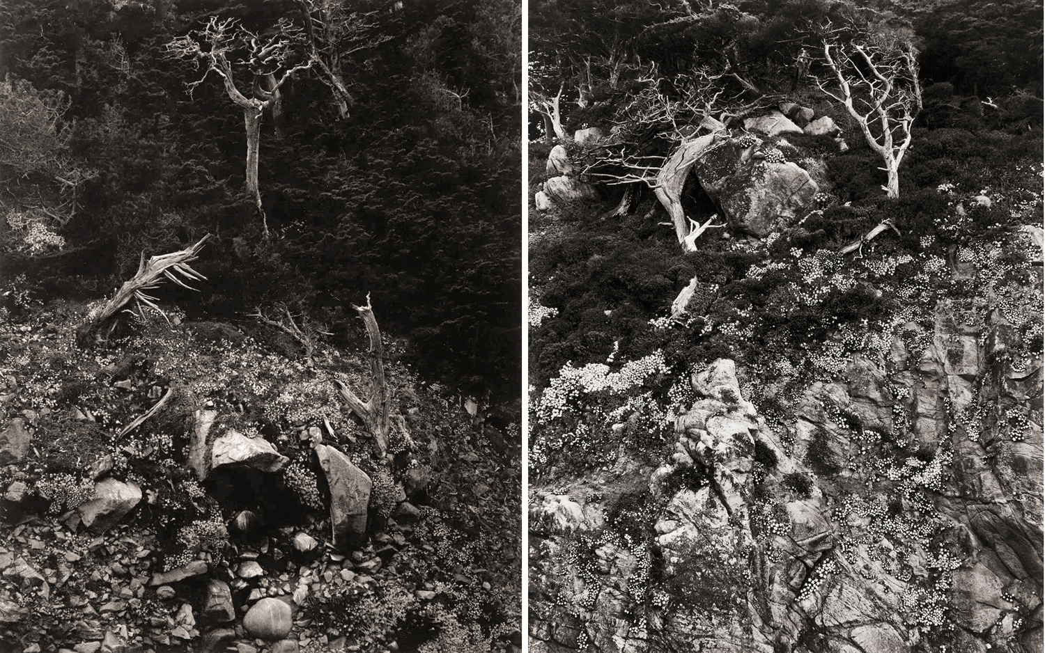
This is something we might lose sight of in the later landscapes, if we are fooled into thinking of them as postcard pictures — a way of remembering scenery we have driven past. All of Weston’s work, whether portrait, still life or landscape, were made and meant to be seen as metaphor.
As his esthetic progeny, Robert Adams, put it: “Landscape pictures can offer us, I think, three verities — geography, autobiography and metaphor. Geography is, if taken alone, sometimes boring; autobiography is frequently trivial; and metaphor can be dubious. But taken together, as in the best work of people like Alfred Stieglitz and Edward Weston, the three kinds of information strengthen each other and reinforce what we all work to keep intact — an affection for life.”
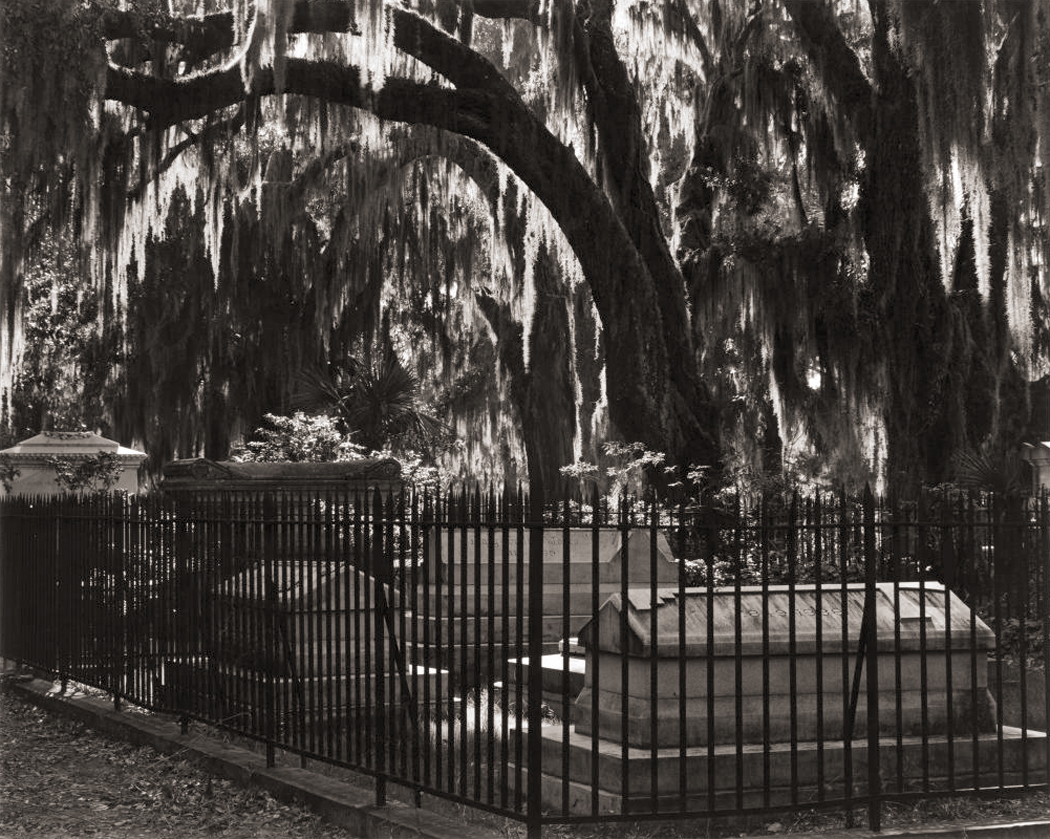
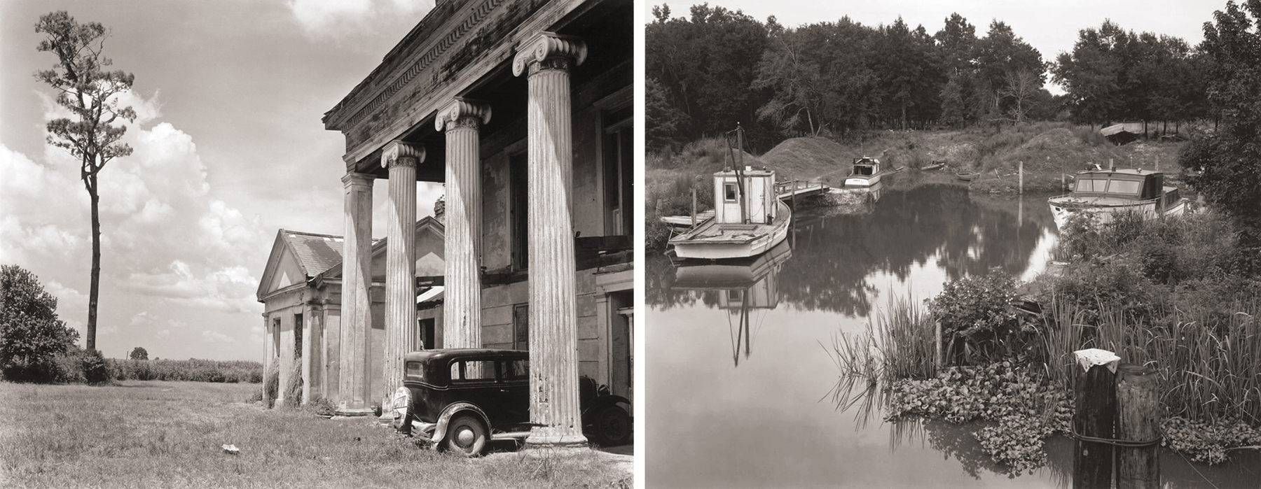
In 1941, he visited New Orleans and made a passel of photographs of graveyards and abandoned plantation houses, some burned out with old family pictures and children’s dolls left in the debris. (He even traveled around New Orleans with arch-surrealist Clarence John Laughlin, whose pictures are hardly weirder than Weston’s.)
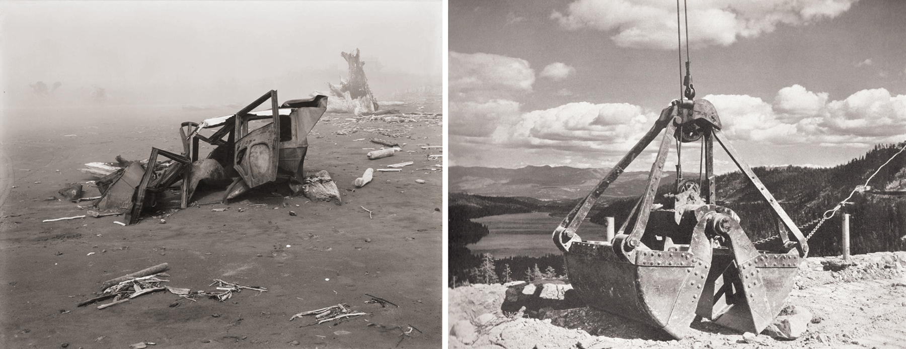
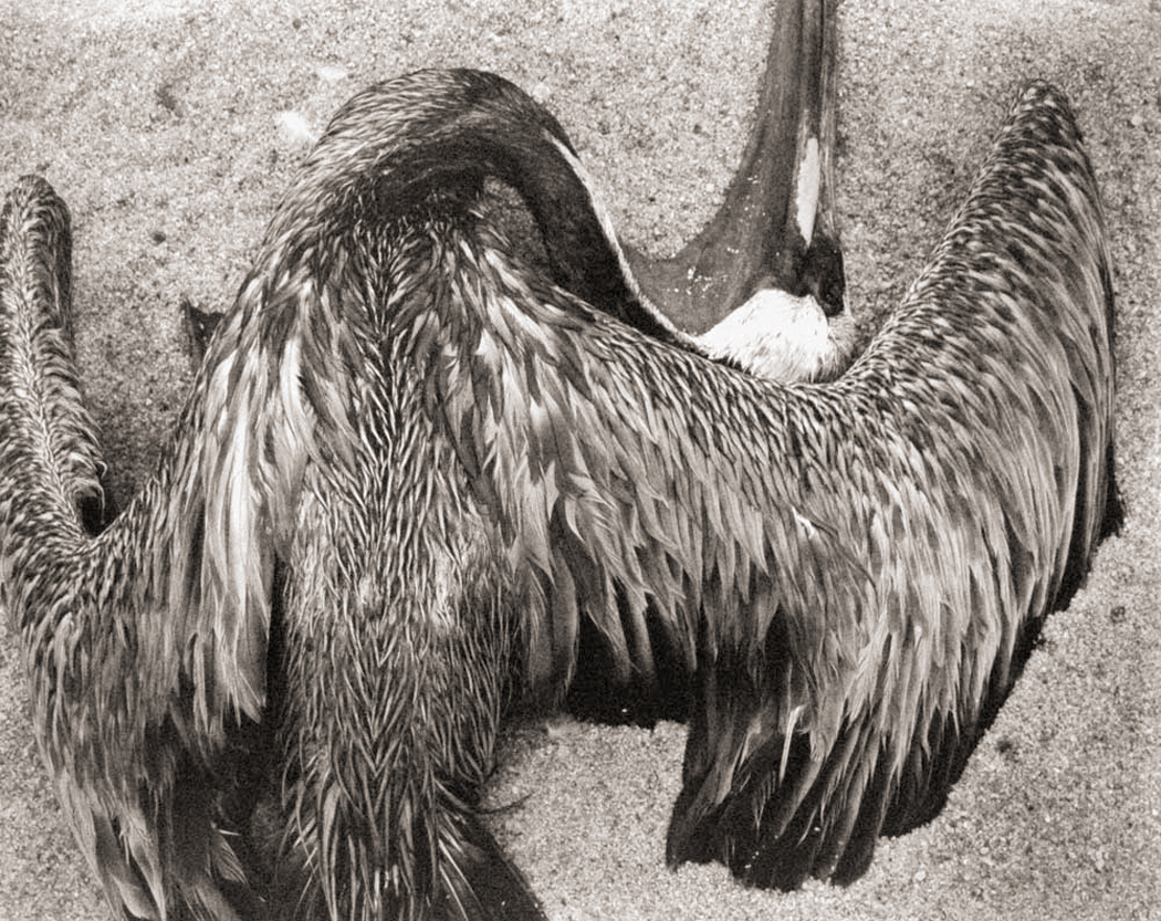
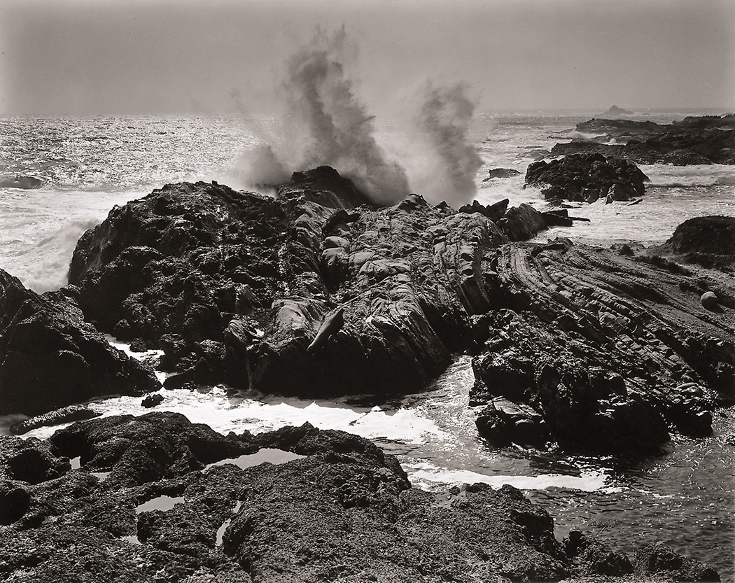
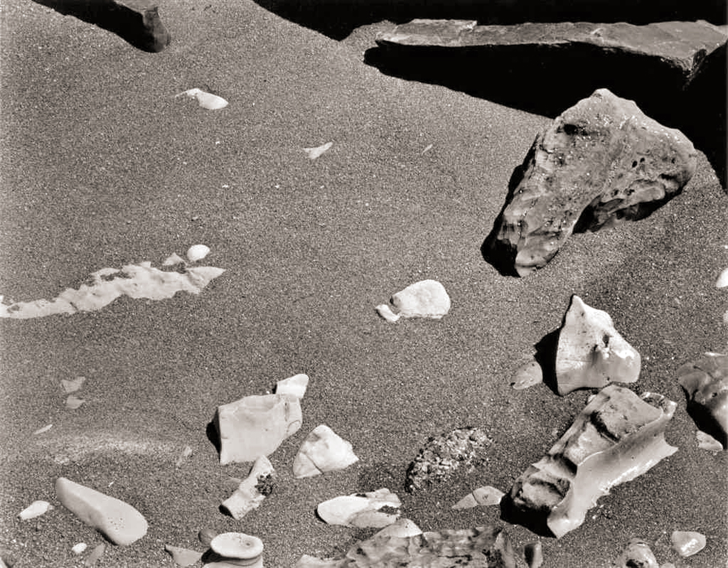
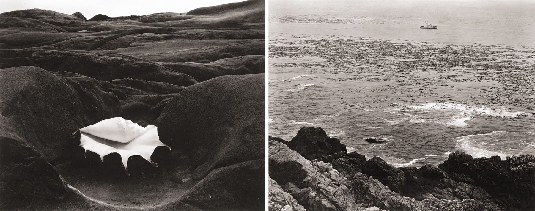
And there always had been the pictures of scorched car wrecks on the beach, twisted dead pelicans, sandstone concretions in peculiar shapes, a giant cup of coffee in the desert and a particularly modern-looking photograph of a steam-shovel bucket in the High Sierra. Ansel Adams he is not. Weston saw the world as it was, not a pristine version he might have wished.
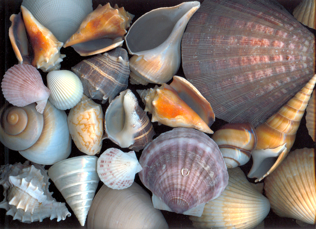
His shells and peppers are often noted for their sensuous beauty, almost more flesh than calcium or chlorophyll. It can almost become comic.
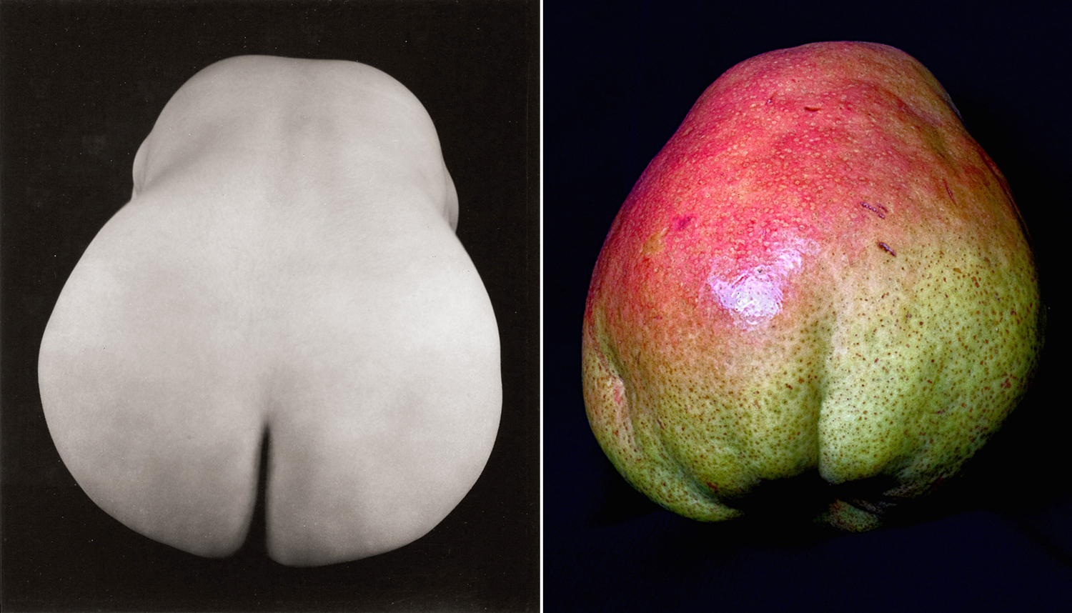
It is almost perverse, the way he conflated skin with rind.

Often his nudes are mere fragments, as if he were making a new set of Elgin marbles.
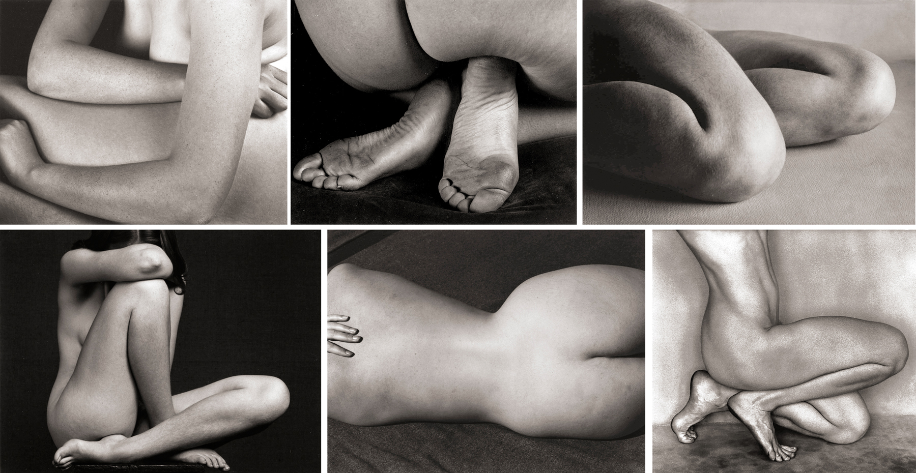
His nudes were another form of his Modernism. No “September Morn” for him.
4.
I mention all this in prologue to the three points I really wanted to make. The first is the simplest: That seeing the images here on your screen, or in reproduction in a book is a poor substitute for seeing the actual silver prints.
Most of us get to see Weston’s images only in books. (And I own, or have owned, at least a score of them — some I have since donated to museum collections).
But I remember as one of the highlights of my esthetic and critical life, getting to see and handle several Solander boxes of Weston’s originals at the Prints and Photographs Department of the Library of Congress in Washington, D.C. This was in the early ’70s, before such access was limited by new conventions of conservation. I was permitted to take each print from its box, open its hinged matte and examine the prints as close as my eye could get and still focus.
And what is more, and more important, I could take it to the window in the viewing room and let the incoming blast of sunlight ignite the print to its true glow and incandescence. Parts of the print that in reproduction might look like a uniform black turn out to have infinite detail, which is only revealed by the intensity of the light.
Silver coated on paper is an actual piling up of image, and the blacker the image, the thicker the coating of tarnished silver. A strong light enters into that layer, hits the paper behind and reflects back out through the grains of silver, so that, the more light hitting the photograph, the more luminous become the shadows.

What is more, even the grays and highlights pop in a way they cannot as the photos are now usually presented, in reduced light in museum galleries under the constraints of current professional standards. Those standards are meant to protect the artwork from UV damage and other light damage, so it’s hard to complain too much. But a silver image is one of the least affected by light. It is by all measures, archival.
Nevertheless, if you ever get a chance to view a silver-image photograph in a strong light, you will understand what glorious thing it is.
And seeing the original print can be a revelation. I remember seeing at least one image in my first-edition book California and the West, published in 1940, which featured his Guggenheim images, and that image seemed so uninteresting, that I labored over trying to figure out what Weston was thinking. But there in the Library of Congress, I held the original and it was amazing. It popped.
He took two versions of the scene, and I have seen both live, and they both jump out with life: What looks like bland areas of light gray turn out to be deeply textured with detail that is completely lost in reproduction. These are now among my favorite Westons.
As a P.S.: During that trip to D.C., there was a Weston show at a local gallery and they were selling original prints (albeit printed by his son, Cole) for $100 a pop. I drooled, but I was a poor student and just didn’t have the C-note to put down. I have regretted it ever since.
5.
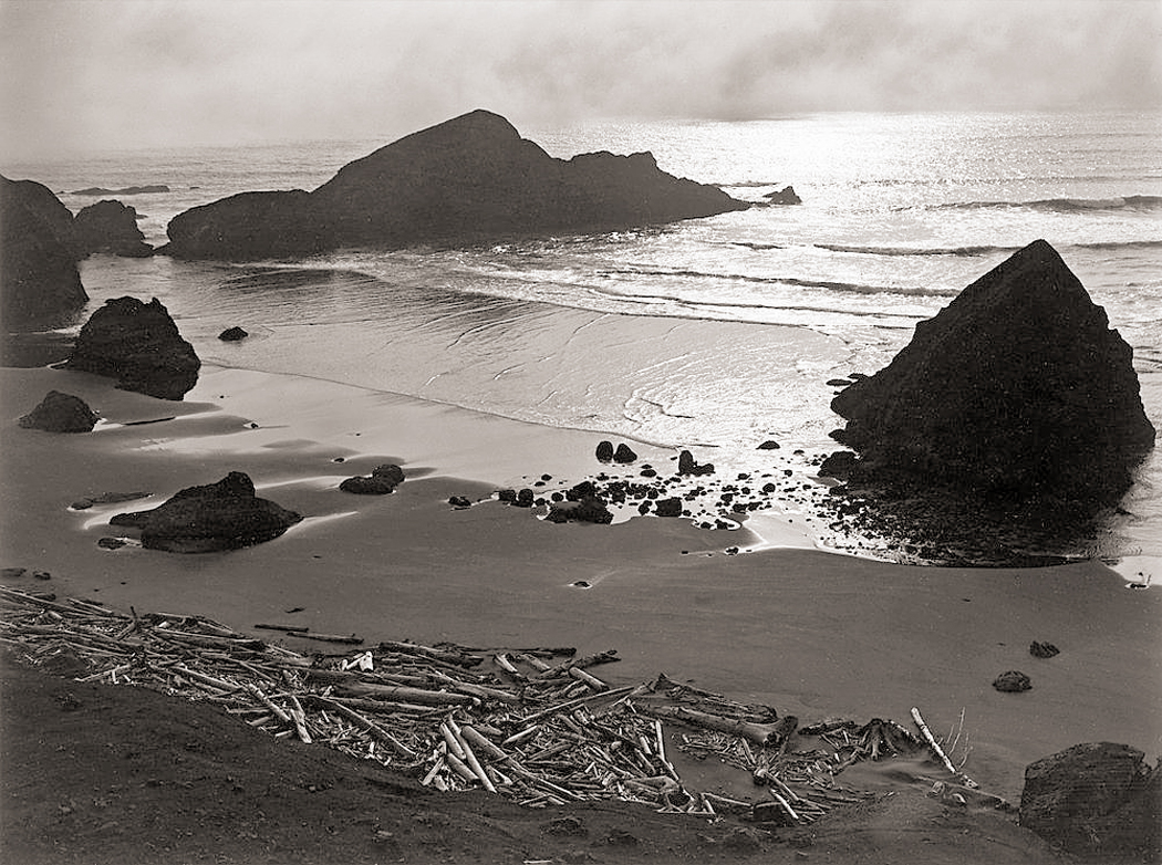
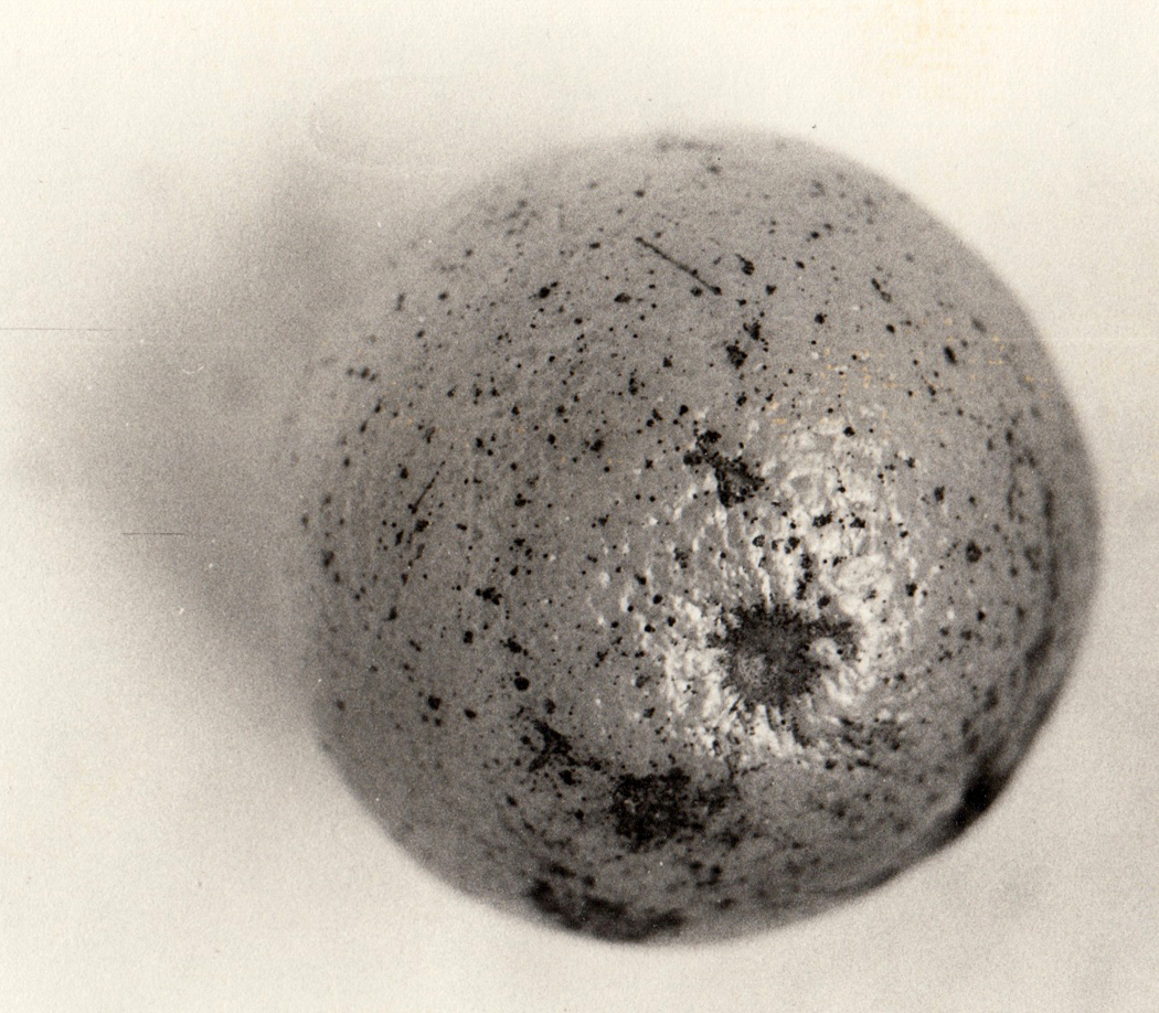
Famously, the last photograph Weston ever made, from 1948, is of a few beach pebbles flying out from the center of the frame, which is left blank with its empty sand. Rather like the blank, unprimed canvas untouched by the paint that Morris Louis has thrown down along its edges.
“Weston arranged his compositions so that things happened on the edges; lines almost cross or meet and circular lines just touch the edges tangentially; his compositions were now created exclusively for a space with the proportions of eight by ten. There is no extraneous space nor is there too little,” wrote Weston scholar Amy Conger.
Notice how, although the center of the image is largely empty, the rocks cluster at the bottom, as if drawn down by gravity, giving the photograph, although nearly abstract, a firm sense of what is upside-right.
The cluster along the bottom of the image is nearly a constant in Weston’s design sense. It is almost as if, like a child drawing a “ground line” at the bottom of his painting before adding his house and sun, Weston wants to provide a solid base to build his composition on.
Certainly not every image has this, but if you rifle through a book of his pictures, you will come across the ground line more often than would be expected. Sometimes, it is an actual ground line, sometimes it is a fence that runs across the bottom of the landscape, sometimes it is a row of items. Often it is near the bottom, but sometimes, he raises that ground line up in the frame, even to the halfway point or even above. But over and over, there is a foundation poured for the rest of the picture to settle safely upon.
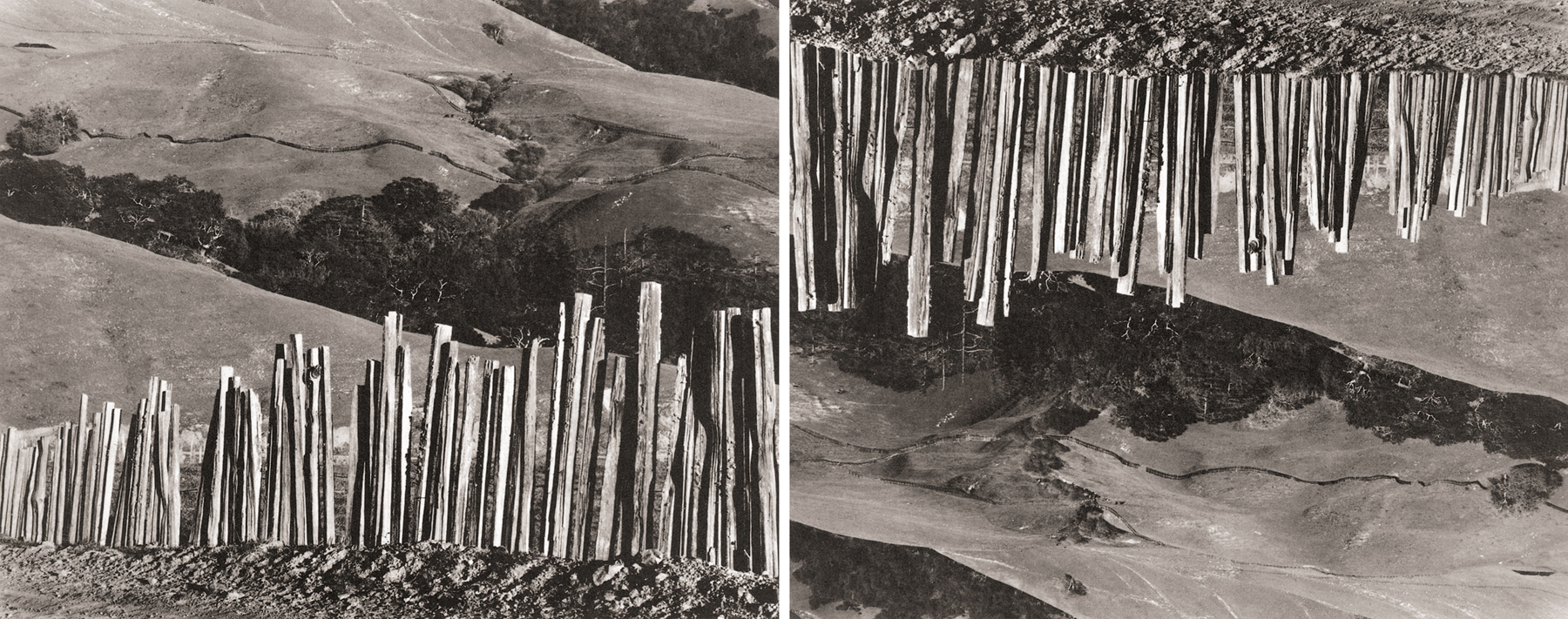
Take one of these images and turn it upside down and see how the gravity affects it: The picture dangles from its fence. Upside right, it sits comfortably.
6.
Finally, I would make a plea to some curator, scholar or writer, to publish a book concentrating on his work for the edition of Walt Whitman’s Leaves of Grass, which was first published in 1942.
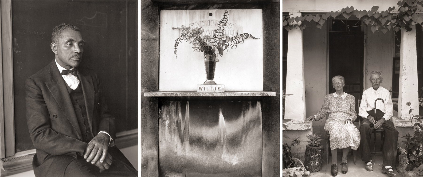
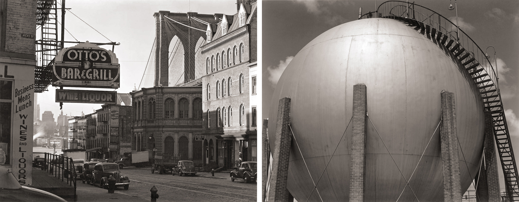
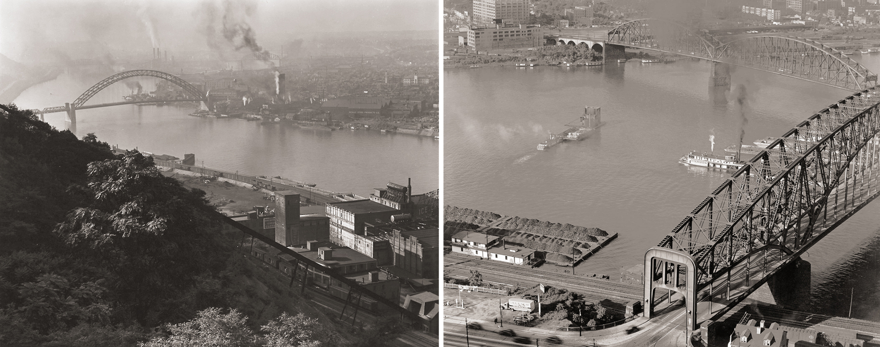
In 1941, he was commissioned by the Limited Editions Club of New York to illustrate a deluxe edition of Whitman’s poems. Weston and Charis traveled something like 24,000 miles across 24 states in their Ford, named “Walt,” and visited places in the East that he had never photographed before.
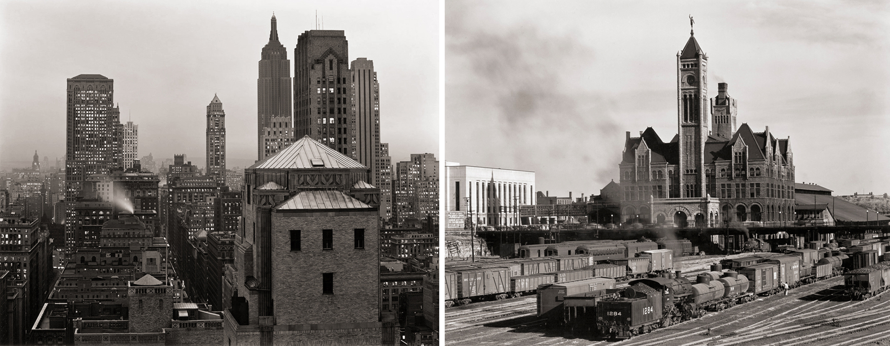
Unfortunately, the war interrupted the trip, and he had to come back to California prematurely, with some 700 negatives in the sack. Forty-nine were chosen for the book. (Weston was always inclusive: He photographed many African Americans for the book; the publishers chose not to use any of them.) The book sold poorly during the war, and has only been available since in a very badly printed re-print edition, with grayed-out images.
This period of his work is the least studied, the least exhibited and the least published — and the least respected. Which is unfortunate, because they are some of his best work, an opinion shared with Weston himself.
Two exhibits have been mounted in recent years, one at the Museum of Fine Arts in Boston in 2012, and one at the Huntington Library in San Marino, Calif., in 2016. But each was rather small, compared with the number of images available, and each was rather slightly remarked in the art world.
There are hordes of books about Edward Weston out there, many of them huge and gorgeous, with hundreds of images printed, often in beautiful duotone, nearly approaching the beauty of the originals (sans the caveat above), and they all repeat the peppers, the shells, the Guggenheim landscapes, the nudes, the portraits, even the Surrealist goofs from the war years, but no one has seen fit to gather the Leaves of Grass work together for a well-crafted presentation.
Come on, guys, it’s just begging to be done.
Click on any image to enlarge


