Archive

Tag Archives: renaissance

turn here 1

A reader once asked me what I thought were the major turning points of art – by which he meant the Euro-American tradition in art from the Renaissance to the 20th century. Of course, he had his own list already prepared to share with me. On it were 20 items. He wanted to know what would be on my list. He had the enthusiasm of a puppy dog, and it would have felt churlish to refuse him.

Making it a list of 20 is, of course, arbitrary: There are hundreds, maybe thousands of “turning points” in art history.

Also, we must confess this is a parochial list, when you have the rest of the world and antiquity — to say nothing of prehistory — to consider. But that bobsled ride from the Renaissance to Postmodernism can be seen as a single unit, and that is what my reader wanted me to consider.

Off the top of my head, then, are the 20 most pivotal pieces of art, each of which could be a chapter heading in an art history text.

Admittedly, they function as epitomes. It is rare a single piece of art can change the course of art history; instead, they are stand-ins for whole movements in art, entire changes of esthetic outlook and purpose that propel the eras they helped codify or inaugurate.

But even given my guidelines, I had to start a bit earlier, because the reawakening of Europe after the Dark Ages doesn’t happen in Renaissance Italy, but in Gothic northern Europe.

Chartres north rose window

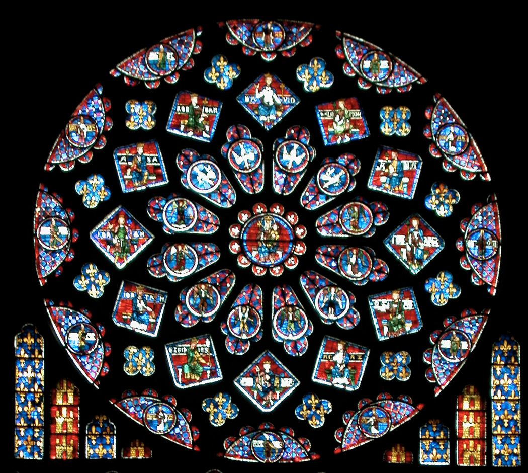
My list begins with the north rose window at Chartres – the single most beautiful thing I’ve ever seen from the hand of humankind. Actually, the list should begin with the basilica of St. Denis in Paris, the first truly Gothic church, and the inspired conception of Abbot Suger, one of the most important clerics of the 11th century. His Neoplatonist idea was that God was light and that a church, to capture the spirit of divinity, must be opened up with windows and color. The engineering was a breakthrough: He realized that you don’t need walls – the heavy stone walls of the Romanesque – to hold up a roof, but you could put the roof on pillars and fill in the space between the pillars with curtains of colored glass. It was a huge step forward esthetically and technologically. But St. Denis was a first draft: It is in Chartres that the ideal finds its apotheosis.

Giotto

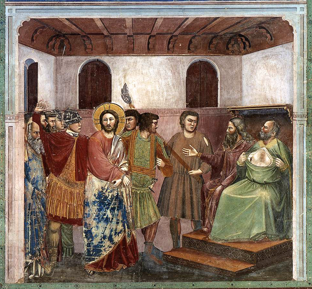
Second, Giotto’s interior frescoes for the Arena Chapel in Padua, for waking up to the idea that painting not only could, but should try to capture something of the feel of reality.

Masaccio trinità

Third, the Trinity of Masaccio at the Sta. Maria Novella in Florence. It’s impossible to choose the single image that represents the triumph of Renaissance perspective over the Gothic style, but Masaccio is as good a choice as anyone.

ghiberti abraham 2

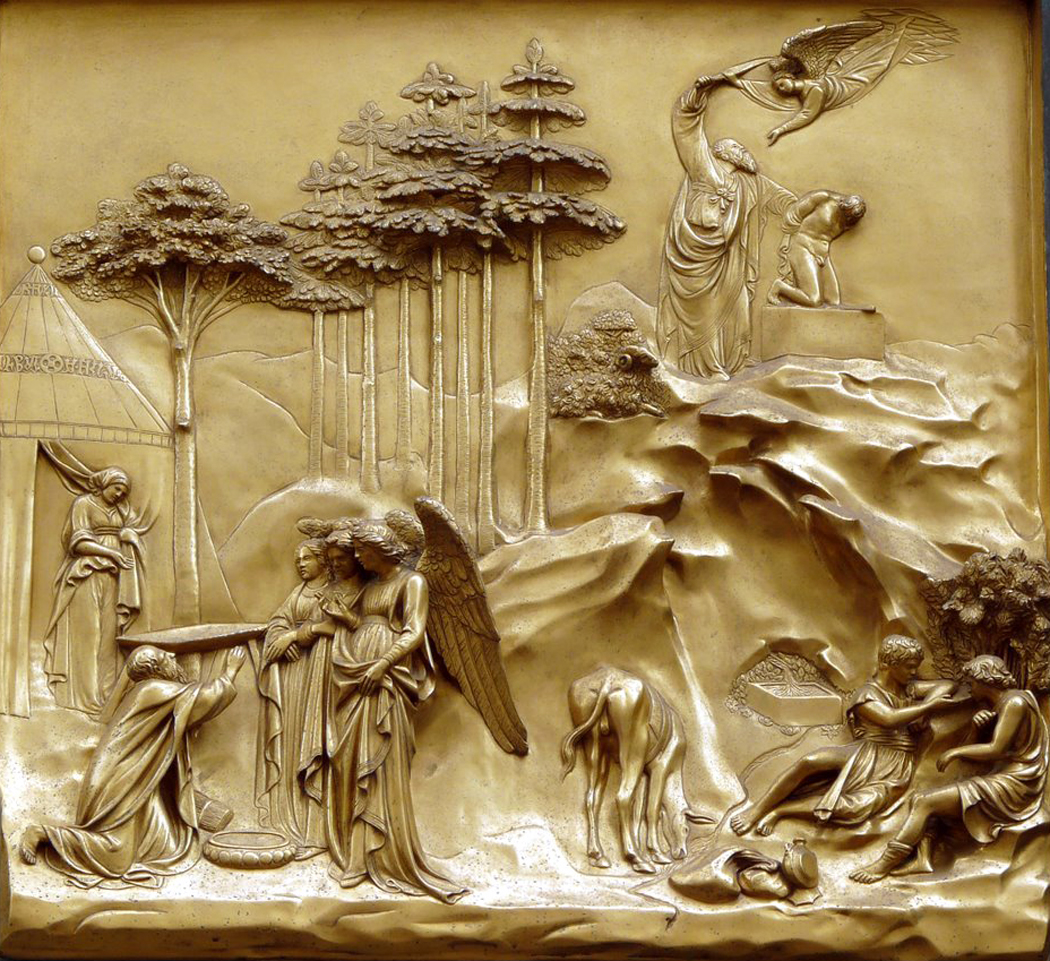
Fourth: The bronze doors of Ghiberti to the Baptistry in Florence, an astonishing display of inventiveness and naturalistic imagery.

three davids

Fifth: The David of Donatello, and the final destruction of the Gothic schema in Western art.

Sixth: The David of Michelangelo Buonarroti, and

Sistine ceiling detail

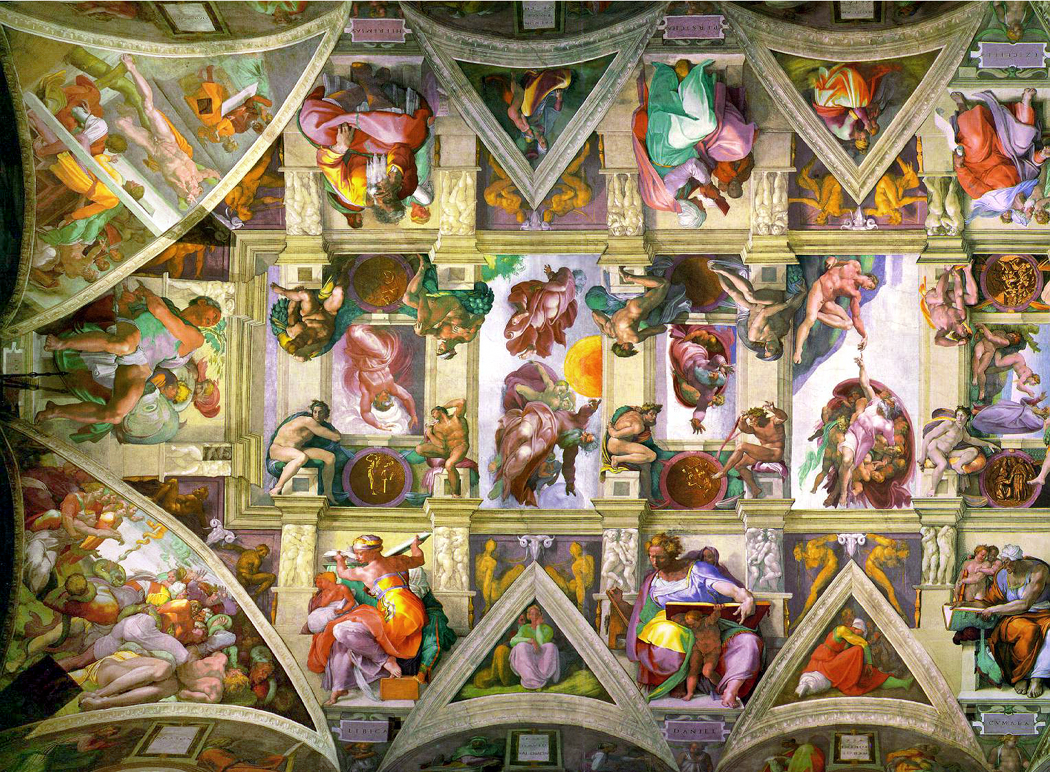
Seven: The Sistine ceiling. No artist so defined his age and the two hundred years after him more than Michelangelo, the single most influential artist in history.

caravaggio

Eight: Caravaggio: The Calling of St. Matthew, although most of the crazy guy’s central paintings would do: The Invention of the Baroque. “Energy is eternal delight,” as Blake says.

Nine: The David (above) of Gianlorenzo Bernini (although I actually prefer the Apollo and Daphne), and the perfection of the Baroque, and the most proficiently perfect sculptor in history. I choose the David only for the symmetry with Donatello and Michelangelo. Look at the three Davids together and see the direction of the 15th and 16th centuries.

rembrandt

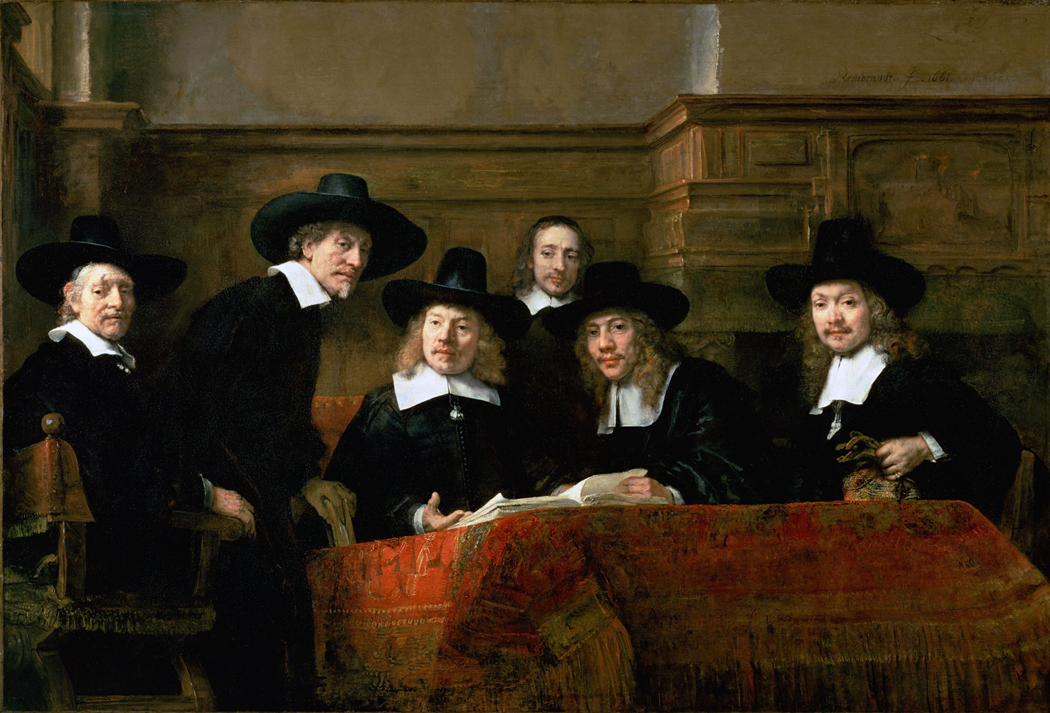
10: Rembrandt Portrait of the Syndics of the Cloth-maker’s Guild, (chosen over the more flamboyant Night Watch) to show how the psychological acumen of the Dutchman could bring life to an otherwise utterly conventional group portrait. This sense of psychology, that there is a real person behind the eyes, is what Rembrandt brought to painting, as Shakespeare brought it to the stage.

benjamin west

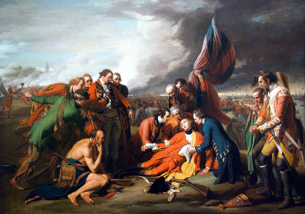
11: The Death of General Wolfe by Benjamin West, which manages to turn the conventions of the mythological painting onto not merely the historical event, but the current event. In a way, each of these choices is a step on a road from stylization and convention to a more aware and awake attempt to engage with the experience of being alive, with what we might call a more “real” vision of the world.

delacroix

12: Liberty on the Barricades by Eugene Delacroix, although you could also use Greece Expiring on the Ruins of Missolonghi, as the symbolic use of politics and the rise of the democratic spirit in the world.

Turner

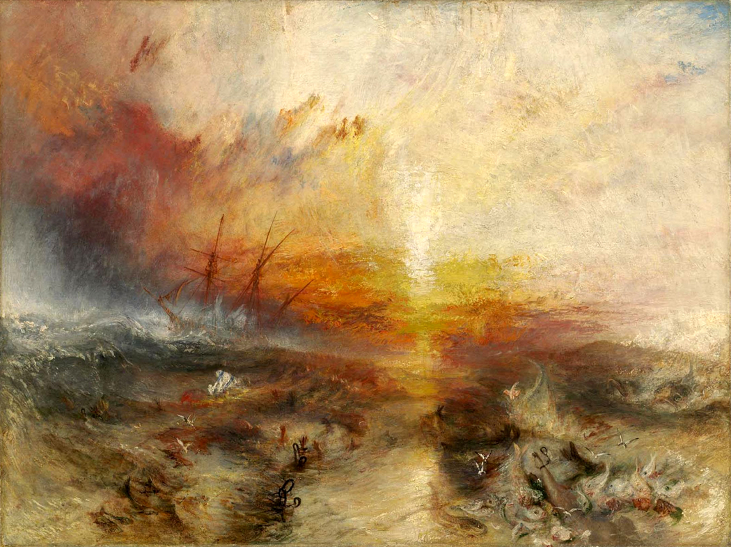
13. Joseph Mallord William Turner’s The Slave Ship as another political comment, but more important as the first glimmerings of a kind of Impressionism in paint, and the turning point where what we now call Modernism has not its birth, but at least its conception.

Manet

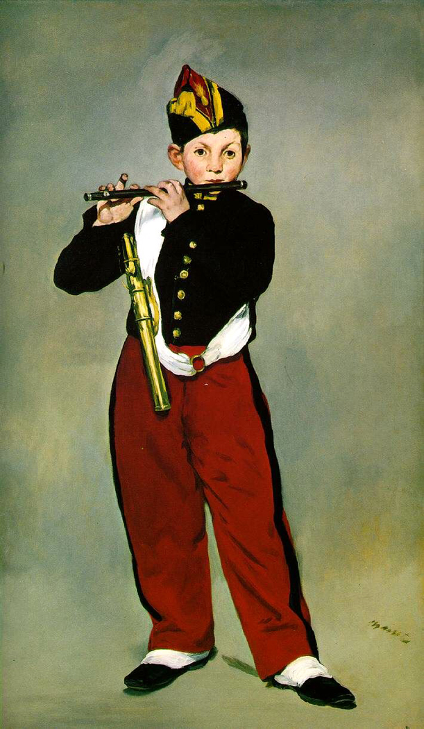
14. Edouard Manet, The Fife Player, as the birth of that Modernism, flat, ironic, oblique.

Gauguin

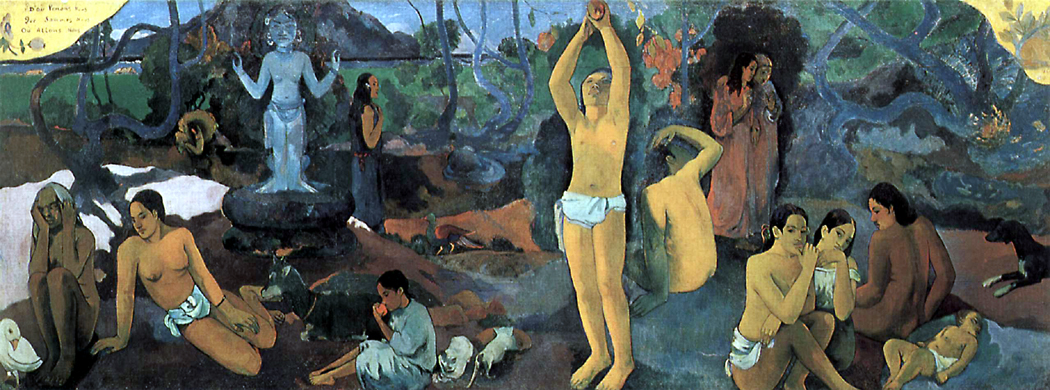
15. Paul Gauguin, Where Do We Come From? What Are We? Where Are We Going? and the continuing flattening of picture space, at the same time as opening up to non-Western pictorial influences — to say nothing of questioning the values of European civilization, and it’s about time.

picasso demoiselles

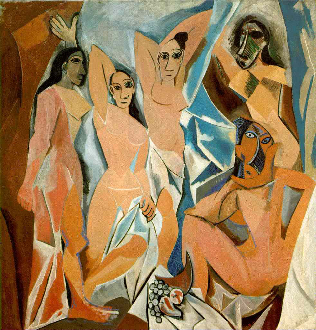
16. Pablo Picasso, Demoiselles d’Avignon as the source of Cubism, and the sense that the picture is a canvas and not a window. It was the single most revolutionary painting of the 20th century, although in retrospect, not Picasso’s best.

duchamp

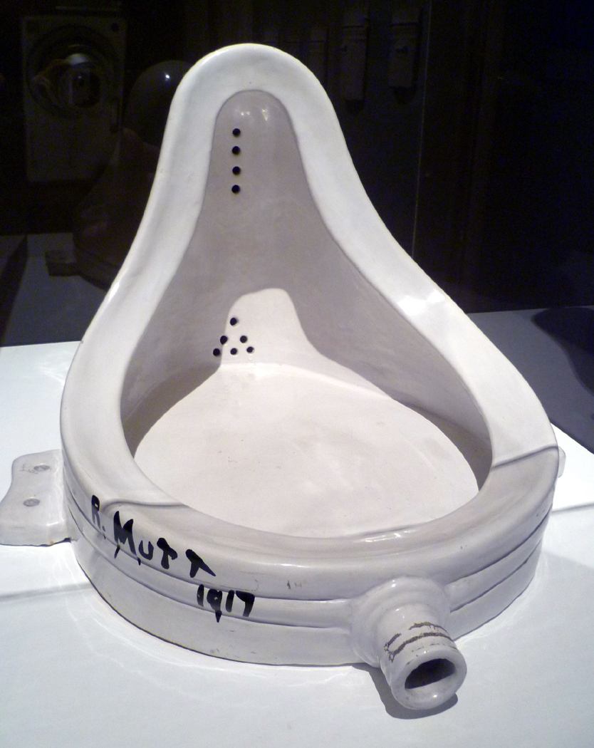
17. Fountain by Marcel Duchamp – the “found object” urinal – and the single most influential sculpture of the 20th century, and an influence that is still oppressive today. Now, everyone thinks he’s Duchamp.

40-12-17/35

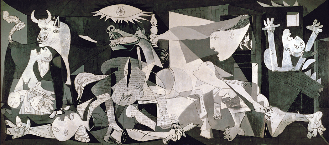
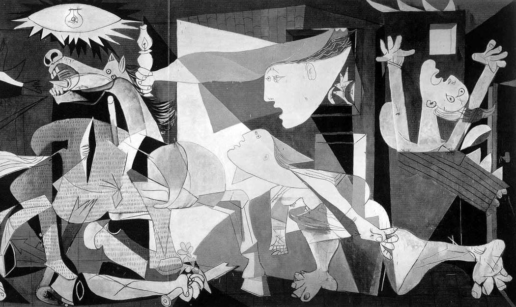
18. I would also include Picasso’s Guernica in this list, as his most ambitious work and the single most powerful image of the 20th century. I grew up with this mural size scream, when it was at MOMA in New York and I was a kid. It is the perfect meld of technique, imagery, symbol and “message.”

warhol soup can multiples

19. Andy Warhol’s Campbell Soup Can and the rise of Pop. Warhol is the most serious postwar American artist, despite his public antics. Art is about the world we live in; Warhol reminds us that the world we currently inhabit is the one of commercial signage and media imagery.

beuys

20. Finally, Joseph Beuys How to Explain Pictures to a Dead Hare, or any of a dozen other Beuys pieces, angry yet detached, symbolic yet utterly there physically as a presence. The most influential European artist of the postwar years.

This list is, of course, just off the top of my head. I’m sure if I gave it deeper thought, I’d switch out some of these choices. But this is a good enough start.

I’m sure you can think of things I’ve missed.

cun 18th century

What does the midday sun look like?

That may sound like a simple question, but it’s not. You can’t really look at the sun: If you try, the result is sensory overload, like the distortion of loud music on cheap speakers. You can even go blind, rather quickly.

Yet, everyone thinks he knows what the sun looks like. It’s everywhere in art, beginning with the tempera paintings kids make in elementary school: They so often put a wedge of sun in the corner of the painting, with rays spread out below like sea urchin spines.

kid turtle

But the sun doesn’t look like that: The child’s version of the sun is a symbolic representation of the solar disk.

But then, so are all adult representations.

So we also recognize the gilt centrifugal rays of Louis XIV’s Sun King symbol and the terra cotta sun face of Mexico and the red ball and rays of the World War II Japanese “Rising Sun” naval ensign.

sunmosaic

The sun is the paradigm of art problems, because it can never be portrayed accurately as it looks. Paint cannot be so bright.

But that doesn’t stop artists from attempting it. Van Gogh painted the solar disk over and over in his landscapes. Usually, the sun is a yellow circle surrounded by concentric brushstrokes in a darker ocher. The only way he could make the sun seem bright was by making the sky unnaturally dark.

vangoghsun1


Ansel Adams had a photograph he called The Black Sun, in which a long exposure caused the image of the sun to solarize, making it a dark dot in the picture, surrounded by a halo of rays. It looks almost like an eclipse photo.


Ansel Adams' "Black Sun"

Ansel Adams’ “Black Sun”

In Picasso’s Guernica, the sun is an edgy elliptical disk with spiked rays, in the middle of which is a light bulb.

guernica detail

Each of these is an attempt to portray something that cannot be portrayed.

On a piece of paper or a canvas, the brightest white is no more than 40 times brighter than the deepest black. In the Arizona summer, the sun is thousands of times brighter than the shadow under a mesquite. A canvas just cannot accommodate that brightness range. We compress that range and accept it.

But the emotional effect of the sun’s brightness is just as hard to portray. When artists attempt it, they have to leave the realm of naturalism and create a fiction, a symbol for the sun instead of its snapshot.

So, what does the world look like? The sun is only one minor example of the complexity of this question. It is a question that has been at the core of art for 30,000 years and has still not been answered in any finality.

The problem in formulating an answer is that human perception is both so complex — scientists keep finding more astonishing whirligigs in the brain’s apparatus — and at the same time, so universally believed simple. We all have eyes; and seeing, after all, is believing.

We see with our eyes, most people think. The world looks the way a photograph makes it look.

But of course, we don’t see with our eyes, but with our brains – and even more difficult, with our minds, which means we see through the haze of emotions, culture and individual life experience. We so thoroughly process the data that our eyes collect that the final result barely matches the patterns on the tickled retina.

Seeing doesn’t just happen; it is a complex mental process. And it is a learned process, as any of hundreds of studies have confirmed. One of the ways it is learned is through art — or, to use the more modern term, through media.

Which is why, until the Modernist revolution in this century, artists concerned themselves with attempting to accurately depict the world around them.

It was to this end that such men as Leon Battista Alberti and Filippo Brunelleschi attempted in the 15th century to devise a mathematical formula for creating the illusion of three-dimensional reality on a two-dimensional canvas. The linear perspective they created became the mother tongue of European painting for four centuries.

But perspective wasn’t the only question: We’ve all seen the obsessive drawings of Leonardo da Vinci, attempting to get down on paper the swirl of water in motion.

leonardowater

Or Michelangelo’s attempts to show every anatomical muscle under the marble skin of his statuary.

The Italian Renaissance was so thorough in its quest for realism, and so successful, in contrast to the Romanesque and Gothic art that came before it, that we have on some level considered the question answered ever since: This is what the world looks like.

Yet, it isn’t so. There are gross distortions built into perspective: Its grid of parallel lines is pure fiction. Leonardo’s water looks more like masonry than fluid, and Michelangelo’s muscles are a little too manic to be visually true.

Yet, the schematic system of image-making they came up with was so persuasive that we still accept the look of it.

Photographs, for instance, which are often taken for the ultimate in realism, are actually made through lenses carefully designed to mimic Renaissance perspective. Rectilinear imagery doesn’t happen naturally.

No art is ultimately realistic. What we tend to call realistic art, whether it is 200 years old and hanging on a museum wall, or hanging in the “starving artist” corner of your shopping mall, is more properly called ”conventional” art. It partakes of the conventions of art that we have, for the moment, accepted.

But those conventions are just as stylized – just as unrealistic – as the ”King Tut” angular figures on an Egyptian frieze, or the misty landscapes on Chinese scrolls.

Take any so-called realistic piece of art and ask just how like life it might be.

When a British cleric, Dr. Thomas Church, visited Rome in 1816, he sat to have his portrait drawn by Jean Auguste Dominique Ingres, one of the leading French artists of the time. The 6- by 8-inch pencil drawing Ingres made is now owned by the Los Angeles County Museum of Art. It is a drawing almost everyone would call a realistic likeness. Certainly, if you knew the drawing, you could have picked out Church from a police lineup.

Ingres' Dr. Thomas Church

Ingres’ Dr. Thomas Church

Yet, the drawing is realistic in only a conventional sense; we are so used to those conventions, we don’t even think about them. We are fish, the conventions are water. It almost seems silly if I point them out. But it isn’t silly; it is profoundly important for us to think about them.

First of all, I doubt the good reverend was only 15 inches tall, as he is in the drawing, or would be if he stood up and his legs hadn’t been cut off by the edge of the paper. We have no trouble believing that a small likeness is realistic, any more than we have trouble with Georgia O’Keeffe’s larger-than-life flowers.

Second, Church probably had a little more color in his cheeks than in this monochrome drawing. We accept black and white as realistic.

We even accept his high-collared coat as black because we know such coats, even though in the drawing, it is the same blank-paper color as his nose and cheek.

Third, the real doctor was three-dimensional; the drawing is not. We could walk around the real person and see his back; the verso of the drawing is just blank paper.

Then, too, the real person moved and the drawing is frozen still.

The real person moved through time, too. It should also be noted that the drawing still exists; the same cannot be said for the good cleric. Ars longa, vita brevis.

The real person made noise — I cannot imagine such a cleric not talking constantly, even prattling. The only noise the drawing can make is a crinkling sound if you were to crush it in your hands — a sound to draw the immediate attention of the museum guard, no doubt, but not exactly conversation.

The drawing also has no odor of humanity about it. Then, too, the drawing is made up of pencil lines. Examine as you will the world around you, you will not discover lines in it that outline the borders of objects. The use of line in drawing is one of the most persistent, and least realistic conventions.

And the last thing I’ll mention: There is a frame, an edge of the picture that cuts off the bottom half of the good reverend. Real experience does not come with a frame line.

All these things we look right past and accept the drawing as an accurate rendering of reality. I’m sure you can come up with a dozen other hidden conventions I have passed over. But that is the power of convention. And it is all the more reason we should be concerned with the question: What does the world look like?

A century of Modernism has taught us not to ask such a question, and we have largely bought into the propaganda. Instead of asking the question, “What does the world look like, from the time of Cezanne on, art has primarily asked, ”What does art look like?” When a visitor looked at one of Jackson Pollock’s swirls of paint drippings, he asked, wondering what the picture’s subject might be, ”What is it?” Pollock answered, ”A painting.” He wasn’t just being cute. All of art critical theory at the time asked us to consider the effects of colors against other colors, forms against form, line against line.

But as great as some of the century’s art is, the overall effect is of a mirror held up to a mirror. It is intentionally mute: ”Music can express nothing,” said the arch-Modernist composer Igor Stravinsky. He was wrong, but he summed up this century’s own unacknowledged provincialism.

Art must regain its connection with the life we live. There is no better way to do this than attempt to answer the basic question about the appearance of the world.

For seeing is active, not passive. It is something we do, not something that happens to us. Each generation must keep up this dialogue with the world.

It is still a noble goal of art: to discover the difference between the schematic and the mimetic, between convention and experience — between what is and what has to be.

To parse it all out.

What is called Postmodernism doesn’t effectively do this. If Modernism is a mirror looking at a mirror, what has followed is a TV set looking at a TV set.

nam june paik1

A generation of media-savvy savants has created an art that is self-referential, and its main reference is The Brady Bunch.

I am certainly not calling for artists to imitate the look of Norman Rockwell. I hope I have made clear that Rockwell is not realistic.

I am calling for artists to take a really close look at the world around them — actually, I am calling for them to love the world, to caress the things of the world with their eyes.

The most effective way of doing that is to draw. Not until you have drawn something have you really seen it, felt its texture in your mind, tasted its color on front and back of tongue, known its shape and the shape of the air around it.

You can see this in Ingres’ drawing again. The coat, the pose, the chair arm — they are all merely conventional. But look at the eyes. They fairly swell with life, there is a softness to the bags underneath, a bristliness to the eyebrows and a live intensity to their gaze. The eyes are the animated center of the drawing, a jewel in a supportive setting.

In the coat, one sees the artist’s training; in the eyes, his connection with the world. There is no doubt which is more important.

So I ask the question of artists, what does the world look like?

Take take just one of those issues: motion, for instance. In the early Renaissance, it was not unusual to repeat a figure several times in a painting, depicting action as it is shown in the frames of a comic strip – showing the same figure in different parts of the frame at different moments in the action.

salome

One depicts Salome dancing in one part of the picture and John the Baptist in his cell in another. Another corner of the picture shows John bent over the block with an executioner’s ax raised over his head and a final portion has Salome watching John’s head on a platter.

Even God appears twice, from front and back, in Michelangelo’s Sistine Chapel Creation.

An entire century of art grappled with this problem as Baroque artists painted violent action at its most unstable point in time, suggesting the motion even when the figures are still as statuary.

Marcel Duchamp’s Nude Descending a Staircase is an attempt to portray the motion itself.

nudedescendingstair

Jackson Pollock’s action paintings are visually active with the result of the painter’s own motion.

Jean Tinguely created kinetic sculpture that actually did move.

Which of these is most “realistic”?

The depiction of visual reality is only one of the purposes of art, but it is a great and noble purpose that has been in eclipse as artists have been seduced by the cleverness of conceptual art.

As though the problem of mimesis in art had somehow been solved, freeing us for other endeavors.

But every time an artist picks up a pencil and tries to get the proportions of a figure right, every time an artist mixes a rose madder with an alizarin crimson to match the color of a landscape, she is tackling the biggest and most intractable question of art.

Looking is hard work, worthy work for an artist.

The sun streams in through the window, I go to it, look out at the world beyond and wonder what it looks like.

Astonish us.