What do we talk about when we talk about color? Too often we talk at cross purposes. The fact is, color isn’t a thing. It is several things, and we often stir them all up into a single confection — all of which leads to avoidable confusions. And arguments.
One of the greatest arguments my late wife and I had was over the color blue. The fight lasted three days. We didn’t sleep the first night, but kept trying to persuade the other of our righteousness.
“Isn’t that a blue you could fall into?” she asked.

“I know what you mean, but of course, you’re talking metaphorically, not literally.”
“No, I mean it literally. You can fall into it.”
And we were off to the races. Of course, at the end of the third day, I capitulated. She was right. She was always right, and it was a lesson I finally learned, after years of not recognizing the fact of it. And now, I can fall into blue.
But before I got sidetracked there, I meant to say that when we discuss color, we are really talking about at least three separate things, and the three don’t play well together.
The three separate color discussions come from science, from art, and from language.
SCIENCE
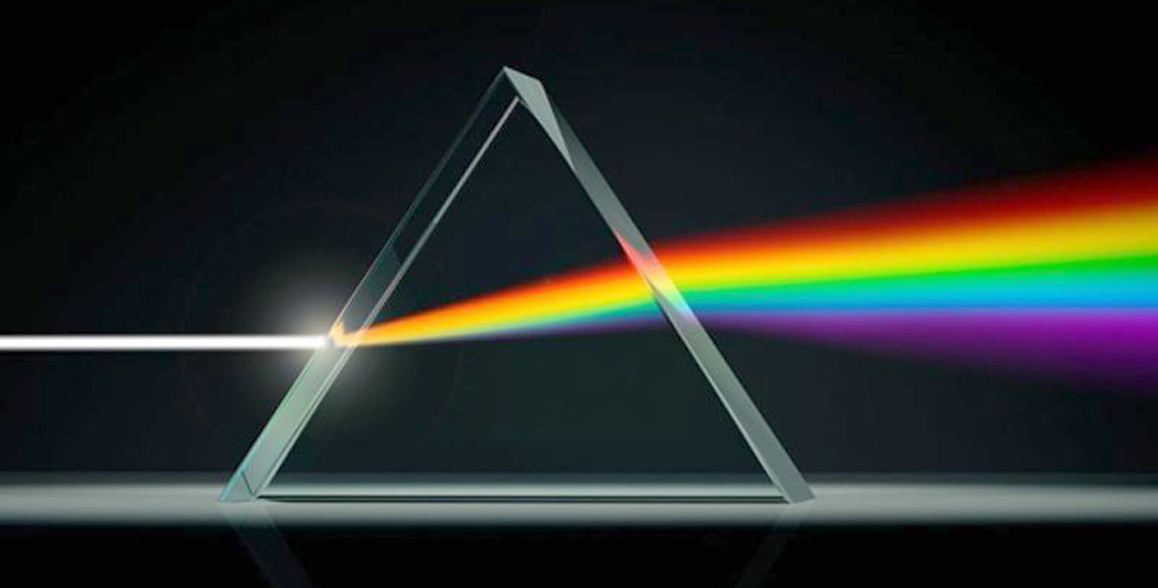
The first begins with Isaac Newton. He proved experimentally that white light is actually composed of a spectrum of colors, ranging from blue on the short end and red on the long end. Short and long wavelengths, that is. For, scientifically, color is a function of light’s electromagnetic wave construction.
The problem is that there is no forest green in the spectrum. No magenta, either. The spectrum — which we see in a rainbow — contains only a single version of a wide range of hue, but none of the subtlety of actual color.

And so, you can talk about blue being at a place on the electromagnetic band measured in wavelengths of 450 to 500 nanometers and red at the other end, at 700 nanometers.
But these are numbers, not colors.
Science also causes issues when it comes to color perception: How do we see the colors we do?
Humans don’t see spectral color. That is, human color perception is not dictated by wavelength, but rather by the mechanisms of color vision. What the eye sees and the brain interprets is only marginally related to the color defined by wavelength.
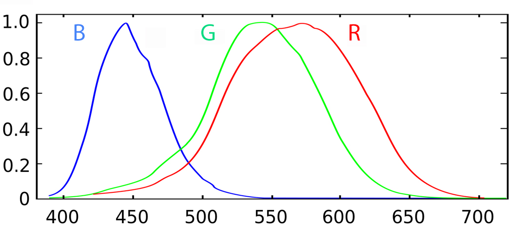
There are three color sensors in the eye, one tripped by red light, another tripped by green light, and a third by blue light. The ratios of how much each is stimulated governs what colors we see. (Yes, I know this is a grossly simplified version, but it is basically correct).
When both blue and red are tickled, we see violet; when blue and green are set off together, we see blue-green or aqua; when green and red are stimulated, we see yellow.
Yellow is particularly interesting. While there is a wavelength on the spectrum that is yellow, we almost never see that wavelength. It is rare in nature.

What we call “white” light, or sunlight, contains all the hues, which can be separated by a prism into its component parts. But when this white light hits something red, the blues, yellows, greens, etc., are absorbed by the object and the red is reflected, and so it is only red that hits our eyes. The blues, yellows and greens are digested by the object and turned into heat, which is why the sun makes things hot.
But if an object absorbs blue and reflects both red and green — this may seem bizarre, but it’s true — we see those colors combined and our brains interpret them as yellow.

The famous Kodak-yellow film box isn’t really yellow. It is red and green together, but our brains stir them together and see yellow. Indeed, most of the colors we see are impure mixes and what our brains see are the interpretations, not the wavelengths.
Take purple, or violet, or magenta (the names for this section of the so-called “color wheel” are terribly imprecise; more on that later). It is a color that does not have a wavelength. That is, it doesn’t exist on the spectrum. It exists solely in our brains as the combination of blue and red.
All color, or what we call color, is subjective. That is, it is a phenomenon created in our brain as a way to code the visual information of the world, very like the so-called “false color” of Hubble space photographs. It is an interpretive trick our brains play, useful for deciding which berries are ripe. The wavelengths may be real, but the redness is a figment.

ART
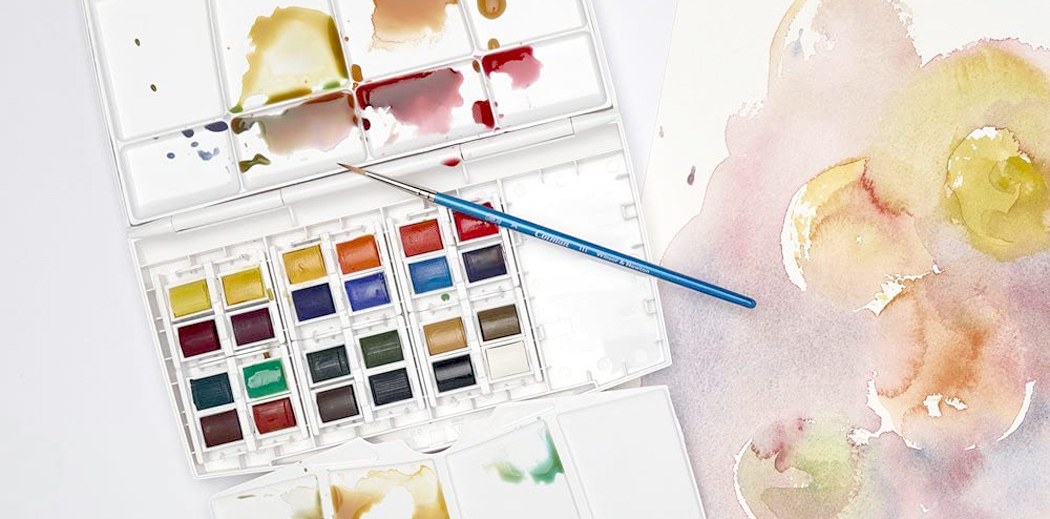
For a painter, all the stuff about wavelengths and spectrums is dryly theoretical and idealized, which is to say, lies. Painters work with paint, not theory, and the pigments that make those paints are cantankerous. No blue is spectrum-blue, no green is pure green. The paints are made from dirt, or ground up stones, or plant dyes (or, nowadays, from alchemically manipulated petroleum), and all are amalgams of various ingredients. Probably 95 percent of the colors used by painters don’t occur in the spectrum. Real paint is impure.
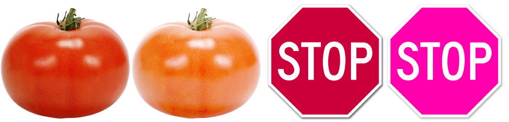
One yellow might mix with black to make a dun, another yellow that looks the same, might turn greenish when mixed. An artist has to know not merely color theory, but the individual nature of his paints. Some greens are bluer than others; some reds are more orangey, some more violet. A tomato is one red, a stop sign, another. Lighten tomato-red and you get an orange. Lighten stop-sign red and you get a pink.
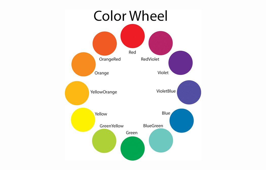
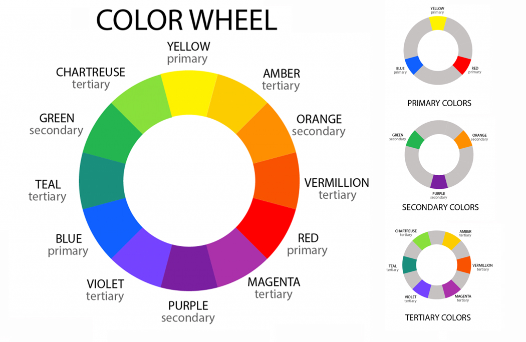
For artists, colors don’t come in a lineup, like a spectrum, but a wheel. And on that wheel, there are three “primary” colors — red, blue and yellow — from which all the other colors can be mixed. Theoretically, that is.
There are painters who have used only four tubes of paint for their work, usually a blue, a red and a yellow and the ubiquitous titanium white. You can’t paint without a white: the colors themselves are too dark to make a bright sky or a tawny lion.
But there are limitations to this. You can mix a blue and yellow to get a green, but it will never be quite as bright and pure as a dedicated green paint. If you want the deepest, richest greens, you will buy a tube of green paint.
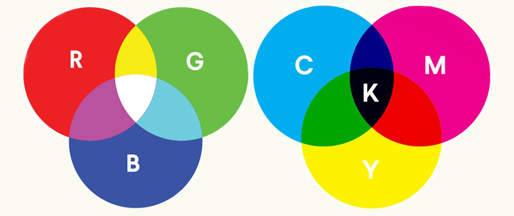
The problem is, that there are at least three sets of primary colors. There’s the painter’s set, of red, blue and yellow. But now that much art and design is made on a computer, another set of primary colors is common, called the “additive primaries” of red, blue and green. Then, there is the printer’s primaries, known as “subtractive, made of cyan, magenta and yellow (with black added in, making it often called “CYMK,” with the “K” standing for black.)
But there are other issues, too. The spectrum exists theoretically, but real-world color has a physical presence, and so the same hue will appear different whether glossy or matte. And there are metallic colors, with specular reflections. Some paints are opaque and others transparent. Then, too, colors on one wall, which gets sunlight, will appear different from colors on the opposite wall, in the shade.
And there is something called “simultaneous contrast,” which means that colors are affected by the colors around them.
There’s a lot to keep track of, and the ability to do so is one of the things that marks a professional from an amateur.
LANGUAGE
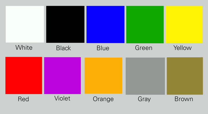
In the English language, there are really ten primary colors, that is, color names that are distinct and cover generic territories of color. They are: red, blue, green, yellow, violet, orange, brown, black, white and gray. All other color names are either shades or tints of these main color names (such as “tan” being a variety of “brown”) or metaphorical and named after some object of that color (such as “fuchsia” being named after the flower).
There are hundreds, probably thousands of variations of the primary colors, and designers and marketers keep coming up with fresh, new names, usually for the same old colors. Marketers try to make their color names more appealing (would you rather buy a fabric that was a yellow called “morning haze,” or the same one, but called “piss yellow?”)

But beyond that, there is the problem of the squishiness of color names. The boundaries between colors is indistinct. Where, for instance, does blue become green? There is a greenish blue, and a bluish green. Where do you draw the line? We each have our judgement, but that changes with context. Against a red background, even a greenish blue will appear bluer.
Where does red become magenta? Where does purple merge into a deep, dark blue?
Even more problematic are all those tertiary colors. Is Turquoise green or blue? The stones for which the color is named comes in both forms, and also a version in between. One person’s “amber” is another’s “golden.” Vermilion is also cinnabar. What the Roman’s called “royal purple” is to our eyes closer to red. These names shift over time and by individual perception. It makes it very hard to talk about color between two people with different color palettes in their brains.
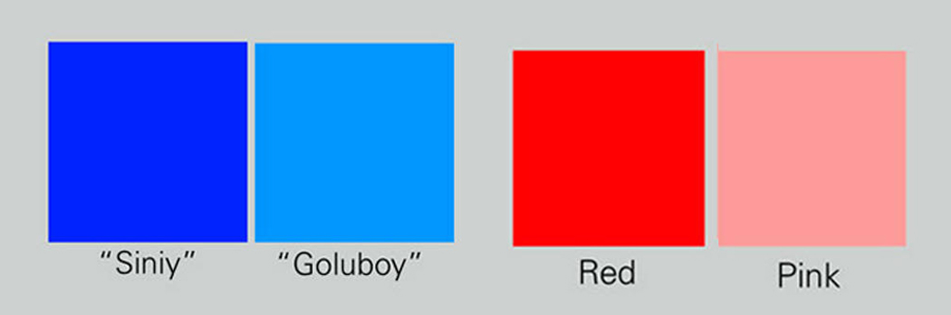
Of course, that hardly accounts for the various color organizations across different languages. Many languages had only words for black, white and red. Blue, for them, was a variety of black. The Ancient Greeks talked about the “wine-dark sea,” but the Mediterranean was never ruby colored. In traditional Japanese, the same word, “ao,” covered both green and blue (modern Japanese has, after WWII, added the word “gurin” as an English cognate). In Russian light blue (“goluboy”) is considered a separate color from dark blue (“siniy”), just as in English, we distinguish “pink” from “red.”
Here’s an alphabet of English color names, and please feel free to argue over what they each mean: azure; burgundy; coral; dun; ecru; fulvous; gules; heather; ivory; jasper; lavender; mustard; navy; oxblood; periwinkle; quimper; rose; sapphire; topaz; umber; viridian, watchet; xylous; yapan; zaffre.

So, you see, any discussion of color needs to take into account which sort of color system you mean. Pedants will complain that white isn’t a color, but the absence of color, but then, why do you need to buy a tube of white paint? And, of course, in the additive system, white is not the absence, but the combination of all the colors. So, which is it? Well, they are three distinct ways of talking about white. You need to be clear.
And even white isn’t just one thing: It comes in alabaster, in ivory, in cream, bone white, snow white, chalk white, Chinese white, eggshell white, vanilla and off-white. No doubt, interior designers and marketers could come up with a hundred new shades and names. There are warm whites and cool whites. You can paint with zinc white, titanium white and flake white, aka white lead or lead white. The range in any color is nearly infinite.
All of which makes talking about color difficult and misunderstanding almost inevitable.