Archive

Tag Archives: ultramarine

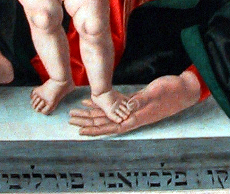
What do cows in India, Mexican bugs and Egyptian mummies have in common?

If you said, “Rembrandt,” give yourself a cigar.

Most of us, when think of color, think in the abstract. Color is the spectrum or the rainbow. Or the deciding factor in which car we buy. We think we know what “blue” means, or “yellow,” but that doesn’t say what particular blue or what of many possible yellows. Just an abstract approximation. Exact hues require incarnation. 

And so, for an artist, color is pigment, and pigment is ornery, peculiar and sometimes toxic, sometimes distressing, even morally questionable.

Poet William Carlos Williams wrote in his book-length Paterson, “No ideas but in things.” It was the total anti-Platonic declaration of faith in the here-and-now, the lumpy, gritty, quotidian things we can feel with our fingers or stub our toe with. I paraphrase his dictum with “No color but in things.” This is not abstract, but palpable.

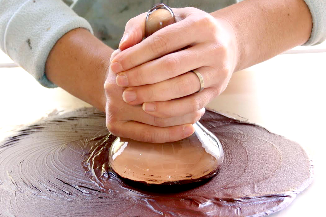
A painter cannot simply decide on green or yellow, but on what pigment that paint is made from. Each acts in its own way, mixes with others differently, dilutes differently, requires a different thinner, binder or medium, displays varying levels of permanence, transparency and glossiness. The painter cannot think in abstract hues, but in the actuality of the physical world. Hands in the mud, so to speak.

The earliest pigments were dug from the earth or sifted from the cook-fire: Ochers and soot. The caves of France and Spain were painted with these pigments. 

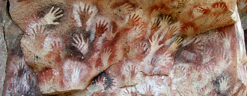
They had to be worked into submission by the artist, grinding, mixing, adding medium and binder. His — or her (we cannot know for sure) — hands got dirty in the process. There was a smell to it, fresh loamy smell or the acrid residue of the hearth. There was a feel, gritty or pulverized, oily, or smudgy like moist clay.

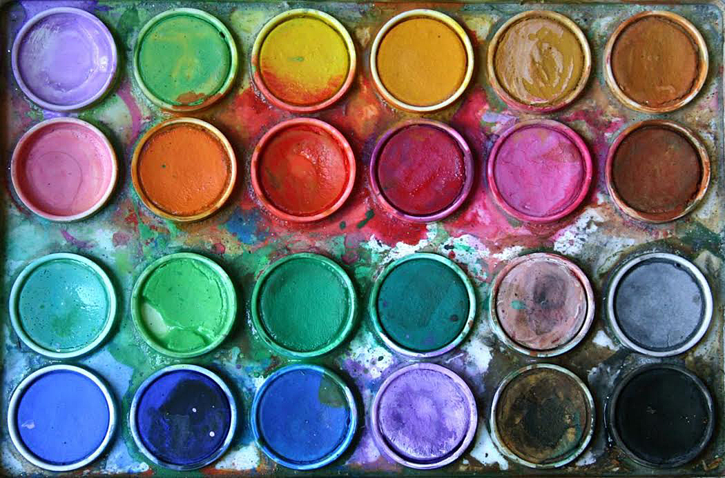
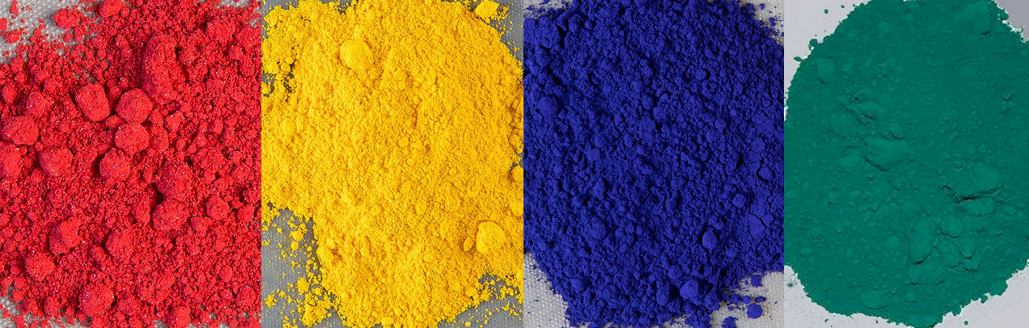
So, until the mid-19th century, all paints were made from the things of this world. Soils and rocks, plants and snails. Each pigment had its idiosyncrasies and those had to be reckoned with when mixing them or placing them side-by-side. None was pure, save, perhaps, the blackness of soot.

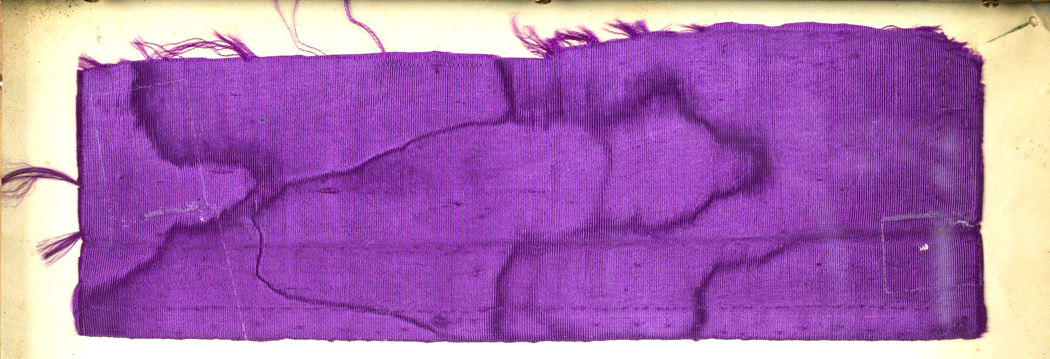
Then, in 1856, an 18-year-old chemist named William Henry Perkin, trying to find a cure for malaria, found instead a new, synthetic purple dye — the first aniline dye. He called it “mauve,” or “mauveine.”

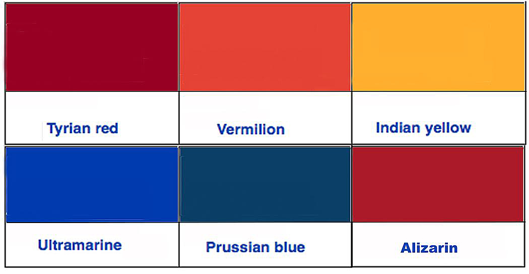
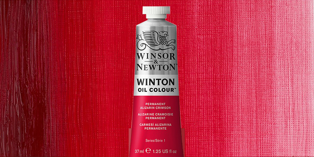
A decade later, the German chemists Carl Graebe and Carl Liebermann, working for BASF, synthesized alizarin crimson, making an artificial pigment that matched the natural alizarin dye that had been extracted from the madder plant. It was the first color created from an element of coal tar — a byproduct of turning coal into coke.

Apres moi, le deluge” — Since then, there has been a flood of synthetic colors, all devised in the laboratories of giant corporations. There are the aniline dyes, the azo dyes, the phthalocyanine dyes, diazonium dyes, anthraquinone dyes — a whole chemistry lab of new industrial color. Many of these new dyes and pigments were brighter and purer of hue and more permanent.

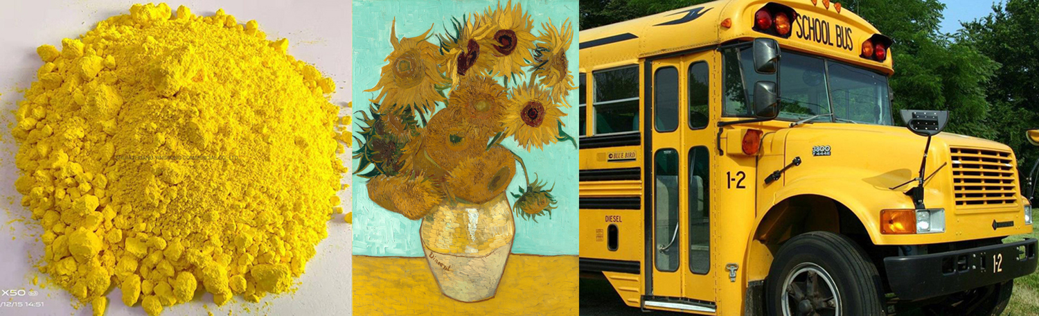
 (Not all: the new chrome yellow that Vincent Van Gogh used developed a tendency to turn brown on contact with air. Properly protected, chrome yellow is familiar as the paintjob on most schoolbusses).

Nowadays, even oil and acrylic paints with traditional names, such as burnt umber and ultramarine are likely to be produced industrially using chemical derivatives. But that shouldn’t blind us to the fact that Rembrandt or Michelangelo had to arrive at their paints through laborious and time-consuming processes.

Most pigments came to the artist’s atelier in the form of a rock or a sediment. It had to be ground down to a powder, a process normally done by an apprentice — basically an intern: “Bring me a latte, a bearclaw and the powdered cinnabar.” Being ground to a grit wasn’t enough; the poor apprentice sometimes had to spend days with the pigment between grinding stone and levigator or muller, working it into pulverized paste that could be mixed with a binder and medium and finally used by the artist on canvas.

It wasn’t until the advent of the industrial revolution and the invention of a pigment-grinding machine in 1718, that the tedious work of pigment making became doable in large quantities. And it wasn’t until the mid-19th century that prepared paints, sold in zinc tubes, made it possible for artists to buy portable paints they could carry out into the countryside to paint in the open.

But we should not forget the sometimes ancient origins of the paints used for the canvasses of the Renaissance, the Baroque — the Old Masters. This is where the Indian cows, the Mexican bugs and the Egyptian mummies come in.

First, let’s look at a few of the standard paint-sources from this pre-industrial age. Many of them have wonderful and memorable names, now largely gone out of use.

We’ll take the reds first. None was perfect, several were lethal. 

Carmine — This is the Mexican bug I mentioned above. The cochineal scale insect grows on certain cactuses in Central and South America. It is a bright violet- to deep-red color. The Aztecs called it “nocheztli,” which means “tuna blood,” and dyed the tunics of Aztec and Inca royalty.

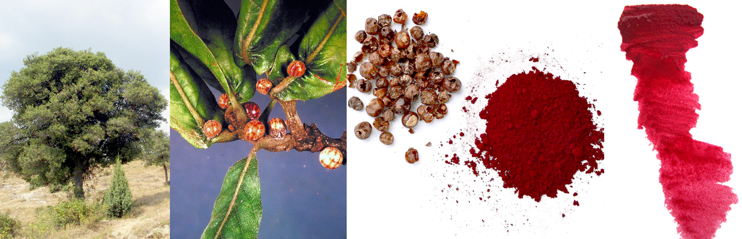
Crimson — Before the Conquista, a European scale insect, growing on the kermes oak, provided a red dye. These insects were picked from the twigs with fingernails and processed into a scarlet dye. It was the color used to dye the curtains of the Temple in Jerusalem. Also widely used by ancient Egyptians and Romans. It was less efficiently grown and produced than the cochineal of Mexico, and so was replaced. Michelangelo used it in his paint.

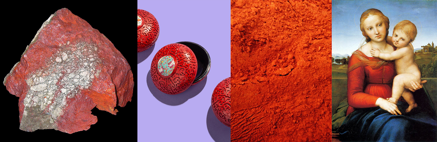
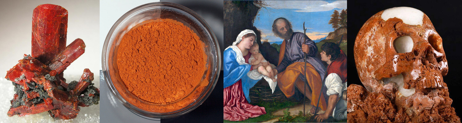
Vermilion — A scarlet red form of mercury sulfide and highly poisonous, it was mined in Europe, Asia and the New World as cinnabar and was used also for cosmetics and medicine — hardly a wise use. In its mineral form, it was used to color Chinese lacquer. A finer, and redder version was first synthesized in China in the fourth century BCE, and depending how well powdered it has been ground, produces hues from orangey-red to a reddish purple that  one writer compared to “fresh duck liver.” It is still also produced by grinding cinnabar. 

The terms “cinnabar” “vermilion” and “Chinese red” are often loosely interchangeable. The finer the grinding, the brighter the red. Painter Cennino Cennini in his 15th century Craftsman’s Handbook wrote: “If you were to grind it every day for 20 years it would simply become better and more perfect.” It was the most common red in painting until it was replaced in the 20th century by cadmium red.

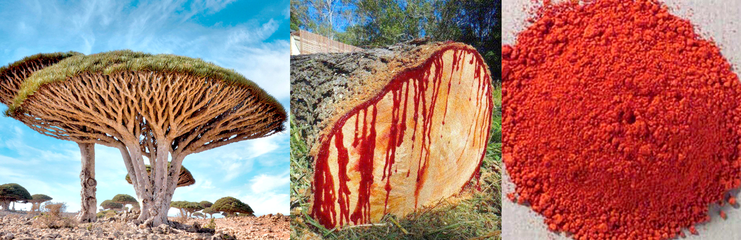
Dragon’s blood — Mentioned in a First-Century Roman travel guide (a periplus), it is a maroon-red pigment made from the sap of various plants, most notably the Dracaena cinnabari. Medieval sources wrote that it was made from the blood of actual dragons. It is also what gives classic violins their reddish varnish. In several folk-religions and in neo-paganism, it is a source of magical power, presumably because of its supposed connection to dragons. 

Minium — Also known as red lead, this orange-red pigment was commonly used in Medieval illuminated manuscripts. It was made by roasting oxidized lead in the air to form lead tetroxide. It is named for the Minius River between Spain and Portugal, and because this red lead was used for the small letterings and illustrations in hand-made books, it is the source of our word, “miniature.” 

Near colors of yellow, orange and purple had their sources, too. 

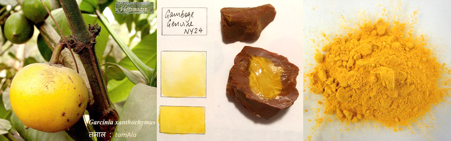
Gamboge — A yellow pigment formed from the resin of the evergreen Cambodian gamboge tree (genus Garcinia). Coincidentally, the name comes from the Latin name for Cambodia. It is the traditional color used to dye Buddhist monks’ robes. The pigment first reached Europe in the early 17th century. When mixed with Prussian blue, it creates Hooker’s green. A strong laxative if ingested; in large doses can cause death. 

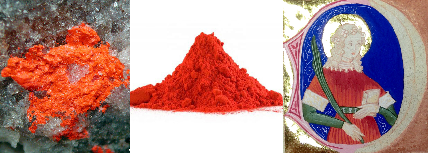
Orpiment — A bright yellow pigment gathered from volcanoes and hot springs and is a highly poisonous compound of arsenic and was once used as an insecticide and to tip poison arrows. It was traded as far back as the Roman empire. Its name is a corruption of the latin auripigmentum or “gold pigment.”

Realgar — Realgar was, along with orpiment, a significant item of trade in the ancient Roman Empire and was used as a red paint pigment. It is an arsenic sulfide mineral and sometimes called “ruby of arsenic.” Early occurrences of realgar as a red paint pigment are known for works of art from China, India, Central Asia and Egypt. It was used in European fine-art painting during the Renaissance, a use which died out by the 18th century. It was also once used as medicine and to kill weeds, insects and rodents. Be grateful for modern medicine. 

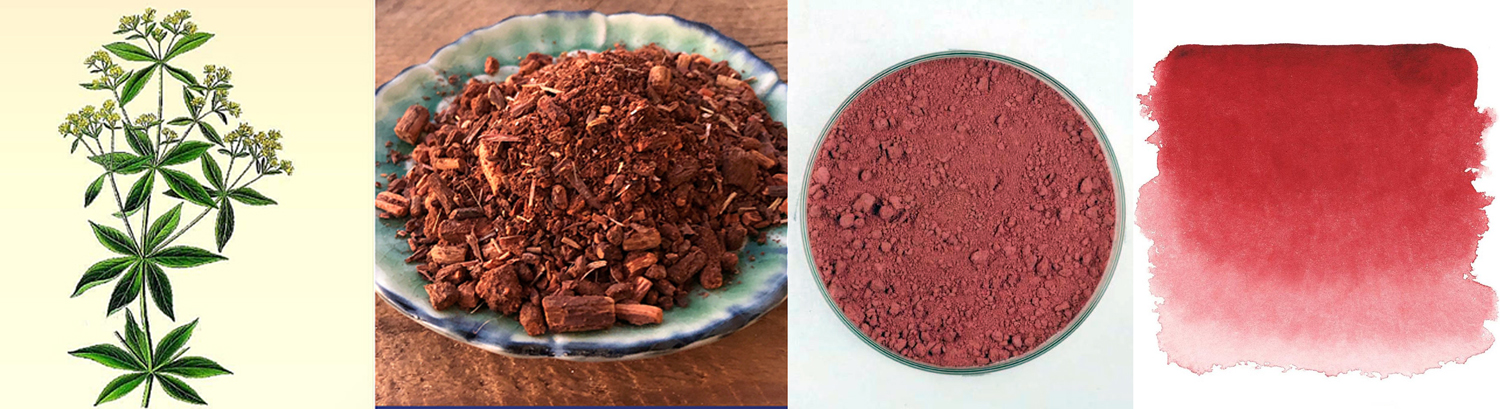
Madder — Another dye that goes as far back as ancient Egypt, it is a violet to red color extracted from the Rubia tinctorum and related species, plants that grows on many continents, and in southern France is called garance — for those of you who love the great French film Les Enfants du Paradis. It is turned into a pigment from a dye by the process known as “laking,” and so often encountered as madder lake.

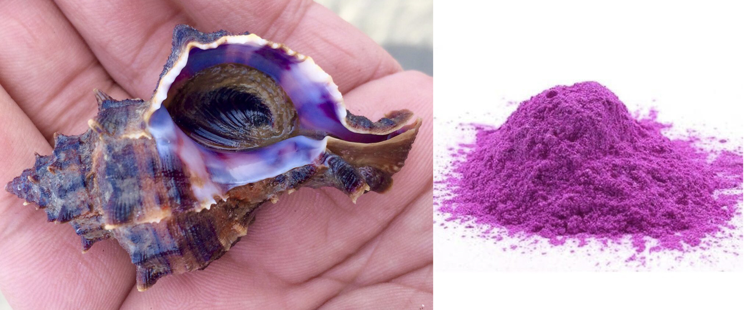
Tyrian purple — This is the purple of the Roman emperors, and is extracted from a mucous secretion from the hypobranchial gland of a predatory sea snail found in the eastern Mediterranean. It was worth its weight in silver and it might take 12,000 snails to produce enough dye for a single garment.

Blues and greens were often so close as to be made from variants of the same thing. 

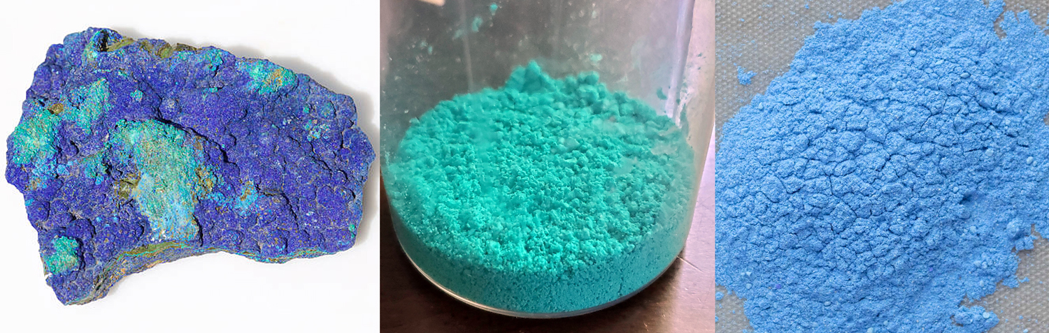
Bice — Is a dark green-blue or blue-green pigment made from copper carbonates, primarily the mineral azurite, sometimes malachite. Lightened, it was often used for skies.

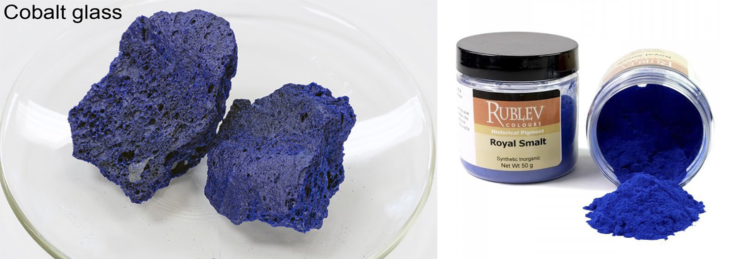
Smalt — First used in ancient Egypt, it is a cobalt oxide use to color glass a deep blue. The glass is then ground into a powder used as a pigment.

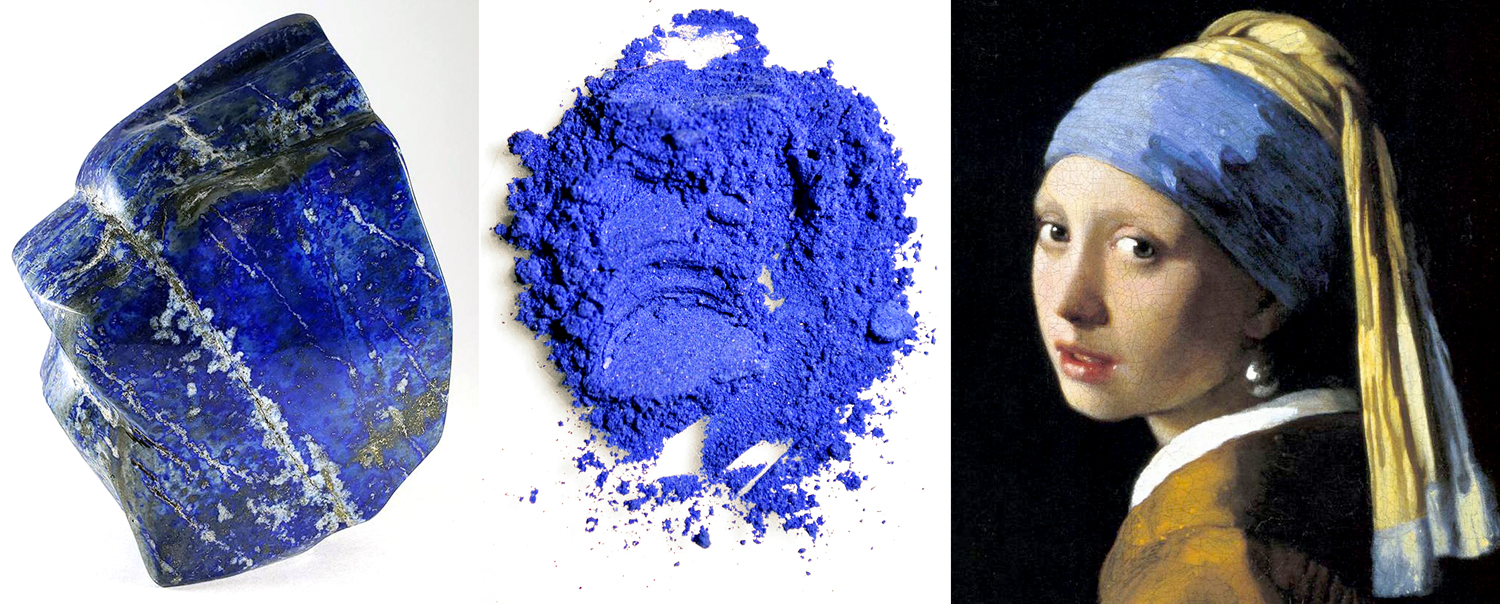
Ultramarine — The ultimate blue, made from the mineral lapis lazuli, found almost exclusively in Afghanistan, which, for Europeans, was “beyond the (Mediterranean) sea” or “ultra-marine.” The process of making the pigment from the mineral was complex and the final color was so highly prized, and so expensive, that its use had to be expressed in the contract commissioning a painting by Renaissance artists, less they use some less costly, and less glorious blue. 

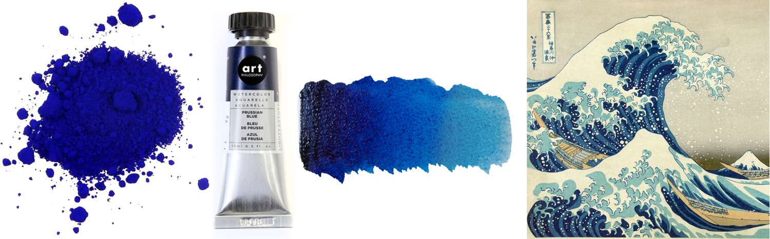
Prussian blue — The first modern synthetic pigment, Prussian blue is iron hexacyanoferrate and a very dark, intense blue. It is also sometimes called Berlin blue or Paris blue. It is the blue of traditional blueprints and became popular among painters soon after it was formulated in 1708 — by accident when a chemist attempted to make a red dye and got blue instead. It largely replaced the more expensive ultramarine. After it was imported to Japan, it became the standard blue of woodblock prints. 

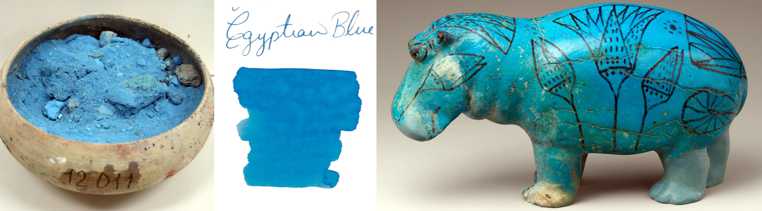
Egyptian blue — Long before Prussian blue, the ancient Egyptians manufactured a light blue pigment from calcium copper silicate, by mixing silica, lime, copper and an alkali. First synthesized during the Fourth Dynasty (ca. 2500 BCE), its use continued through the Roman period. The Egyptians called it “artificial lapis lazuli,” and used it to decorate beads, pots, scarabs and tomb walls. 

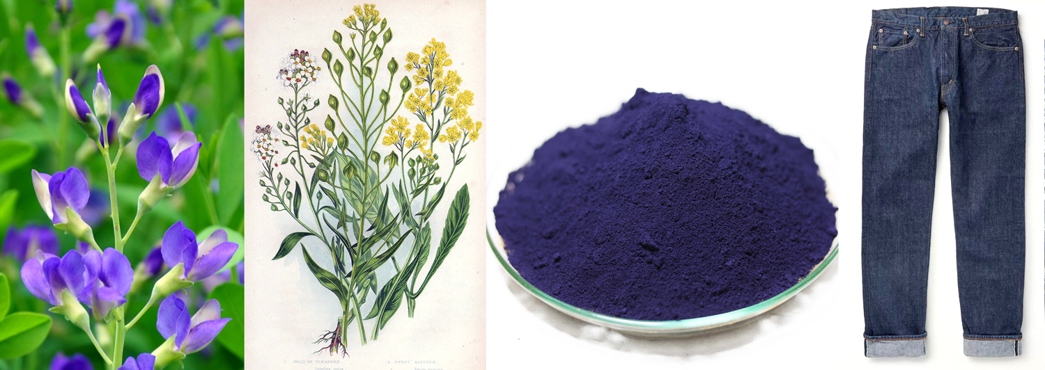
Indigo blue — The familiar color of blue jeans comes from indigo, made from the indigo plant Indigofera tinctoria. At least, it once did. Now the dye is synthetic. It is a deep, dark blue, almost black. Before the Asian indigo plant was imported to Europe, the dye was made from the woad plant Isatis tintoria. Before the American Revolution, Asian indigo, grown in South Carolina, was the colony’s second-most important cash crop (after rice), and counting for a third of the value of exports from the American colonies. Initially, European woad processors fought against the importation of Asian indigo dyes, as later, after adopting the Asian product, they fought tooth and nail against the synthetic. Progress. 

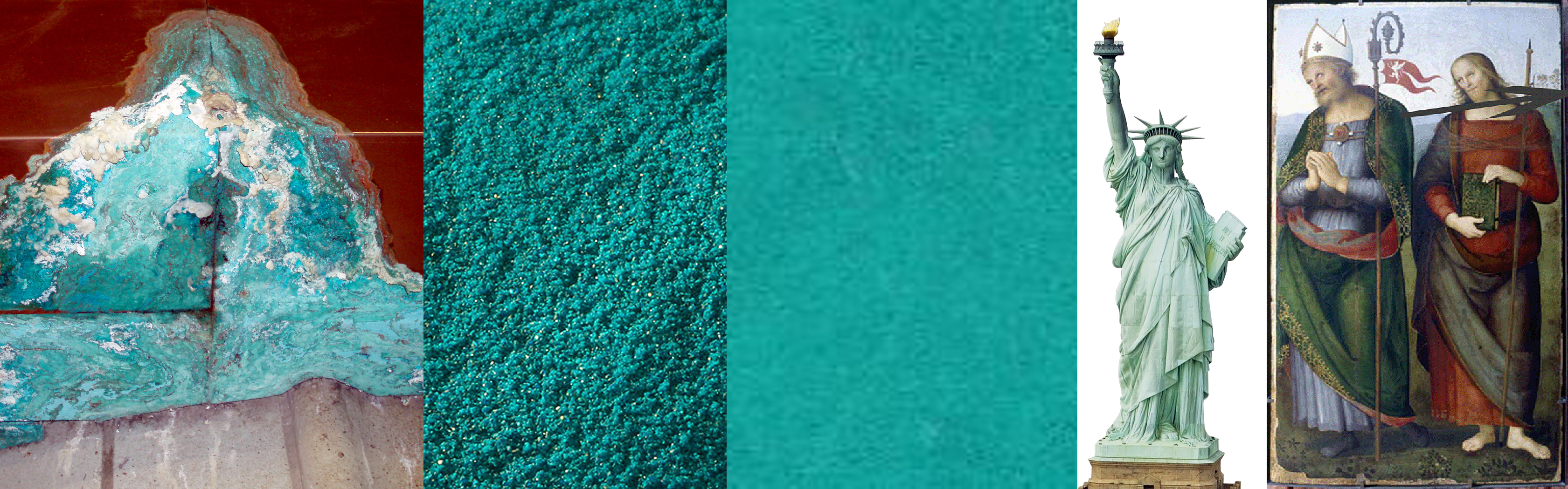
Verdigris — A green pigment formed by copper carbonate, chloride or acetate. It is the patina on the Statue of Liberty, but in oil paint, it has the odd property of being initially a light blue-green and turning, after about a month into a bright grass green.

Viridian — A darkish blue-green pigment, a hydrated chromium oxide, popularized by Venetian painter Paolo Veronese.

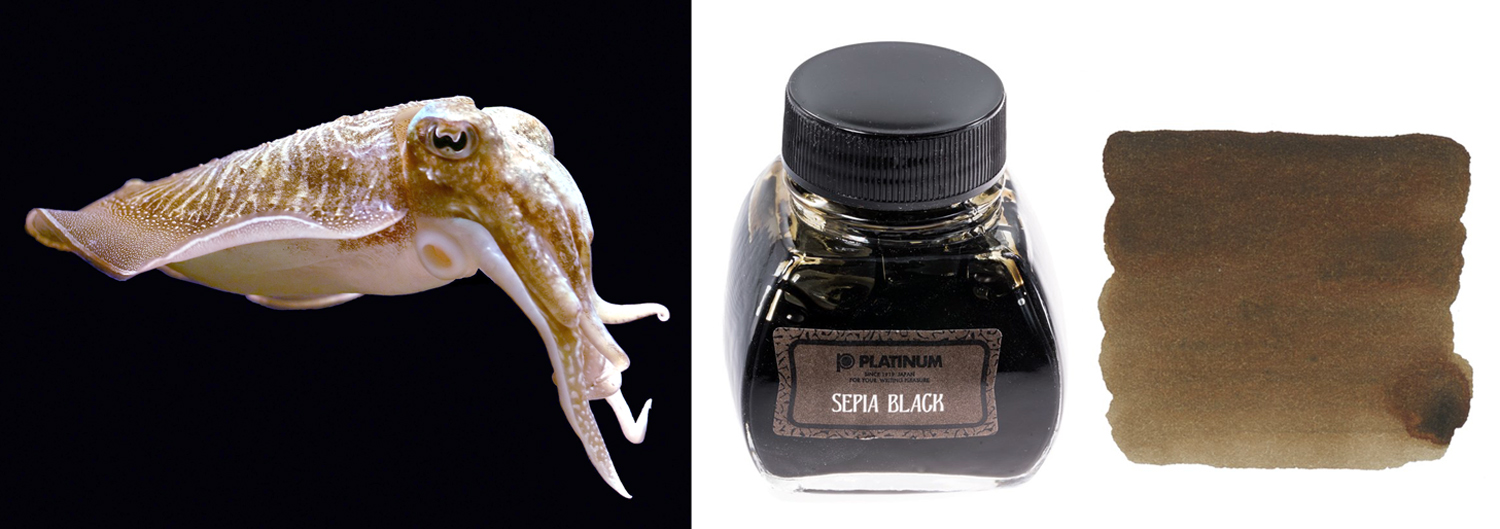
Sepia — a dark brown to black dye and pigment extracted from various species of squid. Most popular as an ink, it has also been used for oil paint.

You will have undoubtedly noticed how many of these pigments were poisonous. It has certainly been suggested that Van Gogh’s madness may have been caused by his habit of tipping his brushes on his tongue.

So many of these pigments relied on the unholy trinity of toxins: mercury, arsenic, and lead. Their toxicity was understood from ancient times. The cinnabar used for vermilion was mined in China by convicts, whose life expectancy was — well, who cared? They were convicts. 

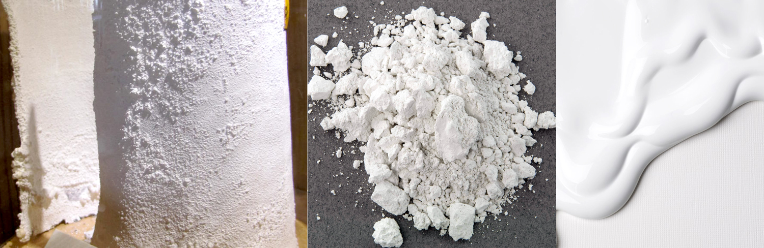
The most common toxic color through history was white, which was most often lead carbonate, or flake white, aka white lead. It was easy to manufacture by soaking sheets of lead in vinegar for weeks at a time and scraping the resulting white powder off the surface of the metal. Flake white was a wonderful, opaque and brilliant white pigment. Unfortunately, it could kill, blind or make mad those who used it. Even today, older houses have sometimes to be de-leaded of their original paint in order to be sold legally. Children are especially vulnerable.

A substitute for white lead was looked for. Zinc white — an oxide of zinc — was tried, but was not as opaque or as white. Nowadays, titanium white is used, safer and nearly as good a pigment.

But, as I said at the top of this article, some of the old pigments were not only dangerous, but morally questionable.

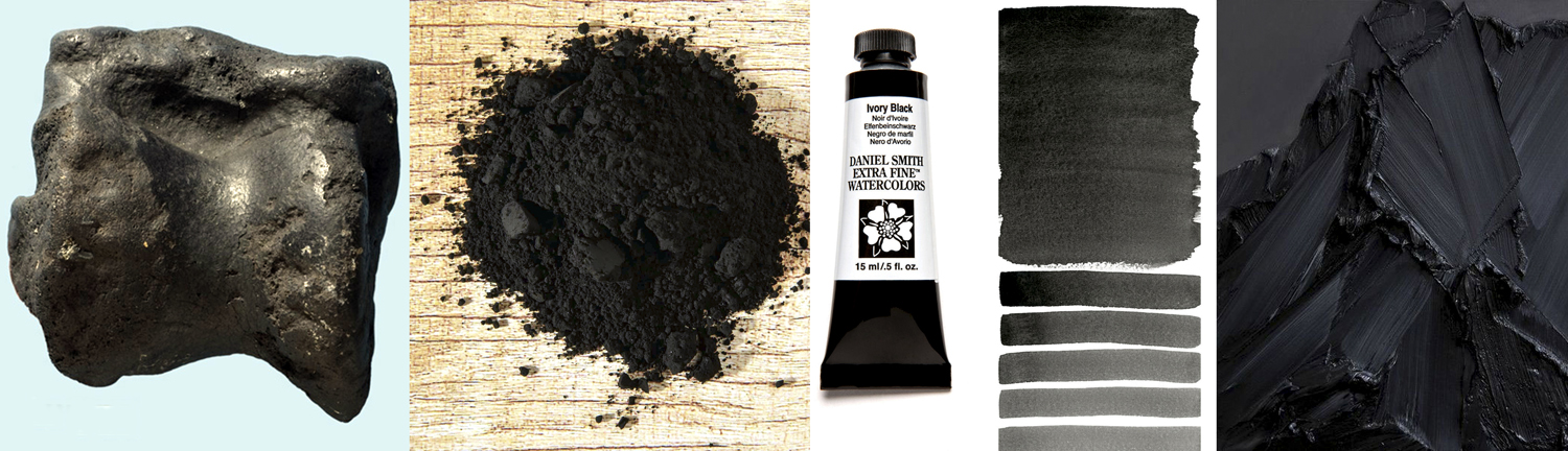
Ivory black — made from elephant ivory, and essentially ivory charcoal, it is (or was) an intense black pigment. Nowadays, it is most often made from bones, as bone black, aka Mars black.

Indian yellow — A pigment brought to Europe from the east, it was described as being made by feeding cows solely on mango leaves, which made their urine an intense yellow, which was then evaporated into a sludge, dried and sold. The cattle were severely malnourished by this diet, and the practice outlawed. There are those who doubt this explanation of the pigment, but no one doubts the strong stench of the bolus. It is no longer made.

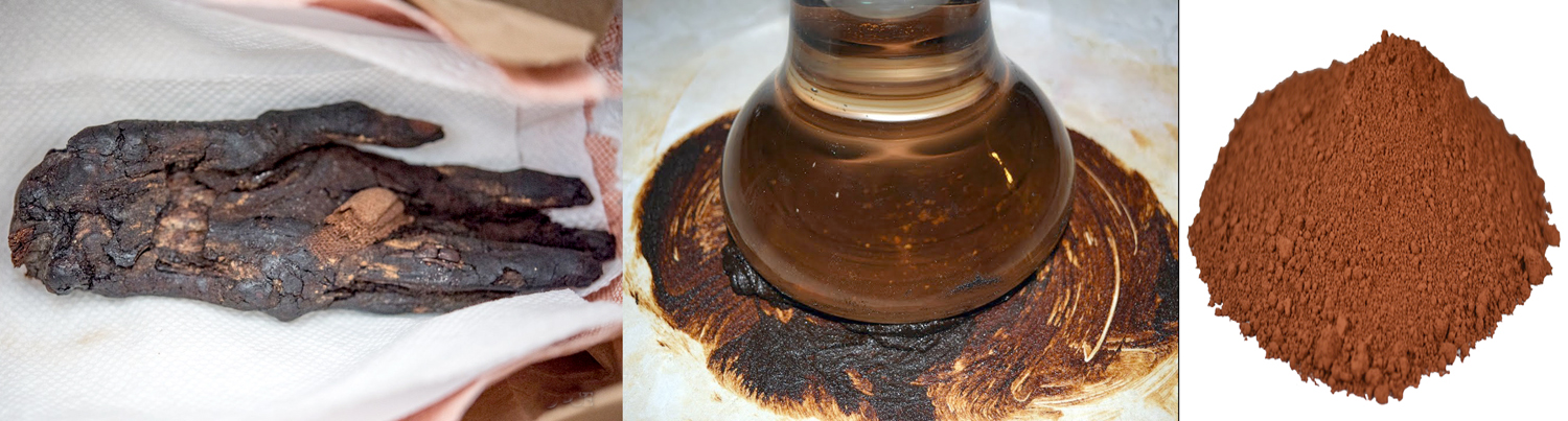
Mummy brown — A bituminous brown, made from ground-up Egyptian mummies, both human and feline. Popular from the 16th century, it was good for “glazes, shadows, flesh tones and shading.” In the 19th century, the supply of Egyptian mummies was so great that in England, they were used as fuel for steam locomotives. But when the actual origin of the pigment became widely known, a moral repugnance swept England and the Pre-Raphaelite painter, Edward Burne-Jones was horrified to find out what he was using, “and when he heard what his brown was made of, he gave all his tubes of this color a decent burial” in his garden.

Makes you look at all those rich, warm browns in Rembrandt with a slightly different eye.

——————————————

This blog entry is significantly rewritten and expanded from an earlier essay published on the Spirit of the Senses website in March, 2018.

Click on any image to enlarge

Palmezzano from PAM

The Italian Renaissance is littered with unfamiliar names. Sure, there are the Leonardos, the Raphaels and the Michelangelos, but there are dozens of others from the Trecento through the early 16th century that we need an encyclopedia to look up.Forli map

Just take the small town of Forli in northern central Italy along the Montone River. It produced such painters as Livio Agresti, Ansuino da Forli, Guido Cagnacci, the two Baldassarre Carraris, father and son, Francesco Menzocchi and foremost among them, Melozzo da Forli and his student, Marco Palmezzano. All of them competent if conservative artists without which museums (and churches) around the world would be the poorer.

It is Palmezzano that drew my interest.

In an age of giants, Marco di Antonio Palmezzano (1458-1539) was merely human. He was a good but lesser painter in a Renaissance backwater. So little was his life noted that even his dates are approximate.

Born in the middle of the Quattrocento, 25 years before Raphael, he died in his 80s, about 20 years after his great countryman’s death. It was a life that spanned the most exciting years of the Renaissance.

He was born and died in Forli, a small town at the back of Italy’s knee, remaining there for his entire professional career. During his long life, he provided the necessary religious paintings for the churches and monasteries of the region.

His teacher was the better-known Melozzo di Forli (1438-1494), who had studied with Piero della Francesca (1416-1492), one of the great masters of the early Renaissance. Palmezzano’s youth was spent apprenticed to Melozzo, and his first signed paintings indicate his debt to his mentor: He called himself Marcus de Melotius, or ”Melozzo’s Marco.”

We know he visited Rome with Melozzo in 1489 and, after Melozzo’s death, he visited Venice, where the most advanced painters were to be found.

But the latest techniques and styles didn’t seem to interest Palmezzano, or maybe they didn’t interest his clients. At any rate, he remained an artistic conservative and his paintings look back rather than forward.

The exact date of Palmezzano’s death is disputed, but a self-portrait as an old man is dated 1536.

More than 90 of his works are still in existence, mostly in Forli, but his frescoes for the Feo Chapel in Forli were destroyed in World War II.

There is a Holy Family by Palmezzano at the Phoenix Art Museum, and it is a painting that I kept coming back to over the 25 years I lived and worked in that city.

A Right-Hand Man

One day, I noticed that Marco Palmezzano was right-handed.

It wouldn’t be any big deal, but Palmezzano has been dead for 400 years. And because I discovered it myself, this minor bit of information seems much more personal than the few cold facts in the painter’s biography. It brings him to life for me: Even the grave couldn’t hide this datum. It’s there in the painting.

Discovering things for yourself is what art is all about. Doing research is fine, but it is your personal interaction with a painting that is the real point.

The painting I’m talking about is the Holy Family with Infant St. John, which can be seen at the Phoenix Art Museum. It is a fairly standard oil-on-panel Madonna-with-her-entourage painted by a fairly standard middleweight Italian painter of the middle Renaissance.palmezzano madonna combo

These are a few of Palmezzano’s Holy Family paintings

Palmezzano himself painted dozens of similar works, fulfilling commissions for various churches and monasteries. You have to think of the painter as a small business owner, providing needed objects for the prevailing institutions of the day. Whatever was called for, he was contracted to provide — and his studio would have been not a simple artist’s studio, but a small factory with a variety of employees or apprentices helping out.palmezzano genre examples

Palmezzano produced most of the usual religious genre paintings, including this Virgin Enthroned, Annunciation and Crucifixion.

There are many things you could notice about this painting, or any painting you are willing to put the time and effort into.

”Noticing” is the operative word. Many museumgoers zip past the pictures on the wall, stopping a few seconds in front of one or another that catches a rushed eye. But artists who spend weeks or months on a painting have put more into their work than you can squeeze out in a moment.

It is a case of slowing down to see the roses.

So I want to take some time to dissect Palmezzano’s right-handiwork, and to walk you through the process of looking at a painting.

I’ll get back to Palmezzano’s right hand later.

Sensuous pleasure

First, why have I chosen this painting?

Primarily because I liked that intense, mineral green that makes up so much of Palmezzano’s Holy Family. It is a hue and an intensity that cannot be seen in reproduction. You can swim in this green.

There is nothing intellectual or difficult about the mindless sensuous pleasure that this green gives me, but it got me to slow down and decide to spend some hours with the painting.phx infantphx joseph

On second glance, the painting didn’t seem too promising. It is a very ordinary Madonna and child, with a rather awkwardly drawn child, with short, skinny arms and a set of hips that might have done Mae West proud.

But there was something that caught my eye and held it. After a few moments I realized what it was. The painting was staring back at me.

If you look around the museum gallery at the other paintings hanging there, the people in them look at each other or off into space. But in Palmezzano’s Holy Family, Joseph is looking at . . . me.

Noticing details

There are dozens of things to notice in this painting, from its complex structure of diagonals to the fact that the painter seems to have used no blue. Then, there is the peculiar Hebrew inscription at the bottom, the gold-leaf halos and an oddly gray landscape in the background. All these things are worth noticing, and all contribute to the final effect of the painting, but it is Joseph that gives this painting its particular emotional resonance.

In that gaze is the secret of the painting: There are two levels of reality being described here. Mary, Jesus and John are divine or semi-divine. Joseph, like you or me, is merely human. Mary or Jesus could not pay attention to us, it would break the spell, make them too human, too fallible. But Joseph can make the connection.

That distinction is enforced by the style in which Palmezzano paints them. Mary is idealized, a perfectly formed human with a look of unmoved serenity in her face. Jesus and John make stylized hand gestures that infants their age couldn’t understand, let alone perform.

The Madonna and children are iconic rather than real. We are meant to ”behold” them as symbols of religious faith.

But Joseph, all alone in the back of the painting, is not idealized, rather he is a portrait of someone real. We don’t know who, possibly the person who paid for the painting to be made. He is old (a convention for Josephs), and his hands rest arthritically on a walking stick.

Mary and the babies are involved with each other; Joseph looks at us. He is one of us.

Humanity speaking

Whatever the painting meant when it was new, it is Joseph’s humanity that speaks most clearly to us today.portrait of a man palmezzano

Portraiture was not an important art form during Palmezzano’s day; no one in Italy could make a living doing only portraits. That is too bad, because it is Palmezzano’s one notable talent. (Here is his Portrait of a Young Man). His Joseph is more real than most of the idealized figures we run into from the Renaissance, an age when what should be was more valued than what was.

What was required of Pamezzano were religious paintings. A Raphael or Michelangelo could bring life to their faith. Palmezzano could only imitate the patterns. His sense of color was average, his ability to create design was average, but his ability to draw a human face was above average. It is too bad that it was a talent that wasn’t particularly valued during his life.

In another time, in another place, Palmezzano might have been a more important artist.

Artistic conservative

Which brings us back to Marco’s right hand.

We know that Palmezzano was something of a conservative, artistically. His figures are a bit stiff, like those in Quattrocento paintings, despite the sinuous contrapposto he has given the Christ.

And although he is painting in oil, he continues to use techniques better suited to the earlier tempera painting.

In egg tempera, the paint dries almost immediately, so it is difficult to blend paint together on the panel. What an artist must do is lay down tiny brush strokes one next to the other, building up shades and tones. When you look closely, you can see those tiny lines, called ”hatching.”scribbles

Oil’s great advantage over tempera is that paints can be blended right on the panel or canvas and smooth gradations of tone are possible.

Palmezzano still uses hatching in this painting. It can be seen as the tiny lines in the shadows of the figures’ faces. Across the entire canvas, the hatching goes from upper right to lower left.

Take a pencil and scribble on a pad. If you are right-handed, the lines will run from upper right to lower left. If you are left handed, they will run the opposite. Try to draw them opposite and you will see how awkward it feels.

The hatching proves

Palmezzano was right-handed.

Ker-blue-ee

Perhaps the oddest thing about Marco Palmezzano’s Holy Family is that there is no blue in it. Because blue is one of the primary colors, its lack is unusual, though not unprecedented.

There are a few reasons we might expect to find blue. First, there is a sky, an ocean or lake and the receding mountains of the painting’s landscape, which we might expect to go bluish in the distance. But in this painting, they are iron gray.

Then there is the Virgin, who is garbed traditionally in a blue robe or hood. Blue was the color of the heavens, of which Mary was queen. Blue is so traditionally Mary’s color that probably 80 percent of the early Renaissance images of her conform to the blue scheme. In this painting, Mary’s robe is emerald green.

Blue was a special color in the Renaissance. Artists had no tubes of Grumbacher to squeeze back then. Their colors were prepared meticulously from the chemical or mineral pigment stock.

Color from stone

The best, most permanent blue was made by grinding rare and expensive lapis lazuli on a stone. When it was pulverized sufficiently — a long and arduous process — it was processed in chemicals. It was called ultramarine, and it was the most expensive color after gold and silver leaf.

During the Italian Renaissance, painters did not create canvases and then sell them to people who wanted them. Rather, a client or patron commissioned an artist to make a Madonna and child, or a Crucifixion or a Nativity, of such and such a dimension, with a certain number of figures (some artists were paid according to how many figures were in the painting) and with a certain quality of pigment and skill.

Ultramarine cherished

Of the hundreds of surviving contracts between painter and client from Italy during those years, about half mention ultramarine specifically, and what quality of ultramarine the artist is required to use. No other pigment is named regularly. Reds, greens, yellows can take care of themselves, but ultramarine would add significantly to the final cost of the painting, and so the client wished to protect himself contractually against inferior substitutes. It was a case of caveat emptor.Porta_schiavonia Forli

Well, Palmezzano, in a small town not so rich as neighboring Florence, Bologna or Venice, well may have been given a commission for an inexpensive Holy Family, with minimum gold leaf and no requirement for ultramarine.

This is pure speculation and should not be taken as gospel. But it well may be that Palmezzano, to keep the painting’s cost low, avoided blue altogether, or he may have used a cheap, impermanent blue that 400 years later has decomposed into the hueless gray of the sky and water.

Other things to notice

In writing this story, I spent about four hours with Palmezzano’s Holy Family, spread over several visits to the museum. It was time I enjoyed immensely.

While contemplating the painting, I began to notice things. These bits of information or insight came quite randomly and I noted them on a legal pad as they occurred. Some were thoughts on the iconography or the symbolic meaning of the images, some concerned the design or visual construction of the panel, and some were mistakes that Palmezzano made.

Here are a few of them:

— Joseph is leaning on a walking stick that in an apocryphal story once sprouted flowers and designated him worthy to marry the Queen of Heaven. The story was traditional in the Middle Ages and Renaissance. Nowadays, it is obscure to all but Catholic scholars and art-history students.

— All four characters in the painting look surprisingly like Renaissance Italians. They are wearing contemporary clothes and jewelry. Mary and the Christ child are blond. Joseph wears a familiar Italian hat.

The landscape behind them is certainly not Levantine, but more like that part of central Italy where Palmezzano lived.

Either Palmezzano had no sense of historical accuracy, or accuracy was not the point. I suspect the latter; the story is supposed to be eternally true.

Strange signature

— Then there is that strange Hebrew calligraphy at the bottom of the panel. If you parse them out, reading from right to left, they spell MRRQW PLMZZANN FWRLWVISI, roughly, given the lack of precise Hebrew equivalents to European languages. That is, ”Marco Palmezzano Forlovisi,” or Marco Palmezzano of Forli. Forli was his hometown.

Why he signed his name in a Hebrew transliteration of Italian is not known. Maybe he just liked the biblical look of it.

— The peculiar curtain rod that holds up the backdrop is not attached to anything; nothing holds it up. There is a chance that the painting used to be bigger than it is and that the rod had some visible means of support. But the edges of the panel, hidden behind the frame, are even and don’t suggest the panel ever was trimmed. (Sometimes paintings were trimmed by their owners to fit smaller frames or, as in the case of the Mona Lisa, to cut away a damaged portion.)

— But that rod does something else. It is artificially parallel to the picture plane, as is the balustrade at the bottom on which the Christ child stands. And midway up on the picture, so is the castle in the background. Those three horizontal lines divide the rectangle of the panel into smaller rectangles.Palmezzano zee

— As a counterpoint to that is the diagonal of heads and shoulders that cut the painting from upper right to lower left. Seen against the three horizontals they make a great big ”Z” out of the painting, with a line through its center, as is customary in Europe.palmezzano diagonals

— But there are other diagonals, too. The Christ child stands in front of Mary, who stands in front of Joseph. As we move from left to right, we recede at an angle into the painting. This is also a counterpoint to the strict parallel of the three horizontal lines.

— Even more radical is the depth we are asked to absorb from the figures in the front to the landscape in the back. This diagonal moves right to left into the distance, making the opposite diagonal.

— That same crossing diagonal is mirrored in the crossed arms of John. Design-wise, a great deal is going on in the painting.

Hands hold interest

— You also might notice that although the figures are overlapped, all eight hands are visible and all are expressive.

Joseph’s hands seem cramped and arthritic. Mary’s hands support her son. John’s hands are crossed in reverence, and Jesus raises one hand symbolically while touching his thorax with the other, as if to point to his mortality.

— It is Joseph’s eyes that first make us take notice of him, but his ear can’t be ignored. It is a peculiar ear, oddly orange. It is bent over by his cap and forms a shape that imitates his mouth.

That orange tint and odd shape are repeated in Christ’s ear, contradicting the idea that Joseph had nothing to do with the birth. This is family resemblance.

That may not be too odd, if we remember that Joseph, Jesus and Mary were understood then not only as themselves, but also as allegorical of the Father, Son and Holy Spirit. Joseph can be understood as a stand-in for God the Father.

— Yet, there are mistakes in the painting, several if you can find them.

Mary’s hands are out of proportion, much too big for her body and head.phx hand feet

And her left hand can be no thicker than paper for it to slide under Christ’s left foot on the balustrade. Palmezzano has poorly drawn that space, making something of an unconformity there.

— Other mistakes are more technical. The most glaring is the triangle of orange behind the Christ’s ear: The artist has painted Mary’s mantle first ocherish yellow, as an underpainting, and then green on top. This underpainting helps make the green seem all the more glowing; it is a standard artist’s device. But he misdrew the mantle with the ocher and forgot to cover it up with green in this small area.

Unusual coloring

— You can see more of this orange, on purpose, in the brocade borders of Mary’s mantle, as Palmezzano scratched into the green to expose the orange underneath, making a golden pattern.

— In another place, the back of Mary’s neck is artificially circular, from her ear to her shoulder. The shape is geometric rather than organic.

The perspective of his castle isn’t too well thought out, either.

— And if you crouch down in front of the painting to see the glare of the museum’s lights on the glazed surface of the painting, you will see the painting is pieced together from large, outlined sections, something like puzzle pieces, or, more accurately, like the giornata, or daily working sections that a fresco painter creates in wet plaster.

We know Palmezzano worked in fresco. Did he bring his fresco habits to oil paint?

There are many more things to notice, but I will leave them to you, hoping you will spend your own time with this painting or another — they all are worth close examination and contemplation.