Archive

Tag Archives: William Golding

A Facebook friend left a challenge for her followers: 

“In a text post, list 10 books that have stayed with you in some way. Don’t take but a few minutes, and don’t think too hard — they don’t have to be the “right” or “great” works, just the ones that have touched you. Tag ten friends, including me, so I’ll see your list.”

bookshelves

Of the 20 books on my top 10 list, none of them comes from my high school years. This is hardly surprising; adolescence is a time apart from the normal flow of life — actually years of pupation between childhood and adulthood, spent in a chrysalis of self-regard, dread and hero worship.

That doesn’t mean books weren’t important. Indeed, they may have been most important in those years, but it does mean that the books that were important then have faded. Indeed, have become more likely a source of personal embarrassment as we remember them. selby cover

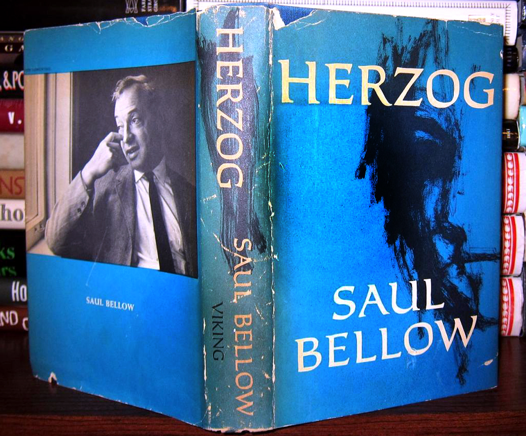
For me, those years were filled with almost obsessive reading. I ate up books like potato chips, at times during summer vacations at the rate of a book-a-day. And I devoured more contemporary fiction than I have at any other period in my life. I read everything Saul Bellow had written up to that time. I read John Updike, Malcolm Purdy, Hubert Selby Jr., Thomas Pynchon, Jules Feiffer, James Drought, Herbert Roth, James Baldwin, Norman Mailer and a host of others I cannot recall at the moment.

The fact I don’t recall them is germane. I hardly remember what was in any of these books because, clearly, I was reading way over my head. What could a goyishe 14-year-old suburban boy, pimply-faced and horny, ever understand about urban Jewish angst or African-American anger? Simply beyond my realm of experience. More to my concern: whether my shoes were pointy enough, my hair wavy enough and if my trousers had cuffs or not. I forget now whether it was cool to have cuffs or supremely uncool. OLYMPUS DIGITAL CAMERAI tried to instruct my parents in these finely parsed issues, but they were too block-headed to understand.

And speaking of not understanding: My young libido, raging but unfocused, led me to Terry Southern’s Candy and Robert Gover’s One Hundred Dollar Misunderstanding. It was my primary source of sex education, and it is a wonder to this day that I survived.

But I’m dancing around the central issue. The bible of pubescence was and remains J.D. Salinger’s The Catcher in the Rye. Here was a book that addressed my concerns directly, that understood my life from the inside, that expressed those unsayable thoughts. I gobbled it up, and all the Glass family sagas and short stories. I wanted more; there were no more.

There were other books that teens revered, and I read those, too: John Knowles’ A Separate Peace and William Golding’s Lord of the Flies — which, because I was a teenager and therefore an idiot, so it never bothered me that Golding told of a world-view diametrically opposed to Salinger’s fable of self-righteous innocence. catcher cover

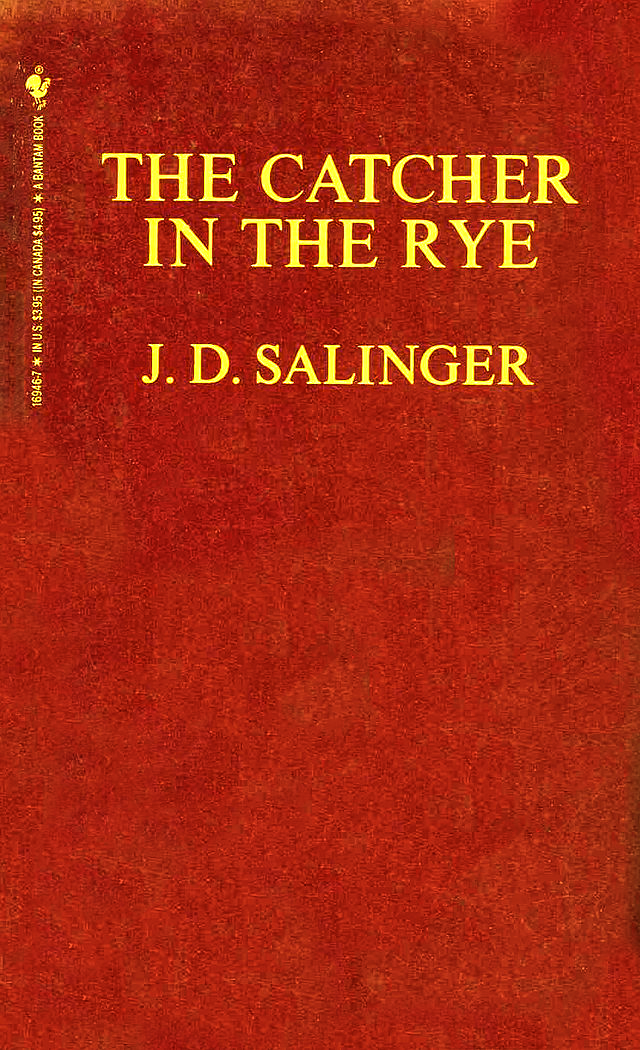
Holden Caulfield recognized the essential hypocrisy of adulthood and pointed fingers everywhere but reflexively. The purity of his heart guarded the cleanliness of his soul. I signed on. It was society that was rotten.

Of course, looking back, one realizes Holden Caulfield was the biggest phony of them all. But it is the nature of hucksters and demogogues that they project their limitations outward. It is what makes them so convincing, at least to the unformed souls they lead around by the nose.

I have tried to reread Salinger a few times as a grown-up, but the treacle leaves an unpleasant coating on the inside of my mouth.

My self-image at the time was that I was a budding bohemian, that I was an intellectual among cattle. I had subscriptions to Evergreen magazine and Paul Krassner’s The Realist. I read Jean-Paul Sartre’s Les Mots. I listened most nights in my bed to Jean Shepherd on the radio, and never really understood that the “hipsters” he railed against were the very people I idealized. evergreen 1965
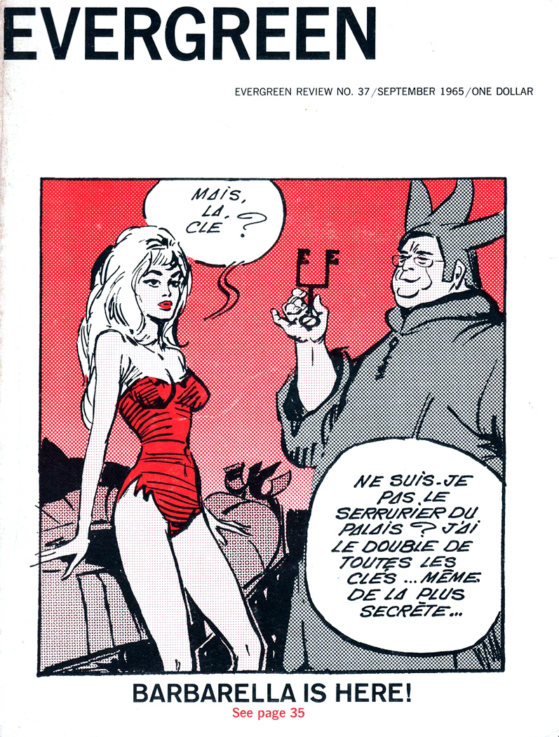
Irony, at that age, is invisible. We look right through it without seeing it. I went to Greenwich Village every opportunity I got and frequented the Sheridan Square Paperback Corner.

Lordy, I was a pretentious twit.

There were books I was required to read for school, but while these books are worthy, they are wasted on adolescents who cannot grasp their import. I read The Great Gatsby for school, and never quite understood that Gatsby was a gangster. Over my head. The Scarlet Letter was assigned, and I don’t think I even understood that Pearl was Hester’s daughter. I’m not sure why a punk kid was ever asked to read such a rich and subtle book. There was clearly no way I could wrap my tiny, unformed brain around the complexity of that book — to say nothing of the boredom induced by paragraphs that long without being broken up into constant bites of dialog.

There was a tendency during those years, when introduced to a book I enjoyed, to attempt to read everything else by that author. Gobble it all up, nine-yards and a tail. That is the way it was with the Glass family, and that is how it was with Jack Kerouac.juliette greco

There was scarcely a Kerouac book in print in the mid-1960s, that I didn’t inhale, starting with On the Road, which I read twice. I fantasized riding the rails, driving a broad-hipped Hudson at a hundred miles an hour through the nights of Nebraska, listening to Ornette Coleman and dispensing off-the-cuff witticisms to the Juliette Greco on my lap. When I had a chance to travel to Europe between my junior and senior years, I took Lonesome Traveler with me, and in the bookstalls along the Seine in Paris, found Big Sur and Subterraneans in British paperback editions.

I am amazed when I look back, at how much I read — all of which was outside schoolwork, which I neglected. And I am amazed now at how little of anything I read then I retained. It went through me like a sieve. All that verbiage accumulated around me like gravel around a caddis fly larva, and when I left for college, I shed that cocoon and started fresh with a new set of enthusiasms.

Next: Reading outside the curriculum

???????????????????????????????

I began seriously reading in high school, mostly contemporary fiction. I don’t remember what I could possible have made of Saul Bellow’s Herzog at the age of 16, but there it was. I followed that with Seize the Day and The Dangling Man. I read James Purdy, James Drought, Jules Fieffer, Hubert Selby Jr., Thomas Pynchon, Terry Southern, Albert Camus, and, ahem, P.G. Wodehouse.The Secret cover

Jack Kerouac, Brendan Behan, William Golding, Kingsley Amis, Eugene Ionesco, and of course, J.D. Salinger. I was a teenager, after all.

Quite a load of words for a high school student. I doubt I understood a tenth of what I read, but I couldn’t get enough.

There were a few “classics” thrown in, some required reading for school, but it was primarily new fiction I read — almost all of it over my head.

And almost all of it in paperback. There was a rack of paperbacks in the local drug store, and I would pore over them after school, looking for the latest Bellow or Updike.

return of the native airmontAnd then, there was Thomas Hardy’s Return of the Native, which was required reading in 8th grade — why, I don’t know. But I had the hardest time plowing through it. It seemed dense and impenetrable. I got bored. I couldn’t finish it.

Over the years, there were other books I had a hard time reading. The sense was always the same: They were uninviting; they were dense; they were difficult to read. I lost interest in them and didn’t finish them.return of native page

It was only years later that I realized the problem was not with the writing, it was with the printing: The cheap paperback edition of Return of the Native was really horribly designed: grey type, insufficient leading, narrow margins, bad, under-inked offset printing on grey or yellowed paper.

The problem was not with Hardy, the problem was not with me, the problem was with Airmont Classics, the paperback publisher. They had skimped on book design and created a brick.

Last week, wandering through the shelves of our local used book store, I found a copy of that noxious tome. As I began reading, I realized what a magical writer Hardy really could be. Now that I’m more mature — actually a geezer — I had a bit more patience than I had as a teenager, and I could manage to cut the furze, as it were, of the wretched typography. It is still a dank and uninviting book to look at, but I nearly cried at the opening paragraphs, as Hardy describes that particular and exact time of day and time of year when you can look down at dusk and the ground has lost any visual contrast; it dulls into the gray of evening — but if you look up, the sky is still bright. It is like that Magritte painting, only not meant to be surreal, only beautiful.magritte

“A Saturday afternoon in November was approaching the time of twilight, and the vast tract of unenclosed wild known as Egdon Heath embrowned itself moment by moment,” the book begins.

“Overhead the hollow stretch of whitish cloud shutting out the sky was as a tent which had the whole heath for its floor.

“The heaven being spread with this pallid screen and the earth with the darkest vegetation, their meeting-line at the horizon was clearly marked. In such contrast the heath wore the appearance of an installment of night which had taken up its place before its astronomical hour was come: Darkness had to a great extent arrived hereon, while day stood distinct in the sky. Looking upwards, a furze-cutter would have been inclined to continue work; looking down, he would have decided to finish his faggot and go home. The distant rims of the world and of the firmament seemed to be a division in time no less than a division in matter. The face of the heath by its mere complexion added half an hour to evening; it could in like manner retard the dawn, sadden noon, anticipate the frowning of storms scarcely generated, and intensify the opacity of a moonless midnight to a cause of shaking and dread.”

What had I missed over the years by thinking that certain books were dull, when it was only the visual aspect of their presentation that had discouraged me?aeneid

I remember trying my damnedest to shoulder my way through C. Day Lewis’ translation of The Aeneid. Whoever designed that paperback managed to use a page too small to hold the average length of a line in the font size he chose, meaning that almost every other line wrapped to the next line, flush right, giving the text a kind of visual hiccups, making a very ugly page that was nearly unnavigable. It put me off Vergil for decades.

By-and-large, it is paperbacks which are the greatest offenders. Designed to be cheap — which we appreciate — they are also designed to fit as much type onto a page as possible so as not to waste space or paper. Type is small; leading is squished; margins are narrow. To say nothing of the quality of paper used and the ink rolled on.

It isn’t merely a question of type size. Some large-type books are hard to read, and some with tiny text are easy. The issue seems to be the length of the line: Small type on a small page is fine, but spread that line out over a wide page and the eye tires before turning down to the next.

walden 1One of the prettiest books I own is a copy of Walden from the Heritage Club, published in 1939, with wood engravings by Thomas W. Nason. It was proud enough of its look to credit its designer, Carl Purington Rollins. I believe every book should credit its designer: A good design makes a book better; a bad design deserves blame.

Although it is printed in 8-point type, the page is compact, and the margin wide enough that the print-line is never too wearying.

One of the things that makes this Walden so attractive is that it was printed with lead type, not run off an offset press roller.

There are so few who still get pleasure from the look and feel of ink on paper — especially the tender and slight embossment of lead type dug into the fiber, and the ink laid there in the troughs. The soy ink now used flat on offset printing seems so one-dimensional. I have a two-volume Milton printed in 1843 that is as beautiful to look at as to read, as beautiful as a Piranesi engraving or a stained-glass window.milton 1

The question is not one merely of what typeface is chosen; some books are overly “artistic,” with fancy fonts and eccentric spacings — all of which make the book harder to read. What makes it all work is a typeface that is neutral enough not to call attention to itself, but not so dull as to be banal. No one want a whole book wearing Times New Roman like fishscales — you want to take the back of a knife to it and scrape it clean.

No, the question goes beyond type: It is a question of air between lines and around the text. It is a question of the darkness of the type — the heaviness of line in the drawing of the letters. It concerns the break of chapter and the intent of the paragraph: Neither too much nor too little.

And yes, this is a matter of taste, not of metrics: What is too much or not enough? The answer requires not a rule, but an awareness: awareness of the physical properties of the page and its contents. Most of us are unaware that books even get designed, unaware that there was a choice made in type, margin, leading, initial capitals, weight and brightness of paper stock, the deckling or smooth cut of the page edge.

Americans are often chided (and most often by themselves) for being too materialistic. But this simply isn’t true: Americans are not materialistic enough — they have little sense of the material world. The acquisitiveness that infects our nation has more to do with the non-material quality of status than with any love of the sensuous world we inhabit. One might say it is a “spiritual” value, not a material one. Certainly a tedious and unworthy spiritual value, but not in any way truly materialistic.kindle

So, it is hardly surprising that we now do so much of our reading on electronic gadgets. One might say one has become one’s own book designer, since one can choose certain visual parameters on your iPad or Kindle. But aside from enlarging the type for easier reading as we venture into the world of presbyopia, few take the chance to actually “design” the presentation on their e-reader.

And as a writer of a blog, I am frustrated by the fact that no matter how I try to make my text look on the computer screen, when it reaches your screen, it is your default choices that govern its looks as you read it. We have cut out the middle man — cut out the book designer, who can make my writing fun to read or a trial to machete through.