In a recent piece on this blog, I mentioned that Pablo Picasso, while he was undoubtedly a great artist, might not be a particularly good painter. That is, his craftsmanship over the years could be quite indifferent. Inventive, no question, but seldom painstaking over execution. I wrote a fuller explanation of this in an essay I wrote in 2023 for the Spirit of the Senses salon website and I thought this might be a good time to reproduce that post for a wider audience.
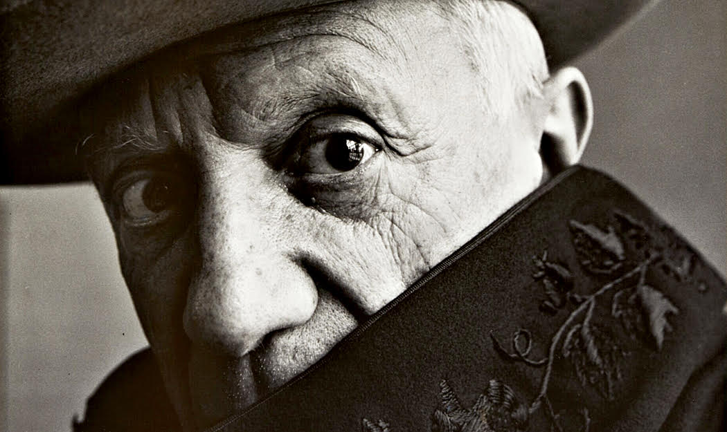
Pablo Diego José Francisco de Paula Juan Nepomuceno María de los Remedios Cipriano de la Santísima Trinidad Ruiz y Picasso was a very impatient man, perhaps because his name takes so long to say or write.
I say he was impatient on the evidence of his paintings. I certainly never met the man. But I have seen a boatload of his paintings in person and hundreds in reproduction, and they all tell me he didn’t have the patience to spend time on their finishing touches.
Don’t misunderstand: Pablo Picasso was a great artist, and for many reasons. But he was not what I would call a great painter. Let’s take a look.
There was a time when many thought that Picasso’s art was a hoax. You know, the “My kid could paint better than that,” and serious-minded critics would say, “First, you have to be able to master the techniques before you can experiment with abstraction.” (Yeah, this was a while ago).
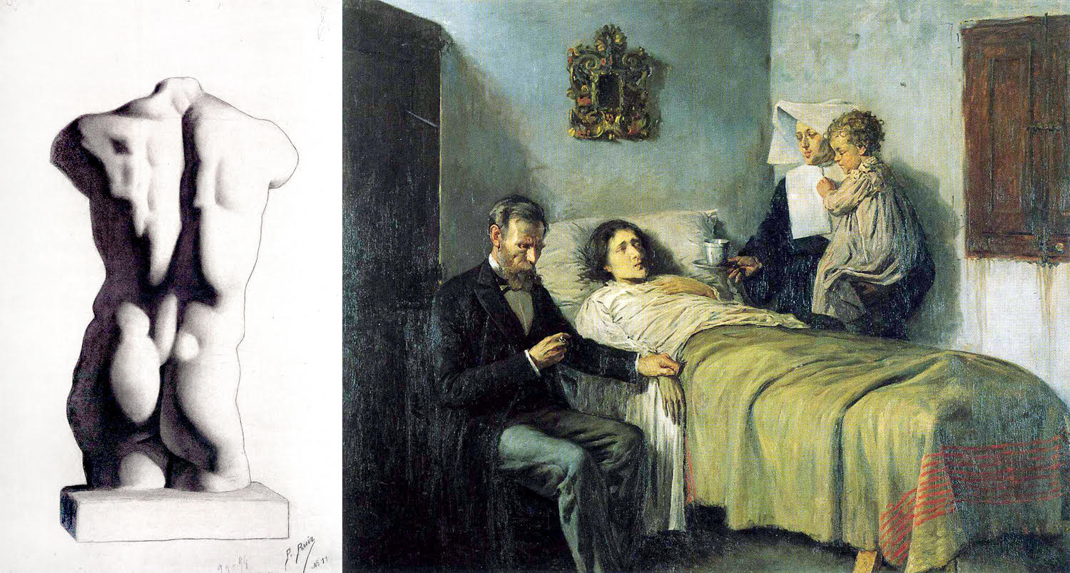
But then, some of the young Picasso’s art, from his adolescence, began showing up and it was clear that he had been a masterful draftsman and could draw and paint as realistically as anyone.
He could pump out an academic figure study like an Old Master. And he could put on canvas as realistic a painting as you could wish. Just look at some of these, from 1893, when the artist was 12, and 1896. It is clear he could do anything. But he didn’t: By the turn of the century, he had been taken with more modern trends in art, from Impressionism to Post-Impressionism, to Fauvism and Expressionism. His style loosened and the works became sketchier.
This evolution of style was characteristic not only of Picasso, but of other artists, writers and poets. There had been Impressionism and Post-Impressionism, Van Gogh, Gauguin, Cezanne — all with different styles.
By the middle of the last century (that’s the 20th, remember), Modernism had not only established itself, but become entrenched. Its hagiography had been codified and the heads of its various branches were Igor Stravinsky in music, James Joyce in prose, Ezra Pound in verse, and Picasso on canvas.
These were hardly the only names in the mix, and they may not even have been the best artists working, but they became the names we all knew. They are the names in the anthologies and textbooks.
And they all burned through styles. Stravinsky went from late Romantic chromaticism, to a savage primitivism, to Neo-Classicism and finally to his version of 12-tone serialism. Joyce from some of the most beautiful, clear prose in The Dubliners to the stream-of-conscious jumble in Ulysses and into the paronomastic almost-abstract gibberish of Finnegans Wake. Pound began with highly poeticized Edwardian prettiness to a hard-edged sarcasm and into his own form of pan-linguistic word salad.
Most serious artists go through stylistic growth from early to late periods, but Modernism seems less like organic growth and more like a conscious seeking-out of something new, something that would get attention. Pound’s battle cry was, “Make it new!” Where style had been a function of personality, it became a “brand” and ever newer versions were sought, like updating your car every few years.
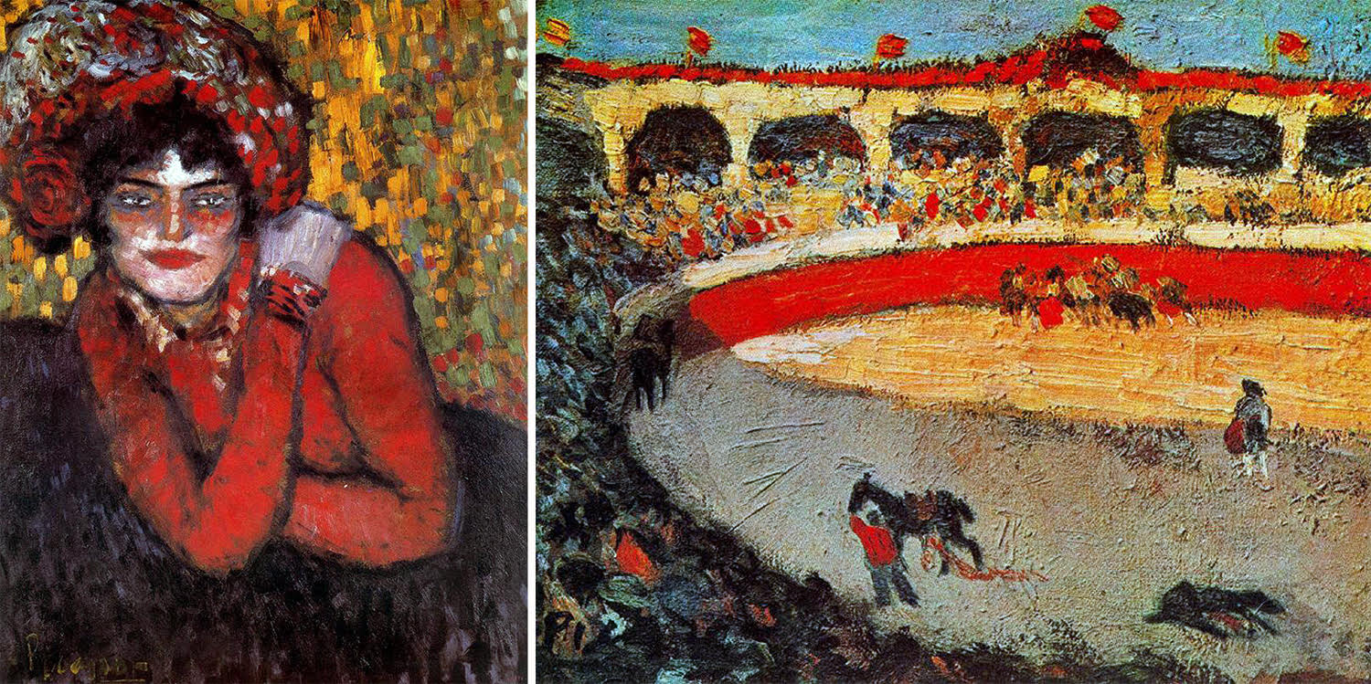
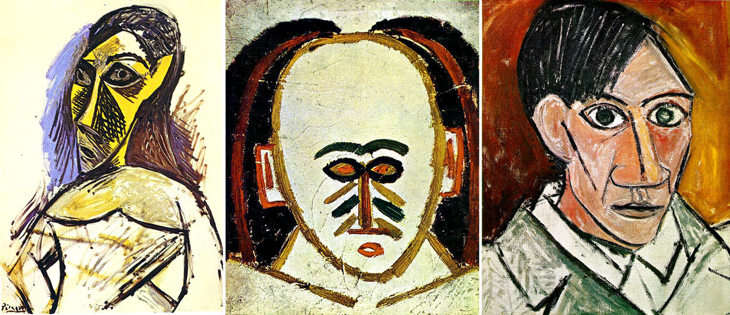
I’m being too harsh here, but to make a point. Picasso kept evolving, from that early Expressionism
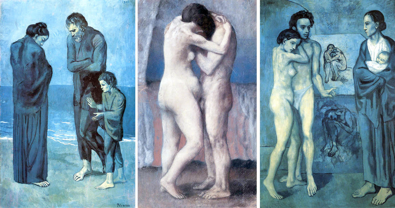
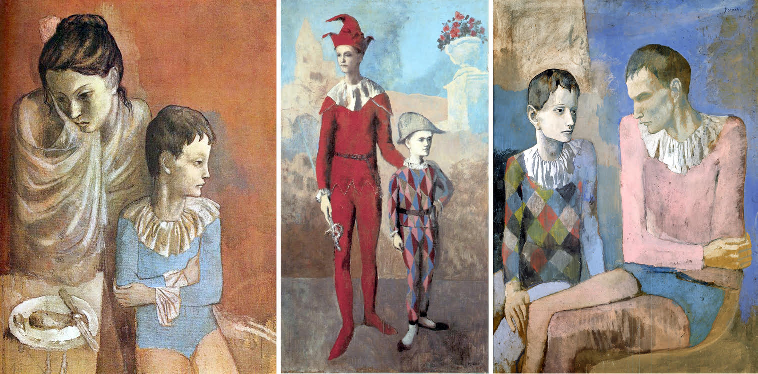
To the famous “Blue Period”
Through a subsequent “Rose Period”
to African primitivism,
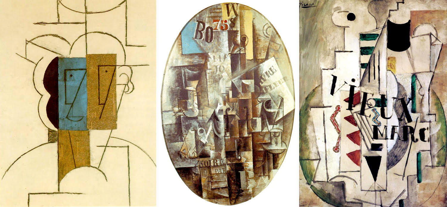
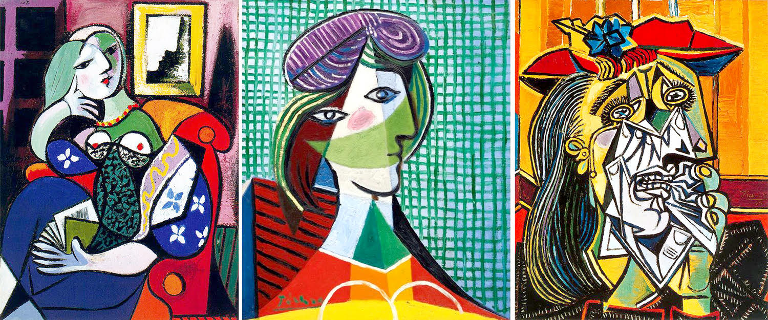
to analytic Cubism,
to Synthetic Cubism,
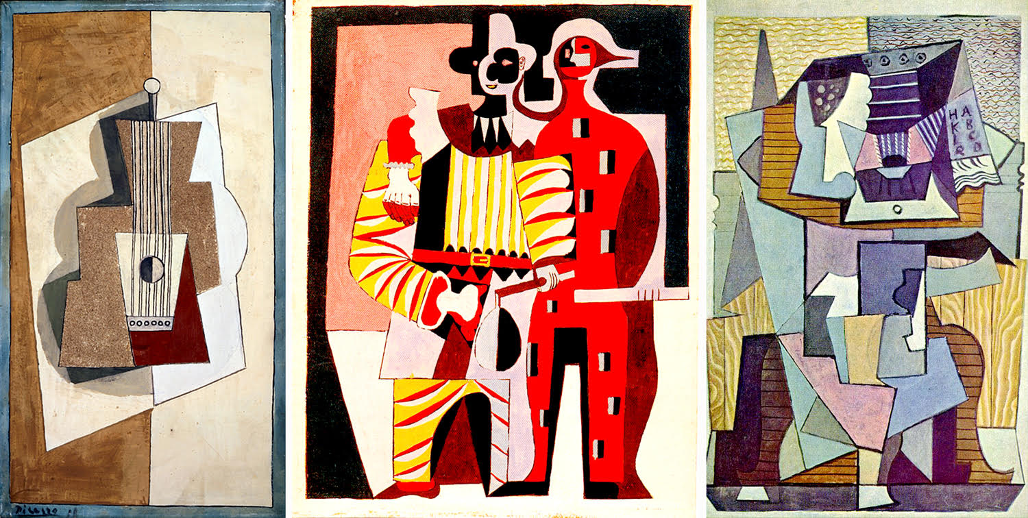
to Surrealism
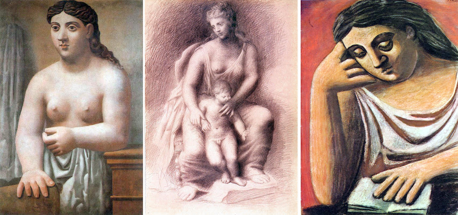
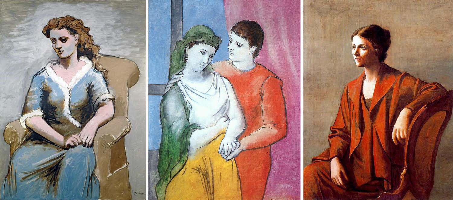
and Neo-Classicism
Then a brief period in the mid 1920s of what might look like a return to a kind of realism
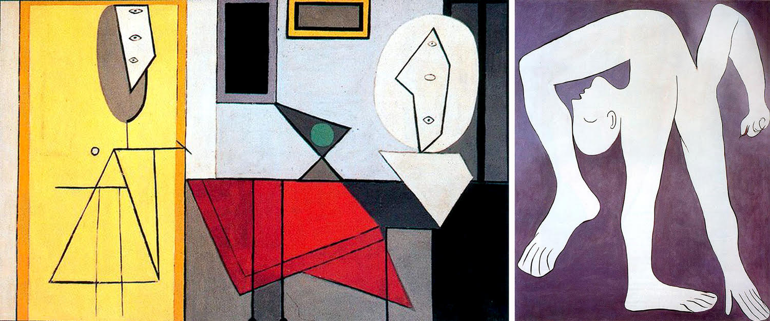
and then, into what can only be termed Picasso-ism — his playful mix of everything and anything, usually turned out in a few hours and often rather haphazard.
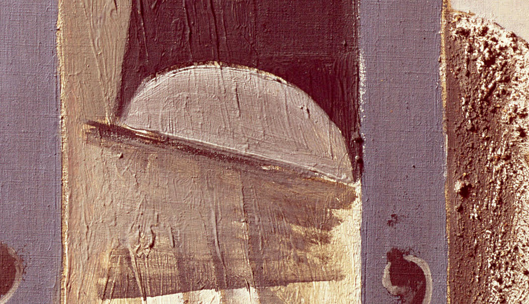
And this gets to my main point: That Picasso was an epically inventive visual artist, clever in the first degree. But from his earliest work onward, was always rather indifferent about the craft of painting. His application of paint to canvas was often sloppy; parts of many paintings were essentially unfinished; many are more caricature than character; even his color choice often seems unconsidered — any red might do, any green, any blue. His art is one of suggestion rather than observation.
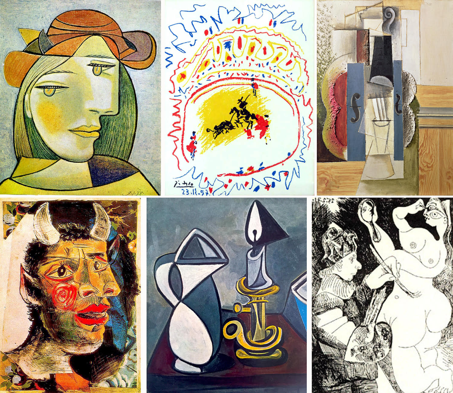
This was typical of his approach in other ways. Where most artists use their work to react to life and the world, Picasso seemed always more interested in cultural tropes. That is, he picked on several archetypes — or stereotypes — and re-imagined them over and over. These are themes straight from his brain, without recourse to the actual world.
There were bulls and bullfights; Harlequin and Pulcinello; circus performers; the down-and-out; birds; women, both as portrait and as nude; satyrs, fauns and demons; still lifes; and over and over: the artist and his model.
He drew these subjects from his mind, not his eye. And the goal seems to have been to get them down as fast as possible and to get on to the next canvas. During the Renaissance, an artist might work on a painting for a month, polishing it to a perfect finish; Picasso seems to have been more likely to complete several paintings in a day.
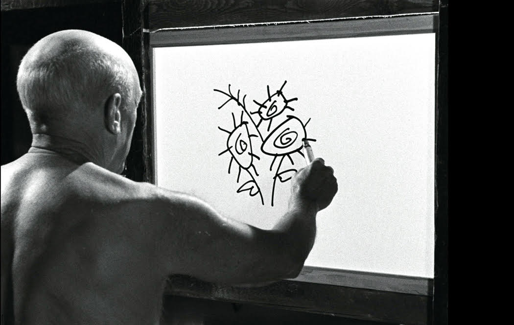
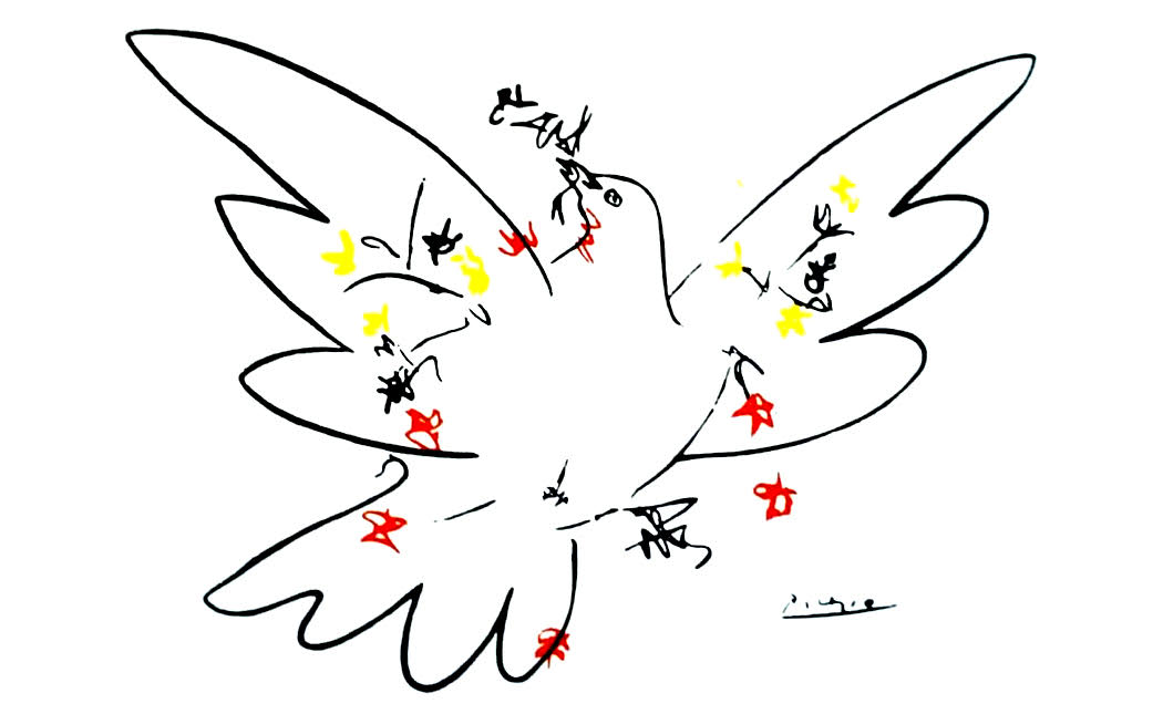
You can see how fast he works (and how fast his mind could work) in the 1956 film by director Henri-Georges Clouzot, The Mystery of Picasso, in which, over the course of its 75 minutes, the shirtless Picasso completes 20 drawings and paintings. Of course, most of these are merely sketches, but you can see how fast his brain is functioning — and how diagrammatic his take on the visual world really is. He is not capturing the way the world looks, but rather creating hieroglyphs to be read, the way his dove is a symbol for “peace.” Or the stick-figure man or woman on restroom doors.
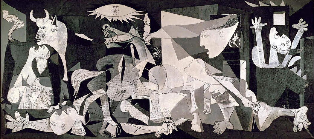
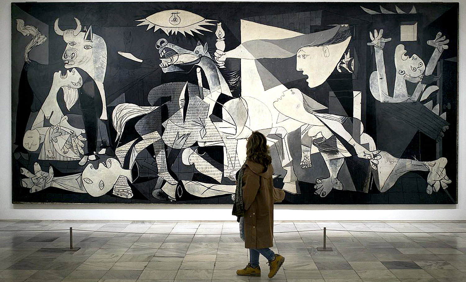
The one time he made the effort, worked over many preliminary sketches and worked his canvas to a fine finish, he produced what is probably the most important, most powerful painting of the century — his 1937 Guernica, about the bombing of the Basque city by Nazi planes supporting the Fascist forces of Francisco Franco. The giant painting —roughly 12 feet by 25 feet — hung for many years at the Museum of Modern Art in New York, as, under the will of the artist, it could not be returned to Spain until the reestablishment of democracy. It finally went home to Madrid in 1981.
I saw the painting many times when I was a young man, living just outside New York, and visiting MoMA as often as I could. It anchored one end of the museum and you could see it as soon as you got out of the elevator on the second floor, the focus of the whole museum.
I’m not saying that we would have been better off if Picasso had spent more time on fewer paintings — his prodigious energy is largely why we honor him. But what can’t be ignored is that his work is often slapdash, sometimes not much more than a doodle.
When I was young, and for the first three-quarters of the 20th Century, Picasso was a colossus, almost universally acclaimed as the era’s greatest artist — the Muhammad Ali of the paintbrush — but in recent years, his primacy has receded. Partly because the adrenalin rush of Modernism has petered out; partly because the art market has become so much more simply part of the financial world, more interested in investment and less in the actual art; and perhaps most of all because Picasso, the man, has been revealed as such a misogynist pig. He was a very unpleasant man.
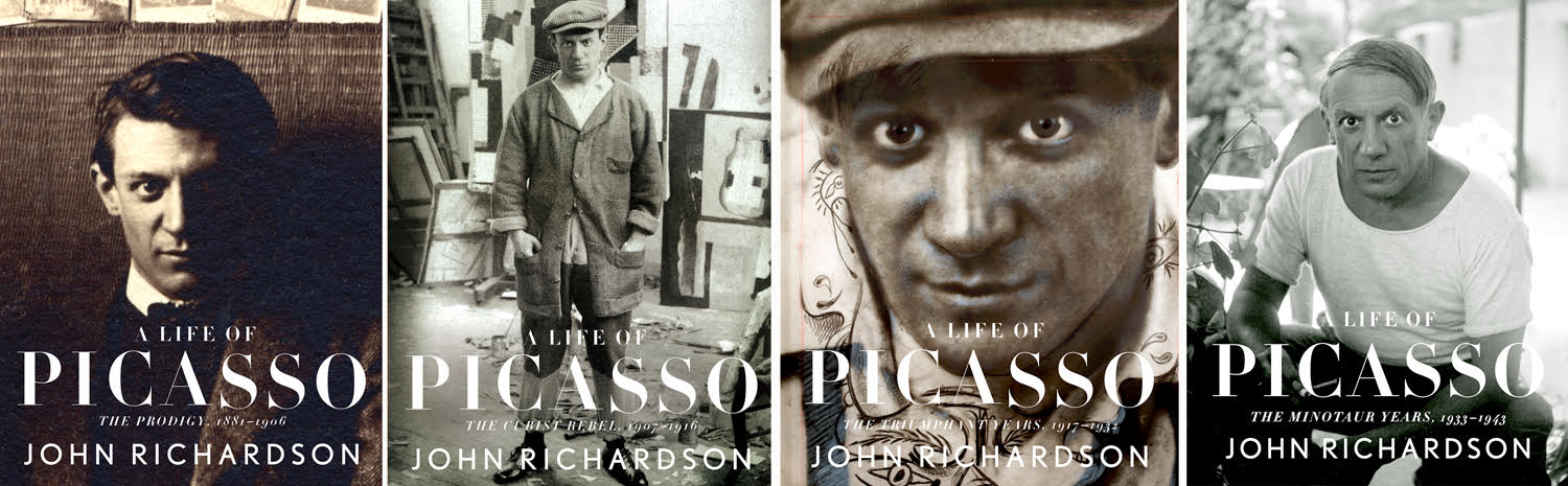
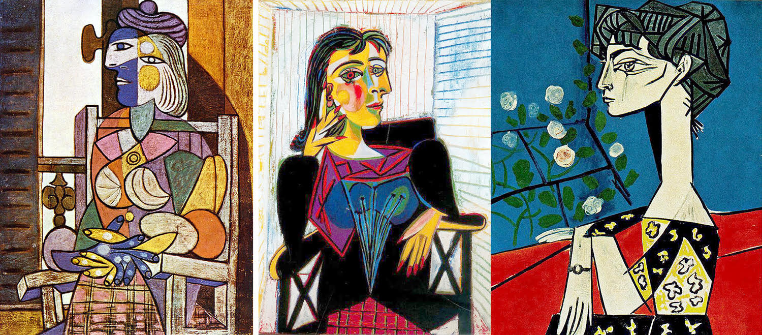
Since the publication of the four-volume biography by John Richardson, it has been clear what a self-serving, self-promoting, egotist he was. He went through wives and mistresses, using them and often abusing them. Once we thought of him as the great stud of art, now more like a frat boy with little care for the women in his life. Fernande Olivier, Olga Khokhlova, Marie-Thérèse Walter, Dora Maar, Françoise Gilot, Jacqueline Roque — there and gone.
Then, there was the semi-criminal past, selling fraudulent or stolen art, and footsying with the Nazis in occupied wartime France. In our current more censorious age, we more likely to knock the laurels off the heads of our writers, artists, filmmakers and actors — Did they diddle underage girls? Did they coddle to dictators? Did they steal the credit due to women? Were their intentions less than pure?
If we give in to these worries, we will have to strike from the record much of our cultural heritage. Artists are just as human as the rest of us.
And so, I forgive the genius his sins — they are past and he is dead — and honor the art. But I cannot ever not notice that for all his brilliance, Picasso was an indifferent craftsman. When I look at his work, I see the careless brushwork, the muddy colors, the repetitive subject matter.
My own youthful enthusiasm for Picasso has aged into a mature appreciation for his accomplishments. However diminished he is in the public eye, he is still the dominant artistic name from the first half of the 20th century.
It is midwinter spring, those few days that habitually show up in February with sunshine and temperatures into the 70s that fool you into believing that spring is close at hand, only later to kick you with plummeting temperatures and perhaps another snow. The National Weather Service predicts that for this weekend.
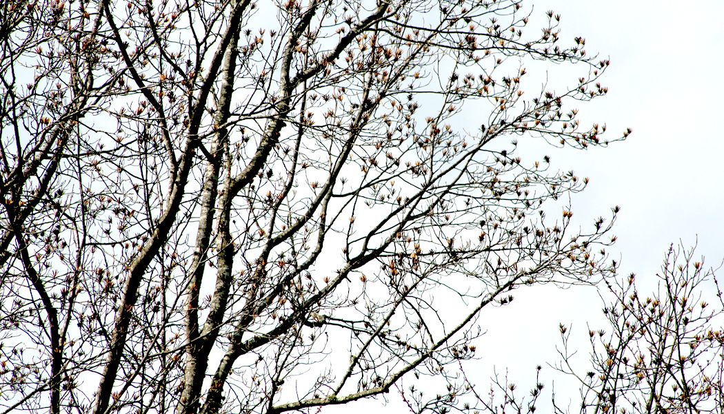
This is my favorite time of the year, when the bare trees begin budding at the twig tips. You can watch the trees change day by day, turning the dead sullen grey of December into something that clearly has a rising sap under the dull bark. When you watch the buds close up, their bud scales slowly separate, with thin lines of green beginning to spread at the edges.
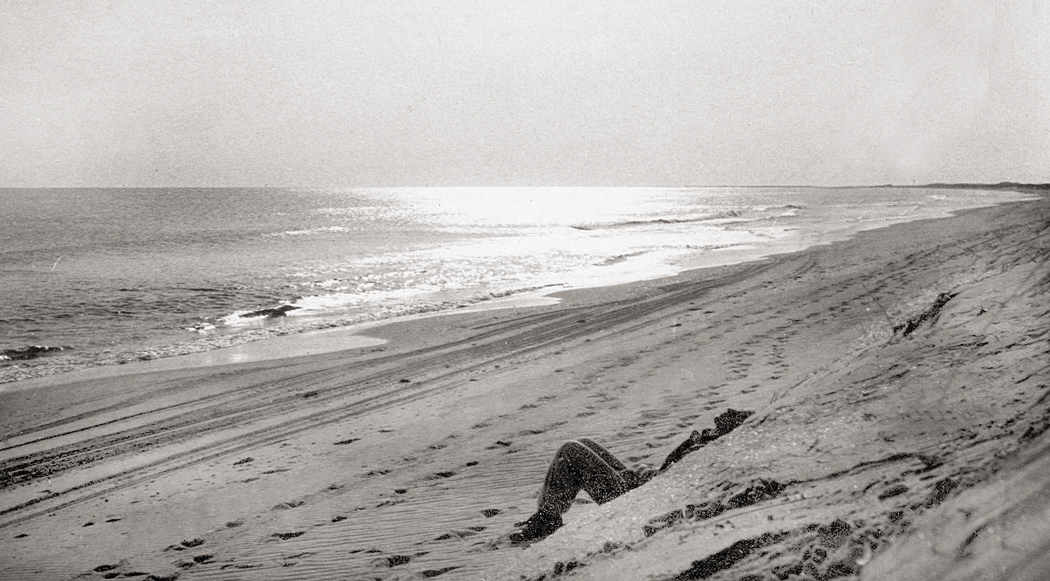
Fifty years ago, my friend Sandro and I would annually take this time to camp at the Outer Banks. Off-season meant we had the sand and sea to ourselves and could walk five miles along the strand without ever meeting another human.
Sandro at Cape Hatteras, 1969
It was also Mud Season. You don’t read about it in literature, with its darling spring buds, its gold first green and its young sun half-run in the ram’s course. But there it is — early winter rains drained deep into soil and then turned hard as rock in the frozen air. November’s squishy footprint is turned to fossil, brittle as any sandstone, its edges wedged up in a tiny crater. But the February thaw, or later, when March brings those buds to stretch their scales, those footprints turn once more to watery goo, slippery under your shoe, sucking your heel right off your foot. It is what is wrong with pretty literature. Among all the pinking petals, among all the bright girls in spring dresses, among all the apple blossoms and greening grass to come, there is the mud, ripe, fertile, pliable in your squeezing fist, the one brown, crowning reality of the the coming spring, when there is mud again.
It is such elemental things that seem most real, most important. Culture changes, fashions change, but the cycle of seasons wears a constancy.
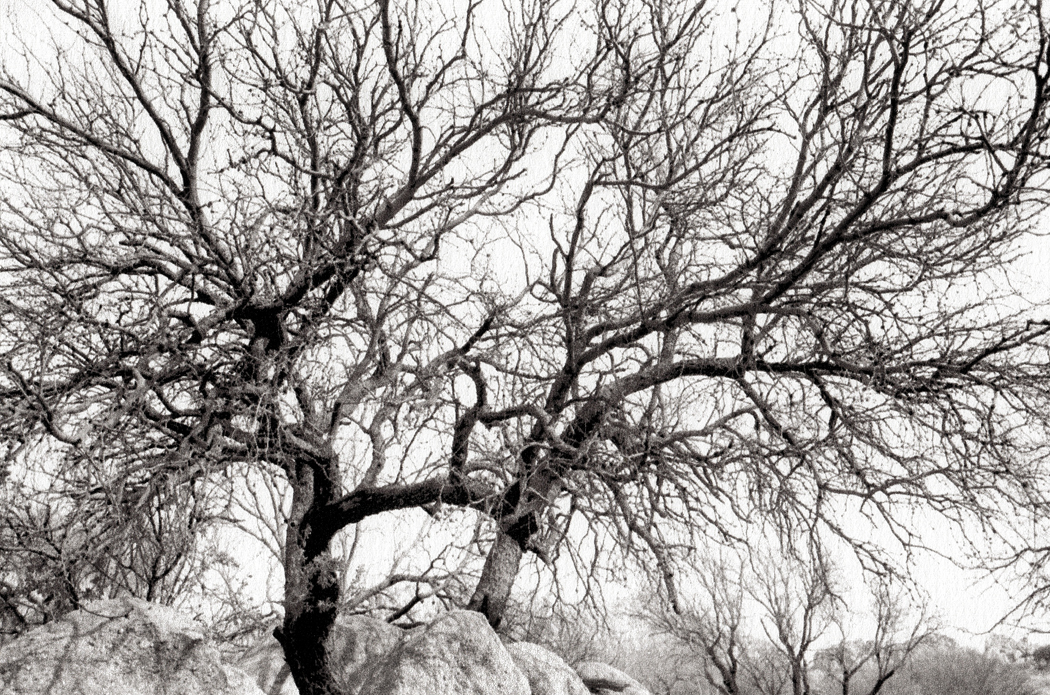
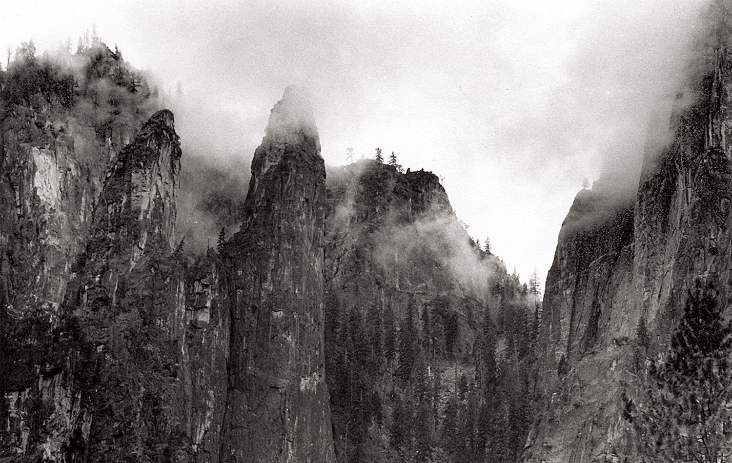
Texas Canyon, southern Arizona
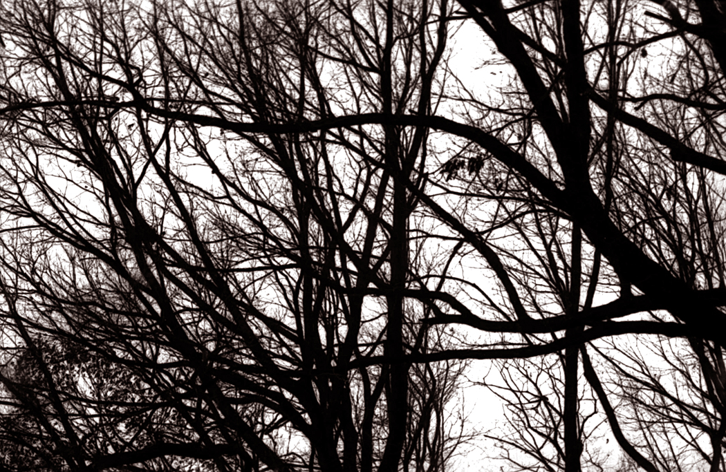
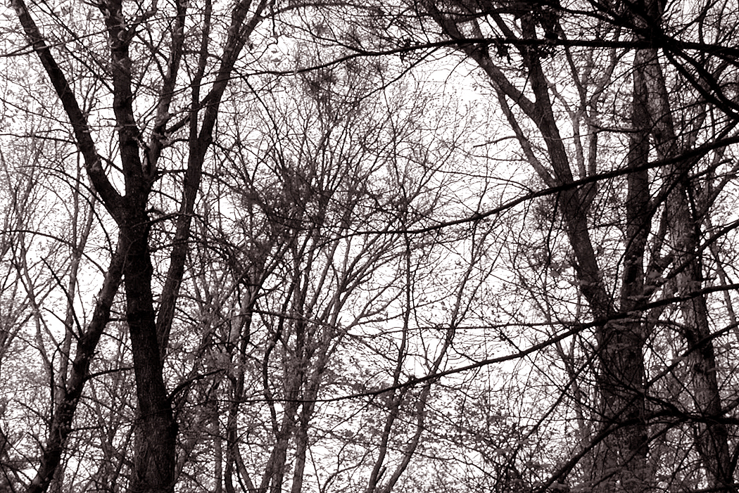
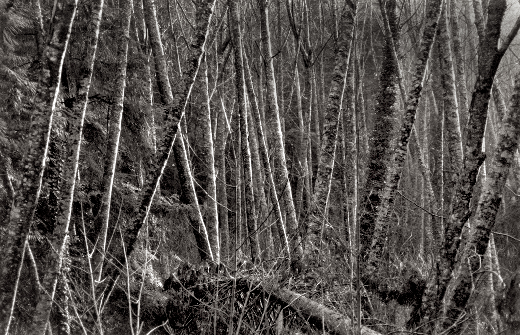
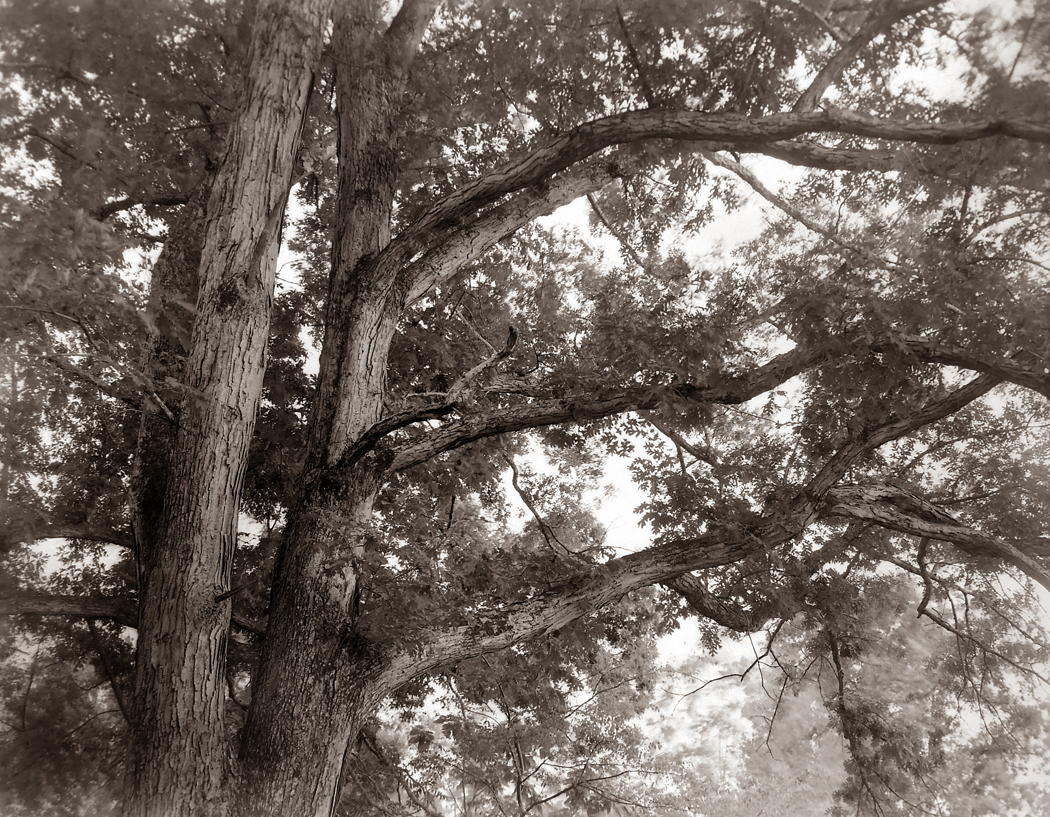
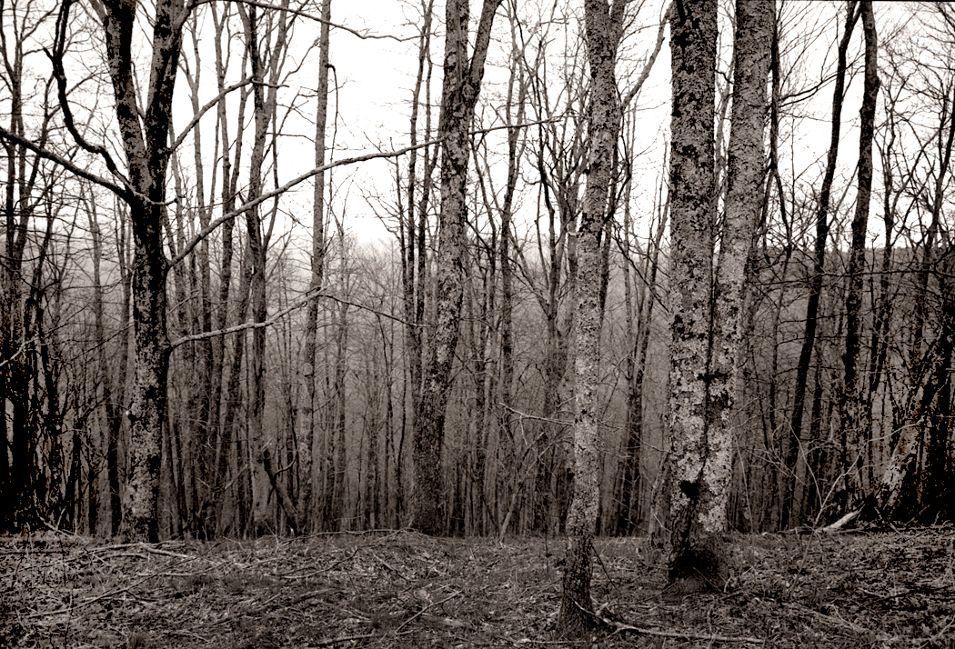
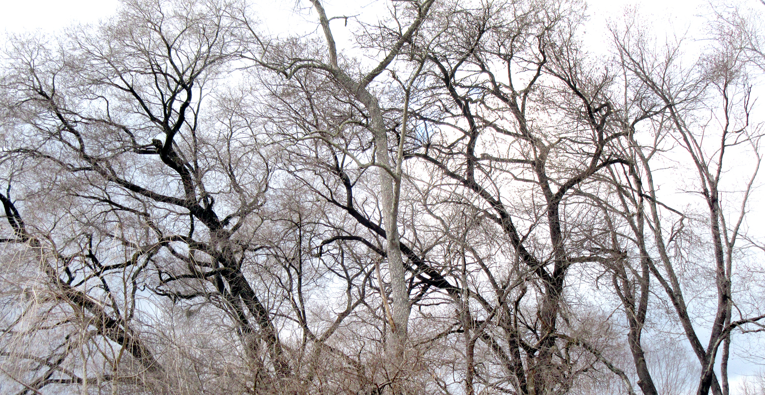
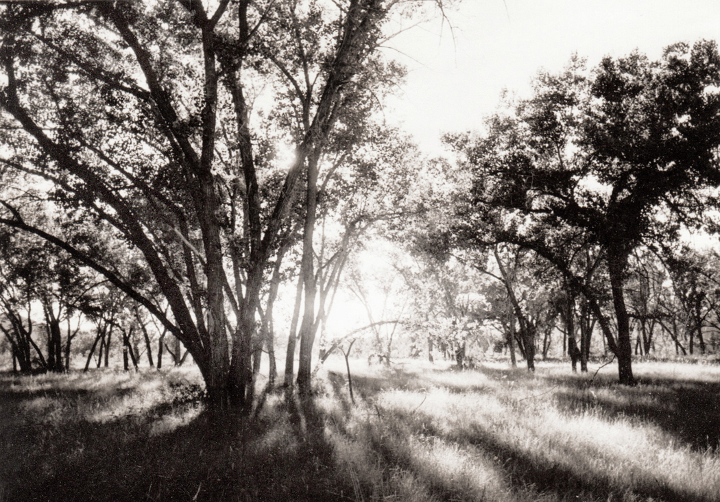
For me, it is the trees, most of all. I love the spring trees well enough, but it is this time of year, when the trees are still bare and show their bones that I wait for each fall. Drop the leaves ecdysiastically and I can see the shape of the thing they cover.
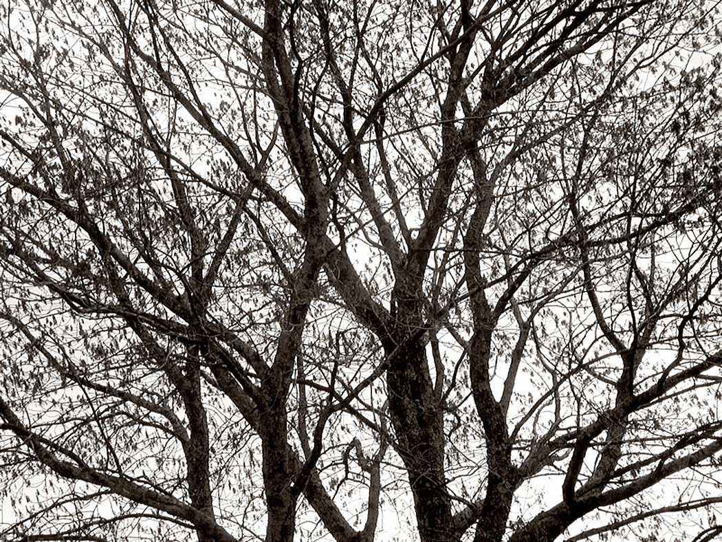
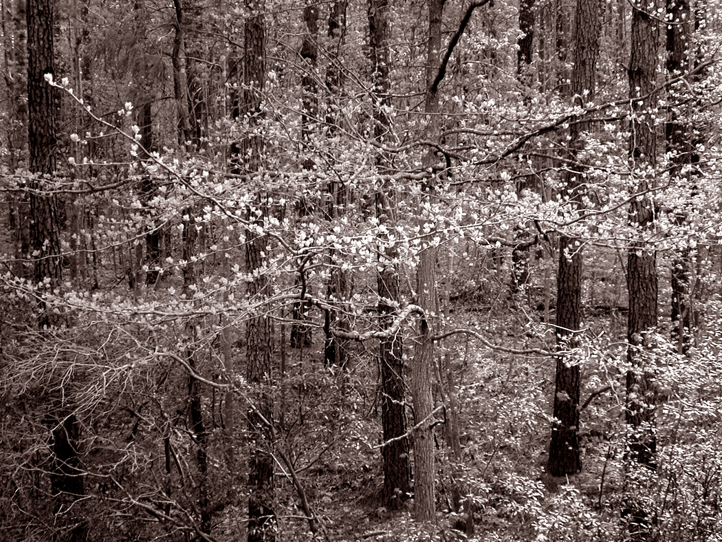
Spring oak, Blue Ridge
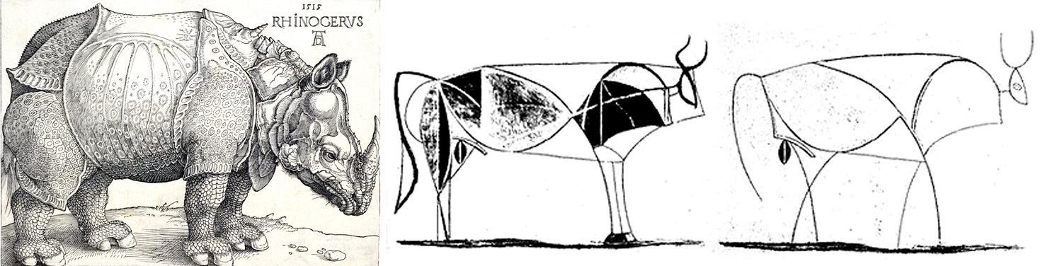
It is the lines they make against the sky. An etching more than a painting. Artists through history are generally assigned to one of two categories — they are either line people or color people. Line painters, like Botticelli, tend to draw their scenes, often in actual outlines, and then fill in the colors, while color guys, like Titian daub pigment onto the canvas and let the patterns of color define shapes. It’s one of the major distinctions made by Heinrich Wölfflin in his 1915 book, Principles of Art History. It doesn’t mean the line guy doesn’t appreciate color or the color guy doesn’t appreciate shapes and forms, but rather it defines what hits them first and most centrally.
(There is a similar distinction in music. Composers — and performers, too — tend to be line guys or chord guys. Lots of counterpoint for the first, and washes of tonal color for the latter. Bach vs. Debussy.)
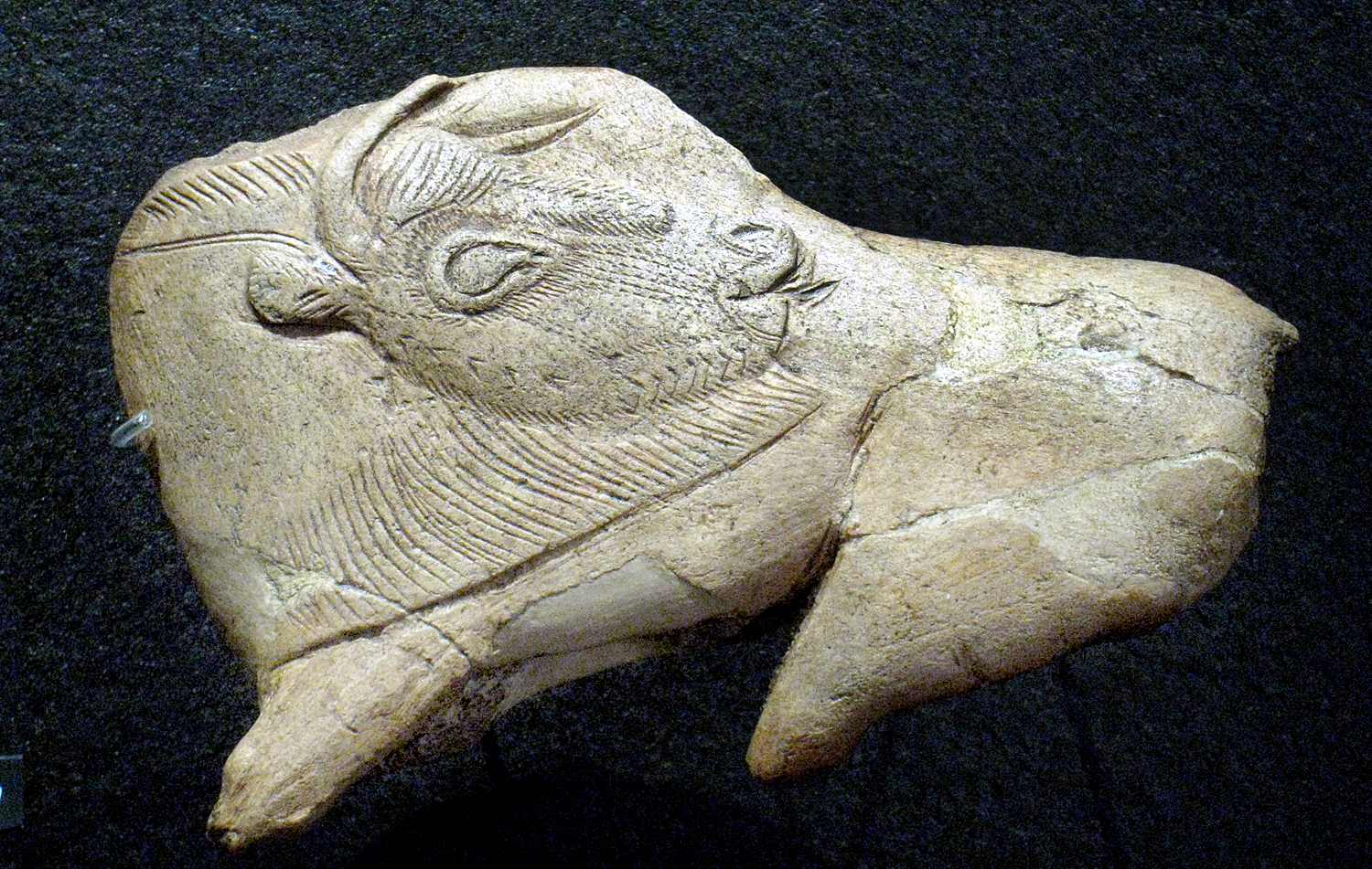
Albrecht Dürer rhino; Pablo Picasso bull
Albrecht Dürer was a line guy, most characteristically in his wood engravings. Picasso was a line guy and certainly an indifferent colorist. Most of his paintings could easily be given different fill-in colors. Matisse, though, a color guy to his teeth. Even more recent painters can be divided. Ellsworth Kelly a color guy; Lucian Freud a line guy.
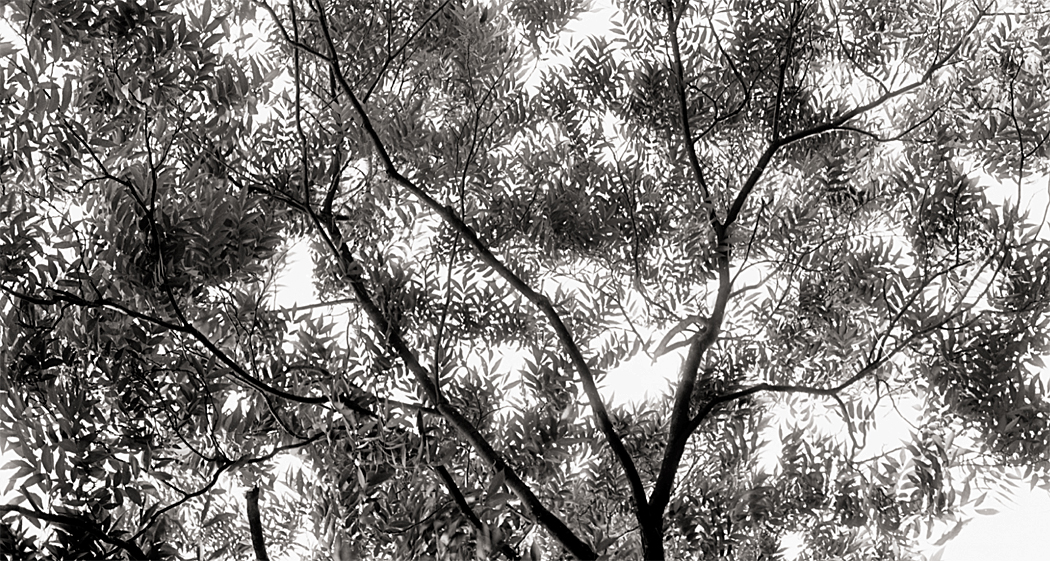
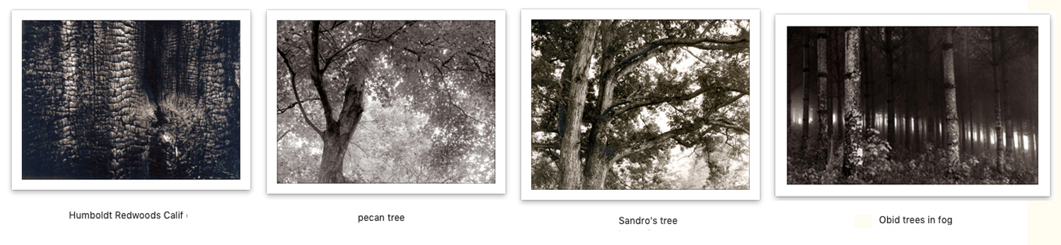
Well, I’ve always been a line guy. And the lines drawn by winter trees have hypnotized me since I was a wee bairn. One whole category of my photographs are what I called my “tree nudes.”
The nude has a specific purpose (outside the merely voyeuristic). Clothes drop their subjects into a very particular time and place. Eighteenth century breeches; flapper skirts; bell-bottom trousers; togas; saris; morning coats with a peeking handkerchief in the breast pocket.
But the nude is — or can be — timeless (with the caveat that hairdos can be a giveaway). There is a universality to the nude in art, which is why so many Greek statues are naked. And we are meant to appreciate the form — shape, detail, muscularity — and not just a specific person with a name, family, opinions, and personality.
And I feel the same thing in the bare ruined quiers, where late the sweet birds sang. There is structure in the dark lines of the branches, and a systematic chaos in the way they all cross each other in a welter of visual information.
In this, I am reminded of the drip paintings of Jackson Pollock, which I came to love in the New York art museums I visited beginning as a teenager. A good nature-scribble of branches puts a buzz in my visual brain. I love it and have sought it for the past 60 years. Among the first photographs I ever made, 60 years ago with an ancient 35mm Praktica camera were of trees.
Of course, while trees are beautiful, they can become an obsession. If I had chosen to make a career out of photography instead of writing, the trees pictures would have dwindled. As Fred Astaire says in the film Funny Face, “You’d be amazed how small the demand is for pictures of trees.”
But I have followed trees through seasons
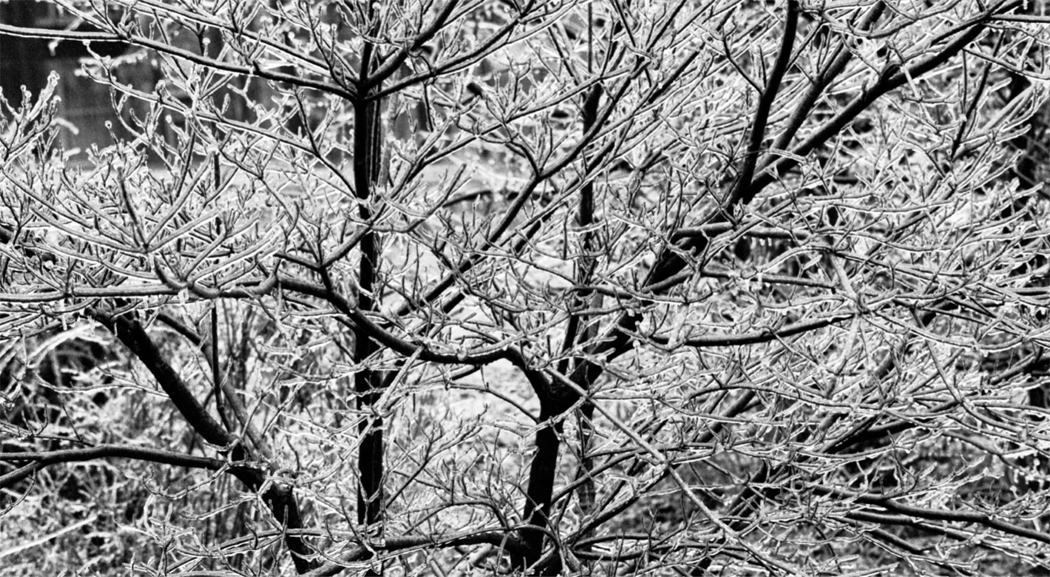
Ice storm, Greensboro, NC, 1969
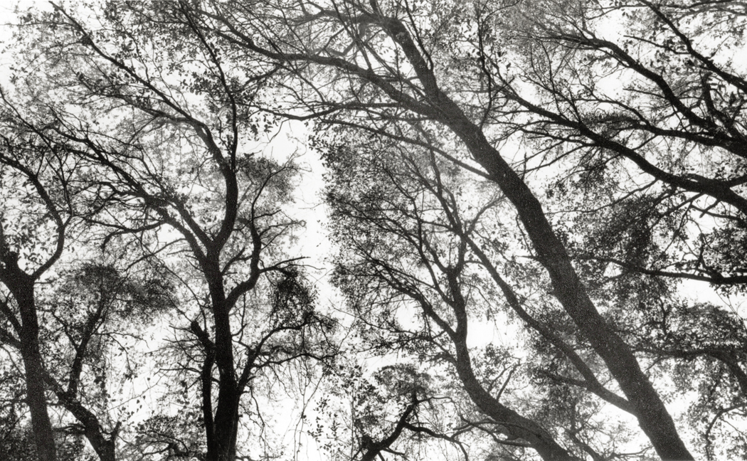
and all their leafy-ness
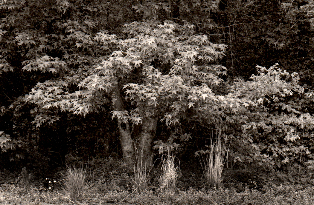
Sweetgum tree, Redwing Golf Course, Virginia Beach, Va., 1984
I have sought the best image of the jumble of buds, twigs, branches, trunks and bark that I feel as a signal for my emotions.
One of the first shows at the Museum of Modern Art that made a deep impression on me was in the summer of 1972, when they put together a group of 50 photographs of Paris trees by Eugene Atget (1857-1927).
Lined up on the wall in a darkened space, with brilliant track lighting that made each photograph gleam like a jewel, the photographs made my heart jump and my eyes smile. Most of the trees were winter trees, with wiry roots dug into the ground, and ancient boughs twisted and weighed down with age. They were ungodly beautiful, but also, in Minor White’s expression, it wasn’t just what they were, but what else they were.
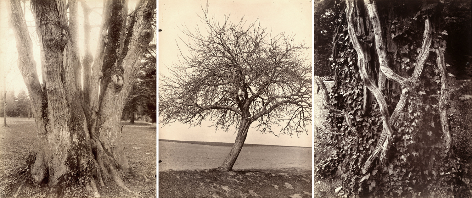
Three tree photographs by Atget
The way they were lit, the gnarled forms they took, their texture and even the gold-toned sepia surface of the silver images all functioned as metaphor. They evoked emotion the way art can.
Usually, when most people see a picture, in a magazine or newspaper for instance, the image is just a kind of shorthand for language. You see a picture of a house or car and instantly the words “house” or “car” spring to mind. The journalistic photograph is a kind of pictogram or hieroglyph, like the stick figures on the doors of public restrooms.
But images can also do more than that: When you abjure the naming phase and feel the color, line, shape, form and also the cultural resonance of an image, they evoke thoughts and emotions beyond the named subject.
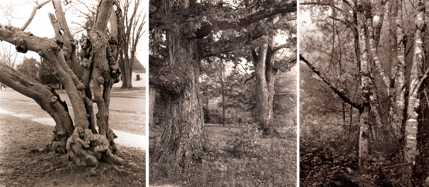
My imitations of Atget
And it was that that blew into my brain, seeing the Atget trees.
And that is something I have been hunting all of my creative life. And attempting to find in my own photographs of trees. Or not just trees, but in all the photos I’ve tried, whether landscape or still life or nude or portrait or abstract. — What else it is.
So, when I sit on my back patio and look up the hill at those mid-winter spring trees, with their augury of renewal, and their complex shapes and overlaps — those wonderful lines drawn against the sky’s paper — I want to catch something as it flickers by.
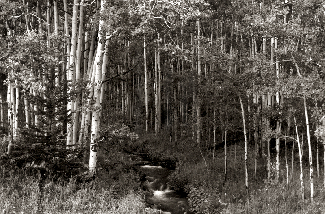
Aspens, Colorado
I’ve snapped a lot of them, although I’ve caught few. Many don’t have the magic and just sit there as noble attempts. It hasn’t just been bare trees. I’ve tried to find the emotion in all kinds of them.
Morning, Obids, NC, Blue Ridge Mountains
The photographer Alfred Stieglitz called the equation between the subject of a picture and the emotions that are evoked “equivalents.” It’s part of the constant fight between the simple depiction of something you can name, and the attempt to make the image stand on its own as an esthetic entity.
It’s what most visual art tries to do: create an equivalent in the limbic system to the shapes, colors, lines, and even the subject matter and its resonance with the personal.
Bainbridge Island, Puget Sound, 1979
Most glossy travel photos are meant to make you wish to be there. But with the image made for display, or as art, you are there, in front of the thing itself. You don’t have to make travel plans. Not just pretty pictures, but objects of contemplation.
Sandro’s oaks, Summerfield, NC, 1980
The point is twofold. First, to make you pay attention to the world around you, to see with intention. And second, to allow you to connect with the emotions you have in potential.
Wise, Va.
Both together they make a single bond: interior and external; you and the world; individual and cosmos. No longer separate.
Over the years, the images I make have become less public and more personal. I no longer pay much heed to the wide acceptance of the art I make. I don’t make it for others, but as a kind of personal meditation.
I seek new ways of making this happen. One morning, while visiting my brother- and sister-in-law in Reidsville, N.C., I saw the shadows of winter branches projected onto the window blinds. It made for a kind of Japanese byōbu screen.
And then, one day last week, in midwinter spring, sempiternally recurring, I was sitting out back, listening to birds and airplanes, the dogs down the street and watching the clouds move west to east and the branches waving in the moving air, and I managed to make an image that finally captures for me the complexity of the abstract, neuronal jumble, all the connections, the scribble and the energy. It is small on your computer screen, but it should be large as a mural.
If I could, I would print it out mural size to cover a wall. Or split it up over several vertical panels, like a Japanese byōbu screen.
But I no longer have means to do that, and so, I just look at it and contemplate.
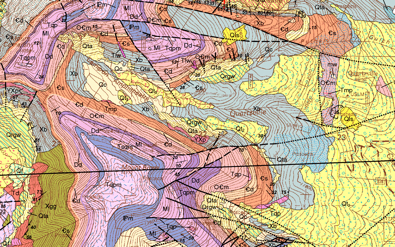
In the TV show, Big Bang Theory, physicist Sheldon Cooper claims that geology “isn’t a real science.” He’s quite a snob about it. But if you unfold any standard geological map — one that outlines the underlying bedrock of any state or county — you will see something so mindbogglingly complex and incomprehensible, that it couldn’t be anything but science.
A geologist is someone who can tell the difference between diorite and andesite, and can measure the schistosity of mica, and explain how seashell fossils came to be found on the top of Mt. Everest. Geologists find petroleum and metals under the earth, and tell us the Earth is 4.6 billion years old. And a good deal of what is written in the field is — much as with quantum physics — well beyond the ken and vocabulary of mere mortals.
They write things such as: “Mass transport deposits (MTDs) occur as intercalations within turbiditic sequences above the ophiolites. They represent syncontractional submarine slides that occurred on frontal accretionary prism slopes during the Late Cretaceous–Paleocene closure of the LPOB.” That, by the way is “Ligurian-Piedmont Ocean Basin,” in case you were confused.
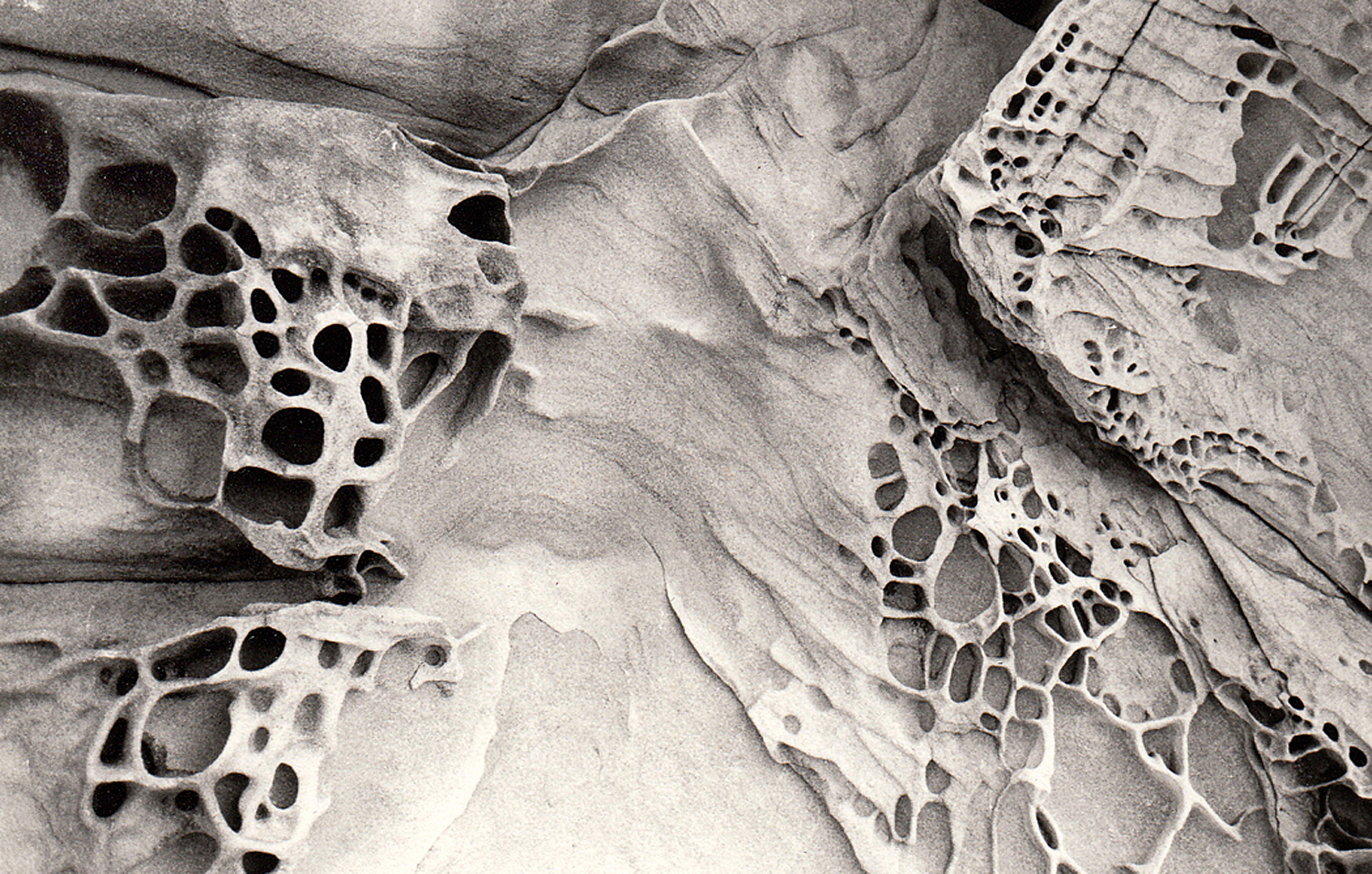
Southern Utah
So, yes, they are scientists. And it’s fun to learn as much as you can, and collect interesting rocks and minerals. But geology is also for poets, artists and cooks. And it is the humanistic aspects of geology that have fascinated me since first studying geology in college.
I read a good deal about geology, including the four books written by John McPhee in the 1980s — although they are about geologists as much as about the rocks they study. They are at the comprehensible boundary between general and specialist knowledge. And you’ll never drive through an interstate highway roadcut the same way again.
Along the Colorado River, Utah
Geology is just everywhere and affects all of our lives not only daily, but even hourly. Think of your car. Every bit of it, save only the rubber in its tires and the fabric or leather of its upholstery, came originally out of the ground. Whether it is the steel of its engine, the platinum in its catalytic converter, the glass in its windshield or the plastic of its dashboard — all dug out of the ground before being polished up and installed on your Hyundai.
And even your tires, these days, are only partially rubber. The rest of it was dug up, too.
The skillet in your kitchen is just a rock that has been processed. The knives, too, and the potato peeler. All just carefully refined stones. In many ways, we still live in the Stone Age; we’re just more sophisticated about it than those guys banging rocks together in the Paleolithic caves.
Paleolithic bison carving
Our human prehistory has been divided into the Paleolithic, Mesolithic and Neolithic. I suggest we now live in the Metalithic Age. (Everything now seems to be “meta.”) We do amazing things with the ore we dredge out of the ground and the petroleum we pump, but the foundation of our civilization is still geology.
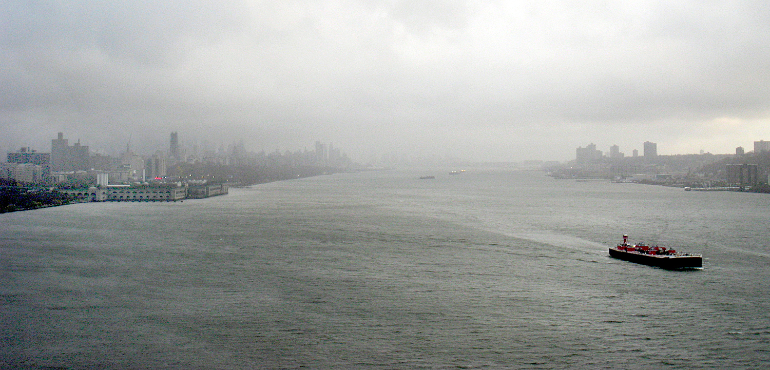
New York on the Hudson River
Cities are the index of civilization and most of the world’s great cities are built on harbors or rivers. The Indus, the Euphrates, the Nile, the Huang Ho. That’s geology. The cities are built with steel and concrete. Geology. Their streets are paved with either concrete or tar and gravel. More geology.
Our food grows in dirt, or grazes on the grasses that sprout from the soil — a soil derived from the bedrock underneath. What are vitamins and minerals but the residue of those same rocks?
Blue Hill, Maine
Geology drives history, too. For instance, because Norway and Greece are so rocky and ungenerous for agriculture, their peoples took to the sea and the Greeks colonized everywhere from Spain to the Black Sea, and the Vikings from Constantinople and Sicily to England and Iceland. Geology kept the Old World and the New from interacting significantly until 1492. It blocked the westward expansion of the British colonies in North America for a century. It is the reason that Afghanistan is the “graveyard of empires.” Plate tectonics — “continental drift” — and the formation of Eurasia as a single east-west landmass has been hypothesized as the cause for European and Asian historical dominance.
Asarco pit mine, Arizona
And geology, in the form of coal mining and petroleum extraction, is the cause of catastrophic climate change and global warming.
Geologist Donald Beaumont wrote, “Geology will, unfortunately, remain an under-recognized, ‘phantom,’ science in that its role in explaining the foundations for human society may never be fully appreciated.”
I’m not making the case that geology explains everything, nor that it is the only thing that made us what we are, but I am saying that it helps explain it, and that you can see the same forces acting out elsewhere in the world.
Olympic Mountains, Washington
It isn’t only physical, it is psychological also. Geology creates emotions. And so artists and poets have used geology to elicit in their audiences certain emotional states — rocky metaphors.
Pleasant Cove, Chuckanut, Wash.
It is to seek this power that great landscape artists — whether painters or photographers — make their pictures. It is not to make a postcard of a pretty piece of scenery, but to find in the land a metaphor for thought, emotion or state of mind — or even a political philosophy.
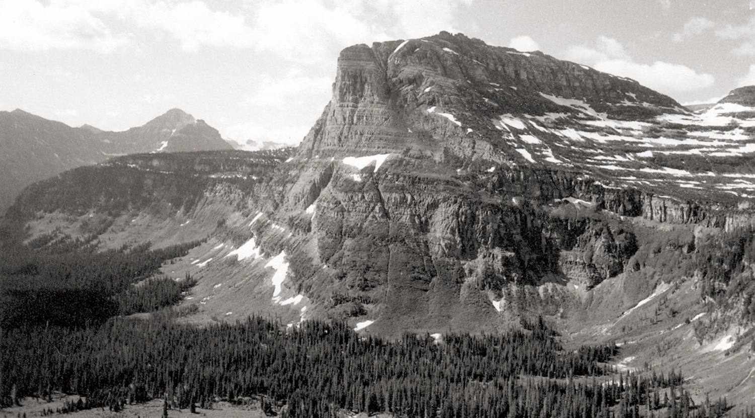
Canadian Rockies, Alberta
That mythic force is why we feel the rise in our throats when we sing of “amber waves of grain,” and “purple mountains majesty above the fruited plain.” Rocks and terrain serve as metaphors for internal states.
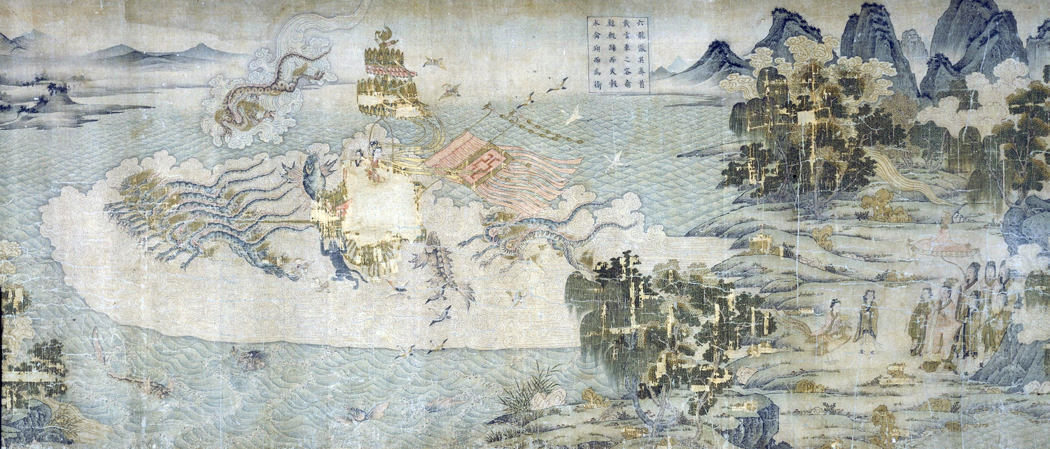
“The Nymphs of the Luo River,” by Gu Kaizhi
European artists have used that metaphor since the Middle Ages, Asian artists since the Jin Dynasty.
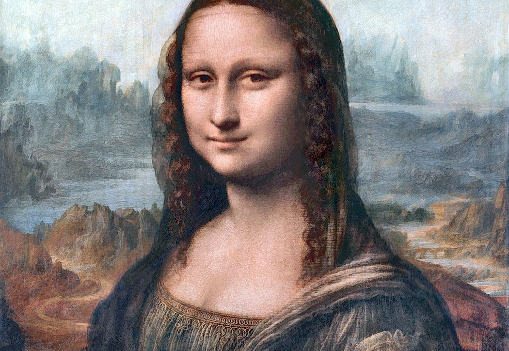
“La Gioconda” detail
Consider the Mona Lisa. Yes, it is a portrait, but behind the smiling lady is a rocky landscape. It is not like anything actually found in Italy, but rather it is a metaphorical landscape — a mountainous desert. Renaissance artists often used such stony views as a reminder that life on earth is a kind of spiritual desert (and the afterlife is where true fulfillment is to be found). As Geoffrey Chaucer wrote: “Here nis noon hoom, here is but wildernesse.”
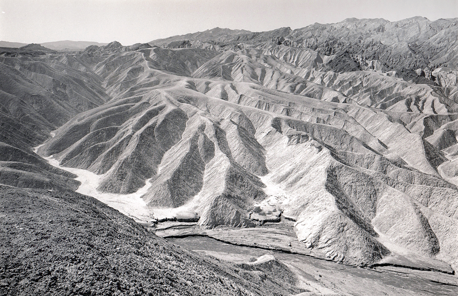
Zabriskie Point, Death Valley, Calif.
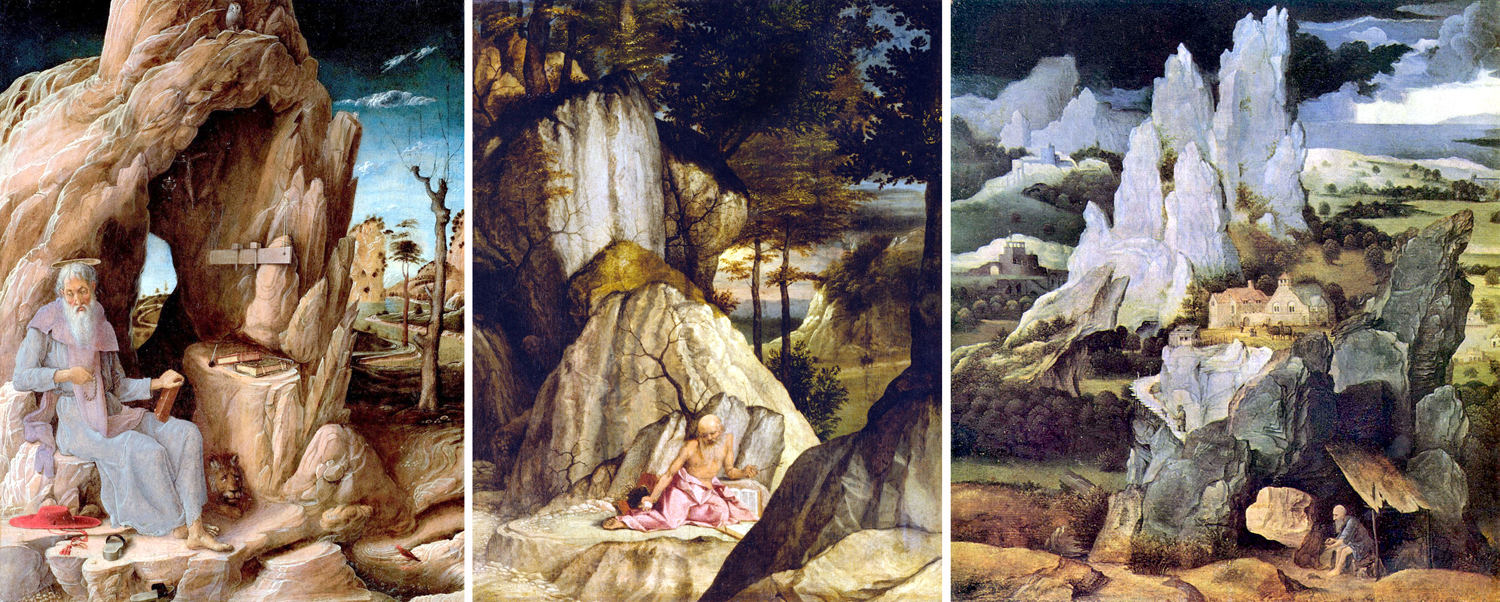
St. Jerome lived in a cave, and painters used the story to show the geology of spiritual isolation. Here are only three of many Renaissance paintings of the saint, by Andrea Mantegna, Lorenzo Lotto, and Joachim Patenier, all from the early 1500s.
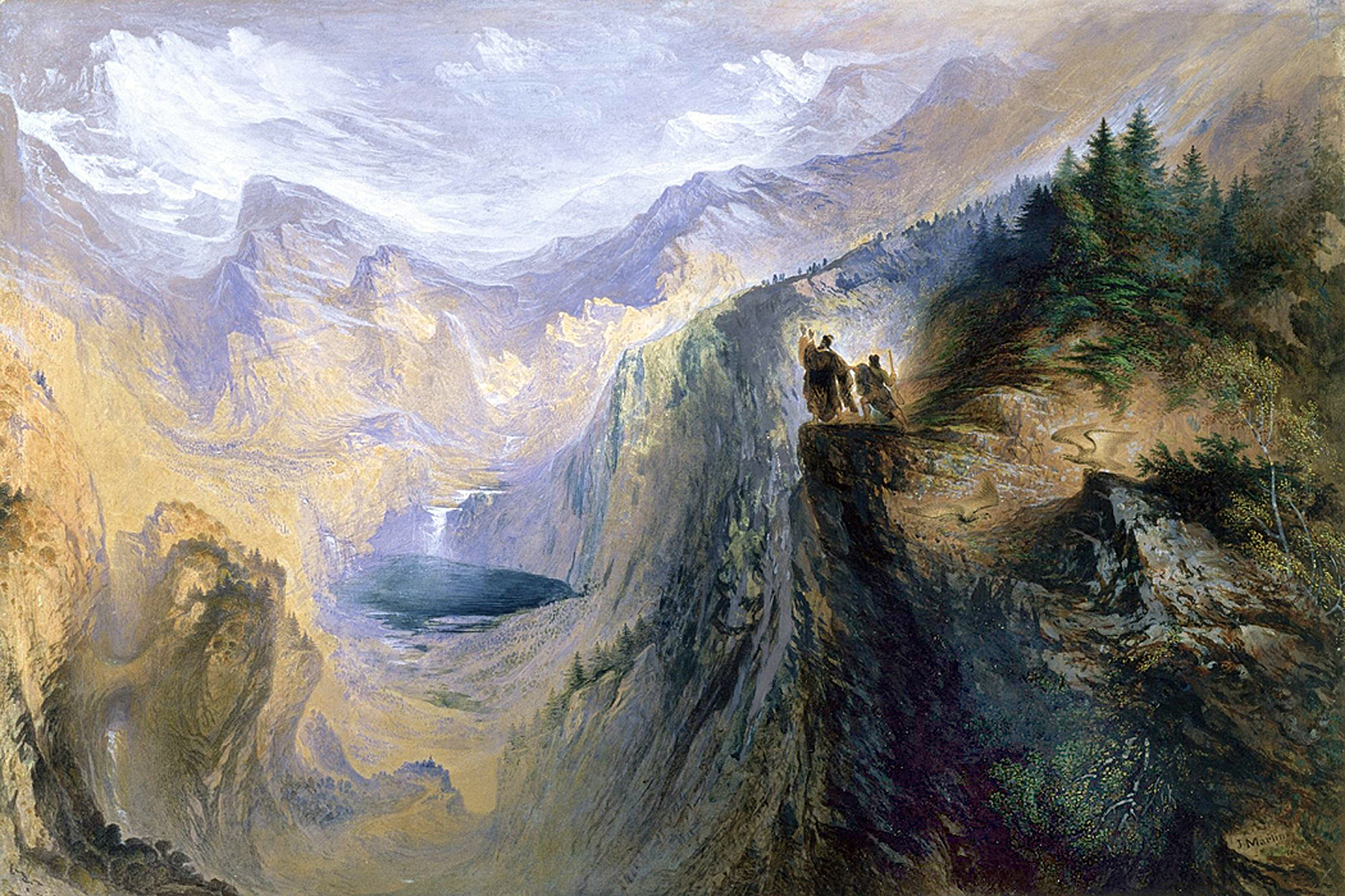
Romantic painters in the 19th century used the vast Alps as a reminder that the cosmos is infinitely larger and more impersonal than we like to believe. Geology becomes an image of The Sublime.
“Manfred on the Jungfrau” by John Martin
Chinese landscape painting features some amazing mountains. I used to believe these scenes were pure fantasy, but no, these mountains actually exist. On porcelain, by Huang Huanwu, a traditional painting — and a photograph, to prove they’re real.
Three paintings and a photo
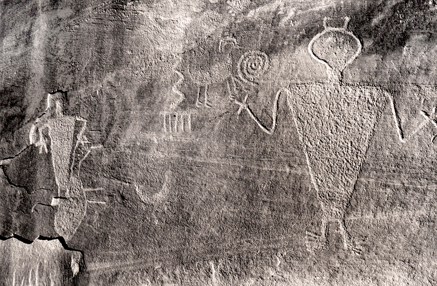
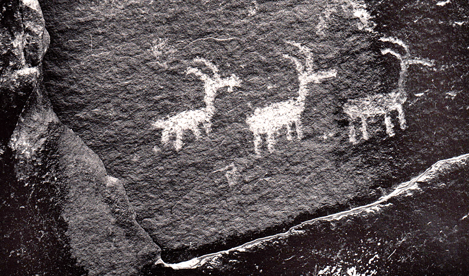
Prehistoric peoples used the rocks for their art, too.
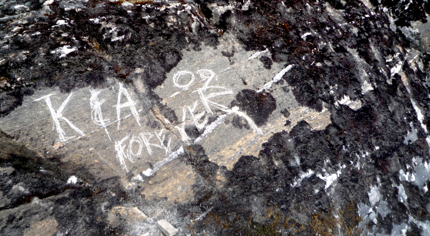
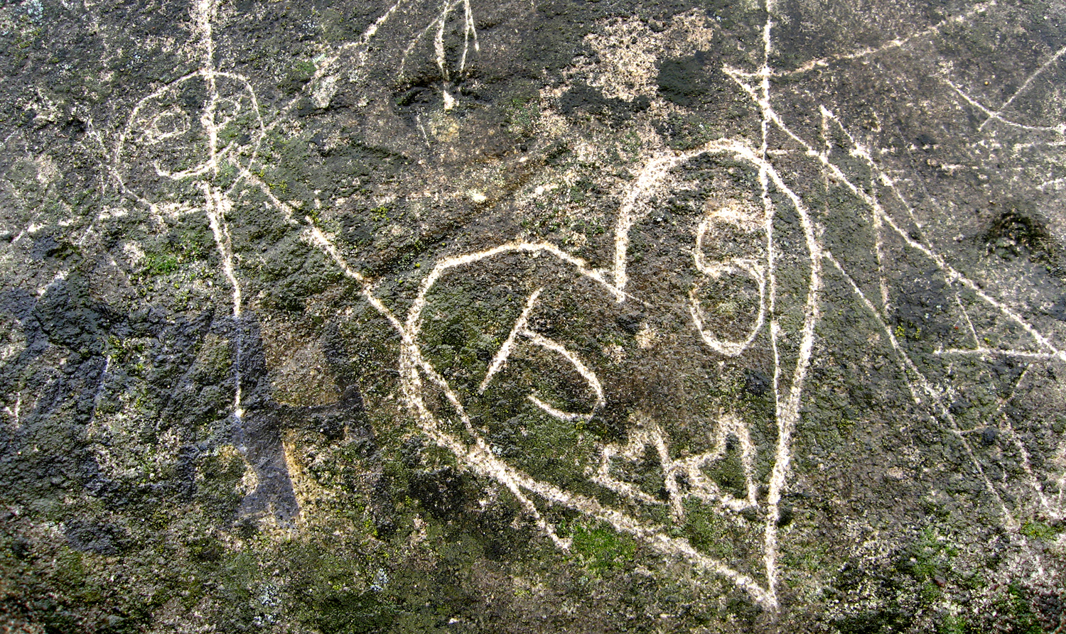
We use stone for permanence. Consider all the marble statuary and granite architecture.
And the way we scrawl our names on rock faces. “K and A Forever.”
The stone is certainly more permanent than the relationship.
Hudson River Palisades, N.J.
Even the pigments that artists use comes from the ground. In the past, it was actually rocks that were ground up and processed. Now, there are pigments also made from petroleum.
Lapis Lazuli
Different rocks, with their colors and textures, evoke different emotions. Think of a brilliant diamond or ruby; think of a cinder. Different emotions.
Mendenhall Glacier, Alaska
We use geology in our language, although often the words mutually exclusive import.
“You must have been stoned when you thought that up.” “No, I was stone cold sober.” “Well, the theory is either a bit rocky or it is rock-solid.” He answered with a stony silence.
Schoodic Point, Maine
The colors, textures and the grain all impart meaning.
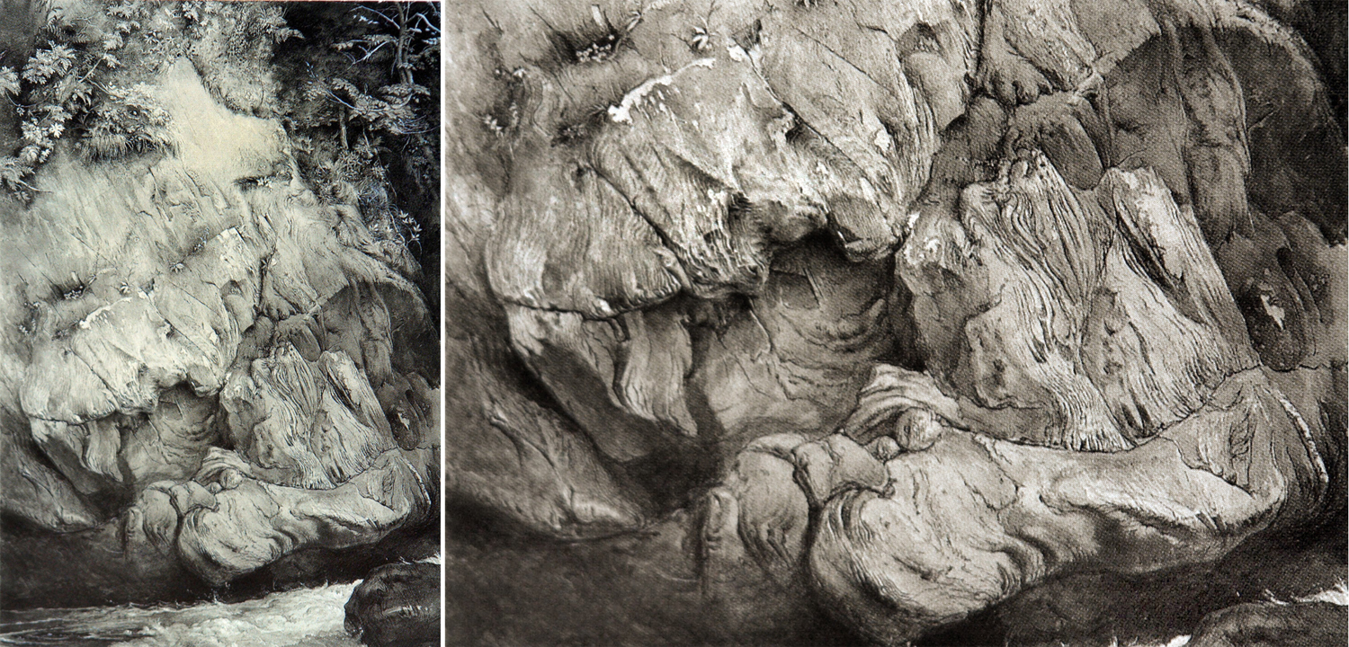
By John Ruskin
I began seriously considering the art elements of geology after seeing a splendid drawing of gneiss by English artist and critic John Ruskin. He made it over several days while visiting Scotland in 1853. The drawing had everything I respond to: texture, detail, close observation and an attention to the world as it is, that is as close to love as is possible to hold for the inanimate world. Ruskin was an astonishing draftsman.
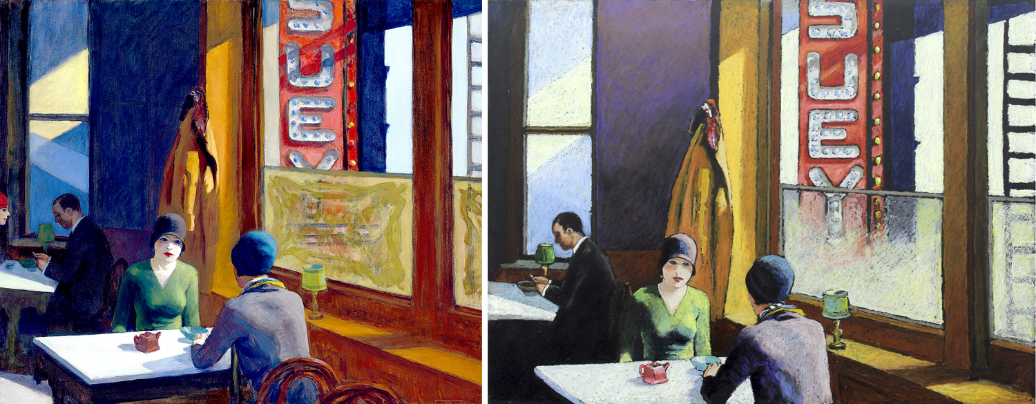
By Mel Steele
It has been one of the lessons of the 20th century and Modernism that meaning in art can transcend anecdote and be more than a story told in a still scene and can impart meaning purely through shape, color, texture, line and scale. Emotions can be evoked by all of them. We have had well more than a hundred years of abstract art.
Even realistic painting depends on the medium it is made from. It isn’t just the face or the scene, but the color and texture of that face and scene.
Craggy Gardens, N.C.
And a camera pointed at the shapes of geology can create meaning in the same manner as the abstract painting we lionize.
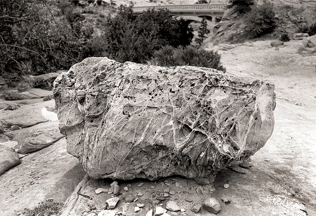
I have since found many rocks, with their esthetic pleasures. There is bright color
Blue Ridge Parkway, N.C.
There is gnarly texture
Blue Ridge Parkway, N.C.
There are planes of surface
Schoodic Point, Maine
Repetition of shapes
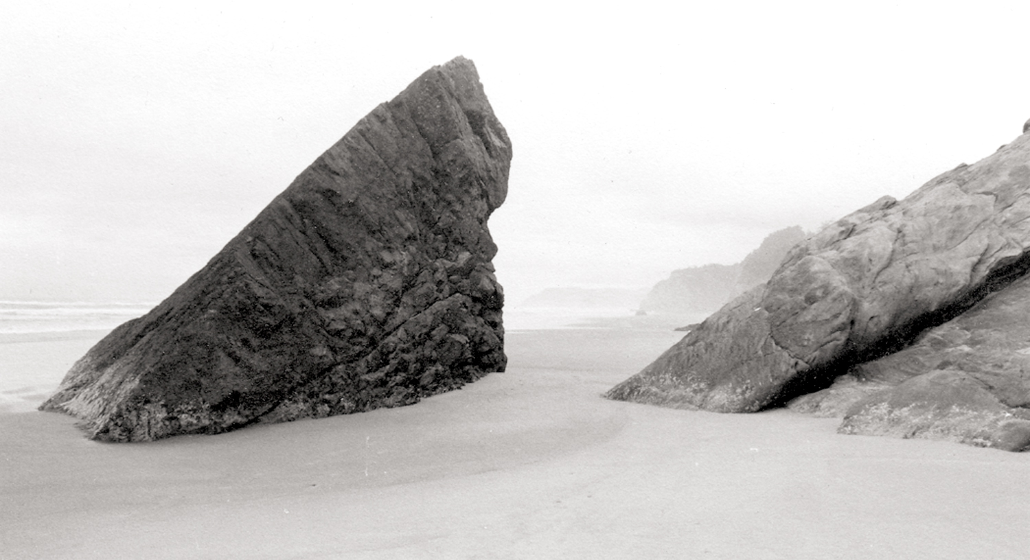
Hug Point, Arch Cape, Ore.
Complexity of image
Schoodic Point, Maine
And a starry night
Pisgah National Forest, NC
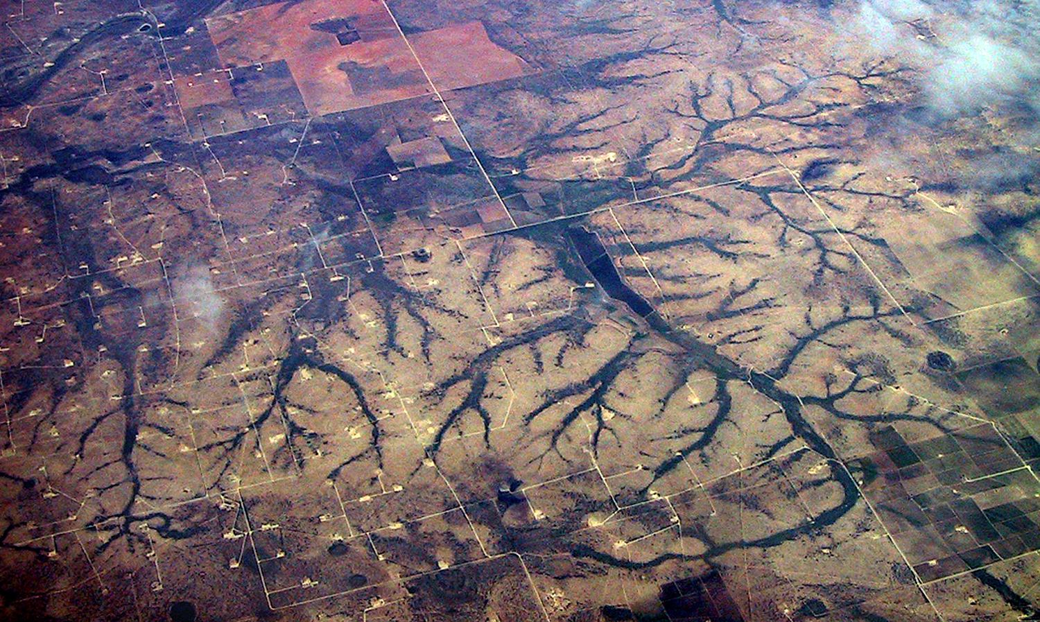
Or flying over the continent and looking down at erosion
Over Colorado
One of the primary functions of art is to make us pay attention. It is an interaction with the world and a response to it.
Rio Puerco Ruins, N.M.
The most important lesson I was ever taught was by a college professor who would not accept glib work. Like many bright students, I was adept at giving a teacher what he or she wanted — basically repeating back what was said in class. But when I did that in my English Romantic Poetry class, he gave me a D for a paper that was otherwise correct in every aspect except one. “Don’t give me back what I’ve said,” he told me. “Engage with the material.” Real engagement cannot be faked.
What was real were the words written, not the words written about the words. Dive directly into the poetry. Don’t waste time learning “about” the poetry.
Try to take the material under study seriously and be real about it. If what you find contradicts what the teacher said, all the better. You’ve learned something.
Engage with the material — something you should do with friends, family, society, even the air and the rocks. Engage. Don’t gloss.
I am within days of turning 78 and I feel my age, slowing down and dealing with new aches daily. I seem to be in reasonably good health, considering. But I don’t know how long I have left, and the length of string in front is clearly shorter than the length trailing behind. I am increasingly aware of mortality.
And I have been considering all the things I have made and written over those piled decades and sometimes wonder why. Nothing will happen to any of it after I’m gone: It will eventually find some landfill somewhere. And part of me is perfectly alright with my life’s effort in words or images being utterly forgotten. Most of what anyone has produced over the millennia is long forgotten, and it’s fine. But I did a few things moderately well, and I can look at it all and note it.
Over the past weeks, I have been spending time trying to consolidate a definitive version of some of the work from over the years. One has a tendency to take the long look and attempt some sort of codification of the evidence of a life lived. And so, I’ve been editing and winnowing.
It is related to the unavoidable sadness one feels, having spent that life learning a huge trove, not merely of facts, but of useful experience — things we never understood as arrogant youths, full of ourselves and dead certain we were smarter than all those benighted generations that gave us birth — and knowing there is no way to impart that accrued experience to the children and grandchildren we love, that they will have to go through all of it again, on their own, and in turn come to rue that they will not be able to keep their own children and grandchildren from the same pains, mistakes and ignorances.
And it will be the same for the physical evidence of that experience — the art and writing. So, I look over a lifetime of production and question to what end?
Even I am astonished at the amount of work put in, a constant chugging away at the production machine, pictures and paragraphs. In 25 years at the newspaper, I wrote more than two-and-a-half million words, and since retiring, I have written another million-and-a-half on this blog — with another 100 essays written for the Spirit of the Senses website in Phoenix, having also given at least a score of well-researched lectures for that salon group. There are also an uncounted number of letters penned, and also both fiction and poetry.
To say nothing of the tens — maybe hundreds — of thousands of photographs I have made.
I have always been this way. I didn’t think about it when I was a boy, but even before first grade, my idea of fun was a pile of paper and a pencil or crayon and I would spend hours drawing. Most kids do that, but most slowly lose the need as they grow up. In high school, I was given access to the darkroom and began making photographs, while also writing for the school newspaper. Always scribble, scribble, scribble. Eh, Mr. Nilsen?
After college, I found work writing, editing and making photos for a Black weekly newspaper, where I pumped out a weekly cooking column and the “Dear Carol” advice to the lovelorn column, in addition to writing the editorials and coming up with the headlines. (My favorite: When the iconic Greensboro, N.C., nightclub closed, I wrote in giant 128 point type, “Cosmos Folds!” Thought it a grand joke.)
In the single month of March of 1980, I wrote 500 pages of letters to friends, on a tiny plastic aqua-colored portable typewriter on a tree-stump “desk” in the back yard. When I finally began work at the daily paper in Phoenix, I averaged about three stories a week. I thought I was being lazy, but apparently I was producing more than most. (At least, that’s what my editors told me).
I would use the word “creating,” but that seems too important for what I was doing. I was producing.
Los, with his forging hammer, by William Blake
There is a character in poet William Blake’s obsessive mythology called Los, and he is one of the four main “gods” of human psychology, and Los spends eternity forging an endless chain. Why he does so is irrelevant: It is what he does. He is defined by it. He produces. It is what I have done: produce.
Many jobs in life call more for other talents. Nurses and doctors, for instance, or office workers who keep the paperwork flowing, or in selling or organizing. The actual creation of something new is not for them the goal. But in my life, like that of Los, all that matters is production. Make. Make. Make. I cannot imagine spending my life without making stuff.
And so, I am going over the thousands of files stored on computer and CD-ROMs and winnowing down what I think has been the better examples, and working on them to create the best or final versions “for posterity,” by which I mean, so I can look at them and contemplate what I have spent my life doing.
I just finished editing the bulk of the portraits I have made, cleaned them up, re-framed some, improved contrast and tone, and come up with a final version. If I were to present a portfolio, these images are what I would offer. I have about 200 such images in the file.
I previously did the same thing for the nudes I took over the years; there were fewer of them and even fewer of those were worth saving.
There have been uncounted thousands, probably tens of thousands, of landscapes I have pointed my camera at. Most are just snapshots — memories of travel — but there are hundreds saved intended as works of art, and shown in gallery exhibits and printed in books
The earlier ones are more clearly derivative, but gave me lots of practice printing in the darkroom, so that I became an excellent printer of silver images. The longer I kept working, the more individual my landscapes became.
Most of my photographic work has been in clear genres, such as portrait, nude, landscape and still life.
One subject that has remained as a visual source of amazement over 50 years of making images are trees. I have thousands of prints of various trees in various seasons and weathers.
And, because of when I grew up — in an era when Abstract Expressionism was king of the hill — I add to those genres a search for abstractions.
And even, non-camera work, where I played with the chemicals and papers to make my abstractions directly in the darkroom.
About 25 years ago, I began making photographs in series — collected in portfolios of between 10 and 20 prints each — made in various gardens, including public gardens and the back yards of friends and family. I must have made scores of these boxes, each with its title, and meant to be understood not as individual images, but as a kind of suite to be taken whole.
And with images made over the course of a few hours, tapping the shutter at whatever caught my eye as deserving its attention.
I expanded the series idea into images I found outside my airliner when flying around the country, a series I titled Window Seat.
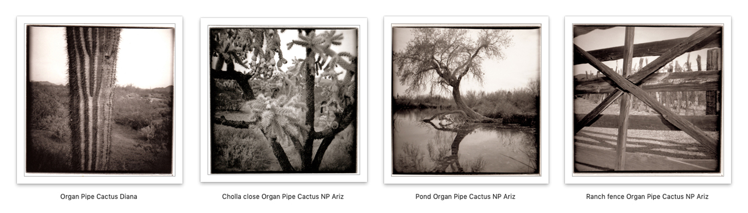
And another using a cheap toy camera (a $2.98 Diana) at Organ Pipe Cactus National Monument in southern Arizona.
And another made from clouds on one particularly stormy afternoon from my back yard in Phoenix, collected in a book titled Monsoon.
Where does all this need to keep creating, keep producing come from? It is just my nature. I can’t help it: It keeps mind and hands busy, engaged, interested, alive.
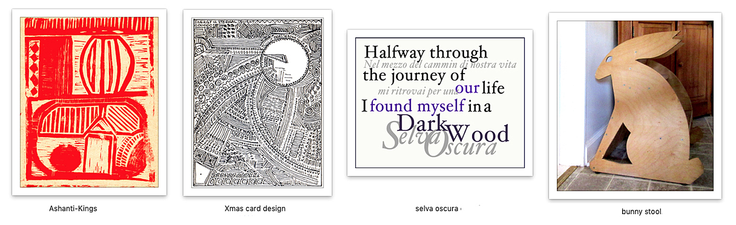
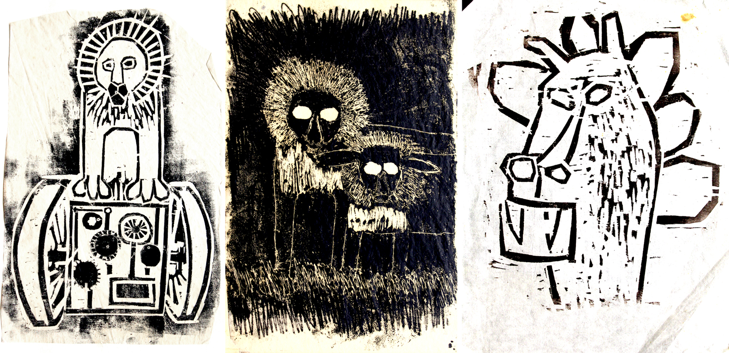
I’ve made linocuts, drawn with pen and ink, played with graphic design, and even, when my wife needed a step-stool for the kitchen, I built one from birch wood in the shape of a jack rabbit.
None of this means I feel especially talented or important, but just that putting things into this world that hadn’t existed before I made them seems as if it is whatever purpose my life has been made for.
When I was newly minted and 20 years old, I thought I would be an artist or poet. It was a goal. But it didn’t take long to give up such an idea. Instead, I began writing and making images. The focus was no longer on my identity, who I thought I was, and more on engaging with the world. Looking outward rather than being stuck with self.
I’ve known plenty of genuine artists; I don’t count myself among them. But I am doing something analogous.
I didn’t care if I was an artist. I was more interested in understanding the world, either visually or conceptually. And not so much understanding as simply experiencing it. I can’t say that self evaporated — I have always had a strong sense of self, as anyone who knows me will admit under muffled giggles. But that it didn’t matter.
And so, a lifetime of making things was not spent in any ambitious attempt at public recognition. I certainly could have written books or sought more gallery shows, but, as comic Steven Wright once put it, “I have ambition, but without the drive.” But I have been driven to use my words and my camera to see better, to connect better, to make objective documents recording what I have seen or learned. Making pictures forces my attention.
So, when I question having spent my life making and producing, and what it was worth, the obvious answer is not in the rewards of having made, but in the immediate doing. The meaning is in the act.
I want to put in a good word for TV sitcoms. They don’t get much respect. And it is true that many of them are routine, uninspired and forgettable. “Chewing gum for the eyes.” But the genre as a whole has both a long history (longer than you may suspect), and a significant role to play in the arts. Yes, the arts.
What we call art is a lot of things, and serves many purposes, but one thing all art, whether painting, music, theater or literature, is asked to do is entertain. There are different levels of entertainment, but even Joyce’s Ulysses or Berg’s Lulu offer an underlying level of amusement.
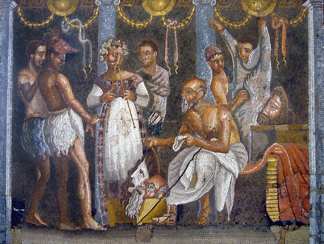
Comedy players, Mosaic from Pompeii
Some offer much more, but the base line of keeping us interested has been there from the earliest times we have record of. And much of it even fills university courses. We study Plautus and Terrence — among the earliest sitcom writers (Rome, 6th century BC), with plays full of dirty old men, unfaithful wives, clever slaves, mistaken identities and love-struck young men.
There are few actual characters in such plays, and a great panoply of stock figures. These kinds of figures, stuck in difficult and comic situations, populate the works of Italian commedia dell’arte, the comedies of Molière, and the plays of Shakespeare (who would sometimes borrow from Plautus and Terrence). Victorian novels — by Dickens, Trollope, Thackeray — now treated as literature, were at the time serialized in popular magazines and thought of much the same as we now consume TV shows. And all now deemed worth of academic study and even reverence.
So, why not the same for All in the Family or The Honeymooners? Are they any “lower” an art form than The Twin Menaechmi? Or The Braggart Soldier?
Remember, Shakespeare’s audience included the uneducated groundlings; he wrote also for them. And he was not above the traditional fart joke. It ain’t all Seneca and Henry James.
I am roughly the same age as television, and have watched the sitcom from its earliest TV days. I was one year old when The Goldbergs switched from radio to television (“Yoo-Hoo, Mrs. Bloom…”). There was The Aldrich Family from 1949 to 1953 (“Henry! Henry Aldrich!” “Coming, Mother.”), and the first season of The Life of Riley, with Jackie Gleason originally taking over the title role from William Bendix, who had played the part on radio (“What a revoltin’ development this is”). Bendix took back the role for the rest of the series run. I don’t know how old I might have been when I first started watching these series. Probably in my playpen watching the images wiggle on the 12-inch screen of a Dumont television.
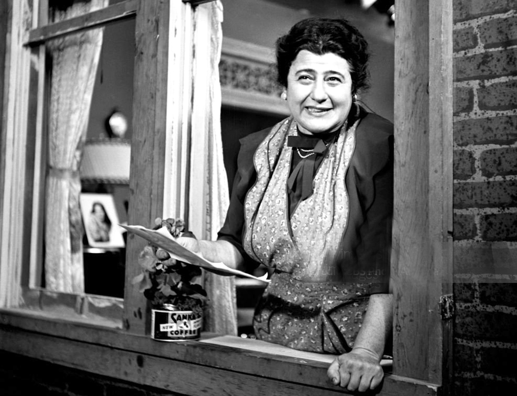
The 1950s brought the onslaught and the sitcom became a staple of the boob tube. These series I remember quite well: Beulah; The Bob Cummings Show; The George Burns and Gracie Allen Show (the first Postmodern show, where George could watch what Gracie was planning on his own TV screen and comment to the audience); December Bride; I Married Joan; Private Secretary; Mister Peepers.
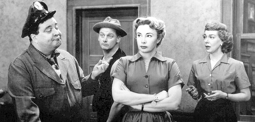
I haven’t mentioned the three most important shows of the time. The Honeymooners emerged as a sometime skit on Cavalcade of Stars, the Jackie Gleason variety show on the Dumont network, sometimes taking up most of the run time. But in 1955, the skit was spun off into a half-hour sitcom for 39 episodes, still run in syndication on various cable channels. (“To the moon, Alice”).
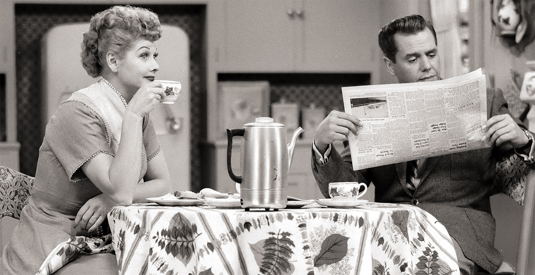
I Love Lucy ran from 1951 to 1957 and pioneered the three-camera filmed sitcom with live audience and laugh track. For its entire run, it ranked No. 1, No. 2, or No. 3 in the ratings. (I have to confess, contrary to the majority opinion, I never found Lucy very funny. Watching reruns, I still don’t). Those reruns can still be found in syndication on cable.
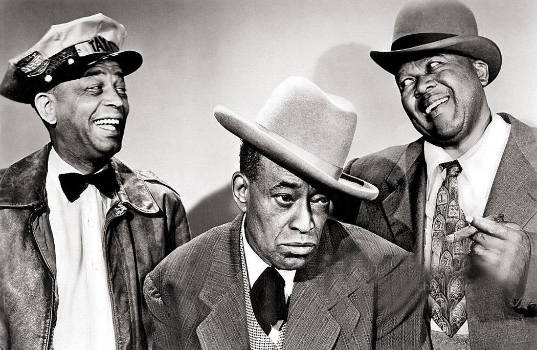
Alvin Childress, Tim Moore, Spencer Williams
But you won’t find Amos ’n’ Andy. It was enormously popular from 1951 to 1953. But reaction to the racial stereotypes changed markedly during the rise of the Civil Rights movement. It would be hard to complain about the series cancellation. In the context of its times, it was deserved. It can be hard to watch nowadays. But I have seen all 78 episodes on bootleg DVDs and must admit we have lost some brilliant comic performances, especially by ex-vaudevillian Tim Moore as the Kingfish. Yes, there are some awful stereotypes, but not everyone was shufflin’ and grifting. Amos was an upright citizen and family man, and the series showed quite a few Black doctors and judges, all horrified at the shenanigans of the series stars.
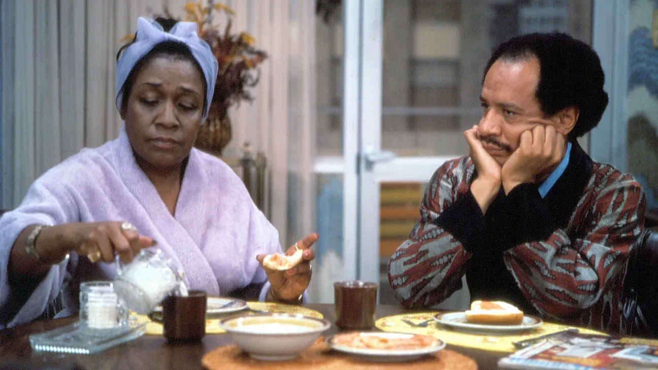
And it should be pointed out that most sitcoms, Black, white or otherwise, focus on less-than-admirable characters. Let’s face it, bland Ward Cleaver does not support a TV series. You need Archie Bunker, Ralph Kramden, or Larry David. Something out of the norm, but exaggerated. Getting past the particulars of Amos ’n’ Andy, basically the same stereotypes come back later as George Jefferson or J.J. in Good Times (“Dyn-O-Mite”) or Redd Foxx in Sanford and Son. Same caricatures, different generation.
I’m not suggesting we forgive Amos ’n’ Andy, but rather to see it in context, and recognize the talent that went into it.
The fact that even Millennials know who Lucy Ricardo was, or Ralph Kramden or Rob and Laura Petrie, means that some of the hundreds of sitcoms that have aired, from the last century and this, have a cultural staying power, very like the classics we read at university.
The foundational stereotypes — or archetypes — have persisted, too. How many sitcoms feature bumbling husbands, from Chester A. Riley and Ozzie Nelson to Curb Your Enthusiasm and The King of Queens? Conversely, the trope of the ditzy wife, from Gracie Allen to Married … With Children to The Middle? Mothers-in-law are a perennial butt of jokes, as are clueless bosses and gay best friends. They each provide a predictable set of familiar and comfortable jokes. (Although the limits of comfort can and have changed over time: Blonde and Polish jokes haven’t worn as well).
And most of these are just modern changes rung on the characters of the commedia dell’arte. Harlequin, Colombina, Pantalone, Pulcinella, Zanni and the lot. We aren’t looking for fully rounded characters so much as familiar types to build plots and gags around — the “situations” in situation comedies.
So, the sitcom has a long history. And I have a long history with them. And I have divided them into four roughly defined groups. The borders of these groups may be squishy — you may parse them differently — but the categories are defensible.
First, there are those that have had an effect on culture broadly. They tend to be the best written and acted, but they have wormed their way into the general consciousness. Class A includes I Love Lucy (my qualms not withstanding), The Honeymooners, All In the Family, The Mary Tyler Moore Show, M*A*S*H, Murphy Brown, The Office (American version), Seinfeld, Roseanne, Curb Your Enthusiasm, and The Cosby Show (which now is hard to watch — both hard to find and hard to endure, knowing what we now know). And I would include both The Big Bang Theory and Young Sheldon. Class acts all the way.
But I would include also: Taxi, Barney Miller, Dick Van Dyke, Cheers, The Bob Newhart Show (the original one), and a few that I never warmed to, but still have a cultural significance, like Friends and Married… With Children. All are or have been in the national conversation.
I should also include a few British series that have had an impact, mainly Fawlty Towers, the British Office, and Absolutely Fabulous.
Class B includes all the quality shows that came and went, with funny characters and solid jokes, but never buried into the Zeitgeist in quite the same way. All solid entries. You can add quite a few to this list and it will depend on your taste and funny bone. I would include: 3rd Rock From the Sun; Black-ish; Brooklyn Nine-Nine; Frasier; Golden Girls; The Good Place (should be in Class A, but not enough people watched); Happy Days; Malcolm in the Middle; The Middle; Mike & Molly; Modern Family; The New Adventures of Old Christine; Parks and Recreation; Scrubs; Two and a Half Men; Veep; WKRP in Cincinnati; and your choice of others. Among my favorites are Mom, Night Court, Reno 911. Individual taste may vary. (I have not included many of the old shows from the ’50s and ’60s that few people have had a chance to see: My Little Margie, Private Secretary; Topper.)
The next rung down, in Class C are the workaday shows, sometimes OK time-wasters, but full of cliched characters and tired jokes — the kind that have the familiar form of jokes, but seldom the wit or laughs. Writing on autopilot. This is the vast majority of TV sitcom bulk. The roughage and fiber of the viewing diet.
When we watch these, it is often more out of habit than desire. The forms are familiar and the laugh track tells us when a joke has passed by. Did anyone ever think The Munsters was prime comedy? or Gilligan’s Island? McHale’s Navy? Saved by the Bell? Mediocrity incarnate. Hogan’s Heroes? I could name a hundred, propelled by laugh tracks and the need of writers to fill air time. Networks toss them on the screen, hoping they’ll stick. Some do, but only because they are gluey.
Wikipedia lists hundreds of sitcom titles and I would guess some 75 percent of them fall into Class C. At least half of those are gone in a single season, un-renewed, or cancelled after a few goes. The rest stick around because they are not overly offensive. They may feature actors we like, even if they have to spout insipid dialog.
Bewitched; The Brady Bunch; Chico and the Man; Community; Ellen; F Troop; The Facts of Life; The Flying Nun; I Dream of Jeannie; Last Man Standing; The Monkees; Perfect Strangers; That ’70s Show; Who’s the Boss? Go ahead: Make a case for any of them. Tube fodder.
Three’s Company is the epitome of Class C, although my son, deeply knowledgeable in the ways of film and media, assures me it is a classic. He loves it. De gustibus.
Then, there is the bottom feeding Class D, those shows so bad they have become legend. My Mother the Car is the type specimen for this class. A series only a studio executive high on cocaine and bourbon, and distracted by facing an expensive divorce and maybe a teenage son in jail could have green-lighted. Quite a few of these were meant to be vehicles for aging film stars given their own sitcom series. The Doris Day Show, The Debbie Reynolds Show, The Tammy Grimes Show, Mickey (with Mickey Rooney), The Paul Lynde Show (in which he is an attorney and family man), Wendy and Me (with George Burns and Connie Stevens), Shirley’s World (Shirley MacLaine as a photojournalist), and The Bing Crosby Show. Most of these didn’t make it past the first season.
Also at the dismal bottom: Hello Larry, New Monkees, She’s the Sheriff, The Trouble with Larry (“not just not funny, but actively depressing”), Cavemen, Homeboys in Outer Space, The Ropers. Most cancelled after one season.
In England, Heil, Honey, I’m Home with Adolf and Eva never made it past the first episode. (currently unavailable on streaming or disk. Too soon?).
Among the abject failures are most of the American remakes of popular British comedies. Many of them never made it past the pilot stage.
And so, you have four general classes of television sitcoms. The best worthy of saving for future generations, the worst best left for whatever is the digital version of the bottom of the canary cage.
The past wasn’t so different. What we remember of classical Roman comedy are what is extant. Much isn’t. A good deal of it was probably just as banal as most bad TV. We don’t know: It didn’t survive. The Victorian novel was largely a serial enterprise, like seasons of a sitcom, weekly chapters published. But for each Dickens or Trollope, there were dozens, maybe hundreds of lesser works now mostly forgotten. In time, we will no doubt continue winnowing the TV past, saving the Norman Lears and perhaps the Chuck Lorres and ranking them as our Plautus and Terrence. Perhaps.
In 1494, at the age of 23, after years of apprenticeship as an artist in Nuremberg, Albrecht Dürer left Germany to visit Venice and Italy and find out what all the Hoohah was about. He was amazed at what he saw and when he returned home to Germany, he brought the Italian Renaissance with him. He went back south for seconds in 1505 and stayed for over a year, soaking up the influences. It was what he had to do if he wanted to see what the Big Boys were doing.
If you wanted to see, you had to travel. There were no full-color coffeetable art books to thumb through. If you wanted to see the work of Bellini, you had to go to Venice; for Raphael, to Rome.
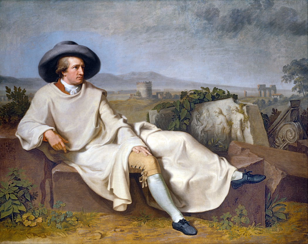
“Goethe in Italy” by Johann Heinrich Wilhelm Tischbein, 1786
In 1786, Johann Wolfgang von Goethe, then age 37, made the trip, this time to see the Roman and Greek sculpture that had been so highly praised in the work of Johann Joachim Winckelmann. He stayed until 1788, studying more than the statues, including many statuesque young women, which he later wrote about in his book of poetry, Roman Elegies.
For most of history — until improvements in color printing in the middle of the 20th century — the only way to see famous art was to leave home and go there. Yes, there were engraved black and white copies published, and later monochrome halftones, but you could not really get a sense of Rembrandt or Titian without traveling.
It gave rise in 17th century to the practice of upper-class families sending their sons on the “Grand Tour” to become educated and cultured. From the 1600s to about the middle of the 19th century, it was common for well-off young men to take a “gap year” — or two — to visit the Continent and see the sights and become men of the world before taking up their roles in government or business. Of course, many of these youths were more attracted to the live demoiselles and regazze than to the canvas madonnas.
“Rose,” Philbert-Louis Debucourt 1788
It wasn’t just visual art. Before recordings, if you wanted to hear a Beethoven symphony, you had to attend a live concert. If you lived outside the city, you had to travel to get to the concert hall. Bach famously walked 280 miles from Arnstadt to Lübeck in order to hear Buxtehude play the organ. Even to hear now-famous symphonies and concertos you likely had to wait years between programmed performances. You might be lucky to have heard Beethoven’s Fifth once or twice in your life. Now, it seems, you can’t get away from it.
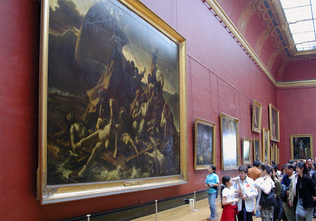
Today, when you can own 30 different CDs of the Beethoven symphonies and have your choice from Furtwangler to Norrington; you can fill your bookshelves with illustrated volumes of any artist you want; and watch endless YouTube videos about the Mona Lisa, it is important to remember that they are not the actual experience of the art in question, but varyingly faithful simulacra. You still need the real thing. A three-inch color plate of Gericault’s Raft of the Medusa cannot replicate the experience of seeing the real thing.
And so, we go to museums and galleries to get to know the art that is our cultural inheritance. Even today people travel across the world to see some of the world’s most famous art. The Grand Tour still exists, if only in ghost form, as a gap year or a summer abroad. My granddaughter had her high school summer in Italy. The traditions continue. Such travel affords an education that books just cannot give.
In the 1960s, I accompanied my grandmother when she went back to the Old Country for the first time since she was five years old. We went to the village where she was born, Mosby, in southern Norway, and as part of that trip, I was sent on a (literal) Cook’s tour of Western Europe, taking in Germany, the Netherlands, Belgium, Luxembourg and France. I saw the Cologne cathedral, Notre Dame de Paris, Ste. Chapelle and the Louvre, among other things. Mostly, it made suburban New Jersey seem even more banal.
Met; Guggenheim; Frick; Whitney; Cloisters; MoMA
But then, I tried to escape the Garden State as much as possible. I was lucky: I had my own Grand Tour just a few miles away. During my own high school years, living on the Jersey side of the George Washington Bridge, I spent as much time as I could in Manhattan, going to concerts and visiting all the museums: The Met, the Guggenheim, the Frick, the Whitney, the Cloisters, the Asia Society, even the long-gone Huntington Hartford Gallery of Modern Art on Columbus Circle.
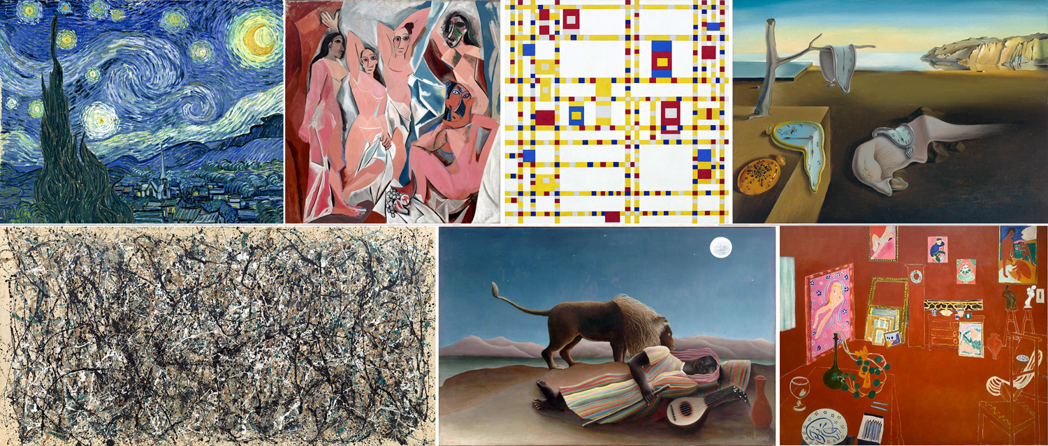
And most of all — the Museum of Modern Art, where I felt most at home. I came to know many famous paintings as old friends. Van Gogh’s Starry Night; Matisse’s L’Atelier Rouge; Picasso’s Demoiselles d’Avignon; Pollock’s One Number 31; Mondrian’s Broadway Boogie-Woogie; Henri Rousseau’s Sleeping Gypsy; Dali’s Persistence of Memory — all proper blue-chip Modern Art landmarks.
After I went away to college, I frequently made the trip to Washington, D.C., to visit the National Gallery of Art, and later, the Hirschhorn and Corcoran. I ate up art like a starving man. It’s hardly surprising that I later made my career as an art critic.
And working for the newspaper, I was sent around the country for major exhibits in Boston, New York, Chicago, LA, San Francisco, Seattle, Philadelphia. I was even sent to South Africa in 1989 to study the art scene there. And vacations brought me and my wife to France many times. Seeing as much as possible and finding troves of art in even small corners of the Continent.
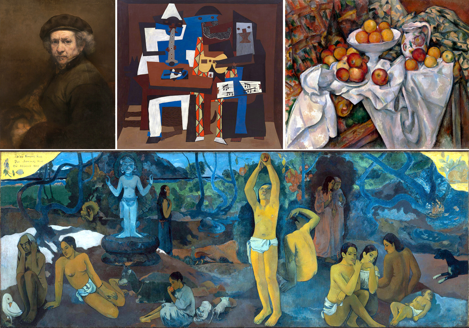
There have been dozens of important artworks I have been grateful to have known, not just in reproduction, but live, in front of my own eyes. My inner life is infinitely enriched by the experiences. There are many I could name, from Rembrandt’s self portrait in DC to Gauguin’s Where Do We Come From? What Art We? Where Are We Going? from Boston, but I need to pick out at least these six as central to my understanding of art, and of life.
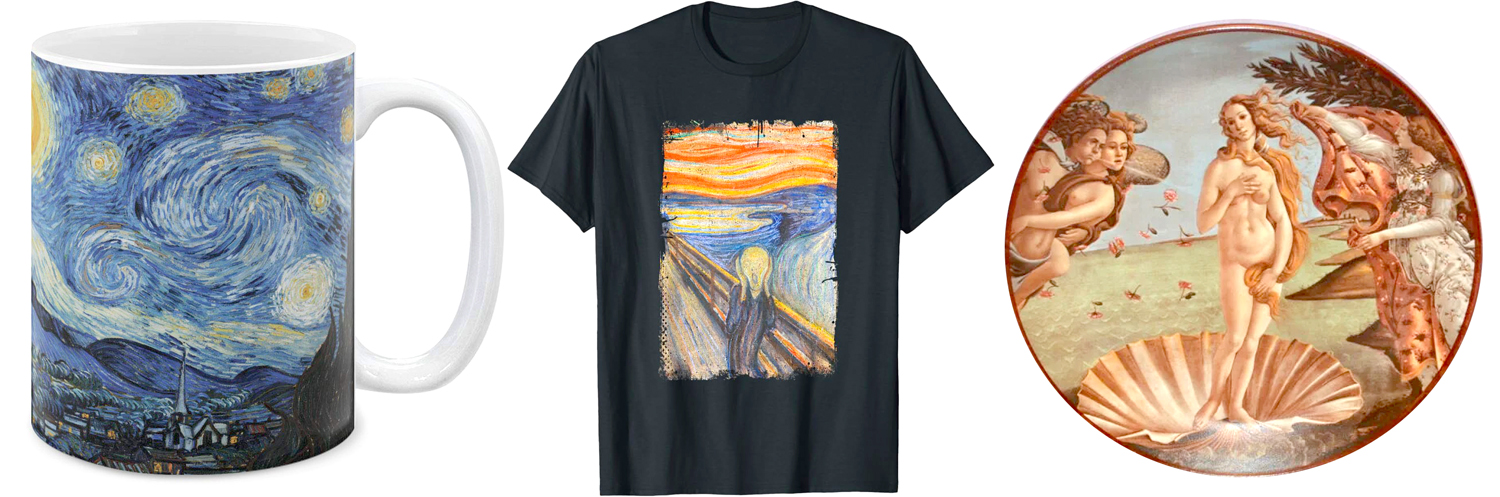
When you know works from reproduction, you cannot feel their size, cannot know the precise colors and pigments used, cannot grasp their tactile surfaces. Some of the most famous art in the world is known to most people by their reproduction on coffee mugs, T-shirts or commemorative plates. What you think is art is really just iconography — the nameable subject matter. The actuality, the physicality of the work is irrelevant in such cases. Seeing the original can then be a revelation.
So here are the six works that have meant the most to me, that I am most grateful for having been able to know personally.
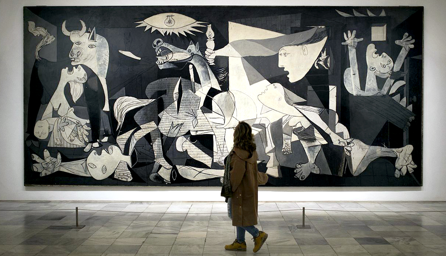
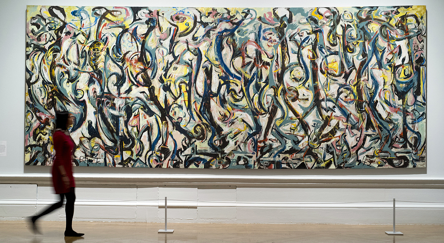
Picasso, Guernica — When I was growing up, this, perhaps the greatest painting of the 20th century, was sitting in the Museum of Modern Art in Manhattan, and I visited it often. As a teenager, I knew it was “important,” because I had seen it in books and magazines. But I thought of it as “mine,” because I knew it would always be there for me. Alas, in 1981, it was repatriated to Spain, where, I have to admit, it belongs. An old friend moved away. It was the first important artwork that I had what felt like a personal relationship with.
Jackson Pollock, Blue Poles — In reverse, Blue Poles is a painting that came to New York for me. Pollock’s 16-foot drip painting from 1952 was auctioned off from a private collection in 1973 and sent to Australia. I loved many of the great Pollocks from MoMA and the Met, but thought I had lost the chance forever to see perhaps his most famous work. But a retrospective Pollock exhibit in 1998 at MoMA brought it back temporarily to the Big Apple. I got to see it there, where it was the jewel-lit highlight of the last gallery.
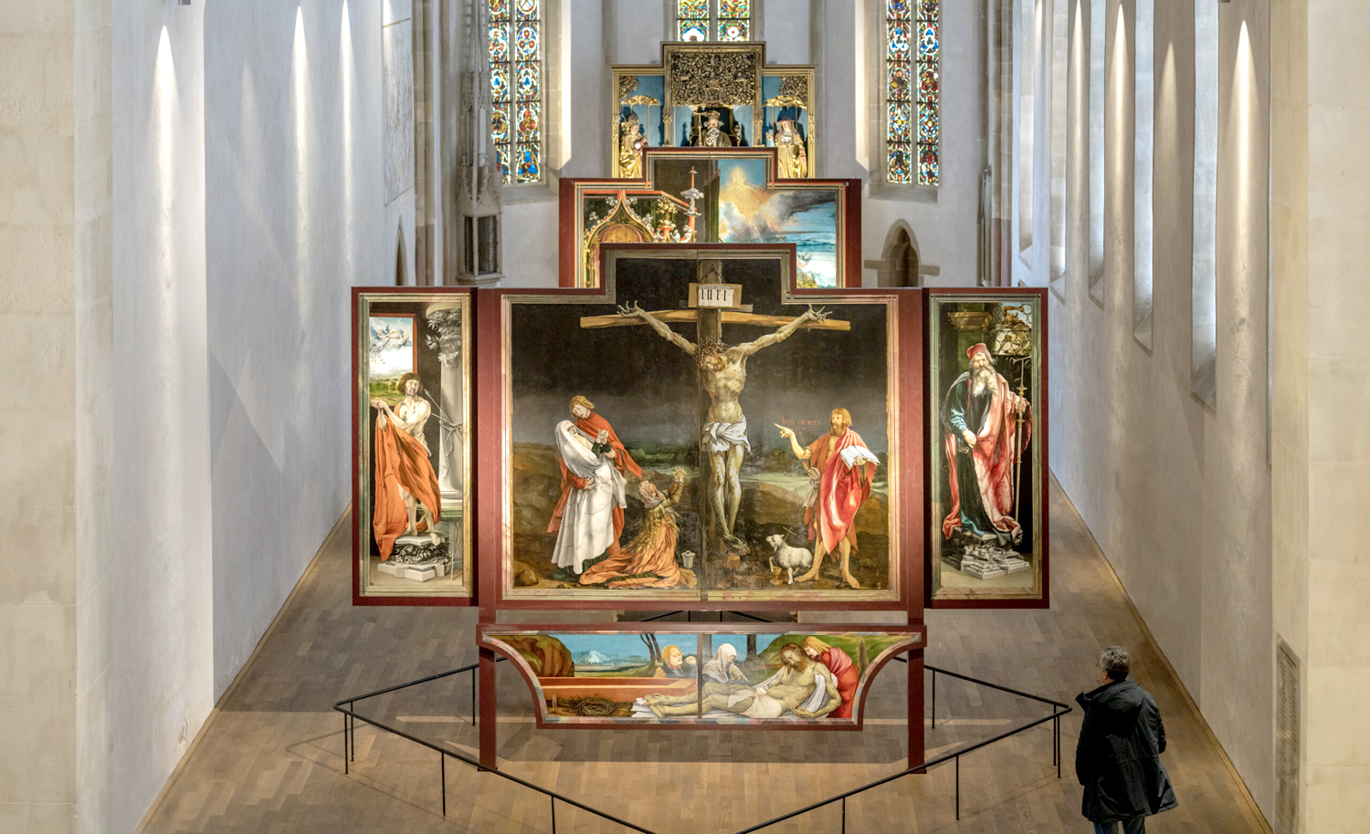
Grünewald, Isenheim Altarpiece — The giant altarpiece comprises 10 paintings by Matthias Grünewald, including the pathos-laden crucifixion as its centerpiece, and a group of polychrome wood sculptures by Nikolaus Hagenauer, executed between 1512 and 1516. It sits in the Unterlinden Museum in Colmar, Alsace, France. The altarpiece was designed to be either closed or open, with various panels showing at different times in the Catholic calendar. I have no stake in the religious significance, I cannot help but be overwhelmed by the pathos and power of the work.
Lascaux II — The cave paintings at Lascaux, France, date from about 20,000 years ago. They were discovered in 1963 and include about 600 images of prehistoric animals. The caves have been closed since 1963 to protect them, but a copy has been made and open to the public. I never thought I would get to experience them, but I got to visit both the reproduced experience at Lascaux II, but also the genuine cave art at nearby Font-de-Gaume. Seeing the original art there threw my spine into a buzz of uncanny deep-time — a state not rational but limbic.
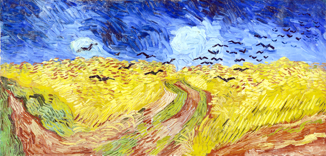
Van Gogh, Wheatfield with Crows — In 1999 the LA County Museum of Art mounted a 70-piece show of the paintings of Van Gogh from the Van Gogh Museum in Amsterdam, including many of his most famous works. My job got me sent to cover the exhibit and I was blown over by the works (also, astonished at how amateurish and awful many of his early works were: It took a while for Van Gogh to become Van Gogh).
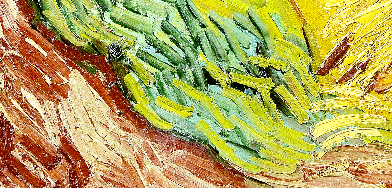
One of the last paintings in the last gallery was Wheatfield with Crows and up close you could see who wild and feverish the artist’s brushstrokes were, and what colors sat on his pallete, left largely unblended on the canvas.
North Rose Window, Chartres Cathedral — I have been back to Chartres many times, and each visit, I spend a half hour, at least, sitting in the transept staring at the North Rose Window. It is, as I have said many times, the single most beautiful man-made creation I have ever seen. It is transcendent, a glowing object of meditation, whose shapes seem to move, to dance around the centerpoint. I am awe blasted. It almost makes up of all the misery, suffering and death human beings cause to each other.
This is, of course, a limited selection. Before writing, I made a list of paintings, sculptures, plays, operas, architecture, poems, novels — I could just make a list of the types of art that would already be too long to include in a single blog entry. Narrowing down to visual arts still left me with too many things to write about — hence my squeezing it all into only six works. (It tried to make a conventional 5, but I already feel bad about only including six.)
Seeing all this art and lamenting all that I never had a chance to see, only reinforced my sense that art is not just what makes us human, but how it makes us human.
I was talking with my very Southern wife about how those brought up down here have a stronger connection to the land than us Yankees. Southerners have often lived on the same patch of land for generations and their sense of identity can course back through great-grandparents and beyond. Your sense of who you are includes the centuries before you were born. New Jersey never gave me that.
But I do have that same sense when looking at the paintings or hearing the music of the past. This all gave birth to me; it is who I am. We too often think of culture in terms of hoity-toity high culture. But really, culture is all the things that have accumulated over time to make the lives we now take for granted.
When I see or hear the so-called canonical works of Western culture, I have that sense of belonging to a long, continuous line. It speaks to me; it tells me who I am.
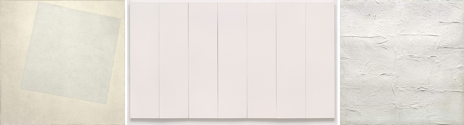
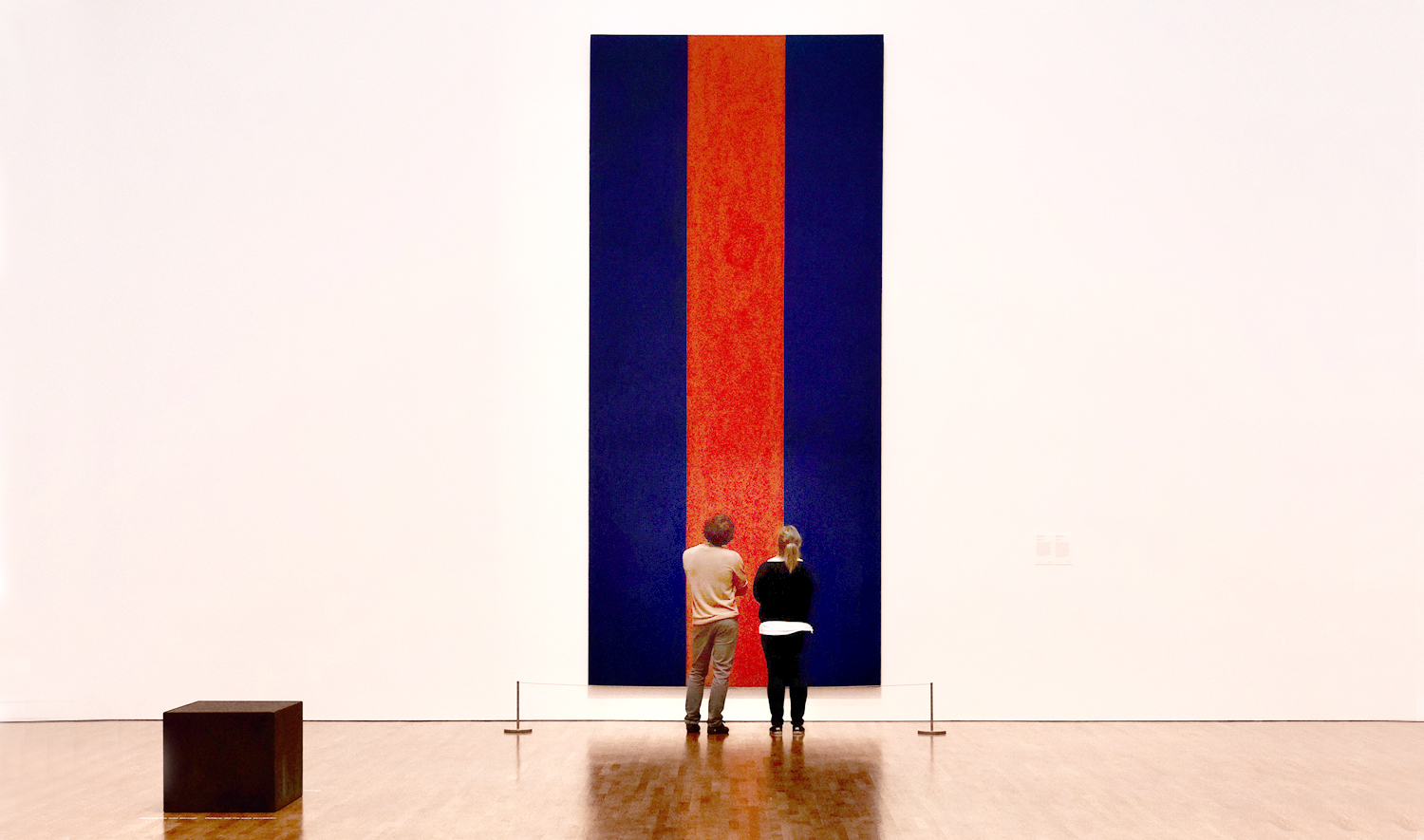
Artist Robert Ryman (1930-2019) made a career with his white paintings. Over and over, he applied white paint to canvas, paper, or board, always with some degree of change in application or tint or texture or shape.
Two years before his death, he donated 21 of his pieces to the Dia Art Foundation in New York. Before its closing in 2014, the Hallen für Neue Kunst in Schaffhausen, Switzerland, had a collection of 29 Ryman white paintings. So, there have been a lot of them.
Three Rymans, L-R: from 1959; 1962; 2012
His work has been accepted into many museum collections, but there has been a backlash.
“Aspects of Ryman’s work definitely stink of seeing what he could get away with,” wrote one critic. Another said, “Ryman is the undisputed master of showing precisely which part of the wall you are supposed to stare at.”
Robert Ryman
There seems to be a widely held belief in the general public that a good portion of art being made these days is a sneaky attempt by artists to put something over on them. That art — at least that art being sold for millions at auction — is a scam. And that artists are hucksters laughing at us all meanwhile getting rich as Scrooge McDuck through our collective gullibility.
“A literal blank canvas? That could symbolize the artist’s emptiness.” And, of course, “If my 5-year-old could do that with his eyes closed, it’s not worth a fortune.”
I am not going to try to defend the rarified world of the art market, nor of any particular trendy piece of celebrity art. One should never, ever confuse the art market with the art. The art market is not a function of the the art world, but of the financial world, where people with too much money buy and trade what is currently valued by the market, as investment or even to launder questionable dollars. Very few artists have anything to do with this crawling underbelly of financial worminess. And even less is fluctuating market value a measure of esthetic worth.
The art and the market are parallel universes, and let’s face it, the overwhelming majority of working artists don’t become rich, and in fact, often have to work other jobs to pay for their need to make art, since their artwork cannot support them. A few solid and successful working artists make a living, but seldom making over a decent middle-class income. In other words, they are working stiffs.
When they were young, probably at a university art program, they get caught up in various trendy ideas about art and get lost diving down this or that rabbit hole, thinking all the while that they are in the process of transforming the history of art. If they have any real talent, they outgrow these fantasies when out in the world attempting to make a living as commercial artists, product designers, advertising artists, or even fine artists, struggling to make ends meet. They are an indulgence of youth.
But is will say that, as a working art critic for most of my adult life, who has known many artists and been friends with them, I have never ever come across one who thought he or she was pulling the wool over the public’s eyes. To a person, they were sincere, sometimes heartbreakingly so.
I don’t mean to defend a lot of the goofy art that ventures out into the world. A lot of it is bad or at least mediocre. And a great deal of it is derivative: imitations of what earlier artists have done.
Artists can develop cockamamie ideas, have brainstorms of breathtaking stupidity, or at least monumental unoriginality or brilliant vapidity. But they are not trying to scam the public. They actually take these things seriously.
I remember seeing a production where a local Arizona artist wore a coat made from pork chops. (And she assured us the meat was past its sell-by date, and would have been thrown out, so she was not wasting food).
Another hung a 3-foot cube of ice from the ceiling by a wire and watched for two days as the weight of the melting ice pulled it through the cutting wire till it dropped to the floor.
And if I never see another painting of nude lesbian vampires flying out of erupting volcanoes, it will be too soon. Who knew that was a trope?
Every one of these artists was dead serious about their ideas. (And not one got rich from the work.) But please remember that over the whole course of human existence, most things that were done were either made badly or aspired to a level of mediocrity. The work in the art history books is skimmed from the top surface of what boils up from the bottom.
Getting back to Ryman, he was not the first to make a white painting. In 1918, Russian Suprematist Kazimir Malevitch made White on White, with a tilted white square on a larger, whiter square. (A few years earlier, he had made a completely black painting, called Black.)
L-R: Malevich; Rauschenberg; Manzoni
In 1951, Robert Rauschenberg made a series of white paintings, using a paint roller to apply flat white wall paint to panels of canvas and joining several panels together to form larger works. For Rauschenberg, the idea was that the blank canvases would change appearance depending on the light hitting them, the shadows in the room, the number of people in front of them, and so they were meant to be visually active — at least to those who were willing to pay attention to them and the take them seriously.
Another avant-garde artist, Piero Manzoni, offered up a canvas plastered over in kaolin clay — the white clay of porcelain — in another series of “Achrome” or “colorless” works of art, made from white wool, rabbit skin or phosphorescent paint.
(Manzoni is probably most famous for allegedly canning his own feces (Merda d’artista, it said on the cans). In 2015, one can sold at Christie’s for the equivalent of about $240,000. As for artists getting rich off fraudulent art, Manzoni originally sold the cans for $37 each. It was the auction house that got rich, along with the owner who offered it up. All of which rather made the artist’s original point: He made the shitcans as an intended critique of consumerism and the waste it creates).
And in many cases I have come across, the artist’s idea is genuinely worth exploring, even if the non-artist public may scratch their heads. Artists see the world differently from civilians. They worry about things that never occur to normal people.
Like: If a piece of white paper sits with a shadow over a corner of it, is the whole page white? What is white? What do we mean by white?
How may whites are there? Paint companies offer dozens of paint cans, each labeled in some form as white, and each different. Whites come in cool and warm varieties, as ivory, as snow, as off-white.
White is not a single thing. If we take a piece of white paper and shine a high-power halogen lamp at it, it gets whiter. So, would a stronger light make it even whiter than that? Like temperature, whiteness is more a judgment than an actual quality.
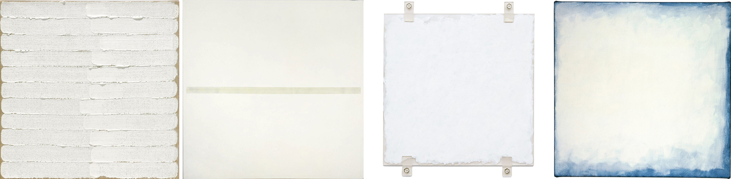
And so, Ryman seems to have wanted to investigate how white survives in various textures, matte or glossy surface, in contrast with other whites, compared with neighboring colors. All those different white paintings were not just repeats of the same blank canvas.
It may not be that Ryman’s art is world shaking. I’m not sure he himself thought of them as the last word in the evolution of art history. But he was quite serious about seeing what he could find out about the universe of white.
Adrian Searle of The Guardian newspaper explained in his obituary of the artist, “Ryman worked with white, and the different kinds of whiteness different paints and pigments produced throughout his career. Lead, zinc, barium and titanium, chalky whites and hard industrial whites, silky whites and bone whites, kitchen whites and shroud whites, numinous whites and dead whites. Whites that seem to spread outward and emit light as we look and whites to fall into. The variety of their opacity, depth, brilliance and dullness all interested him. We apprehend them all differently, and differently again depending on the materials they are painted over and how they are applied, what their binders are and how much they are diluted all make a difference.”
Art, of course, isn’t a single thing. If you think painting is about making pictures of things, then white paintings don’t count. If you think they about expressing emotion, you may look in vain to find much of it in bland white; if you think art is primarily about beauty, you must acknowledge it in the eye of the beholder — remember that scene in the film American Beauty, when Ricky Fitts plays his camcorder video of a plastic bag blown about in the wind and says it is “the most beautiful thing” he has ever seen. When our attention is focused on the bag, we can suddenly see its beauty. It is the direction of focus that awakens our awareness.
Many artists attempt to show us what we habitually ignore, to make us pay attention. Awareness — the sense of seeing the importance of the things of this world — is one of the goals of a certain branch of art. And attention must be paid, even to white.
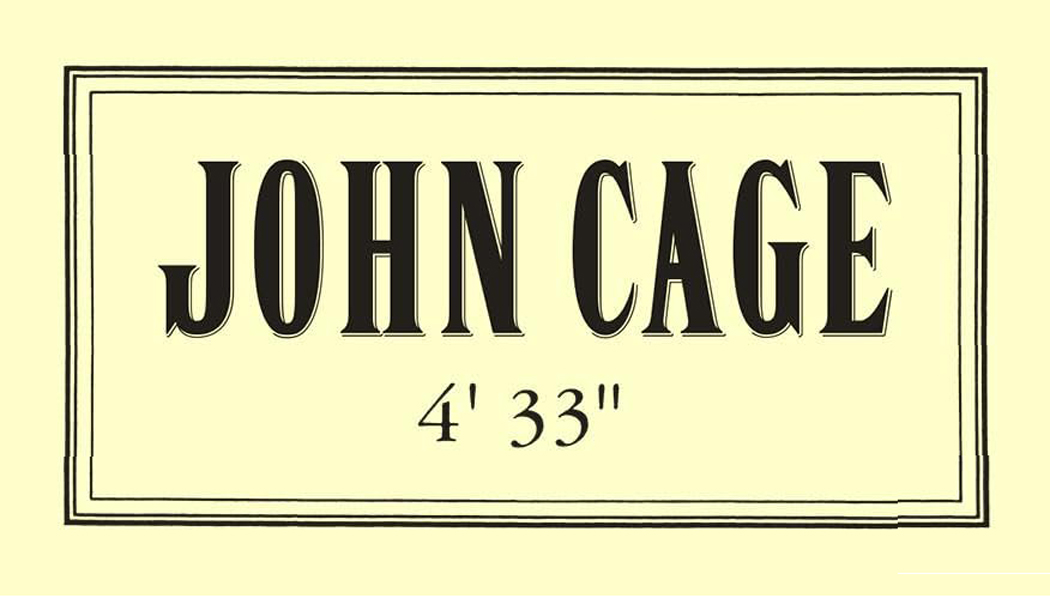
One of the most famous examples, that has been a whipping boy for the crowd that thinks art is frivolous, is the piece of music titled 4’33” by John Cage. For its performance, a pianist sits at his piano for the four-and-a-half minutes of the piece and does nothing. The aural equivalent of a blank canvas.
For those without ears to hear, it is a lousy joke, or a scam pulled by the composer. But Cage’s point was that what filled the concert hall was never silence, but a cacophony of random sounds — programs rustling; people coughing; the air conditioning cycling; perhaps a police siren on the streets outside the hall; and even the sound of the blood pumping through the audiences’ ears. There was something to be paid attention to.
I had scoffed at the idea of this music for years, until I heard it performed live and its meaning hit me like a ton of bricks.
Admittedly, it is not a revelation that one can repeat. Once you get the message, you have it and don’t need to be jerked awake a second or third time — which makes the many imitations of Cage’s piece, such as the Two Minutes Silence track on the John Lennon-Yoko Ono album, Unfinished Music No. 2: Life With the Lions rather a pretentious knock-off rather than a meaningful experiment.
It is easy to misunderstand art when it doesn’t play by the normal rules, or tries to get the viewing or listening public to experience the world in a new way, or understand an otherwise wordless idea.
Perhaps the most famous (somewhat) recent example of this was the anger and outrage expressed in the late 1980s when Congressional Republicans attempted to defund the National Endowment for the Arts over the photograph called Piss Christ by Andres Serrano. The artist received death threats, the work was frequently vandalized when exhibited.
It was described as a photograph of a crucifix in a jar of urine, but there was no jar to be seen: All it was was a crucifix in a glowing golden light and a few bubbles. It was quite beautiful, if you could forget the title.
But what few of its critics recognized was that Serrano was a pious, believing Roman Catholic Christian who was looking at his faith in a way perhaps only an artist would, to emphasize the corporality of the incarnation: God becoming flesh.
I say, “only an artist would,” but I could also say, “an artist or a child,” for I remember when I was a boy, various Catholic friends of mine, in the sixth grade, wondered whether Jesus ever had to defecate or urinate. Did the Christ sweat? Could he produce semen? These were questions that naturally occurred to boys just on the verge of discovering their own bodies.
Serrano’s art often used bodily fluids, like milk or semen or urine, as reminders of the humanness of the god-become-man. I met with Serrano when I was an art critic in Phoenix, and there was no mistaking his sincerity. “Maybe if Piss Christ upsets people, it’s because it gives some sense of what the crucifixion actually was like, he said. “I was born and raised a Catholic and I’ve been a Christian all my life. The piece was intended as a serious work of Christian art.”
If there was no doubting his sincerity, we may still question his naïveté over whether the public would easily understand. Most people have a rather lumpen and literal way of understanding figurative or symbolic imagery. A picture of a house should be a house, dammit. But artists, on the whole, are more interested in the things undefined. That could be color, line, shape, scale; it could be symbolism; it could be what the viewer brings to the experience.
Ultimately, you will get the most from the art if you forget what you know and attempt to see what is actually happening before you. As Robert Irwin famously said, “Seeing is forgetting the name of the thing you are looking at.”
One final note: An awful lot of current art is awful, puerile, badly crafted, poorly thought out, and just plain ugly. Of course, it was the same a hundred years ago. I am not defending it as good or important art. And everyone has their own taste; you are free to like or hate any art you want. I am not making an argument that any of this art is genius that will last through the ages. Please, like what you like.
But understand that the artist is very, very rarely just trying to trick you. They tend to be a very serious and thoughtful lot. They are artists because the see things and think things normal people don’t. And if you in turn take seriously what they have made, you may discover something that will enrich your life.
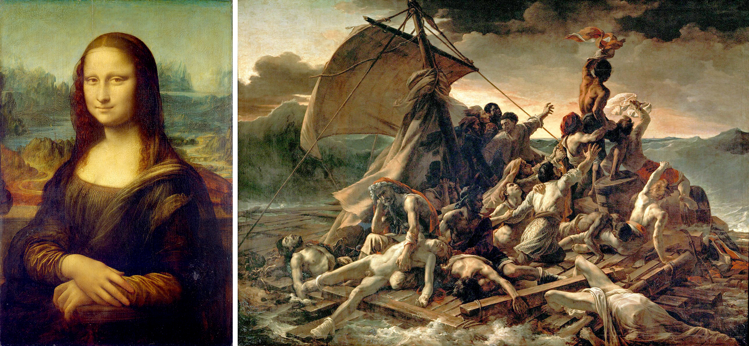
Take two of the most famous paintings in the Louvre. Most of us first experienced them in pictures in a book, perhaps Janson’s History of Art in an art history class. Or, projected onto a screen in the darkened classroom while the teacher pointed out details of the iconography. But these are images, not paintings.
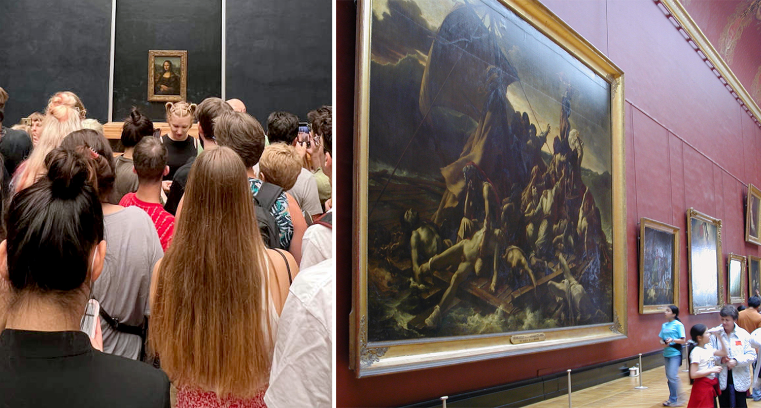
Often, today, we confuse the two, seeing pixels on a cellphone or iPad, and can easily believe we know the art because we can recognize the familiar shapes and colors. That is why so many people remark, on visiting the museum in Paris, about how “small” the Mona Lisa is.
It’s not that small, of course. It’s a fairly normal size for a Renaissance portrait, but the fact is that separated out, as it is, for display, it takes up precious little wall space. Really, most people hadn’t given any thought to the actual size of the painting when seeing the reproduction in a book. It’s just an image, an icon, familiar not only in its regular shape, but also parodied to death in comic take-offs.
You could look at the caption next to the printed image in your book, and see that there is a bunch of information in parenthesis beyond the identification of artist and title. It will often give you the date, in which museum collection it resides, and the size of the painting. In the case of the Mona Lisa, 21-by-30 inches.
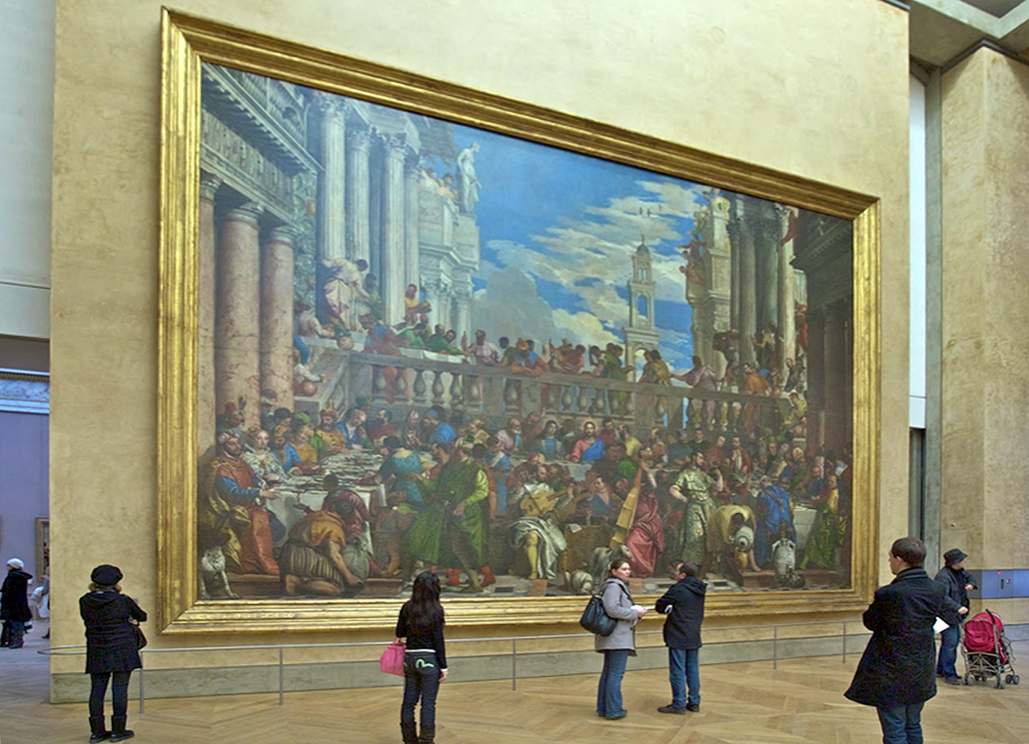
But then, perhaps you wander into the gallery with Théodore Géricault’s The Raft of the Medusa. You’ve seen it in your Janson and think you know it. You don’t. It is 16-by-23 feet — the size of a billboard.
You see them as images, and they are adjusted to the size of the page and you can have no sense of their relative sizes.
But walk through the Louvre and it is quite different.
I remember when I was a teenager and going to the Museum of Modern Art in Manhattan and seeing Picasso’s Guernica, which stretched out across its own wall. You could see it from afar, stepping out of the elevator and looking to your right, several galleries away. Just under 12 feet high and 26 feet across, it was more than a painting and more than an image. It was a presence.
And that was part of its meaning. It was made in outrage over the 1937 German bombing of the Basque down in Spain and if it had been made to display comfortably on a gallery wall, it would have been just another painting for sale. But at size, it forces you to consider the suffering and death. Its size means you cannot just look away.
The world we live in is increasingly a virtual one. The TV screen, the computer screen, the cellphone screen, the tablet and even the wristwatch screen have become so normal to our daily lives it has become easy to mistake what we see there as real. It is not.
You cannot have the personal experience of Guernica from a photographic reproduction or a pixel image. You can memorize its iconography and discuss its provenance and the biography of its creator, but you will not have the gut-level experience of it I had visiting it at MoMA.
And it isn’t just the size. Seeing art in person means you can see the pigments used, the brushstrokes, the opacity or transparency of the paint, whether it is on panel or canvas — a whole range of physical properties not apparent in a reproduction, and all of it — in addition to its physical dimensions — are essential to its meaning.
And by meaning, I don’t refer to its symbology. That is language. I mean the experience of it. Vermilion or ultramarine are experiences not conveyed in ink or pixel, and that experience is meaning.
If you walk through the Louvre, another famous art history painting you find will be Veronese’s The Wedding at Cana. Another wallop in the gut. It is 22 feet high and 33 feet from side to side.
If you think of it as a biblical subject, and believe you are “getting” the painting by naming the people pictured, you have missed the central experience of the work.
Even more ordinary size paintings depend, in part, on their dimensions and how you relate to them. A life-size portrait can mimic meeting the person himself. In the Renaissance, one ideal was that a painting should be like a window through which you are looking, and so a window-size canvas was part of the experience.
A giant head is another thing altogether, like the famous head of Emperor Constantine or one of the Olmec colossal stone heads from Mexico. Their size makes you take notice. The same shape, but the size of a cantaloupe, would hardly carry the power of these monuments. I remember the first time, as a boy, I saw the Olmec head at the American Museum of Natural History in New York; the memory of it stuck to my psyche for decades after. Still does.
The same for the huge portrait heads of Chuck Close.
The word often used to describe such larger-than-life art is “heroic.” They have an effect very like that of Achilles in the Iliad or Ahab in Moby Dick. It is a word often used to describe the large paintings of the Abstract Expressionists of the late 1940s and through the 1950s. These were painters of utter seriousness of intent. The last gasp of a non-ironic age, after which came the deluge of meta.
There are artists who use mere size to impart meaning to their work, Anish Kapoor, for instance, in his huge shiny bean called Cloudgate, or the rusted steel curtains by Richard Serra that are best experienced by walking through. But notice that the giant bean is also ironic. It’s a bean, after all, raised to heroic proportions.
But those cigarette-smoking, heavy-drinking and blue-collar wearing guys at mid-century were dead serious. Jackson Pollock painted his first large painting, called Mural, in the mid-’40s. It is 8 feet by 20 feet and meant to be installed in the apartment of Peggy Guggenheim. It led to the later drip paintings that made Pollock famous — in 1949, Life magazine asked “Is he the greatest living painter in the United States?”
Pollock made paintings in various sizes, but it is his large canvases that hold the emotional power that still resonates today. I visited the huge Pollock retrospective at MoMA in 1998 and was blown away by the variety of the paintings, and got a chance, finally, to see Blue Poles, a large 1952 canvas sold to a gallery in Australia in 1973 and unavailable to American audiences since then. It was given pride of place in the exhibition and deserved it, in the center of the room, on a wall of its own. It was lit like a jewel, but a jewel 16 feet across.
Most of the Abstract Expressionist gang trafficked in scale. Franz Kline, Mark Rothko, Robert Motherwell, Barnett Newman, Willem de Kooning, Clyfford Still — all found now in museums taking up whole walls by themselves.
In the 1970s, I wandered through commercial galleries in New York and came across a back room storage of Newman paintings, being arranged for a show, and a group of them were almost two stories tall — monumental. These men (and they were almost all men) took their heroic calling seriously.
After them, the deluge. Even Motherwell turned to irony; the self-importance of the first generation could not be sustained, or even taken seriously anymore. And although Robert Rauschenberg is sometimes classed among the Abstract Expressionists, his work always played with irony.
All that was left after that was Andy Warhol and Jeff Koons. Art took a different turn.
When the Getty Center opened in Los Angeles in 1997, I was an art critic in Phoenix, Ariz., and given the assignment of covering the event. I met with Robert Irwin, who designed the landscaping for the Getty, and had a concurrent museum show at the Museum of Contemporary Art in LA. In a hallway, away from the main work in the exhibit, were a series of early paintings he made. Irwin was a thoughtful artist and his eyes glistened as he discussed those small, early canvases.
“I was thinking about the heroic nature of those Abstract Expressionist paintings,” he said. “And I wondered if they could still work if they were small.” And so, he painted a line of tiny canvases, usually no more than a foot square, with similar abstract imagery on them. Did they work? Were they still heroic? Do you have to ask?
Artist Mel Steele turned 85 recently. I have known Mel for nearly five decades, through the motorcycle years, the goat-herding years, the gun collecting years, the opera years. He is my brother-in-law and a friend. And I love his recent paintings as much as I’ve loved any art I’ve seen in person. So, I thought I might write a little something about his work.
I made my living as an art critic, and during my time as a journalist, I made it a practice never to write about the art of any of my friends, both because I feared insulting them through misunderstanding, but mostly because I wanted to avoid the charge of favoritism. (There were artists I wrote about who later became friends, but that was different.)
But I have been retired now for a dozen years, and I would not write anything about Mel’s paintings that I have not said to him face-to-face.
Mel Steele was born two years before America joined World War II, and was raised in Madison, N.C., about 30 miles north of Greensboro, and I doubt there was any question about what he would be when he grew up. From childhood, he had a brilliant talent for draftsmanship. I remember seeing a small painting of a rooster head he made when a schoolboy and it was as fully finished as any professional illustrator could have managed — almost photographic in its detail.
He has always drawn and painted animals.
But what do you become when you are an enormously talented child? There is not a lot of expectation for a rural North Carolina boy to become a famous painter. He could have grown up to become a plumber, like his father, and perhaps doodled on his customer’s bills.
He wound up going to the Richmond Professional Institute (now Virginia Commonwealth University) at age 20 and became a commercial artist, graduating from talented amateur to knowing professional. Commercial art seemed like the only meaningful way to use his gifts. Selling paintings in art galleries is an iffy prospect; a paid job is more dependable. As fashion-photographer great Richard Avedon once said about his own choice, “You can’t really make a living photographing trees.”
Yet, at school, Mel was introduced to the larger world of contemporary art. It was 1959, and New York had become the world center for art, with the buzz of abstract painting at the center.
Mel entered school wanting to paint like Norman Rockwell, but, as he says, “Most of the leading guys weren’t teaching just the standard way; they were teaching what was going on right now.” And that meant Willem de Kooning, Jasper Johns, Robert Rauschenberg. Mel loved the new work.
“Asheville” Willem de Kooning, 1948
But there was still that need to make a living, and when he graduated, he worked in advertising, employed initially for Belk department stores. Later, he opened up his own agency in Charlotte, N.C. He was good at what he was doing, enough so that he could pick and choose his clients. And move out of the city to a farmhouse in Rockingham County, N.C., where he and his wife, Deborah Ballington, took up raising goats and chickens.
This is when I first came to know Mel and Deborah, when my wife — Mel’s sister, Carole —and I would visit and get fed goat meat (absolutely fabulous) and perhaps do a bit of target shooting in the yard. (I was introduced to the .45 caliber Browning semi-automatic pistol, which had the kick of an angry horse and could knock a tree stump off its feet.)
And by then, Mel had begun selling what are euphemistically called “limited edition prints” of rural scenes. These were essentially “posters” made from painted originals, printed up in volume and given evocative titles, like Down East or Wentworth Winter.
Most regions of the U.S. have some populist art tradition that sells well commercially. In Maryland, it is pictures of skipjacks on Chesapeake Bay; in Maine, it is lobstering; in Arizona, it is cactus or Indians; in Texas, cowboys. In North Carolina, it was barns. Mel painted barns and farming scenes and became known statewide for his paintings and the prints made from them.
He did well with these, enough he could buy some land in the woods outside of Reidsville, N.C., and design and build a new house and studio. And his prints were popular enough, he could begin selling not just the prints, but the original paintings.
Mel would sometimes cynically denigrate the art he was making, thinking of it as hack work. But it put food on his table and motorcycles in his garage. In retrospect, these images were better than they needed to be. They often had some edge to them, such as the print of a fox skulking near a barn, titled Thief, and presumably looking for chickens to grab.
Thief
Or, more graphically, a dead rabbit, run over in the road.
Highway 704
I say these prints were made better than they needed to be, and compared with many of the regional prints from around the country, they were. The most famous in North Carolina is Bob Timberlake, who has turned his talent into a marketing juggernaut, selling prints and furniture from his gallery in Lexington, N.C. But compared with Mel’s paintings, Timberlake’s are simplified and verge on the cartoonish. And they traffic in a greeting-card sort of nostalgia.
“Boyd’s Creek” Bob Timberlake
There is a long tradition of such sentimental fluff. People have always longed for a past they remember as better than it was. Victorian genre painting is full of such stuff. And artists, such as Paul Detlefsen, made a career out of sentimental Americana, painted for calendars and nowadays reproduced on jigsaw puzzles. Happy ragamuffin farmboys with fishin’ poles, covered bridges, horse-drawn wagons.
By Paul Detlefsen
The point is, the artists who make these images never actually lived such lives — Detlefsen was born in Denmark. It is a fictional history they proffer, a mythologized lie.
“Old School On the Hill” P. Buckley Moss
I don’t know if P. Buckley Moss had any real talent — she didn’t really need it for the kind of work she did, cartoonish prints of Mennonite farmers in northern Virginia — but Mel put some solid effort into his prints.
Of course such prints all play on a kind of sentimental nostalgia, but the nostalgia in Mel’s prints is earned: He and his sister did live for a while in a log cabin growing up. They did know the houses and barns that show up in his prints. And rather than knock off simplified versions, he worked hard on detail and finish.
“The Thicket’s Edge” Mel Steele
Not that there wasn’t some tacky marketing involved. Mel knew his audience and often played to them. When he thought he could sell three prints instead of a single one, he tried making “trilogies,” such as the “Quilt Trilogy” — three prints featuring old-timey quilts in them.
Or, discovering that he could charge more if his prints were “remarqued” — that is, a small detail from the image could be repainted in miniature on the border in actual paint — he began doing just that. You got a tiny bit of genuine painting along with your photomechanical print of the main picture. There should be no forgetting this was a commercial endeavor.
Timberlake had published a coffee-table book to market his prints and Mel did the same, in a 1993 book called Weathered Wood & Rust. The text is godawful and smarmy — they hired a writer to come up with some cliché-filled pabulum — but the images were beautifully made.
Marketing was an essential part of the limited-edition print business. But such things could get out of hand. I remember visiting the Moss studio in Virginia and seeing a framed print for sale with added “value” for having three signatures. First, on the original painting, which was then photographed and printed in large-number editions, with each prints given a second signature. And third, after the prints was framed, the glass was given an extra John Hancock, with gold ink. I don’t remember Mel ever going that far.
I’ve spent a long time on this part of Mel’s career. I believe he often felt sheepish about courting popular fandom when what he was really interested in was more serious art. I have been telling him for years that he has nothing to be ashamed of for those populist prints. They really were often so much better than they needed to be.
I’ve pointed out that his subjects, while they may have had an aura of nostalgia about them, were nevertheless genuine to his life and upbringing. I believe he felt genuine emotion toward them — even if he might have expressed a knowing disdain for what might have been taken as “cornball.” His professional training led him in one direction; his life experience informed another.
I want to discuss two prints in particular. The first is Mitchell’s Mercantile, a gouache from 1980, that is just an old chair on a store’s front porch.
Mitchell’s Mercantile
One of the things you notice in Bob Timberlake’s prints is their general lack of shadow. They are “cartoonish” in the sense that their subjects are simplified and usually portrayed in an overall wash of light. In Mel’s pictures, real objects tend to throw real shadows. Also, in the popular prints of other artists, objects — buildings, people, animals — are generalized, sketchy and not particular. But this chair on this porch is not just a chair, it is this chair. It is almost photographic; Mel has spent time and effort to look and to pay attention to the world. This is not some generalized metal chair.
Paying attention is the unacknowledged secret of fine art. That is true of abstract art as well as naturalistic art. Nothing is glossed over or ignored. And so, the very exact angle that the chair’s seat leans back is paid attention to. The quotidian is afforded dignity. It is the idea behind the German expression “Ding an Sich.” The Thing in Itself.
One does not need to get all academic over it. But look at the chair, the wood floor, the rusted Coke sign and the light that plays out over it all, from a distinct direction and shaping the images and recognize that Mel Steele has looked with care and internalized each millimeter of his picture.
The other print is my favorite of all of them, and that is for entirely personal reasons. When Carole and I moved in together in the early 1980s, we lived in the Blue Ridge Mountains of North Carolina, along the New River in Ashe County and many of the hills were cleared for cattle, and other hills were natural “balds.”
West Jefferson
Mel made a painting of this bare and unprepossessing landscape. It resonated strongly for me. I know this landscape and no one I know has better caught its sense of isolation and innigkeit — of being alone in an expansive space. I am convinced Mel made this picture because he felt something genuine in it. Surely it could never have been one of his more popular sellers. (In fact, Deborah tells me it was never made for sale, but as a Christmas gift for several valued regular collectors of his work.)
So, there are two directions I sense Mel has always been pulled in. On one hand, as a professional and commercial artist, he knows his public and is able to aim his work at that market. But on the other hand, he truly wants to make something worth more than mere dollars, and so even making commercial work, puts an extra effort into it — and something personal — that lifts it above its mere purpose.
I shouldn’t overstate my case here. Mel has made his share of purely pandering images, and often they are not as well crafted, and maybe a little more quickly tossed off. The buying public is looking for rural nostalgia and Mel could give it to them. But in his best prints, he has invested himself and his life experience.
His success in the print world meant that he could also sell original paintings in art galleries, and accept commissions. And he made quite a few paintings for himself. Landscapes,
still lifes,
portraits
— even the motorcycles he loved and collected (he had been a big motocross fan as a young man
Which showed up in a series of motorcycle paintings
He experimented with a series of paintings made from little squares with letters, numbers of text in them, such as the red pepper. A detail shows how the picture is made up of tiny glyphs.
He made another series of copies of famous paintings, usually in oil crayon, but always he made little “improvements” in them (as he called them), like this copy of Edward Hopper’s Chop Suey.
Mel could take on any style of art. His popular prints were photorealistic. But he could also do impressionistic
Or primitive
Or design work
Or even sculpture
Mel can tackle pretty much any style or genre. Yet, what he really wanted to do, since his early days at art school, was the abstract painting he discovered there.
It sometimes needs to be pointed out that abstract painting isn’t necessarily easier or faster than detailed realism. In fact, quality in any variety of art depends on careful attention to color, line, design, mass, balance, and a sense of depth (or lack of, when that is the point). A successful photo-realist scene will only work as art if all its parts work in harmony. A good abstract painting is the same as a good realistic painting, except without a subject matter you can name — like a barn or owl.
Believe me, as an art critic (often asked to judge local art shows and give out blue ribbons), I saw a deplorable boatload of bad abstract painting, and almost always, the problem was that the artist really just threw some colors on the canvas in a haphazard fashion. Bad abstract art is a dime-a-dozen.
Bad, indifferent, tossed haphazardly
It isn’t just the public, but too often the artists themselves, that think an abstract is made by energetically slathering paint on the canvas, and that the energy of its creation will be conveyed to the appreciative viewer. Das ist schlamperei. Sloppy; lazy; careless.
Sometimes a painting can give the appearance of spontaneity, but such doesn’t happen through accident. One may look at an abstract painting by Mel’s hero, Willem de Kooning, and believe he tosses them off in a fit of athletic frenzy, but there is film of the artist painting and mostly he stands back from his easel by about 10 feet and looks at the canvas for two or three minutes and then approaches with his brush and adds a few strokes and steps back again to look. It is a slow accumulation of careful decisions made through a lot of just looking and thinking.
I have watched paintings by Mel in the process of being “builded.” He likes to work alone, but I have snuck into his studio in off hours and seen paintings change slowly over days until he gets the final version he is happy with. Whole quarters of the canvas may be covered over and repainted; new details added or others scrubbed out.
Subtle differences in three states of the same work
When the famous Japanese Ikiyo-e artist, Hokusai, turned 80 he said, “I have drawn things since I was six. All that I made before the age of 65 is not worth counting. At 73, I began to understand the true construction of animals, plants, trees, birds, fishes, and insects. At 90 I will enter into the secret of things. At 110, everything — every dot, every dash — will live.”
Mediocre artists will find a “style” and stick with it. Better artists continue to grow their whole lives. You can follow the growing maturity of Mel’s abstract work from his early canvases to his most recent.
His early abstracts suffer from the rigorous training he got at art school. His abstract paintings are notably careful, well-lined, almost as if he were making photorealist versions of abstract paintings. When architects attempt to make gallery art, they often make this sort of deracinated art — more design-y than resonant. It’s what I have always called “architect’s art.”
Even in this early work, you can see some through-lines to the later. Unlike many abstract paintings, which may as well be wall-paper, Mel tends to situate shapes against a background. Often the background is a tiny sliver at the top of the canvas, sometimes the shapes occupy a spot at the center like a vase of flowers on a table.
You see that in the early paintings and in more recent ones.
This gives Mel’s abstracts a solid sense of structure. Squiggles don’t just run off the edge of the frame.
He also uses the size of shapes and their colors to create a sense of near-and-far, a sense of depth in the painting, so you can look at it as if you were gazing at a landscape. (I don’t want to get caught up here in an argument about Clement Greenberg, the influential mid-century critic who claimed that painting should be flat and that two-dimensionality was its essential fact and that to attempt the illusion of depth was somehow anti-art. That was always pure balderdash and if he had had eyes instead of theories, he would have seen that.)
Some shapes cover up parts of other shapes. Cool colors and darker shades can recede while warmer colors and brighter ones can appear more forward. It isn’t all just a great bowl of oatmeal. There is visual structure available to those who take the time to immerse themselves in the art. Art takes time to look at and the longer you look, the more complex the painting, and the more intense the emotions that may be evoked.
I mentioned that in his more commercial prints, at least in the best of them, Mel found ways to put his own life into them. Unlike some popular print artists, who present a nostalgic world that never actually existed, Mel’s barns and farm houses are part of the life he’s actually lived — at least in his childhood, and after a city life in Charlotte, once again in his life back in rural Rockingham County.
When I have gone to visit Mel and Deborah in Reidsville, as I drive north from Winston-Salem on U.S. 158, I pass many tobacco barns like the ones in his prints. They are still there, and there is often a damaged barbed-wire fence around them. Nostalgia-mongers love white picket fences; there’s little quite so warm and fuzzy about barbed wire. Yet, it’s that detail that makes Mel’s print carry a weight greeting-card art never even attempts.
Softer art likes flowers; Mel’s best paintings show weeds.
And I think there is something similar in the abstract paintings. In most of them, there is a recurring detail of zebra stripes. A shape, either large or small, will be crossed with black-and-white stripes. I’ve asked Mel why and he doesn’t have a thought-out answer. “I just like it,” he says. But Mel grew up in a house in Madison, N.C., just across the street from a railroad grade crossing. I suspect that this detail has lodged in his consciousness and shows up as an emotional nexus in work that is otherwise non-figurative.
After all, the front door of his studio-home is striped also, and a spooky mask that sits on his wall. You can find these stripes all around his house, including on throw pillows on his sofa.
Like many creative people, Mel doesn’t seem to want to look too deeply into, or talk about the wellsprings of his work. Many artists I’ve talked to are afraid if they look too closely, their inspiration might dry up.
One should always be wary of claiming to know what is going on in another person’s noggin. And I may have completely misunderstood Mel’s muse. If so, I’m sorry. It is only a guess, from watching from the outside.
But over a very long work life, Mel has seemed to avoid talking about anything too deep in his art, while at the same time putting great effort into its making, even when less care would have been enough.
For the past dozen years or so, Mel has painted landscapes on commission for certain collectors, mostly sold through his agent, and painted canvas after canvas working on his abstracts, using patches of color, on top or beneath each other, as if they were landscape paintings of imaginary shapes rather than trees and streams.
You can see the layout of shapes running through the middle of these canvases, with a clear patch — almost a sky — above and another patch, almost like a meadow, below. The fact that the middle is made up of a bustle of shapes and colors might stand in for a forest — except that they don’t need to. It is sufficient that they are tangible shapes.
It is the way some classical music has a “program” that tells you the story being depicted in the orchestra, but if you didn’t know the program, you would still be able to feel the movement of the music in a specific direction.
It is in this sense that I say Mel’s abstracts can be seen as quasi landscapes. Not that they are meant to be literally so, but that they display a visual form that mimics the mental idea we have of a landscape. Take away anything in a scene that has a name and this is what is left. Color, shape, form, space, frame.
I have included a passel of Mel’s artwork in the blog entry, but I have at least another 200 images I simply don’t have room for. Mel has been an extraordinarily prolific and various artist, using many styles and many media over the years — gouache, oil crayon, acrylic, pen-and-ink. There is almost no style, genre or medium he has not taken on over the past 60 years.
Frank Lloyd Wright was one of the greatest architects in history, and he’d tell you so, himself. The man in the cape and porkpie hat had an ego as big as any of his buildings, but as they say, if it’s true, it ain’t bragging.
It is so tempting to dismiss Wright. He was a monster of egotism. His taste could be appallingly bad. He spoke in egregious platitudes. He abandoned children and wives. He was arrested for violating the Mann Act. He made life a misery for almost everyone around him. And what is worse: His roofs leaked. For an architect, that may be the worst sin.
But no matter how irritating, Wright cannot be dismissed. It matters not that he insisted he was the greatest architect in American history. (“Why limit it to America?,” he then asked.) The fact remains that no architect of our time — and probably not of any other time — has had so fertile an imagination or produced so many outstanding buildings.
That is undoubtedly the most infuriating thing about Wright: He didn’t only talk the talk, he walked the walk.
“I hated him, of course,” said waspish architect Philip Johnson, “but that’s only normal when a man is so great.”
From his early Prairie Style homes near Chicago to his giant spiral Guggenheim Museum in New York, Wright kept inventing new ideas. “Why, I just shake the buildings out of my sleeves,” he once said.
The man is difficult to pin down because, not only did he change constantly over his 90-plus years of life, he also notoriously lied about everything. He was always making orotund pronouncements and declarations, but not a one of them stands without careful checking.
England has its eccentrics, its beekeeping vicars and parish historians, but America requires something more grandiose.
America has crackpots.
The crackpot differs from the mere eccentric in his missionary zeal, his transcendent ego, his absolute certainty and his touch of utopianism. From Henry Thoreau to Ezra Pound, from Charles Ives to Harry Partch, American art and culture have been defined by crackpots. Something in the American character warms to them. Something of the best of America can be found in them.
It is important to remember that. So much has been written and said about the architect, and with such reverence and hype. It is not that I mean to debunk Wright; he was a singular genius and must be recognized as such.
But he also was a true American crackpot, and we need to remember not only the dynamic imagination and idiosyncratic design, but also the odd geezer in the black cape and cane who wrote crank letters to the president. We need to remember the despotic man who installed glass bars instead of windows in his most famous industrial commission, Wisconsin’s Johnson Wax building, because he declared, “No one should have to look out at Racine.”
There are several things that join to make Wright’s work justifiably the most celebrated by any American architect. First among these was his uncanny sense of space.
What makes architecture work, and particularly Wright’s architecture, is the shape of its insides, the particular chunk of air it surrounds with walls. To experience architecture is to walk through it, sit down in it, see where the space seems to grow and shrink as you pass through.
So many of us live and work in simple boxlike rooms — little boxes inside bigger boxes — we don’t always remember that rooms don’t have to be that way. “Break the box,” was one of Wright’s war cries. And in his buildings, he constantly did just that. Instead of boxes of rooms off a hallway, Wright created vast open spaces, one room opening into another. In his own home, called Taliesin, in Wisconsin, you can stand in the center of the house and see out of it in all four directions.
Wright recreated for us that sense we had more easily when children that space can have emotional meaning, building “forts,” or climbing in tree houses of discovering caves in the hillsides. Adults can have those emotions, too. And great architecture can provide the adult emotions that are analogous to those childhood ones. I can write about thoe spaces and you can see pictures, but pictures of them don’t do it. You can only have those emotions when standing in those places.
Even with his earliest buildings, the Prairie style homes, he attempted to reduce the number of rooms and create large flowing spaces, part of which might serve as dining area and part as living room. They would be built at different levels and sometimes at different angles, all to obliterate the hated “‘box.” In his best buildings, you can feel as if you are standing outside when you are actually indoors, and indoors when you are out.
The second great strength of Wright’s work is its unceasing originality. Wright ideally approached each design as a completely new problem, to be solved in its unique way. This means that, unlike the work of his great contemporary Mies van der Rohe and his International style, there is not, after the Prairie style, a single “look” that can be identified as Wright’s. For Wright, “what we did yesterday, we won’t do today.”
Mies groused back, “You don’t start a new style each Monday.”
But because he did start out each Monday, Wright has given us a startling variety of invention. It is true that not all the work is of equal value, but it is hard to find another artist in any medium who so thoroughly reinvented himself with each idea.
I was architecture critic for most of my 25 years living in Phoenix, Ariz., where Wright had his second home and architecture school later in his life (Taliesin West in Scottsdale), and I was immersed in Wright hype and legend. I got to visit many of the most notable Wright buildings across the country, and I came to recognize and value his genius (there really is no other word for it), but I also came to know and loathe the man himself. I will try to do justice to both.
Architecture has four main components. First, there is the sculptural aspect, the shape a building cuts. It is what most people think of as architecture: the building as seen from the outside.
Second, there is the engineering. Wright was both an innovative engineer and an occasionally casual one. His innovations are myriad; his lapses legendary.
Third, there is the interior design aspect. Early in his career, Wright was especially good at this, and it is the part of his work that comes across best in photographs. The windows, the tables, the carpets he chose are beautiful, refined and subtle. Later in his career, his design became garish and loopy. But it is still what people know best.
But the fourth part of architecture is arguably the most important aesthetically. It is the essence of architecture: the emptiness inside. And Wright’s particular genius is his way with space, the way he orchestrates large and small spaces, to stimulate your emotions as only great art can.
Wright was especially concerned with how one room led to another, how a low ceiling makes you feel, or how nooks make magic. He called space “the invisible fountain from which all rhythms flow and through which they must pass.” These are things that cannot be conveyed in pictures; you have to be there, in the rooms, to sense their splendor.
It is like pictures and writings about Beethoven: No matter how good the text, it cannot tell you what the music sounds like. You have to experience it. So, photographs still cannot show its readers what truly made Wright the special case he was. No one invented interior space more creatively. Wright was not merely inventive, he was revolutionary. On the scale of Stravinsky, Picasso, Brecht or Eisenstein.
People easily mistake the outside of a building as its “architecture.” For most people, architecture is a kind of very large, inhabitable sculpture. And there is certainly that aspect to the art. We recognize the Chrysler Building immediately, or the U.N. Building, from their outsides. But how many people can say what the insides of these buildings look like?
Wright’s essential genius was not that of a sculptor. In fact, some of his buildings are almost ugly. No, his genius was for the empty space inside a building. He changed utterly and forever our idea of what an interior could be. Wright was a creator of empty spaces. Really interesting empty spaces. He approached a building with the air inside it as a kind of armature for the exterior.
He found 2,000 years of architecture in which square rooms inhabited square buildings, one set of cubes inside a larger one, and broke it open, breaking down walls and finding new ways of dividing the space enclosed by the exteriors.
Like Stravinsky or Picasso, Wright constantly changed styles, from the Prairie Style of his early residences to the “Planet Mongo” style he sometimes devolved into in his later years. But like Stravinsky and Picasso, the style itself was never the point. Stravinsky may rush from the lush Firebird to the astringent L’Histoire du Soldat, but underlying it all is an irony. You cannot imagine Stravinsky without the irony. Picasso has his plastic inventiveness — that shows through whether he’s doing Cubism or Neoclassicism.
And Wright always has his empty spaces. Every corner you turn brings a discovery: a room bigger or smaller than you expect, a space that stretches out in interesting ways, or closes you in and makes you cozy. You can like or dislike the decorative style in which Wright worked, but you cannot help but be astonished at the way he makes you feel inside a space.
He was born in Wisconsin in 1867 and began work in the Chicago area in the 1880s, soon becoming one of the most innovative and stylish architects working. His Prairie Style homes from the early 1900s became his signature look.
But by 1909, the 42-year-old wunderkind felt he was losing his grip on his work, “even interest in it,” he wrote. So he left his wife and six children and ran off to Europe with the wife of one of his clients. The scandal affected his practice, and Wright moved into a period of relative obscurity. He built his first Taliesin in 1911 as “a hope and a haven” for himself.
Many artists have written their autobiographies, but Frank Lloyd Wright built his. It sits near the top of a hill in southern Wisconsin near the town of Spring Green and looks out over farm fields and forests. Wright titled his architectural autobiography “Taliesin.” It was his home.
But three years later, that first house burned down in a tragedy of epic proportions when a workman went berserk, took an ax and slaughtered Wright’s mistress, two of her children and four other people, then set fire to the building. Wright was out of town at the time. The scandal was front page news across the country.
He rebuilt immediately. The blow left him numb, but, as he wrote, “There is release from anguish in action. Anguish would not leave Taliesin until action for renewal began. … Steadily, again, stone by stone, board by board Taliesin the II began to rise from the ashes of Taliesin the first.”
And so did Wright’s career. He took a new direction once more, a commission in Tokyo to build the Imperial Hotel, which opened in 1923.
In 1925, a second fire razed Taliesin. Again, he built it up, even using stones from the first two incarnations in the walls of the third.
He went on to design some of the landmark buildings of the century: the Johnson Wax Building in Wisconsin and Fallingwater, a summer home for the Kaufmann family, in Pennsylvania, and a long series of distinguished private and public buildings.
Many of the design and engineering innovations he used in those buildings had their “off-Broadway” run at Taliesin, as Wright built and rebuilt the house. By his own account Taliesin was never finished.
It is one of the most beautiful houses I’ve ever seen. Every angle and corner has something rich and meaningful to give up. One of the other party tricks Wright pulls on us is that, however stunning the living room is while you are standing in it, it is even more glorious when you sit down. Then, the long walls of windows become frames for the landscape outside. Standing, there is greenery, but no horizon; sitting, the horizon cuts halfway through the glass frame, making the windows like another spread-out Japanese screen.
The house is amazing. Wright always said he wanted to “break the box,” by which he meant he wanted to avoid the sense that each room had four walls and a door. So he opened up his house. It is rare to find a corner, for instance: When you approach what looks like a corner, it opens up to display some unexpected nook or hallway. So that, at dead-center of the house, you might almost be standing outdoors: There is a four-direction view.
At that point, standing in the hallway just where it opens into the den, you can look to the north through the living room and see the Wisconsin hillsides; then turn to the east and see more through that room’s glass walls; then turn south and peek through the distant windows of Wright’s office and bedroom, to see the hillside with the house called Tan-y-deri and the windmill that pumped the estate’s water; then, finally, turn west and see the top of Taliesin’s hillside and the garden and greenery surrounding the tea circle where Wright and his apprentices met for discussion.
Almost any room you enter will require you to duck and scrunch down as you worm through the hallway or entry or door and then feel the weight of the universe lifted from you as the room expands upon your entry. It is a party trick, no doubt, but one Wright plays with great relish and effect.
I could go on, waxing ecstatic over other Wright buildings I have visited, from Fallingwater in Pennsylvania to the Marin County Civic Center in San Rafael, California. I have always been astonished by what I saw. But there is the other Frank Lloyd Wright, the liar, cheater, fraudster and prophet of some of the worst developments in civic life.
The shopping mall concept, it can be argued, began with a government building by Wright. In 1957, the equivalent of a Steven Spielberg “mother ship” landed on a woody hillside in San Rafael, Calif. It was the Marin County Civic Center and, from the outside, it was one of Wright’s “Planet Mongo” designs — odd, ungainly and a model of kitsch.
But inside … inside it was truly original. It placed the county governmental offices several stories high along the outer walls of the complex, with balconies running the length of the building overlooking a pedestrian walking space. You could look down at the “storefront” offices and the ferns and plantings along the fountains and escalators.
When you visit the building, you can’t help but think: shopping mall. Brilliant, but I don’t know how grateful we should be for all the soulless malls we find filled with T.J. Maxes and Sbarros.
That Flash Gordon esthetic increasingly began to take over Wright’s design esthetic as he got older. In his early years, Wright was at the forefront of Modernism in architecture and his best work — those Prairie-style houses, the Johnson Wax building — have remained ever fresh and new. But in his senescence, many of his designs have become dated, like those futuristic book illustrations filled with dirigibles and autogiros.
Instead of modern, he became what might be called “modernistical.” As in his design for the First Christian Church in Phoenix, with its science-fiction spires and reptile-scale roof.
Then, there was Wright’s hatred of cities — an odd opinion for a builder of buildings. He called them “a persistent form of social disease,” and when asked in Pittsburgh what could be done to improve the city architecturally, he replied, “Tear it down.”
And he singled out New York for special opprobrium, biblical in its rancor. He compared it to Sodom and Gomorrah, complained that it was the city of Cain. He called it “a pig pile. A fibrous tumor. Is this city not Anti-Christ?” and said it was “a place fit for banking and prostitution and not much else.”
He once said the only logical place to build a skyscraper was in the desert, where the height could afford a view worth seeing. And he designed a skyscraper a mile high, never built, of course.
“Mile-high? Why stop there? Why not two miles, or even five miles, if need be?” he asked a friend. (The irony is that the Burj Khalifa, which is a quarter-mile high, was built in the desert, and although not designed by Wright, did borrow his plan for making the footprint of the building a triangle, giving it the stability of a tripod).
The fruit of this dislike was a vision of suburbia. Wright cannot exactly be said to have invented the suburban prototype Levittown, but he certainly predicted it in his 1932 plans for the fictional Broadacre City. Wright envisioned a sprawling suburbia, created out of minitowns, or self-contained neighborhoods, linked by automobile and tree-lined roadways.
If the thrust of American growth was upward, Wright cast his vote for outward. But we now live with the results of that thinking: It’s most extreme embodiment is Los Angeles, sprawling neighborhoods over an area the size of some Eastern states. It is Broadacre City metastasized.
Wright was as bad as Wagner when it comes to breaking up families. In the 1930s, the architect left his wife and six children and ran off to Europe with Mamah Cheney, who was the wife of one of his principal clients. Wright was notorious, at least in his younger years, for having the sexual morality of an alley cat.
He was a monster of self-regard. “Not only do I fully intend to be the greatest architect who has yet lived, but fully intend to be the greatest architect who will ever live. Yes, I intend to be the greatest architect of all time,” he wrote.
There is a famous TV interview with Mike Wallace, from 1953, where the man spouts off in the most irritatingly smug fashion, about his own greatness. When Wallace asks him if he said something about being the greatest architect of the 20th century, Wright answered, “You know, I may not have said it, but I may have felt it.” Actually, he did say it, many times. He also wanted to claim humility as one of his great virtues.
Much of the interview is a piling up of fatuous truisms and platitudes. “The answer is, within yourself.” That kind of thing, but spoken as if he were giving us pearls of wisdom from Zarathustra in his mountain cave. (The interview is available on YouTube.)
Nothing sums up his dabbling in fraud and mendacity as his involvement with the construction of the Arizona Biltmore Hotel in Phoenix. It was opened in 1929, designed by architect Albert Chase McArthur. Yet, tourists visiting Arizona are often told that the Arizona Biltmore was designed by Frank Lloyd Wright. It wasn’t, although, as we’ll see, Wright sometimes took credit.
There are two things to note about the resort and hotel. First is that Wright was given $10,000 as a license fee by McArthur, for permission to use the patented “textile-block” technique. Problem was, the patent wasn’t Wright’s. It was invented elsewhere by others. Wright had previously used the technique and found no reason to disabuse McArthur of the idea the technique was his to license. Wright was later sued by the true patent owners and had to pay up.
When McArthur contacted Wright about using the textile-block system, the Chicago architect telegraphed back that he would be there immediately, and in January 1928 he showed up at the door.
In another of the changing stories, Wright’s stay in Phoenix stretched out longer and longer. Early sources say Wright was here anywhere from a few weeks to a few months. A little bit later, Wright claimed he worked on the Biltmore for six months. And in a public speech made a few years before his death, he claimed, “I spent a whole year at it.”
In reality, the visit was probably less than a week, after which McArthur had had enough of the overbearing Wright and sent him packing.
“The contractor was complaining about his interference,” McArthur says, “and when Wright refused to pay his rent for the house he was living in, they came with the police and evicted him. Wright said, ‘I don’t have to pay rent; I’m Frank Lloyd Wright.’ ”
McArthur had previously worked for Wright in Chicago from 1909 to 1911, performing various jobs and soaking up the influences. He later set up a practice of his own there.
It is one of the marks of Wright’s tenacious mendacity that each time he later recalled McArthur, Wright’s memory of McArthur’s tenure with him got shorter, until, late in his career, Wright claimed that McArthur “had spent a few months” with him.
It is important to note this, because Wright’s lack of generosity to his fellow architect becomes a major part of the Biltmore story, and a contributor to the mythology.
Wright’s version of his participation in the design also changed over the years. Shortly after the hotel opened, he wrote a letter saying, “Albert McArthur is the architect of that building. All attempts to take the credit for that performance from him are gratuitous and beside the mark.”
In fact, Wright thought the hotel was a botch. He criticized the building as “even worse” than he had imagined. “Far from being a great work of art, (it is) lacking even the most primitive elements of good design.”
Yet, when the hotel became popular and its architecture praised, Wright changed his story. In his notoriously inaccurate and self-serving autobiography of 1943, he appears to see himself as the master architect working sub rosa for the “architect of record.”
And in a lecture in 1957, he answered a woman’s question by saying, “This lady wants to know if I designed the Arizona Biltmore hotel, and I did.”
Wright went on to tell the audience, “There was a young student of mine who had the commission. He never built anything but a house, so they sent for me to help out and I helped out. So that’s the Arizona Biltmore.” Of course, by that time, Albert Chase McArthur had been dead for six years and could hardly defend himself.
Mendacity the great speed bump of Wright’s personality: arrogant, often supercilious, egocentric and selfish. Wright could belittle those around him, fail to acknowledge their contributions, and he could be frustratingly patronizing. He lied, committed fraud, failed to pay bills. Biographers have been unraveling the lies he told about himself for years.
When Brendan Gill wrote his 1987 biography of Wright, Many Masks: A Life of Frank Lloyd Wright, he had to spend a good deal of his time debunking Wrightian lies. The architect used to tell the story that when his mother was pregnant with him, she had already decided he was going to be an architect and hung his nursery with engravings of English cathedrals cut from a magazine. Yet, the magazine engravings in question weren’t published until Wright was a teen-ager, and the tiny house they lived in at the time was too cramped to have a nursery.
He even lied about his name: He was born Frank Lincoln Wright.
He was a monster. We are unfortunately too familiar these days with the concept of the malignant narcissist. Yet, there is an important difference: Wright was also a genius.
When I go to any decent-size bookstore, I can find one or two books about any of the names you read about in architecture — Rem Koolhaas, Renzo Piano, Frank Gehry, Norman Foster — but there are two-and-a-half shelves on Wright, and he’s been dead for 65 years.
ENVOY
It has become common to conflate artists with their work. And artists are rarely angels. If we no longer watch Woody Allen movies, or appreciate Picasso’s paintings because their creators were fallible, even monstrous (Byron diddled his sister; Shelley had a things for underage girls; Wagner was a vicious anti-Semite) then we are likely to be required to excise more than half of all of the creations of civilization — maybe all of it, depending on where you draw the line.
Caravaggio was a murderer; Lewis Carroll enjoyed taking photographs of nude little girls; Samuel Taylor Coleridge and Hector Berlioz were drug fiends. They — and we — are all human and bundles of contradiction. For their crimes, we may prosecute them, as we do anyone else. For their simpler sins, we develop short memories. For what they have given us, we need to be grateful.