Archive

Tag Archives: art history

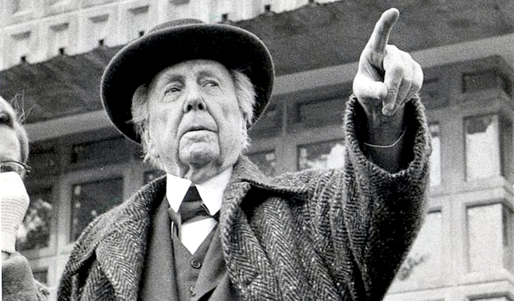
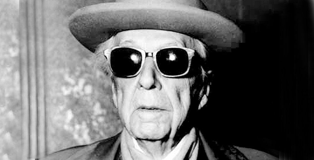
Frank Lloyd Wright was one of the greatest architects in history, and he’d tell you so, himself. The man in the cape and porkpie hat had an ego as big as any of his buildings, but as they say, if it’s true, it ain’t bragging. 

It is so tempting to dismiss Wright. He was a monster of egotism. His taste could be appallingly bad. He spoke in egregious platitudes. He abandoned children and wives. He was arrested for violating the Mann Act. He made life a misery for almost everyone around him. And what is worse: His roofs leaked. For an architect, that may be the worst sin. 

But no matter how irritating, Wright cannot be dismissed. It matters not that he insisted he was the greatest architect in American history. (“Why limit it to America?,” he then asked.) The fact remains that no architect of our time — and probably not of any other time — has had so fertile an imagination or produced so many outstanding buildings. 

That is undoubtedly the most infuriating thing about Wright: He didn’t only talk the talk, he walked the walk. 

“I hated him, of course,” said waspish architect Philip Johnson, “but that’s only normal when a man is so great.” 

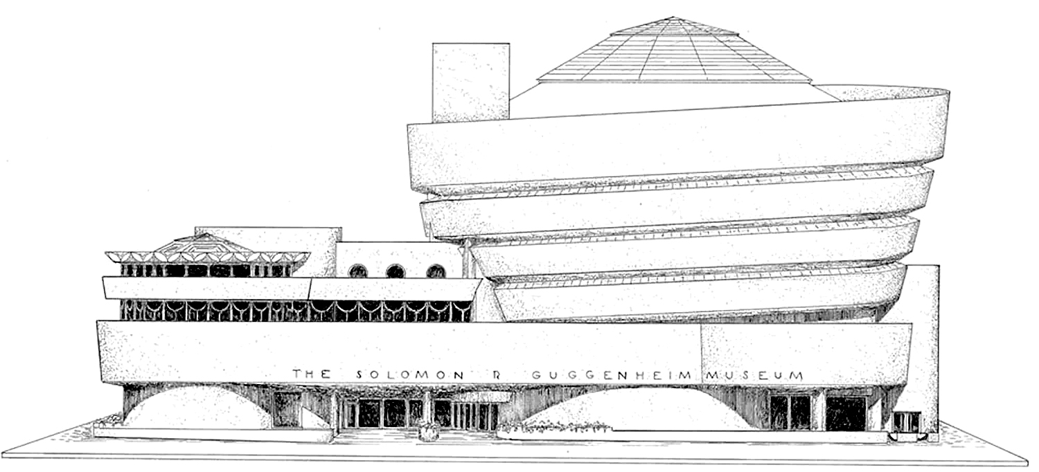
From his early Prairie Style homes near Chicago to his giant spiral Guggenheim Museum in New York, Wright kept inventing new ideas. “Why, I just shake the buildings out of my sleeves,” he once said. 

The man is difficult to pin down because, not only did he change constantly over his 90-plus years of life, he also notoriously lied about everything. He was always making orotund pronouncements and declarations, but not a one of them stands without careful checking. 

England has its eccentrics, its beekeeping vicars and parish historians, but America requires something more grandiose. 

America has crackpots. 

The crackpot differs from the mere eccentric in his missionary zeal, his transcendent ego, his absolute certainty and his touch of utopianism. From Henry Thoreau to Ezra Pound, from Charles Ives to Harry Partch, American art and culture have been defined by crackpots. Something in the American character warms to them. Something of the best of America can be found in them. 

It is important to remember that. So much has been written and said about the architect, and with such reverence and hype. It is not that I mean to debunk Wright; he was a singular genius and must be recognized as such. 

But he also was a true American crackpot, and we need to remember not only the dynamic imagination and idiosyncratic design, but also the odd geezer in the black cape and cane who wrote crank letters to the president. We need to remember the despotic man who installed glass bars instead of windows in his most famous industrial commission, Wisconsin’s Johnson Wax building, because he declared, “No one should have to look out at Racine.” 

There are several things that join to make Wright’s work justifiably the most celebrated by any American architect. First among these was his uncanny sense of space. 

What makes architecture work, and particularly Wright’s architecture, is the shape of its insides, the particular chunk of air it surrounds with walls. To experience architecture is to walk through it, sit down in it, see where the space seems to grow and shrink as you pass through. 

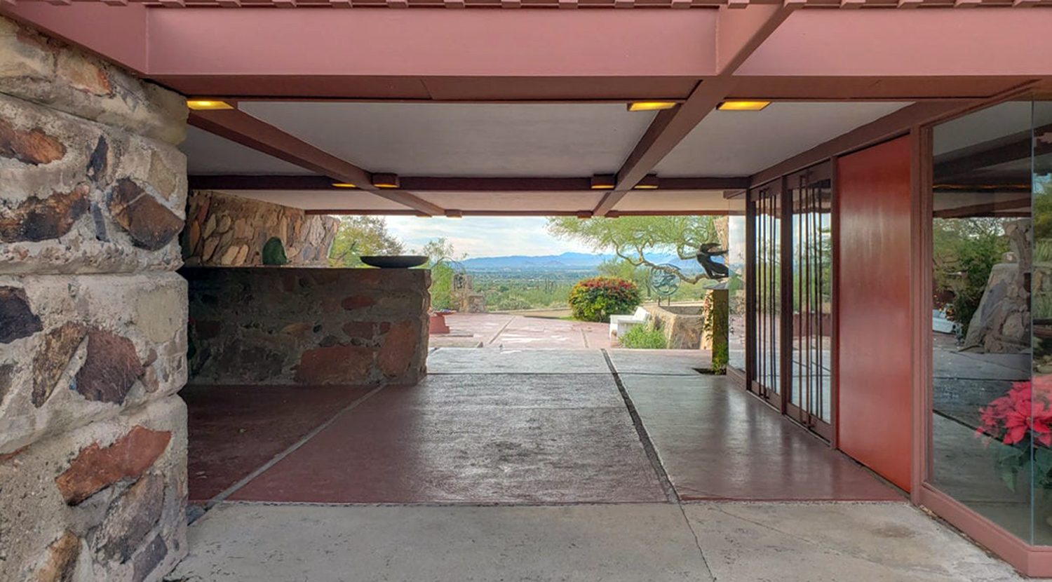
So many of us live and work in simple boxlike rooms — little boxes inside bigger boxes — we don’t always remember that rooms don’t have to be that way. “Break the box,” was one of Wright’s war cries. And in his buildings, he constantly did just that. Instead of boxes of rooms off a hallway, Wright created vast open spaces, one room opening into another. In his own home, called Taliesin, in Wisconsin, you can stand in the center of the house and see out of it in all four directions. 

Wright recreated for us that sense we had more easily when children that space can have emotional meaning, building “forts,” or climbing in tree houses of discovering caves in the hillsides. Adults can have those emotions, too. And great architecture can provide the adult emotions that are analogous to those childhood ones. I can write about thoe spaces and you can see pictures, but pictures of them don’t do it. You can only have those emotions when standing in those places. 

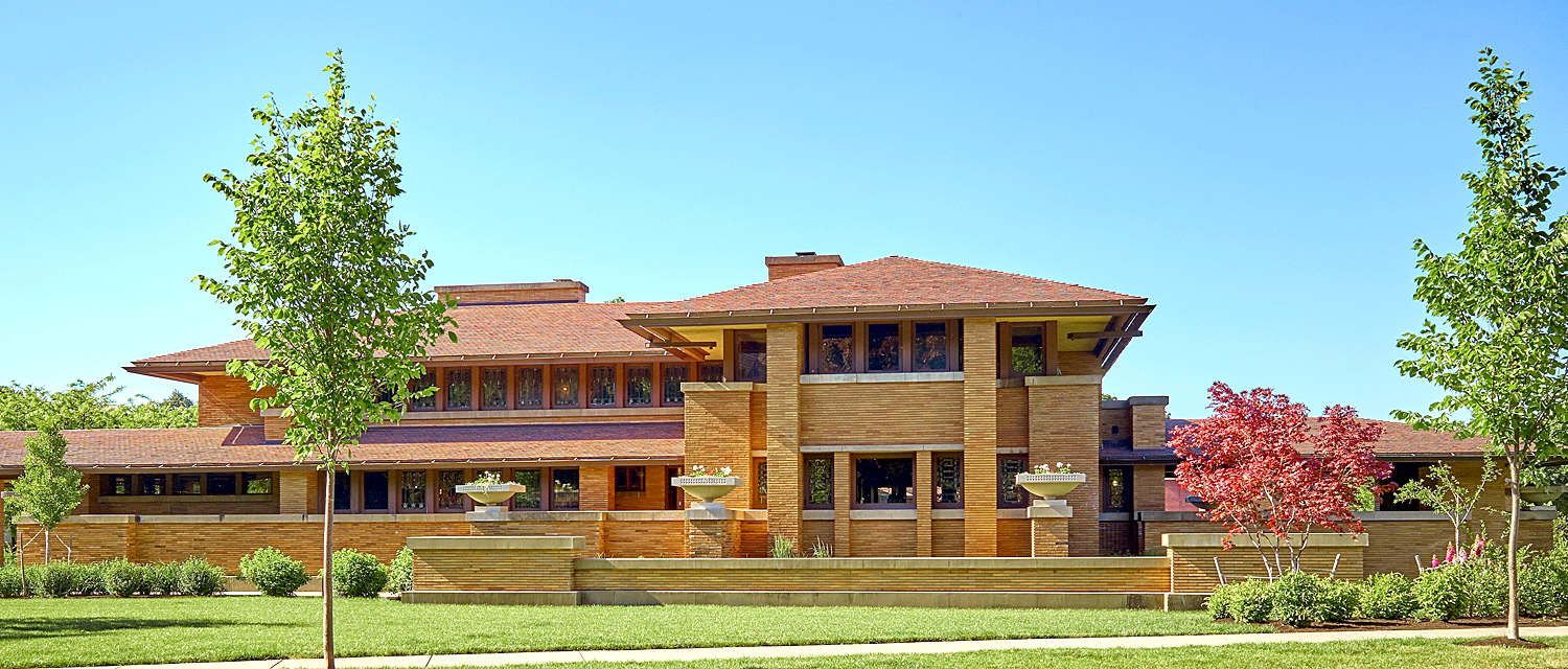
Even with his earliest buildings, the Prairie style homes, he attempted to reduce the number of rooms and create large flowing spaces, part of which might serve as dining area and part as living room. They would be built at different levels and sometimes at different angles, all to obliterate the hated “‘box.” In his best buildings, you can feel as if you are standing outside when you are actually indoors, and indoors when you are out. 

The second great strength of Wright’s work is its unceasing originality. Wright ideally approached each design as a completely new problem, to be solved in its unique way. This means that, unlike the work of his great contemporary Mies van der Rohe and his International style, there is not, after the Prairie style, a single “look” that can be identified as Wright’s. For Wright, “what we did yesterday, we won’t do today.” 

Mies groused back, “You don’t start a new style each Monday.”

But because he did start out each Monday, Wright has given us a startling variety of invention. It is true that not all the work is of equal value, but it is hard to find another artist in any medium who so thoroughly reinvented himself with each idea.

I was architecture critic for most of my 25 years living in Phoenix, Ariz., where Wright had his second home and architecture school later in his life (Taliesin West in Scottsdale), and I was immersed in Wright hype and legend. I got to visit many of the most notable Wright buildings across the country, and I came to recognize and value his genius (there really is no other word for it), but I also came to know and loathe the man himself. I will try to do justice to both. 

Architecture has four main components. First, there is the sculptural aspect, the shape a building cuts. It is what most people think of as architecture: the building as seen from the outside. 

Second, there is the engineering. Wright was both an innovative engineer and an occasionally casual one. His innovations are myriad; his lapses legendary. 

Third, there is the interior design aspect. Early in his career, Wright was especially good at this, and it is the part of his work that comes across best in photographs. The windows, the tables, the carpets he chose are beautiful, refined and subtle. Later in his career, his design became garish and loopy. But it is still what people know best. 

But the fourth part of architecture is arguably the most important aesthetically. It is the essence of architecture: the emptiness inside. And Wright’s particular genius is his way with space, the way he orchestrates large and small spaces, to stimulate your emotions as only great art can. 

Wright was especially concerned with how one room led to another, how a low ceiling makes you feel, or how nooks make magic. He called space “the invisible fountain from which all rhythms flow and through which they must pass.” These are things that cannot be conveyed in pictures; you have to be there, in the rooms, to sense their splendor. 

It is like pictures and writings about Beethoven: No matter how good the text, it cannot tell you what the music sounds like. You have to experience it.  So, photographs still cannot show its readers what truly made Wright the special case he was. No one invented interior space more creatively. Wright was not merely inventive, he was revolutionary. On the scale of Stravinsky, Picasso, Brecht or Eisenstein. 

People easily mistake the outside of a building as its “architecture.” For most people, architecture is a kind of very large, inhabitable sculpture. And there is certainly that aspect to the art. We recognize the Chrysler Building immediately, or the U.N. Building, from their outsides. But how many people can say what the insides of these buildings look like? 

Wright’s essential genius was not that of a sculptor. In fact, some of his buildings are almost ugly. No, his genius was for the empty space inside a building. He changed utterly and forever our idea of what an interior could be. Wright was a creator of empty spaces. Really interesting empty spaces. He approached a building with the air inside it as a kind of armature for the exterior. 

He found 2,000 years of architecture in which square rooms inhabited square buildings, one set of cubes inside a larger one, and broke it open, breaking down walls and finding new ways of dividing the space enclosed by the exteriors. 

Like Stravinsky or Picasso, Wright constantly changed styles, from the Prairie Style of his early residences to the “Planet Mongo” style he sometimes devolved into in his later years. But like Stravinsky and Picasso, the style itself was never the point. Stravinsky may rush from the lush Firebird to the astringent L’Histoire du Soldat, but underlying it all is an irony. You cannot imagine Stravinsky without the irony. Picasso has his plastic inventiveness — that shows through whether he’s doing Cubism or Neoclassicism. 

And Wright always has his empty spaces. Every corner you turn brings a discovery: a room bigger or smaller than you expect, a space that stretches out in interesting ways, or closes you in and makes you cozy. You can like or dislike the decorative style in which Wright worked, but you cannot help but be astonished at the way he makes you feel inside a space.

He was born in Wisconsin in 1867 and began work in the Chicago area in the 1880s, soon becoming one of the most innovative and stylish architects working. His Prairie Style homes from the early 1900s became his signature look. 

But by 1909, the 42-year-old wunderkind felt he was losing his grip on his work, “even interest in it,” he wrote. So he left his wife and six children and ran off to Europe with the wife of one of his clients. The scandal affected his practice, and Wright moved into a period of relative obscurity. He built his first Taliesin in 1911 as “a hope and a haven” for himself. 

Many artists have written their autobiographies, but Frank Lloyd Wright built his. It sits near the top of a hill in southern Wisconsin near the town of Spring Green and looks out over farm fields and forests. Wright titled his architectural autobiography “Taliesin.” It was his home. 

But three years later, that first house burned down in a tragedy of epic proportions when a workman went berserk, took an ax and slaughtered Wright’s mistress, two of her children and four other people, then set fire to the building. Wright was out of town at the time. The scandal was front page news across the country. 

He rebuilt immediately. The blow left him numb, but, as he wrote, “There is release from anguish in action. Anguish would not leave Taliesin until action for renewal began. … Steadily, again, stone by stone, board by board Taliesin the II began to rise from the ashes of Taliesin the first.” 

And so did Wright’s career. He took a new direction once more, a commission in Tokyo to build the Imperial Hotel, which opened in 1923. 

In 1925, a second fire razed Taliesin. Again, he built it up, even using stones from the first two incarnations in the walls of the third. 

He went on to design some of the landmark buildings of the century: the Johnson Wax Building in Wisconsin and Fallingwater, a summer home for the Kaufmann family, in Pennsylvania, and a long series of distinguished private and public buildings. 

Many of the design and engineering innovations he used in those buildings had their “off-Broadway” run at Taliesin, as Wright built and rebuilt the house. By his own account Taliesin was never finished. 

It is one of the most beautiful houses I’ve ever seen. Every angle and corner has something rich and meaningful to give up. One of the other party tricks Wright pulls on us is that, however stunning the living room is while you are standing in it, it is even more glorious when you sit down. Then, the long walls of windows become frames for the landscape outside. Standing, there is greenery, but no horizon; sitting, the horizon cuts halfway through the glass frame, making the windows like another spread-out Japanese screen. 

The house is amazing. Wright always said he wanted to “break the box,” by which he meant he wanted to avoid the sense that each room had four walls and a door. So he opened up his house. It is rare to find a corner, for instance: When you approach what looks like a corner, it opens up to display some unexpected nook or hallway. So that, at dead-center of the house, you might almost be standing outdoors: There is a four-direction view. 

At that point, standing in the hallway just where it opens into the den, you can look to the north through the living room and see the Wisconsin hillsides; then turn to the east and see more through that room’s glass walls; then turn south and peek through the distant windows of Wright’s office and bedroom, to see the hillside with the house called Tan-y-deri and the windmill that pumped the estate’s water; then, finally, turn west and see the top of Taliesin’s hillside and the garden and greenery surrounding the tea circle where Wright and his apprentices met for discussion. 

Almost any room you enter will require you to duck and scrunch down as you worm through the hallway or entry or door and then feel the weight of the universe lifted from you as the room expands upon your entry. It is a party trick, no doubt, but one Wright plays with great relish and effect. 

I could go on, waxing ecstatic over other Wright buildings I have visited, from Fallingwater in Pennsylvania to the Marin County Civic Center in San Rafael, California. I have always been astonished by what I saw. But there is the other Frank Lloyd Wright, the liar, cheater, fraudster and prophet of some of the worst developments in civic life. 

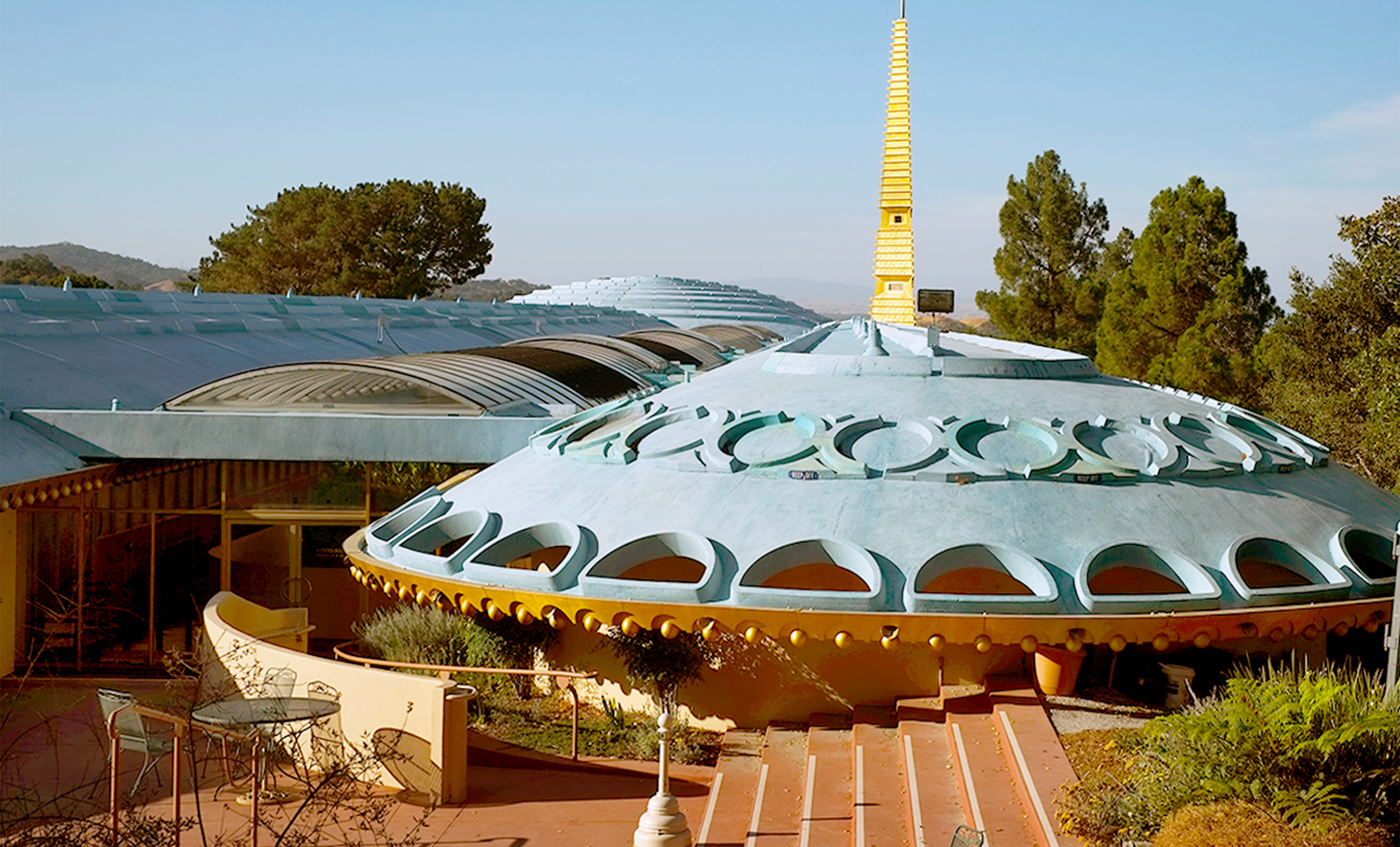
The shopping mall concept, it can be argued, began with a government building by Wright. In 1957, the equivalent of a Steven Spielberg “mother ship” landed on a woody hillside in San Rafael, Calif. It was the Marin County Civic Center and, from the outside, it was one of Wright’s “Planet Mongo” designs — odd, ungainly and a model of kitsch.

But inside … inside it was truly original. It placed the county governmental offices several stories high along the outer walls of the complex, with balconies running the length of the building overlooking a pedestrian walking space. You could look down at the “storefront” offices and the ferns and plantings along the fountains and escalators. 

When you visit the building, you can’t help but think: shopping mall. Brilliant, but I don’t know how grateful we should be for all the soulless malls we find filled with T.J. Maxes and Sbarros.

That Flash Gordon esthetic increasingly began to take over Wright’s design esthetic as he got older. In his early years, Wright was at the forefront of Modernism in architecture and his best work — those Prairie-style houses, the Johnson Wax building — have remained ever fresh and new. But in his senescence, many of his designs have become dated, like those futuristic book illustrations filled with dirigibles and autogiros. 

Instead of modern, he became what might be called “modernistical.” As in his design for the First Christian Church in Phoenix, with its science-fiction spires and reptile-scale roof. 

Then, there was Wright’s hatred of cities — an odd opinion for a builder of buildings. He called them “a persistent form of social disease,” and when asked in Pittsburgh what could be done to improve the city architecturally, he replied, “Tear it down.”

And he singled out New York for special opprobrium, biblical in its rancor. He compared it to Sodom and Gomorrah, complained that it was the city of Cain. He called it “a pig pile. A fibrous tumor. Is this city not Anti-Christ?” and said it was “a place fit for banking and prostitution and not much else.”

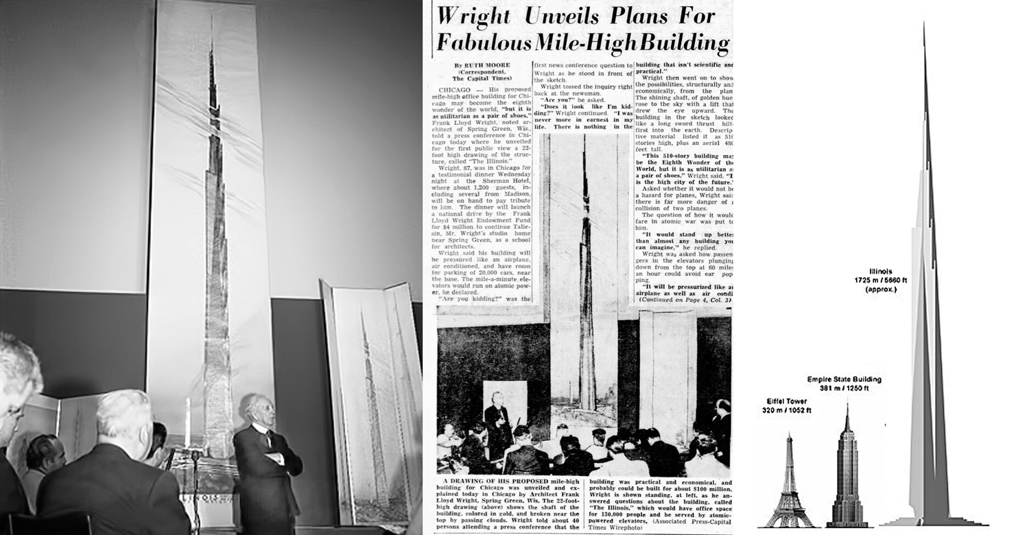
He once said the only logical place to build a skyscraper was in the desert, where the height could afford a view worth seeing. And he designed a skyscraper a mile high, never built, of course. 

“Mile-high? Why stop there? Why not two miles, or even five miles, if need be?” he asked a friend. (The irony is that the Burj Khalifa, which is a quarter-mile high, was built in the desert, and although not designed by Wright, did borrow his plan for making the footprint of the building a triangle, giving it the stability of a tripod). 

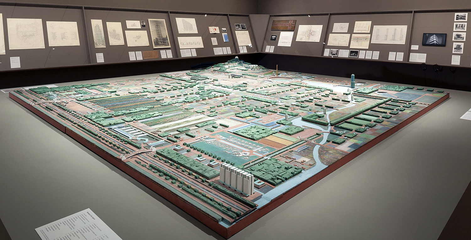
The fruit of this dislike was a vision of suburbia. Wright cannot exactly be said to have invented the suburban prototype Levittown, but he certainly predicted it in his 1932 plans for the fictional Broadacre City. Wright envisioned a sprawling suburbia, created out of minitowns, or self-contained neighborhoods, linked by automobile and tree-lined roadways. 

If the thrust of American growth was upward, Wright cast his vote for outward. But we now live with the results of that thinking: It’s most extreme embodiment is Los Angeles, sprawling neighborhoods over an area the size of some Eastern states. It is Broadacre City metastasized. 

Wright was as bad as Wagner when it comes to breaking up families. In the 1930s, the architect left his wife and six children and ran off to Europe with Mamah Cheney, who was the wife of one of his principal clients. Wright was notorious, at least in his younger years, for having the sexual morality of an alley cat.

He was a monster of self-regard. “Not only do I fully intend to be the greatest architect who has yet lived, but fully intend to be the greatest architect who will ever live. Yes, I intend to be the greatest architect of all time,” he wrote.

There is a famous TV interview with Mike Wallace, from 1953, where the man spouts off in the most irritatingly smug fashion, about his own greatness. When Wallace asks him if he said something about being the greatest architect of the 20th century, Wright answered, “You know, I may not have said it, but I may have felt it.” Actually, he did say it, many times. He also wanted to claim humility as one of his great virtues. 

Much of the interview is a piling up of fatuous truisms and platitudes. “The answer is, within yourself.” That kind of thing, but spoken as if he were giving us pearls of wisdom from Zarathustra in his mountain cave. (The interview is available on YouTube.) 

Nothing sums up his dabbling in fraud and mendacity as his involvement with the construction of the Arizona Biltmore Hotel in Phoenix. It was opened in 1929, designed by architect Albert Chase McArthur. Yet, tourists visiting Arizona are often told that the Arizona Biltmore was designed by Frank Lloyd Wright. It wasn’t, although, as we’ll see, Wright sometimes took credit. 

There are two things to note about the resort and hotel. First is that Wright was given $10,000 as a license fee by McArthur, for permission to use the patented “textile-block” technique. Problem was, the patent wasn’t Wright’s. It was invented elsewhere by others. Wright had previously used the technique and found no reason to disabuse McArthur of the idea the technique was his to license. Wright was later sued by the true patent owners and had to pay up. 

When McArthur contacted Wright about using the textile-block system, the Chicago architect telegraphed back that he would be there immediately, and in January 1928 he showed up at the door. 

In another of the changing stories, Wright’s stay in Phoenix stretched out longer and longer. Early sources say Wright was here anywhere from a few weeks to a few months. A little bit later, Wright claimed he worked on the Biltmore for six months. And in a public speech made a few years before his death, he claimed, “I spent a whole year at it.” 

In reality, the visit was probably less than a week, after which McArthur had had enough of the overbearing Wright and sent him packing. 

“The contractor was complaining about his interference,” McArthur says, “and when Wright refused to pay his rent for the house he was living in, they came with the police and evicted him. Wright said, ‘I don’t have to pay rent; I’m Frank Lloyd Wright.’ ”

McArthur had previously worked for Wright in Chicago from 1909 to 1911, performing various jobs and soaking up the influences. He later set up a practice of his own there. 

It is one of the marks of Wright’s tenacious mendacity that each time he later recalled McArthur, Wright’s memory of McArthur’s tenure with him got shorter, until, late in his career, Wright claimed that McArthur “had spent a few months” with him. 

It is important to note this, because Wright’s lack of generosity to his fellow architect becomes a major part of the Biltmore story, and a contributor to the mythology. 

Wright’s version of his participation in the design also changed over the years. Shortly after the hotel opened, he wrote a letter saying, “Albert McArthur is the architect of that building. All attempts to take the credit for that performance from him are gratuitous and beside the mark.” 

In fact, Wright thought the hotel was a botch. He criticized the building as “even worse” than he had imagined. “Far from being a great work of art, (it is) lacking even the most primitive elements of good design.”  

Yet, when the hotel became popular and its architecture praised, Wright changed his story. In his notoriously inaccurate and self-serving autobiography of 1943, he appears to see himself as the master architect working sub rosa for the “architect of record.”

And in a lecture in 1957, he answered a woman’s question by saying, “This lady wants to know if I designed the Arizona Biltmore hotel, and I did.” 

Wright went on to tell the audience, “There was a young student of mine who had the commission. He never built anything but a house, so they sent for me to help out and I helped out. So that’s the Arizona Biltmore.” Of course, by that time, Albert Chase McArthur had been dead for six years and could hardly defend himself. 

Mendacity the great speed bump of Wright’s personality: arrogant, often supercilious, egocentric and selfish. Wright could belittle those around him, fail to acknowledge their contributions, and he could be frustratingly patronizing. He lied, committed fraud, failed to pay bills. Biographers have been unraveling the lies he told about himself for years.

When Brendan Gill wrote his 1987 biography of Wright, Many Masks: A Life of Frank Lloyd Wright, he had to spend a good deal of his time debunking Wrightian lies. The architect used to tell the story that when his mother was pregnant with him, she had already decided he was going to be an architect and hung his nursery with engravings of English cathedrals cut from a magazine. Yet, the magazine engravings in question weren’t published until Wright was a teen-ager, and the tiny house they lived in at the time was too cramped to have a nursery. 

He even lied about his name: He was born Frank Lincoln Wright.

He was a monster. We are unfortunately too familiar these days with the concept of the malignant narcissist. Yet, there is an important difference: Wright was also a genius. 

When I go to any decent-size bookstore, I can find one or two books about any of the names you read about in architecture — Rem Koolhaas, Renzo Piano, Frank Gehry, Norman Foster — but there are two-and-a-half shelves on Wright, and he’s been dead for 65 years.

ENVOY

It has become common to conflate artists with their work. And artists are rarely angels. If we no longer watch Woody Allen movies, or appreciate Picasso’s paintings because their creators were fallible, even monstrous (Byron diddled his sister; Shelley had a things for underage girls; Wagner was a vicious anti-Semite) then we are likely to be required to excise more than half of all of the creations of civilization — maybe all of it, depending on where you draw the line. 

Caravaggio was a murderer; Lewis Carroll enjoyed taking photographs of nude little girls; Samuel Taylor Coleridge and Hector Berlioz were drug fiends. They — and we — are all human and bundles of contradiction. For their crimes, we may prosecute them, as we do anyone else. For their simpler sins, we develop short memories. For what they have given us, we need to be grateful.

Click on any image to enlarge

The Mona Lisa used to be a painting. Not any more. Now it’s a meme. Especially in the current climate of cellphones and online culture, the original has lost all relevance, and has been replaced by hundreds of refracted reflections. 

For that matter, “meme” isn’t what it was, either. Now, a meme is pretty much anything that someone uploads — a picture with a clever caption; a funny picture; a political observation. If it gets noticed and reposted, either in its original form, or altered by the observer, it has become a meme. A meme is a cat hanging on to a clothesline or a quote from Mark Twain that he never actually said. 

But that is not what I’m talking about here. A meme, as I’m using it, is its older meaning: a familiar image, saying, bit of music, or bit of art that has become so well known as to be instantly identifiable that it becomes a shorthand for whatever you wish it to be. The original needn’t be known for the meme to be understood. I’m sure there are people who believe the image of McCaulay Culkin holding the sides of his face in Home Alone is the original, not recognizing the reference to Edvard Munch’s The Scream. The original painting has receded and the pose itself is the referent. 

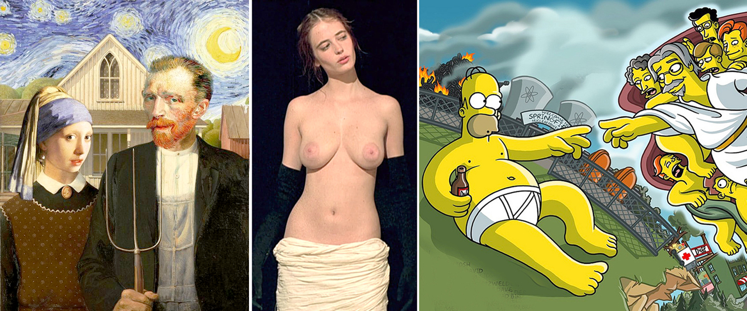
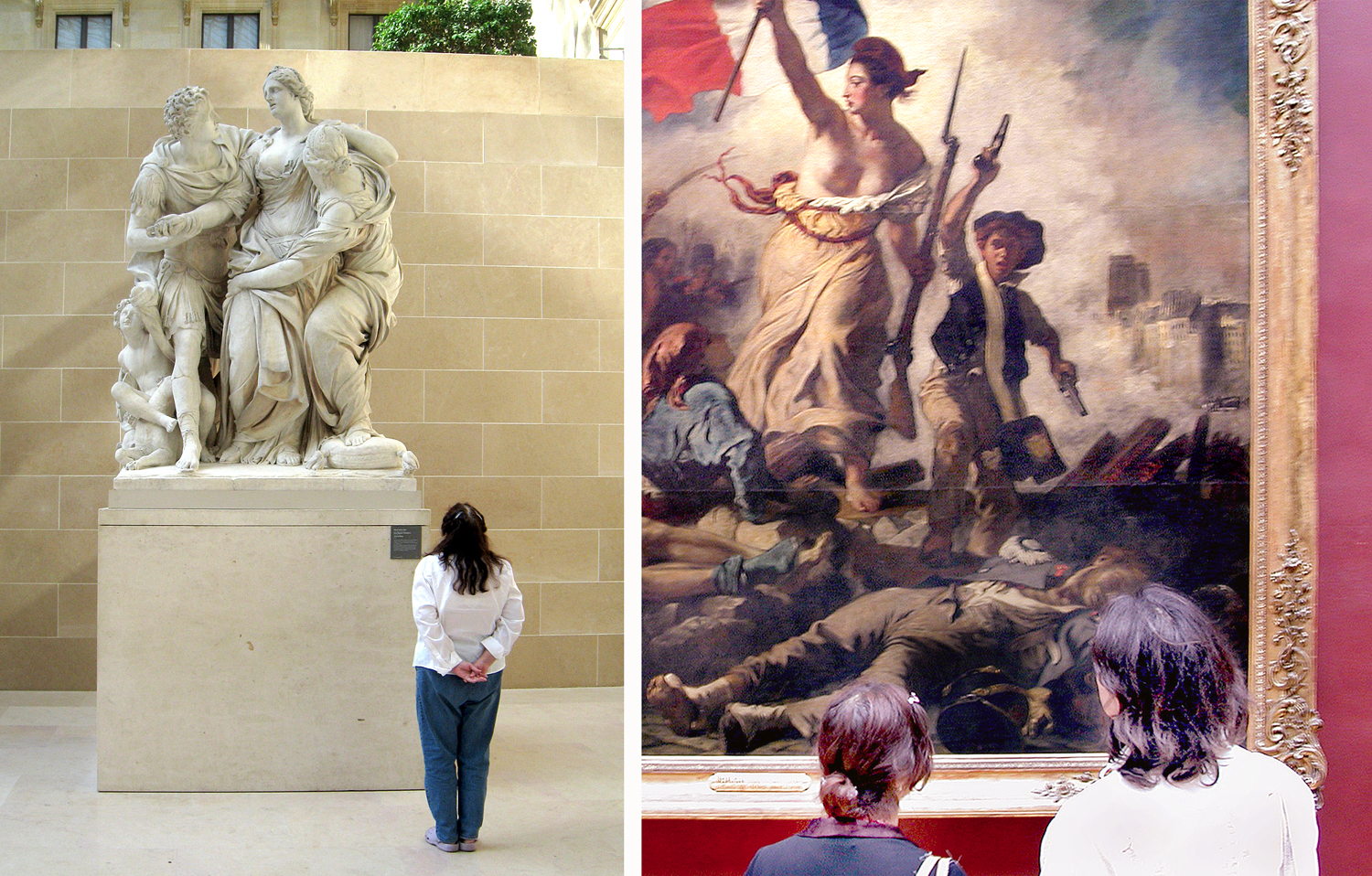
Many of the most famous pieces of art have become memes: Grant Wood’s American Gothic; the Venus de Milo; Michelangelo’s Creation of Adam. You don’t need to explain the joke when you use them. If I made a parody of, say, Ingres’ Portrait of Monsieur Bertin, with Rupert Murdoch’s face replacing Bertin’s, I’m pretty sure I’d have to explain what I meant. But Liberty on the Barricades needs no such support. We know.

 It isn’t just pictures that become memes. One of the oldest, going back to the Roman era, was a glyph sometimes called the Sator Square, an arrangement of letters (words) that reads the same top to bottom and side to side and even backwards. It has been found from ancient times into the Middle Ages. Its exact meaning and purpose are not clear. It sort of translates as “Farmer Arepo works with wheels.” Sort of. And during World War II, the little cartoon, “Kilroy was here” showed up all over the place. Memes come in all sorts of forms. 

Literature can do it, too. You don’t have to know any Shakespeare at all to recognize “To be, or not to be.” It’s there in the atmosphere. Not that we need to know much, or even know correctly. 


Getting it wrong is hardly a hindrance. How many people hear, “Romeo, Romeo, wherefore art thou Romeo,” and assume Juliet can’t find her beau? How many cartoons, comedy skits, movie bits are built from that misunderstanding? Where did Romeo go? “Wherefore” is simply too antique a term to be easily understood. And the following “Rose by any other name” is the sequent meme. 

Even music can do this. “Da-da-da-DUMM” is known to those who have never, ever heard a symphony. It is a meme. The rest of Beethoven’s symphony might as well disappear. 

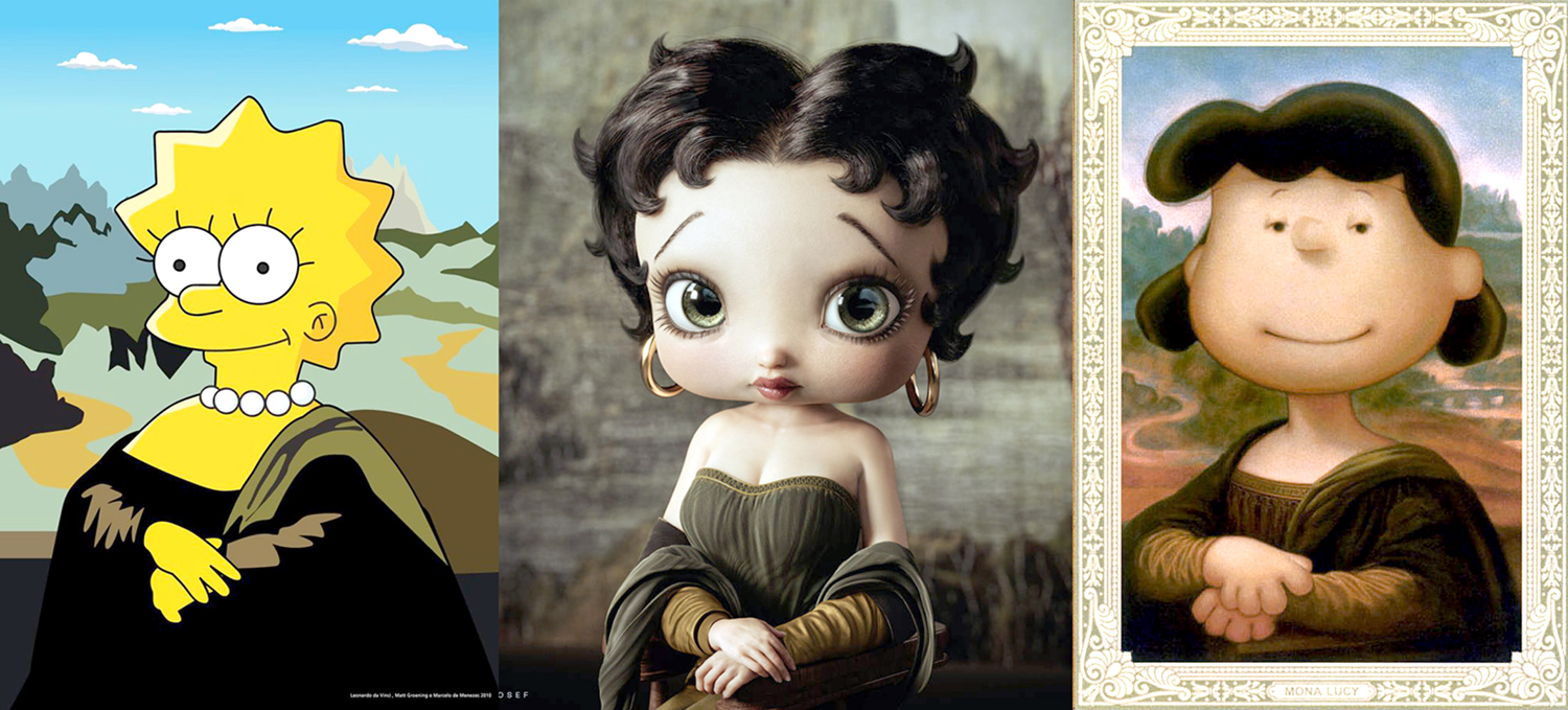
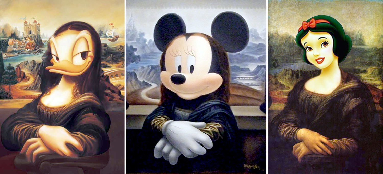
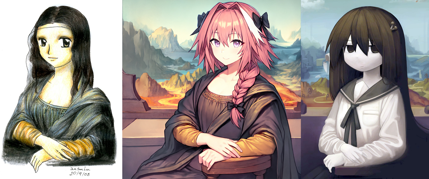
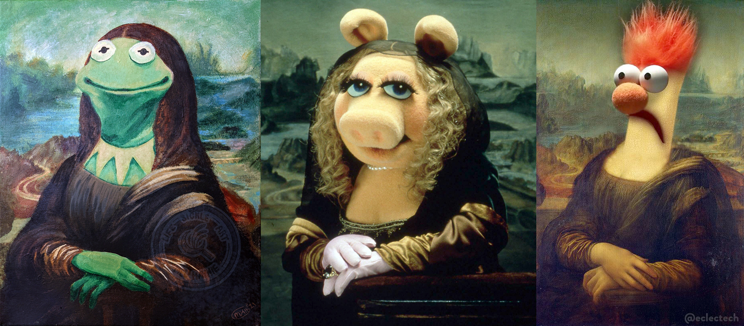
And so it is with Leonardo’s Mona Lisa. It hardly matters who Lisa was, when it was painted, nor all that technical hoo-hah about the sfumato technique. The lady has transmigrated everywhere, known to everyone, pretty much around the world. Use her for whatever you wish. You can even mix memes.


In spending weeks immersed in the Mona Lisa, gathering what I needed for my previous blog entry on the painting, I found hundreds of memed parodies. Some too good to waste. And so, I wanted to post a followup with some of my favorite Mona Lisa knock-offs. (I just counted up the images I have collected, more than I could ever use, and discovered 443 jpegs. I get exhausted just thinking about it.)

The Mona Lisa is the subject of endless cartoons. Some make jokes about the famous smile

 others to Leonardo himself… 

The Mona Lisa can just be a stand-in for important art…

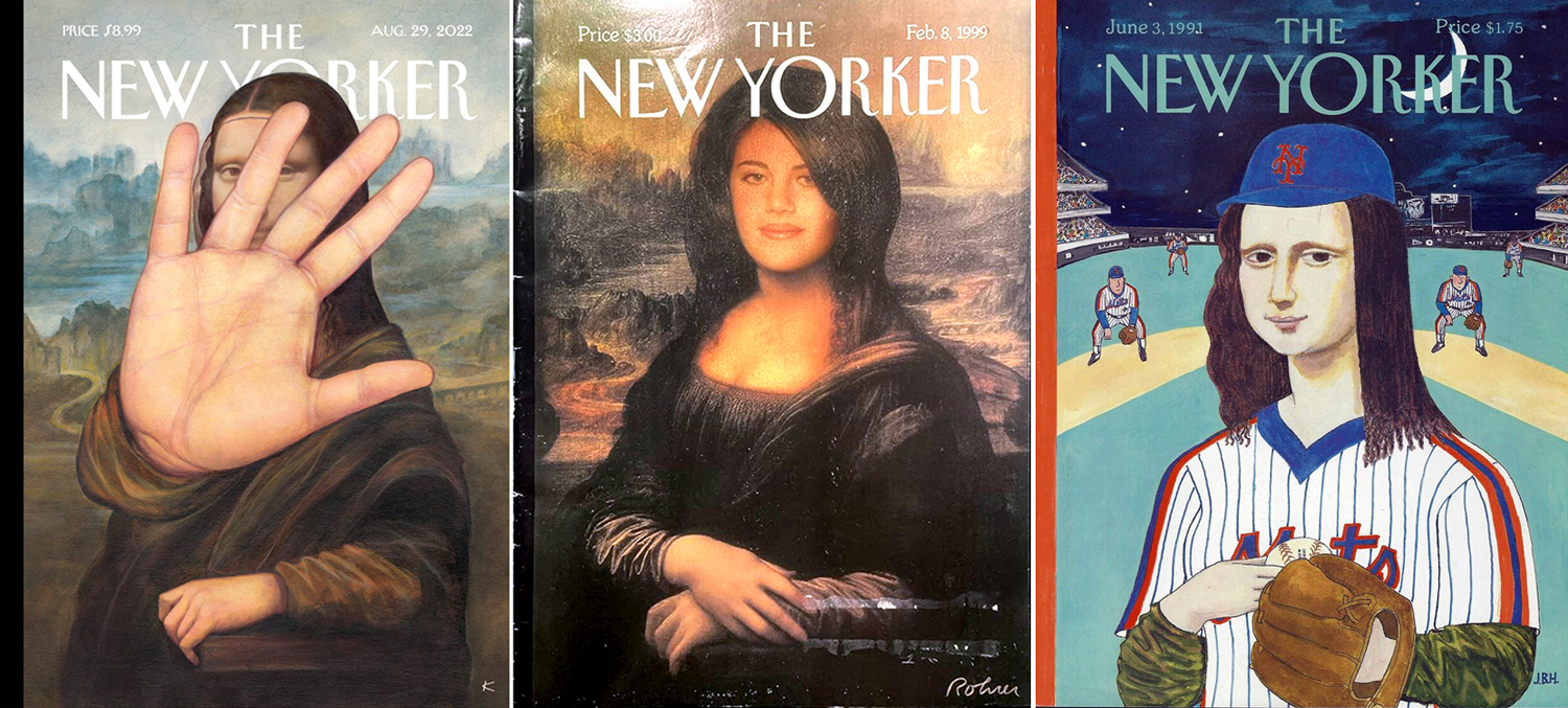
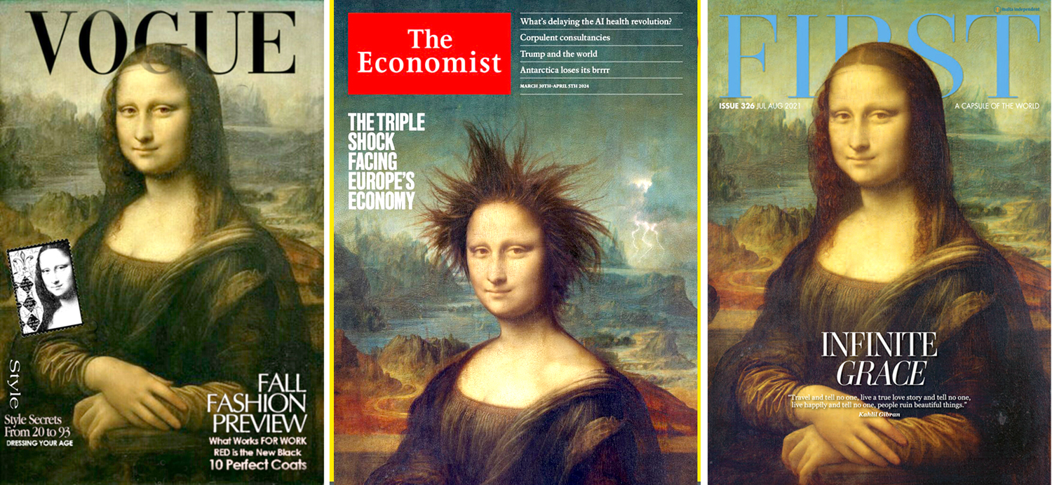
The New Yorker puts them on its cover…

In fact, lots of magazines have slapped our lady on their fronts.

Or made fun of her…

And she shows up on some magazines you might not expect…

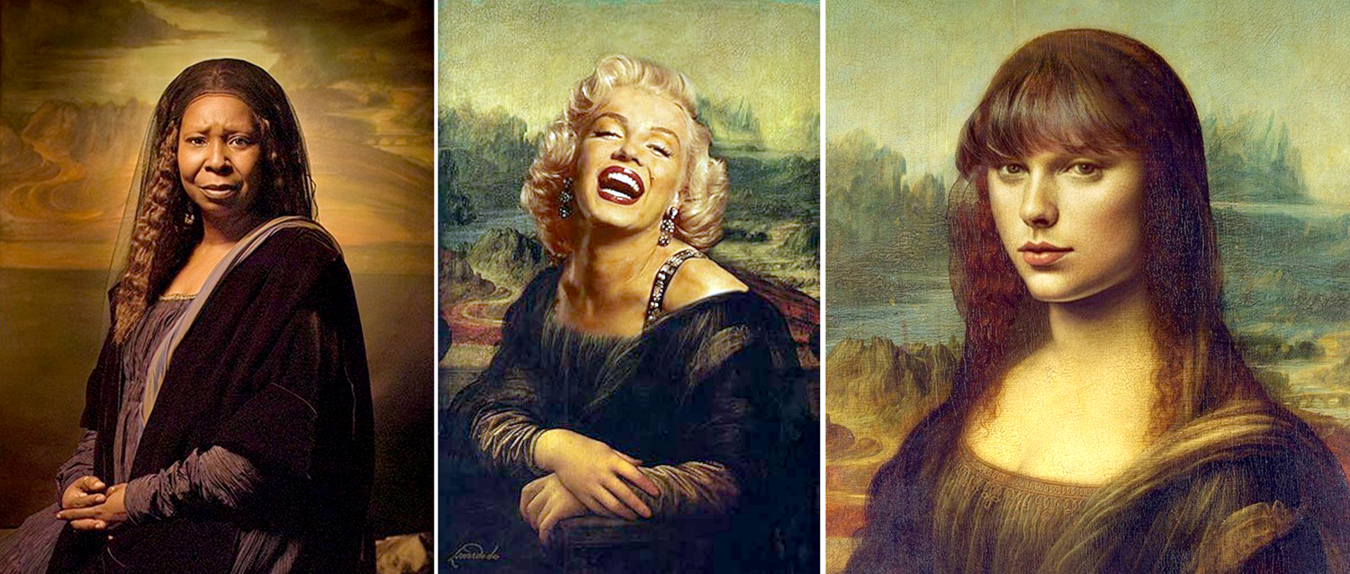
That’s just a sampling. I got lots more, but we need to move on. Celebrities get the Mona Lisa treatment quite often.

Whoopie Goldberg, Marilyn Monroe, Taylor Swift

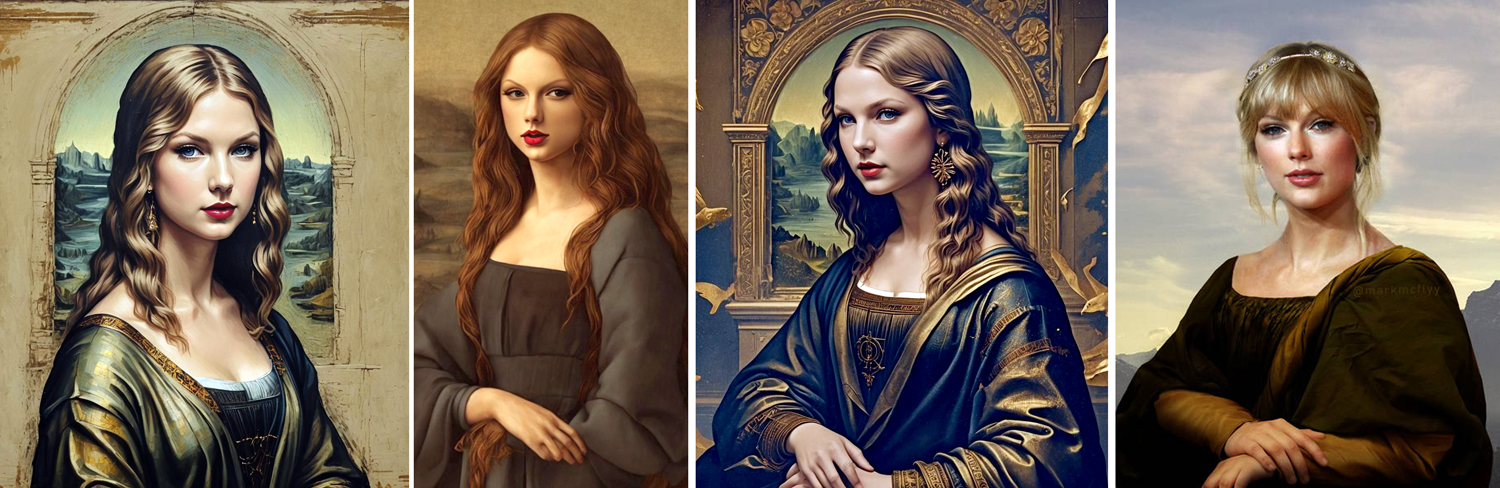
And that last one has had the treatment over and over. Whoda thunkit? 

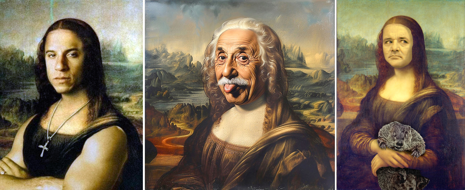
And you don’t have to be female…

Vin Diesel, Albert Einstein, Bill Murray

You can be a cartoon character…


Or a Disney character. They all run the the meme grinder…

And even more. Anyone remember Daria? 

I found dozens of anime Mona Lisas…

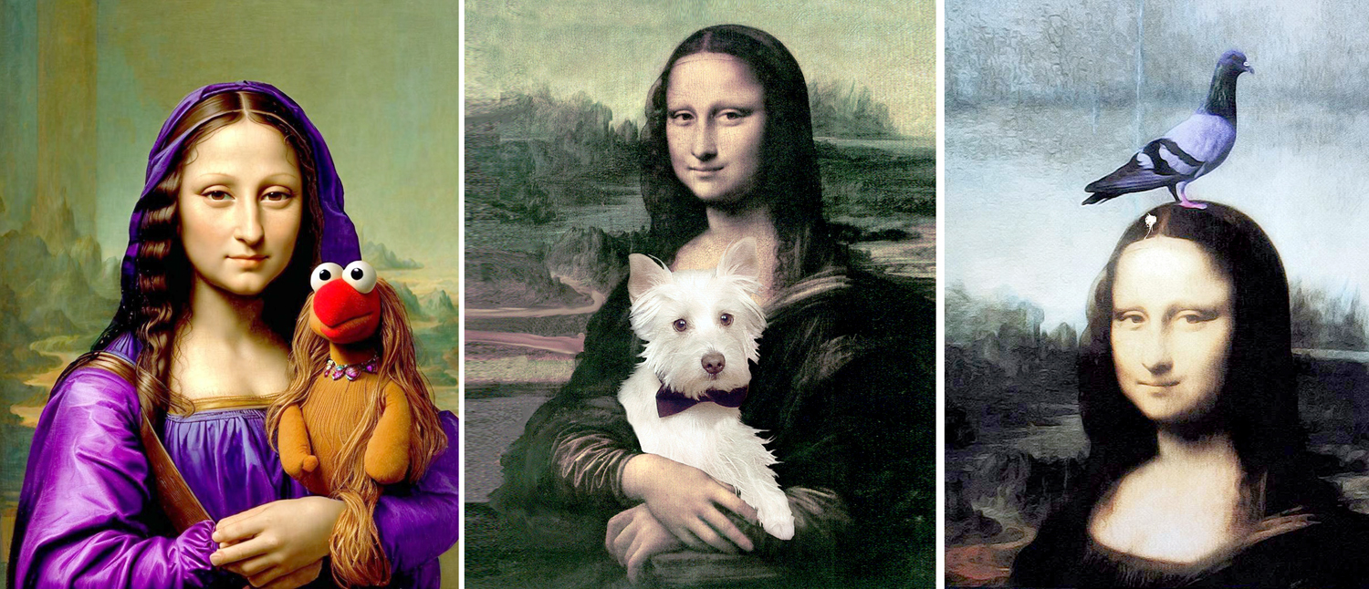
Muppet Giocandas… 

There are Mona Lisas with animals…

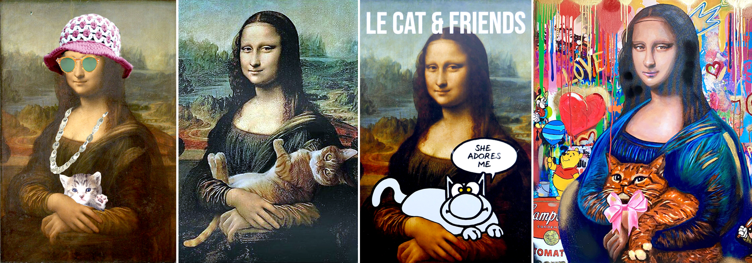
And with cats…

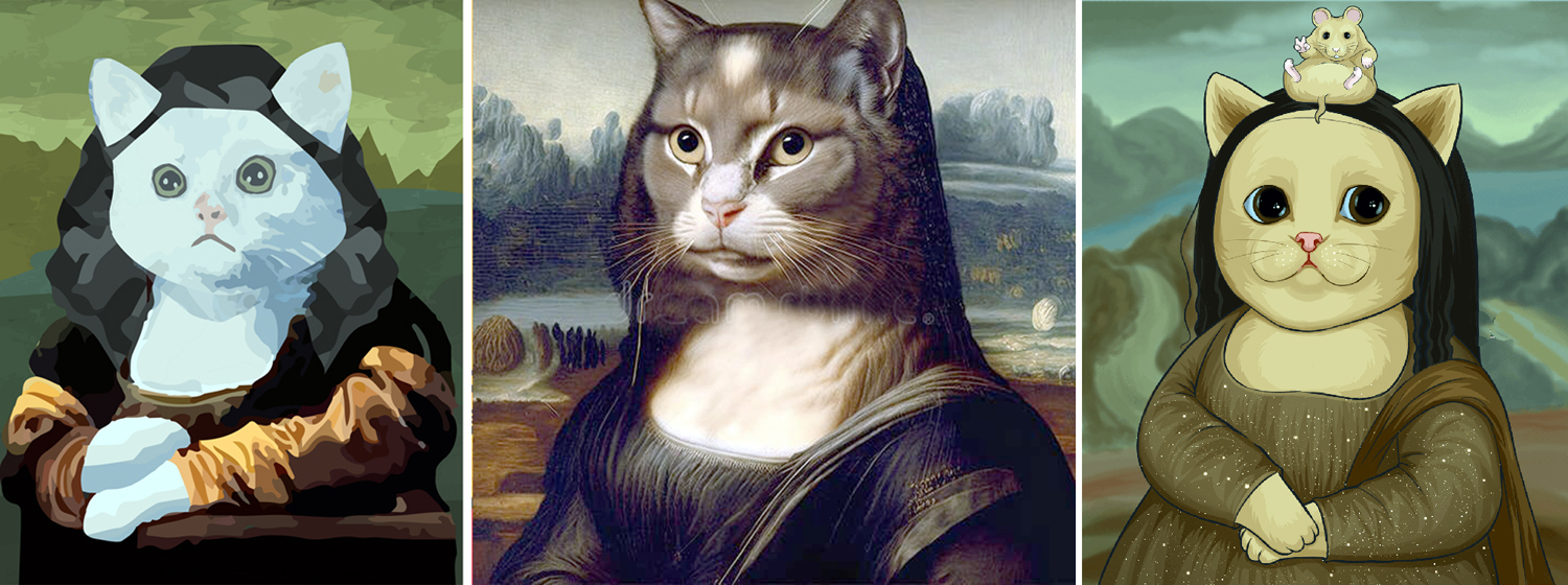
And Mona Lisas as animals…

And as cats… 

She shows up frequently as graffiti…

And as Pop Art. How could she not?

Quite serious artists have used our lady as a model. The joke Mona Lisa by Marcel Duchamp, dating from 1919, gives her a mustache and the letters “LHOOQ,” which, pronounced in French sound the same as “Elle a chaud au cul,” or roughly, “She has a hot ass.” 

By Robert Henri, Marcel Duchamp, and Fernando Botero

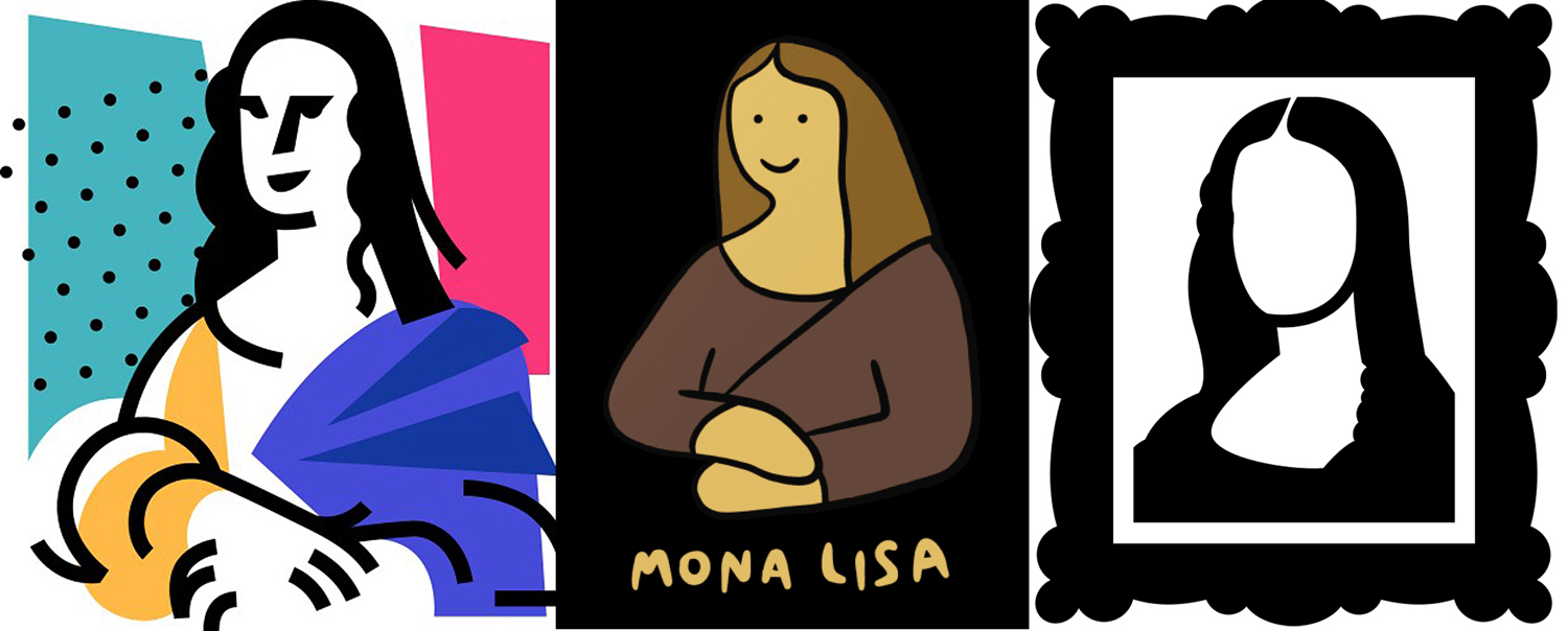
She comes in minimalist form, still easily identifiable…

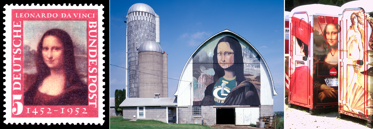
And shows up on stamps, the side of a barn, and, of course, a port-a-potty…

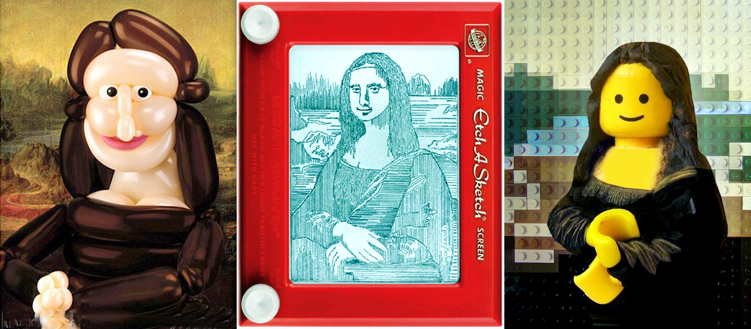
And we’re just getting started with goofy. How about a balloon Mona Lisa, or reproduced on an Etch-a-Sketch or made out of Legos…

And if that isn’t enough, what about a Mona Lisa made from bacon; or a Mona Lisa Pizza; or one made from lentils…

Still further, one made from jelly beans. Or a pair of them in peanut butter and jelly. 

Poet William Blake once wrote, “You never know what is enough until you know what is too much,” and you may very well feel we’ve long gone on too long with this. I get it. But even with all the images I’ve included, I have at least a hundred more that I’ve got left over, including Mona Lisa on coins…

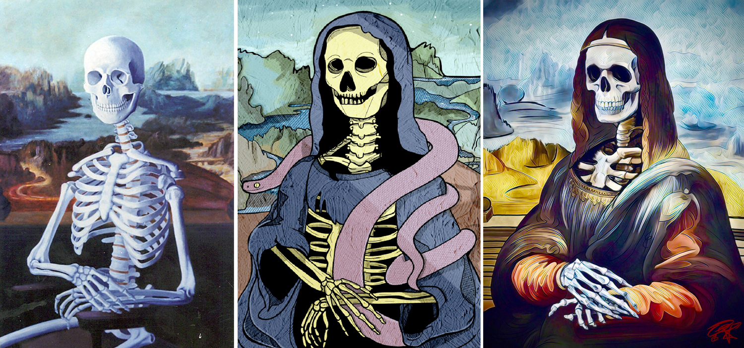
And, suitable for a finale, a big pile of bones…

Originally, I planned to write a single blog entry about the Mona Lisa, but soon came to realize that if I were going to give any background information about the painting to explain all the memified hoopla, it would have to stretch into two halves. I’ve been going through and editing hundreds of images, and researching information about Leonardo and his art. I think I’m ready to give it a rest now for a while. I’m sure you are, too. 

Click on any image to enlarge

Is there a more over-hyped piece of art than the Mona Lisa? I don’t intend to demean Leonardo’s painting, but to question the PR. It’s an excellent painting, but I could name a hundred others as good or maybe better. Yet, this portrait of a middle-class Florentine woman is the most widely known painting in the world. At least, since 1911. 

Leonardo da Vinci (1452-1519) was the prototype of the Renaissance Man. Initially a painter, he was also an inventor, scientist, sculptor and architect. But he was also a world-class procrastinator and leaver of unfinished works. His attention span could be intense, but often quite short. 

He was born to an unmarried woman about 20 miles from Florence, Italy. His father was a local notary who married four times and sired at least 17 children, including our young Leo. 

He studied painting as an assistant to Andrea del Verrocchio, but then made his living primarily as a military architect, working in turn for the Sforzas, the Medicis, and Borgias. In his spare time, he continued to take painting commissions (not all of which he ever finished) and working on various scientific and philosophic theories. 

“Leonardo painting the Mona Lisa” by Cesare Maccari (1863) mistakenly has the left-handed artist painting right-handed

When he was 51, living back in Florence, he was commissioned to paint a portrait of Lisa Gherardini, who was married to Francesco di Bartolomeo del Giocondo. She married him in 1495, when she was 15 years old, which meant she was about 23 when Leonardo began painting her. (I say “began” because the painter never really finished the painting and never delivered it to its commissioner; he never received payment for the commission, either). 

The painting has long been known, outside of the English-speaking world, as La Gioconda, or “the Cheerful Woman,” but was also just the feminine version of her married name, Lisa del Giocondo. 

“Lady with an Ermine;” “Ginevra de’ Benci;” La Ferronnière”

Leonardo seemed to enjoy including puns in his portraits. La Gioconda comes from the Latin “jocundus,” which means agreeable or pleasant. Hence the mild smile. In his three other portraits of women, he does something similar. The Lady with an Ermine includes the beast because the ermine was a symbol of the Sforza family, and also because the sitter’s surname, Cecilia Gallerani — mistress of Ludovico Sforza — is a play on the ancient Greek name for an ermine, galê (γαλῆ). The portrait of Ginevra de’ Benci sets the sitter among Juniper plants. “Ginevra” is Italian for Juniper. And finally, La Belle Ferronnière, is an early portrait of Lucretia Crivelli, who was married to an ironmonger (“ferronnier”) and mistress of Francis I of France. In her portrait, she is also wearing a decorative headstrap known as a “ferronniere.” 

The better known title, Mona Lisa, is her name, Lisa, and the honorific “Mona,” which is a contraction of “Ma Donna,” or “My Lady.” In Italian, it is there usually spelled “Monna,” and the painting as Monna Lisa. (Never “Mona,” because in various Italian dialects that is a slang word for a woman’s lady parts, and used as an insult for a stupid or obstructionist person, much as the C-word is used in British English, where it doesn’t bear quite the taboo status it has in the U.S.)

Leonardo seems to have worked on the portrait until 1506 and put it aside for a bigger commission, a mural commemorating the Battle of Anghieri — a mural he never finished, either. He kept the painting through several moves and took it to France with him in 1516, where he began working for King Francis I, primarily as a military engineer. The king bought the Mona Lisa, probably in 1518, and it wandered around various palaces after that, until after the Revolution when it found its way to Napoleon’s bedroom and then to the Louvre. 

“Mona Lisa” and what it might look like under the darkened varnish

Or, at least, that’s the most likely story. There is an alternative version, in which the painting, of an unknown sitter, was commissioned by Giuliano de Medici in 1513 and was later confused for the Giocondo painting that was mentioned by historian Giorgio Vasari. 

The problem is complicated by the fact there are two Mona Lisas, both generally accepted as by Leonardo — a second one that was in the possession of Leonardo’s assistant (and likely lover) Andrea Salai and catalogued after Leonardo’s death in 1519. 

Making matters worse, there are at least three Mona Lisas that experts agree were made in Leonardo’s studio, at the same time, with the extras likely painted by either Leonardo himself or his assistant Salai. 

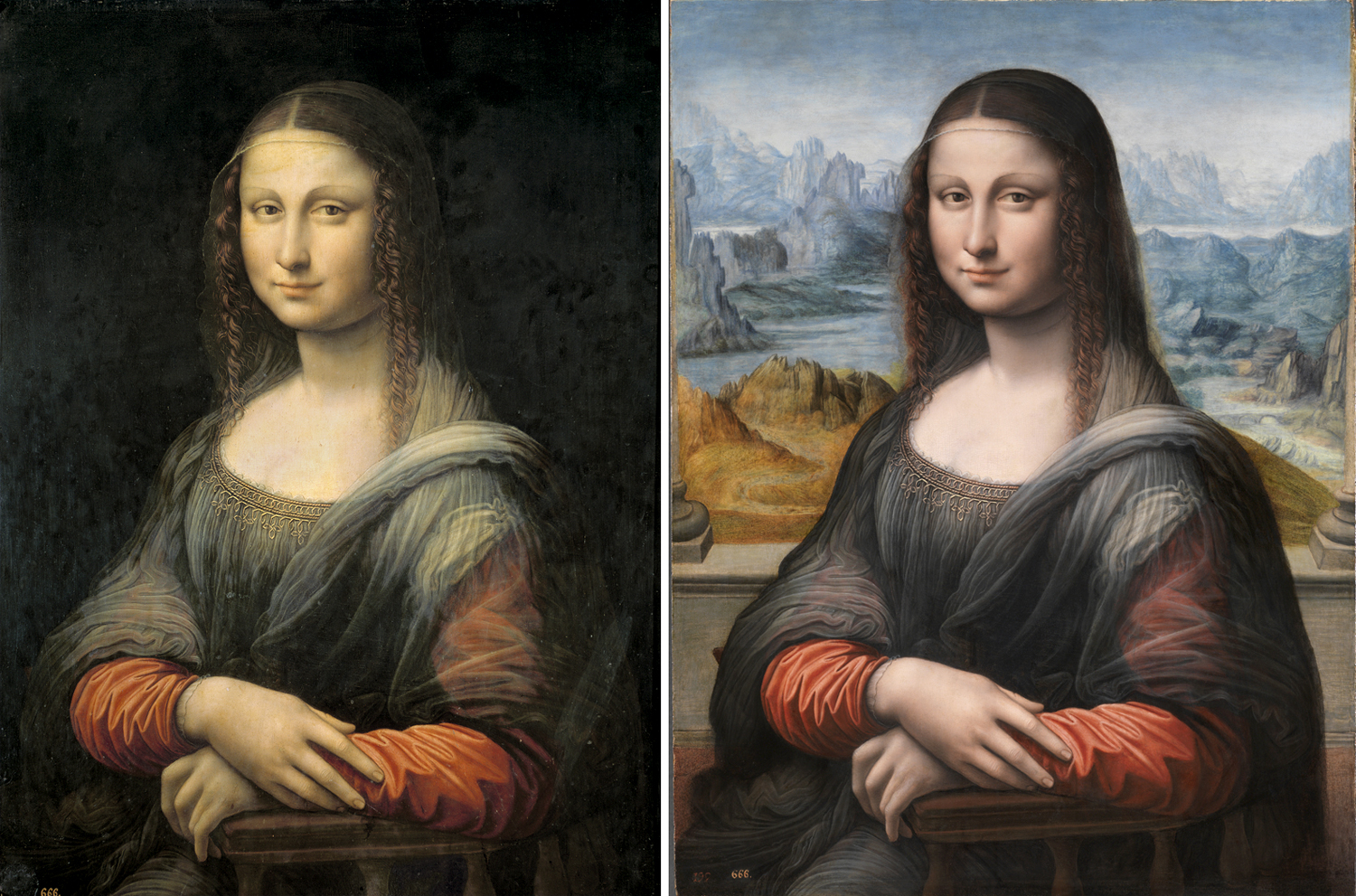
Prado “Mona Lisa” before and after restoration

One of the supernumeraries is at the Prado in Madrid. It was discovered when a portrait of a lady, with a black background was cleaned in 2012 and the background of the famous Mona Lisa was uncovered. The previously ignored painting was then studied more closely and found to have been painted in Leonardo’s studio at the same time as the more famous painting. 

“Isleworth Mona Lisa” and Louvre version compared

Another version, hidden in a Swiss bank vault until 2012, is the so-called Isleworth Mona Lisa, which was first discovered in 1913 and held in private hands since then. Originally brought to England from Italy in the 1780s by a Somerset nobleman named James Marwood and listed in his collection as “La Jaconde.” 

Examined by hordes of connoisseurs, experts, scientists and historians, it has been confirmed as a Leonardo original, as an obvious copy, as the first true Mona Lisa, as a later copy by Leonardo himself, or by one of his assistants, and maybe with a few corrective brushstrokes by the master himself. In other words, it has been argued over constantly and no true consensus has been arrived at. 

It differs from the Louvre painting by having a different background landscape, being painted on canvas and not on poplar board, showing an obviously younger subject, and having columns on each side of the image. 

It does date from the right era, all are agreed, and may have come from Leonardo’s atelier. Since there is further confusion over the date of the initial painting — either begun in 1503, as per Vasari, or in 1513, as per Louis d’Aragon — perhaps the Isleworth Mona Lisa was painted first and years later, the Louvre painting was made; or perhaps the other way around. Not to dive too deep into the weeds here, but X-rays of the Louvre painting show considerable work, changes of pose and features, while the Isleworth painting seems to show very little, suggesting that the Louvre painting came first, with all the hedging and shifting, and the Isleworth version was a confident copy. Perhaps. Who knows? 

It was not unusual, for Leonardo, or any other painter at the time, to make more than one version of a painting, so it is possible that both were made by our hero. Perhaps. Who knows? 

Top row, L-R: two 16th c. copies; 2 18th c. copies, 1 19th c. copy; bottom row: copies with columns, various eras

We do know that the painting was copied many times over the centuries. Some copies have the columns, others do not. A sketch made by Raphael in about 1505 shows the columns, but perhaps Raphael painted it from memory, or from hearing a description. It is not a very faithful copy, either way. 

There are also a series of nude Mona Lisas, seeming to emanate from Leonardo’s studio, perhaps by his students. There are at least six of them. Their grasp of female bodies seems somewhat sketchy, so they may have not been painted from life, but imagined by students less familiar with actual women. (Michelangelo had a similar problem with female nudes, often making them look like male body builders with odd lumps of fat on their chests). In fact, there is some speculation that the subject was not Lisa del Giocondo, but Leonardo’s assistant and gay lover Salai, painted as a woman. Mona Lisa in drag? Perhaps. Who knows? These paintings are usually titled Mona Vanna

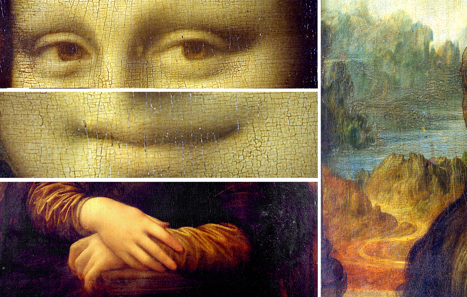
It is the Louvre Mona Lisa that has become the de facto true one, and has been copied, discussed, parodied and referenced endlessly. It is a fairly standard Renaissance-era portrait pose, three-quarter length. There are four aspects of the painting that stand out. 

First, the eyes, which are said to “follow you around the room,” as if that were some magical power. Any face painted or photographed with its subject looking directly out will have eyes that seem to look at you, no matter what angle you stand in front of it. There is no trick to that. But in addition, our lady has no eyebrows and no eyelashes. Many of the copies do, and Vasari describes her eyebrows particularly, and so it is assumed they used to be there, but were accidentally wiped off during some previous cleaning of the painting. 

Then, there is the mouth and its ambiguous smile. The Mona Lisa smile has been subject of innumerable New Yorker cartoons, popular songs and magazine ads. A slight upturn at the corners of the lips, described only by a tiny gradation in shading. This has also been lauded as a special and unique quality of Leonardo’s genius. Of course, many other paintings of the time display nuanced expressions also. 

And there are the hands, gently overlapping in a demure pose meant to signify breeding and chastity. Although one critic, making an argument for the Isleworth Mona Lisa as the original, complained that the hands of the Louvre painting are “thick and bloated.” The eyes of the beholder, I guess. 

Salient features of “La Gioconda” 

Finally, there is the landscape behind the sitter. It has never been satisfactorily identified as a real location, and, of course, it doesn’t have to be. Fantasy landscapes abound in art history. But one theory, which I have long agreed with, is that it isn’t meant to be a real piece of geography at all, but is a tapestry on the wall behind La Gioconda. 

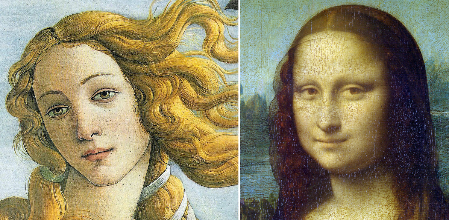
When Leonardo painted the Mona Lisa, oil painting was still relatively new to Italy. It had been common in northern Europe for at least a century, but most Italian painters stuck with egg tempera. Leonardo was one of several who picked up the new technique, which allowed a more graceful shading of tones and colors. 

You can see the difference if you compare Botticelli’s Venus with Leonardo’s Gioconda. Edges are clean and distinct with tempera, but less so with oil, and the particular technique Leonardo used, called “sfumato,” or as he described it: “without lines or borders, in the manner of smoke.”

It was shadows, he said, that build up volume and bring grace to faces. “The gracefulness of shadows, smoothly deprived of every sharp contour.”

In his studies of human perception, the scientist Leonardo had come to the conclusion that human vision is not the clear-edged thing that shows up in tempera, but something more soft-edged, and he sought to capture that in his work. There are few lines or edges in the Mona Lisa; it is mostly soft, in diffused light. 

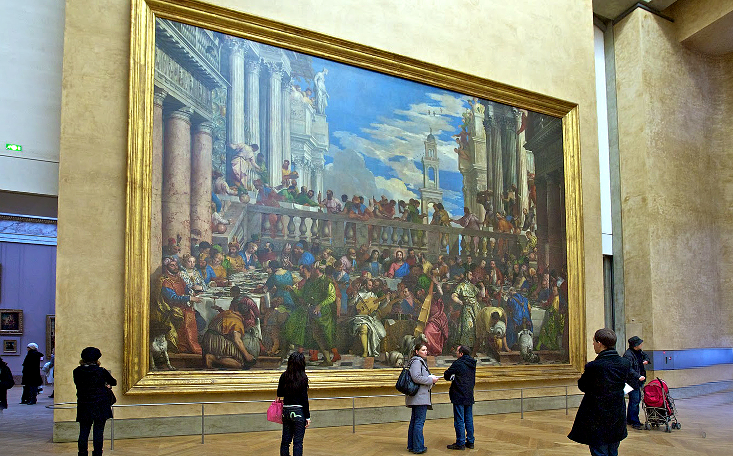
This is how important the Mona Lisa was at the Louvre in 1911

But back to 1911. I mentioned 1911 earlier. Before that year, the Mona Lisa was just one of a bunch of respected portraits of women in the Louvre. Most of them were Madonna and child paintings. Visitors to the museum were much more likely to line up to view the Venus de Milo or the barn-size expanse of Veronese’s Wedding at Cana (32 feet wide). Our Mona Lisa was just another frame among all others hanging on a gallery wall. 

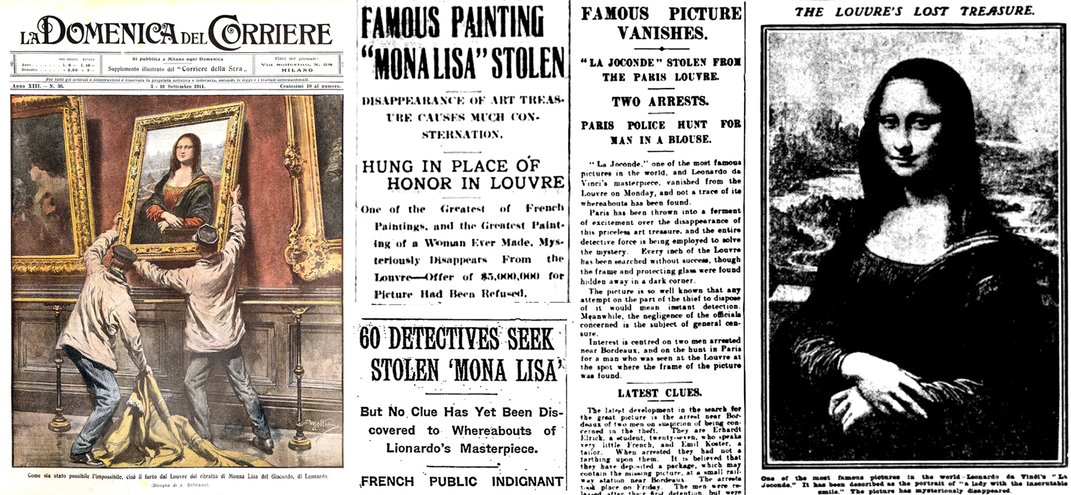
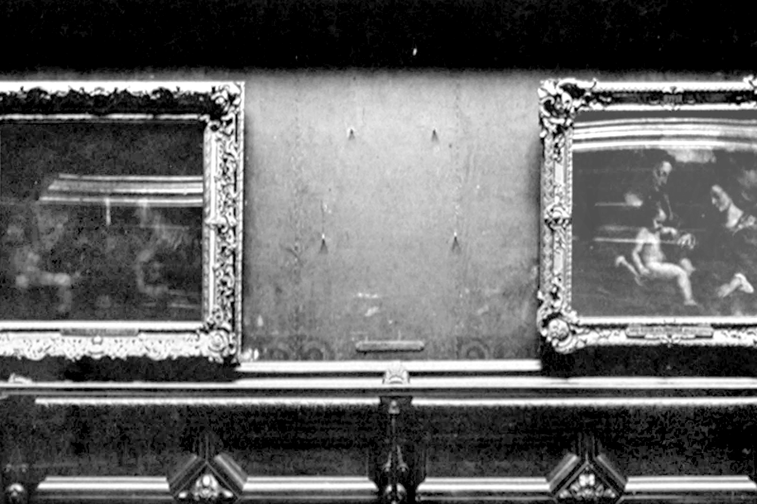
Then, on August 21, it wasn’t. Instead, there were four hooks where the painting had once been attached. The theft of the Mona Lisa became international news. Daring art theft! 

The painter Louis Béroud had come to the museum that morning to paint a scene of the gallery, with its paintings, and reported to the guards that where the Mona Lisa should have been, there were only those hooks. 

The guard assumed the painting had been removed by conservators to clean or photograph. But soon, when they went to check, it became apparent that the painting was gone. The museum was closed for a week while they searched high and low. No luck.

Vincenzo Peruggia mug shot

The painting was gone for more than two years. Turns out, it spent that time in the rented room of an Italian immigrant, hiding in a cupboard only two miles from the Louvre. Vincenzo Peruggia had been working as a glazier at the museum on and off, and felt, as an Italian patriot, he should return the patrimony of his native land. He grabbed the Mona Lisa primarily because his other targets were too large to smuggle out of the museum. 

The police searched for the painting furiously, and many rumors abounded, leading to false leads. 

Lloyd’s Weekly Newspaper reported how early interest was centered on Bordeaux, and indeed, Canadian newspaper the Ottawa Free Press on 26 August 1911 reported from Paris how “there appears to be no doubt here that Leonardo Da Vinci’s famous painting Mona Lisa, was taken to Bordeaux, whence it is feared it will be carried either to Spain or South America.” According to its account, a witness had seen a “stout man, carrying a large panel covered with a horse blanket, take the 7:47 express for Bordeaux on Monday morning,” soon after the Mona Lisa was taken.

Of course, that was fake news. But stories sold newspapers. One newspaper printed an “interview” with Mona Lisa. Another that fictional criminal Arsène Lupin must have done it. There were movies and popular songs about it. Over two years, hundreds of phony leads were sent to police.

Various people were arrested and released, including Pablo Picasso. Picasso, and his friend Guillaume Apollinaire had been dabbling in some minor fencing of stolen artwork. But they were soon cleared in the Mona Lisa heist. 

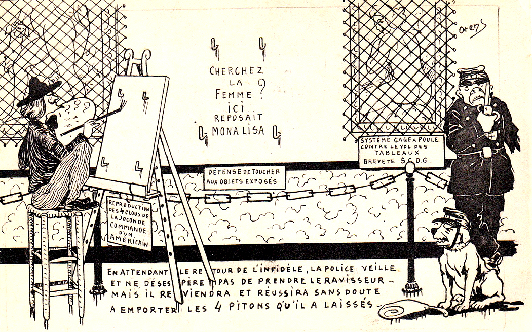
French postcards: Where is she? 

Actually, the painting didn’t leave Peruggia’s cupboard until he tried to sell it to the Uffizi Gallery in Florence, where he was arrested and served seven months in prison — a short term, since, in Italy, he was considered a patriot. 

But the Mona Lisa was not one of the many “appropriated” artworks that have found their way into various museums around the world. It was sold quite legally to the French king 400 years previous. By 1914, it was returned to the Louvre. 

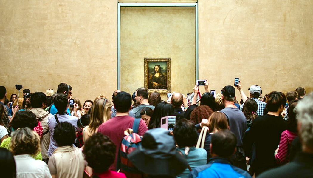
Today, the painting is safely protected behind bullet-proof glass and a barrier, so that the closest anyone can get to it is some 10 feet away, and that only if they are lucky, seeing as how the painting attracts an average of 30,000 visitors a day — about the size of the crowd at an average major league baseball game. People are not there to see the painting, so much, as to be able to say they have seen it. There is little chance to study the vaunted brush work or sfumato. 

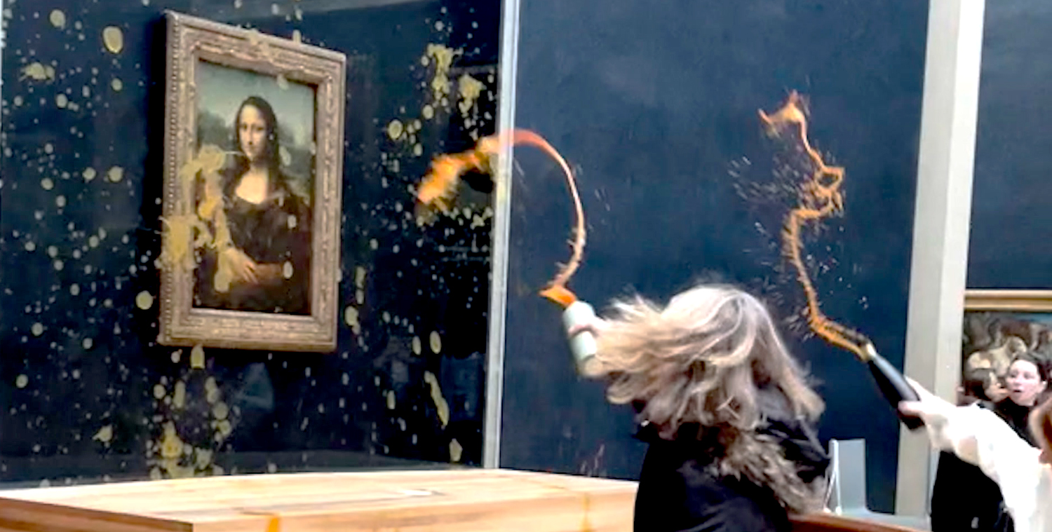
The protection is certainly warranted. In 1956, it was attacked with acid and also with a rock thrown at it. In 1974, it was red paint. In 2009, a coffee cup. In 2022, a man in drag in a wheelchair threw a cake at it. And on January 28 this year, two members of the Riposte Alimentaire (foot retaliation) sprayed pumpkin soup at it, demanding sustainable farming. What the Mona Lisa has to do with farming is anyone’s guess.

This year it was decided to create a special gallery just for the Mona Lisa, in the museum basement, and to charge a special admission fee, and run controlled groups past the painting, in an attempt to systematize the current chaos. Whether this happens or not, we’ll have to wait to see. 

The Mona Lisa is no longer just one painting in the Louvre. It has morphed from a painting into a meme. 

More on that in Part 2

Click on any image to enlarge

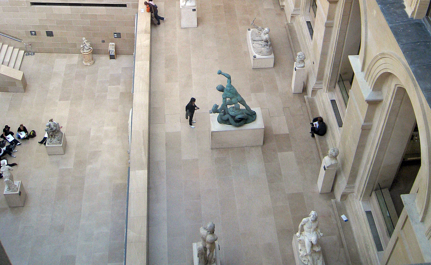
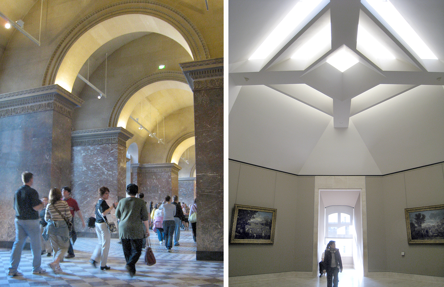
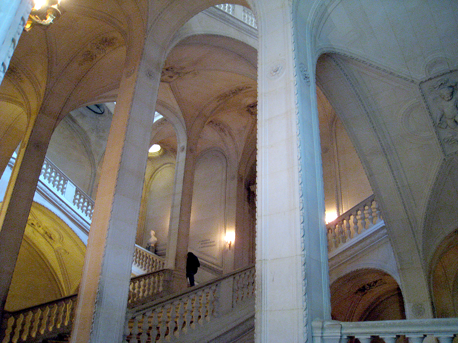
I’ve been to the Louvre in Paris a number of times, but no matter how long I spend there, I never feel as if I’ve seen more than two percent of it. It is vast. It is the largest museum in the world, with 782,910 square feet of floor space (topping the No. 2 museum, St. Petersburg’s Hermitage, by more than 60,000 sq. feet) and a collection of more than 600,000 pieces. 

It’s where you go to find the Mona Lisa, the Winged Victory of Samothrace and the Venus de Milo.

It’s one of the oldest museums around, but never seems quite finished. It began as a royal palace in the 12th century, and has been added on to, parts burned down, parts replaced, and even a glass pyramid added to the top. 

When Louis XIV moved the court from the Louvre to Versailles in 1682, the building became a warehouse for kingly treasures and much of his art collection. in 1699, the first “open house,” or salon was held, and for a century, the royal academy of art was located there. 

The French Revolution ended the monarchy, and all the art once owned by the king became public property, and in 1793, the new government decreed that the Louvre should be open to the citizens as a free art museum. 

But soon after, the collection expanded exponentially, as Napoleon Bonaparte conquered half of the continent, and sent back to Paris a good deal of the art from conquered lands. He even had the museum renamed Musée Napoléon. That didn’t last, but neither did Napoleon. 

Over the 19th century, the museum collection grew, from bequests, purchases and colonial expropriations. For a while, it included a whole section of Pre-Columbian art from the New World, but that spun out into its own museum, leaving the Louvre for the Musée d’Ethnographie du Trocadéro in 1887; in 1945, the Louvre’s extensive collections of Asian art were moved to the Guimet Museum; and by 1986, all the museum’s art made after 1848, including Impressionist and Modernist work, was transferred to the Musée d’Orsay, a refurbished railways station. It seemed the Louvre kept bursting its seams. 

Then came François Mitterrand. Serving as French president from 1981-1995, Mitterrand conjured up the Grand Project to transform the cultural profile of Paris, with additional monuments, buildings, museums, and refurbishment of existing locations. Taxes were raised to accomplish this project, said to be on a scale that only Louis XIV had attempted. 

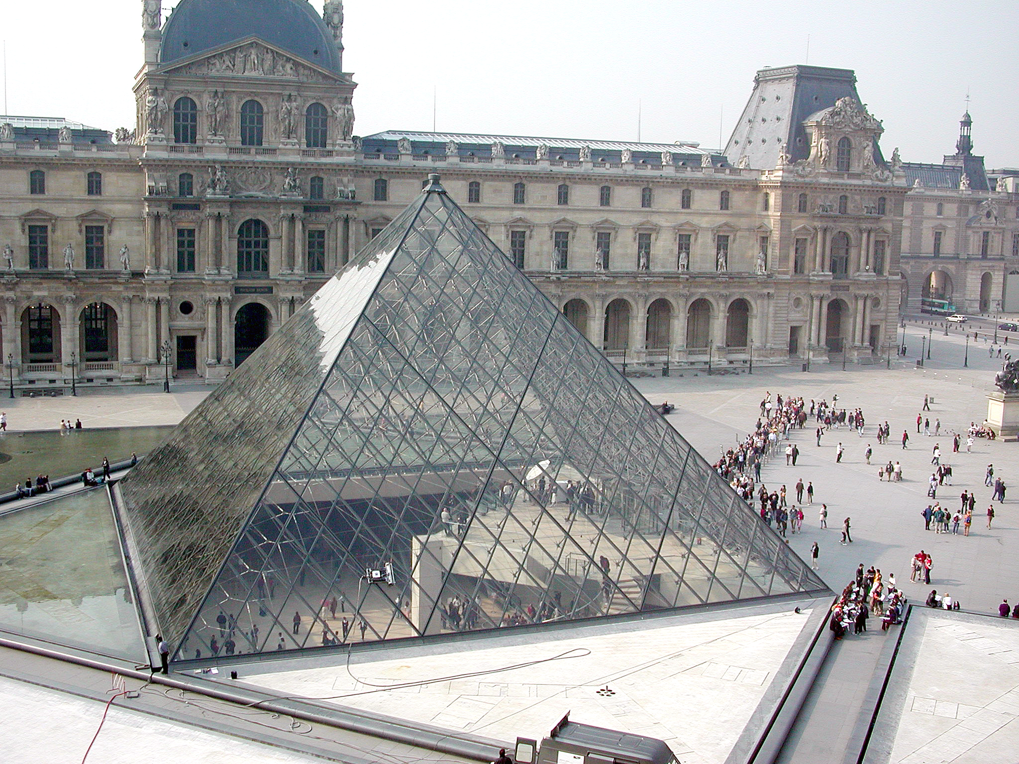
Part of this plan was the Grand Louvre, to remodel and expand the museum, and to regularize (as much as possible) the maze and warren of galleries in the old accretion of palace rooms. The most visible of the changes was the addition of the glass pyramid in the center courtyard of the palace. It was designed by architect I.M. Pei and although it has long become part of the landscape of the museum, it still angers many of the country’s more conservative grouches. In 2017, The American Institute of Architects noted that the pyramid “now rivals the Eiffel Tower as one of France’s most recognizable architectural icons.” 

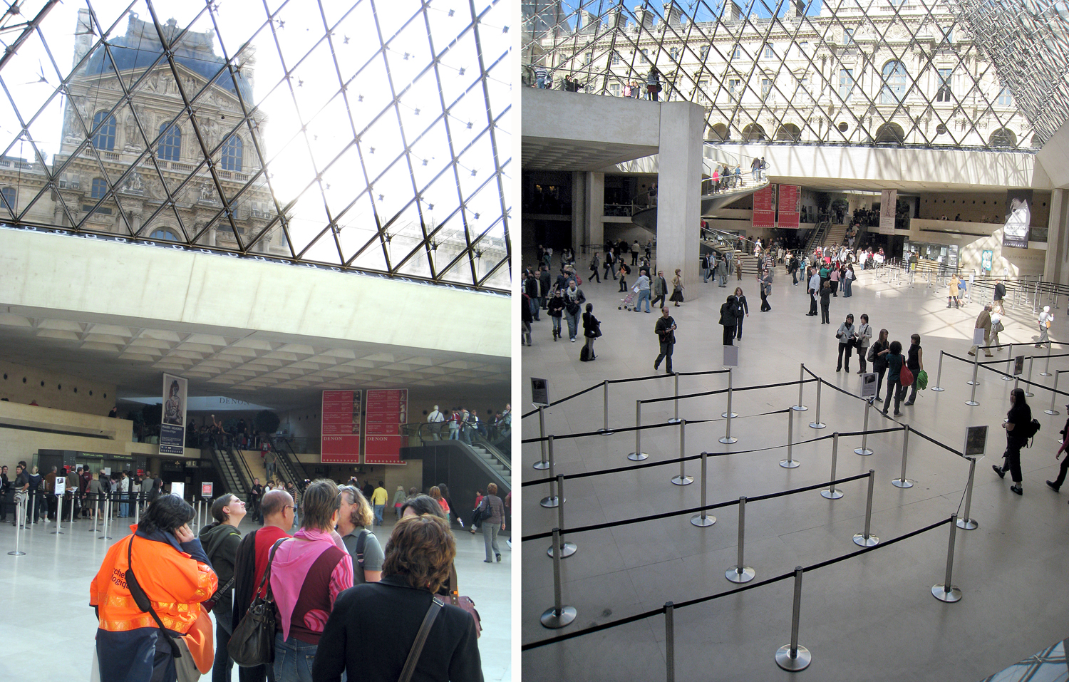
The entire central underground of the courtyard was remodeled to create a new entrance, and to attempt to make sense of the confusion of corridors, rooms, staircases and doorways. It was completed in 1989. 

Now, one cannot think of the Louvre without its pyramid, but speaking as a visitor, while the Hall Napoléon (the underground foyer) has made some sense of the confusion, I cannot honestly claim the chaos has been tamed. The museum remains a labyrinth and you can be easily lost. 

And, unless you have budgeted a month or more to spelunk the entire museum, you will need to prioritize what you want to see in a visit — or two, or three. 

Quick word: Forget the Mona Lisa. It’s a tiny little painting of little artistic note, buried under a Times Square-size crowd of tourists all wanting to see the “most famous painting in the world.” It is what good PR will get you. It may be a historically noteworthy piece as one of the very few paintings Leonardo completed, but there is much better to be seen in the museum. Don’t exhaust yourself in the mêlée

Seek out the unusual, like Jan Provost’s Sacred Allegory, from about 1490, which I like to call “God’s Bowling Ball;” or The Ascension, by Hans Memling, from the same time, which shows Christ rising into heaven, but shows only his feet dangling from the clouds. There’s some quirky stuff on the walls of the Louvre. 

One of the goals of the museum is to collect, preserve, and display the cultural history of the Western world. This is our art, the stuff we have made for more than 3,000 years, from Ancient Sumer and Egypt, through classical Greece and Rome, wizzing past the Middle Ages and brightening with the Renaissance and the centuries that followed. You get the whole panoply and see what tropes have persisted, the ideas that have evolved, the stuff of our psychic landscape. 

(See how the fallen soldier in Jacques-Louis David’s Intervention of the Sabine Women echoes in Picasso’s Guernica. One way of looking at all cultural history is as an extended conversation between the present and the past. The reverberations are loud and clear.)

You can look at the paintings on the wall and see them for the beauty of their colors and brushwork, or the familiar (or not-so-familiar) stories they depict; or you can see them as the physical embodiment of the collective unconscious. 

I have always been a museum-goer. From my earliest times as a boy going to the American Museum of Natural History in New York, through my days as an art critic, rambling through the art museums of the U.S. and abroad. There is little I get more pleasure from. 

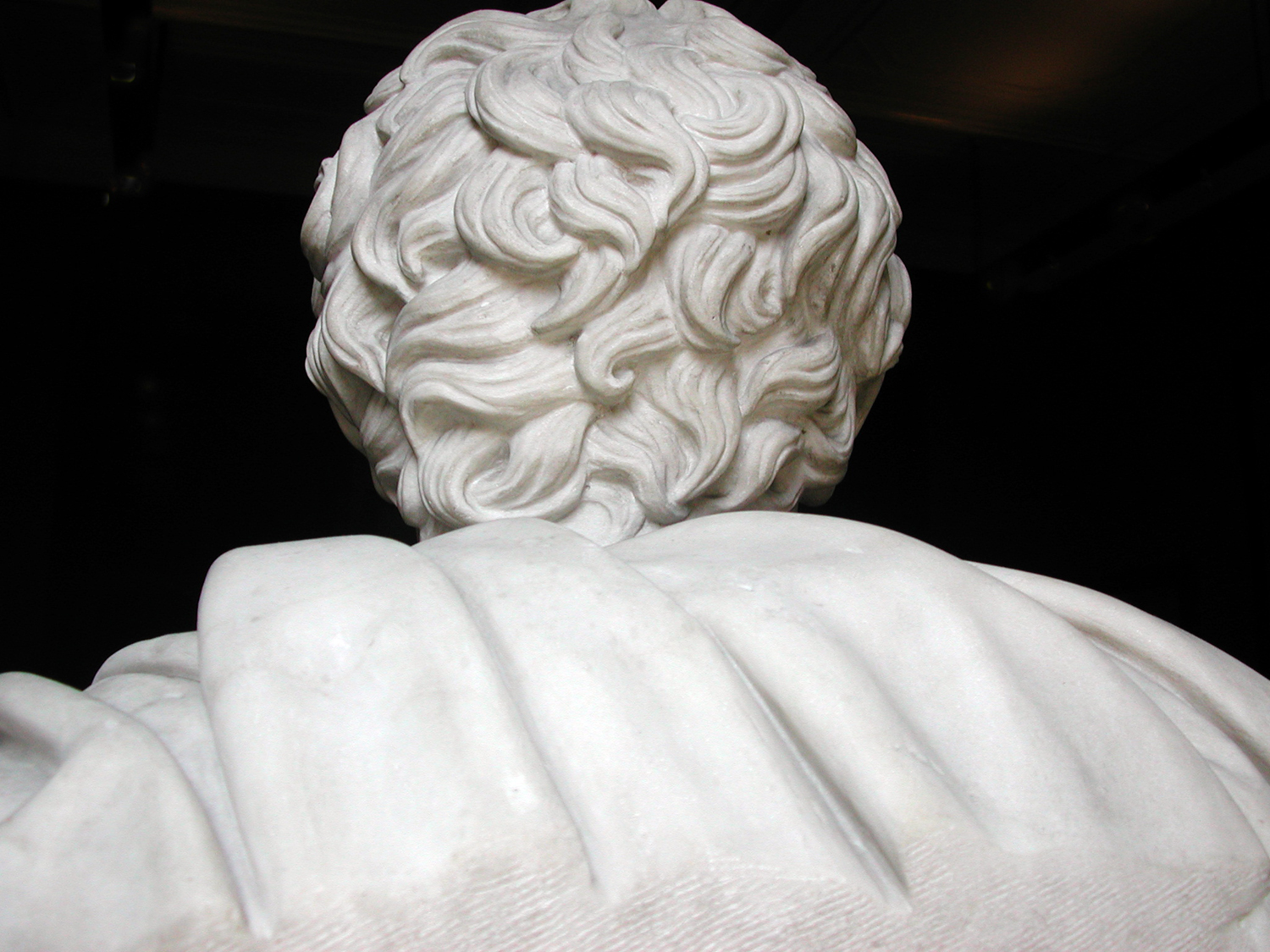
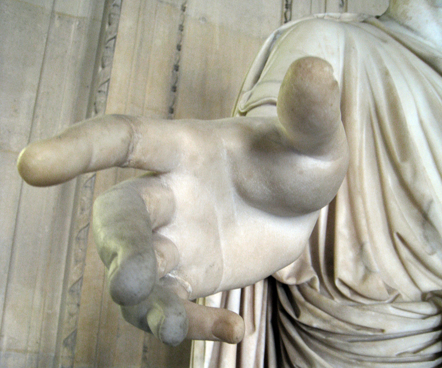
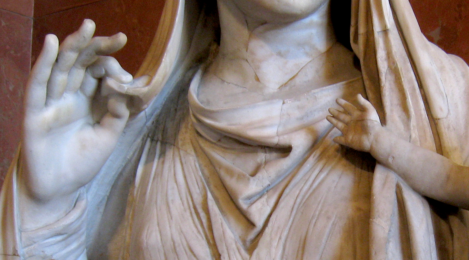
One soaks up the visual patterns, makes connections, recognizes the habits of humankind. Recognizes the shared humanity. The differences between me and Gilgamesh are merely surface tics. When I see the hand of the Roman emperor, it is my hand. I feel kinship with all those whose works and images appear in the galleries. 

And so, if it is two percent of the Louvre I have managed to absorb, I know the rest is there, and that it is me, also. 

Click on any image to enlarge

At the bottom of every product entry on the Amazon webpage you will find customer reviews. Some are quite thoughtful, others merely complain that the package they got was dented. Too often, close reading shows that the review shown is for some other product altogether and simply slung in with the rest by someone — or some algorithm — that wasn’t paying close attention. 

Check out Google’s list of restaurants near you and you will find any number of reviews by those who have eaten there, and often with an iPhone photo of their dinner plate. These range from “The worst scungilli I’ve ever tasted” to “The cleanest restroom I’ve had to use.” Again, perhaps with a photo. 

My favorites are those where someone posts a four-star CD review with the words, “I haven’t heard this yet.” 

More than ever, we are led to believe that “everyone’s a critic.” Opinions are like noses (I’m being polite): Everyone’s got one. But I spent 30 years of my life as a professional art critic, and it has always bothered me that the wider public seems to think that real criticism, by people who are actually paid to think about such things, is little more than “I liked it,” or “I didn’t like it.” 

On such a level, yes, everyone’s opinion is valid. If you liked it, then to say so is an obvious truth. But that is not what a professional critic is paid to do. 

Granted, there are some people out there with the title on the masthead who do little more than report their likes and dislikes. But the kind of criticism I’m talking about — and that I did my best to engage in — has very little to do with simple likes and dislikes. 

I was paid, rather, for my range of knowledge about the subject, about the history of it, the variety of it, the consensus about it, and my ability to say something meaningful and coherent — and interesting — about it. 

I was paid to explain what I was seeing, put it in context, say why it is important — or not — and, especially with new art, to attempt to unknot difficulties that may make understanding elusive. The art world is full of “elusive.” 

 I began as a freelance art critic with the Virginian-Pilot in Norfolk, Va. in the mid-1980s, and became staff critic with The Arizona Republic in Phoenix, Ariz., in 1987, where I worked for 25 years until I retired in 2012. By then, newspapers were in decline and few still had any critics on staff as layoffs became as regular as seasons. When I left, I was not replaced. All across the nation, critics are not being replaced; lights are blinking out all over the heavens. The loss is considerable. 

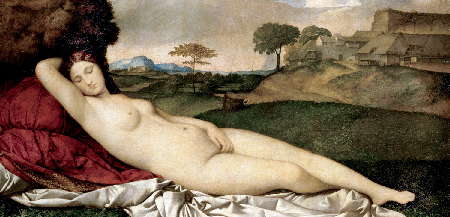
I have continued to post about art on this blog. There was a long piece about Jacques-Louis David’s Death of Marat. Another on the long echoes from the pose of Giorgione’s Sleeping Venus. I wrote about photographers Nan Goldin and Garry Winogrand. Some of these have been the most frequently visited blog entries on my site. 

Over those three decades in journalism, I covered an awful lot of art, both locally and nationally. Much of the art, I loved. Some not so much, and there were even shows of art I had little sympathy for. All of it, I tried to say something real about and meaningful. So, I feel I have established my bona fides to write about criticism.

My tastes didn’t stop me from recognizing quality or importance, even if it was art I didn’t much care for. And there was, correspondingly, art I knew wasn’t especially important that I really, really enjoyed. My likes and dislikes didn’t count much, and weren’t supposed to. 

Let me give you some examples either way. 

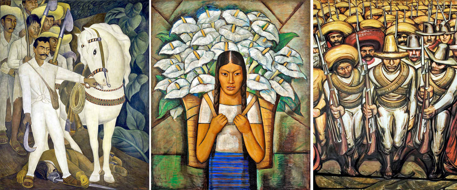
One of the very few times I had a contretemps with my editor was about a show at the Phoenix Art Museum of art by the so-called Mexican Muralists. I mentioned to my editor that I was thinking of giving the show a pass and she nearly bit my head off, making it absolutely clear that I wasn’t being paid not to write about an important show, or to care whether I liked the work. I knew this, of course, but I had to confess my lack of simpatico with the work. Of course, I wrote about it. Without expressing my own qualms. 

In general, I have little love for art that is primarily propaganda, and that is just what the work of Diego Rivera or David Siqueiros is. There is good ol’ Karl Marx pointing the way to the future for the downtrodden campesinos. There are the peasants displaying solidarity by all wearing the exact same clothes and carrying the exact same weapons. For me, this is a big snooze. 

And on top of that, the colors used favor rather dull browns and ochers. It just isn’t very inviting or attractive art. Nevertheless, the movement, from the 1920s through the 1940s, defines an era of Mexican culture, and was immensely important. And, moreover, some of the muralist art was clearly better than other, and it was my job to show that and explain why and how. 

It should be pointed out that it isn’t Mexican art I have a problem with. I love the crazy work of Frida Kahlo; I wrote an appreciative review of Rufino Tamayo for ARTnews  magazine. I enjoy the skeletons and calaveras of Jose Posada and the volcanic landscapes of Dr. Atl. And all that colonial-era art, and all the bright, colorful, energetic folk art. 

It’s just the dreary, politically sentimentalized work of the muralists I dislike. 

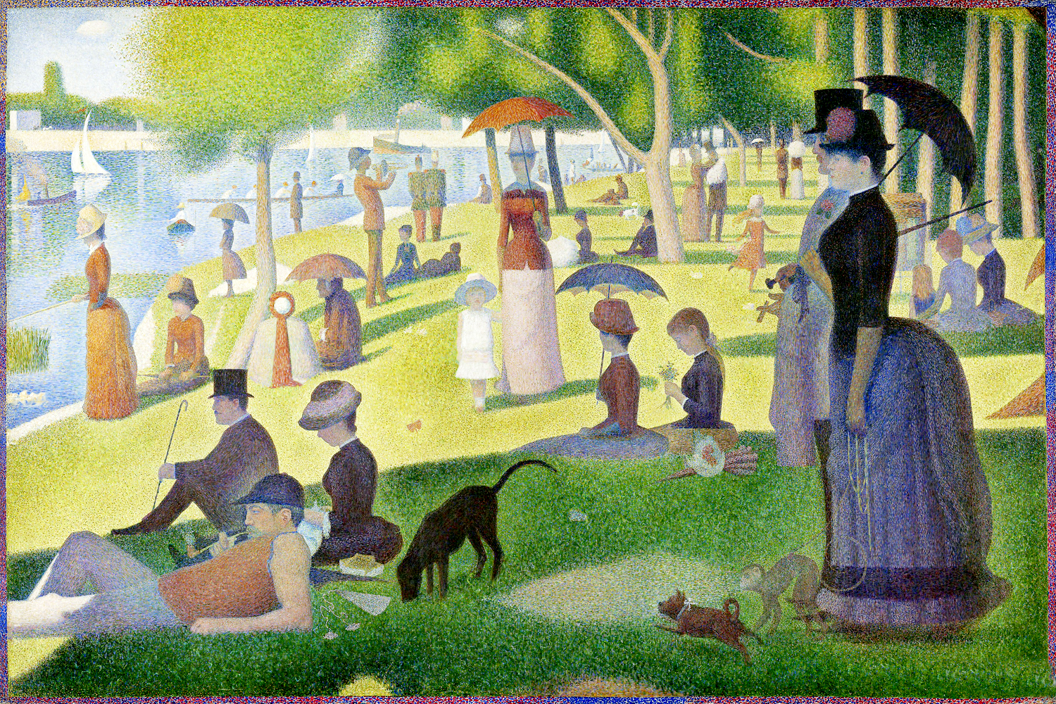
Let me give you some other examples. There is no question but that the pointillist works of Georges Seurat are masterpieces, and important in the history of art. But I find Sunday Afternoon on the Island of the Grandes Jattes a huge bore. Stiff and unyielding, all the life sucked out of what should be a bustling joy. It seems to me a painting made to justify a theory, and not something that had any more lively reason to burst out of his imagination. 

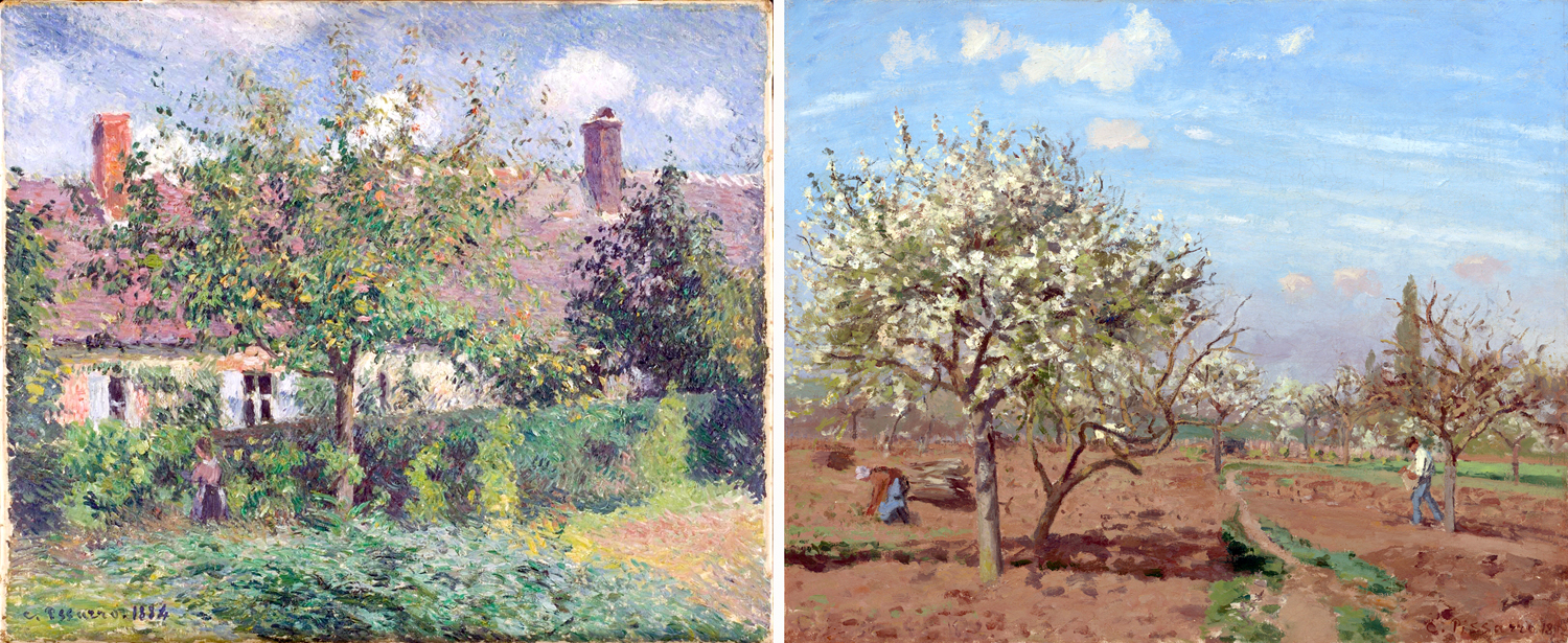
And there is his older contemporary Camille Pissarro. I don’t dislike Pissarro’s painting, but it just seems a trifle dull. He is the painterly version of a composer who can write perfect fugues, knows voice-leading, and can orchestrate magnificently, and yet cannot write a tune I can whistle. 

I’m specifically writing about art I have actually seen in person, and not just stuff I find in books or magazines. Reproduction cannot give anyone a clear idea of the art, its size, gloss, color. You can only get the iconography and some loose sense of everything else. 

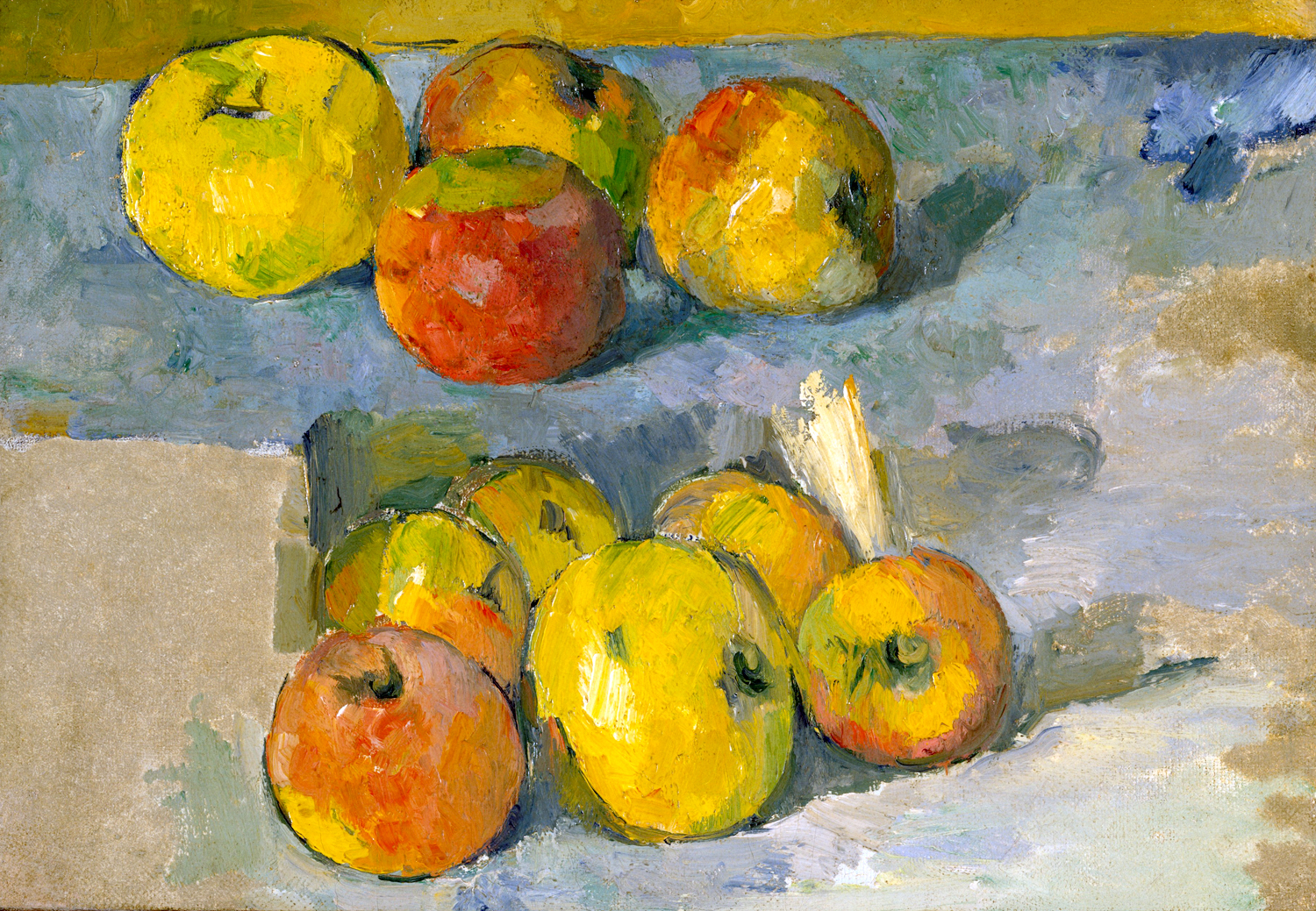
The necessity of seeing the art in person was brought home by Paul Cezanne. I never cared much for the work of Cezanne. But then, I spent some time with the actual work, and it exploded in my eye with form and color that just eludes reproduction. Now, Cezanne is one of my most loved artists and I kick myself for all those years when I paid him scarce attention. Those apples and pears — I want to lick the paint off the canvas. 

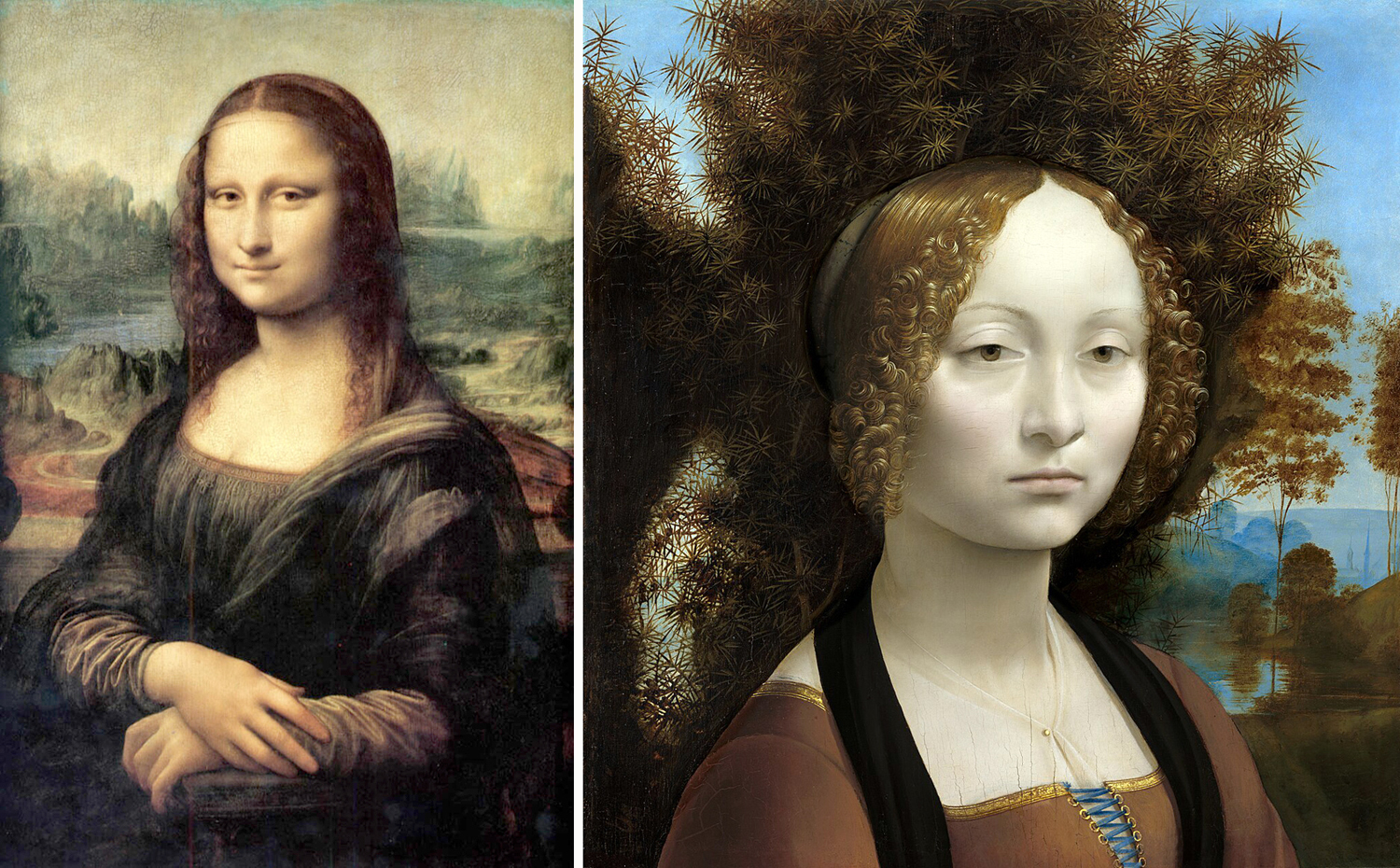
Another confession: I never cared for Leonardo’s Mona Lisa. I’ve been to the Louvre now, several times, and in person, the Mona Lisa is no more exciting. It is a small, rather ordinary portrait. Yes, the sfumato technique is quite pretty, but the painting itself does not deserve the fame it seems to suffer. 

On the other hand, I do love the same artist’s Ginevra de’ Benci, at the National Gallery in Washington, D.C. It has all the glow and spirit that poor Mona Lisa just doesn’t have. 

But even Ginevra doesn’t draw the pleasure from me that I get from Raphael’s portrait of Baldassare Castiglione, one of the most perfect paintings I have ever seen. 

Rembrandt saw the portrait, copied it in pen and ink, and later used it as inspiration for one of his self-portraits, now at the National Gallery in Washington. I love that one, too. 

So, it is not that I hate great paintings and love minor ones. It is just a matter of taste. My taste drifts toward some and is left unmoved by other. But, as a critic, I certainly know the difference. 

I have no issue with anyone liking or disliking any piece of art. Not everything has to appeal to everyone. If you think Damien Hirst’s pickled shark is disgusting, I have no issue with you. If you think the hands on Michelangelo’s David too large, and his privates too small, that’s fair. Even if you find yourself moved emotionally by the light inside the cottage of a work by Thomas Kinkade, I say, enjoy. But that doesn’t qualify you as a critic. 

The art I love — and “love” is not too strong a word — includes some famous and important paintings. I grew up with Picasso’s Guernica when it was hanging at the Museum of Modern Art in New York. In my teen years, I visited MoMA often and thought I’d have Guernica to see for my lifetime. But it returned to Spain in 1981. Seeing it stretched across 25 feet of wallspace helped steer me into a life with art. 

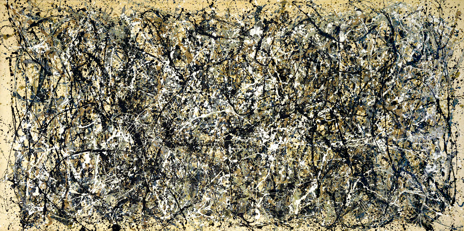
I loved seeing Jackson Pollock’s One Number 31, also at MoMA, back when abstract art was still seen with suspicion by the public. It hit me like a brick, and I loved its visual busy-ness and textural depth. It was a painting I could lose myself in.

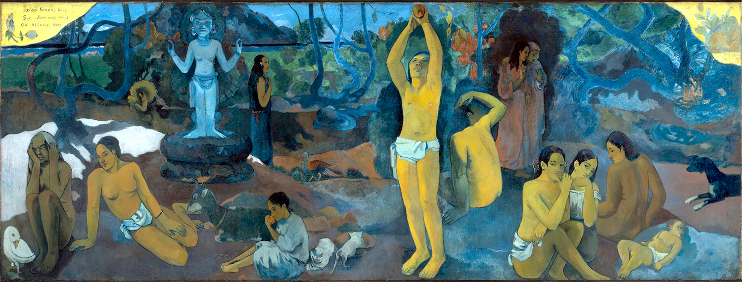
In Boston, I finally saw Paul Gauguin’s Where Do We Come From? What Are We? Where Are We Going?, another panoramic picture. Unlike the Mona Lisa, it makes a stronger affect in person than reproduced. 

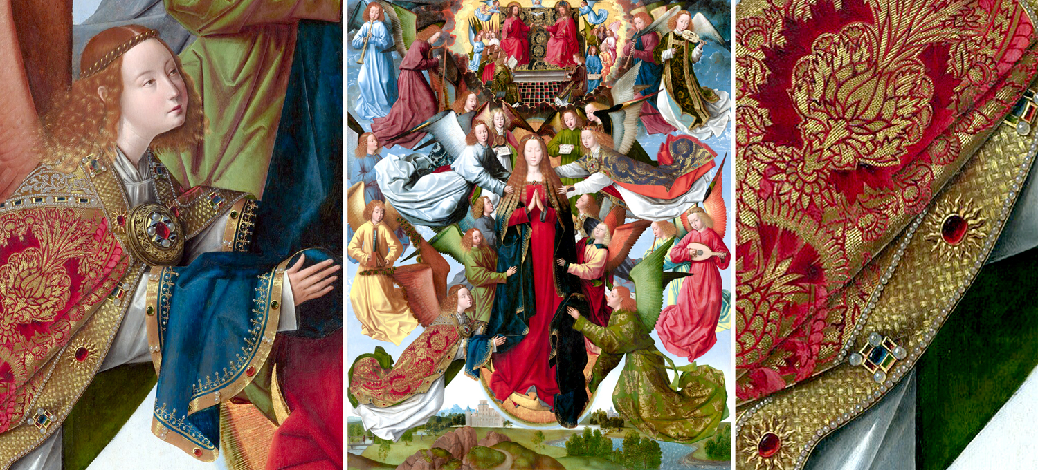
At the National Gallery in Washington, there are a number of paintings I visit, as if on a pilgrimage. Perhaps the main one is Mary Queen of Heaven by the 15th-century Master of the St. Lucy Legend, an unknown artist (so many were anonymous back then) with a magical ability to create detailed fabric and rich color. It is not one of the superstars of the collection, but it is dear to me. It is 7 feet tall, and busy with detail. I love art that highlights texture and color, and am less drawn to iconography or storytelling for itself (such as features in propaganda). The virgin Mary means nothing to me religiously, but this painting I worship. 

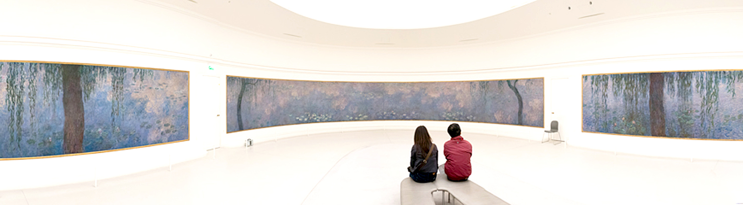
All the work of Claude Monet pleases me, but it is the large waterlilies that move me. When I finally got to see the group of them at the Orangerie in Paris, I had to sit down. Two oval rooms with walls banded with waterlilies. It was a holy place. 

These are all works that both give me great pleasure, and are also historically important works, anthologized in any art history text. 

 Yet, some of the art that I love most and that gives me great pleasure is art not especially important, or at least not widely known. There are so-called “local artists” who never get the national reputation; there are artists I know personally and whose work speaks to me in part because I see their personalities so clearly in what they produce. 

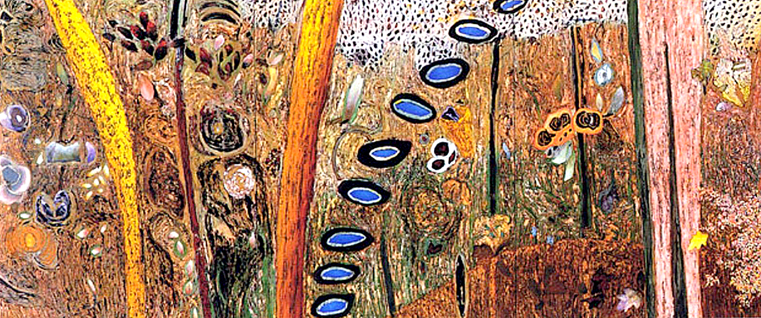
I love the art of Arizona’s Mayme Kratz. I’ve written about her work several times. Mostly, she finds discarded bits of the natural world — seeds, husks, birdnests, grains, twigs, shells — and embeds them in patterns in colored acrylic, finished with a fine sheen. They are intensely beautiful. Kratz makes a living from her work and has buyers and collectors, but I don’t know why she isn’t featured in galleries in New York or Berlin. Her work deserves to be. 

Tucson painter Jim Waid has a growing reputation and has representation outside of Arizona. But his large canvases, electric with color and texture, were featured (during my time) primarily at one gallery in Scottsdale. As I wrote about him for the newspaper, “Is there any reason that David Hockney is ubiquitous and that Jim Waid is not? Waid is clearly as good a painter, and his canvases as original and distinctive, yet Hockney jet sets, and Waid paints in his studio in Tucson.” One of the highlights of my year was the annual Waid show at Riva Yares Gallery. 

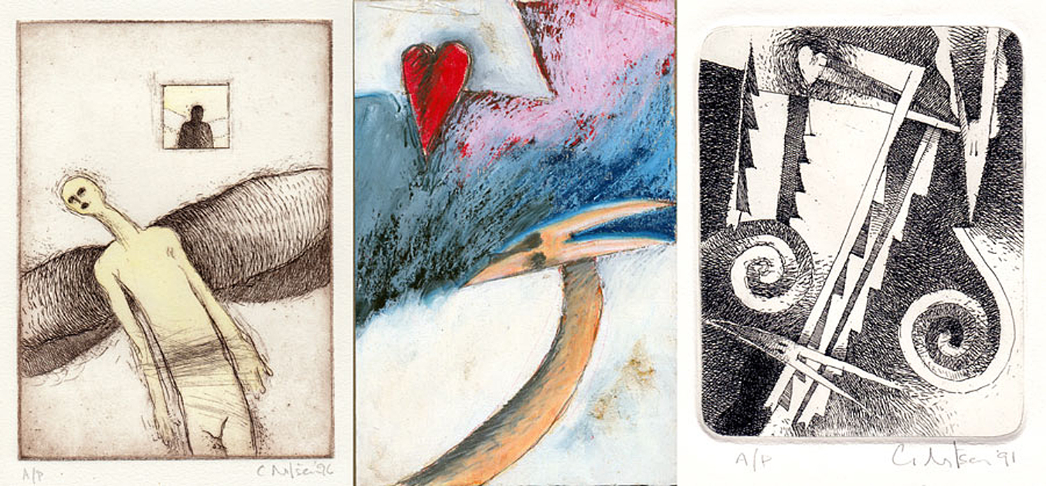
My brother, Craig Nilsen, is a painter and printmaker from Virginia. I have seen his work all his life and I cannot help but see him in the paintings so particularly and often heartbreakingly. He is now retired, as I am, and I am lucky to own quite a few of his pieces. I love them all. 

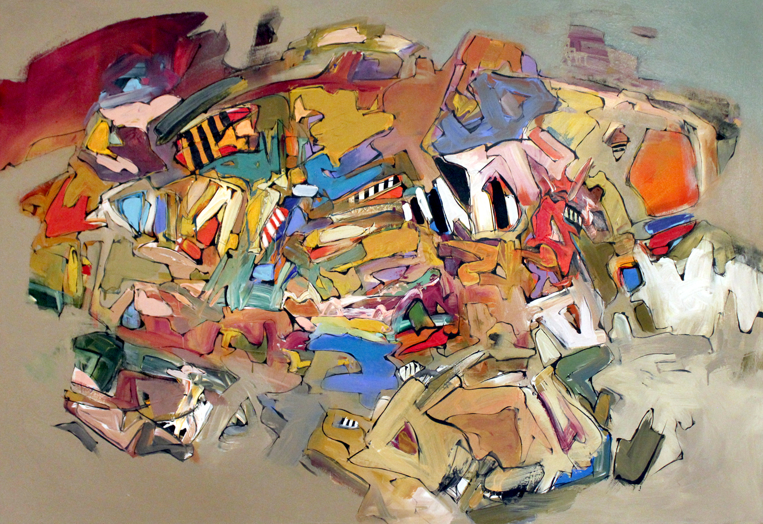
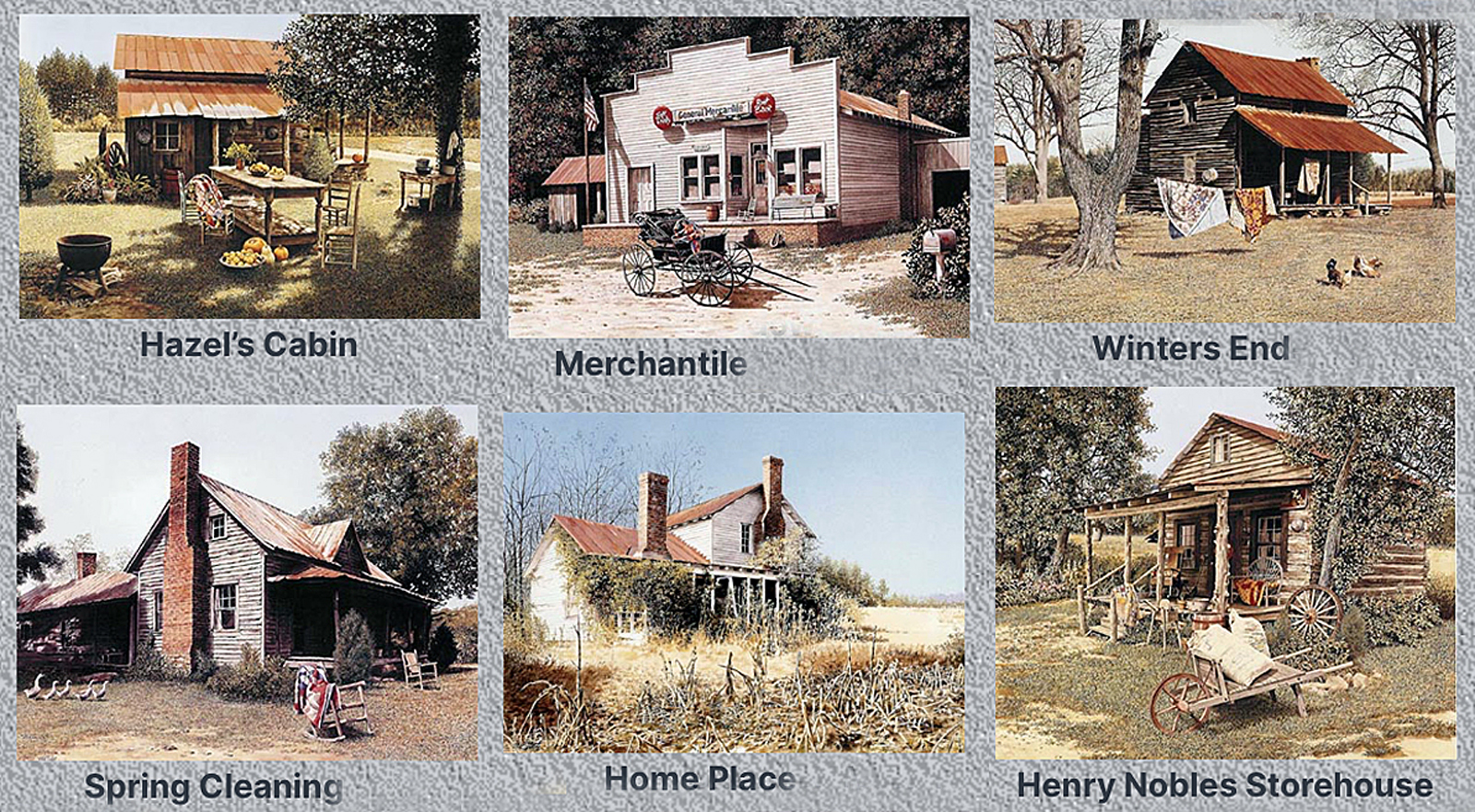
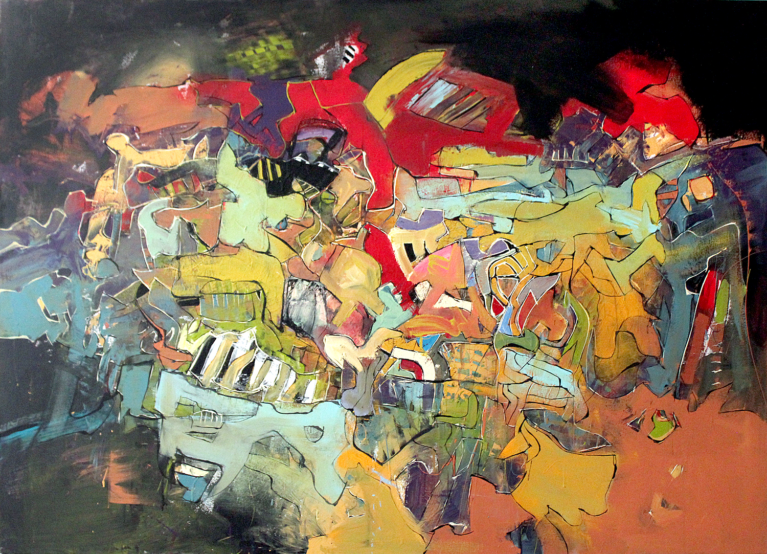
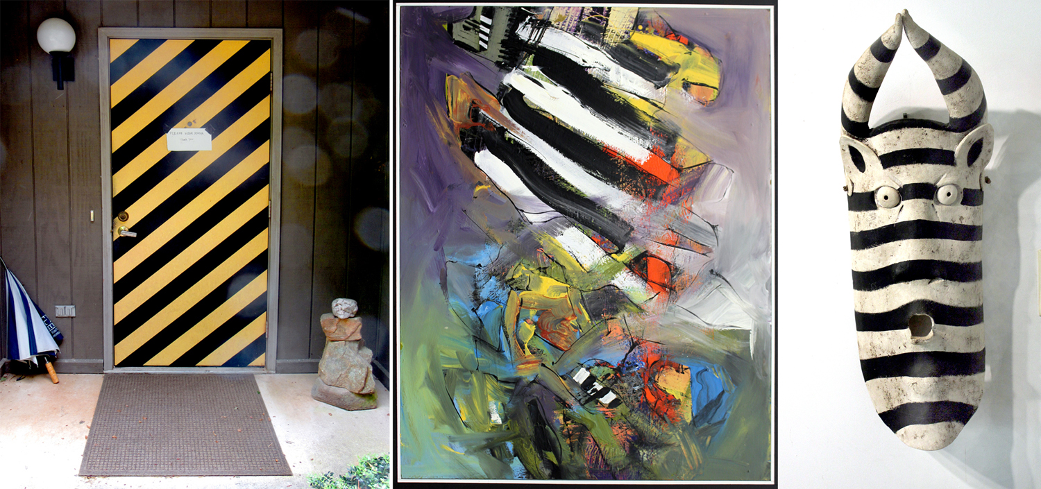
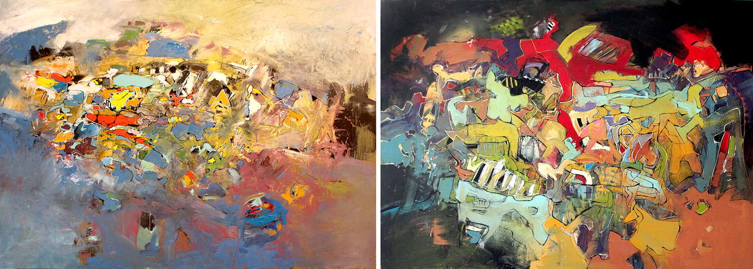
And finally, my brother-in-law Mel Steele, who has a pretty good reputation in North Carolina, although not always for his best work. He made his living for years selling prints of North Carolina rural scenes. But his real work has always been his abstractions, layers of shapes and colors, creating virtual depth and space on the canvas. I am not alone in enjoying his art, but I feel my life would be much less rich without it. 

And so, I feel as if my immersion in art has two channels: One is the official one, where I write for a public and attempt to be somewhat objective; and a second which is what I feel most emotionally connected with. 

There are many other examples of work I feel deep in my bones, but I can’t catalog them all. What I can say, is that a life immersed in paintings, as in music, dance, film, theater, architecture and literature, is a life more deeply connected with being human. I am grateful for having been able to make a living writing about it all.

Click on any image to enlarge
Many years ago, my late wife bought me a copy of A Book of Clouds, published in 1925 by author William A. Quayle. It is a hefty clothbound volume, primarily of old black-and-white photographs of clouds, layered with Quayle’s particular garish encomia and reminiscence about the glories of skywatching. 

Clouds seem to bring out the gooey and poeticizing cliches in a writer. “I was kinsman of the clouds,” Quayle writes. “And as I grew, the clouds still sailed their crafts of  snowy sail across the blue sea of my heart. Clouds, so to say, were indigenous to my soul. I did not begin to notice them: I always noticed them. I did not learn to love them: I always loved them.” 

The book is fervid with such expostulations: “When clouds give reports of portentous skies, of prepending tempests, when they are black as pools of midnight water, their eminences wrinkled as if zigzag lightnings had been the shears which cut their patterns, then as the sun lurches behind their darkness, the fine fire that rims them and seizes all their peaks gives a touch of delirium to the soul.”  

I love this book, for all its gushy writing, because Carole gave it to me, and because, in an era of irony and unbelief, there is something utterly sincere under the purple prose. 

A few years later, she gave me another book, The Cloud Collector’s Handbook by Gavin Pretor-Pinney, a small volume and kind of a field guide to cloud identification — almost a Peterson guide. In it, Pretor-Pinney gives genus and species names of various formations, implying that a taxonomy of anything as gaseous and impermanent as a cloud might be spoken of almost as if it were a wildflower or a bunting. 

And so, there are is a list of Latinate names, not just the familiar “cumulus” and “cirrus,” but also “lenticularis,” “castellanus,” “radiatus,” and “undulatus.” Carl von Linné would have been proud. Each page is devoted to another cloud form, or cloud-related or -adjacent subjects: “pileus,” “virga,” “nacreous,” “noctilucent,” etc. It’s lots of fun. 

Pretor-Pinney, it turns out, is a veritable cheerleader for cloud watching. His full name is Gavin Edmund Pretor-Pinney, son of Anthony Robert Edmund Pretor-Pinney and Laura Uppercu, daughter of George Winthrop Haight — in other words, he’s British and has the “twitcher’s” enthusiasm, but for clouds rather than finches. And in 2004, he founded the Cloud Appreciation Society and two years later, wrote both The Cloud Collector’s Handbook and The Cloudspotter’s Guide. In 2019, he wrote A Cloud A Day, which features 365 cloud images accompanied with a short piece of cloud science, an inspiring sky quotation or a detail of the sky depicted in a classic painting. 

The Society has its website (link here) and features galleries of cloud art by painter-members, collections of cloud poetry, and many, many photographs. The paintings are especially entertaining, and hugely varied in approach.

Artists L-R — Top: Peter Nisbet; Carol McCumber; Elizabeth Busey. Bottom: Judy Friesem; Jethro Buck; Barbara Miller. 

And there is a Cloud Appreciation Manifesto (of course, there is): 

“We believe that clouds are unjustly maligned and that life would be immeasurably poorer without them. We think that clouds are Nature’s poetry, and the most egalitarian of her displays, since everyone can have a fantastic view of them.

“We pledge to fight ‘blue-sky thinking’ wherever we find it. Life would be dull if we had to look up at cloudless monotony day after day. We seek to remind people that clouds are expressions of the atmosphere’s moods, and can be read like those of a person’s countenance. We believe that clouds are for dreamers and their contemplation benefits the soul. Indeed, all who consider the shapes they see in them will save money on psychoanalysis bills.

“And so we say to all who’ll listen: Look up, marvel at the ephemeral beauty, and always remember to live life with your head in the clouds!”

Of course, Pretor-Pinney isn’t alone. 

There are loads of books, including a raft of children’s books, all about clouds. 


The sky is a slate upon which we can project our sense of beauty, our sense of meaning, the expanse of creation, and the progress of time. We look up and always, it is new. Always it is moving. To rephrase Heraclitus, you can never look at the same sky twice. 

And the sky has been there in painting for centuries, but usually as a background for more important goings-on in the foreground. Then, in the late 18th- and early 19th-centuries several artists began studying the clouds and the sky for its own sake.

Most famously, a series of cloud studies by John Constable and sketches by Alexander Cozens. 

Cozens:

Constable:

“Clouds, for Constable, were a source of feeling and perception, an ‘Organ of sentiment’ (heart or lungs) as much as meteorological phenomena,” writes author Mary Jacobus in the book Romantic Things: A Tree, a Rock, a Cloud. “If painting is another name for feeling, and the sky an organ of sentiment, then his cloud sketches are less a notation of changing weather effects than a series of Romantic lyrics: exhalations and exclamations, meditations and reflections, attached to a specific location and moment in time.”

In other words, the clouds, either painted or merely watched, become a subject for contemplation, even meditation. Beginning in the 20th century, paintings became increasingly abstract and the point being not subject matter but the substance of paint — color, shape, line, form, design. To look at a Jackson Pollock painting, or one by Mark Rothko, you are asked not to name a subject matter, but to relate the canvas to human affect, i.e., what does the painting make you feel?

A number of artists and photographers have turned to clouds to make images that are both abstract and descriptive. The clouds themselves provide the abstraction. 

At the beginning of the 20th century, Modernist photographer Alfred Stieglitz made a tremendous series of images of clouds, which he titled, “Equivalents,” meaning that the visual was an equivalent of the emotion. 

He made more than 200 such images, with the intent that they could express emotions, much as music can, purely by abstraction. They are images of actual clouds, but they are also shapes on a piece of photographic paper. You can see them as photographs of the sky, or as pure abstractions. Either way, for Stieglitz, the important part was that an emotion be evoked. 


Another photographer, Edward Weston made pictures of clouds through his lifetime, less consciously manipulated than Stieglitz’s, but cloud abstractions nonetheless. 

The German painter Gerhard Richter made a series of cloud paintings in the 1970s. A Sotheby’s catalog said, “the clouds are caught in a moment of confrontation between the painterly and the photographic, the representative and the abstract, the natural and the supernatural.” Much of Richter’s art is political or otherwise Postmodern tricks about the nature of art itself. As for the clouds, Richter himself said, “I felt like painting something beautiful.”

He kept a notebook of images, which he called “Atlas,” in which he kept many sketches, photos and paintings of everyday items, and a whole section on nothing but clouds. 

I have made countless photographs of clouds. I step out of the house pretty much every day, just to look up and watch clouds. They keep my eyes fresh and my mind invigorated. I have two books I have made: one of images of landforms and clouds seen from my airplane window; and a second of clouds pictures made all on a single afternoon in Arizona during the rising and waning of a monsoon storm. They can be viewed online here and here

When we spend as much time indoors as most people have these past two pandemic years, it is a relief to refocus our eyes outward (and upward) to a distance beyond the four walls. The clouds are far enough that our stereoscopic vision interprets the distance as indistinguishable from infinity. That refocus is necessary to keep us in touch with the greater things. Too often our eyes are focused on electronic screens held less than arms distant. Stretch your eyes back out. Look up. Keep watching the skies. 

Click on any image to enlarge
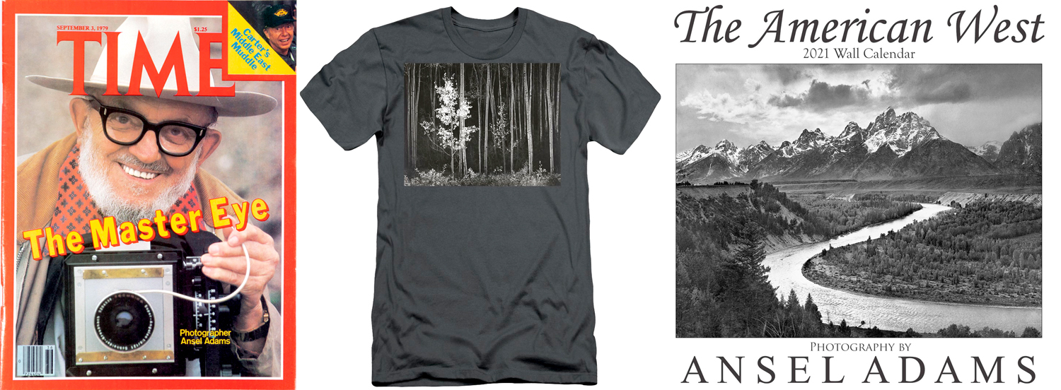
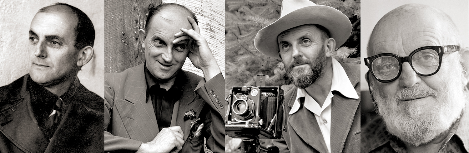
No photographer has had a higher profile in mass culture than Ansel Adams. He was the popular idea of the photographer as artist, and, I’m sure, the only one to have his images printed on beer cans with his name attached. 

His pictures graced not only Coors beer, but books, posters, calendars, aprons, hats and coffee mugs. He was the subject of a Playboy interview, and had his face on the cover of Time magazine.

 He had a mountain was named for him in California’s Sierra Nevada. That honor came to him less for his photographs and more for his constant advocacy for nature and the environment. 

His earliest photographs were made when Adams was still a teenager with a love for back-country hiking in Yosemite National Park, made with a snapshot camera and drugstore prints. Even those early images show a flair for the dramatic and the careful placement of darks and lights to make a balanced photograph.

Ansel Easton Adams was born in 1902 to a well-off family from San Francisco. As a child, he broke his nose when the 1906 San Francisco earthquake threw him against a garden wall. That bent nose became a trademark of sorts: It leaned left, and the man did, too. He joined the Sierra Club at 17 and was a board member from 1934 on. In later life, he railed against the environmental policies of Ronald Reagan.

His family vacationed in Yosemite Valley; he met his wife there and they ran a visitor center and gift shop, now called the Ansel Adams Gallery.

Early in life, he had planned to be a concert pianist, but eventually gave up keyboard for lens. But his ambition was still artistic: He wanted to be more than a recorder of vacation memories. This at a moment in art history when a number of like-minded photographers were arguing for photography as art when museums, galleries and collectors believed photography was a merely mechanical reproduction system. 

You can see that aesthetic vision in Adams’ early art prints, in platinum or other early processes, slightly fuzzy, with the popular Impressionistic love of sunlight and shadow. 

But in the 1930s, he converted to a Modernist vision of photography, with sharply focused images printed on glossy paper. His friends included other leading photographers, including Alfred Stieglitz and Edward Weston, all of whom were proving that a photographic print had earned a place on the gallery wall.

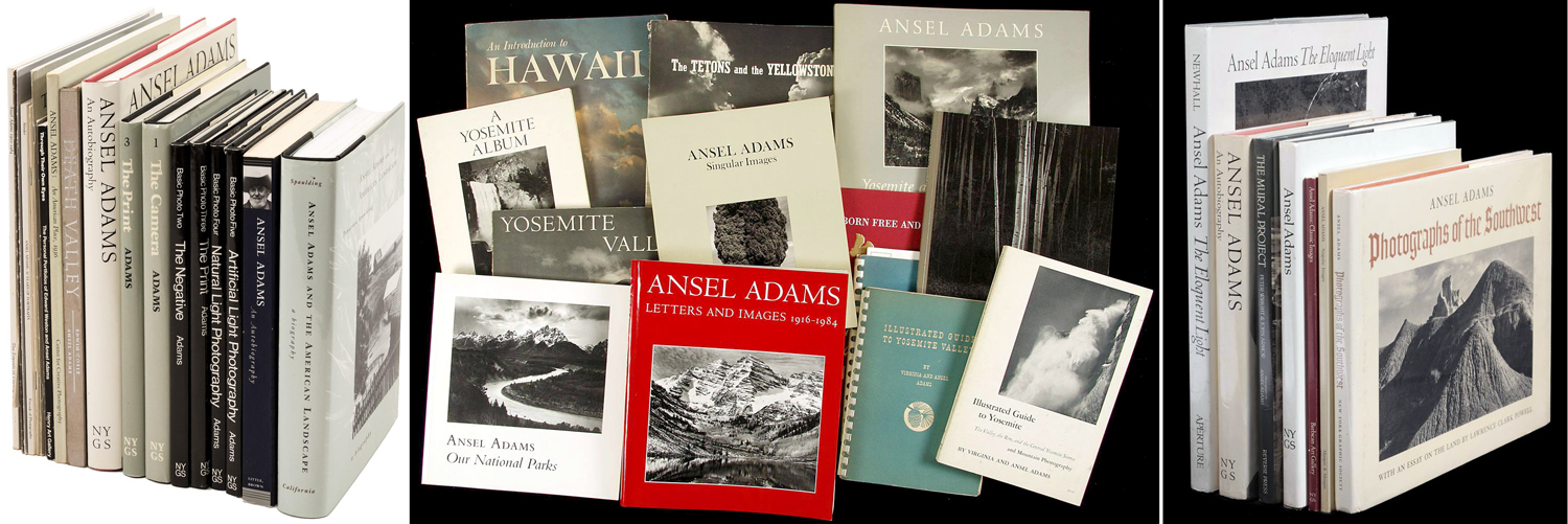
But while these other artists worked in many genres, in the 1940s, Adams turned ever more to the kind of Great American Landscape we know him for: the images of national parks and American wilderness. Publishing books of his photographs has become an industry.

When he ventured beyond his strength, sometimes the results were stiff and uncomfortable, like his portraits, which made their subjects as granitic as the cliffs of Yosemite. The lighting is perfect, the focus is sharp, the detail is precise, and yet, they are completely lifeless. His presidential portrait of Jimmy Carter may be the worst presidential portrait ever. 

On the other hand, when his purpose was to document the injustice to interned Japanese citizens at the Manzanar camp, his people could be warm and human. 

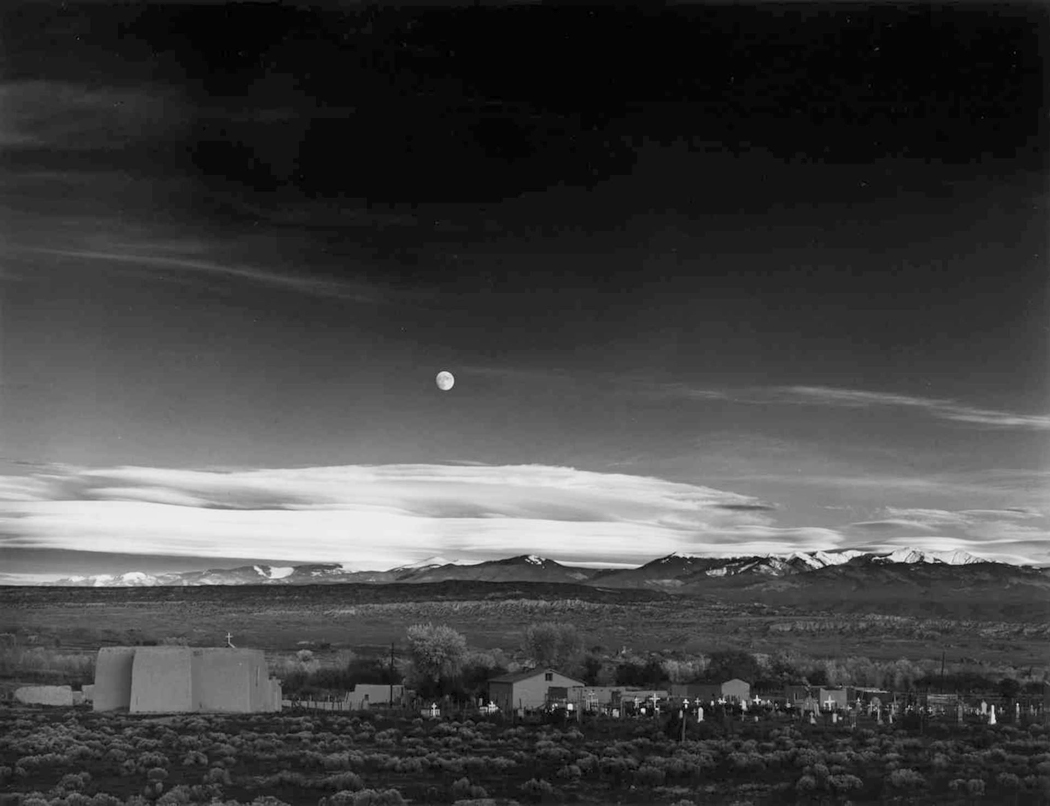
And so, it is the landscapes we remember, and they have become iconic. 

His 1942 image, Moonrise over Hernandez, N.M., sold at Sotheby’s in 2006 for $685,500. 

____________________________________

“You don’t take a photograph, you make it.”

– Ansel Adams

____________________________________

For its first century and a half, photography meant loading light-sensitive film into your camera, calculating focus, f/stop and shutter speed, making an exposure, processing the film in a series of chemical baths to make a negative and then re-exposing that negative onto light-sensitive paper and running it through a series of chemical baths to create a positive image of the subject. It was an intensely physical process, as anyone who remembers the smell of sodium thiosulphate on their fingers will know. 

Now, it means holding up your smart phone and clicking an image and then swiping left or right to go through the results, and maybe sending it out via Instagram or Twitter so others can share it. And the image exists only in virtual form on a screen of pixels, never becoming anything physical — or requiring any specialist knowledge. 

Not that there’s anything wrong with that. But it does mean that the subject of a photo has been separated from the object of the photo itself. For most people, looking at their family snapshots, it has never been otherwise, but for professional photographers and those making photos ostensibly as art, the physicality of photographs and their making is central. 

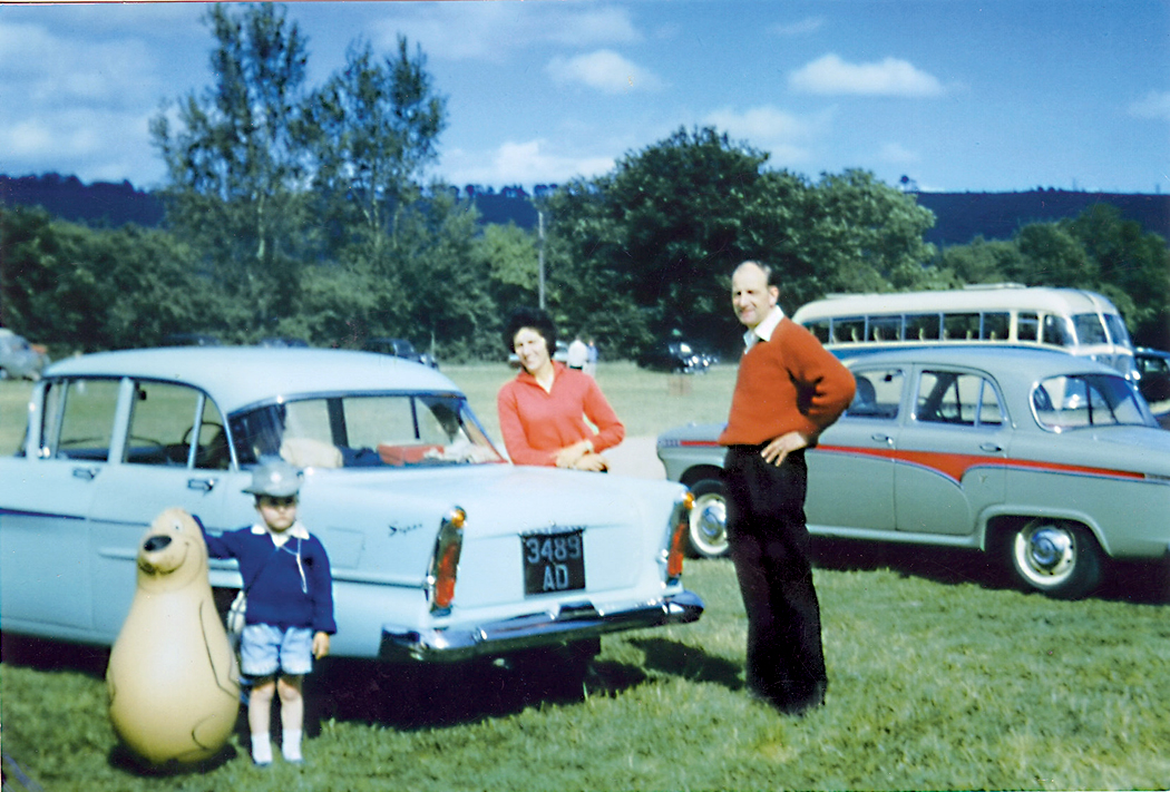
Before digital, a photograph was two things: The image and the substrate on which the image appears. Most of us, looking at the snapshots of our families, see the people in the image, but pay little attention to the paper or the layer of silver that makes up the image. But in photography looked at as art, a good deal of attention is paid to the process and technique. In fact, often so much care is paid to the technique that the subject can become ancillary. Who cares if it’s a still life or a portrait, if the gum bichromate print is gorgeous. The subject was just an excuse for the virtuosity of the technique. 

I remember, in the 1970s, long before digital photography, when the technique was actually fetishized: If you didn’t process archivally and make your mattes of acid-free board, you couldn’t be taken seriously as a photographer. It gave rise to a certain preciosity. 

That was for black-and-white. Color photography hardly counted. It wasn’t accepted, for the most part, because of the impermanence of the image (you’ve all seen old snapshots turned funny colors with age). The only color permitted was the dye-transfer print — an expensive and cumbersome process. In the 1920s, museums were unwilling to collect any photography because, they reasoned, it wasn’t really art; it was mechanical. Before the 1970s, few museums collected color photography. Black and white was for the serious artist. All this has changed. 

The middle years of the 20th century — roughly from World War I till the advent of Pop Art in the 1970s, give or take — were ruled by Modernism, which proclaimed that the medium was the message, that the paint mattered more than the image. Abstract paintings — with no subject matter at all — was king. When someone was confused by the jumble of scribble in one of Jackson Pollock’s works, he naively asked the artist what it was he was supposed to see on the canvass. Pollock answered curtly: “A painting.” 

From the Renaissance to the middle of the 19th century, art was expected to picture reality. Looking at a picture frame mimicked looking through a window. Yes, there might be unreal things seen there: saints and angels. But portraits and landscapes were conventionally realistic, at least until the Impressionist revolution in the 1860s — and the invention and popularization of photography. 

When French painter Paul Delaroche saw his first daguerreotype, he famously proclaimed, “From today, painting is dead!” Of course painting didn’t roll over and expire; it went on to do other, newer things, and gave up the obligation to render visual reality the way a camera can. Because, although it wasn’t historically seen as such — at least by the masses — painting already was something different from simply an image of the world; it was a thing — an object, an artifact, a physical presence made of pigment and canvas. 

With the Impressionists, and later and more thoroughly with abstract painting, the thingness was the point. And when a few amateur photographers thought to elevate their camera imagery to the level of “art,” they at first imitated paintings, and especially Impressionist paintings. A whole movement of artist-photographers geared up with something they called Pictorialism — fuzzy imitations of fuzzy paintings. 

Then, in the 1920s, roughly, a group of exceptional photographers decided that photographs should not imitate paintings, but should look like photographs, and that photography had its own qualities and virtues. When American photographer Edward Weston was about to publish his first book of images, his publisher wanted to title it “Edward Weston: Artist,” but Weston objected and changed it to Edward Weston: Photographer. He was proud of his status as just that. 

In Europe, Modernist photography tended to be more political, but in the U.S., it became more interested in examining the physicality of the the visual world, which meant above all, landscape. The American tradition in painting had long featured landscape, and now, photographers thought they could make landscapes photographic rather than painterly. (They also produced a great number of exceptional portraits, and still lifes, but it is landscape that I’m concerned with here). And the landscapes they chose tended to be either industrial and urban, or the natural unpopulated sections of the American West. 

But while Edward Weston, Alfred Stieglitz, Paul Strand, Charles Scheeler, Edward Steichen — and Ansel Adams — were well aware of their prints being art objects, framed and hanging on gallery walls, the wider public, with their brownie cameras had a less sophisticated understanding of the medium: For them, the camera captured their reality, preserved their memories and became souvenirs of the past. For them, the photograph froze reality for them and held it still. 

Even today, there are many people who believe photographs pin down the visual truth of their world, not being aware of how a lens can distort things, what different types of film — or now, different microchips — can alter the final image. Lighting, focal length, depth-of-field, contrast, color temperature and a hundred different technical aspects of photography can govern the final image. For a professional photographer, all of these things are brought to bear on the final created image. For ordinary people a camera simply registers what they saw, or at least the part of what they saw that was important to them (not seeing, for instance, the tree in the background visually growing out of someone’s head). 

The person who most attempted to regularize the variables of photography was Ansel Adams. He wrote a series of five books (later recast as three) teaching the finer points of making photographs — how the lighting, focal length, depth of field, contrast, etc. affected the final picture. 

He perfected what he called the “Zone System” of exposure and processing to control the contrast and dynamic range of the final photographic print. Simplified, the problem faced was that black ink on white paper has a limited range: The white, under normal lighting conditions, is usually no more than 30 or, at best, 40 times brighter than the black. But when you look at the sunlit scene you want to photograph, the brightest part may be a thousand times brighter than the shadow. How do you squeeze all that into your 30:1 ratio? 

Most photographers and snapshooters just pick what they want to show up best and let the shadows go to solid black, or the highlights to bleach out in detailless white. Adams, instead, attempted to divide a scene into 10 (or 11, depending how you count) “zones” of brightness, from solid black to solid white, and then control your camera negative’s exposure to match your previsualized zones, knowing that you can alter the contrast in the developing process, to increase or decrease contrast to fit, Procrustes-style, the whole into the available printing surface. 

(A simplified version of this is the old photographers’ dictum: “Expose for the shadows, develop for the highlights.” Adams’ version is more precise.)

For the ordinary amateur, you point a camera and click the shutter to capture the image and you satisfy yourself with what you get. Adams and his fellow artists are hyper-aware of the end product. Adams preached what he called “previsualization,” in which you attempted to imagine what the final print should look like before you ever pressed the shutter button. The scene being photographed is just raw material for the final presentation.

 “In my mind’s eye, I visualize how a particular … sight and feeling will appear on a print. If it excites me, there is a good chance it will make a good photograph. It is an intuitive sense, an ability that comes from a lot of practice,” Adams said.

The result is a photographic negative, used to make the final print. 

“The negative is comparable to the composer’s score and the print to its performance. Each performance differs in subtle ways.” Anyone who has followed Adams’ career knows that an earlier print may differ considerably from a later one, just as a young pianist’s performance may mellow and change as the pianist ages. In other words, there is not a “single” true print, but, like a musical performance, a range of them. 

The belief in the veracity of photographs is persistent, even in the face of computer-generated imagery, digital manipulation and fakery. Indeed, that faith has often caused trouble for, say, photojournalists, when a literal-minded editor insists that a photo be printed “unmanipulated.” I have known a photostaff that was forbidden even to alter the contrast of a digital photo in the credulous belief that the image first recorded in the camera is more “truthful” than the finished one. (That dictum didn’t last; it couldn’t). The digital file created in a digital camera is like the negative in silver-image photography and is only a first step in the process. To disallow the photographer to finish the process in some mistaken belief that the unmanipulated version is “truer,” is hooey. 

Certainly a photographer in bad faith can use the editing process to distort the end result, but this was true in silver-image photography as well. Digital may make it easier, but no more possible. You depend on the integrity of the photojournalist not to lie, at least not on purpose. 

As for art photography, since the final product is what is sought rather than a record of something else, there can be no lying, just as there is no lying in fiction. You want a journalist to be truthful, but a novelist is allowed to make it all up. 

In the end, you wind up with an artifact, a thing in itself — a photographic print, a range of black and white, or of colors, making a flat version of a three-dimensional world. The unconsidered understanding of a photograph is that it “captures reality,” but a more sophisticated view is that there are conventional distortions we choose to ignore (a photograph doesn’t move, reality does; a photograph is flat, reality is rounded; a photograph doesn’t make sound, reality won’t keep quiet; a person in a photograph is two inches tall, in reality is six feet — and so on, all mere conventions). 

And so, the artist accepts what he has made as a physical object on its own, with its own expectations and reality. Adams may make images of the Tetons or Yosemite, but, in his best work, it is the print itself that engenders awe. 

Click on any image to enlarge 

Surely the most famous piece of Japanese art is The Great Wave off Kanagawa, by Katsushira Hokusai. It has become iconic enough that, like Van Gogh’s Starry Night or Michelangelo’s Creation of Adam, it can be recognized by even those who know nothing about art and can be fodder for countless parodies. 

The Great Wave is part of a book, published in Japan in 1830 called 36 Views of Mount Fuji, one of the most famous books of the Ukiyo-e woodblock print style of popular art in Japan from the 17th century until World War I. They were cheap: A single Ukiyo-e image could be bought for roughly the price of a bowl of noodles.

Hokusai (1760-1849) was about 70 years old when he published 36 Views and had been working as an artist since the age of 14. In his 88-year lifetime, he drew, painted and carved something like 30,000 works. Three years after publishing 36 Views, he began signing his work as “Old Man Mad With Painting.” 

As early as 1805, he had begun making pictures with the theme of fishermen in a boat fighting great waves.

And even after the Great Wave, he kept working the theme, including in his black-and-white sketchbook 100 Views of Mount Fuji.

He seems to have begun making the images for 36 Views somewhere about 1826. And it was in the years after that a new European pigment, Prussian blue, made its way to Japan. And so, some of the 36 Views are in the old style and some with the new blue pigment, which Hokusai seemed to enjoy experimenting with. The Great Wave would not have been possible without Prussian blue. An advertisement for the book emphasized the new color. 

But it is important to pay attention to the other images in the series. It is called 36 Views, but Hokusai couldn’t stop and later added an additional 10 images, bringing the total up to 46. They were published and republished multiple times during Hokusai’s life, and each new printing differs slightly from the first, sometimes with different colors, sometimes with new details carved into the woodblock. 

There is no set order for the images, but the ones below are in one of the published sequences. I wanted to post them all for two reasons. First because they give context to the Great Wave, but also because the whole set is great and should be known to anyone who loves art. I have loved them since I first encountered them more than 50 years ago. 

1. Nihonbashi Bridge in Edo

2. The Mitsui Store in Suruga District

3. Suruga Hill, Sundai, in Edo

4. The Hongan-ji Temple in Asakusa

5. The Timber Yard at Honjo

6. Under Mannen Bridge in Fukagawa

7. The Sazai Hall of the Temple of the Five Hundred Arhats

8. The Round-Cushion Pine in Aoyama

9. The Waterwheel at Onden

10. Lower Meguro

11. Snowy Morning in Koishikawa

12. Sunset View of Ryogoku Bridge from Oumaya

13. The Village of Sekiya on the Sumida River

14. Senju in the Musashino Province

15. Distant  View of Fuji from the Gay Quarters in Senju

16. Tsukuda Island in Musashino Province

17. The Kazusa Sea Route

18. The Bay at Nobuto

19. Ushibori in Hitachi Province

20. Fuji from Goten-yama in Shinagawa on the Tokaido

21. Great Wave off the Coast of Kanagawa

22. The Tama River in Musashino Province

23. Hodogaya on the Tokaido

24. The Beach of Seven-League in Sagami Province

25. Enoshima in Sagami Province

26. Nakahara in Sagami Province

27. To the Left of Umezawa in Sagami Province

28. The Lake at Hakone in Sagami Province

29. Mishima Pass in Kai Province

30. Fuji from a Tea Field in Katakura, Surugama Province

31. Ono Shindon in the Suraga Province

32. Fuji in a Storm

33. The Red Fuji (Fine Wind, Clear Morning)

34. People Climbing the Mountain

35. Ejiri in Suruga Province

36. The Coast of Tago Bay near Ejiri on the Tokaido

37. Fuji from Kanaya on the Tokaido

38. In the Mountains of Totomi Province

39. Yoshida on the Tokaido

40. Fujimigahara in Owari Province

41. Inume Pass in Kai Province

42. Fuji Reflected on Lake Kawaguchi at Misaka in Kai Province

43. Dawn at Isawa in Kai Province

44. Lake Suwa in Shinano Province

45. Kajikazawa in Kai Province

46. The Back of Fuji from Minobu River

Click on any image to enlarge
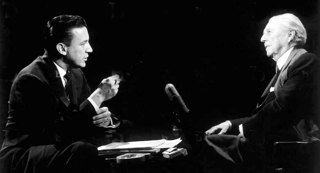
Over the years, it has amused me no end that Christians believe, in the face of all evidence, that their religion is monotheistic, when in fact, it features as many gods and godlets — divine spiritual beings — as Hinduism or the pantheon of Greek gods. Yes, Yaweh is the boss, but so was Zeus, or Indra, or Odin. Yet, Christians persist in calling the other religions pagan, and their own as monotheistic. It’s a hoot. 

And I am not here referring merely to the ineffable concept of the trinity — one god in three forms — which is no different, really from Shiva, Brahma and Vishnu, who are aspects of the Brahman — the Great Mystery. (The Holy Ghost can be seen as the creator, Christ as the preserver, and vengeful Jehovah as the destroyer making the comparison more apt.) 

No, while that by itself qualifies the Christian religion as polytheistic, what I am really interested in are all the other lesser divinities, the angels, saints and demons. A whole army of Thrones, Archangels, Dominions, Principalities and Seraphim. There are a lot of them. 

In the Bible’s book of Daniel, the prophet describes God and his attendees (Daniel 7:9-10). “His throne was a fiery flame, its wheels burning fire; a fiery stream issued and came forth from before him. A thousand thousands ministered to Him; ten thousand times ten thousand stood before Him.” 

Heaven seems traffic-bound with angels. Getting a parking spot must be like in Los Angeles. 

But it isn’t the crowded heavenly city of angels that I am interested in, but their opponents: the devils. And, more than all that, the one balancing deity in opposition to Yaweh —  Satan, aka Beelzebub, Belial, Samael, Old Nick, Lucifer, Apollyon, Old Scratch, Mephisto. Or a host of other names and circumlocutions. 

No agreement is reached among Christian theologians as to whether these are all just aliases of Satan, or whether Beelzebub, Samael or the others are henchmen — sidekicks to Old Nick. There is considerable ambiguity among the sources. 

Either way, there are enough spirits floating around in the spiritual ether to populate a Cecil B. DeMille movie. But the one that interests me particularly is Satan, or rather, how he, as the Devil, has been depicted over the centuries. This is about art history rather than about theology. 

Neither is there any clear picture of Satan’s role. In one version, he is God’s adversary, seemingly nearly co-equal; 

in another, he is cast into hell and suffers eternal punishment and bound in chains; 

in another, he is the presiding spirit of hell — its CEO, as it were — and rules the demons or the damned, like the Greek Hades or Roman Pluto; 

in another, he is the torturer of the damned and devours them; 

and in yet another, he walks the earth creating temptations and havoc. Is Satan to be found in heaven, in hell, or on the earth? 

Satan, after all, is really just a bit player in the Bible. He barely shows up. Yet, he is a major figure in the mythology and iconography of Christianity. In the Bible, the word “satan” is just the Hebrew word for “adversary,” or “advocate” (Yes, Satan is a lawyer). 

He is one of the bureaucracy of Heaven in the book of Job, where he seems to be the commissar who tests the love of humans for Jehovah, and is allowed by God to test his servant, Job. In other Bible verses, the word “satan” simply refers to a normal human who accuses or admonishes someone else. 

It isn’t until after the Second Temple Period, with its Persian influence, when Judaism was heavily colored by Zoroastrianism and its theology of the good Ahura Mazda, god of light, and the evil Angra Mainyu, the god of darkness, that a similar divine dichotomy becomes prevalent in Judaism. Over time, folklore and theology converge. Satan becomes part of the dramatis personae of the theater of beliefs. 

For Satan, devils — and much of saints and angels along with them — are much more the product of folklore than religion. And the stories, myths and legends vary from source to source, from country to country, and from denomination to denomination. (Very like Greek myth, there is no single canonic version of any of the stories.) 

In the early centuries of Christianity, church fathers faced popular paganism and had to deal with the old gods.  Tertullian states unequivocally that all the old gods were disguised demons (De spectaculis, xix).

Pan became one of the templates for our image of Satan, with goat feet and horns. The Germanic earth-sprites, elves, kobolds, fairies, hairy hobgoblins of the forest, water nymphs of the brookside, and dwarfs of the mountains were transformed by Medieval Christianity into devils, or into hellish imps, a sort of assistant or apprentice devils.

One common story involves the rebellion of Lucifer and his army against the angels siding with Jehovah. There are many folkloric versions of this war. In one, Satan’s ambition attempts a coup d’etat against God, in another, God demands Lucifer bow down to God’s newest creation, Man, and the rebellious angel refuses. 

Either way, in one version, a tenth of all angels rebelled, in another a third. No matter how you count, that’s a lot of them. 

“The number of the angels who participated in this movement of rebellion has never been fully ascertained,” wrote scholar Maximilian Rudwin in his exhaustive 1931 book, The Devil in Legend and Literature. “The belief current among the Catholic Schoolmen, based upon an interpretation of a biblical phrase (Rev. xii. 4), is that a third of the angels ranged themselves under Satan’s standard. The rebel leader’s armed force seems to have comprised nearly 2,400 legions (about 14,400,000), of which each demon of rank commanded a certain number. … Alfred de Vigny thinks that a thousand million followed Satan in his fall (Cinq Mars, 1826).”

Apparently, the population of devils and demons has grown since the rebellious angels were cast out of Heaven. Some Medieval theologians believed that devils can procreate just as humans do, and a population explosion has taken place since the Biblical times. Again, according to Rudwin:

“Johannes Wierus, a pupil of the famous Cornelius Agrippa and author of the learned treatise, De praestigiis daemonium (1563), went to the considerable trouble of counting the devils and found that their number was seven and odd millions. According to this German demonologist, the hierarch of hell commands an army of 1,111 legions, each composed of 6,666 devils, which brings the total of evil spirits to 7,405,926, ‘without any possibility of error in calculation.’ A professor of theology in Basle, Alartinus Barrhaus, is, as far as is known, the last man to take the census of the population of hell. According to this infernal statistician, the devils number exactly 2,665,866,746,664.” That’s more than 300 demons for every person currently alive on the planet. 

There have been several times in history when reformers have tried to free theology from myth, to come to an understanding of divinity in the  abstract. But the impulse to anthropomorphize is seemingly too strong to resist. Stories are easier to understand than exegeses. Islam began as a simple assertion of “one god,” and became layered with spirits, angels and their own version of Satan (“Shaitan” or “Iblis”). In the Upanishads in India there is an attempt to demythologize Hinduism, but the myriad devotional deities persist. Many Christian theologians have attempted to demythologize their religion, but it is the stories on the stained glass windows that persuaded the faithful. 

In the New Testament, Satan tempts Jesus in the desert, and then shows up in parable explanations given by him to his disciples. In the book of Revelations, what was obviously intended as an allegory of Roman hegemony turns Satan into a great red dragon with seven heads, ten horns, seven crowns, and a massive tail. 

In later midrash, commentaries and hadith, the stories multiply, and often diverge. And so, Satan has many forms, many motivations, many magical powers, many henchmen. And it is these later forms that are most familiar in art and literature, whether from Dante or Milton, or Salman Rushdie. And the many forms are what interest me, for they change with fashion, just as art does. There are Romanesque devils, Renaissance versions, Baroque Satans, Romantic Satans and modern ones, too. 

“The visuals of Satan have evolved over centuries to create the stereotypical Devil that has become familiar to modern viewers,” writes historian Genevieve Carlton. “Medieval artists borrowed from both the Greeks and Egyptians to depict Satan as a terrifying beast — he was often shown ruling over Hell, tormenting the souls of the damned. By the 16th century, artists began to depict Satan walking the Earth, harassing the living, and working with witches to wreak havoc on society. Satan has also appeared as a goat or a creature with enormous bat wings. This visual Satanic evolution continued in the 18th and 19th centuries, introducing the concept of Satan as a tragic figure or trickster.”

In the Middle Ages, Satan was mostly pictured as a monstrosity, with horns, misshapen face, cloven hooves, gnarly knuckles, and often extra faces where genitals should be, or perhaps a face on his rump. Several versions have faces for every bone joint. 

These are horrific, completely non-human depictions of the father of lies or lord of the flies. It was an image for an age that actually believed in devils and demons, and a hell for the damned. 

And the fear that Satan or his devils or demons could couple with wives or daughters was prevalent.

These were people who took their devils seriously. And they were everywhere, it seemed.

Later ages don’t take Satan so literally, but either as a metaphor for evil, or, if a “real” thing, then an angel fallen from grace. He becomes more literary. 

In Dante’s Inferno, Satan is prisoned at the very bottom of hell. He is portrayed as a giant demon, frozen mid-breast in ice. Satan has three faces and a pair of bat-like wings affixed under each chin. As Satan beats his wings, he creates a cold wind that continues to freeze the ice surrounding him and the other sinners in the Ninth Circle. The winds he creates are felt throughout the other circles of Hell. In his three mouths, he chews on three famous traitors: Judas, Brutus, and Cassius.

As seen by an anonymous artist of Dante’s time

As seen by John Flaxman in the late 18th century

As seen by poet William Blake

In Dante, as in many other mythographies, Satan was once the brightest and best angel of heaven (often called Lucifer), who either rose in rebellion to God Almighty, or refused to pay obeisance to God’s latest creation, Man. 

And so, in various versions, Satan is a once-noble being, whose external appearance maintains some of its former beauty and glory. 

That is certainly Milton’s version, in Paradise Lost

“ . . his form had yet not lost all her Original brightness, nor appear’d

less then arch angel ruind, and th’ excess Of Glory obscur’d . . . but his face deep scars of thunder had intrencht, and care Sat on his faded cheek . . . cruel his eye, but cast Signs of remorse and passion to behold the fellows of his crime. (book I, 591–94, 600–2, 604–6)”

These illustrations are from an early edition of the book

The heroic or anti-hero Satan became even more common in the 18th and 19th centuries. English artist John Martin illustrated Paradise Lost

And more famously, Gustave Dore illustrated the epic poem and made Satan even more heroic

But they weren’t alone. The heroic Satan was all over the 19th century

It is difficult to read Paradise Lost and not find Satan more interesting on the page than God or his angels — who come across as ideas, not as personalities. The 19th century tended to see Satan as the real hero of Paradise Lost

Poet William Blake famously expressed his opinion on why this should be in The Marriage of Heaven and Hell: “The reason Milton wrote in fetters when he wrote of Angels & God, and at liberty when of Devils & Hell, is because he was a true Poet and of the Devil’s party without knowing it.”

For Blake Satan was the symbol of creative energy, while God — or “Nobodaddy” — was the enforcer of stultifying rules. 

But Blake, who was also an artist, illustrated scenes from the book of Revelations where the biblical Satan was a “Great Red Dragon.” 

On the Continent, the devil takes on a dandified aspect, as in Goethe’s Faust, where he goes by the name Mephistopheles. In the Prologue in Heaven, Mephistopheles mimics the scene in Job, where he offers to tempt the scholar Faust. God lets him have his way. As he leaves the scene, Mephistopheles gives an aside:

“I like to see the Old Man now and then, And take good care I don’t fall out with him. How very decent of a Lord Celestial To talk man-to-man with the Devil, of all people.”

It’s hard to imagine anyone in the Middle Ages being so jocular about God and the devil. 

Mephistopheles was portrayed on stage often, in plays and operas, and a standard design developed. 

This devil is an urbane con man

And his stage costume is almost always red. It is from this theatrical version that our common red devil derives. 

You find him all over popular culture. 

In comic books

Tattoo designs

Sports mascots

And, of course, in movies, where there has been an evolution in our versions

In early films, the Mephistophelian model survives, as in the Swedish film Häxan (1922) and the Hollywood My Friend the Devil (1922, now lost)

Over the years, a more Medieval version of devil has been popular, too, with horned monsters, still often red

And, also in animated films, from Betty Boop to Disney’s Fantasia

More recently, Satan has become quite dapper, as in Ingmar Bergman’s The Devil’s Eye, or he’s become a hedge fund manager, such as Al Pacino in The Devil’s Advocate (etymologically redundant) or Tom Ellis as Lucifer Morningstar on TV. 

It isn’t just Western culture or Christianity that populates a spirit world with imps and demons. It seems to be a universal archetype, or part of the Jungian collective unconscious. 

Either that, or leprechauns, fairies, and trolls are real. 

Arabic countries have their djinn, or genies

China has its demons and Tibetan Buddhism has its guardian spirits

Japanese artists have an entire genre of demon paintings 

There are Pre-Columbian scary gods and demons

that survive today with Mexican festival masks — indeed with masks from many cultures 

More masks, just for fun

 Devils predate modern religions and continue to inspire artists and image makers. The Assyrian wind demon Pazuzu in a statuette from the 8th century BC; a sculpture of Satan by Jean-Jacques Feuchère from 1835; and two demons by Fritz Scholder

I could also go into devils in other artforms, such as Liszt’s Mephisto Waltz or the Witches’ Sabbath finale of Berlioz’s Symphonie Fantastique. Or Stravinsky’s A Soldiers Tale. Or Giuseppe Tartini’s Devil’s Trill Sonata, which the composer said came to him in a dream of the devil playing the violin. (Pictured here by French artist Louis-Léopold Boilly in 1824)

For this blog entry, I have collected hundreds of devil and demon imagery. I could not post all of them. But I will leave you with a detail from Albrecht Dürer’s 1513 engraving, Knight Death and the Devil

Click on any image to enlarge
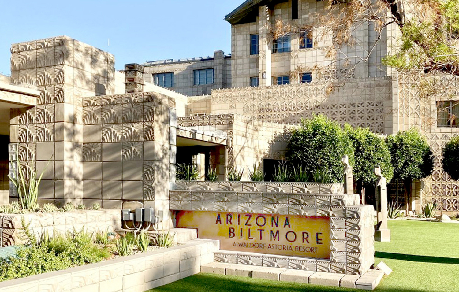
The first time I ever saw Théodore Géricault’s Raft of the Medusa, it was in my art history textbook — the infamous Janson. It was about 5 inches wide on the bottom of page 633. 
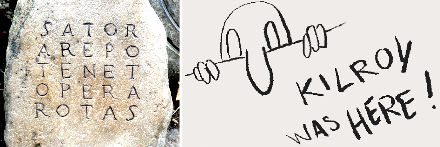
Most of the world’s most famous art I first contacted in reproduction; it is the same for most people. It would be hard to travel the world’s great museums to see all the Vermeers, Rembrandts, Titians or Chardins. Instead, we see reproductions in books, or on the computer screen. I’ve seen hundreds, probably thousands of paintings in reproductions before I ever saw the real things. 
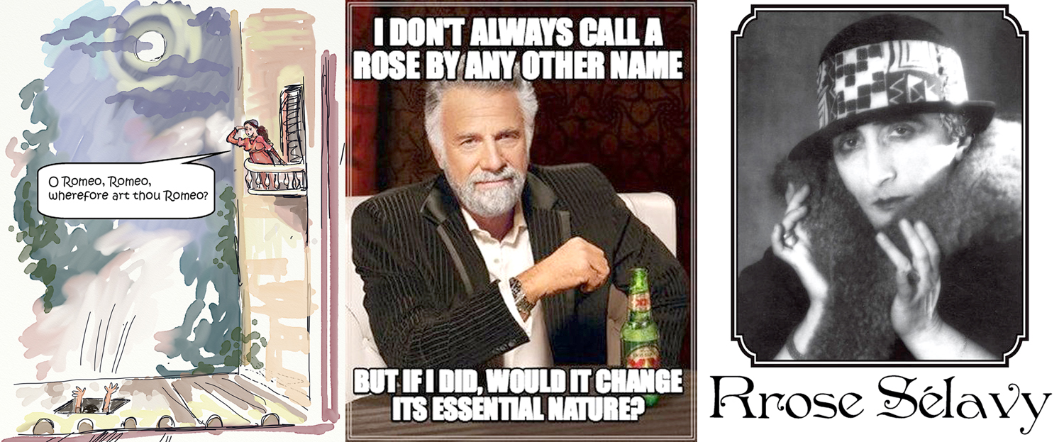
So, imagine my amazement when I encountered the real thing at the Louvre in Paris. There it was, the size of a barn. It was a lesson — if I really needed one — teaching me that a picture of a picture is not the same thing as a picture. But so much of what we imbibe of culture comes not in its original form, but as reproduction, whether it is Canaletto in art history class, or Beethoven on a disc. 

One of the things that divides the world I grew up in from the world I live in now is the unconsidered acceptance of a media experience for the live reality. We all have our noses in our screens. In many ways, what was once the secondary simulacrum of a genuine experience has become the end product itself. Since the days of Sgt. Pepper’s Lonely Hearts Club Band, a great deal of music simply cannot be performed live; the recording is the original. 

In our Postmodern world, suffused with media, many an artist and musician has taken the secondary product as the original. And so, images are designed to be seen on the computer screen. No one asks to see a TikTok video in a movie theater; that would be silly. Content viewed on an iPhone is not an imitation of something else. 

I, myself, now take photographs specifically to be viewed on screen rather than printed out. I edit them differently, I frame them differently. It is a different esthetic. But aside from work made for the virtual world, there is still the palpable object to take into account. 

But the fact is, that many more people listen to recordings than attend concerts; see paintings in book reproductions or on computer screens than visit galleries or museums; prefer audiobooks to sitting in a chair and quietly turning paper pages. It gives a false impression of the art. 

We keep stepping back from an original and choose a Xerox copy. 

I am not here arguing against digital devices — you are reading this blog on one, so where would I be without such devices? — but I am worried that the ubiquity of reproduced media makes us forget that there can be something more immediate, and that through most of history, that immediacy was the primary mode of experiencing art and music. 

My brother and I were once talking about theater. He stated that he didn’t much care for live theater but preferred movies as being so much more realistic — despite the obvious fact that live actors are very real and that celluloid images are only simulacra, and that movies are cut and edited all over the place, while live action must take place in real time. 

But I recognized his point, and when I was younger, I would have agreed with him. Most of us are only subject to live theater, if we are exposed to it at all, in uninspired productions with bad or mediocre acting — the community theater or dinner theater sort of thing. And undistinguished theater is admittedly tedious. 

Most of the theater I had been exposed to was just that sort of thing. Sometimes quite entertaining, but always so darned “theatrical,” i.e. phony. 

Then, in 1994, I got to see the original Broadway production of Tony Kushner’s Angels in America, both parts over two days. It was the most riveting, even mind-blowing thing I had ever seen. And what was so moving was that it was there, live in front of me. They were real people doing and saying those lines and feeling — or evoking — those very primal emotions. It is still the single greatest experience I ever had in an audience. 

I have now seen the two-play cycle four times and each time it has grabbed me by the lapels and yelled into my face in a way that has left me shaken. I’ve seen the Mike Nichols film version, with Al Pacino, and it is a wonderful production, but it cannot move me with quite the same seismic force that the live version had. If I had seen those same actors in the theater instead of on the TV screen, I’m certain it would have been earthshaking, but the remove of the screen gives the whole thing a distance that the live actors don’t suffer from. 

I since have become an advocate for live theater, though it is hard to convince anyone who has not had the experience of great live performances. I have seen really good professional performances since Angels, and they have something nothing else has. Whether it is Fences by August Wilson, or Amadeus by Peter Shaffer or Hamlet performed by the Royal Shakespeare Company, I am completely drawn in, with the same complete concentration one has when reading a great book — the day-to-day world disappears and the esthetic world takes over. 

(Amadeus, by the way, as a play is very different from Amadeus the movie. As wonderful as the film was, a good production of the play is so much more devastating.)

It isn’t only plays that have to be seen live. I have watched a good deal of dance on video or on PBS, and I am always disappointed at some deep level. Ballet and dance theater is the art form that speaks to my inner being the most directly and I love dance profoundly. But only live dance will do it. Balanchine knew this and attempted to re-choreograph a few of his masterpieces especially for video and however beautiful his video versions are, they pale beside seeing them live. You have to see the living, breathing (huffing and puffing), muscle-twisting movement in three dimensions for it to register fully. 

(Mediocre dance, like mediocre theater is the worst ambassador for the artform — how many people have been turned off by watching the local civic ballet company galumph through the annual Nutcracker? That is no more the real thing than little league pitching is like Bob Gibson or Sandy Koufax.)

I have well over a thousand CDs on the shelves in my office and listen daily to recordings of Brahms, Bartok, Weill, Mahler and Glazunov. And I don’t know where I’d be without them. But I also know that the real thrills I have had with classical music have been in the concert or recital hall, listening to live music. It has a presence that the recording cannot duplicate. I’ve written before about hearing the eight horns in Strauss’s Don Juan peel off the great horn call and feeling the sound through my chest and my fundament as much as through my ears. 

I want to make the same case for visual art. Everyone knows what the Mona Lisa looks like. Or do they? Almost to a person, those who have seen the original has remarked how small the painting is. It is a very different thing from the same image on a coffee mug or even in an art book. 
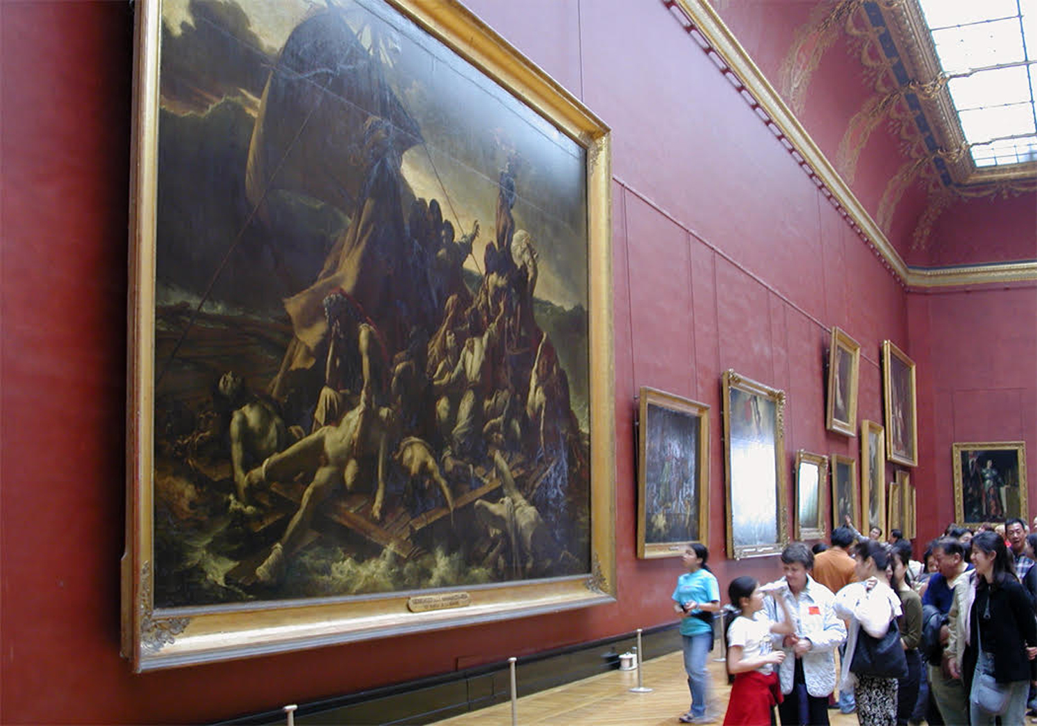
But it’s not merely size I mean. The colors cannot be precisely conveyed by printer’s ink or by a computer’s palette. The paint has a texture that isn’t conveyed, and varying levels of gloss or matte. This was brought home to me — very like the revelation of Angels — when I saw a collection of Cezanne still lifes at Washington’s National Gallery of Art. I had not imagined such an exquisite range of greens; way too many variants than can be named. The Cezannes in my Janson were dull and lifeless in comparison. Yes, I could name the subject in them — an apple here, a vase there — but apple and vase were not what the painting was about. This rich range of visual information was the real subject. Gone in the reproduction. The real paintings made me want to chew the colors like a great meal. 

We are led to accept imagery as the purpose of art, but it is only one portion of it. Alone, it is hardly more than the male or female silhouette on a restroom door. It also must include the scale, the finer shades of color and texture — and as with theater — the “presence.” The fact. Van Gogh’s Starry Night is everywhere from lampshades to mouse pads, but if you stand before it at the Museum of Modern Art in New York, you absorb how complex the painting is. Not just a swirl of blue night sky, but an object, a painting made of pigments and oils. 

The same with the huge paintings of Maria Medici by Rubens, or the meticulous brushstrokes of Robert Campin’s Mérode Alterpiece at the Cloisters in New York. 

But, I hear someone say, you should not let the best be the enemy of the good. As Chaucer said, “Muche wele stant in litel besynesse.” And many of us cannot visit the Louvre or the Prado, or get tickets to the New York City Ballet. Does everything have to be great?

I am not arguing that. I am saying that we should not be bamboozled into thinking that a reproduction can stand in for the genuine and that the real thing can be a life-changing experience, causing you to discover depths in yourself you hadn’t even suspected, whether it is the sympathetic feel of your muscles watching a dancer, or the empathy you extend to Salieri in Amadeus, or the hunger for color you get from Cezanne. 

I am arguing that, in fact, you should look at real paintings and sculpture. Not all of it will be great, but it will be real. It will be present. There is plenty of local art in every town and city. If there is no museum, there may be some Depression-era murals in your post office, or a World War I soldier in your town square. There are local artists working in your neck of the woods, and what they do is real, not virtual. 

Every locale has artists working, and art worth experiencing isn’t only found in museums, or only found in New York or Berlin. 

I remember pulling into a supermarket in Boone, N.C. one fall afternoon and hearing three or four local musicians plucking guitar and banjo on the front steps, gathered informally to play some tunes. It was genuine and I sat and listened with the small crowd for 20 minutes or so before going in for my butter and eggs. 

You never know what you’re going to get. Even the best performer can have an off night, and sometimes an amateur can hit the spot. It isn’t frogs you have to kiss, but you do need to weed through a good deal of acceptable but unexceptional work to find those few that will stick with you for life. 

And then you will know the immediacy of the real.