Archive

Tag Archives: art history

Not every life-changing event happens on the road to Damascus: a blinding light, knocked to the ground, twitching galvanically. The death, the religious conversion, the falling in love. But there are smaller turnings also, often dozens of them in a life, perhaps passed unnoticed at the time, but nudging our lives on a slightly new heading. “As the twig is bent, so is the tree inclined.” The butterfly in Brazil. These are also life-changing. 

In the summer of 1972, the Museum of Modern Art in New York mounted a small exhibition in its downstairs gallery, behind glass doors. “Atget’s Trees” put together 50 photographs by the French artist Jean-Eugène-Auguste Atget (1857-1927). Lined up on the wall in a darkened space, with brilliant track lighting that made each photograph gleam like a jewel, the photographs made my heart jump and my eyes happy. (That kind of lighting is now largely verboten in museums, as they adhere to a strict limit of only so much illumination to protect sensitive materials from light damage. Silver-image black and white photographs are largely immune to such light damage, so the restriction on lighting seems shortsighted and misguided; it dulls the brilliance.)

Atget (At-zhay) was an odd little man who taught himself photography in order to document art, architecture and decor that was disappearing as Paris and France entered the modern world. Originally, beginning in 1890, his work was meant for painters, architects and stage designers to provide models for their work, and he sold his pictures to them. But he seems to have become more and more interested in the details of his city for their own sake. He took thousands, maybe tens of thousands of negatives. Many were sold to various institutions interested in historic preservation, such as the Bibliothèque Historique de la Ville de Paris. 

In 1925, he met American photographer Berenice Abbott, who began buying his photographs and collecting negatives. In 1968, she sold her collection to MOMA, from which the “Atget: Trees” show was developed. 

The majority of Atget’s subjects were buildings, statues, door knockers, gardens and street scenes. No detail was too humble for his attention. There are photographs of doors, photos of stairways, photos of balconies and railings, of fireplaces, of courtyards and alleyways. His curiosity was omnivorous and ravenous. 

But through all, there was one subject he came back to over and over: trees. Most were in parks, like Saint-Cloud or Sceaux; some were at Versailles; others simply out in the countryside. He seems especially taken with ragged bark and gnarly roots. Often, he has photographed the same tree over and over, from very slightly different angles, or in different seasons. There is something sensuous in the growth and surface of trees that excited his artistic libido. 

Atget’s equipment and technique were already antique when he began, using an old bellows camera and large negatives, printing them on albumen paper and toning them with gold chloride. This gave his images a sheen (from the egg white) and rich, chocolatey tone (from the gold) that, in the right light, makes them jump from the frame with gem-like luster. 

And there I was, in 1972, ripe for the message they were giving me. 

You have to remember that 50 years ago, the art world — and especially the world of photography — was deeply buried in a type of snooty puritanism. We were taught you never “crop” your images, but framed them precisely in the viewfinder. Anything else was “sloppy” and perverted the natural uses of the camera. You must used archival paper and processing. Frames must be neutral, matting must be white or ivory.

And most of all, you were made aware that a photograph was all about photography. Art about art. Subject matter hardly mattered; it merely provided an armature on which to make your statement about the nature of photography and art. 

This was the art world the late Tom Wolfe railed against in his book, The Painted Word, where the deacons of art criticism slapped their hands down on a kind of outstretched bible of certainty: A painting must be flat, it must not mix genres, it must investigate the possibilities of paint and never, ever “illustrate” a story or event. Hellfire and brimstone of a different sect.  

This was the heyday of Ansel Adams and his Zone System of photographic exposure and development, to carefully control the results, which were by necessity “previsualized,” i.e., you were to know before you snapped the shutter, exactly what the end result would be, including its printed size and what sort of paper you would print it on. God, it was constricting. What a constipated way of approaching art. 

And here was Atget before my eyes, messy, uncoordinated, obsessive and obviously fascinated with the things of this world. 

Not that it made a dent in the attitude of exhibit curator John Szarkowski, one of the deacons of that puritan orthodoxy. Szarkowski was Director of Photography at MOMA from 1962 to 1991, and one of the most influential voices of the time. He performed many miracles for photography as an art at a time when the status of photos was still doubted in some corners of the art establishment. But he also issued some very dubious edicts. 

About the “Atget: Trees” exhibit, he wrote in a wall label for the show, “On the basis of a small and heterogeneous collection, the quality of effortless poise that identifies Atget’s work might easily be read as naivete. A study of his repeated investigation of the same or similar subjects, on the other hand, suggests a conscious and sophisticated concern with the ultimately formal problems of picture making. 

“Atget was acutely aware of the literally infinite number of images that are potential in a given ‘subject,’ and he knew also that none of them was true, in the sense that it shared a privileged identity with the object photographed. The subtle variations in framing included here among the six plates of the Beech Tree, St. Cloud, for example, make it clear that Atget did not confuse the subject with the object. He understood that the true subject is defined by (and is identical with) the picture.” 

That is art gobbledy-gook for, “Don’t think Atget was a bumpkin. No, he knew that the real subject of a photograph is the photograph itself, and the finished print, given to us, is the only actual goal of taking the thing in the first place.” (I especially note the condescending quotation marks around “subject.”)

And that, my friends, is a complete misreading of Atget and his art. 

What I came to realize, adoring those luscious trees on the wall of 53rd Street, was that what mattered was not the print, but the attention that Atget gave the world he loved. That, in fact, the subject does matter, and the photographer’s engagement with it was the photograph’s raison d’etre. The photo was merely a lasting and sharable byproduct of the artist’s attention. 

Atget was an indifferent craftsman. His photographs are often poorly exposed, a bit out of focus, show effects of lens flare from an uncoated lens; the prints are sometimes poorly processed and some are fading, or picking up spots and stains. In a Postmodern world, all these things might have been consciously introduced to make us aware of process in privilege over subject matter. But Atget was no such. The power of his work, and its attractiveness is in its naivete — or rather, its directness. Art theory cannot touch it, cannot sully it or soil it. 

Soaking in the MOMA show, I fell in love with Atget’s art, but even more, I learned to mistrust the vox auctoritate. Just because a respected and learned expert speaks ex cathedra does not mean he is right. After all, a scholar is shooting in the dark, just as we all are. Just as Atget engaged with the things he loved, I tried my best to engage with his photographs and not be led into believing orthodoxies that had little to do with what I actually saw. 

And this visit to 53rd Street also freed me to loosen my own approach to the camera and use it to engage with the things I love.

I have had many such life-changing encounters, small but meaningful. This was just one of them. 

Click any image to enlarge

Mathematics. We all have our personal sums and divisions. I was once 20; I am now 70. The years have added up, and what is left is now a fraction. 

When I entered college in 1966, I was just over half the age of the professor who had the most influence on me. He is now 85 and have become exactly 14/17ths his age. I am catching up. The ratio has narrowed. 

(If we both live long enough, I calculate by my birthday in 2025, I will be older than him by seven months.) 

There was once a great difference in our ages and in our wisdom; now we are roughly equal. The piling of years does that; the gathering of experience. 

I have spent my life learning. It is the basic drive, like women for Don Giovanni, or gathering corporate acquisitions for Warren Buffett. But more math: Every time I increase what I know by 2 percent, I double what I don’t know. I learn arithmetically, I become ignorant exponentially. It is as if I am splashing in an inflatable wading pool on the beach next to the ocean.

When I was young, I was a complete idiot, and my ambition in life was to know everything. Seriously: everything. I suppose underneath the surface, I understood that was impossible. But you have to have some kind of aspiration. 

But back then, being an idiot, I still thought being intelligent meant knowing a lot of stuff. And I knew a lot of stuff. Piles of facts and factoids. I could explain the Defenestration of Prague in 1618: the shifting taxonomy of lions from Felis leo to Panthera leo to Leo leo; the use of the Neopolitan sixth chord as the subdominant in a minor key. And perhaps I showed off a bit too much. But now I understand that knowing stuff is mere accumulation. Nothing to take credit for: These things stuck in my mind because my brain is gummy. 

Besides, the more you learn, the more you discover that what you once took to be fact has either been superseded by later research, or been misunderstood, or turned out to be canard and cant. I.e., Cliff Clavinism. 

I have a pile of books and music scores that keep me going, and I add to that all the things of the real, the physical world, that I observe — the seasons changing on the trees, the birds chirping, the clouds ranging over the skies.

I am hungry to take it all in. 

But there is another delusion: that being intelligent somehow means being rapid of apprehension. Quick. Sharp. Fast on the uptake. While it is true that a fast comprehension comes with intelligence, it is, as they say, necessary but not sufficient. 

People who know they are smart tend to sort things very quickly into their silos, eager like tennis pros, to volley the next shot back. C’mon, you can bring’em faster than that! But sorting isn’t intelligence. Quickness of wit is fine; it is fun, it is exhilarating, but it doesn’t get us to the core of things. 

This is something I have come to understand over many years. Two people, more than any others, more than any book or class, taught me what to value in whatever mote of intelligence I possessed. 

The first was my wife. She was the most intelligent person I ever knew, although, on first hearing her, you might be confused over that issue. She could say the most surprising things: “Andrew Wyeth is more abstract than Jackson Pollock” or “You can fall into blue.” (We once argued over that last one for three full days and nights, before I capitulated. I always gave in. She was always right, although you had to think sideways or give up long-held unreflected prejudices. Wyeth is abstract in the sense that he abstracts a visual essence from the world and flattens it into an image made of blurts and squiggles, while a Pollock painting is no abstraction: It is palpably and solely a painting; it is what it is and nothing else. As for blue, I have been drowning in it since that fight.)

What she had was complete and utter openness to input. A failure to plop input into those silos. She didn’t so much think outside the box, but was unaware there was a box. I marveled at her insight, which she was basically oblivious to. It just was. 

It led me to my doctrine of volitional ignorance. That is, to approach any subject from the point of view of complete innocence. Forget what you think you know and just take in the new experience. 

The second person, and earlier lesson came from that professor, now frail and failing, who forced me to engage with the material. 

When I first got to college, I knew I was bright, and I responded to classes by doing what I had always done: giving the teacher what he or she wanted. I was good at that. But in my class of English Romantic Poetry, I handed in my first paper, saying exactly what I knew my professor wanted me to say and he gave me back my paper with a big, red “D” on it. (Technically, it was a D-plus). I was dumbfounded. There was nothing in the paper that didn’t repeat what he had said in his lectures. It couldn’t have been that far wrong.

But what he wanted from me was not what I thought he wanted. He wanted me to engage with the material. To know something, not to know about something. There is a difference, not just in magnitude, but in kind between knowing about and knowing. 

That is where engagement comes in. Paying attention. Not sorting to be done with, but holding something between your thumb and fingers, twirling it around, seeing it from all sides, squeezing it to see how hard it is, cutting it open to see what’s inside. 

You must start from the simplest things. Looking at a painting, do not decide what the subject is or means, but first look. Long and hard. Describe everything you see, however slight. Don’t forget the corners, what is hidden in the shadows, describe the exact color of the blank parts of the background, what the fingers of the subjects left hand is doing. Get all the bits in first. Take time. I once spent seven hours in front of a single painting. It takes time and commitment. It takes engagement.

Only when you have spent all the time you need should you then essay to understand what the art might be about. Ingest it first, digest it second. 

Fifty years ago, my professor forced me to engage with the material. I wasn’t there to learn facts about Shelley, but to engage with the work and see what it might teach me. I have been attempting that ever since. It is a hard practice to keep up: so much easier to categorize and dispense and move on to the next. More efficient. Gets things done. 

But if you really want to partake in this life, be embedded in the world into which you have been dropped, it is essential to pay attention, to know in your bones how little you truly understand.  

 For the world is infinitely complex and can obey no schema you toss over it. Engage with it on any level and extract whatever you can. Savor it.  

My brother-in-law likes to listen to something he calls “ugly music.”

This is music with angles, asymmetries and dissonance. I first established my bona fides with him by recognizing a piece of music by its very first note, although it took at least a full second — maybe a second and a half — for the name to gather on my vocal chords and make the passage out past my teeth: “Bartok’s fifth quartet.” I think I shocked him.

Of course, I knew the piece well. For I, too, listen to and enjoy ugly music. And I own and read the score to the Bartok Fifth. Also to many other pieces of music that might be considered by fans of more consonant sounds as “ugly.”

But, I am a firm believer in the observation made by Tom Robbins in his novel, Even Cowgirls Get the Blues, that “The ugly may be beautiful; the pretty, never.”

The “pretty” is conventional; it is bland. It requires no thought or consideration: It just lies there, accepted with lip service paid, but with little active engagement. It is a postcard sunset, a Montovani recording, a symmetrical-faced actress indistinguishable from other symmetrical-faced actresses.

But beauty is an active engagement. You have to actually look or hear. You have to notice. It takes effort on your part. Pretty soothes you into complaisance, beauty wakes you up.

There is a French concept, the jolie-laide, or beautiful ugly. It is most often applied to women whose features are not traditionally good looking, but in concert add up to striking beauty and attractiveness. Think of Cate Blanchett, with that slash of a mouth, squinty eyes and broad nose. Each odd by itself. Blanchett is no cornfed cheerleader. But together the features make up a stunning beauty.

The French have almost a corner on the jolie-laide. Consider Jeanne Moreau. Or Isabelle Huppert. Or Charlotte Gainsbourg. It was her father, Serge Gainsbourg (say “gaze-boor”) who wrote a song about the “Laide jolie laide.” He was no icon of handsomeness himself, although I think many found him irresistibly attractive.

But, I’m not talking simply about feminine pulchritude or masculine formonsutude, but about esthetic beauty, about art.

Consider one of the ugliest paintings ever made, and how unbearably beautiful it is. I’m talking of Matthias Grunewald’s crucifixion from the Isenheim Altarpiece in Colmar, France. The Christ is writhing in pain; his skin is brown and gray, covered in sores; his hands are twisted, his head hung low and grimacing, his ribcage pulled up from his sagging gut, stretching him out, racked; his feet twisted and distorted. Even the cross bows downward from the weight, not just of the body, but of the suffering.

Around him are the mourners, also pulled and distorted, all crying and gnashing their teeth. The landscape behind is dark and barren. There is not a single note of grace in the frame, not a single square centimeter of prettiness. Yet, the painting is unutterably moving. You can hardly bear looking at it, yet, seeing it makes you recognize your own humanity in a profoundly deeper way.

Don’t misunderstand me. I am not saying that only ugliness can be beautiful, but rather, making the case that it can be.

Like that ugly music. Brother-in-law listens to Schoenberg with pleasure. One of the first pieces that turned him on to classical music was Beethoven’s Grosse Fuge — surely one of the hardest pieces to listen to in all the repertoire, but also one of the most sublime.

And it’s not just classical music. He listens to jazz, also, with an ear for the more abstruse and difficult bop. Or free jazz. Let’s face it, Cecil Taylor is not a cocktail lounge pianist. Or Thelonius Monk. That is music proud of its own awkwardness, and uses it for expressive purpose.

One might compare Son House with Montovani. The one is pretty, the other is raw, ugly, powerful. House gets to the gut with the sharpness of a surgeon’s blade. Montovani, no matter how glossy and smooth, is a soporific.

Other ugly music: Tom Waits, grating in voice and peculiar in instrumentation, yet, more satisfying than, say, John Denver. I know, that’s not fair. Sorry. But you know what I mean.

I have a long history with ugly music of all kinds. Appalachia is weighted with ugly music that is beautiful. Consider those mountain Baptist family choirs, singing vibrato-less and consistently just a hair flat, making the most mournful keening. Or the scratchy mountain fiddling of Emmett Lundy. I treasure his few recordings.

Many years ago, I had an LP of field recordings of amateur Spanish brass bands playing for religious festivals, marching down village streets. Sour, scratchy, blaring, they were so intensely beautiful in their ugly way, I came to love them. Alas, the LP is long gone and I’ve never found a digital replacement.

When I was a teacher of photography, one assignment I gave my students was to make a bad photograph. I required that it not be a technical botch, but a bad photograph from conception in the viewfinder. What my students — or at least my good students — discovered, and I already knew, was that if you are paying attention to what you are doing, it is very, very difficult to make a bad photo, because the fact of your attention rules out anything not paid attention to — i.e., the ugly.

It is often said that beauty lies in the eyes (or ears) of the beholder, but I think this saying is basically misunderstood. It is taken to mean something like “To each his own,” or “de gustibus non desputandum est,” but I take it to mean quite differently, and more to the point, that beauty is found in the engagement of mind and senses with the object of perception. In other words, when you pay attention with the focus of someone defusing a bomb, you discover layers of depth and meaning — and therefore beauty — that you might not have suspected. And so, the stains on a concrete sidewalk, layered with fallen leaves and maybe a gum wrapper, will, when observed attentively and with the full engagement of your sensibility, may very well strike you as heartbreakingly beautiful.

This is not just something for pointy-headed esthetes. I have known a farmer who can squeeze a handful of spring soil in his hand and find its loamy odor beautiful enough to bring tears to his eyes. For most of us, it’s just dirt. But to someone who attends to it, it is the essence of existence.

It is the engagement that creates beauty, not the beauty that creates engagement.

And so, when you listen to the Schoenberg Piano Concerto with this sort of eager absorption, you discover a beauty in it that those listening passively, perhaps with the radio on while doing their taxes, can never enjoy, hearing instead only a jumble of disconnected noise. It is not disconnected; it is not noise. It is a carefully created esthetic whole and a thing of beauty and a joy forever.

When I was in high school in New Jersey, I spent as much time as I could in Manhattan, visiting galleries, museums, bookstores and concert halls. And I came to love the Museum of Modern Art. I’d get out of the elevator on the gallery floor and to my right would be Jackson Pollock, Van Gogh’s Starry Night, Pavel Tchelitchew’s Hide and Seek (a painting that primarily appeals to an adolescent, which I was at the time), and beyond those, the the farthest gallery was Picasso’s Guernica, 25-feet wide and 11-feet high.

It is a painting of utter ugliness, not only in subject matter (the Nazi bombing of the Basque city of Guernica in 1937) but also in the angular, distorted and abstracted shapes that make up its design. If one has a shred of humanity, the painting cannot be seen without a welling up in your gorge. It is the prime example in the 20th century of a political painting that is actually an esthetic success. It is Picasso’s shay-doov, and the one piece of art, if we had to choose a single one to represent that century, would be the consensus choice.

It is also profoundly beautiful. While I am pleased that the painting has finally been returned to a democratic Spain, I mourn its absence from New York, from my life. I treasured its palpable presence and its emotional power.

The ugly may be beautiful, the pretty, never.

This absolutely astounded me.

I was surprised enough, when researching the art history of images of Adam and Eve, to find so many — I found at least a hundred, although I couldn’t use them all in my blog entry (link here), and amazed at how many Cleopatras there have been (link here). But nothing prepared me for the contemporary onslaught of actors and supermodels coiled up with pythons, boa constrictors and other serpens photogenica.

I believe the current flood of these images began June 14, 1981, when, after Vogue editor Polly Mellen asked model and actress Nastassja Kinski what she liked and she said, “Snakes,” a Burmese python was corralled for the scheduled photoshoot with Richard Avedon.

Avedon took to the idea, and asked if Kinski would consider posing nude with the beast. She said yes.

In a PBS interview, Avedon said, “Nastassja spent two hours on a cement floor naked.”

“They anchored the snake around her ankles,” and waited to see what would happen. Shot after shot did not work, he said. Then finally, after many takes, the (snake) undulated across Kinski’s hip and slowly made its way toward her head.

Richard Avedon

In a Washington Post interview about the shoot, the story continues:

“ ‘Natassja, this is it,’ Avedon said in a hoarse whisper, ‘Just try to relax!’

“Seconds later the snake came to within inches of the actress’ ear, then almost languorously extended its tongue, as if in a kiss.

“Snap.

“Another classic; another Avedon moment.

“ ‘She [Kinski] rose to the occasion,’ Avedon exulted, grinning, ‘the snake rose to the occasion. I rose to the occasion’ – all in a moment that would have been impossible to plan.”

Mellen said she did regret one thing. “I wish I hadn’t put that bracelet on her.” The Patricia von Musulin bracelet reminded us that this was, after all, a fashion shoot. Mellen said she had wished for it to transcend that.

The photo, first published in  the October Vogue that year and in a second incarnation became one of the most popular dorm-room posters of all time.

But like the face of Helen and the thousand ships, the photo launched a thousand imitations.

Perhaps the most notable came 20 years later, when Kinski’s daughter, Sonja — not yet born when her mothers’s iconic photo was taken — posed with an albino Burmese python for photographer Michel Comte. The photo was commissioned for the 400th edition of the European magazine, Photo. It was published in June, 2003.

But that was just one of a flood of similar photographs. Most notably was the set-up by French fashion photographer Patrick Demarchelier on July 29, 2014 of actor Jennifer Lawrence. It was published in the Feb., 2015, issue of Vogue.

They are hardly alone. Among other actors and models photographed with giant snakes are Elizabeth Hurley, Jenifer Bartoli, Irina Shayk and Rocia Guirao Diaz. You will notice in the picture of Bartoli, she is wrapped with an albino Burmese python.

Clockwise from upper left: Elizabeth Hurley; Irina Shayk; Jenifer Bartoli; Rocia Guirao Diaz

The yellow snake is striking, and has become the go-to snake for such photographs. (Perhaps too much: The mutant yellow python is one of those now terrorizing the Florida Everglades, having been set loose by exotic-animal collectors who kept them as pets until they got too big and unwieldy to keep around the family cat.)

The history of art is full of tropes, or memes, that get reused and developed over the centuries. I wrote about several of them in a 2014 blog entry (link here) in which you can see one pose progress from a fresco on the walls of Pompeii through the millennia to Manet’s notorious Olympia.

Tatjana Patizt; Devon Aoki

Supermodel and Playboy’s Miss November 2016, Ashley Smith upped the ante, with six shots by Giampolo Sgura in the fall/winter 2011 edition of Antidote magazine. She is selling snakeskin shoes and handbags.

Snakes and naked ladies have a long history. It began with classical images of goddesses, through countless paintings of Eve and the serpent, into Baroque paintings of Cleopatra and her asp and down to Victorian Orientalist fantasies feeding the prurient interests of its respectable bourgeoise audience. It reawakens with the artistic ideas of Avedon and flows down to advertising snakeskin handbags. For pop stars like Britney Spears, it becomes a stage accessory.

Could it go any lower? Well, how about pornstar Kristina Rose, star of 2009’s immortal Gluteus Maximass, and her own snake photo.

One could go on. Naomi Campbell got into the act (another yellow python), and so did Czech supermodel Karolina Kurkova (upper right), best known as a former Victoria’s Secret “angel.” And transgender model Andreja Pejic sidled up to the snake when still known as Andrej (lower right).

The horizontal pose isn’t the only one to become overused. There are plenty of vertical snake ladies. Sonja Kinski did one of those as well, along with Kate Moss — both yellow snakes — and Rachel Weisz.

Rihanna gets her photoshoot, mixing metaphors as both Eve and the Medusa. International models seem to love the pose, too.

Rihanna; Carla Ossa; Ellie Gonsalves; Petra Cubonova

There are really just too many to keep up with.

Then, there are the portrait heads.

They usually use smaller snakes, but many so beautifully colored, they are practically jewels.

You think that’s all? Well, it goes on.

And on.

Yet, all this is really not so new. This spate of snake ladies is only a more modern and glitzier version of the familiar snake lady of the carnie and freak show.

The snake charmers and

the tawdry end of the entertainment business that used to travel from town to town hoping to gather a few bored gawkers into their tents.

Then, there a million tattoos with the trope. One sees a long, slow descent from goddesses to dockside ink parlors.

But I don’t want to leave you with a sour taste in your mouths, so I will end with a flourish, from the camera of photographer Mike Ruiz and Zink magazine, in which Miss Piggy harks back to the immortal Nastassja.

Click any image to enlarge

It is 14 years after the assassination of Julius Caesar and three decades before the birth of Christ and the Greek queen of Egypt is about to die. The 39-year-old Cleopatra VII is the mother of four children by two fathers, both now dead. This much everyone seems to agree on. What happens next is romantic fairy tale, or conjecture, or cynical posturing — or all three.

The most widely believed version, used by Shakespeare in his tragedy, Antony and Cleopatra, has the queen, fearing to be taken captive to Rome by the conquering Octavian, has a basket of figs delivered to her, with a smuggled asp hidden under the fruit. She takes the venomous snake and applies it to her tender bosom and expires from the poison.

The problem is that there are conflicting stories told by the ancient writers.

The best known version, and the one Shakespeare cribbed from is that of Plutarch in his essay on Mark Antony.

The two rebellious lovers, having  been conquered by the young Octavian were at odds over what to do. Cleopatra had a false message sent to Antony that she is dead. Antony ran himself into his sword, but botched his suicide and was brought to Cleopatra, where he then expired. Cleopatra mourned and locked herself in her mausoleum. And then, according to Plutarch:

“Having made these lamentations, crowning the tomb with garlands and kissing it, she gave orders to prepare her a bath, and, coming out of the bath, she lay down and made a sumptuous meal.”

An old man came with a basket. The guards Octavian had sent to keep Cleopatra in check stopped him to examine the contents.

“The fellow put the leaves which lay uppermost aside, and showed them it was full of figs; and on their admiring the largeness and beauty of the figs, he laughed, and invited them to take some, which they refused, and, suspecting nothing, bade him carry them in.”

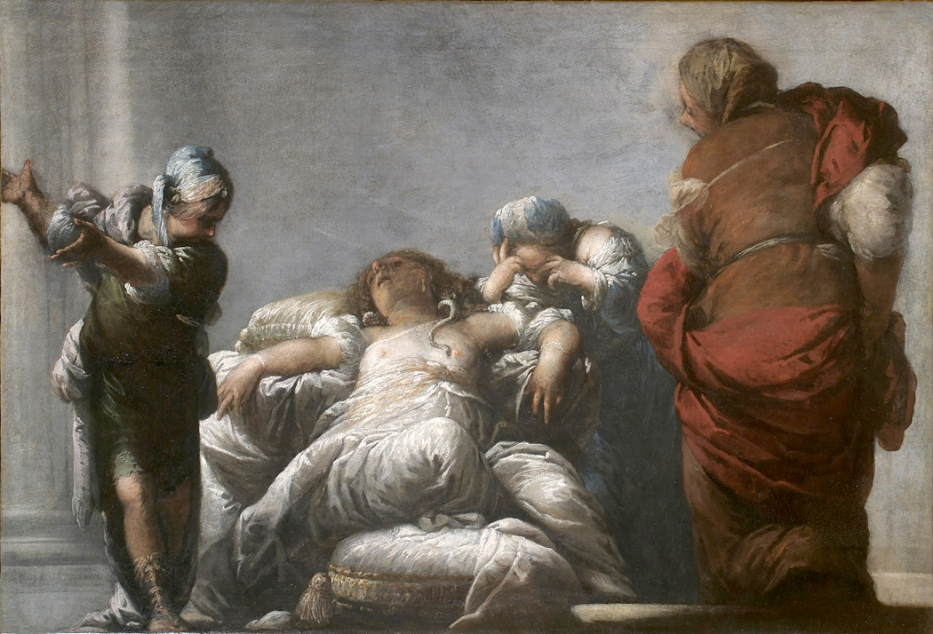
The queen then sent a letter to Octavian describing her intent to kill herself and locked herself in the monument with her two servants, Charmion and Eras. When Octavian got the note, which asked that she be buried next to Antony, he sent messengers to stop her from killing herself. But they found her already dead, “lying upon a bed of gold, set out in all her royal ornaments.”

Eras lay dying at her feet and Charmion, just ready to fall, barely able to hold up her head, was adjusting her mistress’s crown. And when the soldier that came in said angrily, “Was this well done of your lady, Charmion?”

“Extremely well,” she answered, “and as became the descendant of so many kings”; and as she said this, she fell down dead by the bedside.

“Some relate that an asp was brought in amongst those figs and covered with the leaves, and that Cleopatra had arranged that it might settle on her before she knew, but, when she took away some of the figs and saw it, she said, ‘So here it is,’ and held out her bare arm to be bitten. Others say that it was kept in a vase, and that she vexed and pricked it with a golden spindle till it seized her arm. But what really took place is known to no one.

“Since it was also said that she carried poison in a hollow hairpin, about which she wound her hair; yet there was not so much as a spot found, or any symptom of poison upon her body, nor was the asp seen within the monument; only something like the trail of it was said to have been noticed on the sand by the sea, on the part towards which the building faced and where the windows were. Some relate that two faint puncture-marks were found on Cleopatra’s arm, and to this account Caesar seems to have given credit; for in his triumph there was carried a figure of Cleopatra, with an asp clinging to her.

“Such are the various accounts. But Caesar, though much disappointed by her death, yet could not but admire the greatness of her spirit, and gave order that her body should he buried by Antony with royal splendor and magnificence. Her women, also, received honorable burial by his directions.

“Cleopatra had lived nine and thirty years, during twenty-two of which she had reigned as queen, and for fourteen had been Antony’s partner in his empire. Antony, according to some authorities, was fifty-three, according to others, fifty-six years old. His statues were all thrown down, but those of Cleopatra were left untouched.”
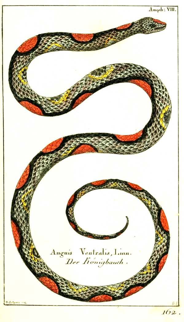
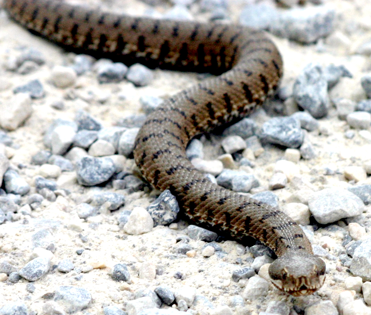
European asp

While Plutarch’s story has been repeated many times, it must be remembered that it was written 120 years after the events. Other historians and poets also told stories of Cleopatra’s death: Strabo, Velleius, Florus, Suetonius, Dio Cassius and Galen, Virgil, Horace and Propertius.

Of the historians, the only one who was alive at the time of Cleopatra’s death was Strabo, who wrote: “(Octavian) took the city at the first onset, and compelled Antony to put himself to death, but Cleopatra to surrender herself alive. A short time afterwards, however, she also put an end to her life secretly, in prison, by the bite of an asp, or (for there are two accounts) by the application of a poisonous ointment.”

Strabo was about 34 years old when Cleopatra died, but his account was written at least 10 years after that. It is thought he might have been in Alexandria at the time of the queen’s death.

The poet Horace wrote his ode, “Nunc est bibendum,” within a year or two of the queen’s death and mentioned it near the end of the poem: “Caesar came back to put the deadly monster in chains, but she, wanting to die more nobly had no feminine dread of the sword, and finding no way out of the situation, went to her palace lying in ruins and with a tranquil face was brave enough to handle vicious serpents and drink their black venom into her body. Having chosen death, she was fiercer still, unwilling to be taken back to Rome and led in a humiliating victory parade.”

The physician Galen (AD 130-200) wrote in De Theriaca ad Pisonem that “The queen had bit her arm and then rubbed the wound with poison.”

Virgil in the Aeneid says she died of “two fatal asps.”

Modern commentators tend to suspect that all the stories of Cleopatra’s suicide may very well be spin concocted by Octavian (by then Augustus Caesar) to cover up her murder at his orders. We know he had Cleopatra’s oldest son killed. Caesarion was the natural son of Julius Caesar and was 17 when Caesar’s adopted son had him quietly eliminated. “Too many Caesars is not a good idea,” he supposedly said.

So, Cleopatra either killed herself by taking poison, or by rubbing herself with poison ointment, or by stabbing herself with a sharp comb laced with poison, or held an asp to her arm to bite her, or scratched her arm up and rubbed it with venom from the smuggled asp, or — and the list goes on — it probably wasn’t an asp, since there are no actual asps in Egypt and if there were, their venom causes a very slow and painful death, and would more likely have been an Egyptian cobra, which is the sacred snake of the Egyptian pharaohs. Or she was killed by Caesar.

As Plutarch admits: “What really took place is known to no one.”

Among other accounts, Cleopatra tested various poisons on her slaves before picking the one that would cause her the least suffering. A good deal of the gloss on Cleo comes from the Romans, who had a vested interest in presenting her in the least flattering light. She was, after all, an enemy of Rome — at least after the disputed empire fell from the likely rule of Antony into the sure hand of Octavian.

Denouement: In addition to Caesarion, born to Julius Caesar, she had three children by Mark Antony. A son named for the sun and a daughter named for the moon survived her. Ptolemy Philadelphus was the youngest. Octavius spared them but gave them to his sister, the legal wife of Antony, to raise. The daughter, Cleopatra Selene, eventually married King Juba II of Numidia in north Africa. The son, Alexander Helios, is lost to history along with his brother.

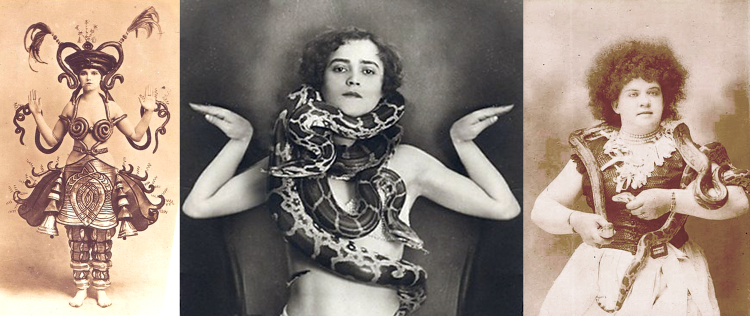
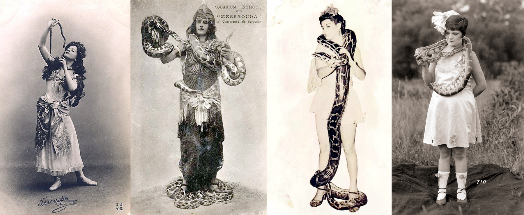
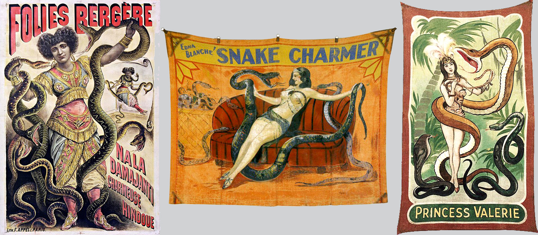
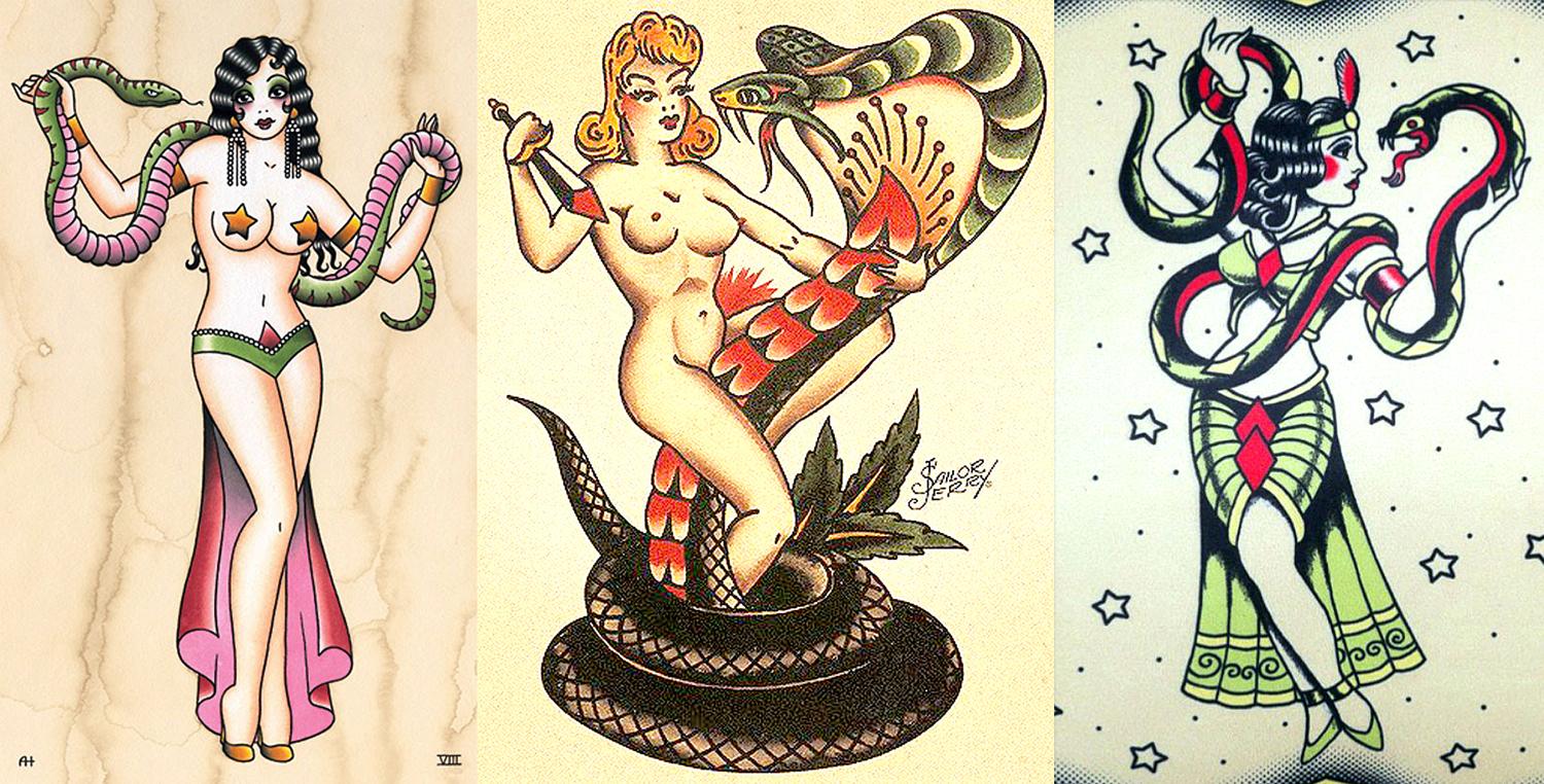
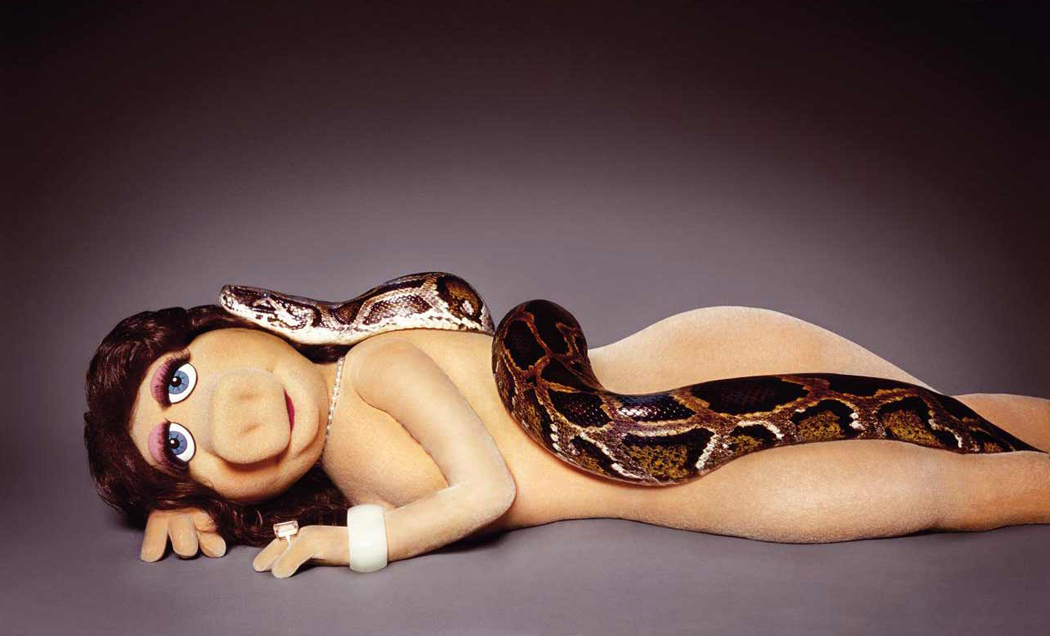
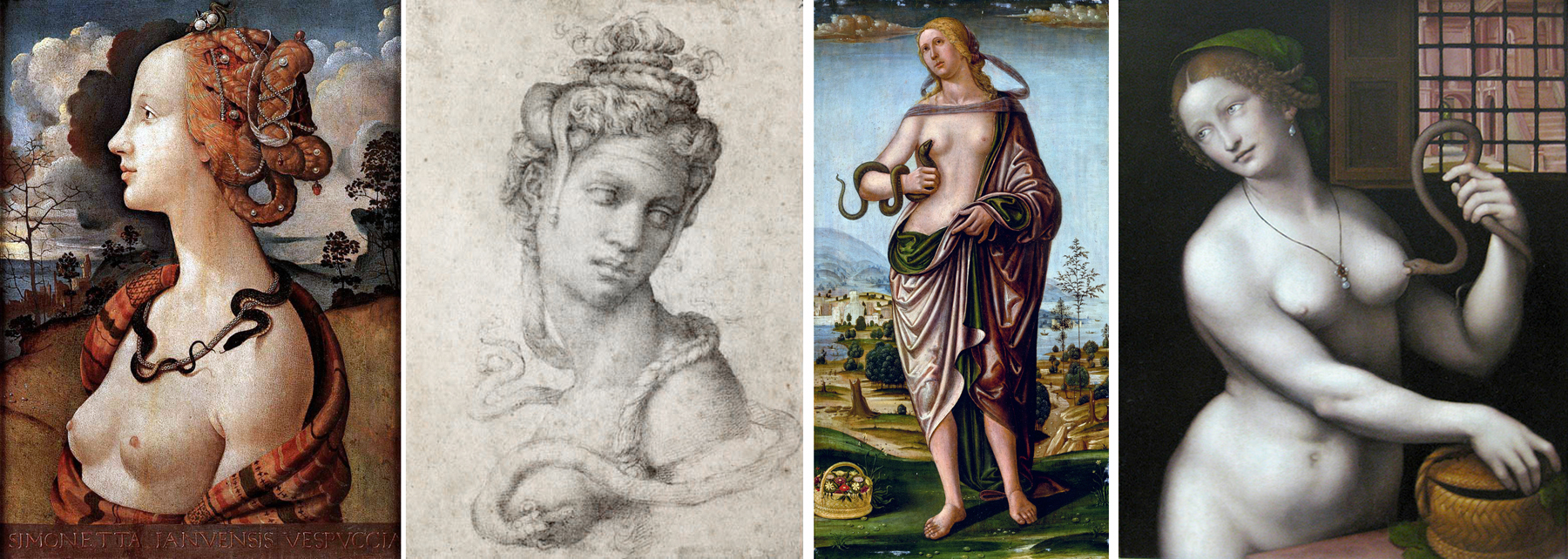
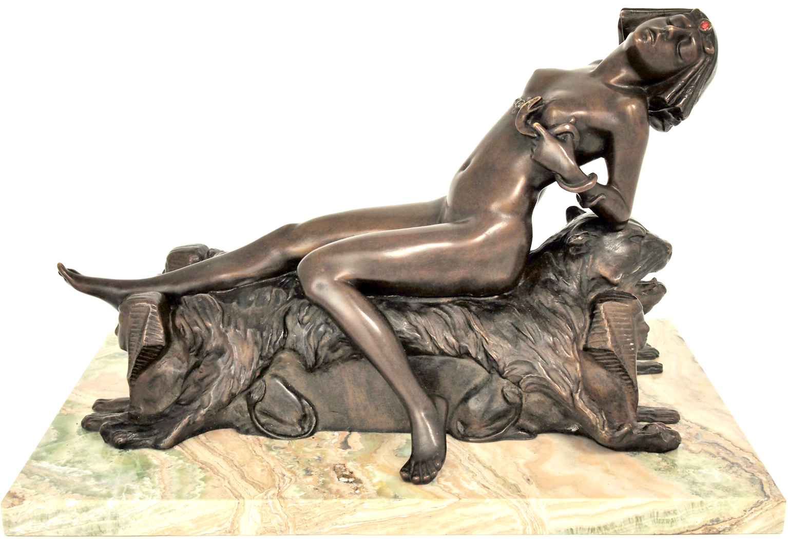
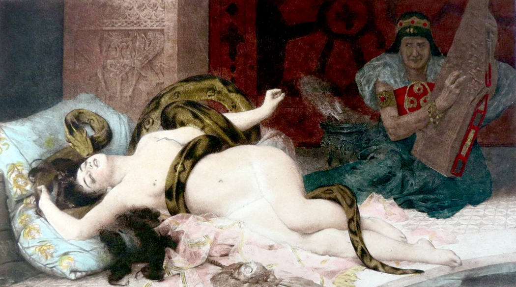
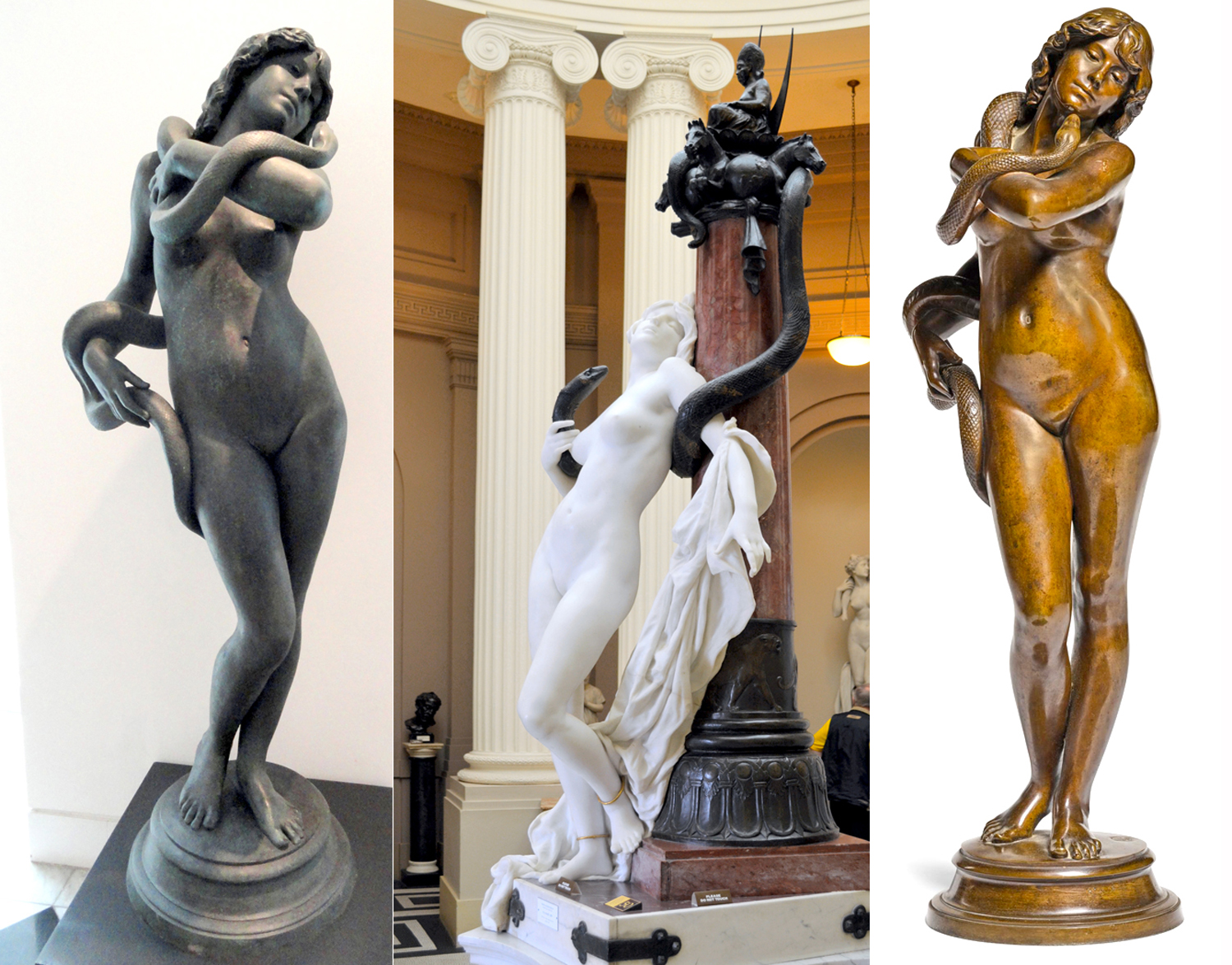
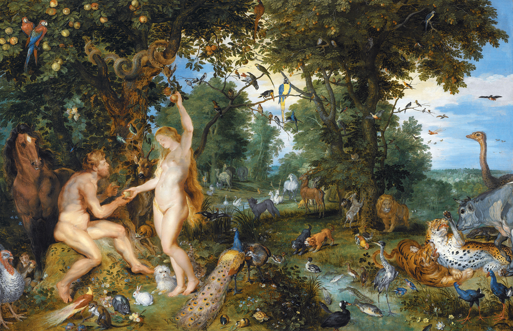
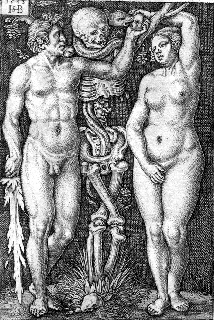
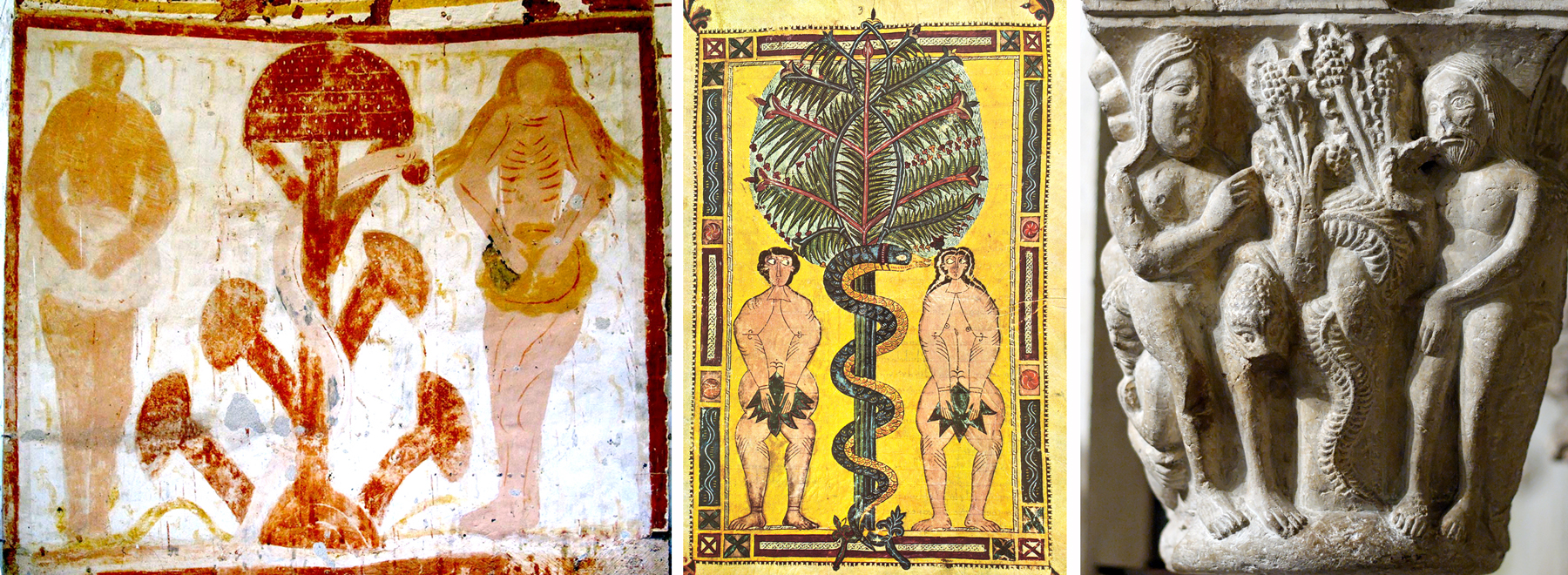
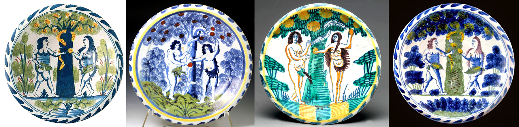
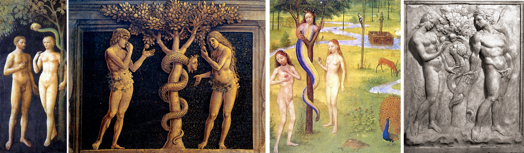
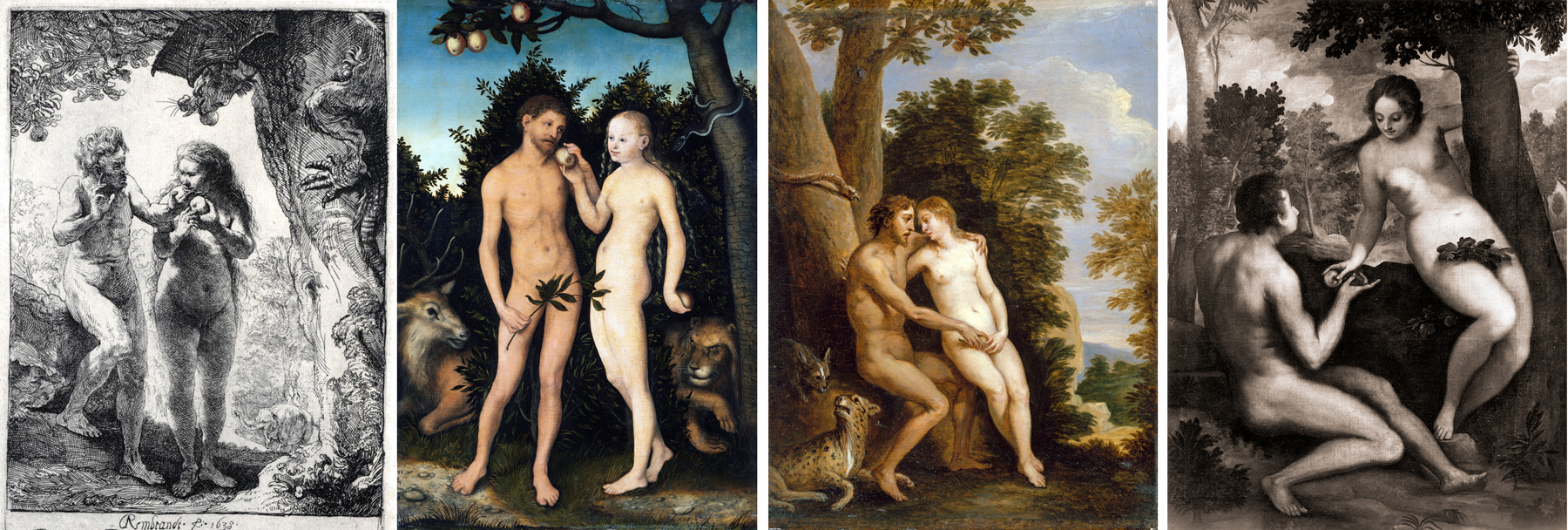
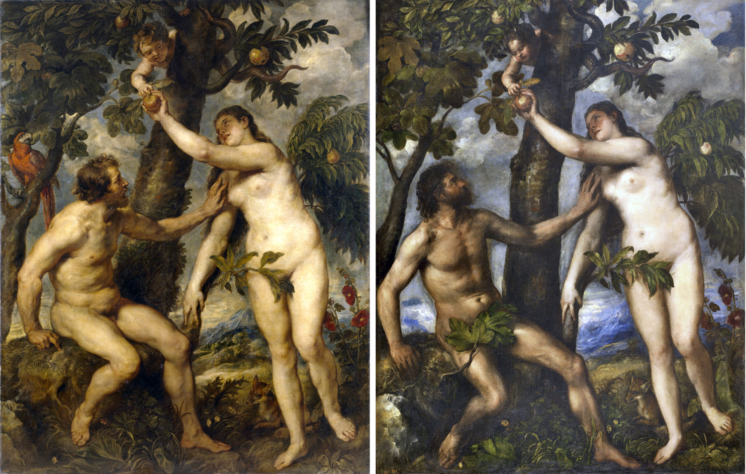
Of course, you will have noticed that in none of the ancient stories of her death does Cleopatra apply the serpent to her firm but supple breast. That version comes later, especially as painters attempted to give us the version not so much of Plutarch as of Joseph L. Mankiewicz. There is a Cecil B. DeMille quality to most of the historical paintings of Cleopatra, who ranks second only to Eve as a ripe subject for images of naked women with snakes.

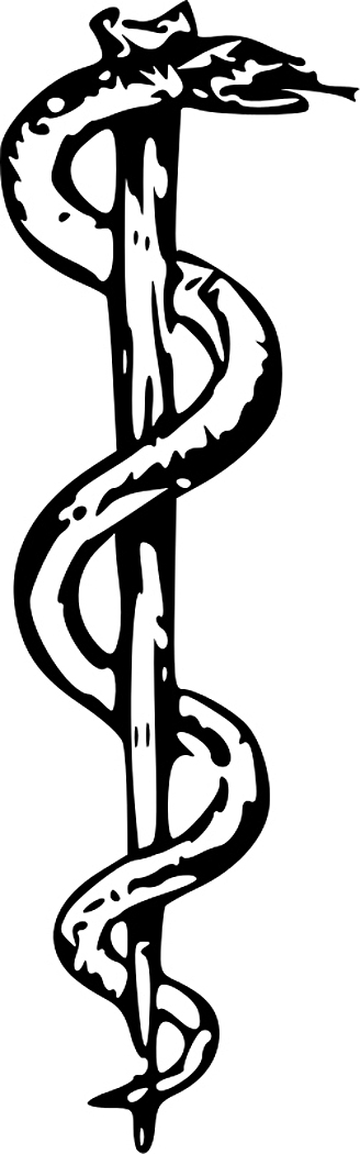
Not that they are the only two: There are paintings and sculptures of the Roman goddess Hygea, goddess of health, which show her feeding a snake — the snake being the sacred animal of Asclepius, the god of medicine.

Lord Leighton, the English painter, gave us a grand tondo of the Hesperides, the home of the golden apples Hercules was to gather, which was protected by a serpent.

And there is the story of Harmonia and Cadmus. Cadmus, king of Illyria, had killed a serpent and the gods then turned Cadmus into a snake. His wife, Harmonia, stripped herself naked and begged Cadmus to come to her. As she embraced the snake the gods turned her also into a snake.

There is an obviously salacious element in these stories, especially as they are told, painted and sculpted by artists in the Victorian age, where they could be hypocritically sanctimonious about expressing the moral uplift of the glory that was Rome and the grandeur that was Greece while at the same time thinking “Look at the boobies on that one,” and, as the French say, “L.H.O.O.Q.”

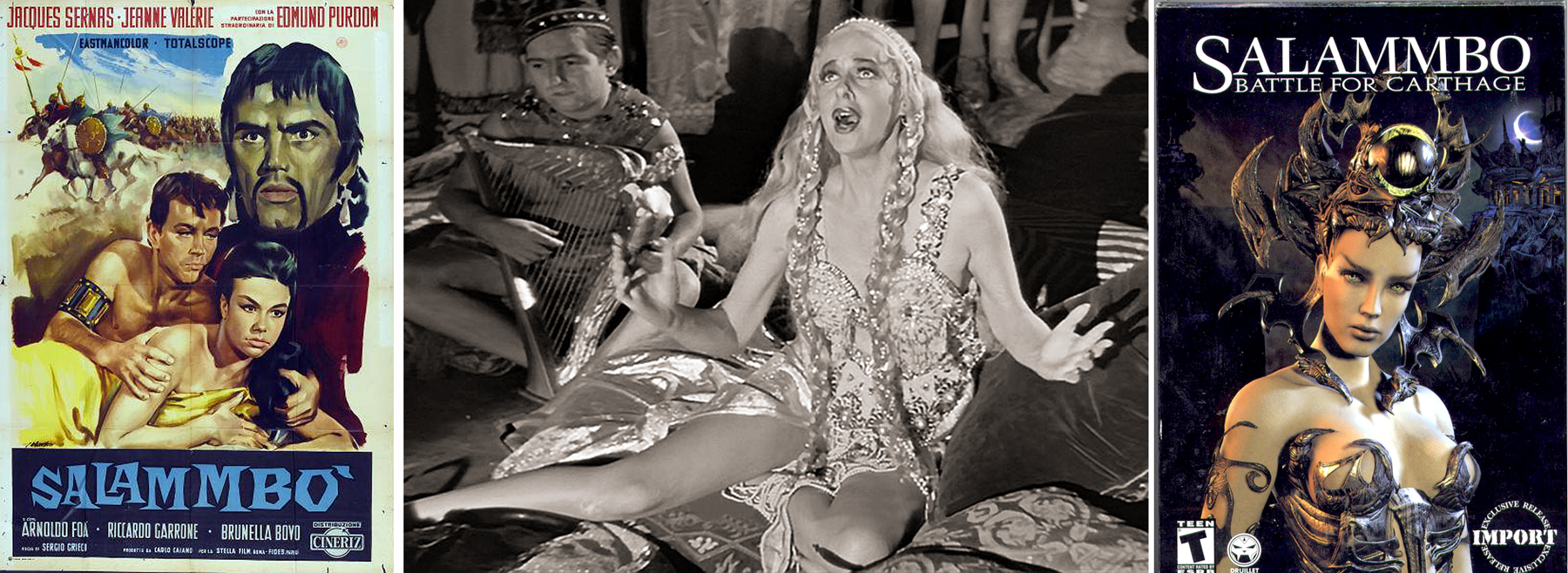
But the crown of this Orientalizing prurience must be in Gustave Flaubert’s novel, Salammbo — his followup to the scandalous Madame Bovary. It is the tale of the daughter of a Carthaginian general, set shortly after the first Punic War (264-241 BC). The plot is silly enough for an opera or a Hollywood epic. But there are scenes of sex and lasciviousness, not the least when the priestess Salammbo enters the enemy camp to retrieve the MacGuffin and encounters a prophetic snake. It is hard to avoid the Freudian undertones. They can hardly be called undertones.

“The moon rose; then the cithara and the flute began to play together.

“Salammbo unfastened her earrings, her necklace, her bracelets, and her long white simar; she unknotted the band in her hair, shaking the latter for a few minutes softly over her shoulders to cool herself by thus scattering it. The music went on outside; it consisted of three notes ever the same, hurried and frenzied; the strings grated, the flute blew; Taanach kept time by striking her hands; Salammbo, with a swaying of her whole body, chanted prayers, and her garments fell one after another around her.

“The heavy tapestry trembled, and the python’s head appeared above the cord that supported it. The serpent descended slowly like a drop of water flowing along a wall, crawled among the scattered stuffs, and then, gluing its tail to the ground, rose perfectly erect; and his eyes, more brilliant than carbuncles, darted upon Salammbo.

“A horror of cold, or perhaps a feeling of shame, at first made her hesitate. But she recalled Schahabarim’s orders and advanced; the python turned downwards, and resting the centre of its body upon the nape of her neck, allowed its head and tail to hang like a broken necklace with both ends trailing to the ground. Salammbo rolled it around her sides, under her arms and between her knees; then taking it by the jaw she brought the little triangular mouth to the edge of her teeth, and half shutting her eyes, threw herself back beneath the rays of the moon. The white light seemed to envelop her in a silver mist, the prints of her humid steps shone upon the flag-stones, stars quivered in the depth of the water; it tightened upon her its black rings that were spotted with scales of gold.

“Salammbo panted beneath the excessive weight, her loins yielded, she felt herself dying, and with the tip of its tail the serpent gently beat her thigh; then the music becoming still it fell off again.”

Yes, Flaubert; Mr. Mot Juste. More like Mot Jeaux, i.e. mojo.

We’re not done yet with naked women and snakes. More anon.

Click on any image to enlarge

What’s with all these women and snakes? Or more precisely, what’s with all these artists painting pictures of women with snakes?

Yes, there’s a pat, comic answer, but put your inner sophomore away for a few minutes.

In Western culture, the woman most often depicted in significant art must be the Virgin Mary. Most of those paintings do not portray any specific act or episode in her life, but are devotional Madonnas — mother and child. There are episodes painted — the nativity, the flight into Egypt or the lamentation at the cross — but mostly they are icons, static and symbolic.

If we were to search for the second most painted woman, it would have to be a tossup between Venus (or Aphrodite) and Eve. I’m not going to examine the goddess here, but I want to consider Adam’s consort.

She is painted over and over, with and without Adam, but almost always with the “apple,” and usually with the serpent, although the serpent takes many forms.

I became interested in this as I began to discover many paintings. I now have images of several hundred historical paintings of the Temptation of Eve (I can only share a handful).

It interested me to watch the change in the iconography over the centuries, and the shift from one compositional pattern to a second.

The source of the imagery in the paintings begins in Genesis, but quickly adds bits from other places, none authorized by the actual words in the Bible. The Bible, for instance, does not say the serpent is Satan; it does not name the fruit as an apple; does not say that Eve “seduced” Adam into tasting the fruit.

The earliest visual representations of the Temptation are Late Roman, or early Romanesque. In these the first design is firmly established: a symmetrical disposition of the man and woman to either side of the central tree, usually with a snake coiled around its trunk.

One of the most interesting early images is from a fresco in the Plaincourault Chapel, a 12th-century chapel of the Knights Hospitaller in Merigny — at nearly the perfect center of France. In it, the Tree of the Knowledge of Good and Evil is depicted in a very primitive way that could easily be interpreted as a giant mushroom. Indeed, there is a vein of scholarly thought that takes the forbidden fruit to be psychedelic mushrooms. Having eaten of them, Adam and Eve are able to see the deeper reality behind the surface one.

In this fresco, you see the familiar items. Adam, Eve, the tree and the serpent wound around the trunk very like the caduceus carried by the messenger god, Mercury, or the Rod of Asclepius, an insignia of healing. The symmetry of the design serves it well to becoming a kind of icon.

You see the pattern repeated over and over in Medieval prints, carrying over into the early Renaissance.

The design continues in popular arts for centuries. You find it even in plates.

But, at some point an insidious misogyny infects the standard imagery. In some paintings, starting in the Renaissance, the serpent takes on a female’s head, either Eve’s own likeness, as if the serpent were a mirror, or the head of the mythical non-Biblical figure of Lilith, styled to be Adam’s first wife.

The problem of Lilith originally arose because there are actually two stories of the creation of the first woman. In the first (Genesis 1:26 and 27), after having created all the animals, God “created humankind in his own image, in the image of God did he create it, male and female he created them.”

In the second story (Genesis 2:18-25), Jehovah, having already created Adam, creates all the animals to give him company, and when that isn’t sufficient, puts Adam to sleep and takes from his side a woman, making the bad pun in Hebrew, translatable to English as “We will call her ‘woman’ because from ‘man’ is she taken.” (In Hebrew “Ish” and “Isha.”)

Later commentators puzzled by these two different creations of Woman, decided that the first must be different from the second, and came to give the first one the name Lilith. The name may derive from ancient Semitic demons, known as “Lilitu.”

There are several examples of Mediterranean goddesses with special commerce with snakes. There is the Snake Goddess of Minoan culture, the Canaanite Astarte and even the Egyptian Isis. So, there is precedent for commingling the first woman and the serpent.

At any rate, in later Talmud, Midrash and Kabbalah texts, this first woman created is identified as Lilith and various stories get told about her, in all of which, she is evil, and a kidnapper and killer of children, and later, as a seducer and destroyer of men.

Obviously, then — at least to the Medieval minds of the interpreters of the sacred texts — this must be the woman God created first. She disappears from Eden through various versions of myth, but returns to cause havoc.

Most notably, as the serpent in the Garden. And so, many of the snakes wrapped around the Tree have a woman’s head or face. Most notable, perhaps, is the Sistine fresco by Michelangelo.

In the 15th and 16th centuries, you can hardly get away from this trope.

But as art history progresses into the Baroque, the static symmetry of the classic tree and couple gives way to moving both Adam and Eve to the same side and putting tree and snake in its own half of the frame.

The old design doesn’t disappear. You can see it in the grand paintings of Rubens, who clearly copied from Titian.

What does happen, however, is that the biblical stories are no longer able to be taken as literal fact. You find the Scripture being used as pretext for allegory or even for an excuse for painting naked women. You see the light of faith dimming and the approach of the Enlightenment.


When Eugène Viollet-le-Duc renovated the cathedral of Notre Dame in Paris in the mid- to late 19th century, he replaced weathered Medieval sculpture with modern replicas of his own design, imitating the Gothic style. The central trumeau of the central portal of the cathedral sports this wonderful take on the Temptation of Eve. It follows the old formula, and has some vigor, but you know that Viollet-le-Duc could never believe in the Fall of Man in quite the same way as the original builders of the cathedral.

Into the 19th century, the whole issue of the Fall, of the snake — for now the ambiguity of the “serpent” has been changed out for the Freudian certainty of the phallic snake — and the naked Eve have given way increasingly to kitsch.

There are some Modernist attempts at reviving the mythology, but they are few and lack the persuasiveness of the older images, perhaps because the 20th-century artists cannot actually believe in what they are painting. It is not only God that is dead.

This has been a very short overview. There is so much more I would like to share, but there is limited space. They come in all styles and media.

In the next blog entry, we will look at some other permutations of the naked lady and the snake.

Click on any image to enlarge.

In 1873, an amateur German archeologist working in western Anatolia, claimed to have dug up a trove of gold he called “Priam’s Treasure” and ascribed to the king of Ilium during the Trojan War of Homer’s Iliad.

Whether any of his claim was true remains contentious; Heinrich Schliemann fibbed about many of his claims. But what is not under question is the public attention roused by the gold. Nothing dug from the earth quite hypnotizes the layman so much as gold. Treasure. Pirate’s booty. Roman coins.

The fascination seems unquenchable. Museum blockbuster shows are predicated on that fascination. “The Treasures of Tutankhamun;” “Treasure Houses of Britain;” “Catherine the Great: Treasures of Imperial Russia;” “Splendors of the Ottoman Sultans;” “Treasures of the Czars.” The list is long. And so are the lines to get in.

But while traveling blockbusters are tarted out with gold, the permanent collections of major museums also offer more humble relics of antiquity. Visit the Metropolitan Museum in New York, the Boston Fine Arts Museum, even a smaller one, such as the Chrysler Museum in Norfolk, Va., and you find vitrines highlighting the pottery dug up from the historic layers of soil. While the gold glitters, the simple ceramics — more common than the jewelry — yield up more useful information about the people who lived before our ancestors knew they were our ancestors.

Shards of Egyptian pottery have turned up in Afghanistan, evidencing the far-flung trade network from before the 12th century BCE, Greek red-figure ceramics show up from Spain to Iran. When archeologists want to find out about the lives of the earliest European settlers in the New World, they search out the middens of refuse from those early outposts and it is the broken dishes, cooking vessels, drinking cups and flatware that tell us perhaps the most. We learn where those dishes were made, how they were used, about the trade networks that brought Delftware from the Low Countries to southern England and to Massachusetts, where the village burgermaster showed off his status, while the laborer ate off tin plates.

But such clayware isn’t shown in museums only for its historical importance. You can find great esthetic value in archaic Greek ceramics, in red-figure and black-figure pottery, in the designs of pre-Columbian figurines, in Egyptian clay palettes, in ancient Chinese vases. They are shown in museums for their beauty. They are works of art.

On a visit to Colmar in eastern France, to see the Isenheim Altarpiece, that huge symbol of the sorrows of life on earth, the museum also had a whole wing of domestic arts, including some fabulous dinnerplates, hand painted with flowers, abstract floral patterns and the occasional family crest. There was no question that those beautiful plates deserved their spotlight behind the glass.

Which brings me to my own kitchen. I have way too many dinner plates. The cause is esthetic, not practical. In fact, it is anti-practical.

My interest in what I ate off of was nil until my second unofficial marriage. I have no recollection at all of what plates we had during my first official marriage. Anything that held victuals was sufficient.

I know we had a few blue-speckled enamel tin plates. As humble as our incomes at the time. (I still feel a nostalgia for tin plates). Years later, between relationships, I lived with friends whose plates were a traditional Pfaltzgraff design. I came to feel a comfortable homeyness about them. Who knew you could have emotional feelings about baked mud?

But with my second unofficial pairing, the two of us sought out dinnerware that expressed who we were, or who we thought we were. Something vaguely arty.

We found the perfect answer in the stripped-down esthetic of Dansk breakfastware. The large plate was as plain as could be, with a mildly speckled blue ironstone, about 10 inches in diameter, with a half-inch lip around the edge, almost as if it were a pie tin. We had the bowls and mugs to go with them, and for years, they served as a signal of the kind of Modernist esthetic we cared for. Others might choose more flowery plates, or something elegant with gold rims, but we liked the showy simplicity of our Dansk dishes.

Where those dishes went, I have no idea. Through divorce and  break-up, they have vanished. But many years — many decades — later, I came across a pair of Dansk plates in a thrift store. These were brown rather than blue, but they were the same design. I snarfled them up and use them to this day, still enjoying that heavy crockery feel, that masculine, stripped-down directness.

Pfaltzgraff pattern

But when it came to my second official marriage — the one that took — there was a problem. Although Carole and I were perfectly matched in so many ways, there was a significant rupture in our esthetic senses. Where we were the same was that neither of us tolerated bad design. We both wanted something well thought-out and pleasing to our senses. But Carole tilted toward the traditional, the more feminine, the more what I called “doilied-up.” While I, of course, favored the blunt, direct and undecorated and modern look. This could be a problem.

So, over 35 years of living together, we tried many ways of satisfying both of us. She usually won in this struggle. She came with an heirloom set of Haviland settings, well over a hundred years old. But they were too valuable to actually use. So, they sat in a cupboard looking elegant. Elegant if that is the sort of thing you value.

She also had a thing for Blue Willow ware, and collected platters and plates, bowls and tureens in the pattern. Some so old their whites had begun to turn brown. They came from Goodwills and Salvation Army stores, and while they didn’t cost us a whole lot, took up way more pantry space than their use warranted.

Blue Willow was perhaps the sweet spot for Carole, but it wasn’t enough. She brought home random dinner plates from her sallies into various thrift stores. We collected quite a few floral plates. Then, there was a mismatched set of autumnal plates that she meant to use for Thanksgiving dinners. Those plates featured grouse or hunting scenes.

There was a new set she bought without telling me. One day, it showed up: A bright red and white set of Christmas dishes, bordered with reindeer and sleighs. The whole disaster — plates, salad plates, bowls, cups, saucers. Hardly room in the cabinet to hold them. And they were used, maybe, once a year. The crowded shelves hardly left room for the wine and water glasses.

Fiesta ware

My Modernist taste was clearly being drowned under a welter of semi-kitsch. Meanwhile, the growth of Blue Willow continued.

Clearly, there had to be some kind of compromise. Weighted to her side, of course, but at least a little give.

The clue came in France, while we were visiting the gardens painter Claude Monet had established for himself in Giverny, some 40 miles northwest of Paris. We have been to Giverny three or four times, in different seasons. It is powerfully beautiful, restored to its original glory.

And in the inevitable gift shop, there were offered for sale reproductions of the tableware that the painter used for his guests. In 1898, Monet designed a porcelain dinner service by painting a simple white plate with a blue edge and a yellow rim. It was executed by the company of Godin and Arhendfeld and perfectly set off the bright yellow dining room the painter fitted out in the old farm house that he refurbished.

In 1978, the Foundation Claude Monet commissioned the Robert Haviland and C. Parlon company of Limoges to recreate that original set of crockery. We gawked at it in the Giverny gift shop, salivated over it, distressed by its price. If you wanted to buy such a dinner plate now, it would cost you $155. Yes, per plate. A single five-piece place setting was $570. Standard setting for six, nearly $3500. Clearly this was out of our price range.

Yet, we knew we had found that compromise. Both traditional and Modernist, with the imprimatur of a great artist we both loved, it would have been the perfect set for our kitchen. We pined; we sighed; we longed.

In the meantime, every few years, we would see some place settings we liked, and if it was in our price range, we might buy it. We did both love the joy of the hunt for dinnerware we both could live with. There were compromises, mostly by me.

But then, we found a perfect knock-off. The Italian firm of Pagnossin had a set of blue-edged, yellow-rimmed plates. They were on sale. They weren’t exactly the same as the Monet plates. Monet’s had a light, powdery blue edge. These had a navy edge. But the yellow was identical. They were elegant, traditional and modern. We fell in love with them. I still have them and use them whenever company comes over.

Now that Carole is gone, the Blue Willow is gone, too. So are the red Christmas dishes. Alone, I find myself eating off of paper plates more than I care to admit. But I still have the faux-Monet plates and the replacement Dansk plates. And I keep several of Carole’s additions. There are two beautiful, simple plates with blue flowers drawn, not painted, on them. And there is a set of four Rita Monti hand-painted dishes, with floral and Renaissance patterns on them, very Mediterranean, which are perfect for pasta or fish. It seems I have mellowed; my need for masculine simplicity has softened into an absorption of some of Carole’s personality into my own, where it persists, even as she no longer does.

Part 1: The Thing

Abstract art has several jobs, but one of the most important is to take the bits of the visual world around us, separate them from their context, and allow us to see them freshly. By removing color, texture, and pattern from their received meaning allows us to pay attention to the building blocks of vision. As if we could take the music of speech and remove the words from them, so only the sensuous vestige remains.

In most of the visual world we live in, we have given meanings to what we see, like seeing the diagrammatic picture of a man or woman on the restroom door. And in “reading” the visual world this way, as a sort of language, we too easily fail to actually see what we are looking at: We simplify and name: That is “green,” rather than “that is the green of kelp,” or “the green of grass.” Two very different greens. And there are thousands of greens. If we abstract the color from its worldly signature, we can place two greens next to each other and force ourselves to notice.

The same is true for texture, reflectivity, surface (whether matte or glossy), size or scale, the opacity or translucency of pigment — a thousand different qualities of sight, and of the visual world we inhabit, but where habit has dulled our perception — and our delight.

Still, no matter how abstracted from the quotidian an image may be, there remains some remnant of its source. We tend to recognize a certain green by the chords it sounds in our memory, our sense memory. We respond to this green or that in part — and idiosyncratically — by the way it calls to mind the emotions and pleasures we attach to it in a rather Proustian way.

Thus, although we may think of abstract art as a kind of rationalized set of color and pattern, line and texture, we can never entirely divorce our response to it from the experience of our own lives.

So, we are left with complicated response to art that on the surface seems to have no meaning.

(It’s no use making the argument that such response is too subjective, too personal. Our response to any art, no matter how abstract or how realistic, is always personal. Abstraction, again, reminds us of what we don’t normally think about.)

Painters have the advantage that they can invent shapes and lines from nothing but cobalt blue and vermilion. But a photographer is left with a more direct connection to the world outside his head. The camera must be pointed at something.

So, to make the same sort of visual argument as an abstract painter, the photographer has to use the real world and re-see it in some way as to make it unrecognizable. The two most immediate ways to do that are to get so close that all context is stripped away, or to step so far back that the perspective is one that no ordinary human can recognize it.

It is why I always book a seat by a window when I fly. I can look out the window and see the colors, textures and patterns of the planet below me, and make designs with them with my camera.

I self-published a book of such abstractions using the website, blurb.com. You can find the book here, and open it up in preview mode: http://www.blurb.com/b/1376943-windowseat

The skin of the continent becomes a canvas painted in swirls and pools, like some de Kooning or Pollock, Rothko or Diebenkorn. If you look, you can see again.

Part 2: The Metaphor

We live on a planetary canvas; colors and shapes are spread across the stretched linen of the Earth’s surface, although we have to step back to see it with any clarity.

The best way to do that is to climb up into the air. Up a tree and the neighborhood looks different; up a mountain and the valleys change; up in a jet plane and whole quarters of the continent are transformed.

That is the gift of the window seat. The view out and down paints a completely different picture of the world: clouds below us; shadows stretch out for dozens of miles late in the day, or as the sun rises; seas catch the sunlight in a scatter of sparks; the sky overhead is so dark a blue as to mimic midnight at midday.

I love flying. There is nothing quite so exciting as seeing a whole state underneath you opened up like a life-size map.

From 30,000 feet, you get a sense of the world as a tiny globe and can see whole ranges of many mountains as single features, like wrinkles on a face.

Few of us will ever see the Earth from the moon, or even from orbit, but anyone with a boarding pass can have his sensibility slapped silly with the incredible beauty of the planet.

So I always book a window seat for the show. And no matter how long the flight, I’m glued, stiff-necked, to the view.

You can spot the Rio Grande and its terrace, the Mississippi and its wiggle. You can tell Chicago from Detroit, Oklahoma from Arkansas.

Several times on cross-country flights, sitting on the north side of the plane, away from the glare of the direct sun, I looked out the window and down below the jet would be a floating pool of light, moving with the plane at some 500 mph. It is called a “glory” and it is certainly well-named. It is a visual effect much like a rainbow, and no two people see it in just the same place.

It can be seen at a point 180 degrees opposite the sun, speeding across the map-landscape below, crossing interstates and rivers, past the pegged dots of new housing developments, looking like mitochondria in an electron microscope, or the great circles of irrigated crops — great green coins spaced across Texas.

But it isn’t just the landforms that excite me. Even bad weather keeps my attention. Think of all the thousands of generations of humans who were never able to see the tops of clouds, which form their own fantastic landscapes, with mountains and valleys of crenellated whiteness.

The pilot curves the jet route in wide circles around a towering thunderhead, bleach-white at top and sooty at bottom, with its cauliflower protuberances catching new light. The distance is crowded with them, sprouting like mushrooms to the horizon. Dozens of fresh, new thunderstorms rising sunward like children reaching up for their mothers.

Over California once, after a rainstorm, with a low mist of water evaporating up into the atmosphere, the millions of puddles aggregated their mirror effect into a single flash, moving at the speed of the plane and making Fourth of July lightning bolts that flashed just beneath the surface of the mist, the way you can sometimes see the blood pulsing under the skin of a newborn. It gave me a feeling of intimacy with the planet.

Or a night flight, with the ground black underneath you as you fly over the empty expanses of the Southwest, with the small embers of tiny desert communities coming periodically into view, glowing like the last bit of a dying campfire. As you approach Phoenix, those embers gather into a vast pattern of incandescence, like some great lava field, with the glowing magma breaking through the cracks of the cooling stone above it. Almost nothing is as radiant as a city at night seen from the air. You want to hold your palms out toward it, to warm your hands in its heat.


Earthbound, we have a very bland, utilitarian sense of the celestial body we ride around on. It is all streets and signage, houses and mini malls. It is the place we go to work every day, the place where we watch television in the evening.

It is true, to those who have the eyes to see it, the planetary nature of our home is there to be seen: Daybreak shows us the sun breeching the horizon and moving across the heavens; the stars are there to see at night; there are rainy days and lightning storms to remind us of the larger forces. But they have all become ordinary through habit and usage. How many of us take the time to look up and admire a mackerel sky or a fair-weather cumulus cloud floating puffy on the slightly denser air beneath it?

But take an elevator to 30,000 feet and you get the god’s-eye view, moving across the curved surface of the world, where the people aren’t even ants and where the Earth is one small aggie in a great colliding pile of cosmic marbles.

Click any image to enlarge

Pablo Picasso painting Guernica in his studio, Paris, 1937; photograph by Dora Maar

When Pablo Picasso painted Guernica, he knew he was making a monument. When Milton wrote Paradise Lost, he knew he was writing for the ages. When Bergman filmed Seventh Seal, he knew he was saying something important and not merely entertaining us with a cool story.

Art is often made with large purpose. Artists may work a whole lifetime to be able to sum things up in a major piece, or group of pieces, like  the Isenheim Altarpiece of Grünewald, or Proust’s À la recherche du temps perdu.

In these cases, the art becomes an entity in itself, a thing produced. It takes on a life beyond its maker’s; it is a milepost in cultural history. We look to it not only for beauty, but for wisdom, for inspiration, for a sense that there is something large which we all share as humans.

On the other end of the spectrum are the snapshots we take of our families, on birthdays, on vacations, on weddings. As such, the photographs are seldom seen as esthetic objects, but rather encapsulated memories — something to hold fast a fleeting moment of importance to our singular lives. They may capture something intensely human, but that is not their primary purpose.

(It is always fun to scavenge anonymous snapshots to find glimmers of the idiosyncratic or the universal, that is, to see them as if they were intended as art. But that is a piece of active curation on our parts, as if we were the artists ourselves, editing the random into a coherent message. The family photos were never meant to hang in art galleries.)

Even if a painter isn’t making a Sistine Chapel, if he is a professional, he is creating a commodity — an object that can be sold. And even if it’s not bought, the thing exists as a thing. There it is, framed and hanging on a wall, with track lighting making it glow jewel-like in the gallery.

But there is something between these two poles — between commodity and snapshot. It is the artist’s working sketch, never meant to be sold, never meant even to be seen. It is either the artist trying out ideas for a painting, or — and this is even more important — just keeping his hand in.

There is something of the throwaway in such noodling, but there is also something of value we shouldn’t underestimate.

We often forget that there is an intimate connection between art and the experience of living. It has been made easier to forget because in the last half century or so, a good deal of art has been made simply about art, about its materials, its limits, its meaning, its history. But through most of that history, art was about the world. Whether it was landscape or still life, whether portrait or history painting, it was meant to reflect something of our common experience of life.

Even when art has been about art, it has been about the experience, in life, of thinking about art. There is an unbreakable connection between experience and its image.Which takes me back to those sketches. Whether it is Picasso doodling on a napkin or Turner washing light watercolor pigment over rag paper, it is — aside from any commercial intention — an effort by the artist to make the connection with the world. To see, and see clearly.

Andreas Gursky

Photography, as much as painting, has its monuments, whether it is an Edward Weston pepper or Ansel Adams’ Moonrise Over Hernandez, or more recently, the giant photomurals of Thomas Struth or Andreas Gursky. They are the opposite of family photos.

But there is a middle ground in photography, also. It is the equivalent of an artist sketching. Photographer Lee Friedlander calls it “pecking.” It is the quick, improvisatory snapping of bits of the world, to see what is there.

With is 35mm rangefinder Leica camera, Friedlander says, “you don’t believe you’re in the masterpiece business. It’s enough to be able to peck at the world.”

Only afterwards, going through his accumulation, does he edit and pick a few that stand on their own to be published or to be exhibited. But the interesting part, to Friedlander, is the engagement with the world.

“I take more to the subject than to my ideas about it. I am not interested in any idea I have had, the subject is so demanding and so important,” he says. “Sometimes just the facts of the matter make it interesting.”

Friedlander is amazing in that his peckings are often so visually rich and complicated that they are nearly as Baroque as a painting by Rubens. Action seems to be in every corner of the frame.

But you don’t have to be an artist as good as Friedlander to engage with the things of this world. Making photographs is a way of seeing, similar to sketching. It is about paying attention. We can focus on the details.

For many Americans — maybe most humans anywhere — only use their eyes for useful things. They see the road they drive on, the could that tells them it will rain, the house, the car, the coat closet. When they make a snapshot for the family album, it is enough to be able to name the items in the picture — that is Uncle Vern, that is the house we used to live in, that is my first car — and beyond the naming of the subject, we don’t really pay attention to what is there. Most probably, we have framed the image so the house or the uncle stands dead center in the frame.

Frielander talks about the potency of the photograph describing what is either his experience when he was a boy with his first camera, or perhaps anyone’s similar experience: “I only wanted Uncle Vern standing by his new car (a Hudson) on a clear day. I got him and the car. I also got a bit of Aunt Mary’s laundry and Beau Jack, the dog, peeing on a fence, and a row of potted tuberous begonias on the porch and seventy-eight trees and a million pebbles in the driveway and more. It’s a generous medium, photography.”

For Friedlander, his life work became making all these disparate bits harmonious in the frame. Again, like a Rubens.

For most of us, these pecked pictures are mostly details. They are not the grand view or the concatenated whole, but the tiny bits out of which the larger scene is built. Most of us pay attention only to the whole, when we pay attention at all; for most Americans — maybe most humans anywhere — only use their eyes for useful things. They see the road they drive on, the cloud that tells them it will rain, the house, the car, closet. But every house has a door, and every door a door-handle; every car has tires and every tire a tread and each tread is made up of an intricate series of rubber squiggles and dents. Attention must be paid.

Paying attention to the details means being able to see the whole more acutely, more vividly. The generalized view is the unconsidered view. When you see a house, you are seeing an “it.” When you notice the details, they provide the character of the house and it warms, has personality and becomes a Buberesque “thou.” The “thou” is a different way of addressing the world and one that makes not only the world more alive, but the seer also.

(It doesn’t hurt that isolating detail makes it more necessary to create a design. You can make a photo of a house and just plop it in the middle of the frame and we can all say, “Yes, that’s a house,” and let the naming of it be the end-all. But if you find the tiny bits, they have to organize them in the frame to make something interesting enough to warrant looking at.)

Sectioning out a detail not only makes you look more closely, but forces your viewer to look more closely, too. Puzzling out what he sees without the plethora of context makes him hone in on its shape, color, and texture. It is a forced look, not a casual one.

This is a rich world, profound in detail, millions of species, visual patterns in every rock and cloud. Each bit of rust on a grate is intense, when noticed. And noticing is what “pecking” is all about. With my own peckings, I am not making any argument for them as art; they will not be hanging in a gallery. I make them for myself, to force me to pay attention to the minutiae that are the bricks of the visual world they inhabit. And paying attention is a form of reverence.

Click to enlarge any image

How do you hold up a roof?

Seems like a simple question: Walls hold up a roof. And if your roof is heavy and two or three stories up? A stronger, thicker wall.

This is the problem faced by the builders of European churches in the 11th and 12th centuries. With those thicker, stronger walls, windows became a problem because they weakened the walls with holes, which meant that the churches had small windows and were rather dank and dark places to worship the Creator.

When we are taught about Romanesque and Gothic cathedrals in our art history classes, we are usually given a list of characteristics they have: round arches for Romanesque; pointed arches for Gothic: thick walls for Romanesque; flying buttresses for Gothic: barrel vaults for the Romanesque;  rib vaults for the Gothic — as if the shift from one to the other were merely a catalog of stylistic tics and the change from one to the other nothing but a change in fashion, as if giving up pegged trousers and taking on bell bottoms.

Why would it be important for art history students to spend this much time on something so old and arcane? Our professors always seemed to think this was such a profound change and worth a week of class time. We couldn’t wait to move on to Impressionism.

It was never made clear in class why it would be important for us students to know these things: buttresses, rose windows, naves and aisles, apses and choirs. These cathedrals were in Europe, not America.

But the change from Romanesque to Gothic should not be seen as merely a change in styles, but as a major innovation in architecture whose results led to the glass and steel skyscrapers that populate all our cities. The Seagram Building in New York is merely an extension of the ideas behind Chartres cathedral.

What happened was (for reasons I will get into in my next blog post) someone figured out you didn’t really need walls to keep a roof up. You could, like a picnic pavilion, support the roof with posts, leaving the space between the posts open. And, if you build a church this way, you can glaze the open spaces with colorful glass and let inspiring light into the interior of the church. Wow. In an instant, churches became lighter, both by weight and by illumination. What had been dour and forbidding became bright and inviting.

Perhaps the most dramatic example of this is the small royal chapel built on the Ile de la Cite in Paris between 1238 and 1248. While it is tiny in comparison with the big cathedrals, such as Notre Dame or Reims, it is a glory of glass. Its walls are explosive with color and light.

If you were to stand in the middle of Ste.-Chapelle and gaze up at the ceiling, you would see that the ceiling and roof are supported by a cage of stone pillars, between which are cascading sheets of stained glass. When you realize that such roofs are made primarily of lead or slate, you realize how heavy it must be, and how brilliant was the engineer who figure out how to keep it up with only these spindly supports.

This is the genius of Gothic architecture. Follow its logic out to the 20th century and you understand that you can make a skyscraper with a cage, not of stone, but of steel, and glaze the open areas and let light into every one of the 40 or 50 stories of office space. In some sense, the International Style — all those glass-and-steel towers that define our urban architecture — are really just a further refinement of the Gothic breakthrough.

Ste.-Chapelle was built for King Louis IX, later known as St. Louis, as his private church on his palace grounds. It was meant to house a series of holy relics he had bought, including the supposed “crown of thorns” Jesus had worn upon his crucifixion, and a piece of the “one true cross,” of which there were a whole woodpile scattered across Europe. These relics were held in great esteem. Louis wanted a home for them that would honor their importance with great beauty and wealth, and Ste.-Chapelle is the result.

Louis spent 40,000 livres on the chapel, but nearly four times that in buying the relics from the cash-strapped Byzantine emperor, Baldwin II in 1239. The chapel was built to hold the relics and finished in record time.

Ste.-Chapelle is 118 feet long and 56 feet wide, but more importantly, 139 feet high. Above that a spire of cedar wood extends another 108 feet. (The current spire is a 19th century replica, designed after the 15th-century spire. It is unknown if the original chapel had a spire).

The church is a two-story affair, with the lower level once reserved for the royal staff and servants, while the upper level, with its grand windows, was for the king. He had an elevated walkway built between the palace and the chapel’s second floor so he never had to descend to ground level with the hoi-polloi. The palace is largely gone now, replaced with the bureaucratic buildings of the Paris metropolitan police force, but Ste.-Chapelle remains on the grounds, surrounded now by parking lot.


You can see how it once sat, in the illuminated manuscript of the Limbourg Brothers, made in 15th century and known as the Très Riches Heures du Duc de Berry.

Today, there are lines waiting to get in to see Ste.-Chapelle. You walk through security and through the parking lot and into the ground floor chapel, where the fleur-de-lys seems to be painted everywhere in gold. It is a stunning space, even if its ceilings are low. The paint is bright and colorful. The staff wasn’t cheated; the lower chapel is plush and beautiful.

But then, you walk up the stone staircase to the main floor and it is as if the heavens open up above you. The glass, the color, the light: They stun.

In 1323, the French writer Jean de Jandun wrote of Ste.-Chapelle in his Tractatus de Laudibus Parisius, “The most excellent colors of the pictures, the precious gilding of the images, the beautiful transparency of the ruddy windows on all sides, the most beautiful cloths of the altars, the wondrous merits of the sanctuary, the figures of the reliquaries externally adorned with dazzling gems, bestow such a hyperbolic beauty on that house of prayer, that, in going into it (from) below, one understandably believes oneself, as if rapt to heaven, to enter one of the best chambers of Paradise.”

While it is true that Ste.-Chapelle was restored in the 19th century, its restorers attempted to be exceptionally faithful to the original. And while most of the paint is more recent, a full two-thirds of the windows are original 13th century glass. The remaining panels replace glass removed when the chapel was used as a government records archive after the French Revolution.

The glass in the nave tell primarily Old Testament stories, in the apse the glass covers New Testament stories. The 15 stained glass windows, each more than four stories high, depict 1,113 scenes from the Bible in 6,458 square feet of glass.

The great Rose window is a replacement from 1390 when the original window, in Rayonnant style (as seen in the Très Riches Heures), was updated into the then-current Flamboyant style, with its curlicues and circles.

The tympanum painting above the king’s doorway is a recreation, but in the style of the original.

The designs in the floor are wonderfully graphic.

The columns and walls are brightly painted.

All this color, light and throat-grabbing beauty is understandable on esthetic terms, but its purpose was more than to be pretty, or even awesome. The philosophical momentum behind the architectural advance will be discussed more thoroughly in the next blog, about the basilica of St. Denis.

Click on any image to enlarge

Next: St. Denis