The music of Charles Ives has been thought gnarly and noisy, difficult and dissonant. And it is, for sure. But it is also profoundly nostalgic and deeply American.
Instead of avoiding his music because it is so “modern,” you should let the music steep inside your consciousness and let it dredge up all your most inkept feelings of loss and childhood. Ultimately, his music is not so much avant-garde as it is heartbreaking. Fireworks, parades, summer vacations, church picnics — it’s all there in the music. And all the more potent for its evocation of the New England that Ives grew up in.
For Ives, New England was America. He was born from the soil of New England and finally was returned 79 years later to that same soil. He inherited the culture of Emerson, Thoreau and Hawthorne and turned it into sound.
His piano sonata Concord, Mass. 1840-1860, his Holidays Symphony and his Third Symphony (Camp Meeting) all grow from his New England roots, full of the marching-band tunes, patriotic airs and revival-meeting hymns he heard as a boy.
But one piece above all sums up his New England experience, and it is one of his easiest to digest and, therefore, most popular. It is Three Places in New England, and it describes in music three very precise landscapes.
Sometimes called the “New England Symphony,” it was written by Ives between 1903 and 1911. It contains three movements that are unforgettable impressions of the land and people.
Landscape plays a big part in the history of painting and hardly less in literature. We can visit the very square foot of land in Canada where painter Frederic Edwin Church stood to paint his monumental Niagara Falls or we can tour the Lake District that inspired William Wordsworth and Samuel Taylor Coleridge.
But it is not often that landscape inspires music. There is the occasional Moldau or La Mer, but scene-painting in sound is not often as precise as a painting. Smetana takes in the whole river, not a single view, and Debussy’s ocean is any ocean.
Yet Ives gave us in his Three Places three distinct sites that can be visited and enjoyed and compared with the sound portraits.

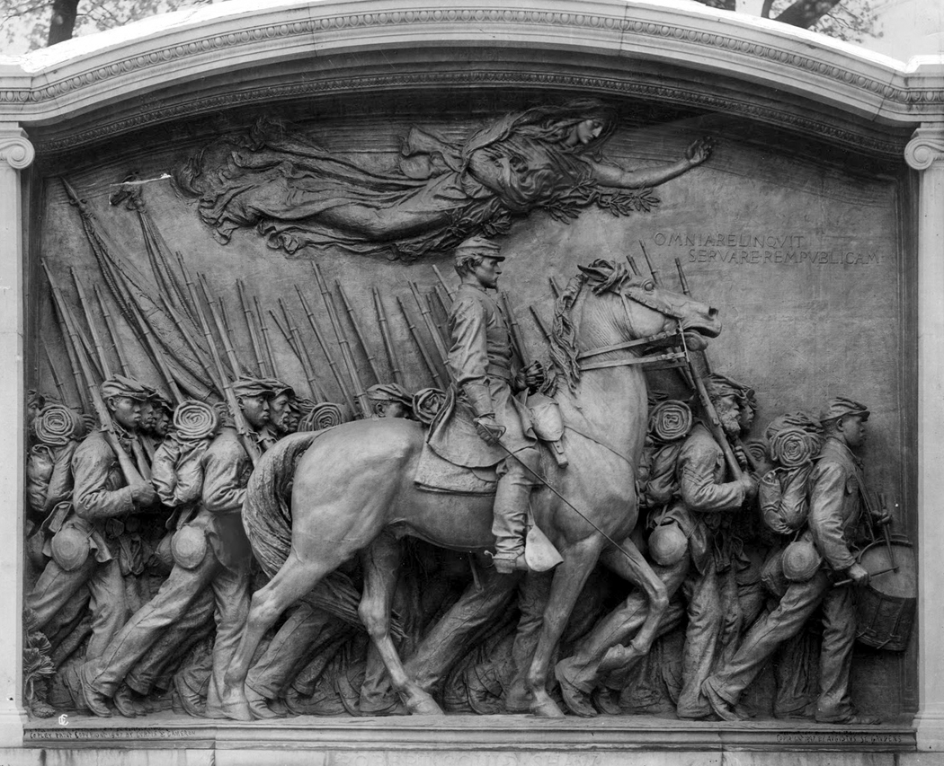
Shaw Memorial, Boston
The SHAW MEMORIAL, Boston
The first section in Ives’ music is titled ”The St. Gaudens in Boston Common” and is subtitled ”Col. Shaw and his Colored Regiment.”
The St. Gaudens is a Civil War monument, considered by some people to be the best American example of memorial sculpture. It was created by Augustus Saint-Gaudens and unveiled in 1897 at the northeast end of Boston Common, across the street from the Massachusetts Statehouse.
The deep-relief sculpture commemorates the 54th Massachusetts Volunteer Infantry Regiment and its commander, Col. Robert Gould Shaw, who died in the Civil War.
The 54th was unusual at the time because its enlisted ranks were composed entirely of African-Americans. On May 28, 1863, the largest crowd in Boston’s history came out to see the 54th march off. They saw the thousand Black soldiers marching, accompanied by their White officers on horseback.
A souvenir of the day quoted Byron: ”Who would be free, themselves must strike the blow.”
Two months later, Shaw and a third of his command were dead, killed in the attack on South Carolina’s Fort Wagner in Charleston Harbor. Their charge had failed, but the soldiers had fought so well that they legitimized what had been considered a questionable idea: African-Americans in combat.
Shaw initially was buried in a common combat grave with his dead troops, and after the war, when plans were made to exhume the gallant young officer and give him an official ceremony in a Massachusetts cemetery, his parents refused, writing that they could hope for ”no holier place” for him than ”surrounded by his brave and devoted soldiers.”
Saint-Gaudens, America’s premier sculptor at the time, was commissioned in 1883 to monumentalize Shaw, and briefly considered a standard equestrian statue, but finally decided that the Black troops deserved the memorial as much as Shaw and devised plans to include them.
He wanted to represent the soldiers accurately; some were as young as 16, others were bearded grandfathers. So he hired African-Americans to pose for him and made 40 heads as studies. Sixteen went into the final bronze.
So Shaw rides his horse in front of a rhythmical line of marching soldiers, their heads, sleeping packs and rifles creating a visual drumbeat.
Ives’ 8-minute portrait of the monument is a diffuse, dissonant wash, as though not only the images of the Civil War but also its very idea were obscured in the haze of memory and history.
”Moving — marching — faces of souls! Marked with the generations of pain, Part-freers of a destiny, slowly, restlessly swaying us on with you towards other freedom!” Ives wrote in his score.
The monument was only a few years old when Ives began writing about it, and the layers of time show through in the music: the war, the remembrance of war, the causes and unfinished business of the war in a conflicting mass of sound.
Often, in the welter, you can make out a familiar tune: Marching Through Georgia or Battle Hymn of the Republic.
Then it all fades away into the nostalgic past.
Today, the sculpture is nearly black in its patina. It sits on its granite plinth looking vaguely like a plaque on a headstone. The tour buses stop, and the tourists pour out with their cameras. Some shoot the gold-domed statehouse, others shoot the St. Gaudens.
One bus unloads two dozen Japanese tourists. They also point their cameras. The amplified sound of a tour guide overpowers the street noise — but in Japanese — and I cannot possibly know what she is saying or what the Japanese tourists can make of the racial complexity involved in the war, the monument and American history.

Putnam’s Camp, Redding, Connecticut
PUTNAM’S CAMP
The second movement is called ”Putnam’s Camp, Redding, Connecticut.”
Gen. Israel Putnam, like most American generals in the Revolutionary War, was better known for strategic and tactical retreats than for victories. Charged with holding the Hudson Highlands in 1777, he lost Fort Monroe and Fort Clinton while backing up into Connecticut.
He and his troops wintered near Redding, Conn., in 1778, undergoing much of the same privation and hardship Washington endured at Valley Forge.
But Ives isn’t remembering the Revolutionary War in his music. Rather, he is remembering his childhood, when he used to visit the site of Putnam’s Camp and fantasize what it must have been like in the winter of 1778-79.
He also recalls the patriotic Fourth of July picnics he attended there and the brass bands that played.
”Long rows of stone campfire-places still remain to stir a child’s imagination,” Ives wrote.
What he hears is a grand cacophony of marching bands, playing different tunes at the same time. It is loud, bouncy and ear-blasting, getting louder and louder, with strains of The British Grenadiers and other songs, and ending in a misquoted bar and a half of reveille.
It is all a jolly 6-minute joke but the kind of music Ives loved best. ”Pretty sounds are for pretty ears,” he said, deriding those who wanted pleasant melodies from his orchestra.
Once, upset over the hoots and boos of an audience listening to some modern music, Ives got out of his seat and exhorted the unappreciative crowd to ”Stand up and take your music like a man!”
Putnam’s Camp is today a state park, half on the east side of Connecticut 58, half on the west. It is the eastern half that is most visited; it has a lake, a parking lot and picnic tables, and many of the people who come there probably give little thought to the Colonial army that once wintered there.
On the other side of the road, there is a path through the woods that passes the lines of camp hearths and a hilltop cemetery full of the unmarked graves of those who died fighting for American independence.
At the lake, a man — who looks like he’s playing hooky from work — casts his fishing line into the water. The fall remnants of waterlily leaves are curled and brown on the water, and a few Canada geese honk on the lawn.
The sky is overcast, and the woods are brown as tweed, with neither shadows nor highlights. And the old-fashioned New England Fourth of July patriotic and religious picnic is as much a part of the past as Putnam’s war.

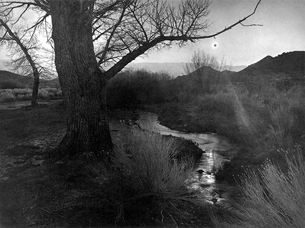
Housatonic River, Stockbridge, Massachusetts
HOUSATONIC at STOCKBRIDGE
The last section of Three Places in New England is perhaps the most moving. It is ”The Housatonic at Stockbridge.”
That is, the Housatonic River at Stockbridge, Mass.
The Housatonic is one of those alternating lazy and cascading streams that run from north to south, along which New England’s factories were built in the early years of the Industrial Revolution.
It begins at a small pond in Washington, Mass., and wends its way 149 miles to Long Island Sound at Stratford, Conn.
Along its banks are both towns and woods. Ives honeymooned in the Berkshires in 1908 with his new wife, Harmony, and one Sunday morning, they strolled near Stockbridge and the river.
”We walked in the meadows along the river,” he wrote many years later, ”and heard the distant singing from the church across the river. The mist had not entirely left the riverbed and the colors, the running water, the banks and the trees were something that one would always remember.”
The 4-minute movement that Ives wrote captures the quiet and the mist: It is ambiguous tonally and melodically, like a remembered dream, builds to a climax that evaporates abruptly, uncovering the quiet chords playing on the orchestral strings as if they had been sounding all along, but drowned out by the noise.
Like the strings in Ives’ Unanswered Question, which are drowned out by chattering woodwinds, the final quiet strings in Three Places are the eternal harmonies of nature.
Ives liked his piece well enough that he turned it into a song later, with words by poet Robert Underwood Johnson:
”Contented river! In thy dreamy realm — the cloudy willow and the plumy elm.”
It is an elegy to nostalgia.
Stockbridge has changed since the Iveses visited. It is now a prime tourist destination, full of gift shops and art galleries, with frozen yogurt. It is also the home of the Norman Rockwell Museum. Rockwell made his home there and used Stockbridge natives as models for his magazine-cover paintings.
The river eases in and out of town, crossed by four or five small bridges. The Housatonic is an average of only 35 yards across in Stockbridge, hardly more than a brook.
On a cloudy day in October, it also is hidden by the grayness. I have visited every spot along the river in town and enjoyed its quiet but missed its beauty.
Until late that afternoon when I stand on the hill by the Rockwell Museum looking over the river out at Pleasant Hill and a chink in the clouds widens, throwing a spotlight on the meadow across the water. The bare winter sycamores along its banks suddenly stand out like neon, and the band of sunlight sweeps from left to right, finally in its passing leaving the scene in gray once more.
And the riverbed and the colors, the running water, the banks and the trees were something that one would always remember.
DEEP TIME
The search for Ives’ three places has turned into a pile of time on time, present on past, past on deeper past, all wound up in a single point of geography.
It is as if the Indians, who were in New England before the Pilgrims came, had a deeper understanding of reality. When something happens, they believed, it is always happening. Time is not a straight line but a basket full of harvest, all piled in together.
So that I cannot see this single piece of real estate, the Housatonic, the Yankee military camp or the St. Gaudens statue, without thinking of history, memory, my past and my nation’s past, all balled up into a single, complex thing.
All happening at once and all happening in my eye, looking at the past.
And I know it is not just true for these three places, caught in Ives’ web of meaningful noise, but for all places and all times.

Charles and Harmony Ives
CHARLES IVES
Charles Ives is the father of American music.
Before him, what American composers wrote for the concert hall was a dim reflection of European — and especially German — art music, with its sonatas and symphonies. After him, it was possible to feel truly American.
You can see his influence in the folk tunes that show up in Aaron Copland, the spare orchestrations and open harmonies of Roy Harris and the avant-garde fun John Cage has with noise.
Ives was a funny duck. Born in 1874, he studied composition at Yale, but instead of becoming a poverty-stricken composer, he became a wealthy insurance executive. Ives and his partner, Julian Myrick, founded a successful agency that pioneered much of the industry’s modern practice. Myrick had the business sense, Ives brought the creativity.
Together they prospered, ultimately becoming the largest insurance agency in America. In 1929, the firm sold $49 million worth of insurance.
But he was also a genius in music, taking little stock of what he learned from his stuffy college professors and feeding large on the oddball music education he received from his father, George Ives, who was bandmaster for the small Connecticut town of Danbury.
George Ives loved to experiment with sound, playing with microtones, out-of-tune instruments, polytonality and organized noise. That enthusiasm for experiment, which in George was a variety of practical Yankee inventiveness, became for his son a creed and a muse.
Yet although Charles Ives’ music was more modern than Stravinsky’s and more dissonant than Bartok’s, he really was not concerned with fitting into the long history of European art music. It is obvious in the music; Ives was not writing about modern things.
For although the music is filled with ear-splitting dissonances, it is unabashedly nostalgic. Ives felt a powerful nostalgia for the past — his past — and his music drips with bits of the music he heard when he was a boy: old hymn tunes and marching-band music.
No matter how loud and incoherent Ives sounds at first, at long last, it settles into Bringing in the Sheaves and Columbia the Gem of the Ocean — not whole but in snippets, as if half-remembered.
Ives wrote the bulk of his music in the first years of this century. His business and his ailments — he suffered from a poor heart muscle — kept him from concentrating on composition after 1918.
Or perhaps, as Ives’ early biographers, Henry and Sidney Cowell, suggested, ”The war was a shock of the first magnitude to a man whose life was based on his confidence in human progress.”
He lived on until 1954, becoming for many American composers a kind of father figure and rallying point.