Archive

Tag Archives: color photography

Reidsville is a small town in north-central North Carolina halfway between the city of Greensboro and the Virginia border. It was once the home of the American Tobacco Company and at the north end of downtown is a huge factory complex with a smokestack that still says “Lucky Strike” on its shaft. 

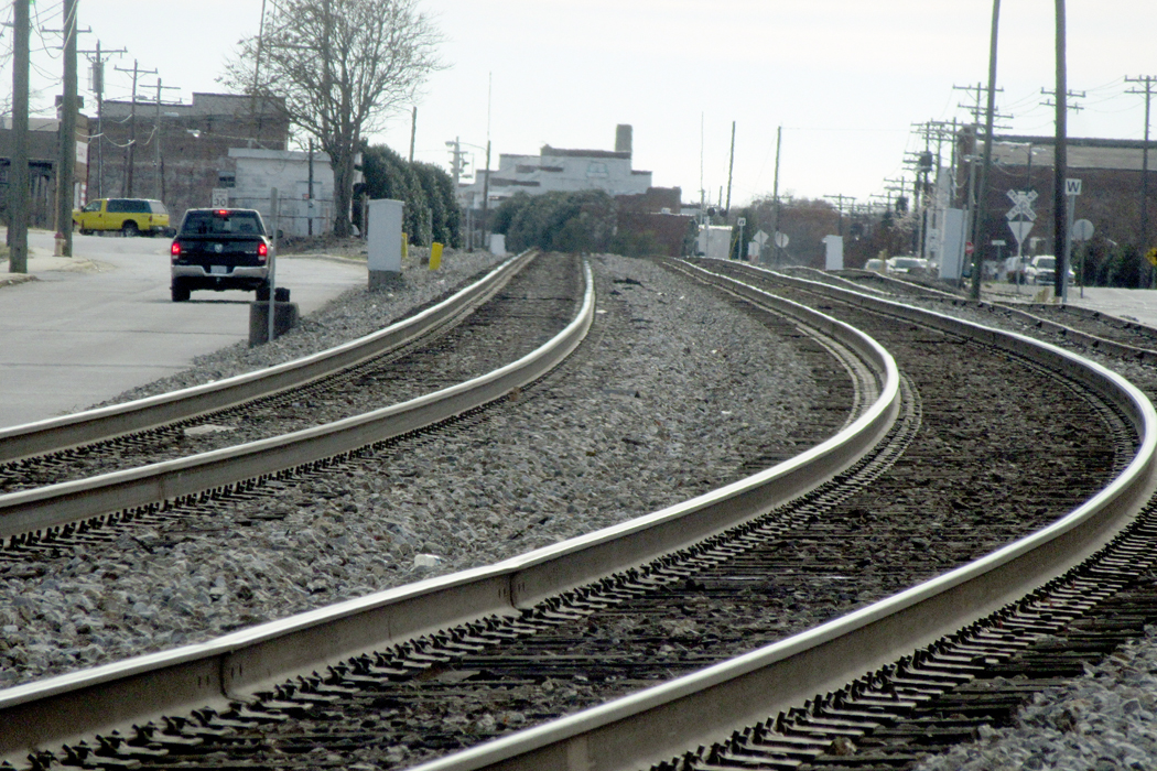
Like so many Southern towns, there is a main street where the shops are found, and a parallel street where the old factories and warehouses are located, with the railroad tracks running alongside. This pattern is repeated throughout Dixie, but is especially common in the Piedmont, which was once the industrial heart of the Southern states. 

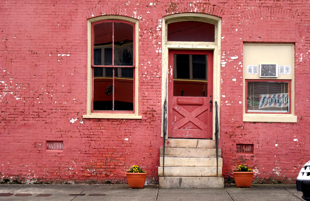
The downtown in Reidsville is not as vibrant as it used to be. There are many empty storefronts and some of those have been filled with “antique” emporia and consignment shops. I don’t want to imply it is a dying town; in fact, it seems quite happy and busy, even though its heyday ended with the closing of the tobacco plant. 

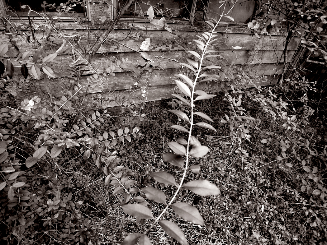
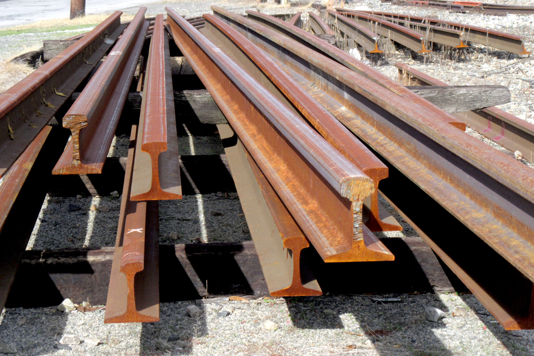
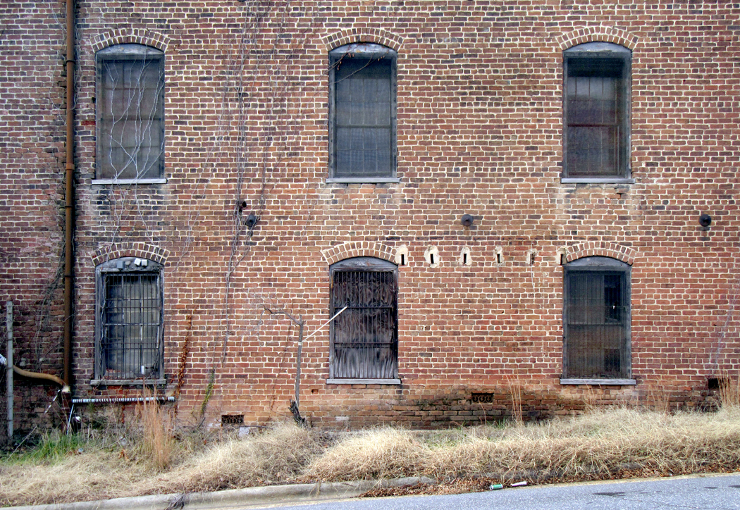
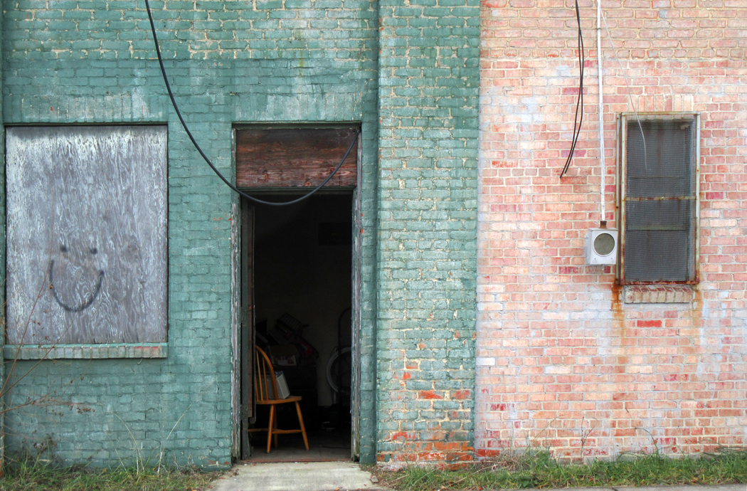
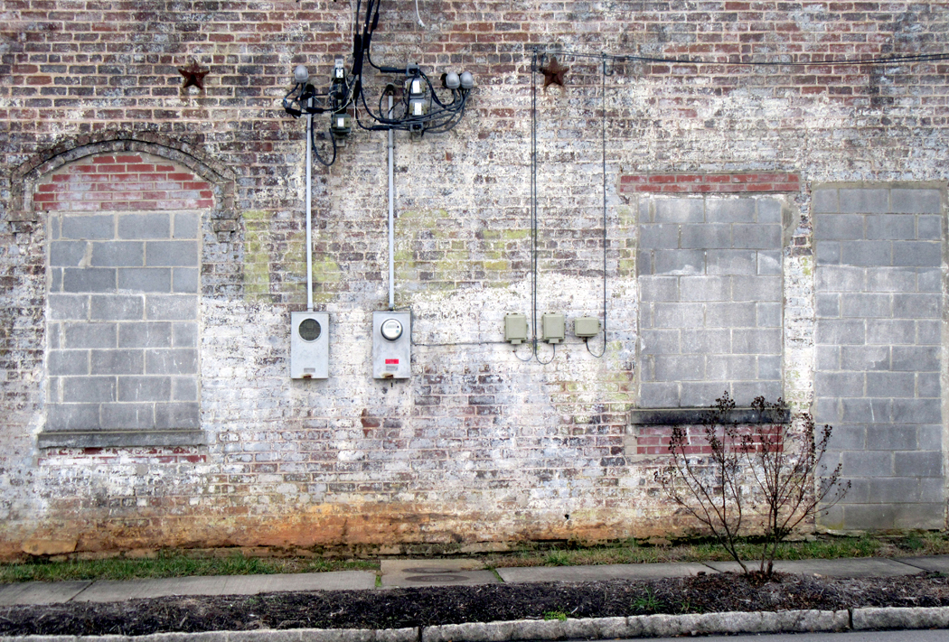
There were also textile mills and other factories and their old buildings, now repurposed or abandoned, line the back street and railroad tracks. I find such relics irresistible. 

As I explained in the previous blog entry, I am compelled to make things — the compulsion is itself a relic of the old Protestant work ethic; I feel guilty if I am not producing something. So, as a retired writer, I still pump out blog entries, and as a former photographer, I am still driven to make images. These usually group in series; which I call “projects.” For years, I made serial images of gardens, always meant to be seen not singly, but as a cohesive group, rather like a book. I hope each image can stand on its own, but it is not designed solely for that purpose. 

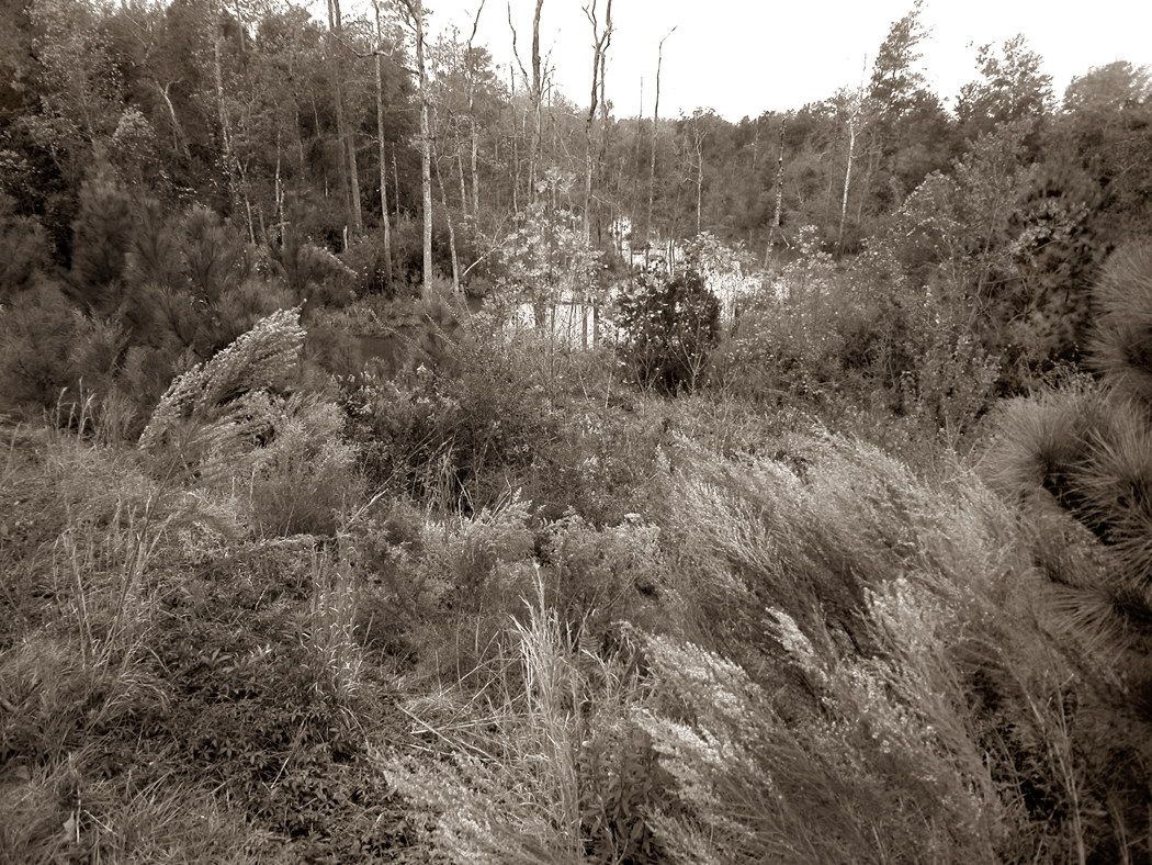
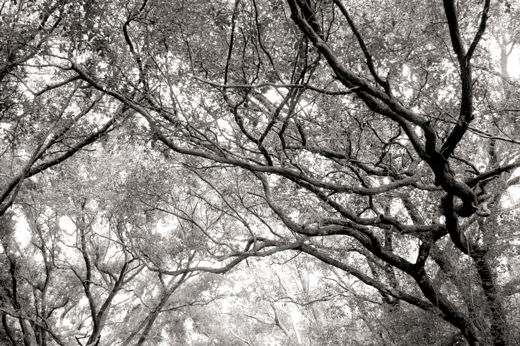
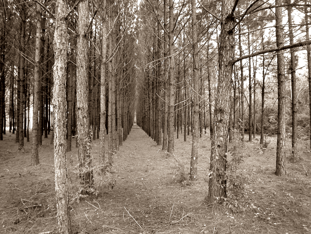
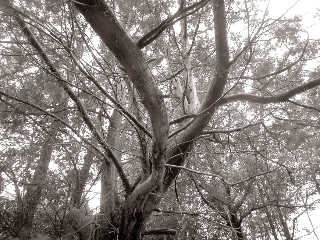
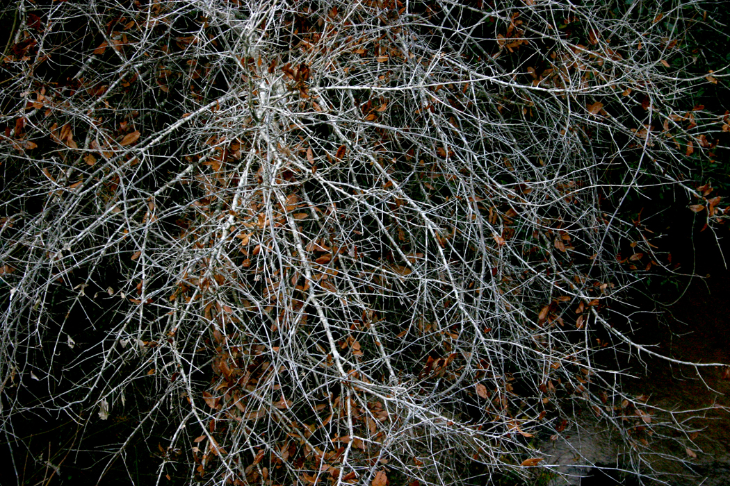
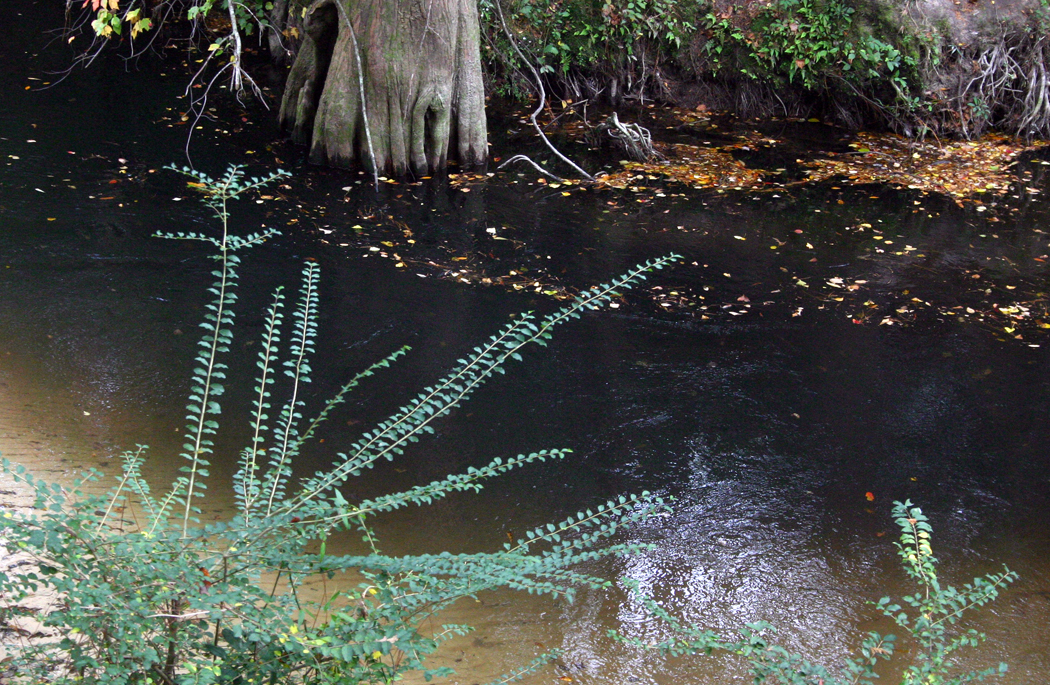
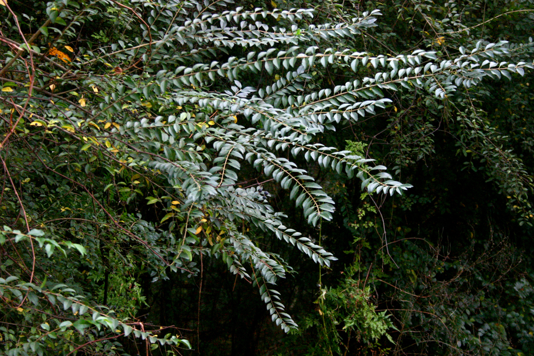
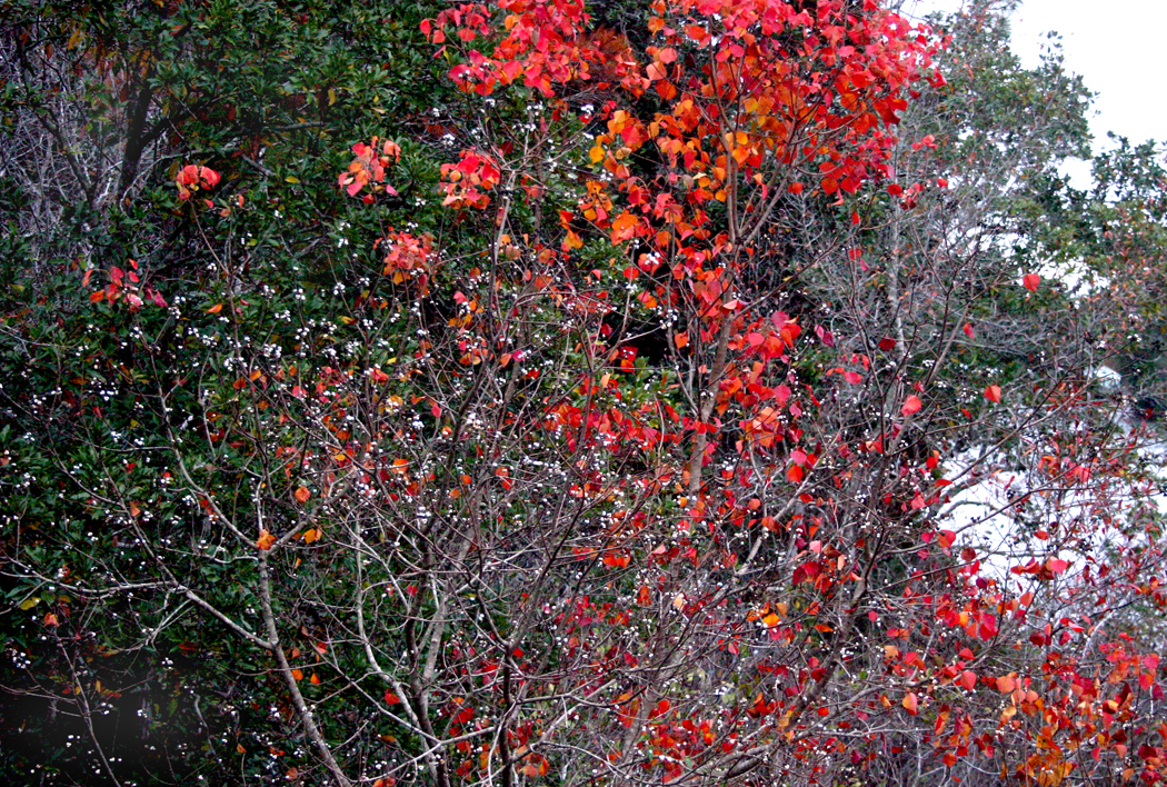
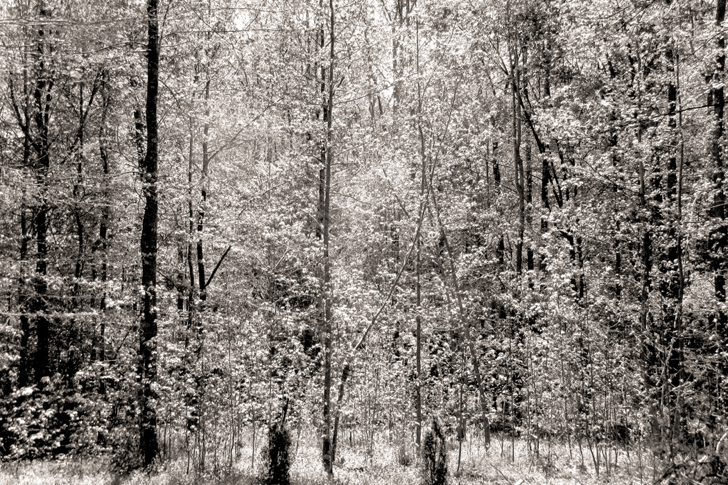
In the entry previous to this one, I presented bits of a series of fruit and vegetable images, and a recent bunch of “tree nudes” — winter trees with their branches and bark naked to the weather. 

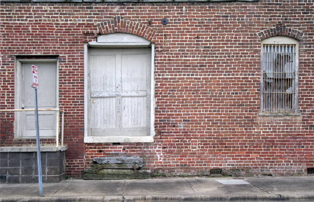
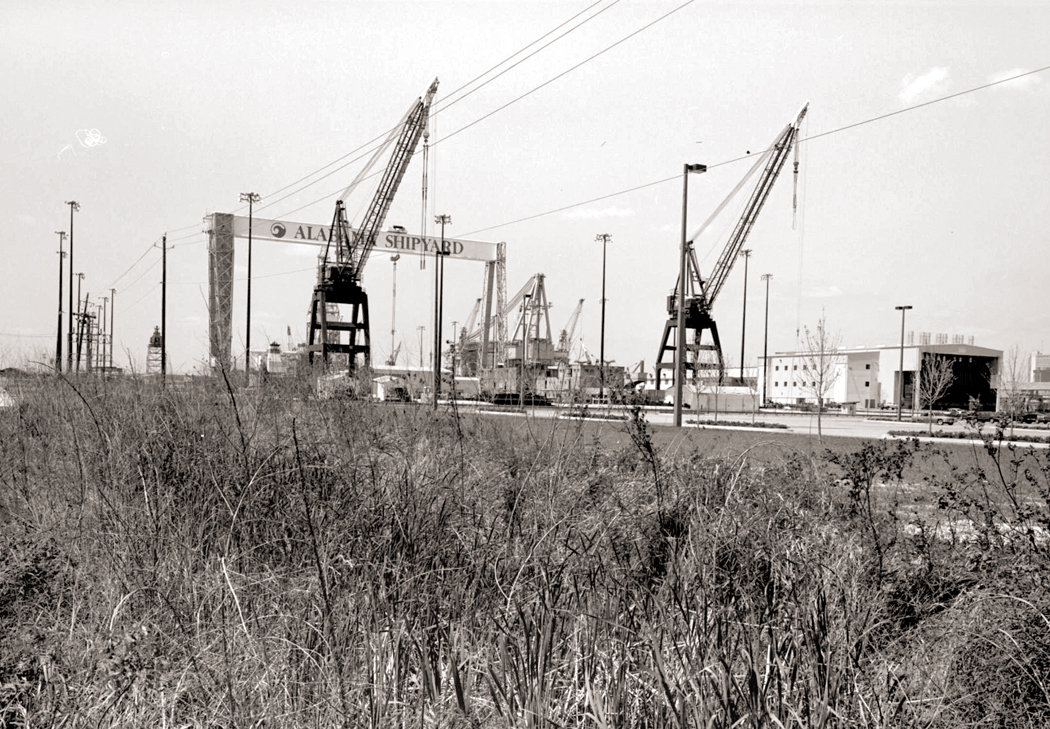
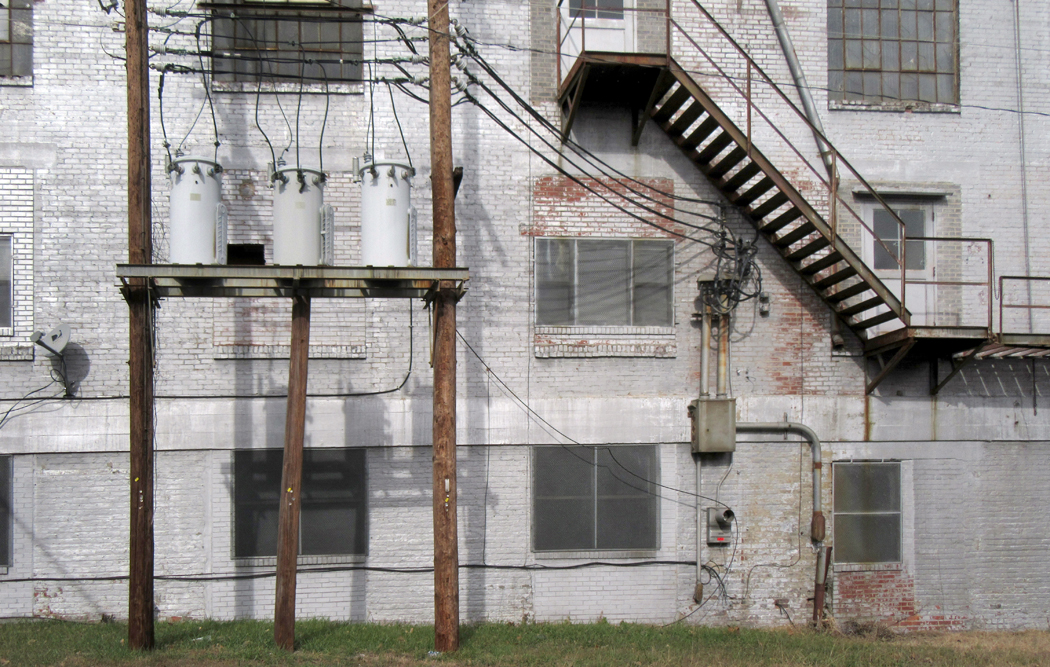
I also spent a day driving the industrial streets of Reidsville, looking for the past poking through the present. Along SE Market Street, alongside the rails, there are the shells of old warehouses and factories, textured with brick and sometimes closed off with tornado fencing. 

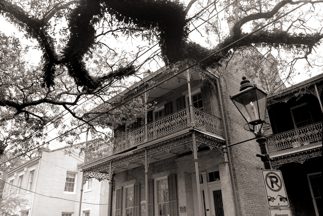
I have been fascinated by such places since I was a boy, loving the less visited side-streets in New York, looking at old apartment buildings and second-story residences above storefronts. There is something about the edge of decay that is beautiful. A fresh new building just seems unripe; one that has been settling for decades, even a century, has gained character.

This is something like the Japanese esthetic concept of wabi-sabi, or an appreciation of the imperfection and impermanence of things, and why a Japanese potter will often crack or warp a vessel before firing it, finding the result more beautiful than bland regularity. 

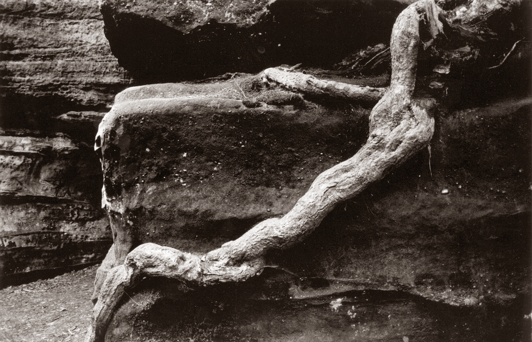
In the past, when I made photographs of old buildings, I made them in black and white, which seemed a way to emphasize form and texture, and was then the accepted presentation of “art” photography — color not making it into most museums because of its perceived impermanence (consider your old snapshots, turned magenta and faded. A museum didn’t want to pay good money for an artwork that would go south in only a few years). 

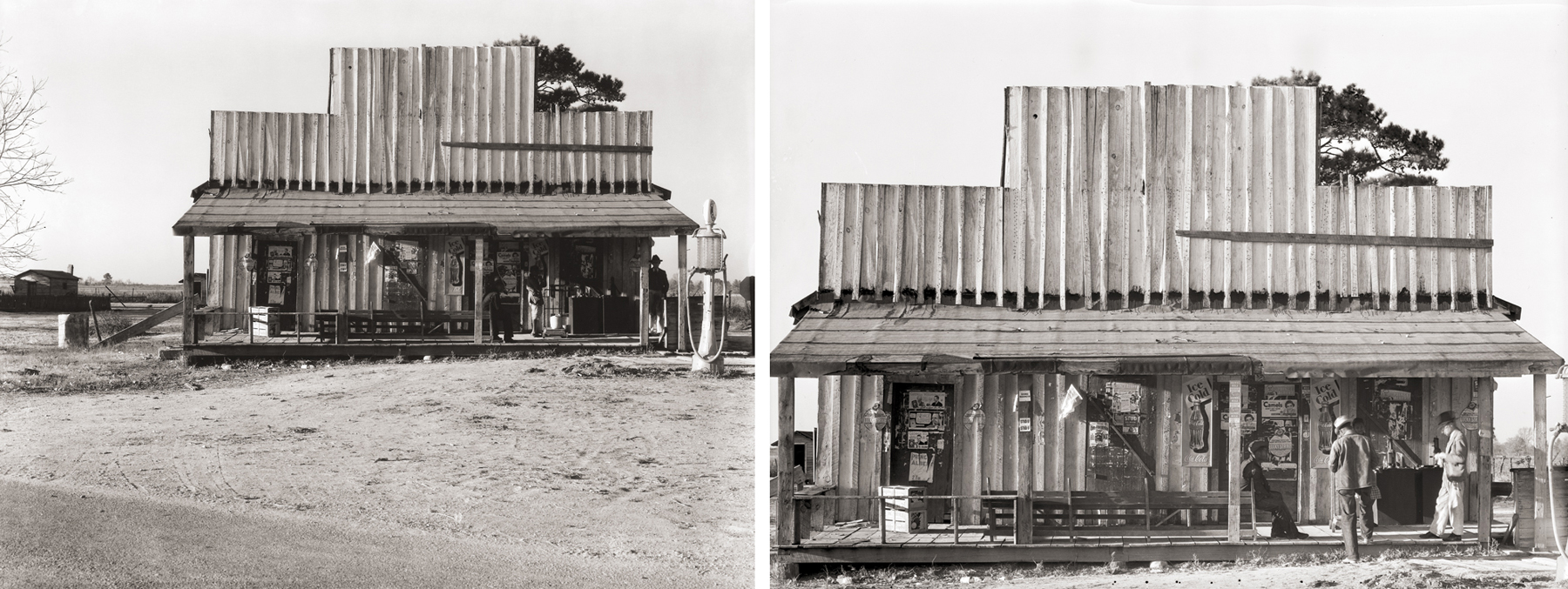
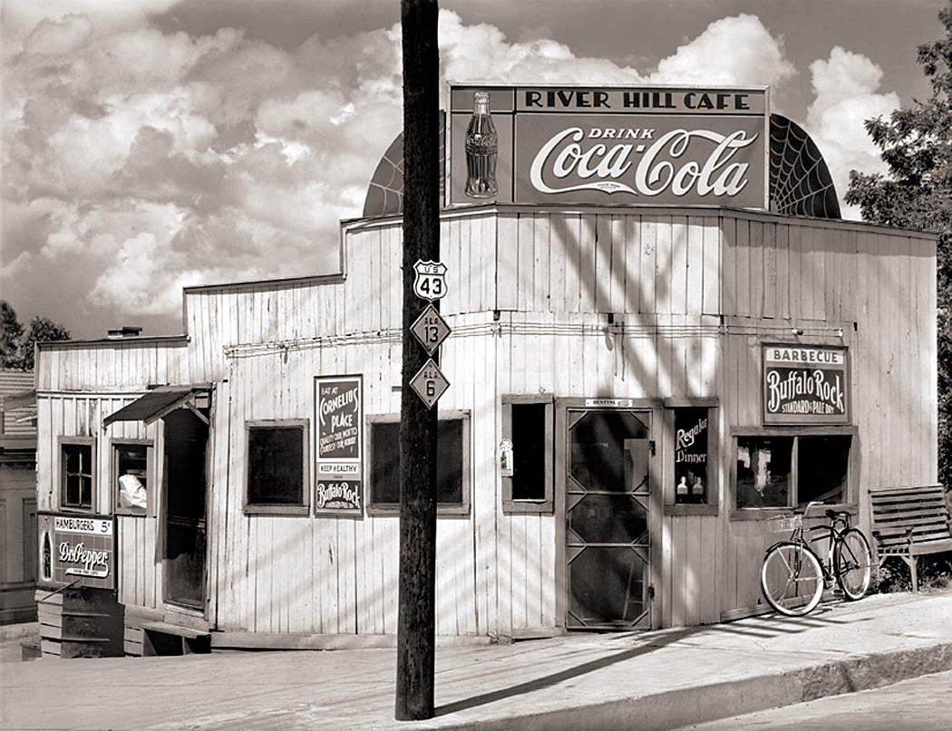
Black and white was what all the photographers I admired used (with a few exceptions). And if I looked at one of Walker Evans photographs for the Farm Security Administration in the 1930s, I found beyond the images of poverty, a way of making beauty out of decaying architecture. 

One of the few classic artworks I actually own is Evans picture of the Rock Hill Cafe in Alabama. It is beautiful and I love it. 

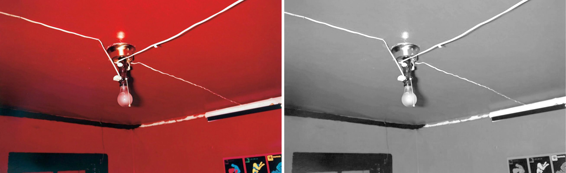
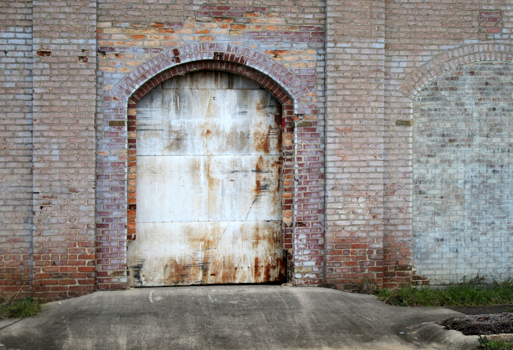
But as I get older and as technology has improved and my perceptions have changed, I find myself making color photographs more often, and often the color is the point. So, I might see an old welding shop in Reidsville and see it in monochrome.

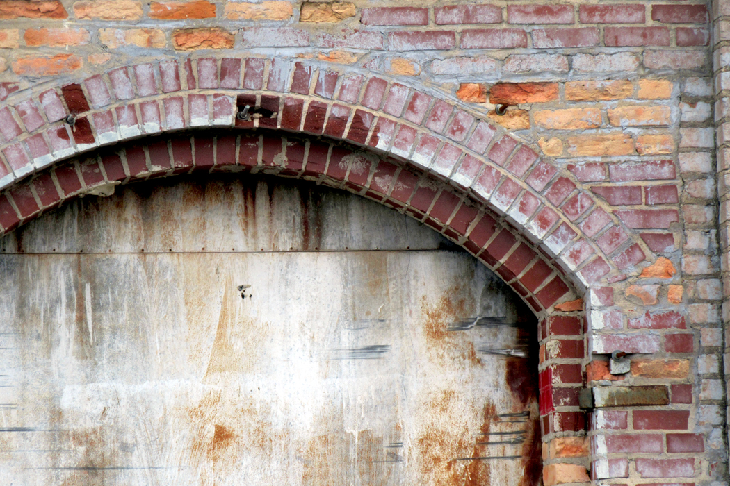
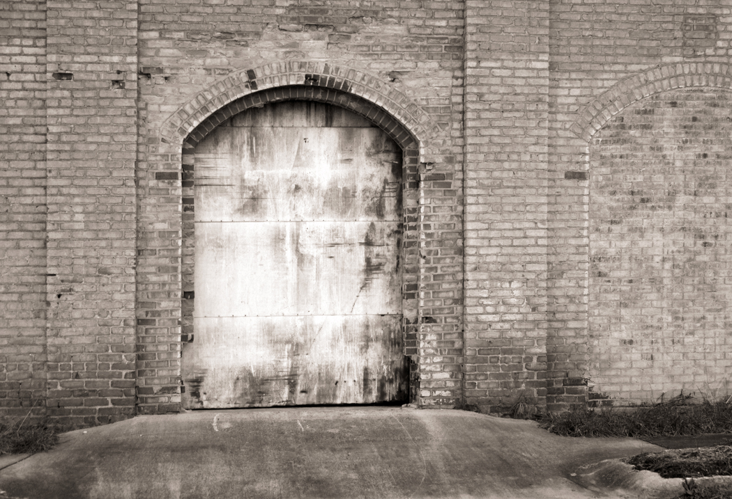
Or I could present an old rusted doorway in B&W

I saw, though, a range of subtle color that just delighted my eye. 

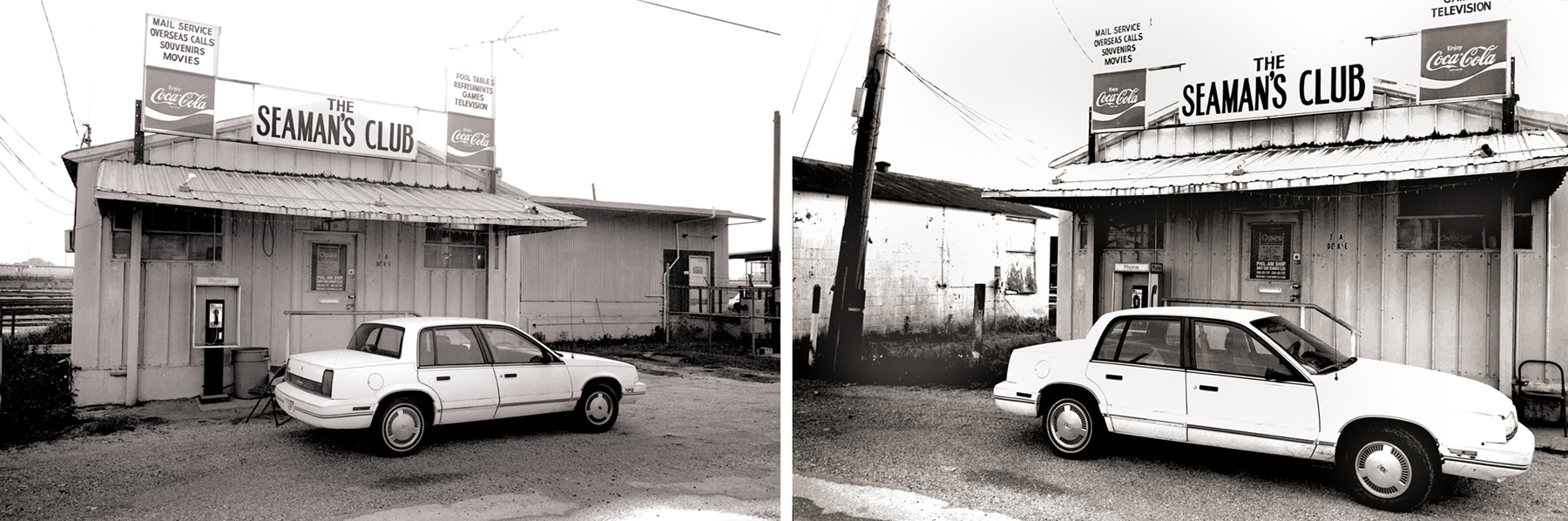
Interestingly, Evans himself took up color and in the 1960s made a series of color photographs of old buildings. His materials were not as good as we have now and the color never completely satisfied him. 
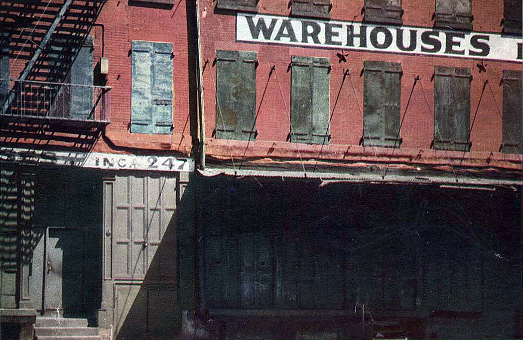
Walker Evans 1960

There have been some truly impressive color photographs made by such artists as William Eggleston, Eliot Porter or Ernst Haas. They forced me to reconsider the esthetics of color.

To say nothing of the melancholy and beautiful streets of Edward Hopper. 

So, I drive through the streets of Reidsville on a December morning and see so many absolutely beautiful wrecks. Because it is cold, and because I am old and my hams have gone weak, I aimed my camera through the opened side-window of my car and made my series. 

There were times I parked and got out of the car, but mostly, I made the window-height camera a part of the esthetic — or I’m just lazy. 

I drove down Market Street and up the other side of the tracks, then crossed back by Harrison, Gilmer, Settle and Williams streets. There was beauty everywhere. 

The question of whether what I have made is art no longer interests me. There was a time I wanted to be an artist, but now my emphasis in not at all on how I am seen or judged by others, but rather the direct fact of making stuff. It matters little what it is called. 

The photographs are my way of engaging with the world, reminding myself to see it and see it whole, not just the sunsets and mountainscapes, but the sagging doorways, too, and the cracks in pavement. The way the clouds gray-up and dull the shadows till they flatten completely. The roundness of an orange, the spatter of mud on my tires, the layers of paint on my back porch. 

I now consider this engagement far more important than the artifacts that results, however much fun it is to share them. 

I have talked with my brother about this, who is an artist — a real one, with sales and exhibitions — and he rather laughed. “What do you think an artist is? A vocation? Something you go to trade school for, like plumbing or accountancy?” 

The urge, the need to make things, he said, the fact that you do it makes you an artist, whether you think of yourself that way or not. Being an artist is not so lofty a title; it is simply something one does. 

And so, I drive up and down streets looking at the world that amazes me, and I find color and shape and texture; shadow and highlight; past and present; banality and transcendence.

Click on any image to enlarge

When you look at a map of Alabama, you see it has a little tail at the bottom. It is where you find the city of Mobile, and where you find Baldwin County. Mobile is to the west, Baldwin County to the east of the vast Mobile Bay. 

My daughter, Susie, worked for years at the Mobile Register — she is the third generation to become a journalist — but lived across the causeway in the county. 

The two are very different. Mobile is urban, with shipyards and warehouses, high rises and traffic. 

The county is rural, with farms, fishing shacks and at least one high-end bayside resort: the Grand Hotel at Point Clear. 

When we lived in Phoenix, Ariz., we visited Susie and our granddaughters once or twice a year and I managed to circumnavigate the county pretty thoroughly. 

I would sometimes make day-long excursions with my camera. I was a photographer before I became a writer. For six years, I taught photography at Tidewater Community College in Virginia Beach, Va. 

But that was back in the days of Dektol, D-76 and Kodabromide. Cameras used film and gave us negatives to print. I was trained at a time when for most of us, photography was black and white. 

That tended to govern how we approached our subjects. If color meant nothing, we had to focus on form, on darks and lights. 

As a result, my eye was attuned to shadings rather than hues. 

And so, my first forays into the back of Baldwin County were seen in black and white. 

What I had in mind, more than anything else, were the photographs of Walker Evans, who made some famous Depression-era photographs in Alabama. Old service stations, abandoned farmhouses, agricultural towns with raw main streets. Evans was wonderful. 

When you see a boatload of his work, you can’t help seeing how many times, on the same day, he made multiple images of the same subject, trying to capture it from different angles and distances, later choosing the one image that said what he wanted to say. 

Walker Evans, “Selma, Ala.”

So, as I drove through the backside of Mobile and the county, I sought out similar things, and made multiple angles, too. 

One day, when the womenfolk were out shopping for clothes, or shoes, or whatever it is that the female gender tends to focus on, I took my camera out and drove up and down County Route 13, which runs north to south in the County. 

In a single day, I finished a project that I printed up and displayed under the show title: “Southern Baroque.” 

I found ruins, 

trees,

homes,

cotton fields,

Tractor paths,

and weeds, lots of roadside weeds. 

And at the end, Weeks Bay, an offshoot of Mobile Bay, which opens onto the Gulf of Mexico. Hundreds of pelicans bobbed like decoys in the water and scattered in the air. 

In all, I wound up with about 50 good images to show in the exhibit. 

On an earlier trip, I tried to capture Mobile. 

I found oil tanks,

shipyard derricks,

downtown iron-rail balconies,

and restaurants on stilts along the causeway, safe from storm tides.

But Tri-X and Photo-Flo went the way of the mastodon, and I eventually had to take up digital photography. Turns out, it was a revelation. 

I was never happy with color film. Kodachrome was too garish, Ektachrome too grainy. Some photographers, such as Ernst Haas and Eliot Porter, managed to make stunning color photos, but they had the advantage of dye-transfer, a process way too expensive for a mere teacher. 

So, over the decades, I had worked at training my eye to see in textures, shades and shapes. My sense of color had begun to atrophy.

But using the digital camera, I began to relearn color. I began to see in color. I hope I have been able to blend that with the lessons of shape and light I had already learned. 

And then, when I traveled Baldwin County, I had an eye for color. It screamed out at me. 

And instead of traveling down Route 13, I followed the Fish River, a few miles to the east (and also ending at Weeks Bay.)

I began where the river is not much more than a rivulet. It was crowded with multiple greens, and the rich tawny stream bottom was delicious in contrast. 

It was early fall, and leaves had begun to turn, and those that hadn’t were drying out. 

I wandered down the road by the river, stopping once in a while to catch a patch of grass,

or a tangle of branches,

or a great tree

or a beautiful tangle of old oaks.

But I cannot credit merely the change in technique for this awareness of color. It seems to be something that has come to me with age. 

When I was young, I tended to see the world in starker terms. I was cocksure of myself, and so often wrong. But the black and white coincided with that black-and-white worldview. 

As I got older, I grew softer. I became more attuned to my insides — how I felt, and aware of how others felt.

I imagine this has something to do with a decrease in testosterone — and thank god for that. I am a kinder man than I ever used to be. 

It may also have something to do with having a family made up almost entirely of women: daughter and two granddaughters. I can’t say I learned empathy — that implies a will to do so.

But rather, that an empathy has pupated in me and emerged in my senescence, fully colored. 

Whatever the cause, color now delights me no end. Sometimes when driving, I will choose a color and make an especial notice of it and how often it appears. It’s surprising how much yellow there is in the world. 

And like so much else I’ve learned over the long span of years, it is paying attention that matters. Live slower, notice more, enjoy more. 

Click on any image to enlarge

The world is not black and white, but until fairly recently, photography was. For most of its history, the art was an art of silver on paper, spread from inky blacks through velvety grays into pristine whites. 

There had been attempts to add color, either by painting on top of the monochrome image, or by various experimental techniques to capture the color directly. But even after the commercially successful introduction of Kodachrome in 1935, photography as a museum-approved art continued to be primarily in black and white. 

(In cinema, Technicolor predated Kodachrome by about a decade, but that process was essentially three different black and white negatives overlapped through color filters to create the effect. It was an expensive and difficult process and relatively few films, percentage-wise, were made with the process until after the commercial success of Gone With The Wind and The Wizard of Oz in 1939.)

I have been a photographer for at least 50 years. I have had shows and my work has been published. But for most of that time, I worked in monochrome. I “saw” in black and white. My photographic heroes worked in B&W, the techniques I mastered were silver techniques. I became an excellent printer. But I seldom used color film. It seemed an unnecessary noise to bring to the purity of the medium. 

I was hardly alone in this. When I was younger, even museums shied away from color photography. It was seen as not “permanent.” It’s images faded over time (I’m sure you all have old family snapshots turned rather magenta with age). The real artist-photographers used silver or platinum and made glorious images. 

Back then, art in general was seen with more precious eyes. We thought of “archival processing,” and even paintings were carefully preserved and curators looked down on some artists — such as Jackson Pollock or Mark Rothko — who used non-archival pigments or unprepared canvases and whose works, therefore, had begun to deteriorate. 

In current times, few artists or galleries worry much about such things. Art can be made on newsprint, or can even purposely self-destruct. Concern for the permanence of an artwork is seen as elitist. After all, no matter how careful you are, the art is going to be gone eventually, even if it lasts till the sun explodes. 

And besides, color is now no more or less permanent than black and white: Now they are both nothing but ones and zeros. Silver is dead; long live digital. 

Yet there is still a difference between color photography and black and white. It is a difference not simply of technique, but of thought. Thinking in color is different from thinking in black and white. 

The part of vision that deals in color is processed in a different area of the brain than the part that concerns itself with darks and lights. (Vision is ridiculously more complicated neurologically than you might think — the information on the retina is broken down into many separate components, processed by differing regions of the brain and then re-coordinated as a gestalt.)

And so, some people pay closer attention to the hue, others to the forms they see. 

The fact is, black-and-white photography and color photography are two different art forms. To be successful in both requires a kind of bilingualism. Most of us have brains that function best either in seeing forms and shades, or in seeing hues. The two photographies emphasize those different talents.

One has only to consider the work of Stephen Shore or William Eggleston. Most of their meaning comes through the color. Take one of Eggleston’s best-known images and suck the color out. What have you got?

He made this photo of a ceiling and light bulb. The red is overwhelming. But imagine it as a black and white image.

He also made a similar image of a brothel ceiling painted blue. Also overwhelming. The two are nearly the same image, but with very different emotional and sensuous meanings.

But if we make them both black and white, they very nearly merge into the same thing. 

Color can by itself separate forms. Here are four squares in four colors; as distinct as can be. But the exact image, unaltered except for the draining of all color from it, leaves a confused mess, barely a separation between grays. 

Black and white photography requires the separation of parts not by hue, but by contrast: Lights agains darks. It’s what makes great silver prints sing. Where color photographs separate forms primarily by hue, black and white shapes form with contrast.

I am not saying a color photograph has to be garish. Far from it. But the color will carry a good deal of the meaning and emotional resonance of the image. Even in a color photo that has hardly any color in it.

Many years ago, I tried an experiment. Like so many others, I loved the waterlily paintings of Claude Monet. But I wondered if they would make as much sense in black and white. Is there a structure holding the pictures together, a design or composition, that didn’t depend solely on the rich color. 

So, I began making photographs in black and white of water lilies. 

The most successful of them clearly relied on bright highlights and strong shadows. The shapes made the picture.

If I tried an overall design, like Monet’s the picture lost its strength. 

I did the same experiment with one of Monet’s paintings, rephotographing it in black and white. 

Did it hold up? It is certainly a very different beast. 

Then I went back to one of my own color photographs of his waterlilies in Giverny, a photograph that imitated Monet’s paintings, with color, sky, reflection, shadow and lily. In color and side-by-side, in black and white. 

What I discovered shouldn’t be a surprise: Monet was much more effective in color. But I also noticed that because my photos were well-focused rather than impressionistically fuzzy, they translated better into black and white: Black and white is meant to clarify shapes. Color identifies “areas” rather than discrete textures. 

And so, while I have spent the majority of my photographic career making monochrome images, along with many others now working in digital media, I switch back and forth between color and B&W. They do, however, require different vocabularies. They are different languages. 

While I have always made visual art, I made my career in writing about art. 

As an art critic, I had the unusual need to be bilingual in an odd sort of way. As a journalist, I needed to be good with words, but in writing about art, especially visual art, I needed to know how to use my eyes.

I discovered very early on how these two talents were seldom granted to the same person. All around me were reporters who knew a gerund from a copulative, but who often seemed almost infantile when discussing pictures. They could name the subject of the image, but not go much further than that. 


A photo editor of my acquaintance once explained photojournalism this way: “I need to know it’s a house; don’t trick it up with ‘art.’” This was image as ID photo. 

But on the other side, so many artists I knew couldn’t explain themselves out of a paper bag. They effused in vague buzzwords, words that changed currency every year or so. I once taught a graduate course in writing about art for art students who needed to prepare so-called “artist statements” for their exhibits. Most of what they wrote before the course was utter blather, obscure and important-sounding without actually meaning anything. 

Words and images: Worlds seldom interpenetrable. I call the talent for riding both sides a form of bilingualism. 

I do not know if the ability to deal in multiple “languages” is something you are born with, or that you learn early on the way you acquire language before the ability to do so closes off in adolescence. But somehow, I managed to do it, at least well enough to write about it without embarrassing myself.

The mental juice necessary to process each seems walled off from the other, except in rare cases. One either runs a literary program, based on sentence and paragraph structure, linear words building a whole out of alphabetic parts; or one comprehends shapes, lines, color, size, texture, and frame as carrying the information required to convey meaning. 

This doesn’t mean that visual people are illiterate, nor that literary people can’t enjoy an art gallery, but that their primary modes of understanding vary. The squishiness of an artist’s gallery talk can drive a writer bonkers; the flatness of a word-person’s understanding of a painting can leave an artsy type scratching her head: “Can’t you see?” 

Nor does it mean that either side can’t learn, although it will remain a second language, without native understanding of idiom and customary usage. A word person can be trained to see shape and form, but it will always remain as I learned Spanish. No one will ever confuse me with a native speaker.

This split between word and image, though is only one of the bisections. Musicians can think in tone the way painters can think in pigment. Yes, there is a language that can describe the music, but for non-musicians, that language is usually impressionistic and often visual — what the music “makes you think of,” or the “pictures in your mind.” 

For the musically trained, there is also language, but it is completely opaque to the civilian: Dominant-seventh, voice-leading, timbre, reed trimming, tenor clef, Dorian mode, ritornello, de capo, circle of fifths. But even these are merely words to describe the non-verbal reality of the music itself, which can convey meaning through sound alone. The words are not the music. 

The ability to think in the terms of each mode is essential to create well in that form, and a mighty help in understanding it for the audience. If you are not in love with words, the rich cream of Gibbons or the organ tones of Milton can leave you cold. If you have no eyes for color, the nuance of Turner or the pears of Cezanne can zip past without notice. If you think of pop tunes as music, the shifting tonal centers of Schubert are inaudible, the orchestration of Mahler merely noise. 

We each have a frequency our sensibilities are tuned to, and can receive it loud and clear; we may think we understand the rest, but too often we are only fooling ourselves. Do you really inhale the contrapuntal movement of a Balanchine chorus? Do you notice the rhythm of editing in a Spielberg film? Each is a language that its practitioners and connoisseurs understand profoundly, but zip past the mass of those sitting in the cheap seats. 

It’s a different language

Click on any image to enlarge