Archive

Tag Archives: design

I sit across the table from my brother at the seafood restaurant in Virginia and he doodles on a napkin with a Sharpie.

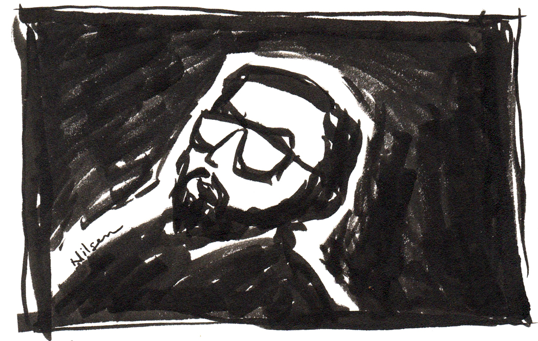
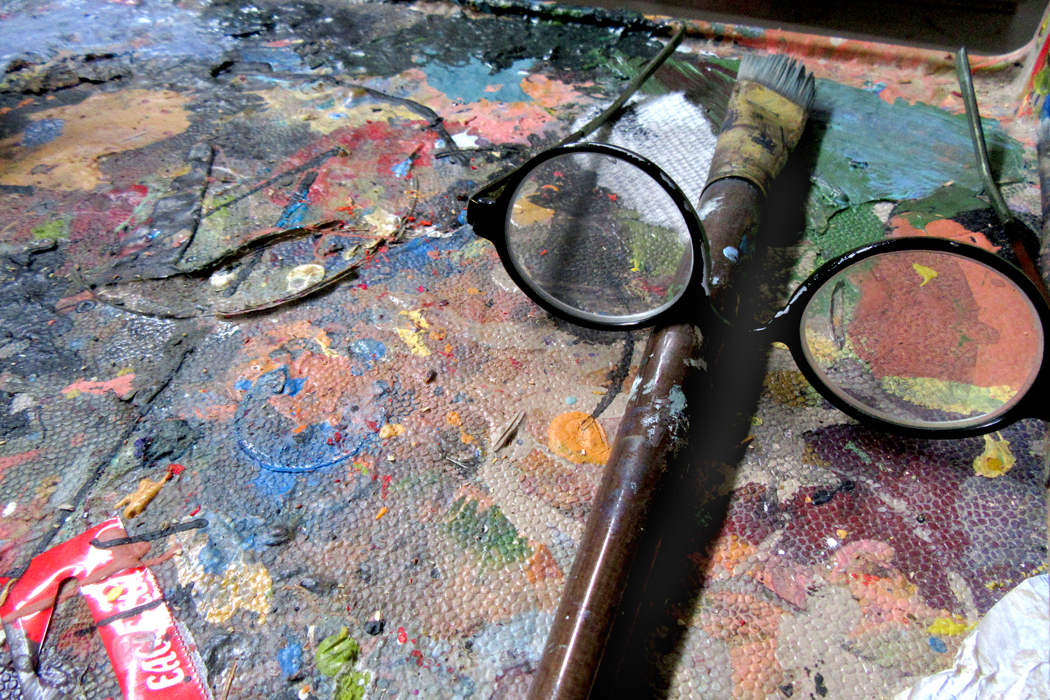
My brother is an artist — primarily a printmaker, but more recently a painter. And while he isn’t terribly prolific, he is constantly drawing. His mind is always coming up with visual ideas and he jots them down. Most never go anywhere, but he just cannot stop himself from playing. It is his way of processing experience: What he sees he transforms.

Lee Friedlander

It reminds me of the photographer Lee Friedlander, who describes his addiction to making photographs as “pecking.” Like a hen darting at cracked corn on the ground, he clicks his camera — peck, peck, peck. Some of the results of his pecking turn into finished photographs he displays in galleries and publishes in books. But there is an improvisatory quality to his work that comes — like a jazz musician woodshedding — from constantly working his instrument.

Among the images caught by pecking, Friedlander will periodically find something he hadn’t considered before, and thus his body of work takes a new direction, constantly refreshing his art.

In part, the importance of this kind of sketching is that it is not art — or rather, not meant as art. It is more the flexing of an esthetic muscle. One can become intellectually paralyzed if all you aim at is writing deathless prose, or painting the museum masterpiece, or composing the next Eroica. Not everything needs to be The Brothers Karamazov. There is great value in just pecking. It keeps your senses alive.
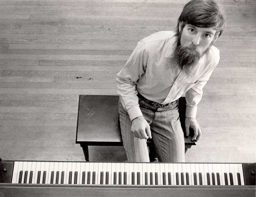
Mel Steele

I periodically visit my brother-in-law, Mel Steele, who is also an artist, a very accomplished artist who regularly sells his paintings to clients both private and corporate.

I often spend a portion of my time doodling — pecking — with my tiny point-and-shoot digital camera. We would sit on their patio talking about the things one yammers on about with one’s relations — old times, where former acquaintances have gone, the horror of recent politics, the joys of fishing — and I would distractedly point my camera around me at the things one seldom notices.

I wasn’t thinking of making art. I barely paid attention to what I was doing with the camera, but I pecked. The result is a kind of notebook of the things we lived among, seen in some different way, so as to lift them from their context, to suck them out of the everydayness they languish in.

 It reminded me of an assignment I used to give my photography students, some 35 years ago, when I taught the subject at the same school where my brother also taught. “Make a photograph of something so I cannot tell what it is.” I made sure they understood I didn’t mean to make it out of focus or poorly run through the darkroom, but to find something we see everyday, but pay so little attention to, that when faced with its presence, we might be baffled until that moment when, the proud student, having fooled us all, tells us what we’re looking at and we all let out a gasp of breath and say, “Of course, now I see it.”

Try it: 

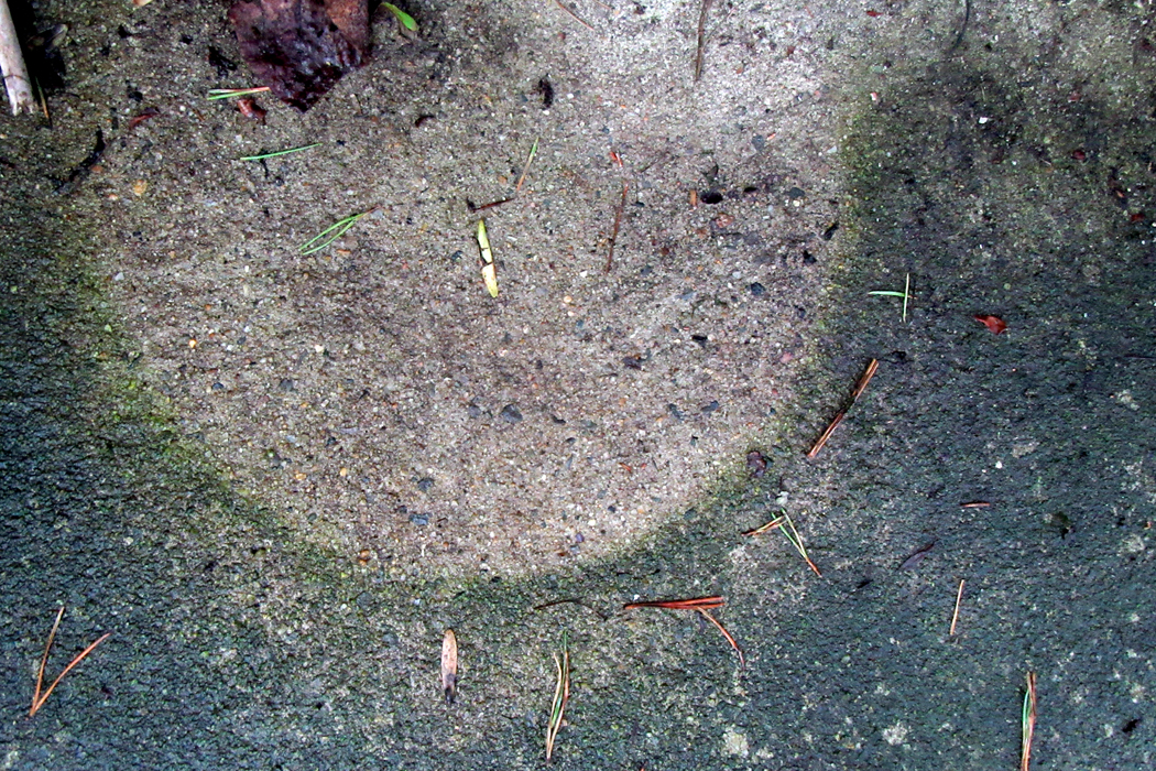
Quiz photo No. 1 (Answers at the end of story)

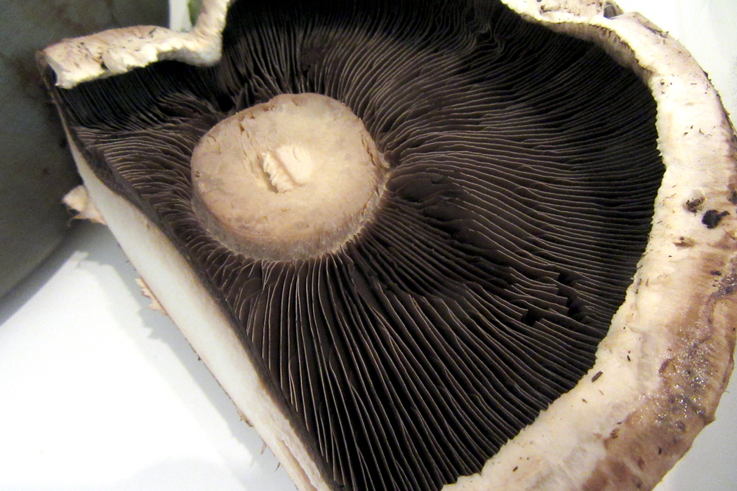
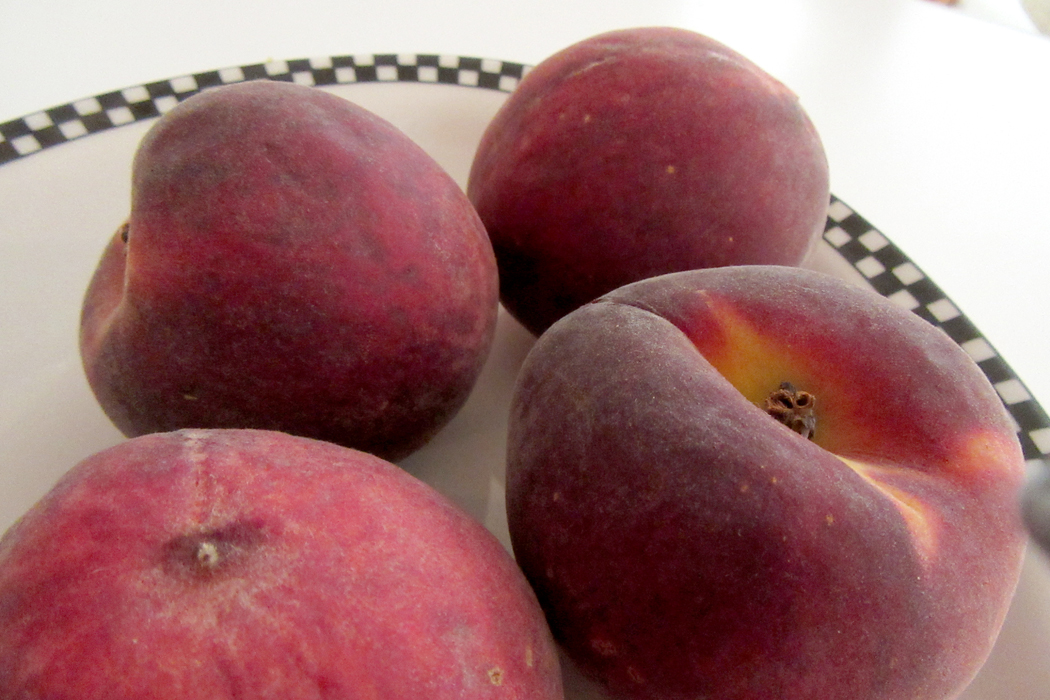
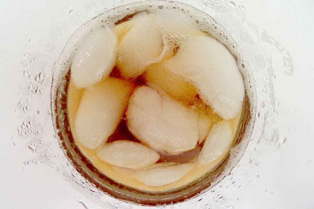
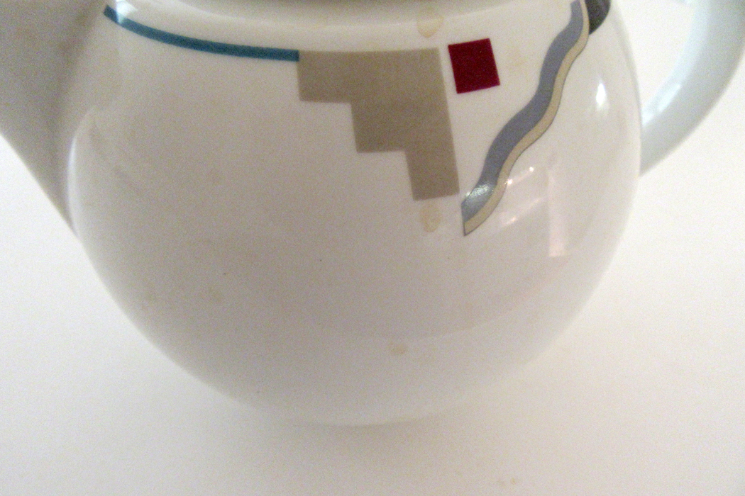
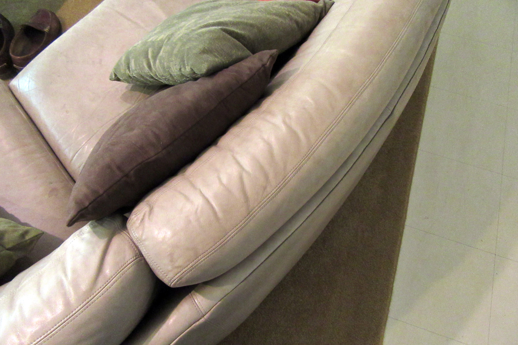
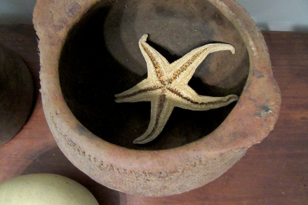
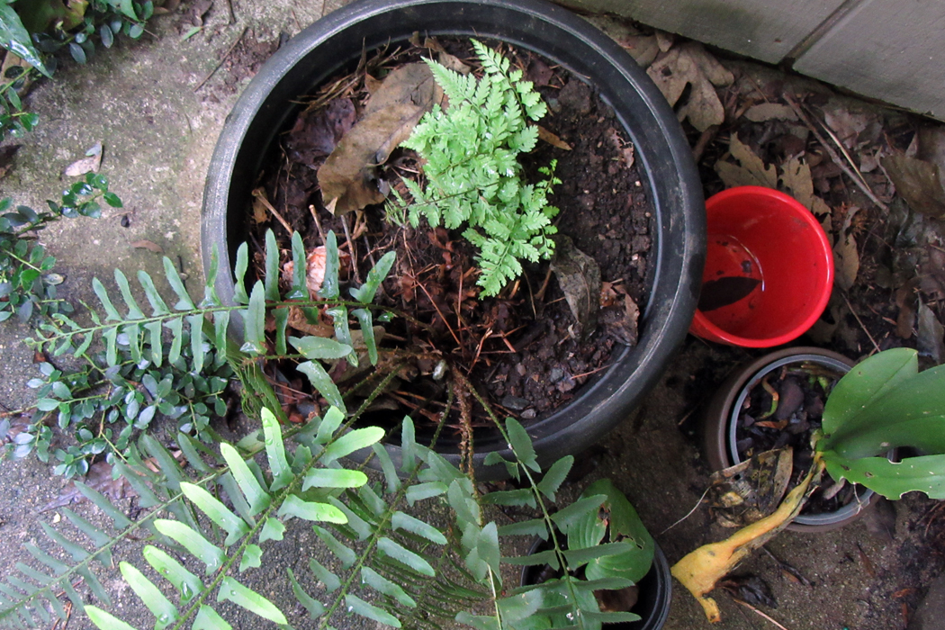
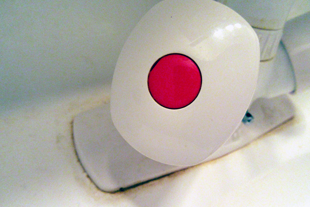
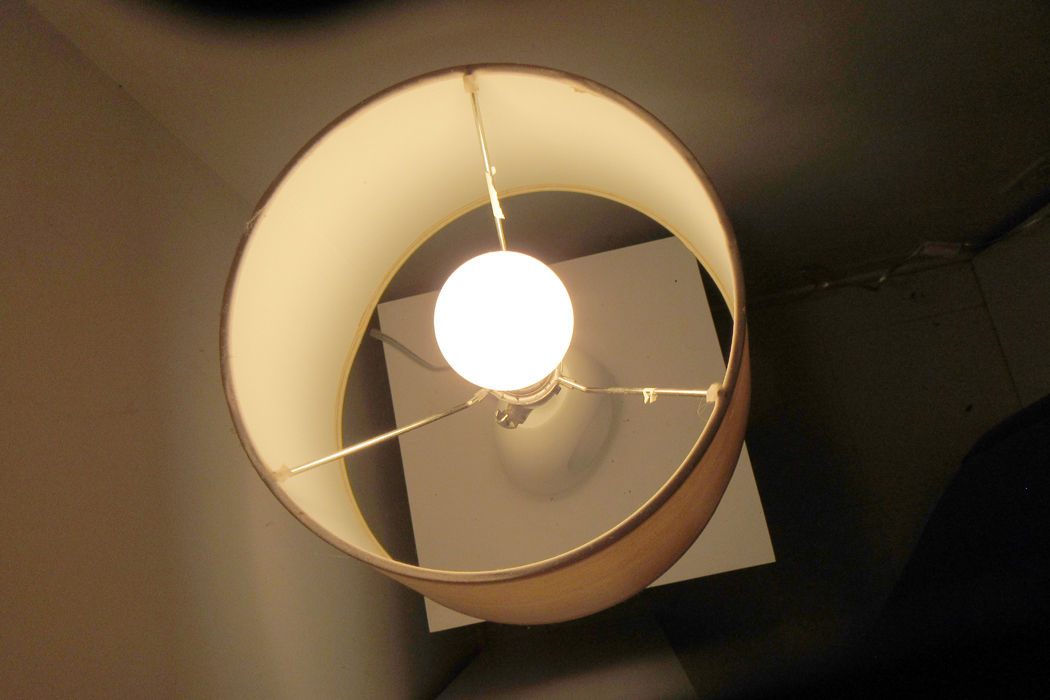
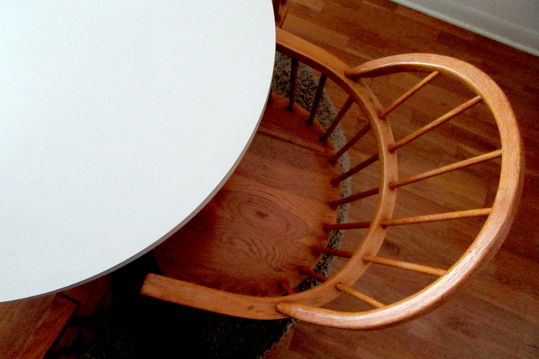
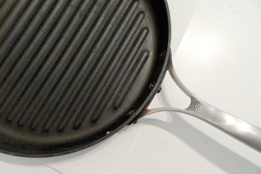
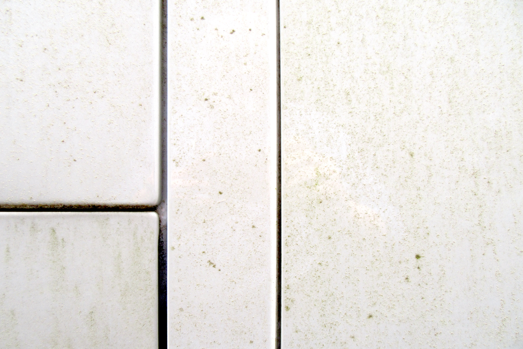
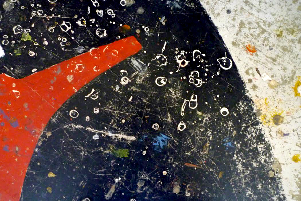
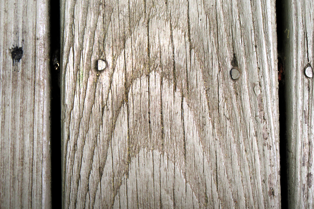
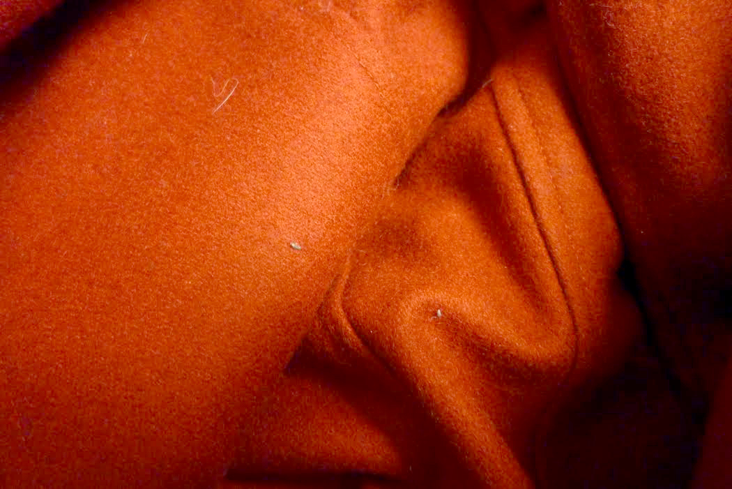
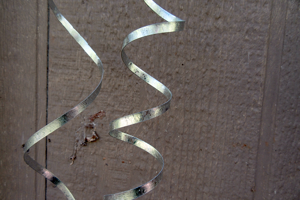
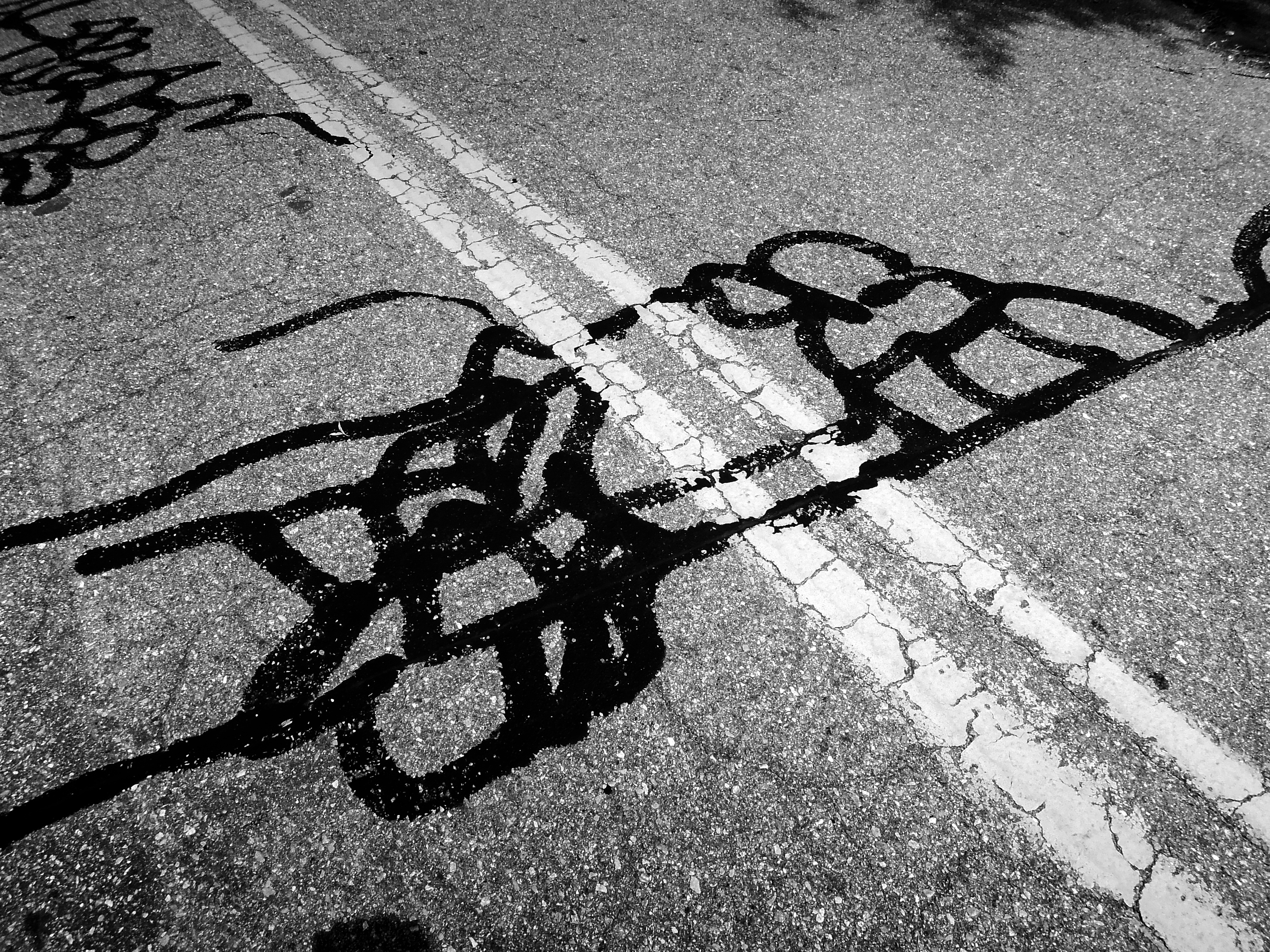
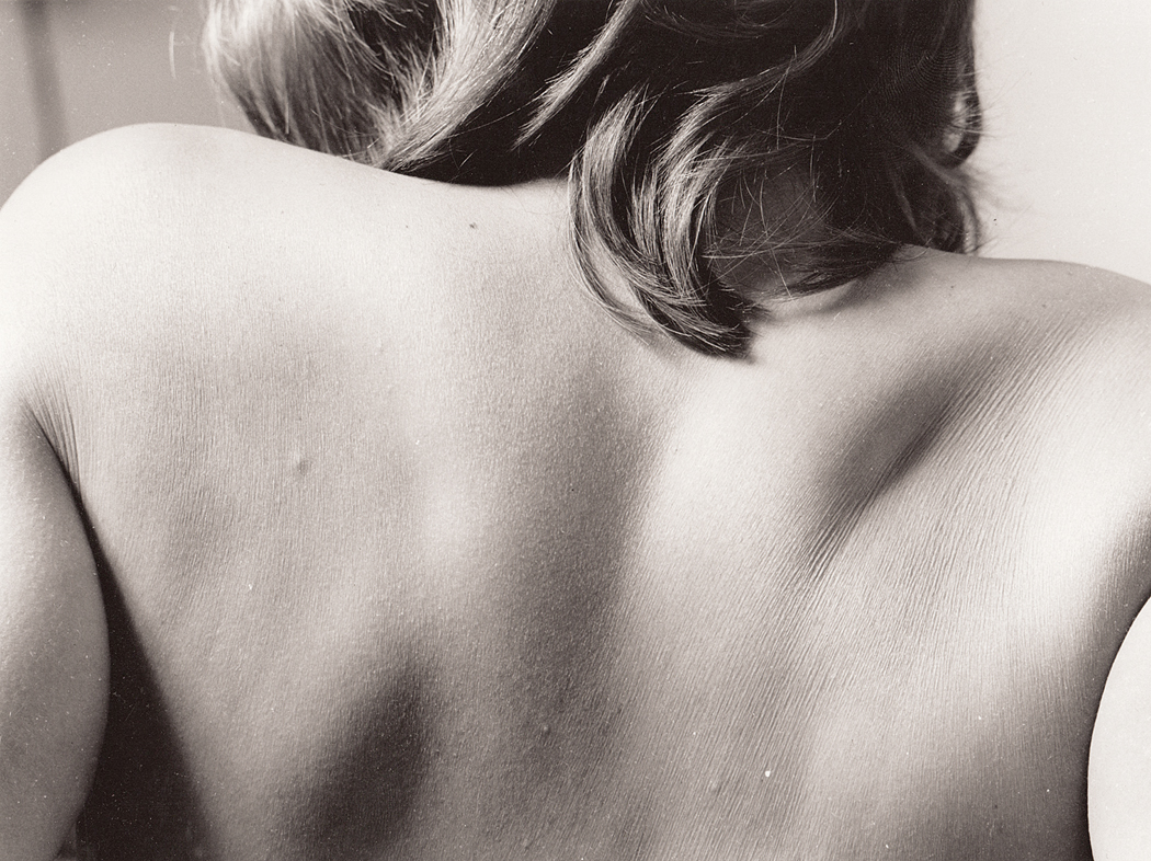
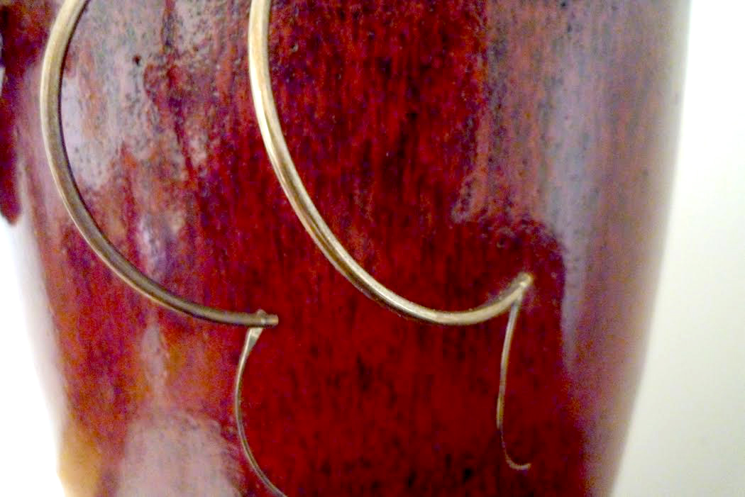
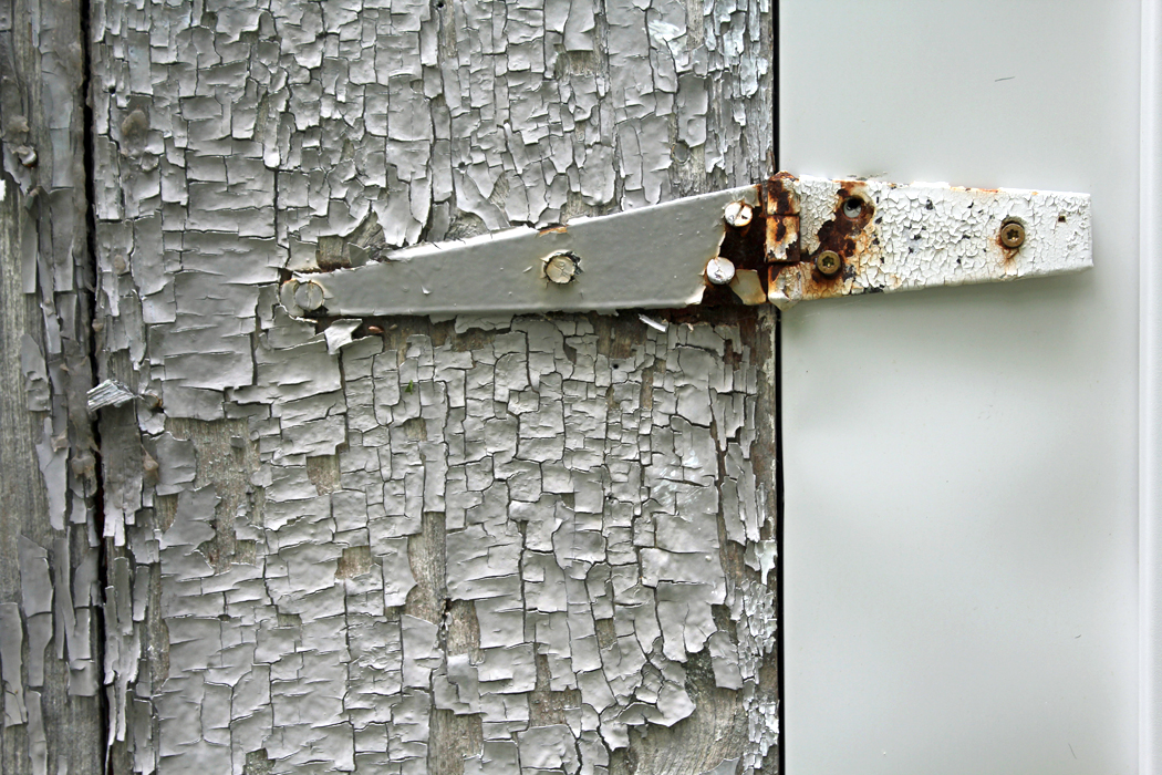
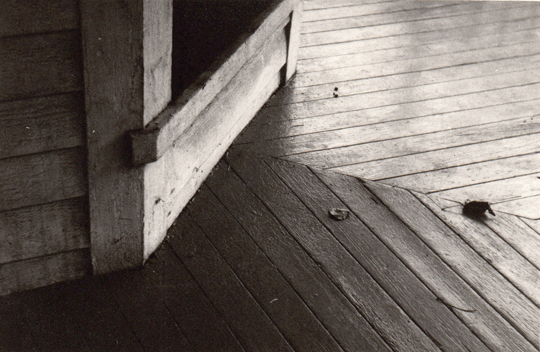
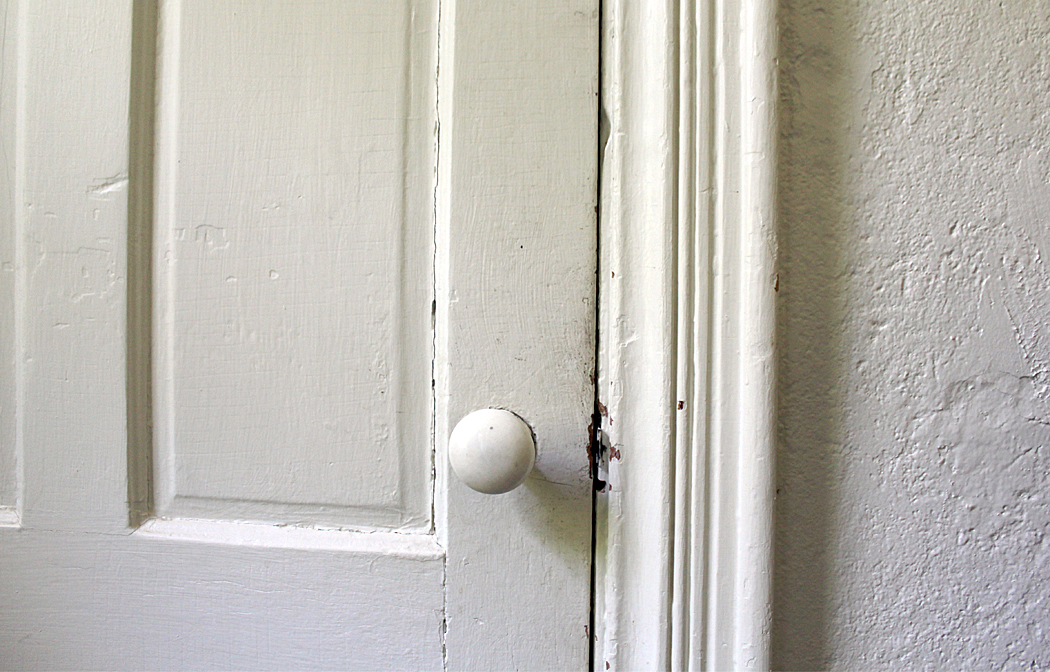
These pecked pictures are mostly details. 
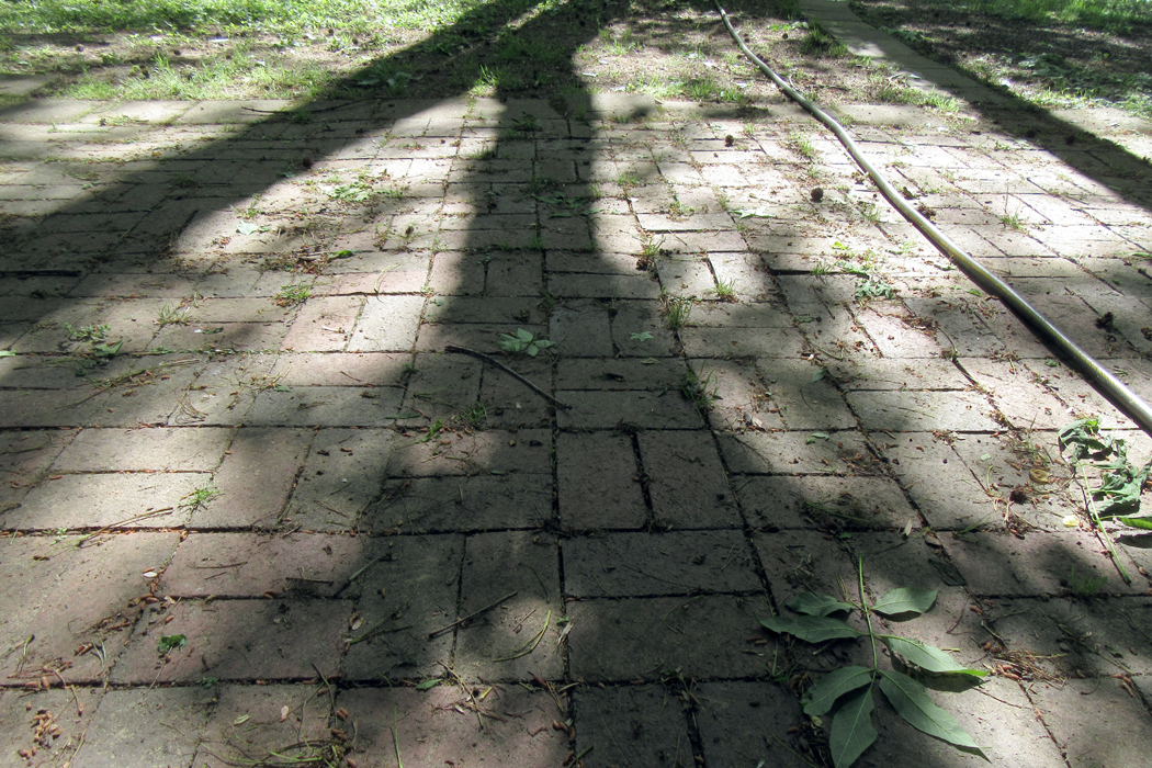
Quiz photo No. 2

They are not the grand view or the concatenated whole, but the tiny bits out of which the larger scene is built. 
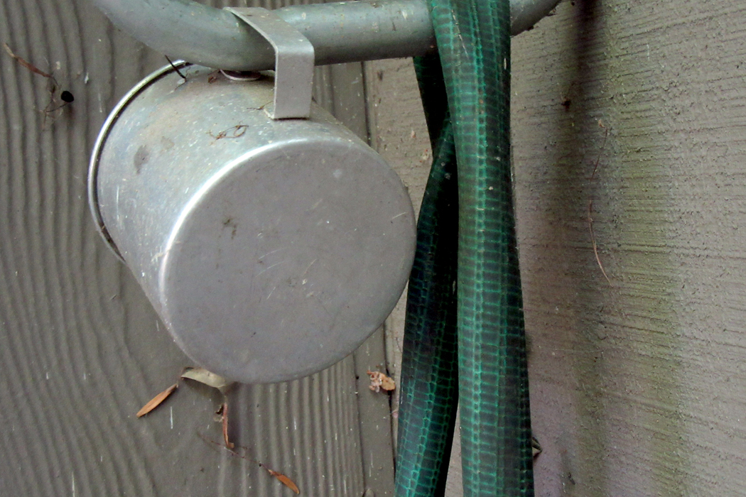
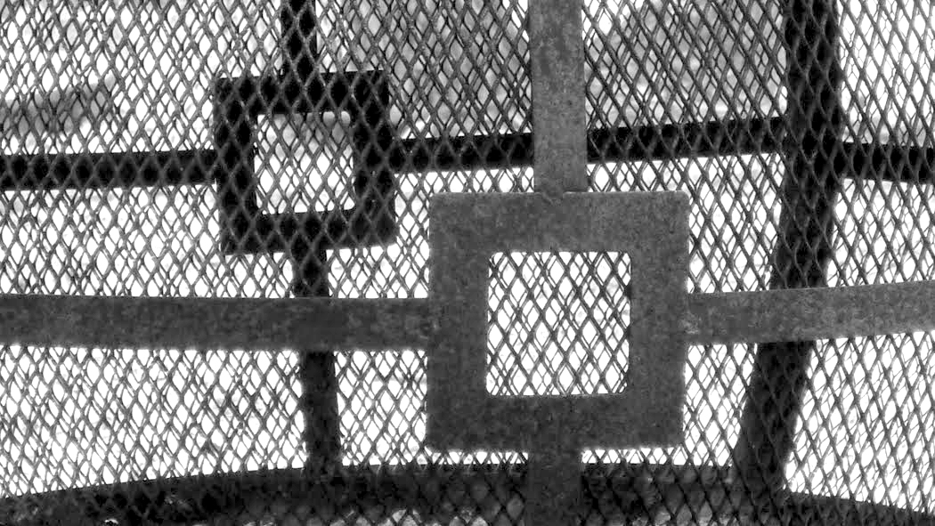
Quiz photo No. 3

Most of us pay attention only to the whole, when we pay attention at all; for most Americans — maybe most humans anywhere — only use their eyes for useful things. They see the road they drive on, the cloud that tells them it will rain, the house, the car, closet. But every house has a door, and every door a door-handle; every car has tires and every tire a tread and each tread is made up of an intricate series of rubber squiggles and dents. Attention must be paid.

Aime Groulx

Many years before, when I taught photography at a private art school in Greensboro, N.C., the artist Aime Groulx, who ran the school, made a photograph he called Doorknob to the Doors of Perception. I still have my copy. It was his version of “pecking.” 

Doorknob to the Doors of Perception

Paying attention to the details means being able to see the whole more acutely, more vividly. The generalized view is the unconsidered view. When you see a house, you are seeing an “it.” When you notice the details, they provide the character of the house and it warms, has personality and becomes a Buberesque “thou.” The “thou” is a different way of addressing the world and one that makes not only the world more alive, but the seer also.

(It doesn’t hurt that isolating detail makes it more necessary to create a design. You can make a photo of a house and just plop it in the middle of the frame and we can all say, “Yes, that’s a house,” and let the naming of it be the end-all. But if you find the tiny bits, they have to organize them in the frame to make something interesting enough to warrant looking at.)

Side panels of a pickup truck

Sectioning out a detail not only makes you look more closely, but forces your viewer to look more closely, too. Puzzling out what he sees without the plethora of context makes him hone in on its shape, color, and texture. It is a forced look, not a casual one.

So, when I gave my students that assignment, it wasn’t just to be clever, but to make them pay attention to the minutiae that are the bricks of the visual world they inhabit. And paying attention is a form of reverence.

The mental view of the world is telescopic. It zooms from the blue watery globe in the blackness of space, down to the map of the U.S., to your state, to your city — each step focusing on closer detail — and then to your street, to your house, to the room you are sitting in to the armrest you are tapping your fingers on, to the hairs on your knuckles. Always more detail. 

Turn from the tapping hand to the floor and see the woodgrain in the flooring, or the ceiling and see the cobweb you had not noticed before. The clothes you are wearing has a texture and a color. The wrinkles in the shirt of blouse are replications of the drapery in Greek sculpture. 

Each of these details is a microcosm, worth looking at — it is your world, after all. What did William Blake write? “To see the world in a blade of grass. And heaven in a wild flower. To hold infinity in the palm of your hand. And eternity in an hour.” 

Or, as he scribbled in annotation to the pages of Joshua Reynolds’ Discourses, “To generalize is to be an idiot. To particularize is alone the distinction of merit.”  

The general is the world of politicians and businessmen, of carnival barkers and evangelists. Dogma, ideology, commercial advertisement, are founded on generalizations, while what genuinely matters in our lives is the particular. It is generalizations that permit the destruction of Bamiyan Buddha statues, the bombing of synagogues, mosques and Sikh temples. The stoning of homosexuals. It is generalizations that lurk behind the Shoah. It was generalization that justified the enslavement of a race of people. 

To know any individual is to know the stereotype is a lie. The world, and its peoples, are infinitely complex and varied. So much so, that no broad statement can ever be anything but a lie. And so, there is actually a moral level to this paying of attention to detail, to the minutiae, to the individual. 

And so, you peck. Finding this bit or that bit, that shape, that texture, that precise color. This is the context of your life. 

You can focus your attention on color. How much yellow is in your field of view at this moment. Look around. Single it out. Or blue. How many different blues can you spot right now? Paying attention is being alive; paying attention is reverence. Attention must be paid. 
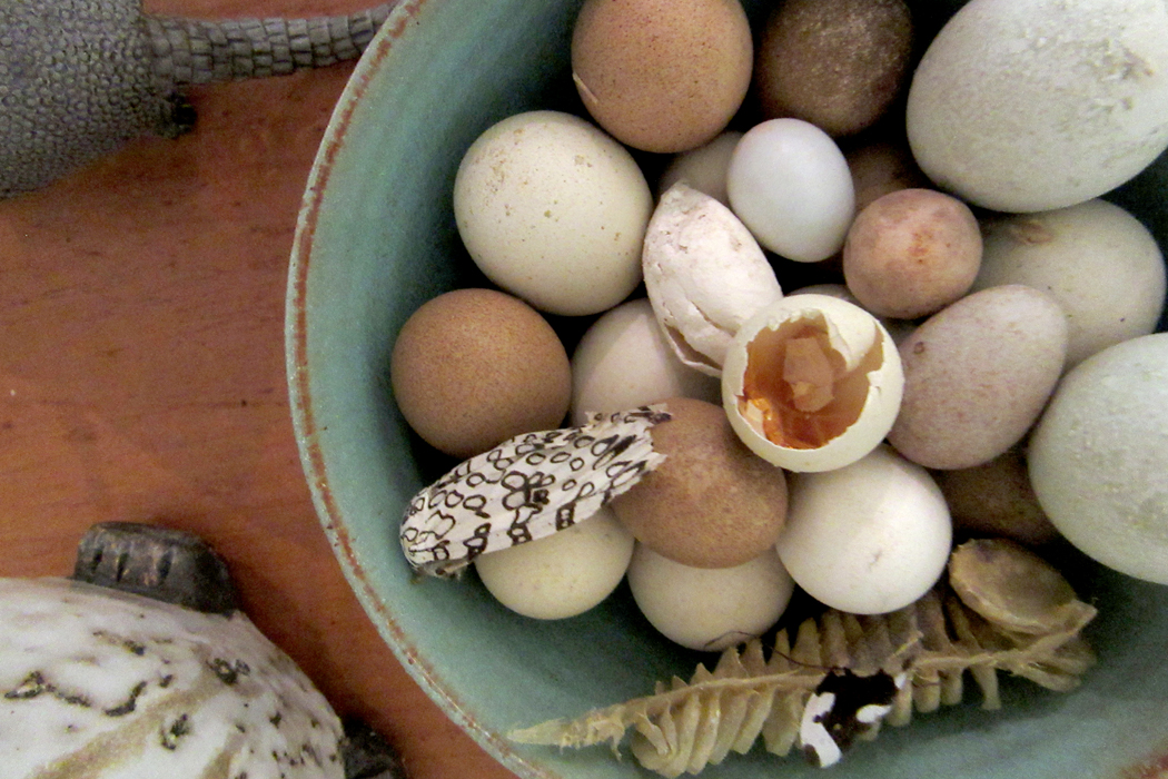
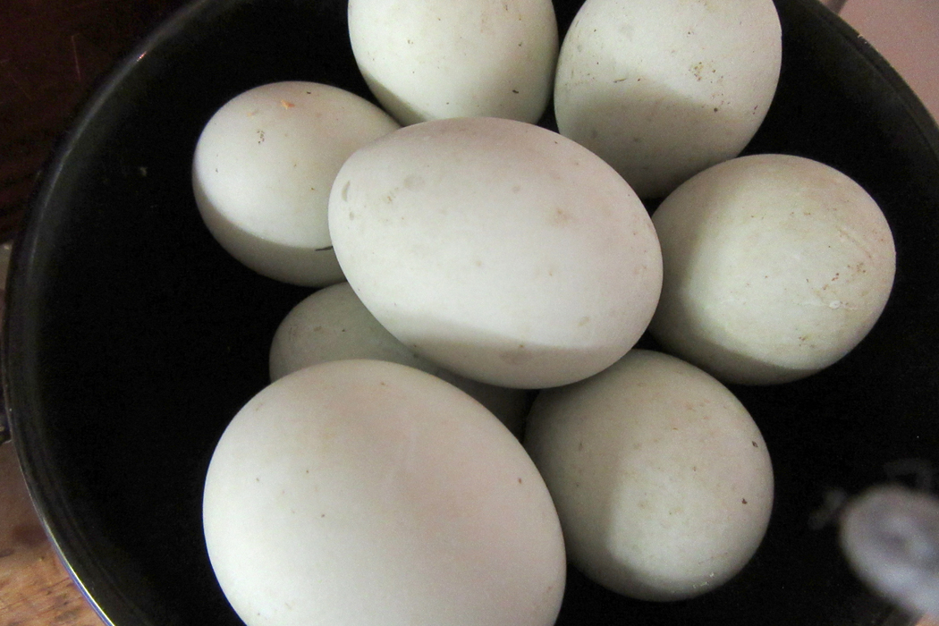
Duck eggs

Your life is not made up of the broad swathes, but of the minute details, and when we pay too much attention to the big picture, we are likely to miss the particles that give that picture its character. 

And when you come to make your art, write your novel, dance your dance, that detail means there is a truth to what you do, a reality behind the fantasy that gives it depth and meaning. 

Exercise makes your muscles strong. Pecking keeps your senses alive and alert. Peck Peck Peck

Click on any image to enlarge

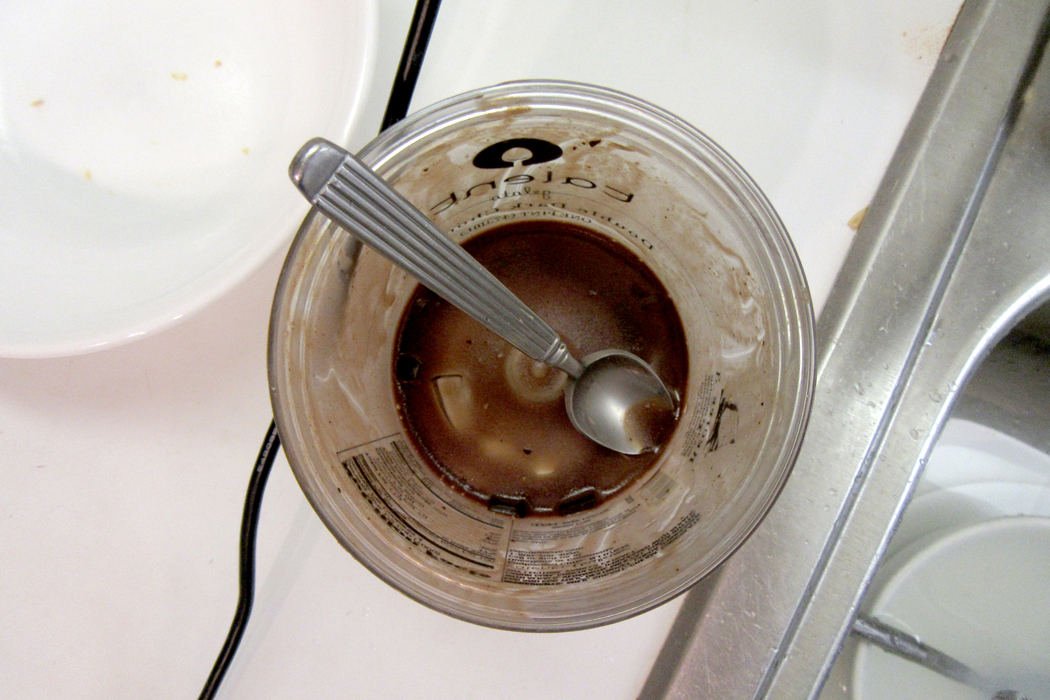
Answers to quiz: No. 1 — the twill of denim jeans; No. 2 — dried coffee stains on a white table top; No. 3 — garden hose on patio tiles. 

Work has become the habit of a lifetime, and a habit is hard to break. So, even though I have been retired for seven years, I wake up each day believing that I must produce something. What is produced is not irrelevant, but it is a minor concern compared with the unswervable drive to be productive.

That is why I continue to write this blog; it is why I keep making new photographs — compelled like William Blake’s Los, forging link upon link of a continuous chain.

Which is why, visiting my friends I cannot help but carry my point-and-shoot around in my pocket and take it out at seemingly random moments to point and shoot. Each visit I make, a theme arises, unbidden but clear. One visit, I photographed ceilings and floors — it is amazing how much I could find there. (Link here).  It is in these details that I find design: and it is the design rather than content that tickles my eye. (Link here). 

But that doesn’t mean content doesn’t count. This visit I began photographing randomly, as I do, making pictures of their cats, of birds, of the woods behind the house. But more and more, my camera kept finding circles. Circles, curves and arcs. 

It seemed as if one of the marks of human industry is the circle. Nature allows few of them, choosing a great deal more vertical and horizontal lines, such as trees and horizons. But the circle is human; it is idealized. 

Throughout the house, I kept finding them, in pots, in lamps, in clocks, dishes and sculptures. Round is an idealized form, almost Platonic. Industrial. 

Certainly, I remembered the Zen ideal of the enso, or circle, which is drawn swiftly with the sumi brush, in a single swish, or perhaps two. It is often incomplete, and usually scruffy with brushstroke. It is meant to symbolize enlightenment, but also the great emptiness of the universe. It is an expression of the Japanese esthetic ideal of wabi-sabi, or the beauty of imperfection, incompleteness or impermanence. 

It is very different from the Western concept of the ideal, or perfect. A perfect circle is difficult to draw freehand. The Greek painter Apelles once left a perfect circle on a wall in the home of his rival, as proof that he had been there.

More famously, the Italian Renaissance painter Giotto, when tasked by the Pope to demonstrate his mastery, scribed a perfect O in red paint. 

A Canadian math teacher from Ottawa, Alexander Overwijk, once made up a story of winning the 2007 World Freehand Circle Drawing Competition in Las Vegas, as a means of getting the attention of his students. (The fiction went viral, and you can find it all over the internet, as if it were real). He was able to draw such a circle on the blackboard for his class. (Link here). 

But perfection is boring. It is abstracted from the real world, a world of imperfection, incompleteness and impermanence. The real world has jagged or fuzzy edges, it is left perpetually unfinished, it is ambiguous. 

As I moved about the house, I kept finding not only circles, but curves and arcs, the incomplete circles. 

The 18th century philosopher Giambattista Vico wrote of the historical cycles of recurrence. Time, he implied, was not a straight line, but a circle. We see these cycles and epicycles in our own lives, inarticulate as infants and incoherent in old age dementia. Our lives recapitulate in our children’s lives, as ours recycle those of our parents and grandparents. 

Weeks cycle through from Monday to Monday, months from January to January. The clock on the wall from noon to noon. 

In Finnegans Wake, James Joyce begins the book with the end of a sentence that began at the finish of the book, “bringing us by a commodius vicus of recirculation” to the ouroboros of time and history — and the story. 

William Butler Yeats, in his A Vision, gives another version of the cycles of history, which in his case is paired with the phases of the moon. In Vico’s version, history has four stages; in Yeats, there are 28 phases. 

(The moon is one of those few natural circles, although, it should be pointed out, it is only perfectly round once a month. A second natural circle is the eye’s iris, from which I see the circles I photograph.) 

“In my beginning is my end,” wrote T.S. Eliot in East Coker — one of his Four Quartets. “In succession houses rise and fall, crumble, are extended,/ Are removed, destroyed, restored, or in their place/ Is an open field, or a factory, or a by-pass.”

“In my end is my beginning.” 

Round planets circle round suns; Shakespeare’s Puck promises he “will put a girdle round about the earth in forty minutes.” Now a moon named Puck circles the seventh planet of the solar system. 

As I continued to make pictures — and I wound up with 97 of them over a four-day visit — they tended to diverge from the circle to the arc, finding that incompleteness more interesting visually. The arc implies rather than states. It suggests; it doesn’t insist. It is metaphor, not fact. 

Curves are human, they are sensuous. Straight lines and squares are the stuff of Procrustes, something we overlay on the natural roundness of delight to pretend there is something schematic about the world, something we can graph and diagram. Something we can make use of. 

But the curve gives us motion, change, the complexities of the calculus. It is Ovidian, not Platonic. It is pleasure; it delights the eye. In the eternal battle between mind and body, the body has all the fun. The mind is a doughty schoolmarm. 


The metaphor is real. My wife died two years ago and now I am meeting my ex-wife again, after 50 years.

And so, I keep finding these circles and arcs, these bows bending like the curved universe Einstein posited. They delight me. 

Click on any image to enlarge

How do you hold up a roof?

Seems like a simple question: Walls hold up a roof. And if your roof is heavy and two or three stories up? A stronger, thicker wall.

This is the problem faced by the builders of European churches in the 11th and 12th centuries. With those thicker, stronger walls, windows became a problem because they weakened the walls with holes, which meant that the churches had small windows and were rather dank and dark places to worship the Creator.

When we are taught about Romanesque and Gothic cathedrals in our art history classes, we are usually given a list of characteristics they have: round arches for Romanesque; pointed arches for Gothic: thick walls for Romanesque; flying buttresses for Gothic: barrel vaults for the Romanesque;  rib vaults for the Gothic — as if the shift from one to the other were merely a catalog of stylistic tics and the change from one to the other nothing but a change in fashion, as if giving up pegged trousers and taking on bell bottoms.

Why would it be important for art history students to spend this much time on something so old and arcane? Our professors always seemed to think this was such a profound change and worth a week of class time. We couldn’t wait to move on to Impressionism.

It was never made clear in class why it would be important for us students to know these things: buttresses, rose windows, naves and aisles, apses and choirs. These cathedrals were in Europe, not America.

But the change from Romanesque to Gothic should not be seen as merely a change in styles, but as a major innovation in architecture whose results led to the glass and steel skyscrapers that populate all our cities. The Seagram Building in New York is merely an extension of the ideas behind Chartres cathedral.

What happened was (for reasons I will get into in my next blog post) someone figured out you didn’t really need walls to keep a roof up. You could, like a picnic pavilion, support the roof with posts, leaving the space between the posts open. And, if you build a church this way, you can glaze the open spaces with colorful glass and let inspiring light into the interior of the church. Wow. In an instant, churches became lighter, both by weight and by illumination. What had been dour and forbidding became bright and inviting.

Perhaps the most dramatic example of this is the small royal chapel built on the Ile de la Cite in Paris between 1238 and 1248. While it is tiny in comparison with the big cathedrals, such as Notre Dame or Reims, it is a glory of glass. Its walls are explosive with color and light.

If you were to stand in the middle of Ste.-Chapelle and gaze up at the ceiling, you would see that the ceiling and roof are supported by a cage of stone pillars, between which are cascading sheets of stained glass. When you realize that such roofs are made primarily of lead or slate, you realize how heavy it must be, and how brilliant was the engineer who figure out how to keep it up with only these spindly supports.

This is the genius of Gothic architecture. Follow its logic out to the 20th century and you understand that you can make a skyscraper with a cage, not of stone, but of steel, and glaze the open areas and let light into every one of the 40 or 50 stories of office space. In some sense, the International Style — all those glass-and-steel towers that define our urban architecture — are really just a further refinement of the Gothic breakthrough.

Ste.-Chapelle was built for King Louis IX, later known as St. Louis, as his private church on his palace grounds. It was meant to house a series of holy relics he had bought, including the supposed “crown of thorns” Jesus had worn upon his crucifixion, and a piece of the “one true cross,” of which there were a whole woodpile scattered across Europe. These relics were held in great esteem. Louis wanted a home for them that would honor their importance with great beauty and wealth, and Ste.-Chapelle is the result.

Louis spent 40,000 livres on the chapel, but nearly four times that in buying the relics from the cash-strapped Byzantine emperor, Baldwin II in 1239. The chapel was built to hold the relics and finished in record time.

Ste.-Chapelle is 118 feet long and 56 feet wide, but more importantly, 139 feet high. Above that a spire of cedar wood extends another 108 feet. (The current spire is a 19th century replica, designed after the 15th-century spire. It is unknown if the original chapel had a spire).

The church is a two-story affair, with the lower level once reserved for the royal staff and servants, while the upper level, with its grand windows, was for the king. He had an elevated walkway built between the palace and the chapel’s second floor so he never had to descend to ground level with the hoi-polloi. The palace is largely gone now, replaced with the bureaucratic buildings of the Paris metropolitan police force, but Ste.-Chapelle remains on the grounds, surrounded now by parking lot.


You can see how it once sat, in the illuminated manuscript of the Limbourg Brothers, made in 15th century and known as the Très Riches Heures du Duc de Berry.

Today, there are lines waiting to get in to see Ste.-Chapelle. You walk through security and through the parking lot and into the ground floor chapel, where the fleur-de-lys seems to be painted everywhere in gold. It is a stunning space, even if its ceilings are low. The paint is bright and colorful. The staff wasn’t cheated; the lower chapel is plush and beautiful.

But then, you walk up the stone staircase to the main floor and it is as if the heavens open up above you. The glass, the color, the light: They stun.

In 1323, the French writer Jean de Jandun wrote of Ste.-Chapelle in his Tractatus de Laudibus Parisius, “The most excellent colors of the pictures, the precious gilding of the images, the beautiful transparency of the ruddy windows on all sides, the most beautiful cloths of the altars, the wondrous merits of the sanctuary, the figures of the reliquaries externally adorned with dazzling gems, bestow such a hyperbolic beauty on that house of prayer, that, in going into it (from) below, one understandably believes oneself, as if rapt to heaven, to enter one of the best chambers of Paradise.”

While it is true that Ste.-Chapelle was restored in the 19th century, its restorers attempted to be exceptionally faithful to the original. And while most of the paint is more recent, a full two-thirds of the windows are original 13th century glass. The remaining panels replace glass removed when the chapel was used as a government records archive after the French Revolution.

The glass in the nave tell primarily Old Testament stories, in the apse the glass covers New Testament stories. The 15 stained glass windows, each more than four stories high, depict 1,113 scenes from the Bible in 6,458 square feet of glass.

The great Rose window is a replacement from 1390 when the original window, in Rayonnant style (as seen in the Très Riches Heures), was updated into the then-current Flamboyant style, with its curlicues and circles.

The tympanum painting above the king’s doorway is a recreation, but in the style of the original.

The designs in the floor are wonderfully graphic.

The columns and walls are brightly painted.

All this color, light and throat-grabbing beauty is understandable on esthetic terms, but its purpose was more than to be pretty, or even awesome. The philosophical momentum behind the architectural advance will be discussed more thoroughly in the next blog, about the basilica of St. Denis.

Click on any image to enlarge

Next: St. Denis

???????????????????????????????

I began seriously reading in high school, mostly contemporary fiction. I don’t remember what I could possible have made of Saul Bellow’s Herzog at the age of 16, but there it was. I followed that with Seize the Day and The Dangling Man. I read James Purdy, James Drought, Jules Fieffer, Hubert Selby Jr., Thomas Pynchon, Terry Southern, Albert Camus, and, ahem, P.G. Wodehouse.The Secret cover

Jack Kerouac, Brendan Behan, William Golding, Kingsley Amis, Eugene Ionesco, and of course, J.D. Salinger. I was a teenager, after all.

Quite a load of words for a high school student. I doubt I understood a tenth of what I read, but I couldn’t get enough.

There were a few “classics” thrown in, some required reading for school, but it was primarily new fiction I read — almost all of it over my head.

And almost all of it in paperback. There was a rack of paperbacks in the local drug store, and I would pore over them after school, looking for the latest Bellow or Updike.

return of the native airmontAnd then, there was Thomas Hardy’s Return of the Native, which was required reading in 8th grade — why, I don’t know. But I had the hardest time plowing through it. It seemed dense and impenetrable. I got bored. I couldn’t finish it.

Over the years, there were other books I had a hard time reading. The sense was always the same: They were uninviting; they were dense; they were difficult to read. I lost interest in them and didn’t finish them.return of native page

It was only years later that I realized the problem was not with the writing, it was with the printing: The cheap paperback edition of Return of the Native was really horribly designed: grey type, insufficient leading, narrow margins, bad, under-inked offset printing on grey or yellowed paper.

The problem was not with Hardy, the problem was not with me, the problem was with Airmont Classics, the paperback publisher. They had skimped on book design and created a brick.

Last week, wandering through the shelves of our local used book store, I found a copy of that noxious tome. As I began reading, I realized what a magical writer Hardy really could be. Now that I’m more mature — actually a geezer — I had a bit more patience than I had as a teenager, and I could manage to cut the furze, as it were, of the wretched typography. It is still a dank and uninviting book to look at, but I nearly cried at the opening paragraphs, as Hardy describes that particular and exact time of day and time of year when you can look down at dusk and the ground has lost any visual contrast; it dulls into the gray of evening — but if you look up, the sky is still bright. It is like that Magritte painting, only not meant to be surreal, only beautiful.magritte

“A Saturday afternoon in November was approaching the time of twilight, and the vast tract of unenclosed wild known as Egdon Heath embrowned itself moment by moment,” the book begins.

“Overhead the hollow stretch of whitish cloud shutting out the sky was as a tent which had the whole heath for its floor.

“The heaven being spread with this pallid screen and the earth with the darkest vegetation, their meeting-line at the horizon was clearly marked. In such contrast the heath wore the appearance of an installment of night which had taken up its place before its astronomical hour was come: Darkness had to a great extent arrived hereon, while day stood distinct in the sky. Looking upwards, a furze-cutter would have been inclined to continue work; looking down, he would have decided to finish his faggot and go home. The distant rims of the world and of the firmament seemed to be a division in time no less than a division in matter. The face of the heath by its mere complexion added half an hour to evening; it could in like manner retard the dawn, sadden noon, anticipate the frowning of storms scarcely generated, and intensify the opacity of a moonless midnight to a cause of shaking and dread.”

What had I missed over the years by thinking that certain books were dull, when it was only the visual aspect of their presentation that had discouraged me?aeneid

I remember trying my damnedest to shoulder my way through C. Day Lewis’ translation of The Aeneid. Whoever designed that paperback managed to use a page too small to hold the average length of a line in the font size he chose, meaning that almost every other line wrapped to the next line, flush right, giving the text a kind of visual hiccups, making a very ugly page that was nearly unnavigable. It put me off Vergil for decades.

By-and-large, it is paperbacks which are the greatest offenders. Designed to be cheap — which we appreciate — they are also designed to fit as much type onto a page as possible so as not to waste space or paper. Type is small; leading is squished; margins are narrow. To say nothing of the quality of paper used and the ink rolled on.

It isn’t merely a question of type size. Some large-type books are hard to read, and some with tiny text are easy. The issue seems to be the length of the line: Small type on a small page is fine, but spread that line out over a wide page and the eye tires before turning down to the next.

walden 1One of the prettiest books I own is a copy of Walden from the Heritage Club, published in 1939, with wood engravings by Thomas W. Nason. It was proud enough of its look to credit its designer, Carl Purington Rollins. I believe every book should credit its designer: A good design makes a book better; a bad design deserves blame.

Although it is printed in 8-point type, the page is compact, and the margin wide enough that the print-line is never too wearying.

One of the things that makes this Walden so attractive is that it was printed with lead type, not run off an offset press roller.

There are so few who still get pleasure from the look and feel of ink on paper — especially the tender and slight embossment of lead type dug into the fiber, and the ink laid there in the troughs. The soy ink now used flat on offset printing seems so one-dimensional. I have a two-volume Milton printed in 1843 that is as beautiful to look at as to read, as beautiful as a Piranesi engraving or a stained-glass window.milton 1

The question is not one merely of what typeface is chosen; some books are overly “artistic,” with fancy fonts and eccentric spacings — all of which make the book harder to read. What makes it all work is a typeface that is neutral enough not to call attention to itself, but not so dull as to be banal. No one want a whole book wearing Times New Roman like fishscales — you want to take the back of a knife to it and scrape it clean.

No, the question goes beyond type: It is a question of air between lines and around the text. It is a question of the darkness of the type — the heaviness of line in the drawing of the letters. It concerns the break of chapter and the intent of the paragraph: Neither too much nor too little.

And yes, this is a matter of taste, not of metrics: What is too much or not enough? The answer requires not a rule, but an awareness: awareness of the physical properties of the page and its contents. Most of us are unaware that books even get designed, unaware that there was a choice made in type, margin, leading, initial capitals, weight and brightness of paper stock, the deckling or smooth cut of the page edge.

Americans are often chided (and most often by themselves) for being too materialistic. But this simply isn’t true: Americans are not materialistic enough — they have little sense of the material world. The acquisitiveness that infects our nation has more to do with the non-material quality of status than with any love of the sensuous world we inhabit. One might say it is a “spiritual” value, not a material one. Certainly a tedious and unworthy spiritual value, but not in any way truly materialistic.kindle

So, it is hardly surprising that we now do so much of our reading on electronic gadgets. One might say one has become one’s own book designer, since one can choose certain visual parameters on your iPad or Kindle. But aside from enlarging the type for easier reading as we venture into the world of presbyopia, few take the chance to actually “design” the presentation on their e-reader.

And as a writer of a blog, I am frustrated by the fact that no matter how I try to make my text look on the computer screen, when it reaches your screen, it is your default choices that govern its looks as you read it. We have cut out the middle man — cut out the book designer, who can make my writing fun to read or a trial to machete through.

Maxim Gun

Nobody writes epigrams anymore, and we are the worse for it. Instead, they are too busy writing Tweets. The difference? A Tweet says in 140 characters what no one needs to say. An epigram says in a few short words what can be unfolded and stretched out into a book: It is a seed waiting to sprout in the mind of the hearer. A Tweet goes everywhere in the world, but goes nowhere.

A Tweet is flaccid and generally pointless; an epigram, or maxim, is a gun that fires rapidly.

La Rochefoucauld

La Rochefoucauld

I love rambling through such terse cynics as La Rochefoucauld, and I eat up the ”eternity in a phrase of glass” of Ralph Waldo Emerson and the punchy paragraph perorations Henry Thoreau.

I don’t claim to be any Martial, but over the years, I’ve squeezed out a few. Here are some, strung together and pretending to be pearls:

–› Curiosity is the libido of art.

–› Art doesn’t come from the brain; it comes from the base of the spine.

–› I don’t want to know an artist is clever; I want to know he is more alive than me.

–› We need to know that the moments of time are connected to one another and are not merely adjacent.

–› Meaning depends on ambiguity. The more precise a word is, the less it describes.

–› You can forget knowledge; understanding changes your life.

–› It is the conservative’s impotence that he can only react, never create.

–› Ultimately, what counts is not the wisdom of Solomon, but stories of that wisdom.

–› Design is your awareness of everything in the frame.

–› Western art is really a branch of physics.

–› Art history is fine for the historians, but the rest of us must watch not to be hit by the flying debris.

–› Reality is no excuse.

–› What you know prevents learning.

–› There can be no great beauty that doesn’t know tragedy.

–› There are those for whom the world is rote. For whom knowledge is an orderly collection of facts, not the experience of understanding. For whom a set of rules prescribes behavior and describes art, music, politics, commerce. They are the managers, the commissars, the education reformers — for them, the planet turns on a dry axle.

–› To the degree that you use someone else’s words to express yourself, to that degree you don’t understand what you are saying.

–› The difference between a commercial artist and a fine artist is that a commercial artist knows what he is doing.

–› Art is the discovery or creation of meaning and order from the chaos of perception and experience.

–› The artist knows that 1 plus 1 equal 3. There is the one apple, the other apple and the two together.

–› Art is not a product; it is a byproduct.

–› A fact is a fragment, a truth is a wholeness.

–› Science is the test we give to hard facts, art is the test we give to everything else.

–› Art makes you aware that you are alive. That is not always very pleasant.

–› Art worth remembering is art that tackles knotty problems. Everything else is wallpaper.

–› Entertainment diverts us from the cares of life; art makes us feel alive. The two things are opposites.

–› Design is not a set of rules, it is a level of awareness.

–› All the questions that matter are insoluble.

–› Civilization is an irrational fear of the irrational.

–› Art creates civilization, not the other way around.

–› Everyone asks questions; intellectuals ask questions about the questions.

–› Opposites do not exist in the world separate from the language that describes them.

–› One end of the cigar is lit, the other is where we draw smoke. We call the two ends opposites, but there is only one cigar.

–› You can teach knowledge, but understanding has to be learned.

–› Aesthetics is the use of large words to describe what you can feel in your fingertips without any words at all.

–› Everything changes, said Heraclitus. Nature is a verb; a noun is only a parking space.

–› All art is regional art; New York City is a region, too.

–› A Truth is never probable.

–› A Truth satisfies an inner need for order.

–› It’s not what you know, but what you are willing to be aware of.

–› Words are the smoke screen art attempts to penetrate.

–› You must look at art longer than you can stand.

–› Boredom is an essential part of the art process, for artist and viewer alike.

–› Art starts out with only one belief: that the intuitions and emotions of the artist are valid. Period.

georgeb&w

The dollar isn’t what it used to be.

I’m not talking economics here; I’m talking esthetics. And actually, the dollar bill is about the only one that actually IS what it used to be. The U.S. mint and the Bureau of Engraving and Printing have redesigned most of our money in ways that show a miserable falling off in design and execution.

Our $5, $10 and $20 bills and our coins have suffered a severe drop in quality when considered as art.

Yes, money is art, whether it’s the engraving that makes up the bills or the bas-relief sculpture on our coins. There are long histories in both as art mediums, from the intricate lozenge-and-dot portraits of the 17th and 18th centuries and the commemorative medallions struck from the Renaissance on.

But craftsmanship at the mint and at the Bureau of Engraving and Printing has declined precipitously, leaving us with wallets full of bad art. This wouldn’t be so noticeable if the older coins and bills hadn’t been so beautifully made.

Look at an old bill, before the anti-counterfeiting “improvements” of the 21st century. Not only are the portraits more lifelike — there’s a personality behind the eyes in Grant’s picture on the $50 bill — the designs also are fuller, more detailed and graceful, full of trailing acanthus and olive leaves.

The vegetative growth and architectural motifs that used to grace our bills announced our national fecundity. We were a waxing moon, a rising tide. The scrollwork and border ornament recalled the inventive bustle of the Renaissance.

fivescrollcompare

The new bills, full of iridescent ink, microprinting and watermarks to discourage counterfeiting, are defensive and speak of a nation feeling the need to protect itself. There is no room now for the purely ornamental or decorative profusion of the old designs. Everything there has a purpose, stripped down like some typographic battlement.

twentyreversea

Genuine beauty comes from an effusion of confidence and grace; in contrast, our new bills look as though they were designed by forensic engineers.

Even worse are the newer coins, which look less like legal tender and more like tokens at a state fair. Or perhaps you catch yourself trying to peel back the foil to eat the chocolate inside.

The portraits on them are an embarrassment — one observer noted that the frontal portraits must have been “zombie presidents.”

One problem is that the coin designers have chosen to represent the faces not in profile, but head-on. It’s hard to make a shallow relief sculpture of a full face without having the nose stick out too much. The new coins try, but because they have to be flat — after all, they have to stack — the nose gets squashed flat into the cheeks, and the eyebrow ridge stick out as much as the nose. Hence the zombie look.

Looks not important

Madison looks more like Count Olaf in the Lemony Snicket movie than a founding father. Jefferson has an eyebrow ridge like Frankenstein’s monster.

madison snicket

The “Return to Monticello” nickel is just as bad, with its oddly squished portrait of Jefferson, off-center on the coin’s front.

The problem is that the rationale for changing the design is conceptual, not visual.

As Edmund Moy, most recent director of the U.S. Mint (resigned in 2011, leaving the office vacant), said, “We are proud of the result of interesting design innovations like the forward-facing Jefferson nickel, so appropriate in showing a forward-thinking president who had the foresight to expand our country westward through the Louisiana Purchase.”

Fine metaphor, lousy image. There’s a reason we have used profiles since the beginnings of coinage some 2 millennia ago.

The worst is probably the new State Quarters series. The many state designs vary in quality, but it’s the road-kill George Washington on the front that’s the main problem.

These things are hard to describe in words, but reach into your pocket and pull out some art — I mean, some change — to see for yourself.

If you have more than a couple of quarters, at least one is likely to be the old eagle-backed quarter that has been standard since 1932, and another will probably be one of the new state quarters.

Look at Washington’s head on both. The old head was satisfying and sculptural; the new head is flat, ugly and can’t make up its mind if it wants to be bas-relief sculpture or incised drawing. Sculpture and drawing are different things, and they don’t sit well together in such a tiny space as a coin.

OLYMPUS DIGITAL CAMERA

“Relief on most modern coins is lower,” says Michael White, spokesman for the Mint, “because of volume and vending-machine usage. When you make billions of coins, you don’t do the same relief.”

Little relief in sight

In fact, there’s hardly any relief at all.

You can see that confusion between the three-dimensional sculpture and the outlined two-dimensional drawing on many of the individual state designs. The Michigan quarter is practically nothing but an outline map of the state. That isn’t sculpture. Coins this dull could be molded out of plastic and tossed out at Mardi Gras parades.

Even the space around Washington’s head is a disgrace. Move the old quarter in the light to notice that the background space is not flat, but dish-shaped. Because it’s modulated, it catches the light as it moves in a way that makes the space — even the empty space — come alive. But the new quarter has a flat, uninflected background, as if no one really cared or paid attention.

All around, the founding fathers’ portraits have lost their vitality. Look at the lifeless portraits on the newer $5, $10, $20 and $50 bills. Hamilton’s nose is out of joint on the $10.

tenmedalliona

Look at Andrew Jackson on the $20 and ask yourself, “What’s going on with those shoulders?” His head looks like a giant paste-on over what might be taken for a volcano.

Aside from poor draftsmanship, there’s a lowering of craftsmanship in the bills.

The problem is that money is printed by engraving, and the engraving process is a slow, exacting one that few people have either the talent or patience for anymore.

We live in a time that moves much faster than it did in the 16th, 17th or 18th centuries, when engraving rose to a peak of craftsmanship. We don’t want to spend the time to do it anymore.

The engraver has to cut a line in a metal plate using a sharp metal burin. For the lozenge-and-dot technique used for portraiture, a series of parallel lines have to be drawn to follow the contours of the face. They are incised more shallowly in areas that should be light and more heavily in darker areas. Keeping the pressure even is a task for someone who has a great deal of time to spend getting it right.

In the details

Few people have the patience needed or the courage to attack a metal plate knowing that making a mistake means having to start over again.

We’re a nation with ADD, and our money shows it. The esthetic concern fades away. Who actually looks at money, anyway?

Perhaps decline is a historical inevitability. One remembers the incredible flowing drapery carved by Greek and Roman sculptors and the slow decline of the art into the third and fourth centuries, when the drapery folds no longer had any relation to the body underneath.

This is what happens when people lose their ability to see, to look with attention. It has often been said that we live in a visual culture, but that’s not really true. We may have given up the written word, but what we are calling visual is really just a written symbol: The stick-figure female that signifies the women’s restroom. It is an ideogram. You read such symbols, not see them. It gives up its meaning instantly.

A real woman, in contrast, can be studied for a lifetime.

There are hopeful signs. The initial design update of the bills had a giant medallion holding the presidential portraits. But instead of placing the medallion in the center, they shifted it off to the side. It may have looked more au courant, but it was totally out of balance.

But the newer bills, such as the most recent $5 bill, has done away with the medallion altogether, and although Lincoln is still large, he fits into the design better without the space-eating oval surrounding him. And with the addition of subtle colors, a line of stars and an eagle, it begins to recover from the disaster of the previous design.

newfivesobversea

They haven’t attacked the $1 bill yet. Perhaps that’s because the naked dollar simply isn’t worth counterfeiting.

onereversescroll01a

|

Money facts

* George Washington first appeared on a $1 bill in 1869.

* It wasn’t until 1907 that someone figured out that a lower relief, matched to the same height as the rim of a coin, would allow the coins to be stacked evenly.

* The first coin with a president on the front came in 1909, when the Lincoln-head penny made its debut on the centennial of Lincoln’s birth. The Washington quarter (1932) came second, followed by the Jefferson nickel (1938) and the Roosevelt dime (1946).

* The 5-cent nickel isn’t the only one: There used to be other nickels, worth 3 cents and 1 cent.

* The Eagle is not a nickname but a congressionally mandated coin with a $10 value. It’s no longer in circulation. There were also Double Eagles ($20), Half Eagles ($5) and Quarter Eagles ($2.50).

* Nickels were originally called half-dimes. Dime was originally spelled disme.

* The $10 bill was once called a sawbuck because a Roman numeral X on its face reminded some of a carpenter’s sawbuck. A $20 was called a double sawbuck.

* The $5 used to be nicknamed a fin, as in, “Buddy, can you spare a fin?”

* We are familiar with Washington on the $1 bill; Jefferson on the $2; Lincoln on the fiver, Hamilton on the sawbuck, Jackson on the $20, Grant on the $50 and Benjamin Franklin on the infrequently used $100 bill. But there used to be higher denominations: William McKinley on the $500, Grover Cleveland on the $1,000, James Madison on the $5,000 and Salmon P. Chase on the $10,000.

* Salmon Chase, secretary of the Treasury under Lincoln, was also on the first $1 bill (1862, when he was still in office — no shrinking violet, Chase).

* Martha Washington is the only woman whose portrait has appeared on a U.S. currency note. It appeared on the face of the $1 Silver Certificate of 1886 and 1891 and on the back of the $1 Silver Certificate of 1896.

* The highest denomination note ever put in circulation was Hungary’s 100 million-billion pengo, issued in 1946, worth about 20 cents at the time.