Archive

Tag Archives: images

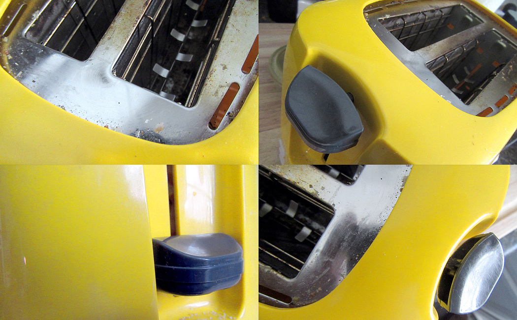
This is a toaster. Something so banal that in our ordinary lives, we hardly notice or look at it. Actually this is a picture of a toaster, which is a remove from the real thing. But then, so is the word “toaster,” which is also not the real thing, but a remove from the reality. 

For most of us, most of the time, seeing something — like the toaster — means being able to name it and move on to something more interesting or more immediately useful. The image in the picture functions as a pictogram, or a different “spelling” of the word. We read the image as if it were the word. 

Pictogram to “read” as teapot; teapot image as “seen”

It is how we respond to most images that bombard our daily lives. We name the item seen. It has been categorized, filed and forgotten. Our lives are too busy to spend any time remarking that the toaster is yellow, or made of plastic, or has rounded corners. These details are of no particular use when fixing our morning bagel, and so, they might as well be invisible. 

Of course, being able to recognize things quickly is a survival skill, and humans have survived these hundreds of thousands of years precisely because they could point quickly and yell, “Tiger!” So, I’m not pooh-poohing that ability categorically. 

But life is about more than just survival. The things of this world are bursting with sense data that gets ignored by reading rather than seeing the visible world. The toaster was designed to have an esthetic impact; the yellow was chosen to be pleasing to the eye; the curves were worked in to make the shape more inviting than it would be if it were all pointy edges. 

We are embedded in a universe of things — a material world — and all of those things have physical and sensuous properties. They have shape, color, heft, texture, volume, solidity or softness, shine or roughness. And all of these properties make up the elements of art, and one of the jobs art does  is to remind us of these delights we normally pay no attention to. Art reminds us we are alive. 

Any life can be enriched simply by paying attention. To notice the yellow, the curve, the size and shape. In fact, to those awake to the world, it is all art — and the emotional richness that the awareness brings. 

It is one of the things artists were doing at the beginning of the last century when they began making abstract art: art about the color, shape, texture, without a nameable subject. 

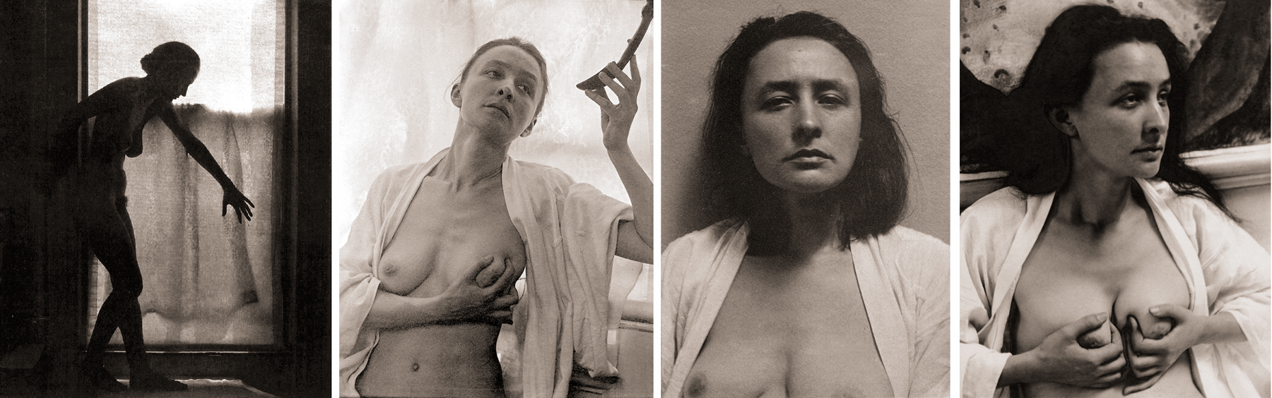
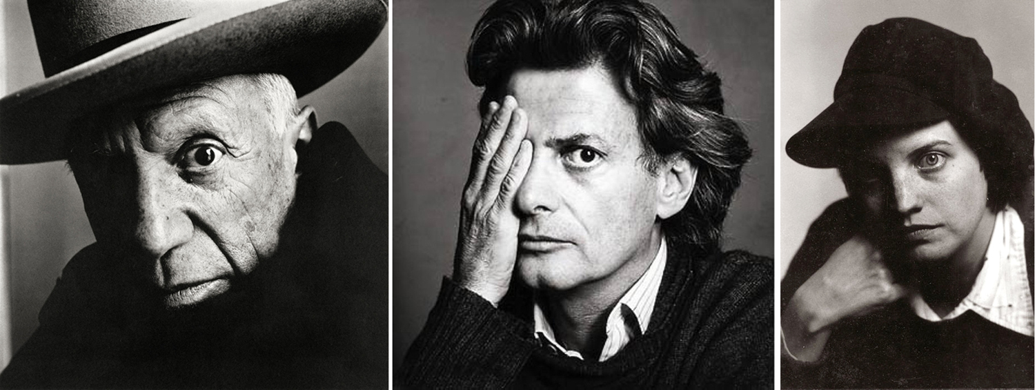
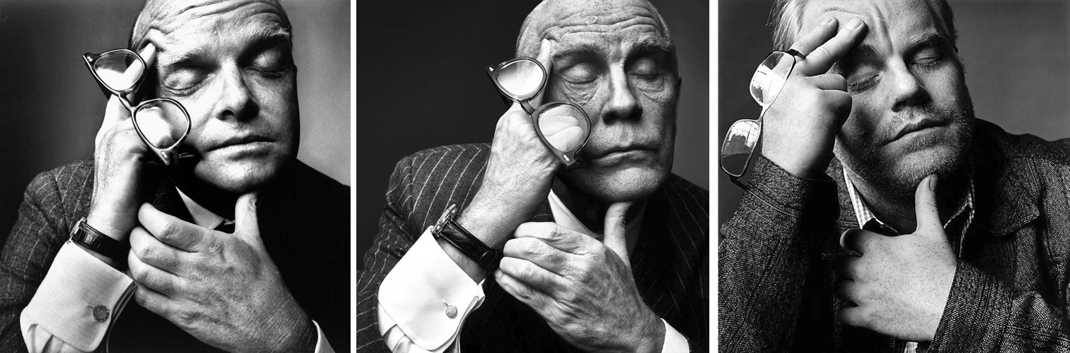
Of course, artists have always paid attention to these visual qualities. Just because a painting is of a still life, and we can name the objects, doesn’t mean that the artist wasn’t obsessed with the sensuous truth. 

And so, it is a worthwhile exercise to occasionally attempt to forget what you know and see the things of your life freshly, as if you didn’t know the names, but saw only the qualities. 

Humanity is varied in its ability to see beyond the names. It takes an imagination — a way of turning off your rational mind to see only the vital facts and not their meaning or use. Some people have the hardest time: I remember one woman who was asked to close her eyes and describe what she could see in her mind’s eye, and her answer was “With my eyes closed, I see only black.” 

But attempting to see past the names of things is deeply rewarding. The pleasure of colors, shapes, designs, apprehended primally enriches our lives immeasurably. 

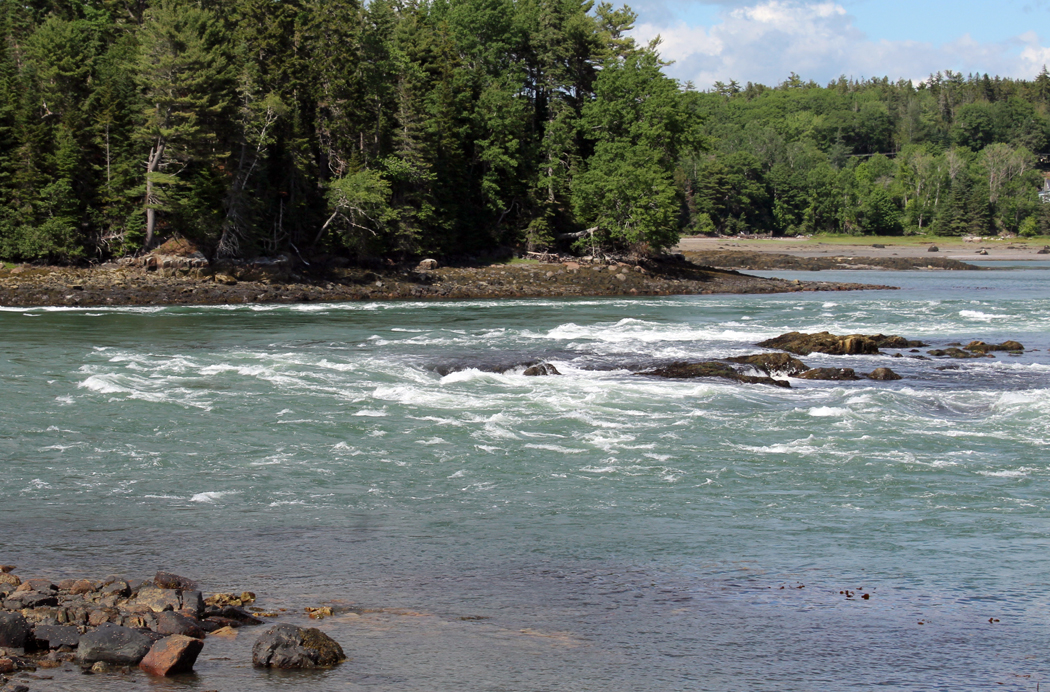
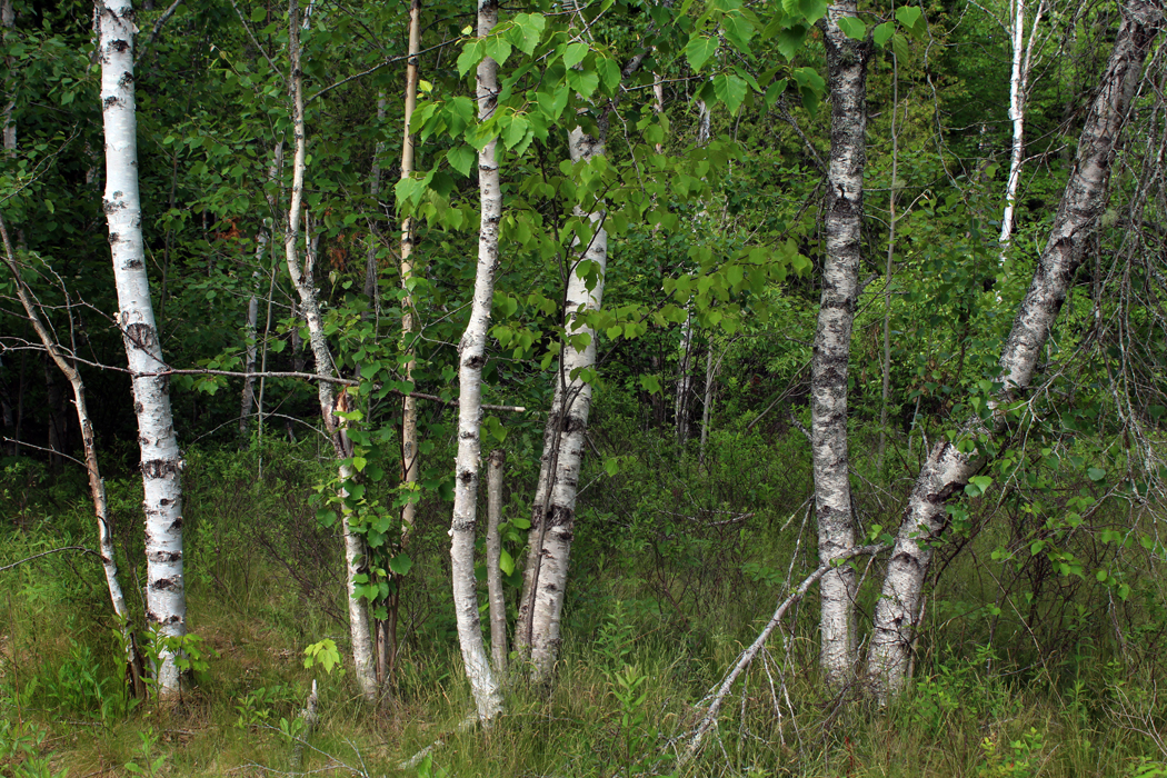
Certainly the natural world invites us with color and beauty. But it isn’t just the flowers and trees, the birds and the clouds. Everyday items can be appreciated for their roundness, plumpness, hardness, color, shape, even the feel under your fingertips. 

Many eons ago, when I was teaching photography at a two-year college, one of the assignments I gave my students was to photograph something in such a way I could not tell what it was. I made sure they understood that I didn’t mean just out-of-focus, or so badly lit it was murk. But to see something from a different angle, or to find a meaningful detail and separate it out. 

The purpose was to help them see without depending on what they already knew things looked like. To see directly. 

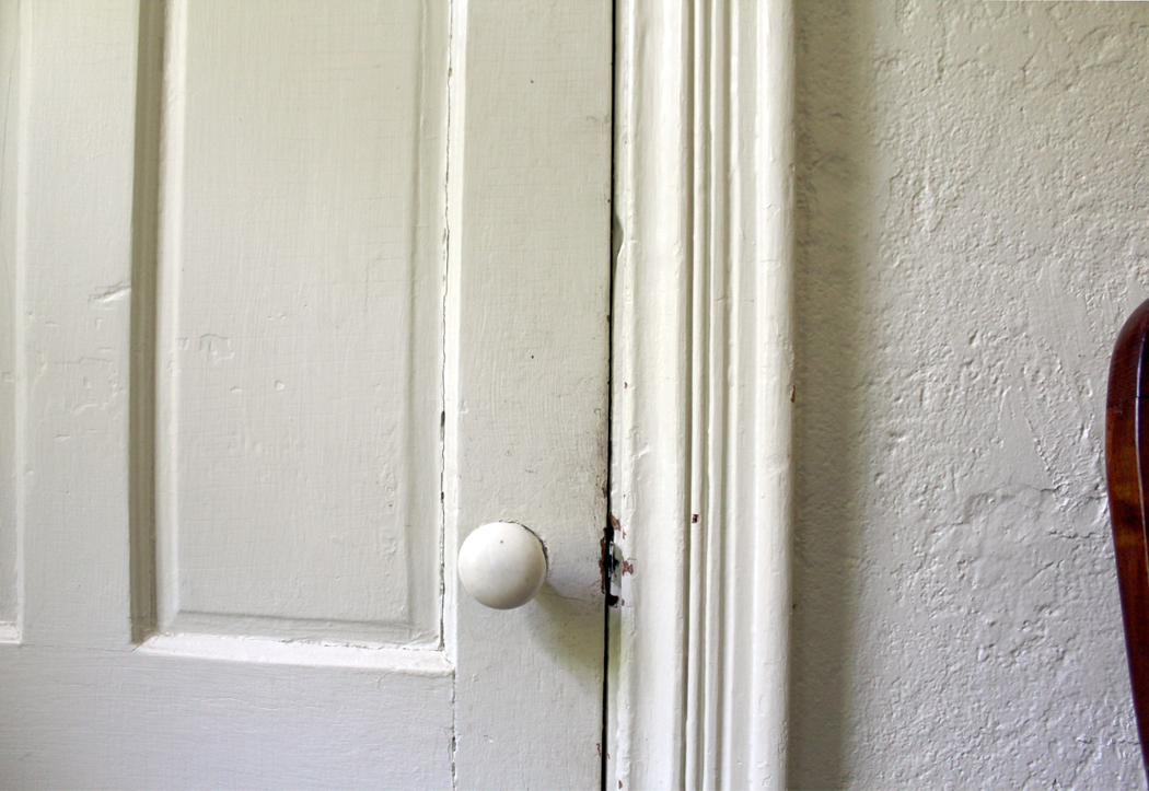
For example, here’s something most people see almost every day. 

Did you spot what it is? It is a view of your driver’s side rear view mirror as you approach the door to open it. A great big globular shape. 

One of my favorite images is one taken by Voyager II in 1983 as it passed the (then) planet Pluto and snapped this image of its moon, Charon. And compare with the more recent, and clearer image taken by NASA’s New Horizons space probe on its flyby in 2015. 

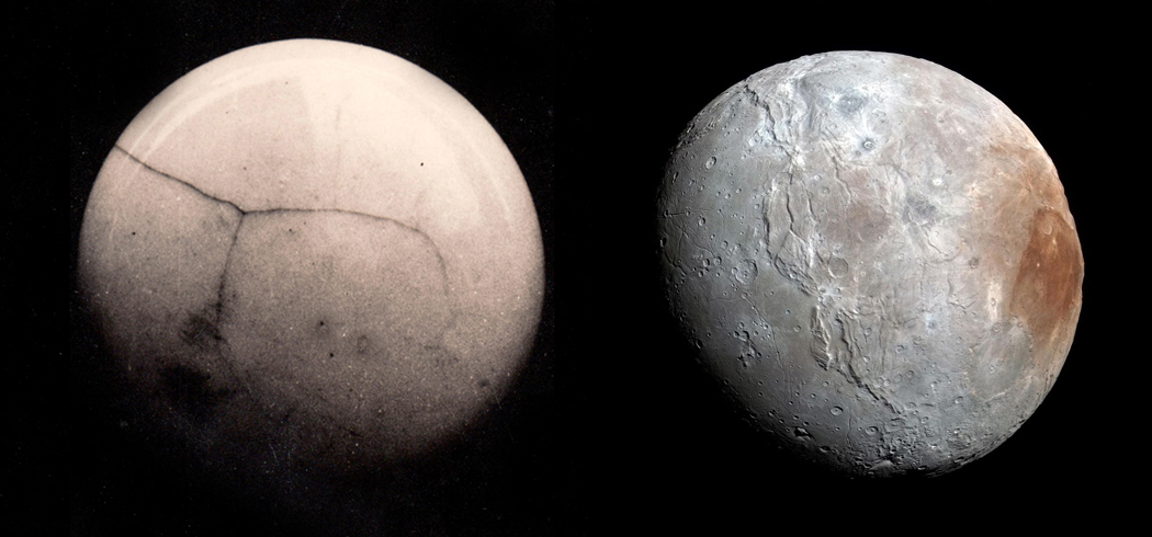
Actually, that’s a lie. The image on the left is a doorknob. 

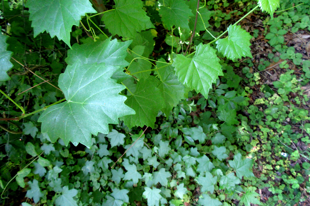
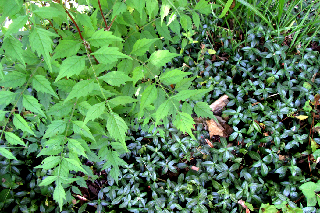
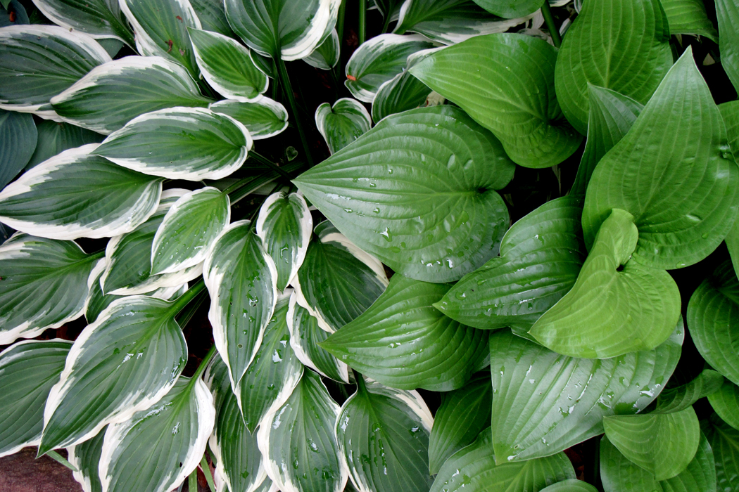
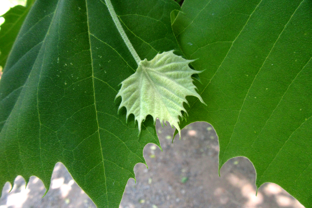
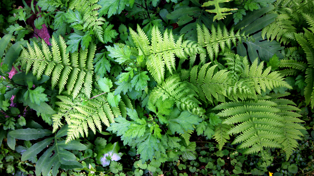
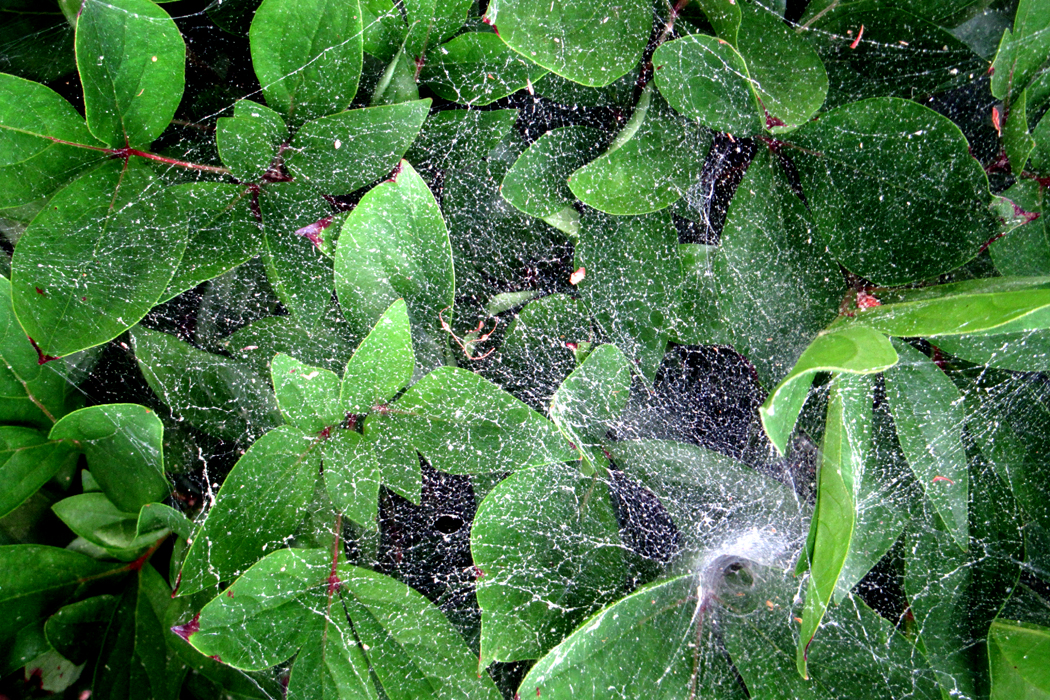
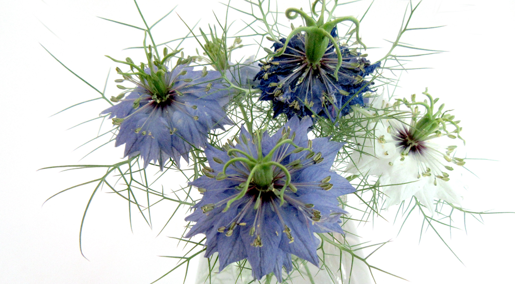
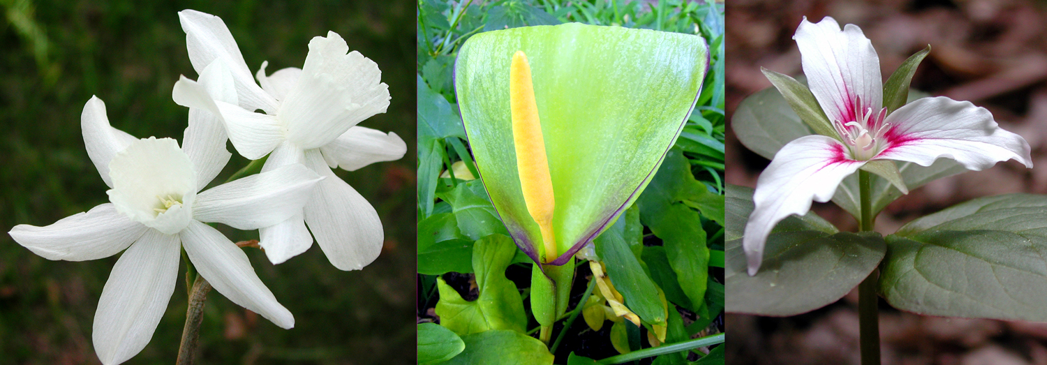
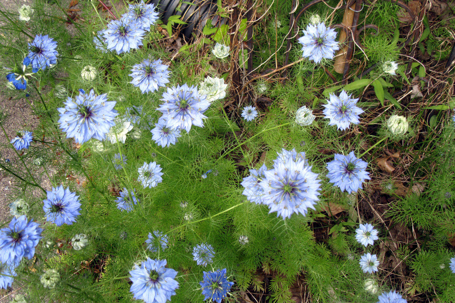
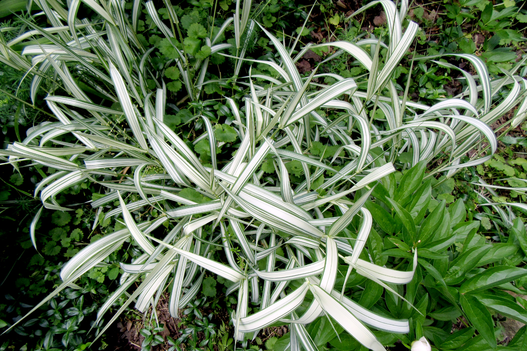
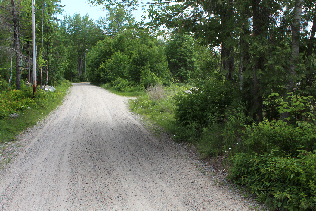
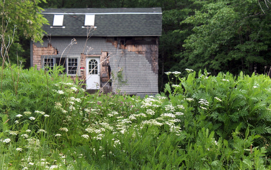
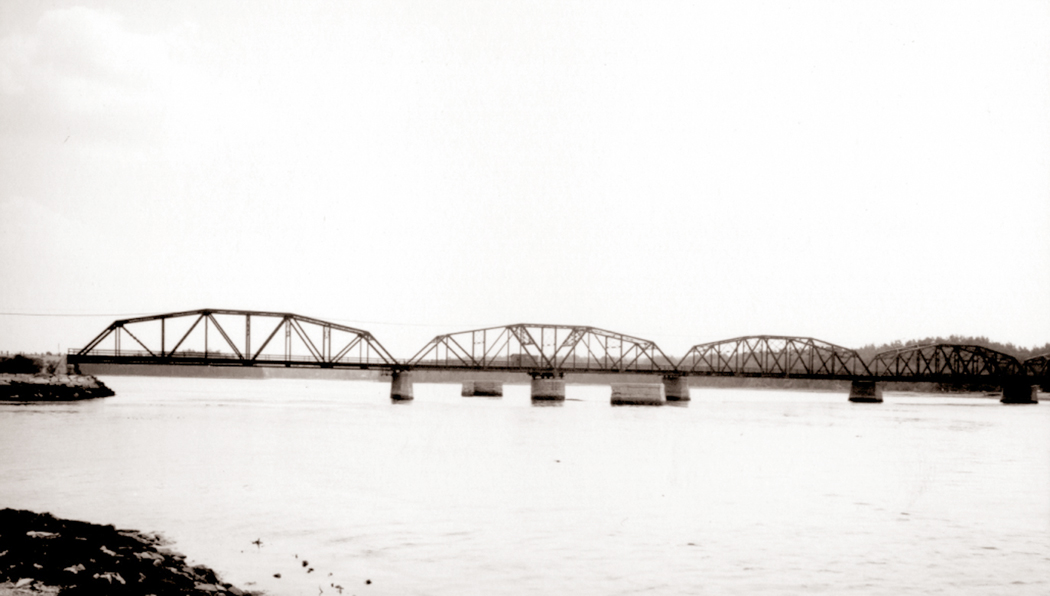
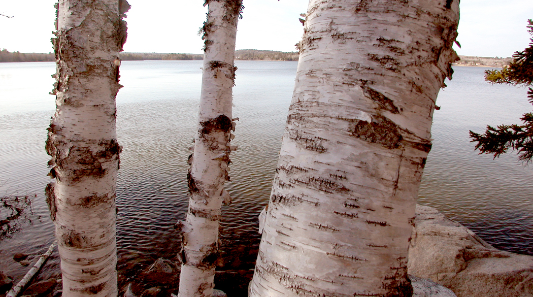
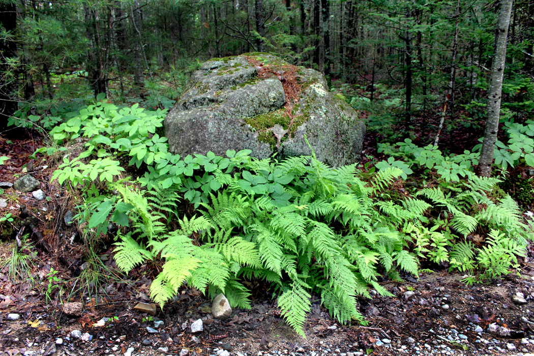
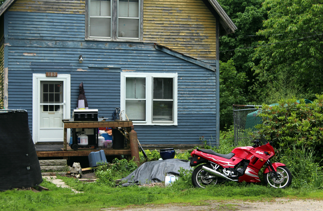
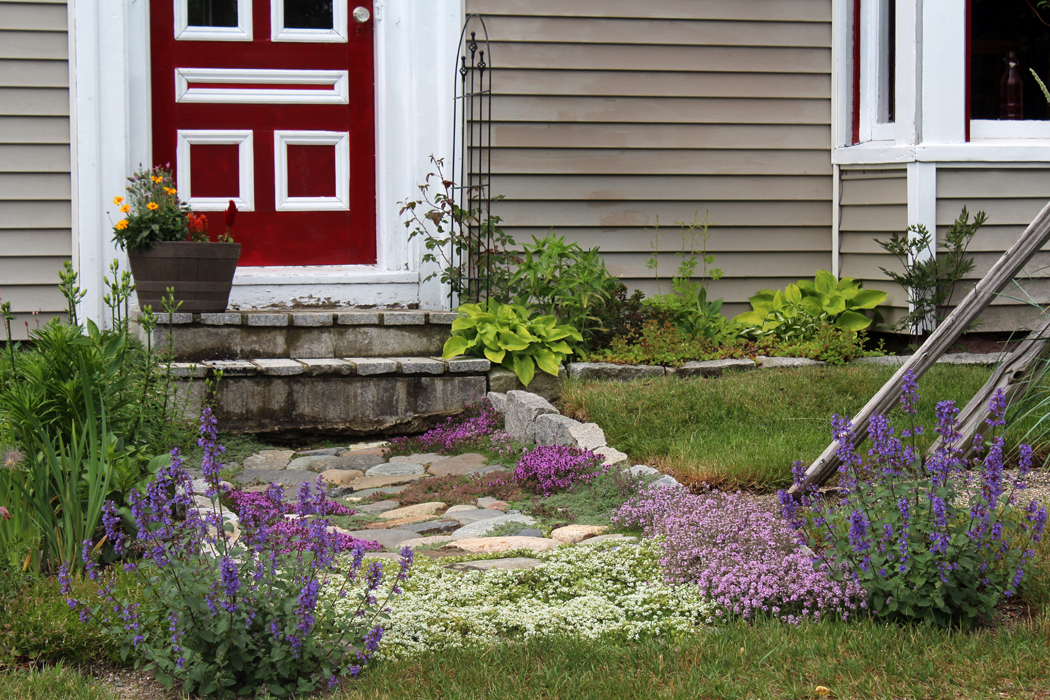
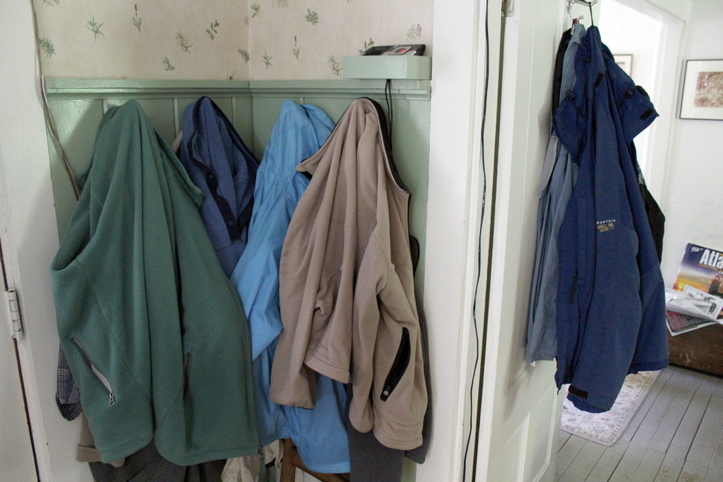
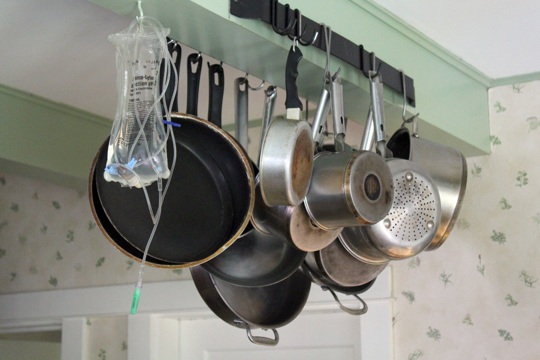
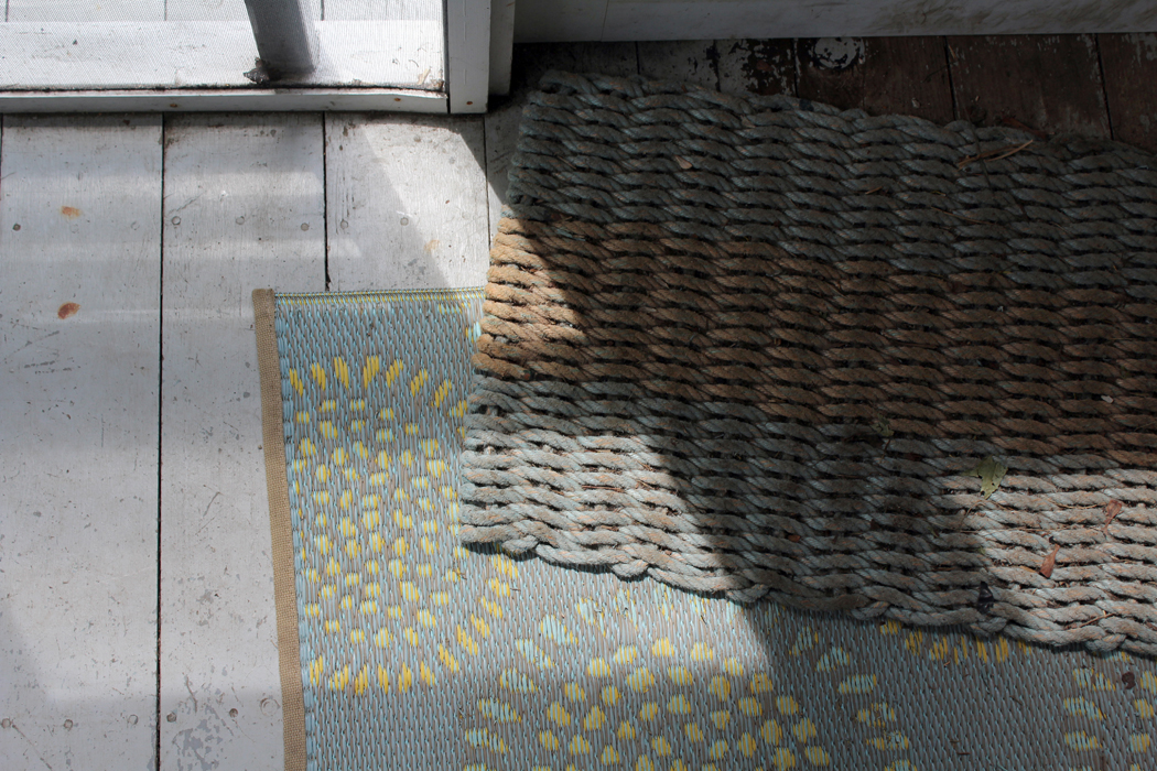
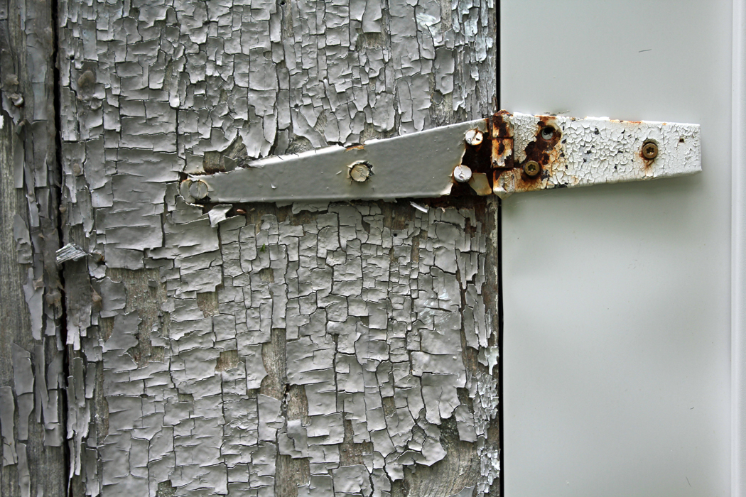
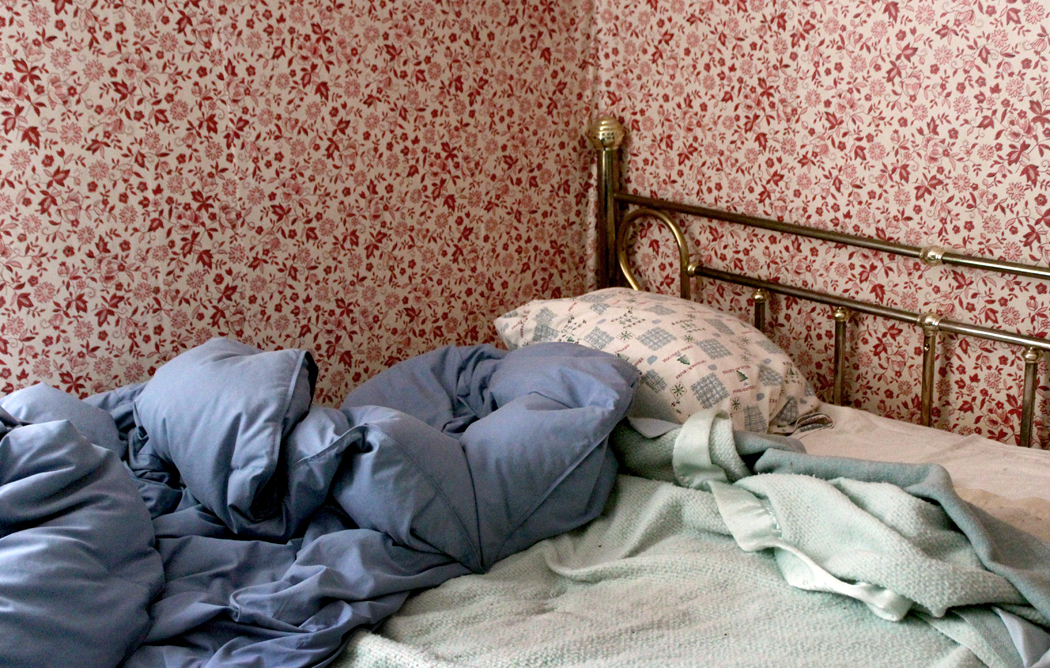
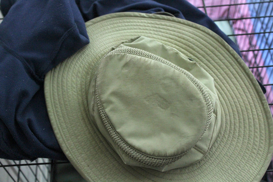
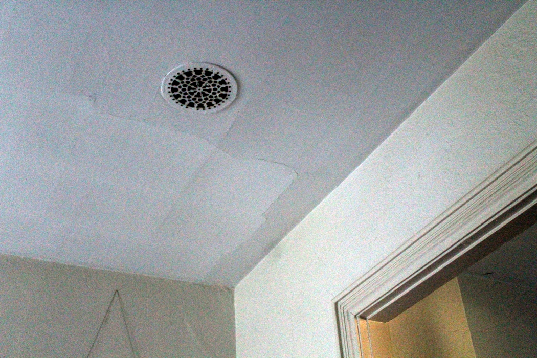
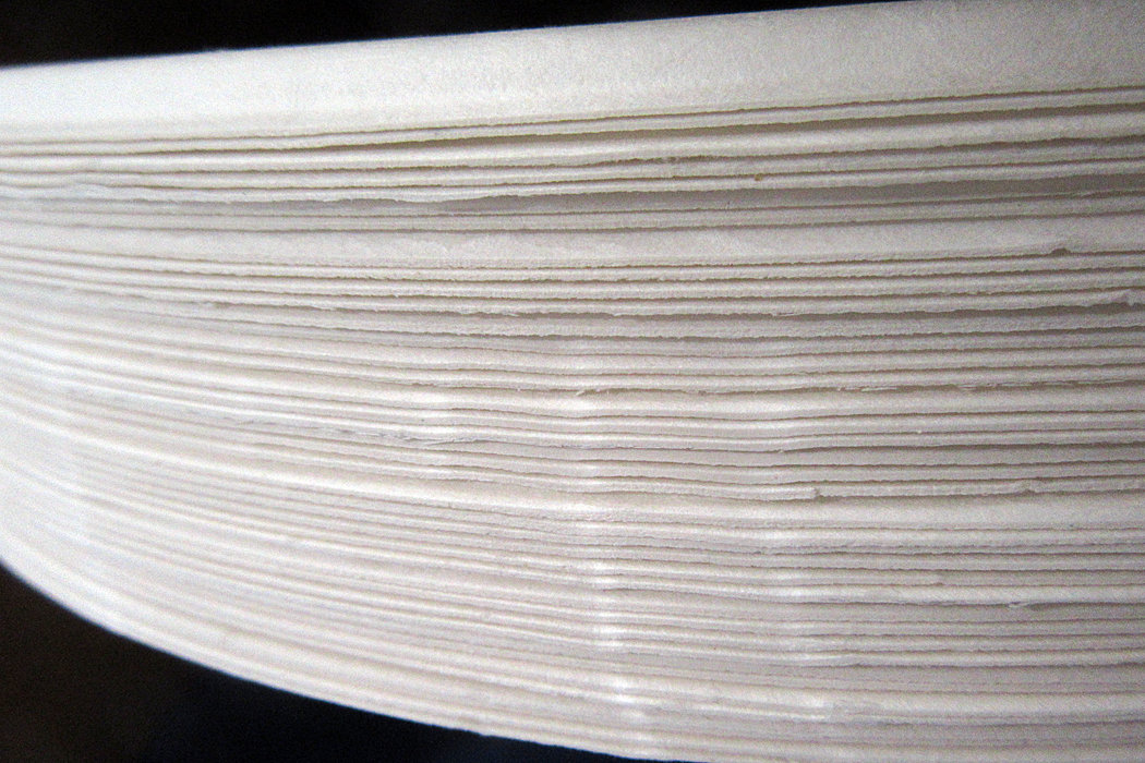
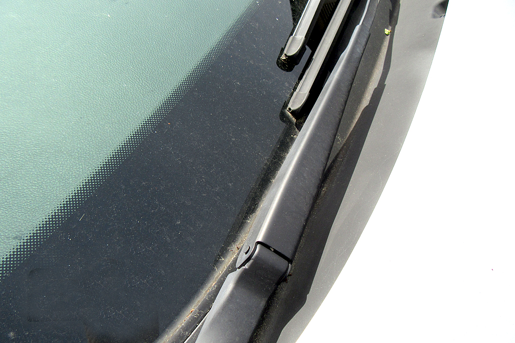
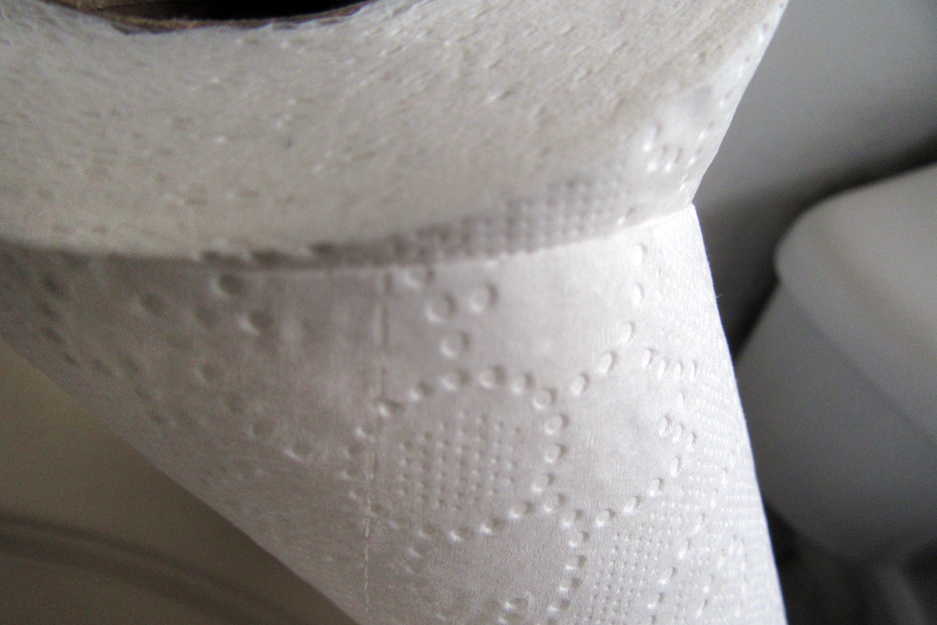
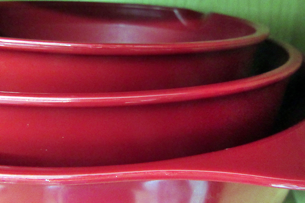
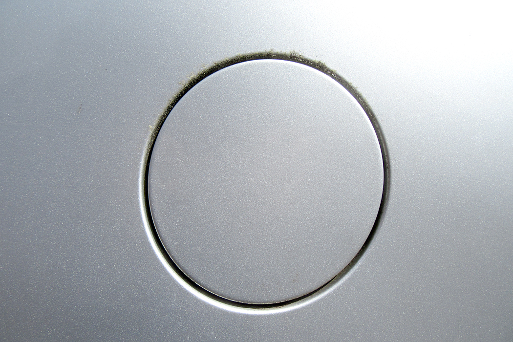
And so, here’s a little quiz. These photographs were taken to illustrate the shapes, colors and textures of ordinary objects, but seen in fresh ways. But they are still recognizable, if you can spot them. Can you tell what they are? The answers are at the end of the column. 

1

2

3

4

5

6

7

8


10

Even when you are not trying to be tricky, it is good to pay attention to the physical properties of the things of the world. Those shapes make images more memorable. And there are shapes all around.

A doorway turned into a check-mark

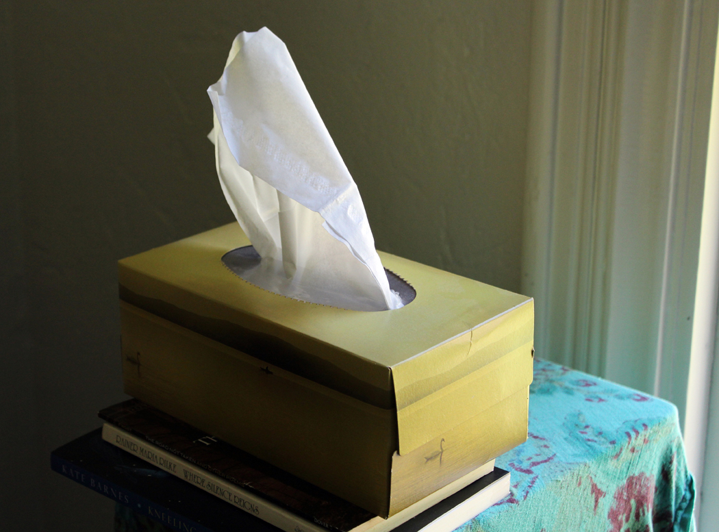
A paper tissue half out of a box
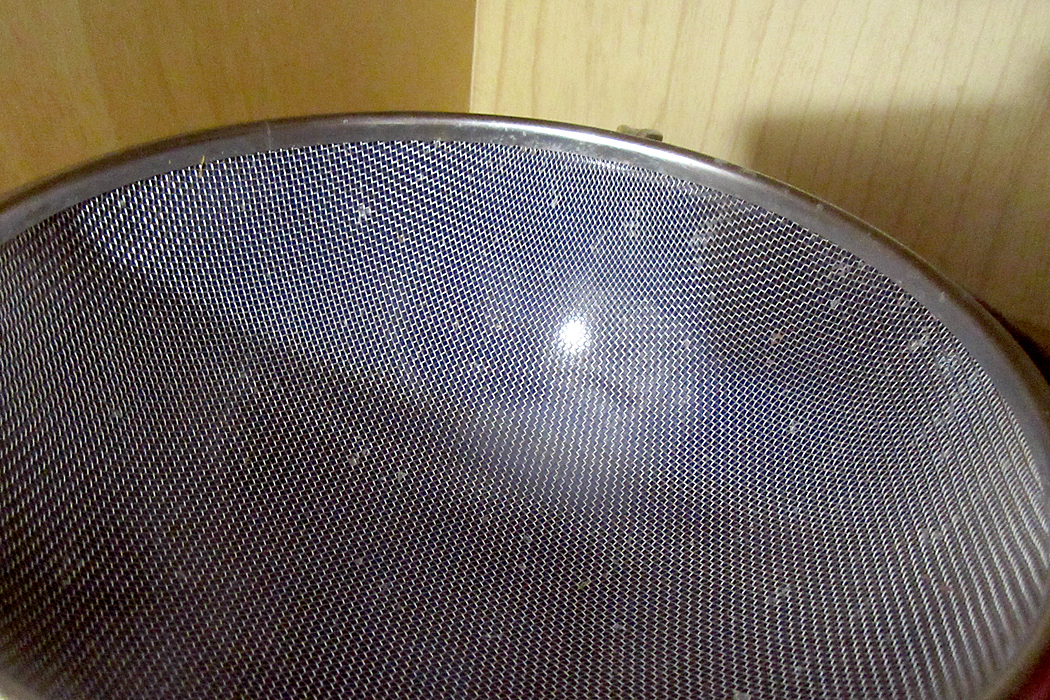
A kitchen strainer

We are alive on this planet for such a short time, and there is so much to take in. With our five senses we are privy to such delight and can never exhaust the riches around us. But we must be open to them, aware of them, awake to them. 

Learning to see is a part of art education. To see a picture of a giraffe and point, like a first-grader, and say, “Giraffe,” is not seeing. But take up a pencil and attempt to capture what you see on paper will teach you what things really look like. Paying attention is the great secret of life. 

Quiz answers: 1. Paper plates; 2. Work glove; 3. Windshield wiper; 4. Measuring spoons and ceramic duck head towel hook; 5. Old Oxford cloth shirt; 6. Toilet paper; 7. Plastic mixing bowls; 8. Pop-open gas-cap cover for Buick; 9. Ceiling fan lamp fixture; 10. Assorted shopping bags. 

Click on any image to enlarge

The best gift a writer can get is proof that his words are being read, and not just read, but understood. (When I was writing for the newspaper, too often I heard from readers who complained about what they thought I wrote and not what I actually wrote. Every writer has had this experience.)

The other day, I received such a gift, a small one, not meant to be anything important, but it was completely meaningful to me. This gift was from an old and dear friend who I only see once or twice a year, and to our lunchdate, she brought a 3-by-5 notecard on which she had scribbled with every color green she could extract from her colored pencil set. I doubt she knew how much that meant to me. 

It was a gloss on my most recent blog essay, in which I had mentioned how many greens I saw in the foliage in the woods and garden I was visiting, and also how many greens Paul Cezanne had managed to generate in his paintings. The card she plopped down on the table was meant to be a casual joke, but to me, it was very much more than that. We don’t always know the significance of what we do. 

But it set me to thinking about those greens — blue-green, yellow-green, sea-green, leaf-green (not enough words for the varieties of hue) — and made me take my camera out to the garden again to gather my own set of greens. Nature gushes with them. 

There are three qualities that make an image: shape, color and texture. (Leaving aside the question of what you name the subject of a picture: “That’s a house;” “That’s a car;” “That’s my Aunt Philomela at the beach house in Boca.”) Shape can be defined by outline. Color and texture fill those outlines in and what is more, if you are making an image in black and white, texture (stippling, crosshatching, scribbling) can substitute for color. Each of these elements can be as much a delight to the eye as harmony is to the ear or flavor to the palate. 

And so, I walked through the yard drinking in the greens and pointing my camera to arrange the patterns of shape, color and texture to try to make a kind of visual mixed salad for the eye. 

In the afternoon, I drove out into the countryside and stopped near the Mayo River — barely a river — that I had once canoed down maybe 50-plus years ago, hitting white water on the way (if the canoe had capsized, I doubt the water would have gotten higher than my knees). Along the banks were further salad greens. I gathered them all in my lens. 

The pleasure later that evening was editing the photographs, collating those shapes and textures and those luscious greens. “No white nor red was ever seen/ So am’rous as this lovely green.”

Many years ago, the professor I studied under commented offhandedly that nature never made a bad color combination. Any two colors found in nature, he said, could be placed side by side for a satisfying esthetic treat. Salmon red and pea green. The blue and yellow of a spiderwort flower. The orange and black of a monarch butterfly. 

Humans are quite capable of jarring our eyes with garish mismatches — gaze down any “Miracle Mile” for its signage — but nature, he said, is always right. Of course, our pleasure in the color-matches of nature should probably be laid at the feet of natural selection: We have evolved to love those colors and perhaps we shouldn’t be too glib about assuming that nature had us in mind when she plopped the buttercups next to the violets along the highways. 

 The riot of greens I saw and photographed played off against each other, making color combinations as rich in greens as the roadside flowers made of whites and yellows. 

And the various textures of leaf surface made their own contrasts. 

And the lights and darks, as shadow and light hit the foliage, gave them visual depth. 

Deep in one image, the bright green leaves nearer the surface hid the shadowed poison ivy, almost hidden in a cavern of green.

Leaves come in varieties of all of them. And when you layer one next to another, the contrast can keep the eye interested. 

In the process, I found myself drinking in not just the colors, but the varied shapes, creating patterns and textures that delighted my eye. 

Shape against shape, color against color, texture against texture: the analog of variety in the world, a variety that means we can never grasp it all — there is too much. 

One gets to know the plants in the woods near where you live, perhaps even name them: Duchesnia, Tradescantia, Helianthus, Ranunculus. They are part of what makes your home territory comfortable and familiar. Clovers, mosses, ferns, plantains, dandelions.  

And there is excitement when you enter a new biome and come across new greens, like the gray-green greasewood of the Sonoran Desert or the euphorbias of South Africa, each with its idiosyncratic shades and tints. 

Before the photographs from space showed us the dominant blue of our world, the Earth was traditionally called a “green planet.” It is green that makes life possible. Without it, the planet would be bare rock surrounded by the blue sea. 

Each time I visit this part of the state, I can’t help but set myself a task — a kind of art project, to try to organize a different way of seeing. A few days ago, my task was to look straight down at the ground to see what it looked like. I made more than a hundred photographs I could use. After I wrote that blog entry, and after my friend gave me her gift, I began a second project, to see how many greens I could find, how many leaf shapes and contrasts I could photograph.

These that I’m presenting here are just a small sample. But I hope they are worth looking at, at least as a tasting menu of delicious green.

Click any image to enlarge

According to European-Western tradition, there are four cardinal directions: north, south, east and west; and we mark them on a map by making the sign of a cross: north, south, east and west. Dominus Vobiscum. But Western culture tends to value a map rather more than the ground under your feet. If we take a larger view of it all, we should acknowledge two more cardinal directions: up and down. We live in three dimensions, not two. A map is only a diagram. Et cum spiritu tuo.

And when we make images — photographs, drawings, paintings — we tend to look along the flat plane of our cardinal directions, which means also, the plane of our standing vision. And if we photograph flowers, we tend to make our images like the identification photos in a nature guidebook. We look at them as if they were as tall as us, or we as ground-hugging as them. 

The bias is to ignore the sky above, the mud below. I spent some hours yesterday attempting to break my own tendencies and see if a shift in perspective might give me a fresher look at the garden. And so, I made a series of photographs pointing the camera straight down at the flowers from the top. 

The first image I made, when I put it up on my screen, reminded me of something. It took a moment, but then I had it: the Pleiades — the Seven Sisters in the night sky in the constellation Taurus. Here are the flowers:

Here are the Pleiades:

Looking down in the day was a mirror of looking up at night. Bunches of flowers, especially roadside wildflowers, often remind us of stars in the night sky. It’s why we name them cosmos, stellas and asters. 

Certainly the flower that has meant the most to me, emotionally, through my life is the aster, named for the stars. I remember a day, some 40 years ago, driving with my then-soulmate (is there a sadder hyphenated word in the language?) near Port Jervis, N.Y., and coming across an abandoned field, maybe a couple of football fields in extent, that was crammed with asters, thistles and ironweed, so thick on the ground there was barely any green showing through. It was hysterical with blue, and I thought it was the most beautiful sight I had ever seen. Since then, I have sought any semblance of that abundance. I’m not sure a single life affords more than one of those moments. 

And so, I am walking through my sister-in-law’s garden in North Carolina and holding my camera flat parallel to the ground to see what these flower-stars look like from an angle we don’t normally see — or at least, think of them. 

Over and over the star analogy shown through. Constellations of yellow or white against a sky of green. 

Even the leaves themselves can be stars:

Patterns made: line-ups, triangles, squares, quincunx, spatters and grids. 

There is a Medieval trope that everything in Heaven finds its analog in the sublunary world (much like the Renaissance idea that everything in the world is mirrored internally in the mind). And I certainly felt that correspondence strongly while finding my floral models to photograph. 

It was the looking down that made the connection, the opposite of the looking upwards at the night sky. But looking down — straight down, if I could avoid my own clumsy feet — gave me more than that. I found that I was photographing more than calyx and petal, but discovering just how many distinct greens nature blares forth. 

Historically, painters had a limited number of pigments to use when painting leaves and trees. They could modulate those hues with the admixture of others, but there was a limit. The trees of Claude or Titian are mostly monophonic rather than stereo. The artist who freed green from those confines was Paul Cezanne, whose paintings contain more greens and more blues than any artist before or since. His eye for tint and shade was phenomenal. I remember when I first came to appreciate the work of Cezanne. I had seen his paintings only in reproduction and always thought of them as rather dull, even muddy. But visiting the National Gallery in Washington, D.C., I found a wall of the still lifes and was knocked out by the glowing depth of color: color I had never experienced except under the influence of herbs. But those chemical-induced colors were vaporous compared with the earthiness of Cezanne’s greens, blues and yellows. 

And so, there I was, camera in hand, looking earthward and seeing the exuberance of May in Piedmont, North Carolina, and the blistering variety of green that sprouts from the ground.

I walked around the property, head held downward, and finding such a joyous variety under my feet, that I wound up, in the space of under an hour, taking at least 100 usable photographs — images I would be proud or eager to share with the enthusiasm of a convert. The greens made patterns; the blossoms made patterns; the leaves were shapes to pleasure in; the colors were delicious. 

The esthetic sense, however, awakens an awareness of yet a seventh cardinal direction, which we might call “center.” It is the inward direction that is privy to the other six and gives them meaning and purpose. North, south, east, west, up, down, and in. Each in some way a reflection of all the others.

I have traveled much in each of the cardinal directions, north to the Canadian arctic, south to the Cape of Good Hope, eastward to Europe and finally, the Pacific coast. I have gone up in aeroplanes  and cathedral bell towers, and down in chthonic mine shafts and vast caverns, but most of all, I have gone inside of myself. The experience of nature — but also the making and partaking of art — expand the inner world, adding continents to the mental globe, possibilities of understanding, and depths of compassion. 

Looking down at the humble soil and its profuse variety keeps one from becoming tired of life. Paying attention is, in some ways, coequal with life itself.

Next — perhaps in tomorrow’s rain — I will extend my interior travels by looking straight up to see what is there.

Click on any image to enlarge

“Which way to Millinocket?”

“Don’tcha move a goddamn inch.” 

Maine jokes — an acquired taste, perhaps. So many of them are built on city slickers asking for directions. “You can’t get there from here.” (Say it with the accent: “You cahn’t get they-ah from hee-ah.”) Lost travelers always seem to find farmers willing to guide them: “First, you drive up a mile, mile-and-a-half maybe, and turn left where the old church used to be.” 

“Used to be.” It is a familiar refrain in the more rural and forgotten areas of the state, and along the coast north of Acadia National Park, where few out-of-staters are likely to venture — an area known as “Down East.” 

There is much that “used to be” in Sullivan, Maine, a small community on Taunton Bay about 15 miles beyond where the tourists turn off U.S. 1 to Mt. Desert Island and Acadia. With a population of about 1200 spread over half a dozen townlets between Hancock and Gouldsboro, it has been home to my best friends from college for about 30 years. Over that time I have visited them often. 

They have an old farmhouse (I call it a farmhouse, although there is no farm) in North Sullivan along the road that parallels Taunton and Hog bays. Like much in the town, it is weathered and steeped in character. 

Sullivan has changed over those decades, although you might not notice it if it were your first visit. It still looks quaint, as if it were some Down-East Brigadoon. But there are many things that “used to be.” 

The Singing Bridge

For me, the most notable is the loss of the singing bridge from Hancock to Sullivan over the narrows between Frenchman’s and Taunton bays. The old bridge had a steel mesh roadway and every time a car ran over it, it roared like a banshee. That steel-truss bridge was replaced in 1999 by the “silent bridge,” made from prosaic concrete. 

Taunton Bay

The singing bridge was opened in 1926, replacing, after many years, the original wooden toll bridge that was washed away by winter ice a few years after it opened in the 1820s. Between bridges, a ferry ran from south shore to north — a flat boat that held one carriage at a time and charged a dime for a crossing. The Waukeag Ferry went out of business when the singing bridge opened. 

Stuffy

You get attached to something and then, it’s gone. When we first started going up to Sullivan, there was, just across the bridge, a small, wooden roadside ice cream stand called “Stuffy’s,” which also sold lobster rolls and the best lobster bisque I ever ate. We went back there for lunch many times. Of course, it is now gone. 

Abandoned quarry

So are the granite quarries that used to support the town, and so are the silver mines that made the town viable in the first place. 

According to A Gazetteer of the State of Maine, published in 1886, “There are now eleven incorporated companies owning mines in the town, most or all of them being operated. Work has been done also in five or more unincorporated mines. There has been completed in the vicinity a concentrating mill and smelting works for reducing silver ore.

“On the various streams there are two saw-mills, two stave mills, one shingle-mill, and one grist-mill. … A steamboat touches at Sullivan Falls three times a week.”

All gone. 

The Native American name for the area was Waukeag. It was first settled by the French in the early 1700s, but was given to English-speaking settlers by the colonial government of Massachusetts in 1761, when it was called New Bristol. It was incorporated in 1789 under the name of Sullivan, one of the original settlers. At the time of the Revolutionary War, there were just 20 families in town. By 1870, the population was 796. In 1880 it was 1,023. It is not much bigger than that now. 

Schoodic Mountain

As you drive north on U.S. 1 through Sullivan, you can often spot Frenchman’s Bay to your right, a vast tidal flat at low tide, a lake at full. In the distance to the south you can see Cadillac Mountain and Mt. Desert Island. Just north of the highway is Schoodic Mountain, 1,069 feet high, and Tunk Lake, where Rear Admiral Richard Byrd used to have a vacation home. 

On the peninsula just south is Sorrento, a resort town a bit more upscale than Sullivan. 

Reversing Falls

And at the mouth of the inlet, where Taunton Bay dwindles to the narrows that used to be called Sullivan River and opens onto Frenchman’s Bay, the tide creates what is known as a “reversing falls,” where the rising tide creates a dangerous rapids heading into Taunton Bay, and with a falling tide, creates the same rapids in the opposite direction. The current is fierce, up to 13 knots. 

But it is Taunton Bay Road that is what I am most interested in. Just after the silent bridge, there is a left turn that takes you through West and North Sullivan along the eastern shore of Taunton Bay. It continues out of town along Hog Bay and into Franklin. The road is beaded with old homes, usually clapboard with front porches and foundations or stoops made from granite once quarried locally. 

Across the water, Taunton Bay opens up into Egypt Bay and the town of Egypt, made famous — or notorious — by Carolyn Chute’s 1994  book, The Beans of Egypt, Maine. 

Among other losses in Sullivan are Jerry’s Hardware and, while Gordon’s Wharf is still extant, the busy fishing business is gone. There are a few family cemeteries, an art studio where stone sculpture is made, and a ceramic studio. 


This last time I visited, I attempted to make a “portrait” of this end of Sullivan, the way Alfred Stieglitz made a portrait of Georgia O’Keeffe — hundreds of photos that I hoped would, in aggregate, give a sense of the place. I can only share a tiny fraction here. You can find a more detailed portrait of a single house at (link here). 

There are three reasons to photograph something you care about. First, simply to capture it so as to possess it, for the sake of memory, the way you keep old snapshots of family birthdays and vacations. Second is to create art, that is, to make an image out of shapes and colors in a design that has graphic interest. But third is to see.

We look over so much at every minute of every day, but seldom see it. Looking closely, paying attention to details, absorbing character, seeing relationships — these things come with seeing with purpose. Seeing is engaging. Engaging is being alive. 

Wandering through Sullivan, I wanted to gather albumblätter  for my scrapbook; I also wanted to make something that might be, in its tiny way, considered art; but most of all, I wanted to use my camera as a way of focusing my sometimes wayward attention on something I want to know more deeply.  It is a way of expressing affection. Photographing, done this way, is a means of caring.

To collect snaps, or to frame art are fine in themselves, but using the lens to focus the mind and heart is infinitely more rewarding. It creates meaning.

Click on any image to enlarge

How many is enough? Beginning in 1917, photographer Alfred Stieglitz began making portraits of his new squeeze, Georgia O’Keeffe. But he soon developed the idea that a single image could not adequately express the essence of a person. Over the next 20 years, he photographed the artist some 350 times, making what to Stieglitz counted a single, all-encompassing portrait of O’Keeffe. 

“To demand the portrait that will be a complete portrait of any person,” he claimed, “is as futile as to demand that a motion picture be condensed into a single still.”

As he took up the camera once more after several years of editing his magazine, he wrote: “I am at last photographing again. … It is straight. No tricks of any kind. — No humbug. — No sentimentalism. — Not old nor new. — It is so sharp that you can see the [pores] in a face — & yet it is abstract. … It is a series of about 100 pictures of one person — heads & ears  — toes — hands — torsos — It is the doing of something I had in mind for very many years.”

The series went well past the hundred pictures he mentioned, and became one of the signature events in the progress of American art photography. The photographs were shown in galleries and museums and a selection of them were published in a book issued by the Metropolitan Museum of Art. 

He photographed O’Keeffe nude, surly, playful, artsy and in snapshot mode. He seems to have had a thing for hands. There are a boatload of hands, all very arty. Certainly, they are expressive, but they are also a bit arch. And do they actually tell us anything about O’Keeffe, the woman who kept her privacy like a recluse, so that even when she seems to be opening up to us, she is really just assuming a simulacrum of candor? She simply doesn’t want us to presume we might know her. 

But despite his intent, it is obvious that while 350 images may be more varied than a single portrait, it is no more complete. To achieve his goal, Stieglitz would have had to film every second of O’Keeffe’s life from birth to death and show it unedited. Attempting to capture a personality in any finite number of moments requires that some editing and interpreting will be necessary. Is Irving Penn’s portrait of Carson McCullers any less an accurate version of the author than Stieglitz’s O’Keeffe? 

In fact, I might say that O’Keeffe, even photographed by her husband 300 times, is more reserved, and lets less of herself out into the frame of the picture than McCullers does in one single instant. There is infinite sadness in those eyes. 

As a “control group,” we might include the three versions of Truman Capote made by Penn over time: First in 1948, then in 1965 and 1985. Does the grouping tell us much more than any of the single images? Only that Capote got old. We knew that. 

There is some kind of naive innocence in Stieglitz’s attempt, that there is a possibility of “capturing” a person in an image. 

The problem is that an image has a reality of its own, a separate reality, which may or may not partake of the person photographed. Irving Penn’s famous image of Picasso becomes a piercing eye, but then, so does the eye of Richard Avedon, also photographed by Penn. Or, for that matter, a portrait of Pam Henry I made in the 1970s. 

The image carries meaning in and of itself. Consider that 1968 image of Capote, eyes closed, glasses carried lightly between his fingers. Both John Malkovich and Philip Seymour Hoffman have sat for publicity photos mimicking the Penn photo. The pose trumps the person.

Or take Malkovich trying on the 1948 Capote. Again, the image is instantly recognized, and if you were turning the page quickly in a magazine spread, you might just well assume you had looked at the writer rather than the actor. 

Malkovich seems to have had fun doing this. He has mimicked many overly familiar images, from Hemingway to the migrant mother photographed by Dorothea Lange in 1936. 

Avedon often said that all photographic portraits — including and especially his — are really portraits of the photographer. It is the version of the subject transmuted by the picture-taker, and made into a vision of how the photographer understands the world. You look at that lineup of Malkovich parodies and you can as easily — or more easily — name the photographer as the name of the sitter. Top row: Irving Penn, Yousef Karsh, Philippe Halsman, Arthur Sasse; bottom row: David Bailey, Alberto Korda, Dorothea Lange, Diane Arbus. Each a distinct style; each a distinct image. 

Surely many a celebrity has felt defined and constrained by the immutable image that has usurped the actual life. Could Norma Jean live up to the image of Marilyn? Either the Bert Stern, the Avedon, the Eve Arnold or the Cecil Beaton version (l. to r.)? 

We run into the same problem we have with language. It cannot bear a one-to-one relationship with reality; it is rather a parallel universe, which can imitate our perceptions but never fully embody them. The image exists in another reality; we can name what we see, but the name is not the thing. The photo is not the person. Stieglitz’s attempts are heroic but doomed to failure. None of those 350 pictures of O’Keeffe is O’Keeffe, and the whole together is no closer to being her. 

We are left to enjoy them, then, as works of art. The eyes of Carson McCullers are not her eyes, but the sadness in the photo speaks to us clearly. That has to be enough. 

Click on any image to enlarge

Many years ago, I attended a photo staff meeting at my newspaper and the photo editor was complaining about a picture that a very talented staffer had made. For him, it was too arty.

“This is a newspaper,” he said. “Our photographs must be clear. We cannot have any ambiguity in them. If it is a picture of a house, I want it in the center of the frame, and I want the whole house. Like a real estate photo. We are not making images for a gallery; we are showing readers what the story is about.”

I remember cringing, but I said nothing. I was not on the staff, but just a travel writer who made my own photographs for my stories. I was in the meeting by default. 

The idea that a photograph was merely an illustration to back up words bothered me then, and it bothers me now. Instead of a supplement, I thought of them as amplification. 

Some things can be said better visually than verbally. The photo might very well be able to stand on its own. 

But, in a culture of verbal people — as a newspaper tends to be — a picture is a stand-in for words. You should be able to point to something in the photograph and name it: “House.” The name then, takes over, and any visual information is immediately rendered moot. Very like when you head to a rest room at a McDonald’s and the pictures on the doors tells which one to open. The image becomes a pictogram. 

This is the way many people regard photographs. They look and they name. “Aunt Julia.” “The house I used to live in.” “Niagara Falls.” Then they turn the page in the album. “Here is me at my prom.” 

Much of the visual information in the picture is passed over, not registering. Was that a blue tux at the prom? Did those horn-rim glasses make you look dorky? Were the shoes cropped out of the picture? Can you remember, then, what shoes you wore? 

Details matter. When you name the image rather than see it, you miss the majority of what is pictured; you miss all the pleasures you could enjoy — the colors, shapes, textures — and all the information that is there to mine. I am reminded of those impatient people I have seen in art museums running from painting to painting and reading the tags next to them. “This is a Renoir. Oh, this one is a Picasso.” 

Naming things often gets in the way of seeing them. Naming is a very low form of intellectual activity, but one it is too easy to become proud of. It does not actually indicate your intelligence if you can name ever painting in the gallery, or the make and model of every car you spot on the highway. It just means you can memorize. 

When, before I was a writer, I was a teacher, I would sometimes draw two shapes on the blackboard and ask, “Which of these shapes can you draw more accurately?” Most students would pick the square. It had a name and they could see the square, translate what they saw to a word, and then retranslate that word onto the paper with their pen. In the process, details of the original are obliterated.

Notice that the square here is not a perfect square. It has some sketchy lines and it is not completely closed up, and, in fact, it isn’t even a square, but a low-aspect-ratio rectangle. All of that visual information is expunged when you replace it with the name, “square.” The amorphous shape, on the other hand, would require you to look at it and attempt to follow its contours with your pen, forcing you to pay attention visually. 


Your blob would be drawn more accurately than your square. 

In his groundbreaking book, Principles of Art History (1915), Heinrich Wölfflin described the differences between Renaissance and Baroque art with a series of oppositions. Among these is the contrast between art which emphasizes the unity of the whole, which may suppress detail to the benefit of the overall design; and art which revels in a multiplicity of detail, even if it confuses the overall design. 

It isn’t that the classic art doesn’t pay attention to detail. In fact, it often takes pains to make everything equally easy to recognize, well lit, well placed in the frame. But the whole is more important than the parts. 

Balancing that is art that may even obscure some detail to make others more prominent. 

This dichotomy occurs repeatedly in art history — from Classic Greek art to Hellenistic Art, from Renaissance to Baroque, from Neoclassic to Romantic, from Modernism to Postmodernism. In Nietzschean terms, classic and romantic, Apollonian and Dionysian. 

The 20th Century, which we are most recently heir to, unity was valued as supreme. Artists, writer and poets who filled their work with profusion of detail were denigrated. The most concise poets were held superior. Painters who reduced their subject to basic forms were extolled. Musicians who subdued florid detail in order to render the overall form of the music more clear were applauded. They had a “grasp of the structure.” 

The complaint lodged against pianist Vladimir Horowitz, for instance, was that he never fully expressed the form of longer pieces of music, such as sonatas, getting lost in multifarious musical volutes and whorls. Of course, when you listen to the ancient recordings of the great pianists of the early 20th century — an era of romantic piano playing — all of the pianists focused on details. It is where the fun was to be found, the flavor of the ingredients rather than the melange of the whole.  

Romanticism in general relishes the detail, and can often get lost in it. That’s what makes it Romanticism. (Well, one of the things). Detail is where we find the pith, the essential oils, the meat. 

Classic painter Joshua Reynolds taut the “grand style,” and recommended choosing the general over the particular: a stylized tree over the quirky oak in the back yard. Romantic artist William Blake read Reynold’s book and wrote in the margin: “To generalize is to be an idiot. To particularize is the alone distinction of merit.” You can also imagine him chasing kids off his lawn. 

But his point is that the world is made up of details, and meaning is found in them. The collection of details fills out the impression we get from the quick overview. It is the detail that we know the whole. 

Through this essay, I have sprinkled photographs of the details of a house in Maine. It is one I know and love very well. 

If you look closely at them and absorb all the tasty detail, you can have a much fuller understanding, not only of the house, but of the style of Down East Maine, its economy, its culture, the nature that grows green in profusion everywhere. 

Crumbs to make a cake.