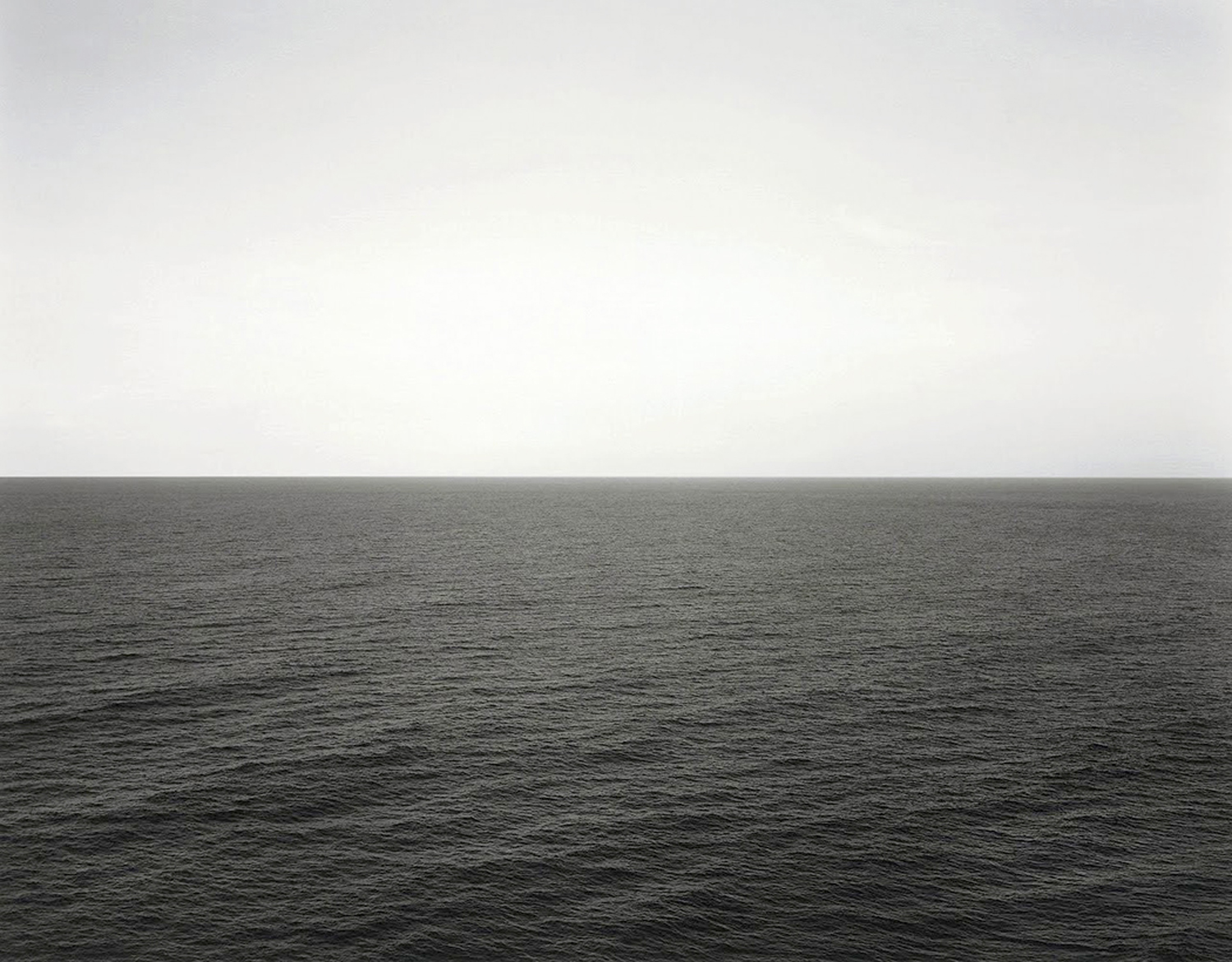
Many years ago, when I was still teaching photography in Virginia, I visited an art show that bothered me. In the gallery were a series of large black-and-white seascape photographs by Hiroshi Sugimoto. Each was about 3-feet square and each was divided exactly in half by the horizon line.
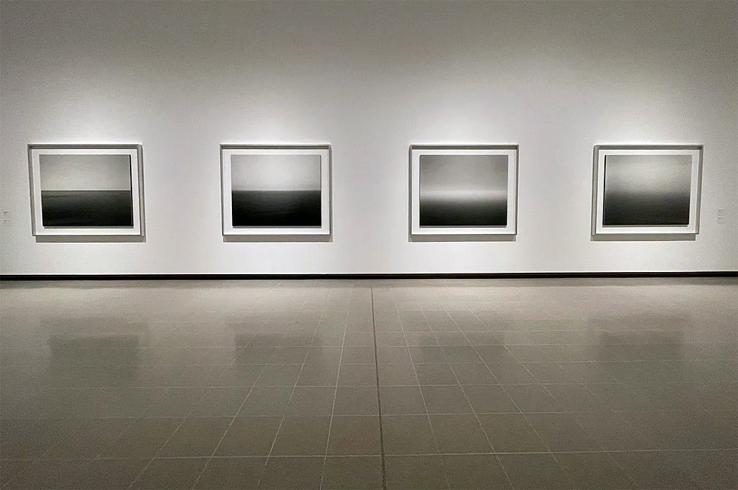
Sugimoto, who is exactly my age, is a Japanese architect and artist who created a project of making pictures of various seas, oceans and great lakes, at different times of year and different times of day and different weathers. But every one was the same size and with the top and bottom divided in half, sky and water.
What bothered me, initially, was the featurelessness of the images. The seas were generally calm and the skies usually cloudless.
At the time, in my class, I was trying to get ordinary students to make better pictures. Most of the students had no ambition to show in galleries, but rather had wanted to be able to make better family snapshots, or to improve as hobbyists and learn darkroom techniques. And so, I taught such normal things as making sure their images had a center of interest — a person or a dog, placed foreground against a background. If they wanted to make a landscape, to include some center of attention and not just make a dull grab-all of the scene.
These were not “rules,” but ways to get beginners to improve. First steps, as it were.
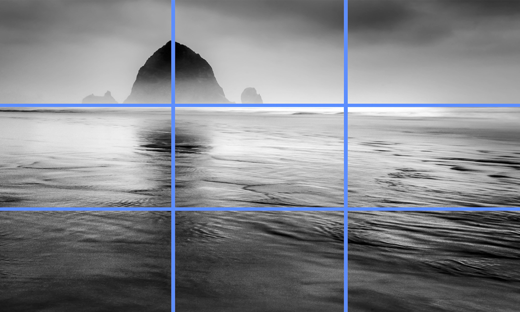
And I taught the ubiquitous “rule of thirds,” in which you help the design of a photograph by placing things a third of the way from the bottom or top, or a third of the way in from the sides of the picture. Or, also, to place your horizon line a third of the way from the bottom or two-thirds up from the bottom. And never, ever, put your horizon through the center of the image. The center is the most boring and static place in the frame.
(Of course, no accomplished photographer pays any attention to these notions, but I was helping beginners up their games and making their pictures marginally more interesting.)
But here were Sugimoto’s seascapes, centered and otherwise featureless. It bothered me for a long time — enough so that decades later, I can remember that show, burned in my memory, when so many others that I went to in so many galleries, have faded into time and oblivion.
I was aware that if the images stuck in my craw and couldn’t be dislodged, there must have been something to what Sugimoto was doing. I have thought long and hard on the subject. And I came to the conclusion that their very inexplicability, tied with the elemental themes of nature and the vast oceans, gave them their power. That, in fact, they were a projection of the sublime.
The sublime is a subset of esthetics, a particular experience of the beautiful, set in distinction to what is attractive and pleasing, by showing what is immense, often frightening, and which gives the viewer a palpable sense of his own unimportance in a vast and radiant universe.
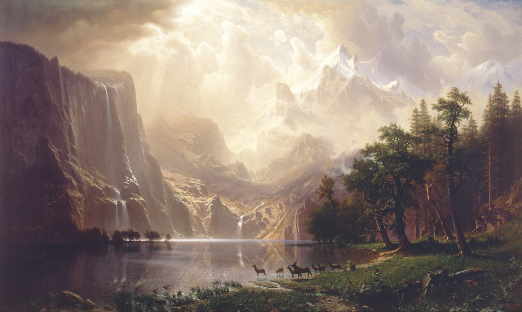
“Among the Sierra Nevadas” Albert Bierstadt 1868
It was a popular theme in 19th century art, with landscapes of the mountains of the American wilderness, or, in England, of vast biblical scenes, or or battles or storms. You have Jacob Mallord William Turner painting disasters at sea, John Martin showing the apocalypse in giant canvases, Gustave Dore engraving images of Dante’s hell and Satan’s flight through chaos.
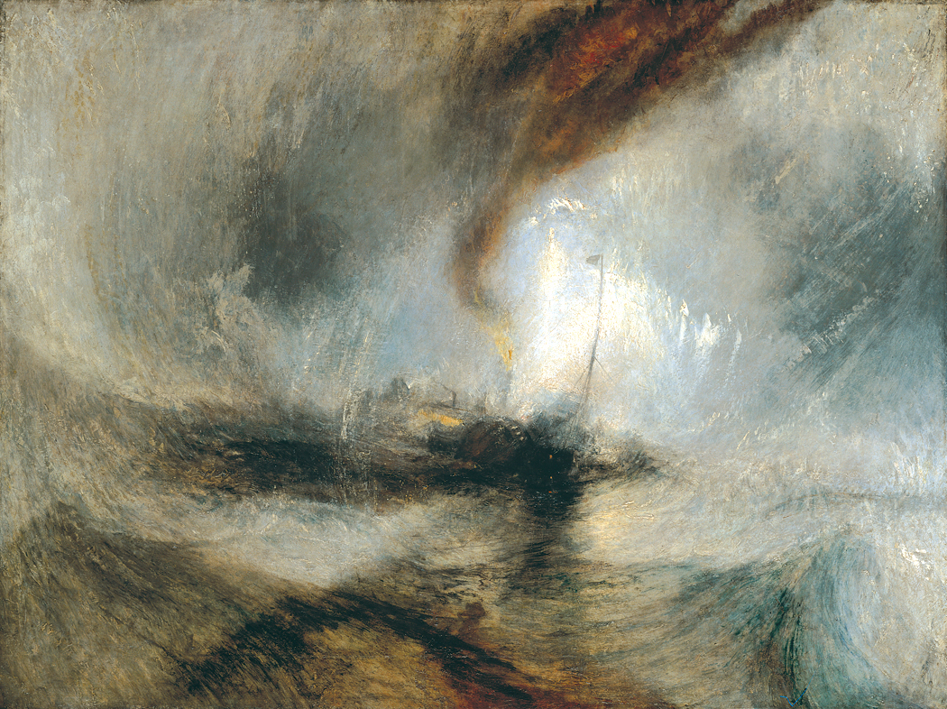
“Snow Storm at Sea” JMW Turner 1842
You have poets describing limitless scenes of the Alps or the Arctic. Mary Shelley’s Frankenstein ends in such a scene, with a ship stranded in the Arctic ice and the monster choosing white oblivion over life. The ship’s captain writes in his log: “We are still surrounded by mountains of ice, still in imminent danger of being crushed in their conflict. The cold is excessive, and many of my unfortunate comrades have already found a grave amidst this scene of desolation.”
Nature could be pretty. It could be daffodils. But it could be overpowering, desolate, dangerous. As in Percy Shelley’s Mont Blanc: “In the wild woods, among the mountains lone,/ Where waterfalls around it leap for ever,/ Where woods and winds contend, and a vast river/ Over its rocks ceaselessly bursts and raves.”
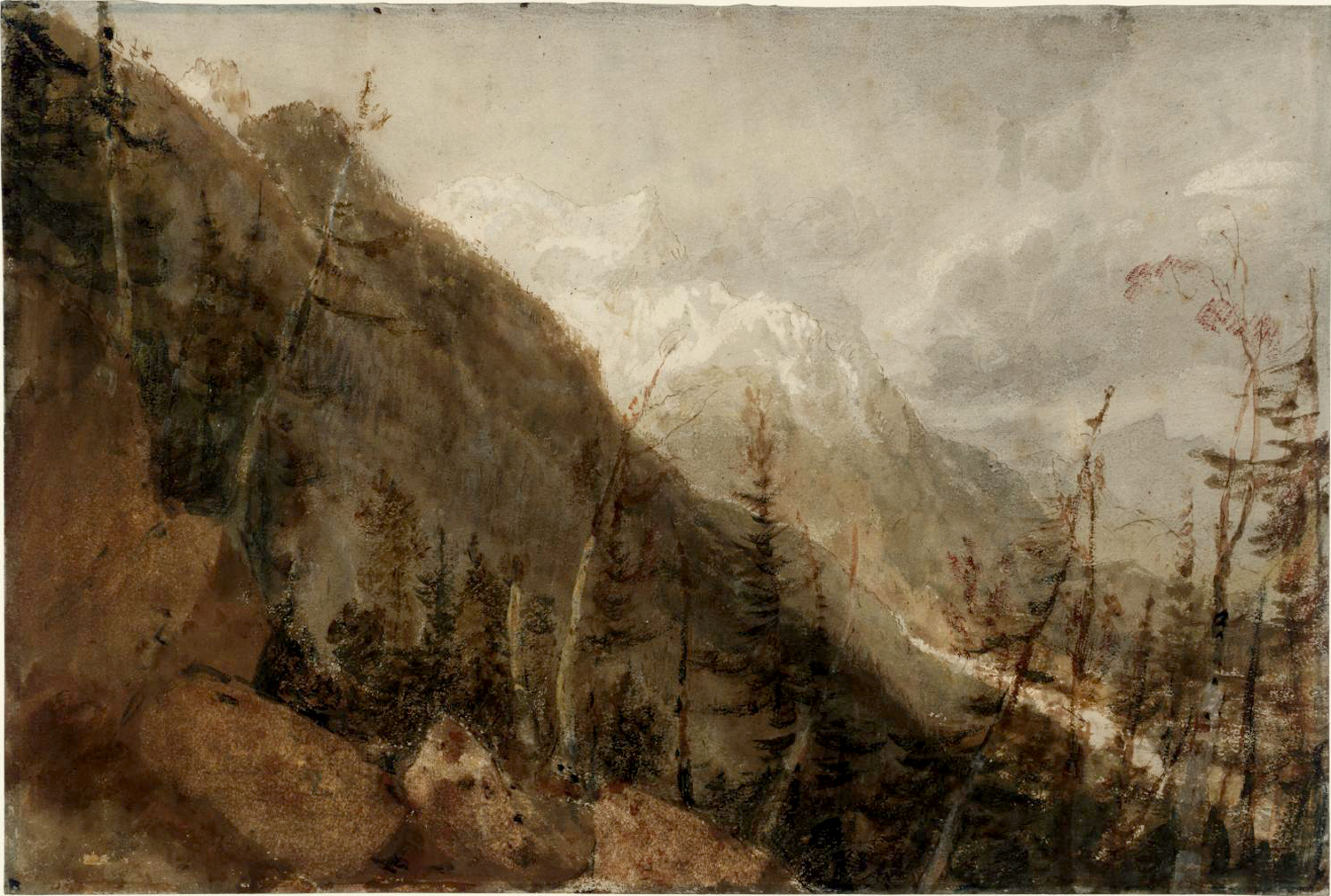
“Chamonix: Mont Blanc and the Arve Valley from the Path to the Montenvers” JMW Turner 1802
Hardly a better example could be found than Sam Coleridge’s Kublai Khan: “But oh! that deep romantic chasm which slanted/ Down the green hill athwart a cedarn cover!/ A savage place! as holy and enchanted/ As e’er beneath a waning moon was haunted/ By woman wailing for her demon-lover!”
In Byron’s Childe Harold’s Pilgrimage: “Roll on, thou deep and dark blue Ocean — roll!”
It’s all over the place in English Romantic poetry — “Tyger Tyger, burning bright,/ In the forests of the night” or later, in the works of Americans such as Walt Whitman (“Out of the cradle endlessly rocking”) or Emily Dickenson.
British poet Samuel Taylor Coleridge describes the sublime in his 1818 lecture on “European Literature” by recalling: “My whole being expands into the infinite; earth and air, nature and art, all swell up into eternity, and the only sensible expression left is, ‘that I am nothing!’ which concludes that his ultimate realization of the sublime was of his own human insignificance.”
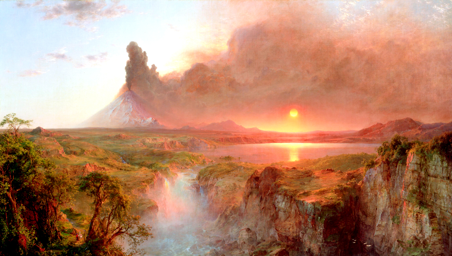
“Cotopaxi” Frederic Edwin Church 1862
Giving in to the infinite — or the emotional experience of it — can hit you whenever you are open to it. Not necessarily seeking it, but nevertheless open to it. Most often, we spend our lives closed, trying to make sense of the everyday things that take up most of our time. But there are moments when it all breaks in. These moments tend to stick in our psyches, to be brought back in memory to refresh our lives.
In music, the sublime is found in Haydn’s depiction of Chaos at the beginning of his oratorio, The Creation. Or in the ecstatic chorus of Beethoven’s Ninth Symphony, the trumpets of apocalypse in Berlioz’s Requiem or the vastness of Mahler’s Symphony of a Thousand.
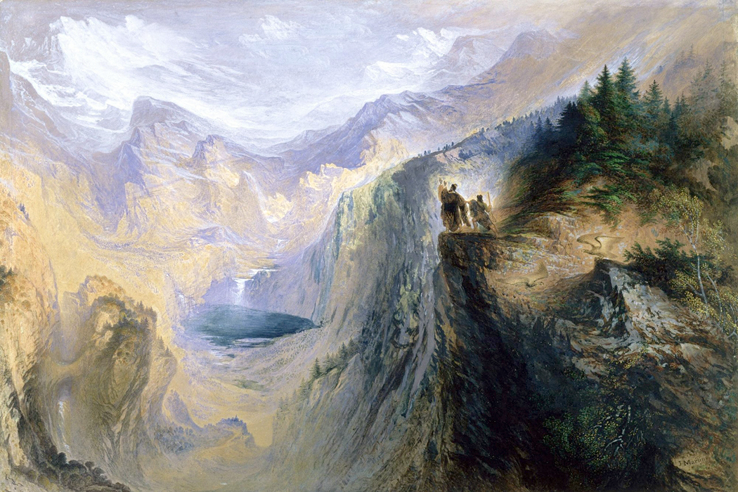
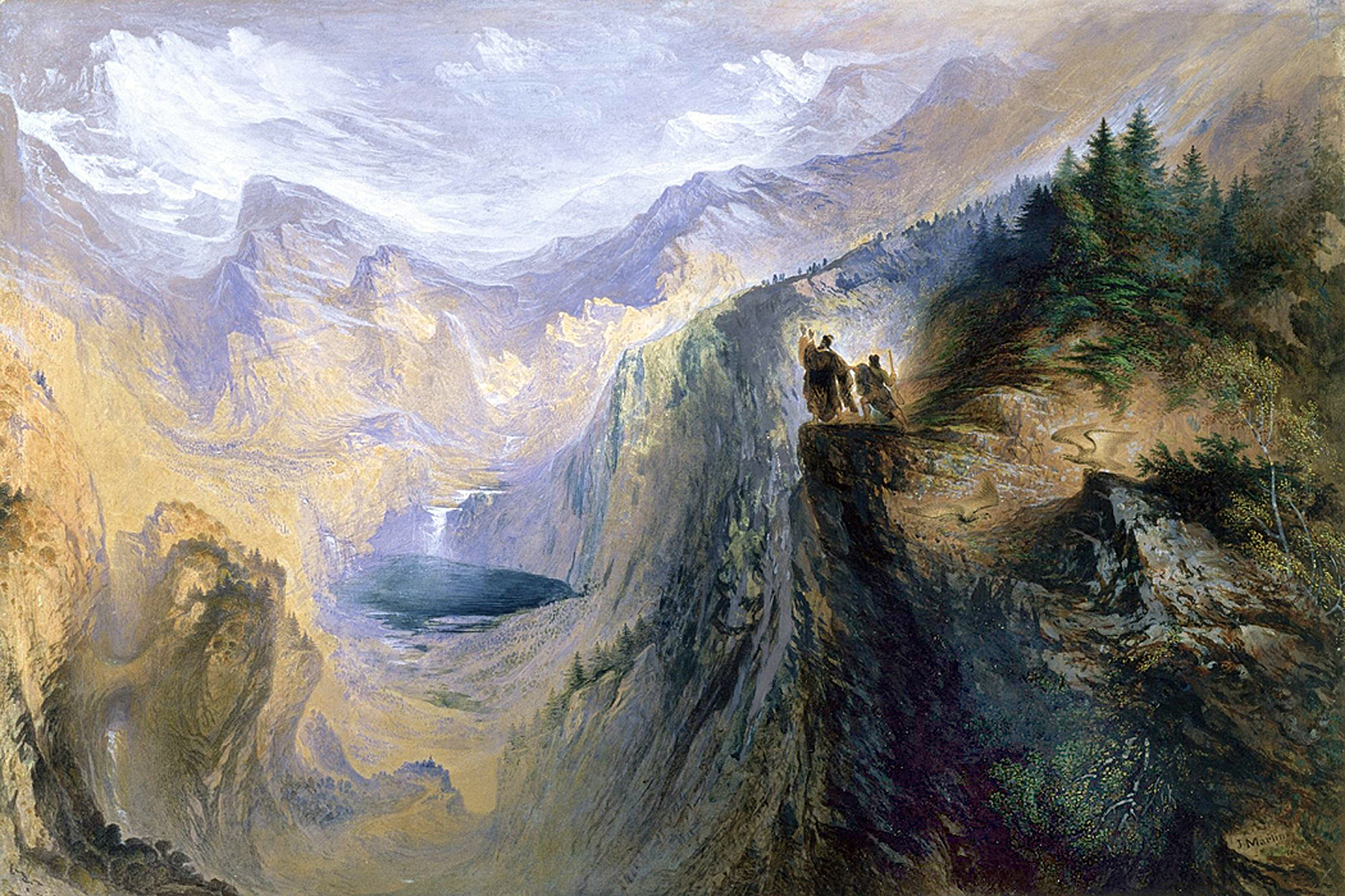
“Manfred on the Jungfrau” John Martin 1837
The problem with the Romantic vision of the sublime is that it can too easily devolve into kitsch. The sense of cosmic overload shrinks into a kind of religious sentimentality and you wind up with Charlton Heston and Cecil B. DeMille. Where you draw the line, personally, depends very much on your willingness to accept the underlying metaphor of the vastness and impenetrability of the universe.
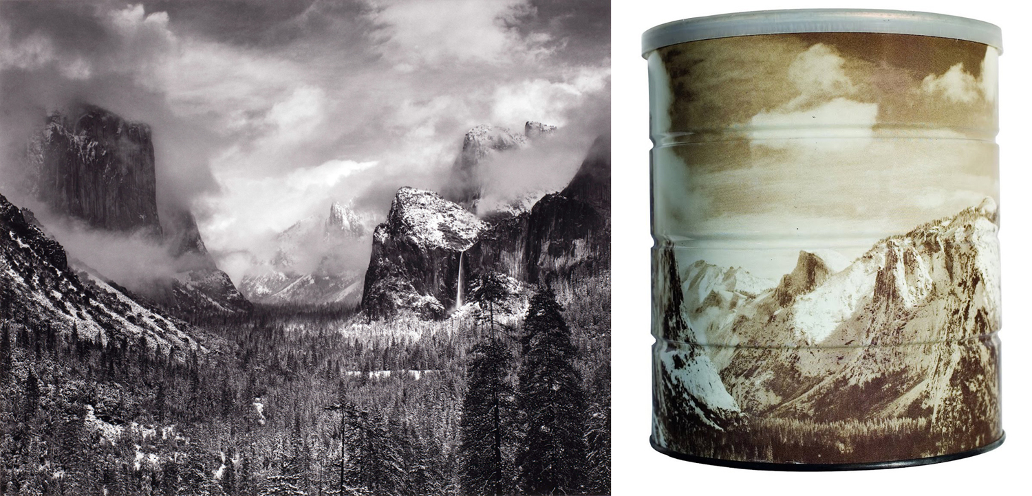
Any theme, including the sublime, can peter out in too-familiar tropes and cliches. And so, in the 20th century, artists and poets have needed to find new ways to explore the idea, without the hurling boulders and cataclysmic storms of the 19th century. The old ideas still persist, of course, in such things as the photographs of Ansel Adams. It came to a banal end in 1968 when Adams let his photos grace the cans of Hills Bros. coffee.
But, for the most part, the sublime has quieted down for the past hundred years or so, with priority given to social and political themes, from Brecht to Basquiat. We have a suspicion of grandiosity. Two world wars made us modest.
Nevertheless, that cosmic power is still out there, seducing and threatening us. The night sky, the city-flattening hurricane, the ever-retreating horizon, the glimpse over the edge of the Grand Canyon precipice. And, always, our awareness of the inevitable extinction of our personal consciousness.
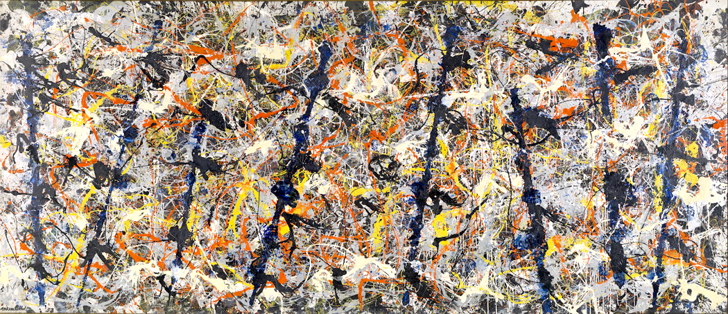
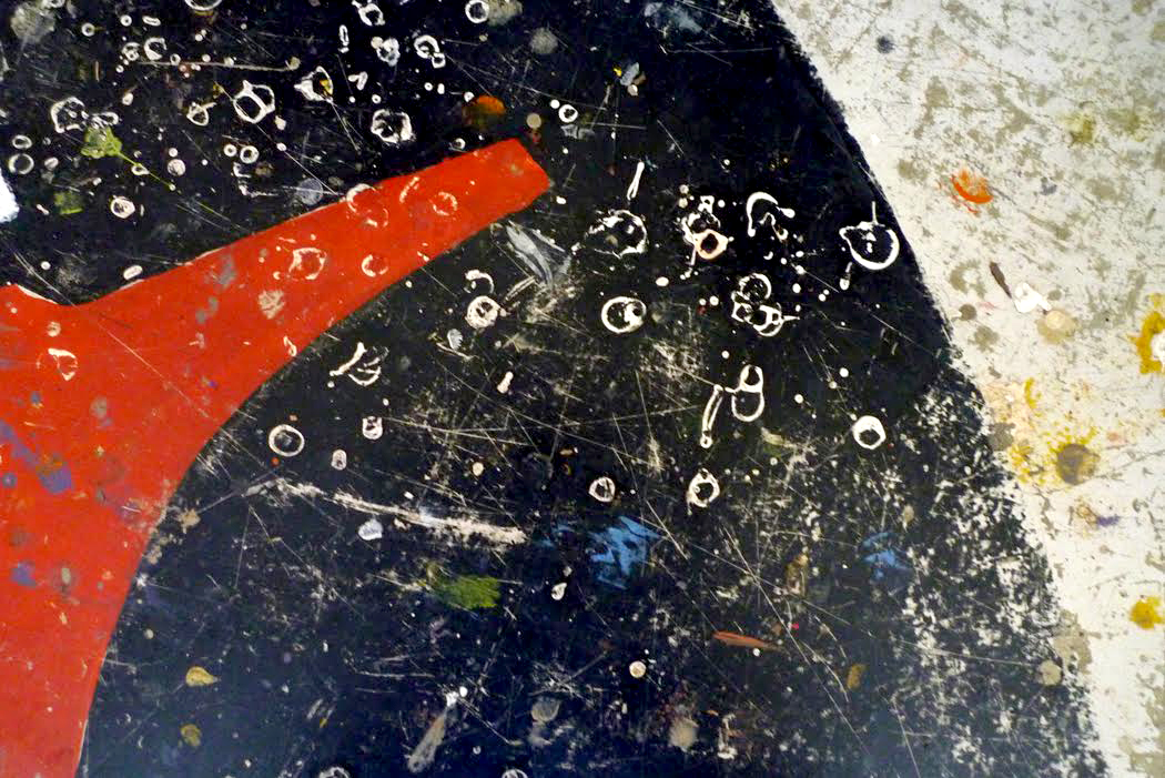
“Blue Poles” Jackson Pollock 1952
And some artists attempted to address this, but without the baggage of 19th century Romanticism. People like Barnett Newman with his huge blank colors, Jackson Pollock with his impenetrable scribbles, and Mark Rothko with his inscrutable floating squares.
In fact, it was Rothko that first unlocked the Sugimoto seascapes for me.
Rothko was another artist whose work initially I didn’t understand. Having only seen reproductions in books, I thought of his paintings as simply boxes of pleasing colors splashed on the canvas.
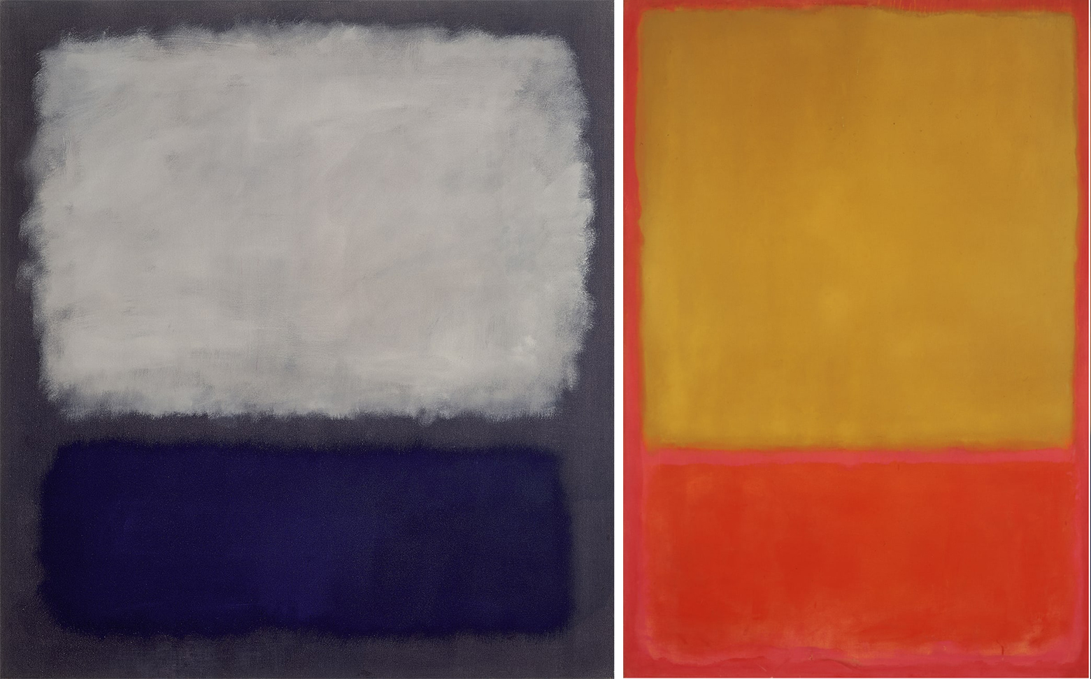
“Blue and Gray” 1962” and “Ochre and Red on Red” 1954 Mark Rothko
All that changed when I got to see the actual work, hanging on museum walls, and I realized those colors actually floated — visually — above the canvas. The colors of ink in a book illustration couldn’t do that the way actual pigment on canvas did. The difference between seeing a picture of an airplane and the actual flying at 30,000 feet.
And so, it hit me, Rothko’s quiet illuminations were the 20th century version of the sublime. I couldn’t explain the emotions they roused in me, but they were the sense of seeing the primordial meanings of life, something no words could convey.
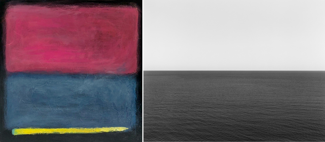
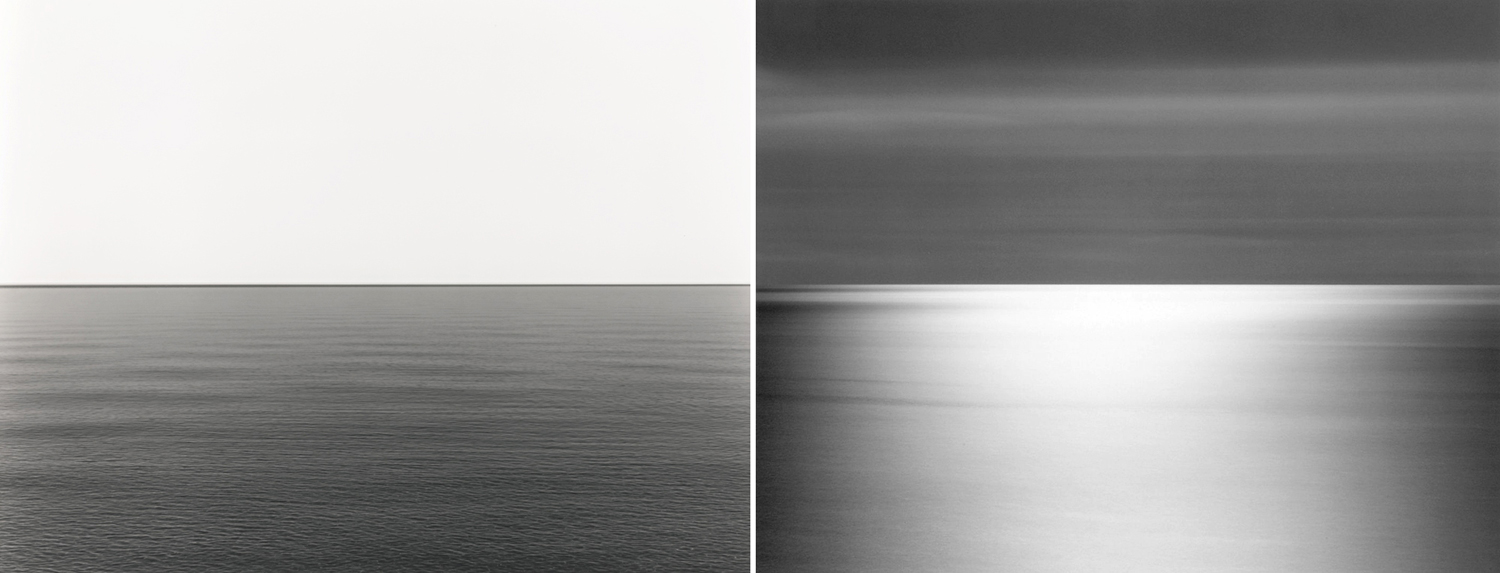
It was this same thing that nagged at me in Sugimoto’s photographs. The sky and sea were yin and yang, something primeval and immutable.
“When you look up at outer space there’s the Moon and the Stars,” Sugimoto said. “But on the surface of the Earth, the farthest place people can see is an ocean horizon.”
Sugimoto also said that seascapes are pivotal in that they are a scenery that we, in our modern world, still share with the ancients. Cities all look modern; even rural landscapes are crossed by interstates and power lines. But the ocean looks today the same as it did for Homer.
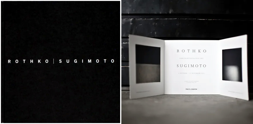
(Only recently, I discovered that the Pace Gallery in London had mounted a joint exhibit of Rothko and Sugimoto in 2012, and had even published a book about it.)
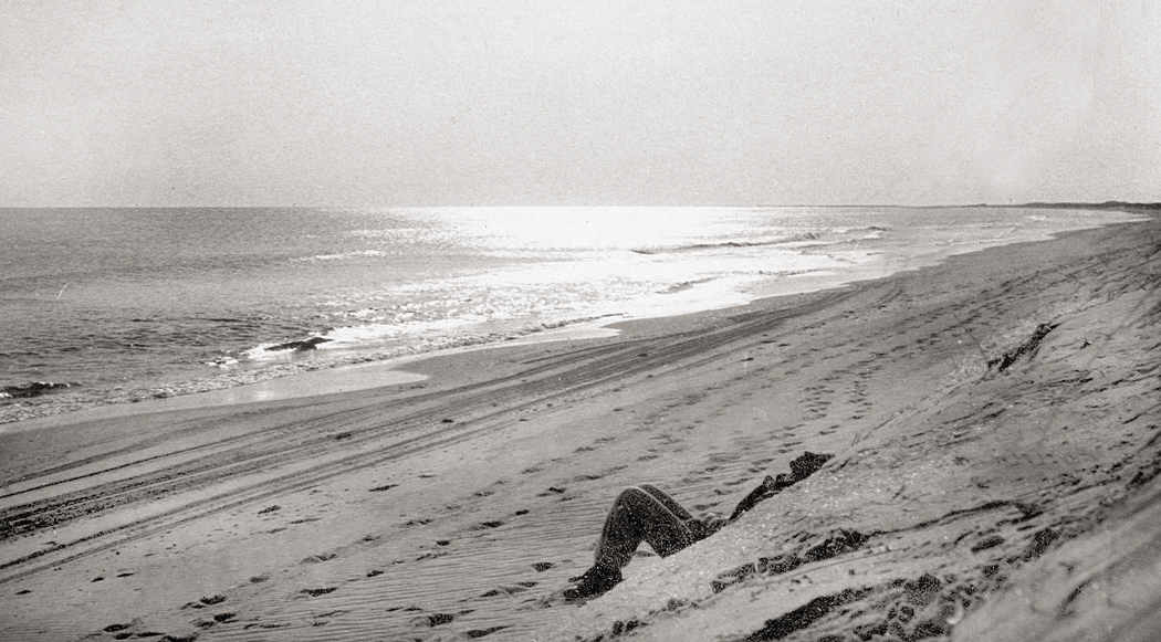
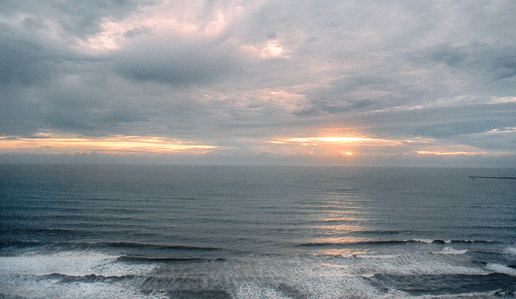
When I lived in Virginia, all those decades ago, it was on the ocean and I would almost daily have the opportunity to look out over the waves and into the horizon. I saw the seascape in sun and under the wind-blown scud of a nor’easter. It changed every day, even hourly. There were times when the sky color and sea color were so matched that the actual horizon line vanished and what I saw was a great blankness. A void. An infinity of sameness without edge. That blankness was a key to the modern sublime.
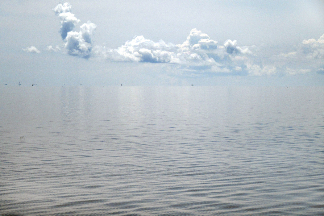
Currituck Sound, N.C.
Usually what I saw was just “the beach,” with its swimsuits and sunscreen. The everyday tends to crowd out — needs to crowd out — the eternal. After all, we have lives to live, jobs to get to, families to care for, and we cannot function if our adrenaline is always at the boil. But there were also times that I could look out at the water and air and realize that I was seeing the fundamental sense of existence. The quotidian keeps us functioning in society, but the sublime absorbs us into the universe.
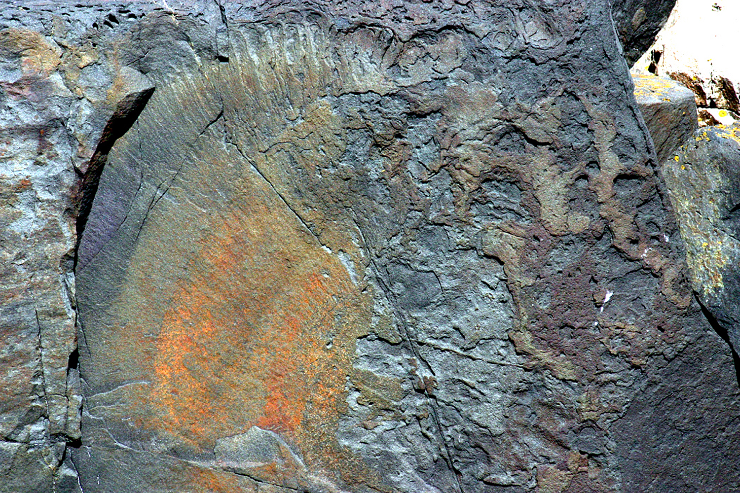
There is such a thing as an intense blankness. It is both frightening and beautiful.
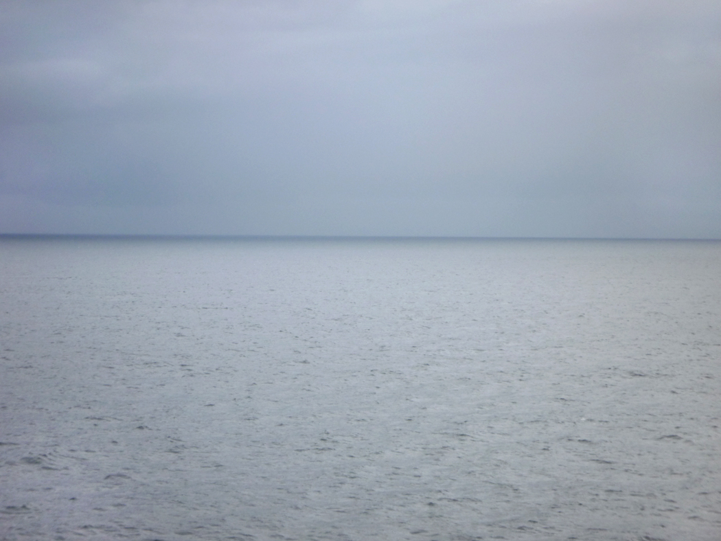
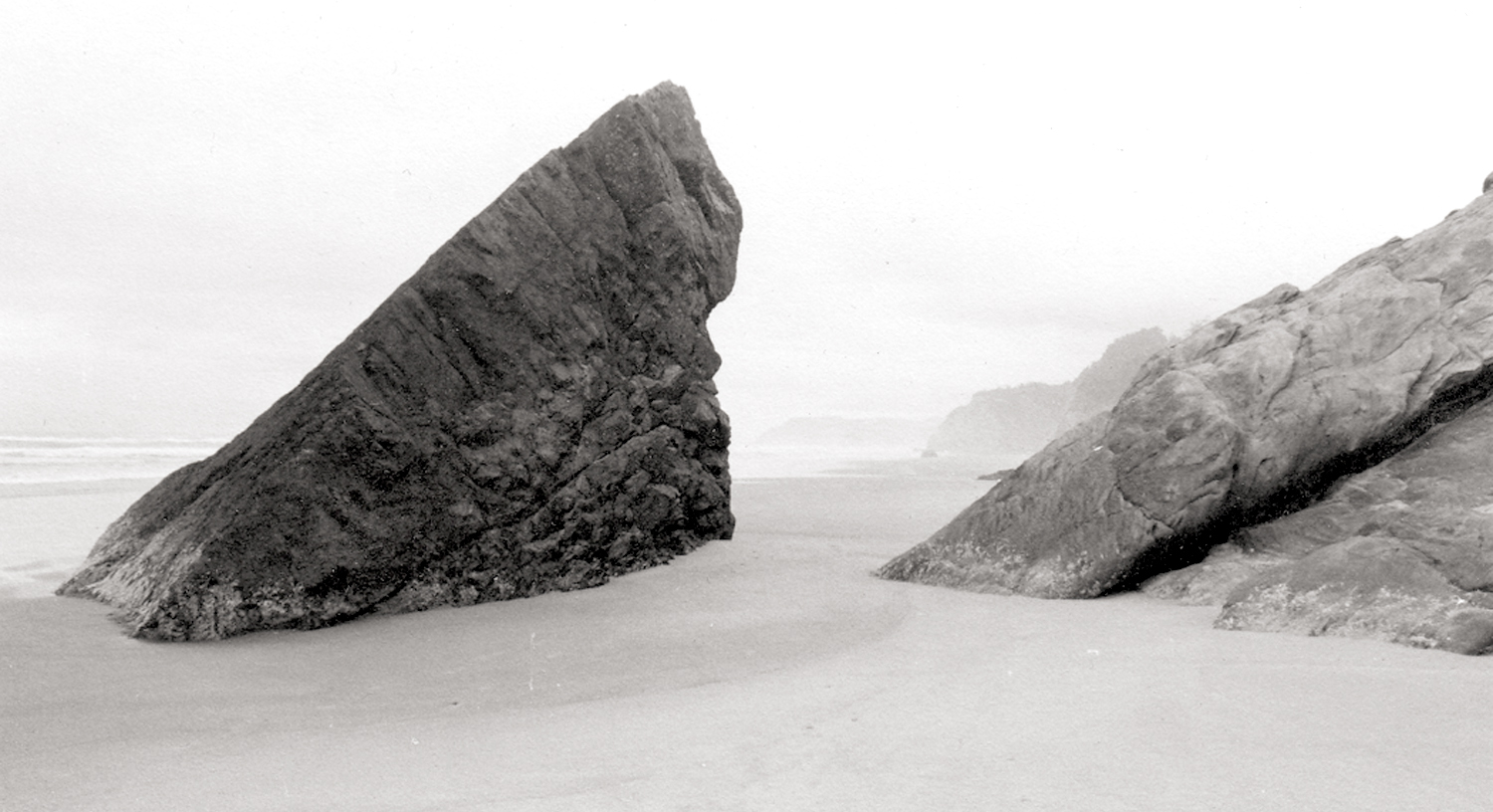
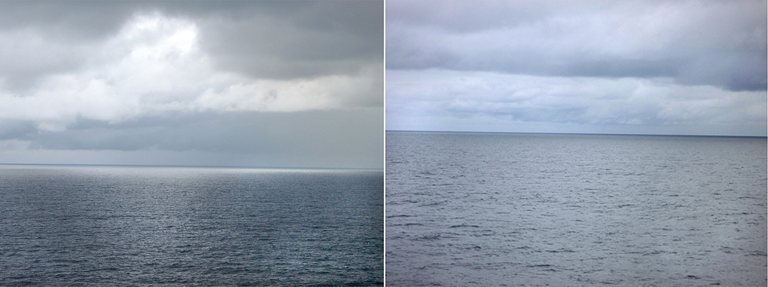
Alaska
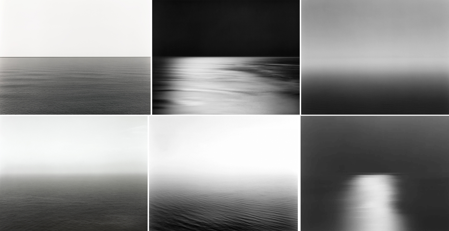
And without consciously realizing it, those Sugimoto photos had buried their way into my psyche, and without consciously imitating his work, I had begun making my own photographs of that phantom horizon. I did so all around the world, like this one of the Indian Ocean from South Africa:
Or these from Alaska:
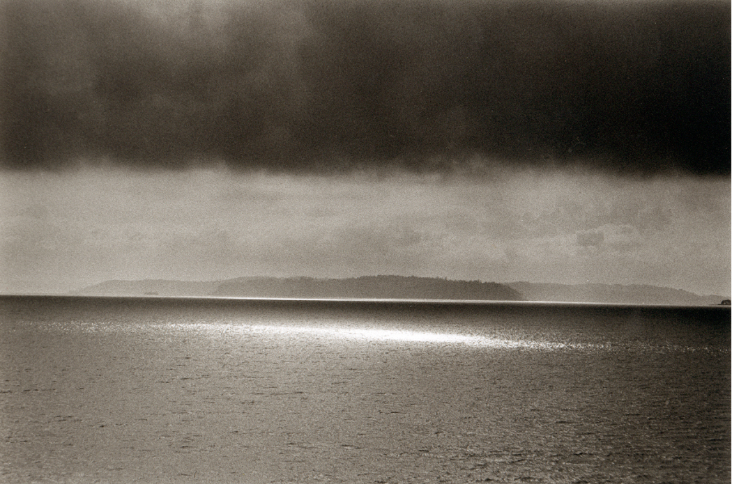
Or this coup de soleil on Puget Sound:
Although I was not aware, when making these images, that Sugimoto was buried in them, I was aware that they were informed by the sublime, and specifically, from a 20th- and now 21st-century version of the concept.
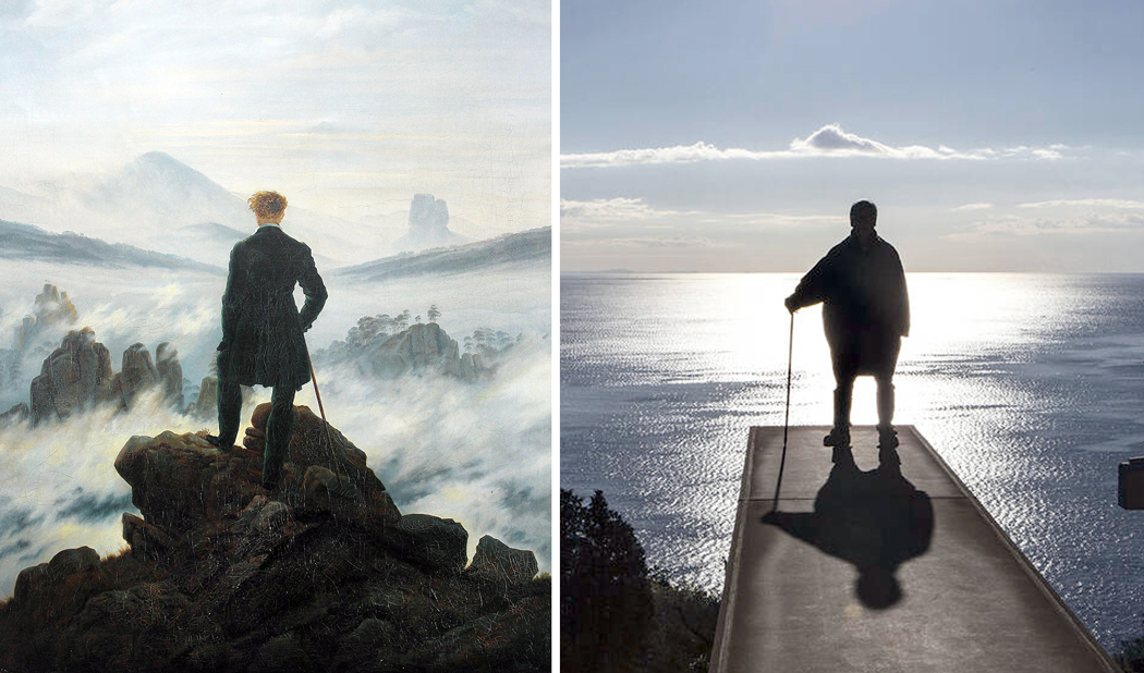
Finally, if I needed any confirmation that Sugimoto was striving for the sublime, I found it in this photo of the artist, posed to mimic the painter who was perhaps the poster-boy for 19th-century Romantic sublime, Caspar David Friedrich.