Archive

Tag Archives: taste

As a little boy in the 1950s, I remember visiting my great-grandmother in Jersey City. She had a darkened living room, with great stuffy chairs, a mantel clock surrounded by tchotchkes, floor-length curtains over the windows, and the back of every chair featured a lacy antimacassar. There were cut-glass bowls on the animal-claw end-tables, one of which was filled with hard candy, from which we children were offered “one.” 

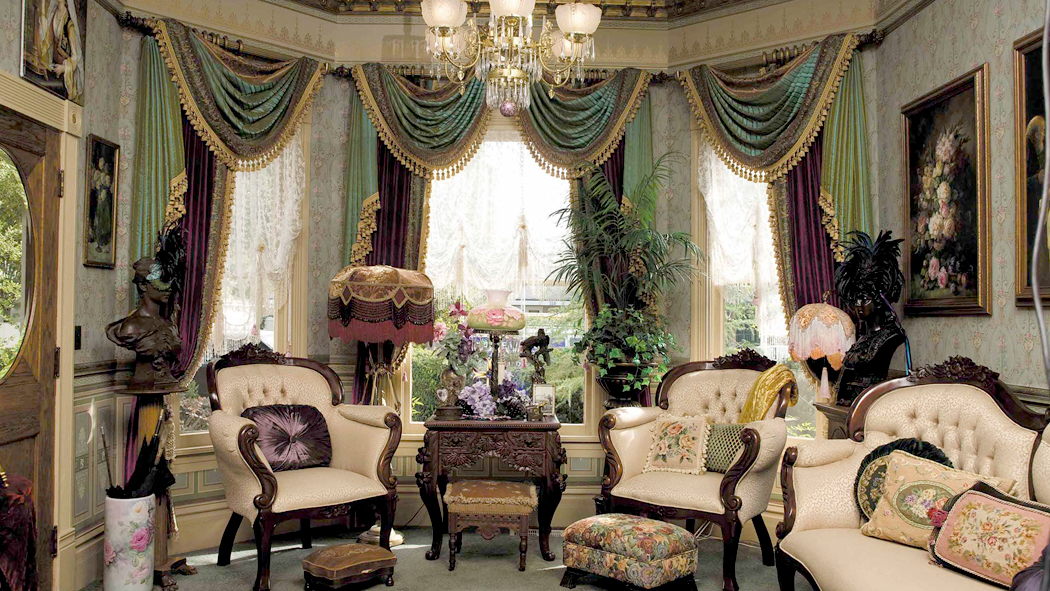
It was for my tiny little brain, simply what old people lived in, so unlike the split-level suburban home where I grew up. There was the smell of oldness, the wool of oldness, the dark mahogany of oldness. Above all, everything seemed upholstered and dark. Later, when I was an adult, I recognized the style as Victorian. 

As in Norse mythology, there were three separate worlds — the world I knew, with my schoolmates; the world of my parents, with its privileges and authorities; and the distant and rarefied world of the ancients. These were not simply different houses, but completely different universes. 

Each of these reflected the “taste” of its generation. Victorian; Mid-Century Modern; now Postmodern. 

They were three different “tastes.” And taste rules so much of what we like, what we choose, and who we think we are. It is the way we groom our hair, the clothes we wear, the car we drive — we don’t choose a BMW over a Honda because it gets us to our destination any faster, but because it presents to the world the person we think we are — or want to be. The same with a Volvo or a Ford truck. Taste is a powerful driving force in our lives, whether we are aware of it or not. But sometimes, it must be transcended. 

When I made my living as an art critic, I had to put aside my individual tastes and attempt to judge art by more impersonal standards. For instance, I have never responded to what are called the Mexican muralists — the Diego Rivera, David Siqueiros, José Orozco paintings and their peasant-proletarian mythologizing. It shared too much with socialist realism and was, to me, rather drab in its muddy earth colors. Nevertheless, I had to acknowledge the importance, art historically, of their work, and to be able to distinguish between the best of Mexican muralism and the lesser, more humdrum examples. To be able to distinguish and understand was more important than my “taste.” 

This problem has cropped up again recently when a friend and former colleague posted a series of videos on YouTube cataloguing the biblical paintings of Marc Chagall, accompanied by ironic and meaningful music by Tori Amos, John Lennon, Mix Master Mike and others. He asked for my opinion. I watched all nine short videos (watch the first one here) and was impressed by his graphic and editing skills, but had a hard time otherwise. I simply don’t much like Chagall’s painting. Never have. 

I recognize his significance in art history, and there are things of his I respond to — a few paintings, such as 

I and the Village (1911); View of Paris from My Window (1913); Cubist Landscape (1919)

his stained glass at Reims Cathedral; 

and the ceiling of the Palais Garnier in Paris. But the general run of Chagall has always struck me not as childlike, but childish. And he produced way too much with too little editing, leaving dozens and dozens of images virtually identical except for their finish — a blue coat here, turned red coat there, or left as a scribble. This was especially true of the biblical images, of which there seemed to be hundreds. 

My friend had collected them all and divided them into the familiar episodes or stories of the Bible, adding the music and sometimes his own commentary to them. I dutifully sat through all nine chapters of the video, but in the end did not come away with any higher opinion of the artist — indeed, the need for editing seemed all the more imperative. 

I don’t fault anyone for their taste. I recognize it as an individual thing. My taste is not better than anyone else’s, it is just mine. If I respond to Mahler more than I do to Max Reger, well, then, that’s me. If I would rather re-read Milton than James Dickey, so be it. Would travel across the country to see a Pollock retrospective but wouldn’t cross the street for Frank Stella, that’s just the way it is. (This may have something to do with a sense that the world is not tidy and organized, but chaotic and spontaneous. I share Pollock’s sense and not Stella’s). 

Yet…

Yet, there is that passage in Coleridge’s Biographia Literaria where he makes the distinction between gustibus and gustus. Plural and singular. We all know the Latin phrase, “de gustibus non est desputandum,” but, Coleridge says, “gustibus” is what I have been talking about so far — personal preference. We like some things more than others. Any argument is silly: “I like pickles.” “No, you’re wrong, I don’t like pickles.” 

But “gustus,” he says is different. It is the ability to differentiate between value and trash. Tastes are personal, but taste is about discernment. It is what allows us to know that Marc Chagall — no matter what I personally think about him — has value that, say, Thomas Kinkade does not. That James Dickey wrote poetry and that Rod McKuen wrote whatever you want to call it, but not really poetry. 

Gustibus allows us to enjoy even trash. It is OK to like Kinkade’s brand of nostalgic goo, but it should never confuse it with quality. 

John Waters is the master of bad taste, but he has taste. The interior of Elvis Presley’s Graceland is also in bad taste, but there is no evidence of actual taste involved. Hence the word “tasteless.” 

The distinction to be made is one of awareness. Taste comes from engagement, from paying attention. Lack of taste comes from acceptance of the conventional, of the expression of sentimentality, or the dependence on what someone else says is good. 

Much has been made of taste as a class distinction. But that is not what I am talking about here. Artist Jenny Holzer has famously said that “Money creates taste,” but it doesn’t. Money creates fashion and fashions change. Taste is a way of experiencing the world; it is not a hemline or this year’s color pairing. British aristocracy includes some of the world’s most tasteless people. 

Here in Asheville, N.C., there is a mansion called the Biltmore House, which is one of the most tasteless, garish pieces of architecture I know. Money creates smugness, not taste. Think of all the money Donald Trump has. 

Taste in the sense I mean it is at its foundation an engagement with the world, with all of it. It is the attempt to see things as they are and appreciate them for their worth.  

There is a problem. It is so easy for gustibus to blind us to gustus. We easily take our tastes as taste and assume that things we like are therefore universally good. It takes some doing to divorce one from the other. We assume we like something because it is good and therefore, everyone should agree with us. I like pickles and if you don’t, you must be a Communist. 

It’s a trap we all fall into at times. Myself certainly included. But I’ve seen many things I initially didn’t appreciate later come to be favorites. Did Bruckner suddenly become better than he used to be? I wrote a whole piece about how my mind changed on the paintings of Joseph (not Frank) Stella (here). The acquisition of taste is an ongoing process and requires constant engagement and re-engagement. Make up your mind too soon and you miss a lot. 

In short, our tastes close us off, while fostering your taste opens you up. Tastes are our hidey-hole, where we burrow in and stave off the parts of the world that make us uncomfortable. Tastes are lazy; taste is adventurous. 

The cultivation of taste is a question of experience. The more we become familiar with, the better our choices will be. 

I remember when the film critic at The Arizona Republic was brand new. Bill Muller had been a political reporter, and when the previous critic left the paper, the feeling was he had been too “arty.” And so, they wanted an “ordinary Joe” to speak for the ordinary moviegoer. Muller seemed the perfect choice. He knew nothing about film (which he readily admitted to. Muller was a very smart guy and honest). 

And so, for his first year as a critic, he loved movies where things “blowed up real good.” He was the demotic critic the company hoped for. The problem was, once you’ve seen 20 or 30 movies where “things blowed up real good,” you begin to be able to distinguish between those films done well and those done poorly. And so, Muller began to give negative reviews to sloppy and cliched movies. His taste grew. 

When he was first hired, Muller often shuffled off art and foreign films to me to review. It was a great gift to me. I loved those films. But as Muller’s taste grew, he began to appreciate the finer points of filmmaking and — as I said, he was a hugely intelligent man — he began to keep the art films for himself. He became a cultured critic. He never lost his common touch and became an Andrew Sarris, for instance, but I watched him with great interest as his taste level rose with his exposure. 

I don’t mean that Muller became a stodgy old pedant like me. He still loved popular movies — if they were good — but popular wasn’t enough. It had to be popular and good. His tastes were always different from mine, but his taste became more and more discerning. 

Taste requires exposure and it grows unbidden. There are no rules for it, as Susan Sontag wrote, “Taste has no system and no proofs.” But you miss it when it’s absent.

How did I ever become such a sobersides? An old fogey? So donnish?

My late wife used to call me “the man who can’t have fun.” But I do have fun. I have lots of it; it’s just that I get pleasure out of things most people find impenetrably dull. I find them incredibly fascinating. I watch C-Span Book TV on weekends, for instance. I read Homer and Dante, and listen to Paul Hindemith. I pine for ballet. And little makes me happier than digging into some arcane research. 

It goes way back to when I’m this kid, see. When my classmates were listening to Cousin Brucie on the AM radio and loving the Drifters or “Splish-splash, I was takin’ a bath,” I was spinning Stravinsky’s Rite of Spring on the Sears Silvertone. 

In third grade, I enjoyed diagramming sentences. Why?

 These things come to mind because I recently came across an essay written by Artsy editor Casey Lesser about how seeing Guernica when she was 15 years old changed her life and set it on its course. I had an instant reaction to her piece because when I was about the same age, I also came across the painting. 

It was in the early 1960s and I was a high-school student in New Jersey. I took the bus to Manhattan as often as I could and practically lived in the city’s museums, including the Museum of Modern Art, where I became lifelong friends with Van Gogh’s Starry Night, Jackson Pollock’s Number 1A and, of course, the wall-spanning expanse of Picasso’s Guernica. 

Back then, when I would exit the elevator on the third floor of MoMA, the painting — more than 11 feet high and 25 feet wide — dominated the view to the right, on the far wall through two other galleries. It was on “permanent exhibition,” and I was confident it would always be there for me to see. Nothing is permanent in this life, and in 1981, the painting absconded to Spain. 

With its powerful and painful imagery, the painting was proof to my adolescent mind that there was a world more real and more meaningful than the suburban life I was stuck in. And like countless young “sensitive souls,” from Wilhelm Meister to Holden Caulfield, I urgently and earnestly yearned for something that cast a larger shadow on the screen. I was a little too conscious of being the hero of my own Bildungsroman. 

That early exposure to the art at MoMA, and especially Guernica, aimed me at my eventual career as an art critic. Parvis e glandibus quercus. Or, as Pope had it, “As the twig is bent, so the tree inclines.”

But this recognition also set me off to consider what other early exposures bent that twig. Of course, some of the most transformative influences were people: teachers, friends, and eventually, wives. But I am concerned here primarily with arts and books that yanked the steering wheel from my hand and sent me in new directions.

I was in high school and my new exposure to history, poetry, foreign languages, both Latin and Spanish, all kindled a growing sense that there was more to life than sitting in the living room watching Bonanza and eating Oreos. 

Many of us rebel as adolescents against the banality of our lives, and that of our parents’. Most of that rebellion is inchoate and poorly aimed, leading to teen drinking, minor car theft or simple sullenness. But in some few cases, such as mine, there was a clear alternative: For me, the life of the mind. 

Art and literature spoke of an existence that was not banal, but intense and meaningful. I began eating it up. 

For instance, theater. I had little experience of live theater until my freshman year in high school, when the class was bussed down to Princeton, N.J., to see Shakespeare’s Julius Caesar at the McCarter Theatre. It was the perfect introduction to the Bard; the story was clear and simple, so, while the language was baroque, we could still follow the play easily enough. 

McCarter Theatre Center

Then, the following fall, we went back to the McCarter to see O’Neill’s Long Day’s Journey into Night. What crazed educator thought that a three-and-a-half hour play about a screwed up family in 1912 was a good one for high school sophomores, I don’t know. But it struck just the right note of high seriousness for my nascent psyche. I loved it. I wanted more. 

I’ve already written about my high school girlfriend, who became a professional musician, and how we used to make out on her couch while listening to Stravinsky on the phonograph. We went to countless concerts and recitals in New York and I came to love classical music. I bypassed the doo-wop: My Four Seasons were Vivaldi’s, not Frankie Valli’s. 

I took up reading contemporary literary fiction: Updike, Bellow, Pynchon. Two books especially hit the mark. I was bowled over by Joyce’s Portrait of the Artist as a Young Man. I sought epiphanies. It’s a book I still read again every few years. 

Then, I discovered Kazantzakis after watching the movie of Zorba the Greek, where I read the book and found in the novel a deeper level of Buddhist thinking, which sent me on to discover Zen via Alan Watts and poetry via Matsuo Basho. 

Each taste made me seek out more. Haiku eventually expanded into Paradise Lost — an inflation equivalent to the early seconds of the universe after the Big Bang. 

All this was heady stuff for a pimply-faced teenager, but even if only dimly understood at the time what I was reading and experiencing, I knew it was bigger and more important than my paper route or the Reader’s Digest. The desire for a richer, deeper, more profound life has been the driving force behind my inclination toward what used to be called high-brow culture.

There has been an ersatz distinction between high-brow and low-brow. But that distinction is characteristically middle-brow. There is a snobbery of the middle classes that seeks to distinguish itself from the uneducated tastes, and an aspirational striving for the status (and wealth) that seem to mark the upper classes. In this dynamic, there is an inherent self-loathing to the middle class, at least when it is self-aware. 

And no doubt my allegiance to fine art was originally spawned by this loathing of what seemed a mundane and insipid upbringing. Art told me there were more serious concerns in life, and bigger adventures. If I didn’t want to be squelched by the 9-to-5 life, hanged by the necktie and imprisoned by my own front lawn, then I would have to take on Bach, Joyce, Hokusai, Zora Neale Hurston, Laurence Sterne, Miles Davis, Correggio, Xenophon, and Philip Glass. Gobble them all up and look for even more with an incessant appetite. 

That was all a half-century ago. I have sucked up every bit of knowledge and wisdom I could find, only to discover that I knew less and less, and was more foolish than I ever knew possible. Now at 72, I no longer feel intolerant of the middle class that gave birth to me, but find it is the foundation of a society that allows me space to be an outlier. Only with the solid support of a functioning culture could I have found a means to leave it behind. Its tolerance allows me my eccentricity. I know I would have found none in Stalin’s Moscow nor Pol Pot’s Phnom Penh. 

So, I have been allowed to read what I want, see and hear what I want, and if that has led me away from the class that a-borned me, it has led me to a place where I find it hard to judge anyone. Not impossible, but difficult, knowing how little all my education and cultural exposure has taught me. Much information; little wisdom. 

But it has informed my life, made it richer, provided endless pleasure, occupied a mind that hated inactivity, and, as all great art and literature does, nurtured compassion and forgiveness, an awareness of others both locally and globally. It has been the key to let me step out of the prison of myself. 

I once wanted to change the world. Most of us did in the 1960s. We knew we could make it a better place. That has all collapsed. Now, my idealism is drained from me, my expectation for the future and future generations is quelled. I expect no better than life can serve up. There is no end, only perpetual churn and change. I cannot fix the world; it needs no fixing, it only needs accepting, faults and all. And my need for improvement turns in on myself. 

Someone once said in defense of our youthful enthusiasms that what is called maturity is made up of equal parts of cowardice and exhaustion. I once would have agreed. Exhaustion, maybe, but cowardice, no. Maturity is acceptance. “The wrastling for the world axeth a fal.” 

I still find myself bored by the simple and simple-minded, and find myself excited by the complex and the beautiful. And so, I read Tolstoy, listen to Bartok, examine the canvases of Titian and Francis Bacon, weep over the dance of Pina Bausch, and soak in the films of Tarkovsky. These may not be plebeian tastes, but they are my tastes. They satisfy. 

It is is not just the life of the mind, it is life to the mind. 

“Do not move. Let the wind speak.” 

May those I love try to forgive what I have made of it. 

wall panels

Two of the most common complaints I heard at art galleries were: “My kid could do that,” and “It’s the emperor’s new clothes.”

As far as the first, I suspect the kid could do that, although the parent could not. Kids’ art is amazing. As for the second, it implies that the artist is somehow hoodwinking the public, setting out to create something to “fool the rubes.”

But in my 25 years of being an art critic and seeing hundreds, probably thousands of shows, I have to say I cannot remember a single example of an artist deliberately scamming the public. On the contrary, no matter how godawful the art, how silly the conceit, how pretentious the content, every single one of them was utterly sincere.

The issue has been raised by my former esteemed colleague, Kerry Lengel, on his Facebook page: “What percentage of Modern art was created for the sole purpose of making rubes like me scratch their heads and go, ‘Whuh …?’ ” Included is the above photo of a four-panel Minimalist artwork. He seems to have addressed this question specifically to me.

My initial response to his percentage question was “13.7 percent.” But that was merely facetious. He suggested 40 percent. But my real answer is closer to zero.

This is not to exonerate all the really bad art that hangs on gallery and museum walls, but to claim that the miserableness is not by intent. Remember the rule of thumb: 90 percent of everything is crap. (Others calculate that at 99 percent, but I’m not here to quibble).

Nor am I going to argue that many arts professionals aren’t gargling jargon and hiding behind graduate degrees and claiming to have arcane knowledge the ordinary art goer is not privy to. Any profession has its shibboleths. I have complained many times about the ridiculous text that curators post beside the art on the wall, claiming all kinds of political and philosophical content in otherwise simple imagery. Such content may or may not be there, but if it isn’t communicated by the art itself, what good is having an explanation next to it?

The academic and intellectual world has been infected for the past 30 or 40 years with “theory,” and it has deracinated a good deal of the art, both by explaining away the work, or by substituting theory for actual experience. There is much to be learned from deconstruction or semiotics, but it cannot replace just looking at the art itself. All theory is an attempt to replace living experience with dry words. Language is a way to tame the effusive and prolific chaos of human experience. It is a map instead of a voyage.

(I thank goodness that we seem to be leaving the constipated orbit of post-structuralism. I could never understand why we should take seriously any theory that by its own tenets is meaningless. It has been one of the least helpful things the French have ever given us.)

Let’s take a look at the four wall panels above. First, they aren’t just any colors, but specifically the primary colors of the additive color system, that is, the colors in your TV and computer screen. The blue isn’t any blue, but the almost purple blue, the red is a tomato red. If you look closely at the colors and try to ingest them the way you might a salami sandwich, roll them around on your eyes the way you might roll that deli meat on your tongue, you can simply enjoy their intensity. They are a pleasure to look at.

But they may also make you consider the difference between the mediated world of digital experience and the sensuous world that you float in daily. The artist could have chosen the printer’s subtractive primary colors (the colors of the printed page), cyan, yellow, magenta and black (abbreviated to CYMK, where the K stands for black).

wall panels cmyk

So, they are not just any colors. You bring to the art your knowledge of the color choices you use daily on your iMac, the same way you bring your knowledge of biblical mythology to the paintings of Titian, or your knowledge of the French demimonde to Impressionists.

Further, the rectangular shape of the canvases (or panels, I can’t tell from the photo) is the shape of the pixels on your TV or computer screen. If you look with a magnifying glass at the screen you can see them lined up in register. These four panels seem to be about something, not merely four panels of random colors.

What you make of all this is up to you, but you should not simply dismiss the art. I don’t want to make to great a claim for this specific piece of art, but the artist clearly had something in mind.

What we are asked to do by any piece of art is to take it seriously. We may ultimately decide it belongs with the 90 percent that deserves to be flushed away, but we haven’t earned the judgment unless we first allow ourselves to assume its sincerity (even when it is clearly an ironic comment). It’s the art world equivalent of “innocent until proven guilty.” Admittedly, it can sometimes be a short trial, but it shouldn’t be a lynching.

It should also be noted that there is a difference between liking a piece of art and appreciating it. We all have tastes and sometimes we like vanilla and don’t like asparagus. But we can recognize that some people love the vegetable. Liking is not a judgment, it is an expression of personal taste. There are many works of art I recognize as important and distinguished but that I have no taste for. I have a personal animus toward all Victorian literature. Can’t stand the stuff. But just because I was put off Dickens by being forced to read Oliver Twist in eighth grade doesn’t mean I think Dickens is no damn good. I just don’t resonate to Victorian writing. I don’t enjoy Browning, either, or Hardy. Liking is merely personal; quality is something else.Holzer

Samuel Coleridge says somewhere in his Biographica Literaria that there is a difference between “gustibus” and “gusti.” De gustibus non est desputandum, he says is merely the personal liking and disliking of something, but taste, he says, is not like that. It can be cultivated and developed.

I remember recoiling at the rather glib statement by artist Jenny Holzer that “Money creates taste.” That should be, “Money creates fashion.” Taste is something else. Just ask Donald Trump.

Taste requires engagement. Spending time and effort. It is not a question of academic degrees, but willingness and openness; and an ability to forget the myriad conventional categories we have been ground down by. Art that is unfamiliar is usually art that is going somewhere beyond the norm, and invites us to go with it.stella-flowers-italy-1931-copy

So, if you don’t recognize value in the four panels of color on the wall, this should be a sign that you should stop and plan to spend an hour with it trying to figure out what the artist might be attempting that you cannot understand with the speed and alacrity you might get the punchline of a New Yorker cartoon. (See: https://richardnilsen.com/2014/07/10/how-to-look-at-a-painting/ )

Engagement — not in the Sartrean political sense, but in the sense of spending your time and attention — is the bottom line both in making art and in perceiving it. Let it absorb you as you absorb it. Seek the pleasure in the simplest things, such as the green; not just any green, but this very specific green. Taste it in your eye. For the time you stand in front of it, let the painting or sculpture, or installation, be everything in the world, a funnel into which you pour your whole life experience, and let it come back out in a torrent.

Obviously, you won’t get the big reward every time. Some art is thin gruel. But you should never just assume it is pabulum. It just may prove worth your time.

???????????????????????????????

I began seriously reading in high school, mostly contemporary fiction. I don’t remember what I could possible have made of Saul Bellow’s Herzog at the age of 16, but there it was. I followed that with Seize the Day and The Dangling Man. I read James Purdy, James Drought, Jules Fieffer, Hubert Selby Jr., Thomas Pynchon, Terry Southern, Albert Camus, and, ahem, P.G. Wodehouse.The Secret cover

Jack Kerouac, Brendan Behan, William Golding, Kingsley Amis, Eugene Ionesco, and of course, J.D. Salinger. I was a teenager, after all.

Quite a load of words for a high school student. I doubt I understood a tenth of what I read, but I couldn’t get enough.

There were a few “classics” thrown in, some required reading for school, but it was primarily new fiction I read — almost all of it over my head.

And almost all of it in paperback. There was a rack of paperbacks in the local drug store, and I would pore over them after school, looking for the latest Bellow or Updike.

return of the native airmontAnd then, there was Thomas Hardy’s Return of the Native, which was required reading in 8th grade — why, I don’t know. But I had the hardest time plowing through it. It seemed dense and impenetrable. I got bored. I couldn’t finish it.

Over the years, there were other books I had a hard time reading. The sense was always the same: They were uninviting; they were dense; they were difficult to read. I lost interest in them and didn’t finish them.return of native page

It was only years later that I realized the problem was not with the writing, it was with the printing: The cheap paperback edition of Return of the Native was really horribly designed: grey type, insufficient leading, narrow margins, bad, under-inked offset printing on grey or yellowed paper.

The problem was not with Hardy, the problem was not with me, the problem was with Airmont Classics, the paperback publisher. They had skimped on book design and created a brick.

Last week, wandering through the shelves of our local used book store, I found a copy of that noxious tome. As I began reading, I realized what a magical writer Hardy really could be. Now that I’m more mature — actually a geezer — I had a bit more patience than I had as a teenager, and I could manage to cut the furze, as it were, of the wretched typography. It is still a dank and uninviting book to look at, but I nearly cried at the opening paragraphs, as Hardy describes that particular and exact time of day and time of year when you can look down at dusk and the ground has lost any visual contrast; it dulls into the gray of evening — but if you look up, the sky is still bright. It is like that Magritte painting, only not meant to be surreal, only beautiful.magritte

“A Saturday afternoon in November was approaching the time of twilight, and the vast tract of unenclosed wild known as Egdon Heath embrowned itself moment by moment,” the book begins.

“Overhead the hollow stretch of whitish cloud shutting out the sky was as a tent which had the whole heath for its floor.

“The heaven being spread with this pallid screen and the earth with the darkest vegetation, their meeting-line at the horizon was clearly marked. In such contrast the heath wore the appearance of an installment of night which had taken up its place before its astronomical hour was come: Darkness had to a great extent arrived hereon, while day stood distinct in the sky. Looking upwards, a furze-cutter would have been inclined to continue work; looking down, he would have decided to finish his faggot and go home. The distant rims of the world and of the firmament seemed to be a division in time no less than a division in matter. The face of the heath by its mere complexion added half an hour to evening; it could in like manner retard the dawn, sadden noon, anticipate the frowning of storms scarcely generated, and intensify the opacity of a moonless midnight to a cause of shaking and dread.”

What had I missed over the years by thinking that certain books were dull, when it was only the visual aspect of their presentation that had discouraged me?aeneid

I remember trying my damnedest to shoulder my way through C. Day Lewis’ translation of The Aeneid. Whoever designed that paperback managed to use a page too small to hold the average length of a line in the font size he chose, meaning that almost every other line wrapped to the next line, flush right, giving the text a kind of visual hiccups, making a very ugly page that was nearly unnavigable. It put me off Vergil for decades.

By-and-large, it is paperbacks which are the greatest offenders. Designed to be cheap — which we appreciate — they are also designed to fit as much type onto a page as possible so as not to waste space or paper. Type is small; leading is squished; margins are narrow. To say nothing of the quality of paper used and the ink rolled on.

It isn’t merely a question of type size. Some large-type books are hard to read, and some with tiny text are easy. The issue seems to be the length of the line: Small type on a small page is fine, but spread that line out over a wide page and the eye tires before turning down to the next.

walden 1One of the prettiest books I own is a copy of Walden from the Heritage Club, published in 1939, with wood engravings by Thomas W. Nason. It was proud enough of its look to credit its designer, Carl Purington Rollins. I believe every book should credit its designer: A good design makes a book better; a bad design deserves blame.

Although it is printed in 8-point type, the page is compact, and the margin wide enough that the print-line is never too wearying.

One of the things that makes this Walden so attractive is that it was printed with lead type, not run off an offset press roller.

There are so few who still get pleasure from the look and feel of ink on paper — especially the tender and slight embossment of lead type dug into the fiber, and the ink laid there in the troughs. The soy ink now used flat on offset printing seems so one-dimensional. I have a two-volume Milton printed in 1843 that is as beautiful to look at as to read, as beautiful as a Piranesi engraving or a stained-glass window.milton 1

The question is not one merely of what typeface is chosen; some books are overly “artistic,” with fancy fonts and eccentric spacings — all of which make the book harder to read. What makes it all work is a typeface that is neutral enough not to call attention to itself, but not so dull as to be banal. No one want a whole book wearing Times New Roman like fishscales — you want to take the back of a knife to it and scrape it clean.

No, the question goes beyond type: It is a question of air between lines and around the text. It is a question of the darkness of the type — the heaviness of line in the drawing of the letters. It concerns the break of chapter and the intent of the paragraph: Neither too much nor too little.

And yes, this is a matter of taste, not of metrics: What is too much or not enough? The answer requires not a rule, but an awareness: awareness of the physical properties of the page and its contents. Most of us are unaware that books even get designed, unaware that there was a choice made in type, margin, leading, initial capitals, weight and brightness of paper stock, the deckling or smooth cut of the page edge.

Americans are often chided (and most often by themselves) for being too materialistic. But this simply isn’t true: Americans are not materialistic enough — they have little sense of the material world. The acquisitiveness that infects our nation has more to do with the non-material quality of status than with any love of the sensuous world we inhabit. One might say it is a “spiritual” value, not a material one. Certainly a tedious and unworthy spiritual value, but not in any way truly materialistic.kindle

So, it is hardly surprising that we now do so much of our reading on electronic gadgets. One might say one has become one’s own book designer, since one can choose certain visual parameters on your iPad or Kindle. But aside from enlarging the type for easier reading as we venture into the world of presbyopia, few take the chance to actually “design” the presentation on their e-reader.

And as a writer of a blog, I am frustrated by the fact that no matter how I try to make my text look on the computer screen, when it reaches your screen, it is your default choices that govern its looks as you read it. We have cut out the middle man — cut out the book designer, who can make my writing fun to read or a trial to machete through.

bruckner stamp austria

Are you old enough for Bruckner?

Poet Ezra Pound said there is no reason you should like the same book (or music or art) at 40 that you liked at 16. At 16, I liked Ezra Pound; now I’m 65.

The author graduates high school in 1966

The author graduates high school in 1966

Our tastes change as we age, or they should. My introduction to classical music was Tchaikovsky. His symphonies and concertos pumped new-generated hormones through my arteries like adrenalin — when I was in high school.

It wasn’t long before I left him behind for Stravinsky, then Beethoven.

By the time that I was middle-aged, I had gone through Bach, Mozart, Berlioz, Debussy, Mahler, and most recently had added Bruckner and Haydn to the list. I get things from each of them I was deaf to earlier. Now that I am retired, I have finally come to appreciate Verdi. But, boy, it was hard to get past all the oom-pah-pah-pah, oom-pah-pah-pah.

The path won’t be the same for everyone, but there are some general patterns that seem to hold.

In painting, we all loved van Gogh at about the same time we loved Tchaikovsky. There is a bigger-than-life striving in van Gogh that appeals to the adolescent, striving himself for some sense of the heroic.

The author 1975

The author 1975

That same aspiration drove us to read Catcher in the Rye.

With a few more years under an increasingly large belt, we drop Tchaikovsky as hopelessly sentimental, Salinger as naive and simply move past van Gogh as we become aware of the Impressionists, who tickle our eyes all over again. Hormones calm, reality sets.

When we are in college or as grad students, we tend to gravitate to those things that are trendy, new, and exclusive, that set us off from the proles: We read Umberto Eco or — in my generation, Alberto Moravia and Robbe-Grillet. We jumped on Marina Abramowic  and Bruce Nauman and listened to Lutoslawski, Schnittke and Harry Partch. Yes to Pina Bausch, meh to Swan Lake.

The author 1977

The author 1977

Yes, we were showing off. In many cases we admired more than enjoyed.

We then gave up the need to be au courant or exclusive as we came to distinguish between the gee-whiz and the substantial.

As adults, we craved the substantial. Adult tastes are acquired tastes: Poussin, Schoenberg, Milton, rutabagas, pickled herring.

Old age now brings something else: simplicity and inclusiveness. I am no longer quick to drop the critical meat-cleaver and sever away something I consider unworthy. They are all worthy. Tchaikovsky as much as Webern, Salinger as well as Joyce. We are enriched by each of them.

The author in his "Van Gogh" pose 1980

The author in his “Van Gogh” pose 1980

(No, I haven’t gone senile — I’m not ready to accept Andrew Lloyd Webber or Thomas Kinkade, although I see some value in Norman Rockwell that would have shocked me to hear anyone admit when I was 20. No, Rockwell is no Raphael, but there is room for an entire spectrum of abilities and accomplishments. What I ask isn’t so much undying masterpieces, as sincerity of attempt, and a willingness to put in the work.)

So, growth isn’t just a case of moving on from one thing to another, but adding more and more to our trove. By the time you are my age, you will have a heady backlog of esthetic experiences to draw on.

What is most interesting to me is that, if we continue to grow, we can return to art we left behind and find something new in it. From age 17 to about 40, I couldn’t bear Tchaikovsky — it seemed like treacle. But then I began noticing his bizarre harmonic sense and what I might call ”orchestration from Mars.” You only have to read the scores to see how peculiar is his voice leading. When I could get past the heart on the sleeve, I discovered an intelligence there that was hiding, or rather, that I was unwilling to discover, having made up my mind and moved on.

The author at Canyon de Chelly, 1989

The author at Canyon de Chelly, 1989

An now that I am bald, bearded and grey, I find that there is something even in the emotional immediacy that once embarrassed me.

As we grow, we not only grow into new experiences, we grow out of our old prejudices.

This all came back to me this week as I watched Lust for Life on cable. The 1956 biopic starred Kirk Douglas as van Gogh and Anthony Quinn as Gauguin. The film is an odd combination of excellence and awfulness, mixing insight with bromides, sanitizing the painter’s life while emphasizing the insanity.

More than anything, this is the van Gogh who appeals to adolescents, the van Gogh of idealism, identity crisis and suicide.

Alienated, misunderstood.

But there is one more aspect of him that is included: his commitment and perseverance. These quieter virtues, more than his insanity, give van Gogh his stature as an artist.

the author lecturing 2005

the author lecturing 2005

There was a time, in my 20s, that I dismissed van Gogh. The peculiar paint-busy canvasses, I was convinced, were just the evidence of a deranged mind. If you were schizophrenic, you could be a great artist, too.

But more careful study in recent years, especially of the many notebooks filled with drawings, told me something else again. Van Gogh paints the way he does because of his unwavering honesty to his eyes. He kept looking till he got it right.

And ”right” for him was to notice everything that his eyes saw, not merely what he had been trained to see.

If you stare long enough and with enough concentration, you can see something of the granular reality van Gogh saw. We no more pay attention to it in daily life than we pay attention to the grain in a movie’s film stock. It is not the information, but the medium of the information. We filter out so much. Van Gogh didn’t.

the author at Giverny 2008

the author at Giverny 2008

The other wonderful thing about van Gogh is that he had so little talent.

We tend to think of great artists being as fluent as Mozart or Raphael. Yet talent is a poor indicator of quality in art. For every Raphael, there are scores of Geromes and Bouguereaus: accomplished and pretty, but ultimately empty.

Van Gogh shared a lack of talent with several other great artists: Cezanne, for instance; or Jackson Pollock. One searches the drawings and oil sketches of Cezanne for even the slightest encouragement of talent. His drawing is hopelessly awkward.

Pollock searched for years for an adequate means of expressing what was inside him. To do it, he had to give up everything he had learned. If he had no talent for drawing, he would not draw. He found a talent for splashing instead.van gogh landscape

Van Gogh’s notebooks are full of erasures. He looked, drew, erased, looked again, drew again, erased again. Many drawings are never finished, but those that are, are right in a way the more facile Ingres never is.

Van Gogh was stubborn. I admire that in him more than I admire the talent of William Merritt Chase.

But give me another 10 years and we’ll see.