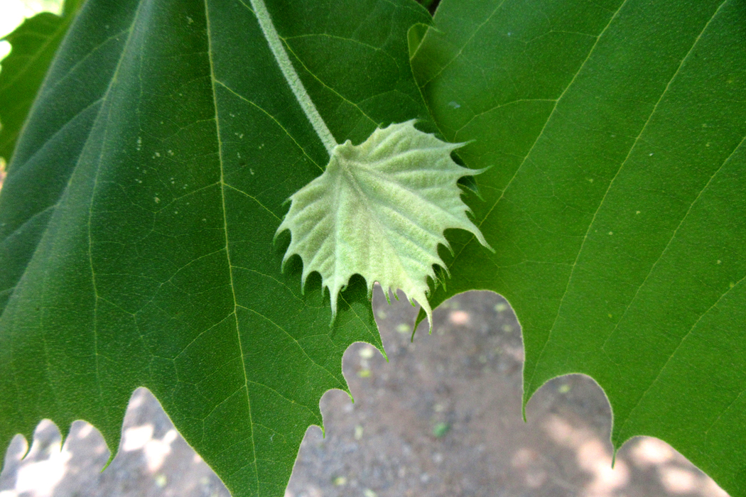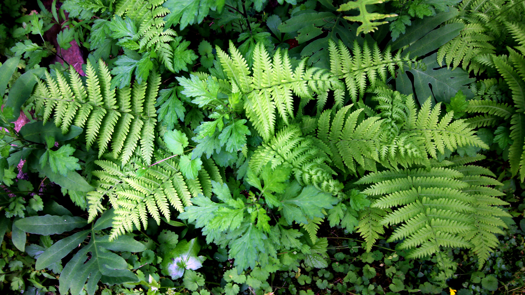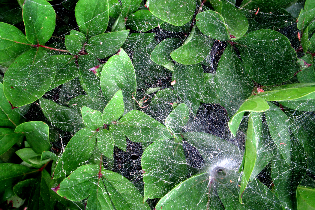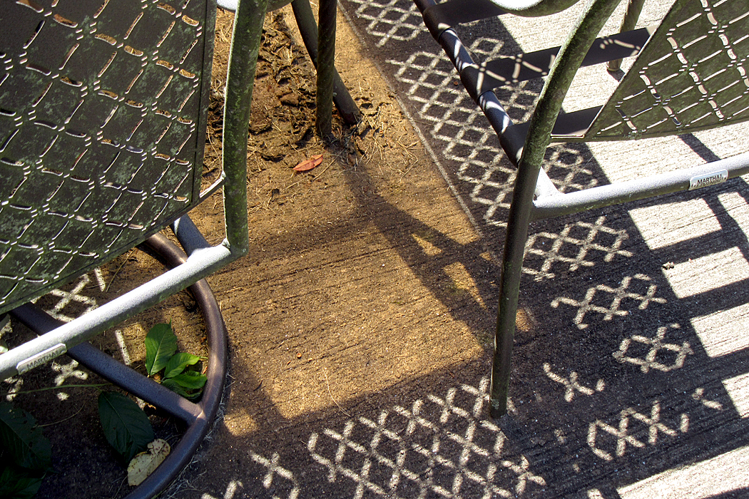
Archive

Tag Archives: texture

Garry Winogrand once said, “I photograph to see what the world looks like in photographs.” What? It looks like reality, surely. Isn’t that the whole point of taking pictures — to capture reality? 

But most photographs, historically, and including Winogrand’s are in black and white. The world is not. And even if you used Kodachrome or a digital camera, the colors are exaggerated, more saturated than the colors your eyes see. And then, a photo of your house, for instance, is maybe 8 inches by 10 inches, while the house is immense. The photo is two-dimensional and the world is 3-D. And most of all, your photo has an edge, a frame around a portion of what you see in front of you. It is not reality at all, but a convention of how we picture the world. 
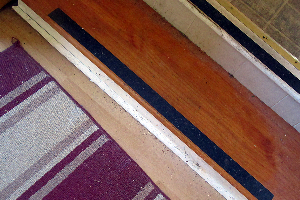
This is one of the hardest lessons for the beginner, or the ordinary person to learn. Seeing photographically is imagining how an image will perform shrunk and separated from context. To see photographically is to see shapes, lines, colors, textures and not to see houses or people. Yes, they may be in there, but you have first to recognize the shapes, lines colors and all that. And be aware of them. 

If you just see a subject, say, Aunt Trish, you may ignore the tree behind her looking like it’s growing out of her head, or you may take a picture of your car and not notice that half of it is blacked in shadow. You’re seeing a car, and not the patches of lights and darks that make the actual shapes your camera records. 
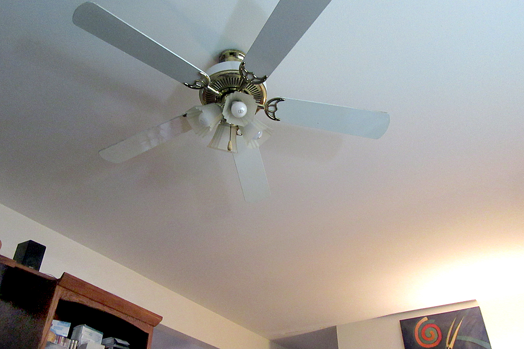
Most people think in words, and so, they name what they see. That’s a horse; that’s a tree; that’s my Grandma Edna. The camera doesn’t understand words or names. It sees shapes, lines, patterns, textures. As artist Robert Irwin put it, “Seeing is forgetting the name of the thing one sees.” 
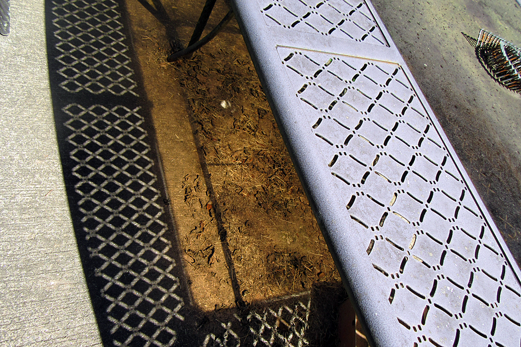
It takes some practice, some eye exercises, to train yourself to see. One online videomaker has suggested that whenever you have a spare moment, say, just sitting in your living room, to look around and see what may make a pattern, to spot contrasts of shape or color, to see abstract designs. You needn’t actually make a picture, but imagine things around you as if they were photographs. Make an imaginary frame. 
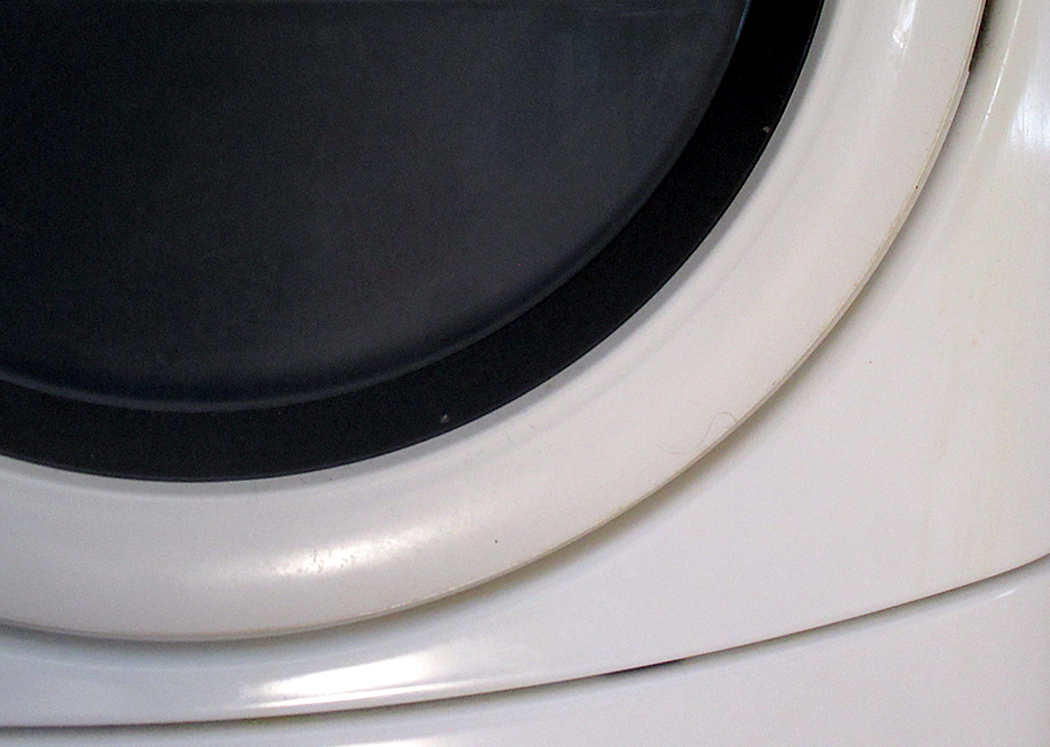
I do this regularly. I take my point-and-shoot Canon and take as many photos as I can in a period of time, say an hour, and see how many of them, simple details rather than nameable items, and turn them into visual offerings. 
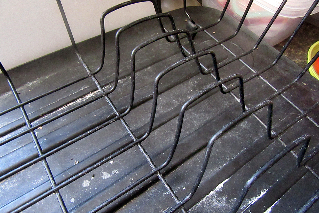
Another photographer, Lee Friedlander, calls this “pecking,” and uses his camera to find possible images. Out of a roll of film (in the pre-digital days), he might wind up with only a few pictures worth showing the public, but the exercise keeps his eyes awake and noting the possibilities. 
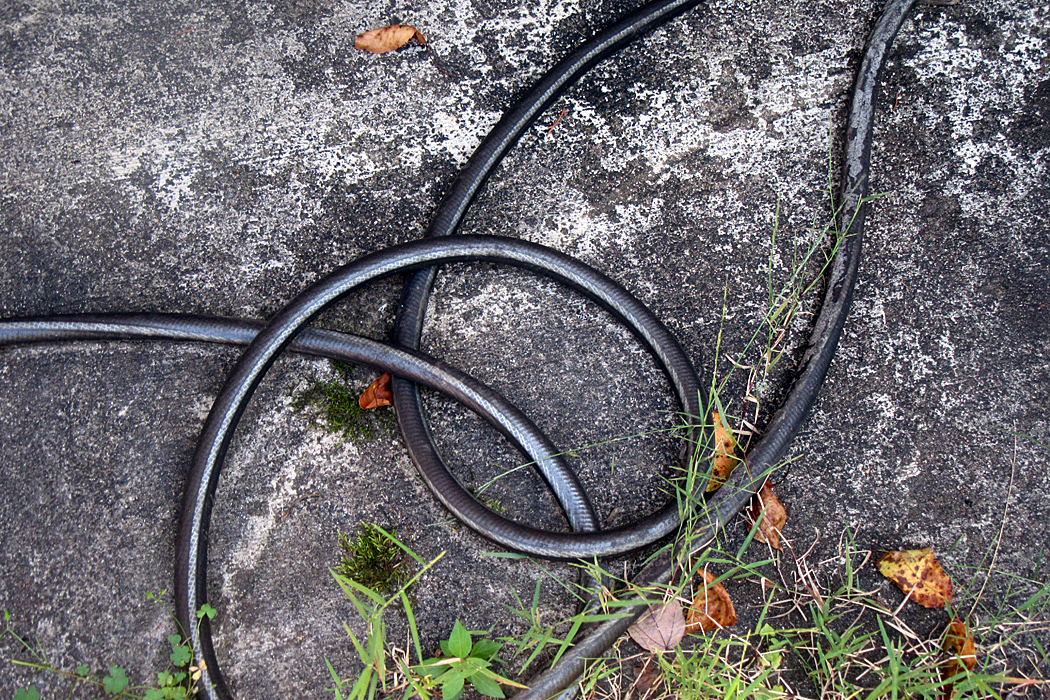
When I was teaching photography in the 1980s, I had an assignment I gave my students. I asked them to photograph something so that I couldn’t tell what it was. I warned them, I was really good at deciphering bits and pieces. They were not to simply make bad photos, out-of-focus or blurred images, but to see the shapes and lines extracted from context to hide their identities. (I can brag that only once in six years of teaching was I stumped. Usually, I spotted immediately the bits of clothesline, or the bottom of a teacup, or the stitching of a sole onto a shoe. To quote Captain Reynaud, “It is a game we play.”)
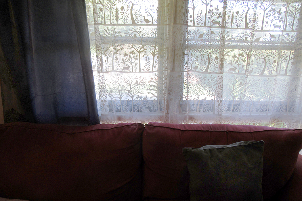
The world is made up of details. We assemble them into an experience we recognize — the neighborhood street, our children, the Grand Tetons, flowers in a vase — but each of these is constructed of details. Seeing the details vivifies the whole. 
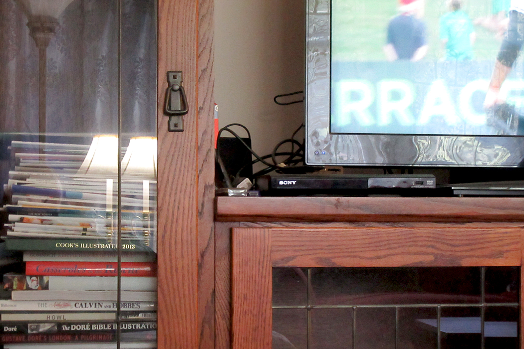
I have played with this exercise before, and even posted some of the images on this blog, when I spent an afternoon photographing all the circles I found. (link here)

I posted another on the patterns I found visiting my brother-in-law and “pecked” at the things in his house and yard. (link here). 
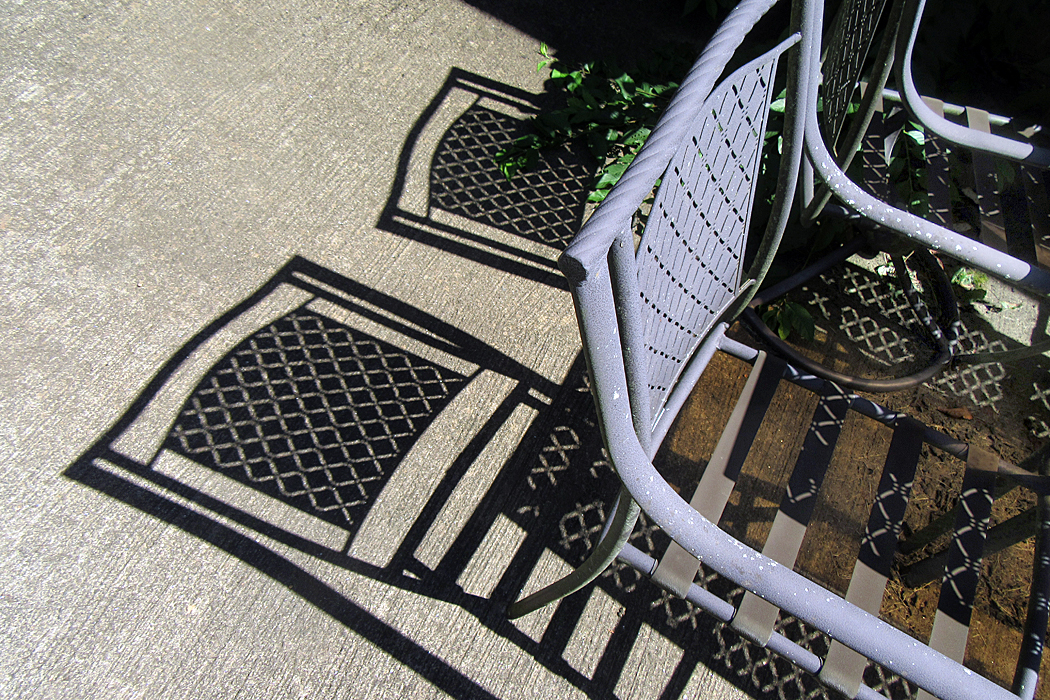
And I did it again yesterday in the back yard and in the house. I’m sure you can guess the identity of the things in the pictures, but it is the abstract patterns I was seeing, ways to use shapes, lines, textures, colors to form an esthetic whole out of parts. I made 50 photographs in the space of about 40 minutes. 
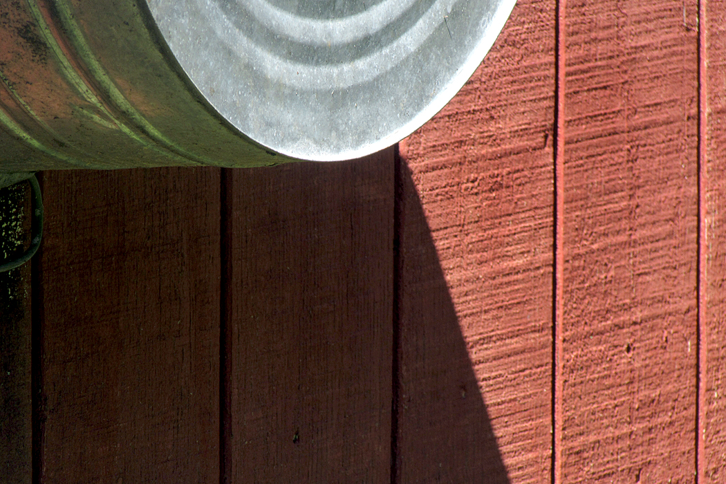
I don’t usually call these images art, although I don’t know what else to call them. They are ocular calisthenics, eye exercises, to help me focus on the seeing behind the naming. 
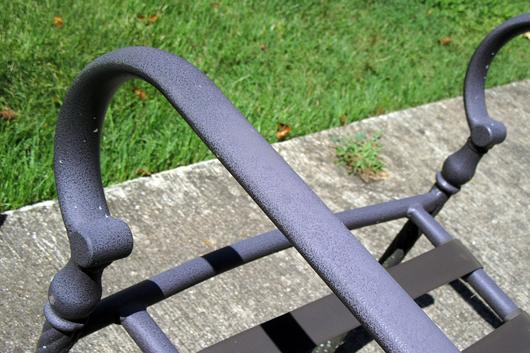
Back when I was a teacher, and therefore knew nothing, so was able to pass on my knowledge to unsuspecting students, I had to teach a word I now only mention with contempt: composition. We all taught things like the “rule of thirds” and “focal point,” and where to place horizons or how much of a person to include in a portrait. We taught awareness of negative space, and keeping it interesting. 
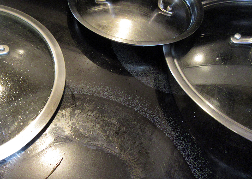
But long ago, it hit me that all these precepts had nothing to do with taking good photos. The word, “composition” implies a kind of blueprint or set of construction instructions. But I instead used the term “design.” And the secret to good design was never rules. It was awareness. “Design is your awareness of everything in the frame.” Want to chop someone’s head off at the top of the frame? Do it on purpose and it will work. Want to cut your landscape in half with a horizon? If you are aware of what you are doing, go ahead. Make that point. 
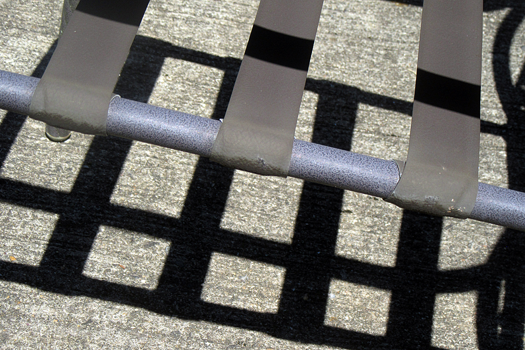
Most people, making photographs, or drawings or paintings, focus on their subject, and don’t pay much attention to the backgrounds, or the framing, or the patterns of light and dark. They focus on what is named. 
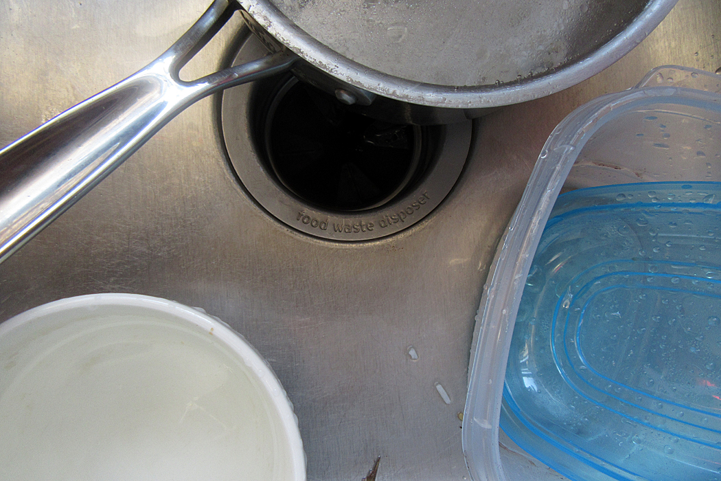
But if you look at all the great art of the past, and the famous photographs in your books, you see that the upper left corner, or the bit halfway in from the side, still has interest. It has not been ignored. Even a 17th century painting of a Dutch burger with a blank background has the precise color of that emptiness calculated and thought about. What a delicious blue-gray it is. Block out the rest of the picture and you will still get pleasure from the background. 

Awareness is the secret to any art. Paying attention. The more you are aware of, the better your result will be. 

Click on any image to enlarge

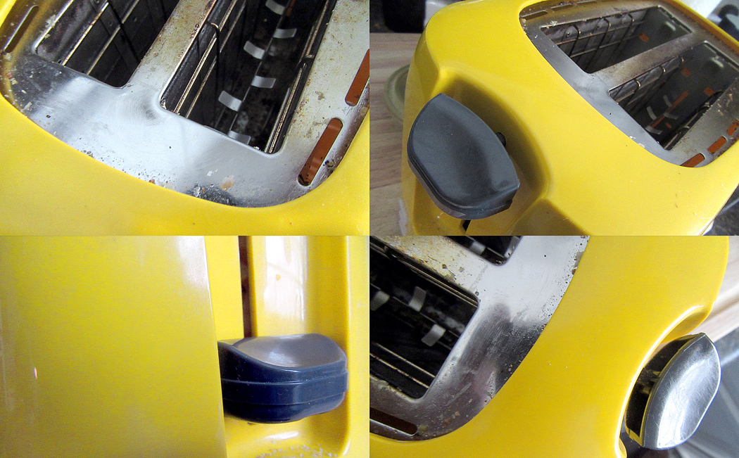
This is a toaster. Something so banal that in our ordinary lives, we hardly notice or look at it. Actually this is a picture of a toaster, which is a remove from the real thing. But then, so is the word “toaster,” which is also not the real thing, but a remove from the reality. 

For most of us, most of the time, seeing something — like the toaster — means being able to name it and move on to something more interesting or more immediately useful. The image in the picture functions as a pictogram, or a different “spelling” of the word. We read the image as if it were the word. 

Pictogram to “read” as teapot; teapot image as “seen”

It is how we respond to most images that bombard our daily lives. We name the item seen. It has been categorized, filed and forgotten. Our lives are too busy to spend any time remarking that the toaster is yellow, or made of plastic, or has rounded corners. These details are of no particular use when fixing our morning bagel, and so, they might as well be invisible. 

Of course, being able to recognize things quickly is a survival skill, and humans have survived these hundreds of thousands of years precisely because they could point quickly and yell, “Tiger!” So, I’m not pooh-poohing that ability categorically. 

But life is about more than just survival. The things of this world are bursting with sense data that gets ignored by reading rather than seeing the visible world. The toaster was designed to have an esthetic impact; the yellow was chosen to be pleasing to the eye; the curves were worked in to make the shape more inviting than it would be if it were all pointy edges. 

We are embedded in a universe of things — a material world — and all of those things have physical and sensuous properties. They have shape, color, heft, texture, volume, solidity or softness, shine or roughness. And all of these properties make up the elements of art, and one of the jobs art does  is to remind us of these delights we normally pay no attention to. Art reminds us we are alive. 

Any life can be enriched simply by paying attention. To notice the yellow, the curve, the size and shape. In fact, to those awake to the world, it is all art — and the emotional richness that the awareness brings. 

It is one of the things artists were doing at the beginning of the last century when they began making abstract art: art about the color, shape, texture, without a nameable subject. 

Of course, artists have always paid attention to these visual qualities. Just because a painting is of a still life, and we can name the objects, doesn’t mean that the artist wasn’t obsessed with the sensuous truth. 

And so, it is a worthwhile exercise to occasionally attempt to forget what you know and see the things of your life freshly, as if you didn’t know the names, but saw only the qualities. 

Humanity is varied in its ability to see beyond the names. It takes an imagination — a way of turning off your rational mind to see only the vital facts and not their meaning or use. Some people have the hardest time: I remember one woman who was asked to close her eyes and describe what she could see in her mind’s eye, and her answer was “With my eyes closed, I see only black.” 

But attempting to see past the names of things is deeply rewarding. The pleasure of colors, shapes, designs, apprehended primally enriches our lives immeasurably. 

Certainly the natural world invites us with color and beauty. But it isn’t just the flowers and trees, the birds and the clouds. Everyday items can be appreciated for their roundness, plumpness, hardness, color, shape, even the feel under your fingertips. 

Many eons ago, when I was teaching photography at a two-year college, one of the assignments I gave my students was to photograph something in such a way I could not tell what it was. I made sure they understood that I didn’t mean just out-of-focus, or so badly lit it was murk. But to see something from a different angle, or to find a meaningful detail and separate it out. 

The purpose was to help them see without depending on what they already knew things looked like. To see directly. 

For example, here’s something most people see almost every day. 

Did you spot what it is? It is a view of your driver’s side rear view mirror as you approach the door to open it. A great big globular shape. 

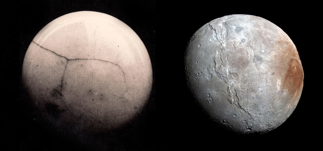
One of my favorite images is one taken by Voyager II in 1983 as it passed the (then) planet Pluto and snapped this image of its moon, Charon. And compare with the more recent, and clearer image taken by NASA’s New Horizons space probe on its flyby in 2015. 

Actually, that’s a lie. The image on the left is a doorknob. 

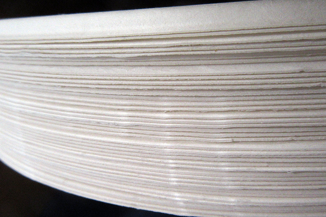
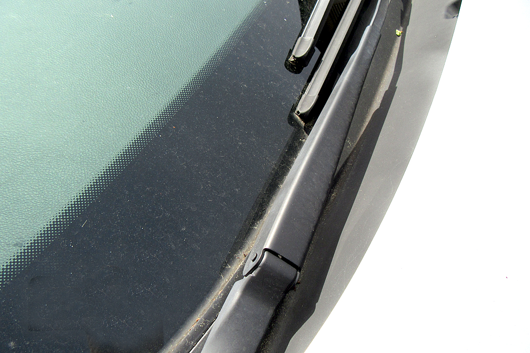
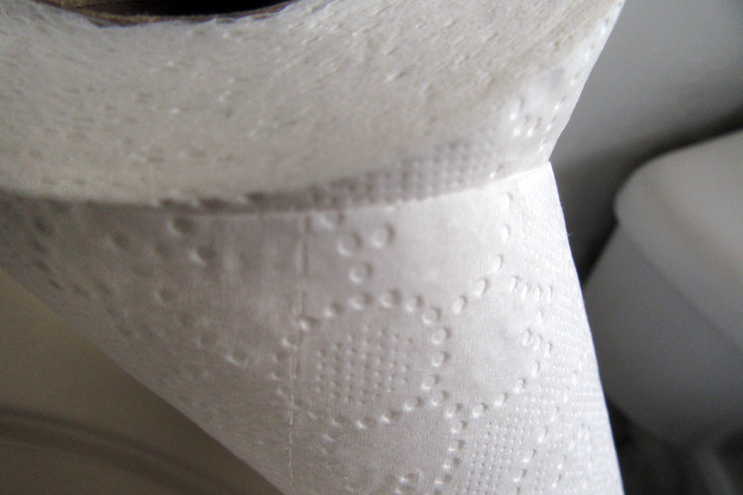
And so, here’s a little quiz. These photographs were taken to illustrate the shapes, colors and textures of ordinary objects, but seen in fresh ways. But they are still recognizable, if you can spot them. Can you tell what they are? The answers are at the end of the column. 

1

2

3

4

5

6

7

8


10

Even when you are not trying to be tricky, it is good to pay attention to the physical properties of the things of the world. Those shapes make images more memorable. And there are shapes all around.

A doorway turned into a check-mark

A paper tissue half out of a box

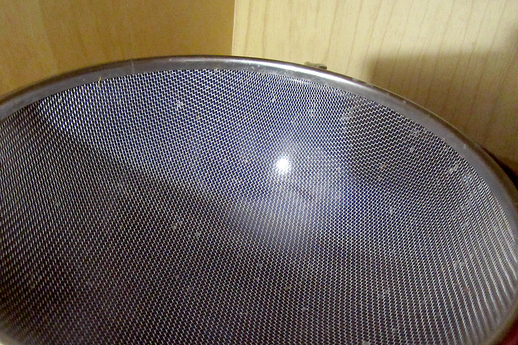
A kitchen strainer

We are alive on this planet for such a short time, and there is so much to take in. With our five senses we are privy to such delight and can never exhaust the riches around us. But we must be open to them, aware of them, awake to them. 

Learning to see is a part of art education. To see a picture of a giraffe and point, like a first-grader, and say, “Giraffe,” is not seeing. But take up a pencil and attempt to capture what you see on paper will teach you what things really look like. Paying attention is the great secret of life. 

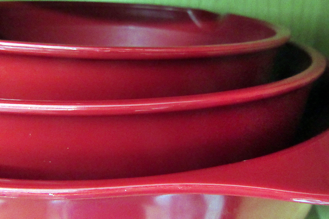
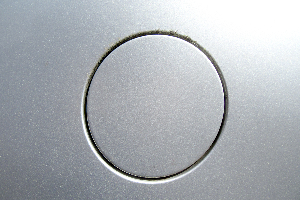
Quiz answers: 1. Paper plates; 2. Work glove; 3. Windshield wiper; 4. Measuring spoons and ceramic duck head towel hook; 5. Old Oxford cloth shirt; 6. Toilet paper; 7. Plastic mixing bowls; 8. Pop-open gas-cap cover for Buick; 9. Ceiling fan lamp fixture; 10. Assorted shopping bags. 

Click on any image to enlarge
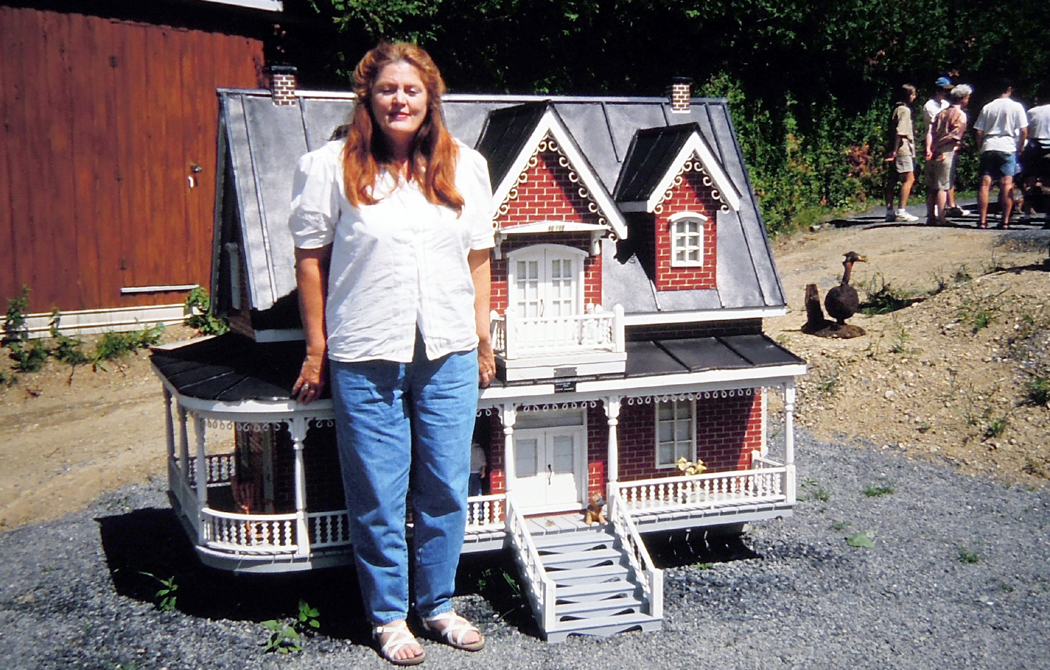
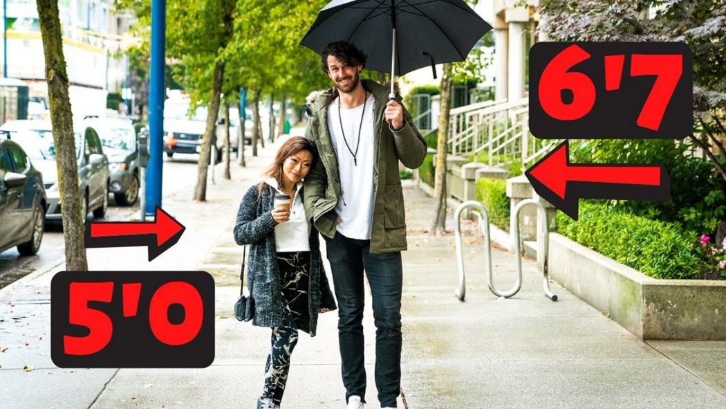
My daughter, Susie, is a scant five feet tall. She went to the University of North Carolina at the same time as six-foot-six-inch Michael Jordan. One day, they both got in an empty dorm elevator together. The door closed; one looked up, one looked down and they both spontaneously started laughing. 

Scale is important.

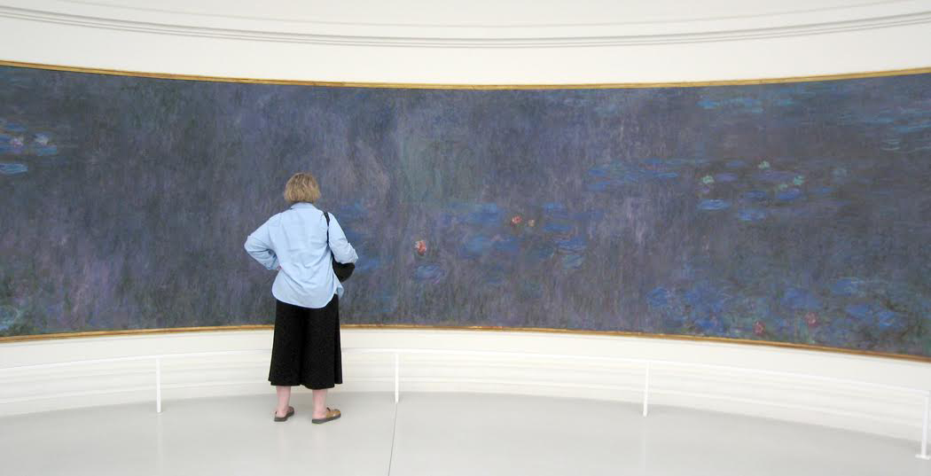
And no matter how many times you’ve seen Monet’s waterlilies in books, on computer screens or in slide shows, you are not prepared for the wallop they have in person at the Orangerie. They spread out across your vision from one peripheral side to the other.

Scale matters.

In 1972, Apollo 17 astronauts photographed the “Blue Marble” Earth from roughly 18,000 miles, giving us an image of the wet, watery ball we live on. It looks small and vulnerable — and it is, in the immensity of space. But it also gives a misleading impression of the scale of the planet.
Scientists may measure scale with numbers and exponents, but each of us, personally, can only conceptualize size and distance against our bodies and senses. Who of us can tell the immediate difference between 1011 and 1110? Which is the larger number? But between your fingers, you can tell which of two grains of sand is larger, merely by feel. 

In 2008, I drove from Phoenix, Ariz. to Reidsville, N.C., over a weekend, a trip of about 2,200 miles, or roughly 1/11th of the circumference of the globe. I left after work on a Friday and pulled in to Reidsville on Monday morning. I was hauling ass, as they say. On the Sunday, I drove 900 miles. The trip was exhausting, but gave me a palpable sense of the size of the world. I could feel it, because I drove over it.

(And, by the way, the world is not flat: I could see the great grain elevators of the Midwest rise from the curved horizon before me and, after I passed, watch them settle, like the setting sun, behind me.)

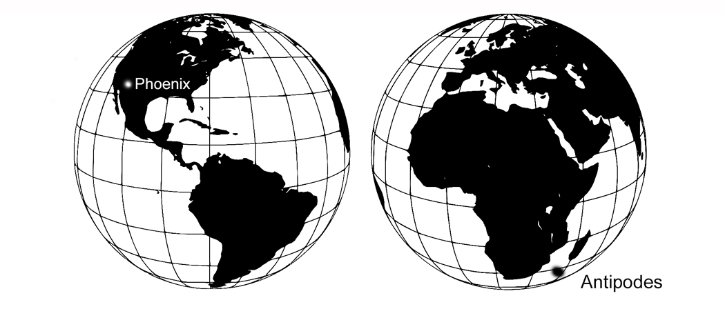
In 1989, I flew from Phoenix to South Africa, a flight that spent some 40 hours in the air. The popular image is that if you dig straight down in your back yard in America, you eventually hit China, but this isn’t so. Directly opposite Phoenix on the Great Blue Marble is a spot in the Indian Ocean just off the coast of South Africa. 

So my flight was literally to the antipodes. (It took so long because in that apartheid era, I had to take an especially roundabout route to my destination: Phoenix to Philadelphia, changing flights to Frankfurt, Germany, changing again to a South Africa Airlines flight that, because of opposition to apartheid, was not permitted to overfly most other nations in Africa, and so, had to fly out over the Atlantic, refuel in the Azores, and cruise over the water all the way to Namibia before finally landing in Johannesburg.) It took Lindbergh 33 hours to cross just the Atlantic.

Such a trip really gives you a sense of the scale of the planet.

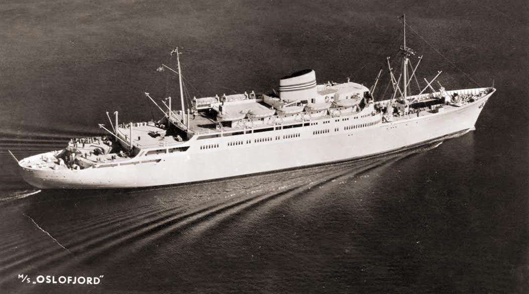
Before air travel, however, such a voyage would take months, not hours, providing an even more body-interior feel for the distance. In 1967, I took a trans-Atlantic ocean liner to Europe, and the monotony of the unchanging sea, day to day, made the earth seem even larger. My trip took four days and a bit. It took Columbus more than two months to cross the Atlantic.

The point I am making with all this travel tale, is that scale, whether looking at Picasso’s Guernica, or watching the odometer while driving from Bangor to Seattle, is that scale is felt in the body, it is measured by human proportions. As Protagoras recognized in the Fifth Century BC, “Man is the measure of all things.”

When we look out at the night sky and realize we are at the bottom of a seemingly infinite and dark well, we can be awed, but we cannot feel in our bodies the inestimable size of the cosmos.

Yes, we can speak of it in abstractions. We can point out that Voyager I, now in interstellar space, is traveling at a speed of 17,000 miles per second — which would take about a second and a half to circle the Earth — and will cover 325 million miles in a year. Yet, at that speed, it would take it  some 45 thousand years to reach the nearest star. There is no way you can process that scale in your paltry human skin. We can talk in big words, like billions and trillions, but outside of abstract mathematical numbers, can you actually feel the difference between a billion miles and a trillion? They are meaningless words. You might as accurately call it a “gazillion.”

Do not misunderstand me. Humans have been amazing at understanding the cosmos intellectually. We can calculate the orbit of a satellite within what seems like a few inches. But I am not talking here about abstract reasoning.

There is a limit to the human imagination. We can calculate overwhelming numbers, but in terms of body knowledge — being able to physically conceptualize — such numbers turn into little more than words. 

We can use the math for engineering and for science, but we must recognize that our puny minds cannot get their arms around such boggling numbers. We are limited by the evolution of our human brains, which grew to process the daily income of sense data. We can feel the road under us as we speed along the interstate; we cannot feel the gap between Earth and Alpha Centauri. We can name it, but we cannot feel it. 

All trans-human scales are metamorphosed into a single size: Infinite, or might-as-well-be. It is what we feel when we turn our eyes up toward Orion or the Milky Way.

An earlier version of this essay appeared on the Spirit of the Senses website Oct. 2, 2018

The best gift a writer can get is proof that his words are being read, and not just read, but understood. (When I was writing for the newspaper, too often I heard from readers who complained about what they thought I wrote and not what I actually wrote. Every writer has had this experience.)

The other day, I received such a gift, a small one, not meant to be anything important, but it was completely meaningful to me. This gift was from an old and dear friend who I only see once or twice a year, and to our lunchdate, she brought a 3-by-5 notecard on which she had scribbled with every color green she could extract from her colored pencil set. I doubt she knew how much that meant to me. 

It was a gloss on my most recent blog essay, in which I had mentioned how many greens I saw in the foliage in the woods and garden I was visiting, and also how many greens Paul Cezanne had managed to generate in his paintings. The card she plopped down on the table was meant to be a casual joke, but to me, it was very much more than that. We don’t always know the significance of what we do. 

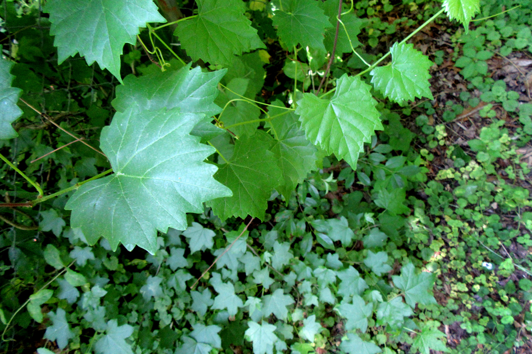
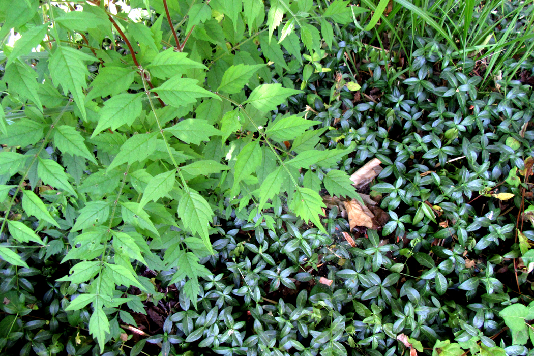
But it set me to thinking about those greens — blue-green, yellow-green, sea-green, leaf-green (not enough words for the varieties of hue) — and made me take my camera out to the garden again to gather my own set of greens. Nature gushes with them. 

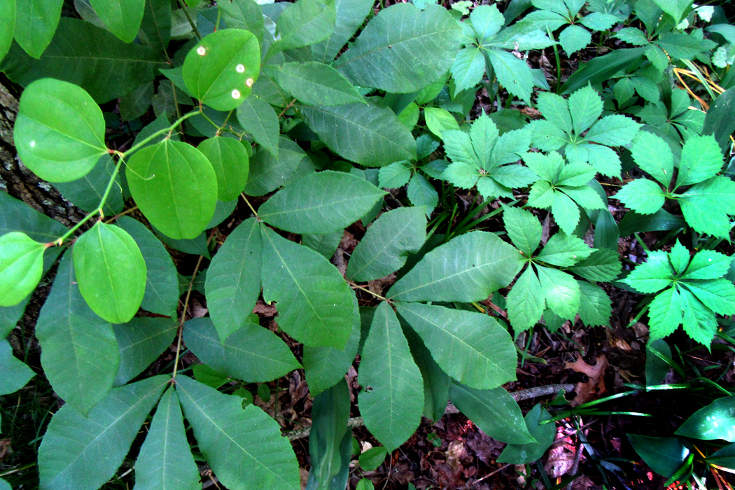
There are three qualities that make an image: shape, color and texture. (Leaving aside the question of what you name the subject of a picture: “That’s a house;” “That’s a car;” “That’s my Aunt Philomela at the beach house in Boca.”) Shape can be defined by outline. Color and texture fill those outlines in and what is more, if you are making an image in black and white, texture (stippling, crosshatching, scribbling) can substitute for color. Each of these elements can be as much a delight to the eye as harmony is to the ear or flavor to the palate. 

And so, I walked through the yard drinking in the greens and pointing my camera to arrange the patterns of shape, color and texture to try to make a kind of visual mixed salad for the eye. 

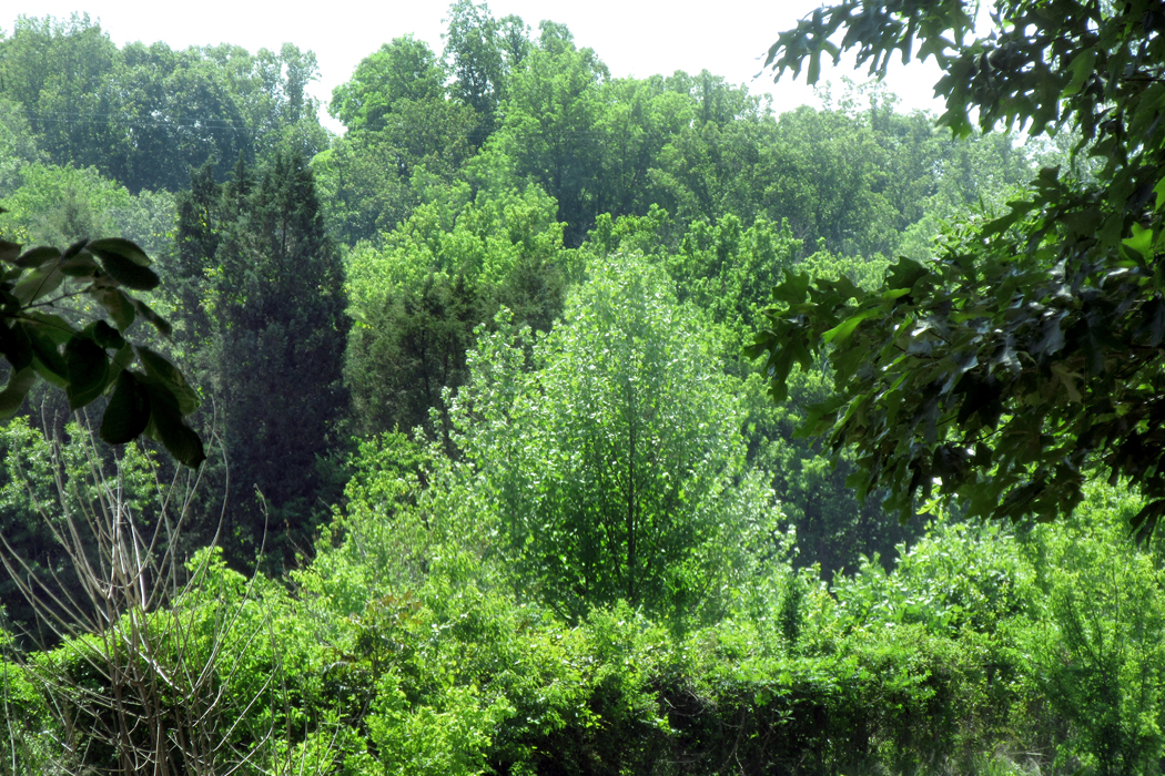
In the afternoon, I drove out into the countryside and stopped near the Mayo River — barely a river — that I had once canoed down maybe 50-plus years ago, hitting white water on the way (if the canoe had capsized, I doubt the water would have gotten higher than my knees). Along the banks were further salad greens. I gathered them all in my lens. 

The pleasure later that evening was editing the photographs, collating those shapes and textures and those luscious greens. “No white nor red was ever seen/ So am’rous as this lovely green.”

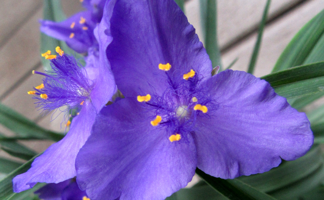
Many years ago, the professor I studied under commented offhandedly that nature never made a bad color combination. Any two colors found in nature, he said, could be placed side by side for a satisfying esthetic treat. Salmon red and pea green. The blue and yellow of a spiderwort flower. The orange and black of a monarch butterfly. 

Humans are quite capable of jarring our eyes with garish mismatches — gaze down any “Miracle Mile” for its signage — but nature, he said, is always right. Of course, our pleasure in the color-matches of nature should probably be laid at the feet of natural selection: We have evolved to love those colors and perhaps we shouldn’t be too glib about assuming that nature had us in mind when she plopped the buttercups next to the violets along the highways. 

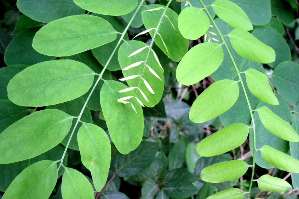
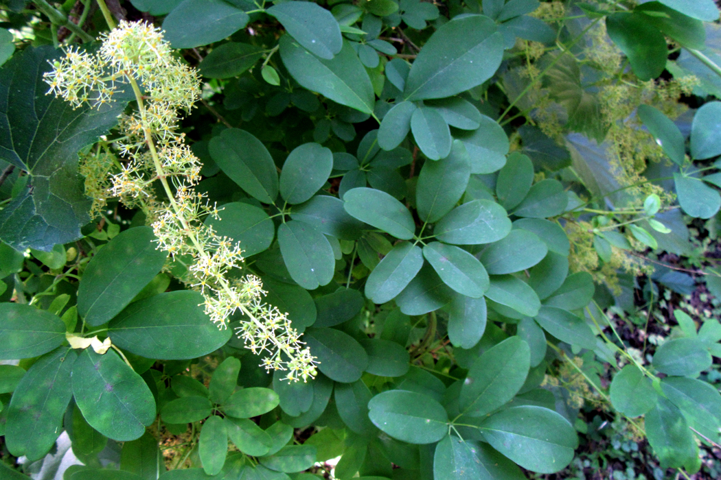
 The riot of greens I saw and photographed played off against each other, making color combinations as rich in greens as the roadside flowers made of whites and yellows. 

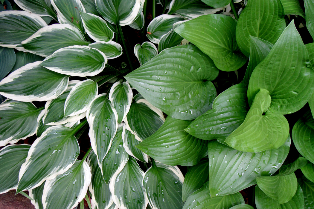
And the various textures of leaf surface made their own contrasts. 

And the lights and darks, as shadow and light hit the foliage, gave them visual depth. 

Deep in one image, the bright green leaves nearer the surface hid the shadowed poison ivy, almost hidden in a cavern of green.

Leaves come in varieties of all of them. And when you layer one next to another, the contrast can keep the eye interested. 

In the process, I found myself drinking in not just the colors, but the varied shapes, creating patterns and textures that delighted my eye. 

Shape against shape, color against color, texture against texture: the analog of variety in the world, a variety that means we can never grasp it all — there is too much. 

One gets to know the plants in the woods near where you live, perhaps even name them: Duchesnia, Tradescantia, Helianthus, Ranunculus. They are part of what makes your home territory comfortable and familiar. Clovers, mosses, ferns, plantains, dandelions.  

And there is excitement when you enter a new biome and come across new greens, like the gray-green greasewood of the Sonoran Desert or the euphorbias of South Africa, each with its idiosyncratic shades and tints. 

Before the photographs from space showed us the dominant blue of our world, the Earth was traditionally called a “green planet.” It is green that makes life possible. Without it, the planet would be bare rock surrounded by the blue sea. 

Each time I visit this part of the state, I can’t help but set myself a task — a kind of art project, to try to organize a different way of seeing. A few days ago, my task was to look straight down at the ground to see what it looked like. I made more than a hundred photographs I could use. After I wrote that blog entry, and after my friend gave me her gift, I began a second project, to see how many greens I could find, how many leaf shapes and contrasts I could photograph.

These that I’m presenting here are just a small sample. But I hope they are worth looking at, at least as a tasting menu of delicious green.

Click any image to enlarge