Archive

Tag Archives: art

What’s with all these women and snakes? Or more precisely, what’s with all these artists painting pictures of women with snakes?
Yes, there’s a pat, comic answer, but put your inner sophomore away for a few minutes.

In Western culture, the woman most often depicted in significant art must be the Virgin Mary. Most of those paintings do not portray any specific act or episode in her life, but are devotional Madonnas — mother and child. There are episodes painted — the nativity, the flight into Egypt or the lamentation at the cross — but mostly they are icons, static and symbolic.

If we were to search for the second most painted woman, it would have to be a tossup between Venus (or Aphrodite) and Eve. I’m not going to examine the goddess here, but I want to consider Adam’s consort.

She is painted over and over, with and without Adam, but almost always with the “apple,” and usually with the serpent, although the serpent takes many forms.

I became interested in this as I began to discover many paintings. I now have images of several hundred historical paintings of the Temptation of Eve (I can only share a handful).

It interested me to watch the change in the iconography over the centuries, and the shift from one compositional pattern to a second.

The source of the imagery in the paintings begins in Genesis, but quickly adds bits from other places, none authorized by the actual words in the Bible. The Bible, for instance, does not say the serpent is Satan; it does not name the fruit as an apple; does not say that Eve “seduced” Adam into tasting the fruit.

The earliest visual representations of the Temptation are Late Roman, or early Romanesque. In these the first design is firmly established: a symmetrical disposition of the man and woman to either side of the central tree, usually with a snake coiled around its trunk.
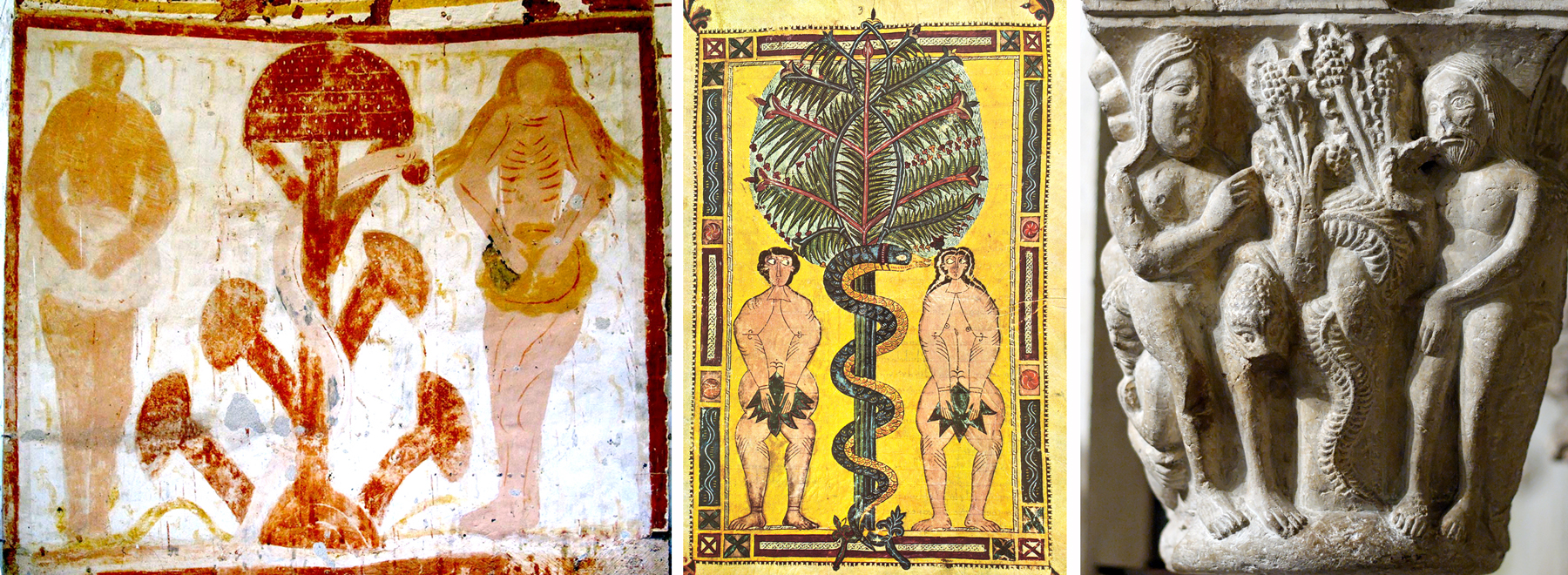
One of the most interesting early images is from a fresco in the Plaincourault Chapel, a 12th-century chapel of the Knights Hospitaller in Merigny — at nearly the perfect center of France. In it, the Tree of the Knowledge of Good and Evil is depicted in a very primitive way that could easily be interpreted as a giant mushroom. Indeed, there is a vein of scholarly thought that takes the forbidden fruit to be psychedelic mushrooms. Having eaten of them, Adam and Eve are able to see the deeper reality behind the surface one.

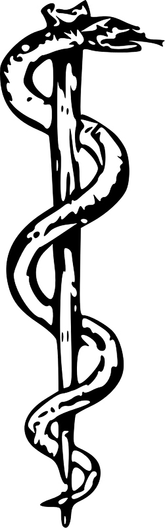
In this fresco, you see the familiar items. Adam, Eve, the tree and the serpent wound around the trunk very like the caduceus carried by the messenger god, Mercury, or the Rod of Asclepius, an insignia of healing. The symmetry of the design serves it well to becoming a kind of icon.

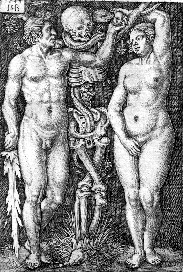
You see the pattern repeated over and over in Medieval prints, carrying over into the early Renaissance.

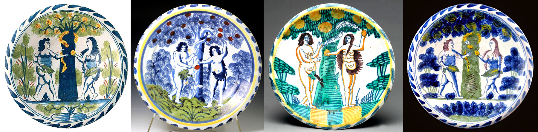
The design continues in popular arts for centuries. You find it even in plates.
But, at some point an insidious misogyny infects the standard imagery. In some paintings, starting in the Renaissance, the serpent takes on a female’s head, either Eve’s own likeness, as if the serpent were a mirror, or the head of the mythical non-Biblical figure of Lilith, styled to be Adam’s first wife.

The problem of Lilith originally arose because there are actually two stories of the creation of the first woman. In the first (Genesis 1:26 and 27), after having created all the animals, God “created humankind in his own image, in the image of God did he create it, male and female he created them.”

In the second story (Genesis 2:18-25), Jehovah, having already created Adam, creates all the animals to give him company, and when that isn’t sufficient, puts Adam to sleep and takes from his side a woman, making the bad pun in Hebrew, translatable to English as “We will call her ‘woman’ because from ‘man’ is she taken.” (In Hebrew “Ish” and “Isha.”)

Later commentators puzzled by these two different creations of Woman, decided that the first must be different from the second, and came to give the first one the name Lilith. The name may derive from ancient Semitic demons, known as “Lilitu.”

There are several examples of Mediterranean goddesses with special commerce with snakes. There is the Snake Goddess of Minoan culture, the Canaanite Astarte and even the Egyptian Isis. So, there is precedent for commingling the first woman and the serpent.

At any rate, in later Talmud, Midrash and Kabbalah texts, this first woman created is identified as Lilith and various stories get told about her, in all of which, she is evil, and a kidnapper and killer of children, and later, as a seducer and destroyer of men.

Obviously, then — at least to the Medieval minds of the interpreters of the sacred texts — this must be the woman God created first. She disappears from Eden through various versions of myth, but returns to cause havoc.
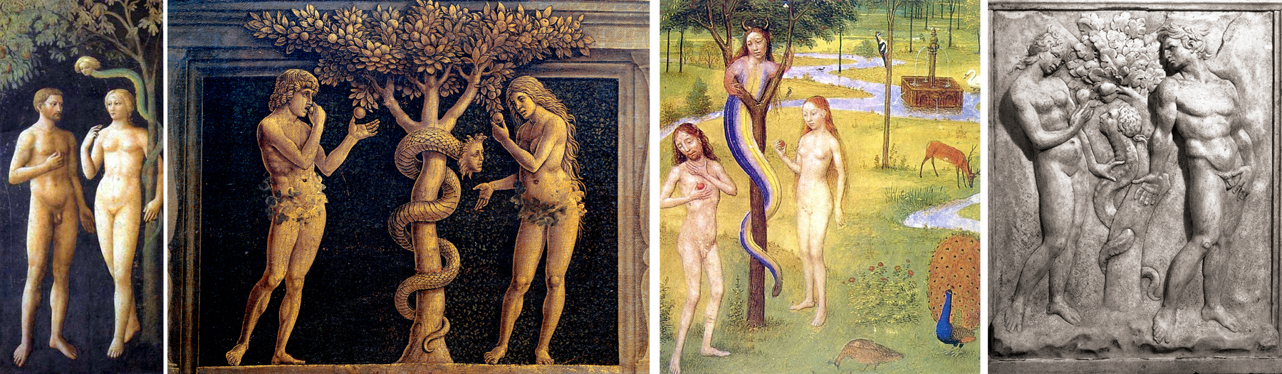
Most notably, as the serpent in the Garden. And so, many of the snakes wrapped around the Tree have a woman’s head or face. Most notable, perhaps, is the Sistine fresco by Michelangelo.

In the 15th and 16th centuries, you can hardly get away from this trope.

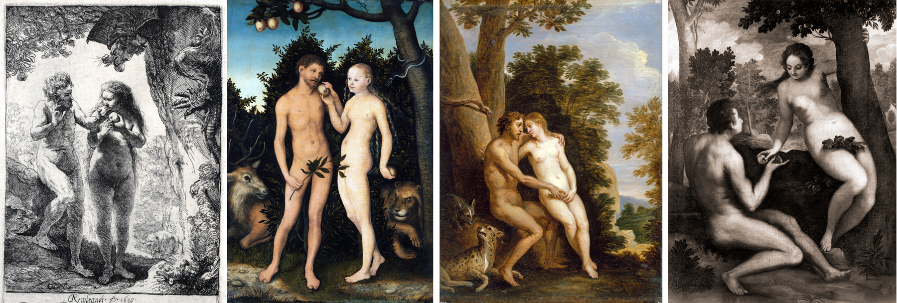
But as art history progresses into the Baroque, the static symmetry of the classic tree and couple gives way to moving both Adam and Eve to the same side and putting tree and snake in its own half of the frame.
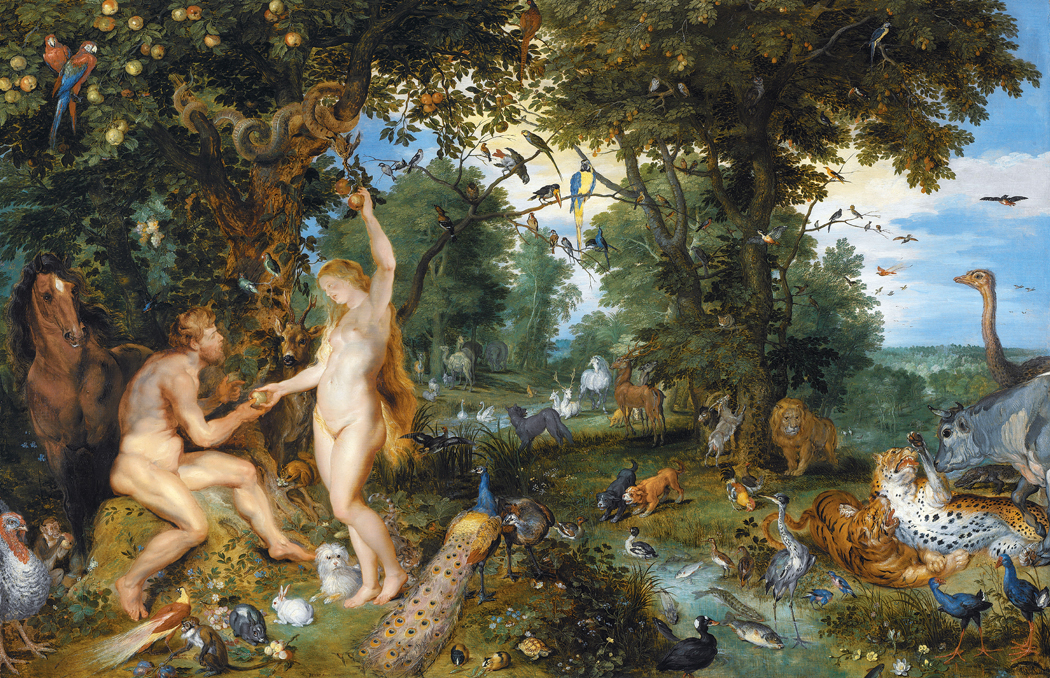
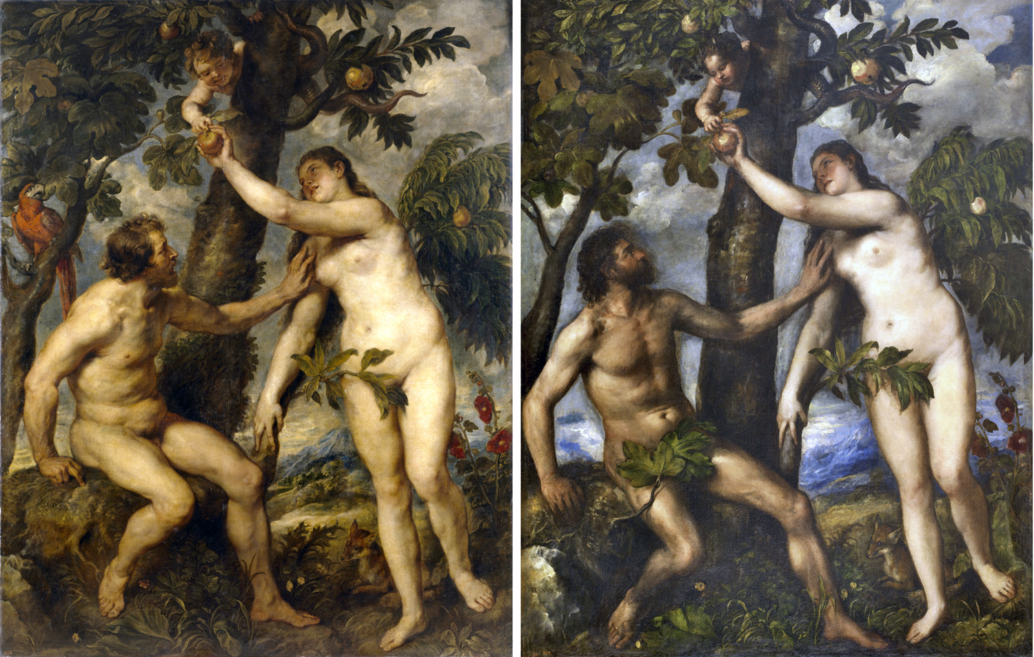
The old design doesn’t disappear. You can see it in the grand paintings of Rubens, who clearly copied from Titian.
What does happen, however, is that the biblical stories are no longer able to be taken as literal fact. You find the Scripture being used as pretext for allegory or even for an excuse for painting naked women. You see the light of faith dimming and the approach of the Enlightenment.


When Eugène Viollet-le-Duc renovated the cathedral of Notre Dame in Paris in the mid- to late 19th century, he replaced weathered Medieval sculpture with modern replicas of his own design, imitating the Gothic style. The central trumeau of the central portal of the cathedral sports this wonderful take on the Temptation of Eve. It follows the old formula, and has some vigor, but you know that Viollet-le-Duc could never believe in the Fall of Man in quite the same way as the original builders of the cathedral.

Into the 19th century, the whole issue of the Fall, of the snake — for now the ambiguity of the “serpent” has been changed out for the Freudian certainty of the phallic snake — and the naked Eve have given way increasingly to kitsch.

There are some Modernist attempts at reviving the mythology, but they are few and lack the persuasiveness of the older images, perhaps because the 20th-century artists cannot actually believe in what they are painting. It is not only God that is dead.

This has been a very short overview. There is so much more I would like to share, but there is limited space. They come in all styles and media.

In the next blog entry, we will look at some other permutations of the naked lady and the snake.

Click on any image to enlarge.

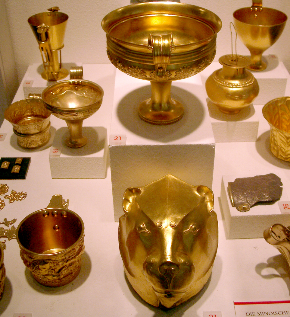
In 1873, an amateur German archeologist working in western Anatolia, claimed to have dug up a trove of gold he called “Priam’s Treasure” and ascribed to the king of Ilium during the Trojan War of Homer’s Iliad.

Whether any of his claim was true remains contentious; Heinrich Schliemann fibbed about many of his claims. But what is not under question is the public attention roused by the gold. Nothing dug from the earth quite hypnotizes the layman so much as gold. Treasure. Pirate’s booty. Roman coins.

The fascination seems unquenchable. Museum blockbuster shows are predicated on that fascination. “The Treasures of Tutankhamun;” “Treasure Houses of Britain;” “Catherine the Great: Treasures of Imperial Russia;” “Splendors of the Ottoman Sultans;” “Treasures of the Czars.” The list is long. And so are the lines to get in.

But while traveling blockbusters are tarted out with gold, the permanent collections of major museums also offer more humble relics of antiquity. Visit the Metropolitan Museum in New York, the Boston Fine Arts Museum, even a smaller one, such as the Chrysler Museum in Norfolk, Va., and you find vitrines highlighting the pottery dug up from the historic layers of soil. While the gold glitters, the simple ceramics — more common than the jewelry — yield up more useful information about the people who lived before our ancestors knew they were our ancestors.

Shards of Egyptian pottery have turned up in Afghanistan, evidencing the far-flung trade network from before the 12th century BCE, Greek red-figure ceramics show up from Spain to Iran. When archeologists want to find out about the lives of the earliest European settlers in the New World, they search out the middens of refuse from those early outposts and it is the broken dishes, cooking vessels, drinking cups and flatware that tell us perhaps the most. We learn where those dishes were made, how they were used, about the trade networks that brought Delftware from the Low Countries to southern England and to Massachusetts, where the village burgermaster showed off his status, while the laborer ate off tin plates.

But such clayware isn’t shown in museums only for its historical importance. You can find great esthetic value in archaic Greek ceramics, in red-figure and black-figure pottery, in the designs of pre-Columbian figurines, in Egyptian clay palettes, in ancient Chinese vases. They are shown in museums for their beauty. They are works of art.

On a visit to Colmar in eastern France, to see the Isenheim Altarpiece, that huge symbol of the sorrows of life on earth, the museum also had a whole wing of domestic arts, including some fabulous dinnerplates, hand painted with flowers, abstract floral patterns and the occasional family crest. There was no question that those beautiful plates deserved their spotlight behind the glass.

Which brings me to my own kitchen. I have way too many dinner plates. The cause is esthetic, not practical. In fact, it is anti-practical.

My interest in what I ate off of was nil until my second unofficial marriage. I have no recollection at all of what plates we had during my first official marriage. Anything that held victuals was sufficient.
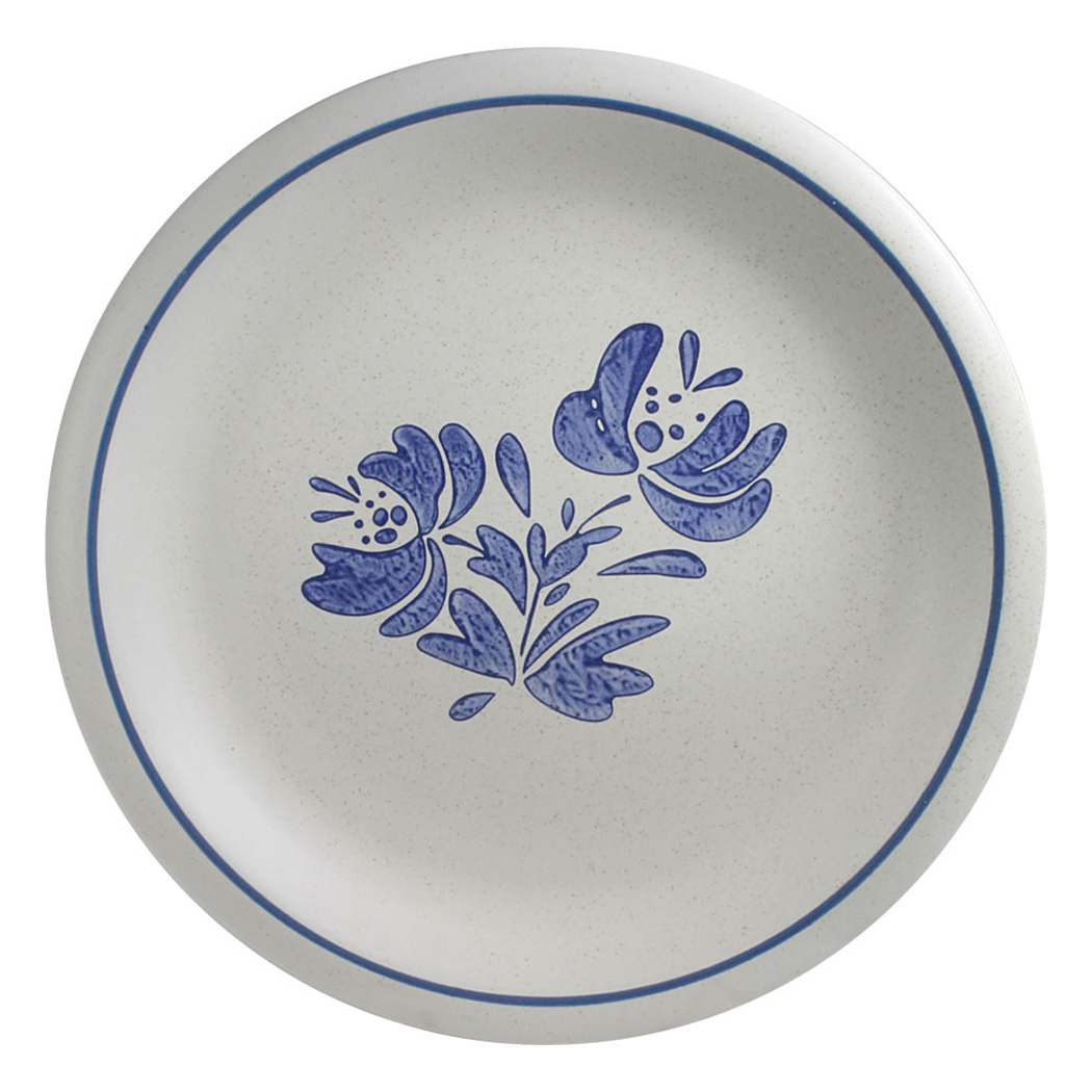
I know we had a few blue-speckled enamel tin plates. As humble as our incomes at the time. (I still feel a nostalgia for tin plates). Years later, between relationships, I lived with friends whose plates were a traditional Pfaltzgraff design. I came to feel a comfortable homeyness about them. Who knew you could have emotional feelings about baked mud?

But with my second unofficial pairing, the two of us sought out dinnerware that expressed who we were, or who we thought we were. Something vaguely arty.

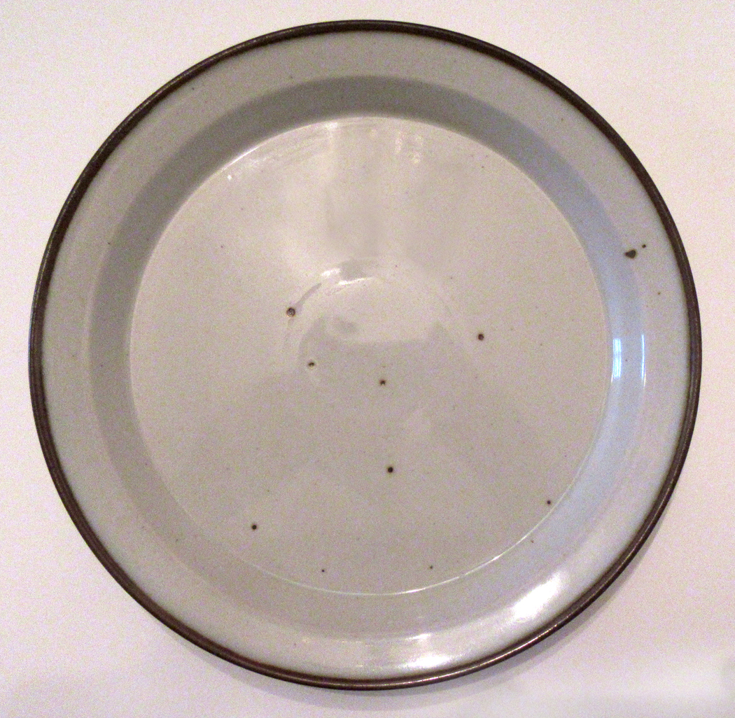
We found the perfect answer in the stripped-down esthetic of Dansk breakfastware. The large plate was as plain as could be, with a mildly speckled blue ironstone, about 10 inches in diameter, with a half-inch lip around the edge, almost as if it were a pie tin. We had the bowls and mugs to go with them, and for years, they served as a signal of the kind of Modernist esthetic we cared for. Others might choose more flowery plates, or something elegant with gold rims, but we liked the showy simplicity of our Dansk dishes.

Where those dishes went, I have no idea. Through divorce and  break-up, they have vanished. But many years — many decades — later, I came across a pair of Dansk plates in a thrift store. These were brown rather than blue, but they were the same design. I snarfled them up and use them to this day, still enjoying that heavy crockery feel, that masculine, stripped-down directness.

Pfaltzgraff pattern

But when it came to my second official marriage — the one that took — there was a problem. Although Carole and I were perfectly matched in so many ways, there was a significant rupture in our esthetic senses. Where we were the same was that neither of us tolerated bad design. We both wanted something well thought-out and pleasing to our senses. But Carole tilted toward the traditional, the more feminine, the more what I called “doilied-up.” While I, of course, favored the blunt, direct and undecorated and modern look. This could be a problem.

So, over 35 years of living together, we tried many ways of satisfying both of us. She usually won in this struggle. She came with an heirloom set of Haviland settings, well over a hundred years old. But they were too valuable to actually use. So, they sat in a cupboard looking elegant. Elegant if that is the sort of thing you value.

She also had a thing for Blue Willow ware, and collected platters and plates, bowls and tureens in the pattern. Some so old their whites had begun to turn brown. They came from Goodwills and Salvation Army stores, and while they didn’t cost us a whole lot, took up way more pantry space than their use warranted.

Blue Willow was perhaps the sweet spot for Carole, but it wasn’t enough. She brought home random dinner plates from her sallies into various thrift stores. We collected quite a few floral plates. Then, there was a mismatched set of autumnal plates that she meant to use for Thanksgiving dinners. Those plates featured grouse or hunting scenes.

There was a new set she bought without telling me. One day, it showed up: A bright red and white set of Christmas dishes, bordered with reindeer and sleighs. The whole disaster — plates, salad plates, bowls, cups, saucers. Hardly room in the cabinet to hold them. And they were used, maybe, once a year. The crowded shelves hardly left room for the wine and water glasses.

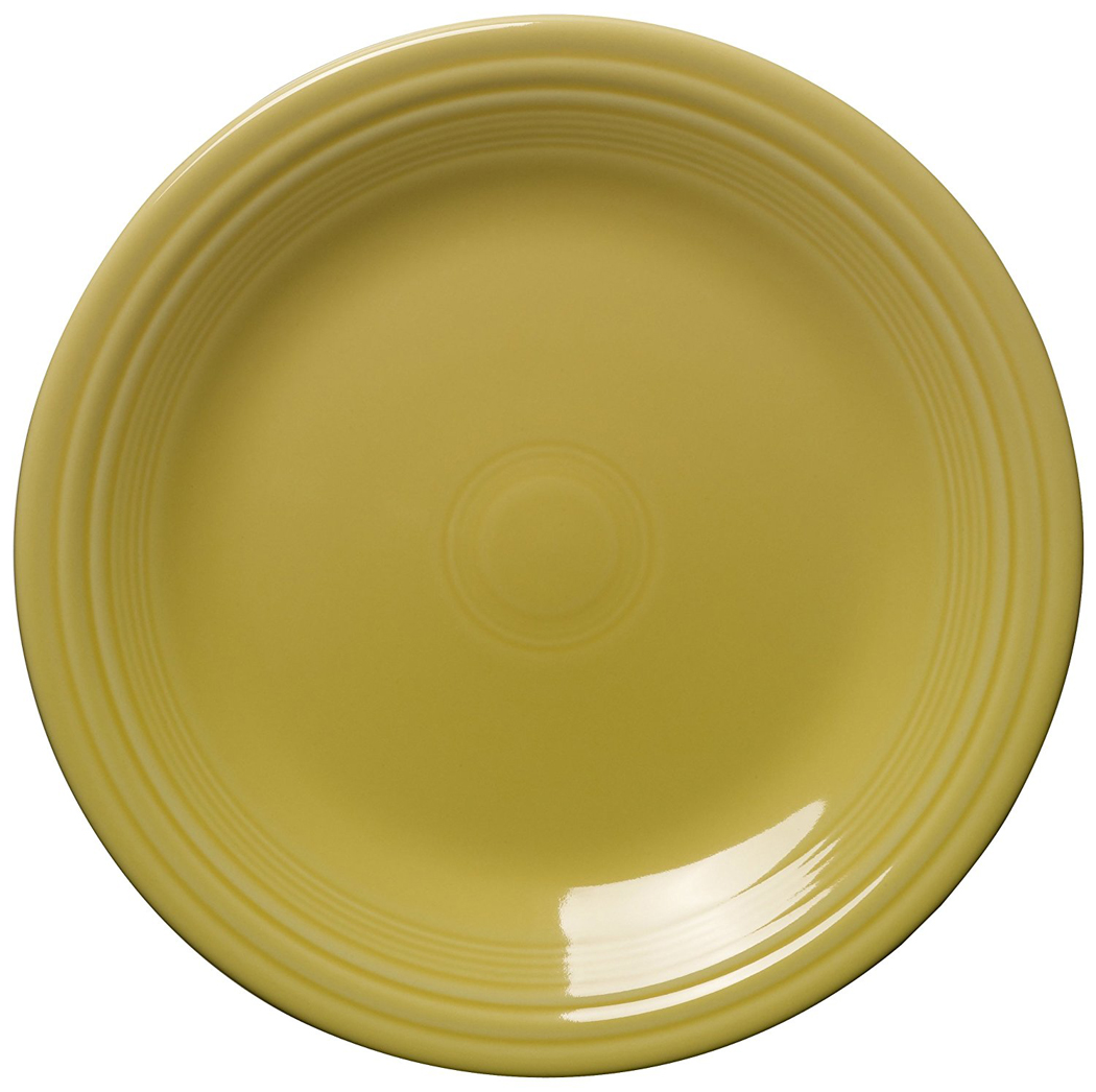
Fiesta ware

My Modernist taste was clearly being drowned under a welter of semi-kitsch. Meanwhile, the growth of Blue Willow continued.

Clearly, there had to be some kind of compromise. Weighted to her side, of course, but at least a little give.

The clue came in France, while we were visiting the gardens painter Claude Monet had established for himself in Giverny, some 40 miles northwest of Paris. We have been to Giverny three or four times, in different seasons. It is powerfully beautiful, restored to its original glory.

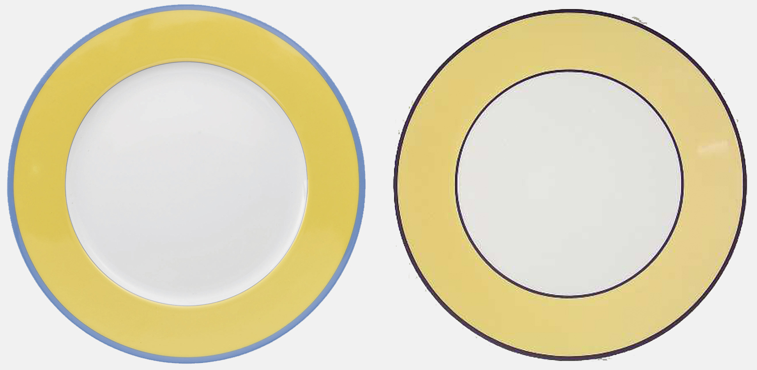
And in the inevitable gift shop, there were offered for sale reproductions of the tableware that the painter used for his guests. In 1898, Monet designed a porcelain dinner service by painting a simple white plate with a blue edge and a yellow rim. It was executed by the company of Godin and Arhendfeld and perfectly set off the bright yellow dining room the painter fitted out in the old farm house that he refurbished.

In 1978, the Foundation Claude Monet commissioned the Robert Haviland and C. Parlon company of Limoges to recreate that original set of crockery. We gawked at it in the Giverny gift shop, salivated over it, distressed by its price. If you wanted to buy such a dinner plate now, it would cost you $155. Yes, per plate. A single five-piece place setting was $570. Standard setting for six, nearly $3500. Clearly this was out of our price range.
Yet, we knew we had found that compromise. Both traditional and Modernist, with the imprimatur of a great artist we both loved, it would have been the perfect set for our kitchen. We pined; we sighed; we longed.
In the meantime, every few years, we would see some place settings we liked, and if it was in our price range, we might buy it. We did both love the joy of the hunt for dinnerware we both could live with. There were compromises, mostly by me.

But then, we found a perfect knock-off. The Italian firm of Pagnossin had a set of blue-edged, yellow-rimmed plates. They were on sale. They weren’t exactly the same as the Monet plates. Monet’s had a light, powdery blue edge. These had a navy edge. But the yellow was identical. They were elegant, traditional and modern. We fell in love with them. I still have them and use them whenever company comes over.

Now that Carole is gone, the Blue Willow is gone, too. So are the red Christmas dishes. Alone, I find myself eating off of paper plates more than I care to admit. But I still have the faux-Monet plates and the replacement Dansk plates. And I keep several of Carole’s additions. There are two beautiful, simple plates with blue flowers drawn, not painted, on them. And there is a set of four Rita Monti hand-painted dishes, with floral and Renaissance patterns on them, very Mediterranean, which are perfect for pasta or fish. It seems I have mellowed; my need for masculine simplicity has softened into an absorption of some of Carole’s personality into my own, where it persists, even as she no longer does.

Part 1: The Thing

Abstract art has several jobs, but one of the most important is to take the bits of the visual world around us, separate them from their context, and allow us to see them freshly. By removing color, texture, and pattern from their received meaning allows us to pay attention to the building blocks of vision. As if we could take the music of speech and remove the words from them, so only the sensuous vestige remains.

In most of the visual world we live in, we have given meanings to what we see, like seeing the diagrammatic picture of a man or woman on the restroom door. And in “reading” the visual world this way, as a sort of language, we too easily fail to actually see what we are looking at: We simplify and name: That is “green,” rather than “that is the green of kelp,” or “the green of grass.” Two very different greens. And there are thousands of greens. If we abstract the color from its worldly signature, we can place two greens next to each other and force ourselves to notice.

The same is true for texture, reflectivity, surface (whether matte or glossy), size or scale, the opacity or translucency of pigment — a thousand different qualities of sight, and of the visual world we inhabit, but where habit has dulled our perception — and our delight.

Still, no matter how abstracted from the quotidian an image may be, there remains some remnant of its source. We tend to recognize a certain green by the chords it sounds in our memory, our sense memory. We respond to this green or that in part — and idiosyncratically — by the way it calls to mind the emotions and pleasures we attach to it in a rather Proustian way.

Thus, although we may think of abstract art as a kind of rationalized set of color and pattern, line and texture, we can never entirely divorce our response to it from the experience of our own lives.

So, we are left with complicated response to art that on the surface seems to have no meaning.

(It’s no use making the argument that such response is too subjective, too personal. Our response to any art, no matter how abstract or how realistic, is always personal. Abstraction, again, reminds us of what we don’t normally think about.)

Painters have the advantage that they can invent shapes and lines from nothing but cobalt blue and vermilion. But a photographer is left with a more direct connection to the world outside his head. The camera must be pointed at something.

So, to make the same sort of visual argument as an abstract painter, the photographer has to use the real world and re-see it in some way as to make it unrecognizable. The two most immediate ways to do that are to get so close that all context is stripped away, or to step so far back that the perspective is one that no ordinary human can recognize it.

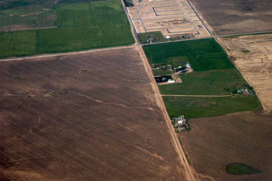
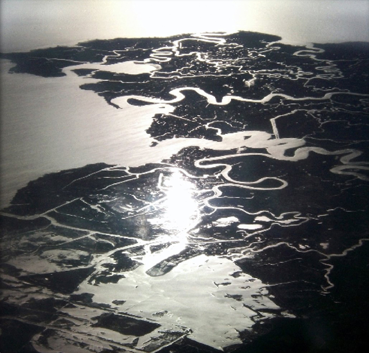
It is why I always book a seat by a window when I fly. I can look out the window and see the colors, textures and patterns of the planet below me, and make designs with them with my camera.

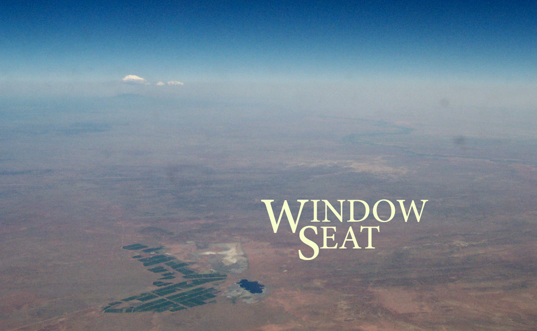
I self-published a book of such abstractions using the website, blurb.com. You can find the book here, and open it up in preview mode: http://www.blurb.com/b/1376943-windowseat

The skin of the continent becomes a canvas painted in swirls and pools, like some de Kooning or Pollock, Rothko or Diebenkorn. If you look, you can see again.

Part 2: The Metaphor

We live on a planetary canvas; colors and shapes are spread across the stretched linen of the Earth’s surface, although we have to step back to see it with any clarity.

The best way to do that is to climb up into the air. Up a tree and the neighborhood looks different; up a mountain and the valleys change; up in a jet plane and whole quarters of the continent are transformed.

That is the gift of the window seat. The view out and down paints a completely different picture of the world: clouds below us; shadows stretch out for dozens of miles late in the day, or as the sun rises; seas catch the sunlight in a scatter of sparks; the sky overhead is so dark a blue as to mimic midnight at midday.

I love flying. There is nothing quite so exciting as seeing a whole state underneath you opened up like a life-size map.

From 30,000 feet, you get a sense of the world as a tiny globe and can see whole ranges of many mountains as single features, like wrinkles on a face.

Few of us will ever see the Earth from the moon, or even from orbit, but anyone with a boarding pass can have his sensibility slapped silly with the incredible beauty of the planet.

So I always book a window seat for the show. And no matter how long the flight, I’m glued, stiff-necked, to the view.

You can spot the Rio Grande and its terrace, the Mississippi and its wiggle. You can tell Chicago from Detroit, Oklahoma from Arkansas.

Several times on cross-country flights, sitting on the north side of the plane, away from the glare of the direct sun, I looked out the window and down below the jet would be a floating pool of light, moving with the plane at some 500 mph. It is called a “glory” and it is certainly well-named. It is a visual effect much like a rainbow, and no two people see it in just the same place.

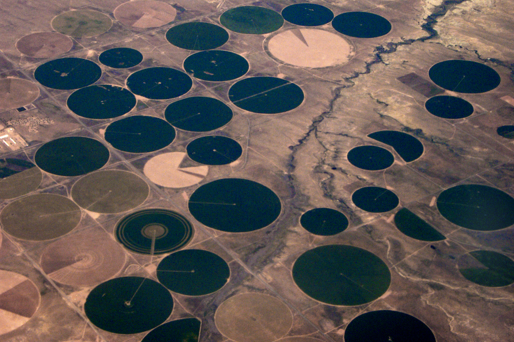
It can be seen at a point 180 degrees opposite the sun, speeding across the map-landscape below, crossing interstates and rivers, past the pegged dots of new housing developments, looking like mitochondria in an electron microscope, or the great circles of irrigated crops — great green coins spaced across Texas.

But it isn’t just the landforms that excite me. Even bad weather keeps my attention. Think of all the thousands of generations of humans who were never able to see the tops of clouds, which form their own fantastic landscapes, with mountains and valleys of crenellated whiteness.

The pilot curves the jet route in wide circles around a towering thunderhead, bleach-white at top and sooty at bottom, with its cauliflower protuberances catching new light. The distance is crowded with them, sprouting like mushrooms to the horizon. Dozens of fresh, new thunderstorms rising sunward like children reaching up for their mothers.

Over California once, after a rainstorm, with a low mist of water evaporating up into the atmosphere, the millions of puddles aggregated their mirror effect into a single flash, moving at the speed of the plane and making Fourth of July lightning bolts that flashed just beneath the surface of the mist, the way you can sometimes see the blood pulsing under the skin of a newborn. It gave me a feeling of intimacy with the planet.

Or a night flight, with the ground black underneath you as you fly over the empty expanses of the Southwest, with the small embers of tiny desert communities coming periodically into view, glowing like the last bit of a dying campfire. As you approach Phoenix, those embers gather into a vast pattern of incandescence, like some great lava field, with the glowing magma breaking through the cracks of the cooling stone above it. Almost nothing is as radiant as a city at night seen from the air. You want to hold your palms out toward it, to warm your hands in its heat.


Earthbound, we have a very bland, utilitarian sense of the celestial body we ride around on. It is all streets and signage, houses and mini malls. It is the place we go to work every day, the place where we watch television in the evening.

It is true, to those who have the eyes to see it, the planetary nature of our home is there to be seen: Daybreak shows us the sun breeching the horizon and moving across the heavens; the stars are there to see at night; there are rainy days and lightning storms to remind us of the larger forces. But they have all become ordinary through habit and usage. How many of us take the time to look up and admire a mackerel sky or a fair-weather cumulus cloud floating puffy on the slightly denser air beneath it?

But take an elevator to 30,000 feet and you get the god’s-eye view, moving across the curved surface of the world, where the people aren’t even ants and where the Earth is one small aggie in a great colliding pile of cosmic marbles.

Click any image to enlarge

We know what photography is: You point a camera at something and take its picture. But what if you don’t use a camera? And what if there is nothing to make a picture of?

Certainly, many have used their cameras to make abstract or quasi abstract images. Sometimes you just have to get close enough to avoid any context, or take it from some extreme angle.
Many decades ago, when I was teaching photography — so long ago that the photo lab was filled with noxious chemicals and darkness visible — I played around with making abstract photographs. Most of my photographs were landscapes and portraits, but in the darkroom between classes, I had time on my hands and tried a number of things out.

But let’s take this a step at a time. First, some straight photographs.

Many years before I began teaching, I knew an artist in Greensboro, NC, named Aime Groulx (he signed his name with a dot over the “X” as if it were an “I”). He was primarily a sculptor, but he also made photographs. One he made was of a doorknob in his house that looked like nothing else but a newly discovered planet. He called it “Doorknob to the Door of Perception.” He was an indifferent printer, but I used his negative to make a good silver print, which I still have.

The image was both totally realistic — it was a doorknob — and yet, as Minor White used to say, it is “what it is, and what else it is.”

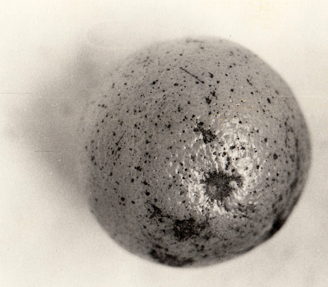
Over the years, I took this lesson to heart and made many an image that seemed to be something more than what it is. An orange can be a planet, too.

Or a sand dune can be a spiral.

Finding interesting and beautiful shapes divorced from their quotidian meaning can make us see them more sharply, make us understand something about the colors, shapes, textures, that being able simply to name the subject of a photo prevents us from acknowledging. When we recognize too easily what our photo is of, the image ceases being visual and becomes instead a word. “That’s a picture of a house;” “That’s a picture of a dog,” and by naming it, we find we have done our job and neglect to actually look and to see.

Making something abstract forces us to see those colors, shapes, textures — allows us to find new emotional meanings in the familiar, and new designs.

So, then, let’s take the camera out of the process. Once digital photography nudged out the silver, dried out the Dektol and replaced the Beseler 23C with Photoshop, there were other ways of making image files.

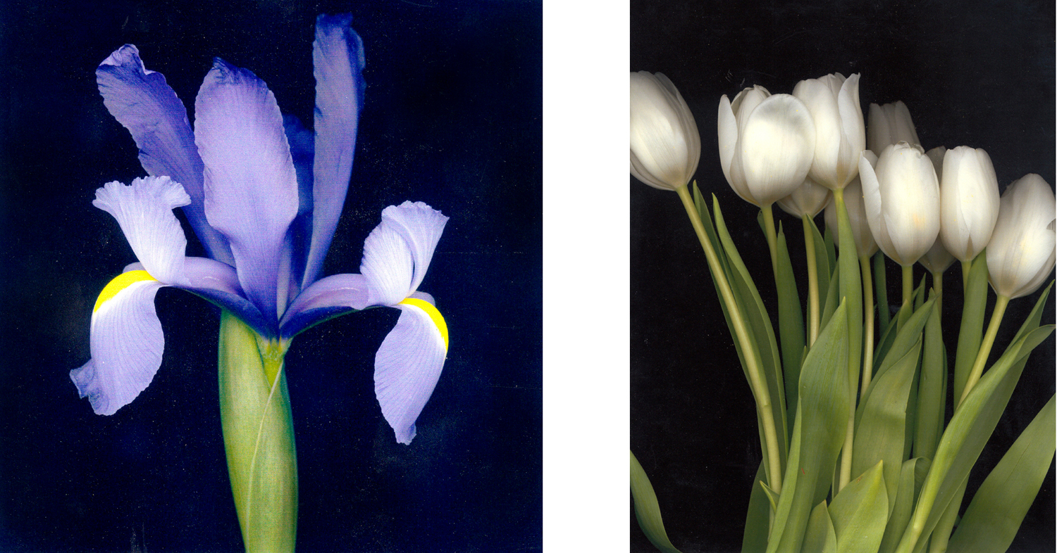
I began experimenting with a flatbed scanner, making extremely high-definition images of flowers. With the scanner cover left open, the background of these images became a very deep black or blue-black and only the parts of the flowers held flat on the glass platen were fully focused. The images were stunning and essentially shadowless.

I tried other things, too.

But there was still a lens involved in the scanner. So, let us return to earlier days, when chemicals still stained a photographer’s hands. I tried scratching the end-bits of developed rolls of film and printing them as if they were negatives.

Still, however, there was the lens of the enlarger focusing the negative down onto the silver paper.

I wanted to get into the image directly, with no mechanical mediation. I wanted to get my hands into the process the way a potter gets his hands into the clay.

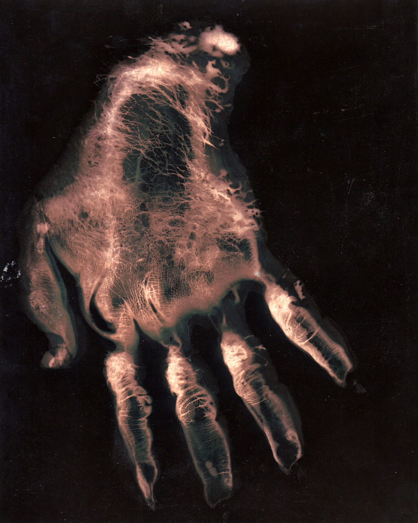
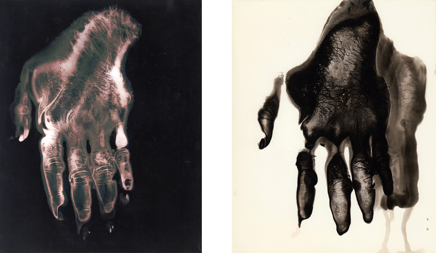
So, I dipped my hand into the tray of sodium hyposulfite and pressed it wet onto a sheet of light-sensitive paper, then washed the hypo off the paper and doused it in the developer, which turned the image black except for where the hypo had left its imprint. It made for rather spooky gorilla hands.

I tried it in the reverse way, too, dipping my hand into the developer and then, after the blacked image appeared, finished the process in stop bath and hypo. That gave me a black hand on a white sheet.

Certainly, this gave me an image of the familiar that was decontextualized and made strange. I saw my hand very differently.

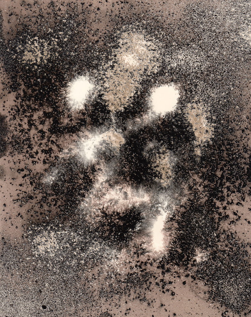
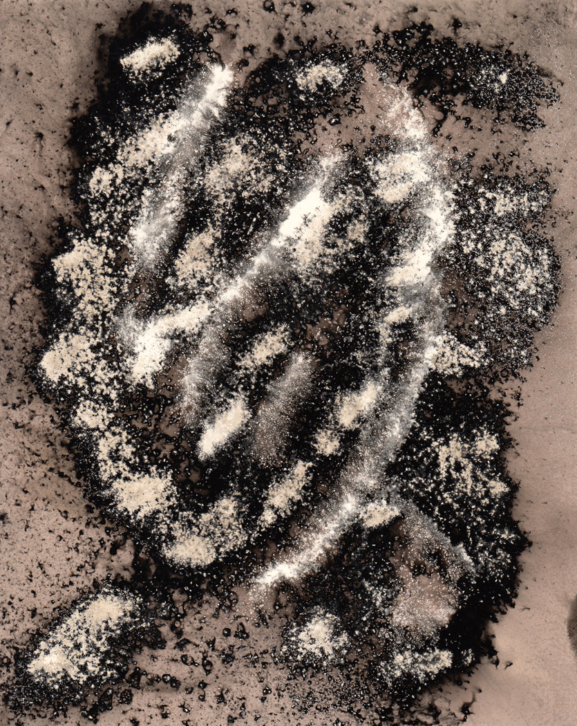
There is, however, only so much you can do with a hand. After the first hundred or so versions of my hand, I tried some other things. Like scattering salt on the paper and spraying the developer like Windex down onto the sheet, leaving a scattering of stars on the paper.

I also tried dusting the paper with dry developer granules and spraying it with water, making the black specks on the lighter background. The spray made the salt or the developer wash weakly over the paper, making mid-tones that I enjoyed.

You could make an image that vaguely resembled a portrait.

These experiments continued over the six years I taught, but when I left that job, I became a writer instead of a photographer. My camera was used primarily to illustrate stories I was writing.

I look back at some of the images I made so long ago and feel there might have been something in them. Whether there is or not, the process was worth the time; it gave me great pleasure.

Click on any image to enlarge

I recently wrote about the Bible as part of our cultural heritage, along with Ovid, and the importance for our younger readers to be familiar with both of them, since they provide such an important resonance for so much of our art and literature. Not simply as footnotes to explain some obscure allusion in some poem you are studying, but as a kind of foundation layer — a diapason for everything that has followed and sounding deeply underneath it.

I received one rather snarky comment complaining that my piece was characteristically over-weighted with Western culture, and that I should have also mentioned non-Western writings.

My reader, I think, had rather missed the point. I was talking about the Western culture we were born into. I was not making a value judgement that ours is necessarily better or more important than others. But I was not born into the Chinese, Indian, African or Native American cultures.

I have always encouraged the widest possible exposure to the rest of the world. I have tried to read widely in other cultures, and to familiarize myself with the art and music of other peoples.

But there are two problems inherent in the criticism my misguided reader has leveled at me. This is not to exculpate myself — I do sometimes overvalue my own culture — but rather to point out some serious problems with trying to be too cosmopolitan. I wish I could embrace all times and all cultures, and god knows, I have tried my best. I read widely, whether the Mahabharata or the Tao Te Ching; I have studied the development of Chinese landscape painting and the impenetrable glyphs of Mesoamerica; I have attended Chinese opera; I watch the new cinema of Iran. I traveled to South Africa to study contemporary art there.

One should be familiar with the Popol Vuh, with the Egyptian and Tibetan books of the dead, Gilgamesh and the Shahnameh.

One should also read more recent things by Chinua Achebe, Athol Fugard, R.K. Narayan, Kobo Abe, Isabel Allende, Mario Vargas Llosa. Jorge Luis Borges, Pablo Neruda and Gabriel Garcia Marquez are hardly less essential than Leo Tolstoy or William Faulkner.

Still, there are insurmountable problems with the whole idea.

The first is that no matter how much I study, how much I learn — even if I were to get my Ph.D. in the Fu poets of China and were able to read them in their original language — Chinese culture would never be native to me. Culture, like language, is acquired, not learned. And just as it is impossible after the teen years to acquire a new language as a native tongue, no matter how well you learn that new language, you can never fully absorb a non-native culture. You will always know it from the outside.  Its idioms are elusive.

So, the sort of resonance I wrote about — the unconscious undertones you pick up when reading in your own lingua that deepen your emotional understanding of your text — you can never fully acquire in a culture you study later in life. Deep as you penetrate, you cannot soak it in the same way a Chinese child, or an Indian child soaks in his own.

Related to this is the second problem.

The pretense of assuming a non-native culture is almost always a form of Orientalizing. That is, there is a kind of romanticized sheen that is cast over the other culture. And that other culture is often used as a flail to scourge one’s native culture.

Lord knows, Europe has a lot to answer for historically. And those who bemoan Western culture use the counter-example from some other culture to make the point. The problem with this kind of cultural self-loathing is that it ignores the simple fact that it is not Western culture that creates the evil, it is human beings that do so. Every culture has its evils to answer for. Europe may, in the past 500 years been dominant, and have a list of sins more immediate in our cultural memory, but we should never forget that all cultures are made up of humans, and humans do and have always done reprehensible things.

I once made a study of genocides, and which religions have been responsible for the largest portion of them. Turns out they all have their murders. The religion least likely to turn on others is Buddhism. Yet, even they have their share; not the least is the current situation with the Rohingya in Burma. So, historically speaking, no one escapes blame. Before Columbus, Native Americans were not living in peace and amity: They were killing each other. China had Mao; Cambodia had Pol Pot; Rwanda had its Tutsis and Hutus. Humans red in tooth and claw.

The romanticization of other cultures leads to some utter silliness. I never cease to be stunned by all the “harmony with nature” blather about American Indians, as if they, as a group (and not a hundred different languages and cultures), had some magic relationship with the natural world that Europeans do not. You look at European painting or read Western poetry and practically all you see or hear is nature, finely seen and deeply felt.

And conversely, you travel through the Navajo reservation in Arizona and see the profound overgrazing that has devastated grasslands. Or visit First Mesa on the Hopi reservation (one of the places I most love in the world), and peek over the edge of the precipice and see the trash and old mattress springs tossed down the cliff as a trash dump. Talk to me then about how Native Americans live in harmony with nature.

No, I don’t mean to imply that Europeans are better than Native Americans, nor do I mean that some Native Americans don’t have a specific cultural relationship with the natural world. What I mean to state is that Native Americans are people too, and are just as capable of being less than their best selves.

These two problems together mean that when we leave our own milieu, we are always tourists — or at best, travelers — strangers in a strange land, fascinated by this bauble or that, able to learn lessons and pick up fresh ways of understanding existence, but these are always souvenirs, the benefits of travel that broaden our horizons.

When we Orientalize — idealize the foreignness of others — we can easily toss away the pith and suck on the bark. There is much value, say, in Buddhism. And if one is to have a religion, it is certainly the least offensive, with the least blood on its hands. But if you want to be one, be a Buddhist in a jacket and tie; don’t shave your head and wear yellow robes. If you were born in Indiana or West Anglia, these Volkgedanken externals miss the elemental meaning and turn profound ideas into cosplay.

So, be aware of the rest of the world. Read widely and deeply. But also, drink deeply from the culture that gave you birth. You may understand other places and other peoples in your head, but you feel your own in your belly. If you are Chinese, dive into Chinese culture; if Mexican, soak in your history, literature and art; if you are born into the culture of Chaucer and King James, imbibe deeply of the Pierian Spring. Learning from other cultures broadens you, but your mother culture nourishes you.

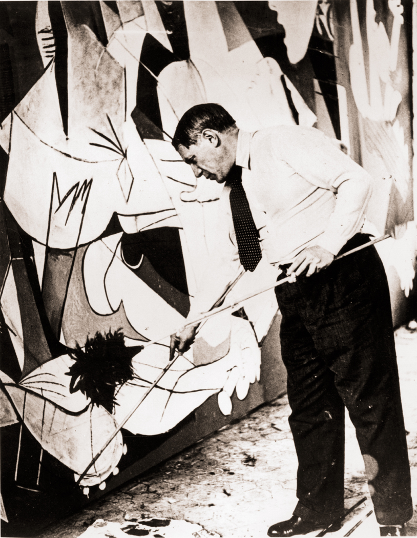
Pablo Picasso painting Guernica in his studio, Paris, 1937; photograph by Dora Maar

When Pablo Picasso painted Guernica, he knew he was making a monument. When Milton wrote Paradise Lost, he knew he was writing for the ages. When Bergman filmed Seventh Seal, he knew he was saying something important and not merely entertaining us with a cool story.

Art is often made with large purpose. Artists may work a whole lifetime to be able to sum things up in a major piece, or group of pieces, like  the Isenheim Altarpiece of Grünewald, or Proust’s À la recherche du temps perdu.

In these cases, the art becomes an entity in itself, a thing produced. It takes on a life beyond its maker’s; it is a milepost in cultural history. We look to it not only for beauty, but for wisdom, for inspiration, for a sense that there is something large which we all share as humans.

On the other end of the spectrum are the snapshots we take of our families, on birthdays, on vacations, on weddings. As such, the photographs are seldom seen as esthetic objects, but rather encapsulated memories — something to hold fast a fleeting moment of importance to our singular lives. They may capture something intensely human, but that is not their primary purpose.

(It is always fun to scavenge anonymous snapshots to find glimmers of the idiosyncratic or the universal, that is, to see them as if they were intended as art. But that is a piece of active curation on our parts, as if we were the artists ourselves, editing the random into a coherent message. The family photos were never meant to hang in art galleries.)

Even if a painter isn’t making a Sistine Chapel, if he is a professional, he is creating a commodity — an object that can be sold. And even if it’s not bought, the thing exists as a thing. There it is, framed and hanging on a wall, with track lighting making it glow jewel-like in the gallery.

But there is something between these two poles — between commodity and snapshot. It is the artist’s working sketch, never meant to be sold, never meant even to be seen. It is either the artist trying out ideas for a painting, or — and this is even more important — just keeping his hand in.

There is something of the throwaway in such noodling, but there is also something of value we shouldn’t underestimate.

We often forget that there is an intimate connection between art and the experience of living. It has been made easier to forget because in the last half century or so, a good deal of art has been made simply about art, about its materials, its limits, its meaning, its history. But through most of that history, art was about the world. Whether it was landscape or still life, whether portrait or history painting, it was meant to reflect something of our common experience of life.

Even when art has been about art, it has been about the experience, in life, of thinking about art. There is an unbreakable connection between experience and its image.Which takes me back to those sketches. Whether it is Picasso doodling on a napkin or Turner washing light watercolor pigment over rag paper, it is — aside from any commercial intention — an effort by the artist to make the connection with the world. To see, and see clearly.

Andreas Gursky

Photography, as much as painting, has its monuments, whether it is an Edward Weston pepper or Ansel Adams’ Moonrise Over Hernandez, or more recently, the giant photomurals of Thomas Struth or Andreas Gursky. They are the opposite of family photos.

But there is a middle ground in photography, also. It is the equivalent of an artist sketching. Photographer Lee Friedlander calls it “pecking.” It is the quick, improvisatory snapping of bits of the world, to see what is there.

With is 35mm rangefinder Leica camera, Friedlander says, “you don’t believe you’re in the masterpiece business. It’s enough to be able to peck at the world.”

Only afterwards, going through his accumulation, does he edit and pick a few that stand on their own to be published or to be exhibited. But the interesting part, to Friedlander, is the engagement with the world.

“I take more to the subject than to my ideas about it. I am not interested in any idea I have had, the subject is so demanding and so important,” he says. “Sometimes just the facts of the matter make it interesting.”

Friedlander is amazing in that his peckings are often so visually rich and complicated that they are nearly as Baroque as a painting by Rubens. Action seems to be in every corner of the frame.

But you don’t have to be an artist as good as Friedlander to engage with the things of this world. Making photographs is a way of seeing, similar to sketching. It is about paying attention. We can focus on the details.

For many Americans — maybe most humans anywhere — only use their eyes for useful things. They see the road they drive on, the could that tells them it will rain, the house, the car, the coat closet. When they make a snapshot for the family album, it is enough to be able to name the items in the picture — that is Uncle Vern, that is the house we used to live in, that is my first car — and beyond the naming of the subject, we don’t really pay attention to what is there. Most probably, we have framed the image so the house or the uncle stands dead center in the frame.

Frielander talks about the potency of the photograph describing what is either his experience when he was a boy with his first camera, or perhaps anyone’s similar experience: “I only wanted Uncle Vern standing by his new car (a Hudson) on a clear day. I got him and the car. I also got a bit of Aunt Mary’s laundry and Beau Jack, the dog, peeing on a fence, and a row of potted tuberous begonias on the porch and seventy-eight trees and a million pebbles in the driveway and more. It’s a generous medium, photography.”

For Friedlander, his life work became making all these disparate bits harmonious in the frame. Again, like a Rubens.

For most of us, these pecked pictures are mostly details. They are not the grand view or the concatenated whole, but the tiny bits out of which the larger scene is built. Most of us pay attention only to the whole, when we pay attention at all; for most Americans — maybe most humans anywhere — only use their eyes for useful things. They see the road they drive on, the cloud that tells them it will rain, the house, the car, closet. But every house has a door, and every door a door-handle; every car has tires and every tire a tread and each tread is made up of an intricate series of rubber squiggles and dents. Attention must be paid.

Paying attention to the details means being able to see the whole more acutely, more vividly. The generalized view is the unconsidered view. When you see a house, you are seeing an “it.” When you notice the details, they provide the character of the house and it warms, has personality and becomes a Buberesque “thou.” The “thou” is a different way of addressing the world and one that makes not only the world more alive, but the seer also.

(It doesn’t hurt that isolating detail makes it more necessary to create a design. You can make a photo of a house and just plop it in the middle of the frame and we can all say, “Yes, that’s a house,” and let the naming of it be the end-all. But if you find the tiny bits, they have to organize them in the frame to make something interesting enough to warrant looking at.)

Sectioning out a detail not only makes you look more closely, but forces your viewer to look more closely, too. Puzzling out what he sees without the plethora of context makes him hone in on its shape, color, and texture. It is a forced look, not a casual one.

This is a rich world, profound in detail, millions of species, visual patterns in every rock and cloud. Each bit of rust on a grate is intense, when noticed. And noticing is what “pecking” is all about. With my own peckings, I am not making any argument for them as art; they will not be hanging in a gallery. I make them for myself, to force me to pay attention to the minutiae that are the bricks of the visual world they inhabit. And paying attention is a form of reverence.

Click to enlarge any image

At the climax of Fritz Lang’s 1925 classic, Metropolis, the mad scientist villain kidnaps the heroine and climbs to the top of the city’s cathedral, dangling precipitously over the narrow walkway at the edge of the roof. From the first time I saw the movie, I wanted to join him.

Not, obviously, as a kidnapper, but rather to experience the hidden acroscape of the cathedral — the skin over the vast interior space that defines such a cathedral. It is akin to the thrill of walking along the catwalks above a stage, among the ropes and dropscenes. You have the charge of being somewhere illicit, somewhere ordinary mortals never get to see.

If you are willing to climb the stony steps inside the northern tower of Chartres cathedral in France, you can break out into the air high above the town and look down not only at the houses but on the gargoyles arrayed below you. You have something of the point of view of the angels Cassiel and Damiel from Wim Wenders’ film, Wings of Desire. It is almost like flying.

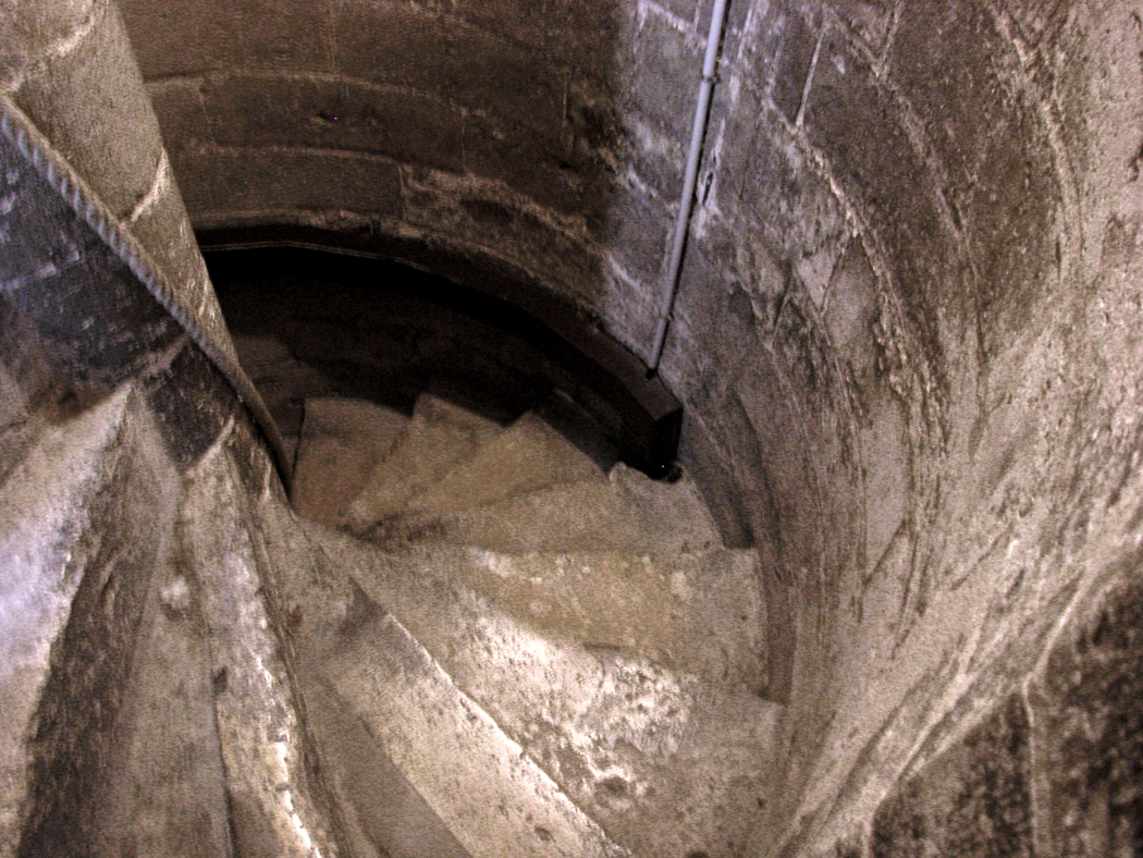
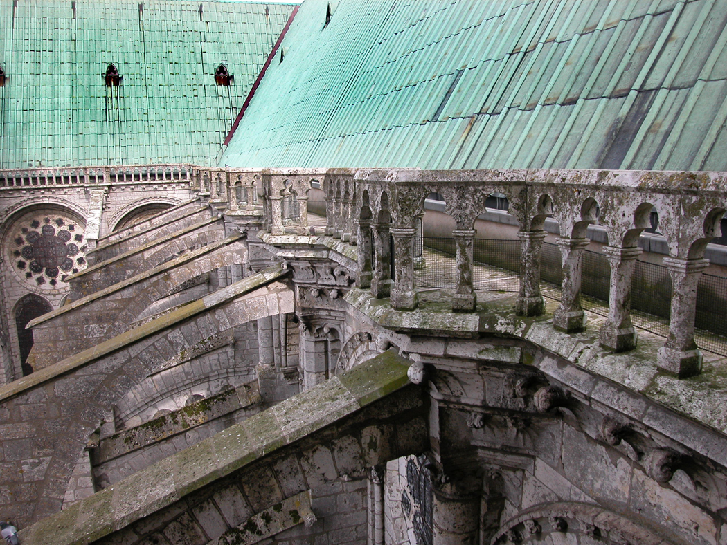
It is a long way up and a lot of stairs narrow inside a tube of rock and no one with serious claustrophobia should attempt it. But you can climb to the bell tower rooms and then to the roof of the cathedral and walk on the narrow stone walkway, with the low stone balustrade preventing you from a headlong five-second, wind-rushed appointment with your inevitable end.

You look down at the flying buttresses and notice architectural details you cannot see from the ground. You see the moss and lichen that has been slowly eating at the stone for centuries. You see the vivid green of the roof and beyond that, the distant round horizon.

What is more, and perhaps the most surprising, is the incredible amount of ornamental detail put into the structure at a level that no normal human would ever get a chance to see. There are finials and floral scrollwork, there is tracery and statuary, all placed there, as far as anyone can tell, for the sole amusement of gods and angels — for who else will get to appreciate the work put in to such places that have no public access, no meaningful purpose for the clergy or staff, no liturgical function. The old stone carvers who made such beasts must have had a grand time unlocking the cage doors of their ids.

Indeed, much of the carving along the roofline of Chartres seems positively pagan rather than Christian. There are demons and lizards, chimeras and gargoyles. The building is positively animated with this menagerie of odd animalia.

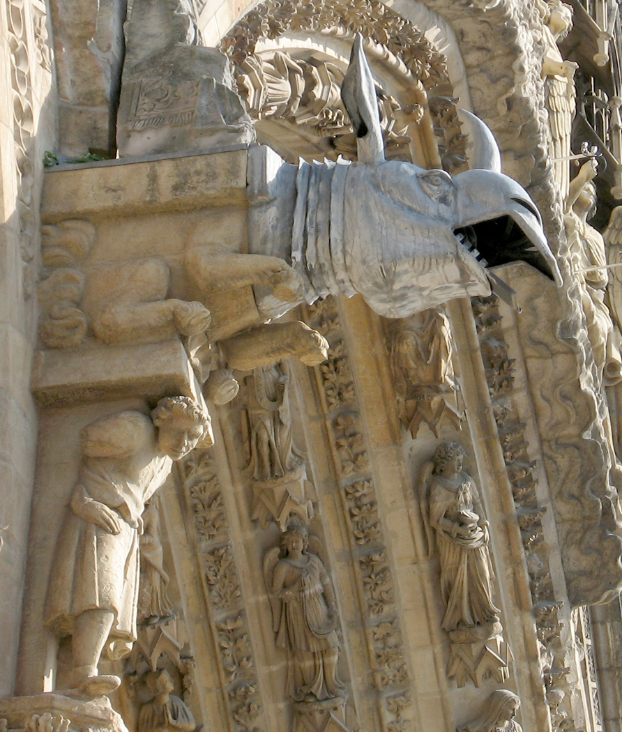
And up this high, you can see the gargoyles from above, and see the grooves down their backs and the holes through the skulls that guide the rainwater out into the streets, away from the foundations of the church. Gargoyles are drainspouts; the others are chimera — the odd animals that decorate corners, niches and summits. In the Middle Ages, they were all called “babewyn,” which was Italian for “baboon.”

It is one of the touchstones of Gothic thinking that a building should match the fecundity and variety of the world. We who have grown up in the age of Mies van der Rohe have come to think that the hallmark of elegance is simplicity, that “less is more.” But the Medieval artist looked around him and saw oak leaves and irises, chipmunks and rooks, gullies and precipices, and all in an abundance of color and shape — and he strived to match that earthly brilliance with a corresponding abundance in his work.

Cultural history shows us a constant pendulum swing between epochs in which unity and simplicity were elevated, and those eras in which complexity and extravagance were valued. The Romanesque that preceded the Gothic, and the Renaissance that followed both were times of constricted unity. A few shapes served as template for an entire building.

Ernest Hemingway characterized the contrasting impulses when he said there were “putter-inners and taker-outers” among writers — he being the ultimate taker-outer. The Gothic age in history is the key putter-inner. Everything is dumped into the esthetic hopper and the plenitude is gloried in.

Take for example the great neo-classic St. Paul’s Cathedral in London, which is a marvel of studied simplicity and symmetry. Each column and capital is uniform in design, each window matches for an overall sense of unity and simplicity. Then take Chartres and realize that each column is different, each capital a unique design. And because the cathedrals were built over such a long time scale, the style at the beginning of the build may vary greatly with that at the completion. At Chartres, the west facade is nearly Romanesque in its austerity, while the north porch is extravagant in its Gothicism.

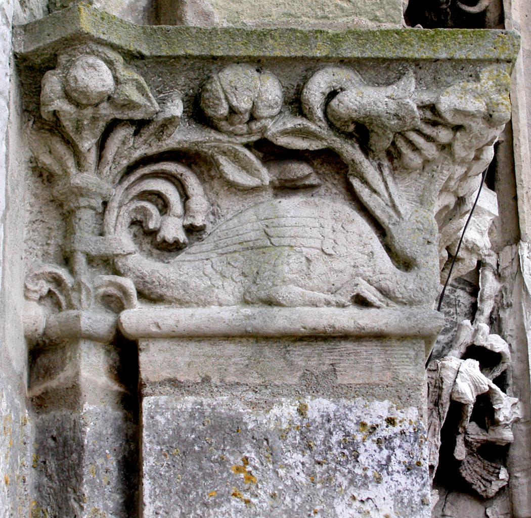
You can see this tendency not only in the columns (often called pillars when discussing Gothic cathedrals) and capitals, but in the column bases. Just in the north porch alone, I photographed a series of them. Here are six.

They vary from foliage to flowers, to star shapes and scrollwork. And even when they depict the same variety of leaf, they are designed differently. You can enjoy the image of the world in seeing them, just as one patch of ivy in a garden mimics but still varies another patch.

Unity or diversity, it is still a tension we feel these days, as the gravitational pull of unified Modernism gives way to the stunning diversity and lack of unity in the Postmodern world. Throw it all in together and see what happens.

The elders among us, brought up in the orthodoxy of the 20th century sees this trend as a decline, but in reality, it is really just another pendulum swing, back to a moment when motion, complexity, diversity, light and shade can triumph once again over stasis, simplicity, coherence and uniformity.

You walk around Chartres and you can see the glory in such a world view, such a vivifying afflatus, a joy in living, and in the world we inhabit; and less of a mechanized drive to control and regularize our lives.

As William Blake wrote, “Energy is eternal delight.”

Click any image to enlarge

Next: The chimera of Paris

You can never know what an experience will be like until you have it. You can read about Chartres and see the photos. And you can visit other cathedrals, as we have on this trip. But you have to be there, at Chartres to see how it is different.

This is not a panegyric to Chartres. Others have written them. My reaction is a bit different. I was surprised to see how sparse the cathedral is. After Notre Dame de Paris, I was expecting something a little more crenelated, more decked out, more flamboyant.

After all, Notre Dame de Paris was an early example of Gothic architecture. Chartres is considered High Gothic. It was followed by Rayonnant and Flamboyant styles, each increasingly geegawed up.

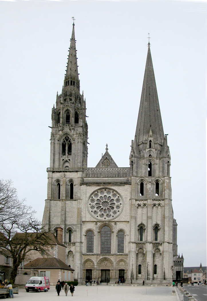
But Chartres is a veritable Spartan of cathedrals. Her west facade, for instance, is spare in the extreme, with only a few decorations, not counting the portals and their sculpture. But those portals are rather small and restrained, unlike their cousins in Paris. You almost get the idea of a facade that isn’t finished, that is waiting for someone to come along and add the finials, Hebrew kings, garlands of trefoils and quatrefoils.

Instead, it almost looks like the Gothic cathedral equivalent of plywood.

Because this was our first acquaintance with Chartres, we took a rather methodical approach to the building. We walked first around the building, from the facade to the south porch, around the apse and treasury, along the north porch and back to the front, making the full circuit.

North porch

Yes, the portals of the transepts are splendid, rich with sculpture. The bulk of the statuary can be found on the transept porches, and some of it is extravagant. But otherwise, the walls of the building are generally plain.

And when we went inside, we were blinded by the dark. It is a dimly lit nave — again contrasting with the brightness of Paris, to say nothing of Sainte-Chapelle.

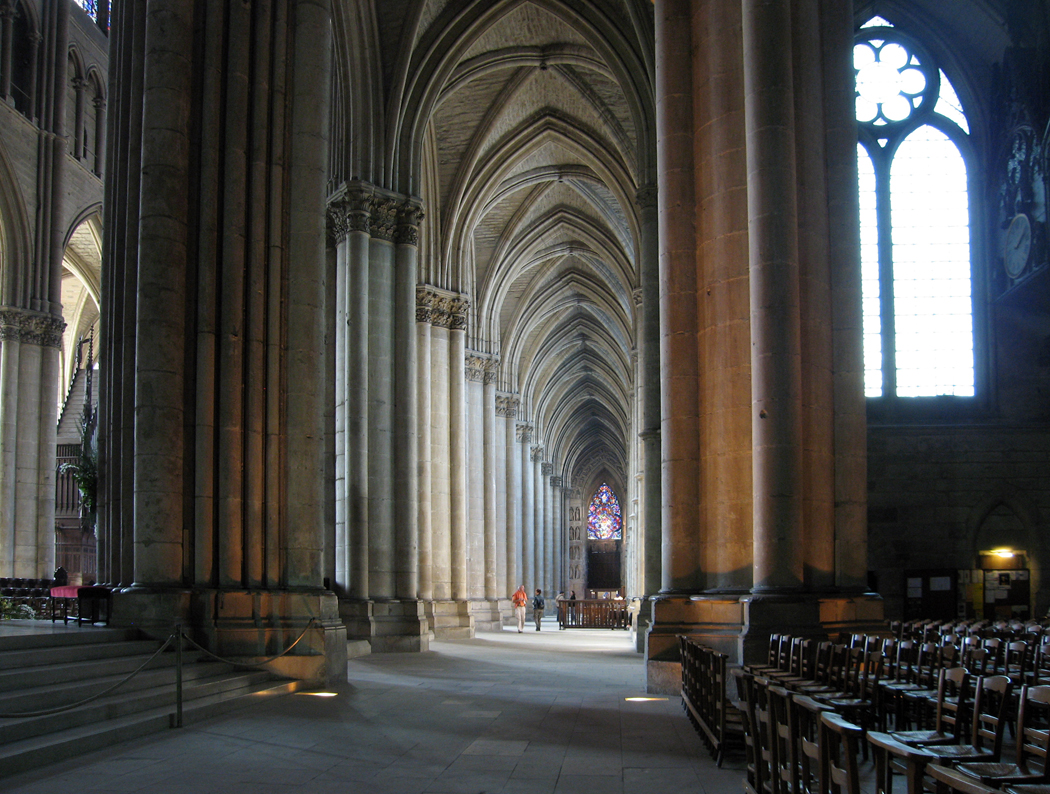
The proportions of the nave seem almost primitive. The classic Gothic nave walls consist of three layers: an arcade between the nave and the aisles on either side of it; a second-story, called the triforium, which is another arcade piled on top of the first; and finally a wall of windows, called the clerestory, which lets the light into the building. At Chartres, the proportions are different from in most of the other cathedrals we visited. The large aisle arcades take up almost half the height of the nave. The small triforium leaves room for a rather scaled down clerestory. The result of these odd proportions is that not much light drifts down to the nave floor. It takes quite a while for your eyes to adjust.

West rose window

When they do, there is a good deal of wear to be seen. Not only is the stone floor worn wobbly from centuries of traffic, but the vaulting in places is peeled or exfoliated, showing some brickwork behind the stone. In far corners, walking through Chartres feels almost like spelunking.

The rose windows are also smaller in proportion to their settings than those of Paris.

The west rose window, in particular, is at least half stone. The tracery is heavy and dense, leaving only small patches of glass to shine. Unlike the Paris rose windows, this one seems almost a crude, early attempt at constructing one.

The north and south rose windows are more elaborate, but even they are small in comparison with the space of the transept walls. They could easily have been made 20 percent or 30 percent larger without overwhelming their setting.

The interior almost gives you the feeling of an empty apartment, after someone has moved out. Where are the paintings, the furniture, the curtains? In Chartres, where are the windows, the interior carving, the elaborate bosses in the vaulting?

Of course, we didn’t see Chartres in operation, as we did Paris. Perhaps it has the same awe inspiring grandeur when a mass is being said.

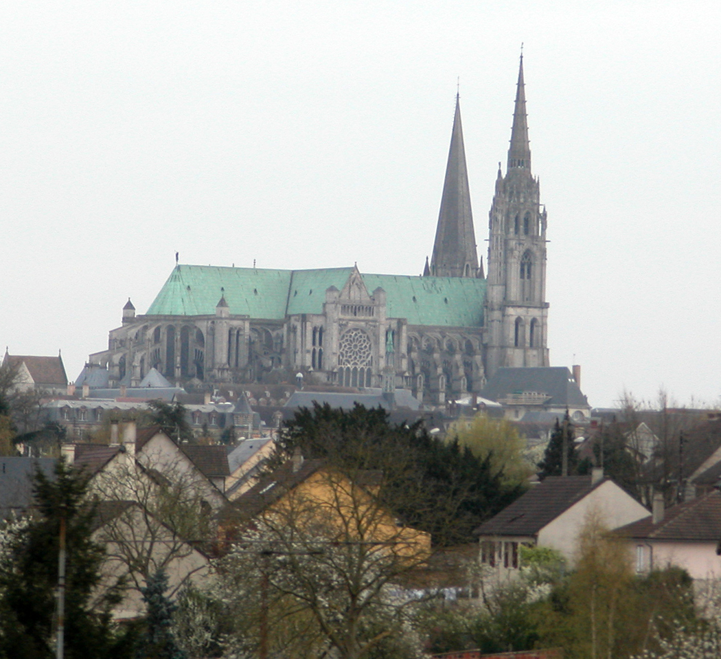
And you cannot fault its setting, on the hill above the town. From miles around, you can see the twin towers looming. It was the first thing we could see from the train arriving in the morning: Those towers poking up out of the countryside.

I walked the eleventy-hundred stairs up the north tower and dangled acrophobically over the roof, the bell and the south tower, taking photos of gargoyles, tracery and stone foliage. Liability laws must be quite different in France. In the U.S., they would never allow anyone to climb up those stairs, let alone hang out over the precipitous drop, with its low balustrades and that steady breeze that must often become a wind.

One of the reasons Chartres is so highly prized is because so much of it is original. The statuary at Paris is cleaner and more neatly featured. But then, it is only 150 years old, having been restored by Viollet-le-Duc in the 19th century. Viollet-le-Duc was a magnificent man, and his restoration work at Paris is convincingly original looking. You don’t sense much of the 19th century in it.

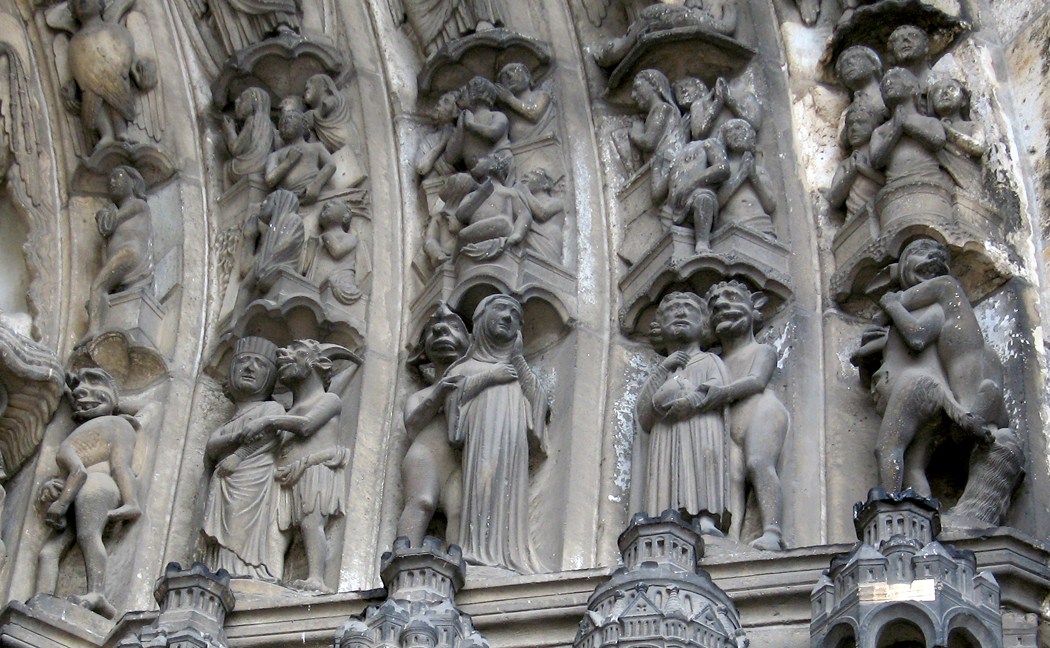
The damned

But it is still pristine. At Chartres, the statuary is weathered. You can see the lichen growing on the stone.

Even the walls of the cathedral sport tufts of daisies high up, in unlikely places, growing straight out of the masonry.

The limestone is mossy, lichened and eroded. Paris has only recently been sandblasted. Its stone seems newer — although there is plenty of erosion to go around there, too.

But Viollet-le-Duc’s restoration has made Paris look fresher than her matronly cousin in Chartres.

Don’t get me wrong. I don’t mean to pooh-pooh Chartres. It has its glories. And it is the very prototype of the high Gothic. But there was a certain musty odor in the nave; Paris smelled more urban, more used.

South porch

If I sound disappointed, I don’t mean to. We spent a good 9 hours with Our Lady of Chartres. We spent that time feverishly. I photographed every one of the main sculptures of the portals, and a good deal else beside.

If Chartres seemed dimmer than we had expected, the problem was with our expectations. Chartres has since drawn us back several times, and each time, it has revealed more and more of itself, and now I see it as the archetype of the cathedral, the mother building, the pure form. Other churches may be more tarted up, but there is a dignity at Chartres, a refusal to take on the shallow and transient, that makes it more classic. I have come to love Chartres, and especially its glorious rose windows, those burning embers glowing through the walls.

We have gone to Notre Dame de Paris more often — because it is in Paris, and therefore available each time we visit France — and we love the cathedral in Paris very dearly, but there is in me, at least, a special reverence for Chartres, that draws us back, no matter how far out of the way we must go as we drive around the hexagon that is France. From every corner of the country, we somehow are pulled by the gravity of Chartres back to absorb its special aura, power and spirit yet one more time. And I say that as a committed atheist.

I can remember the art history courses from college, and the long, boring lectures about the Romanesque and the Gothic, and taking it all in, looking at many fuzzy slides of Chartres projected on the screen at the front of the lecture hall. And the many photographs from books, including the great Mont-Saint-Michel and Chartres by Henry Adams. Pictures in picture books are one thing. The palpable feeling on the skin of the humidity in the vast interior space of Chartres, the light hitting the floor, the smell of centuries of stone — the reality grabs you by the hair on the back of your neck and has not let go yet. Now we have experienced it, have it in our blood.

This is a panegyric to Chartres.

Next: Climbing Chartres

Click on any image to enlarge

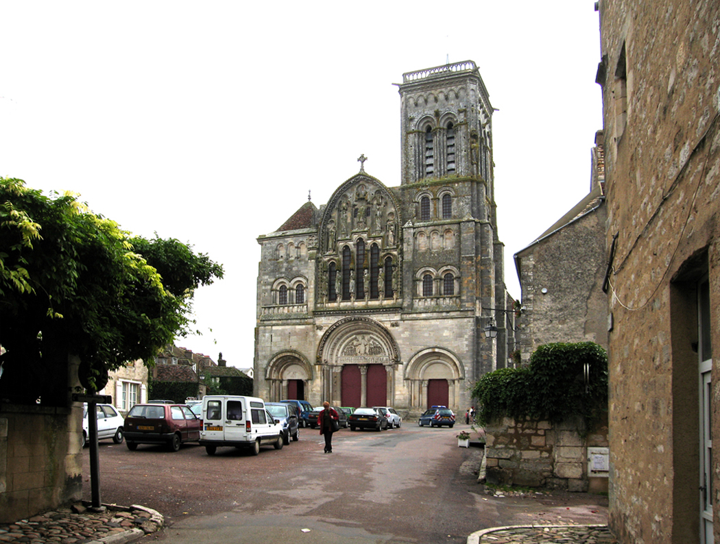
There is a small hill about 140 miles southeast of Paris, surrounded by fields and forests. On its southwest slope is a small town, barely a village, population 480 people, with a hotel near the bottom and the basilica of St. Mary Magdalene at the top, an abbey church dating to the 10th century. On the slope to the opposite side of the town are simply more woods.

At this hill, in 1146, the renowned cleric, Bernard of Clairvaux, later Saint Bernard, called for a second crusade to the Holy Land. Now, it seems a remote spot to initiate such an epic enterprise, but on March 31 of that year, with King Louis VII present, the influential abbot preached to a crowd in a field. A platform was built just outside the town and Bernard called for the masses to “hasten to appease the anger of heaven,” in retribution for the losses suffered after the First Crusade.

“Hasten then to expiate your sins by victories over the Infidels, and let the deliverance of the holy places be the reward of your repentance,” he said. “Cursed be he who does not stain his sword with blood.”

Bernard wrote to the pope a few days later, “Cities and castles are now empty. There is not left one man to seven women, and everywhere there are widows to still-living husbands.”

The Second Crusade was eventually a bust, failing to achieve its goals, but as you stand now in Vezelay, where the call went out, you can feel both the weight of the endeavor, and the astonishment that such a sleepy community could ever have been the site of anything so momentous.

But back then, Vezelay was the center of a thriving abbey, and its church is now visited each year by many times the number of the village’s permanent inhabitants.

Compared to the famous cathedrals further north, Vezelay’s basilica is small and simple. But it is exceptionally beautiful.

It had rained all our way to Vezelay, and it was dusk when we got to the town and could see the tower of the church high on the hill through the mist, like something from a Hiroshige print.


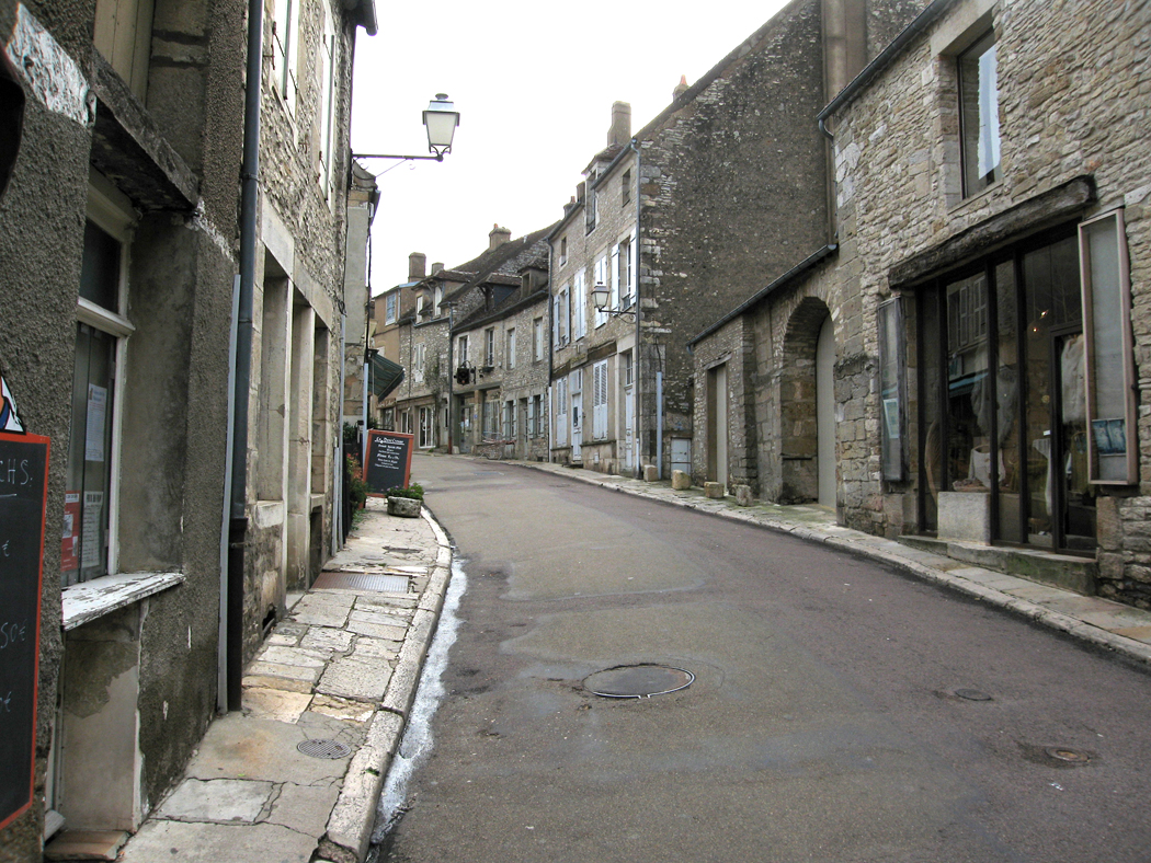
In the morning, with the sun come out and the waters subsiding, we started up the hill toward the abbey church. At the hotel, a sign said, “Pas voiture; pietons seulement” — “no cars, pedestrians only.” So we walked, up the hill, rather higher and more difficult on foot than it appeared, past souvenir shops, brasseries, a book store, the mairie (or city hall), past home with bright flowers outside and past gated house with BMWs in the yard.

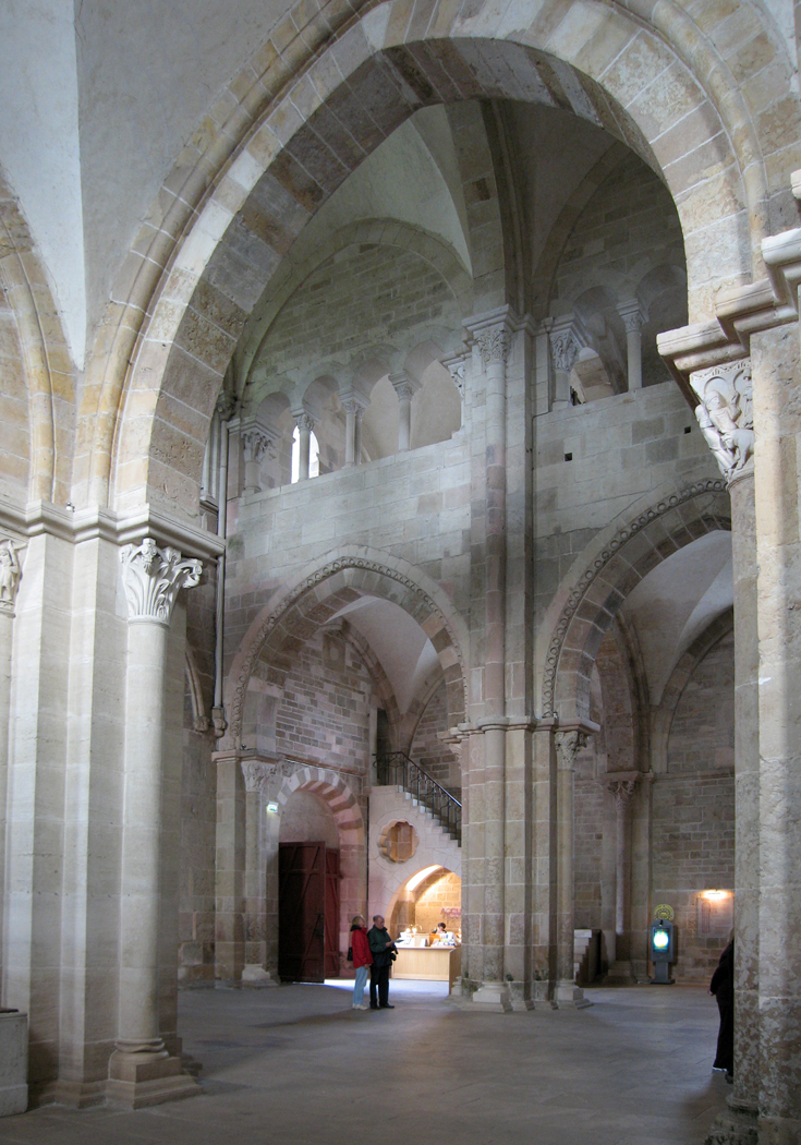
Huffing and puffing, we made the summit and the west facade of the church, looking quite Romanesque. Most of what we had seen had been Gothic, but the buildings constructed before the 12th century were designed to a different principle, one heavier with stone and parsimonious with windows.

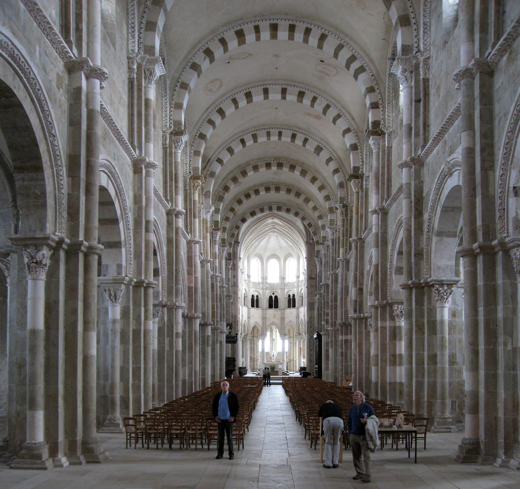
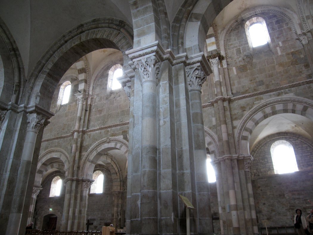
Almost all of them, however, were begun in the earlier style and later added on to with the later style, often obliterating the Romanesque underneath or replacing it entirely. At Vezelay, you have a Romanesque facade and nave, but a Gothic choir and apse at the far end. Whether by design or accident, it makes a visit to the church a sacred metaphor, from the darker interior of the Romanesque to the illumination of the Gothic.


This metaphor is amplified by the unusual narthex of the church. In most cathedrals, the narthex is the junction between the west facade of the church and the beginning of the nave. It functions both as an architectural joint, and as a kind of foyer. In Vezelay, the narthex is blown out to fully three bays, with a second portal inside. This three-doored portal, with its own tympanums, used to be the exterior of the church, before the narthex was added, making the narthex a kind of overture to the main event. This first experience of the church interior is notably dark, with few windows.

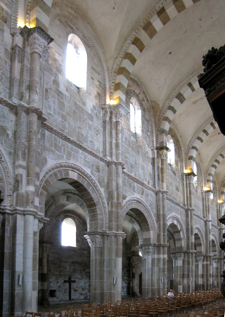
Enter through the second set of portals and the nave is much more brightly lit. It is a long nave, 10 bays long, and with barrel vaults painted in striking dark and light checks.

The choir is Gothic, and so, brighter still. The path is from dark to light as you reach the “holier” end of the basilica.

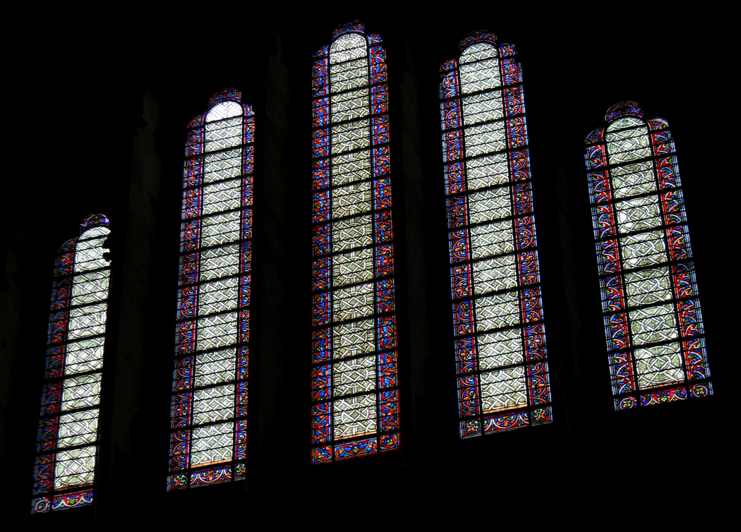
The glory of the big churches and cathedrals can be found in the glass, with the rose windows and the lancets. The outside of the buildings are gaudy with Gothic statuary, tall, gaunt and and stately, but with distinct and individual faces. Vezelay has little glass to note, and its sculpture is Romanesque, not Gothic.

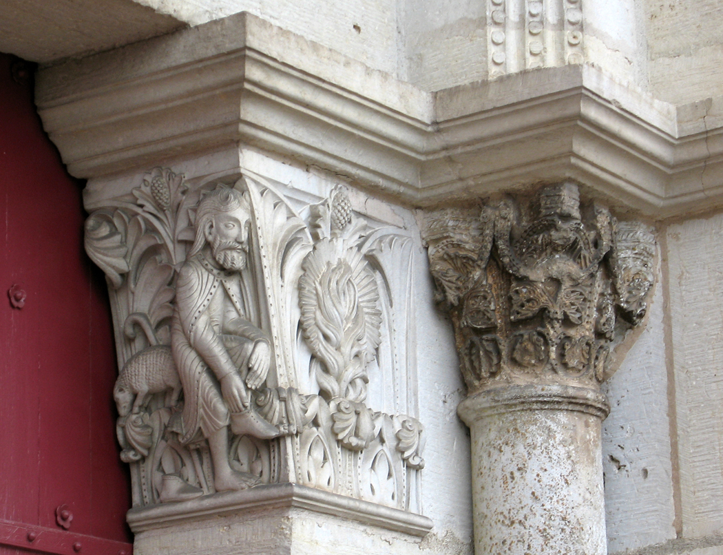
In ages past, the Romanesque style seemed primitive and childish, with large heads and hands, poor proportions and sometimes goggling eyes. But fresher, 21st century perspectives can see them through the abstraction and distortion of Modern Art and they seem not primitive at all, but profoundly expressive.

Alas, much of the sculpture is not original, but replaced in the original style by — guess who — Viollet-le-Duc in the 19th century. Yet, many of the originals remain. You can sort out the difference between the more weathered look of the originals and the smooth surface of the replacements.

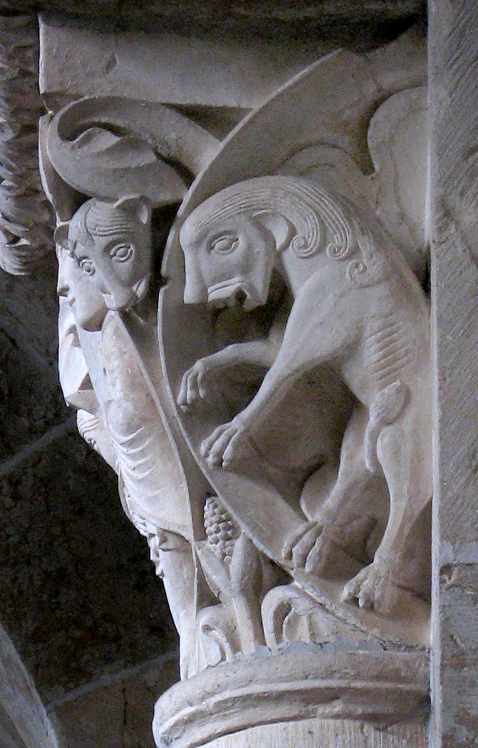
Looking at the many column heads in the nave of the abbey church at Vezelay, you can see the narrative drive of the Romanesque artists. Many tell Old Testament stories, such as David and Goliath, or the slaying of Absalom by Joab, or even the rather comical Noah and his wife.

One of the weirdest is the depiction of the sin of lust, a naked woman tearing at her distorted dug while, on the back side of the capital, a demon delights in the torment he causes her.

In another, Moses grinds the Old Testament through a flour mill to form the New Testament, received by St. Paul.

And on another, Ever receives the apple from the serpent in her right hand, while serving up the fruit to Adam with her left hand.

At so many other churches, you spend your time being absorbed up into the cosmos — into the great spaces defined by the nave and vaulting, almost being sucked up into the heavens. But in Romanesque churches, the heaviness of the stone cannot give you the escape velocity you need. Yet, replacing the marvel of the spaciousness, you find yourself standing before column after column, looking up to the top and gasping at the expressiveness of the sculpture.

We are often told that the Gothic cathedral was meant to be scripture in pictures for the illiterate public. But when you stand at the bottom of the well in such buildings, it is nearly impossible to read the imagery of the stained glass, so high above. Surely the mass of the population, either nearsighted or astigmatic, could never read the Bible stories there.

But in the smaller Romanesque, the stories told in the sculpture couldn’t be clearer. You can make out the stories very well.

Vezelay is a palate cleansing change of pace before moving on the the queen of Gothic cathedrals, Chartres.

Click on any image to enlarge

Next: Chartres


The names of the towns and cathedrals of northern France can be a challenge for American English speakers. They all seem to require vowels and consonants not only strange to American ears, but downright taunting.

 
We started this trip at Notre Dame de Paris. That “tre” in “Notre” is something not available in English, outside the clearing of one’s throat. We tend to just go with the name of the Indiana university and say “Noter Daim.” But to approximate the French, you have to give it a “Notra,” ending at the back of the soft palate and “Dom.”

Then we went to Rouen, which is easier, except for that non-rhotic “R” at the start, but we can get by with “Roo-on.”

The drive took us to Amiens, with is a little like saying “Onion,” but with an “M” instead of an “N.” Beauvais is the easiest one: “Bo-vay.”

It’s a little trickier at Noyon, which we might offer “Nwa-yone,” especially if you can say it while losing the “n” in “yone” somewhere in your nasal cavity.

After that, we climbed the hill to Laon, which looks easier than it is to say. Try “loud,” but without the “d” on the end, but with that nasal sound that the French like to use for an “n.” Or, give up and just say “Lao,” as if you were naming the “Seven Faces of Dr. Lao.”

Yet, none of these challenges the English speaker as much as the next cathedral town. In English, we spell its name Rheims, although in France, they spell it Reims. If you think that should be “Rems” in the mouth, well, foolish you. The closest you might get is to say “Rance,” as if it were a gunslinger in a Western movie. Why this should be? Well, if you want to give it the Gallic good-old-try, you might speak the initial “R” at the back of your throat, as if you were clearing it of phlegm, follow that with the “ei” spoken both through your mouth and your nose at the same time, and then attempt to elide into an “m” completely nasal, but more like an “n” than an “m.” Round it all off with a sibilance and you’re good to go. It should come out, perhaps a leaning a little toward “Rass,” as if it were attempting to clean out your sinuses at the same time.

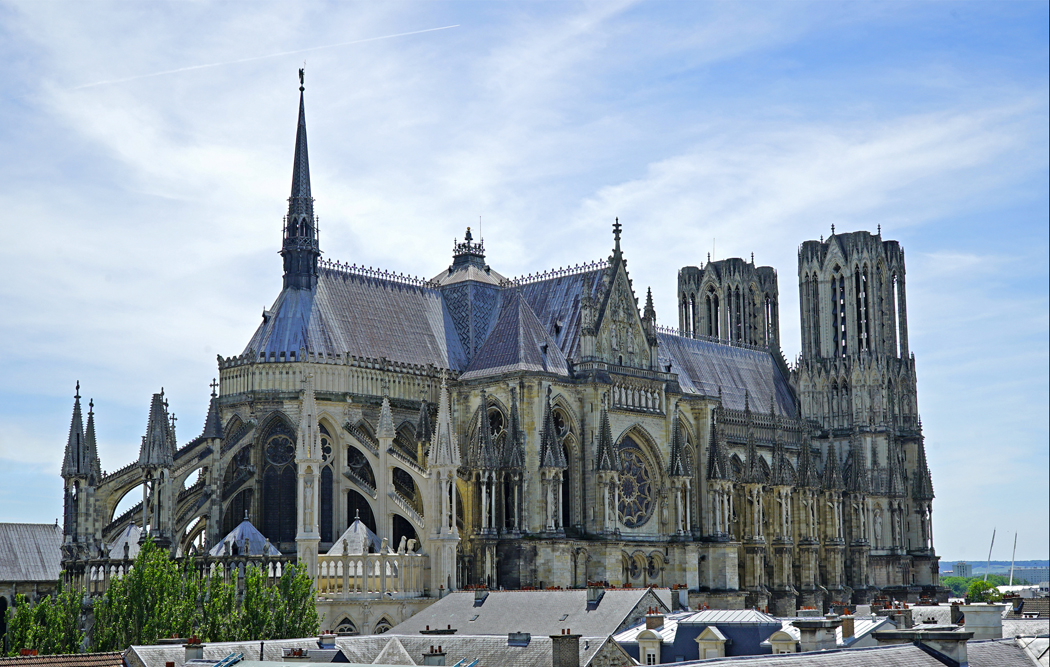
All that aside, the cathedral in Reims is from central casting; it is the handsomest, most perfect, with good bone structure and a set of capped teeth to rival the glossiest Hollywood star. If you were to invent the perfect Gothic cathedral, you would have invented Reims.

Yet, something seems just a little off, like the Hollywood star you suspect of being hollow behind the glittering eyes.

Unlike the buildings in Amiens, Beauvais, Noyon or Laon, which seem too large for the towns or villages they dominate, the cathedral in Reims sits at the center of a sizable city. Traffic is congested and parking is hard to find. When you confront it, walking into the parvis, you see an edifice that shines large, the hub of a great urban wheel.

Also unlike the other cathedrals, it is symmetrical, with two identical towers on either side of the central three portals. Other cathedrals seem hotch-potch, assembled from spare parts, almost, Reims was put together from a kit straight out of the box, all parts included.

Which is all the more surprising, considering that it has been worked over and rebuilt, redesigned and rejiggered for some 800 years. If it looks all of a piece, that is because its many restorers and rebuilders made the conscious decision to keep the essential plan unchanged.

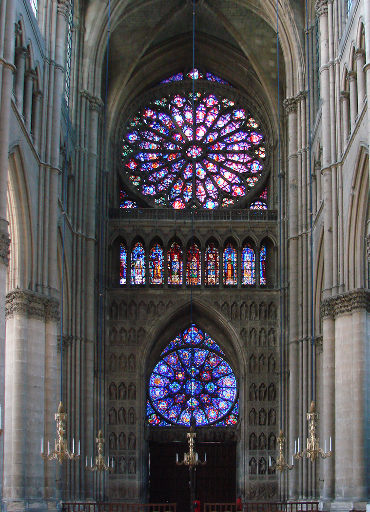
So, the first impression of Reims is of a sturdy, beautiful, archetypal Gothic church, three great arches on its western front lined with rings of sculpture, a great rose window in the center, a line of kings above that and the twin towers rising to the height of a 26-story skyscraper. It is jutting jaw and piercing eyes, all perfectly tanned.

I’m afraid I may be sounding a little too snarky about what is a very impressive bundle of awesome. If you had never seen Chartres or Paris or Amiens, then Reims would satisfy all your spiritual hunger for a Gothic cathedral.

The problem is one that you face in almost every Gothic survivor. One recalls the problem of Theseus’ ship, in which, over the years, every board, every nail, every rope has been replaced, one by one. And one asks, is this the same ship that carried Theseus home from Crete?

Or, more aptly, the Japanese temple, whose wood is replaced every 20 years. The grand shrine in the city of Ise has been replaced this way more than 60 times, yet is considered the same temple that was built in AD 692.

(It is widely believed — though not exactly true — that all the cells in a human body are replaced every seven years, yet we think of ourselves now as the same person we were when we popped out of the dark into this bright world.)

Reims has undergone something of the same constant renewal, like the goddess Aphrodite.

The modern cathedral was begun in about 1220 and was finally roofed in 1299, but work continued, adding details through the 14th century. A fire in 1481 required major reworking, finished in 1516, keeping to the Medieval style.

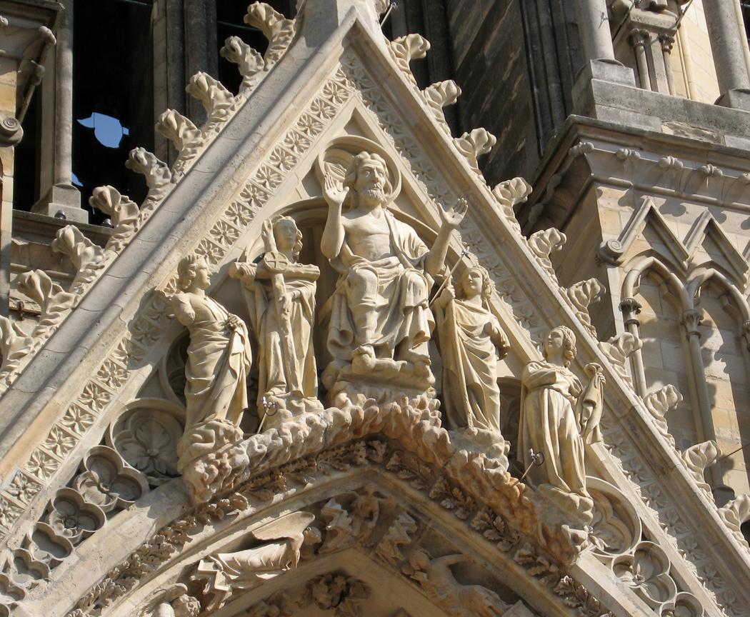
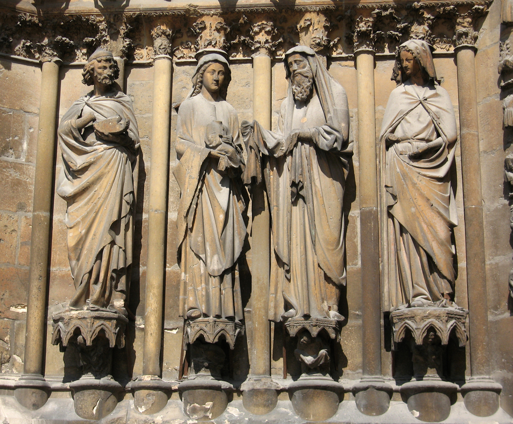
The continuous renewal of Reims began in 1610 with gussying up the central portal of the west facade. Nineteen statues of the central portal archivolts were replaced.

Later reworkings took place from 1727 to 1742 and from 1755 to 1760 to repair the deterioration caused by rain leakage and freezing. Many of the sculptures were repaired or replaced.

But the real overhauls began in the 19th century, as France began looking at its great cultural monuments and deciding to upgrade them. The Romantic movement in art and literature idealized the Middle Ages, and books such as Chateaubriand’s “The Spirit of Christianity,” and Victor Hugo’s “Hunchback of Notre Dame” (to give it its popular title) revived interest in buildings that had been allowed to deteriorate or had been desecrated during the violently anti-clerical French Revolution.

In 1818, a catalog of “Romantic and Picturesque Sites of Ancient France was begun, not finished, in 20 volumes, until 1878. And in 1830, the government created an post of Inspector of Historical Monuments.

Hugo wrote a pamphlet called “War on Demolishers,” to “stop the hammer that is mutilating the face of the country” by destroying historic edifices. He denounced “ignoble speculators,” who “vandalized” the great monuments to build cheap get-rich-quick developments. He called for a national law to protect the old treasures.

He also explained “There are two things in an edifice: its use and its beauty. Its use belongs to its owner, its beauty to everyone. Thus, the owner exceeds his rights in destroying it.”

Between 1826 and 1837, the first major interventions of the 19th century were carried out, replacing sculptures on the western facade. One after another, from then on, a series of restorers and architects tried to bring Reims back to what they considered the authentic and original designs of the cathedral. First diocesan architect Arveuf, then Eugene Viollet-le-Duc, the restorer of Notre Dame of Paris, who undid the modifications of 1481-1516 and replaced them with his own design.

After Viollet-le-Duc, Eugene Millet did the same thing to the south side of the nave. From 1879 to 1886, Victor Ruprich-Robert did the same thing to the north side. After him, Denis Darcy jumped in, working to 1904. From 1904 to 1915, Paul Gout reworked the western facade and parts of the chevet. The work was not quite finished when World War I broke out. The war did not treat Reims kindly. It was bombed and a good portion left in rubble.

It took another 20 years to fix what the German artillery shells had broken. Restorer Henri Deneux, began in 1919, clearing away debris and cataloging the fragments and installing a temporary roof. The glass was a particular victim of the war. Deneux had the guide of drawings made of the stained glass made before the war and had many of the windows rebuilt, sometimes from the shards of the originals.

By 1938, most of the restoration was complete,  but World War II was in the offing. This time, the windows were removed for safe storage and reinstalled after the war.

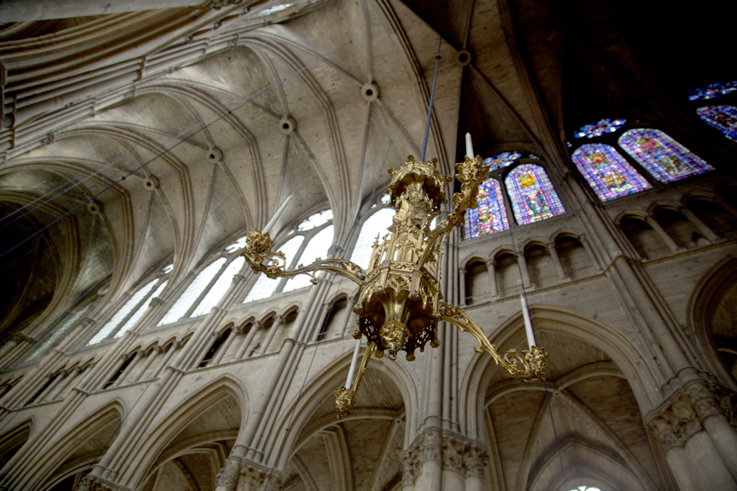
The rose windows at Reims are beautiful and unusual. Each of the four roses has an “eyebrow,” an arc of stained glass over the oculus. There are roses on the transept facades and two, one large, one smaller, on the western facade. Outside the roses at Chartres and Paris, these are among the most stunning in Christendom.

The large window dates originally from 1240s, and was restored in 1872; because of war damage, it currently contains only about a quarter of its original glass. The rest, like the lower rose, dating from 1255, now has replacement glass from 1937.

The south rose was destroyed in a storm in 1580 and replaced a year later, then destroyed again in WWI and recreated in 1937; the north rose dates from before 1241, but now contains only a couple of original panes, also having been replaced after The Great War.

Finally, there are modern admixtures, like the great trio of lancet windows designed by artist Marc Chagall and installed in 1974.

So, like Theseus’ ship or the Shinto temple, the question of how much can the current cathedral be called Gothic is problematical.


Reims was clearly one of the big boys, as far as cathedrals go, but it is hard, sometimes to really appreciate how much restoration has gone on at these buildings. The older, plainer looking churches, such as Noyon, tend to be more authentic, however you want to define that. The better looking churches are usually the ones restored by Viollet-le-Duc or one of the other enthusiastic restorers of the 19th century. You have to choose between effectiveness or authenticity. Are you willing to accept the slightly “Disneyesque” interpretations of the restorers, to get a feeling for what the buildings must once have been like, or do you approach it with a scholar’s eye, and want to see nothing but the actual evidence of the era, uninterpreted by later centuries, no matter how well-meaning.

This is why Chartres is so well admired by those who know: Most of it is original, and most of it wasn’t destroyed during the Revolution. It is the best example of the style, without the admixture of good intentions. We will be visiting Chartres soon.

Click on any image to enlarge

Next: Vezelay