
It is the literary equivalent of “Da-da-da-Dum” from Beethoven’s Fifth Symphony. “2B or not 2B.” Everyone knows it, whether they have seen Hamlet or not. It would be hard to find another phrase as often quoted or as immediately recognized by a wide public. “Call me Ishmael.” “It was the best of times; it was the worst of times.” “In the beginning was the word.” Even these lag behind the opening of Hamlet’s soliloquy as cultural roughage.
Because it is so deeply buried in the culture, it is hard to even hear it anymore. It glides by not as information, but as a kind of tune, hummed thoughtlessly while sanding a table top or cutting carrots in the kitchen.
But that soliloquy, just as the play it sits in the middle of, can be performed many different ways, with very different meanings. There are Hamlets that are Oedipal, Hamlets that are schizophrenic, Hamlets that are hot-blooded, those that are indecisive, those that are crafty — and at least one Hamlet played as a stand-up comedian. Take the words the playwright wrote and you can construe them myriad ways. In Ulysses, James Joyce has his character Stephen Daedalus prove that Hamlet is his own father. Sort of.
Likewise, the “to be or not to be” speech can be spoken theatrically, like Master Thespian — this is too often the case — or emotionally, or enunciated with clinical precision. It can be spoken to the audience, breaking the fourth wall, or whispered under the breath. It can be done as a voice-over, as if we are hearing Hamlet’s thoughts.

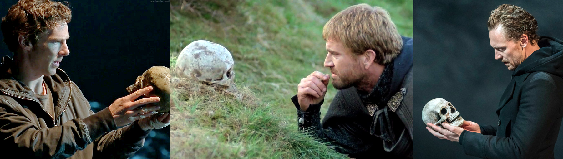
Benedict Cumberbatch; Mel Gibson; Thomas Hiddleston
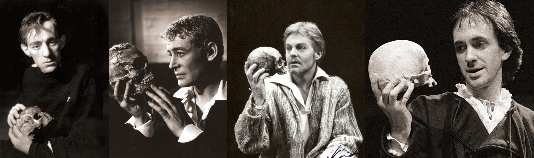
(The one thing that seldom changes is Hamlet holding up poor Yorick’s skull in Act 5. Everyone has to do it, and what is more, be photographed doing it. Even publicity photos for provincial productions have to feature the Dane and his moldy jester.)

Hamlet is perhaps Shakespeare’s greatest play. It certainly has his wittiest hero: Hamlet, the Dane, is in fact too smart for his own good. In part, that’s what the play is about.
In it, Claudius has killed his brother, the king — Hamlet’s father — and usurped the throne and queen.
When the dead king’s ghost tells Hamlet to revenge him, Hamlet enters a storm of uncertainty: How, when, why and if to kill Claudius. In the process, Hamlet alienates most of the people he knows, even killing several.
When Claudius contrives to murder Hamlet before the young prince can kill him, the whole Danish court is thrown into violence and death.
You can just keep turning this play around and the light will keep catching a new facet. The more you look at it, the more you see. An actor has to decide: At any moment, is what is driving the character?
Hamlet is the single most complex, multilayered and confusing character in any play. Is he insane? Is he pretending to be insane? Is he sane at some moments and mad at others? Is he obsessed with his mother? Is his inability to act caused by fearfulness, thoughtfulness, indecision or a desire to kill Claudius only when murder will do the most harm to Claudius’ eternal soul?
None of these versions is ruled out by the text, but none is sufficient of itself.
“As an actor,” one Hamlet said, “I’m going to try to illuminate as many facets as I can. But you can’t do it all, or you’ll lose focus. I feel sometimes I’m trying to cover myself with too little blanket: If I cover my head and shoulders, my feet stick out.”
Critics have argued for 400 years about Hamlet’s inaction. But the reason the character refuses to go away is that he is at least as complex as we are in the audience: Hamlet is real.
Hamlet has a line, when he’s talking to Rosencrantz and Guildenstern, “You would seem to pluck out the heart of my mystery,” and that is what most scholars and critics try to do.
Not only actors, but whole ages have their takes. In the 19th century, Hamlet was often played as effeminate, or at least as one easily in touch with his feminine side.
Edwin Booth brother of Lincoln’s assassin, and considered the greatest American actor of the 19th century, himself wrote in 1882, ”I have always endeavored to make prominent the femininity of Hamlet’s character and therein lies the secret of my success — I think. I doubt if ever a robust and masculine treatment of the character will be accepted so generally as the more womanly and refined interpretation. I know that frequently I fall into effeminacy, but we can’t always hit the proper keynote.’’

Edwin Booth; Sarah Bernhardt; Asti Nielsen; John Barrymore
In fact, there were many notable actresses who took on the role then, most famously, Sarah Bernhardt, who said, ”I cannot see Hamlet as a man. The things he says, his impulses, his actions, entirely indicate to me that he was a woman.’’
The practice actually goes back further. In 1775, Hamlet was played by the young Sarah Siddons to great acclaim (she continued to play the role until she was 47). Two decades later, the role went to Elizabeth Powell in London’s Drury Lane theater.
These women achieved great praise. The stuffy Dr. Samuel Johnson saw Kitty Clive in the play and compared her performance with that of the famous actor David Garrick. “Mrs. Clive was the best player I ever saw,” he noted. “What Clive did best, she did better than Garrick.”

Ruth Mitchell; Frances de la Tour; Lisa Wolpe
In 1822, Julia Glover played Hamlet in London and fellow actor Walter Donaldson said, “Her noble figure, handsome and expressive face, rich and powerful voice, all contributed to rivet the attention of the elite assembled on this occasion; while continued bursts of applause greeted her finished elocution.” The greatest actor of his age, Edmund Kean, came backstage to congratulate her: “Excellent. Excellent,” he said.
In 1820, the first American female Hamlet was Sarah Bartley, in New York. At mid-century, Charlotte Cushman took on the role in New York and Boston, wearing the costume Edwin Booth had lent her.
The sentiment was not unanimous, however. The New York Mirror disapproved of Nellie Holbrook’s Hamlet in 1880. “This absolutely masculine character is not capable of proper presentation by a woman, however great or talented,” the reviewer wrote. “We are, however, free to say that Miss Holbrook’s Hamlet is eminently respectable.”
That is better than the patronizing review of critic William Winter in 1911. “It is difficult to understand why Hamlet should be considered feminine, seeing that he is supereminently distinguished by a characteristic rarely, if ever, discerned in women: namely that of considering consequences, of thinking too precisely on the event.”

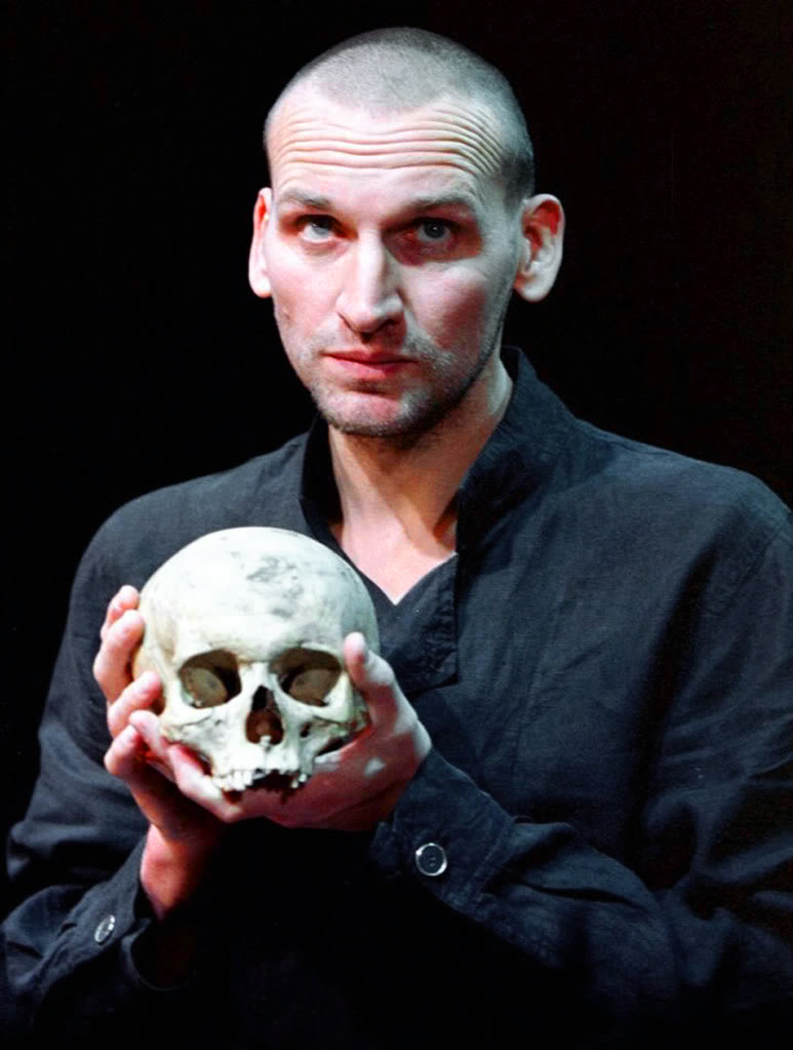
Christopher Eccleston
In the 20th century, Hamlet took a decidedly macho turn (say it like the British: “Match-oh”). He becomes a swashbuckler or a sadist, by turns. Olivier, Mel Gibson, Christopher Eccleston, who makes him look like a soccer hoodlum.
Yet, there have been actresses who took the role. Maxine Peakes is available on DVD. Frances de la Tour, Ruth Mitchell and Lisa Wolpe played the Dane. In 1982, Joseph Papp produced a Hamlet with Diane Venora.
“There are men who have played Hamlet very effeminate and there are those who played it macho; the male spectrum goes from the very tough to the effete and very delicate,” Papp said. “Most English Hamlets from the 19th century on were quite delicate, while American Hamlets were much tougher — like Barrymore. Diane is a strong Hamlet, but not a macho Hamlet; vulnerable, but not hysterical.
“For years I have wanted to do a female Hamlet,” Papp said. “I have always felt that there is a strong female side to Hamlet — not feminine so much as female. To me that has to do with an easier capacity to express emotion. The person playing Hamlet should be able to weep unabashedly and unashamedly. There are men who can do that, but they should be young; Hamlet is a very young person, an adolescent, a student.”
In 1937, it was Eva LeGallienne, who said, “I think psychologically one feels Hamlet was a youth … He’s still going to Wittenberg, to college, you know. He can’t be a mature man. The whole thing points to a very young youth, and therefore because a boy of that age might not be technically equipped to play the role, this is why many women in their thirties who can look like a youth, and had the technical skills to play this great role, have played it.”

Top row: Campbell Scott; Alan Mahon; Danforth Comins; Jonathan Douglas; Bottom row: Nathan Darrow; Rory Kenner; Tobias Fonsmark; Holder Bulow; Michael Benz
But, of course, Hamlet can be played all of these ways. The part is supremely plastic — you can stretch it this way and that and it still makes theatrical sense.
But this divigation has gone on too long. Back to the soliloquy. To be or not. To be? That is the question. Nothing can stale its infinite variety. Let’s take a few different versions. Olivier, in his 1959 film, does it mostly as a voice-over, set on a precipice overlooking roiling surf. It is Hamlet on the edge of a breakdown. (Link here).
Gielgud was an enunciator. The clarity of his delivery overtakes the overt emotionalism that Olivier brought. (Link here).
Kevin Kline gives it the Master Thespian touch, emphasizing every word as if it were the most important. It becomes monotonous. But, soft, he doth drop a tear. (Link here).
In the entire opposite direction, Benedict Cumberbatch speaks the lines as if they were spoken off the cuff. This is the way real people speak. I especially love the way he makes sense of the line: “to sleep. No more.” He makes it into “death is to sleep, no more than that.” His is my current favorite version. (Link here).
One last version. John Barrymore was the great Hamlet of the early part of the 20th century. The bulk of his career was before sound film, so it was only in his decline that he filmed the speech — or part of it — in a silly comedy starring Kay Kyser as a hick bandleader attempting to learn to be an actor. He hires Barrymore, playing a parody version of himself, to be his mentor. At one point, the comedy stops and Barrymore gives his bit of the soliloquy and you can see the majesty of his talent peek through the alcoholic puffiness. The take is almost ruined by his uncontrollable eyebrows, looking like two marmots fighting over a cheese. But the words, the words, the words. (Link here).

Papa Essiedu, Simon Russell Beale, Paul Giamatti, Grantham Coleman
As for the words, they can be difficult for modern listeners. What the hell is a fardel? Would you bear fardels with a bare bodkin? Sometimes you wonder what Shakespeare meant, although the problem isn’t as apparent when the words are spoken on stage, as when you read them in text. An actor can make the meaning clear in context. When Hamlet says, “with a bare bodkin,” he draws his dagger and the audience understands.
But language has changed in the past 400 years and even words that are still in current usage often had different meanings then. A careful reading of Shakespeare’s work demands an attention to lexicographical detail, if we are to avoid confusion.
And even when we know what the words mean, we are still faced with the fact that the Bard often uses the words metaphorically, as when he has Hamlet talk of “taking his quietus,” which doesn’t literally mean to kill himself, but rather means, having finished an enterprise, or having paid off a longstanding debt. Such is life, he implies.
The most famous soliloquy in Hamlet is a profound meditation on death and suicide — the question Albert Camus said is the only philosophical question that really matters. But what do the words mean?
To be, or not to be: That is the question:/ Whether ‘tis nobler in the mind to suffer/ The slings and arrows of outrageous fortune,/ Or to take arms against a sea of troubles,/ And by opposing end them? To die: to sleep;/ No more; and by a sleep to say we end/ The heartache and the thousand natural shocks/ That flesh is heir to, ‘tis a consummation/ Devoutly to be wish’d. To die, to sleep:/ To sleep: perchance to dream: ay, there’s the rub;/ For in that sleep of death what dreams may come/ When we have shuffled off this mortal coil,/ Must give us pause: There’s the respect/ That makes calamity of so long life;/ For who would bear the whips and scorns of time,/ The Oppressor’s wrong, the proud man’s contumely,/ The pangs of despised loved, the law’s delay,/ The insolence of office and the spurns/ That patient merit of the unworthy takes,/ When he himself might his quietus make/ With a bare bodkin? Who would fardels bear,/ To grunt and sweat under a weary life,/ But that the dread of something after death,/ The undiscover’d country from whose bourn/ No traveler returns, puzzles the will/ And makes us rather bear those ills we have/ Than fly to others that we know not of?/ Thus conscience does make cowards of us all;/ And thus the native hue of resolution/ Is sicklied o’er with the pale cast of thought,/ And enterprises of great pitch and moment With this regard their currents turn awry,/ And lose the name of action.

Alec Guinness, Peter O’Toole, Derek Jacobi, Jonathan Pryce
A quick glossary:
Rub – actually, an obstacle on a lawn bowling green.
Shuffled – cast off, like a snake skin
Coil – Turmoil
Respect – consideration or regard
Of so long life – long lived.
Time – The world as we know it.
Contumely – Contemptuous insults
Despised – Rejected.
Office – Office-holders; bureaucrats.
Spurns – Insults.
Quietus – the paying off of a debt; the resolution of an enterprise.
Bare – used here, “bare” may mean “mere.”
Bodkin – a sharp object, sometimes a hatpin, but here a dagger.
Fardels – Burdens, as a bindle or an army’s dunnage.
Bourn – Region; boundary.
Conscience – Used in an older sense of consciousness; thought.
Native hue – Natural color.
Cast – shade of color.
Pitch – The height of a soaring falcon’s flight; before falling on its prey.
Moment – Importance.
Regard – Consideration.
It is poetry, in iambic pentameter, with rhythm and melody. But we can translate the whole into modern American tapwater. And so, if we take the poetry out of this soliloquy, what we are left with is the bare-bones meaning:
The only question that counts is suicide: Should one put up with the suffering of life or do something about it and end it all? Death is like sleep: And if as in sleep, the troubles go away, that would be wonderful. But when we sleep, we also dream. And if we dream after death, the way we do in sleep, well, that’d make you stop and think wouldn’t it? That’s why this disaster we call life goes on: For who would put up with life’s crap if he could end them all through suicide? Who would bear the burdens of life but that the threat of something much worse after death makes us hesitate and makes us put up with the troubles we have rather than fly to others we don’t know anything about? And so, thinking makes us cowards; And the will to action is weakened by thinking, And what mighty deeds we would perform come to exactly zip.
And that is why Shakespeare is Shakespeare.

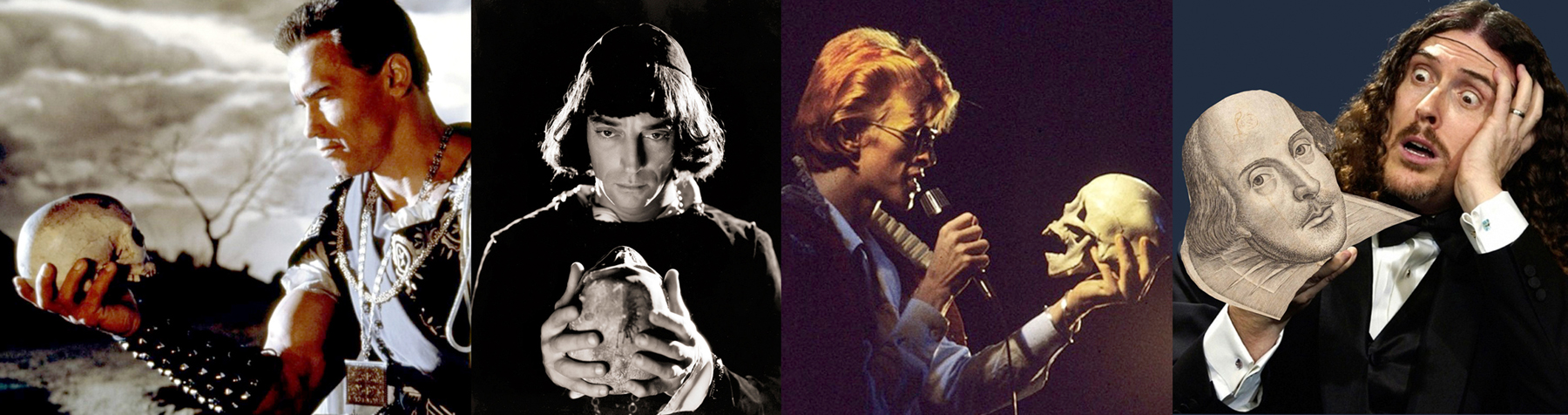
The Arnold, Buster Keaton, David Bowie, Weird Al Yankovich
Photo at top: Top row, L-R — Lawrence Olivier, John Gielgud, Richard Burton, Nicole Williamson; bottom row — Kenneth Branagh, David Tenant, Ethan Hawke
Click on any picture to enlarge
 How many is enough? Beginning in 1917, photographer Alfred Stieglitz began making portraits of his new squeeze, Georgia O’Keeffe. But he soon developed the idea that a single image could not adequately express the essence of a person. Over the next 20 years, he photographed the artist some 350 times, making what to Stieglitz counted a single, all-encompassing portrait of O’Keeffe.
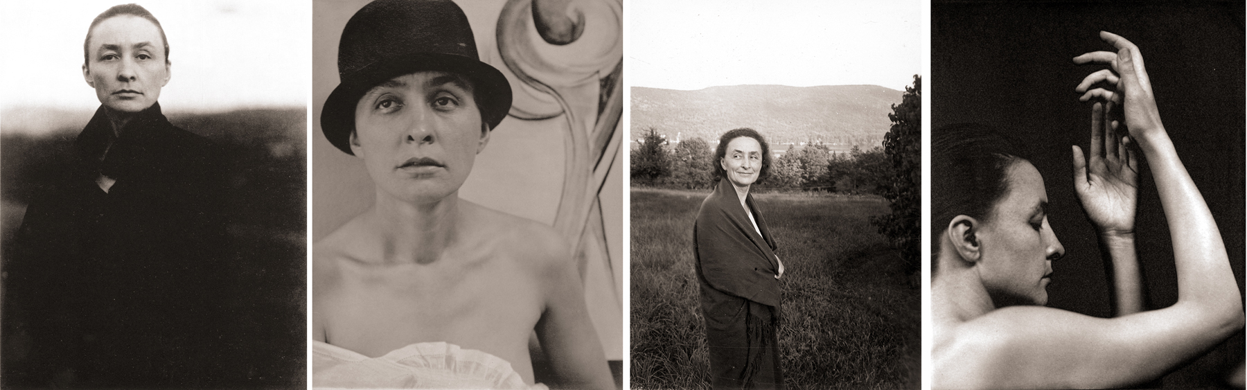 The series went well past the hundred pictures he mentioned, and became one of the signature events in the progress of American art photography. The photographs were shown in galleries and museums and a selection of them were published in a book issued by the Metropolitan Museum of Art.
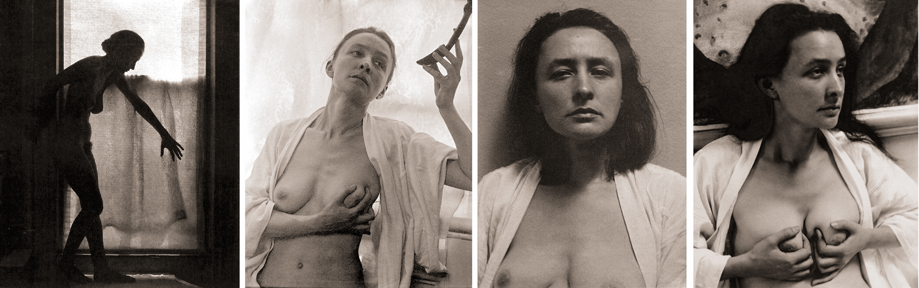
 He photographed O’Keeffe nude, surly, playful, artsy and in snapshot mode. He seems to have had a thing for hands. There are a boatload of hands, all very arty. Certainly, they are expressive, but they are also a bit arch. And do they actually tell us anything about O’Keeffe, the woman who kept her privacy like a recluse, so that even when she seems to be opening up to us, she is really just assuming a simulacrum of candor? She simply doesn’t want us to presume we might know her.
 There is some kind of naive innocence in Stieglitz’s attempt, that there is a possibility of “capturing” a person in an image.
 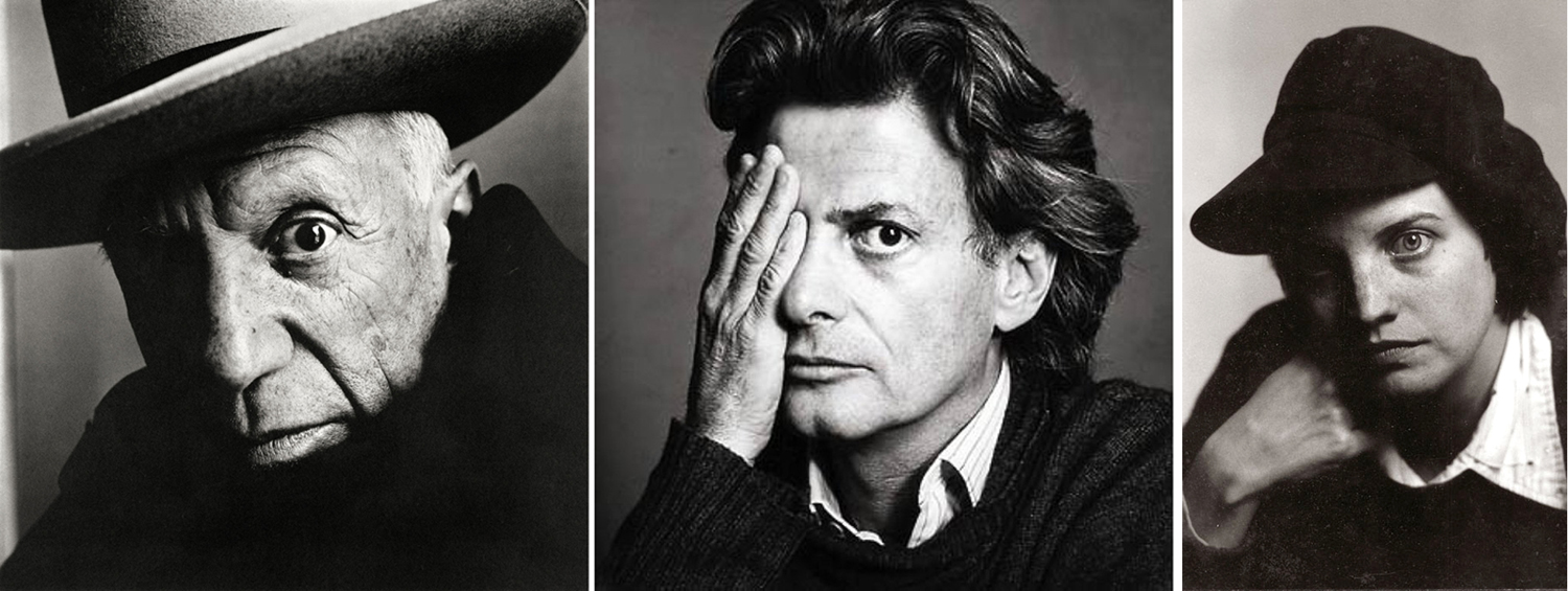 The problem is that an image has a reality of its own, a separate reality, which may or may not partake of the person photographed. Irving Penn’s famous image of Picasso becomes a piercing eye, but then, so does the eye of Richard Avedon, also photographed by Penn. Or, for that matter, a portrait of Pam Henry I made in the 1970s.
 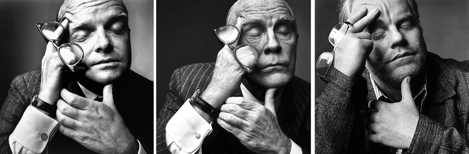 The image carries meaning in and of itself. Consider that 1968 image of Capote, eyes closed, glasses carried lightly between his fingers. Both John Malkovich and Philip Seymour Hoffman have sat for publicity photos mimicking the Penn photo. The pose trumps the person.
 Or take Malkovich trying on the 1948 Capote. Again, the image is instantly recognized, and if you were turning the page quickly in a magazine spread, you might just well assume you had looked at the writer rather than the actor.
  Avedon often said that all photographic portraits — including and especially his — are really portraits of the photographer. It is the version of the subject transmuted by the picture-taker, and made into a vision of how the photographer understands the world. You look at that lineup of Malkovich parodies and you can as easily — or more easily — name the photographer as the name of the sitter. Top row: Irving Penn, Yousef Karsh, Philippe Halsman, Arthur Sasse; bottom row: David Bailey, Alberto Korda, Dorothea Lange, Diane Arbus. Each a distinct style; each a distinct image.
  Surely many a celebrity has felt defined and constrained by the immutable image that has usurped the actual life. Could Norma Jean live up to the image of Marilyn? Either the Bert Stern, the Avedon, the Eve Arnold or the Cecil Beaton version (l. to r.)?
  We are left to enjoy them, then, as works of art. The eyes of Carson McCullers are not her eyes, but the sadness in the photo speaks to us clearly. That has to be enough.


