Archive

Tag Archives: art

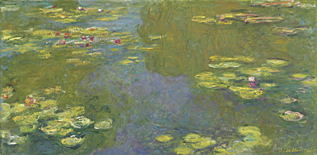
I first became interested in Monet’s water lilies when I was teaching black-and-white photography in Virginia, over 40 years ago. Of course, I had always loved the paintings; I grew up with his long panel at the Museum of Modern Art, which was a kind of second home as a teenager. 

But while I loved them, I hadn’t really thought about them. 

Because the photo lab where I taught back then was set up entirely for black-and-white, I thought in black-and-white. Seeing that way is different from seeing in color. A bright red might grab your eye in a scene you look at, but in the monochrome print you make, it is the same gray as a green or a blue. So, you learn to see in lights and darks, highlights and shadows. The world becomes translated to patches of charcoal and blasts of ivory. 

Such seeing — and thinking — leads to seeing your frame as a kind of jigsaw puzzle of those highlights and shadows, and you use them to make designs. Patterns. It is what is taught as “composition.” Rule of thirds; foreground-background. The frame edge becomes a kind of corral fence inside of which you deploy the monochrome elements of your design. 

But, looking at Monet’s nymphéas, I realized there was very little careful design, the way I was taught to see. Especially in the long ribbon-like murals of water lilies. I wondered if there were a way to make a successful black-and-white version of them. 

Back then, there was no digital photography; it was all Tri-X, Dektol and Kodabromide. I couldn’t easily drain an image of a Monet painting of its color to see what it looked like in black-and-white. But there were old art books that had black-and-white illustrations, and I found a few of those books and attempted to study them. There didn’t seem to be any good reason to look at such a painting; without the color, the image was vague, inchoate and pointless. 

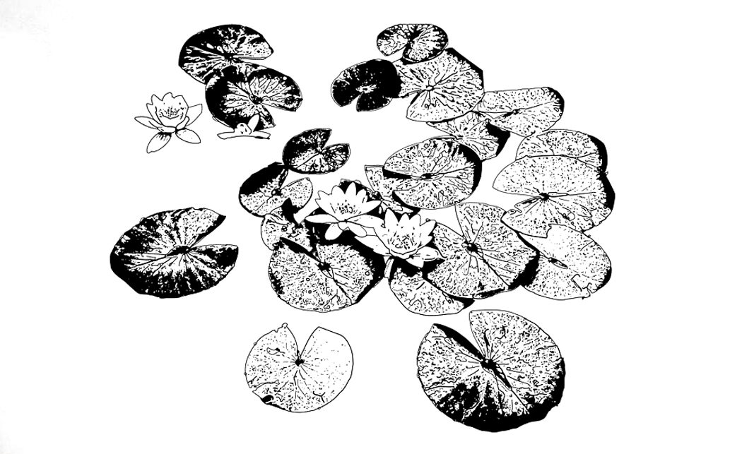
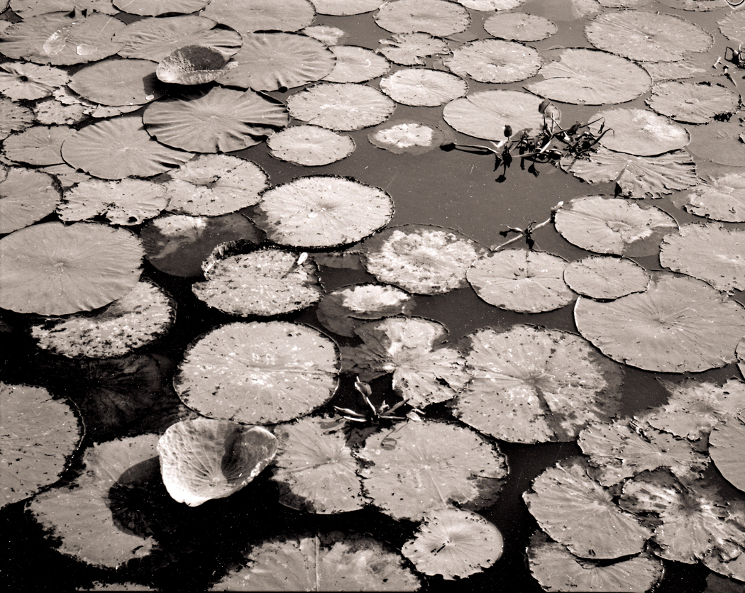
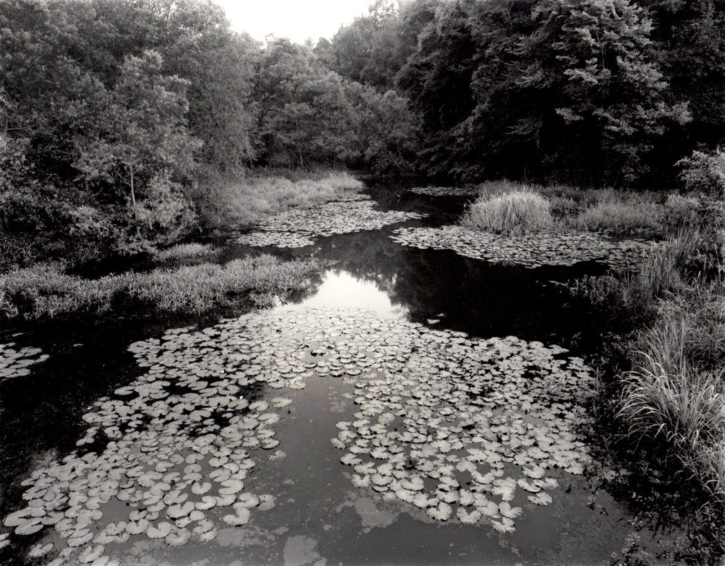
At first, I put it all down to poor reproduction. Perhaps if I made my own photographs. So I dragged out my 4-by-5-inch field camera and tripod and drove down to Mackay Island National Wildlife Refuge on Back Bay, at the north end of the Outer Banks, where there was a rich crop of Nymphaeaceae (the scientific name of the water lily family, a name richer in vowels than the plant is in chlorophyll). 

Now, I had photographed water lilies before. I made some images I was happy with at Brookgreen Gardens in South Carolina. But there, I was photographing individual water lilies, or small pairs or trios, which allow for easy disposition into designs. Or I could use a single blossom as a point of focus.

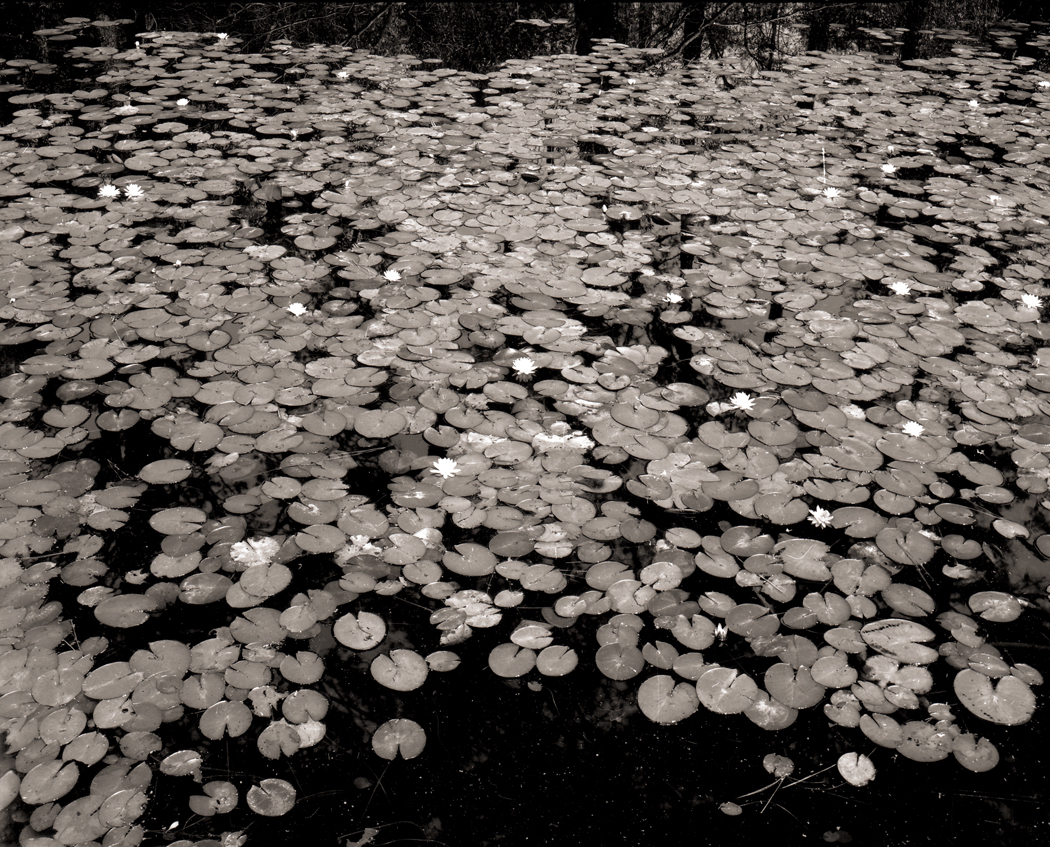
What I was now interested in was the mass of lily pads floating on a larger body of water, a deracinated version of Monet’s luscious color images. Was there something of value that could be extracted from the subject? 

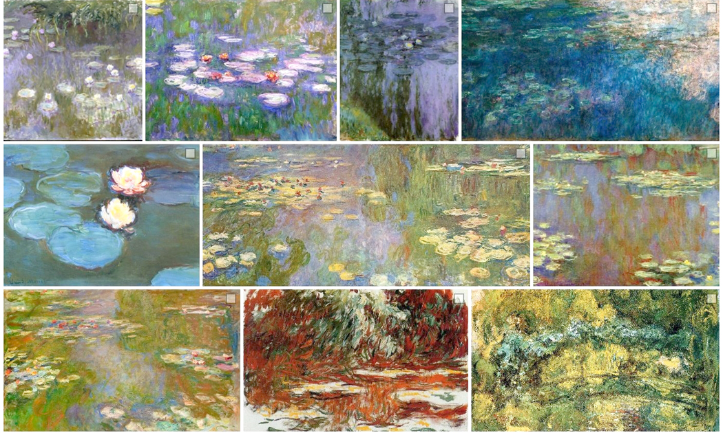
It isn’t as though Monet has not had imitators. Since his first water lilies in the 1860s, there have been knock-offs. The 20th century is especially full of epigones. Most all have managed to attempt some variation not on water lilies, per se, but variations on Monet’s take on water lilies. 

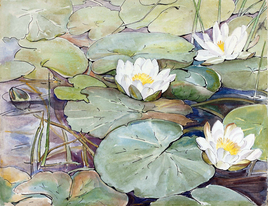
They’ve been done in water colors

In thick impasto

in pen and ink

colored pencil

in silk screen or other print forms

and my favorite: wallpaper

Even Pop Artist Roy Lichtenstein has had his go at the subject

The impact of Monet’s flurry of flowers has been enormous. I got on the queue and tried my luck. 

I carried my bulky view camera out to the wildlife refuge and set it up looking down on a clutch of lily pads and tried to find a way to frame them that made sense. 

The initial problem was how to make a black-and-white design with so chaotic a subject matter. Should I angle the camera out to exaggerate the near-far relationship? Should I attempt the “overall” design and find them roughly equal size in the frame?

Should I use massed pads as individual subjects and pair groups rather than individual pads?

Or use clear sections of water as negative space?

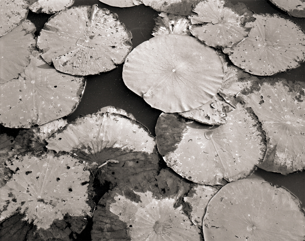
Should I get close and single out an individual? I could put bits of others agains the frame edge to irregularize the rectangle.

I tried many different approaches. 

The results look best shown as 20”-24” prints, large for photographs — almost the size of paintings. (The physicality of prints, the rich black of the silver image, and the impact of the size is impossible to show on a digital screen. You have to imagine.)

After all this, what was my conclusion? Well, I never really came to one. My photographs were interesting enough, but I’m not sure they told me that much about Monet’s sense of design. 

That had to wait until I managed to visit Monet’s gardens at Giverny, some 30 miles northwest of Paris. I have now been there four times, and each time attempting to make images. The first visit, I attempted to make black and white images, primarily. The second, I gave in completely to color and by the third visit, I had found my own way into making images of this famous garden. 

But the water lilies were still an issue. They really don’t make that interesting a photograph. They are largely a dull green against a greenish, brownish water. 

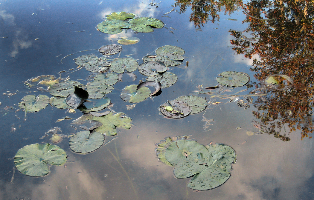
A few years before, I had made a photograph of water lilies in a pond in Mississippi that I later noticed looked very like vintage photographs made at Monet’s water garden, where the water and its plants was just one element in an otherwise traditional landscape design. 

Monet, however, was not making traditional landscapes. He was interested in something completely other. On a flat canvas, he was seeing into layers of distances: the water surface, the water underneath the surface and the reflection in the water of the sky, the clouds, and the trees surrounding the pond. 

This, then, became my intent as I came back to Giverny and photographed once again the lily pond that Monet had created. 

I found I could recreate a passable Monet imitation, but I’m not happy with doing that. 

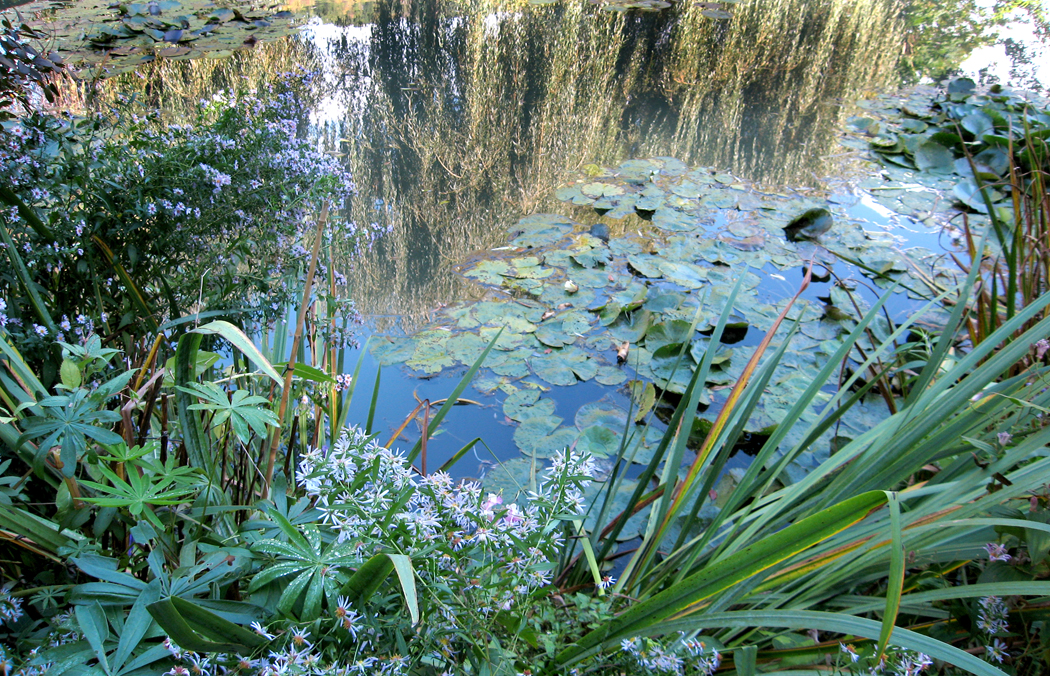
There were images that looked under the surface to find the tangle of roots underneath and bits of tree reflection and sky on the mirror interface of the water.

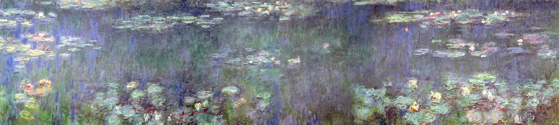
I made wider and wider images, like the cinemascope panels made by the painter.

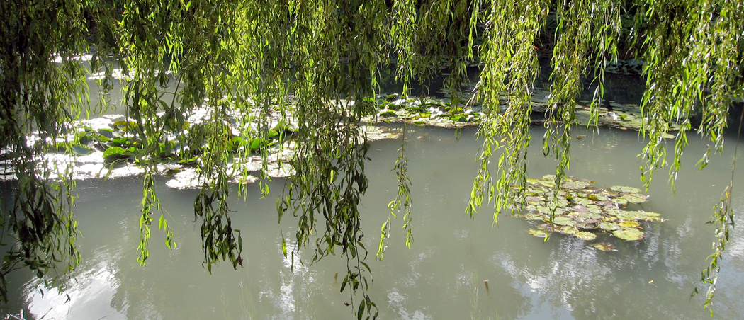
And I found ways to mix the water lilies with the weeping willows.

But this was all pastiche. I enjoyed them, but they weren’t me. They were apprentice lessons. Do it his way first and then wander off on your own.

My own inclination is to find other ways of “complexifying” an image. I like a good tangle, I enjoy looking through one tangle at another. 

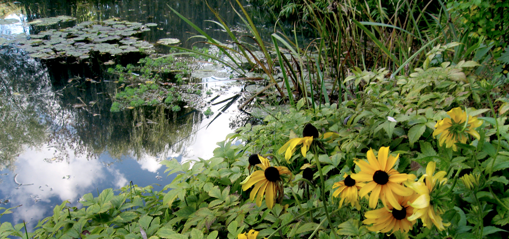
So, I sought to mix the water lilies of Giverny with the plants, reflections and trees to show, not the mere patterns of lily pads

which would never approximate Monet’s luxurious colors, but rather to see what I could find for myself in the garden. Nature is prolific and extravagant, it seeks to fill the world in a green horror vacui.   

I love seeing vegetable growth, the vines, the twigs, leaves, panicles, stalks and roots. And the gardens at Giverny overflow with sprouting, stretching and swelling. 

In my several visits to Giverny, I have amassed a couple of thousand photographs. Many are duplicates or in poor focus, but there must be at least 1500 images that are printable and showable. Most are of the upper garden and the flowers there, not the lower garden with the water lilies. 

But walking through Monet’s vision in the fall is a kind a paradise. I think of Milton’s Eve or Marvell’s “Garden,” or Wordsworth’s daffodils. A world alive; a world happy and bright; a world we can sometimes enter. 


Click on any image to enlarge

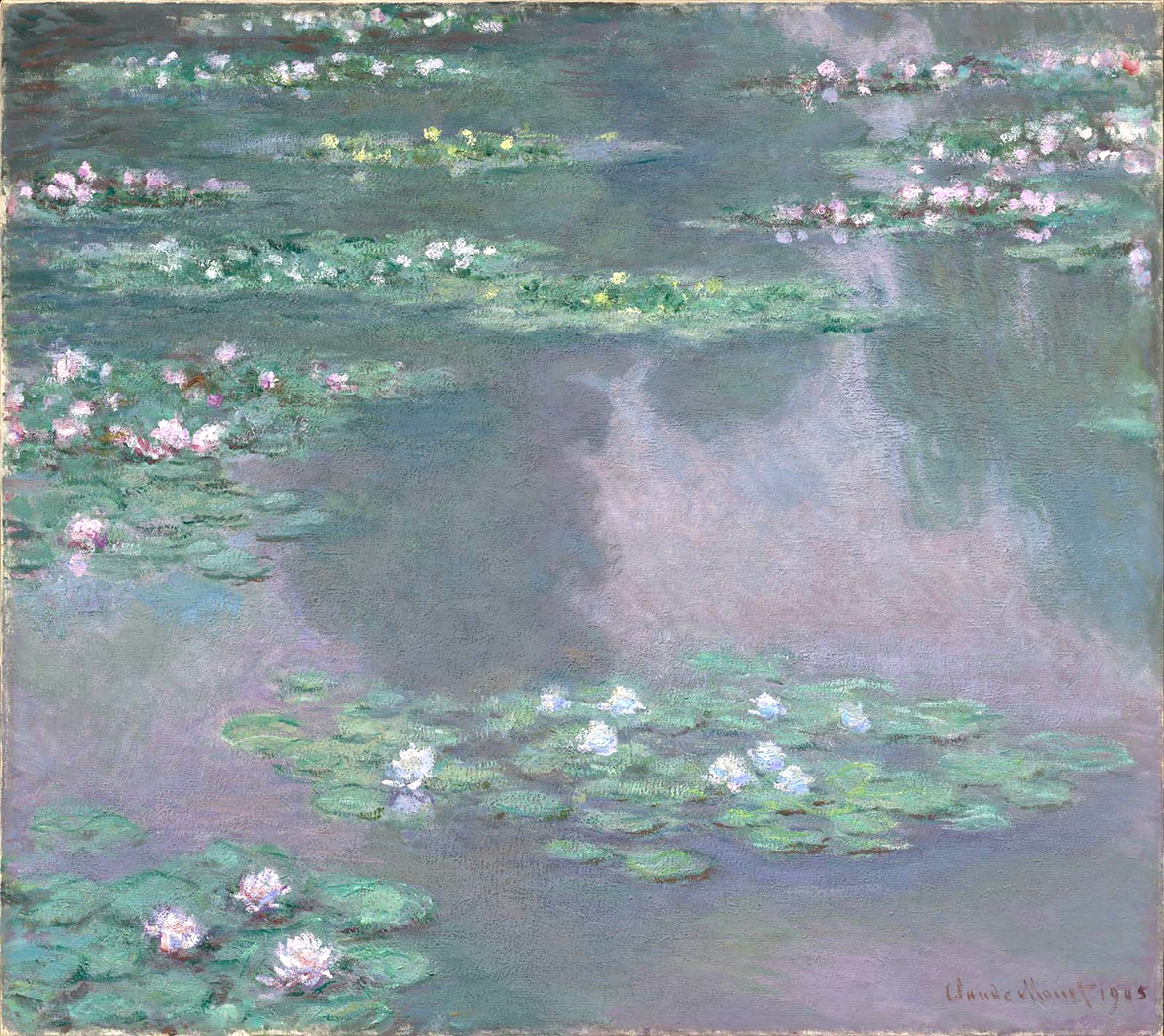
On the surface, water lilies would seem to be an unpromising subject for painting. Except for their flowers, there is little color to them. Their shapes are mostly just repetitive ovals on the surface of the water. Unlike a rose or a tulip, there is little structure to be seen — a pad floating on the water, a bloom — usually plain white — in an open space here or there. 

But Claude Monet managed to turn them into an icon of both Impressionism and Modernism. The water lily is as identified with Monet as sunflowers are with Van Gogh or soup cans with Warhol. And since then, a gazillion artists after him have imitated his work. 

Like photographer Edward Weston and his peppers, no one before him thought it worth their attention; after him, hordes of artists and Sunday painters have taken their crack at it. An artist sees something nobody notices, and suddenly, everyone can see them. 

The problem is, very like Weston and his peppers, his epigones don’t merely see water lilies, but some reflection in their minds of having remembered Monet’s water lilies. The paintings reshape reality. 

In some ways, Monet actually made it harder to see the real water lilies. 

What is missed is that Monet wasn’t painting water lilies in his some 250 canvases on the subject. They are merely pretext. When he first began painting them, he wanted to paint what he saw. Monet was the great transcriber. As Cezanne said, “He is only an eye; but what an eye.” 

He could see nuance of color and was able to paint not what he knew but what activated his retina — that is, not a house or a peony, but whites, reds and blues, shaded from highlight to shadow. When put down on canvas, those hues and tones could be seen as a house or peony, but it was never the object itself that he attempted to capture, but the visual impression of them. 

“Perhaps my originality boils down to being a hypersensitive receptor,” he said, “and the expedience of a shorthand by means of which I project on a canvas, as if on a screen, impressions registered on my retina.”

But at some point as he turned into the grand old man of Impressionism, the outer world ceased to be of much importance and became merely the armature for his work, the reason for wiping across his canvas his flake white, vermilion, madder, cobalt blue and emerald green.

In a letter, he wrote, “The subject doesn’t matter!”

In the earlier work, there is usually a subject; in the later work, he developed a sort of “overall” design, almost like wallpaper. He prefigured the world of such later painters as Jackson Pollock. Indeed, it was really only after the Abstract Impressionists that common audiences could understand what was going on in Monet’s late water lilies. 

Carnegie Museum of Art, Pittsburgh

They were, to paraphrase Pollock, not water lilies at all, they were paintings. 

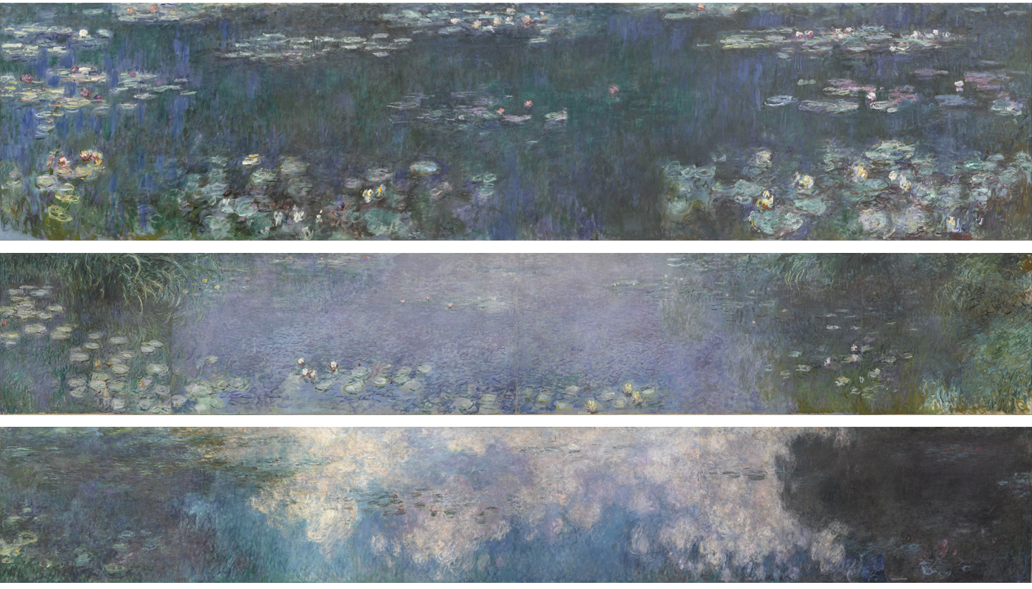
The best and most memorable of them are the mural-size nymphéas. Any museum in the world worth its salt has one of these: MoMA, the Carnegie, Chicago, etc. They tend to be huge, wide, paintings, almost ribbons of paint stretched 10-, 15-, or 20-feet wide as grand Cinemascope wide-screen visions. And where, in the earlier paintings, the water lilies were often the foreground to a more conventional landscape, backgrounded with trees and a shoreline, the later ones eliminate the horizon and become sheets of color. 

Museum of Modern Art, NY

In those museums, a single Nymphéas (as he called them) could eat up an entire gallery wall. 

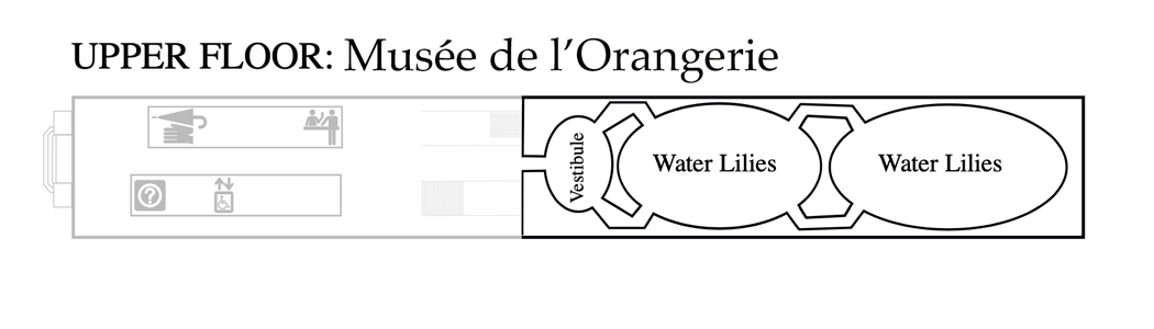
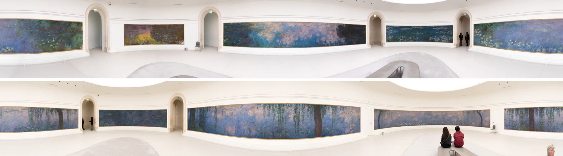
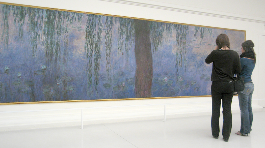
But the grandaddy of them all are the eight paintings mounted in two oval rooms of the Orangerie in Paris. If you lined them up end to end, they would be longer than a football field. The two rooms are end-to-end, making a floorplan in the shape of an “infinity” symbol. Along the longer sides, panels are some 42-feet long and 6-feet high, and the pointy end of the football shaped rooms, the paintings are 20-feet long. Between each pair of panels is an entrance. The ceiling is a kind of skylight, flooding the paintings with natural light. The walls are white. 

The whole is one of the wonders of the art world. Critic André Masson famously called the installation the “Sistine Chapel of Impressionism.” 

The whole thing came together because of time and place — a confluence of the World War and the room in which to hang the pictures. 


Even 30 years before the Orangerie finally opened, Monet had in mind the idea. “One imagines a circular room, the walls of which, above the baseboard, would be entirely filled by water dotted with these plants to the very horizon, walls of a transparency by turns toned green and mauve, the still water’s calm and the silence reflecting the opened blossoms; the tones are vague, lovingly nuanced, as delicate as a dream.” 

He was thinking primarily of a private patron decorating his home. 

Some years later, he was still mulling the project. In a 1905 article in the Gazette des Beaux Arts, he was quoted, “At one point I was visited by the temptation to use the theme of nymphéas for a decoration. Carried the length of the walls, enveloping the entire interior with its unity.”

Still, nothing came of the idea. It sat in the back of the painter’s mind for another decade. Then came the war. The Western Front and the trenches of World War 1 were as close as 35 miles from Monet’s home in Giverny. At times, he could hear the artillery fire. In 1914, his wife had recently died, and so had his elder son. The younger son and his step-son had joined the army. Monet was devastated and anxious. Many of the inhabitants of Giverny fled to safety but Monet remained: “If those savages must kill me, it will be in the middle of my canvases, in front of all my life’s work.” He saw, as an old man, his painting as his patriotic contribution.

{French filmmaker and playwright Sacha Guitry captured silent film of Monet painting in his garden in 1914.) 

At the end of the war, the painter formed an idea for a memorial, a gift to the nation commemorating both the victory and the loss of life. He proposed this to his longtime friend, now prime minister of France, Georges Clemenceau, two large panels, one of flowers to mark the victory and the other of weeping willows as a memorial to those who died. (Willows were a common symbol of mourning in the 19th century.) 

The day after the Armistice in 1918, Monet wrote to Clemenceau: “I am on the verge of finishing two decorative panels which I want to sign on Victory day, and am writing to ask you if they could be offered to the State with you acting as intermediary.”

The prime minister liked the idea, but suggested a larger series of a dozen panels. It grew to 19 panels at one point, before winding up with the eight we see today at the Orangerie. Monet fussed and painted, and fussed and destroyed paintings he was unsatisfied with, and fussed over where they might be displayed. Several venues came up and were dismissed, for various reasons. 

Ultimately, two rooms at the Orangerie at the far end of the Tuileries gardens in Paris, near the Place de la Concorde were chosen and prepared. It had been built in 1852 by Napoleon III as a place to house citrus trees.

 Unfortunately, Monet never got to see the paintings in place. He died  in December, 1926, and the water lilies at the Orangerie were opened to the public May 17, 1927. 

Orangerie

At the time, both Monet and Clemenceau were seen by the post-war generation as old-hat, a holdover from a previous century and for the next 40 years, they were occasionally walled over to allow the showing of newer art. But after the next great war and with the rise of Abstract Expressionism, Monet was recognized not so much as a holdover, but as a prophet of the coming abstraction.

Musee Marmottan, Paris

During his life, Monet was enormously popular and became rich — something very few artists, even great and now-famous artists failed to achieve — but his water lilies were not always understood. For a show of water lily paintings in 1909, one critic wrote: “One’s first reaction to these 48 pictures is bewilderment. In most of them, objections having little to do with painting are the cause of this malaise; they have to do more with the identity of the subject and the number of duplications and with the at first seemingly fragmentary aspect of these pictures. The paintings manifest an authority and independence, an egocentric quality that is offensive to our vanity and humbling to to our pride. M. Claude Monet is interested in pleasing only himself.”

Nelson Atkins Musuem, Texas

But at least one critic seems to have grasped something essential about the paintings. They are not designs carefully laid out inside a frame, with horizon lines and identifiable primary subjects. French critic Roger Marx noticed that same year, “The painter deliberately broke away from the teachings of Western tradition by not seeding pyramidal lines or a single point of focus. The nature of what is fixed, immutable, appears to him to contradict the very essence of fluidity; he wants attention diffused and scattered everywhere. He considers himself free to place the small gardens of his archipelago wherever he pleases: to the right, to the left at the top of at the bottom of his canvas.”

Several Impressionist painters were influenced by Japanese prints and Chinese art at the time. Monet, like Van Gogh, even copied some of them in oil paint. He built a bridge in his water garden at Giverny in the style of a Japanese bridge on a Hokusai print. He was photographed on it with Clemenceau.

But the influence on the large water lilies has not always been mentioned.

One of the salient characteristics of Chinese landscape painting is that one doesn’t just stand back and take in the whole as a coherent design, but rather, might follow a path the artist has laid out, along a river or up a mountain, finally coming to rest at a little halfway house for contemplation.

  Many such paintings are not even possible to view in toto, since they are scrolls that must be slowly unwrapped and rerolled as you follow a journey from one end to the other. The details along the way are to be lingered over. In such work, there is no controlling or overarching composition or design. Only the detail.

And in Monet’s earlier paintings, there are horizons, rivers, trees, umbrellas, flowers — something to make a shape within the shape of the canvas, a single pattern that one can step back and take in at a single bite.

But when you have a 42-foot long panel that is 7 times longer than it is high, and in a room too narrow to step back to take it all in at once, you are forced to view the work as if it were a scroll, and enjoy detail after detail as you walk along the painting’s length. 

And so, you step from detail to detail in the Orangerie, relishing the daub of yellow and the streak of blue and, if you are in the receptive mood, you let go anxiety and discontent and let the water and floating lily pads calm you into a restful and meditative state. 

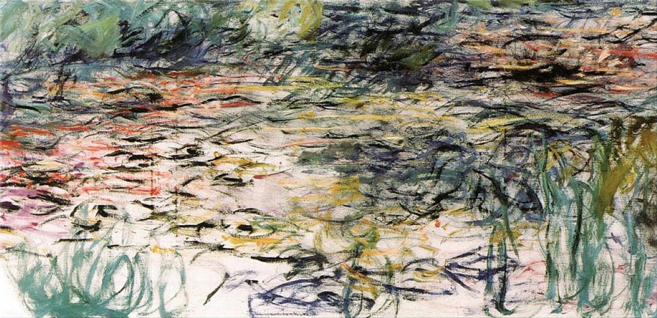
Orangerie detail

Or, as Monet put it, “it would attain the illusion of a whole without end, of a watery surface without horizon and without banks; nerves overstrained by work would be relaxed there, following the restful example of the still waters, and to whomsoever [visited], it would offer an asylum of peaceful meditation at the center of a flowery aquarium.”

Click on any image to enlarge

Reidsville is a small town in north-central North Carolina halfway between the city of Greensboro and the Virginia border. It was once the home of the American Tobacco Company and at the north end of downtown is a huge factory complex with a smokestack that still says “Lucky Strike” on its shaft. 

Like so many Southern towns, there is a main street where the shops are found, and a parallel street where the old factories and warehouses are located, with the railroad tracks running alongside. This pattern is repeated throughout Dixie, but is especially common in the Piedmont, which was once the industrial heart of the Southern states. 

The downtown in Reidsville is not as vibrant as it used to be. There are many empty storefronts and some of those have been filled with “antique” emporia and consignment shops. I don’t want to imply it is a dying town; in fact, it seems quite happy and busy, even though its heyday ended with the closing of the tobacco plant. 

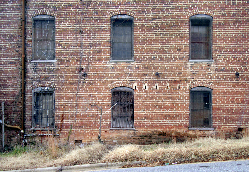
There were also textile mills and other factories and their old buildings, now repurposed or abandoned, line the back street and railroad tracks. I find such relics irresistible. 

As I explained in the previous blog entry, I am compelled to make things — the compulsion is itself a relic of the old Protestant work ethic; I feel guilty if I am not producing something. So, as a retired writer, I still pump out blog entries, and as a former photographer, I am still driven to make images. These usually group in series; which I call “projects.” For years, I made serial images of gardens, always meant to be seen not singly, but as a cohesive group, rather like a book. I hope each image can stand on its own, but it is not designed solely for that purpose. 

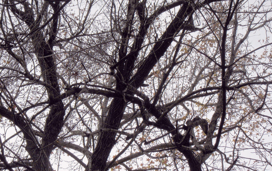
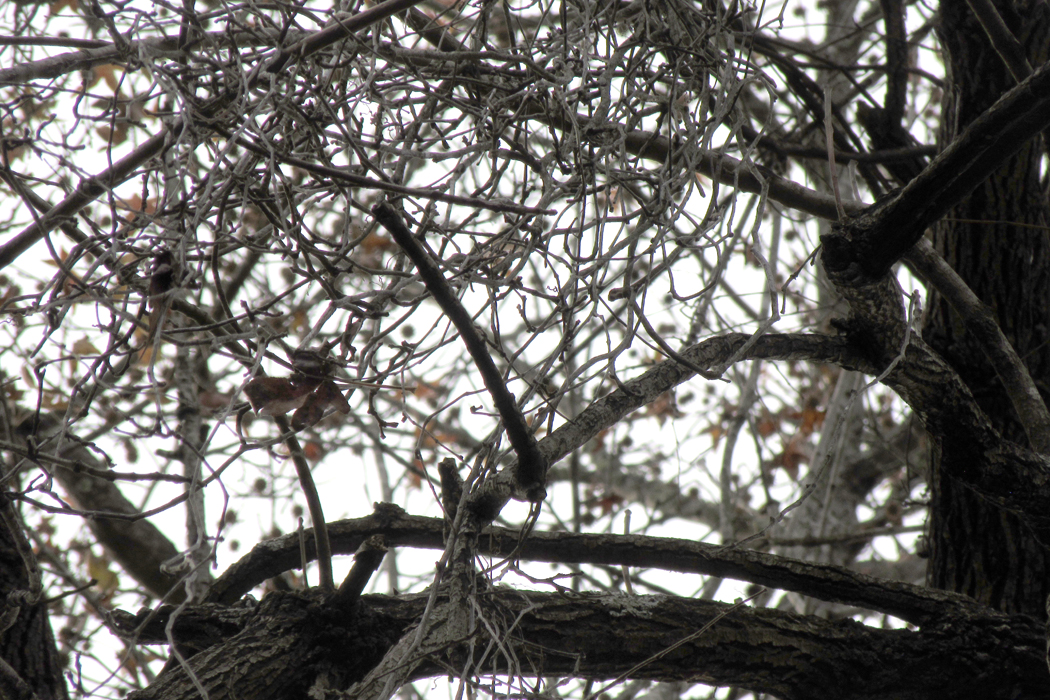
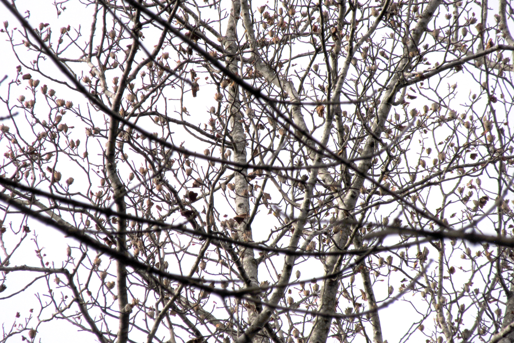
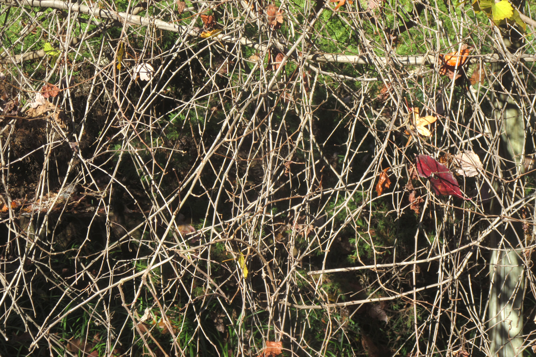
In the entry previous to this one, I presented bits of a series of fruit and vegetable images, and a recent bunch of “tree nudes” — winter trees with their branches and bark naked to the weather. 

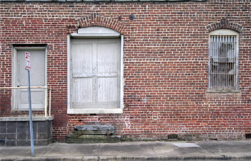
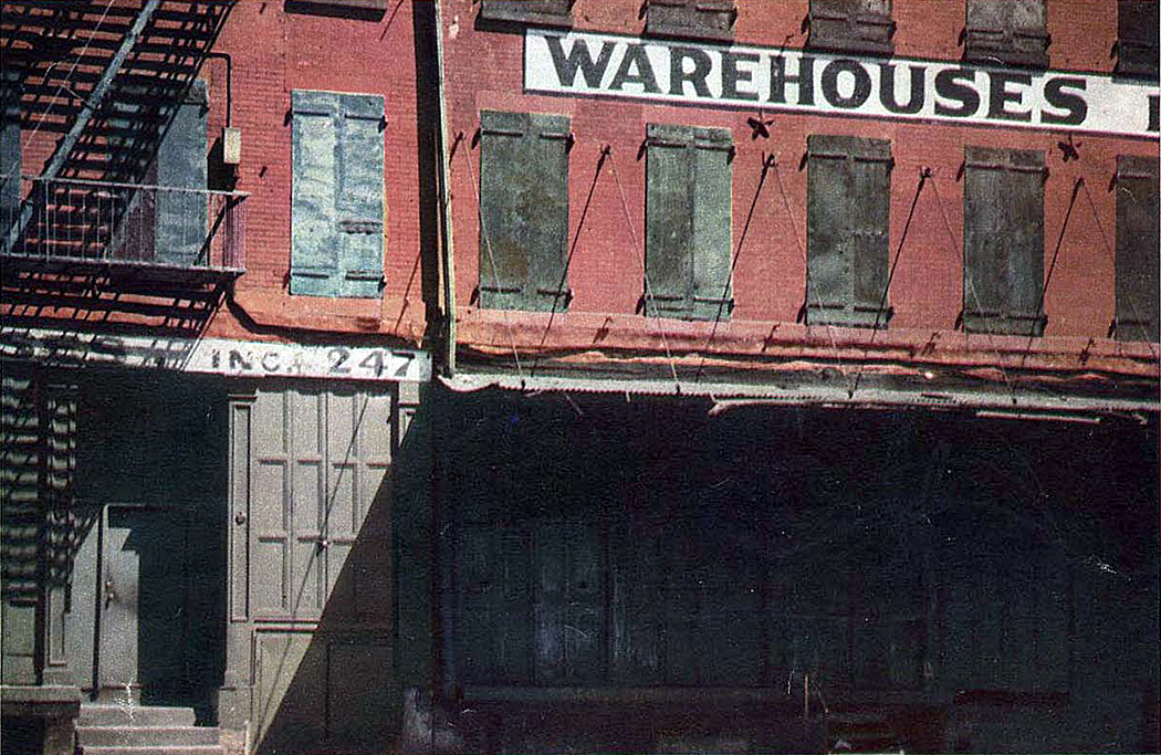
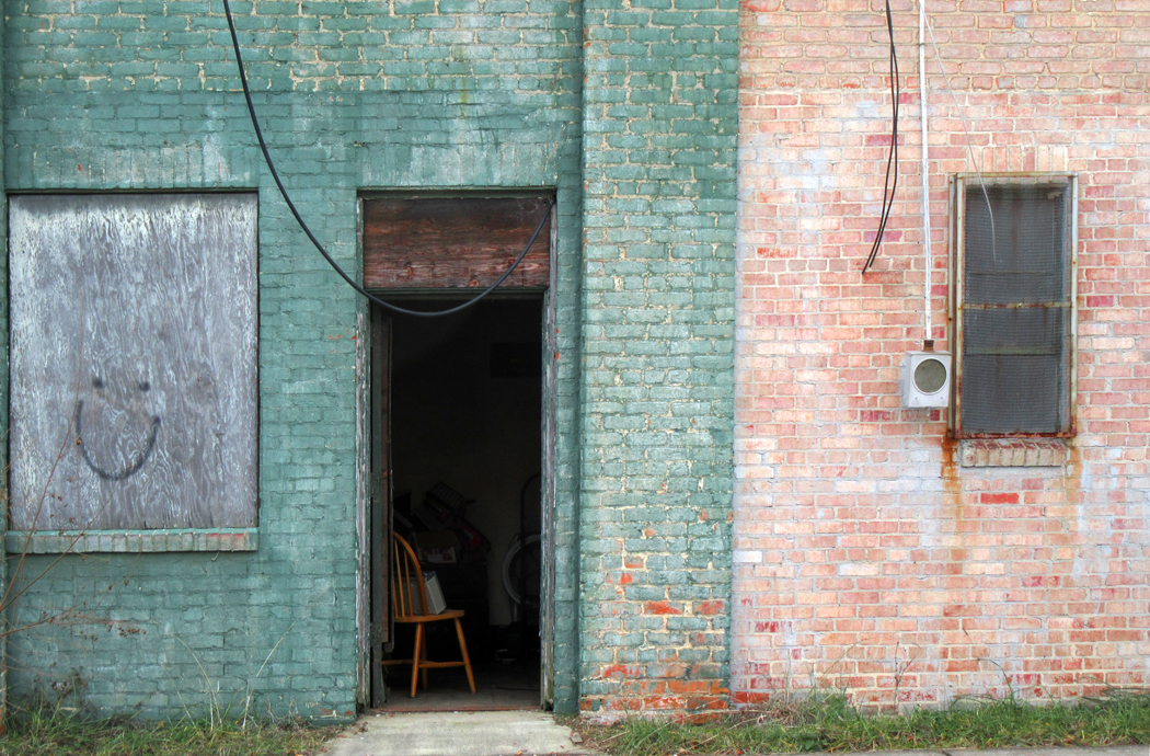
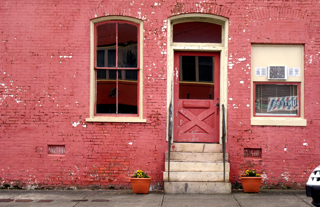
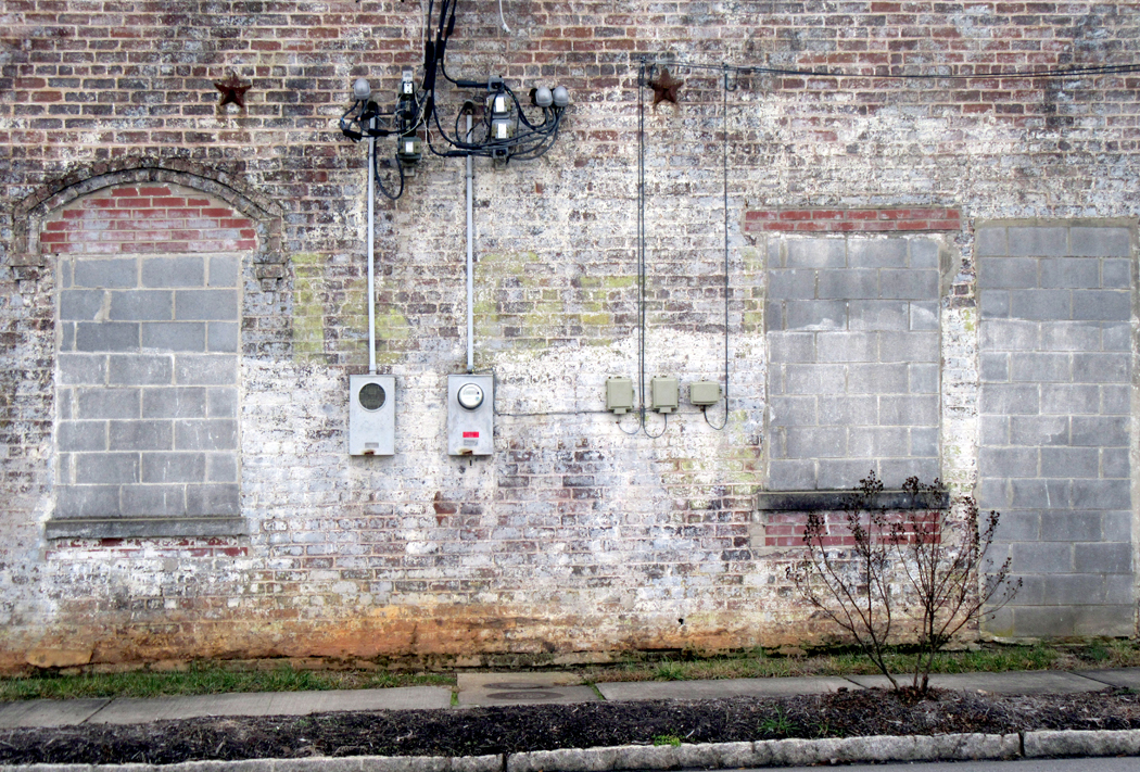
I also spent a day driving the industrial streets of Reidsville, looking for the past poking through the present. Along SE Market Street, alongside the rails, there are the shells of old warehouses and factories, textured with brick and sometimes closed off with tornado fencing. 

I have been fascinated by such places since I was a boy, loving the less visited side-streets in New York, looking at old apartment buildings and second-story residences above storefronts. There is something about the edge of decay that is beautiful. A fresh new building just seems unripe; one that has been settling for decades, even a century, has gained character.

This is something like the Japanese esthetic concept of wabi-sabi, or an appreciation of the imperfection and impermanence of things, and why a Japanese potter will often crack or warp a vessel before firing it, finding the result more beautiful than bland regularity. 

In the past, when I made photographs of old buildings, I made them in black and white, which seemed a way to emphasize form and texture, and was then the accepted presentation of “art” photography — color not making it into most museums because of its perceived impermanence (consider your old snapshots, turned magenta and faded. A museum didn’t want to pay good money for an artwork that would go south in only a few years). 

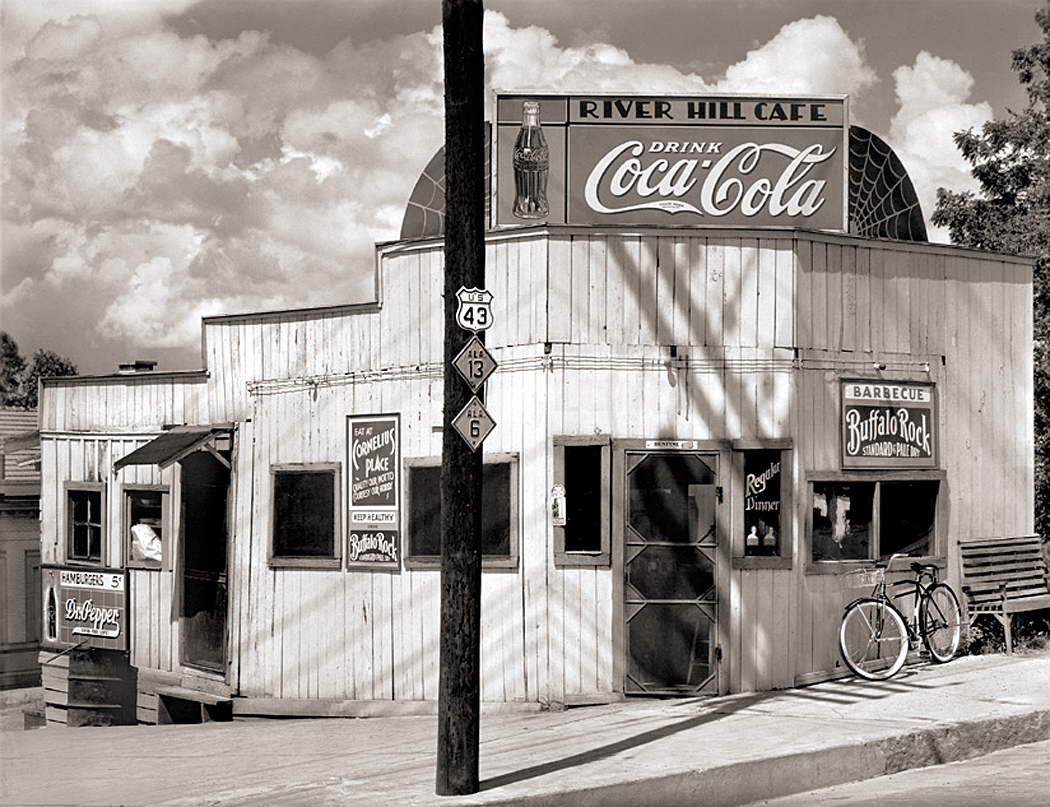
Black and white was what all the photographers I admired used (with a few exceptions). And if I looked at one of Walker Evans photographs for the Farm Security Administration in the 1930s, I found beyond the images of poverty, a way of making beauty out of decaying architecture. 

One of the few classic artworks I actually own is Evans picture of the Rock Hill Cafe in Alabama. It is beautiful and I love it. 

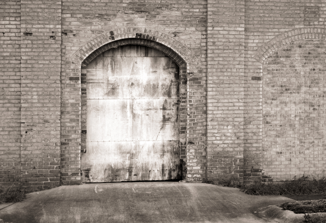
But as I get older and as technology has improved and my perceptions have changed, I find myself making color photographs more often, and often the color is the point. So, I might see an old welding shop in Reidsville and see it in monochrome.

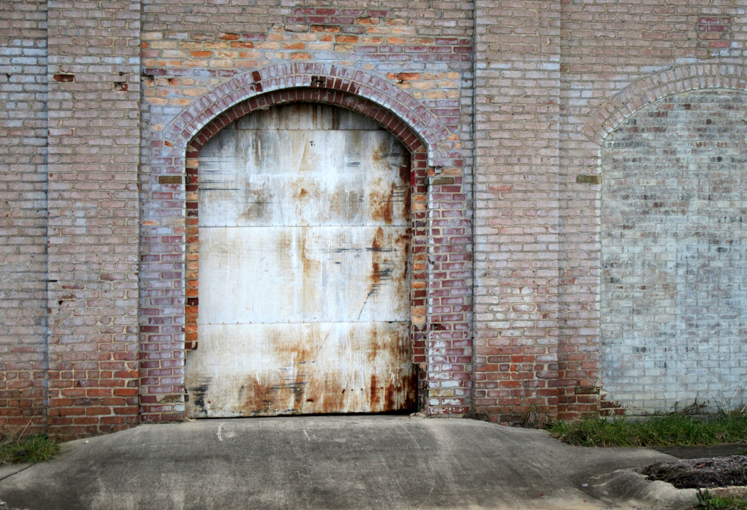
Or I could present an old rusted doorway in B&W

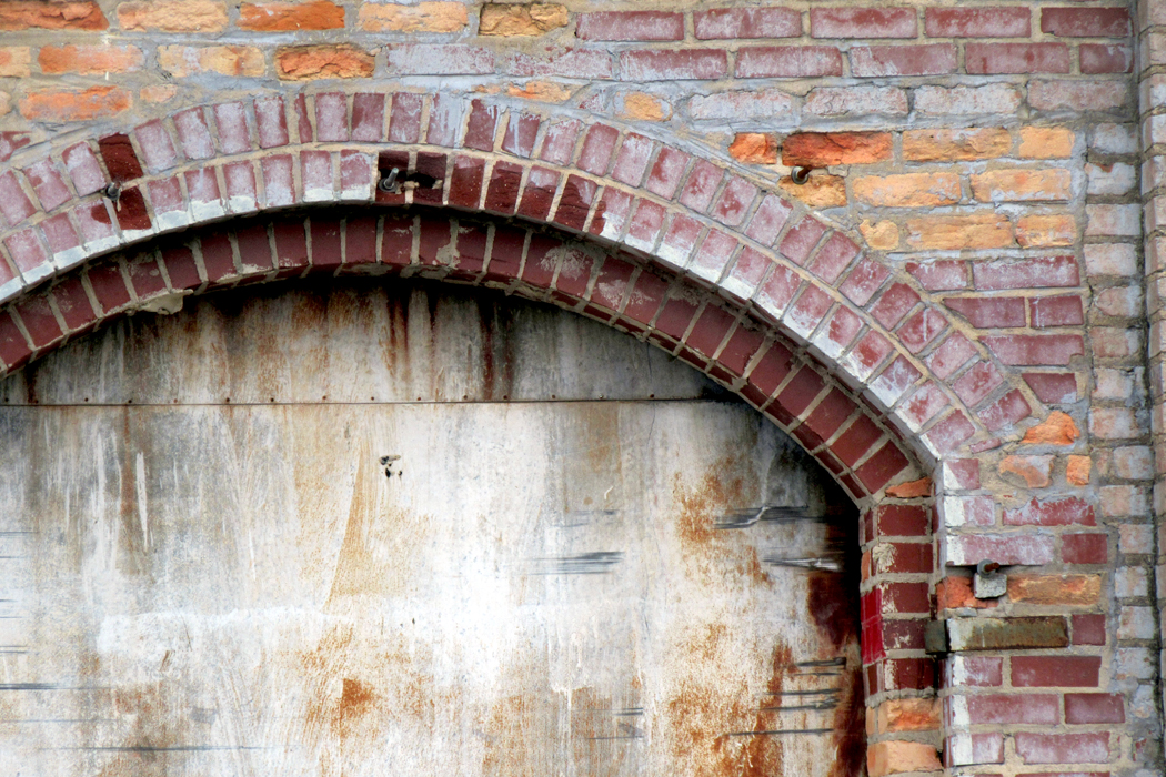
I saw, though, a range of subtle color that just delighted my eye. 

Interestingly, Evans himself took up color and in the 1960s made a series of color photographs of old buildings. His materials were not as good as we have now and the color never completely satisfied him. 

Walker Evans 1960

There have been some truly impressive color photographs made by such artists as William Eggleston, Eliot Porter or Ernst Haas. They forced me to reconsider the esthetics of color.

To say nothing of the melancholy and beautiful streets of Edward Hopper. 

So, I drive through the streets of Reidsville on a December morning and see so many absolutely beautiful wrecks. Because it is cold, and because I am old and my hams have gone weak, I aimed my camera through the opened side-window of my car and made my series. 

There were times I parked and got out of the car, but mostly, I made the window-height camera a part of the esthetic — or I’m just lazy. 

I drove down Market Street and up the other side of the tracks, then crossed back by Harrison, Gilmer, Settle and Williams streets. There was beauty everywhere. 

The question of whether what I have made is art no longer interests me. There was a time I wanted to be an artist, but now my emphasis in not at all on how I am seen or judged by others, but rather the direct fact of making stuff. It matters little what it is called. 

The photographs are my way of engaging with the world, reminding myself to see it and see it whole, not just the sunsets and mountainscapes, but the sagging doorways, too, and the cracks in pavement. The way the clouds gray-up and dull the shadows till they flatten completely. The roundness of an orange, the spatter of mud on my tires, the layers of paint on my back porch. 

I now consider this engagement far more important than the artifacts that results, however much fun it is to share them. 

I have talked with my brother about this, who is an artist — a real one, with sales and exhibitions — and he rather laughed. “What do you think an artist is? A vocation? Something you go to trade school for, like plumbing or accountancy?” 

The urge, the need to make things, he said, the fact that you do it makes you an artist, whether you think of yourself that way or not. Being an artist is not so lofty a title; it is simply something one does. 

And so, I drive up and down streets looking at the world that amazes me, and I find color and shape and texture; shadow and highlight; past and present; banality and transcendence.

Click on any image to enlarge

I don’t know if it is just me, or my generation — a cohort of Baby Boomers who once felt, or more precisely, knew they could change the world for the better (sigh). 

Or perhaps it is some random mutation of the Protestant work ethic. I think of stately plump Buck Mulligan telling Stephen Dedalus, “You have the cursed Jesuit strain in you, only it’s injected the wrong way.” Only, in my case, it is a dour Lutheranism, a faith I have never believed in nor practiced, yet discover somehow in my Scandinavian blood, where it lingers and makes me feel that if I am not working, not producing, I am not making quitrent on my existence. 

It is not simply a compulsion to work, but a crippling sense of guilt if I do not. The joke is that I am fully aware in my rational mind that there is no reason to feel this way. I am 71 and no one will threaten me with a cat-o-nine-tails if I don’t pull my oar till I drop dead. I worked steadily during my working years, and even after I retired, I managed to pump out more than 500 essays on this blog in just a few years. 

When I was employed, even on my vacations I managed to squeeze out travel stories for my newspaper. I was writing all the time, and making the photographs to accompany those stories. “Your business is producing; your business is producing,” a tiny Stalinist voice is grinding in my subconscious. 

So, even now, five years on from my paycheck, when I go visiting out of town, I am compelled to spend at least a portion of my time on one project or another. Several of these projects have been displayed on this blog over the years. One such project was to photograph nothing but circles; another to photograph ceilings and floors; another to document every house on a given street. 

Well, I am just back from visiting my brother- and sister-in-law. I drive three hours from Asheville to Reidsville, N.C., several times a year to spend a few days with them. He is an artist of some reputation; she keeps him in line. And this time I managed to work on three different ongoing art projects. 

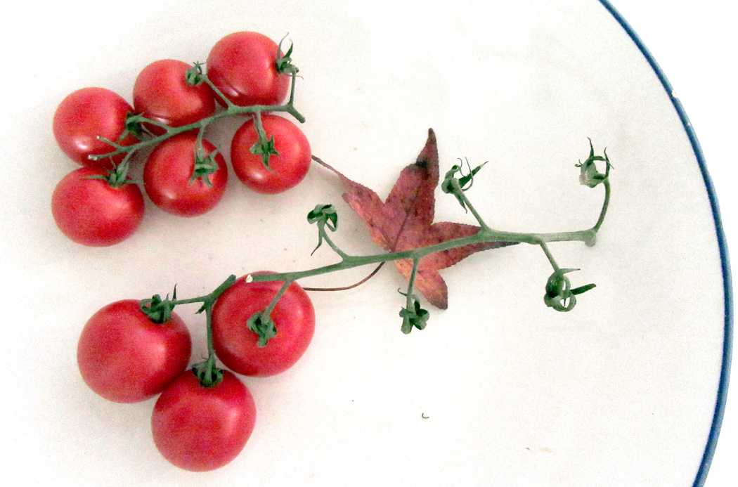
The first I’ll mention is a series of images of fruits and vegetables in bowls. A bit of the round rim usually crosses and edge of the frame. I love the organic and geometric shapes interacting. 

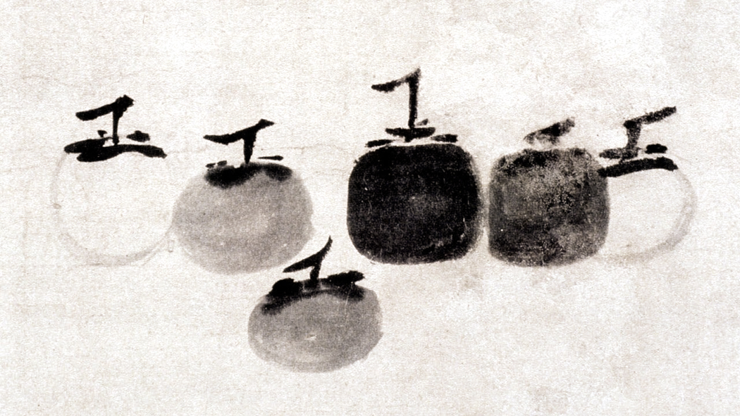
I am also responding to a famous sumi-e Zen painting by the 13th century Chinese artist Mu-Chi, in which he lines up six persimmons and cleverly evades the monotony of an even number of fruits by making three groups, of one persimmon, of two, and of three. I have always loved this painting.

There is no way I can ever match it. But I have my own interest in the roundness, the ripeness and the color of fruits and vegetables. 

There is a one-off I made this trip. Looking out the window in my bedroom and seeing the branches through the Venetian blinds, I was reminded of a three-part Japanese shoji screen. 

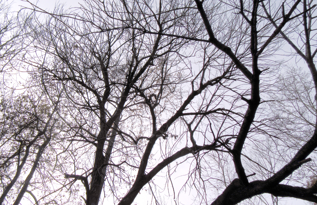
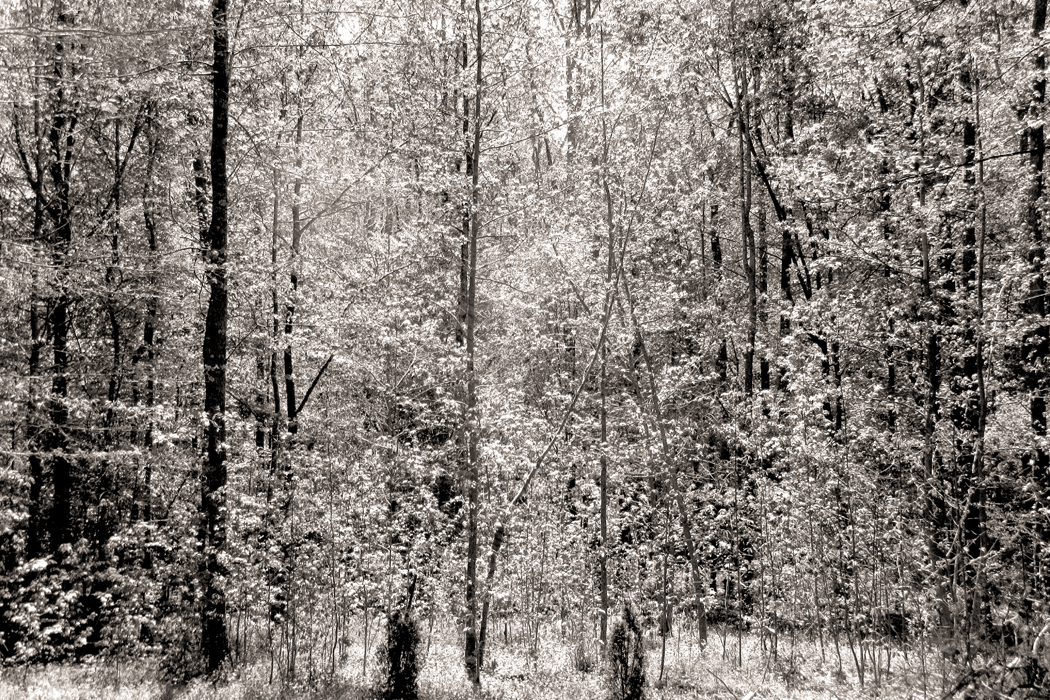
The second project is a continuation of a lifelong fascination with the complex, ungovernable patterns of tree branches in the winter. I always think of them as a metaphor of the tangle of axons and dendrites in the human brain. The macro mimics the micro. 

It is a series I have called “tree nudes,” and I feel toward the rough bark, the curves in the tree trunks, the graceful dance of the end-twigs in a breeze as a similar kind of sensuousness you find in a classic nude painting or photograph. 

I made my first tree nudes at least 50 years ago and my solander boxes are filled with old silver prints I made from that point until I gave up chemical photography and took up digital. Now my hard drive is silting up with jpeg tree nudes. 

I used always to photograph in black and white and tree nudes are a perfect subject. The trees are usually rather color-drained in the winter and their silhouettes are perfect for a monochrome. But I have also discovered the magnificently subtle colors that can be found in a completely grey image. Grey is never just neutral; it always hints at something on the color wheel. 

In my senescence I have discovered color. I never thought to think in chroma, perhaps because color film, whether Kodachrome, Ektachrome, Fujichrome, or Agfacolor, was always such a poor conveyer of color. A Kodachrome image looks jammed with Kodachrome colors, not the colors of the world. And transparencies never printed out well enough to make a satisfyingly crisp picture. Even Cibachrome looks always like a Cibachrome. 

But, for some reason, my own sensitivity to color has rejuvenated and I find myself seeking out images that work best in color, and I like the look of digital color, which I can control so much better, thanks to Photoshop, than I used to be able to control the color of a transparency or a print from color negative film. 

Almost all my art has been unmanipulated. I am not a fan of solarization, double exposures or all those godawful “filters” that Photoshop provides. But I did make one experiment this trip. 

The tree nudes were inspired, perhaps, when I was a teenager visiting the Museum of Modern Art in Manahattan — I lived just across the George Washington Bridge in New Jersey — and I came to love the great Jackson Pollock hanging there. The business of the paint drips was the first neuronal metaphor I was aware of. 

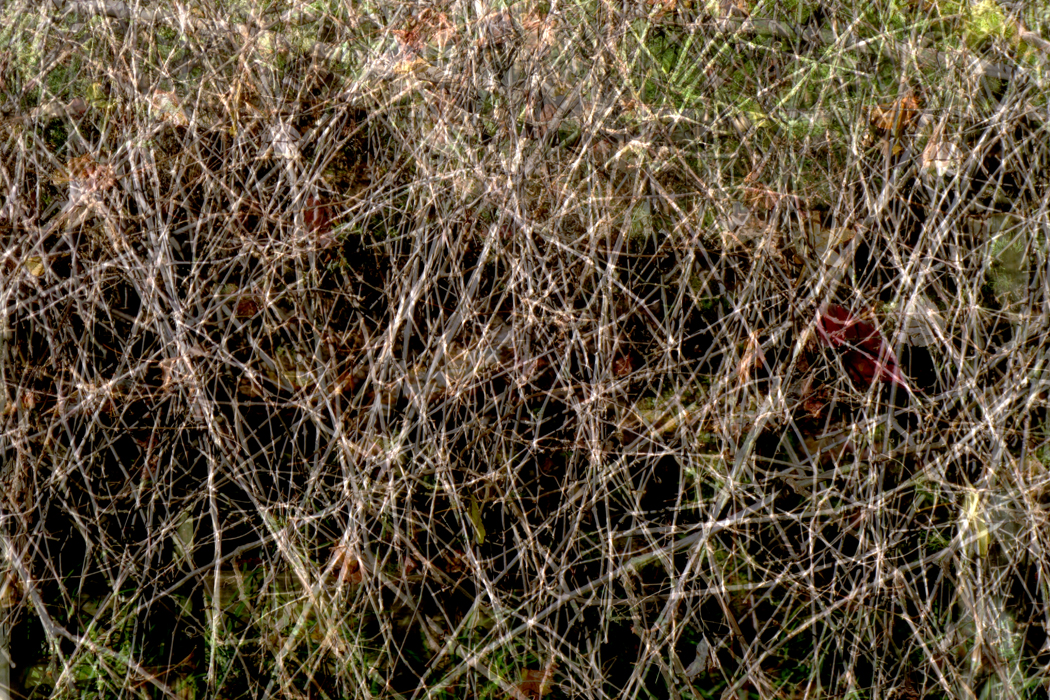
So while in Reidsville, I made three photographs of some vines out the front door. Here’s one of them as an example:

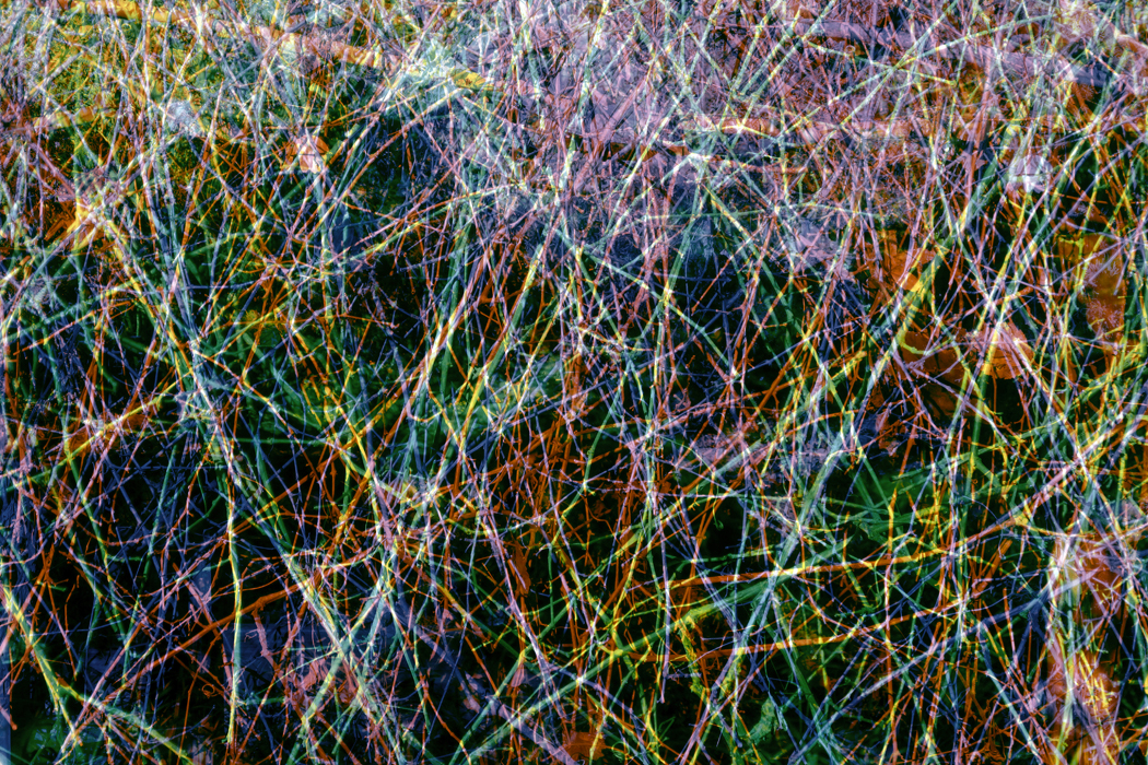
I then edited the three images, lightening them up, and layering them one atop the other. The result is my simulacrum of a Pollock, only with the lines and shapes of nature. 

I made a second version in which I tinted one of the images yellow, a second one cyan, and the third magenta, so they might make a color version of the monster I had created. 

Finally, I had my third project this trip. I sought out the older parts of Reidsville and made a series of images of post-industrial Piedmont. For those images, I will wait for the next posting. 

Click on any image to enlarge

“What gives you joy?” asked Stuart. “I don’t mean what do you EN-joy, but truly fills you up with an uncontrollable emotion, maybe brings you to tears?” 

I thought about this for a moment. It seems different things at different times set off the buzzer. 

“That’s a fuzzy question,” I said. “Joy is one of those words that covers a whole basket of things. Like ‘love.’ Everyone means something different by it.”

“In this case, I guess, I mean something that fills you up, as if emotion will burst you open. This is very different from pleasure or happiness. Originally it meant ekstasis – a moment when you stand outside your ordinary self, and feel a connection to something bigger than you.”

“That’s a tall order,” I said. “How often does it even happen?”

“Maybe I’ve made it sound too grand,” Stuart said. “Sure, there is the big transcendent blast, but it can happen in smaller doses, too. The big ones are life changing, but the smaller ones carry you through an hour or two of rising above the ordinary.”

“As long as we leave love out of it, and theology, too, then I guess I get most joy from the arts: Music, dance, painting. Odd moments when I’m reading poetry and a line or idea takes off and I become emotional. It can make me weep uncontrollably.”

“Billy Blake said, ‘Excess of joy weeps.’”

“Of course, only when the performance is good — or not just good, but exceptional. Other times, I enjoy them, but those times that are transcendent are rare, but necessary.”

“Necessary?” 

“Yes. Just going to the symphony every week is fine, or to a play, or the ballet. But if once in a blue moon a performance doesn’t reach beyond that and pierce the essential innards of my psyche or soul or emotions — I don’t know what you call it — then it’s hard to justify the expense of buying the tickets. It’s that nearly-never performance that makes all the others worthwhile.”

“Anything else?” he asked. “I mean being an esthete is fine, but what about non-artistic things?”

“Certainly. Love has elevated me like that, although more often when I was young and an idiot. Now, it is seeing someone I love feel joy that raises my heart. When I was young and with the woman I was nuts over, seeing a breeze blow the hem of her skirt or the wrinkles of her eyes, or even the ridges of her knuckles would send shivers through my being. That was transcendent.

“Now the thrill comes from cooking for someone I care for and seeing them enjoy what I have prepared. That actually gives me something of the same feeling.”

“Interesting,” said Stuart. “Because I have this theory…”

Here we go, I thought. Buckle up. 

“… this theory that people are roughly divided into those who are what I might call ‘sensualists’ and those we might call ‘activists.’ There are other classes, too: There are the depressives who never feel that elation we call joy.

“This came to me when I asked Genevieve this question. Although playing viola with the orchestra is her job, nothing gives her greater pleasure in her off-hour time than playing quartets with friends, or accompanying on the piano as another friend sight-reads a sonata. Sitting in and playing music with others is for her the ultimate in joyfulness.”

“I recognize that,” I said. “Carole felt the same way about playing four-hand piano. The two players meld into a single entity in the music. It gave her deep pleasure. She often asked me to play recorder while she played piano. I usually declined: I did not get the same thrill she did, perhaps because I had no real talent for it. I did once sing Gutte Nacht from Winterreise as she accompanied. You would not have wanted to hear me, but it made her happy and that made me happy.”

“Yes, well, that is the activist, the one who gets joy from doing. But I thought of you, on the other hand. You observe. You watch. Your joy comes from seeing a well-performed ballet, or the rich gray-purple in the background of a Renaissance painting. It is the sensual side of things that fills your sails.”

“I never thought of myself as a sensualist,” I said. “I’m too dull and academic. But I see your point. It is through my senses that I apprehend the transcendent. Looking, hearing, touching, tasting, smelling: These are all real portals into the reality of the cosmos. And it is seeing them, like the stars and Milky Way in a truly dark night sky, that gives me a sense of something bigger and beyond myself.”

Stuart smiled. “That is exactly what I mean by ‘joy.’ It can be found in the sense of how you are connected to things outside your self. What I call activists, in this sense, are those who find that experience in caregiving, or hiking in nature, or playing music with others — something outside, bigger and more important. The sensualists are seeking the same, but find it in metaphor, in what they see and hear. The Beethoven symphony that is a metaphor for the struggle of life, or the Balanchine choreography that does the same for the dance of the cosmos.”

“When I see a great dance performance,” I said, “I feel in my own muscles the twisting and flexing of the dancers’ muscles. Hell, in a particularly good and athletic performance, I can feel it in my own body so much that I need liniment the next day.”

“Iris Murdoch once said we always seek out ways to ‘unself.’ Usually, we are stuck in our egos, which is a boring place to be, claustrophobic, anxious and lonely. We want to know there is a bigger place to be, in which we are a puzzle piece that fits a waiting empty spot. What is more, that puzzle is vast, extending to the ends of the cosmos. It what we feel when we magnify, like Mary in the Magnificat — ‘Quia fecit mihi magna qui potens est’ — and extend our being out to the night sky and the bright pin pricks there.”

Aldous Huxley wrote that humans have “a deep-seated urge to self-transcendence. I know what Stuart was talking about. I have often felt it, even in an unguided universe.  

“Yet, there are those who don’t feel joy, or at least, when I ask, they seem puzzled, not sure what I mean by the word. These are people, I think, who either don’t have the gene for joy, or who are depressed and squeezed flat, or who have not yet found their capacity. Surely they had it when they were children: Kids seem to drink directly from a fountain of joy. Joy requires a certain lack of self-consciousness, an openness, even to make yourself goofy or admit to emotions that others may not feel. 

“Depression flattens the world out — talk about the flat-earth people — and the …”

“Well,” I interrupted, “what does it for you? You always have these theories, but they are never directly about you. What gives you the giddies?”

Stuart talks a lot, but seldom about himself. There is always something held back, as if his jibber-jabber were a way of shielding himself.  

“I dunno. Let me think. I’ve gotten old — we’ve both gotten old — and can look back on a long history of sorrows and joys, both those I’ve caused and those I’ve been dealt. I have to say that the sources of joy have changed radically over those years. It used to be I felt most awake and alive when I found a new lady love to dazzle me, but after three mangled marriages and …” 

Here, he looked toward the sky and sort of bit his lip as he used his fingers to count.

“Seven, yes, seven significant other relationships, the blush of that first encounter has gone. Now I’ve been with Genevieve for eight years and I feel I’ve finally settled in, and I have found that I sometimes can watch her sleep next to me and feel that sense of magnification, expansiveness, joy, just in seeing her, and feeling that we are joined as co-puzzle pieces.”

“So,” I asked, “is that activist or sensualist?”

“Maybe I need to rethink this,” he said. “There is something passive, not active in this sort of joy, but neither is it sensual. There is joy I find in simply its ‘is-ness,’ the fact of it, the actuality and not theoretical. The ‘is-ness.’ That’s the best term for it.”

“God tells Moses, ‘I am that I am.’ But you don’t need a deity for that to be true. The cosmos is that it is.”

Stuart looked at me. “I remember Joseph Campbell talking about a newborn bawling, and that it is its way of proclaiming a joy that says, ‘I exist,’ or, as you have it, ‘I am that I am.’ Perhaps we’re finally getting to the bottom of this.”

Work has become the habit of a lifetime, and a habit is hard to break. So, even though I have been retired for seven years, I wake up each day believing that I must produce something. What is produced is not irrelevant, but it is a minor concern compared with the unswervable drive to be productive.

That is why I continue to write this blog; it is why I keep making new photographs — compelled like William Blake’s Los, forging link upon link of a continuous chain.

Which is why, visiting my friends I cannot help but carry my point-and-shoot around in my pocket and take it out at seemingly random moments to point and shoot. Each visit I make, a theme arises, unbidden but clear. One visit, I photographed ceilings and floors — it is amazing how much I could find there. (Link here).  It is in these details that I find design: and it is the design rather than content that tickles my eye. (Link here). 

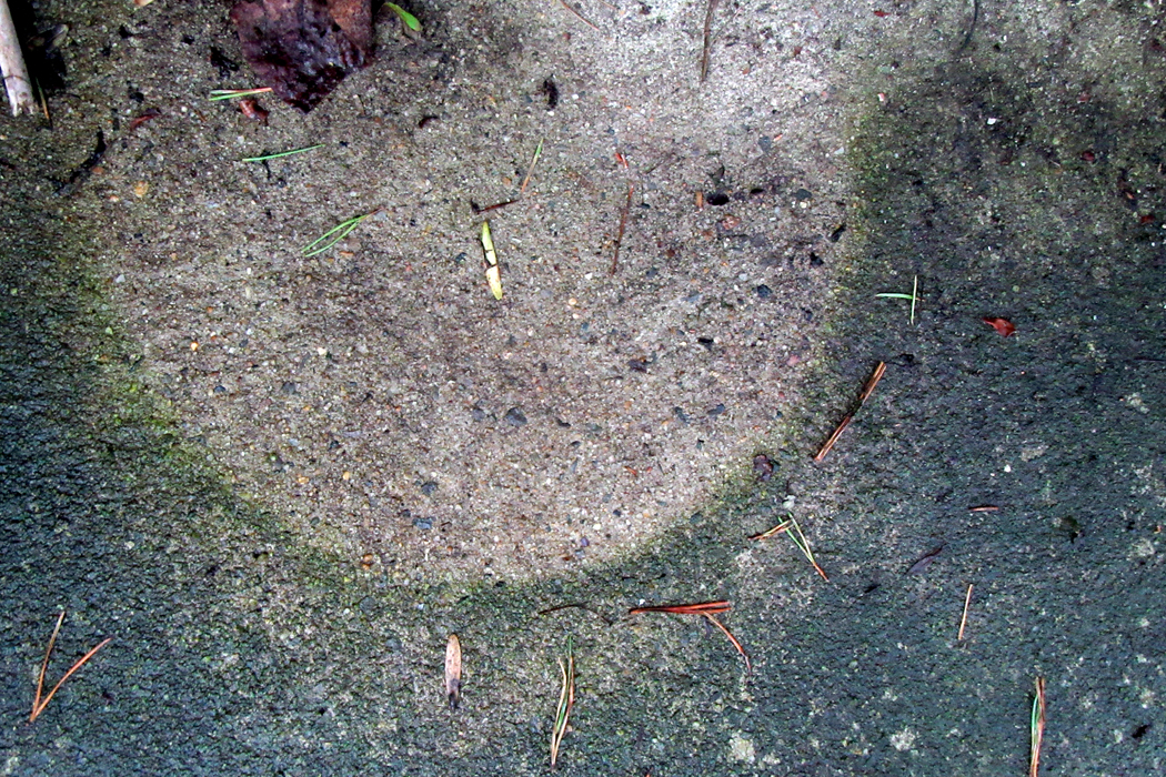
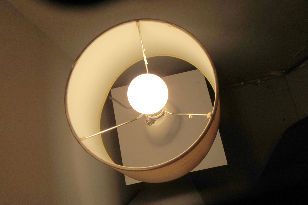
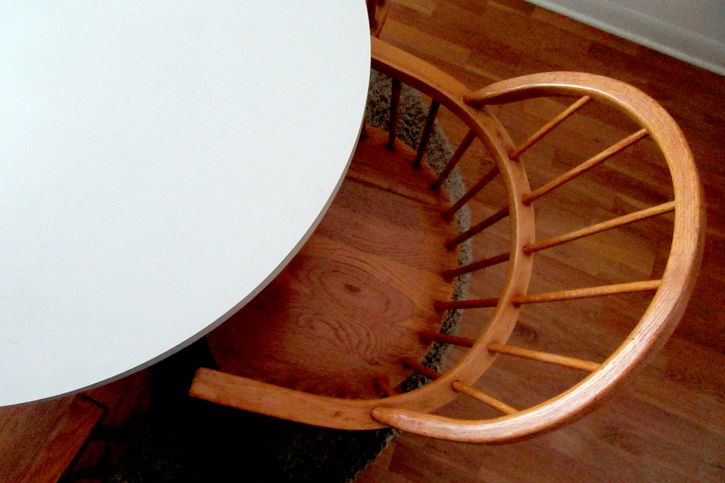
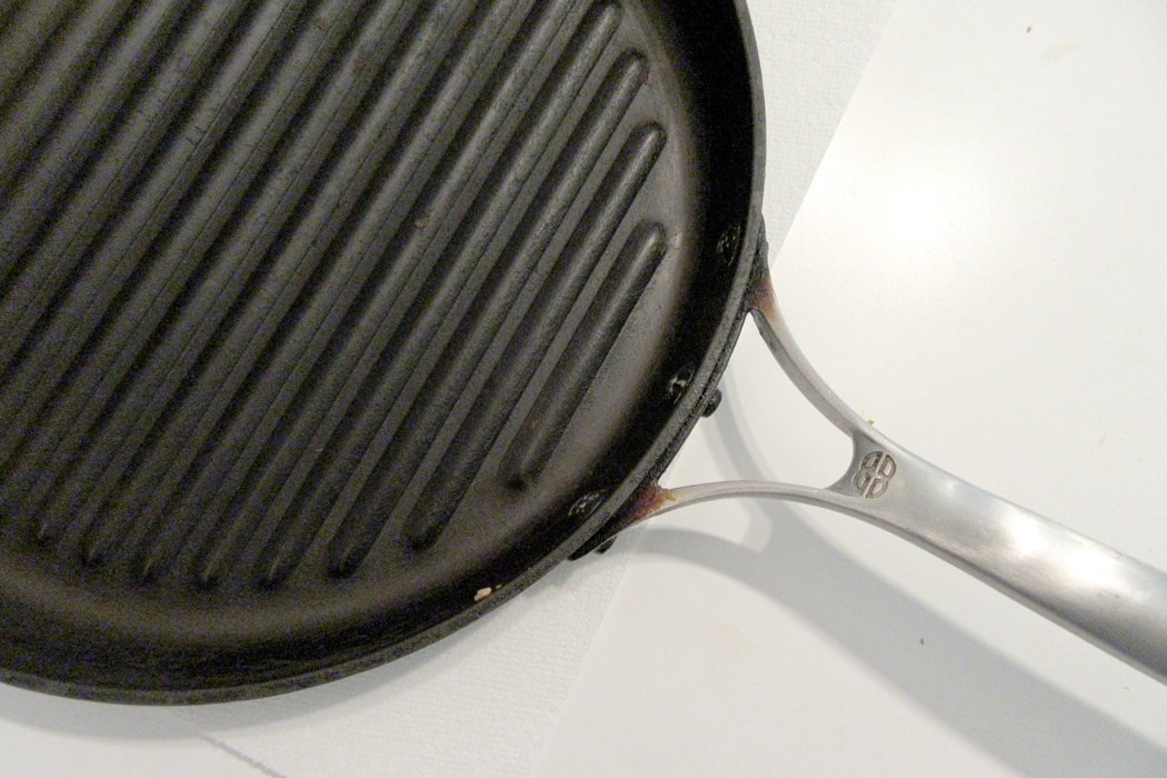
But that doesn’t mean content doesn’t count. This visit I began photographing randomly, as I do, making pictures of their cats, of birds, of the woods behind the house. But more and more, my camera kept finding circles. Circles, curves and arcs. 

It seemed as if one of the marks of human industry is the circle. Nature allows few of them, choosing a great deal more vertical and horizontal lines, such as trees and horizons. But the circle is human; it is idealized. 

Throughout the house, I kept finding them, in pots, in lamps, in clocks, dishes and sculptures. Round is an idealized form, almost Platonic. Industrial. 

Certainly, I remembered the Zen ideal of the enso, or circle, which is drawn swiftly with the sumi brush, in a single swish, or perhaps two. It is often incomplete, and usually scruffy with brushstroke. It is meant to symbolize enlightenment, but also the great emptiness of the universe. It is an expression of the Japanese esthetic ideal of wabi-sabi, or the beauty of imperfection, incompleteness or impermanence. 

It is very different from the Western concept of the ideal, or perfect. A perfect circle is difficult to draw freehand. The Greek painter Apelles once left a perfect circle on a wall in the home of his rival, as proof that he had been there.

More famously, the Italian Renaissance painter Giotto, when tasked by the Pope to demonstrate his mastery, scribed a perfect O in red paint. 

A Canadian math teacher from Ottawa, Alexander Overwijk, once made up a story of winning the 2007 World Freehand Circle Drawing Competition in Las Vegas, as a means of getting the attention of his students. (The fiction went viral, and you can find it all over the internet, as if it were real). He was able to draw such a circle on the blackboard for his class. (Link here). 

But perfection is boring. It is abstracted from the real world, a world of imperfection, incompleteness and impermanence. The real world has jagged or fuzzy edges, it is left perpetually unfinished, it is ambiguous. 

As I moved about the house, I kept finding not only circles, but curves and arcs, the incomplete circles. 

The 18th century philosopher Giambattista Vico wrote of the historical cycles of recurrence. Time, he implied, was not a straight line, but a circle. We see these cycles and epicycles in our own lives, inarticulate as infants and incoherent in old age dementia. Our lives recapitulate in our children’s lives, as ours recycle those of our parents and grandparents. 

Weeks cycle through from Monday to Monday, months from January to January. The clock on the wall from noon to noon. 

In Finnegans Wake, James Joyce begins the book with the end of a sentence that began at the finish of the book, “bringing us by a commodius vicus of recirculation” to the ouroboros of time and history — and the story. 

William Butler Yeats, in his A Vision, gives another version of the cycles of history, which in his case is paired with the phases of the moon. In Vico’s version, history has four stages; in Yeats, there are 28 phases. 

(The moon is one of those few natural circles, although, it should be pointed out, it is only perfectly round once a month. A second natural circle is the eye’s iris, from which I see the circles I photograph.) 

“In my beginning is my end,” wrote T.S. Eliot in East Coker — one of his Four Quartets. “In succession houses rise and fall, crumble, are extended,/ Are removed, destroyed, restored, or in their place/ Is an open field, or a factory, or a by-pass.”

“In my end is my beginning.” 

Round planets circle round suns; Shakespeare’s Puck promises he “will put a girdle round about the earth in forty minutes.” Now a moon named Puck circles the seventh planet of the solar system. 

As I continued to make pictures — and I wound up with 97 of them over a four-day visit — they tended to diverge from the circle to the arc, finding that incompleteness more interesting visually. The arc implies rather than states. It suggests; it doesn’t insist. It is metaphor, not fact. 

Curves are human, they are sensuous. Straight lines and squares are the stuff of Procrustes, something we overlay on the natural roundness of delight to pretend there is something schematic about the world, something we can graph and diagram. Something we can make use of. 

But the curve gives us motion, change, the complexities of the calculus. It is Ovidian, not Platonic. It is pleasure; it delights the eye. In the eternal battle between mind and body, the body has all the fun. The mind is a doughty schoolmarm. 


The metaphor is real. My wife died two years ago and now I am meeting my ex-wife again, after 50 years.

And so, I keep finding these circles and arcs, these bows bending like the curved universe Einstein posited. They delight me. 

Click on any image to enlarge

In nova fert animus mutatas dicere formas corpora.

With these words, Publius Ovidius Naso begins one of the most famous and influential books of the ancient world, his Metamorphoses. 

“Now my spirit brings me to speak of changing forms into other bodies.” In the poem, he recounts hundreds of mythological stories, all to do with transformation. Nothing in his universe is permanent; everything seems to change into something else, women into birds, men into horses, gods into bulls. The poem recounts such tales with the wit and fizz of a supreme ironist. 

The Metamorphoses is a compendium of Greek and Roman mythology. It is the primary source for later writers who use it to retells the stories of Echo and Narcissus, Daphne and Apollo, King Midas, Venus and Adonis, Pyramus and Thisbe and Phaethon and the sun chariot. Some of the myths are found only in Ovid. He is primary source for Chaucer, Dante, Shakespeare, Milton, Dryden and hundreds of others, including Nathaniel Hawthorne, in his Wonder Book and Tanglewood Tales. 

He was popular in his time, largely derided as “pagan” in the early Christian centuries, rediscovered in the Renaissance, enjoyed in the enlightenment, again avoided in the Victorian era of high-mindedness and didacticism, and only again come out of the shadows after mid-Twentieth Century with a spate of new translations. (The most recent trend is away from him once more, in a “Me-Too” era that takes umbrage at all that rape and patriarchy.) 

With all that shapeshifting, it makes me think of how I manage to read the poem: in English. In the past year, I have read three different translations, plus I have re-read Ted Hughes’ Tales from Ovid. And I have loved every moment. 

And so, now my spirit brings me to speak of changing language into other words. Specifically, how can we translate from one tongue to another, from Ovid’s Latin to my English. It should be simple: Just take the ancient words, one by one, and turn them into English words. But if we do that, we get gibberish. “In now bring spirit change to speak forms bodies.” 

To say nothing of the multiple meanings of each of the Latin words. A few bits: animus can be “mind,” “soul,” “feelings,” “heart,” “spirit,” “courage,” “character,” “pride,” or even “air.” Corpora may mean “body,” but it also means “person,” “self,” “virility,” “flesh,” “corpse,” “trunk,” “framework,” or “collection.” So, which of each of these do you choose. A possible, but nonsensical translation, borrowing synonymous meanings from the words in the opening sentence, could read, “Within the extraordinary, pride wins a substitute for pleading a collection of patterns.” 

Huh? Of course, no on thinks that is what Ovid was trying to say. It is completely unidiomatic. But how do you make meaning in English from a language spoken 2000 years ago? 

One of the first translators into English was Arthur Golding. In 1567, he gave the first line as, “Of shapes transformde to bodies straunge, I purpose to entreate.”

The most famous translation, by John Dryden in 1717, makes it short and sweet: “Of bodies chang’d to various forms, I sing.” 

In 1899, Henry T. Riley gave it as: “My design leads me to speak of forms changed into new bodies,” which is fairly literal. 

“My soul is wrought to sing of forms transformed to bodies new and strange!”  Brookes More, 1922.

 Horace Gregory, in 1958 has it: “Now I shall tell of things that change, new being out of old.”

William S. Anderson, rather clumsily makes it nearly unreadable in 1978 with: “From bodies various form’d, mutative shapes my Muse would sing.” 

I have collected (a “corpus” of data) some 20 different versions of this single sentence, including Hughes’ “Now I am ready to tell how bodies are changed into different bodies.”

Ovid’s Latin is not only light and ironic, it is often self-consciously poetic, and other times comically demotic. Because of the different structures of Latin and English — the Latin being built of case endings, declensions and conjugations — it is impossible to recreate accurately the tone and content of the original. Parallels must be found, and those vary from age to age, mandating new and current translations. 

Outside of Hughes, who is near perfect but only translates barely a tenth of the whole, my current favorite is Charles Martin, which is easy to read, idiomatically English, but able to shift tones when needed. It is also in a swift pentameter, unlike those hexameters so many try to match Ovid’s own verse form, which is oddly ungainly in English. 

But, what I started out to say, before shifting off into all this about language, is that the same piling up of version in language has its counterpart in imagery. Ovid’s tales have been subject matter for countless painters and sculptors. 

So, now I am moved to write about verse changed into other art media. I wanted to take a single tale and decided, since I feel so European, I might consider the continent’s eponym, Europa. 

In the Metamorphoses, Jupiter, head god, gets the hots for the young woman, Europa, and seeing her among her herd of kine, plots to abduct her. 

“The great father and ruler of the gods — whose right hand is armed with the three-forked lightning, who shakes the world with his nod — puts on the appearance of a bull, and having mixed himself with the bullocks, he lows and walks about beautiful on the tender grass. 

“He is as white as the untrampled snow before the south wind turns it into slush. His shoulders brawny, his dewlap dangles on his broad chest. His horns are curved but as if they were hand made and flawless as pearls. 

“He seemed unthreatening and his eye filled with no anger; he was all peaceful. 

“And so Europa, the daughter of Agenor, wondered at him that he was so beautiful and gentle. At first she was afraid to touch him, even though he promised no threat, but she did approach him and held out flowers to his white mouth. The would-be lover rejoices and biding his time till he gets what he wants, he kisses her hands. It isn’t easy for him to hold back. 

“And so, he fawns upon her and gambols on the green grass, he lays down his snowy side on the yellow sands; her fear evaporates slowly. He offers his breast to be stroked by the virgin’s hand and his horns to be snared by her garlands. She dared then to sit on the back of the bull, not knowing who he really was. 

“The god by slow degrees plants his foot in the sand, leaving prints there, moving incrementally to the edge of the waves, and then suddenly he goes off farther through the waves into the wide sea. She trembles and being carried away, she looks back on the shore left behind, holding his horn with her right hand while the other was placed on his back. Her windswept garments shook behind her. And so, the god, having then changed back from his lying bull form, confessed himself to her.”

The story is later picked up in Book 6, in the story of Arachne, challenging Minerva to a weaving contest. Arachne weaves a picture of Europa “deceived in the form of the bull: You would have thought it a real bull and real waves in the tapestry. Europa is seen looking back to the shore she has left and calling to her companions, afraid of the surging water and nervously lifting her feet.” 

 It’s in little details, like the feet, that Ovid makes his stories palpable. 

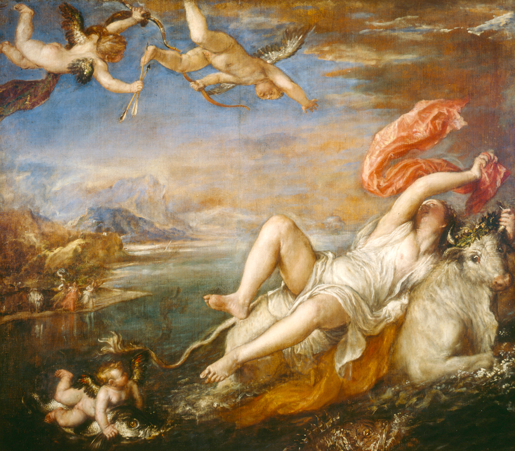
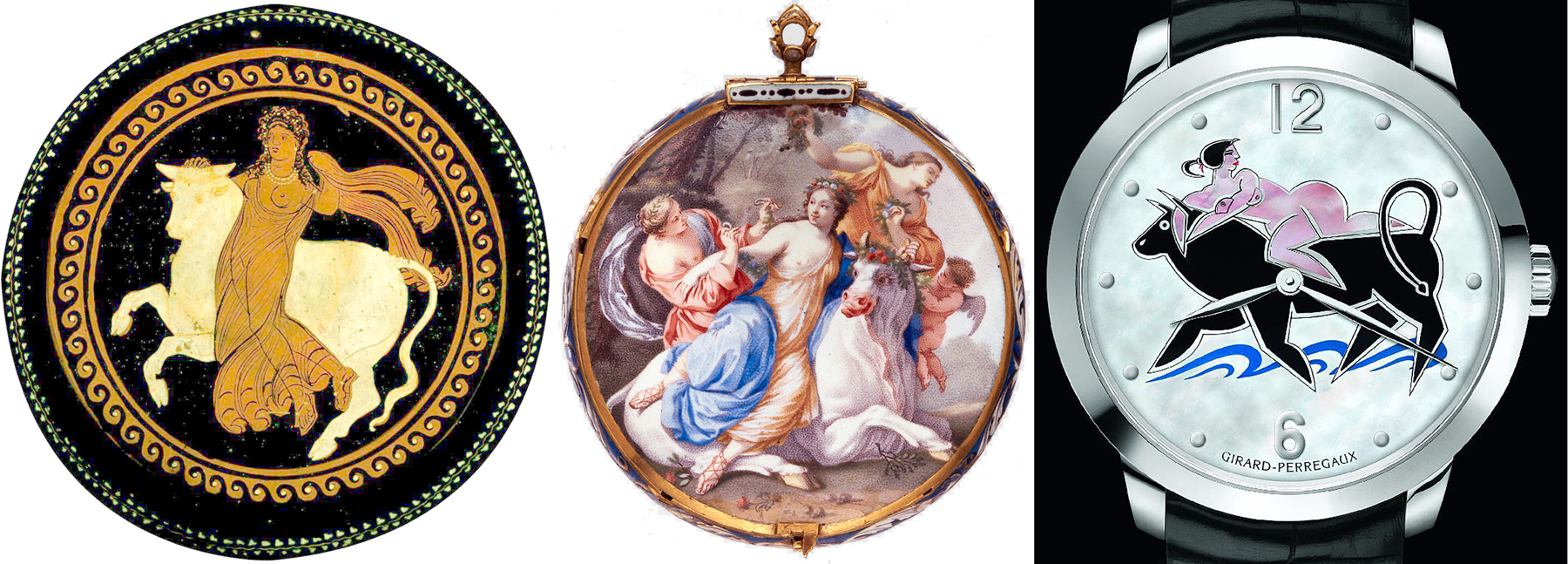
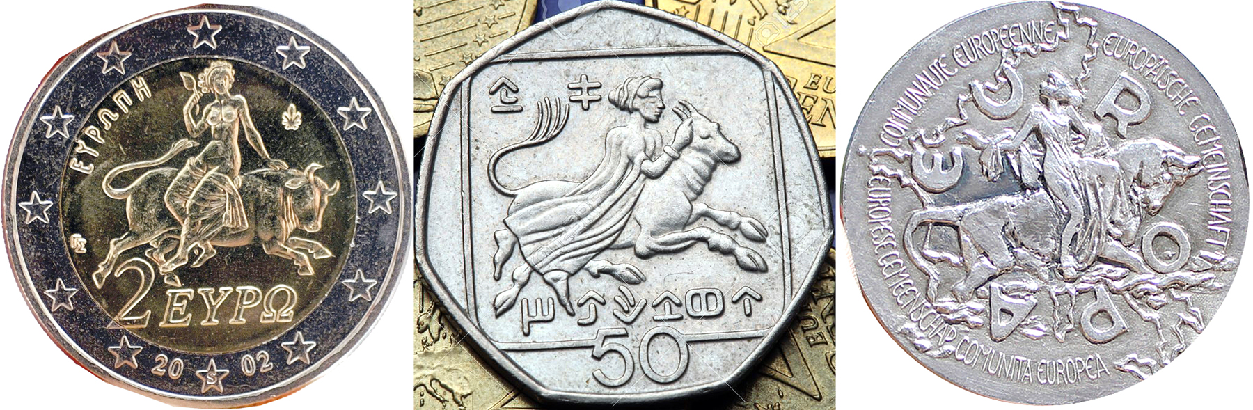
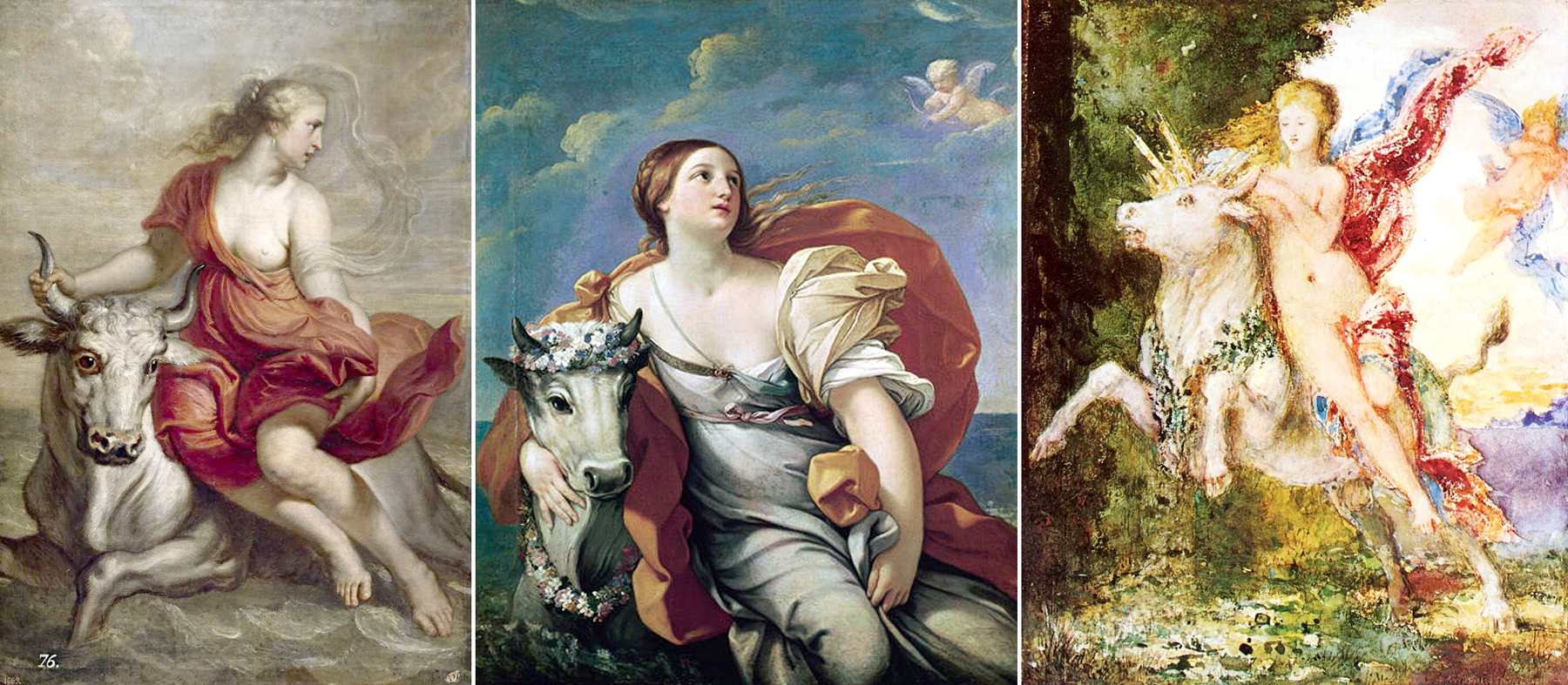
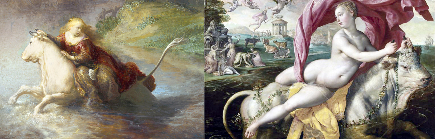
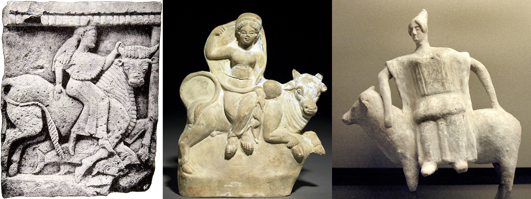
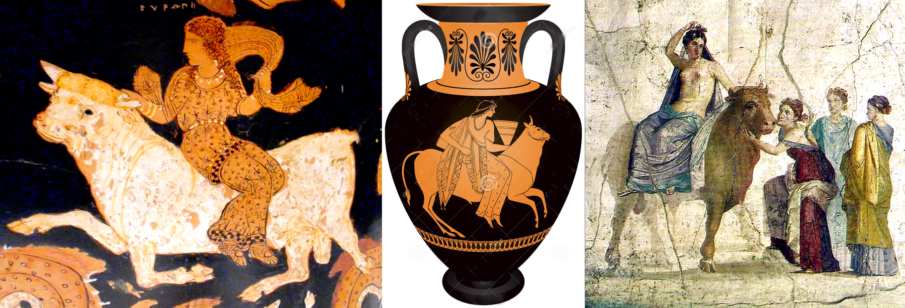
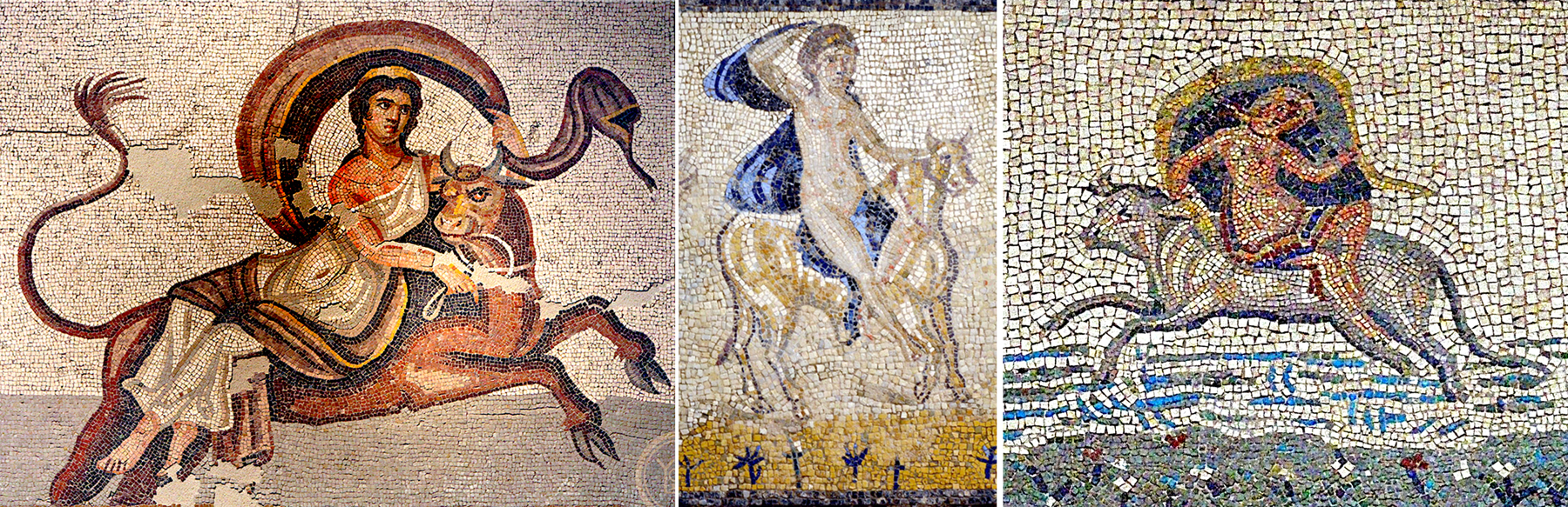
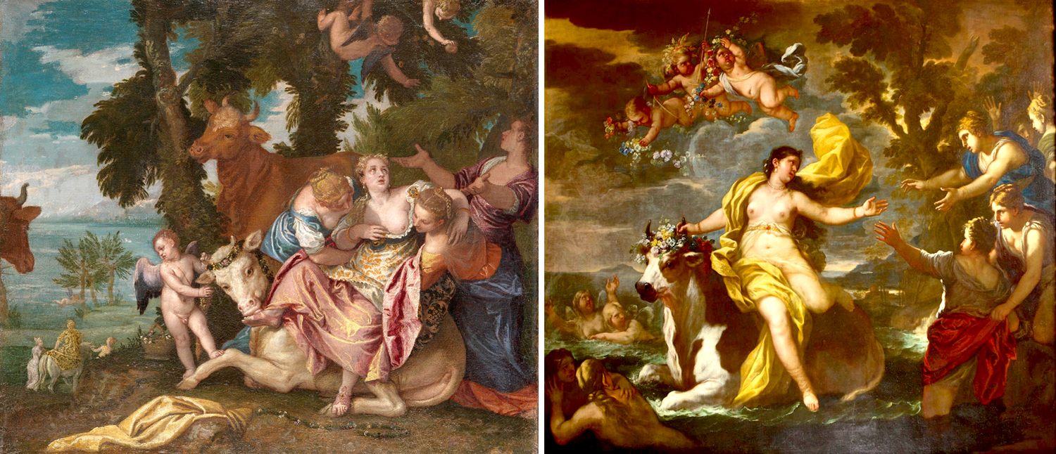
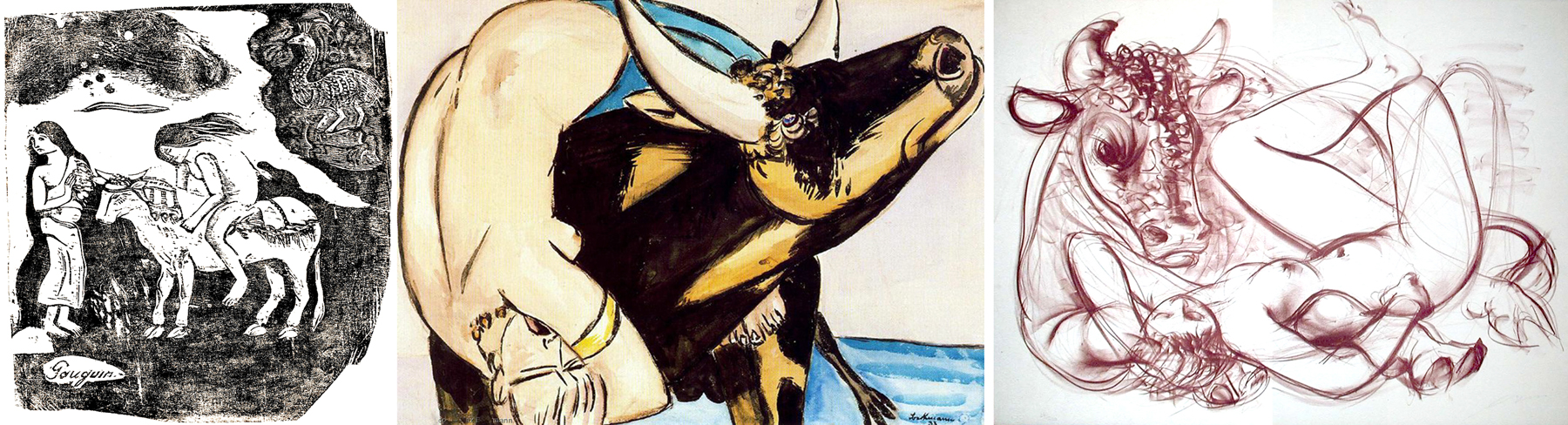
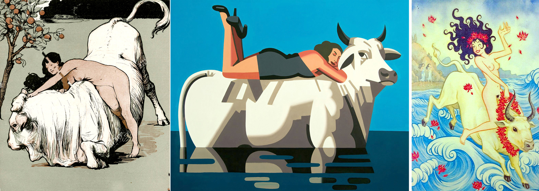
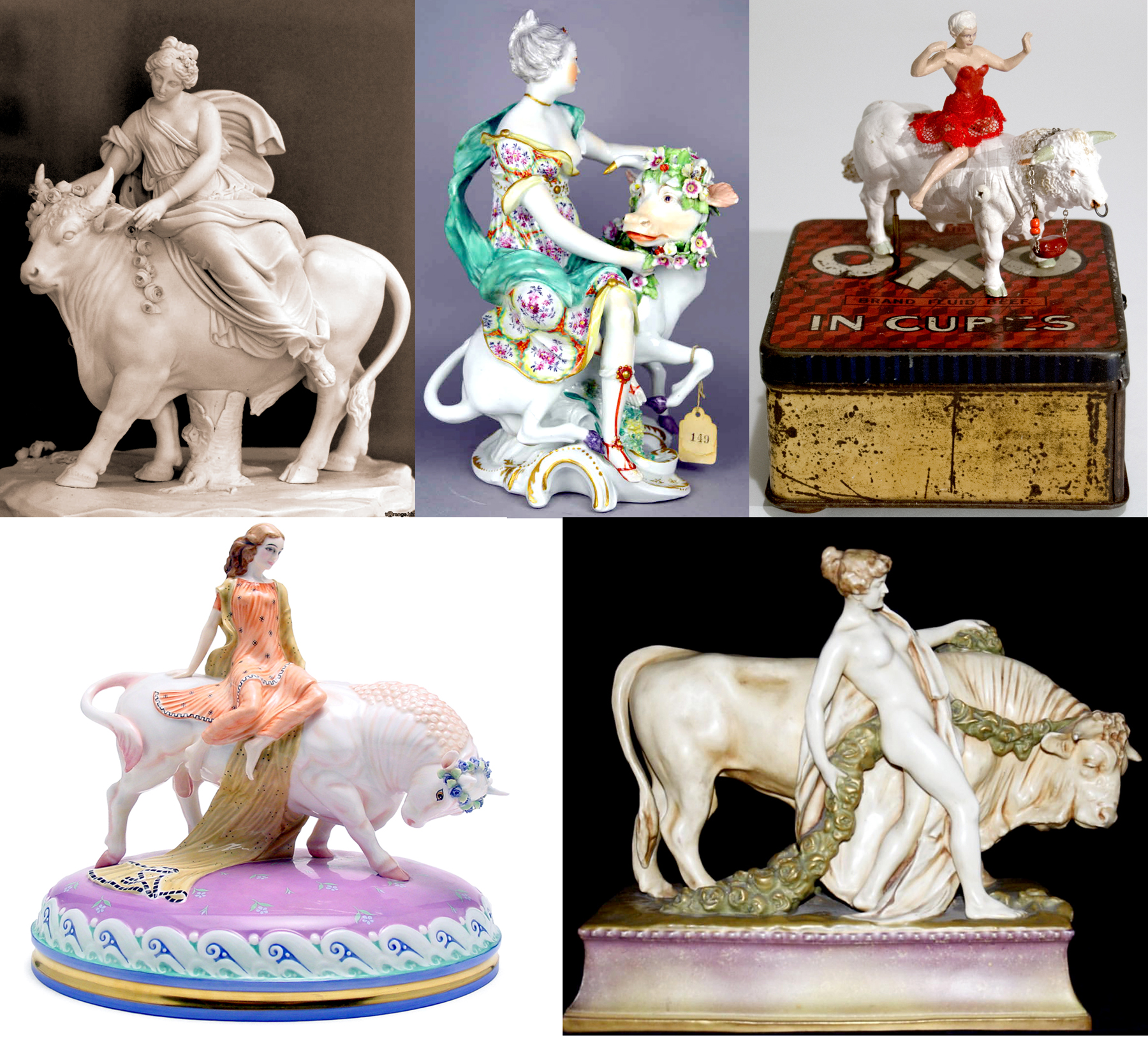
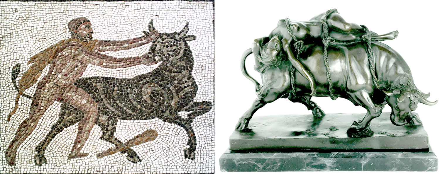
I have now collected more than a hundred images of drawings, paintings, sculpture and relief depicting Europa and the bull, usually with the girl holding the animal’s horn and her clothes sailing off behind her. 

The earliest of these predate Greek mythology: There are Babylonian figures of a woman riding a bull, and others from the Middle East. 

And of course, there are all those images of bull umping in Mnoan Crete.

There is a depiction on red-figure Greek vases and on the walls of Pompeii

and numerous floor mosaics — The Rape of Europa seemed to be a popular image for Roman homes. 

But it was later, in the Renaissance and Baroque ages that Europa exploded with painters and sculptors. Every artist who was anybody did at least one version of the story, usually a vast mythological scene with the bull and the virgin, but also various putti and godlets swirling around. 

The iconography is fairly uniform: The bull is usually white, the girl hangs on for dear life to a bull horn, and her clothes sweep away in a grand gesture. In some, the shore features her distraught friends, in others she sits lovingly on the gentle beast, before the mad dash. 

There are modern versions, too. Some are by serious artists, such as Gauguin, Max Beckmann and Hans Erni.

Some are more kitschy or popular.

There are modern sculptures.

There are figurines by the dozen.

And there is at least one drawing that, compared with the Rococo version of Jean-Francois de Troy, make absolutely clear the brutality of the story as rape. 

It needs to be pointed out also, that the bull shows up over and over in mythology, like with Hercules and the Cretan Bull, or, closely paralleling the story of Europa, there is Dirce, who is punished by her twin nephews by being tied to a bull and ridden to her death. 

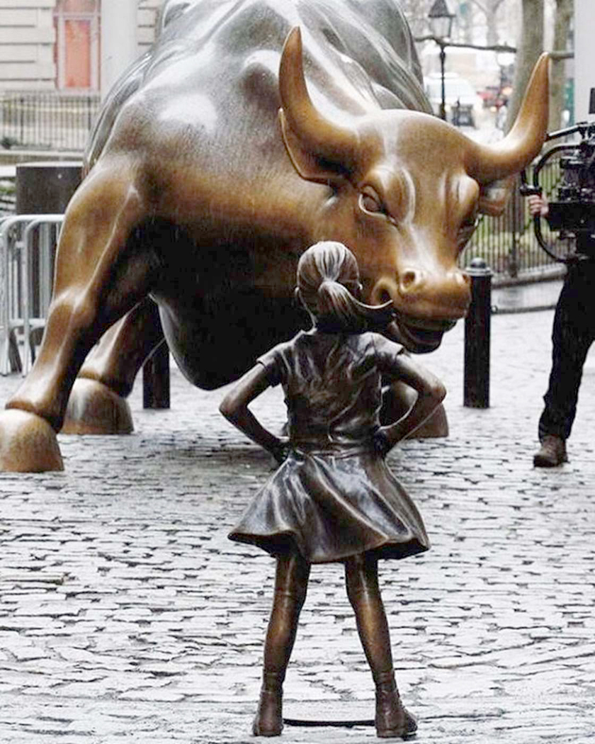
But I want to end with a version that may not have been intentional, but has a wonderful resonance as it makes a contemporary political point. It is the girl facing the bull on Wall Street. Called “Fearless Girl,” by Kristen Visbal, it was originally a kind of publicity gimmick for a Wall Street firm, erected in 2017, but became a symbol for feminism and anti-capitalist protest, as it was first positioned in front of the iconic 1989 “Charging Bull” by artist Arturo Di Modica. Complaints from De Modica and support from protesters and NY Mayor Bill de Blasio ended in a 13-month standoff, but eventually, the “Fearless Girl” was moved. 

I think of it as Europa gets her own. 

Click on any image to enlarge 


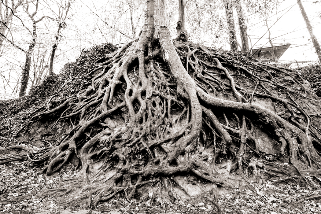
We all have roots. We draw up family trees, naming as far back as we can our ancestors; sometimes we discover Charlemagne or Henry II hiding in the branches. Many of us have tested our DNA to discover the nameless past before that and perhaps trace our route from Africa through Europe or Asia by haplogroup. 

There is a lineage — a straight line that leads from some familial Adam to ourselves. Or at least, we see it that way: The reality is messier. Each of the names above ours on the family tree doubles; parents, grandparents, great-grandparents and so on. That lineage becomes a mesh, a network of interconnectedness. Thousands of Adams and their Eves woven together.

Yet, there is still the sense of having gotten from there to here. A sense that, however complex the root system, the florescence is now. 

This seems to me to be true culturally as well as genetically. I am certainly American, with my bona fides in Thoreau, Emerson, Whitman, Dickinson, Melville, Hawthorne. But there is still something behind those names. When one marries and begins a family of one’s own, there is still the family in which you were raised and it never really goes away. One day when you are 50, you look down and at the ends of your arms you discover your father’s hands. Or you find yourself saying something that rings the bell of remembrance: This is what the old man used to say. Your wedded family, like your friends are acquired later, but your original family stays with you forever. It is somehow more unshakable than the one you later don. You may divorce a first wife, but you can never lose your birth family: It is traced in your muscle and bone. 

And it is, at least for me, the same for the culture I resonate to. I find ever more as I grow older, that I am at heart European. It is European literature, music, thought — even landscape and city — that I respond to. France has always felt like home to me. And the painting and sculpture of the Old World — from Ancient Greece, through Rome, the Middle Ages and Renaissance, through the Enlightenment and into the horrifying terrors of the 20th century — they all speak to me more directly than the neotenous and optimistic culture of the New World. 

This is not to claim any supremacy for Europe. There are many great cultures in the world, and just as one knows one’s own family may not be the greatest one — indeed, it has its characteristic neuroses and scars — it is nevertheless your own and has a deep comfortableness and familiarity that you cannot get from other families. I am inoculated against any sense of European supremacy; I’ve read my Jared Diamond. But that can’t change my cultural genes.

And so, I see my grandfather’s nose taking over the center of my face. I find the patience so inborn in my father taking over my own, and his natural moderation in all things political guiding my own, and overtaking the youthful certainty and idealism that drove me to chant “Hey, hey, LBJ” and stew in a smug self-righteousness. 

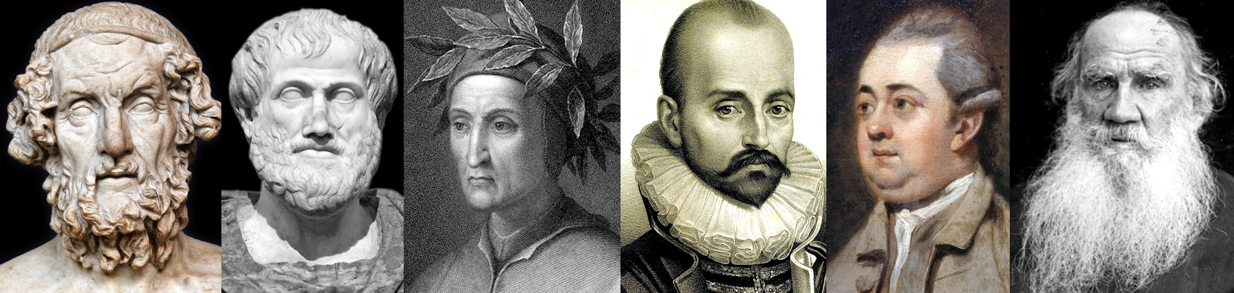
So, there is Homer, Aristotle, Ovid, Montaigne, Dante, Gibbon, Tolstoy — these are my cultural parents and great-grandparents, and I find their hands at the end of my cultural arms. 

Yes, American culture owes a great deal to Africa, Asia and Native America, but underneath it all, the “dead White guys” are peeking out. Whether it is Indian art on canvas or blues riffs over triadic harmony, the basement layer supporting all the ethnic and cultural overlay, all the borrowings and tinctures, is European.

It’s so etched into the American memory, even on a pop-culture level,  that it’s the starting point for all American culture, both highbrow and lowbrow. Can we recognize it when we see it? Do we know how European we are? The older I get, the more I know it. Others feel the amalgam in their blood. They grew up on pop music and TV. I grew up on Stravinsky and Bach, and the pop culture never quite took hold. 

First, what do we mean by “Europe”? We sometimes have to laugh at any definition of Europe; after all, Europeans cannot agree on it. The European Union is now contemplating whether Turkey is part of Europe — a Muslim nation in Europe, and the United Kingdom is trying to divorce itself from the rest of the continent, as if you could divorce your parents. 

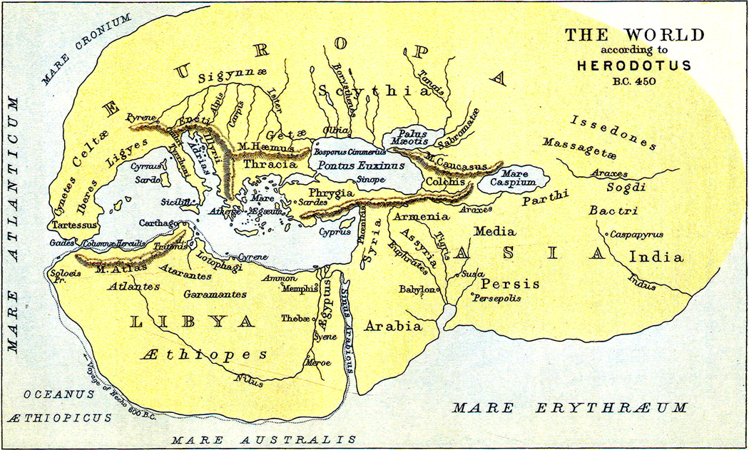
The continent got its name from ancient Greece, which divided the world into three: Europe was where “we” lived; to the east was Asia, meaning primarily Persia, the Levant and what is now Turkey; Africa was usually called Libya and included Egypt and Ethiopia. These three continents were surrounded by Ocean, the great river that circled the known world. That is the world as Herodotus knew it. 

Nowadays, Europe usually is defined to include Iceland, the western end of Turkey as measured from the Dardanelles, and Russia to the Ural Mountains.

It’s a huge and disparate place, including cultures that are Mediterranean, Germanic, Slavic, Celtic — even Turkic. But when we talk generically about European culture and art, we most often mean that of Western Europe: a cultural tradition that began in classical Greece, spread through the Roman Empire and flowered again in the Renaissance.

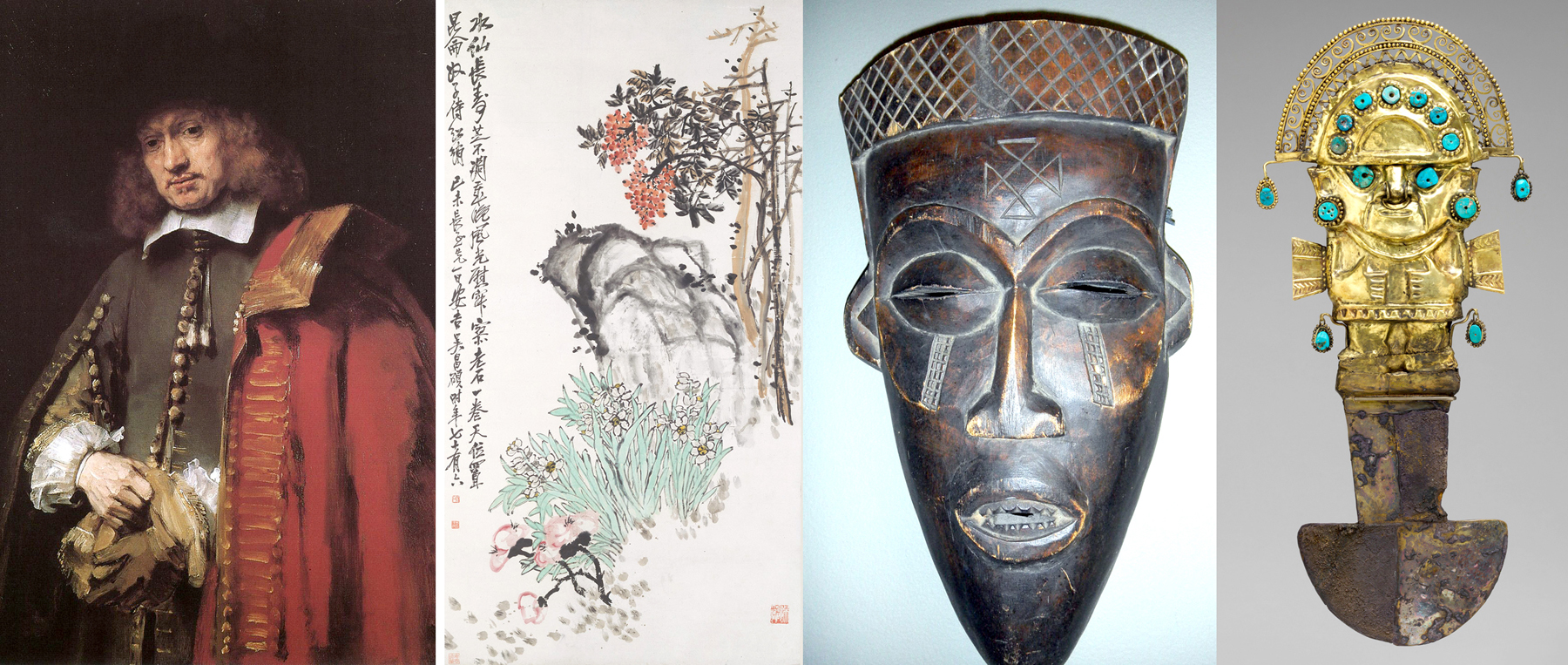
But what makes European art European? What distinguishes Michelangelo, Rembrandt, Beethoven, Shakespeare from art made in China, Ghana or Pre-Columbian Peru?

There are many things Europe gave us, from rationalism to colonialism, from democracy and humanism to the nation state and patriarchy, to say nothing of two world wars. Each aspect is cheered or booed, depending on whether you have come to praise Europe or to bury it.

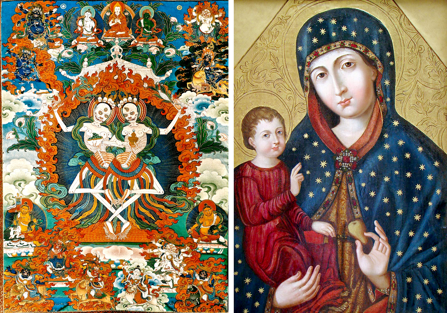
But there is something familiar to it, whether it’s a Madonna or an Apollo: It is the heritage I feel in a way that Japanese noh theater and Tibetan thankas — no matter how beautiful or meaningful — I do not.

(Do not get me wrong here: I try to be as cosmopolitan as possible. I’ve read the Mahabharata three times, Basho’s Narrow Road to the Deep North, Naguib Mahfouz, Jorge Luis Borges, and Mao’s little red book. As a teenager, I took up the use of the shizuri and sumi stick; I have a collection of African sculpture. I hope I am not a completely ignorant yob. But I can never drink as deeply from the vast elsewhere as I can from my backyard  European well.) 

For me, it is European art that is a touchstone for history, for ideas of beauty, for widely held social values, some of which are out of date and some of which are lamentable, even shameful. But an Old Master painting has just as much validity in our cultural ambience today as learning about Shakespeare in literature or Mozart and Tchaikovsky in music. It’s a huge spectrum of cultural experience, all tied into European art and culture.

What makes it European? I suggest five key things:

—First, there is a bias toward realism.

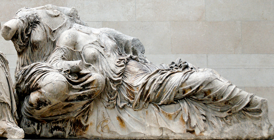
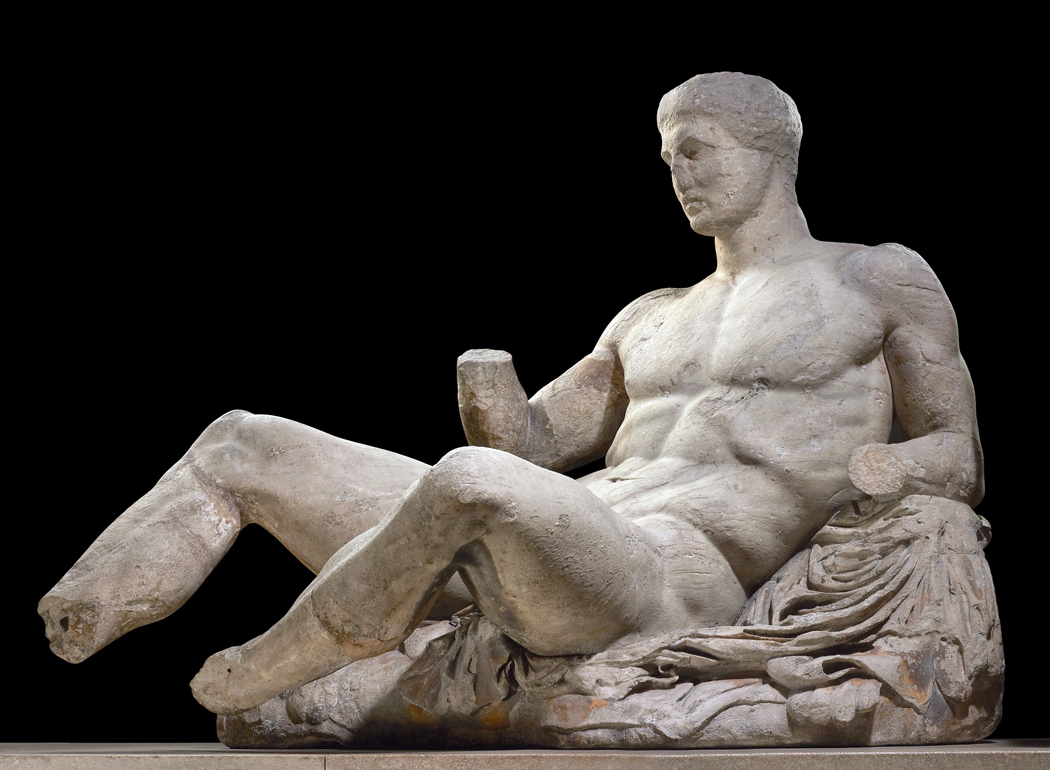
—Second, an astonishing persistence of Classical antiquity.

—Third, a belief, justified or not, in the idea of progress. 

—Fourth, the pervasive influence of Christianity.

—And finally, the singular importance of the human body and the nude that we might distill into the word “humanism,” a belief in the nobility, or divinity, of corporeal human existence.

(Also, in music, the use of harmony as the basic building block.) 

Deeply rooted realism

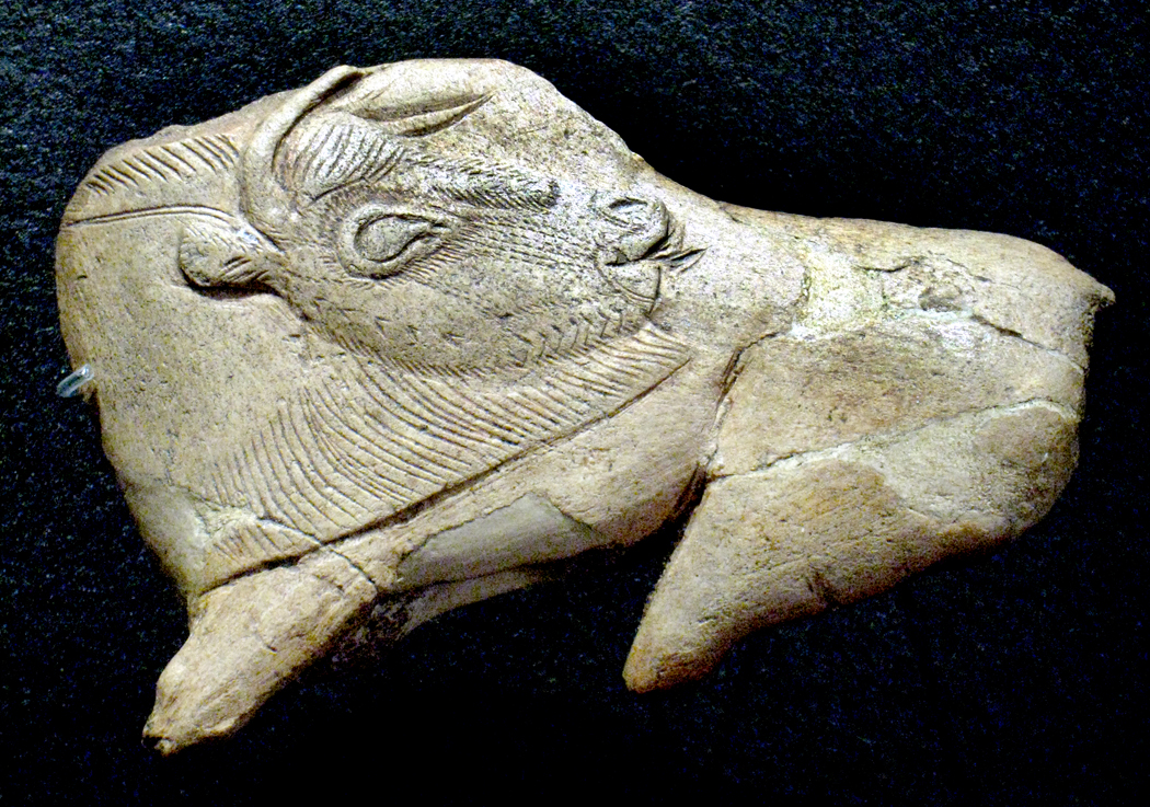
In the caves of southern Europe you can find the world’s oldest art, dating to 30,000 years ago. Even that long ago, proto-European artists created paintings that looked like the world they lived in: the aurochs and horses of Lascaux and Altamira often are so naturalistic that they can be taxonomized by zoologists into genus and species.

Prehistoric art from other cultures — South African, Australian and Southeast Asian — tend to be more diagrammatic: symbolic stick figures rather than shaded, colored images mimicking what the eye sees.

Aristotle said it 2,300 years ago: “Art imitates nature.” You can see it in Greek art from the fifth century B.C. The Greeks were intensely interested in realism. It is not just in the physicality of the statues, the lifelike figures, but in the drapery that clothed those statues. Later European artists, going back to that, like Poussin or Courbet, those lush mythological landscapes with that gleaming pink flesh. It is a love of the actual, of the real, physical world.

In our sophisticated provincialism, after a century of increasingly abstract and intellectualized art, we may think we have left all of that behind. But is Andy Warhol’s soup can any different?

Antiquity endures

We often say Europe was born in ancient Greece, which gave us so many of the philosophical and political ideas that we still live with. But even in art, antiquity remains in our lives. Go to any neighborhood and notice the homes with porticos, columns, architraves and pediments. Or listen to a pop tune sung in major or minor key and hear the remnants of a medieval and Renaissance idea of how the music of antiquity sounded.

Even in films, you have things like 300 and Troy. Even O Brother, Where Art Thou? is a take on Homer’s Odyssey. Theaters have their prosceniums and orchestras. 

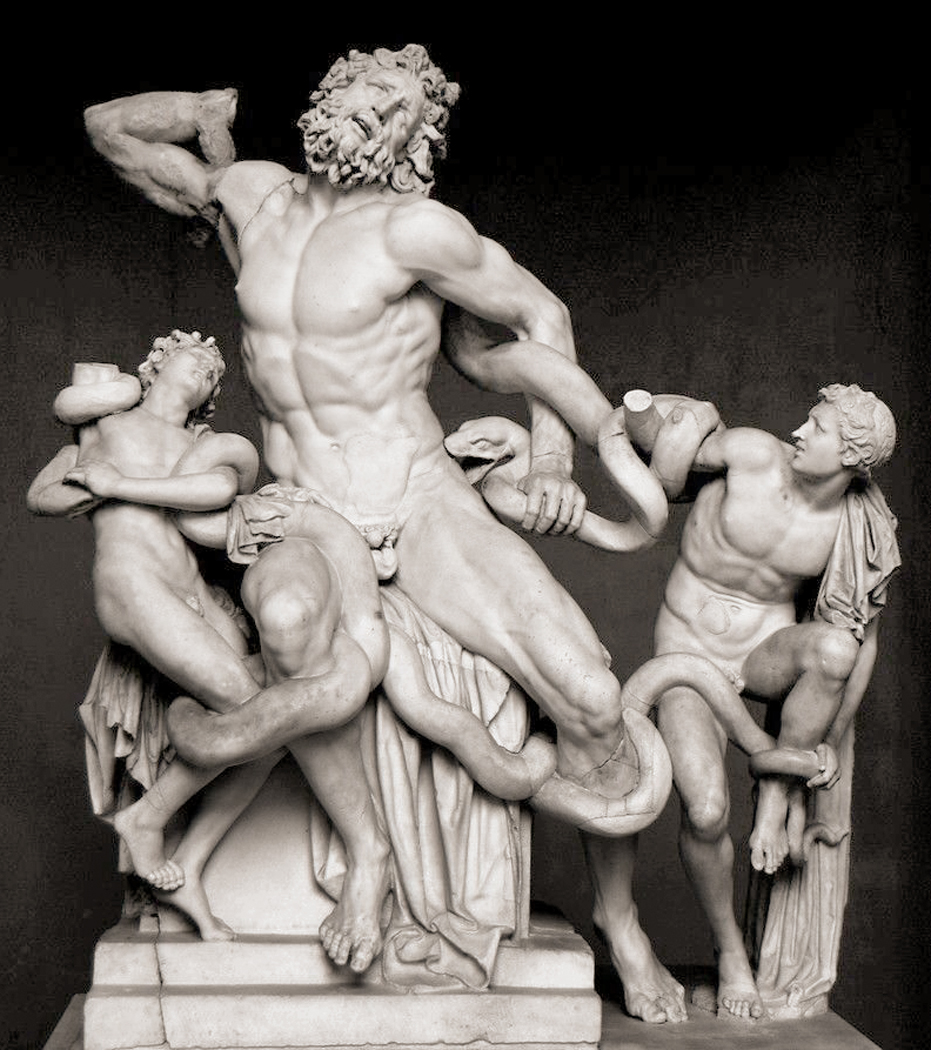
Our poets still write odes, 2,500 years after Pindar, and the statues in our city squares mimic the poses of Augustus and Constantine. Turn to the back of your Yellow Pages and you’re likely to see a chiropractic ad with a photograph of a man in pain, in the pose of the famous Greek statue of Laocoon. These things persist in our visual memory.

And where do you think that cupid on your Valentine’s Day card comes from?

Artistic progress?

Technological progress has been a hallmark of Western culture, and the tendency has been to see a parallel development in the arts.

Giorgio Vasari, writing his influential Lives of the Painters in the 16th century, argued that “one artist supersedes the last and is better.”  Always march on to the next style.

But while European art history is a parade of changing styles, science and medicine move forward and improve our lives, but it isn’t so clear in art. Is Tom Clancy really much of an improvement on the Iliad? 

It’s not so easy to embrace the idea of cultural progress anymore. Progress covers up a lot of really nasty stuff, like the looting of other cultures. And as we have come to know and understand other cultures better, it’s harder to maintain that our art is “better” than theirs. 

Christianity’s sway

If you were to name the single-biggest source of imagery in European art, you’d be hard-pressed to find anyone willing to step into the ring with Christianity. It’s the winner by default: The central role of religion in the arts is manifest. Just as Islam governs the art of the Middle East and Buddhism colors the art of China and Hinduism the art of India, so the themes and subjects from the Bible are central to Europe.

Christian themes are an overwhelming component of the European sense of morality and ethics. It is through Christian stories, illustrated in art, that we see how we should think about our own lives. The good Samaritan, the prodigal son, doubting Thomas, the woman at the well — these serve in our art as parables and lessons.

At one end of the spectrum, you have the universal grief and suffering of Michelangelo’s Pieta. At the other end, you have the plastic Jesus riding on the dashboard of your car.

The human figure

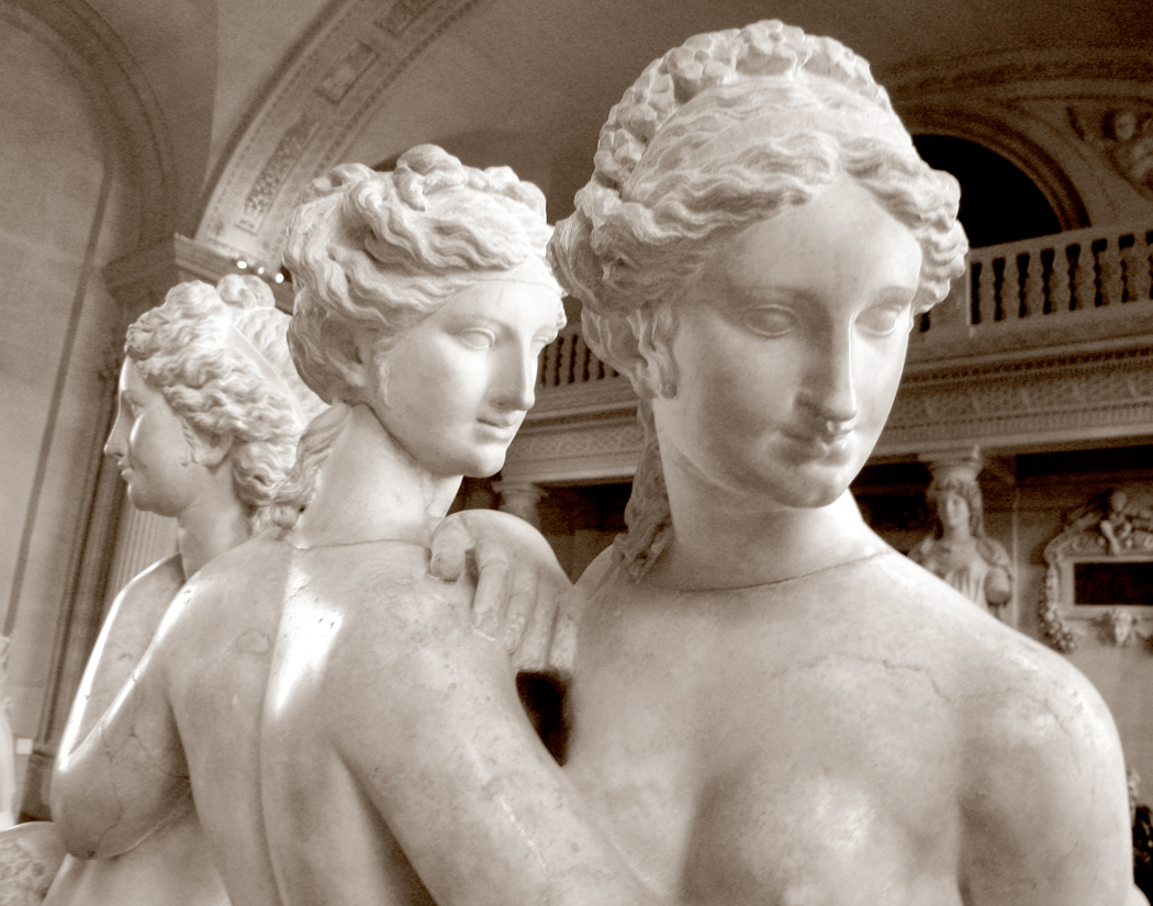
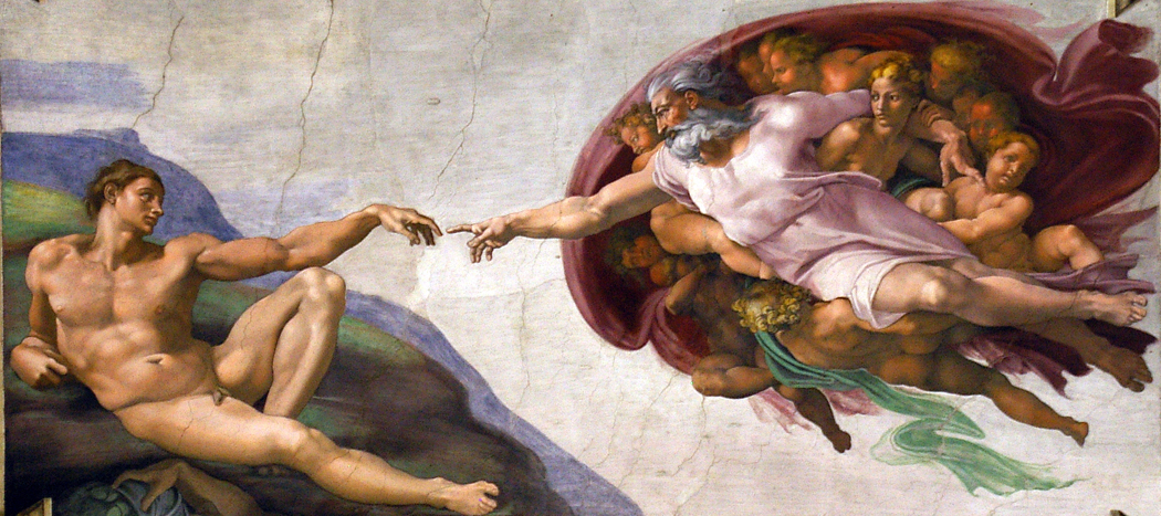
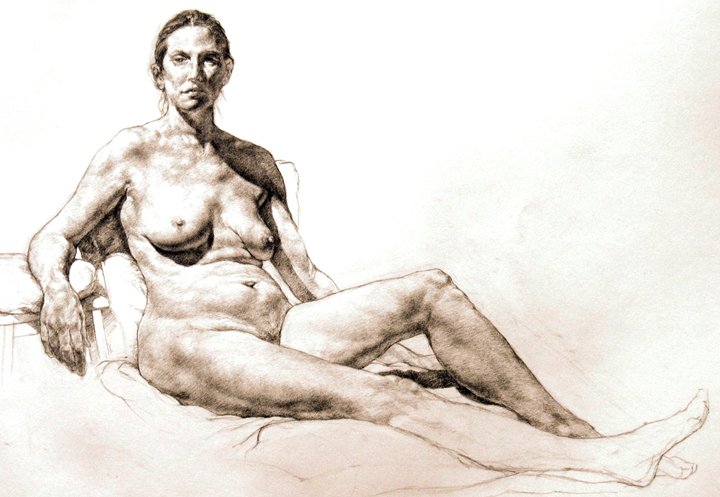
It has become an emblem of art: The nude figure. Whether it’s Aphrodite born from the seafoam, King David gazing at a naked Bathsheba or the painter’s lover dropping her dress in the studio, the human figure is primary.

It isn’t just men ogling naked women: It’s Myron’s Discus Thrower and Michelangelo’s David. From the Greeks on, the male nude is just as important.

You won’t find this in the art of Asia, Africa, Australia/Oceania or the New World. When you find the naked figure there, it is almost always a fertility talisman or a figure with exaggerated sex. In Asia, you find such things in “pillow books” and other intentionally pornographic images. In Europe, the figure isn’t only sex and generation, it’s a mirror of the divine. It is man as the measure of all things, and that means men and women.

‘Dead White males’

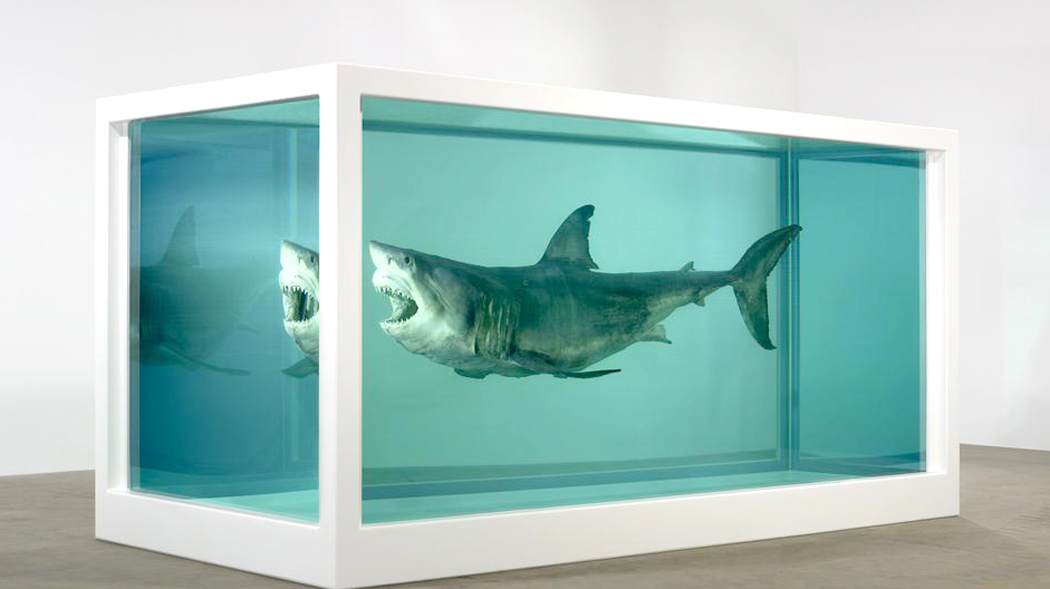
It has been a long ride from the caves of southern France to the latest pickled roadkill of Damien Hirst, and European culture has changed at least as much as it has persisted.

Listen to the music of Osvaldo Golijov, for instance, and hear the legacy of Beethoven mixed with the Arabian oud, the Balinese gamelan, the pipa of China and Peruvian flutes. It’s all one big mix.

As Europe has changed the cultures it has come in contact with, its own is being changed in return. Globalization isn’t only economic.

But there’s still a great deal to be learned from the long march we have taken. We think it all must be irrelevant because it comes from so long ago. It’s what people mean when they complain about all that art, literature and music from the so-called “dead White males” that have been taught in universities for centuries. Yes, the world has opened up to include more, but the old art is still as meaningful as ever.

Cultural DNA

Just as genealogy fascinates many people, who trace a great-great-grandfather back to the battle of Appomattox or look at old photos to see in faded black and white where the family nose comes from, so a look at our cultural ancestors shows us where we came from. That cultural DNA is still there.

Again, this is not to make any special claims for European culture: It can speak for itself. And the rest of the world is equally compelling. I love Chinese painting, African carvings, Australian designs, Hopi pottery. The case I’m making is that for myself — and I am speaking primarily for myself here — there is a nest in Europe that my psyche fits almost perfectly. Fragments of its past often show up unacknowledged in my prose or my photographs. The art and poetry speaks a language I was born to. I get the idioms, when other cultures, no matter how much I love them and respect them, are a second language — its idioms will always elude me. 

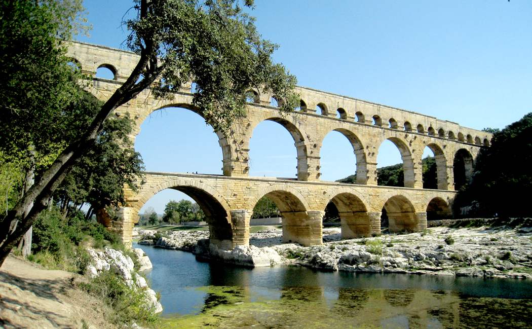
When I go to Brittany or the Vosges Mountains, or visit the Roman arena — now a bull ring — in Arles or the aqueduct at Pont du Gard, or see the stained glass at Saint Denis, or the stave churches in Norway or the polders of Holland, I have an overwhelming sense of being home. This is my family, for all its faults. 

Click on any image to enlarge

The world is not black and white, but until fairly recently, photography was. For most of its history, the art was an art of silver on paper, spread from inky blacks through velvety grays into pristine whites. 

There had been attempts to add color, either by painting on top of the monochrome image, or by various experimental techniques to capture the color directly. But even after the commercially successful introduction of Kodachrome in 1935, photography as a museum-approved art continued to be primarily in black and white. 

(In cinema, Technicolor predated Kodachrome by about a decade, but that process was essentially three different black and white negatives overlapped through color filters to create the effect. It was an expensive and difficult process and relatively few films, percentage-wise, were made with the process until after the commercial success of Gone With The Wind and The Wizard of Oz in 1939.)

I have been a photographer for at least 50 years. I have had shows and my work has been published. But for most of that time, I worked in monochrome. I “saw” in black and white. My photographic heroes worked in B&W, the techniques I mastered were silver techniques. I became an excellent printer. But I seldom used color film. It seemed an unnecessary noise to bring to the purity of the medium. 

I was hardly alone in this. When I was younger, even museums shied away from color photography. It was seen as not “permanent.” It’s images faded over time (I’m sure you all have old family snapshots turned rather magenta with age). The real artist-photographers used silver or platinum and made glorious images. 

Back then, art in general was seen with more precious eyes. We thought of “archival processing,” and even paintings were carefully preserved and curators looked down on some artists — such as Jackson Pollock or Mark Rothko — who used non-archival pigments or unprepared canvases and whose works, therefore, had begun to deteriorate. 

In current times, few artists or galleries worry much about such things. Art can be made on newsprint, or can even purposely self-destruct. Concern for the permanence of an artwork is seen as elitist. After all, no matter how careful you are, the art is going to be gone eventually, even if it lasts till the sun explodes. 

And besides, color is now no more or less permanent than black and white: Now they are both nothing but ones and zeros. Silver is dead; long live digital. 

Yet there is still a difference between color photography and black and white. It is a difference not simply of technique, but of thought. Thinking in color is different from thinking in black and white. 

The part of vision that deals in color is processed in a different area of the brain than the part that concerns itself with darks and lights. (Vision is ridiculously more complicated neurologically than you might think — the information on the retina is broken down into many separate components, processed by differing regions of the brain and then re-coordinated as a gestalt.)

And so, some people pay closer attention to the hue, others to the forms they see. 

The fact is, black-and-white photography and color photography are two different art forms. To be successful in both requires a kind of bilingualism. Most of us have brains that function best either in seeing forms and shades, or in seeing hues. The two photographies emphasize those different talents.

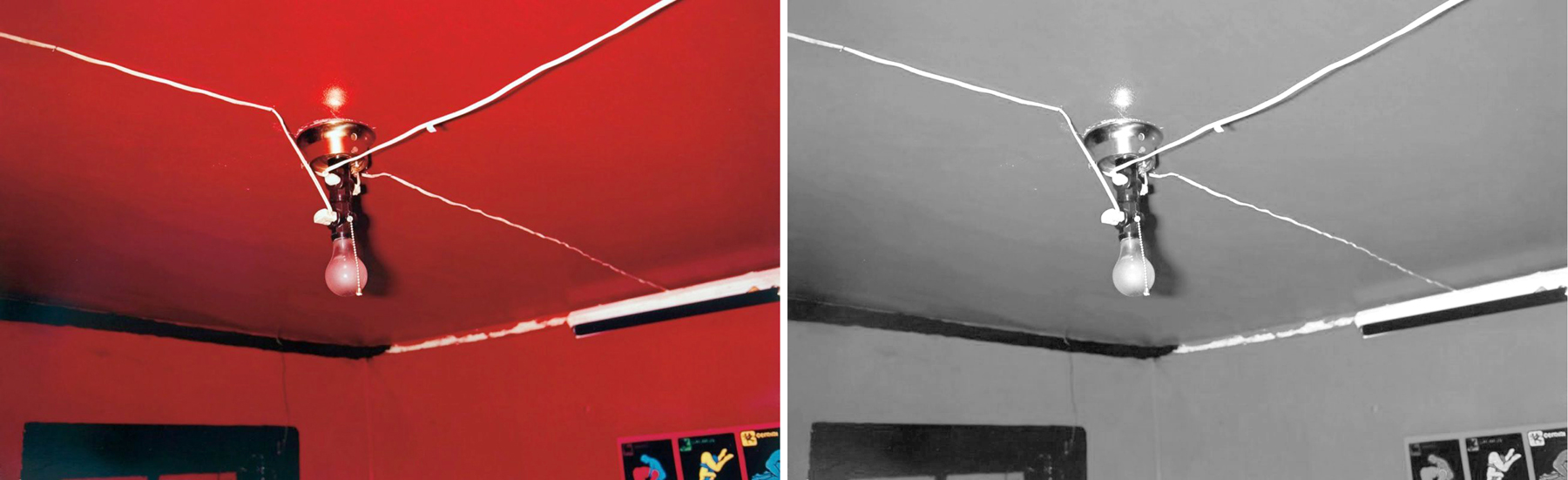
One has only to consider the work of Stephen Shore or William Eggleston. Most of their meaning comes through the color. Take one of Eggleston’s best-known images and suck the color out. What have you got?

He made this photo of a ceiling and light bulb. The red is overwhelming. But imagine it as a black and white image.

He also made a similar image of a brothel ceiling painted blue. Also overwhelming. The two are nearly the same image, but with very different emotional and sensuous meanings.

But if we make them both black and white, they very nearly merge into the same thing. 

Color can by itself separate forms. Here are four squares in four colors; as distinct as can be. But the exact image, unaltered except for the draining of all color from it, leaves a confused mess, barely a separation between grays. 

Black and white photography requires the separation of parts not by hue, but by contrast: Lights agains darks. It’s what makes great silver prints sing. Where color photographs separate forms primarily by hue, black and white shapes form with contrast.

I am not saying a color photograph has to be garish. Far from it. But the color will carry a good deal of the meaning and emotional resonance of the image. Even in a color photo that has hardly any color in it.

Many years ago, I tried an experiment. Like so many others, I loved the waterlily paintings of Claude Monet. But I wondered if they would make as much sense in black and white. Is there a structure holding the pictures together, a design or composition, that didn’t depend solely on the rich color. 

So, I began making photographs in black and white of water lilies. 

The most successful of them clearly relied on bright highlights and strong shadows. The shapes made the picture.

If I tried an overall design, like Monet’s the picture lost its strength. 

I did the same experiment with one of Monet’s paintings, rephotographing it in black and white. 

Did it hold up? It is certainly a very different beast. 

Then I went back to one of my own color photographs of his waterlilies in Giverny, a photograph that imitated Monet’s paintings, with color, sky, reflection, shadow and lily. In color and side-by-side, in black and white. 

What I discovered shouldn’t be a surprise: Monet was much more effective in color. But I also noticed that because my photos were well-focused rather than impressionistically fuzzy, they translated better into black and white: Black and white is meant to clarify shapes. Color identifies “areas” rather than discrete textures. 

And so, while I have spent the majority of my photographic career making monochrome images, along with many others now working in digital media, I switch back and forth between color and B&W. They do, however, require different vocabularies. They are different languages. 

While I have always made visual art, I made my career in writing about art. 

As an art critic, I had the unusual need to be bilingual in an odd sort of way. As a journalist, I needed to be good with words, but in writing about art, especially visual art, I needed to know how to use my eyes.

I discovered very early on how these two talents were seldom granted to the same person. All around me were reporters who knew a gerund from a copulative, but who often seemed almost infantile when discussing pictures. They could name the subject of the image, but not go much further than that. 


A photo editor of my acquaintance once explained photojournalism this way: “I need to know it’s a house; don’t trick it up with ‘art.’” This was image as ID photo. 

But on the other side, so many artists I knew couldn’t explain themselves out of a paper bag. They effused in vague buzzwords, words that changed currency every year or so. I once taught a graduate course in writing about art for art students who needed to prepare so-called “artist statements” for their exhibits. Most of what they wrote before the course was utter blather, obscure and important-sounding without actually meaning anything. 

Words and images: Worlds seldom interpenetrable. I call the talent for riding both sides a form of bilingualism. 

I do not know if the ability to deal in multiple “languages” is something you are born with, or that you learn early on the way you acquire language before the ability to do so closes off in adolescence. But somehow, I managed to do it, at least well enough to write about it without embarrassing myself.

The mental juice necessary to process each seems walled off from the other, except in rare cases. One either runs a literary program, based on sentence and paragraph structure, linear words building a whole out of alphabetic parts; or one comprehends shapes, lines, color, size, texture, and frame as carrying the information required to convey meaning. 

This doesn’t mean that visual people are illiterate, nor that literary people can’t enjoy an art gallery, but that their primary modes of understanding vary. The squishiness of an artist’s gallery talk can drive a writer bonkers; the flatness of a word-person’s understanding of a painting can leave an artsy type scratching her head: “Can’t you see?” 

Nor does it mean that either side can’t learn, although it will remain a second language, without native understanding of idiom and customary usage. A word person can be trained to see shape and form, but it will always remain as I learned Spanish. No one will ever confuse me with a native speaker.

This split between word and image, though is only one of the bisections. Musicians can think in tone the way painters can think in pigment. Yes, there is a language that can describe the music, but for non-musicians, that language is usually impressionistic and often visual — what the music “makes you think of,” or the “pictures in your mind.” 

For the musically trained, there is also language, but it is completely opaque to the civilian: Dominant-seventh, voice-leading, timbre, reed trimming, tenor clef, Dorian mode, ritornello, de capo, circle of fifths. But even these are merely words to describe the non-verbal reality of the music itself, which can convey meaning through sound alone. The words are not the music. 

The ability to think in the terms of each mode is essential to create well in that form, and a mighty help in understanding it for the audience. If you are not in love with words, the rich cream of Gibbons or the organ tones of Milton can leave you cold. If you have no eyes for color, the nuance of Turner or the pears of Cezanne can zip past without notice. If you think of pop tunes as music, the shifting tonal centers of Schubert are inaudible, the orchestration of Mahler merely noise. 

We each have a frequency our sensibilities are tuned to, and can receive it loud and clear; we may think we understand the rest, but too often we are only fooling ourselves. Do you really inhale the contrapuntal movement of a Balanchine chorus? Do you notice the rhythm of editing in a Spielberg film? Each is a language that its practitioners and connoisseurs understand profoundly, but zip past the mass of those sitting in the cheap seats. 

It’s a different language

Click on any image to enlarge

The day after the fire that destroyed the roof of Notre Dame de Paris, more than a billion dollars have been pledged toward the reconstruction, and French President Macron has promised the work would be completed within five years.

But already, a backlash has begun, a rearguard action, to prevent any “modernization” of the building in its restoration. This reaction demonstrates a misunderstanding of what a Gothic church is, and its peculiar history.

Fires are not the exception, but the norm for these buildings. Hardly a one has survived from inception without at least one grand conflagration. Indeed, most catalog a history of fires and collapses, followed by rebuilding, and almost always in a newer and more modern style than the original. For the norm of the Gothic style is its constant change and adaption.

Now, I’m not suggesting that Notre Dame de Paris should be rebuilt in the style of Frank Gehry, but I am suggesting that it is a sentimentalism and a distortion to believe that any Gothic cathedral is “pure” and “historical.” They are all patchworks of styles and modernizations over the centuries. 

In fact, we would not now have Chartres Cathedral if the older building had not burned down in 1194 and wealthy donors had not given money to rebuild in a new style — the Gothic. 

There had been at least five cathedrals on the same hill in the town, each destroyed by fire or war. The first, destroyed in 858, the Carolingian replacement burned in 962, another in 1020 and another in 1134. In 1506, the north spire was destroyed by lightning and its replacement came in the newer “Flamboyant” style — making the two spires so unlike, which is the characteristic feature of Chartres. 

In 1836, the lead roof burned and was replaced by copper. The flammable wood braces were replaced with cast-iron ribs. 

Most of the Medieval churches were constructed piecemeal over centuries, and in almost every case, styles changed over that time, and so Gothic architecture is an especially heterogeneous one: unity out of difference. 

The church considered the original Gothic cathedral, at St. Denis, north of Paris, was built by Abbot Suger and completed in 1144. But he kept a Romanesque Western facade, and filled in behind it in this newer style, with stained glass and a flood of light. 

When he died, the church had three parts: a Romanesque front, a Carolingian middle and a Gothic choir. In 1231, Abbot Odo Clement, Suger’s successor, updated the nave with a newer Gothic style and remade the triforium and clerestory of Suger’s choir and apse. As we see it today, the building is an architectural gryphon. 

Rouen takes that idea and runs with it. It was begun in 1035 on the ruins of a previous Romanesque site that had burnt down. Since then, the history of Rouen is one of calamity and rebuild. This constant reboot has made it a less harmonious jumble than one finds elsewhere, of ad hoc fixes, misguided redesigns and megalomaniac civic striving.
It is the Peter Abelard of cathedrals, and a book could be written on the history of its misfortunes. The previous cathedral was struck by lightning in 1110, and construction began on the current building. The new one burnt again in 1200, destroying all but the nave arcades, the Saint-Romain tower and the left portal, with work ending in 1250. It was struck again by lightning in 1284, was partially taken down and rebuilt in 1302, the spire was blown down in a wind storm in 1353. The construction of the Butter Tower in the 16th century led to disturbances in the facade, which had to be reinforced (finished 1530). 

The original Gothic spire had burned down in 1514 and was finally replaced by a wooden spire covered in gold-plated lead in 1580, paid for, in part, by the selling of indulgences. In 1562, it was damaged by rebelling Calvinists  during the Wars of Religion, when much of the statuary and windows were destroyed. The cathedral was struck again by lightning in 1625 and 1642, damaged by a hurricane in 1683. The choir burnt in 1727 and a bell broke in 1786. 

During the French Revolution, the church, like many in France, was deconsecrated and turned into a civic building and metal parts of the church were melted down to make cannons and cannonballs. The spire was again blasted by lightning in 1822 and a new one made from cast iron added in 1876 (making it the tallest building in the world until displaced from atop the list four years later by the cathedral at Cologne. (Then to the Eiffel Tower in 1889).

The misfortunes continued. In 1940, a fire damaged the building’s structure and burned that part of the city from the church to the Seine river, and later during World War II, the cathedral was bombed twice, first by the British, then by the Americans, just before D-Day. Parts of the south aisle were destroyed and the south tower burned. Much of the remaining stained glass was blown out, leading to the current situation with frosted glass in many of the windows.

Then, in 1999, a cyclone named Lothar destroyed one of the four wooden turrets surrounding the central lantern tower was blasted and fell crashing into the choir. The history of Rouen’s cathedral is one of constant upkeep and rebuilding, like trying to sustain a sand castle against the tide.

If anything is true of these prodigies of architecture, it is that there is no such thing as a Gothic cathedral — at least no such thing as a “pure” Gothic cathedral. Each has been built over decades, even centuries, and each has add-ons in different styles, rebuilds made more “modern,” and restorations by well-meaning finaglers such as the 19th-century Eugene-Emmanuel Viollet-le-Duc, who replaced damaged statuary, added grotesques and redesigned finials and gargoyles according to his Victorian sense of what Gothic style should be.
Viollet-le Duc

Viollet-le-Duc was put in charge of restoring Amiens in the late 19th century, and he added a whole new line of statues at the top of the west facade, called the “Galerie des Sonneurs,” or “Gallery of Bell Ringers,” a passageway arcade between the two towers. He redid a good deal of the statuary and had the cathedral floor redone to smooth out the cobbling of centuries of foot traffic. Modern standards for restoration were not part of his procedure. “To restore an edifice”, he observed in his Dictionnaire raisonné, “is not to maintain it, repair or rebuild it, but to re-establish it in a complete state that may never have existed at a particular moment.” In other words, as he might imagine it.

It is the genius of the Gothic style that it can absorb almost anything and still seem perfectly harmonious. Some historical styles that strive for unity require any additions to be matched stylistically or the new parts seem like carbuncles grown where they are least desired. (Can  you imagine an addition to London’s Saint Paul’s Cathedral designed by, say, Louis Kahn?) 

Burning of St. Paul’s 1666

St. Paul’s would not exist now, but for the burning down of the older Gothic cathedral in 1666, which had replaced one burned down, built after the Norman church burned in  1087. 

But Gothic is an accepting style. There is not much you can do to it and not have it welcomed into the family.

The past as we imagine it is always a shaky construct. History is always being revised, and those scholars who do the work are initially derided as “revisionist,” when, of course, that is their job. To quote the revered Firesign Theatre, “Everything you know is wrong.”

Take Beauvais, the tallest of all Gothic churches. It makers were proud, certainly, not only of the tallest church, but the finest, slenderest flying buttresses supporting the roof. But 12 years after it was finished, the roof collapsed. It seems to modern engineering studies, that a gale wind off the English Channel caused sympathetic vibrations in the structure and it shook apart. They rebuilt.

But the collapse, which caused concern about the engineering, and trouble fund raising to complete the whole left the church with only the choir and transept. At some point, it was decided that instead of using the money they had to finish the nave, they would use it to top the whole with a giant spire, which was finished in 1569 and left the church — at 502 feet high — the tallest building in the world at the time.

“We will construct a spire so high that once finished those who see it will think that we were crazy.”

Perhaps they were. Unfortunately, on April 30, 1573, it, too, came crashing down, along with three levels of the bell tower.

As described by author Elise Whitlock Rose, “On the eve of Ascension Day, 1573, a few small stones began to fall from its heights. The next morning, a mason, who had been sent to test it, cried out in alarm; the bearers of the reliquaries, about to join the Procession of the people and the clergy who were waiting outside, fled; — there was a violent cracking, — and in an instant, the vault crashed amidst a storm of dust and wind. Then, before the eyes of the terrified worshippers, the triple stories of the lantern sank, the needle fell, and a shower of stones rained into the church and on the roofs.”

This could almost describe the fall of the spire on Notre Dame de Paris this week. 

The choir at Beauvais was rebuilt once more, but without the spire. But the nave (except for one bay) was never completed, leaving Beauvais as the trunk of a cathedral, a mutilated fragment.

The shakiness of its construction continues to threaten the building even today. The inside, meant to be an awe inspiring sublime holy space, is filled with trusses and braces, attempting to keep the whole from final catastrophe.

This stylistic hodge-podge is something that you face in almost every Gothic survivor. One recalls the problem of Theseus’ ship, in which, over the years, every board, every nail, every rope has been replaced, one by one. And one asks, is this the same ship that carried Theseus home from Crete?

Or, more aptly, the Japanese temple, whose wood is replaced every 20 years. The grand shrine in the city of Ise has been replaced this way more than 60 times, yet is considered the same temple that was built in AD 692.

(It is widely believed — though not exactly true — that all the cells in a human body are replaced every seven years, yet we think of ourselves now as the same person we were when we popped out of the dark into this bright world.)
Reims has undergone something of the same constant renewal, like the goddess Aphrodite.

The modern cathedral was begun in about 1220 and was finally roofed in 1299, but work continued, adding details through the 14th century. A fire in 1481 required major reworking, finished in 1516, keeping to the Medieval style.

The continuous renewal of Reims began in 1610 with gussying up the central portal of the west facade. Nineteen statues of the central portal archivolts were replaced.

Later reworkings took place from 1727 to 1742 and from 1755 to 1760 to repair the deterioration caused by rain leakage and freezing. Many of the sculptures were repaired or replaced.

But the real overhauls began in the 19th century, as France began looking at its great cultural monuments and deciding to upgrade them. The earlier Enlightenment, for instance, saw the so-called Middle Ages as a time of irrationality and superstition. That age saw its ideals in classical Rome. But the 19th century, given in to Romanticism, idealized the very things the previous century had dismissed. So, in the 19th century (yes, beginning in the late 18th century — these things are not governed by calendar dates), you had a Gothic revival, a raft of novels set in castles, the knights of Sir Walter Scott, the cornball folly of Strawberry Hill and Victor Hugo’s Hunchback of Notre Dame.

The Romantic movement in art and literature idealized the Middle Ages, and books such as Chateaubriand’s The Spirit of Christianity, and Victor Hugo’s Hunchback of Notre Dame (to give it its popular title) revived interest in buildings that had been allowed to deteriorate or had been desecrated during the violently anti-clerical French Revolution.

In 1818, a catalog of Romantic and Picturesque Sites of Ancient France was begun, not finished, in 20 volumes, until 1878. And in 1830, the government created a post of Inspector of Historical Monuments.

Hugo wrote a pamphlet called War on Demolishers, to “stop the hammer that is mutilating the face of the country” by destroying historic edifices. He denounced “ignoble speculators,” who “vandalized” the great monuments to build cheap get-rich-quick developments. He called for a national law to protect the old treasures.

He also explained “There are two things in an edifice: its use and its beauty. Its use belongs to its owner, its beauty to everyone. Thus, the owner exceeds his rights in destroying it.”
Notre Dame de Paris before 19th C. restoration

Between 1826 and 1837, the first major interventions of the 19th century were carried out, replacing sculptures on the western facade. One after another, from then on, a series of restorers and architects tried to bring Reims back to what they considered the authentic and original designs of the cathedral. First diocesan architect Arveuf, then Viollet-le-Duc, the restorer of Notre Dame of Paris, who undid the modifications of 1481-1516 and replaced them with his own design.

After Viollet-le-Duc, Eugene Millet did the same thing to the south side of the nave. From 1879 to 1886, Victor Ruprich-Robert did the same thing to the north side. After him, Denis Darcy jumped in, working to 1904. From 1904 to 1915, Paul Gout reworked the western facade and parts of the chevet. The work was not quite finished when World War I broke out. The war did not treat Reims kindly. It was bombed and a good portion left in rubble.

It took another 20 years to fix what the German artillery shells had broken. Restorer Henri Deneux, began in 1919, clearing away debris and cataloging the fragments and installing a temporary roof. The glass was a particular victim of the war. Deneux had the guide of drawings made of the stained glass made before the war and had many of the windows rebuilt, sometimes from the shards of the originals.

By 1938, most of the restoration was complete,  but World War II was in the offing. This time, the windows were removed for safe storage and reinstalled after the war.

The attempt to make the Gothic church “pure,” or “as originally built” is a chimerical idea, only fancied beginning in the 19th century. And you found, in France, a renewed interest in the monuments left over from those discarded days. And discarded is the proper word: The cathedral of Notre Dame de Paris, for instance, was a crumbling shambles, stripped of most of its sculpture and left to be a ruin on the island in the middle of the Seine River. 

In addition to the ravages of time and 500 years, there had been various “updates” to the building, and then, before, during and just after the French Revolution, the sculpture on the door jambs had been removed and the Gallery of Kings above the western portals had been junked in a frenzy of anti-monarchical and anti-clerical sentiment.

But in an ironic stroke of luck, the central government appropriated and deconsecrated the church property in 1789, and thus became responsible for the administration and upkeep of churches, including the cathedral (know then as the Métropole), which had for a time been turned from a Roman Catholic cathedral into a “temple of reason” and then into a food warehouse.

Under the auspices of the state, a few clumsy attempts were made to restore the cathedral, but those attempts did more damage than good.

Then, in 1831, Victor Hugo began his personal crusade to repair and renovate the crumbling monument. He and others worked for a decade persuading public opinion and so, in 1841, a committee was established in Paris to consider the matter, and a year later, architect Arveuf was asked to submit a plan for the refurbishment of the cathedral. Several others decided to submit plans, also, and eventually it was the team of Jean-Baptiste Lassus and Viollet-le-Duc who were chosen to mastermind the restoration. Lassus had already spearheaded the restoration of Sainte-Chapelle, and Viollet-le-Duc had been in charge of the work at Vezelay. 

They were the two most qualified restorers of the age (and although Lassus died in 1857 before the completion of the work in Paris, Viollet-le-Duc went on to work on several more of the cathedrals and basilicas of northern France).

The project began in 1845 and didn’t finish until 1864. It was a huge project. Walls needed rebuilding, statues were carved and put back on the door jambs, all the gargoyle waterspouts that had been replaced over the centuries by lead pipes were redesigned and recarved. (The hideous lead pipes had caused the cathedral in the previous century to be compared to a hedgehog, with all the points spiking out from its walls). The windows were reworked, the doors remade, a new spire added to the roof above the crossing, and perhaps most remarkable — a series of 54 grotesques — “chimères,” or “chimerae,” as Viollet-le-Duc called them — were added to the gallery along the roof line.
Yes, that spire, so lamented in its collapse, was never Gothic, never original. It is a 19th century addition. 

Viollet-le-Duc and his partners sat at the crux of a change in restoration theory — at midpoint between the older ideas of just replacing worn-out parts with modern equivalents and the more recent concept of saving everything original as best as can be done. Viollet-le-Duc’s idea was not to put Notre Dame back to any historically accurate version of the building, which had changed over the centuries with add-ons and updates, but rather to create a vision of the “perfect completed ideal” of what the building would have looked like, if it had ever been completed according to a single plan.

In other words, a fantasy of what the 19th century wanted to believe about the Gothic era. 

Viollet-le-Duc wrote that, for him, restoration should be a “means to re-establish [a building] to a finished state, which may in fact never have actually existed at any given time.”

So, Notre Dame as we see it today, is a fiction, a 19th century overlay, almost a “Disneyfication” upon the remains of a 13th century building in an attempt to recapture what the Romantic 19th century believed to be the soul of the Medieval era.

But we should not be too harsh on them. Viollet-le-Duc was an astonishing person, the best-informed restorer of his time, who published the standard encyclopedia of Medieval architecture and design. His energy and commitment were legendary, and although he had his critics, there was no one else in the central years of the 19th century better placed to give us the Middle Ages.

And without him, the cathedrals of northern France would today be more like the ruins of Ancient Greece than like the awe-inspiring churches in which the Mass has been celebrated for 800 years.

The fact is, there is no “original” and “authentic” Gothic building to which we can point. All such churches were constructed over centuries, with changing styles, and continuous updates and remodelings. The Gothic cathedral is less a thing than a process, and Viollet-le-Duc should be seen as simply part of that continuing process.

And we need to remember that when attempting to repair the newly burned and mourned Notre Dame de Paris. And not be too “precious” about how it will be rebuilt. 

Certainly, the “forest” of wooden beams and joists will be replaced with reinforced concrete or steel, and the toxic lead roof sheathing will become either copper or titanium, with a patina to mimic the dull lead. And it will be architects who oversee that modernization. 

I don’t see a Buck Jones futuristic spire replacing the 19th century one — in fact, if I had my way, there would be no spire at all. But I leave that to the architects and designer who know very well what they are doing. 

Gothic should continue to evolve: That is, after all, what it means to be Gothic. 

Click any image to enlarge