It is midwinter spring, those few days that habitually show up in February with sunshine and temperatures into the 70s that fool you into believing that spring is close at hand, only later to kick you with plummeting temperatures and perhaps another snow. The National Weather Service predicts that for this weekend.
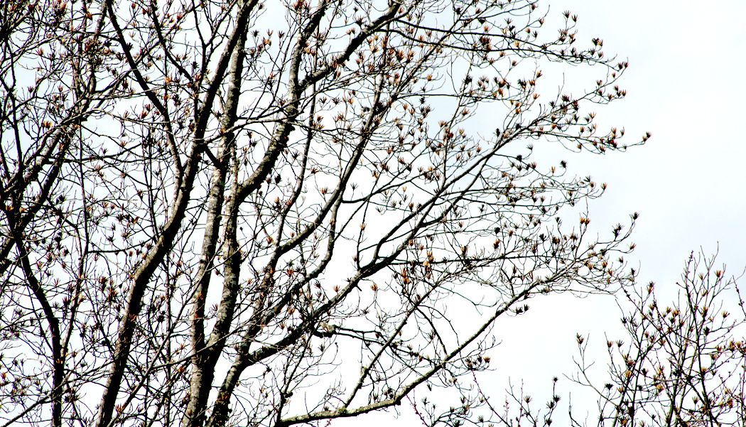
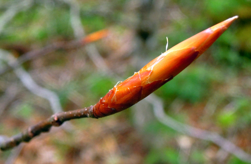
This is my favorite time of the year, when the bare trees begin budding at the twig tips. You can watch the trees change day by day, turning the dead sullen grey of December into something that clearly has a rising sap under the dull bark. When you watch the buds close up, their bud scales slowly separate, with thin lines of green beginning to spread at the edges.
Fifty years ago, my friend Sandro and I would annually take this time to camp at the Outer Banks. Off-season meant we had the sand and sea to ourselves and could walk five miles along the strand without ever meeting another human.
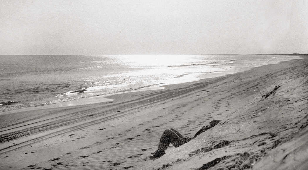
Sandro at Cape Hatteras, 1969
It was also Mud Season. You don’t read about it in literature, with its darling spring buds, its gold first green and its young sun half-run in the ram’s course. But there it is — early winter rains drained deep into soil and then turned hard as rock in the frozen air. November’s squishy footprint is turned to fossil, brittle as any sandstone, its edges wedged up in a tiny crater. But the February thaw, or later, when March brings those buds to stretch their scales, those footprints turn once more to watery goo, slippery under your shoe, sucking your heel right off your foot. It is what is wrong with pretty literature. Among all the pinking petals, among all the bright girls in spring dresses, among all the apple blossoms and greening grass to come, there is the mud, ripe, fertile, pliable in your squeezing fist, the one brown, crowning reality of the the coming spring, when there is mud again.
It is such elemental things that seem most real, most important. Culture changes, fashions change, but the cycle of seasons wears a constancy.
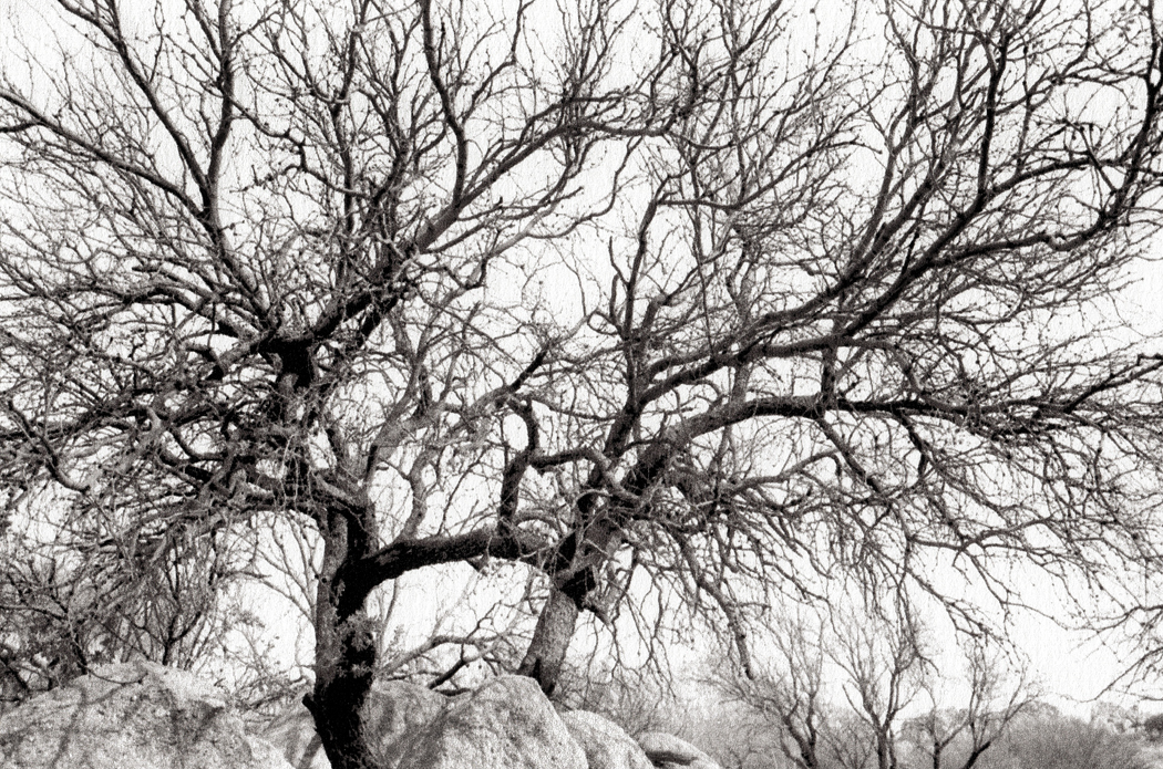
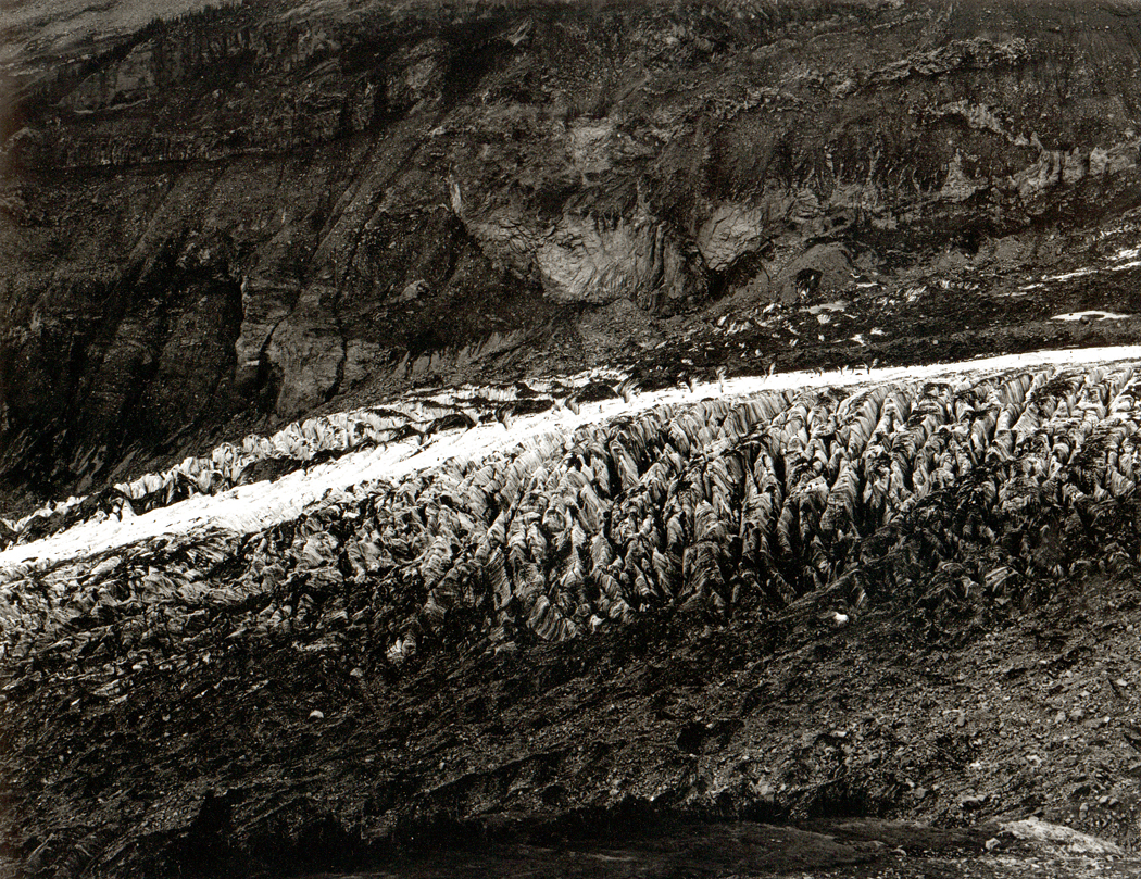
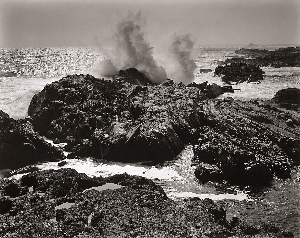
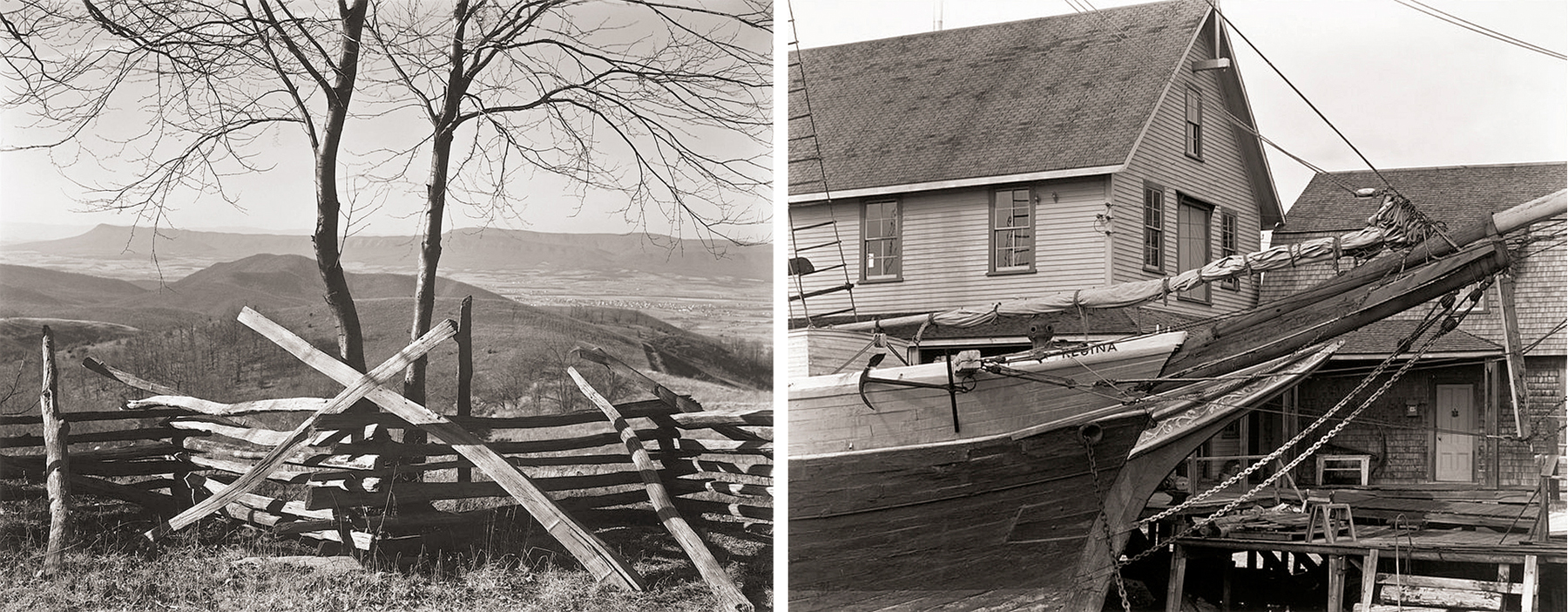
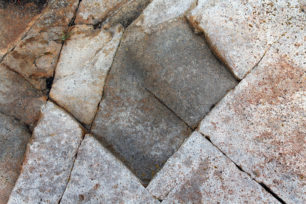
Texas Canyon, southern Arizona
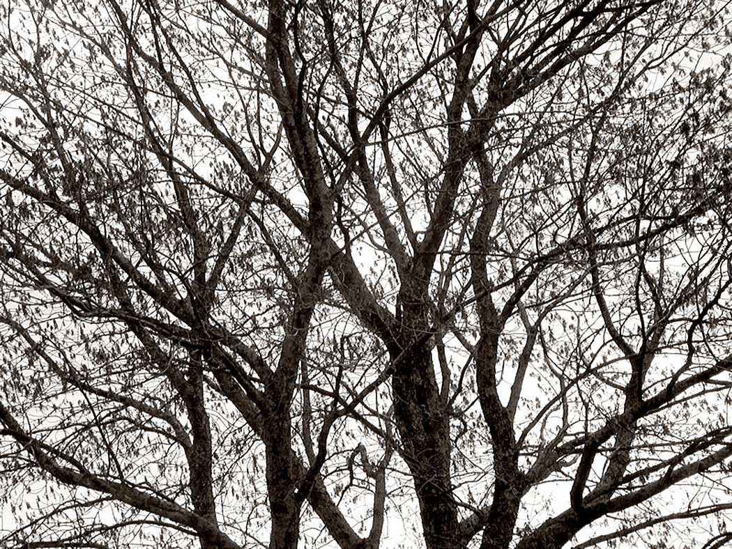
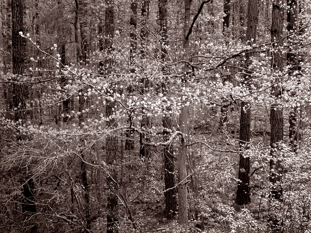
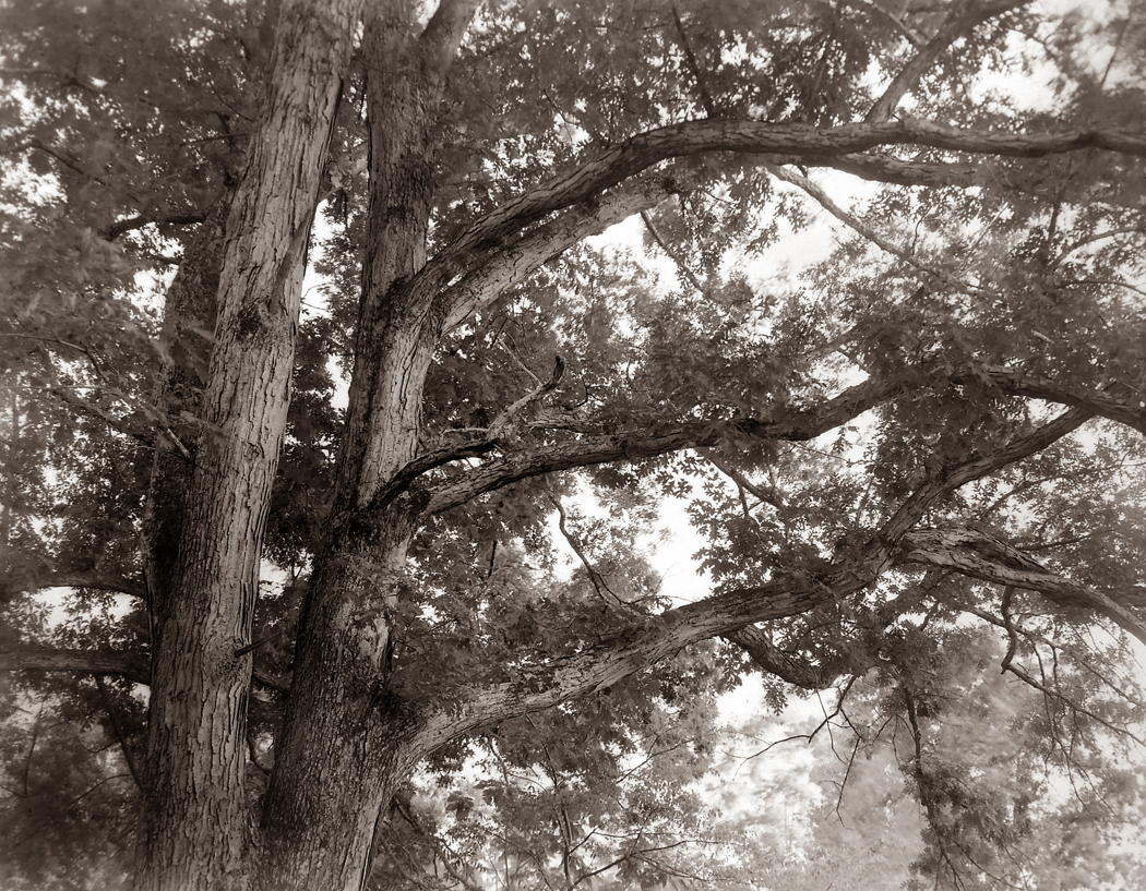
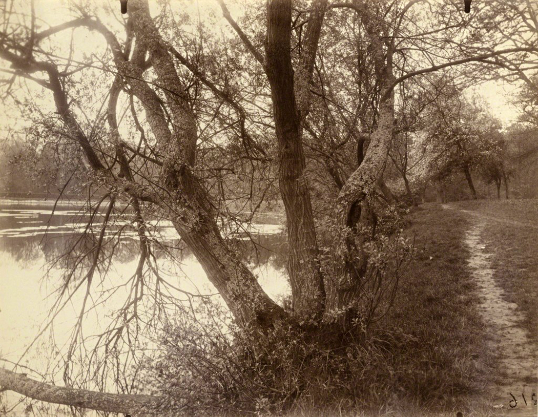
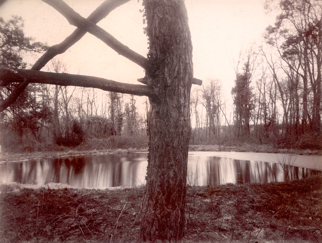
For me, it is the trees, most of all. I love the spring trees well enough, but it is this time of year, when the trees are still bare and show their bones that I wait for each fall. Drop the leaves ecdysiastically and I can see the shape of the thing they cover.
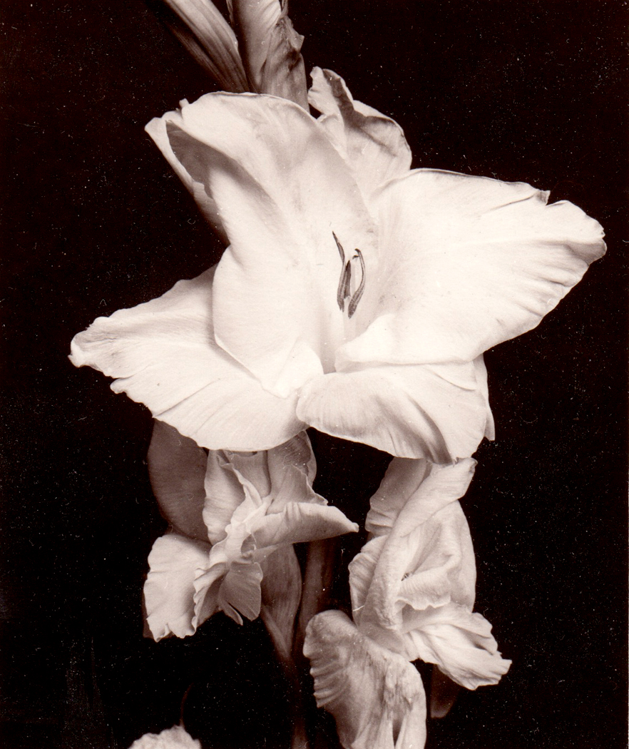
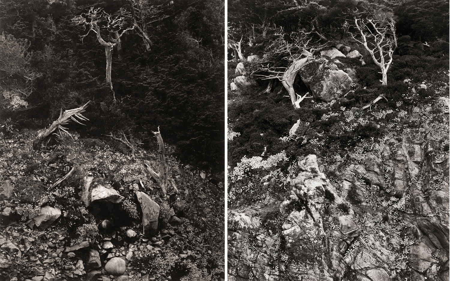
Spring oak, Blue Ridge
It is the lines they make against the sky. An etching more than a painting. Artists through history are generally assigned to one of two categories — they are either line people or color people. Line painters, like Botticelli, tend to draw their scenes, often in actual outlines, and then fill in the colors, while color guys, like Titian daub pigment onto the canvas and let the patterns of color define shapes. It’s one of the major distinctions made by Heinrich Wölfflin in his 1915 book, Principles of Art History. It doesn’t mean the line guy doesn’t appreciate color or the color guy doesn’t appreciate shapes and forms, but rather it defines what hits them first and most centrally.
(There is a similar distinction in music. Composers — and performers, too — tend to be line guys or chord guys. Lots of counterpoint for the first, and washes of tonal color for the latter. Bach vs. Debussy.)
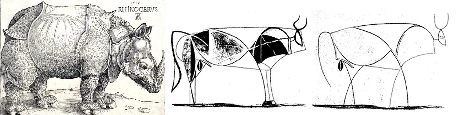
Albrecht Dürer rhino; Pablo Picasso bull
Albrecht Dürer was a line guy, most characteristically in his wood engravings. Picasso was a line guy and certainly an indifferent colorist. Most of his paintings could easily be given different fill-in colors. Matisse, though, a color guy to his teeth. Even more recent painters can be divided. Ellsworth Kelly a color guy; Lucian Freud a line guy.
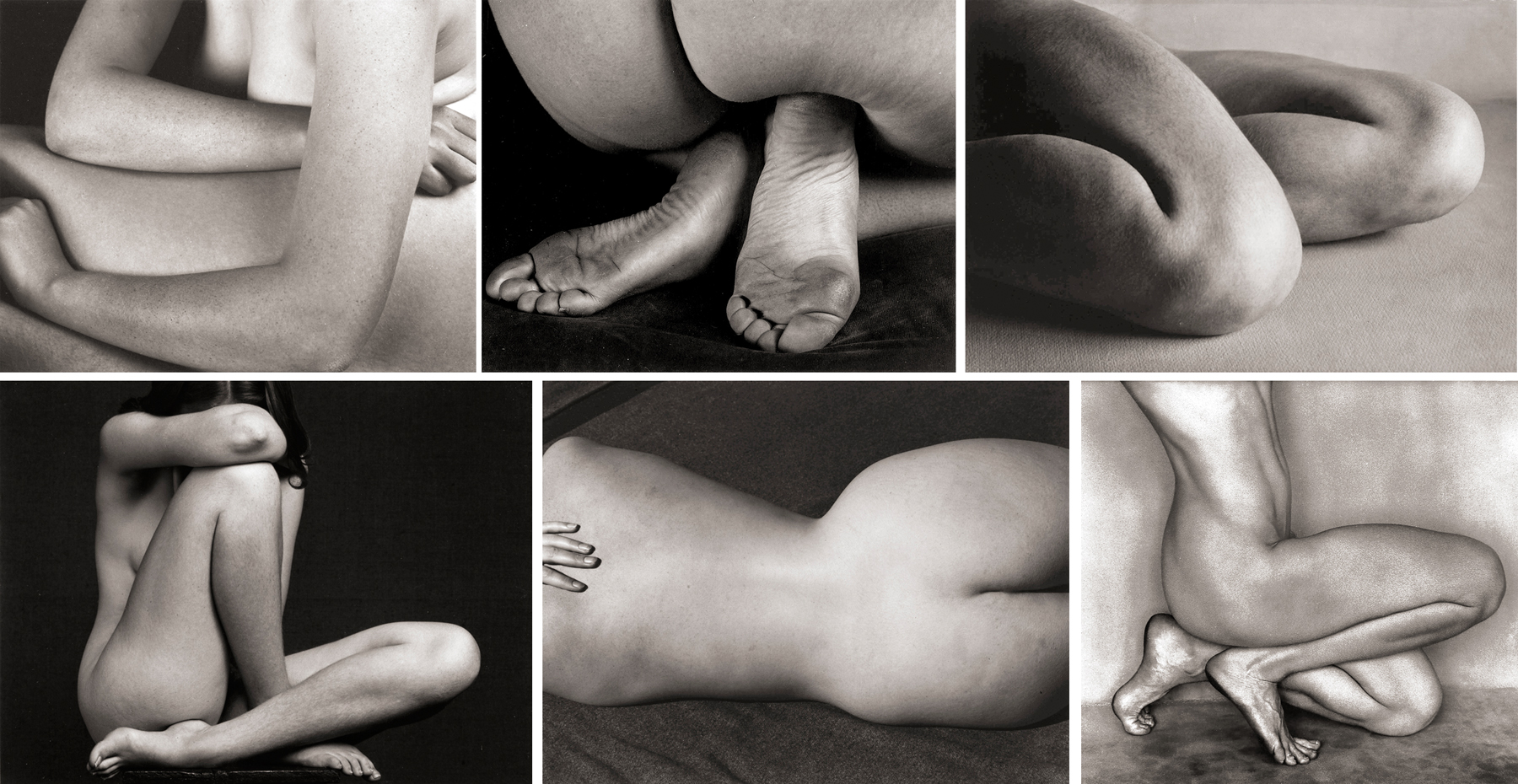
Well, I’ve always been a line guy. And the lines drawn by winter trees have hypnotized me since I was a wee bairn. One whole category of my photographs are what I called my “tree nudes.”
The nude has a specific purpose (outside the merely voyeuristic). Clothes drop their subjects into a very particular time and place. Eighteenth century breeches; flapper skirts; bell-bottom trousers; togas; saris; morning coats with a peeking handkerchief in the breast pocket.
But the nude is — or can be — timeless (with the caveat that hairdos can be a giveaway). There is a universality to the nude in art, which is why so many Greek statues are naked. And we are meant to appreciate the form — shape, detail, muscularity — and not just a specific person with a name, family, opinions, and personality.
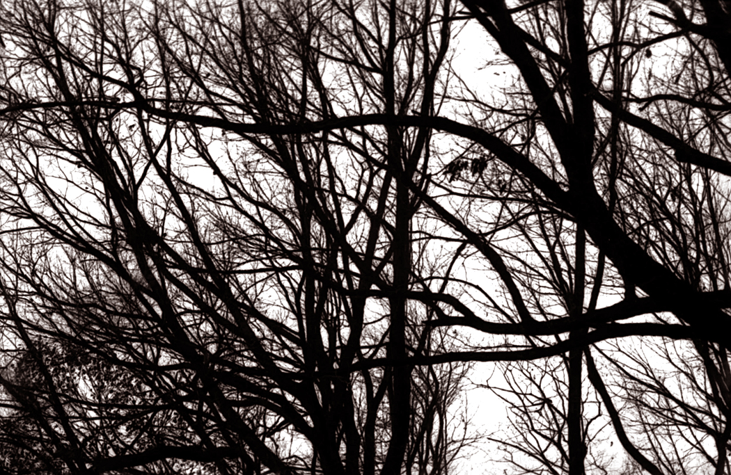
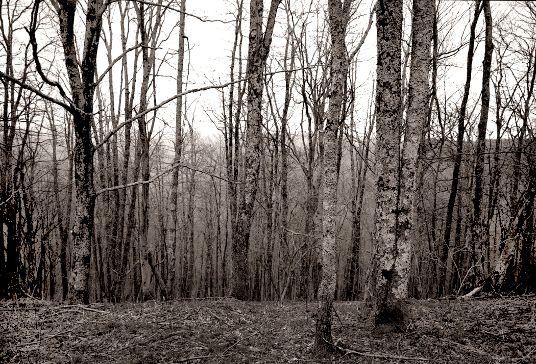
And I feel the same thing in the bare ruined quiers, where late the sweet birds sang. There is structure in the dark lines of the branches, and a systematic chaos in the way they all cross each other in a welter of visual information.
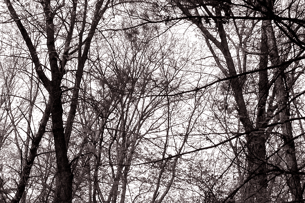
In this, I am reminded of the drip paintings of Jackson Pollock, which I came to love in the New York art museums I visited beginning as a teenager. A good nature-scribble of branches puts a buzz in my visual brain. I love it and have sought it for the past 60 years. Among the first photographs I ever made, 60 years ago with an ancient 35mm Praktica camera were of trees.
Of course, while trees are beautiful, they can become an obsession. If I had chosen to make a career out of photography instead of writing, the trees pictures would have dwindled. As Fred Astaire says in the film Funny Face, “You’d be amazed how small the demand is for pictures of trees.”
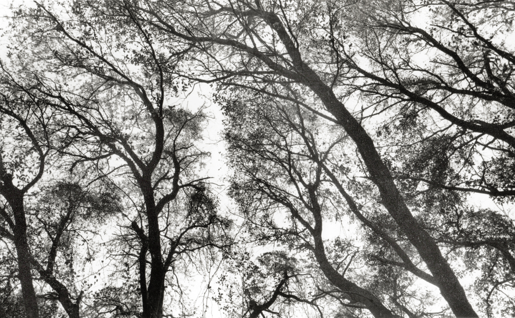
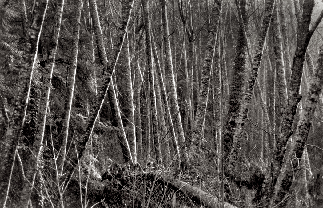
But I have followed trees through seasons
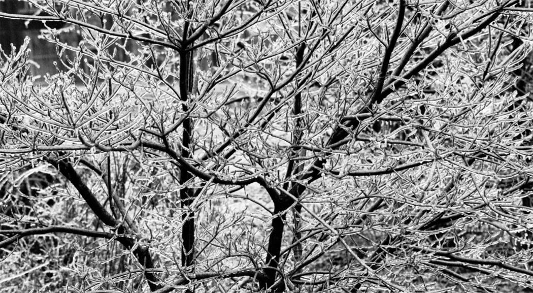
Ice storm, Greensboro, NC, 1969
and all their leafy-ness
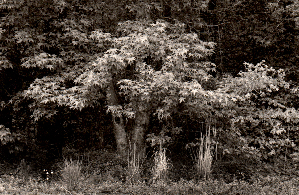
Sweetgum tree, Redwing Golf Course, Virginia Beach, Va., 1984
I have sought the best image of the jumble of buds, twigs, branches, trunks and bark that I feel as a signal for my emotions.
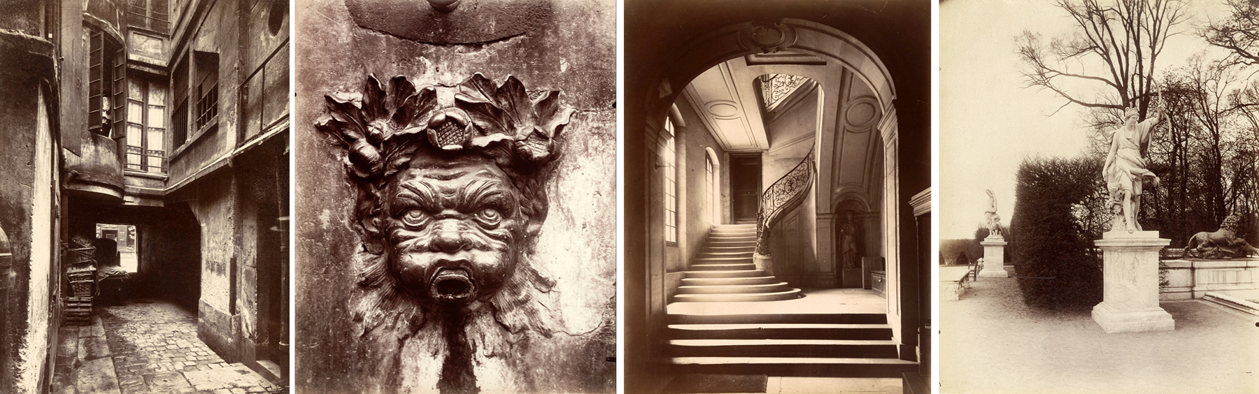
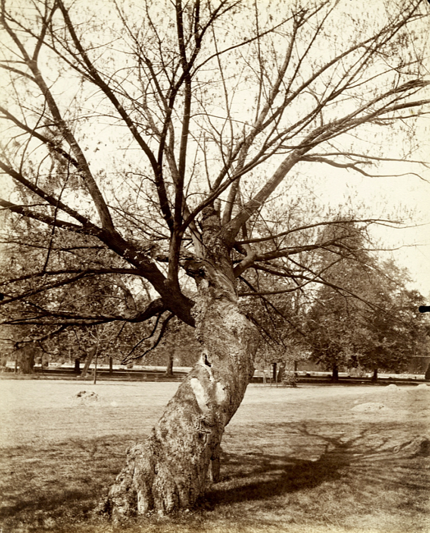
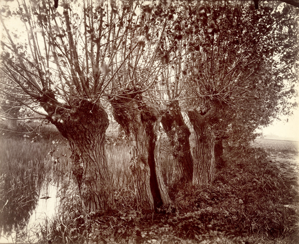
One of the first shows at the Museum of Modern Art that made a deep impression on me was in the summer of 1972, when they put together a group of 50 photographs of Paris trees by Eugene Atget (1857-1927).
Lined up on the wall in a darkened space, with brilliant track lighting that made each photograph gleam like a jewel, the photographs made my heart jump and my eyes smile. Most of the trees were winter trees, with wiry roots dug into the ground, and ancient boughs twisted and weighed down with age. They were ungodly beautiful, but also, in Minor White’s expression, it wasn’t just what they were, but what else they were.
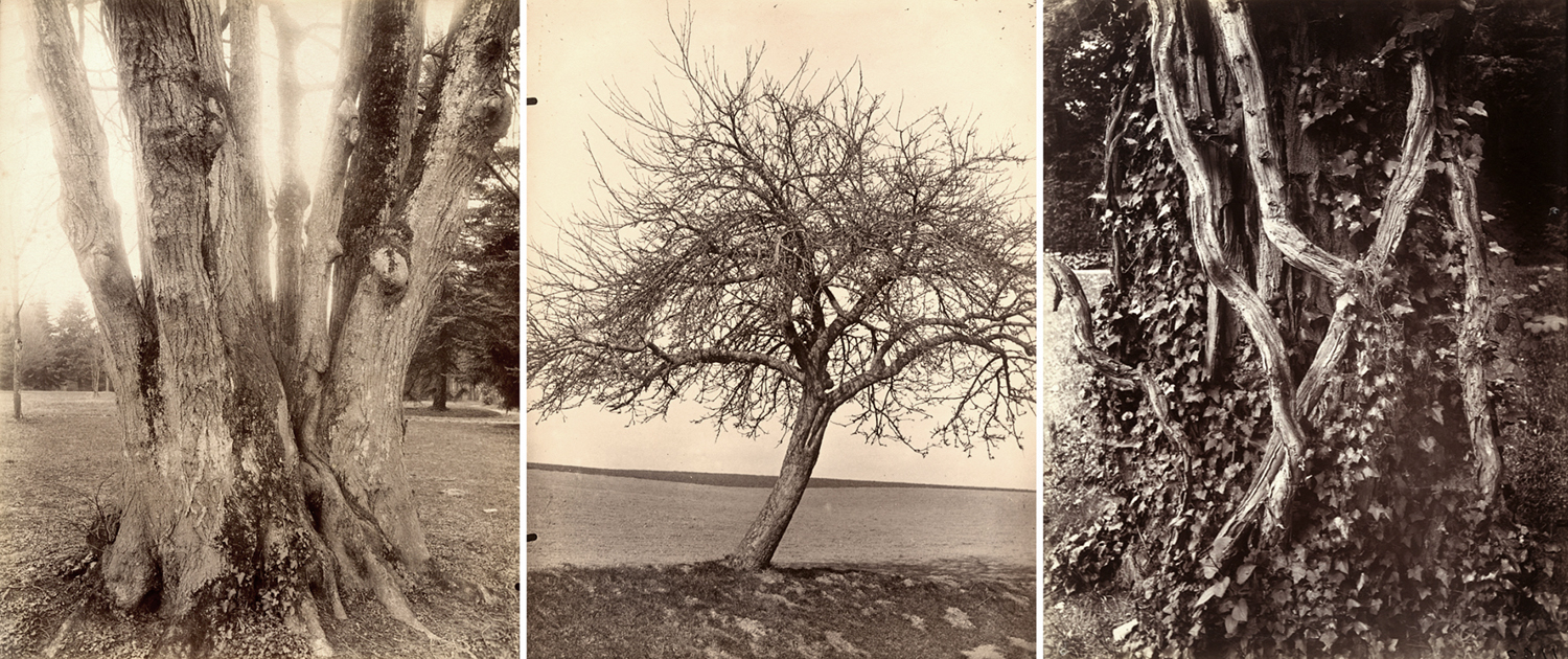
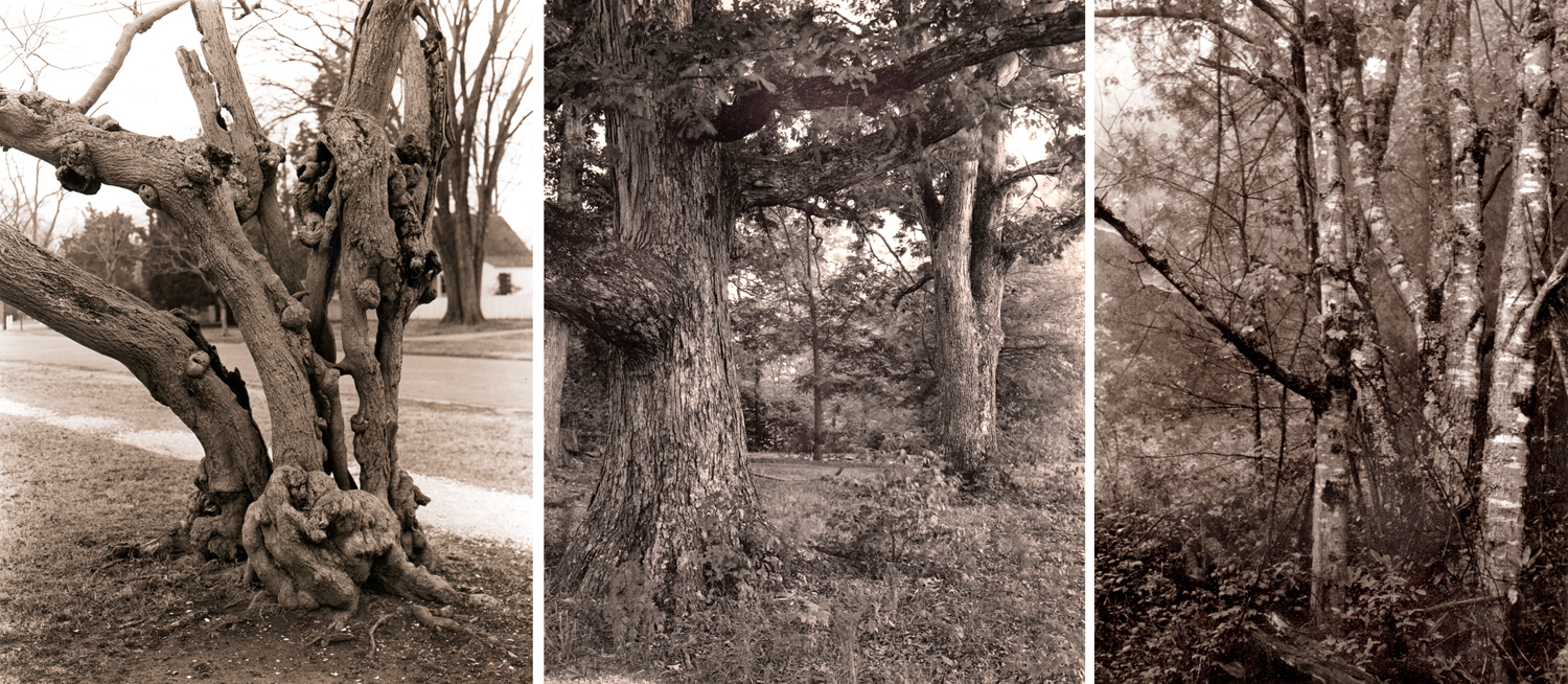
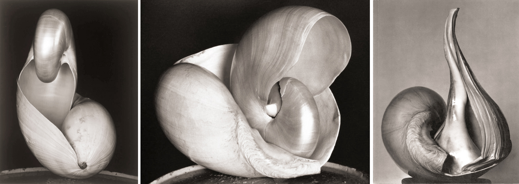
Three tree photographs by Atget
The way they were lit, the gnarled forms they took, their texture and even the gold-toned sepia surface of the silver images all functioned as metaphor. They evoked emotion the way art can.
Usually, when most people see a picture, in a magazine or newspaper for instance, the image is just a kind of shorthand for language. You see a picture of a house or car and instantly the words “house” or “car” spring to mind. The journalistic photograph is a kind of pictogram or hieroglyph, like the stick figures on the doors of public restrooms.
But images can also do more than that: When you abjure the naming phase and feel the color, line, shape, form and also the cultural resonance of an image, they evoke thoughts and emotions beyond the named subject.
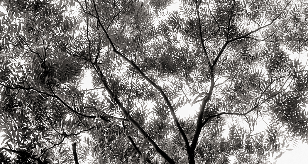
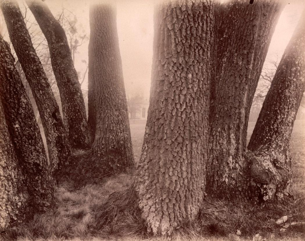
My imitations of Atget
And it was that that blew into my brain, seeing the Atget trees.
And that is something I have been hunting all of my creative life. And attempting to find in my own photographs of trees. Or not just trees, but in all the photos I’ve tried, whether landscape or still life or nude or portrait or abstract. — What else it is.
So, when I sit on my back patio and look up the hill at those mid-winter spring trees, with their augury of renewal, and their complex shapes and overlaps — those wonderful lines drawn against the sky’s paper — I want to catch something as it flickers by.
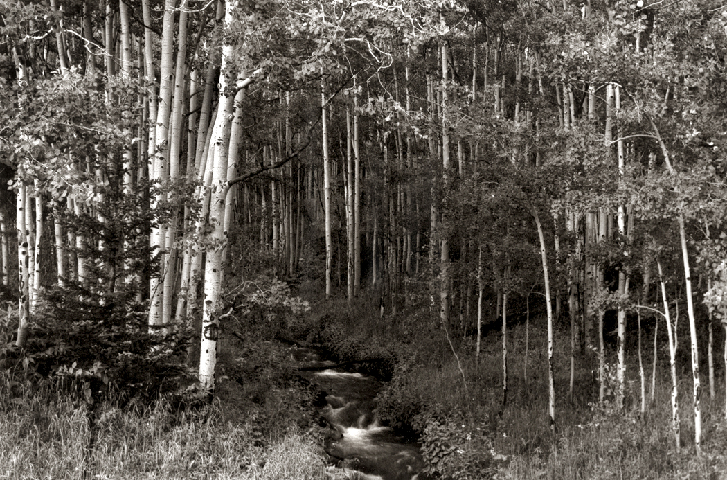
Aspens, Colorado
I’ve snapped a lot of them, although I’ve caught few. Many don’t have the magic and just sit there as noble attempts. It hasn’t just been bare trees. I’ve tried to find the emotion in all kinds of them.
Morning, Obids, NC, Blue Ridge Mountains
The photographer Alfred Stieglitz called the equation between the subject of a picture and the emotions that are evoked “equivalents.” It’s part of the constant fight between the simple depiction of something you can name, and the attempt to make the image stand on its own as an esthetic entity.
It’s what most visual art tries to do: create an equivalent in the limbic system to the shapes, colors, lines, and even the subject matter and its resonance with the personal.
Bainbridge Island, Puget Sound, 1979
Most glossy travel photos are meant to make you wish to be there. But with the image made for display, or as art, you are there, in front of the thing itself. You don’t have to make travel plans. Not just pretty pictures, but objects of contemplation.
Sandro’s oaks, Summerfield, NC, 1980
The point is twofold. First, to make you pay attention to the world around you, to see with intention. And second, to allow you to connect with the emotions you have in potential.
Wise, Va.
Both together they make a single bond: interior and external; you and the world; individual and cosmos. No longer separate.
Over the years, the images I make have become less public and more personal. I no longer pay much heed to the wide acceptance of the art I make. I don’t make it for others, but as a kind of personal meditation.
I seek new ways of making this happen. One morning, while visiting my brother- and sister-in-law in Reidsville, N.C., I saw the shadows of winter branches projected onto the window blinds. It made for a kind of Japanese byōbu screen.

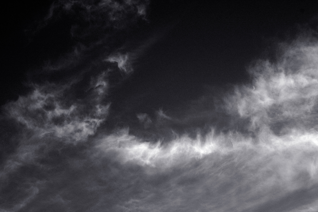
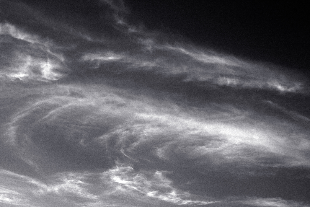
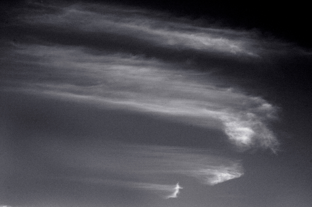
And then, one day last week, in midwinter spring, sempiternally recurring, I was sitting out back, listening to birds and airplanes, the dogs down the street and watching the clouds move west to east and the branches waving in the moving air, and I managed to make an image that finally captures for me the complexity of the abstract, neuronal jumble, all the connections, the scribble and the energy. It is small on your computer screen, but it should be large as a mural.
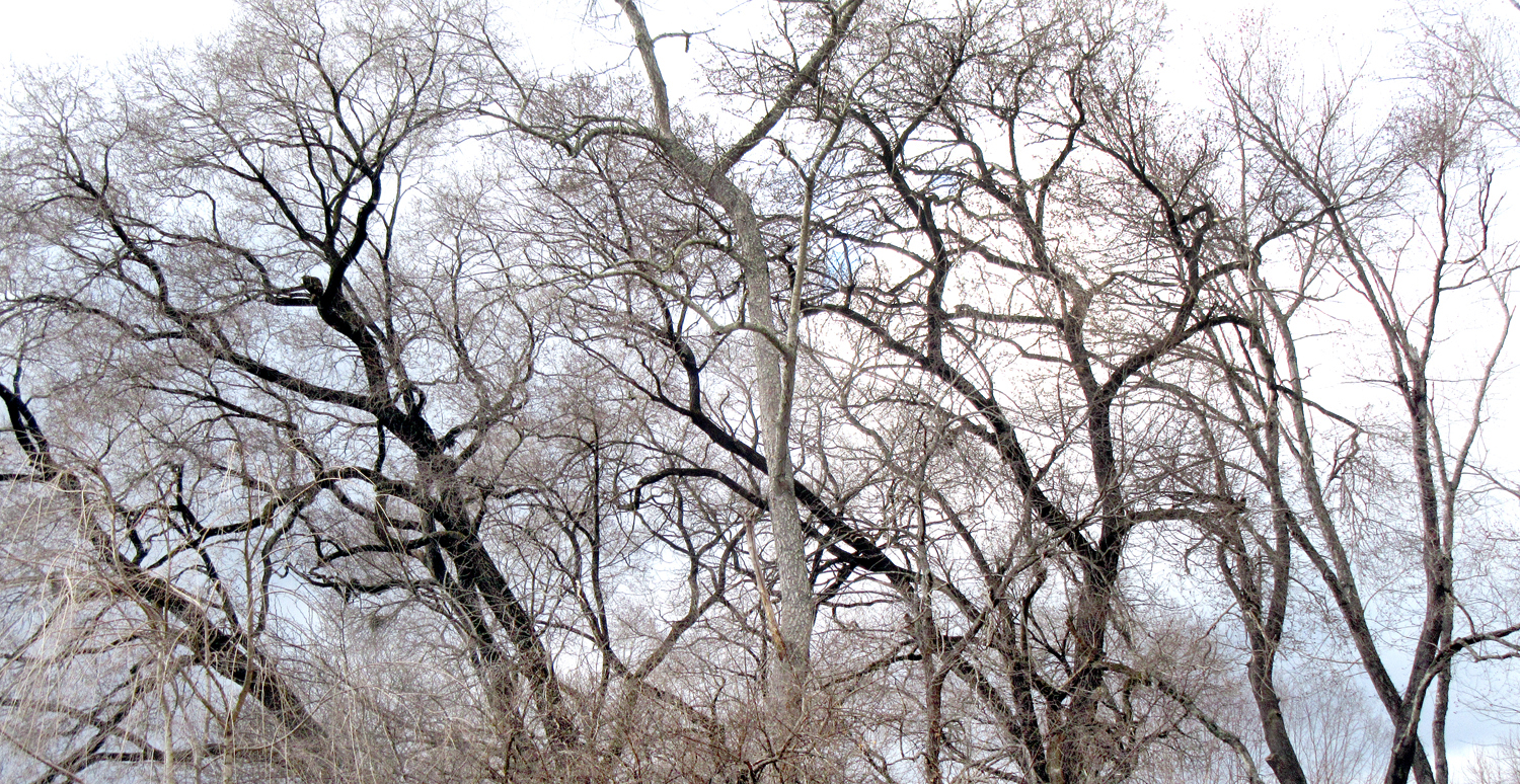
If I could, I would print it out mural size to cover a wall. Or split it up over several vertical panels, like a Japanese byōbu screen.
But I no longer have means to do that, and so, I just look at it and contemplate.
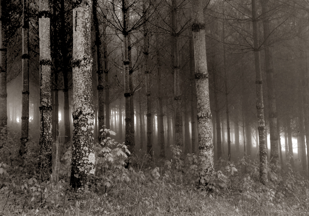
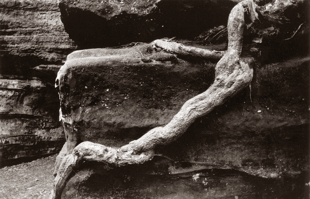
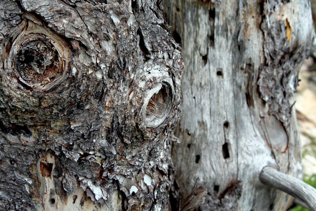
Roosevelt National Park, ND
Click on any image to enlarge


