Archive

Tag Archives: details

Garry Winogrand once said, “I photograph to see what the world looks like in photographs.” What? It looks like reality, surely. Isn’t that the whole point of taking pictures — to capture reality? 

But most photographs, historically, and including Winogrand’s are in black and white. The world is not. And even if you used Kodachrome or a digital camera, the colors are exaggerated, more saturated than the colors your eyes see. And then, a photo of your house, for instance, is maybe 8 inches by 10 inches, while the house is immense. The photo is two-dimensional and the world is 3-D. And most of all, your photo has an edge, a frame around a portion of what you see in front of you. It is not reality at all, but a convention of how we picture the world. 
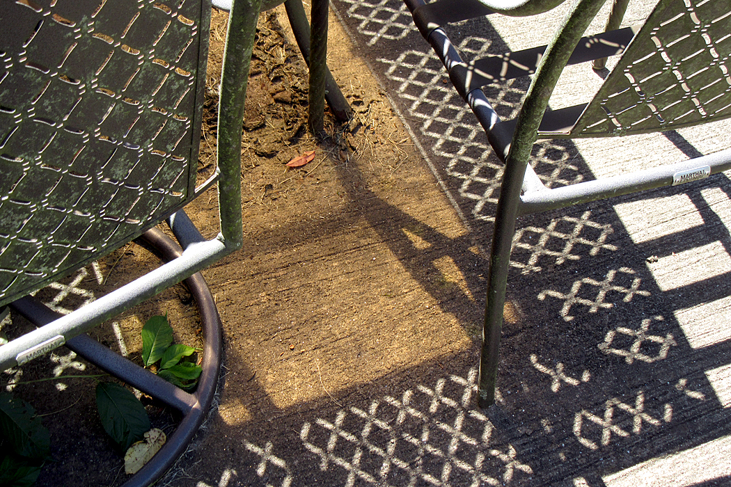
This is one of the hardest lessons for the beginner, or the ordinary person to learn. Seeing photographically is imagining how an image will perform shrunk and separated from context. To see photographically is to see shapes, lines, colors, textures and not to see houses or people. Yes, they may be in there, but you have first to recognize the shapes, lines colors and all that. And be aware of them. 

If you just see a subject, say, Aunt Trish, you may ignore the tree behind her looking like it’s growing out of her head, or you may take a picture of your car and not notice that half of it is blacked in shadow. You’re seeing a car, and not the patches of lights and darks that make the actual shapes your camera records. 
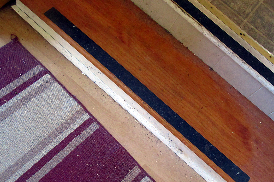
Most people think in words, and so, they name what they see. That’s a horse; that’s a tree; that’s my Grandma Edna. The camera doesn’t understand words or names. It sees shapes, lines, patterns, textures. As artist Robert Irwin put it, “Seeing is forgetting the name of the thing one sees.” 
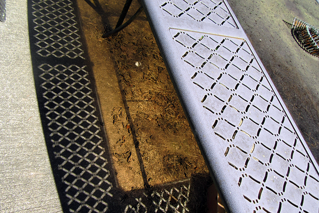
It takes some practice, some eye exercises, to train yourself to see. One online videomaker has suggested that whenever you have a spare moment, say, just sitting in your living room, to look around and see what may make a pattern, to spot contrasts of shape or color, to see abstract designs. You needn’t actually make a picture, but imagine things around you as if they were photographs. Make an imaginary frame. 
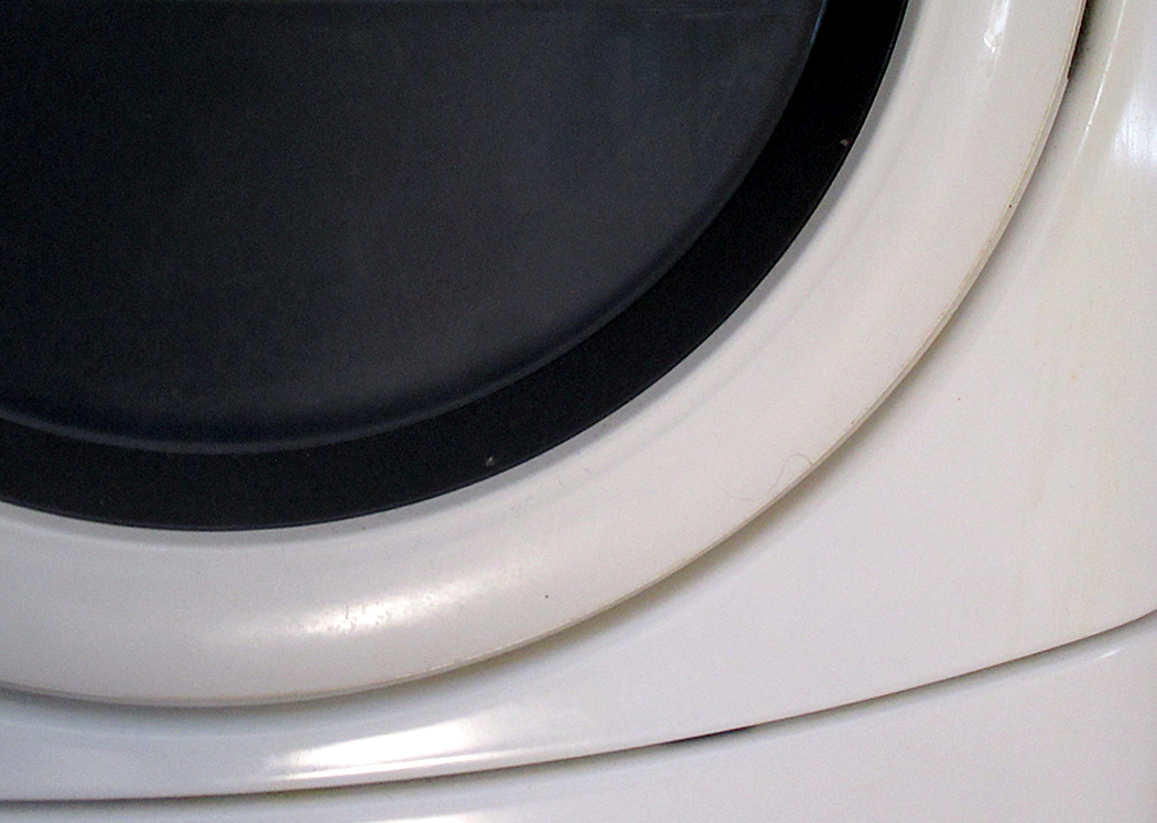
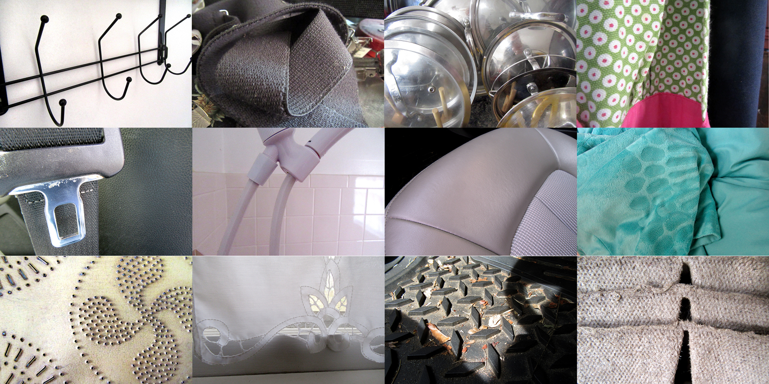
I do this regularly. I take my point-and-shoot Canon and take as many photos as I can in a period of time, say an hour, and see how many of them, simple details rather than nameable items, and turn them into visual offerings. 
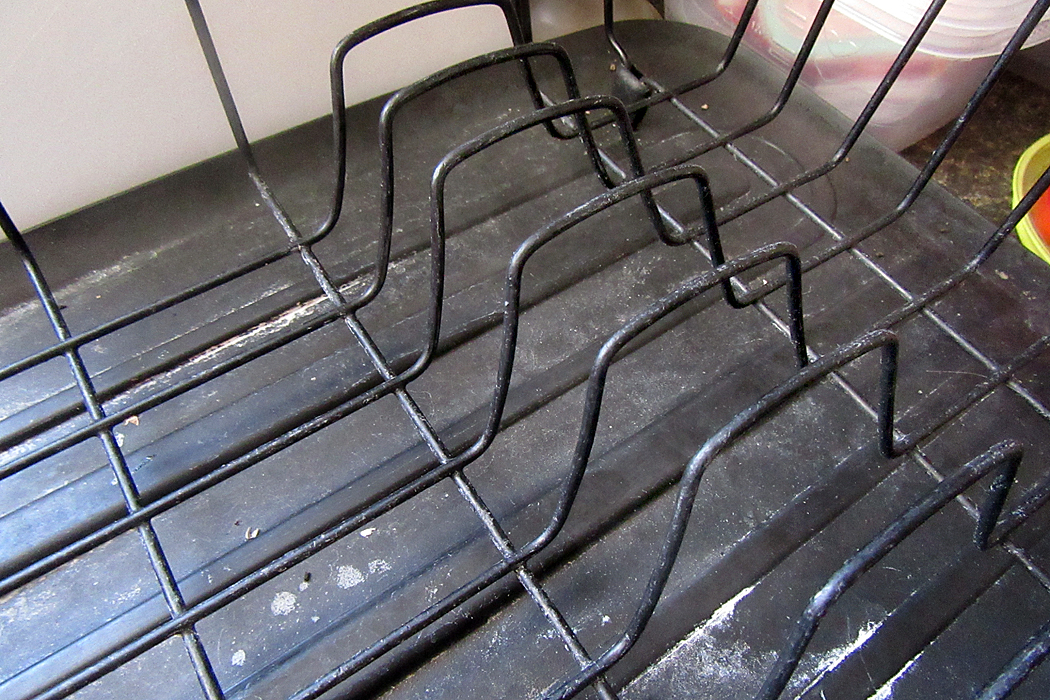
Another photographer, Lee Friedlander, calls this “pecking,” and uses his camera to find possible images. Out of a roll of film (in the pre-digital days), he might wind up with only a few pictures worth showing the public, but the exercise keeps his eyes awake and noting the possibilities. 
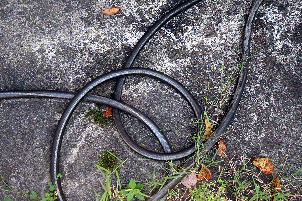
When I was teaching photography in the 1980s, I had an assignment I gave my students. I asked them to photograph something so that I couldn’t tell what it was. I warned them, I was really good at deciphering bits and pieces. They were not to simply make bad photos, out-of-focus or blurred images, but to see the shapes and lines extracted from context to hide their identities. (I can brag that only once in six years of teaching was I stumped. Usually, I spotted immediately the bits of clothesline, or the bottom of a teacup, or the stitching of a sole onto a shoe. To quote Captain Reynaud, “It is a game we play.”)
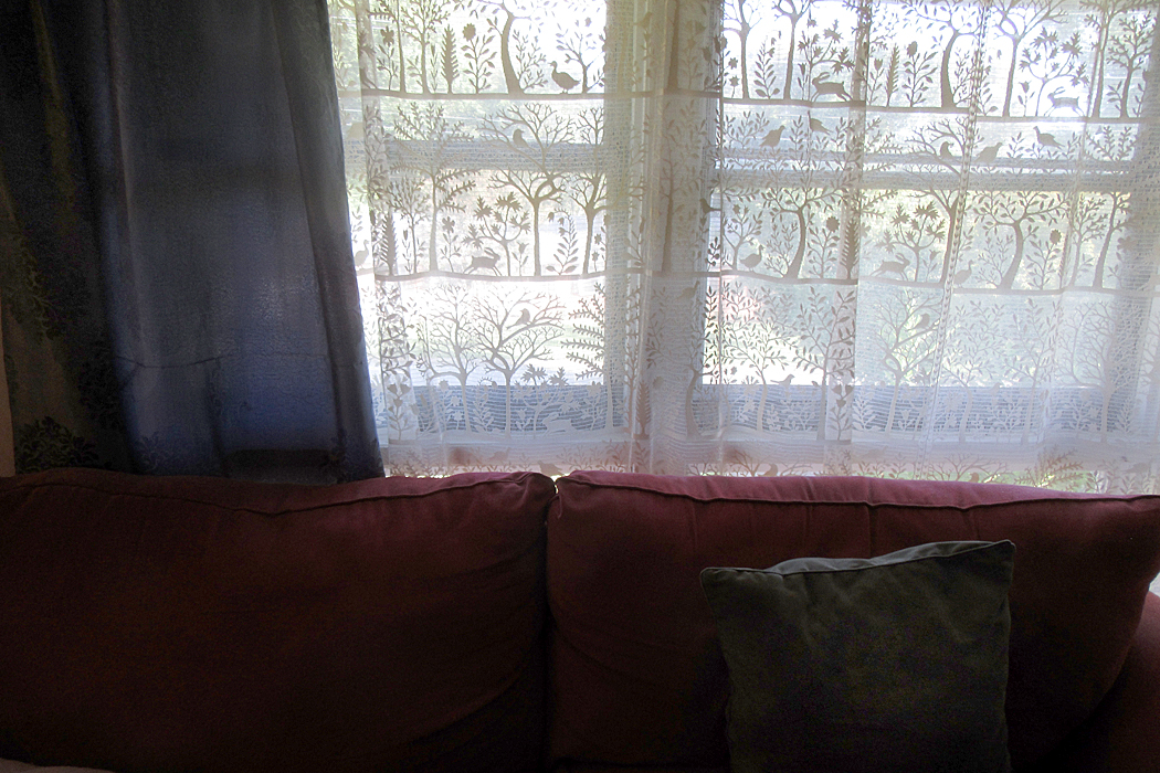
The world is made up of details. We assemble them into an experience we recognize — the neighborhood street, our children, the Grand Tetons, flowers in a vase — but each of these is constructed of details. Seeing the details vivifies the whole. 
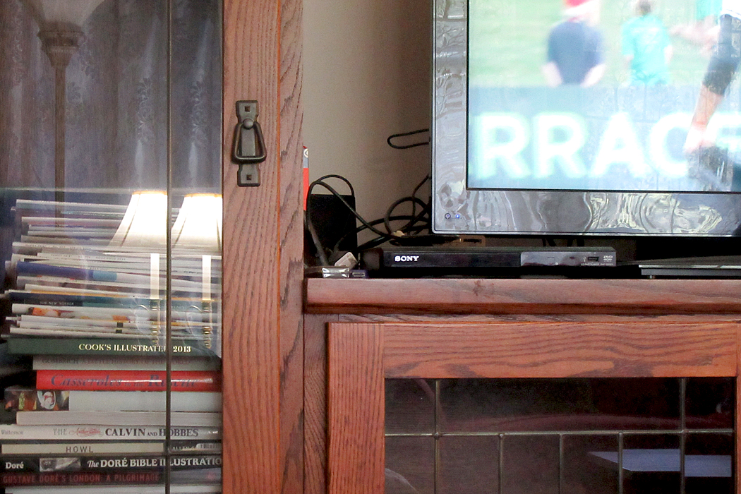
I have played with this exercise before, and even posted some of the images on this blog, when I spent an afternoon photographing all the circles I found. (link here)

I posted another on the patterns I found visiting my brother-in-law and “pecked” at the things in his house and yard. (link here). 
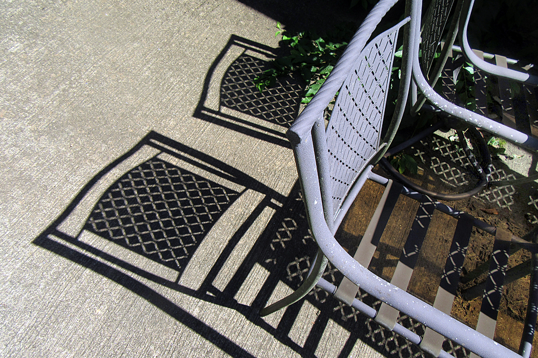
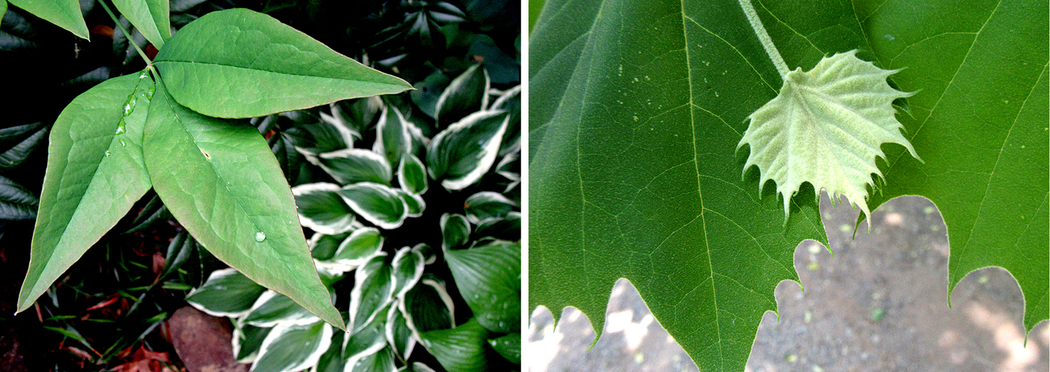
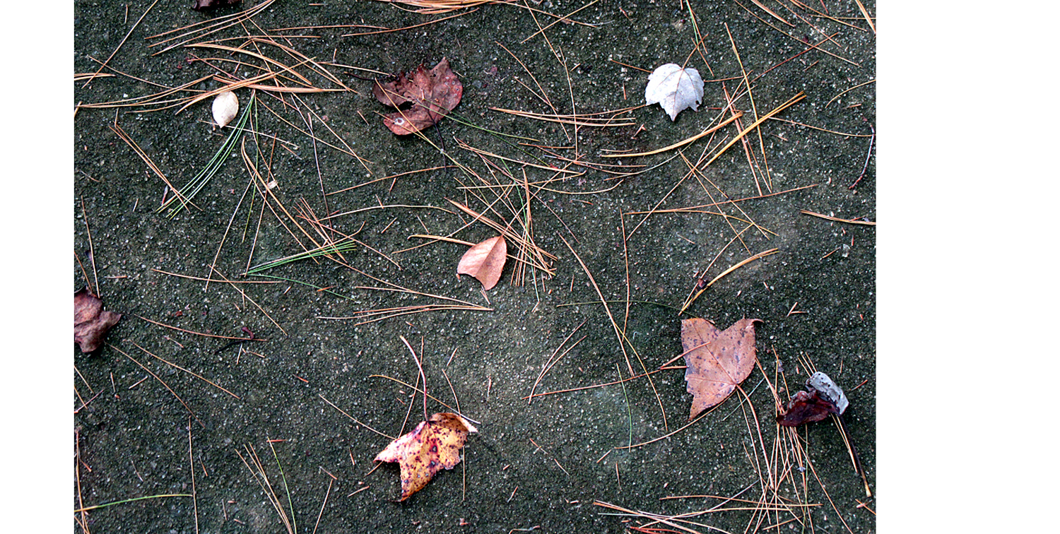
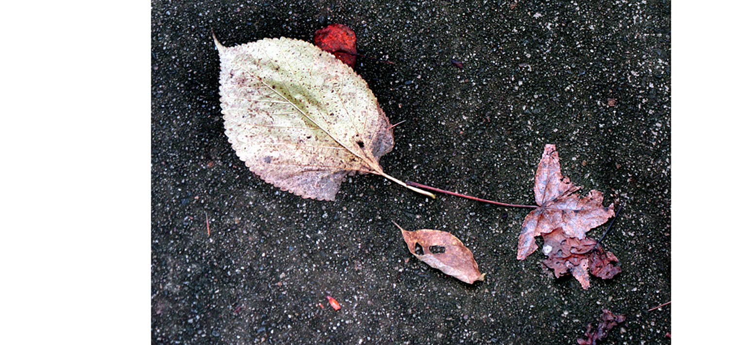
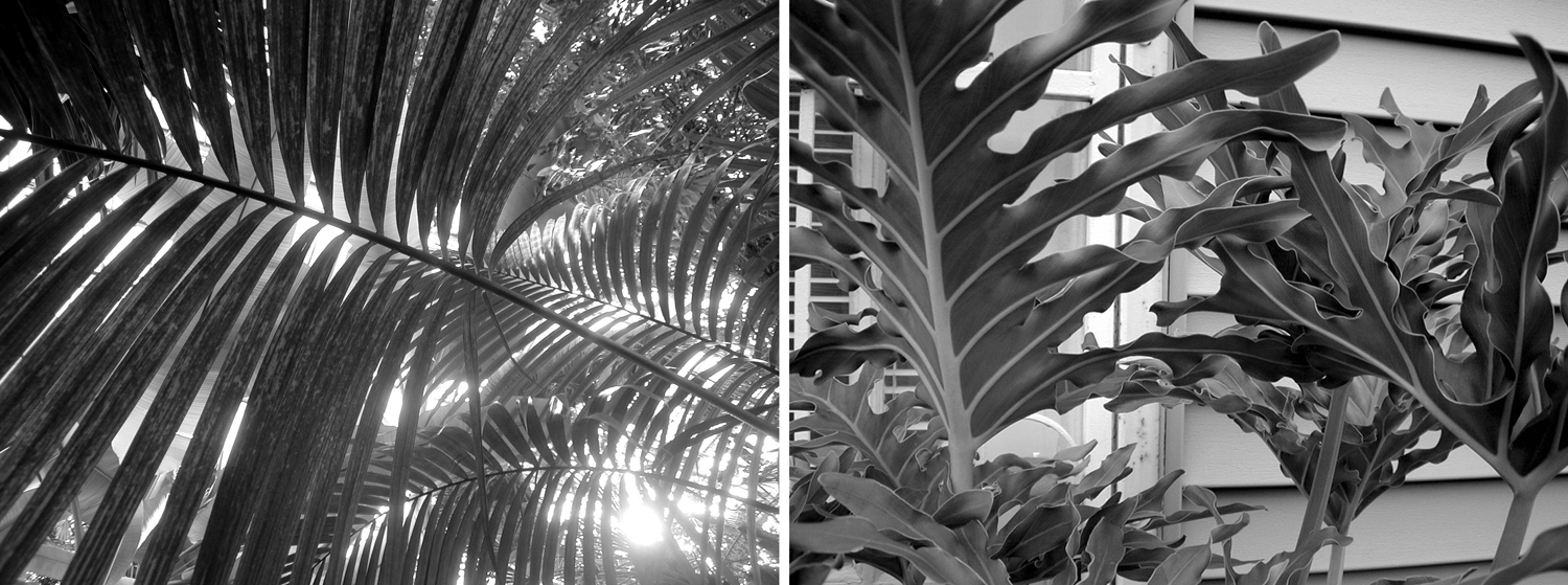
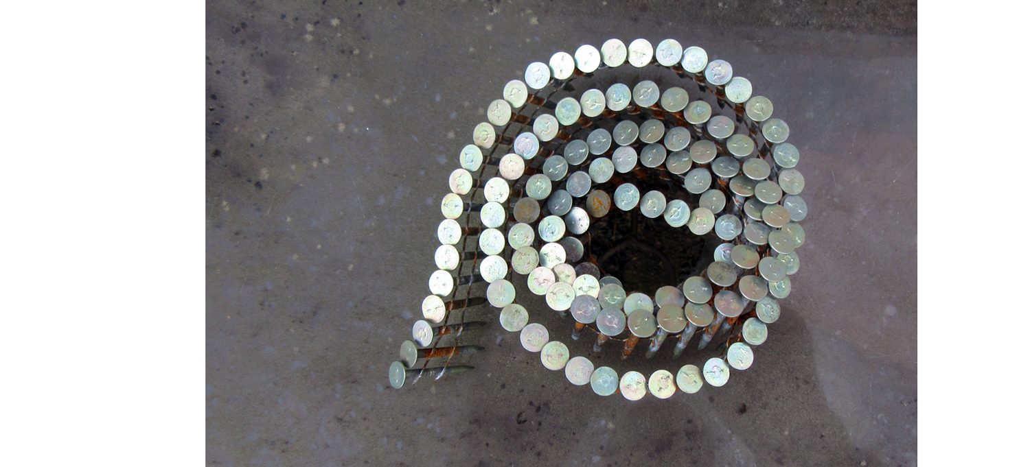
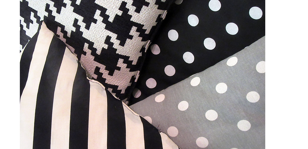
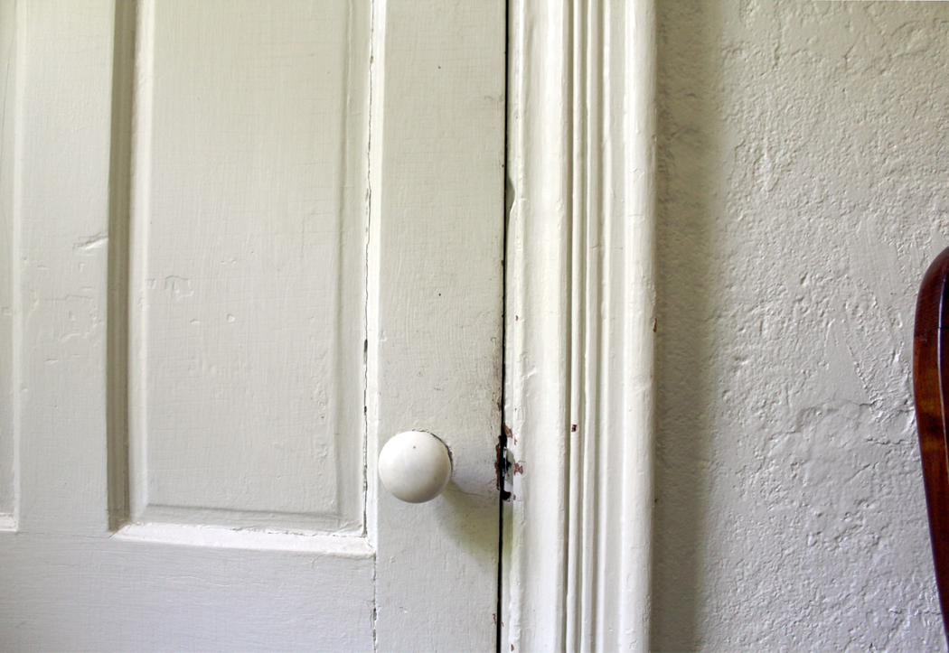
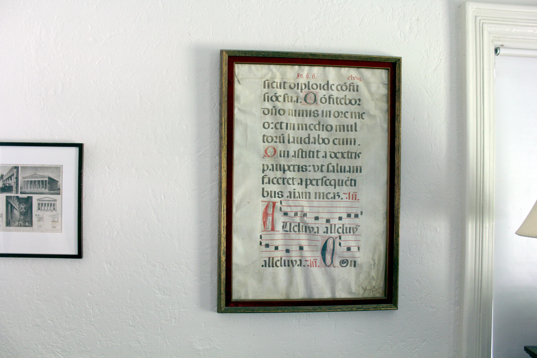
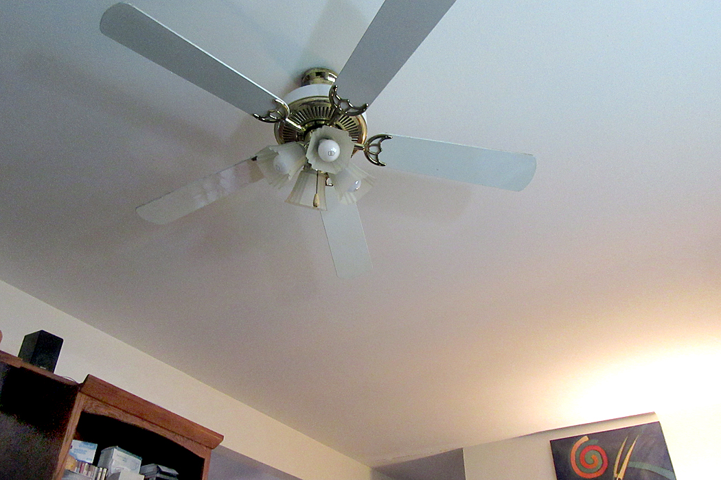
And I did it again yesterday in the back yard and in the house. I’m sure you can guess the identity of the things in the pictures, but it is the abstract patterns I was seeing, ways to use shapes, lines, textures, colors to form an esthetic whole out of parts. I made 50 photographs in the space of about 40 minutes. 
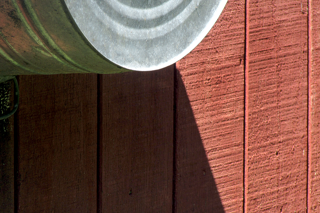
I don’t usually call these images art, although I don’t know what else to call them. They are ocular calisthenics, eye exercises, to help me focus on the seeing behind the naming. 
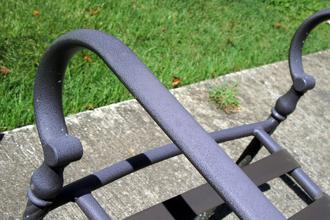
Back when I was a teacher, and therefore knew nothing, so was able to pass on my knowledge to unsuspecting students, I had to teach a word I now only mention with contempt: composition. We all taught things like the “rule of thirds” and “focal point,” and where to place horizons or how much of a person to include in a portrait. We taught awareness of negative space, and keeping it interesting. 
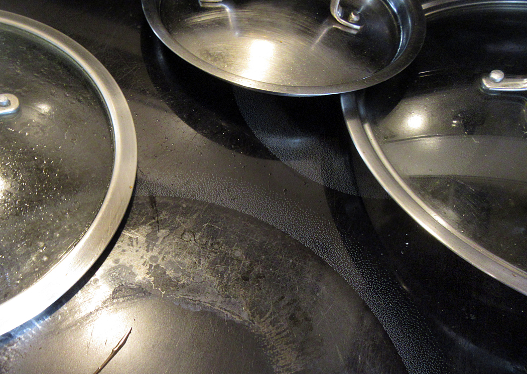
But long ago, it hit me that all these precepts had nothing to do with taking good photos. The word, “composition” implies a kind of blueprint or set of construction instructions. But I instead used the term “design.” And the secret to good design was never rules. It was awareness. “Design is your awareness of everything in the frame.” Want to chop someone’s head off at the top of the frame? Do it on purpose and it will work. Want to cut your landscape in half with a horizon? If you are aware of what you are doing, go ahead. Make that point. 
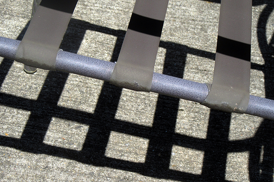
Most people, making photographs, or drawings or paintings, focus on their subject, and don’t pay much attention to the backgrounds, or the framing, or the patterns of light and dark. They focus on what is named. 
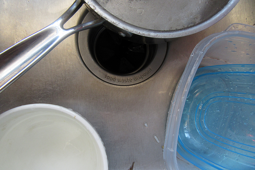
But if you look at all the great art of the past, and the famous photographs in your books, you see that the upper left corner, or the bit halfway in from the side, still has interest. It has not been ignored. Even a 17th century painting of a Dutch burger with a blank background has the precise color of that emptiness calculated and thought about. What a delicious blue-gray it is. Block out the rest of the picture and you will still get pleasure from the background. 

Awareness is the secret to any art. Paying attention. The more you are aware of, the better your result will be. 

Click on any image to enlarge

I made my living as a writer, spending my career primarily as an art critic and travel writer with The Arizona Republic in Phoenix. But it didn’t start out that way. Originally, I planned to be a photographer. I spent years working with my cameras and hoping to become the next Ansel Adams. 

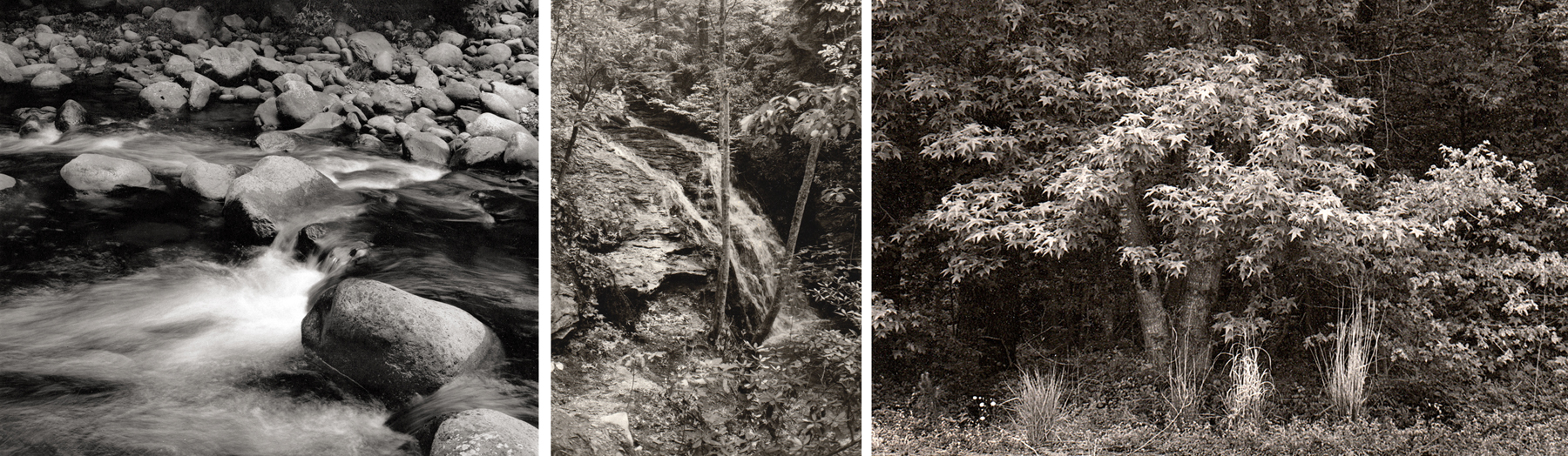
Yosemite Falls

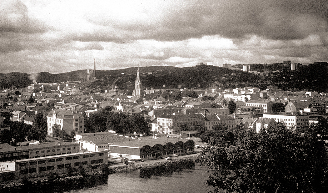
I got my first camera when I was about 12, a Brownie Hawkeye, which I took on family vacations. I got my first SLR in 1965 — a rather primitive Praktica, which I took to Europe with me. Only a few pictures remain from those early efforts, including this image of Kristiansand in Norway. I was 17. 

Kristiansand, Norway

College came next and I took very few photographs, but after graduation, I began a very serious addiction to acquiring ever newer and greater cameras, marching up through Nikons and Leicas, hoping for a Hasselblad, and eventually getting a 4X5 field camera with a Super Angulon lens (don’t worry if these names are Greek to you; they don’t mean anything anyway. They are hardly more than shibboleths for photo geeks.)

I got job in a camera store, and for the next several years, acquired a full darkroom setup, used my employee discounts to experiment with various films, chemicals and printing papers, until I became an accomplished darkroom technician. I got deep blacks and whites that never blanked out. 

Then, in the ’70s, I was hired as a photographer for the Carolina Peacemaker, a Black weekly newspaper in Greensboro, N.C. But when the editor quit, I got his job, and became factotum, writing editorials, a food column and I became “Dear Carol,” the advice columnist, along with taking photos. It did seem, at the time, a bit peculiar for a white guy to be the editor, but then, the other reporter was also white. (At the time, talented Black writers were being head-hunted for the previously all-white daily paper, bypassing the usual route to the African-American press). 

The writing came by default, but I still considered myself a photographer. And not a jobbing photojournalist, but one with my aim being art galleries and photo books. And all my personal work tended to be in traditional genres: portraits, landscapes, still lifes, nudes, architecture. For some reason, street photography never much interested me. 

In the mid-1980s, my wife and I moved to Virginia, where I spent six years teaching photography at a two-year college. Back then, we taught black-and-white photography. Color was left to jobbing professionals, and digital photography was unheard of. (It’s odd to remember, but back then color photography was not widely accepted as art. It was looked down on as fit only for glossy magazines, advertising, and Sunday lifestyle sections in newspapers. The medium was thought to lack permanence — dyes faded — and most museums didn’t collect color). The school built a darkroom with a dozen enlargers and all the sinks and equipment needed, and I had all the students I could handle. 

I loved teaching — or perhaps I just loved having an audience. But I continued with my own work, again, in all the usual genres. 

Because we were both teachers, we had summers free to travel, which gave me a chance to visit all 48 contiguous states, and most many times. I vacuumed up landscapes and have a collection of what must number into the tens of thousands of landscape photos. 

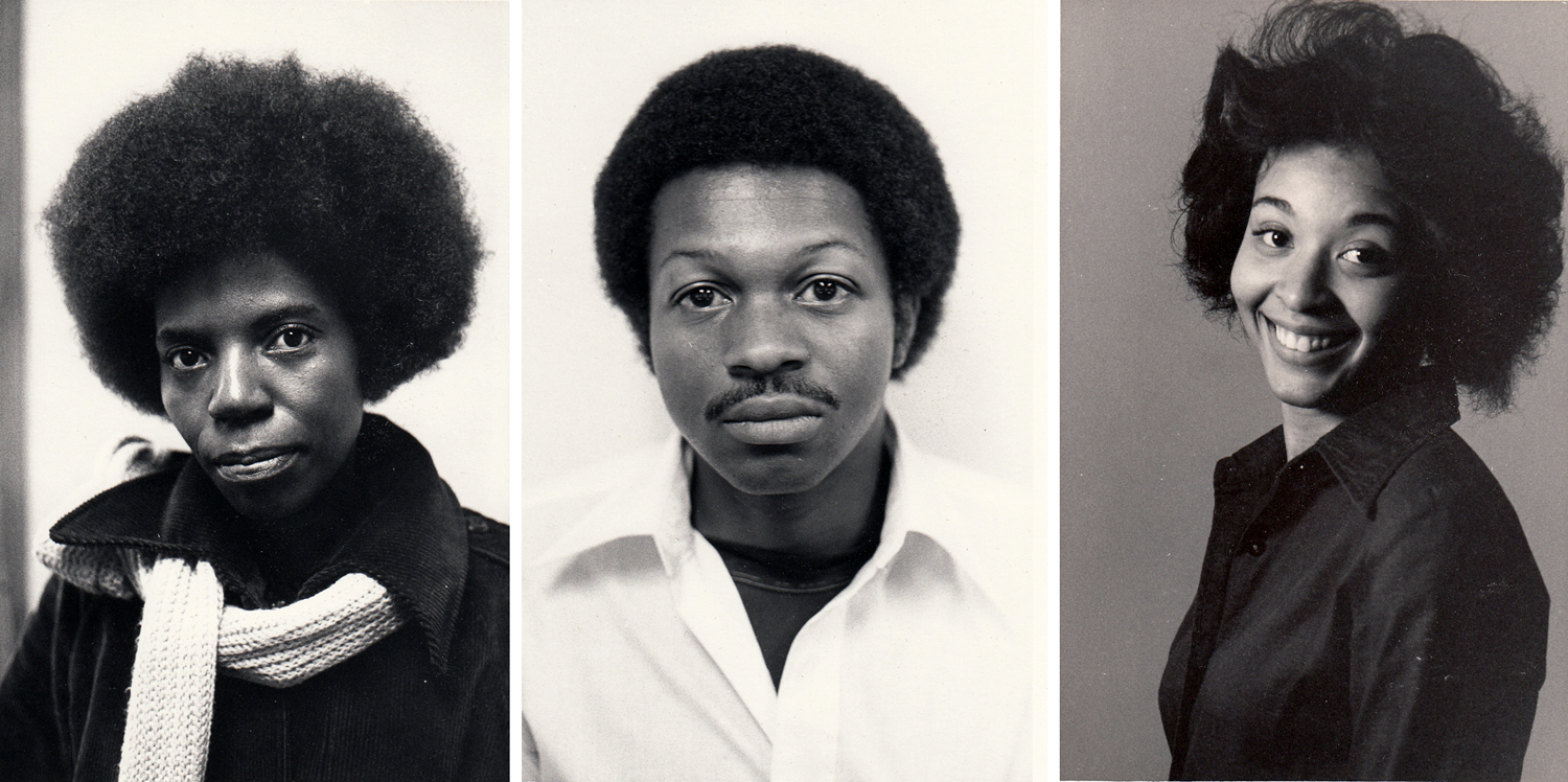
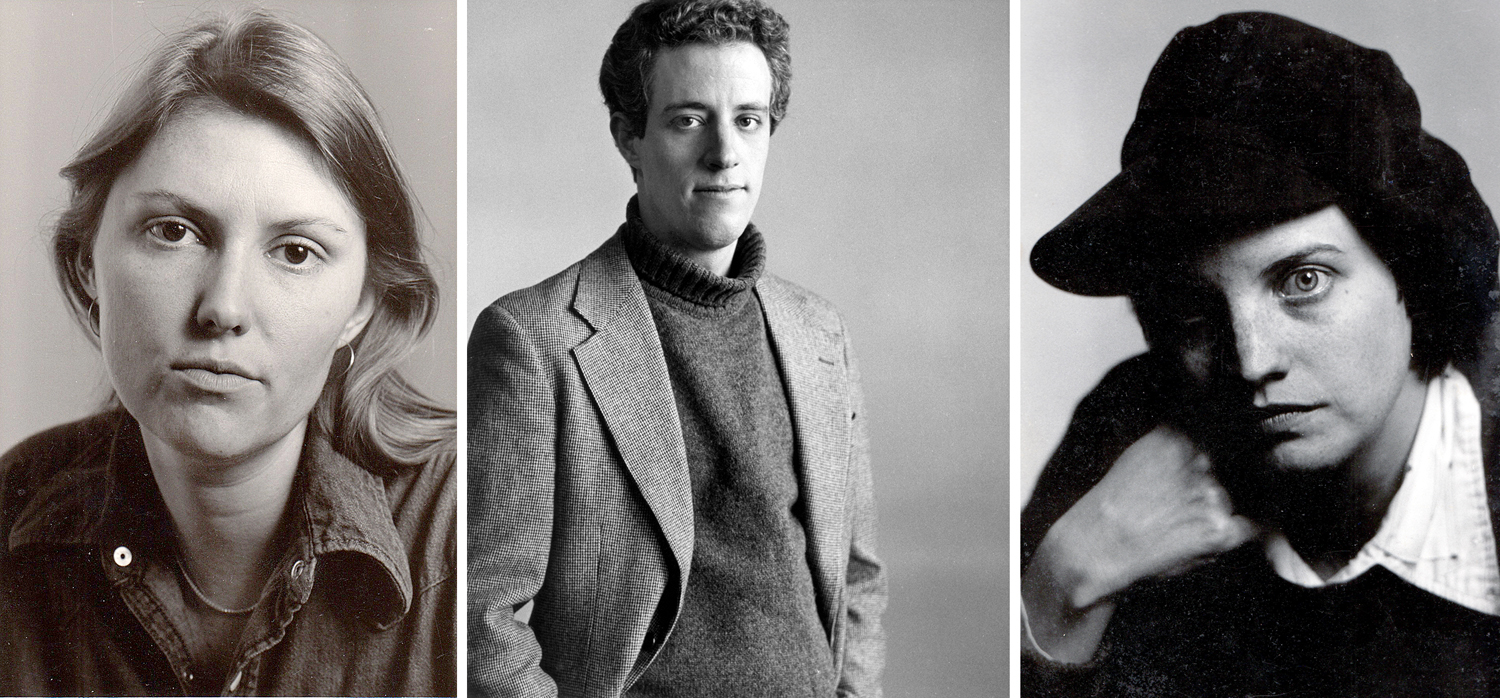
Judy Crawford; Hank Hackett; Pam Henry

I had always photographed friends and colleagues, and taught a yearly course in portrait photography. My models were formal rather than candid. I loved the work of Irving Penn and Richard Avedon, and it shows, I’m afraid. 

My method went against the trend. Most photographers preferred a longer lens for portraits, like and 85mm or 105mm lens. I felt that such a lens kept the photographer too far away from his subject. I wanted to insist on a kind of intimacy, that the subject should be kept a bit on edge and alert. So I taught using a wide-angle lens for portraits, and getting up close. 

Carole Steele

I also insisted that the subject look directly into the lens, giving the pictures both a confrontational aspect, and also a peek into the “window of the soul.” 

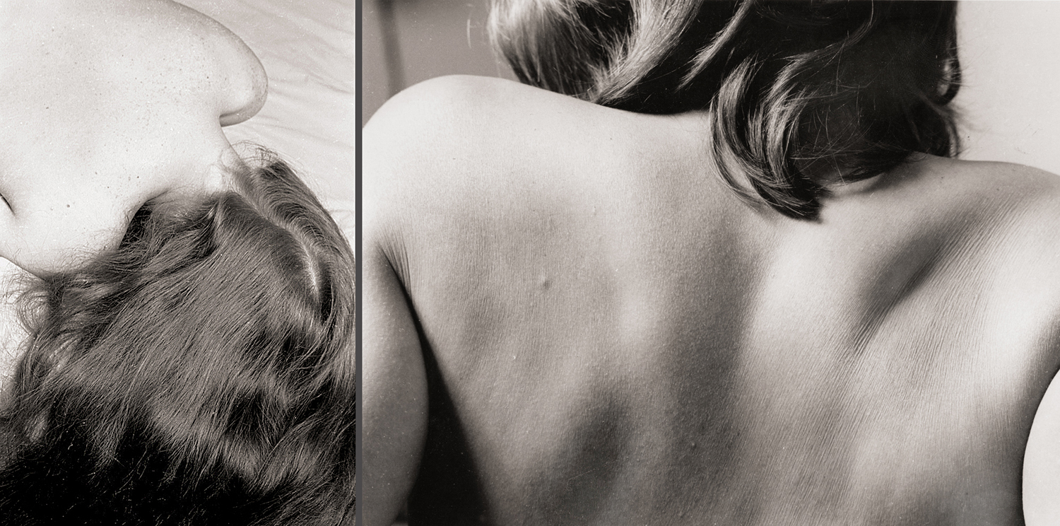
I have made a trove of nudes, too, both studio and outdoors. Over the years I have had a series of models. Only one person I asked declined the request. I believe I have avoided anything too exploitive and always, I hope, looked for the human being wearing the skin. 

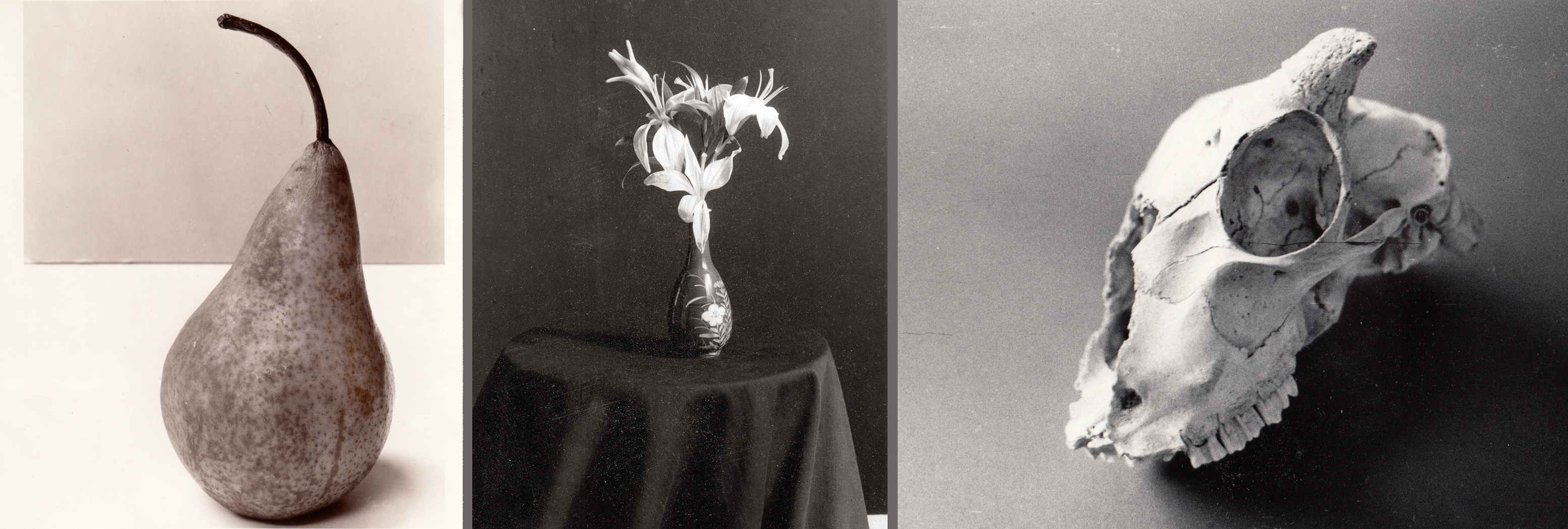
Still lifes are often pictures of flowers in vases, and I confess to having taken a barge-load of such pictures. But the percentage of blossoms has dwindled over the years, and other things have taken the focus. 

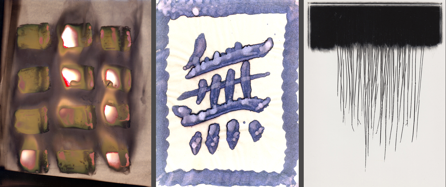
And I tried many experiments, with chemicals and printing papers, seeing ways to make something like abstract art. 

Yet, even while teaching photography, I wrote out instructional sheets for my students, and tried to be at least a bit amusing in them. My four main rules for better photography were: “Get close; make sure your lens cap is off; hold the camera steady; get closer.” Just these rules will improve the beginner’s pictures by a proven 800 percent. 

All this takes me to the late 1980s, and a major change. My department head at the school saw the handouts I had written for my students, and decided I had some talent for putting words together. She knew the Norfolk newspaper was looking for a freelance art critic, and suggested I write some sample art reviews of local shows. I wrote one about a new Edward Hopper painting bought by the Chrysler Museum and The Virginian-Pilot printed it and signed me up. For a year or so, I wrote a review for each Sunday edition. The extra income helped. 

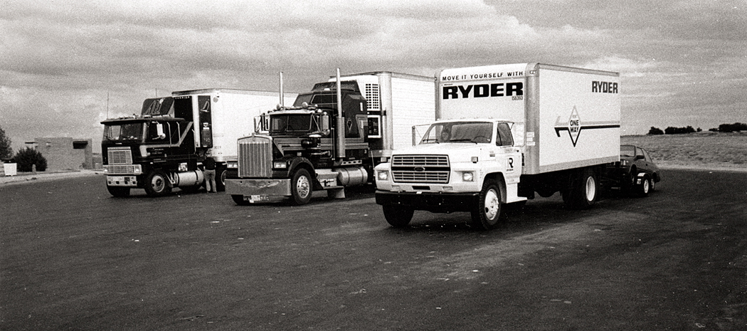
Truck stop in Texas

In the mid-’80s, my wife got a job offer in Arizona and we piled everything we owned into a Ryder truck and crossed the country, towing our car and keeping a cat in the cab the whole way. I applied for a job at The Arizona Republic, based on my experience with the Norfolk paper. To my great surprise, they hired me. I became a writer.

For the next 25 years, I functioned as an art critic, a travel writer, an editor, and, eventually a critic writing about classical music, ballet, architecture, theater, and movies. For many of the pieces I wrote, especially interviewing artists, I took my own pictures.

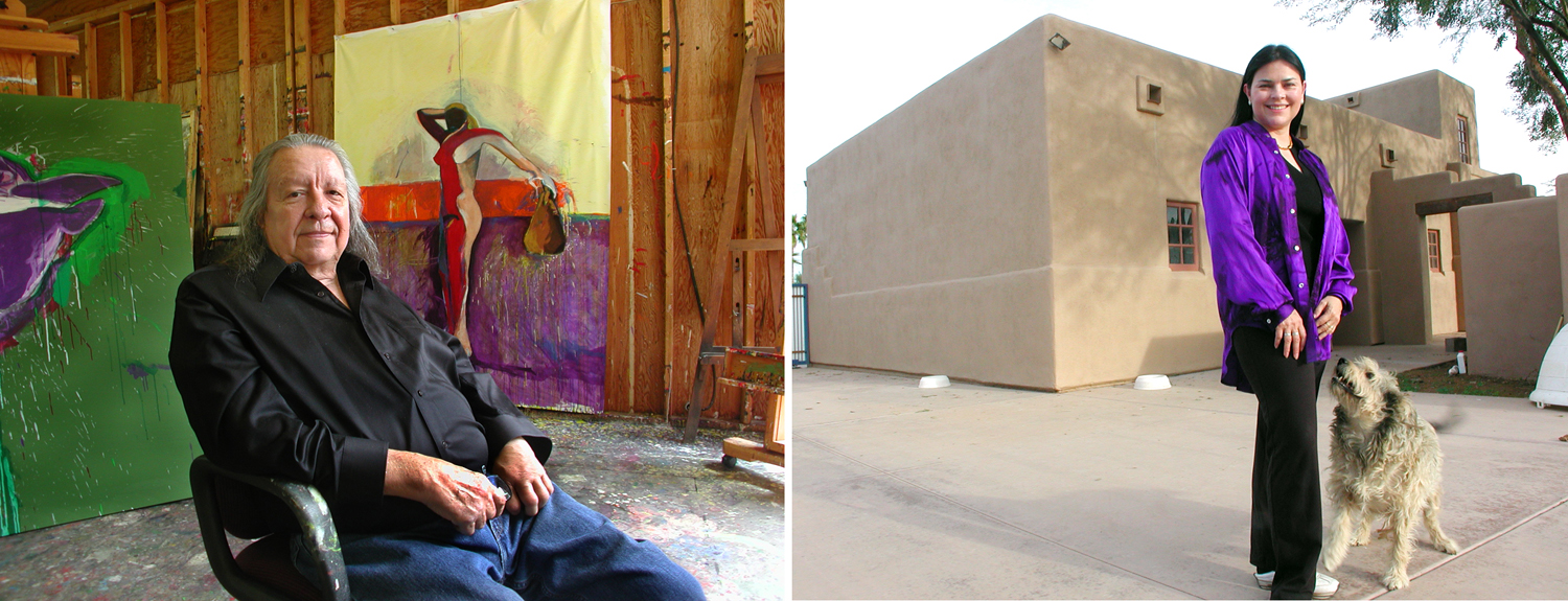
Artist Fritz Scholder and novelist Diana Gabaldon

The Republic was generous in sending me off on travel for stories, including a trip to South Africa, and I used my vacations as source for many of my other travel pieces. 

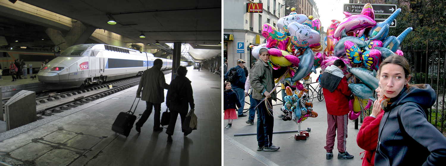
Paris

Such photographs were journalism (not that there’s anything wrong with that). But I never stopped making my own work. But there was a growing difference. The formality of my past work had loosened up. I was no longer concerned with the silly strictures that had been so important to the art photography movement from the ’50s through the ’80s, when cropping was thought a sin, the Zone System was the magic elixir, and documentary fidelity was a jealous god. It all began to seem quite beside the point. 

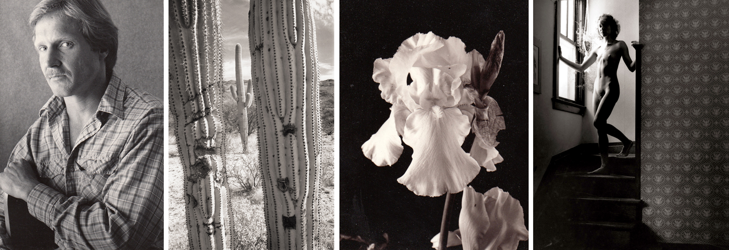
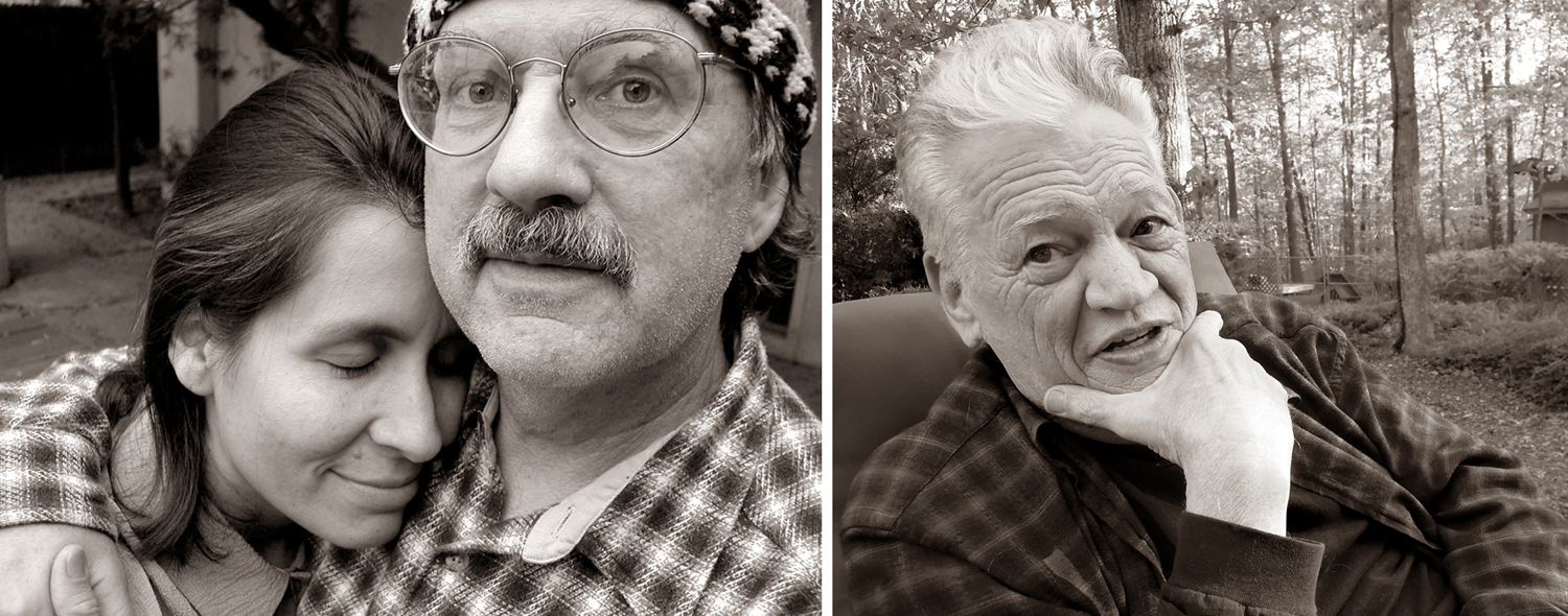
Curtis Beckman and Isabel Fierros; Mel Steele

My portraits became warmer, more human. 

Landscapes tended to shrink down into details. In fact, the whole change in my approach was less a concern with art and all its concern with composition and metaphor, and more a means of focusing my attention. Paying attention to the world became the aim. The image was merely the by-product. I mean, how many greens are there? Pointing a camera can make you notice such things. They are important. 

And so, I found myself “pecking,” in the word that Lee Friedlander uses. I would see some detail and try to make it work as a design. They were often random things in the house or car. 

The natural world was infinitely various, and seeing the bits that made up the whole drew my attention. 

There was texture, rhythm and physical presence in these minor, normally unnoticed micro-worlds. 

I also found the images worked better in groups, and so I began making sequences, mean to be seen almost as a visual story. Individual images became less the point, and relationships from one to the next took over. 

Jardin des Plantes, Paris; Judy’s garden, New Orleans

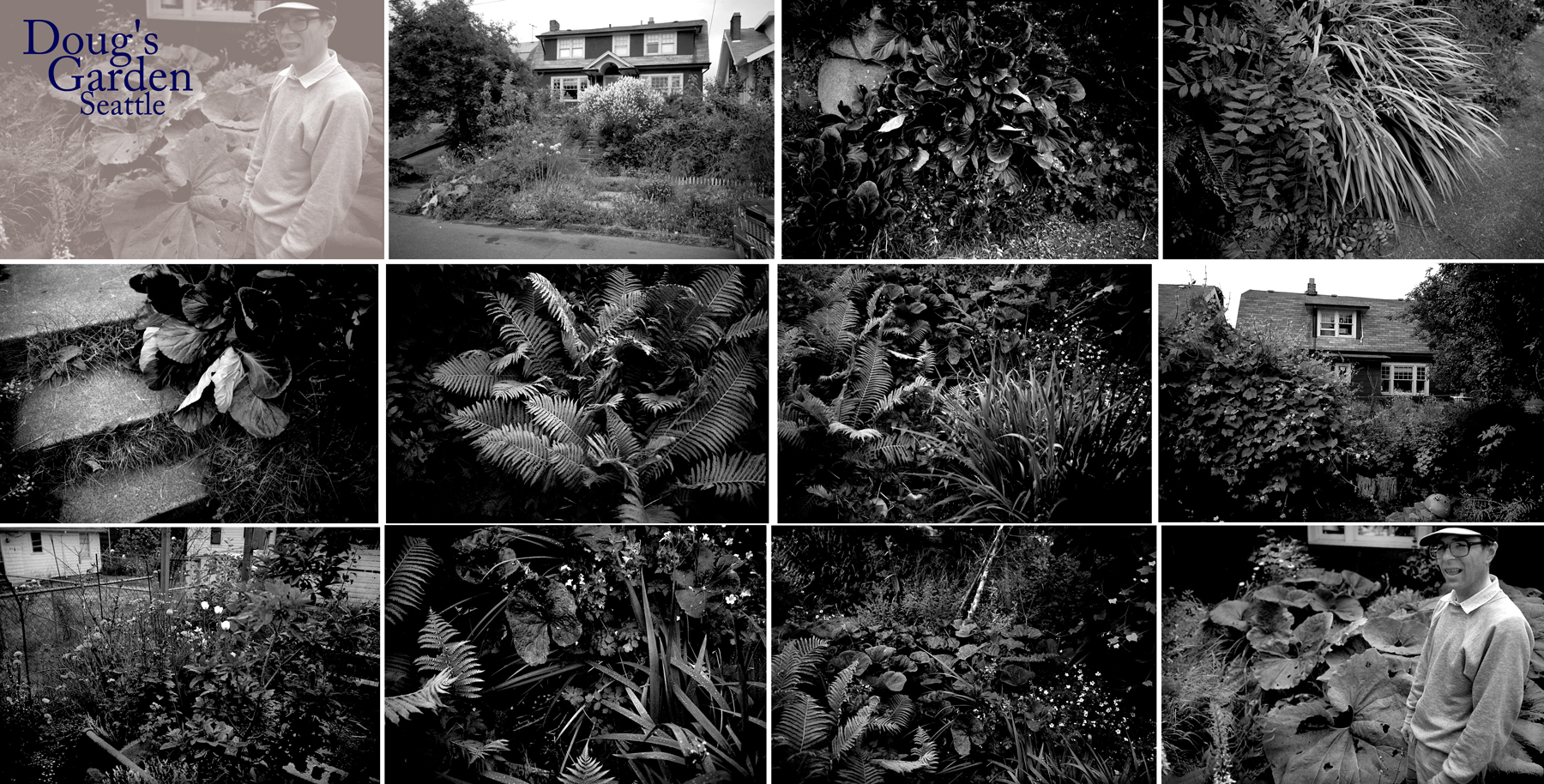
With my interest in natural details and vegetative profusion, I started a series of garden sequences, each group containing from 10 to 20 related images. I made series in friends’ back yards, public gardens, anywhere plants defined space. 

Doug’s garden, Seattle

I love gardens, but I love weeds, too, and trees. There just seems such a rich variety in nature. But, again, I wasn’t no longer thinking of the work as art, although I don’t know what else you could call it.

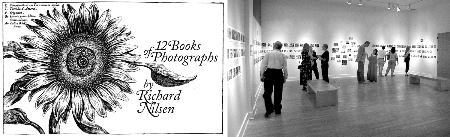
Title sign and opening at Tidewater Community College, Portsmouth, Va. 

At one point, I gathered about a hundred images, organized in 12 “books” and was invited to mount a show at my old Virginia school. 

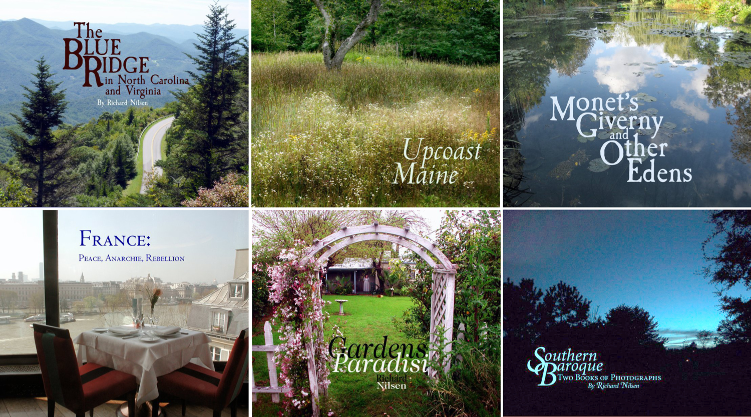
To make these series more palpable, I began making a series of bound books, using the Blurb app, and have now assembled 14 volumes. They look good on my bookshelf, and I’ve given away many copies, but they are, after all, just vanity projects. But, boy, they do look good. 

When I was younger, I tried to make art; now, I don’t care about that: I concern myself with looking, paying attention, becoming immersed in the world I inhabit. Photography is just the means I have to focus my awareness. Being more aware is being more human. 

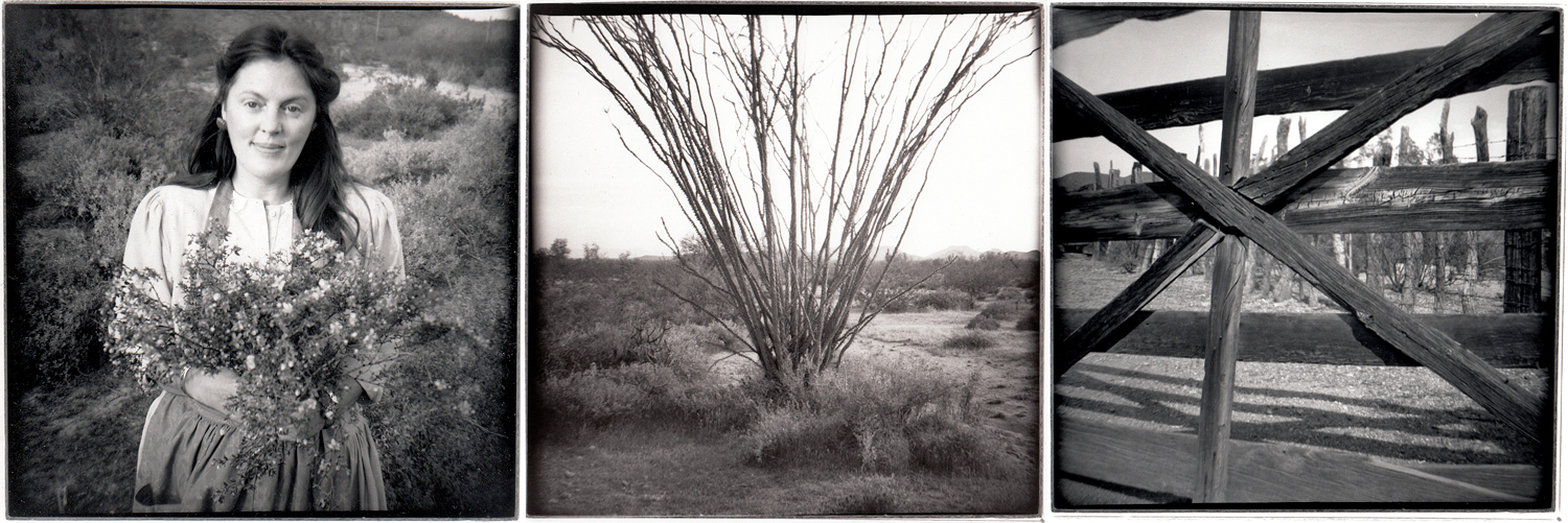
This freeing up of my intention also let me play around more. I bought a $1.98 Diana camera and took it to Organ Pipe Cactus National Monument. 

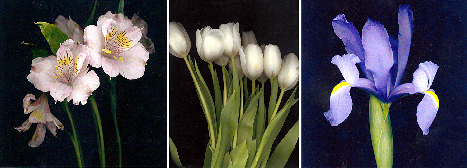
I made a series of flower prints by scanning them on a flatbed scanner instead of using a camera.

Anne Iott

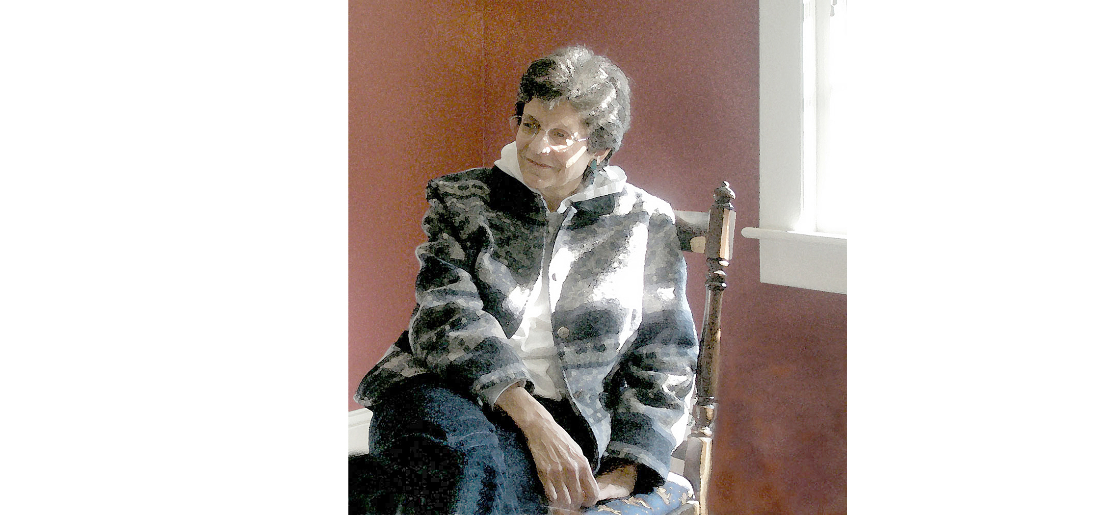
Playing with the options of Photoshop, I made a faux watercolor from a photo of my college department head. 

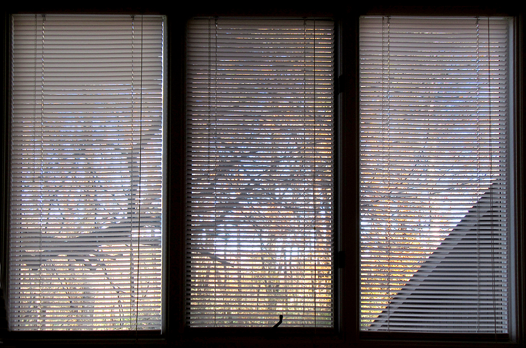
I woke up one day and noticed that sunlit trees outside my windows looked rather like images on a Japanese shoji screen. 

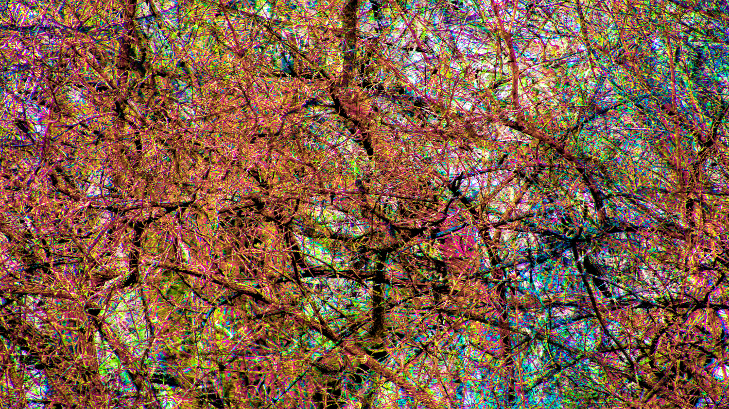
I used multiple images of crossed tree branches, overprinted them to make an abstract image, looking rather like a Jackson Pollock.

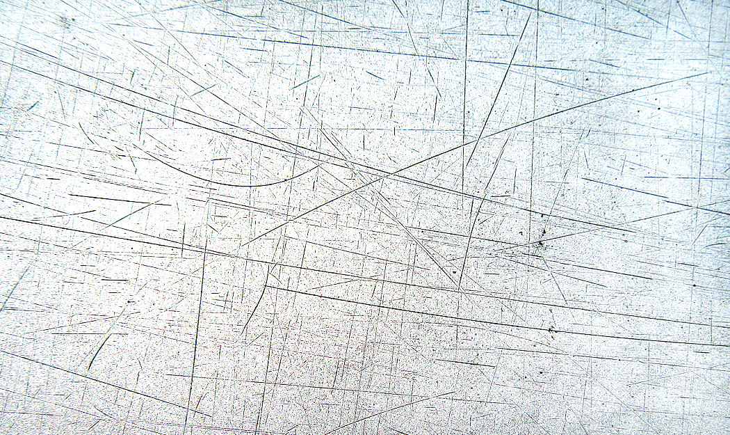
I found abstractions everywhere, including these micro-scratches in the silver paint of our old Buick, and looking rather like something from a Wilson cloud chamber, or perhaps a Cy Twombly. 

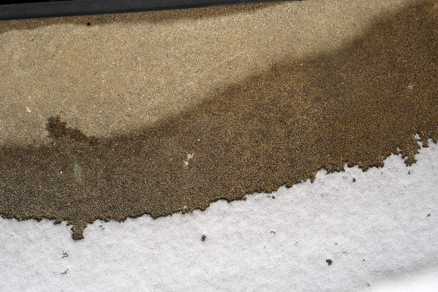
Snow melt on front stoop

The more I looked, the more I found, turned into patterns rather than things you might name. 

When I was a young man, I desired an audience. Having gallery shows or publishing books seemed to have a point. Now, I find I make images simply for myself. It has turned out true for my writing, as well. 

For a quarter of a century, I wrote for my reading audience. If no one read what I wrote, I wouldn’t have been paid for it. And it was gratifying, I admit, to be recognized in the supermarket, or to have Richard Avedon write to me after having read one of my reviews. But it has now been 14 years since I retired, and have written almost as much on this blog as I did then, and for no pay. I just cannot stop writing. And it is still pleasant to get comments from readers, but I write for myself, to clarify my thoughts, to express my feelings. Anything beyond is gravy. 

Rest stop on I-40, east of Asheville, N.C.

And it is the same with my camera. It is my response to the world. I make these images to interact with that world, to force my gaze, to pay attention. 

The most important lesson I ever got from college was from the professor who forced me to “engage with the text.” That simply re-uttering what he had said in class was not enough. I had to find my own way in the subject, bring something to it, rather than just memorize. Engage. Pay attention. It’s real, not just some hoop to jump through to get a degree. There is genuine reward, intellectually and emotionally, for involving your best self with what the cosmos has to offer. You will be more alive. 

Click on any image to enlarge
Many years ago, I attended a photo staff meeting at my newspaper and the photo editor was complaining about a picture that a very talented staffer had made. For him, it was too arty.

“This is a newspaper,” he said. “Our photographs must be clear. We cannot have any ambiguity in them. If it is a picture of a house, I want it in the center of the frame, and I want the whole house. Like a real estate photo. We are not making images for a gallery; we are showing readers what the story is about.”

I remember cringing, but I said nothing. I was not on the staff, but just a travel writer who made my own photographs for my stories. I was in the meeting by default. 

The idea that a photograph was merely an illustration to back up words bothered me then, and it bothers me now. Instead of a supplement, I thought of them as amplification. 

Some things can be said better visually than verbally. The photo might very well be able to stand on its own. 

But, in a culture of verbal people — as a newspaper tends to be — a picture is a stand-in for words. You should be able to point to something in the photograph and name it: “House.” The name then, takes over, and any visual information is immediately rendered moot. Very like when you head to a rest room at a McDonald’s and the pictures on the doors tells which one to open. The image becomes a pictogram. 
This is the way many people regard photographs. They look and they name. “Aunt Julia.” “The house I used to live in.” “Niagara Falls.” Then they turn the page in the album. “Here is me at my prom.” 
Much of the visual information in the picture is passed over, not registering. Was that a blue tux at the prom? Did those horn-rim glasses make you look dorky? Were the shoes cropped out of the picture? Can you remember, then, what shoes you wore? 

Details matter. When you name the image rather than see it, you miss the majority of what is pictured; you miss all the pleasures you could enjoy — the colors, shapes, textures — and all the information that is there to mine. I am reminded of those impatient people I have seen in art museums running from painting to painting and reading the tags next to them. “This is a Renoir. Oh, this one is a Picasso.” 

Naming things often gets in the way of seeing them. Naming is a very low form of intellectual activity, but one it is too easy to become proud of. It does not actually indicate your intelligence if you can name ever painting in the gallery, or the make and model of every car you spot on the highway. It just means you can memorize. 

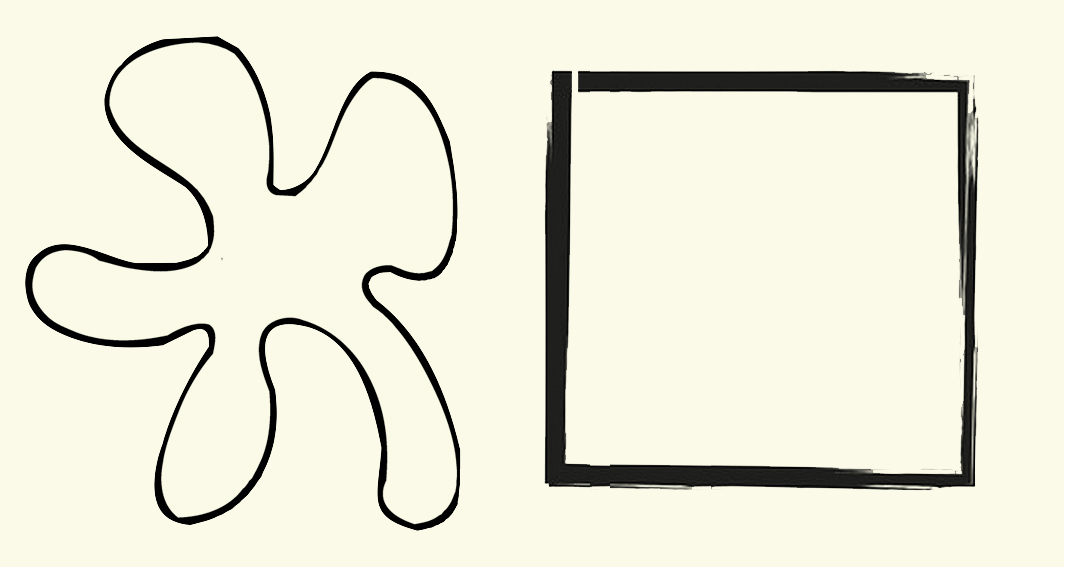
When, before I was a writer, I was a teacher, I would sometimes draw two shapes on the blackboard and ask, “Which of these shapes can you draw more accurately?” Most students would pick the square. It had a name and they could see the square, translate what they saw to a word, and then retranslate that word onto the paper with their pen. In the process, details of the original are obliterated.

Notice that the square here is not a perfect square. It has some sketchy lines and it is not completely closed up, and, in fact, it isn’t even a square, but a low-aspect-ratio rectangle. All of that visual information is expunged when you replace it with the name, “square.” The amorphous shape, on the other hand, would require you to look at it and attempt to follow its contours with your pen, forcing you to pay attention visually. 


Your blob would be drawn more accurately than your square. 

In his groundbreaking book, Principles of Art History (1915), Heinrich Wölfflin described the differences between Renaissance and Baroque art with a series of oppositions. Among these is the contrast between art which emphasizes the unity of the whole, which may suppress detail to the benefit of the overall design; and art which revels in a multiplicity of detail, even if it confuses the overall design. 

It isn’t that the classic art doesn’t pay attention to detail. In fact, it often takes pains to make everything equally easy to recognize, well lit, well placed in the frame. But the whole is more important than the parts. 

Balancing that is art that may even obscure some detail to make others more prominent. 

This dichotomy occurs repeatedly in art history — from Classic Greek art to Hellenistic Art, from Renaissance to Baroque, from Neoclassic to Romantic, from Modernism to Postmodernism. In Nietzschean terms, classic and romantic, Apollonian and Dionysian. 

The 20th Century, which we are most recently heir to, unity was valued as supreme. Artists, writer and poets who filled their work with profusion of detail were denigrated. The most concise poets were held superior. Painters who reduced their subject to basic forms were extolled. Musicians who subdued florid detail in order to render the overall form of the music more clear were applauded. They had a “grasp of the structure.” 

The complaint lodged against pianist Vladimir Horowitz, for instance, was that he never fully expressed the form of longer pieces of music, such as sonatas, getting lost in multifarious musical volutes and whorls. Of course, when you listen to the ancient recordings of the great pianists of the early 20th century — an era of romantic piano playing — all of the pianists focused on details. It is where the fun was to be found, the flavor of the ingredients rather than the melange of the whole.  

Romanticism in general relishes the detail, and can often get lost in it. That’s what makes it Romanticism. (Well, one of the things). Detail is where we find the pith, the essential oils, the meat. 

Classic painter Joshua Reynolds taut the “grand style,” and recommended choosing the general over the particular: a stylized tree over the quirky oak in the back yard. Romantic artist William Blake read Reynold’s book and wrote in the margin: “To generalize is to be an idiot. To particularize is the alone distinction of merit.” You can also imagine him chasing kids off his lawn. 

But his point is that the world is made up of details, and meaning is found in them. The collection of details fills out the impression we get from the quick overview. It is the detail that we know the whole. 

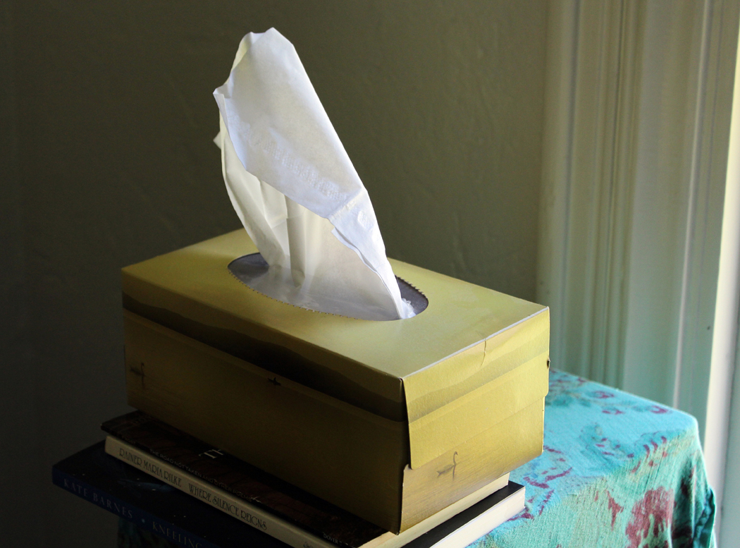
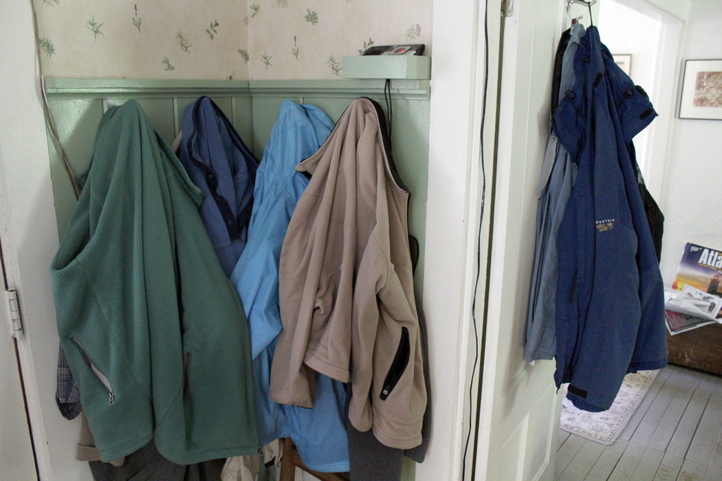
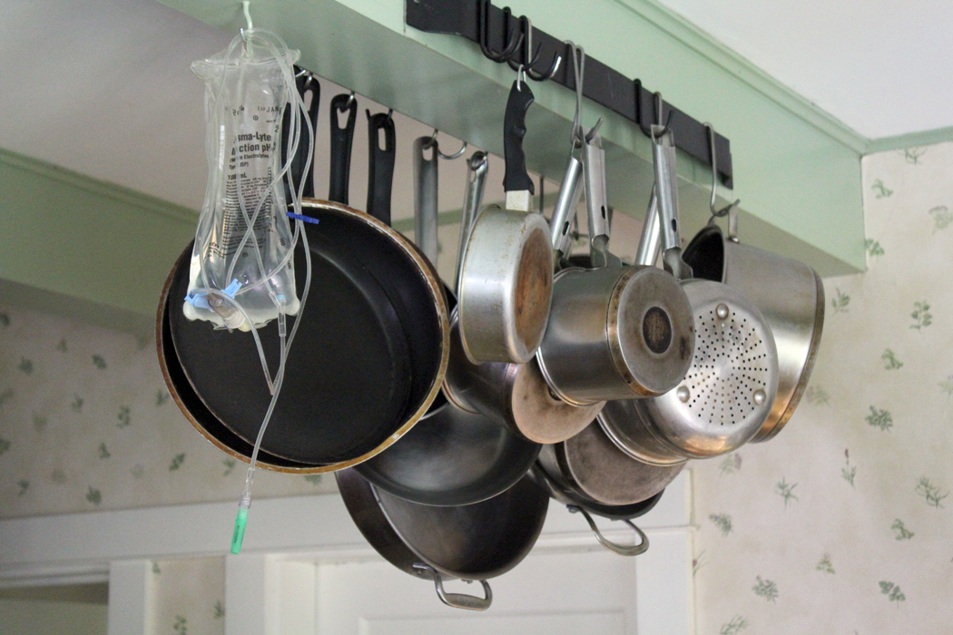
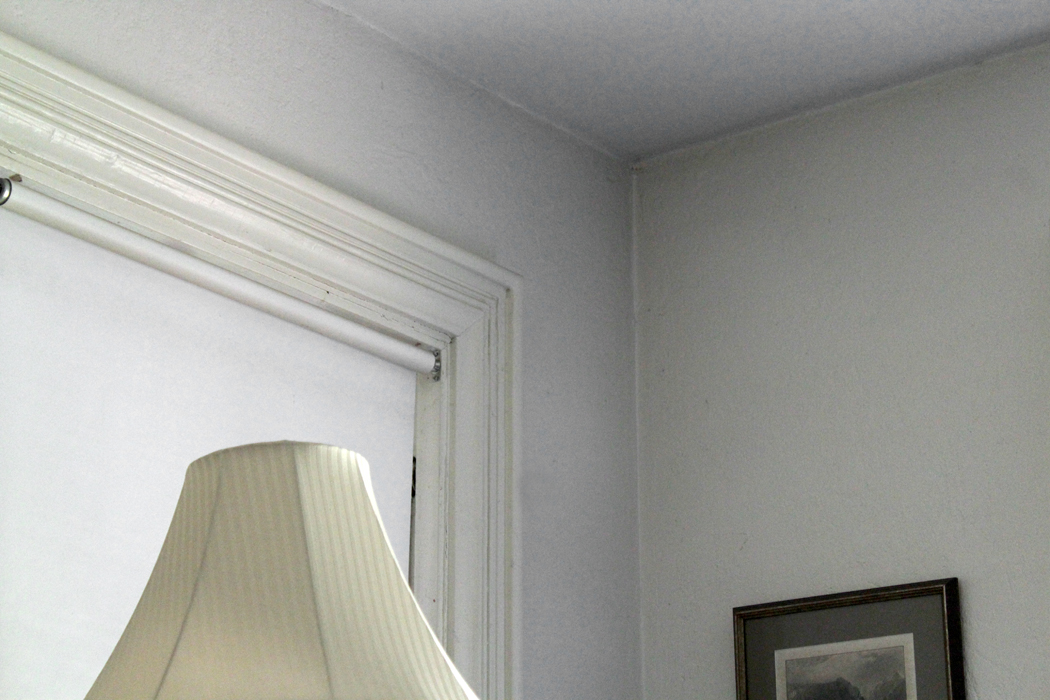
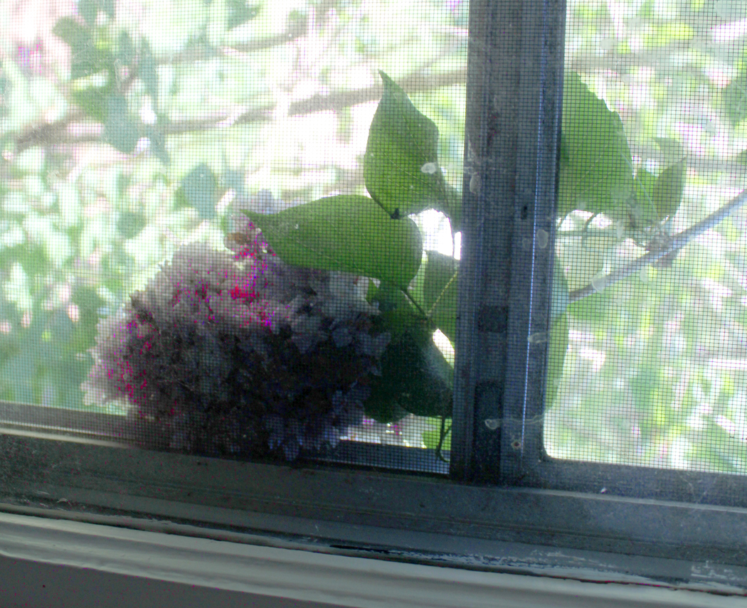
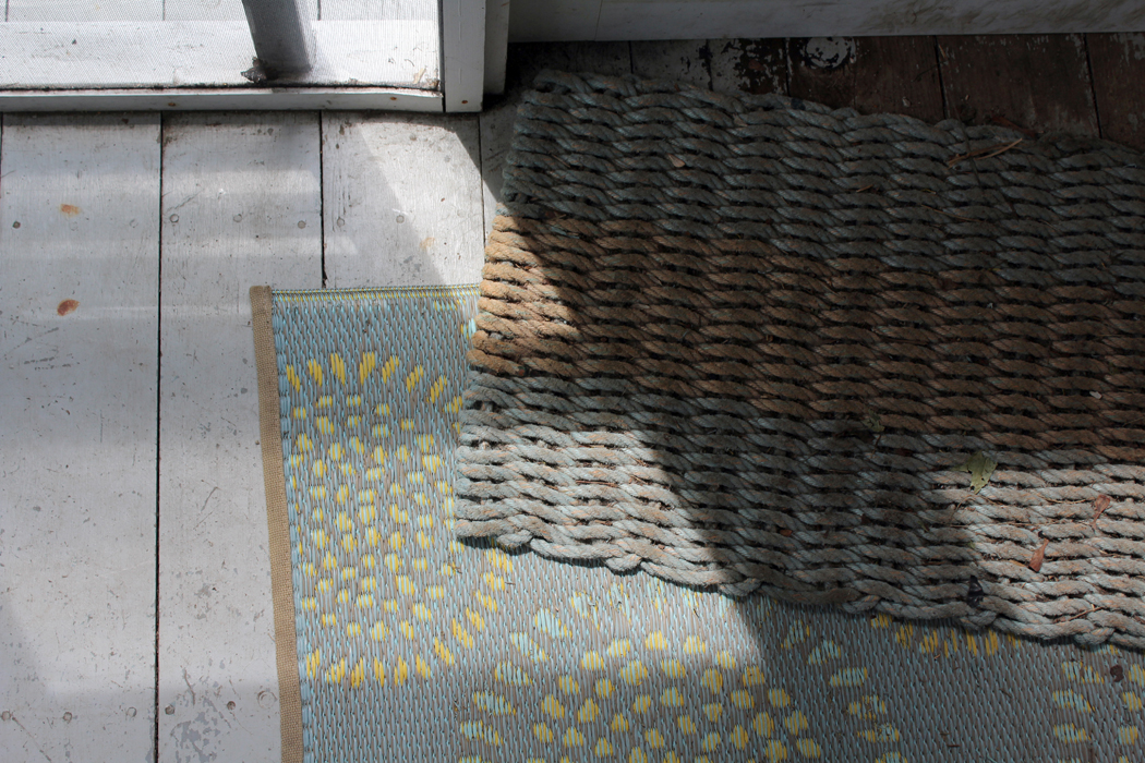
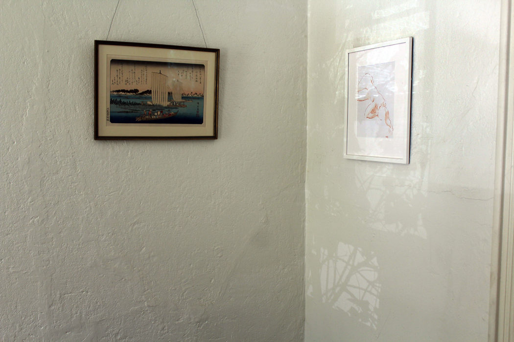
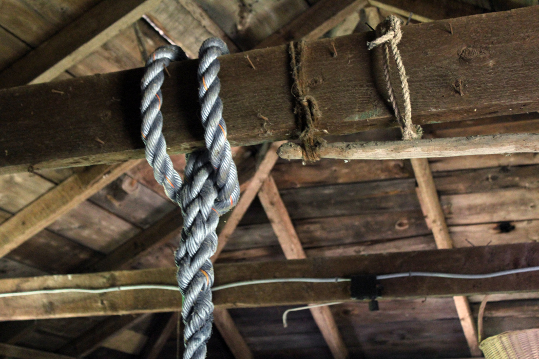
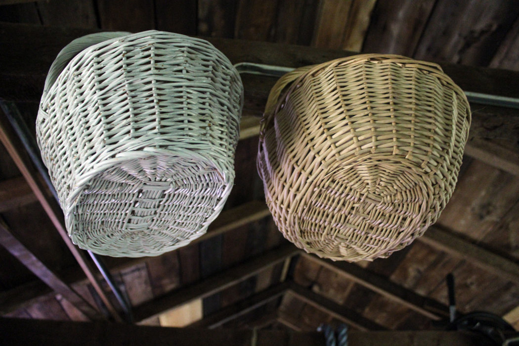
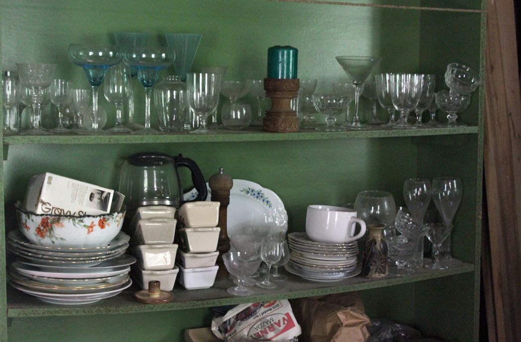
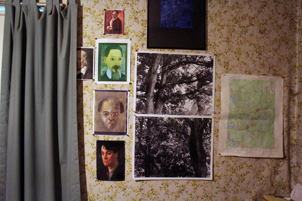
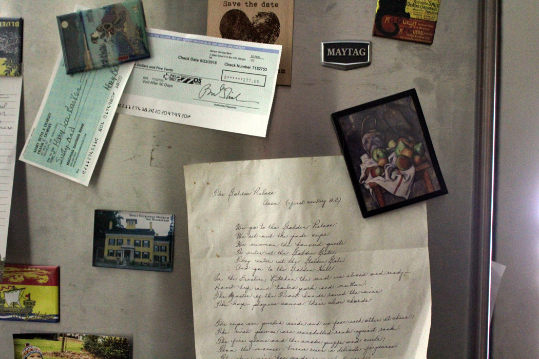
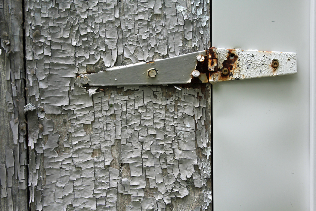
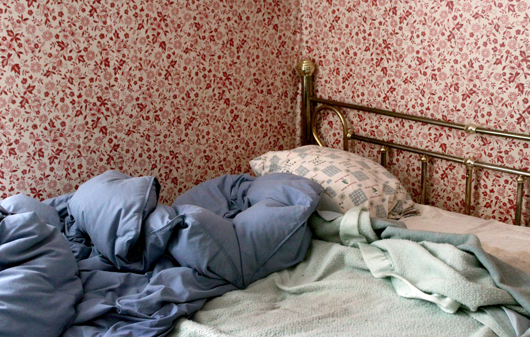
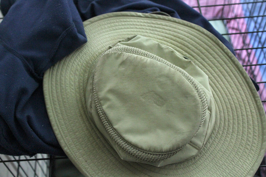
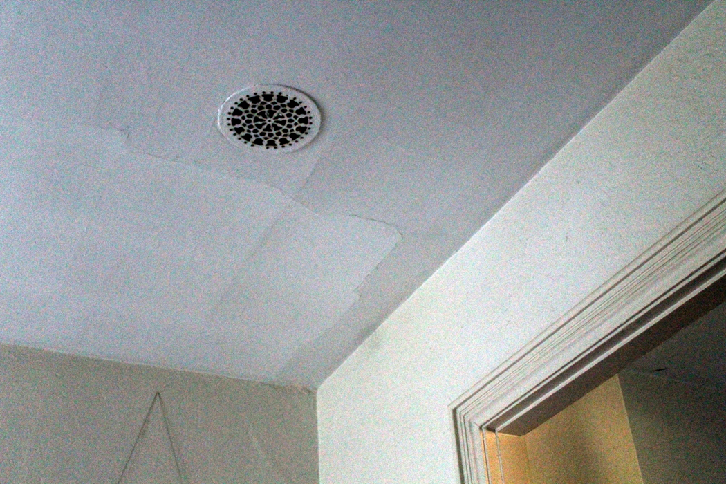
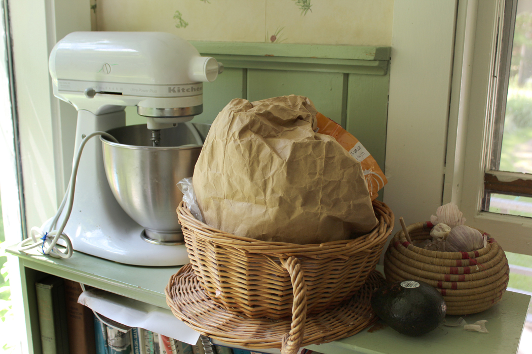
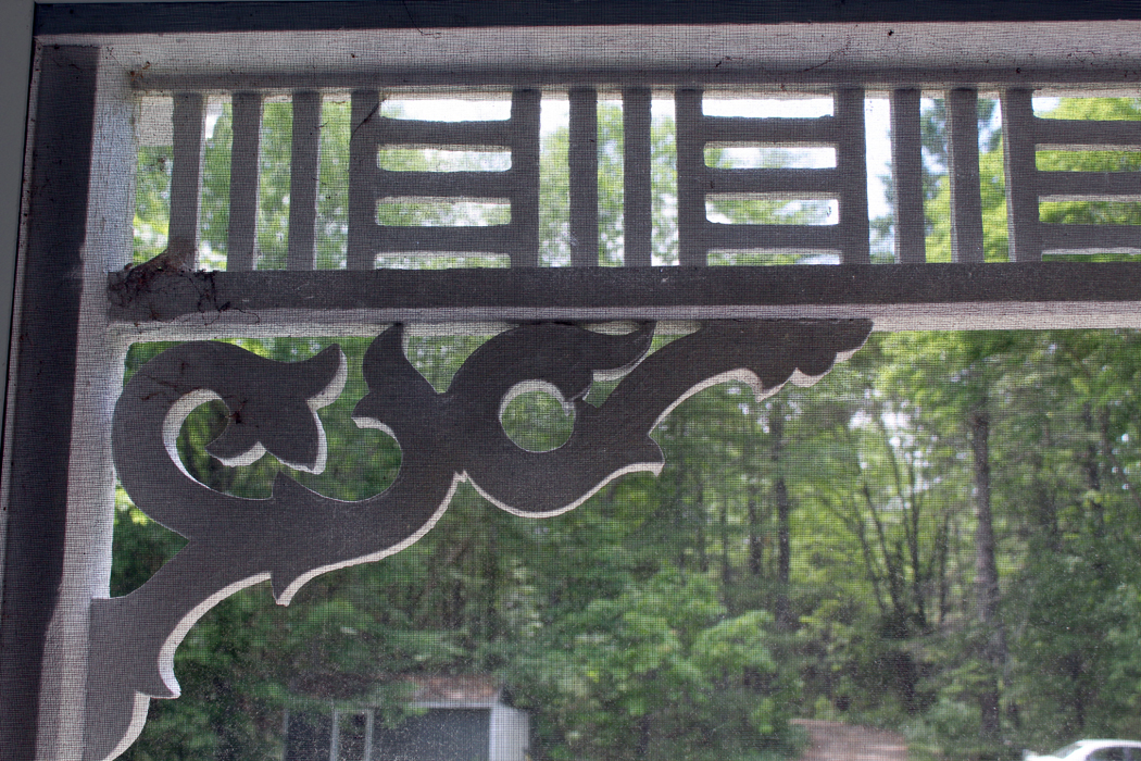
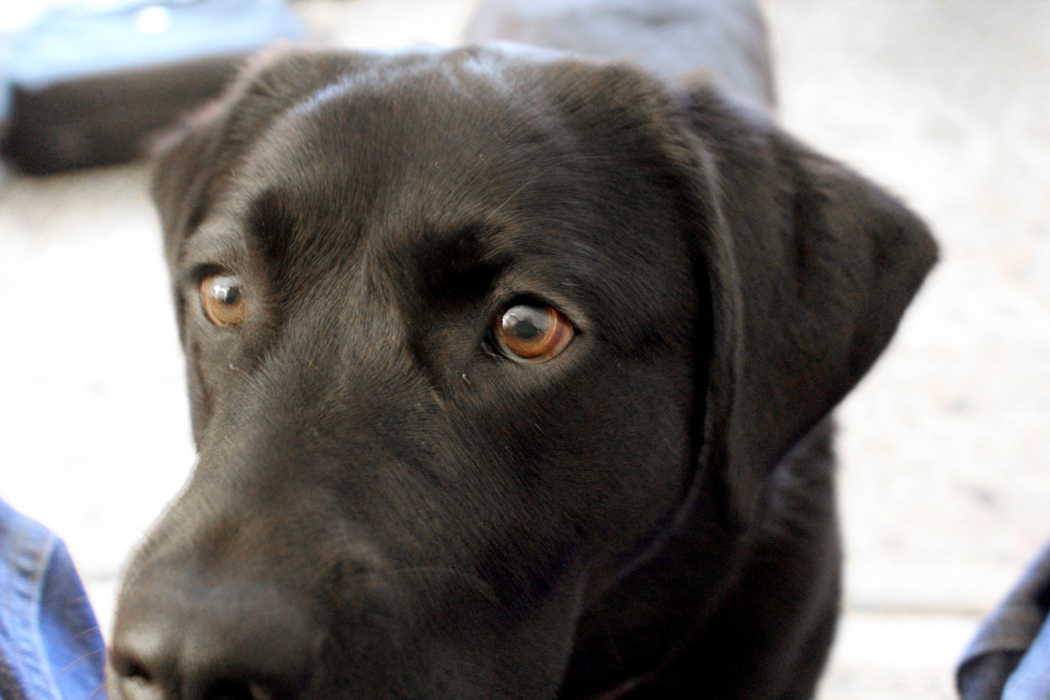
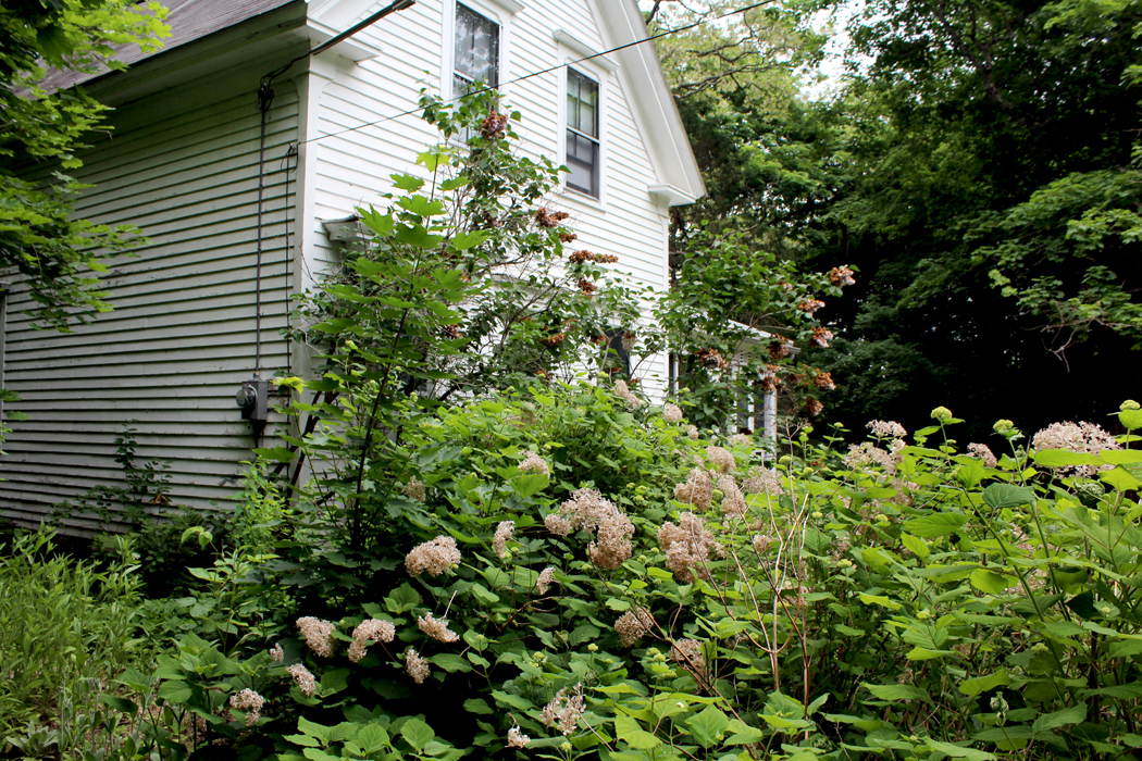
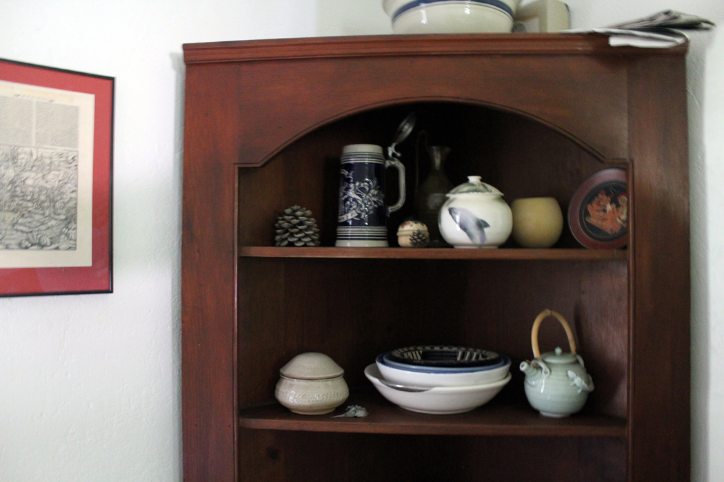
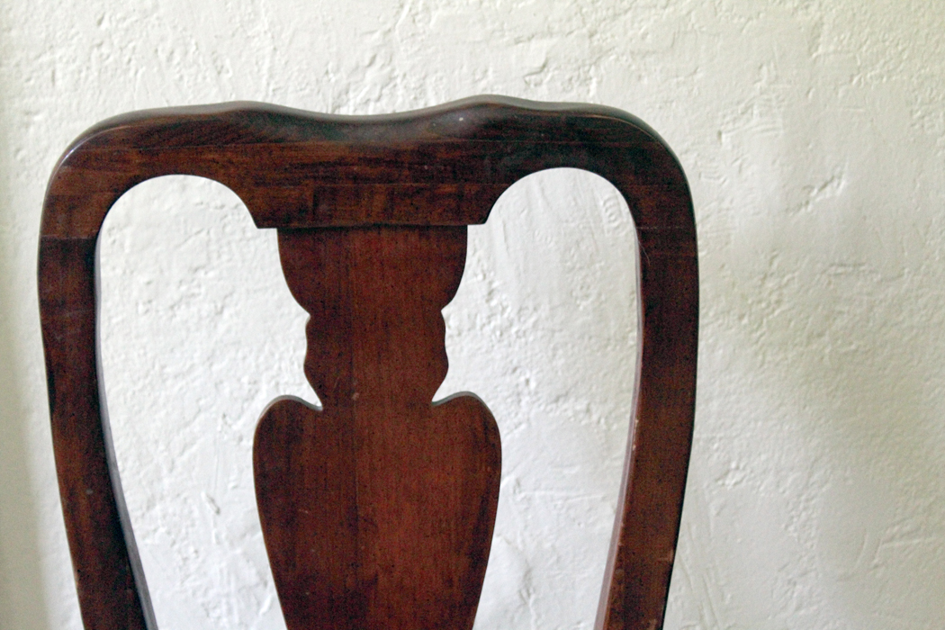
Through this essay, I have sprinkled photographs of the details of a house in Maine. It is one I know and love very well. 

If you look closely at them and absorb all the tasty detail, you can have a much fuller understanding, not only of the house, but of the style of Down East Maine, its economy, its culture, the nature that grows green in profusion everywhere. 

Crumbs to make a cake.