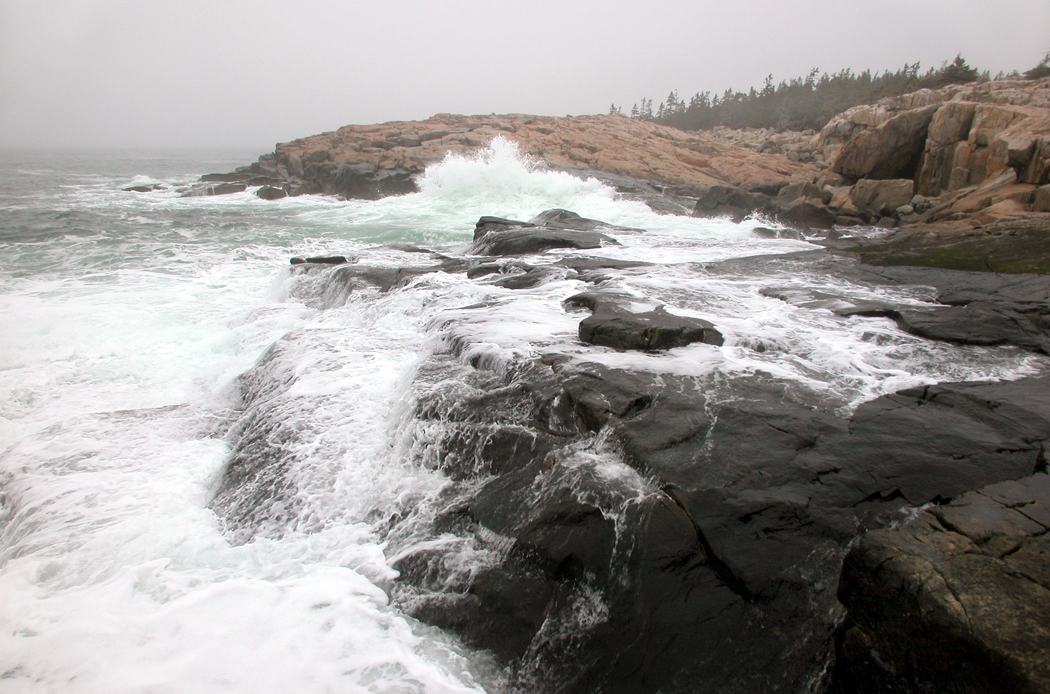
Archive

Tag Archives: photography

Many years ago, I attended a photo staff meeting at my newspaper and the photo editor was complaining about a picture that a very talented staffer had made. For him, it was too arty.

“This is a newspaper,” he said. “Our photographs must be clear. We cannot have any ambiguity in them. If it is a picture of a house, I want it in the center of the frame, and I want the whole house. Like a real estate photo. We are not making images for a gallery; we are showing readers what the story is about.”

I remember cringing, but I said nothing. I was not on the staff, but just a travel writer who made my own photographs for my stories. I was in the meeting by default. 

The idea that a photograph was merely an illustration to back up words bothered me then, and it bothers me now. Instead of a supplement, I thought of them as amplification. 

Some things can be said better visually than verbally. The photo might very well be able to stand on its own. 

But, in a culture of verbal people — as a newspaper tends to be — a picture is a stand-in for words. You should be able to point to something in the photograph and name it: “House.” The name then, takes over, and any visual information is immediately rendered moot. Very like when you head to a rest room at a McDonald’s and the pictures on the doors tells which one to open. The image becomes a pictogram. 

This is the way many people regard photographs. They look and they name. “Aunt Julia.” “The house I used to live in.” “Niagara Falls.” Then they turn the page in the album. “Here is me at my prom.” 

Much of the visual information in the picture is passed over, not registering. Was that a blue tux at the prom? Did those horn-rim glasses make you look dorky? Were the shoes cropped out of the picture? Can you remember, then, what shoes you wore? 

Details matter. When you name the image rather than see it, you miss the majority of what is pictured; you miss all the pleasures you could enjoy — the colors, shapes, textures — and all the information that is there to mine. I am reminded of those impatient people I have seen in art museums running from painting to painting and reading the tags next to them. “This is a Renoir. Oh, this one is a Picasso.” 

Naming things often gets in the way of seeing them. Naming is a very low form of intellectual activity, but one it is too easy to become proud of. It does not actually indicate your intelligence if you can name ever painting in the gallery, or the make and model of every car you spot on the highway. It just means you can memorize. 

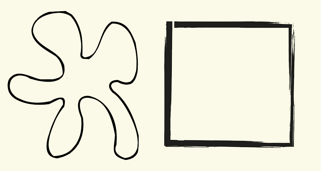
When, before I was a writer, I was a teacher, I would sometimes draw two shapes on the blackboard and ask, “Which of these shapes can you draw more accurately?” Most students would pick the square. It had a name and they could see the square, translate what they saw to a word, and then retranslate that word onto the paper with their pen. In the process, details of the original are obliterated.

Notice that the square here is not a perfect square. It has some sketchy lines and it is not completely closed up, and, in fact, it isn’t even a square, but a low-aspect-ratio rectangle. All of that visual information is expunged when you replace it with the name, “square.” The amorphous shape, on the other hand, would require you to look at it and attempt to follow its contours with your pen, forcing you to pay attention visually. 


Your blob would be drawn more accurately than your square. 

In his groundbreaking book, Principles of Art History (1915), Heinrich Wölfflin described the differences between Renaissance and Baroque art with a series of oppositions. Among these is the contrast between art which emphasizes the unity of the whole, which may suppress detail to the benefit of the overall design; and art which revels in a multiplicity of detail, even if it confuses the overall design. 

It isn’t that the classic art doesn’t pay attention to detail. In fact, it often takes pains to make everything equally easy to recognize, well lit, well placed in the frame. But the whole is more important than the parts. 

Balancing that is art that may even obscure some detail to make others more prominent. 

This dichotomy occurs repeatedly in art history — from Classic Greek art to Hellenistic Art, from Renaissance to Baroque, from Neoclassic to Romantic, from Modernism to Postmodernism. In Nietzschean terms, classic and romantic, Apollonian and Dionysian. 

The 20th Century, which we are most recently heir to, unity was valued as supreme. Artists, writer and poets who filled their work with profusion of detail were denigrated. The most concise poets were held superior. Painters who reduced their subject to basic forms were extolled. Musicians who subdued florid detail in order to render the overall form of the music more clear were applauded. They had a “grasp of the structure.” 

The complaint lodged against pianist Vladimir Horowitz, for instance, was that he never fully expressed the form of longer pieces of music, such as sonatas, getting lost in multifarious musical volutes and whorls. Of course, when you listen to the ancient recordings of the great pianists of the early 20th century — an era of romantic piano playing — all of the pianists focused on details. It is where the fun was to be found, the flavor of the ingredients rather than the melange of the whole.  

Romanticism in general relishes the detail, and can often get lost in it. That’s what makes it Romanticism. (Well, one of the things). Detail is where we find the pith, the essential oils, the meat. 

Classic painter Joshua Reynolds taut the “grand style,” and recommended choosing the general over the particular: a stylized tree over the quirky oak in the back yard. Romantic artist William Blake read Reynold’s book and wrote in the margin: “To generalize is to be an idiot. To particularize is the alone distinction of merit.” You can also imagine him chasing kids off his lawn. 

But his point is that the world is made up of details, and meaning is found in them. The collection of details fills out the impression we get from the quick overview. It is the detail that we know the whole. 

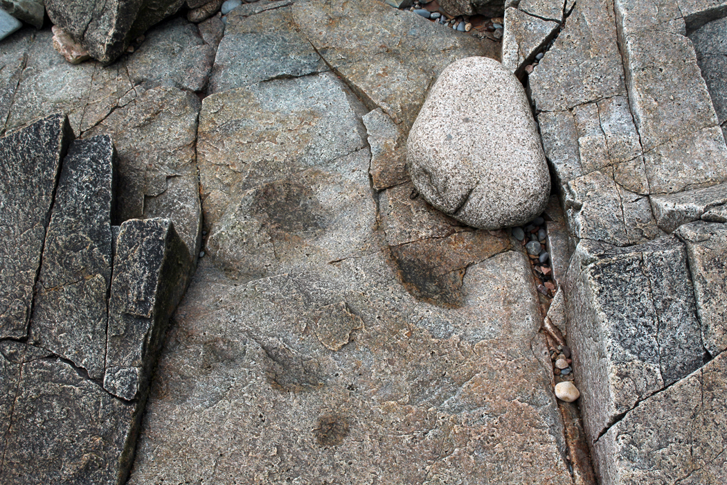
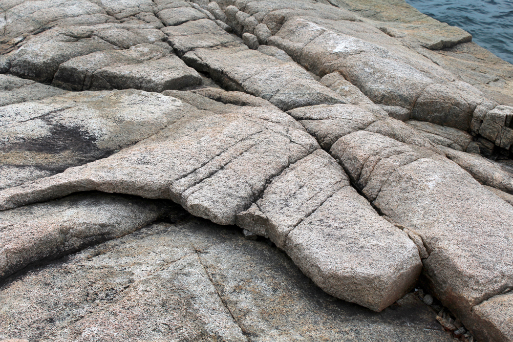
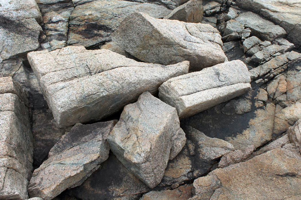
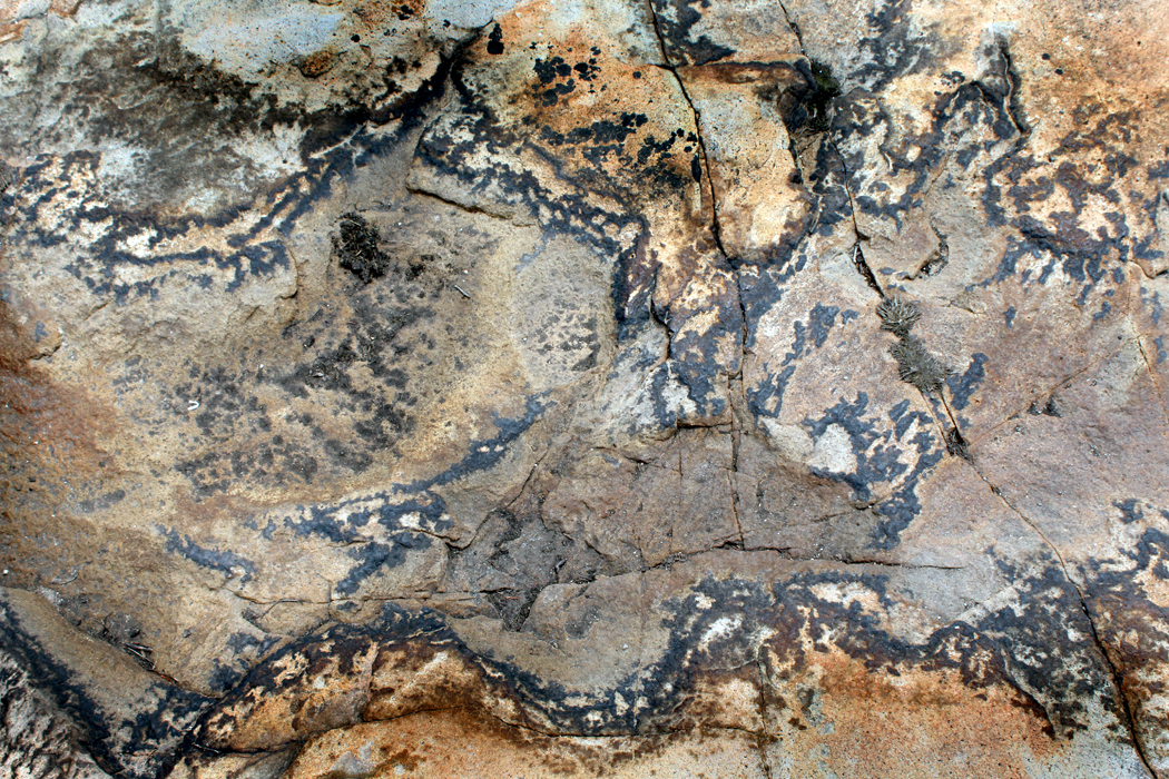
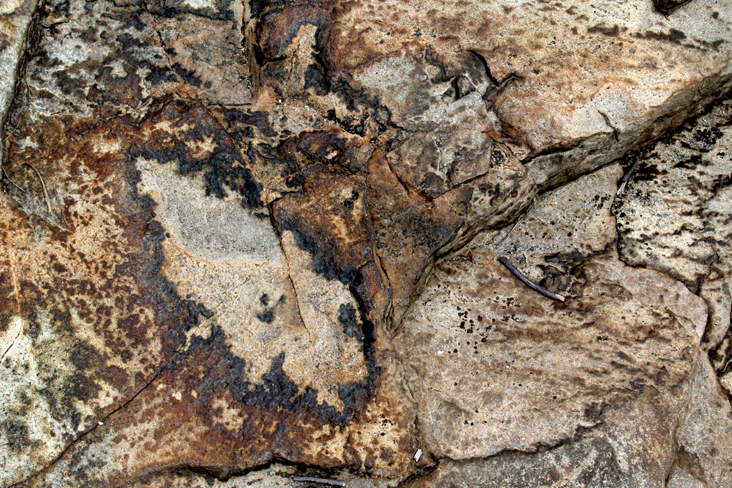
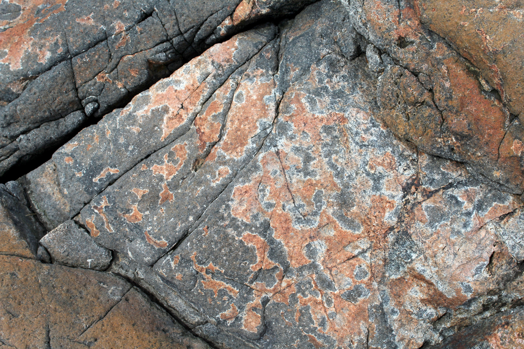
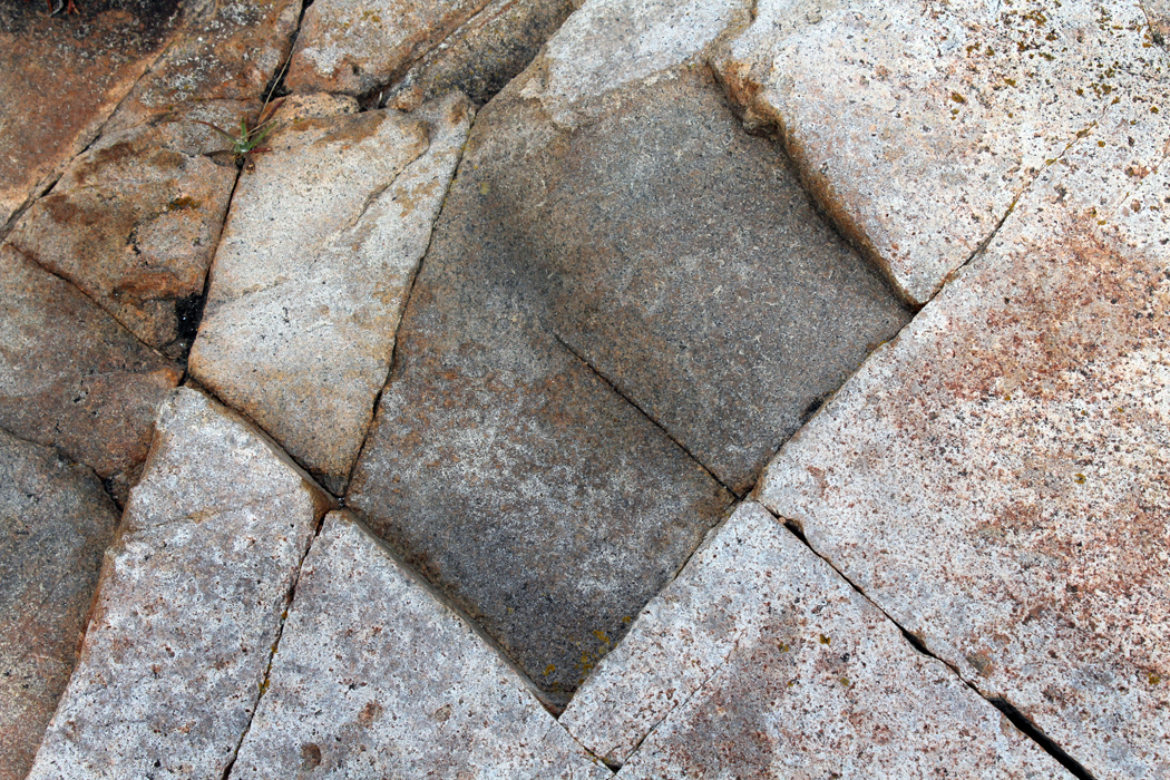
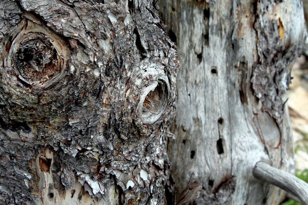
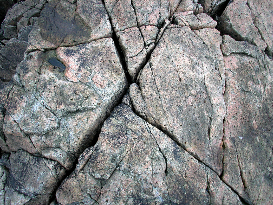
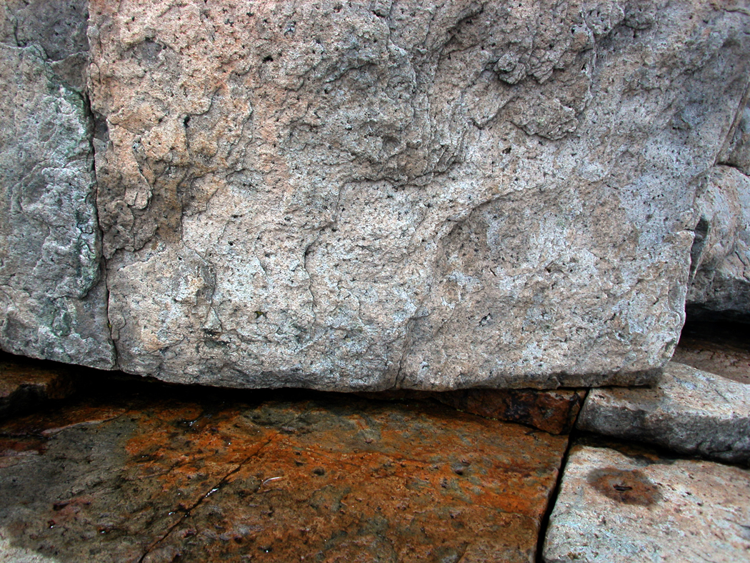
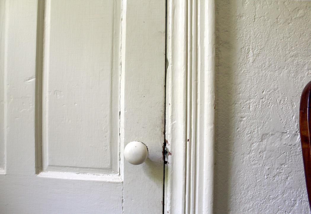
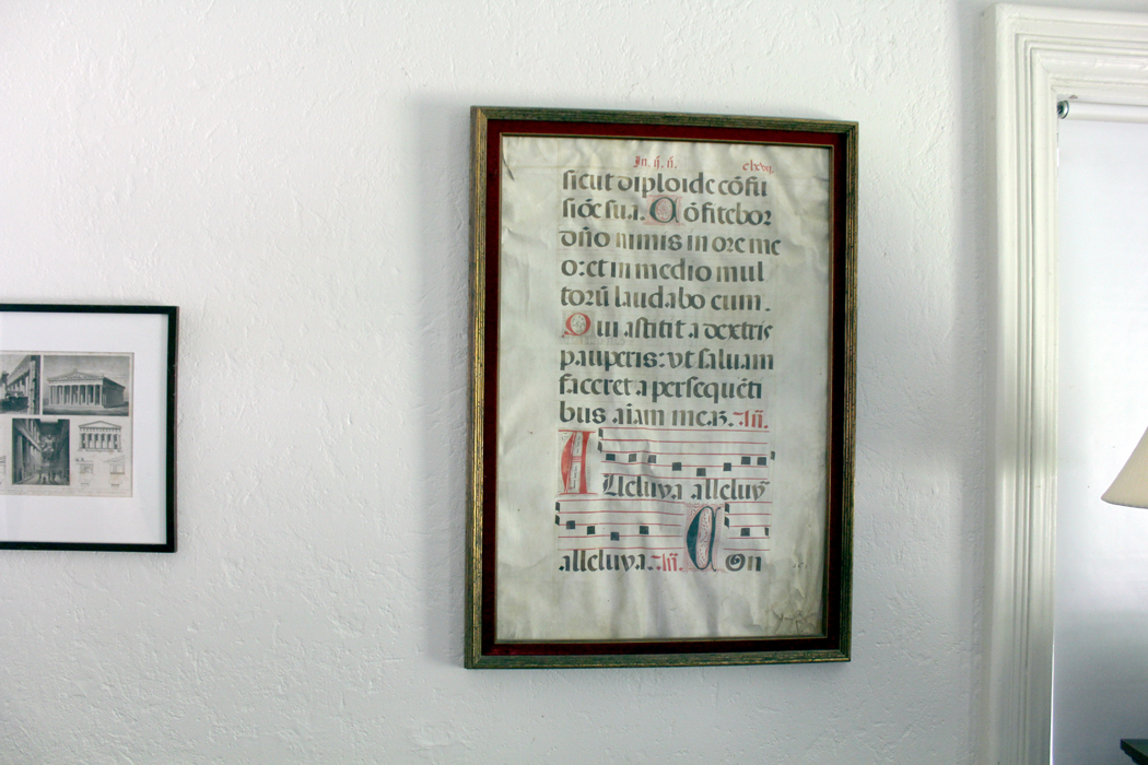
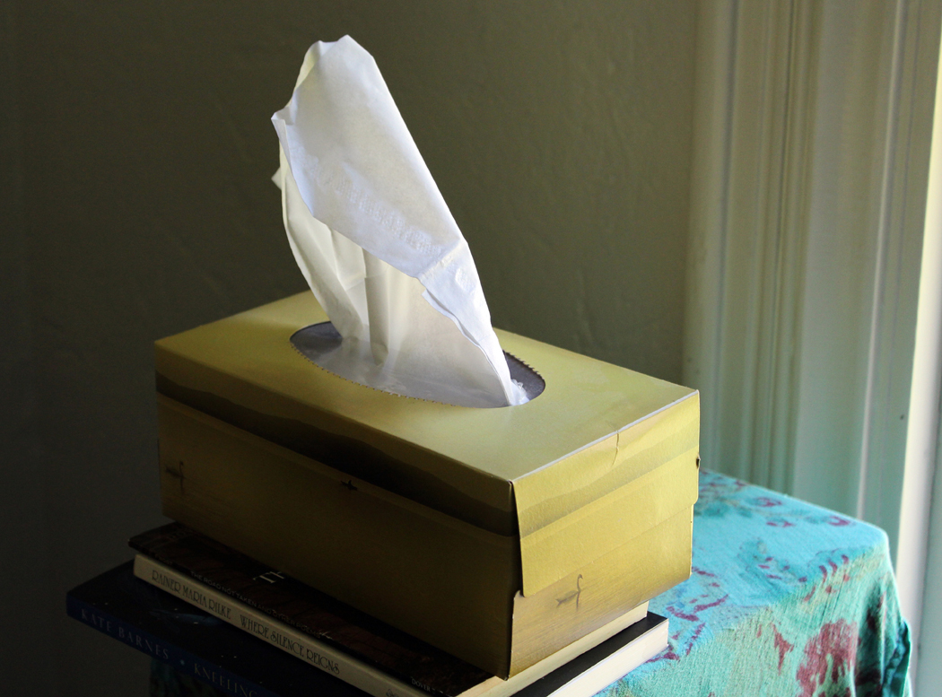
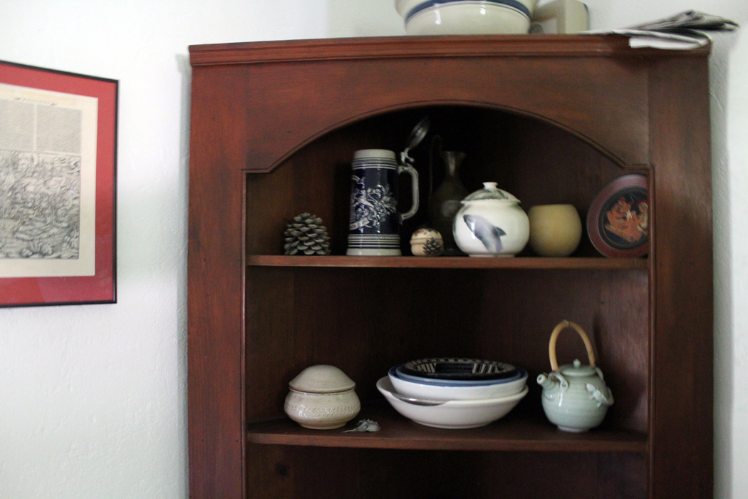
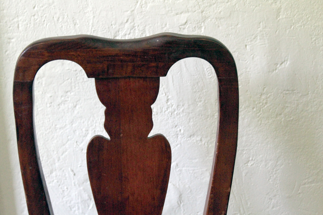
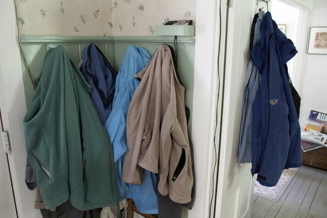
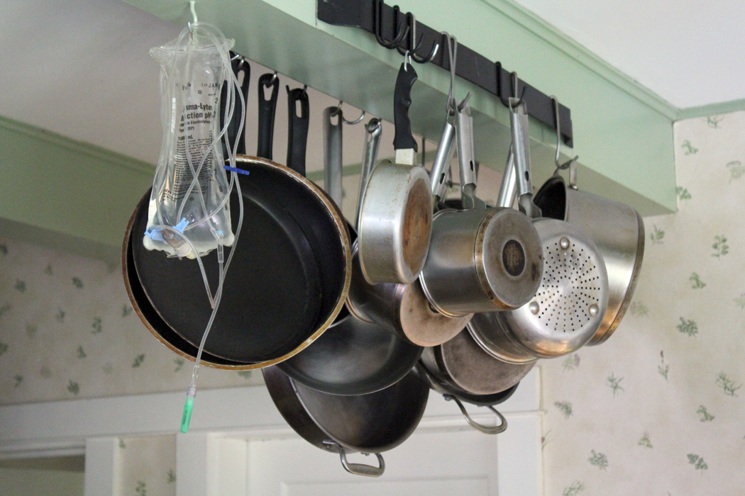
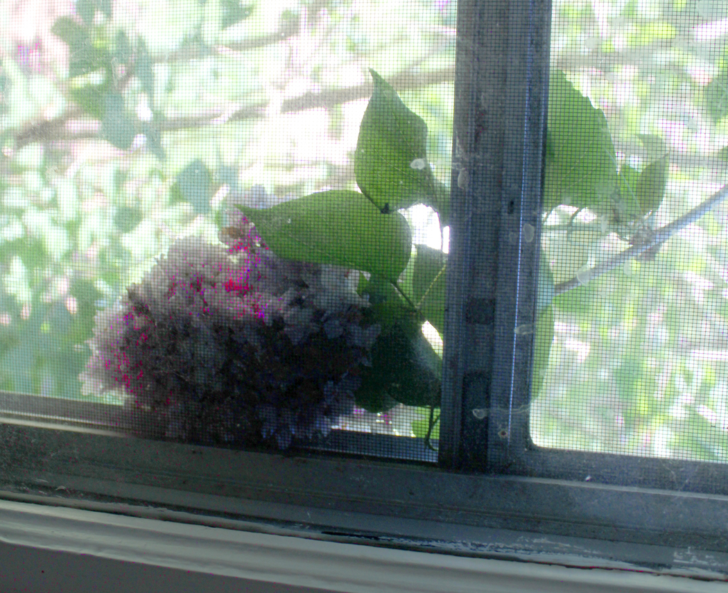
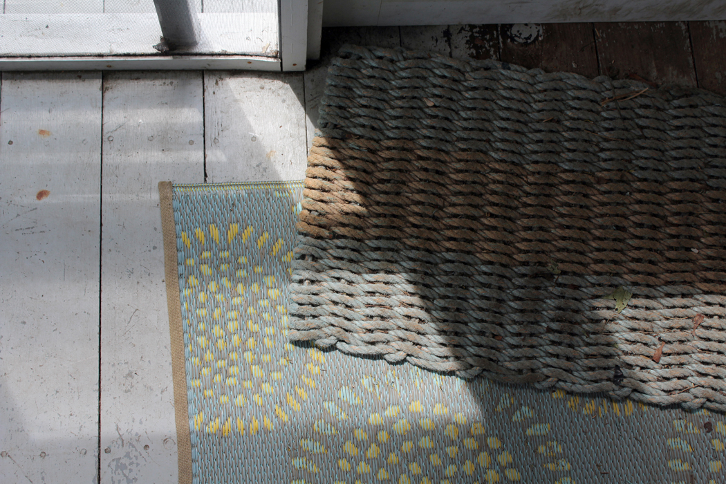
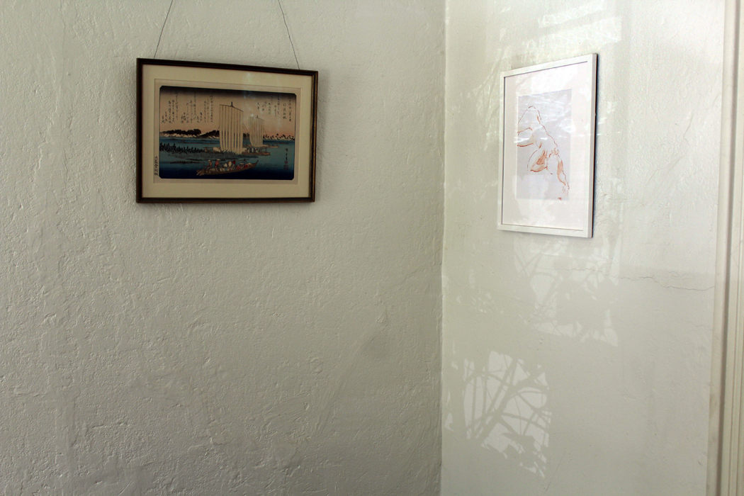
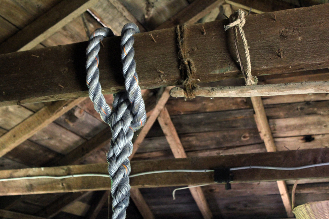
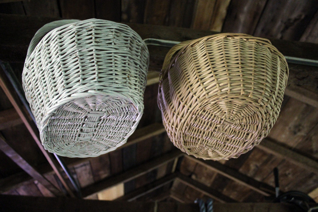
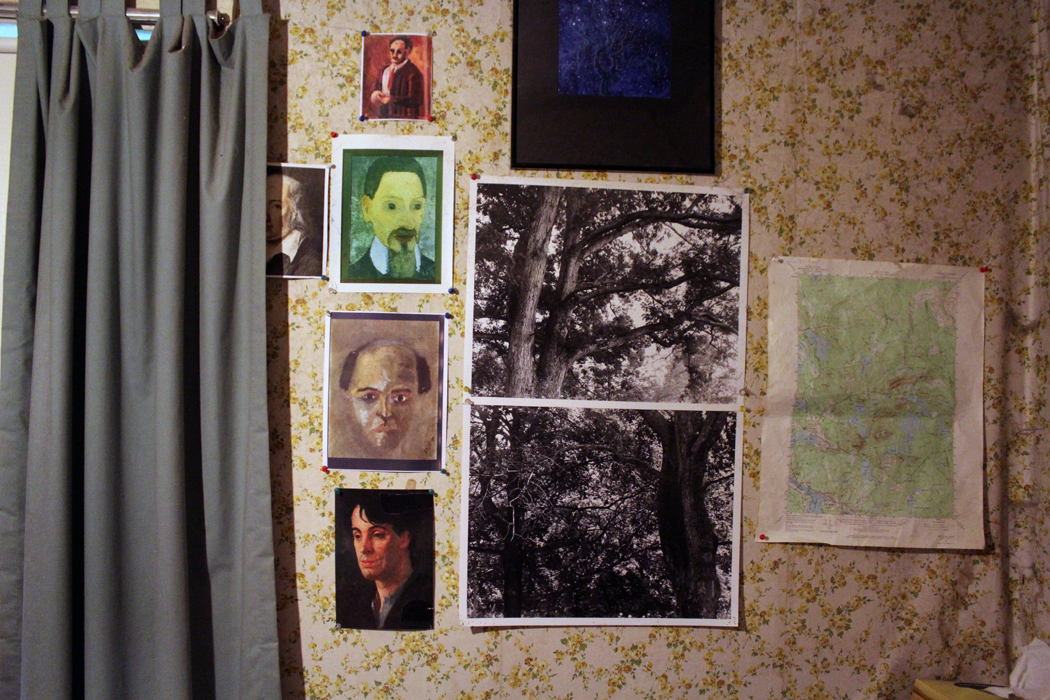
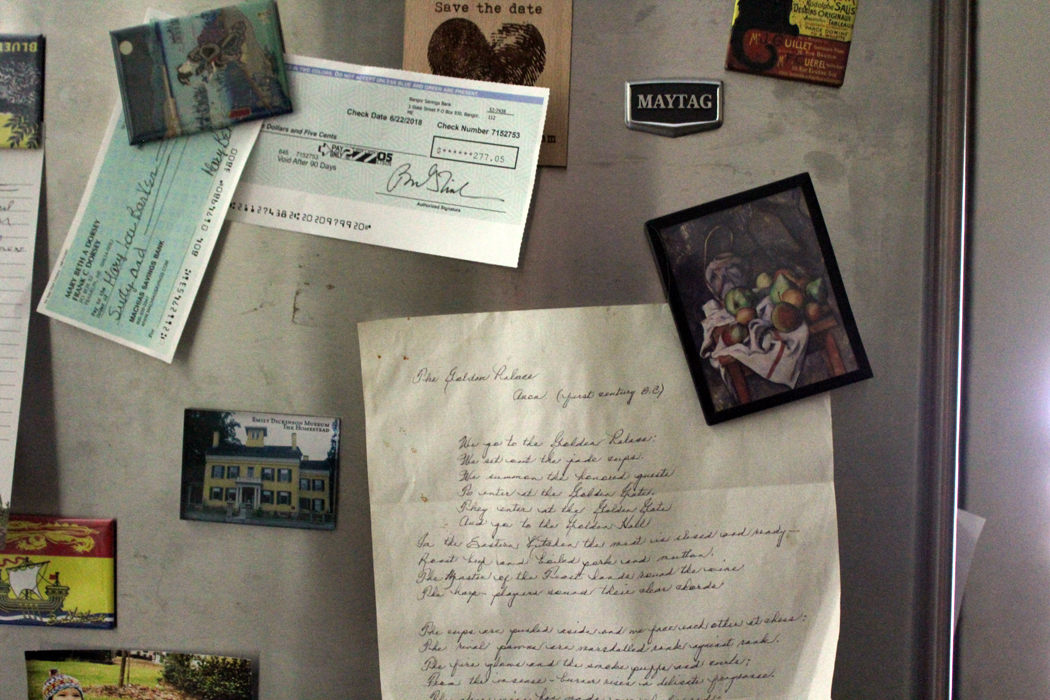
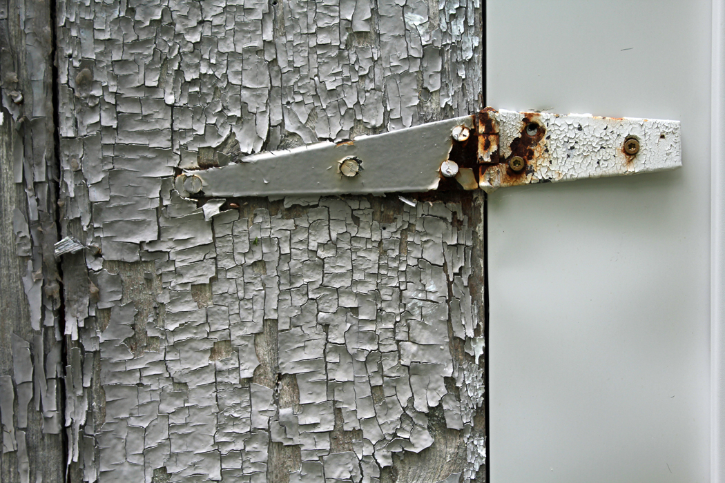
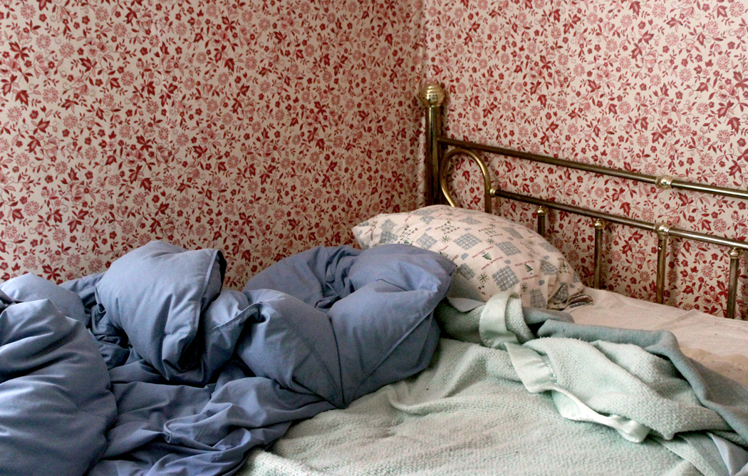
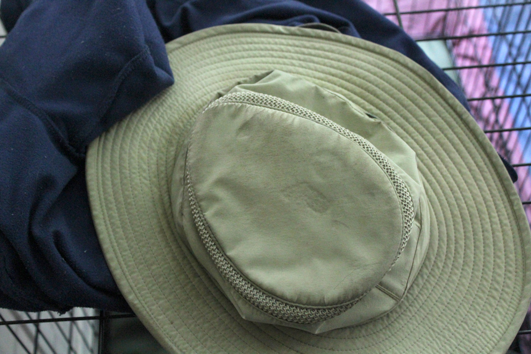
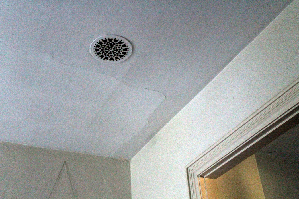
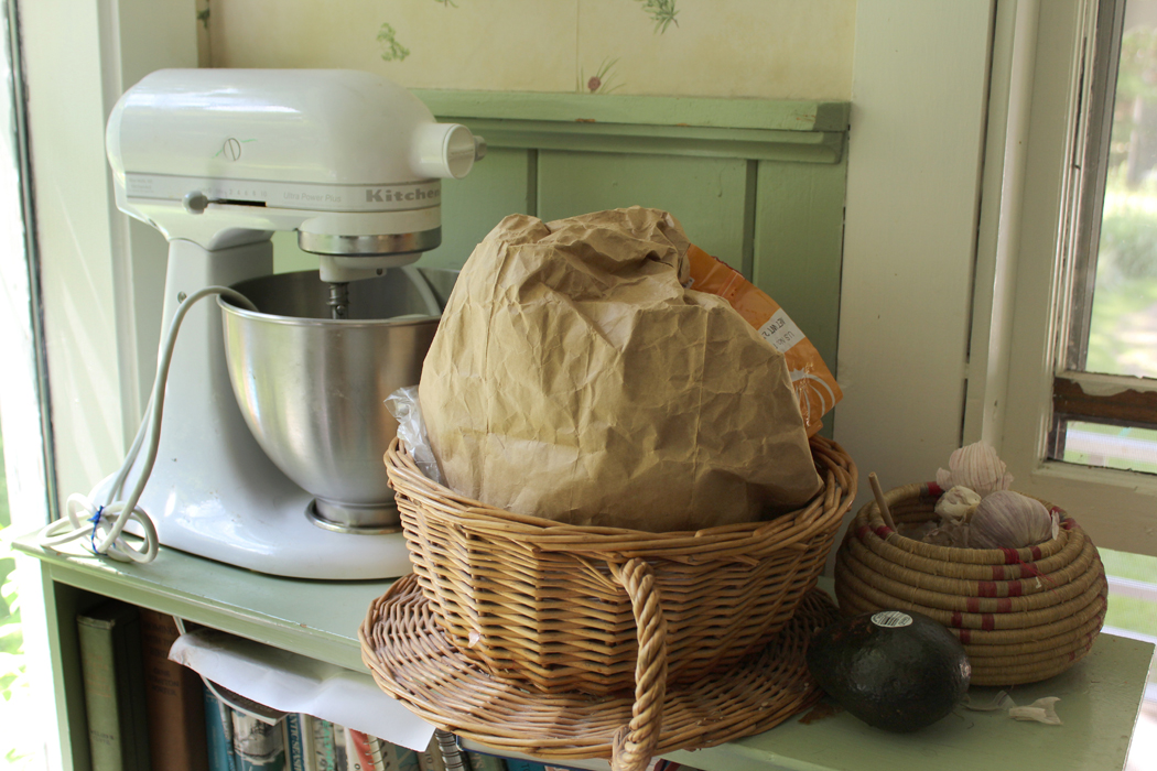
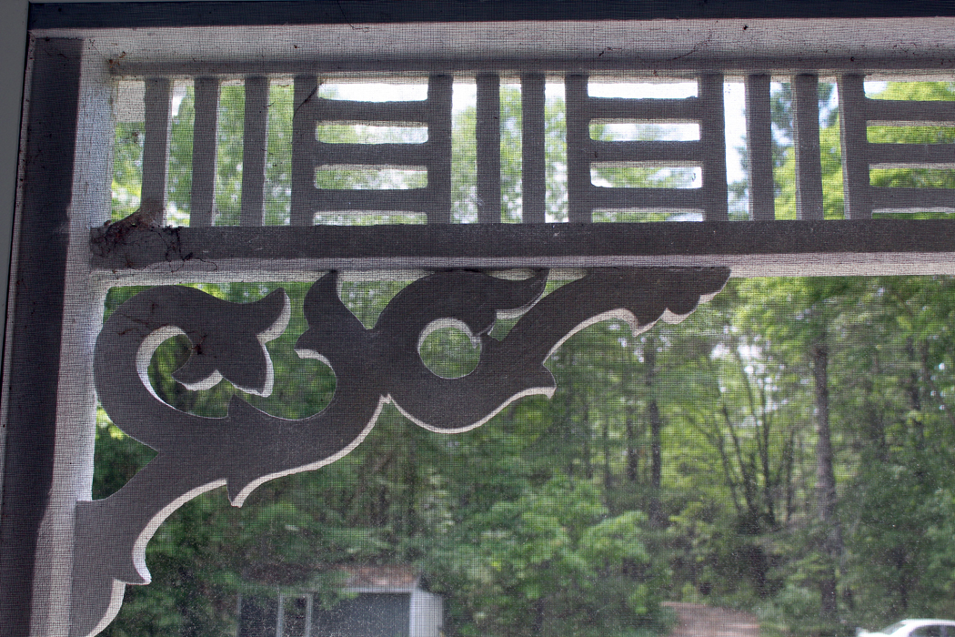
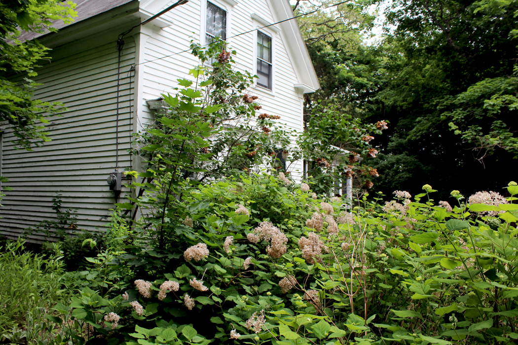
Through this essay, I have sprinkled photographs of the details of a house in Maine. It is one I know and love very well. 

If you look closely at them and absorb all the tasty detail, you can have a much fuller understanding, not only of the house, but of the style of Down East Maine, its economy, its culture, the nature that grows green in profusion everywhere. 

Crumbs to make a cake. 

Boulevard de l’Hôpital

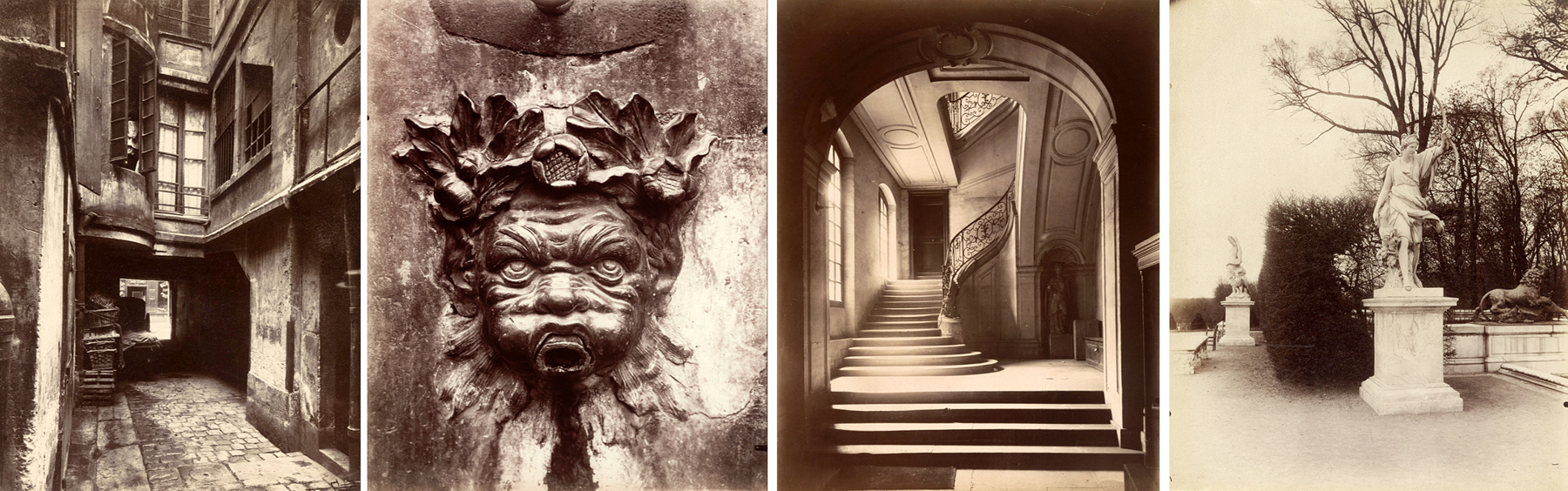
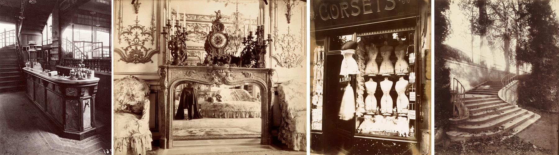
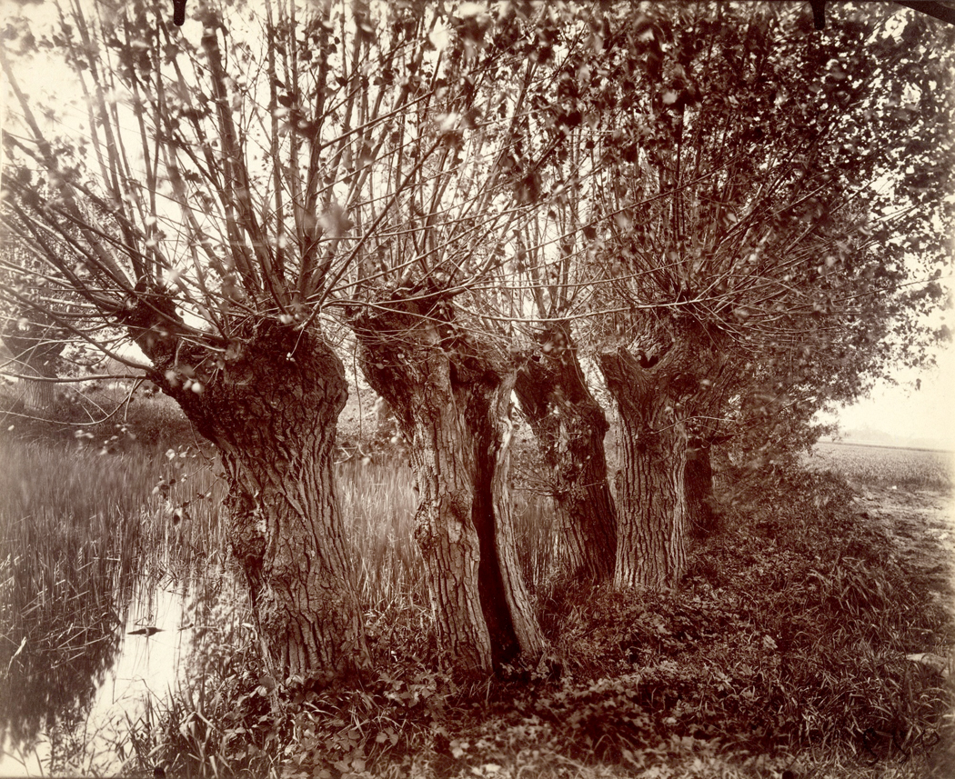
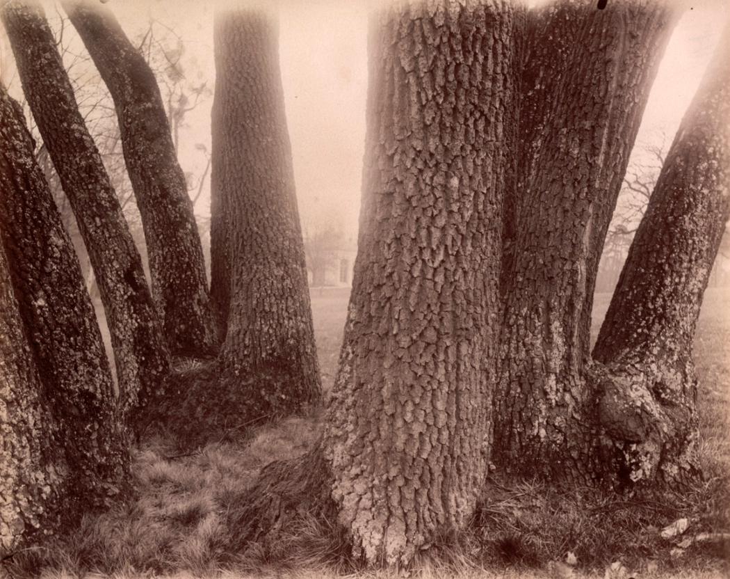
In the past post, I put together a group of pairings of the photographs of Eugène Atget and some of my own, noting the coincidental similarities (link here). I certainly didn’t want to make too much of it. It was just some fun.

Paris

But I had a surfeit of examples and I had to leave a bunch behind. So, I figure, why not post them, too. If I am taking up too much of your time by this surplus, you can always leave the page and find something more profitable. But even if you don’t care to enjoy the joke of this unintended mimicry, you might still enjoy the travelogue. 

Jardin des Plantes, Paris

My late espouséd saint and I spent weeks at at time driving around France, and exploring Paris. We never went to the Eiffel Tower or the Moulin Rouge, but instead found rooms in less frequented quarters of the city and tried to discover what it would be like to live there. We ate in local bistros and cafes and shopped in local stores. We got to know the people in our neighborhoods and enjoyed their friendliness (the celebrated French rudeness is something we have encountered no evidence of). 

Chartres

France is often called by the French the “Hexagon,” because roughly speaking, that is the shape of the nation on the map. We have been to all the corners and came to love them all, although, to be fair, Normandy and Brittany have stood out in our affection. 

Fontenay

These photos cover most of those corners. I could easily post a hundred, two hundred photographs, each distinct, but I have narrowed it all down to a mere 30 of them. 

Confessional, Rouen

As I said, you can look at them as a kind of travelogue — a black-and-white slide show of our vacations — or as a presumptuous comment on the work of Atget. 

Paris

I don’t present them as a serious labor of art, but as a kind of game: seeing parallels in my own visual record of la belle France to the city and countryside of a hundred years ago lodged on film by a man who also claimed no great esthetic achievement in the taking those photos. 

Vezelay

Atget was proved wrong; now his work is taken as art. I have no expectation that the same will happen for mine. It is enough that I had a good time making these images in the first place, and jiggering them around to mimic that of my progenitor. 

Notre Dame de Paris, Easter

Here they be. 

Montluçon

click any image to enlarge

WWI shell craters, Verdun


Musée national de la Moyen Âge, Paris


Concarneau


Apples, Hambye


Jardin des Plantes, Paris


Locmariaquer


Notre Dame de Paris


Paris


Angoulême


Noyon


The gods, Palais Garnier, Paris


Rue Mouffetard, Paris


Paris


Musee national de la Moyen Âge, Paris


Tuileries, Paris


5th Arrondissement, Paris


Les Eyzies


Rouen


Paris Opera


Bayeux


Paris


Tuileries, Paris


FIN


I didn’t do it on purpose. 

In my previous post, I wrote about the effect on me of an exhibit of the photographs of Eugene Atget I saw nearly 50 years ago. Looking at those images at the Museum of Modern Art in New York all those years ago eventually led me to loosen up my own approach to making pictures. 

Where I had been a disciple of Modernism in photography, from Stieglitz to Strand to Weston to Adams, I realized, looking at the Frenchman’s photos, that a looser, more direct approach to the art might be more productive. 

And, in fact, I gave up attempting to make precious jewel-like prints matted in perfect ivory mattes and framed in black aluminum section frames. 

But I had no intention of mimicking Atget’s pictures. Please believe me, I didn’t do this on purpose. 

As I look through the many images I have taken in Paris and in France, I find that there are so many parallels to the pictures of Atget. 

I found myself making records of so many curious and interesting corners of the city, so many details, so many textures and lines, so many storefronts and alleyways, that I could hardly help myself. 

Because I have come to find more interest in reacting to the world around me than in creating what receives the imprimatur of art. 

Being awake and aware of my milieu is what drives me, makes me happy, gives me esthetic fulfillment. 

So, here I have taken some of my photos and edited them, making them black and white and toning them sepia. 

I do not mean for you to believe I am trying to make art here, merely to play a little game, matching up images. 

Many others have taken their cameras around the city of light and consciously mimicked Atget’s work in an exercise of “rephotography,” a Postmodern trope. I am intending no such thing. 

I merely enjoy the little joke of finding in my work these unconscious rhymes with the work of a photographer I have loved for all these years, but haven’t given a whole lot of thought to in decades. 

Such is influence, I guess. You don’t always know it’s there. And you don’t consciously attempt to counterfeit your model. 

But somehow, it has worked its way into your bones, into the way you approach the world, the way you understand it. 

So, here are a group of parallel images. Those on the left are by Eugène Atget, those on the right are mine, albeit gussied up to amplify their similarity to my progenitor. 

I hope you find a twinkle of pleasure in this game. And it is just a game. 

Click to enlarge any image 


FIN


Not every life-changing event happens on the road to Damascus: a blinding light, knocked to the ground, twitching galvanically. The death, the religious conversion, the falling in love. But there are smaller turnings also, often dozens of them in a life, perhaps passed unnoticed at the time, but nudging our lives on a slightly new heading. “As the twig is bent, so is the tree inclined.” The butterfly in Brazil. These are also life-changing. 

In the summer of 1972, the Museum of Modern Art in New York mounted a small exhibition in its downstairs gallery, behind glass doors. “Atget’s Trees” put together 50 photographs by the French artist Jean-Eugène-Auguste Atget (1857-1927). Lined up on the wall in a darkened space, with brilliant track lighting that made each photograph gleam like a jewel, the photographs made my heart jump and my eyes happy. (That kind of lighting is now largely verboten in museums, as they adhere to a strict limit of only so much illumination to protect sensitive materials from light damage. Silver-image black and white photographs are largely immune to such light damage, so the restriction on lighting seems shortsighted and misguided; it dulls the brilliance.)

Atget (At-zhay) was an odd little man who taught himself photography in order to document art, architecture and decor that was disappearing as Paris and France entered the modern world. Originally, beginning in 1890, his work was meant for painters, architects and stage designers to provide models for their work, and he sold his pictures to them. But he seems to have become more and more interested in the details of his city for their own sake. He took thousands, maybe tens of thousands of negatives. Many were sold to various institutions interested in historic preservation, such as the Bibliothèque Historique de la Ville de Paris. 

In 1925, he met American photographer Berenice Abbott, who began buying his photographs and collecting negatives. In 1968, she sold her collection to MOMA, from which the “Atget: Trees” show was developed. 

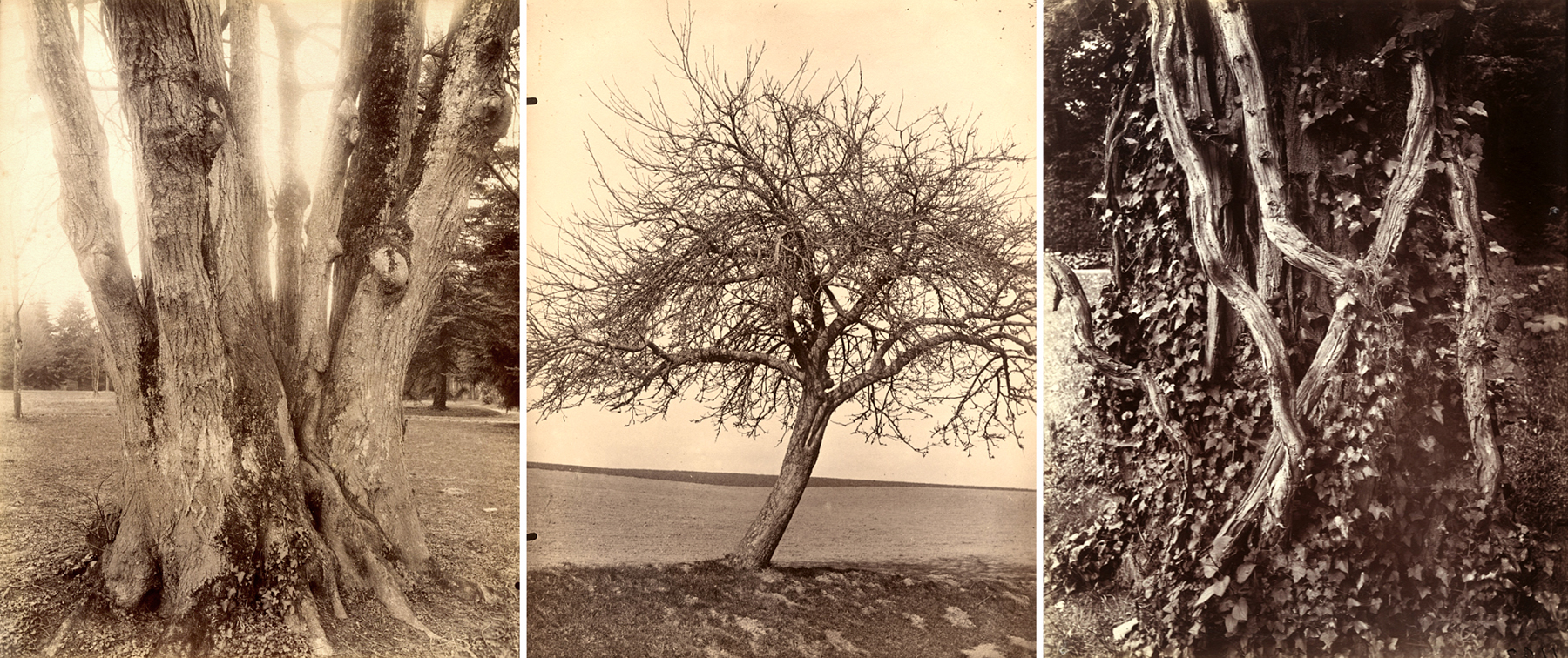
The majority of Atget’s subjects were buildings, statues, door knockers, gardens and street scenes. No detail was too humble for his attention. There are photographs of doors, photos of stairways, photos of balconies and railings, of fireplaces, of courtyards and alleyways. His curiosity was omnivorous and ravenous. 

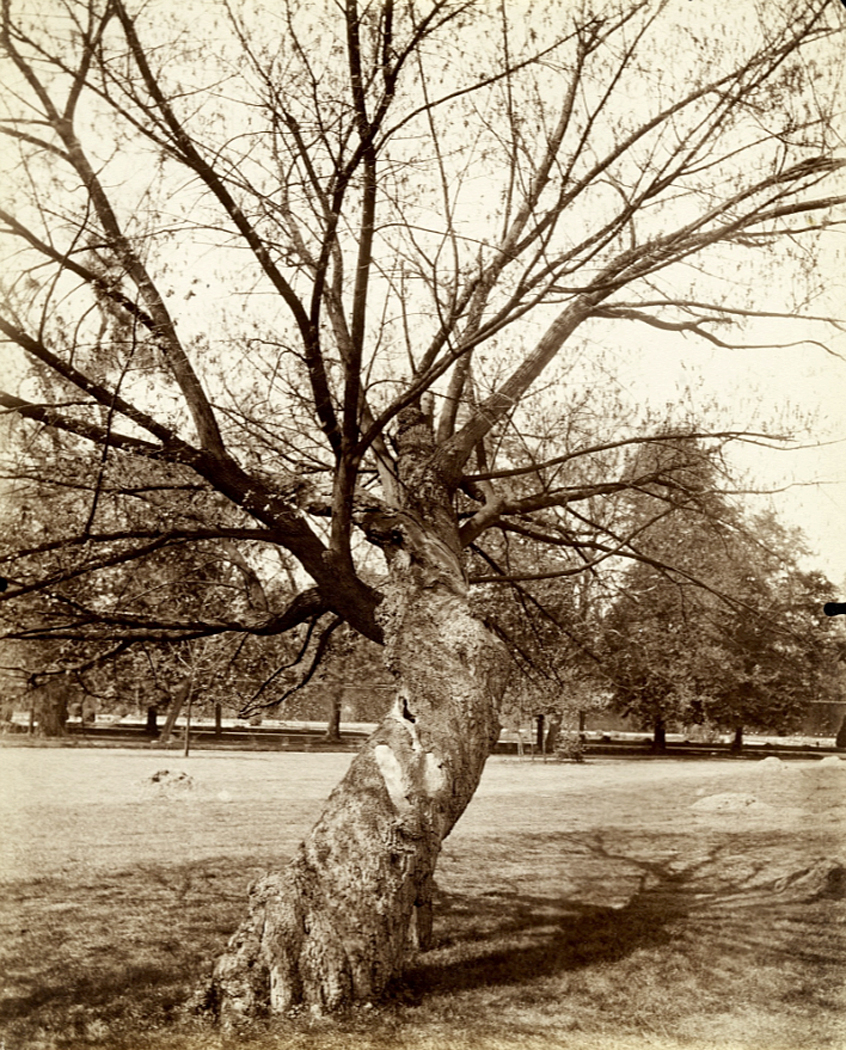
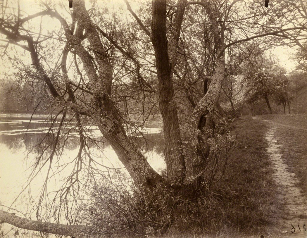
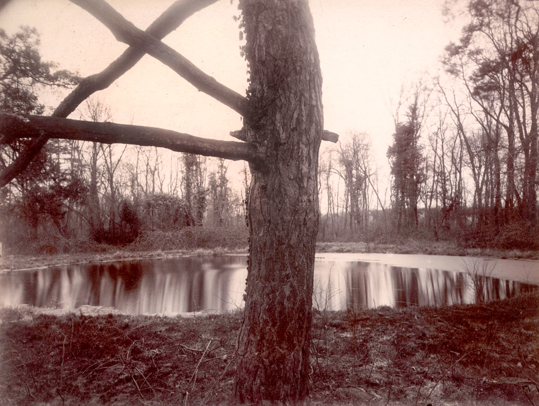
But through all, there was one subject he came back to over and over: trees. Most were in parks, like Saint-Cloud or Sceaux; some were at Versailles; others simply out in the countryside. He seems especially taken with ragged bark and gnarly roots. Often, he has photographed the same tree over and over, from very slightly different angles, or in different seasons. There is something sensuous in the growth and surface of trees that excited his artistic libido. 

Atget’s equipment and technique were already antique when he began, using an old bellows camera and large negatives, printing them on albumen paper and toning them with gold chloride. This gave his images a sheen (from the egg white) and rich, chocolatey tone (from the gold) that, in the right light, makes them jump from the frame with gem-like luster. 

And there I was, in 1972, ripe for the message they were giving me. 

You have to remember that 50 years ago, the art world — and especially the world of photography — was deeply buried in a type of snooty puritanism. We were taught you never “crop” your images, but framed them precisely in the viewfinder. Anything else was “sloppy” and perverted the natural uses of the camera. You must used archival paper and processing. Frames must be neutral, matting must be white or ivory.

And most of all, you were made aware that a photograph was all about photography. Art about art. Subject matter hardly mattered; it merely provided an armature on which to make your statement about the nature of photography and art. 

This was the art world the late Tom Wolfe railed against in his book, The Painted Word, where the deacons of art criticism slapped their hands down on a kind of outstretched bible of certainty: A painting must be flat, it must not mix genres, it must investigate the possibilities of paint and never, ever “illustrate” a story or event. Hellfire and brimstone of a different sect.  

This was the heyday of Ansel Adams and his Zone System of photographic exposure and development, to carefully control the results, which were by necessity “previsualized,” i.e., you were to know before you snapped the shutter, exactly what the end result would be, including its printed size and what sort of paper you would print it on. God, it was constricting. What a constipated way of approaching art. 

And here was Atget before my eyes, messy, uncoordinated, obsessive and obviously fascinated with the things of this world. 

Not that it made a dent in the attitude of exhibit curator John Szarkowski, one of the deacons of that puritan orthodoxy. Szarkowski was Director of Photography at MOMA from 1962 to 1991, and one of the most influential voices of the time. He performed many miracles for photography as an art at a time when the status of photos was still doubted in some corners of the art establishment. But he also issued some very dubious edicts. 

About the “Atget: Trees” exhibit, he wrote in a wall label for the show, “On the basis of a small and heterogeneous collection, the quality of effortless poise that identifies Atget’s work might easily be read as naivete. A study of his repeated investigation of the same or similar subjects, on the other hand, suggests a conscious and sophisticated concern with the ultimately formal problems of picture making. 

“Atget was acutely aware of the literally infinite number of images that are potential in a given ‘subject,’ and he knew also that none of them was true, in the sense that it shared a privileged identity with the object photographed. The subtle variations in framing included here among the six plates of the Beech Tree, St. Cloud, for example, make it clear that Atget did not confuse the subject with the object. He understood that the true subject is defined by (and is identical with) the picture.” 

That is art gobbledy-gook for, “Don’t think Atget was a bumpkin. No, he knew that the real subject of a photograph is the photograph itself, and the finished print, given to us, is the only actual goal of taking the thing in the first place.” (I especially note the condescending quotation marks around “subject.”)

And that, my friends, is a complete misreading of Atget and his art. 

What I came to realize, adoring those luscious trees on the wall of 53rd Street, was that what mattered was not the print, but the attention that Atget gave the world he loved. That, in fact, the subject does matter, and the photographer’s engagement with it was the photograph’s raison d’etre. The photo was merely a lasting and sharable byproduct of the artist’s attention. 

Atget was an indifferent craftsman. His photographs are often poorly exposed, a bit out of focus, show effects of lens flare from an uncoated lens; the prints are sometimes poorly processed and some are fading, or picking up spots and stains. In a Postmodern world, all these things might have been consciously introduced to make us aware of process in privilege over subject matter. But Atget was no such. The power of his work, and its attractiveness is in its naivete — or rather, its directness. Art theory cannot touch it, cannot sully it or soil it. 

Soaking in the MOMA show, I fell in love with Atget’s art, but even more, I learned to mistrust the vox auctoritate. Just because a respected and learned expert speaks ex cathedra does not mean he is right. After all, a scholar is shooting in the dark, just as we all are. Just as Atget engaged with the things he loved, I tried my best to engage with his photographs and not be led into believing orthodoxies that had little to do with what I actually saw. 

And this visit to 53rd Street also freed me to loosen my own approach to the camera and use it to engage with the things I love.

I have had many such life-changing encounters, small but meaningful. This was just one of them. 

Click any image to enlarge

We know what photography is: You point a camera at something and take its picture. But what if you don’t use a camera? And what if there is nothing to make a picture of?

Certainly, many have used their cameras to make abstract or quasi abstract images. Sometimes you just have to get close enough to avoid any context, or take it from some extreme angle.
Many decades ago, when I was teaching photography — so long ago that the photo lab was filled with noxious chemicals and darkness visible — I played around with making abstract photographs. Most of my photographs were landscapes and portraits, but in the darkroom between classes, I had time on my hands and tried a number of things out.

But let’s take this a step at a time. First, some straight photographs.

Many years before I began teaching, I knew an artist in Greensboro, NC, named Aime Groulx (he signed his name with a dot over the “X” as if it were an “I”). He was primarily a sculptor, but he also made photographs. One he made was of a doorknob in his house that looked like nothing else but a newly discovered planet. He called it “Doorknob to the Door of Perception.” He was an indifferent printer, but I used his negative to make a good silver print, which I still have.

The image was both totally realistic — it was a doorknob — and yet, as Minor White used to say, it is “what it is, and what else it is.”

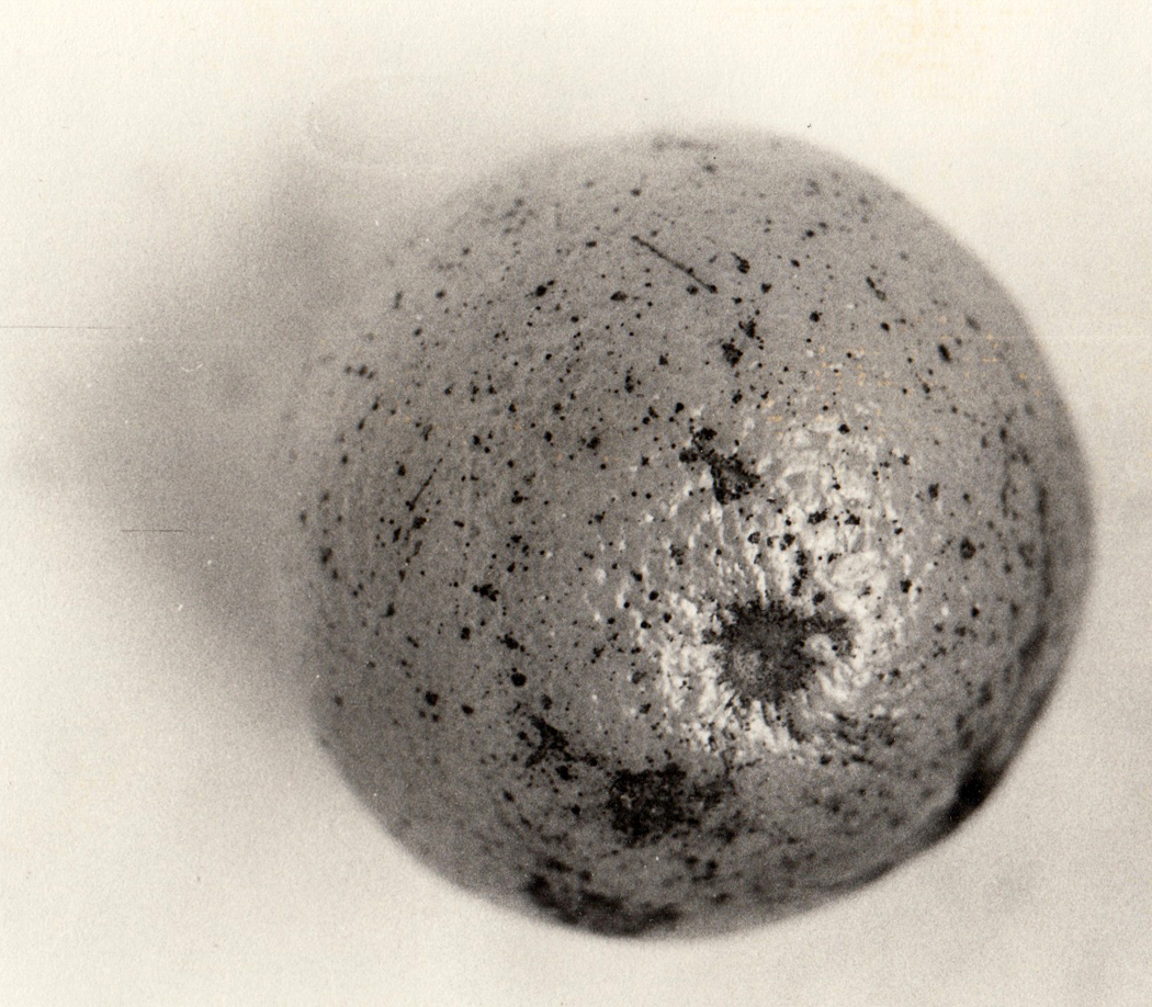
Over the years, I took this lesson to heart and made many an image that seemed to be something more than what it is. An orange can be a planet, too.

Or a sand dune can be a spiral.

Finding interesting and beautiful shapes divorced from their quotidian meaning can make us see them more sharply, make us understand something about the colors, shapes, textures, that being able simply to name the subject of a photo prevents us from acknowledging. When we recognize too easily what our photo is of, the image ceases being visual and becomes instead a word. “That’s a picture of a house;” “That’s a picture of a dog,” and by naming it, we find we have done our job and neglect to actually look and to see.

Making something abstract forces us to see those colors, shapes, textures — allows us to find new emotional meanings in the familiar, and new designs.

So, then, let’s take the camera out of the process. Once digital photography nudged out the silver, dried out the Dektol and replaced the Beseler 23C with Photoshop, there were other ways of making image files.

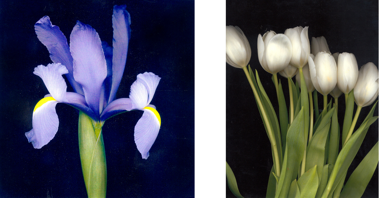
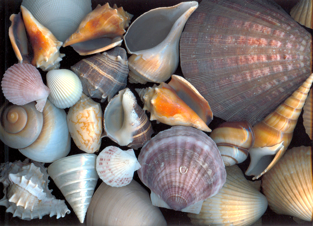
I began experimenting with a flatbed scanner, making extremely high-definition images of flowers. With the scanner cover left open, the background of these images became a very deep black or blue-black and only the parts of the flowers held flat on the glass platen were fully focused. The images were stunning and essentially shadowless.

I tried other things, too.

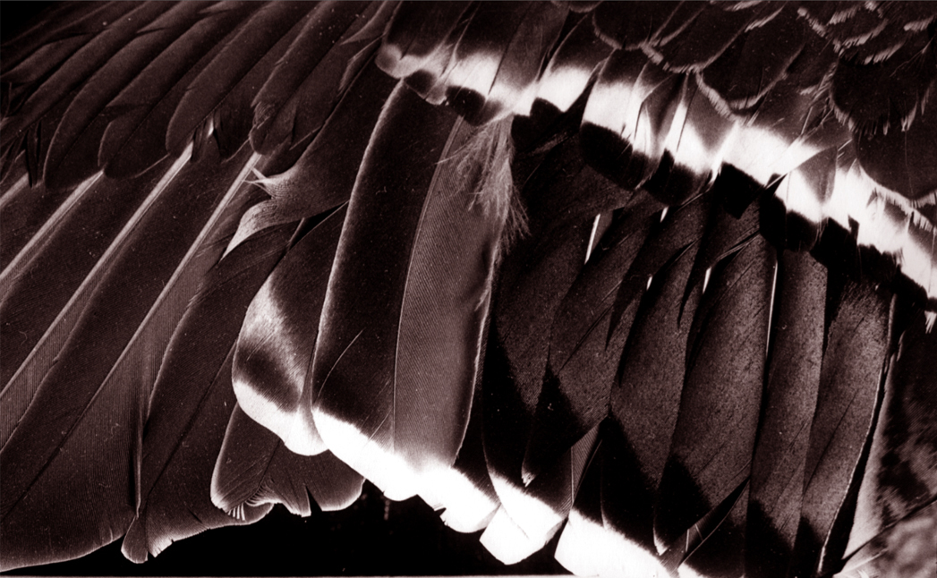
But there was still a lens involved in the scanner. So, let us return to earlier days, when chemicals still stained a photographer’s hands. I tried scratching the end-bits of developed rolls of film and printing them as if they were negatives.

Still, however, there was the lens of the enlarger focusing the negative down onto the silver paper.

I wanted to get into the image directly, with no mechanical mediation. I wanted to get my hands into the process the way a potter gets his hands into the clay.

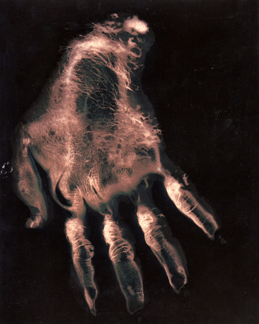
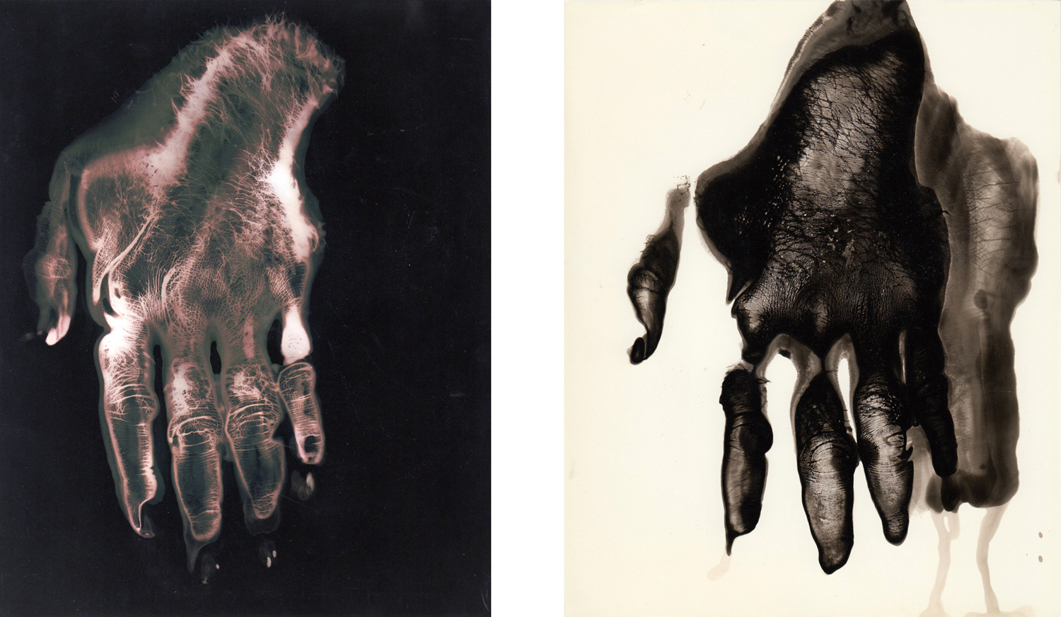
So, I dipped my hand into the tray of sodium hyposulfite and pressed it wet onto a sheet of light-sensitive paper, then washed the hypo off the paper and doused it in the developer, which turned the image black except for where the hypo had left its imprint. It made for rather spooky gorilla hands.

I tried it in the reverse way, too, dipping my hand into the developer and then, after the blacked image appeared, finished the process in stop bath and hypo. That gave me a black hand on a white sheet.

Certainly, this gave me an image of the familiar that was decontextualized and made strange. I saw my hand very differently.

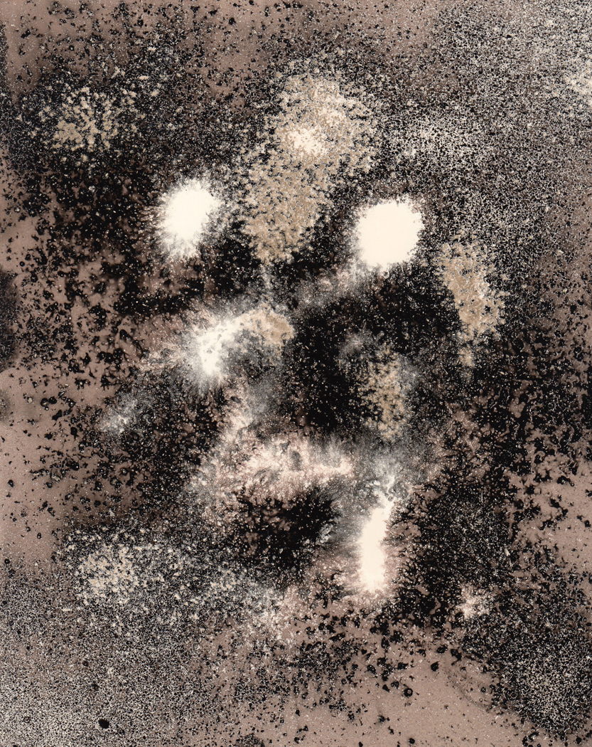
There is, however, only so much you can do with a hand. After the first hundred or so versions of my hand, I tried some other things. Like scattering salt on the paper and spraying the developer like Windex down onto the sheet, leaving a scattering of stars on the paper.

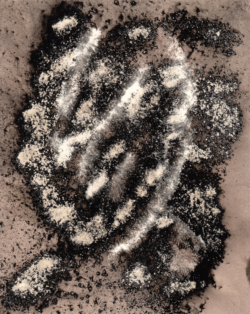
I also tried dusting the paper with dry developer granules and spraying it with water, making the black specks on the lighter background. The spray made the salt or the developer wash weakly over the paper, making mid-tones that I enjoyed.

You could make an image that vaguely resembled a portrait.

These experiments continued over the six years I taught, but when I left that job, I became a writer instead of a photographer. My camera was used primarily to illustrate stories I was writing.

I look back at some of the images I made so long ago and feel there might have been something in them. Whether there is or not, the process was worth the time; it gave me great pleasure.

Click on any image to enlarge
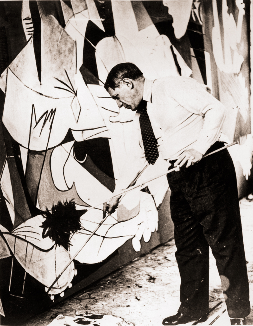
Pablo Picasso painting Guernica in his studio, Paris, 1937; photograph by Dora Maar

When Pablo Picasso painted Guernica, he knew he was making a monument. When Milton wrote Paradise Lost, he knew he was writing for the ages. When Bergman filmed Seventh Seal, he knew he was saying something important and not merely entertaining us with a cool story.

Art is often made with large purpose. Artists may work a whole lifetime to be able to sum things up in a major piece, or group of pieces, like  the Isenheim Altarpiece of Grünewald, or Proust’s À la recherche du temps perdu.

In these cases, the art becomes an entity in itself, a thing produced. It takes on a life beyond its maker’s; it is a milepost in cultural history. We look to it not only for beauty, but for wisdom, for inspiration, for a sense that there is something large which we all share as humans.

On the other end of the spectrum are the snapshots we take of our families, on birthdays, on vacations, on weddings. As such, the photographs are seldom seen as esthetic objects, but rather encapsulated memories — something to hold fast a fleeting moment of importance to our singular lives. They may capture something intensely human, but that is not their primary purpose.

(It is always fun to scavenge anonymous snapshots to find glimmers of the idiosyncratic or the universal, that is, to see them as if they were intended as art. But that is a piece of active curation on our parts, as if we were the artists ourselves, editing the random into a coherent message. The family photos were never meant to hang in art galleries.)

Even if a painter isn’t making a Sistine Chapel, if he is a professional, he is creating a commodity — an object that can be sold. And even if it’s not bought, the thing exists as a thing. There it is, framed and hanging on a wall, with track lighting making it glow jewel-like in the gallery.

But there is something between these two poles — between commodity and snapshot. It is the artist’s working sketch, never meant to be sold, never meant even to be seen. It is either the artist trying out ideas for a painting, or — and this is even more important — just keeping his hand in.

There is something of the throwaway in such noodling, but there is also something of value we shouldn’t underestimate.

We often forget that there is an intimate connection between art and the experience of living. It has been made easier to forget because in the last half century or so, a good deal of art has been made simply about art, about its materials, its limits, its meaning, its history. But through most of that history, art was about the world. Whether it was landscape or still life, whether portrait or history painting, it was meant to reflect something of our common experience of life.

Even when art has been about art, it has been about the experience, in life, of thinking about art. There is an unbreakable connection between experience and its image.Which takes me back to those sketches. Whether it is Picasso doodling on a napkin or Turner washing light watercolor pigment over rag paper, it is — aside from any commercial intention — an effort by the artist to make the connection with the world. To see, and see clearly.

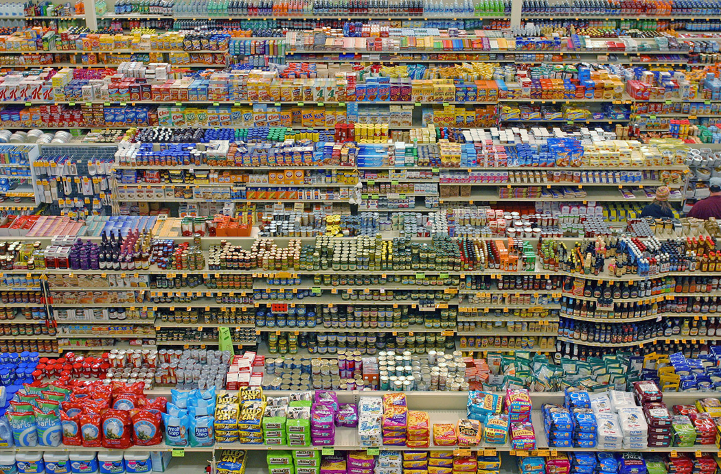
Andreas Gursky

Photography, as much as painting, has its monuments, whether it is an Edward Weston pepper or Ansel Adams’ Moonrise Over Hernandez, or more recently, the giant photomurals of Thomas Struth or Andreas Gursky. They are the opposite of family photos.

But there is a middle ground in photography, also. It is the equivalent of an artist sketching. Photographer Lee Friedlander calls it “pecking.” It is the quick, improvisatory snapping of bits of the world, to see what is there.

With is 35mm rangefinder Leica camera, Friedlander says, “you don’t believe you’re in the masterpiece business. It’s enough to be able to peck at the world.”

Only afterwards, going through his accumulation, does he edit and pick a few that stand on their own to be published or to be exhibited. But the interesting part, to Friedlander, is the engagement with the world.

“I take more to the subject than to my ideas about it. I am not interested in any idea I have had, the subject is so demanding and so important,” he says. “Sometimes just the facts of the matter make it interesting.”

Friedlander is amazing in that his peckings are often so visually rich and complicated that they are nearly as Baroque as a painting by Rubens. Action seems to be in every corner of the frame.

But you don’t have to be an artist as good as Friedlander to engage with the things of this world. Making photographs is a way of seeing, similar to sketching. It is about paying attention. We can focus on the details.

For many Americans — maybe most humans anywhere — only use their eyes for useful things. They see the road they drive on, the could that tells them it will rain, the house, the car, the coat closet. When they make a snapshot for the family album, it is enough to be able to name the items in the picture — that is Uncle Vern, that is the house we used to live in, that is my first car — and beyond the naming of the subject, we don’t really pay attention to what is there. Most probably, we have framed the image so the house or the uncle stands dead center in the frame.

Frielander talks about the potency of the photograph describing what is either his experience when he was a boy with his first camera, or perhaps anyone’s similar experience: “I only wanted Uncle Vern standing by his new car (a Hudson) on a clear day. I got him and the car. I also got a bit of Aunt Mary’s laundry and Beau Jack, the dog, peeing on a fence, and a row of potted tuberous begonias on the porch and seventy-eight trees and a million pebbles in the driveway and more. It’s a generous medium, photography.”

For Friedlander, his life work became making all these disparate bits harmonious in the frame. Again, like a Rubens.

For most of us, these pecked pictures are mostly details. They are not the grand view or the concatenated whole, but the tiny bits out of which the larger scene is built. Most of us pay attention only to the whole, when we pay attention at all; for most Americans — maybe most humans anywhere — only use their eyes for useful things. They see the road they drive on, the cloud that tells them it will rain, the house, the car, closet. But every house has a door, and every door a door-handle; every car has tires and every tire a tread and each tread is made up of an intricate series of rubber squiggles and dents. Attention must be paid.

Paying attention to the details means being able to see the whole more acutely, more vividly. The generalized view is the unconsidered view. When you see a house, you are seeing an “it.” When you notice the details, they provide the character of the house and it warms, has personality and becomes a Buberesque “thou.” The “thou” is a different way of addressing the world and one that makes not only the world more alive, but the seer also.

(It doesn’t hurt that isolating detail makes it more necessary to create a design. You can make a photo of a house and just plop it in the middle of the frame and we can all say, “Yes, that’s a house,” and let the naming of it be the end-all. But if you find the tiny bits, they have to organize them in the frame to make something interesting enough to warrant looking at.)

Sectioning out a detail not only makes you look more closely, but forces your viewer to look more closely, too. Puzzling out what he sees without the plethora of context makes him hone in on its shape, color, and texture. It is a forced look, not a casual one.

This is a rich world, profound in detail, millions of species, visual patterns in every rock and cloud. Each bit of rust on a grate is intense, when noticed. And noticing is what “pecking” is all about. With my own peckings, I am not making any argument for them as art; they will not be hanging in a gallery. I make them for myself, to force me to pay attention to the minutiae that are the bricks of the visual world they inhabit. And paying attention is a form of reverence.

Click to enlarge any image

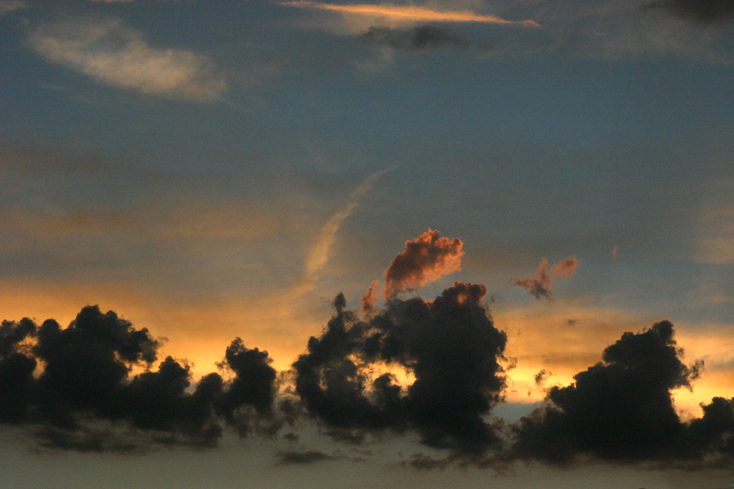
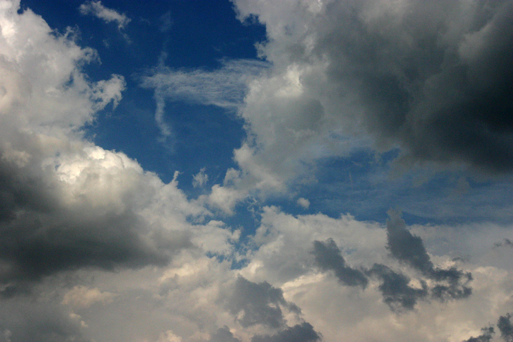
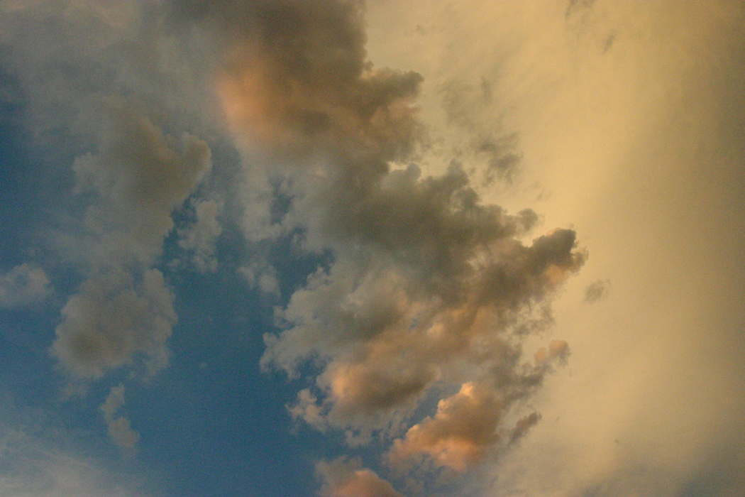
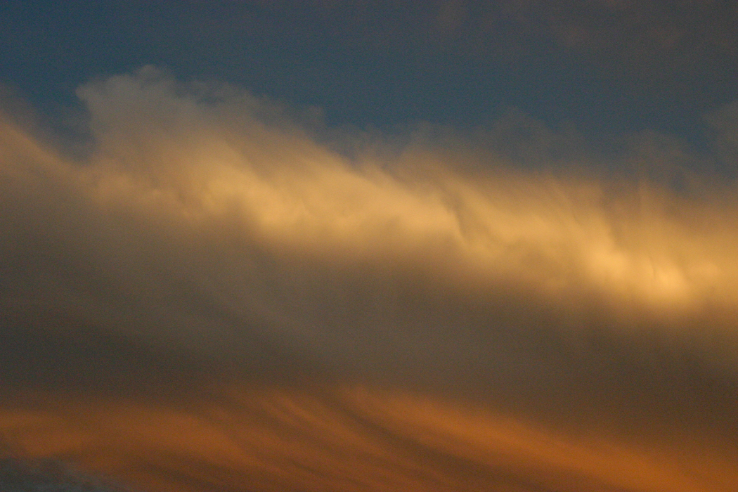
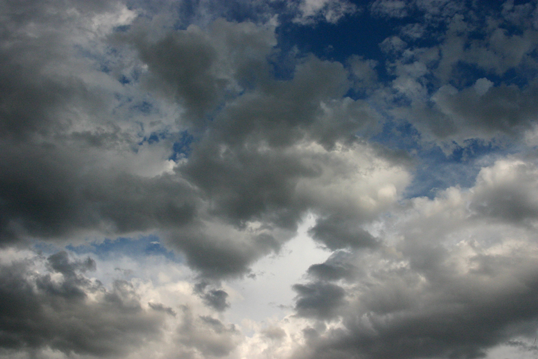
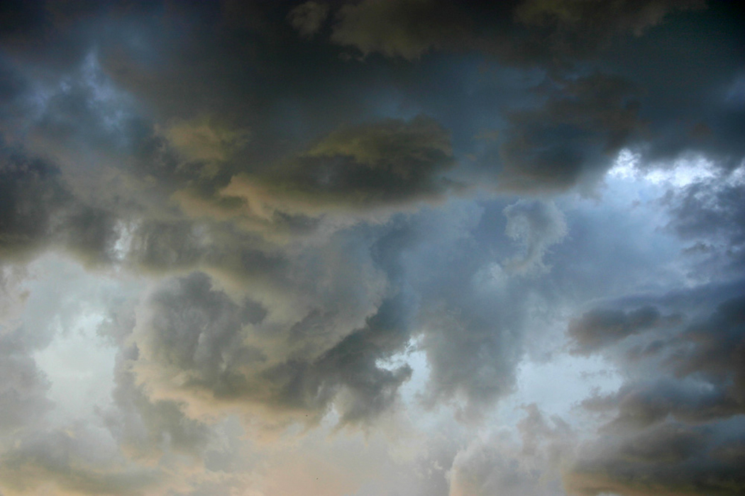
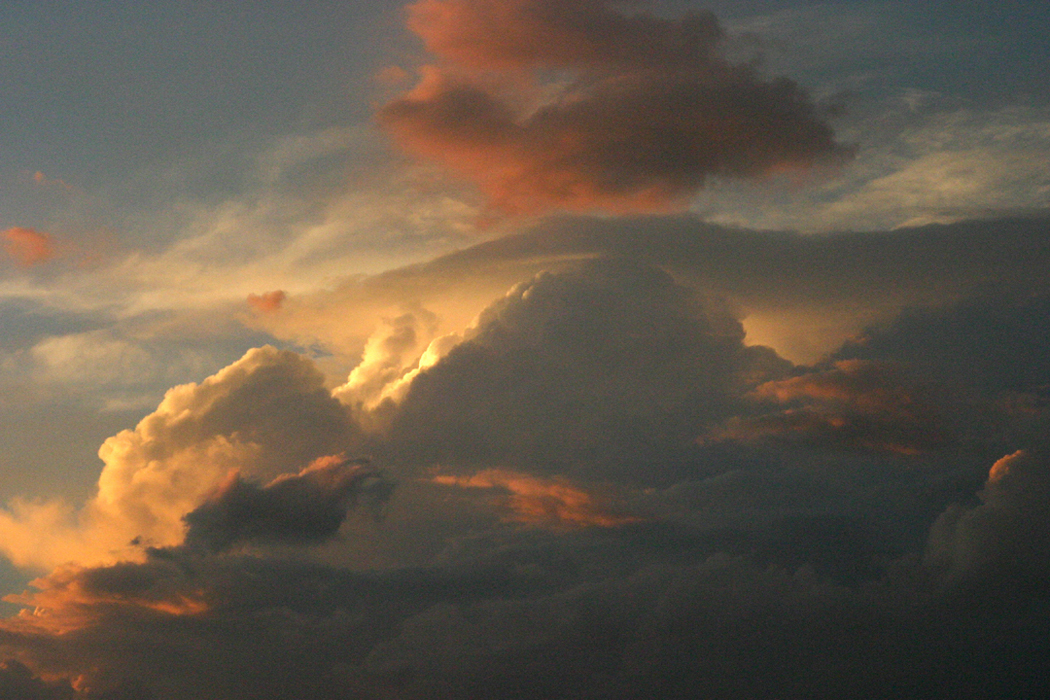
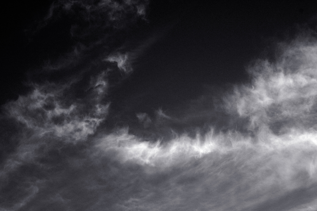
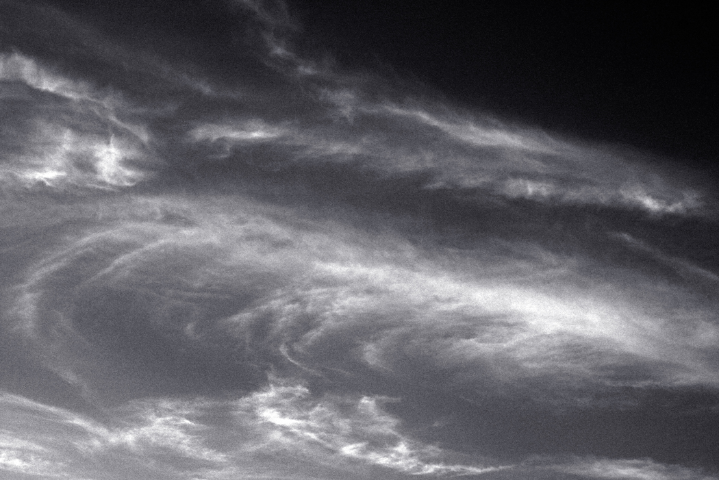
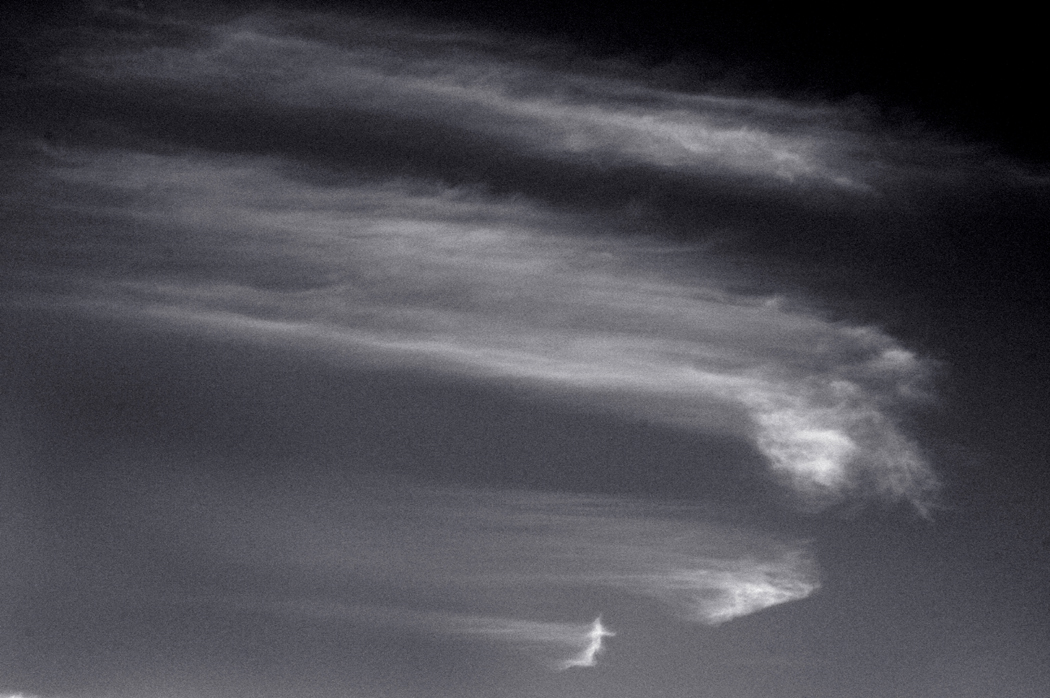
color sky 03One grows as a human being, and the art cannot help but grow, too. When I was young, it was art that impressed me most: the forms, textures, colors, the transformation of stimuli into esthetic forms. Don’t blame me — it was the times in which I grew up; Modernism was in the ascendency and we all mouthed such platitudes as “art changes nothing,” and “Subject matter? The subject doesn’t matter, only what you make from it.” In those years, life drawing ceased to be taught in most art schools; students were asked merely to “be creative.” The divorce between life and art was complete. cloud30 The prejudice was that the subject, say in my chosen medium, photography, was only there to catch light and make for a splendid arrangement of greys and blacks printed out in rich silver on glossy paper. Anything else was pretty pictures for calendars or chamber of commerce brochures. A kind of puritanism set in. If you are old enough, I’m sure you remember it: No cropping, previsualize, etc. So, when I was younger, I concentrated on the beautiful print, in black and white, and archivally processed. Zone system, anyone? cloud 01 My life turned in a different direction. Instead of a photographer, I turned out to be a writer. And lucky for me, it was on a newspaper and not in academia. I never had to slog through the atrocious trends of literary theory then current (still current). When asked to lecture to writing classes, I always had one lesson to give: Good writing is having something to say. Writing in fancy words or jargon, clever euphues, gongorisms, or acrostics or esoteric allusion only get in the way. One can be so caught up in the allure of a classic Bugatti that you forget its purpose is to get you somewhere. Fancy writing is that shiny Bugatti sitting unused in a garage, cherished and polished but useless. cloud08 I continued to make photographs, nevertheless. And I have had gallery shows. But as I got older I came to see that the Bugatti was there to drive somewhere, not to show off. Subject matter not only counted, it was the reason for making the picture in the first place. But — and this is a big proviso — not to share the subject with your audience so you can all go “Ooh, what a beautiful sunset.” That really is a calendar photo. cloud16 No, the entire purpose of art, if it can be said to have a purpose, is to make a connection with the world. To reconnect with what habit has made invisible. To see what you normally ignore, to find the glow of liveliness in the experience of being alive. Few people need to be told that a sunset is pretty; there is no art in that.cloud25 But to find the chispas — the sparks — in the crack of a sidewalk, or the bare winter trees, or the clouds that sail over us every day — this is not so much a finding of a source for perfect prints to hang on the wall, but rather the illumination of a hidden fire. These things are all alive: Every bush is the burning bush. That is what makes Van Gogh’s landscapes so alive. They burn from within. This is not something he has applied from the outside; it is something he was able to see as the scales fell from his eyes. And so it can be for anyone willing to look, to see. It is what makes life drawing so indispensable for an artist. Drawing is not simply making an art object, drawing is learning to see, to break through the cataracts of habit. cloud26 And so, when I come back to clouds as an old man, I see in them not merely abstract shapes from which I can make suitable art. I don’t care about art. I see something that wakes me up, and I try to capture it with the snap of my shutter. For me. Not for some appreciative audience. For me. I am the one I want to keep awake, alive. Others have helped me in this; if I can pass this on to others, all to the good. But I no longer care about making art.cloud38 (Note: All but three of these photographs were taken on the same day during monsoon season from my back yard in Phoenix, Ariz.) cloud42 cloud43

color sky 01 cloud45 color sky 02 cloud07

clouds134In the 1920s, a fundamental change occurred in the part of photography that was attempting to be seen as art. What had always previously been seen as a picture of something became a picture of its own.

In this, it followed the progress of Modernism in other media. What had been a photograph of a house or a boat, and judged by how well it set off the house or boat, it now became an arrangement of grey and black, of line and form.

If anyone could claim to be the leader of this shift, it would be Alfred Stieglitz. “I was born in Hoboken. I am an American. Photography is my passion. The search for truth is my obsession.”

Despite his tendency toward oracular declamation — or perhaps because of it — Stieglitz became the prophet of a new type of photography in America. Modernist. Stieglitz equivalent 1

His first work, from the late 1890s through the 1920s was mostly figurative, but he became dissatisfied with the idea that his photographs were praised for their subject matter.

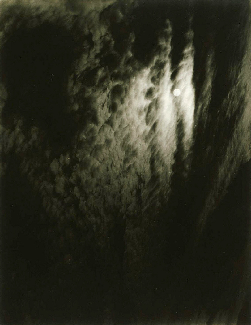
In 1922, he began photographing clouds and turning them into the equivalent of abstract paintings.

“Through clouds to put down my philosophy of life — to show that my photographs were not due to subject matter — not to special trees or faces, or interiors, to special privileges — clouds were there for everyone — no tax as yet on them — free.”

These first series of cloud abstractions he called “A Sequence of Ten Cloud Photographs.”  When he showed a new series in 1924, he renamed them “Songs of the Sky.” He continued making these prints, usually exaggerated in contrast and printed quite dark, making the blue sky black. He made them by the dozens, and by 1925, he was calling them “Equivalents.”stieglitz equivalent 2

“I have a vision of life and I try to find equivalents for it sometimes in the form of photographs…(Cloud photographs) are equivalents of my most profound life experience.”

This idea of “equivalents” was later taken up and expanded by photographer Minor White and others, but in essence, the abstraction of the clouds were to stand for “equivalent” emotional and intellectual experiences.

There is certainly a grandiosity to Stieglitz’s language, indeed to his person. But the photographs remain and many of them are deeply moving, perhaps compared to the late quartets of Beethoven.

But the underlying idea was that the medium of photography, rather than the subject matter the camera is pointed at, could be expressive: that the surface of palladium printed paper, or silver prints, and the blacks and whites of the silver on its surface, and the shapes they make, almost as if a Rohrschach test, could be sufficient for art.

Abstraction became a subset of 20th century photography, and even when there was a subject, such as a portrait or landscape, the photographer, whether Edward Weston or Paul Strand, or White or Bill Brandt, would insist on its essential abstraction as the basis of its value.

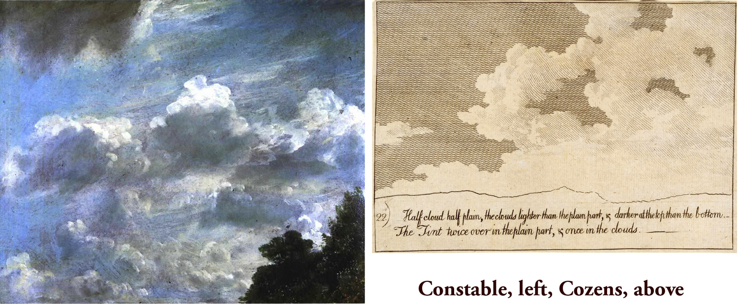
constable cozens pair But there is a problem with this: Those Equivalents that Stieglitz made are still clouds, and clouds carry with them all the baggage of subject matter. From the clouds in Renaissance paintings through the glorious cumulous in the seascapes of Aelbert Cuyp to the drawings of Alexander Cozens and countryside of John Constable. Clouds are an endless source of inspiration for the imagination of shape.

charlie brown and clouds In photography, it is almost impossible to eliminate subject matter, short of making photograms. The forms, colors, shadows, textures of the recognizable sensuous world keep intruding, no matter how extracted from context. When I was a teacher, one of the assignments I gave my students was “to photograph something so that I cannot tell what it is.” I expected them to get ultra close, or turn something upside down, or extend the contrast. But, try as they might, I could always tell what I was looking at.

I do not see this as a deficiency in photography, but a strength. Photography can keep us tethered to the world when we might wish to float free; it reminds us that our primary obligation is to the existence we occupy and work in.

clouds105 Given that, photographs of clouds still has a powerful attraction: We can see that abstraction and reality are not necessarily in opposition: We can have both at once.

Put this way, it seems obvious, a commonplace. But this “double vision” is one of the things that keeps art lively, and informs our interaction with the everyday — keeps us aware that the world is alive, not inert.

And so, I have made my own cloud photographs. The first series, seen here, are a rank imitation of Stieglitz’s Equivalents. The next blog installment will follow with the development of the idea. clouds116 clouds129 clouds115 clouds119

clouds130 clouds131 clouds139 clouds142 clouds145

curtis and isabel
Portrait photographs come in basically two varieties: the formal and the candid. These days, with selfies monopolizing the social media, almost all portraits are informal. And when asked, most people say they prefer the candid picture, perhaps because the formal portrait has fossilized into the Olan Mills mall photo, in garish color against phony backgrounds. It would be hard to make an esthetic case for these assembly-line excrescences, with their banal smiles and enforced familial geniality.olan mills family

karsh sibeliusThen, there is a prejudice against artifice: Many people prefer the snapshots because they seem more natural, more spontaneous. If you look at one of those highly massaged portraits by Yousef Karsh, there would seem nothing less spontaneous. Every light, every specular reflection in an eye, seems calculated, even marmoreal, like his portrait of composer Jean Sibelius. If we’re a “rock and roll” nation, we are one that values the brash, the riff, the off-the-cuff: Indeed, we trust it to be more “truthful” than the rhetoric of the planned, controlled and considered. As Allen Ginsberg mendaciously preached: “First thought, best thought.” (Despite the fact that his best poems, such as Howl, were thoroughly revised and rewritten; we have the typescript for evidence, with all its emendations.)karsh churchill

Yet, some of our most iconic images — the ones we remember, the ones that fix in our minds some large truth about their subjects, are exactly the careful, posed and arranged portraits, such as Karsh’s take on Winston Churchill — a photo that might have won the war all by itself.

The idea of the formal portrait survives, even in the gaudy, awful Olan Mills photos: The idea that the subject wants to be seen in his Sunday best, with his best teeth put forward for posterity: “This is how I want to be remembered.” Even though the actual life may be more squalid or confused, or complex– certainly infinitely richer. But “this version is the one with the barnacles scraped off.”

olan mills family portThe photographer Richard Avedon said, “What ends up in your scrapbook? The pictures where you look like a good guy and a good family man, and the children look adorable — and they’re screaming the next minute. I’ve never seen a family album of screaming people.”

But when done well, it isn’t the vanity of the subject that is portrayed, but the insight of the photographer. A good portrait should tell us something about the subject that the subject doesn’t want us to know, or is not aware of, or is somehow larger than the public face intended.

A photographic portrait also tells us something about the artist who makes it. This is something that Avedon always stressed.

“My portraits are always more about me than they are about the people I’ve photographed,” he said. You can spot an Avedon immediately: It’s style is uniquely his. The same can be said for Irving Penn, or for Arnold Newman, or Yousef Karsh — any of those who made a name as portraitists. An Avedon portrait — or a Penn — is a world view, consistent from image to image. avedon eisenhower

And it is in this sense that the portrait rises from vanity icon to art. The picture tells us not merely, what does this person look like, but rather the larger message: This is what being human is.

It is in the eyes, most often, that the humanity is tethered. You can see the light behind them. Nothing is worse than a picture of someone who is bored with the process of being photographed: The eyes turn into ball bearings, lifeless and extinct. A good portrait is a picture, instead, of being alive, of being in the moment, even if that moment is for posterity, or for eternity.

I bring all this up, because in the age before I became a writer, I thought I would be a photographer. It was in the days of chemicals and dim amber lights, and I became a proficient darkroom worker: My prints, I say with some pride, were as good as anyone’s. Crawford 1977 copy

And I took many portraits, working my way through the learning and development that any artist goes through: Imitation, innovation and finally, something personal that emerges.

Most of these portraits were friends or more. I went through cameras, always seeking the right one, never actually finding it: Nikons, Rolleis, Hasselblads. I went through lighting schemes, through backdrops.

And I went through the history of portraiture, from Holbein to Raphael to Rembrandt to Gainsborough to Chuck Close. The model I felt closest to was the Renaissance portrait, such as Raphael’s portrait of Baldassare Castiglione. Here was a face to look at: Eyes that had seen a good deal of the best and worst of the world: It registers. raphael castiglione portThere is also a sense of moment; this is for posterity. The figure makes a pyramid in the frame, giving it foundation and security. The background is broken into interesting shapes — the so-called negative space, not ignored, but make essential to the impact of the image.

I saw something of the same in the photographs of Avedon: formality, interesting negative space, and the centrality of eyes.

There is one major difference between these great images and the Olan Mills smile-o-thons: So many of them have equivocal expressions on their faces. They aren’t genial and smiling; indeed, it’s hard to quite know what they are expressing. There is a neutrality to their faces; not slack, as if thoughtless, but rather as if thoughts were unresolved.Henry Parrish Lippincott Hackett

In other words, the faces were not billboards flashing their message, but rather something denser, meant to be read and fathomed. Not the momentary but the monumental.

This is a portrait of Henry Parrish Lippincott Hackett, I made it in about 1973. It is a model of what I was trying to get in those years.

Of course, they were also shapes in a frame, and the graphic quality of the images counted for a lot, such as the eye of Picasso in Penn’s version, or the indistinct edge of Eisenhower’s head in Avedon’s portrait.

I used the eye in a photo I made of Pam Henry, in the mid-1970s. double picasso pam

Other imitations, conscious or otherwise can be found in other portraits I made from 1970 to about 1986, when I gave up teaching photography and became a writer at The Arizona Republic.

 My Degas:double chrysanthemums

Not a conscious imitation, but clearly a resonance of Ingres in a portrait of artist Mel Steele.double ingres mel


This is Doug Nufer in 1978, when he was officially dubbed “The World’s Most Obscene Man,” against Avedon’s portrait of Willem de Kooning. Nufer has since gone on to become one of the avant-garde literary lights of Seattle. Made from work print, 9/25/06, 12:15 PM, 16C, 5364x6131 (1182+1975), 125%, Hennessey 0823,  1/15 s, R38.2, G21.9, B47.9

double MK Elks and VenusOr, Botticelli’s Venus in a picture of Kathy Elks.

But it wasn’t all imitation. It was an education, and a slow development of what I was trying to find in portraiture. I wanted it to be formal; I wanted it to be graphic; I wanted it to be more than a snapshot reminder of who my friends were. When I was teaching photography, I ran a course on portraiture and I was not so much concerned with the usual lighting schemes or lens choices, but with engaging with the sitter, finding something human there. And while book after book told us that we should use a long lens for more natural perspective, I found that a normal lens, or even a wide angle lens brought the photographer and the sitter closer together, making interaction unavoidable: The photographer could not be aloof from the sitter, as though the sitter were a mere object, and the sitter could not be indifferent to the photographer invading his private space. The interaction was forced. Always use a short lens, I taught. Get in their faces.

Here is artist and friend, Charles Williams, who returned the favor by making a drawing of my wife and me. Charles Williams

Second lesson: Always have the sitter look into the lens, so that in the photograph, he gazes out of the picture into the eyes of the person looking at the image. This makes the portrait not a neutral event, but it forces the viewer to have a relationship with the subject. In other words, the photographer confronts the sitter; the photograph confronts the viewer. This makes for a more active work of art.

These are three photos I took for The Carolina Peacemaker, when I worked for that weekly black newspaper in Greensboro, N.C. I was looking for that directness, rather than the mere animation that most photo editors want.triple peacemaker ports

Third, no smiles. Unless they are genuine and are more than a tightened muscle at the mouth corner. There is a story about Greta Garbo, when an observer at a studio shoot said afterwards, “I couldn’t see her doing anything,” and the film director said, “But it will show up on film, just wait and see.” And of course, when the dailies were screened, every emotion ran riot across her face — primarily because she didn’t underline each one melodramatically. The film sees things you don’t. Let it do its job.double iott wolf

There were many other points in the course, but these three were most important, even if they ran counter to what is usually taught. After all, I told my students at the beginning of every class that I considered it my job as a teacher in the art department, not to train them for careers, but to make them unemployable. I wanted them to dig deeper than the stereotype. Many of them did. It was a great class.double robin reid linda olson

When I moved to Arizona and started work at the newspaper, I stopped taking as many photographs. I spent my time writing the two-and-a-half million words I pumped out in 25 years. There were photos meant to illustrate stories, but my emphasis had shifted.

Now, I still make the occasional photograph, and I still use the shorter lens, the in-your-face, and the attention to eyes.Mel BW

And I’ve gotten older, and so have my friends. You saw my Ingres-photo of brother-in-law Mel Steele. Here he is a couple of months ago, more informal — almost a snapshot, but with the lessons I learned from years of looking.


01 Cholla Organ Pipe Cactus NP Ariz
I miss the desert.

02 Ocotillo Organ Pipe Cactus NP ArizThe gravel, the dust, the prickles, the skin-shriveling heat, the raking shadows, the beige mountains turned pinkish in the afternoon, the buzzards hanging overhead, the greasewood smelling like aftershave in the rain.03 Organ Pipe Cactus Diana pair 3

When I lived in Arizona, I lived in the city; I don’t miss the city. I used to call Phoenix “Cleveland in the desert,” but aside from the scorch and desiccation, the desert doesn’t make itself much known in the cities of Arizona. For that, you have to leave the gridlock of reticulated and decussated streets and get out to where the dust devils spin and the owls burrow. 04 Cholla close Organ Pipe Cactus NP Ariz

Many years ago, I took a toy camera out to Organ Pipe Cactus National Monument, south of Why, and drove the loop road past Bates Well and Quitobaquito Spring. 07 Pond Organ Pipe Cactus NP ArizThere was no sight of another anthropoid anywhere. The only hint of human occupation was an abandoned ranch, the gravel roads and an occasional descanso commemorating someone’s unfortunate death under the oven dome. The horno cósmico13 nicho trio

Click to enlarge

The Diana camera cost something like $1.99 and had a plastic lens and used old roll film. It had the solid polystyrene worksmanship you might expect from Mattel or Ron Popeil.05 Butte Organ Pipe Cactus NP Ariz After a lifetime of Nikons, Canons and Hasselblads, and having moved up to a 4X5 camera with a Super-Angulon lens, it was a kind of mortification of the flesh to bust out the Diana. A means to get away from the high-resolution, Zone-System rut. 06 Saguaro Organ Pipe Cactus NP Ariz

And now, looking at the results 20 years later, the fuzz and blur of the photos seems more like the nostalgia I feel: less like being there, more like remembering, even half-remembering.16 Organ Pipe Cactus Diana pair 4

08 dark vista Organ Pipe Cactus NP Ariz12 Wire fence Organ Pipe Cactus NP Ariz

10 Ranch fence Organ Pipe Cactus NP Ariz

 
 17 Carole as Flora in the desertCarole as Flora